2d design basics · a greater power to inform, educate, ... wassily kandinsky ... visually, a line...
TRANSCRIPT
Unit 2A | Introduction
9–12 grade level curriculum | 10
www.aiga.org
Time Period: at least one class, 45–60 minutes in length
Unit IntroductionBasic two-dimensional design forms the foundation of graphic design and visual communication. By applying basic mark-making or drawing concepts such as lines and shapes to an understanding of how to define and make use of the picture plane and apply compositional strategies such as figure-ground relationships, scale, proportion, and space, as well as visual elements such as pattern, texture, and color, graphic designers and artists are able to visually communicate ideas and emotions to a viewer. While artists use these foundational principles for self-expression and awareness, graphic designers apply them to the challenge of visual communication. As such, graphic designers frequently focus on using these two-dimensional basics with great efficiency; making the most of a few visual elements at any given time—as opposed to layering many
National Visual Art Standards VA:Re.7.1.Ia: Hypothesize ways in which art influences perception and understanding of human experiences.
VA:Re.7.2.Ia: Analyze how one’s understanding of the world is affected by experiencing visual imagery.
Guiding Questions• How do artists and designers use fundamental
techniques of image making—points, lines, and planes for example—differently? How do they use them similarly?
• How do designers use compositional strategies like Figure-Ground in the making of images? In the organization of complex designs e.g. posters?
• What do designers need to think about in technical terms when it comes to color? What do designers need to consider to use color successfully?
ObjectivesStudents will…
• Develop an awareness of the formal role points, lines, and planes play in art and design through the use of visual aids and class discussion;
• Develop an awareness of the formal role of Gestalt theory in the making of art and design through the use of visual aids and class discussion;
• Develop an awareness of the physical properties of color and color’s expressive role in visual culture through the use of visual aids and class discussion;
• Be prepared to engage with and succeed in the activities and assignments of Unit 2 B–D.
VocabularyAdditive Color: the color that is produced by anything that emits light (the Sun, a computer screen, a movie projector, etc.). When working with additive color, the primary colors are red, blue, and green (RGB). In additive color, white is the combination of all of the colors, and black the absence of color.
Color relationships: the description of the different interactions between colors.
Composition: a complete work of art or design, seen in total, not as individual visual elements.
Cool colors: hues on the color wheel ranging from green to purple.
2D Design BasicsPoints, Lines, and Planes | Gestalt—Shape, Balance, Rhythm, Unity | Color
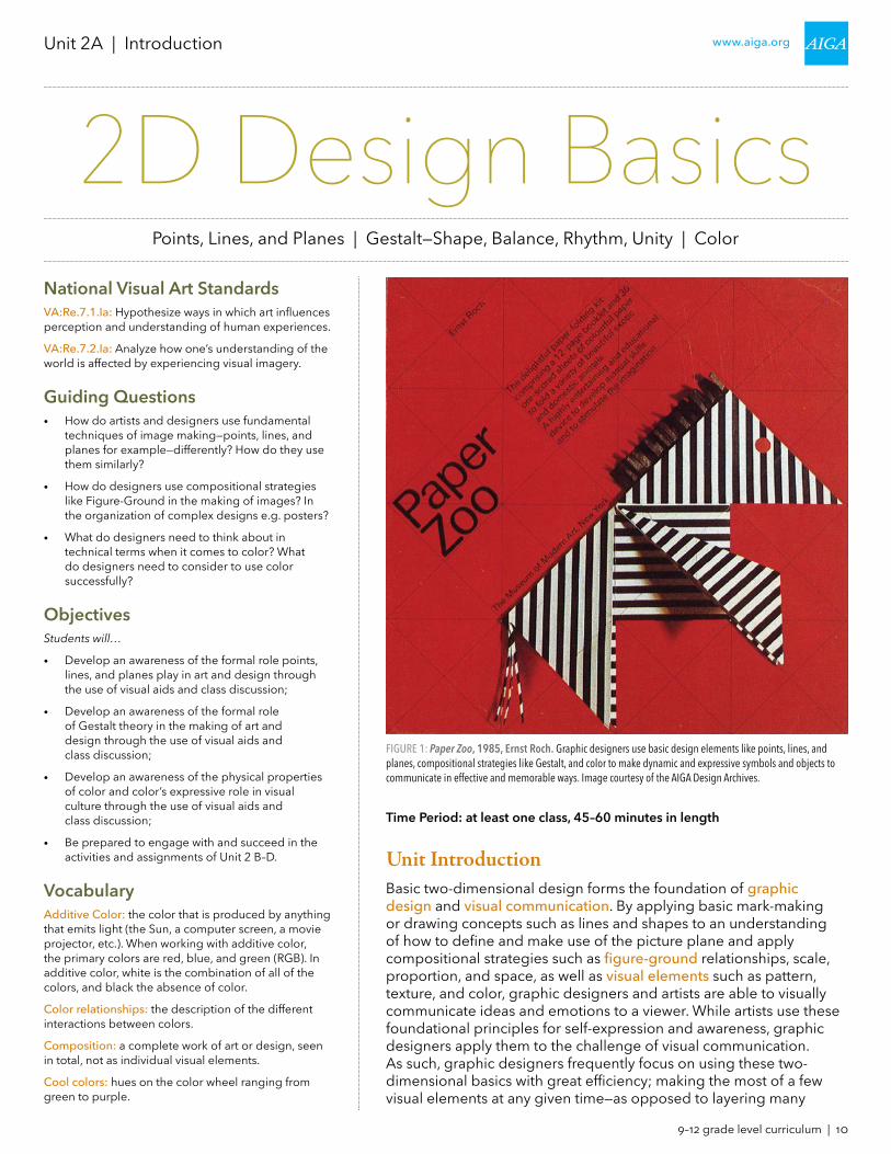
FIGURE 1: Paper Zoo, 1985, Ernst Roch. Graphic designers use basic design elements like points, lines, and planes, compositional strategies like Gestalt, and color to make dynamic and expressive symbols and objects to communicate in effective and memorable ways. Image courtesy of the AIGA Design Archives.

9–12 grade level curriculum | 11
www.aiga.orgUnit 2A | 2D Design Basics | Introduction
Figure-ground: a fundamental concept in design, it refers to the contrast between black and white, foreground and background, dark and light and equilibrium. Tinkering with the equilibrium can throw the figure-ground relationship off balance so the viewer is uncertain what they are viewing.
Gestalt: a psychology term which means “unified whole.” It refers to theories of visual perception developed by German psychologists in the 1920s that describe how humans tend to organize visual elements into groups or unified wholes when certain principles are applied.
Graphic design: also known as communication design, it is the art and practice of planning and projecting ideas and experiences with visual and textual content. The form of the communication can be physical or virtual, and may include images, words, or graphic forms. The experience can take place in an instant or over a long period of time. The work can happen at any scale, from the design of a single postage stamp to a national postal signage system, or from a company’s digital avatar to the sprawling and interlinked digital and physical content of an international newspaper. It can also be for any purpose, whether commercial, educational, cultural, or political. [Juliette Cezzar, www.aiga.org/what-is-design/}
Line: a line is an infinite series of points. Graphically, a line is the connection between two points, or it is the path of a moving point. A line can be a positive mark or the space between two or more positive shapes. Lines appear at the edges of objects and where two planes meet. Lines can exist in many weights; the thickness and texture as well as the path of the mark determine its visual presence. Lines can be straight or curved, continuous or broken. When a line reaches a certain thickness, it becomes a plane. Many lines used together can create volumes, planes, and textures.
Logo: a symbol or other design adopted by an organization to identify its products, uniform, vehicles, etc.
Negative space: negative space is the space between objects or the parts of an object, for example the area between a cup and its handle. Also the space between an object and the edges of the composition, i.e. the space around an object or between lines. The opposite of negative space is positive space.
Plane: a plane is a flat surface extending in height and width. A line closes on itself to become a circle, or intersects with other lines to create a shape, a plane with edges. A plane can be parallel to the picture surface, or it can skew and recede into space. Ceilings, walls, floors, and windows are physical planes. A plane can be solid or perforated, opaque or transparent, textured or smooth.
Point: a point marks a position in space. Graphically, a point takes form as a dot or visible mark.
Positive space: positive space is the area or part of a composition that the subject occupies. For instance, the positive space could be a vase of flowers in a still life painting, a person’s face in a portrait, the trees and hills of a landscape painting. The area around the positive space is called the negative space.
on top of one another—to communicate as clearly as possible. For graphic designers, a firm grasp of the basics is essential to all that they do. While there are many different ways to approach the topic of two-dimensional design, for the purposes of this unit it is helpful to think of them as drawing (Points, Lines, and Planes), composition (Gestalt—Shape, Balance, Rhythm, Unity), and Color.
Points, Lines, and PlanesAs the goal of graphic design is to efficiently connect a viewer with a message, when drawing or making symbols or images, refined renderings (drawings) are seldom the goal. Instead, graphic designers rely on the same tools artists use to render the natural world—points (or dots), lines, and planes (shapes) to distill a complex image or concept into a concise, direct, or evocative symbol or design. To graphic designers, points, lines, and planes are essential tools to plan, visualize, evaluate and ultimately communicate ideas to a broad audience.
FIGURE 3: Ecureuil, Caisse d’Epargne, 1974, Roger Excoffon. In this graphic symbol of the same animal, designer Roger Excoffon uses points, lines, and planes to not only express the idea of a “squirrel” to the viewer, but to also convey the sense of speed and dexterity commonly associated with the animal.
FIGURE 2: Squirrel, 1890, John Muir. In this drawing, the artist uses points, lines, and planes to realistically render a squirrel holding a pine cone. Photo by Carla Gates, used under license (CC BY 2.0).

9–12 grade level curriculum | 12
www.aiga.orgUnit 2A | 2D Design Basics | Introduction
Rendering: a depiction or representation (drawing, photograph, etc.) of an object, person, or place intended to accurately represent the subject.
Subtractive color: where additive color can be thought of as the color of projected light, subtractive color is the color of reflected light. As light strikes a pigment (ink, paint, etc.), certain wavelengths are absorbed (subtracted) while others are reflected back at the viewer. The primary colors of the Subtractive Color model are cyan, magenta, and yellow (CMY). In subtractive color, white is the absence of color, while black is the combination of all the colors. However, as mixing CMY in pigment produces a murky brown rather than a true black, a key color (a black pigment) is added in printing to compensate for this. Thus, printing works with a CMYK model (cyan, yellow, magenta, and black).
Symbol: a thing that represents or stands for something else, especially a material object representing something abstract.
Visual communication: communication through visual aids, which communicates an idea(s) and information in forms that can be read or looked upon, including signs, typography, drawing, graphic design, illustration, industrial design, advertising, animation, color, electronic resources, etc. It also explores the idea that a visual message accompanying text has a greater power to inform, educate, or persuade a person or group of people.
Visual elements: line, shape, tone, color, pattern, texture and form, etc., the building blocks of composition in art and graphic design.
Warm colors: hues on the color wheel ranging from red to yellow.
Materials• None for the introduction
Figures1. Paper Zoo, 1985, Ernst Roch
2. Squirrel, 1890, John Muir
3. Ecureuil, Caisse d’Epargne, 1974, Roger Excoffon
4. A point
5. Points in use
6. A line
7. Lines in use
8. Planes
9. Etching of St. James in South Charlton, England
10. Symbol for St. James
11. Yoshio Flies, 2009, Kat Gloor
12. Symbol for a Modern Dance Company
13. Stressed Weights in Black and White, 1923, Wassily Kandinsky; Photomontage for Arts & Architecture, 1945, Herbert Matter
14. Gestalt in image
15. Shell, California Conservation Center (defunct), and Woolmark marks
What do graphic designers mean when they refer to points, lines, and planes, and how are they used? To explore this effectively, it is best to work from common concepts and definitions.
pointsPoints are those most fundamental marks that artists and designers make; a simple dot or tiny drop of ink or paint that calls the viewer’s attention to a position on the page or canvas. Much as they can be visible, artists often use points as invisible tools in the work they create, in the form of a vanishing point in a perspective drawing, for example. Points can be powerful attention-getting tools when used alone, or can be layered to create textures, a sense of depth, motion, and more.
linesLines are simply linked points; either from the beginning to the end of the stroke of a pen, or the layered and overlapping lines used to create crosshatched shading in a pencil drawing. Much like artists, graphic designers use lines to convey a sense of motion, energy, or direction, or—when combined with other lines—to define the edge or perimeter of an object or space, creating a plane or shape.
FIGURE 4: A point. Points can most commonly be thought of as a dot or the most fundamental of marks that combine to form a larger image.
FIGURE 5: Points in use. Together, individual points can be used much like lines to create a sense of motion, density, or texture.
FIGURE 6: A line. Visually, a line (in red, above) can be thought of as marking the path of a point as it moves through space, or linking the space between two points (in gray, above). Lines are used in perspective drawing, for example, to imply a sense of depth or distance.
FIGURE 7: Lines in use. Individual lines placed together in orderly or random patterns can be used to create a sense of texture (e.g., a basket weave) or a sense of volume or depth (e.g. crosshatch shading) in an image.

9–12 grade level curriculum | 13
www.aiga.orgUnit 2A | 2D Design Basics | Introduction
16. Figure-ground in use
17. Gestalt in use
18. Additive and subtractive color models
19. Warm and cool colors
20. Colors and corporate symbols
Art Context, Cultural Connections and Relevancy2D Design skills such as drawing, composition, and color are critical to being able to express oneself visually. Prompt students to think about impactful visual communication they encounter in their daily lives. Encourage students to reach beyond logos for favorite clothing lines or brands, but to also think about what comes to mind when they think about other forms of visual communication—symbols for authority, symbols for public services, symbols for protest groups. How do students respond on a “gut” level when they see the symbols used for their school? Their state? Their country? The police? Understanding these visceral reactions, why people have them, and how to manage those reactions in communication are key in having one’s message heard and understood in today’s society.
Artists/Designers to ReferenceThese artists and designers provide excellent examples of the core principles of Unit 2 in their art and design. Examples of their work found in a library or Internet search will serve as excellent visual aids and prompts for launching Unit 2 with students.
• Josef Albers (1888–1976): a German-born American painter, Albers completed Itten’s introductory course at the Bauhaus in 1920, eventually joining the faculty there. Albers would later go on to teach at Black Mountain College in North Carolina, where he taught American artists such as Robert Rauschenberg and Cy Twombly. Albers was well-known for his use of color in his art and his work on color theory itself. (See Proto-Form B and the Homage to the Square series for examples of Albers’ color work, as well as his book Interaction of Color.)
• Saul Bass (1920–1996): a designer notable for his identity and film title design. Bass’ use of fundamental shapes and their spatial relationships is an excellent example of the efficiency Gestalt can bring to a design challenge (see Bass’ logos for Alcoa, Girl Scouts of America, Minolta, and Quaker Oats as instructive examples).
• Wassily Kandinsky (1866–1944): an Abstract Expressionist, notable for his use of points, lines, and planes in the creation his compositions (see On White II for a key example).
• Roger Excoffon (1910–1983): a French type and graphic designer who worked with line to create powerful and expressive identities for business and graphic symbols. (See Excoffon’s designs for the 1968 French Winter Olympics and Air France for instructive examples of his expressive and dynamic use of line.)
planesPlanes—or shapes—are defined by the lines at their edges. Artists use planes to realistically render places, objects and people, or to abstractly define space and forms. Graphic designers use planes to much the same effect, though planes are often used or combined to represent complex objects (such as a building) in a more simplified or abstract and symbolic way.
Artists often combine all of these techniques to create realistic renderings and abstract expressions of emotion and thought. Likewise, designers combine all three to create symbols or to add direction or energy to graphics and type. Additionally, graphic designers use these tools to render complex objects or scenes into symbols the viewer can quickly grasp the meaning of—a logo, for example—or respond to—a directional sign. Likewise, graphic designers can use points, lines, and planes to expressively or dynamically define a page to create compelling or interesting compositions.
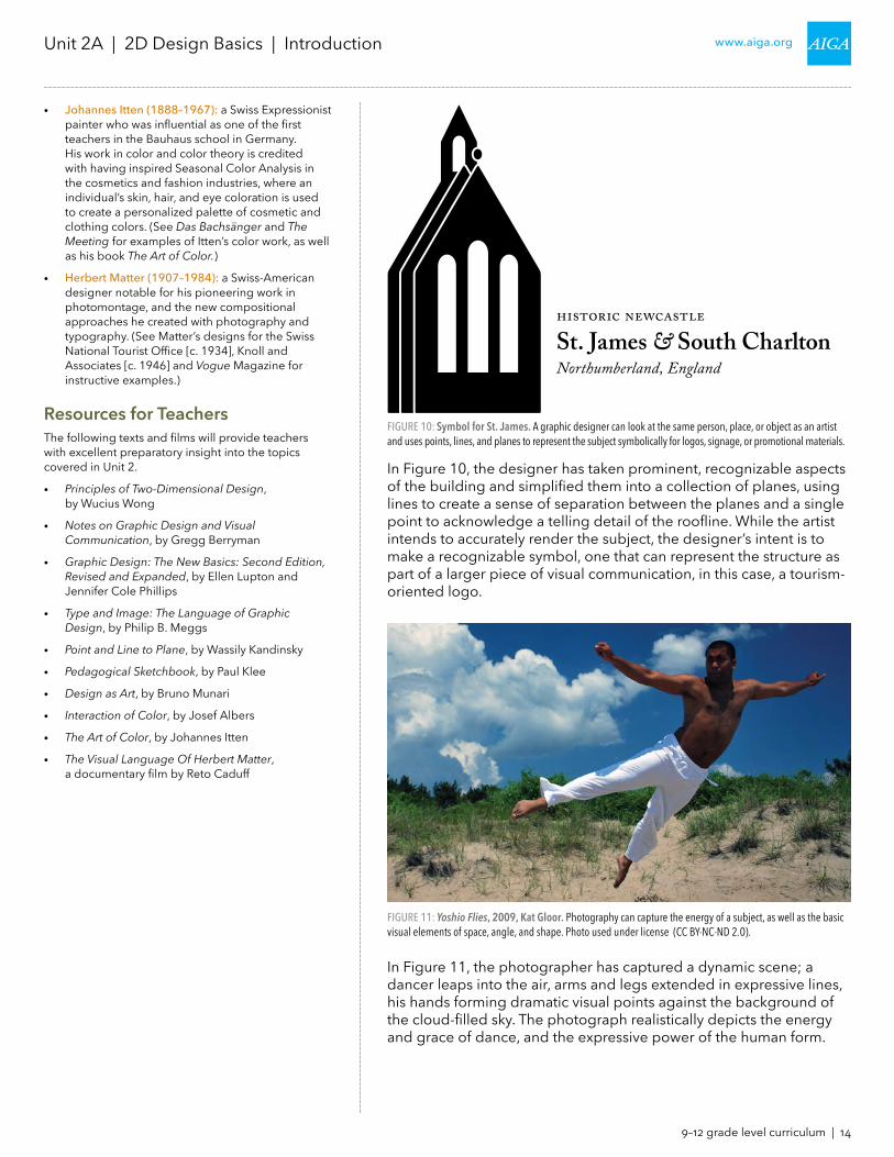
In Figure 9, the artist uses vanishing points to properly establish perspective to give the viewer a sense of the space that St. James inhabits. Points and lines are used not only to create texture, but combined to create the planes—or shapes—of the individual stones, roof tiles, etc. of the building. In the end, the artist has created an accurate rendering of the building and its surroundings.
FIGURE 8: Planes. As lines (in gray) intersect with one another, the interior space they create is known as a plane (in red). All planes and shapes are ultimately defined by the lines at their perimeter.
FIGURE 9: Etching of St. James in South Charlton, England. Artists can expand upon points, lines, and planes to create realistic renderings of people, places, and objects.
9–12 grade level curriculum | 14
www.aiga.orgUnit 2A | 2D Design Basics | Introduction
• Johannes Itten (1888–1967): a Swiss Expressionist painter who was influential as one of the first teachers in the Bauhaus school in Germany. His work in color and color theory is credited with having inspired Seasonal Color Analysis in the cosmetics and fashion industries, where an individual’s skin, hair, and eye coloration is used to create a personalized palette of cosmetic and clothing colors. (See Das Bachsänger and The Meeting for examples of Itten’s color work, as well as his book The Art of Color.)
• Herbert Matter (1907–1984): a Swiss-American designer notable for his pioneering work in photomontage, and the new compositional approaches he created with photography and typography. (See Matter’s designs for the Swiss National Tourist Office [c. 1934], Knoll and Associates [c. 1946] and Vogue Magazine for instructive examples.)
Resources for TeachersThe following texts and films will provide teachers with excellent preparatory insight into the topics covered in Unit 2.
• Principles of Two-Dimensional Design, by Wucius Wong
• Notes on Graphic Design and Visual Communication, by Gregg Berryman
• Graphic Design: The New Basics: Second Edition, Revised and Expanded, by Ellen Lupton and Jennifer Cole Phillips
• Type and Image: The Language of Graphic Design, by Philip B. Meggs
• Point and Line to Plane, by Wassily Kandinsky
• Pedagogical Sketchbook, by Paul Klee
• Design as Art, by Bruno Munari
• Interaction of Color, by Josef Albers
• The Art of Color, by Johannes Itten
• The Visual Language Of Herbert Matter, a documentary film by Reto Caduff
In Figure 10, the designer has taken prominent, recognizable aspects of the building and simplified them into a collection of planes, using lines to create a sense of separation between the planes and a single point to acknowledge a telling detail of the roofline. While the artist intends to accurately render the subject, the designer’s intent is to make a recognizable symbol, one that can represent the structure as part of a larger piece of visual communication, in this case, a tourism-oriented logo.
In Figure 11, the photographer has captured a dynamic scene; a dancer leaps into the air, arms and legs extended in expressive lines, his hands forming dramatic visual points against the background of the cloud-filled sky. The photograph realistically depicts the energy and grace of dance, and the expressive power of the human form.
FIGURE 10: Symbol for St. James. A graphic designer can look at the same person, place, or object as an artist and uses points, lines, and planes to represent the subject symbolically for logos, signage, or promotional materials.
FIGURE 11: Yoshio Flies, 2009, Kat Gloor. Photography can capture the energy of a subject, as well as the basic visual elements of space, angle, and shape. Photo used under license (CC BY-NC-ND 2.0).

9–12 grade level curriculum | 15
www.aiga.orgUnit 2A | 2D Design Basics | Introduction
In Figure 12, the designer has drawn inspiration from the photograph, finding the most expressive points, lines, and planes in the image to evoke the same feelings the photograph does—movement, power, and grace—while at the same time reducing the visual complexity of the image (the beach, clouds, and plants in the background) while also creating a more universal symbol for dance that could be used as part of the logo for a dance company, as opposed to a photo which represents a single dancer in a single place at a single point in time.
Figure 13 demonstrates the different ways points, lines, and planes can be used. While they can be actual marks on the page—whether realistic or abstract—lines and planes can also be used invisibly—like a vanishing point—to establish an expressive and intriguing structure for the organization of different images on a page or poster. Such organization leads to the next component of Unit 2: composition, or Gestalt—Shape, Balance, Rhythm, Unity.
FIGURE 12: Symbol for a Modern Dance Company. A graphic designer can find inspiration in a photograph and uses points, lines, and planes to capture the energy and expressive power of the photograph to communicate a new idea , place, or activity.
FIGURE 13: Stressed Weights in Black and White, 1923, Wassily Kandinsky (left); Photomontage for Arts & Architecture, 1945, Herbert Matter (right). Kandinsky uses points, lines, and planes to create abstract, highly-expressive compositions. Matter uses points, lines, and planes to define an energetic space for images to interact with and respond to one another.
9–12 grade level curriculum | 16
www.aiga.orgUnit 2A | 2D Design Basics | Introduction
Gestalt—Shape, Balance, Rhythm, UnityThough it originates as a branch of psychology concerned with the “pattern seeking” inherent in human thought, graphic designers and artists apply Gestalt theories as a way to create a reliable foundation for the spatial organization of graphic information. For artists and graphic designers, there are two broad components that are considered when applying Gestalt principles to a composition:1. The individual parts of a composition (points, lines, planes, etc.)
that can be analyzed and evaluated as distinct components, and2. The whole of the composition, which is different from—and
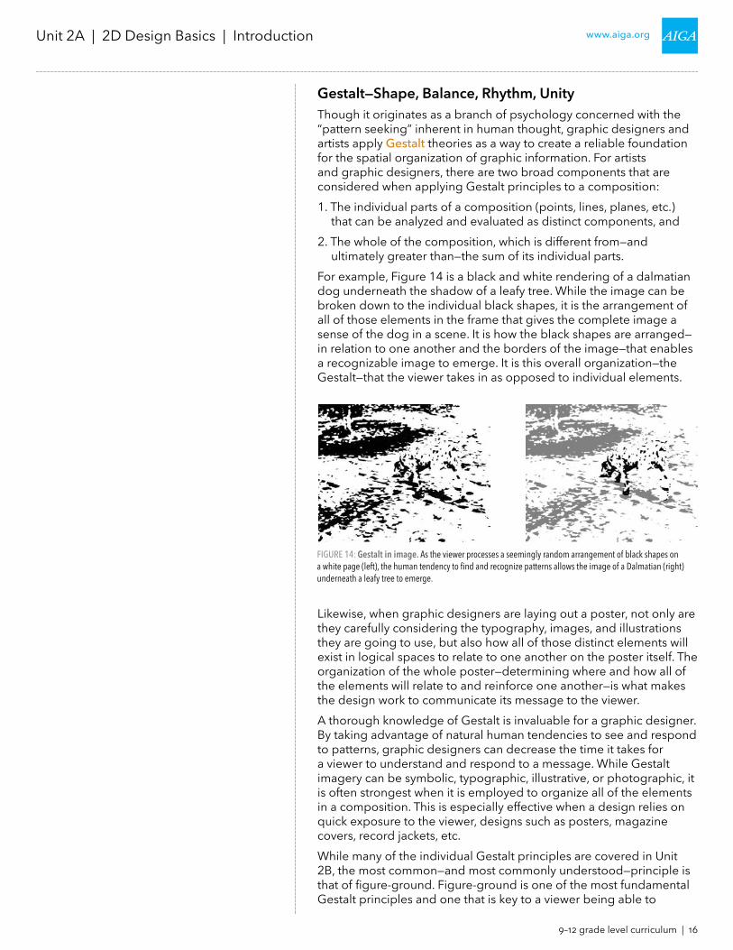
ultimately greater than—the sum of its individual parts.For example, Figure 14 is a black and white rendering of a dalmatian dog underneath the shadow of a leafy tree. While the image can be broken down to the individual black shapes, it is the arrangement of all of those elements in the frame that gives the complete image a sense of the dog in a scene. It is how the black shapes are arranged—in relation to one another and the borders of the image—that enables a recognizable image to emerge. It is this overall organization—the Gestalt—that the viewer takes in as opposed to individual elements.
Likewise, when graphic designers are laying out a poster, not only are they carefully considering the typography, images, and illustrations they are going to use, but also how all of those distinct elements will exist in logical spaces to relate to one another on the poster itself. The organization of the whole poster—determining where and how all of the elements will relate to and reinforce one another—is what makes the design work to communicate its message to the viewer.A thorough knowledge of Gestalt is invaluable for a graphic designer. By taking advantage of natural human tendencies to see and respond to patterns, graphic designers can decrease the time it takes for a viewer to understand and respond to a message. While Gestalt imagery can be symbolic, typographic, illustrative, or photographic, it is often strongest when it is employed to organize all of the elements in a composition. This is especially effective when a design relies on quick exposure to the viewer, designs such as posters, magazine covers, record jackets, etc.While many of the individual Gestalt principles are covered in Unit 2B, the most common—and most commonly understood—principle is that of figure-ground. Figure-ground is one of the most fundamental Gestalt principles and one that is key to a viewer being able to
FIGURE 14: Gestalt in image. As the viewer processes a seemingly random arrangement of black shapes on a white page (left), the human tendency to find and recognize patterns allows the image of a Dalmatian (right)underneath a leafy tree to emerge.

9–12 grade level curriculum | 17
www.aiga.orgUnit 2A | 2D Design Basics | Introduction
understand imagery. Relying on contrast, it breaks a composition down into two components:1. Figure: The positive space(s) that are defined by a spatial
relationship which occurs between all of the other parts on a field or ground.
2. Ground: The background, field, white space or negative space with carries the figure or positive elements.
Figure-ground can be used to describe a wide variety of complex images and compositions, but many people are most familiar with its application in the design of corporate symbols as seen in Figure 15.
The design and arrangement of the figure on the ground is vital to creating a successful symbol. Figure 16 demonstrates the figure and ground as distinct elements, and how they combine to make not only a recognizable image—a sea shell—but a corporate symbol as well. While each element is relatively successful on its own, the combination of the figure with the ground creates the most successful image.
Beyond individual symbols, designers use Gestalt principles to organize posters and other forms of graphic communication. In Figure 17, not only is Saul Bass’ use of figure-ground evident in the images, but the organization of the entire piece—its Gestalt—organizes the relevant information—the title of the film, the name of the actors, etc.—into logical spaces for the viewer.While designers use points, lines, and planes to create symbols and images, and Gestalt principles to organize and arrange information, color is the third fundamental element to creating a strong design. Not only can applying color to individual points, lines, or planes add more energy to a design, or when applied to a design help with the organization—the Gestalt—it is important for designers to understand color on its own: how color is both perceived and used.
FIGURE 15: (Left to right) Shell, California Conservation Center (defunct), and Woolmark marks. Gestalt and figure-ground relationships can be used to describe many different objects and ideas, from the literal to the abstract and in between.
FIGURE 16: Figure-ground in use. While the figure (left) and the ground (middle) are both relatively recognizable, they are most successful in creating a clear—and therefore memorable—symbol in combination.

9–12 grade level curriculum | 18
www.aiga.orgUnit 2A | 2D Design Basics | Introduction
ColorColor is such an important way in which humans visually experience the world; it can be very easy for designers to take it for granted. It is precisely because of this importance, however, that designers must not only understand the physical properties of color (additive color versus subtractive color, for example) but also color’s various relationships and how to apply color to a design to create a mood or other response in the viewer.One of the key challenges a designer faces when working with color is understanding the two key color models, additive and subtractive. While additive color is color we experience in the natural world—it is the color made from the light of the Sun, for example—designers must also work with subtractive color, the color we experience when working with paints, inks, or other pigments. In additive color, white is the presence of all of the colors, while black is the complete absence of color. In subtractive color, black is the result of all of colors being mixed together, while white is the absence of any color at all. Understanding these differences—and their resulting limitations—is important for designers. Additive colors, which are possible on the screen (in the design of websites, apps, etc.) cannot always be reproduced subtractively in print (for packages, magazines, etc.).
FIGURE 17: Gestalt in use. Saul Bass' 1960 design (left) for the film poster for Exodus. Not only does Bass use figure-ground to create the image and typography at the core of the poster, but the arrangement of all of the elements—title, illustration, and text—are organized so that the poster is clear, direct, and uncluttered.
FIGURE 18: Additive and subtractive color models. Additive color, where white is the combination of all colors, is defined by the RGB (Red, Green, Blue) color model, while subtractive color, where white is the absence of any color, is defined by the CMY (Cyan, Magenta, Yellow) color model.

9–12 grade level curriculum | 19
www.aiga.orgUnit 2A | 2D Design Basics | Introduction
This becomes especially important when designers are working on complex design projects with different components across the Web and print. While a logo could potentially make use of millions of colors on screen, print can only replicate several hundred thousand colors. As clients expect their designs to be consistent regardless of use, harmonizing colors across both models is an important skill for a designer to possess. Beyond understanding the technicalities of color, arranging color and using color to communicate are important skills for a designer. Color can be used to create a mood or a sense activity, but those uses can only be successful if the various relationships between colors are understood. Figure 19 demonstrates one of the most basic color relationships, that of warm colors and cool colors. Not only do warm and cool colors create strongly related palettes when used as groups, they also impact the overall Gestalt of a design owing to the visual tendency of warm colors to “advance,” or appear to move toward the viewer, and the tendency of cool colors to “recede,” or appear to move away from the viewer. Designers can use these effects to make a package feel larger and more important on a shelf by making it red or orange, or improve the sense of openness in a poster by making the background blue. Once a designer has mastered the various color relationships, they can apply that knowledge of responding to color preference in the viewer based on the purpose of the design being created. While color preferences are always changing—due to changes in the season, or differences between cultures or economic conditions—particular colors and color combinations can be relied upon to create certain responses in the viewer. For example, while red in a restaurant might stimulate the appetite, blues and greens can be soothing at the dentist’s office. Figure 20 demonstrates the importance of a sensitivity to color in a designer’s work. A designer’s choice in colors must relate logically to the total project and all of its competing and complementary pieces. It is key for designers to remember that color is often the most direct path to connecting with the emotions of a viewer, and depending on the project—particularly in packaging and advertising design—can be the most important single design feature. It is impossible to sell food in unappetizing colors, or clothes in colors
FIGURE 19: Warm and cool colors. Warm colors (yellow, red, orange, etc.) tend to appear to advance toward the viewer, while cool colors (blue, violet, green, etc) appear to move away from the viewer. Designers use these features of color to help guide the viewer through a design, or to call attention to a particular piece of information.

9–12 grade level curriculum | 20
www.aiga.orgUnit 2A | 2D Design Basics | Introduction
AIGA Minnesota Innovate grant funded project
www.aigaminnesota.org
AIGA is the profession’s oldest and largest professional member-
ship organization for design—with 70 chapters and more than
25,000 members—they advance design as a professional craft,
strategic advantage, and vital cultural force. From content that
defines the global practice to events that connect and catalyze,
they work to enhance the value and deepen the impact of design
across all disciplines on business, society, and our collective future.
FIGURE 20: Colors and corporate symbols. Coca-Cola has carefully selected red as the color for its symbol not only because it feels active and fresh, but because it is a color that stimulates the appetite. As their product is frequently featured with food, other colors that may be appropriate for different uses (medicine, clothes, cars, etc.) look out of place and feel unappealing when applied to Coca-Cola’s symbol.
that make the wearer look unhealthy. Designers must always choose colors that serve the goal of the larger design, not simply because they personally like a given color.