4. layoutusers.jyu.fi/~huovila/k04.pdf · magazines. they use a circular lay- ... newspaper or...
TRANSCRIPT

53
4. L
ayou
t
4.1. Organizing the layout4.1.1. Layout in terms of pagestructure or the story
Typography provides the basis forlayout. A publication uses an over-all typography specifically de-signed for it. The typography of sin-gle pages is compatible with thisoverall typography. These togeth-er create a recognizable identityfor the paper or magazine.
Different elements of the lay-out are headlines (19-78 points),visualization (pictures, figures andgraphics), text (7-15 points), spe-cial effects (lines, boxes, rasters,colour, negative texts, etc.) andwhite space. By making use ofthese the designer creates a inform-ative and economical design for thepage.
The layout can be either fixed orflexible.
In a fixed layout the location of
the different stories on a page hasalready been determined. Thismeans that when a journalist gets atopic for his story and starts to writeit, he knows for which page andwhich space he is writing. Thus heknows exactly how long the storyis supposed to be. He cannot writetoo short or too long a story; it hasto be of precisely the requiredlength.
If whole-page stories have beenassigned regular places in the pub-lication, it only remains for thedesigner to place the story in them.
In a flexible layout the page for-mat or layout design does not re-strict the length of a story; this isthe decision of the writing journal-ist. Thus the space needed in a flex-ible layout is based on the lengthof the story itself.
An advantage of a flexible lay-out is that the journalist has a freehand in writing as long or short a

54
story as the topic allows and thejournalist sees as appropriate.
A fixed layout, on the otherhand, restricts the journalist's free-dom. The space for the story hasbeen determined in advance. Thejournalist has no right to alter thelength of the story. If he wants todo so, it has to be separately agreedon with the editors.
An advantage of a fixed layoutis that the journalist knows exactlythe length of the story he is to write.Thus, when writing the story, he canbuild the story to the specifiedlength and use the information ac-quired in such a way that the fin-ished story fills the allotted spaceand covers the most essential fea-tures of the topic.
4.1.2. Vertical and horizontalorganization of a layout
The dominant lines of a page canbe either vertical or horizontal. Ac-cordingly, the layout of a page iscalled either vertical or horizontal.
A horizontal line conveys apeaceful message. Hence a hori-zontal layout is considered to sug-gest coolness and intelligence.This is a very appropriate style forthe layout of stories which are in-tended as serious articles present-ing profound background informa-tion.
A vertical layout is the oppositeof a layout utilising horizontallines. The message it conveys isopposite to that of a horizontal lay-out as it breaks our normal binoc-ular field of vision. A vertical lay-out is considered to be impressiveand to convey emotion visually tothe receiver. Thus it is a suitable lay-out, for instance, for features andother subjective stories.
The visual messages, emotional
and intellectual content of a verti-cal or horizontal layout can be usedto support the inner message ofsome of the stories on the pages inquestion. It is then being used func-tionally. However, the basic struc-ture of a page, especially that ofnews pages, requires stories to beplaced in a certain way regardlessof their content. Thus on routinepages the structure of the layoutitself is more emphasized than themessage.
In a vertical layout the dominantlines are vertical, ie. upwards anddownwards. For instance, a broad-sheet page may be divided into barsof 1-4-3 columns or a five-columntabloid into bars of 2-3 columns.These bars rule the page from theupper edge all the way down.
An advantage of a vertical lay-out is that it makes it easy to ar-range stories on a page - especial-ly if the designer has a largenumber of short stories to make up.Stories are placed in the bars so thatthe shortest ones are in a one-col-umn bar and the longest, for in-stance, in a four-column bar. Thestories start and end at differentpoints on the page, but the domi-nating vertical lines ensure the el-egance of the page - the less noti-cable horizontal elements whichseparate the stories do not disturbthe vertical elements, but separatethe stories vertically from one an-other, and hence the systematicstructure of the page is retained.
In a horizontal layout the domi-nant lines are horizontal. In its sim-plest form the stories are broad andare placed across the page belowone another. Thus they form onebroad bar across the page, all theway down. In a more complex formstories can be placed side by side,but assembled so that the horizon-tal white space and possible line

55
which separate them are more sa-lient than the vertical elements sep-arating the stories.
A horizontal layout is most suit-able when the designer has anumber of long stories to fit in.When a long story is run acrossseveral columns, each separate col-umn is shorter than it would be ifthe story was confined in a narrow-er space. Thus short columns givethe reader the subconscious im-pression of a short story, making iteasier to start reading the story. Astory which appears long has a high-er threshold than a short one.
A vertical and a horizontal lay-out can be combined. The uppersection of a page can be horizontaland the lower section vertical - orvice versa. This is called an inter-change layout.
An interchange layout is justi-fied if the designer has stories ofdifferent lengths which it is diffi-cult to accommodate into either avertical or horizontal layout alone.A page may start with a horizontallayout, in which 2-3 long storiesare placed on the upper section ofthe page. After this a change ismade to a vertical layout, whichmakes it possible for the designerto arrange the shorter stories at hisdisposal in a rhythmic and logicalorder on the page.
In a layout opposite to the oneabove, the main news stories areplaced in the upper section of thepage, whereas in the lower section,for example, an extensive storycontaining much background infor-mation might run in a horizontallayout across the page. In this case,the point size of the headline of thestory in the lower section has to besmaller than that in the main head-line so that they do not competewith one another for the attentionof the reader. For instance, a fac-

56
tual background story can be placedin the lower section, thus makinguse of the layout to support thestyle of the story.
In addition to a vertical and ahorizontal layout a circular layoutis also possible. It aims, through itsirregularity, at breaking up thestructure of the vertical and hori-zontal types of layout. Here, it isnot the purpose to create a system-atic column structure for the page.Large headlines and plenty of ty-pographical effects can be used.The pictures used can be large, too,and might sometimes even be ir-regular in shape or arranged diago-nally.
In a circular layout the main sto-ry is set in the middle of the pageand the other stories groupedaround it. The result is varied butin it lies the danger of a confusingappearance, making perception ofthe whole difficult.
A circular layout is usually usedby tabloids and sensation-seekingmagazines. They use a circular lay-out to attract attention, to supporttheir daring style of reporting andto present their pictures in a spec-tacular way. A circular layout is not,however, confined to tabloidsalone, but it is also used in moder-ation in the layout of daily news-papers.
A photo-centered layout is sim-ilar to a circular layout. In this typeof layout even more emphasis isgiven to pictures, which are themost noteworthy element in anewspaper or magazine. Picturesare placed on a page in such a man-ner that they form a path from themain picture to the others. The or-der of the pictures in the path is de-termined according to their sizeand locations. Thus the most attrac-tive elements on a page, the pic-tures, receive prime locations and

57
an internal preference.After the pictures have been ar-
ranged, the story connected withthe main picture is placed next toit, the second headline is placednext to the second picture, and soon. Stories without pictures are ar-ranged along the picture path in theproximity of the picture to whichthey are connected - either aboveor to the left of it - according tothe order in which the stories arepresented.
In a diagonal layout the main sto-ry begins at the outer edge of thepage. The headline is broad and theend of the story a narrow tail. Thusthe headlines are more prominentand the dominant direction, guid-ing the reader, is from the upperoutside edge of the page down to-wards the inner edge of the page.
Along with computerized layout,newspapers are increasingly re-sembling magazines. The construc-tion of their main newspages andfirst pages of sections are based onlarge pictures and an impressivelayout.

58
4.2 . Preference guides the reader4.2.1. Hierarchy of stories asstarting point
The starting point when designinga layout for a page in a newspaperis usually the page, which forms awhole. The direction in which apage is perceived is from the topdownwards. In a magazine, howev-er, the starting point is a seriesformed of pages, and the pages areperceived from left to right, fromone page to the next. A tabloid fallsbetween these two: the pages areusually constructed in one-pageunits, but a unit of several pagesmay also be treated as a whole.
The aim, when designing a page,is to create a hierarchy or prefer-ence for the stories and to arrangethe stories and pictures on the pageso that the reader, when scanningthe page, will notice all the stories.A preferential reading order can becreated for the page by the use of adifferent story path or paths or theposition of the pictures and the at-tractiveness of the pictures. Thereader is also guided by the use ofpictures which are positioned nextto the most important stories onthe page.
4.2.2. Story paths guide the reader
The most important or head story,is usually placed in the upper left-hand section or the centre of thepage in a vertical or horizontal lay-out, and in a circle layout in themiddle of the upper section of thepage, close to the optical point. Thepoint size of the main headline isthe biggest and the column breadththe broadest of the headlines on thepage. The large point size directs
the reader to start scanning the pagefrom the main headline. A picturewhich is large in terms of thenumber of columns it occupies isusually placed next to the main sto-ry to catch the reader’s attentionand to direct it to the main story.Thus the reader starts scanning thepage from the main story.
The Western tradition of read-ing is also the starting point in de-signing a horizontal layout: a bookis read from left to right and down-wards, which makes the upper left-hand corner also the natural start-ing point for a page.
The story second in importanceis placed next directly below orvery close below the main story sothat the reader is guided towards itfrom the main story. Furthermore,the third story is placed below thesecond, and thus a story path is cre-ated which the reader will followto the end. The reader has now fol-lowed the first path on the page.
The second path of the pagestarts from the top next to the mainstory or below it on the right. Theheadline of the second path isplaced so that the reader will no-tice it when he has finished the firstpath. Thus the reader will follow thesecond path, after which he willstart a third and possibly also afourth path.
All the headlines set on a pageshould have a hierarchy of theirown. They constitute downwardpaths as well as place stories whichare side by side in an order of read-ing preference. Two headlines ofequal size should not be put sideby side on a page: it should be madeclear to the reader which of the sto-ries is to be read first. On the oth-er hand, the hierarchy of readingfrom left to right allows headlinesof equal size if there is a picturebetween them. In this case the hi-

59
The Main Headline is the largest
HEADLINES
The Third Headlineis the third largest
The Heads ina baulk aresimilar
The Second Headlineis the second largest
123456789012345678901234567890123456789012345678901234567890123456789012345678901234567890123456789012345678901234567890123456789012345678901234567890123456789012345678901234567890
123456789012345678901234567890123456789012345678901234567890123456789012345678901234567890123456789012345678901234567890123456789012345678901234567890123456789012345678901234567890
123456789012345678901234567890123456789012345678901234567890123456789012345678901234567890123456789012345678901234567890123456789012345678901234567890123456789012345678901234567890
123456789012345678901234567890123456789012345678901234567890123456789012345678901234567890123456789012345678901234567890123456789012345678901234567890123456789012345678901234567890
123456789012345678901234567890123456789012345678901234567890123456789012345678901234567890123456789012345678901234567890123456789012345678901234567890123456789012345678901234567890
123456789012345678901234567890123456789012345678901234567890123456789012345678901234567890123456789012345678901234567890123456789012345678901234567890123456789012345678901234567890
123456789012345678901234567890123456789012345678901234567890123456789012345678901234567890123456789012345678901234567890123456789012345678901234567890123456789012345678901234567890123456789012345678901234567890123456789012345678901234567890
12345678901234567890123456789012345678901234567890
123456789012345678901234567890123456789012345678901234567890123456789012345678901234567890123456789012345678901234567890123456789012345678901234567890123456789012345678901234567890
123456789012345678901234567890123456789012345678901234567890123456789012345678901234567890123456789012345678901234567890123456789012345678901234567890123456789012345678901234567890123456789012345678901234567890123456789012345678901234567890
123456789012345678901234567890123456789012345678901234567890123456789012345678901234567890123456789012345678901234567890
123456789012345678901234567890123456789012345678901234567890123456789012345678901234567890123456789012345678901234567890
1234567890123456789012345678901234567890123456789012345678901234567890123456789012345678901234567890
1234567890123456789012345678901234567890123456789012345678901234567890123456789012345678901234567890
1234567890123456789012345678901234567890123456789012345678901234567890123456789012345678901234567890123456789012345678901234567890
1234567890123456789012345678901234567890123456789012345678901234567890123456789012345678901234567890123456789012345678901234567890
12345678901234567890123456789012345678901234567890
1234567890123456789012345678901234567890
The Heads ina baulk aresimilar
The Headlines ina baulk arealmost similar

60
erarchy of the stories based on thepaths is not obscured. If, however,the column division 1-5-2 is used,a hierarchy based on the point sizeof the headlines will be strongerthan that of the natural reading di-rection. It will guide the reader firstto the five-column headlines, thento the right to the two-column barand, finally, left to the one-columnbar.
The point size of the headlineand the position of the story on thepage path create a reading hierar-chy and ensure that the reader willnotice every story on the page.
Usually the point size of theheadline, column width and newsvalue coincide, ie. the most impor-tant story gets the largest point sizeand the broadest column width. Thesub-editor, too, aims at this whenmaking up the headline. Importantstories in a tabloid run into 3-5 andin a broadsheet 4-5, or sometimesas many as 7-8 columns, whereasminor news items are alloted asmaller number of columns. Tomake the headline rhythm of a pagework, headlines of different widthsmust be given different point siz-es.
Occasionally column width andalso the width of the headline willdepend on the length of the story:a long story requires more col-umns to fit comfortably on thepage. Hence the headline will alsobe broader. To enable the hierarchybetween the stories to function,the position of the story and thepoint size of its headline should bein proportion to the value of theother headlines on the page.
Secondly, it is determined intohow many lines a headline govern-ing a story running into a certainnumber of columns can be divid-ed. Usually the main headline is onone or two lines; if it is divided into
more, eg. three or four lines, itslarge point size would make itheavy and it would break the bal-ance of the page. However, a head-line running over one or two col-umns and with a small point sizecan be divided into several lineswithout disturbing the balance ofthe page. To make sure that therhythm of the page remains well-designed and neat, a differentnumber of lines is determined forthe headlines of stories which arearranged across different numbersof columns and are printed in dif-ferent point sizes.
The headlines on a broadsheet,for instance, can be divided into thefollowing groups:
Columns Points Lines
1 col 19 p 2 - 5
2 col 30 p 2 - 4
3 col 40 p 2 - 3
4 col 45-55 1 - 2
5 col or more 55 p 1
When the headline containsmore than one line, the upper linewill be narrower than the lowerline. In this way the direction of thelines guide the reader from theheadline towards the text.
The point sizes of headlines oneto three columns wide should beconsistent in relation to the numberof columns occupied: one-columnheadlines, for example, should al-ways be 19 points and headlines oftwo-column stories 30 points.

61
The reader should notice the ma-jor lines and those parts of the lay-out which guide him through thepage. Horizontal, vertical and cir-cular organization, as well as thesizes of pictures and headlinesguide the reader along the storypaths on the page. The other ele-ments of the page - small detailsof the stories, the size of minorheadlines, the structure of subtitlesand the beginning of first para-graphs - should be made inconspic-uous. They are only to be noticedand to guide the reader when hemoves from the story path to lookat a particular story on the pagemore closely. Additionally, pol-ished details add style to a page.
Normally one-column storiesare arranged next to each other, asthis causes them to be more easilynoticed. One-column stories areplaced either in a box or in a bar ofone column; two-column storiessimilarily go into a bar of their own.
All the headlines in a bar shouldbe justified in a similar manner:either all at the left end, or all cen-tred. The chosen style should bekept all through the paper.
Because headlines governingthe same number of columns mayhave a different number of lines,this should be taken into accountwhen designing the layout: thosewith the same number of lines areplaced in one bar or below eachother so that the uppermost head-lines have the most number of linesand, descending, the number oflines decreases gradually. The mostprominent headlines, with severallines, are placed uppermost.
In addition to story arrange-ments based on story paths and pic-ture centres, the upper right-handcorner of the right page of an open-ing can be distinguished; this cor-ner has traditionally been consid-

62
ered one of the most noteworthyspots on a double page. When thereader leafs through a paper pageby page, his eyes anticipate the sto-ries located on the next turn of thepage. When he does this, the storyplaced in the right-hand corner ofthe next right-hand page is revealedfirst to his eyes. Hence the storyin question, even if in one columnonly, hardly ever fails to attract at-tention. The right-hand upper cor-ner is an attention-getting spot.
4.2.3. Front page alternativesin a tabloid
The page size of a tabloid is small-er than that of a broadsheet and, nat-urally, it can accommodate a small-er number of stories. Usually oneof four alternatives is used whendesigning a layout for the front pag-es of a tabloid.
Firstly, the front page can beused as a poster containing onedominant item presented in a veryvisual way with little support fromthe text of the headline; secondly,one large impressive picture can beused with the headline and text aselements of equal importance.Thirdly, the layout of the page canbe based on the headlines, the textand two or three pictures. Thefourth alternative is to build thefront page as a miniature newspa-per, arranging a larger number ofstories, usually 5-7 stories, on thepage.
4.2.4. Layout of a magazine - adouble page as the starting point
A picture is usually a more domi-nant element in a magazine than ina newspaper. So the layout of amagazine can well be approached

63
through the arrangement of pic-tures.
In a magazine the reader’s eyesare directed at the double page as awhole. A whole page and a doublepage are perceived with one glance.Often the stories in a magazineform a unit of several pages. In sto-ries of this kind the direction in alayout is not down one unit but tothe right and forward.
An example of a layout based ona main picture is a design in whichone page of an opening is reservedfor the picture and the other pagefor the headline and the text. Thetext is arranged over a number ofcolumns determined by the formatof the magazine. The size and thelocation of the picture may vary:the picture can be placed on onepage of the opening or it can ex-tend onto the text page, forming asquare. In a vertical format, the pic-ture is placed eg. down left, cross-ing the centre line onto the left-hand section of the right-hand page.
When the main picture is locat-ed in a vertical format in one cor-ner of a page, the text will surroundthe picture. This alternative ap-proaches a picture-centred layout.
In a picture-centred layout themain picture and other pictures arearranged in the middle of the lay-out unit, surrounded by the text.Even though the pictures have acentral role here, a prominent po-sition is reserved for the headline- traditionally it is placed in theupper corner or in a central sectionof the page, close to the main pic-ture.
A third alternative is the oppo-site of a picture-centred layout, ie.a text-centred layout. In this casethe text is arranged in the middleof the page and the main pictureand the other pictures around thetext, on the borders of the layout

64
unit.Picture and text units can also
be placed symmetrically so thatneither pictures or text are domi-nant - for instance, one page is as-signed to the text and the other tothe picture.
A basic idea in the use of pic-tures in a magazine is to utilize vis-ual expression so that an independ-ent unit is created: a visual story,or a composition of pictures whichelaborates the subject in a visuallyrich way.
At its simplest, a layout can beused to decrease the space given tothe text. If one of the pages of anopening is given to the main pic-ture, the other pictures are arrangedeg. along the edge of the oppositepage above each other, and the textis located between the pictureunits. There can be two to four,even five, pictures above each oth-er, depending on topic. In a visualstory or composition, the picturescan be arranged either according toa picture- or a text-centred layout.
Layout can also be seen in termsof relative density. In a dense lay-out the different elements, whichare often small, are placed close toor even overlapping one another.The purpose is to jolt the reader,and to suggest the abundance ofinformation.
A spacious layout uses plenty ofempty space in order to generatean elegant and sophisticated im-pression.
Special effects also include, forinstance, contrasts created by pic-ture content. In this case, the eventas a whole can be illustrated in themain picture and the secondary pic-ture can be used to elaborate onedetail of the main picture. Or, if aneven stronger effect is desired, thesecondary picture may illustratethe whole event and the main pic-

65

66
ture one detail of it.On a cuttings page a large
number of small textual and visualelements are used. The grid systemin particular is useful when arrang-ing them.
A magazine page offers plentyof alternatives as regards the ar-rangement of illustrations. To beable to benefit from them all, thelayout designer must have the ap-propriate skill and knowledge per-taining to the various ways in whichpictures and visual language can bearranged.
4.2.5. A layout unit has a rhythm
When doing the layout of a broad-sheet, tabloid or magazine, atten-tion must be paid to the overall lay-out by which the identity of the pub-lication is maintained, as well as tofully utilizing the different availa-ble alternatives. The smaller thesize of the page and the longer the
paper or magazine, the more im-portant it is to create a rhythm forthe pages by using story units of dif-ferent lengths and also cuttings pag-es. Thus a functional rhythm is cre-ated for the publication, and the fi-nal result is varied and interesting.
4.3. Designing a layout to includepictures and graphics4.3.1. An illustration attractsattention
An illustration is the most atten-tion-getting element on a page. Sto-ries with pictures are noticed best.The bigger the picture the morelikely the number of readers of thatparticular story increase.
At least 2-3 visual elementsshould be placed on the page of anewspaper: pictures, graphics ordrawings. The layout designer se-lects one of those available as themain picture and gives it the larg-est space on the page. This means

67
that - in the same way as one of thestories - one of the pictures is alsoselected as the main picture for thatpage. It dominates the page togeth-er with the main story. Togetherthey guide the reader’s eyes to thestarting point of the path which isto be followed first. Other picturesare given less space than the mainpicture. Thus a preference, contrastand a path based on picture size arecreated to guide the reader fromthe larger pictures towards thesmaller ones.
The main picture should be 3-4columns wide, and it must be thebest possible as regards both itscontent and quality. If it is difficultto find a main picture, the main pic-ture and the main story do not nec-essarily have to be the most sali-ent ones on the page. In view of thelayout, even more important thanto create a preference with regardto the content of the stories is tocreate a logical order for the sto-ries by means of paths. If, for in-stance, there are no suitable pic-tures for the most important story,it can be placed later along the sto-ry path to be observed by the read-er as he proceeds. In this case thefirst story on the path can be thestory which is considered secondor even third in importance on thepage.
4.3.2. Art work as a guide tothe story
A picture usually has a direction,ie. the picture unfolds in a certaindirection. The direction is impliedby eg. the perspective of the pic-ture: the reader’s eyes are led in thedirection taken by that perspective.The picture may also contain ele-ments which interrupt that direc-tion. In this case the picture usual-

68
ly unfolds in the opposite direc-tion. For instance, a dominantbuilding or tree which has beencropped in the left corner of a pho-to stops a leftward gaze and guidesit to the right, which is the direc-tion in which the photo unfolds.Also the direction of the gaze ofpeople in a picture guide the read-er’s gaze in the same direction.
A picture is placed on a page insuch a manner that the direction ofthe picture directs the reader’s eyesto the story connected to that pic-ture. Because a picture is usuallynoticed first on a page, it will sign-post the beginning of the first pathfor the reader. For their part, theother pictures will guide the read-er further in following the storypaths. Thus the picture has a func-tion of its own in guiding the read-er around the page.
In the first place, a picture givesa direction to the story connectedwith it. Secondly, a picture pointstowards the middle of a doublepage. In this way an attempt is madeto keep the reader’s attention fo-cused on the paper. Should a pic-ture guide the reader’s eyes overthe edge of a page, it would bewrong, because, firstly, the picturewould guide the eyes away from thestory connected with it, and, sec-ondly, the picture would guide theeyes outside the paper which, atworst, would make the reader stopscanning it and turn to somethingelse.
4.3.3. The form of the picture as aframe of reference for the message
A picture is most commonly a hor-izontal or vertical rectangle. A pic-ture can also be square in shape. Themost useful picture shape for de-signing a layout is the horizontal

69
rectangle. A horizontal picture por-trays the world like our gaze: be-cause we have two eyes side byside, we see the world as a hori-zontal image. This means that ahorizontal picture on a page of anewspaper or magazine is a ’natu-ral’ view of the world. Thus by con-forming to our normal field of vi-sion a horizontal picture suppliesthe kind of frame for the informa-tion which will not fatigue the read-er. A horizontal picture wears rep-etition well.
A vertical picture, on the otherhand, breaks the normal boundariesof our field of vision. The break-ing of these boundaries halts thereader and makes him pay more at-tention to a vertical picture than toa horizontal one. This is why post-ers, for instance, are often designedin a vertical shape - it is the func-tion of a poster to stop the passer-by and draw his attention to the sub-ject displayed on it. A vertical pic-ture can be used as a special effectin a newspaper, but the reader willgrow tired of it more quickly thanin the case of a horizontal picture.As a rule, in order to preserve thespecial effect provided by a verti-cal picture, horizontal pictures areused.
A picture can also be a square;however, this is for a picture, themost unusual shape. It certainly at-tracts attention, like a vertical pic-ture. However, a square is a diffi-cult shape for a picture. Where itis used, the starting point must bea subject and content such that itcan be cropped into a square.
In terms of picture arrangement,a square is considered, on the onehand, static; it contains an elementof monotonousness. This maymean that not all readers will findsquare pictures pleasing. On theother hand - also in terms of pic-
ture arrangement - it can be said thatdifferent kinds of geometricalshapes are attractive to the eyes ofthe viewer. Thus a circle, a triangleor, indeed, a square can be attrac-tive frames of reference for a pic-ture.
4.3.4. Cropping clarifies themessage of a picture
When selecting a picture for a pageof a newspaper the layout designeraims at simplifying the informationin it. This is done by cropping. Usu-ally the photographer himself cropsthe picture, as effectively as pos-sible with regard to both the trans-mission of information and picturearrangement. However, the mes-sage of a picture, the way it is usedor the original cropping do not al-ways correspond with the purposeit is used for on the page of a news-paper. It can then be improved byfurther cropping.
By means of cropping, informa-tion is relayed more effectivelybecause everything inessential iscut out. At the same time, the readerwill understand the picture betterin the sense the layout designer orthe journalist had in mind when se-lecting the picture. Finally, the pic-ture is anchored to the story by itslegend, ie. by using a legend thereader is guided so as to read thepicture in the desired way and tonotice the features considered es-sential.
Roughly speaking, a picture canbe used in two different ways.Firstly, a picture with details can beused, by which it is made specifi-cally clear to the reader what hasactually taken place in the eventdescribed in the news story. Sec-ondly, a picture can be used to givebackground information. In this

70
Sun
-Sen
tinel
case, the picture portrays the back-ground and surroundings of thenews event extensively, whereas thesubject itself remains a minor de-tail in eg. the middle of the picture.
4.3.5. Graphics - a form ofinformation
Graphics, like a picture, constitutesa visual element on the page of apaper, but one which lies betweena picture and a text as it contains,for instance, readable informationin the form of text or figures. Thesimplest form of graphics is thegraph, which elaborates the contentof a story: at its most complex,graphics can be used to narrate anextensive story. Graphics has alsobeen described as the ’third lan-guage’ of a publication, in additionto text and pictures. In some quali-
ty papers graphics are used insteadof pictures.
Where text, pictures and graph-ics are used, information is relayedin the most effective way if theheadlines, text, pictures and graph-ics form a closely integrated whole,avoiding information overlap.
Graphics are often divided intothree different levels of complex-ity: the first level includes simplefactual graphs which elaborate thecontent of the text, ie. barographs,diagrams or circles; at the secondlevel information is presented byusing several kinds of graphs andother means of elaboration, eg. pic-tures and maps; and at the third lev-el, different kinds of graphs, pic-tures and maps are used to compilea story told entirely in graphics.
When graphics are arranged ona page it is important to take intoaccount the directions of gaze im-
At its mostcomplex,
graphics canbe used to nar-
rate an exten-sive story withdifferent kinds
of graphs,maps and pic-
tures.

71
plicit in the graphic presentation inorder to create a succesful layout.
4.4. An electronic newspaper
A printed product can also be de-signed to be used on a VDU screen.A screen differs from a printedpage. Firstly, the layout space on ascreen is horizontal and, secondly,it is smaller than the page of anewspaper or a magazine. Thespace is often also restricted by theprogram used to view the product.
If the direction in a newspaperlayout is downwards and to theright and in a magazine to the rightand forward, in an electronic prod-uct it is downwards by scrolling thescreen (if a whole page is too largefor the screen) or inwards by meansof icons or hypertexts. An iconopens routes to other pages andhypertexts give key words withwhich to access more detailed in-formation on the subject indicatedby the key word.
The front pages of electronicnewpapers can be divided into fivecategories: Simple pages, fromwhich there is access to inner pagesthrough a logo or buttons; text-dominant pages which are built onthe basis of headlines and articles;picture-dominant pages on whichlink buttons, headlines and the textare grouped around a picture; 'de-partment stores' which offer anabundance of information via vari-ous buttons, headlines and adver-tisements; and newspapers whichimitate traditional printed paperseven though their design is deter-mined by the monitor. Features ofhorizontal, vertical and circular lay-out can be found in these newspa-pers.
It is interesting that a diagonallayout, which was forgotten inprinted newspapers and magazineswhen hot lead was used, has proved
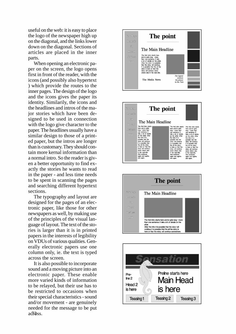
72
useful on the web: it is easy to placethe logo of the newspaper high upon the diagonal, and the links lowerdown on the diagonal. Sections ofarticles are placed in the innerparts.
When opening an electronic pa-per on the screen, the logo opensfirst in front of the reader, with theicons (and possibly also hypertext) which provide the routes to theinner pages. The design of the logoand the icons gives the paper itsidentity. Similarily, the icons andthe headlines and intros of the ma-jor stories which have been de-signed to be used in connectionwith the logo give character to thepaper. The headlines usually have asimilar design to those of a print-ed paper, but the intros are longerthan is customary. They should con-tain more kernal information thana normal intro. So the reader is giv-en a better opportunity to find ex-actly the stories he wants to readin the paper - and less time needsto be spent in scanning the pagesand searching different hypertextsections.
The typography and layout aredesigned for the pages of an elec-tronic paper, like those for othernewspapers as well, by making useof the principles of the visual lan-guage of layout. The text of the sto-ries is larger than it is in printedpapers in the interests of legibilityon VDUs of various qualities. Gen-erally electronic papers use onecolumn only, ie. the text is typedacross the screen.
It is also possible to incorporatesound and a moving picture into anelectronic paper. These enablemore varied kinds of informationto be relayed, but their use has tobe restricted to occasions whentheir special characteristics - soundand/or movement - are genuinelyneeded for the message to be putacross.