a visual analytic system for longitudinal transportation data of
TRANSCRIPT

A Visual Analytic System for Longitudinal Transportation Data of Great Britain
Marzieh Berenjkoub∗, Harsha Nyshadham∗, Zhigang Deng∗, and Guoning Chen∗
Department of Computer ScienceUniversity of Houston
Houston, TX, 77204, USAhttp://www.cs.uh.edu
Technical Report Number UH-CS-15-01
July 9, 2015
Keywords: Public transportation data, visual analytics.
Abstract
It is a known fact today, that globalization has increased the opportunities around the world and moreso in the urban areas. As a result, there is high concentration of population in all urban communitiesaround the world. In order to meet these needs, public transportation systems have been developed at afascinating pace around the world. This leads to a vast amount of transportation data. Now researchersand practitioners are digging in to find new ways to improve it further. In this paper, we explore thelongitudinal transportation data of Great Britain and visually compare changes and trends over the years.We try to answer to what extent the transportation network has directly impacted the population and jobdistribution in major cities of Great Britain, and vice versa. We also aim to evaluate potential issues inthe current services, such as the potential accumulated delay due to the overlapping services. We provideflexible search queries, allowing users to interact with different aspects of city geography and dynamicallysee the changes taking place at those locations. Finally, we present a series of case studies and reportsome interesting findings.
∗Marzieh Berenjkoub, Harsha Nyshadham, Zhigang Deng, and Guoning Chen are with University of Houston

1
A Visual Analytic System for LongitudinalTransportation Data of Great Britain
Marzieh Berenjkoub∗, Harsha Nyshadham∗, Zhigang Deng∗, and Guoning Chen∗
Abstract
It is a known fact today, that globalization has increased the opportunities around the world and more so inthe urban areas. As a result, there is high concentration of population in all urban communities around the world.In order to meet these needs, public transportation systems have been developed at a fascinating pace around theworld. This leads to a vast amount of transportation data. Now researchers and practitioners are digging in to findnew ways to improve it further. In this paper, we explore the longitudinal transportation data of Great Britain andvisually compare changes and trends over the years. We try to answer to what extent the transportation network hasdirectly impacted the population and job distribution in major cities of Great Britain, and vice versa. We also aimto evaluate potential issues in the current services, such as the potential accumulated delay due to the overlappingservices. We provide flexible search queries, allowing users to interact with different aspects of city geography anddynamically see the changes taking place at those locations. Finally, we present a series of case studies and reportsome interesting findings.
Index Terms
Public transportation data, visual analytics.
I. INTRODUCTION
Public transportation is increasingly becoming the preferred way to travel and commute for people around theworld. Globalization has increased the population in almost every urban area. In most cities population densitytends to grow towards the outer suburbs [29], making public transportation more essential. While globalization hasincreased the population in almost every urban area, traffic congestion has become a major issue in our communitiestoday. People have started to prefer using public transport to commute between jobs and their homes. Keeping upwith this, new services are being added every day to enable people to have more convenient and faster travelfacilities. The transportation system of a city tells the general sense of lifestyle in the city today.
Recently, such data have been made available to the general public [20], [23]. These data include geospatialand temporal attributes, and with the visualization resources available today, they give us a lot of opportunities toexplore these spatio-temporal data and to come up with interesting findings that are difficult to obtain otherwise [6],[9]. Visualizing longitudinal data of this kind is challenging because of the multi-dimensional and tightly linkeddata [27]. For example, a route is comprised of a couple of journeys a service takes, where each journey passesthrough many stops. In the same way, all these stops are a part of many routes. Therefore, the public networkedtransportation data are more complicated than trajectory data [8], [10], [30]. In addition, the time schedule of suchdata has a large number of overlaps, which gives scope for wide visualization and analysis tasks.
In this paper, we aim to help analysts to understand the correlation between public lifestyle and a city’stransportation service. In particular, we focus on the transportation system of Great Britain [3]. The importantquestions we seek answers for include: a) is an increase in the transportation network a result of an increase in jobsor population? b) If yes, to what extend does transportation system contributes to this trend? c) can we summarizethe change of the lifestyle of the residents of a city based on the trend of the transportation services over the years?d) will the increase of transportation services lead to potential traffic congestion and where are those hot spots?Existing systems [17], [21] that are solely focused on the analysis of the transportation data are not sufficient toanswer these questions.
We address these questions by designing a visual analytic system to visualize the transportation data as well asthe population and job density of the Great Britain from 2004 to 2011. Our system helps users look at differentaspects of a transportation network. Users can look for transportation connectivity of a single location, to group of
∗Marzieh Berenjkoub, Harsha Nyshadham, Zhigang Deng, and Guoning Chen are with University of Houston

2
locations, to a region of the city and compare it with past years. Users can quickly correlate this with populationand job distribution and see the trend over time. Our tool can also be used by domain experts who are involvedin the designing and planning of transportation system. It helps them analyze whether the services provided at anystops are reasonable or not, and supports the study of possible traffic congestion at certain time and possible timeoverlap between different services.
II. RELATED WORK
During the past decade a lot of research was focused on transportation networks. Many applications, such astraffic simulation [12], road traffic surveillance system [14], and travel planners [2], [18], [28], were developed tohelp domain experts and government agencies understand the structure of transportation or help commuters makeplans given live traffic information. Various traffic data are generated from these applications. Visualization is oneeffective tool for the interpretation of these data.
Visualization techniques: One of the key challenges in working with traffic data is its temporal attributes. Aigneret al. [5] have considered time as a new dimension; they used principal component analysis for data abstraction andevent-driven visualization as important features of any visualization pipeline. One other technique first identifieslinks and directions of traffic flow and then transforms these attributes into HSI(Hue-Saturation-Intensity) colorspace to be mapped on the model [33]. Yin and Wolfson [32] proposed a weight-based map-matching method,which selects a most likely route for a vehicle. Their weighing is based on arcs and does not consider turns. Zhanget al. [34] studied a trajectory splitting model for efficient spatio-temporal indexing. Patel et al. [22] explored theefficient index for predicted trajectories. Visualization has also been implemented in several other public welfareservices, ranging from a basic amenity of city pipeline [31] to a bigger picture of planning a city model [25].Geographic visualization experts itoWorld [11] have developed time lapse animation of public transportation basedon NPTDR data [3]. They use the time table schedule of each service from its origin to its destination and showthe flow of buses, trains, and coaches over the course of day.
Visualization models: One of the interesting research efforts is to focus on visualizing the incident driven trafficdata [26] to enable users to comprehend simultaneous events occurring during a particular traffic incident. Ninget al. [19] developed a visualization tool to aid traffic analysts to comprehend a traffic situation by a feedbackchain model, where feedback is sent between traffic data, traffic flow detection, and traffic signal control. Newvisualization toolkit is developed to help end users to quickly build their customized visualization applicationwithout programming [24]. Guo and Wang [13] presented a trajectory visualization tool that focuses on visualizingtraffic behavior at one road intersection. Ferreira et al. presented a system to help extract interesting patterns fromthe large trajectory data of the New York taxi trips [10], while Wang et al. [30] devised a visual analytic system tohelp understand the traffic congestion behavior in the City of Beijing using GPS trajectories. Recently, Chu et al.introduced a technique to transform the geographic coordinates (i.e. latitude and longitude) to street names reflectingcontextual semantic information for the discovery and analysis of the hidden knowledge of massive taxi trajectorydata within a city [8]. Different from the work on the analysis of large scale dynamic trajectory data, we aim tomine interesting patterns from the public transportation data that are essentially some network data. Particularly,we are interested in answering the quesiton of how the evolution of the transportation services over the years mayindicate certain social changes in a large scale in space and time, such as the migration of the population and thechange of the job opportunities.
III. DATA AND TASKS
In this section we introduce all the definitions which will be used in follow-up sections. We will first explain theTransportation Data of Great Britain, called NPTDR (National Public Transport Data Repository) [3], its format andstructure. Next we explain the scope of our application in the form of tasks, where each task addresses a particularaspect of the transportation structure of a city.
A. NPTDR
NPTDR is a snapshot of route and timetable data for all public transport services in Great Britain. It is generatedfor a sample week every year starting in 2004. The week is normally the first or second complete week (Monday

3
to Sunday) in October of each year, to ensure that it avoids school holidays or other seasonal variations and toachieve consistency from one year to the next.
NPTDR is complied from data supplied by 11 travel line regions of Great Britain, including Scotland, NorthEast and Cumbria, North West, Yorkshire, Wales, West Midlands, East Midlands, East Angalia, South East, SouthWest, and London. Each travel line region gets the data from its region’s local transport authorities that compileinformation for bus, train, coach, and ferry services. Data from each travel line region are then collected into thecentral database of Great Britain as shown in Figure 1. Also, services which operate between points in two or moreregions may be represented more than once in the national data. In our model we have used data for bus, train,metro, and coach services.
Fig. 1: NPTDR - 11 traveline regions, 143 local authorities
NPTDR routes and timetable data are referenced to stops coded in NaPTAN (National Public Transport AccessNodes), which in turn is referenced to NPTG (National Public Transport Gazetteer). The download of NPDTR [3]also includes the latest version of NaPTAN and NPTG.
The data supplied to NPTDR are of the format ATCO.CIF or TransXChange format. We use ATCO.CIF, whichis a legacy format best described as position-specific data records. Figure 2 illustrates the structure of this format.
Note that the NPTDR data do not provide live service timing information; it has the fixed time schedule. Thismeans that the services in real-time may not be the same as the time indicated in data set; i.e., a service may beearly or delayed by few minutes based on the real-time conditions. We have taken this into account as a delayvariable. Also, NPTDR does not have the information on service fares or number of people using the services. Weare not considering these aspects in our application.
Below are the lists of definitions that are used throughout this paper.1) Service: It is a mode of public transport, and it can be either bus, train, or coach.2) Journey: It is the movement of a vehicle (bus, train, or coach) over a sequence of stopping points and the
times from its origin terminal point to a destination terminal point (it is a column in the ATCO.CIF file).3) Stops: It is the geographical locations at which the event happens during a course of Journey.4) Route: It is comprised of a group of Journeys with more or less similar stopping points.5) Route number: It is a unique identifier of each route.
B. Tasks
Given the above data, we are interested in helping the user answer the following questions.

4
Fig. 2: ATCO.CIF data format
1. Visualization view
2. Plot view 3. Right Panel
3. left Panel
Fig. 3: User interface of our system.
Q1: How many stops of a region are accessible at a given time range, say between 2pm to 3pm? Note that somestops do not have services at certain time ranges, say between 11pm to 5am next day. Stops that have services inthe late night may indicate the commercial attractions of the city.
Q2: Which areas are the most (or the least) connected locations? Note that this is different from Q1 as it asksfor the total services without a specific time range. Answering this will help us understand how far and wide theservices from a city are available to other cities or locations.
Q3: Given a time range, which regions (or stops) have a large number of services, e.g., many buses will stop bythese areas? Do these regions with large number of services match the city areas with large job density? Answeringthis question will help us identify the most busy places in a city. It may also be used to estimate the possibilityof the occurrence of traffic congestion in a region at a given time instance due to certain unpredicted delay of theservices. This information can help the traffic analyst evaluate the service quality at the individual stops or withina local region.
Q4: How the transportation connectivity within a city can affect its population and job distribution over theyears, and vice versa? Here we try to identify certain correlation of the increase (or decrease) of the population

5
and job densities with the growth (or reduce) of the transportation services at a given region over the years. Findingthis correlation will help the public transportation authority better plan their services for the future growth.
IV. SYSTEM DESIGN AND IMPLEMENTATIONS
Our system is developed specifically for the visual analytics of longitudinal transportation data. It enables theend users to interact with a rich set of comparison queries, and provides flexibility in selection of the data rangingfrom a particular location, to a group of locations, and to an entire region of a city. This allows the end users toanalyze the variations in the data over the different time-slices of the years (e.g., 2004 to 2011). In this section,we describe the design and implementation of our system.
In order to mine useful information from the raw NPTDR data, we first need to convert them so that our systemcan handle them properly. Specifically, we classify the raw data into two types: 1) polygon data (route data), and2) point data (location data). We also need to convert the coordinate information of the services from the Easting-Northing coordinate system to the Latitude-Longitude coordinate system. In order to visualize the population [16]and job density information [15], we need to extract the boundary data of all the regions inside a given city. We useOpen StreetMap [4] for the geospatial visualization. Open StreetMap (OSM) has shape-file for each country, city,and region [7]. We use these data to draw regions of a city, and allow users to interact with them. We have usedthe OSM data from MapIt website [1], which has all the boundary polygon information from the shape-files ofOSM. More details about this data-preprocessing can be found in the supplemental material. Next we will describethe interface and functionality of our system.
A. User Interface
Figure 3 shows the User Interface (UI) of our system. It consists of the following widgets.1) Visualization view: This view shows the geo-graphical information including the map, region boundaries,
service routes and stops, and other information. It also supports to multiple views for the comparativevisualization of the traffic data from different years. This can be achieved by selecting from the optionsunder the view menu.
2) Plot view: This view displays a number of plots for the mining of different information.3) Right control panel: It consists of: 1) Compare window: Tools in this window compare the transportation
data between different years. The And and To buttons are selective between years, where the And buttoncompares the two years and the To button compares years within a given range. The UI window displaysthe population and job density of a city, by clicking on their respective buttons in this window. The Newand Delete buttons identify all new stops added or deleted between two years. 2) Window variables: Thetwo window variables represent two different years. They show the number of active stops and the numberof active services, at any point during the user interaction process. 3) Route navigator: The route navigatorwindow, aids the users to explore the individual journeys of a route passing through a location or a groupof locations. This interaction also triggers the plotting window and plots time schedule of a service passingthrough the stop(s).
4) Left control panel: It consists of 1) a Function drop-down list that provides support to the user queriesapplied to the selected area via the Draw Region button; 2) the Services sub-panel for the selection amongbus, coach, and train; 3) a Summary drop-down list that displays the plots of the pre-computed information.
B. System Functions
Next, we demonstrate our visualization for each of the tasks as a functionality and the various ways the end userscan interact with them. The implementation details can be found in the supplemental material. In the followingdemonstration, we use the transportation data for the city of Peterborough unless stated otherwise.
1) Functionality 1: Accessibility of Stops: Accessibility of Stops is defined as the availability of a stop at aparticular time. More precisely, it implies that a particular service (bus, train, or coach) is at the stop at thattime. We provide the functionality so that the end users can select a year between 2004 and 2011 in the comparewindow, and see the active stops by changing the time on the arrival and departure time sliders. This interactionalso triggers current window variables, which show the number of active services and routes within the time frame.

6
In this example, the number of active stops are 879 and the number of routes passing through these stops are 3751.The blue dots indicate a stop. By moving the time slider, the user can choose different time intervals to inspect.In this example, we find that the locality East has the highest number of services running throughout the day,indicating it as an important region that might have good job facilities. [[Guoning: Can we highlight a region thathas late buses?]]
Fig. 4: Active bus stops between 6:31am and 7:39am.
2) Functionality 2: Connectivity Strength of Stops: Our system can compute and visualize the connectivitystrength of all stops by calculating the number of routes passing through each stop and show its distribution. Theusers can select particular route strength, by clicking on the scalar color bar at the bottom of the screen as shown inFigure 5. This feature helps the users to identify patterns for particular route strength and then compare it betweendifferent years (Figure 9) or identify patterns between different route strengths of a year. From the visualizationshown in Figure 5, we see that as the day progresses more routes become active, and towards midnight and theearly morning route strength decreases. We also observe that the city of Peterborough has good service connectivitywith the city Norwich and the strength in their connectivity is high. On an average, there are at least 20 stops withmore than 50 routes passing through them from Peterborough to Norwich.
3) Functionality 3: Single Stop Analysis For Congestion Estimation: Our system enables the user to analyzethe services provided at a selected stop. The user can select a stop from the visualization view, the profile of theservices provided at the selected stop will be shown in the plot view. For instance, Figure 6(a) shows the plot ofthe bus services provided at a selected stop. From this plot, the route that provides the most services at that stopis easily revealed, so are the changes of the services of these routes over time.
Our system also supports the study of how a delay of certain bus affects other buses who schedules are nearby.In reality, given a time schedule of a route at a particular stop, the bus may arrive ahead or after the scheduled time.Depending on how many other buses will provide services at this stop, this discrepancy may or may not cause thetraffic congestion at this stop. We study this by estimating the possibility of service overlap, i.e., how close it isbetween any two bus services of the same or different routes, in a given time range at the stop. This is because thelarger the overlap is, the more likely the congestion may occur. This in turn can be utilized to decide whether theservice arrangement in the given time range is appropriate or not. To achieve this, we assign a Gaussian function,gi(τ) = exp(− (τ−µi)
2
2σ2i
), for each scheduled service at the specific stop, which describes the probability that a busarrives the stop ahead or after the scheduled time µi by T minutes (T < σi). We then compute the 1D functionG(τ) = ∑
Ni=0 gi(τ) over the 24 hours period (Figure 6(b)), which we refer to as the service overlap function. This
enables us to inspect the amount of the service overlap at the stop at any time. We also provide an interface, i.e.,the Delay slider bar, to enable the user to control the delay time. With this functionality, we can estimate the quality

7
Fig. 5: Route strength at different times in Peterborough.
(a)
(b)
R 303R 807R 642R 45R 10R 18R 7R 2
Fig. 6: (a) the bus services provided at a user selected top. Different color blocks show the numbers of buses of the respectiveroutes that provide services at the stop. (b) the service overlap function at a selected stop.
of the services provided at the selected stop. We consider the quality is good if the overlap function is smoothwith less spikes, while the services may not be ideal if its overlap function has many spikes (see the time periodhighlighted by the black circle in Figure 6) , because these spikes may indicate a higher chance of getting intocongestion around the stop. Information like this can be used to improve the service schedule at the individualstops in the future. One can further extend this for the estimation of the potential congestion within different cityregions at different given time. This can be achieved by estimating the density of the buses within any city regionsusing a 2D symmetric Gaussian function for each individual bus given its current service location. The higher thedensity, the more likely it will lead to traffic congestion.
4) Functionality 4: Population and Job Density: Our system visualizes the population and job density distributionon top the city map. Figure 7 shows the population density for all regions in Peterborough. The population densityof some regions are not available. These regions are mainly towards the south of Peterborough. The population

8
density shown in the figure scales from white to red, where white indicates least populated regions and red indicatesthe highest populated regions. The regions towards the center have no population data available (displayed in whitewith no boundary); however, we suspect they have high population density since the services in this region arehigh. In Figure 7, we also visualize the active services over the population density to enable the user to inspect thecorrelation between the intensity of the services and the density of the population.
Fig. 7: Services shown over population density in Peterborough.
The blues circles shown in the above figures are interpolations around the center with half transparency. We usethis to differentiate dense locations from sparse locations. For example, consider a location having 20 stops withina mile radius and another location having one stop within a mile radius. In both the cases, if the map view allowsone-mile radius as a pixel size, both these locations will look the same, but by using interpolation and transparencywe make one pixel darker and the other lighter.
From Figure 7, we observe that the region Bretton has the highest population, which is 60 times higher than theaverage population density in Peterborough. However, the availability of services in Bretton is low as compared toother regions; in fact, it is less than the average. This either means that the people in Bretton commute to the otherregions for work or Bretton has poor transport services. OrthonLongueville and OrthonWaterville are the only tworegions that have an ideal balance between population and service strength.
5) Functionality 5: Comparison Over the Years: Our system supports the comparison of the transportation dataand the population/job density from different times or years in the Visualization view. Specifically, the user canopen a new window using view menu item and view the active services for two different time periods. The currentwindow and new window variables show the respective counts for active stops and services within the time frame.With this functionality, the aforementioned information can be compared over time to help us find interesting trends.
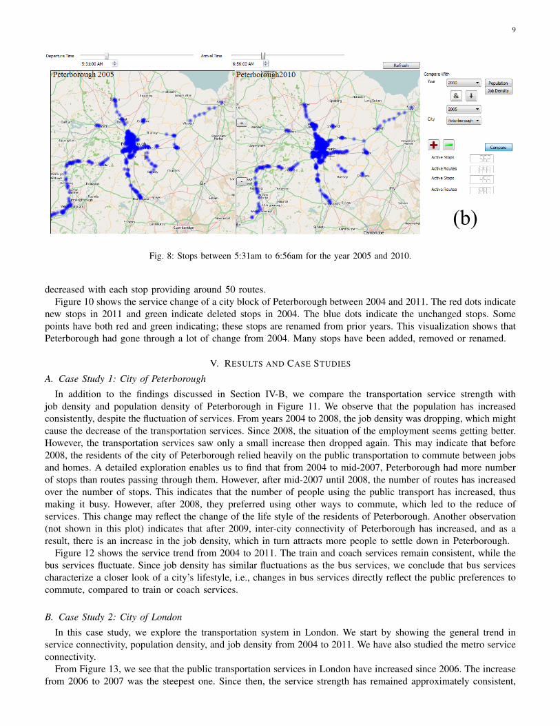
For instance, Figure 8 shows the comparison of the services between 5:31am to 6:56am for the year 2005 (left)and 2010 (right), respectively. In this example, we can see the difference between these years, the number of activeservices between 5:31am and 6:56am increased from 2005 to 2011. In 2005, there were 455 stops, 2010 has 562stops, and 2011 has 571 stops. Also, there is a change in the connectivity of bus services in Peterborough. In 2005,the town Thorney had no services and the town Ramsey was connected between 5:31am and 6:56am. While in2011 and 2010, Thorney has new services running in Peterborough and Ramsey is no longer connected.
Figure 9 shows the change of the connectivity strength between Peterborough and Norwich over the years. Fromthis visualization, we see that in the past eight years the service connectivity and strength has changed a lot. From2005 to 2008, Peterborough and Norwich had good connectivity of at least 200 or more routes running througheach stop between them. However, there has been a sudden decrease in service connectivity in 2009. Since 2009,Peterborough and Norwich had no stops that provided 200 routes between them, the number of stops between them
9
(b)
Fig. 8: Stops between 5:31am to 6:56am for the year 2005 and 2010.
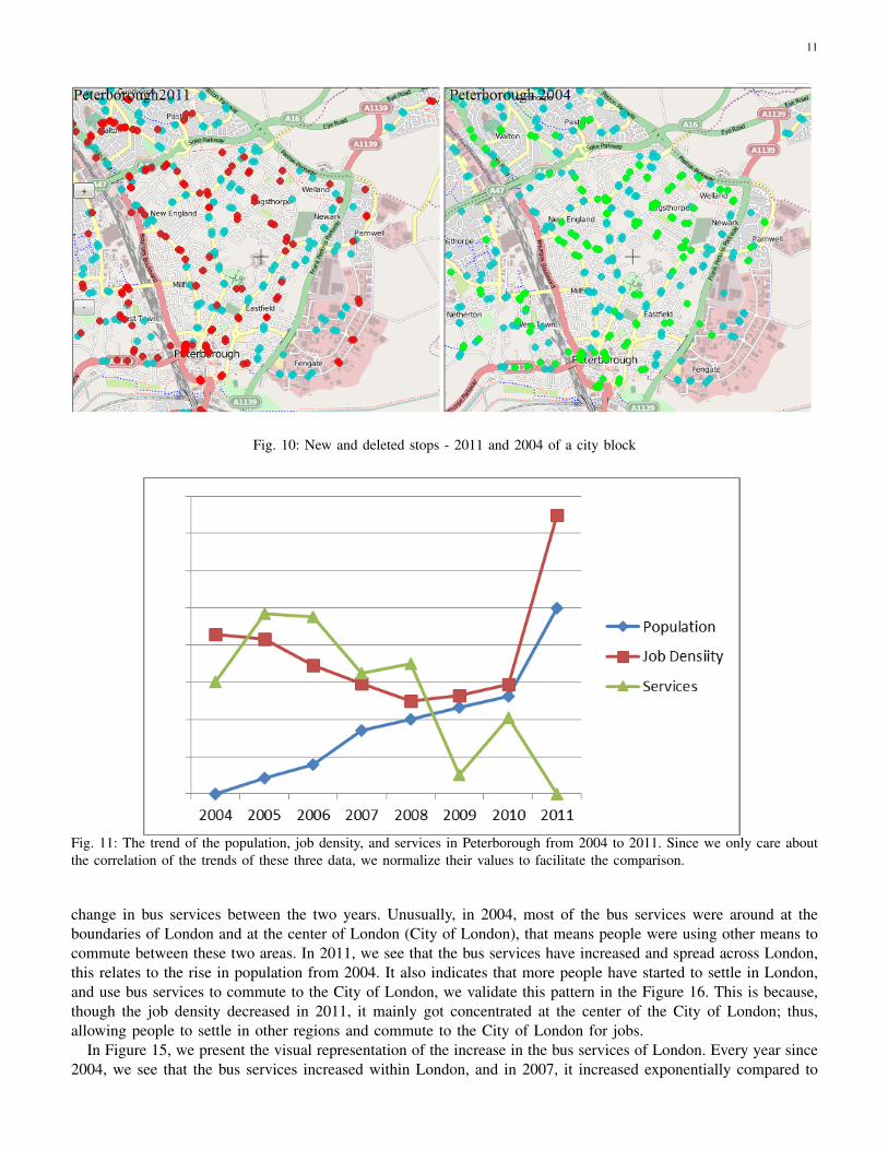
decreased with each stop providing around 50 routes.Figure 10 shows the service change of a city block of Peterborough between 2004 and 2011. The red dots indicate
new stops in 2011 and green indicate deleted stops in 2004. The blue dots indicate the unchanged stops. Somepoints have both red and green indicating; these stops are renamed from prior years. This visualization shows thatPeterborough had gone through a lot of change from 2004. Many stops have been added, removed or renamed.
V. RESULTS AND CASE STUDIES
A. Case Study 1: City of Peterborough
In addition to the findings discussed in Section IV-B, we compare the transportation service strength withjob density and population density of Peterborough in Figure 11. We observe that the population has increasedconsistently, despite the fluctuation of services. From years 2004 to 2008, the job density was dropping, which mightcause the decrease of the transportation services. Since 2008, the situation of the employment seems getting better.However, the transportation services saw only a small increase then dropped again. This may indicate that before2008, the residents of the city of Peterborough relied heavily on the public transportation to commute between jobsand homes. A detailed exploration enables us to find that from 2004 to mid-2007, Peterborough had more numberof stops than routes passing through them. However, after mid-2007 until 2008, the number of routes has increasedover the number of stops. This indicates that the number of people using the public transport has increased, thusmaking it busy. However, after 2008, they preferred using other ways to commute, which led to the reduce ofservices. This change may reflect the change of the life style of the residents of Peterborough. Another observation(not shown in this plot) indicates that after 2009, inter-city connectivity of Peterborough has increased, and as aresult, there is an increase in the job density, which in turn attracts more people to settle down in Peterborough.
Figure 12 shows the service trend from 2004 to 2011. The train and coach services remain consistent, while thebus services fluctuate. Since job density has similar fluctuations as the bus services, we conclude that bus servicescharacterize a closer look of a city’s lifestyle, i.e., changes in bus services directly reflect the public preferences tocommute, compared to train or coach services.
B. Case Study 2: City of London
In this case study, we explore the transportation system in London. We start by showing the general trend inservice connectivity, population density, and job density from 2004 to 2011. We have also studied the metro serviceconnectivity.
From Figure 13, we see that the public transportation services in London have increased since 2006. The increasefrom 2006 to 2007 was the steepest one. Since then, the service strength has remained approximately consistent,

10
Fig. 9: Stops with more than 200 routes between Peterborough and Norwich over the years.
although it dropped a little after 2007. The job density increased from 2004 and reached its peak in 2006 andthen decreased since 2006, reaching its minimum in 2009. Since then, the job density does not change much.The population density has increased consistently every year. From these observations, we deduce that servicestrength and job density change in a similar manner, and population density increased due to the more services inthe areas. This is different from the observation of the city of Peterborough, where the decrease of the servicesdid not prevent people from moving in. This is likely because London is a much bigger city with busy traffic.Most residents of London may prefer using public transportation than residents in Peterborough to commute. Thisindicates the different life styles of the residents between big cities and small cities.
The inset figure to the right shows the trend of thebus services and Metro services in London over theyears. We see that the bus services have increasedexponentially from 2006 to 2007, while the metroservices remained consistent. This shows that the busservices contributed mainly towards the rise in servicestrength, as well as the increase of the population.
Using our application we have visualized this growthof the bus services in London from 2004 to 2011(Figure 15). Interestingly, the visualization indicatesthat there might be other reasons behind this raise inservice strength, when compared to what we observedfrom the graphs in Figure 13. One reason of this discrepancy may be the London 2012 Olympic Games. Londonwon the bid in 2005, since then the bus services started growing.
Figure 14 shows the bus services in London between 2004 and 2011. It is clearly noticeable that there is a drastic
11
Fig. 10: New and deleted stops - 2011 and 2004 of a city block
Fig. 11: The trend of the population, job density, and services in Peterborough from 2004 to 2011. Since we only care aboutthe correlation of the trends of these three data, we normalize their values to facilitate the comparison.
change in bus services between the two years. Unusually, in 2004, most of the bus services were around at theboundaries of London and at the center of London (City of London), that means people were using other means tocommute between these two areas. In 2011, we see that the bus services have increased and spread across London,this relates to the rise in population from 2004. It also indicates that more people have started to settle in London,and use bus services to commute to the City of London, we validate this pattern in the Figure 16. This is because,though the job density decreased in 2011, it mainly got concentrated at the center of the City of London; thus,allowing people to settle in other regions and commute to the City of London for jobs.
In Figure 15, we present the visual representation of the increase in the bus services of London. Every year since2004, we see that the bus services increased within London, and in 2007, it increased exponentially compared to

12
Fig. 12: Peterborough services from 2004 to 2011.
Fig. 13: The trend of the population, job density, and services in London from 2004 to 2011. Since we only care about thecorrelation of the trends of these three data, we normalize their values to facilitate the comparison.
2006. This happened because, although the overall job density reached its a new high in 2006, in reality the jobdensity also increased drastically at the center of London. This made people to settle across London and travel tocenter of London for jobs. Figure 16 shows the job (top) and population (bottom) density of London in 2011. Inthis visualization, darker color indicates larger density values, while lighter color indicates smaller values.
C. Case Study 3: Great Britain over the Years
In this last case study, we extend our application to visualize the transportation strength of all the cities in GreatBritain. We also visualize how every city differs from others in terms of the population and job distribution.
In Figure 17, the image on the left shows the population distribution and the image on the right shows thejob distribution for the year 2011. Cities like London, Lincoln, Ripon, and Preston have good population and job

13
Fig. 14: Bus service of London in 2004 and 2011.
opportunities. While cities like Peterborough and other smaller cities around London have better job opportunities,though the population in these cities are less. This visualization gives a quick overview for all the cities, and isbetter than traditional bar chart representation. Since, we understand the geographical position of a city and at thesame time its population or job density, giving us a wider scope for interpretation.
Figure 18 shows the coach and train connectivity from London to all the other cities for the year 2011. Thisvisualization shows to what cities London is connected to, and at the same time, it shows how well is the serviceconnectivity between them. For example, London and Bedford are connected through both train and coach services,and from the figure we can deduce that the coach services are more prominent over train services between the twocities (i.e., with darker red color). In the same way, when we compare London and Peterborough we see that theyhave only train services running between them. This visual representation helps us to understand other patterns,like the train services from London, connecting many cities compared to coach services. Interestingly, London doesnot have any train or coach services to its neighboring cities, namely, Chelmsford (Essex), Surrey, and Kent.

14
Fig. 15: Bus service of London from 2004 to 2011.
VI. CONCLUSION
We design a system for the visual analysis of the longitudinal transportation data of Great Britain. Through oursystem, we were able to successfully analyze different types of data together and show the inherent dependencybetween them, which might otherwise be difficult to observe. We have analyzed various features of the transportationdata, over different aspects of city geography. From the study of both Peterborough and London, we saw somesimilar trends. In both the cases, the bus services seem to fluctuate more, compared to other services. Our analysisover other cities revealed a similar pattern. Therefore, we conclude that the bus transport expresses a city’s dynamicsand might directly affect the job and population distribution. Other transport services like train, coach, and metroshow the general connectivity strength of a city, but do not point out the city subtleties.
Another interesting observation we made from the service trend, from 2004 to 2011 in both Peterborough andLondon is that in both the cases, first, there was a change in job density, then a similar change followed in thetransportation service strength. That said, the development of the public transportation is always behind the demandof jobs. To utilize this observation, in order to increase jobs at a location, we might first need to focus on improvingthe transportation connectivity of that location.
REFERENCES
[1] City boundary coordinates of uk at. http://mapit.mysociety.org/areas/UTA.html. IV[2] Journey planner application. http://www.moovitapp.com/. II[3] National public transport data repository data. http://data.gov.uk/dataset/nptdr. I, II, III, III-A[4] Open street maps. http://wiki.openstreetmap.org/wiki/Main Page. IV[5] W. Aigner, S. Miksch, W. Muller, H. Schumann, and C. Tominski. Visual methods for analyzing time-oriented data. Visualization and
Computer Graphics, IEEE Transactions on, 14(1):47–60, 2008. II[6] N. Andrienko, G. Andrienko, and P. Gatalsky. Exploratory spatio-temporal visualization: an analytical review. Journal of Visual
Languages & Computing, 14(6):503–541, 2003. I[7] G. B. boundary shapefiles. http://download.geofabrik.de/europe/great-britain.html. IV[8] D. Chu, D. A. Sheets, Y. Zhao, Y. Wu, J. Yang, M. Zheng, and G. Chen. Visualizing hidden themes of taxi movement with semantic
transformation. In Pacific Visualization Symposium (PacificVis), 2014 IEEE, pages 137–144. IEEE, 2014. I, II[9] P. Compieta, S. D. Martino, M. Bertolotto, F. Ferrucci, and T. Kechadi. Exploratory spatio-temporal data mining and visualization.
Journal of Visual Languages and Computing, 18(3):255 – 279, 2007. I[10] N. Ferreira, J. Poco, H. T. Vo, J. Freire, and C. T. Silva. Visual exploration of big spatio-temporal urban data: A study of new york
city taxi trips. Visualization and Computer Graphics, IEEE Transactions on, 19(12):2149–2158, 2013. I, II

15
Fig. 16: Job (top) and population (bottom) density of London regions in 2011.
[11] T. flow visualization of great britain from vimeo. II[12] O. Franzese and S. Joshi. Transportation applications of simulation: traffic simulation application to plan real-time distribution routes.
In Proceedings of the 34th Conference on Winter Simulation: Exploring New Frontiers, WSC ’02, pages 1214–1218. Winter SimulationConference, 2002. II
[13] H. Guo, Z. Wang, B. Yu, H. Zhao, and X. Yuan. Tripvista: Triple perspective visual trajectory analytics and its application onmicroscopic traffic data at a road intersection. In Pacific Visualization Symposium (PacificVis), 2011 IEEE, pages 163–170, 2011. II
[14] A. B. Habtie. Cellular-cloud integration framework in support of real-time monitoring and management of traffic on the road: thecase of ethiopia. In Proceedings of the International Conference on Management of Emergent Digital EcoSystems, MEDES ’12, pages189–196, New York, NY, USA, 2012. ACM. II
[15] J. D. in UK data. http://www.nomisweb.co.uk/articles/649.aspxl. IV[16] P. D. in UK data. http://www.nomisweb.co.uk/articles/676.aspxl. IV[17] T. S. Kam, B. Ketan Dileep, J. H. Tan, et al. Divad: A dynamic and interactive visual analytical dashboard for exploring and analyzing
transport data. World Academy of Science, Engineering and Technology Journal, 71:834–840, 2012. I[18] S. Liu, J. Pu, Q. Luo, H. Qu, L. Ni, and R. Krishnan. Vait: A visual analytics system for metropolitan transportation. Intelligent
Transportation Systems, IEEE Transactions on, PP(99):1–11, 2013. II[19] X. Ning, Z. Li, and Y. Zhang. A practical research on visualized spatial analysis of traffic volume data. In Intelligent Transportation
Systems, 2003. Proceedings. 2003 IEEE, volume 1, pages 172–175 vol.1, 2003. II

16
Fig. 17: England population (left) and job (right) density distribution in 2011. Some regions are left blank due to the lack ofthe data.
[20] G. B. online reservation. I[21] M. L. Pack, K. Wongsuphasawat, M. VanDaniker, and D. Filippova. Ice–visual analytics for transportation incident datasets. In
Information Reuse & Integration, 2009. IRI’09. IEEE International Conference on, pages 200–205. IEEE, 2009. I[22] J. M. Patel, Y. Chen, and V. P. Chakka. Stripes: an efficient index for predicted trajectories. In Proceedings of the 2004 ACM SIGMOD
International Conference on Management of Data, SIGMOD ’04, pages 635–646, New York, NY, USA, 2004. ACM. II[23] E. Peytchev and C. Claramunt. Experiences in building decision support systems for traffic and transportation gis. In Proceedings
of the 9th ACM International Symposium on Advances in Geographic Information Systems, GIS ’01, pages 154–159, New York, NY,USA, 2001. ACM. I
[24] L. Ren, F. Tian, X. L. Zhang, and L. Zhang. Daisyviz: A model-based user interface toolkit for interactive information visualizationsystems. Journal of Visual Languages and Computing, 21(4):209 – 229, 2010. II
[25] J. Royan, P. Gioia, R. Cavagna, and C. Bouville. Network-based visualization of 3d landscapes and city models. Computer Graphicsand Applications, IEEE, 27(6):70–79, 2007. II
[26] M. VanDaniker. Visualizing real-time and archived traffic incident data. In Information Reuse Integration, 2009. IRI ’09. IEEEInternational Conference on, pages 206–211, 2009. II
[27] M. Vasirani and S. Ossowski. A market-inspired approach to reservation-based urban road traffic management. In Proceedings of The8th International Conference on Autonomous Agents and Multiagent Systems - Volume 1, AAMAS ’09, pages 617–624, Richland, SC,2009. International Foundation for Autonomous Agents and Multiagent Systems. I
[28] K. M. Vaughn, M. A. Abdel-Aty, and R. Kitamura. A framework for developing a daily activity and multimodal travel planner.International Transactions in Operational Research, 6(1):107 – 121, 1999. II
[29] G. Wang, X. Shen, and H. Jiang. Research on growth trends and spatial distribution of shanghai population based on gis. InGeoinformatics, 2010 18th International Conference on, pages 1–4, 2010. I
[30] Z. Wang, M. Lu, X. Yuan, J. Zhang, and H. v. d. Wetering. Visual traffic jam analysis based on trajectory data. Visualization andComputer Graphics, IEEE Transactions on, 19(12):2159–2168, 2013. I, II
[31] D. Xiao, Y. Xiao, H. Lin, X. Fu, L. Xu, and J. Yang. A service stack for 3d visualization of gis based urban pipe network. InInformation Technology and Applications, 2009. IFITA ’09. International Forum on, volume 1, pages 342–346, 2009. II
[32] H. Yin and O. Wolfson. A weight-based map matching method in moving objects databases. In Scientific and Statistical DatabaseManagement, 2004. Proceedings. 16th International Conference on, pages 437–438, 2004. II
[33] G. Zhang, J. Hu, R. Ma, Y. He, and Y. Zhang. Research on urban traffic and dynamic revolution based on visualized model. InComputer Science and Information Engineering, 2009 WRI World Congress on, volume 2, pages 70–75, 2009. II
[34] W. Zhang, J. Li, and W. Zhang. Spatio-temporal pattern query processing based on effective trajectory splitting models in movingobject database. In Computer and Computational Sciences, 2006. IMSCCS ’06. First International Multi-Symposiums on, volume 2,pages 540–547, 2006. II

17
London
Bedford Bedford
London
Peterborough Peterborough
Fig. 18: London coach (left) and train (right) connectivity in 2011. The darker color indicates more services between Londonand the corresponding areas, while the lighter color indicates fewer services.