abstract - rutgers university
TRANSCRIPT

186
Guessing Success: Pop Culture, Science, and Logo Evolution Natasha Mangal
Abstract
This project is designed to examine the various aspects of logo design, to judge what is effective or not, and to see if either pop culture or science determines the effectiveness of a logo. Several examples of current logos will be examined under the lens of various scientific studies concerning logo design. On one hand, the success and failure of several modern logos, each implementing some aspect of popular culture, will be discussed with consideration of both the professional opinions of graphic designers and the opinion of the public. These include the Gap logo, London 2012 Olympic logo, HSBC logo, and the Pepsi logo among others. Some of these examples will be compared to actual pieces and/or elements of contemporary art. Conversely, the scientific studies compiled which include research on the effects of chroma (color) and separate design elements will be applied to these various case studies of modern logos, determining success or failure based on empirical standards. A conclusion will be formed based on the result of this research, determining how effective each method is. Throughout this paper, several internet sources will be utilized, ranging from design blogs to news organizations. Due to the misleading nature of some internet content, only blog entries composed by active professional graphic designers will be consulted in this paper. In all, the research should make a case for the importance of utilizing science in design, a field previously thought to be an imprecise and highly uncertain art.
In the modern age, visual culture has become more important to companies
searching to get their product noticed. The influence of an image has risen to an all-time
high, as fewer words are used to attract consumers. As our attention spans shrink, newer
and bolder approaches to advertising have been adopted in order to cope with the change.
Over the past few years, marketing strategies in regard to print ads and consumer
branding have become increasingly aware of the implications of life in a modern society.
Less text is used to influence the consumer, and in lieu of explanations a new attention to
subliminal messaging has emerged. There is, in fact, no greater indication of this change
than when one observes the change in logos over time.
From the steady evolution of the Starbucks logo to the timeless “golden arches” of
McDonald’s, it is through these universally recognizable symbols of popular culture that
we can reflect on ourselves as a consumer society. What makes these advertisements
successful, and do these particular elements stem from pop culture alone or does science
also factor in? Mac Cato, graphic designer and author of Go Logo! admits that, as
consumers in a modern society, “we are bombarded by iconic imagery every day; some
estimates suggest that we see as many as 6,000 logos per day” (80). Logos are required
to appeal and re-appeal to consumers constantly. When a brand makes the decision to
187
update its logo in exchange for a more contemporary one, the new design is the result of
an attempt to maintain the brand’s identity while gaining relevance in a new age.
Therefore, I will examine the qualities of logos in accordance with popular culture versus
science – which is a more effective source when considering logo design and redesign
schemes? To do so, several credible scientific studies conducted within the past ten years
were compiled, each of which attempt to verify that individual design elements can be
judged as either effective or ineffective definitely. In addition, modern day logo releases,
some of which include the Gap and Pepsi logo redesign program, were considered along
with the opinions of the public as compiled by news sources. Lastly, graphic designers
actively in the field who publish in books and in online design blogs were consulted and
their opinions on what is effective and ineffective in design were also considered.
Interestingly, although most logos in today’s society are formed modeling current trends
in art and culture, it has been found that not only can science adequately determine the
standards by which logos should be designed, but it can also explain a logo’s rate of
success or failure with accuracy.
In terms of pop culture, many aspects of society run on what’s currently trendy.
From what is on television to billboard advertisements to the runway, our tastes change
rapidly across the fields of our interests. However, trends are not born instantly, but are
instead the result of a culmination of ideas and opinions that spread into a publically-
accepted part of our lives. For instance, something as simple as the font currently used in
city signs and landmarks has changed over the years in order to embody a more modern
image. According to chief design editor and owner of milkandone.com, Neil Custard,
this particular font known as Helvetica is said to have, “a ubiquitous presence in the
contemporary visual landscape….it can be found everywhere, from signs, to logos,
posters to packaging. [It] is undeniably the most versatile font of the modern age.”
Furthermore, the idea of minimalism embodying the essence of present aesthetic trends is
a commonly accepted idea. Design author for Specky Boy Design Magazine, Jennifer
Moline, agrees with this assessment, adding that, “[today’s] rendering technology is
unthinkable, yet we still study Mondrian. Great minimalist work is striking, elegant, and
classic... a minimalist ad stands out from the crowd.” The examples of Helvetica and
minimalism appear as elements of pop culture that act as guidelines when designing not
only logos, but our world as we know it. Graphic designers must pay particular attention

188
to these types of cultural aesthetic trends at all times to effectively relate to its modern
audience. In truth, to be successful in logo design means, as authors of Pro Logo
Chevalier and Mazzalovo state, “being in phase with the mood of the moment without
betraying the constants of [brand] identity, [which] requires talent, intuition and
processes that are difficult to rationalize” (186). In this fast-paced world of changing
minds and opinions, there arises a real dilemma of relevance for the graphic designers
who attempt to effectively refresh a decades-old logo, for in abiding by what may be
considered as currently “popular” in culture there still exists the possibility of failure.
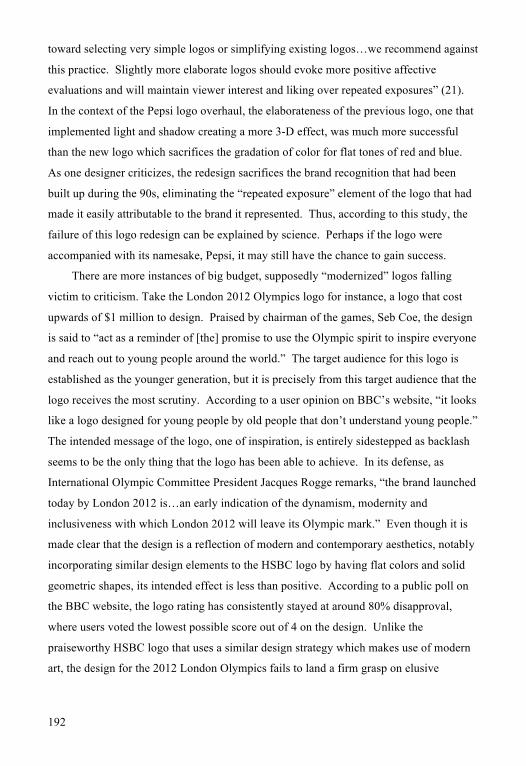
Take for example the hushed October 2010 release of clothing design label Gap’s
new logo (Fig. 1). In order to conform to a more modern and accessible image, the new
logo uses clean lines, a simple blue box in the corner, and “the font of the modern age”
Helvetica. As previously mentioned, these tenets of design (minimalism and Helvetica)
are elements of pop culture that have become increasingly popular in the recent past. In
this way, the design should, theoretically, appeal to modern audiences. However, the
release of the logo triggered instantaneous backlash from the public. As documented in
The Huffington Post, “the new logo was still live on the website…one week after the
company swapped it in on gap.com. Confused fans took to Twitter, Facebook and tech
blogs to complain… investors, competitors, and even potential employees may still be
scratching their head that the company made such a mistake with something so
important.” The company’s biggest mistake is considered to be the fact that the public
was not consulted of the change before it happened. Increasingly, the power of public
opinion, enhanced by social networking on the internet, has become quite the thorn in the
side of graphic designers struggling to appease the masses. Even so, was there a way to
predict the redesigned logo’s failure, even before Gap spent over two years agonizing
over its release?
It is here that science attempts to quantify universal standards for logos. In order to
respond to the “trial and error” method classically employed in advertising and marketing
campaigns, the design of logos has entered the realm of qualitative data and reason. Chief
Executive Officer Dr. A. K. Pradeep of NeuroFocus, a new age marketing firm that
implements neurological studies into its marketing schemes, analyzed the failure of the
Gap logo in his scientific study. The study, testing elements of design such as activeness,
novelty and stylishness, was conducted using EEG sensors that measure brainwave
189
activity 2,000 times a second. The results of the study, Dr. Pradeep admits, were not a
surprise. He explains that, “With the new design, the Gap lost critical ground at the deep
subconscious level for this essential brand attribute [stylishness]. For a retail apparel
marketer seeking to reach and motivate their target audience, this loss of brand value in
the 'stylish' category marks a major cause for concern.” In fact, the study shows that the
previous logo, “scored at an exceptional level, [whereas] the new logo failed to register at
all for this critical attribute.” Although the logo used Helvetica, a font used liberally in
modern society, it is in this way that it fails; it does not break new ground, nor does it
have the same “novel” quality that the previous logo had, using an older styled serif font.
The old style is what captured Gap’s consumers, and it is in this respect that consumers
felt severed from a brand that they had been familiar with for years. "The Gap sells a lot
more than just blue jeans today, but relegating the blue of the original logo to minor
'legacy' status in the new version loses that essential connection in the consumer's
subconscious to the brand's core origins…Instead of honoring their past, unfortunately
the Gap relegated that past to lower relevance," claims Dr. Pradeep. In these ways,
science can effectively pinpoint issues with logo design, and can possibly help determine
the success of future logos.
In the case of the Hong Kong and Shanghai Banking Corporation and the Bank of
China, it was trends in contemporary art rather than science that were consulted in its
change. During the 1980s, in order to accommodate a new, internationally-savvy
business schema, these two banks adopted new logos that would embody a globally
acceptable image. Researched by D.J. Huppatz in the advent of its new design, its praise
was sung in the Journal of Design History. The new bank imagery, “discard[s] eagles,
lions, tigers and similar ferocious fauna in favour of simplified versions of currently
fashionable and expensive works of art” (359). This switchover, along with changing the
bank’s name to an acronym, HSBC, has allowed for a universally-distinguishable image
that is strong enough to speak on its own. The new logo features colors and shapes
reminiscent of the Scottish flag and the cross of St. Andrew, hearkening back to the
bank’s colonial history. But the shapes here do not merely echo that of a flag. As the
previous quote implies, there is a resemblance to works of contemporary art that makes
the new logo socially acceptable and effectively eye-catching. The effectiveness of the
“Mondrian” aesthetic talked about before is apparent in this example. In fig. 2, the logo
190
seems to bear a resemblance to modernist painter Mondrian’s “Tableav IV” in that it
incorporates red, a primary color, in a similar formation of geometric shapes, creating a
pattern. Even though this logo uses contemporary art, an element of pop culture, as the
basis for its redesign, it can be seen that in some instances it can be effective. For this
logo, not only do current trends in the art world present themselves, but there is a unique
homage to the bank’s past (the “legacy” factor from Dr. Pradeep’s study) that makes the
new logo successful.
Another example of a logo that takes queue from the trends of contemporary art
comes in the form of the logo redesign for Pepsi. However, when Pepsi decided to
“refresh” their logo in a 2009 campaign, the resulting logo received mixed reviews. The
change is the result of what graphic designer Peter Arnell of Arnell Group deems, “‘an
iconic graphic that’s also happy…a hybrid between what Pepsi is and its new attitude, the
inspiration of a smile’” (Patel “Few Smiles”). As opposed to the classic wave logo, the
new logo implements the same color scheme of red, blue and white, but sacrifices
gradient changes for a simplified, flatter aesthetic. In his praise of the redesign, Collins
remarks that, “whatever is hot, now and up-to-date is packaged and sent out – it’s
Michael Jackson, it’s Britney Spears, whatever’s about to explode.” As opposed to
consulting science, the logo was created implementing ideas from pop-culture. The
cleaner font resembles the font of the contemporary age, Helvetica, while the flatness of
the new logo hearkens to the particular “pop art style” of contemporary artists Rothko
and Warhol (Fig. 4). However, as graphic designer Aviv comments, “‘Maybe Pepsi
wanted the new logo to feel lighthearted, but instead it feels lightweight, especially for a
brand of this magnitude’.” In this light, the change is seen as a detriment to the brand,
severing pre-established associations with the brand’s recognizable 20th century “wave”
in lieu of an abstract smile. In this case, mixed professional reviews of Pepsi’s
monumental rebranding scheme, costing in the neighborhood of $1 million, contribute to
a mixed public reaction. As strategy director of Frog design Mary Anne Masterson puts
it, the new logo, “‘stepped away from its classic element instead of refining it…[placing]
the burden on consumers to understand what the new ““smile”” means’.” Brands and
logos are supposed to be as didactic as possible to appeal to the masses in a positive
manner, but with Pepsi’s updated logo consumers are left with a metaphorical question
mark hovering above their heads.
191
Science, on the other hand, ventures to eliminate the question mark entirely. In
actuality, scientific analysis shows that elements of design can be judged on an
individualized basis. This attempt is made by scientists Pamela Henderson and Joseph
Cote in "Guidelines for Selecting or Modifying Logos.” In this scientific study, several
elements of design were tested separately in order to determine the most effective
combination of design elements in a logo. Numerous factors were tested, including how
“natural” the logo is, how organic the shapes are that comprise it, and how visually
balanced the overall logo is. In all, 13 separate design elements were tested. It was
determined that the best logos either generate high correct recognition (to the brand),
positive effect with some recognition, or positive effect without thought to recognition;
the mentality here is that even at its lowest point of recognition, when consumers fail to
link the logo to its respective company, a good logo should at least leave a positive
impression in the consumer’s mind. These three possibilities were found to possess
different design qualities implemented together to form a unified logo. For high
recognition logos (the “best” type of logo), they are natural, harmonious, have optimal
amounts of elaborateness and exhibit repetition (24). The study specifies each element as
follows:
Natural reflects the degree to which the design depicts commonly experienced
objects. It is…representative and organic…Harmony is a congruent pattern or
arrangement of parts that combines symmetry and balance and captures good
design…Elaborate is not simply intricacy, but appears to capture the concept of
design richness and the ability to use simple lines to capture the essence of
something, It is comprised of complexity, activeness and depth…Repetition of
elements occurs when parts of the design are similar or identical to one another (16-
17).
As mentioned before, the Pepsi logo’s redesign was successful in some respects, but a
failure in others. This problem of interpretive ambiguity is also explained by this
scientific study. The logo is successful in that it incorporates a natural form, that of a
wave. Harmony is also achieved through even use of color, much like the harmony
achieved through the yin-yang symbol. However, it is a failure in that it lacks
elaborateness and repetition. In fact, the practice of simplification when redesigning
logos is generally unsuccessful. Henderson and Cote find that, “Current trends lean
192
toward selecting very simple logos or simplifying existing logos…we recommend against
this practice. Slightly more elaborate logos should evoke more positive affective
evaluations and will maintain viewer interest and liking over repeated exposures” (21).
In the context of the Pepsi logo overhaul, the elaborateness of the previous logo, one that
implemented light and shadow creating a more 3-D effect, was much more successful
than the new logo which sacrifices the gradation of color for flat tones of red and blue.
As one designer criticizes, the redesign sacrifices the brand recognition that had been
built up during the 90s, eliminating the “repeated exposure” element of the logo that had
made it easily attributable to the brand it represented. Thus, according to this study, the
failure of this logo redesign can be explained by science. Perhaps if the logo were
accompanied with its namesake, Pepsi, it may still have the chance to gain success.
There are more instances of big budget, supposedly “modernized” logos falling
victim to criticism. Take the London 2012 Olympics logo for instance, a logo that cost
upwards of $1 million to design. Praised by chairman of the games, Seb Coe, the design
is said to “act as a reminder of [the] promise to use the Olympic spirit to inspire everyone
and reach out to young people around the world.” The target audience for this logo is
established as the younger generation, but it is precisely from this target audience that the
logo receives the most scrutiny. According to a user opinion on BBC’s website, “it looks
like a logo designed for young people by old people that don’t understand young people.”
The intended message of the logo, one of inspiration, is entirely sidestepped as backlash
seems to be the only thing that the logo has been able to achieve. In its defense, as
International Olympic Committee President Jacques Rogge remarks, “the brand launched
today by London 2012 is…an early indication of the dynamism, modernity and
inclusiveness with which London 2012 will leave its Olympic mark.” Even though it is
made clear that the design is a reflection of modern and contemporary aesthetics, notably
incorporating similar design elements to the HSBC logo by having flat colors and solid
geometric shapes, its intended effect is less than positive. According to a public poll on
the BBC website, the logo rating has consistently stayed at around 80% disapproval,
where users voted the lowest possible score out of 4 on the design. Unlike the
praiseworthy HSBC logo that uses a similar design strategy which makes use of modern
art, the design for the 2012 London Olympics fails to land a firm grasp on elusive

193
success. Sometimes not even money, even at the cost of $1 million, can grant a logo
immunity from often harsh public opinion.
Thus, science attempts to prove why, even on an international level, the logo is a
failure. In “Logo Selection and Modification Guidelines: an empirical international
validation in Chile”, scientists Sergio Olavarrieta and Roberto Friedmann utilize the
design characteristics described in the previous study conducted by Henderson and Cote,
and implement a similar experiment in Chile to see whether or not the study could be
applied on an international stage. The study found that:
Correct recognition can be influenced by natural and repetitive designs in both U.S.
and Chile. Another common factor…is the importance of harmony in order to
generate a positive affect…The overall conclusion is that the logo design
characteristics identified in the US-based literature, do affect consumer responses on
a cross-cultural setting, thus adding value to the original framework” (17-18).
In considering this information, one can analyze the London 2012 logo failure in this
context. As an international example of a logo, it is especially important for the logo to
gain a general sense of positive affect amongst a diverse, global audience. First, the logo
is not natural – it only exhibits the numbers 2012 in an abstract design. Although
somewhat repetitive, the logo lacks harmony in that the parts are each abstracted and
disconnected. In applying the characteristics discussed in Henderson and Cote’s study,
the logo is neither natural nor elaborate design-wise. There are no recognizable forms
within the logo other than abstracted numbers, and its use of a singular color
encapsulated within a few blocky shapes leaves its audience cold. Evidently, the general
sense of public discontent over a logo design can be explained by empirical studies of
logo design elements, even on an international level.
In logo designing, an important factor is also color. In the scientific study conducted
by Gerald F. Gorn, Amitava Chattopadhyay, and Tracey Yi, the objective focuses on
grounding logo color choices into a psychological study that can be used as a standard.
Their study, entitled, “Effects of Color as an Executional Cue in Advertising” found that
the shade of a color (the lightness or darkness of a color) dramatically influenced the
salience of a logo to the consumer. The study suggests that, “Higher levels of chroma
(the intensity of a color) and value influence feelings of excitement and relaxation
[towards a brand], respectively” (1397). Indeed, as the researchers analyze their results

194
in the context of pre-existing successful brands, the study verifies itself. In the case of
brand recognition, it was found that, “changing chroma or value might create the desired
feeling state while still maintaining the hue associated with the product. A good example
is provided by the redesign of the Ritz cracker advertising and repackaging in the early
1980s. Ritz kept the red hue but used a higher chroma level than in previous efforts,
effectively making ‘Ritz look ritzier’” (1398). In this way, scientific evidence has the
ability to not only determine the best design elements to use, but can determine the ideal
types of colors to use as well with very minimal guessing required.
Thus, it has been found that logo redesigns in the modern age have corresponded
more to the current trends of popular culture, adopting stylistic guidelines found in pieces
of modern and contemporary art. However, along with the various recent scientific
analyses of logo designs, the most successful logos can be seen to have the characteristics
designated as the most successful in experiments. As an age that is highly invested in the
power of scientific research, more marketing firms should look to science to verify their
initial designs and updates to designs. If current scientific studies concerning logo design
elements are consulted instead of the ever-wavering public infatuation with various
elements of popular culture, logo design no may longer have the risk of hit-or-miss; it can
possibly “hit” every time.
195
Visual Aides:
Fig. 1 – Original Gap Logo (left), Redesigned Logo (right)
Fig.2 – HSBC Logo (left), Piet Mondrian’s “Tableau No. IV” (right).
Fig. 3 – London 2012 Olympic Logo
Fig 4. – (from left) Rothko’s “No. 301” , Pepsi’s 2009 redesigned logo, Warhol’s
“Flowers”.

196
Bibliography
“Brain Gap: NeuroFocus Study Reveals What Went Wrong With the Gap's New Brand Logo.” PR Newswire, United Business Media.com. 18 October 2010. Rutgers University. 7 December 2010. <http://www.prnewswire.com/news-releases/brain-gap-neurofocus-study-reveals-what-went-wrong-with-the-gaps-new-brand-logo.html>.
Cato, Mac. Go Logo! A Handbook to the Art of Global Branding: 12 Keys to Creating Successful Global Brands. Beverly: Rockport, 2010. Print.
Chevalier, Michel, and Gerald Mazzalovo. Pro Logo: Brands as a Factor of Progress. New York: Palgrave Macmillan, 2004. Print.
Custard, Neil. “Helvetica at 50.” Milkandone.com. 18 February 2009. Rutgers University. 14 November 2010. <http://milkandone.com/2009/02/18/64/>.
Fredrix, Emily. “Gap Gets Rid of New Logo.” The Huffington Post.com. 12 October 2010. Rutgers University. 7 December 2010. <http://www.huffingtonpost.com/2010/10/12/gap-gets-rid-of-new-logo_n_759131.html>.
Gorn, Gerald F., Amitava Chattopadhyay, and Tracey Yi, eds. “Effects of Color as an Executional Cue in Advertising: They’re in the Shade.” Management Science, vol. 43 No.10 (October 1997) pp 1387-1400. JSTOR. Rutgers University. September 28, 2010. <http://www.jstor.org/stable/2634413>.
Henderson, Pamela W., and Joseph A. Cote. "Guidelines for Selecting or Modifying Logos." Journal of Marketing 62.2 (1998): 14-30. Business Source Premier. EBSCO. Web. 24 Oct. 2010.
Huppatz, D.J. “Globalizing Corporate Identity in Hong Kong: Rebranding Two Banks.” Journal of Design History Vol. 18 No. 4. Oxford Journals Online. Rutgers University. 11 October 2010. <http://jdh.oxfordjournals.org>.
“London Unveils Logo of 2012 Games.” BBC Sport Online. Ed. Claire Stocks. 4 June 2007. Rutgers University. 9 Oct. 2010.
Moline, Jennifer. “The Trend of Minimalist Graphic Design.” Speckyboy Design Magazine.com. 23 September 2010. Rutgers University. 14 November 2010. <http://speckyboy.com/2010/09/23/the-trend-of-minimalist-graphic-design/>.
Olavarrieta, Sergio S., and Roberto Friedmann. “Logo Selection and Modification Guidelines: an empirical international validation in Chile.” Estudios de Administracion vol. 14 issue 1, 2007: pgs 1-21. EBSCOhost. Rutgers University, NJ. Oct. 14, 2010 <http://search.ebscohost.com/login.aspx?direct=true&db=a9h&AN=33019672>.
197
Patel, Kunur. "Few Smiles for Pepsi's New Face." CREATIVITY 16.10 (2008): 6-1NULL. Business Source Premier. EBSCO. Web. 24 Oct. 2010.
Stocks, Claire. “New 2012 Logo Sparks Huge Response.” BBC Sport Online. Ed. Claire Stocks. 4 June 2007. Rutgers University. 9 Oct. 2010. <http://www.bbc.co.uk/blogs/sportseditors/2007/06/new_2012_logo>.