art deco society of washington 2013--digital... · art deco society of washington ... silver...
TRANSCRIPT

Volu
me
31 n
o. 1
Septe
mber
2000
Tr
an
sT
ra
ns
Tr
an
s- --L
ux
Lu
xL
ux
ART DECO SOCIETY OF WASHINGTON
In This Issue:
Vo
lum
e 3
1 N
o.1
M
arch
20
13
In This Issue:
Art Deco Now and Then: My Follies in Paris 3 Deco Discoveries: Art Deco Schools in Los Angeles 22

ADSW
Board of Directors
President—Jim Linz
Vice President—Jonathan Mazur
Treasurer—Lou Simchowitz
Secretary—Barbara Varvaglione
General Counsel—Isabelle Puleo
Yerger
Preservation Chair—Linda Lyons
Deputy Preservation Chair—
Steve Knight
Silver Spring—Richard Striner
Visit us on the web at
www.adsw.org
Webmaster—Jim Linz
Wanna Be a Member?
Join online at
www.adsw.org
Or call 202-298-1100
And request an
application
Trans-Lux
Trans-Lux is published four times a year
by the Art Deco Society of Washington,
P.O. 42722, Washington, D.C. 20015-
2722. Phone (202) 298-1100.
ADSW is a non-profit organization in-
corporated to foster public awareness
and appreciation of the Art Deco period
through volunteer actions to preserve the
era’s decorative, industrial, architectur-
al, and cultural arts.
Editor/Publisher—Jim Linz
Book Reviews Editor—Vacant
Calendar Editor—Vacant
Contributors: Jim Linz Clive Foss Barbara Billauer Bailey
Trans-Lux is looking for a few good writers. Please submit manuscripts and photographs to Jim Linz, PO Box 221011, Chantilly, VA 20153. Please enclose a self-addressed envelope for return of material. Sub-mission of letters/articles implies the right to edit and publish. ©2013 ADSW
On the Cover: The Folies Bergère, Paris.
PAGE 3 TRANS-LUX VOLUME 31 NO. 1
Art Deco Now -- and Then:
My Follies in Paris
By Barbara Billauer Bailey
When my friend Elisheva said she was organizing a design trip to France to
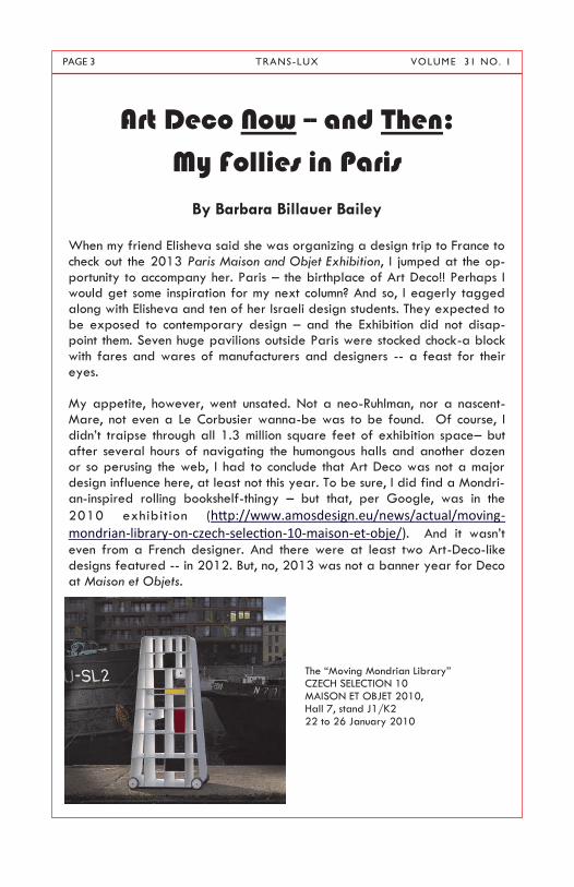
check out the 2013 Paris Maison and Objet Exhibition, I jumped at the op-portunity to accompany her. Paris – the birthplace of Art Deco!! Perhaps I would get some inspiration for my next column? And so, I eagerly tagged along with Elisheva and ten of her Israeli design students. They expected to be exposed to contemporary design – and the Exhibition did not disap-point them. Seven huge pavilions outside Paris were stocked chock-a block with fares and wares of manufacturers and designers -- a feast for their eyes. My appetite, however, went unsated. Not a neo-Ruhlman, nor a nascent- Mare, not even a Le Corbusier wanna-be was to be found. Of course, I didn‘t traipse through all 1.3 million square feet of exhibition space– but after several hours of navigating the humongous halls and another dozen or so perusing the web, I had to conclude that Art Deco was not a major design influence here, at least not this year. To be sure, I did find a Mondri-an-inspired rolling bookshelf-thingy – but that, per Google, was in the
2010 exhibition (http://www.amosdesign.eu/news/actual/moving-mondrian-library-on-czech-selection-10-maison-et-obje/). And it wasn‘t
even from a French designer. And there were at least two Art-Deco-like designs featured -- in 2012. But, no, 2013 was not a banner year for Deco at Maison et Objets.
The ―Moving Mondrian Library‖ CZECH SELECTION 10 MAISON ET OBJET 2010, Hall 7, stand J1/K2 22 to 26 January 2010

PAGE 4 TRANS-LUX VOLUME 31 NO. 1
Admittedly there were some exceptions: the VIP lounge, outfitted in Geor-gia O‘Keefe—Orange, Black and White, had a wonderful black patent (vinyl ?) lounger that reminded me of a Mies van der Rohe, and Tom Dixon had a booth called ―Eclectic‖ which evoked Art Deco lines and utilized typi-
cal Art-Deco type industrial materials, and the color trend of the season is mint green, but otherwise the Art Deco influence at the Exhibition seemed sorely lacking. (Sob. Sob.)
The Bahia Coffee Table by Hubert le Gall
The table was first exhibited at Maison et Objet in 2012: The top of this table is wood lacquer with applied gold leaf, the base is lacquered cast steel. (this edition is from September, 2011) and is available at 21st Century Limited Edition furniture.
Here is a post-modernist reincarnation of an Art Deco chair by an unidenti-fied designer. It was found on Maison & Object, Sep-tember 2012. Picture by Timothy Corrigan at Maison & Objet September 2012 http://bel-gianpearls.blogspot.co.il/2012/09/is-white-next-big-color-trend-in.html
From the Rock Collection designed by Stephane
Mathieu, the black lounger (above, left) was found
in the VIP lounge of the Maison et Objet Exhibition
of 2013. It is available in patterned black patent-
like material and is astoundingly comfortable. A
Quninette Gallay Product.http://pdf.archiexpo.com/
pdf/quinette- gallay/quinette-gallay-product-the-
rock-collection/9470-82994-_11.html
tp://21st21st.com/collections/hubert-le-gall/
products/bahia-coffee-table.

PAGE 5 TRANS-LUX VOLUME 31 NO. 1
Never mind. There‘s still the rest of Paris. The first evening, Elisheva orga-nized a much sought-after and hard-to-come-by guided tour of the special Galeries Lafayette Exhibition-–celebrating their 100th anniversary. Our tour guide at the venerated department store regaled us with the fascinat-ing history of the merchandising empire created by the Bader and Kahn families – touting the fabulous glass and steel ceiling cupola and arched parapet. Indeed, the dome is phantasmagoric (the glass ceiling changes colors before your very eyes) and very Art Nouveau. Some fabrics and carpets created with an Art Deco theme were displayed - but the Art Nou-veau Domes were so much prettier: And, when the sinewy designs of the individual elements of the dome are disregarded, the overall theme of repeating segmental arcs echoing the rounded geometric shape of the cop-pola portends the beginning of Art Deco - which would emerge in full force about a decade after its construction. (Galeries Lafayette was begun in 1905 and completed in 1912. By then, the Hotel Lucretia, a beacon of Art
Deco on the other side of the Seine, had already been completed. )
Tom Dixon’s Eclectic collection is described as “a
collection of everyday home accessories, giftware and
design objects formed from honest, resilient and heavy
weight material, including copper, marble , cast iron
and wood, conceived from a British heritage.
The use of everyday materials, of course, is a trade-
mark of Art Deco fabrication.
Note the jarring contradiction in design between the upper picture
and the one at right. The streamlined grand design of the dome
(above) starkly conflicts with intricate elements in the arches be-
neath, (at right) replete with intricate carvings and a cacophony of
colors, embellished by gold and bronze. Yet the two approaches,
when viewed as a whole, compose a coherent, harmonious and
magnificent spectacle! A perfect blend of old and new.
PAGE 6 TRANS-LUX VOLUME 31 NO. 1
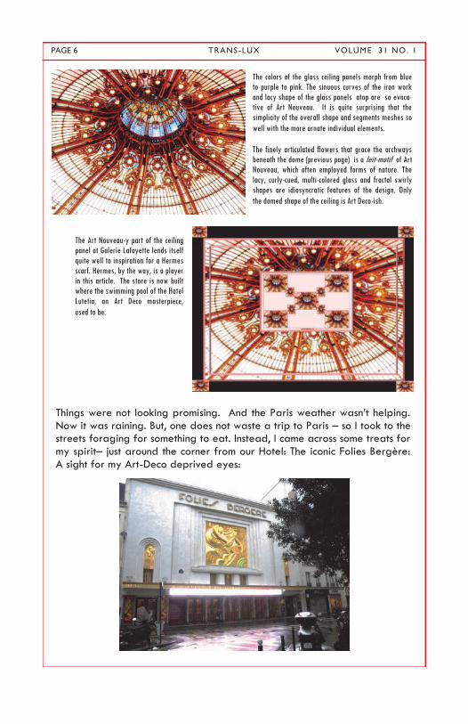
Things were not looking promising. And the Paris weather wasn‘t helping. Now it was raining. But, one does not waste a trip to Paris – so I took to the streets foraging for something to eat. Instead, I came across some treats for my spirit– just around the corner from our Hotel: The iconic Folies Bergère: A sight for my Art-Deco deprived eyes:
The colors of the glass ceiling panels morph from blue
to purple to pink. The sinuous curves of the iron work
and lacy shape of the glass panels atop are so evoca-
tive of Art Nouveau. It is quite surprising that the
simplicity of the overall shape and segments meshes so
well with the more ornate individual elements.
The finely articulated flowers that grace the archways
beneath the dome (previous page) is a leit-motif of Art
Nouveau, which often employed forms of nature. The
lacy, curly-cued, multi-colored glass and fractal swirly
shapes are idiosyncratic features of the design. Only
the domed shape of the ceiling is Art Deco-ish.
The Art Nouveau-y part of the ceiling
panel at Galerie Lafayette lends itself
quite well to inspiration for a Hermes
scarf. Hermes, by the way, is a player
in this article. The store is now built
where the swimming pool of the Hotel
Lutetia, an Art Deco masterpiece,
used to be.

PAGE 7 TRANS-LUX VOLUME 31 NO. 1
Located at 32 rue Richer in the 9th Arrondissement, the Folies Bergère was built as an opera house by the architect Plumeret according to the tradi-tional embellished architecture of the day. It opened in May 1869 as the Folies Trévise, featuring comic opera, popular songs, and gymnastics. It became the Folies Bergère on 13 September 1872, named after a nearby street, the rue Bergère when the original façade was completed by the architect Sari. ("Bergère" means "shepherdess" according to my ninth grade French teacher who taught us the song ―Il etait une begère‖ about a sheperdess who guards her flock, makes cheese, and does a host of other things). Only in 1926 was the magnificent Art Deco fresco of the dancer
Nickolska added, made of concrete and designed by the architect and designer Maurice Picaud. By 2011, the façade was dirty and grey, as depicted in the photograph below. Only in the last year was the place spiffed up and the gold leaf that you see on the following pictures – and that I saw last week - was applied to the three frescos gracing the façade.

PAGE 8 TRANS-LUX VOLUME 31 NO. 1
The Folies were nice, but, I wanted more. And I got it. Snow! Clogged the streets – cancelled buses. But I refused to have my wings clipped. So I went to Musee d’Orsay to see the Impressionisme et de Mode exhibit. I like Impressionist Art – I love fashion. But I was still hungry for Art Deco. That night I was to meet my publisher and editor for dinner. (Yes – my book on Baronial Bedrooms is finally coming out under the imprint of West-phalia Press- you should be able to order it soon on Amazon.) Paul and Daniel were staying at the Hotel de Lutece, a charming hotel on the Isle of St. James in the 6th Arrondissement. But the taxi left me off at the Lutece
Hotel – in the 15th Arrondissement. After verifying that Paul and Daniel weren‘t registered there, the monumentally kind desk clerk spent two hours locating the proper venue and tried to find a taxi for me. (If anyone seeks a very inexpensive hotel with an incredibly helpful staff – the Lutece Hotel is it). The snow was blanketing Paris with a good inch – and traffic was paralyzed. Finally, a new taxi driver appeared. This one took me to the Hotel Lutetia- in the 7th Arrondissement. I made him wait while I checked to see if I found the right place. No Paul. No Daniel. But I took a quick look around and made a mental note to come back. There was something here that begged to be seen. Finally I made it to the Hotel de Lutece and had a truly wonderful evening. Afterwards, the ever-gallant and helpful Daniel and his urbane and eru-

PAGE 9 TRANS-LUX VOLUME 31 NO. 1
dite colleague Guillermo stayed with me while we waited in the snow near Notre Dame for a taxi to show up. It took two hours. I tumbled into bed at 3 am, cold and exhausted. Even so, the evening was a real treat. But the treasure was yet to come. A few days later I went back to check out the Hotel Lutetia – and here is her story: Founded by the Bon Marché department store as a respite for weary out-of-town shoppers, the Hotel Lutetia was designed by architects Louis-Charles Boileau and Henri Tauzin. Work started in 1907 and was complet-
ed in 1910. (Boileau‘s son, Louis-Hippolyte, created the Pomone Pavilion for Bon Marché at the 1925 Exposition Internationale des Arts Décoratifs et In-dustriels Modernes, regarded as the birthplace of the Art Deco movement). Even though the heyday of Art Deco did not begin until the decade follow-ing its completion, the Hotel Lutetia is prescient is its design -- and consid-ered one of the first major Art Deco buildings in Paris.
The Hôtel Lutetia’s Art Deco facade. Photo by Olivier Amsellem The exterior is the work of two sculptors, Leon Binet and Paul Belmondo: carved vine leaves and grapes cascade across the undulating façade, residual traces of the Art Nouveau movement. Its undulating stone facade was an early harbinger of the Art Deco motif.
PAGE 10 TRANS-LUX VOLUME 31 NO. 1
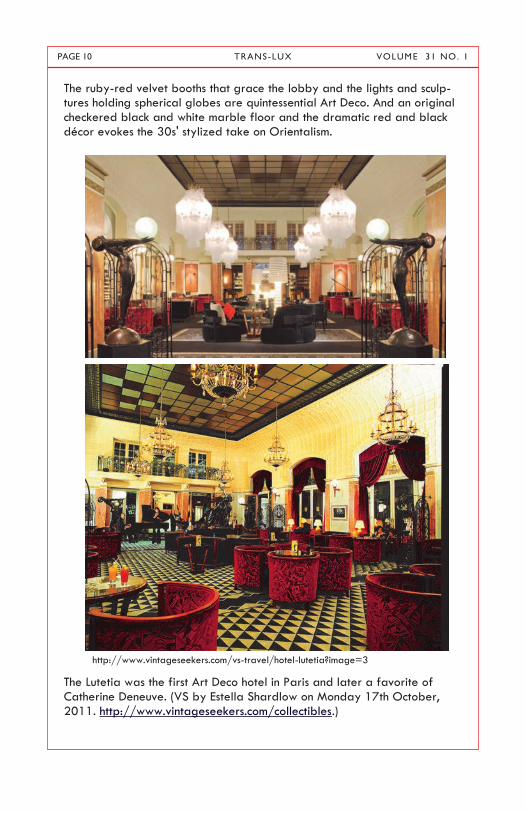
The ruby-red velvet booths that grace the lobby and the lights and sculp-tures holding spherical globes are quintessential Art Deco. And an original checkered black and white marble floor and the dramatic red and black décor evokes the 30s' stylized take on Orientalism.
The Lutetia was the first Art Deco hotel in Paris and later a favorite of
Catherine Deneuve. (VS by Estella Shardlow on Monday 17th October, 2011. http://www.vintageseekers.com/collectibles.)
http://www.vintageseekers.com/vs-travel/hotel-lutetia?image=3

PAGE 11 TRANS-LUX VOLUME 31 NO. 1
In the Brasserie, the pearlized finish in the tin embossed ceiling panels pro-
vides a lovely contrast with the black lacquered wall inlays separated by matte rectinlear silvered frames, which repeats the color motif of the ceil-ing. The chairs, however, appear to retain the influence of a previous Art-Nouveau incarnation. The mélange of Art Deco and Nouveau during the early years, and eased the transition from the flowery earlier aesthetic to the starker Deco design. Here, the juxtaposition of the two influences work quite well – the semi-circular arms of the chair comfortably co-exist with
the more sinewy arm rests and backs.
Between 1910 and 1939 the Hotel, located on the trendy Left Bank in the
heart of Saint-Germain-des-Prés, catered to artists and musicians, the intel-ligensia and the avant-garde. Here Picasso and Modigliani probably dis-cussed modern painting, and Josephine Baker likely held court after one of

PAGE 12 TRANS-LUX VOLUME 31 NO. 1
her exotic performances. In the Brasserie Lutetia, vintage posters for Monte Carlo and Deauville still hang on the mirrored walls, evoking a time long
past.
By 1939, the outbreak of war brought refugees from these metiers, dis-placed artists fleeing Germany, who the Hotel tried to accommodate. But in June 1940, the French government evacuated Paris and the Germans en-tered and occupied the city. A number of the Lutetia's residents escaped; others were captured by the Germans. Draped in swastikas, the Hotel was among the most notorious redoubts for Nazi officers. Requisitioned by the
Abwehr (the German counter-espionage), it housed, fed, and entertained officers in command of the occupation such as Alfred Toepfer and the
French collaborator Rudy de Mérode.
When Paris was liberated in August 1944, the hotel was abandoned by
German troops and taken over by French and American forces. From then
until after the end of the war, it was used as a repatriation center for pris-
oners of war, displaced persons, and returnees from the German concentra-
tion camps.
As Paris returned to normalcy, the Lutetia was restored to its previous state
as a luxury hotel. It was acquired by the Taittinger family in 1955. In the
late 1980s, designer Sonia Rykiel opened a boutique in the building and
supervised a major redesign intended to restore the Art Deco splendor of
earlier decades. Rykiel stayed true to the hotel‘s artistic heritage, most
notably revamping its gourmet restaurant, ‗Le Paris‘. Inspired by the dining
rooms of 30s ocean liners, she employed grid-like leading on the mirrors.

PAGE 13 TRANS-LUX VOLUME 31 NO. 1
The chairs‘ geometric styling further carries the Art Deco glamour through a
rich cinnamon and gilt interior.
The Hotel‘s revival continued with the invitation to contemporary designers to design a series or suite of rooms. The designers were urged to integrate modern décor with Art Deco, as evidenced by Sculptor Philippe Hiquily‘s homage to the shoe in Suite 704. In the vast Arman Suite, metal furniture in the forms of cellos and violins is a surreal tribute to the installations of de-constructed musical instruments for which Arman was best known, and calli-graphic prints by the artist are on display. Most inspired, however, are the four Rotunde suites created to mark the hotel‘s centenary last year. In col-laboration with the Maison Européenne de la Photographie a quartet of contemporary photographers who exemplified the key trends and tech-niques of our times were selected and suite was assigned to each one to decorate in the spirit of the Continent from which they came. In ‗Europe‘
Italian photographer Mimmo Jodice incorporated brooding shots of Vesuvi-us within muted slate-colored walls, while Brazilian ‗illusionist‘ master Vik Muniz captured the flamboyant South American spirit with bejeweled im-ages of Brigitte Bardot and Marilyn alongside rich chocolate velvet furnish-ings. Many of these rooms exemplify how vintage can meet the future harmoni-ously, as when contemporary elements are incorporated subtly and rever-ently. Not only was the original Art Deco aesthetic incorporated into the modern rejuvenation, but respect for its illustrious more recent history was also honored. It is said that the hotel now is not very different from when Charles de Gaulle spent his wedding night there, or when Catherine De-neuve used the lounge as her ―second office.‖
PAGE 14 TRANS-LUX VOLUME 31 NO. 1
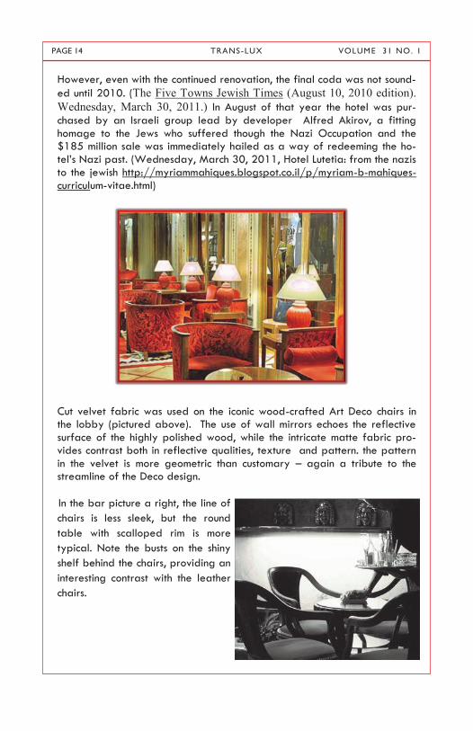
However, even with the continued renovation, the final coda was not sound-
ed until 2010. (The Five Towns Jewish Times (August 10, 2010 edition).
Wednesday, March 30, 2011.) In August of that year the hotel was pur-
chased by an Israeli group lead by developer Alfred Akirov, a fitting homage to the Jews who suffered though the Nazi Occupation and the $185 million sale was immediately hailed as a way of redeeming the ho-tel‘s Nazi past. (Wednesday, March 30, 2011, Hotel Lutetia: from the nazis to the jewish http://myriammahiques.blogspot.co.il/p/myriam-b-mahiques-curriculum-vitae.html)
Cut velvet fabric was used on the iconic wood-crafted Art Deco chairs in the lobby (pictured above). The use of wall mirrors echoes the reflective surface of the highly polished wood, while the intricate matte fabric pro-vides contrast both in reflective qualities, texture and pattern. the pattern in the velvet is more geometric than customary – again a tribute to the streamline of the Deco design.
In the bar picture a right, the line of
chairs is less sleek, but the round
table with scalloped rim is more
typical. Note the busts on the shiny
shelf behind the chairs, providing an
interesting contrast with the leather
chairs.

PAGE 15 TRANS-LUX VOLUME 31 NO. 1
Wrought iron railings lived on after the demise of Art Nouveau. In the pic-
ture above, an original stair railing calms the curlyques of the Nouveau
aesthetic, while in the more modern reincarnation below, the design is more
severe and geometric, almost reminding the onlooker of Rockefeller Center.

PAGE 16 TRANS-LUX VOLUME 31 NO. 1
The Brasserie Restaurant (above) boasts black leather and shiny surfaces, while the Paris Dining Salon below is a study in wood and soft restraint.
Compare the use of lighting fixtures –overhead globes above, with rectilin-
ear shapes and period wall sconces below.
PAGE 17 TRANS-LUX VOLUME 31 NO. 1
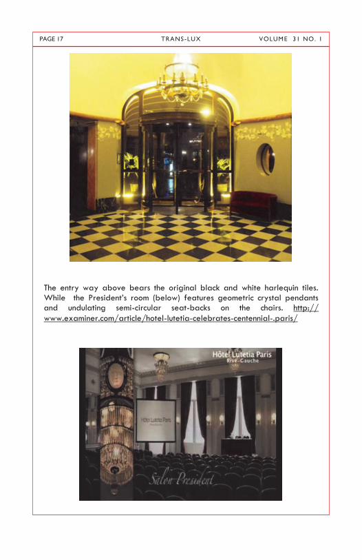
The entry way above bears the original black and white harlequin tiles. While the President‘s room (below) features geometric crystal pendants and undulating semi-circular seat-backs on the chairs. http://
www.examiner.com/article/hotel-lutetia-celebrates-centennial-.paris/

PAGE 18 TRANS-LUX VOLUME 31 NO. 1
Even the more modern rooms, like the business center below, try to incorpo-rate Art Deco touches. Note the modern interpretation of the wall sconces,
and the pedestal pentapod chairs.
In the living area below, sleek chrome and glass prevail.
http://www.vintageseekers.com/vs-travel/hotel-lutetia?image=6 By Estella Shardlow October, 2011

PAGE 19 TRANS-LUX VOLUME 31 NO. 1
My penchant for bedrooms is amply respected here. David Lynch designed the bedroom suite on this page. The woodworking was done in the Mont-parnasse workrooms where Matisse, Picasso, Pond, and Giacometti once worked. Note the shape of the rooms on these pages, the period furniture
and head boards, lamps and wall sconces.

PAGE 20 TRANS-LUX VOLUME 31 NO. 1
An eclectic mélange combines the Art Nouveau reminiscent of Gaudi with streamlined recessed wall niches, a semi circular head board pokes out from the bedroom, repeating the shape of the round glass table top in the
living area.
http://www.vintageseekers.com/vs-travel/hotel-lutetia?image=6

PAGE 21 TRANS-LUX VOLUME 31 NO. 1
The son of the Lutetia‘s architect, Louis-Hippolyte Boileau, created the mas-terpiece Art Deco Pomone Pavilion for Bon Marche at the 1925 Paris Expo-sition- widely regarded as the birthplace of Art Deco. It‘s just too grand to be excluded - even if not strictly on point. (http://img.photobucket.com/ /v679/Gatochy/LouisHippolytePomonepavilionforBonM.jpg)
http://www.architecture.com/LibraryDrawingsAndPhotographs/Exhibitionsandloans/ArtDecoTriumphant/Departmentstores/Pomone-Axonometric.aspx http://www.answers.com/topic/paris-exposition-
des-arts-d-coratifs-et-industriels-modernes

PAGE 22 TRANS-LUX VOLUME 31 NO. 1
Deco Discoveries:
Art Deco Schools in Los Angeles By Clive Foss
Los Angeles is well known as one of the great centers of Art Deco - public buildings like the City Hall, Public Library or Griffith Observatory; a whole range of commercial structures from shop fronts to skyscrapers; an abun-dance of movie theatres, some really extravagant; and the wacky pro-
grammatic architecture that created buildings shaped like hot dogs, coffee pots or donuts. If you count Frank Lloyd Wright‘s houses there as Deco (I wouldn‘t), you can add works by one of the great masters. Yet there is one class of buildings that gets surprisingly little attention, even though it‘s the most numerous of all and includes some real masterpieces: I mean the pub-lic schools of the 1930‘s that abound throughout the metropolitan area. These schools are products of the depression, when Los Angeles was doing relatively well: population was growing, suburbs were expanding, automo-bile production was booming, oil was coming on line and of course, the movie industry was reaching new heights as its glamorous productions of-fered an escape from the dismal realities of the day. The new Streamline style, with its implications of speed and modernity, was ideally suited to a population increasingly oriented to the automobile. This was also a time of massive government intervention in the economy, with billions being spent by President Roosevelt‘s confusingly named rival organizations, the PWA (Public Works Administration) and WPA (Works Progress Administration). The PWA (1933-1943) will appear frequently here because it financed some 70% of the schools constructed nationally in the 30s, with over 140 of them in California. It tended to promote large
scale projects like dams and highways in cooperation with private firms, while the WPA (1935-1943) dealt with such works as roads, public utilities, parks or airports, hiring the unemployed directly - but there was much overlap in the projects each agency promoted. There was also a grimmer reason why so many schools were built in 1930‘s Los Angeles. On 10 March 1933, the port city of Long Beach was devas-tated by a 6.4 magnitude earthquake whose epicenter was just offshore. Since much of the Los Angeles basin consists of relatively soft alluvium, the damage was widespread. Schools were hit especially hard, with 230 of them destroyed or severely damaged. As a result, a month later the Cali-
fornia legislature ordered that all school buildings had to be made earth-quake resistant, accounting for a great deal of rebuilding.

PAGE 23 TRANS-LUX VOLUME 31 NO. 1
For all these reasons, every part of LA‘s enormous metropolitan area fea-tures schools in the Deco idiom, some of them real gems, and most hardly known. Their architects enthusiastically adopted the Streamline Moderne, replacing the ubiquitous Spanish Colonial Revival style of the 1920‘s. At first, the buildings tended to the monumental, but as the decade progressed, the softer, more elegant Regency Moderne came to the fore. In most cases, they were simple and functional - sometimes not much more than reinforced concrete boxes - but curved walls by the entrance, bands of windows, or glass bricks made them Deco. Add to this the dramatic lettering, bas-reliefs, sculptures and interior murals and tiles and you get some stunning examples.
The schools were not just attractive buildings, but also displays of public art whose decoration added an uplifting or inspiring element, featuring the virtues of America, the value of work or the advances of science and tech-nology. Pupils, as soon as they saw the school, were faced with lessons, of-ten brilliantly composed. Jefferson Junior High School in Long Beach, a WPA project of 1937 replac-ing a building destroyed in the quake, has typical Moderne characteristics: fluted pilasters that accentuate the vertical, banded recessed windows, and a rounded canopy over the main entrance; but the geometric floral reliefs reminiscent of the 20‘s add a striking touch.

PAGE 24 TRANS-LUX VOLUME 31 NO. 1
These schools are rarely dull: even the boxy Stevenson Elementary School (1937), also in Long Beach, has distinctive stucco decoration reminiscent of American Indian or pre-Columbian traditions.
In terms of design, the prize here surely goes to the Thomas Jefferson High School, rebuilt in 1936 after the earthquake by LA‘s prime deco architect, Stiles Clements (1883-1966). He was responsible for the city‘s greatest Deco structure, the gold and black Richfield Tower (sadly demolished), such extravaganzas as the Mayan Theatre or the neo-Babylonian Sampson Tire

PAGE 25 TRANS-LUX VOLUME 31 NO. 1
Factory, as well as numbers of office buildings, supermarkets, department stores and theatres.
In this case, bold lettering, warm colors, curving walls, striking light horizon-tals balanced by heavy unadorned pilasters, and recessed windows are distinguishing features.

PAGE 26 TRANS-LUX VOLUME 31 NO. 1
Subtlety, novelty and imagination combine to produce a harmonious whole. The PWA supported the Science (1935) and Liberal and Household Arts (1938) buildings of the Hollywood High School, reinforced against earth-quakes. Their architects, the firm of Norman Marsh, David Smith and Her-bert Powell, were the most prolific school builders of the age. For Holly-
wood, they produced school buildings with dramatic entrances, colonnades on unadorned columns, tall recessed windows, and both curving and straight walls. This complex was adorned with suitable low reliefs, by Bar-tolo Mako, a sculptor of Italian origin whose work appears throughout the metropolitan region, and perhaps best known for his reliefs at the entrance to Exposition Park where the opening and closing ceremonies of the 1932 Olympic Games were held. For the Science building, his frieze represents great moments in the history of science, and for the Liberal and Household Arts such feminine occupations as clothes making.

PAGE 27 TRANS-LUX VOLUME 31 NO. 1
PAGE 28 TRANS-LUX VOLUME 31 NO. 1
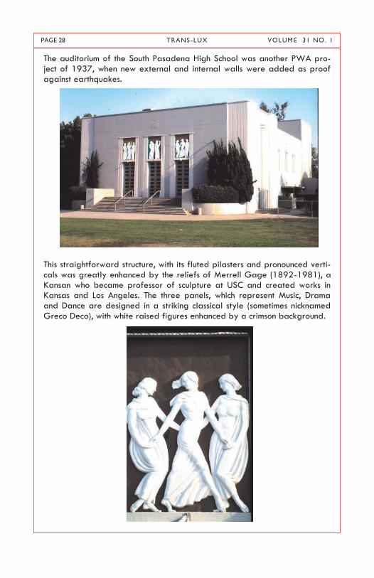
The auditorium of the South Pasadena High School was another PWA pro-ject of 1937, when new external and internal walls were added as proof against earthquakes.
This straightforward structure, with its fluted pilasters and pronounced verti-cals was greatly enhanced by the reliefs of Merrell Gage (1892-1981), a Kansan who became professor of sculpture at USC and created works in Kansas and Los Angeles. The three panels, which represent Music, Drama and Dance are designed in a striking classical style (sometimes nicknamed Greco Deco), with white raised figures enhanced by a crimson background.

PAGE 29 TRANS-LUX VOLUME 31 NO. 1
Decoration, an important element in these schools, was not confined to the facades, but many were adorned with New Deal style murals (as common-ly in the post offices of the time) or ceramic tiles. The artwork could be symbolic or didactic. The Industrial Arts Building of the Long Beach Poly-technic High School has both: a rather crowded mural representing the in-dustrial activities of Long Beach (here, fruit packing) as well as a ceramic tile plaque featuring the god Mercury zooming through the air along with an airplane (it looks like a Douglas DC-3), a streamlined train below on the globe, and a motto expressive of the place and time ‗Speed is the Great-est Factor in Modern Life‗. Ivan Bartlet and Jean Swiggett, supported by
the Federal Arts Project, did the murals, while a local architect, Hugh R. Davies (1884-1967) designed the building, which was finished in 1936 with the aid of both the PWA and the WPA.

PAGE 30 TRANS-LUX VOLUME 31 NO. 1
As the decade wore on, the lighter, elegant Regency Moderne tended to replace the more monumental classicizing style. A prime example is yet
another WPA project, the Lou Henry Hoover School in Whittier, designed in 1938 by a local architect, William H. Harrison (1897-1988) and named for President Hoover‗s wife. The school‗s main entrance, set in a curving wall, is approached through a unique cascading stairway. In front is a mon-umental inscription, ‗What you would want in the life of a nation you must first put into its schools.‘ Above the entrance a series of reliefs by Bartolo Mako, The Pageant of Education, which shows a progression from the Quak-er pioneers who founded the city to the happy, healthy outdoors family of today. Other parts of the school manifest porthole windows, fluted pilas-ters, rounded facades and glass bricks.

PAGE 31 TRANS-LUX VOLUME 31 NO. 1
(Continued from page 30)
(Continued on page 32)

PAGE 32 TRANS-LUX VOLUME 31 NO. 1
Finally, more pioneers (the sprit of the age was progress through hard work) in a relief labeled The Truth Shall Make You Free above the semicir-cular bay window of the Upton Elementary School, a 1938 product of Marsh, Smith and Powell. The lettering of the school‘s sign is a fine exam-ple of the 30‘s style.
This is not even the tip of the iceberg: there are dozens of schools, maybe more than a hundred, that would be worth seeing or discussing. But this being Los Angeles, they are scattered over a vast area and take a lot of driving time to discover. Not all are in desirable parts of town: when I visit-ed the Thomas Jefferson School, parked cars contained teenagers ex-changing surprisingly large sums of money. I didn‘t stop to ask questions.
Also, these photos were taken twenty or more years ago in a more inno-cent age. I suspect that a man of mature years found now lurking around school grounds with a camera would attract unwanted attention and have trouble giving a convincing explanation. But good luck; there‘s a tremen-dous treasure out there for the decophile.