artists ...cdn.johnnealbooks.com/downloads/14-1pgs.pdfaccordion-fold artist’s book. photoetchings....
TRANSCRIPT
Volume 14, Number 1 $8.50
ARTISTS’ BOOKSbBOOKBINDINGbPAPERCRAFTbCALLIGRAPHY

Bound & Lettered b Winter 2016 1
Volume 14, Number 1, December 2016.
True Places by Sissy Buck and Karen Brooks
Briony Penn
Ethan Cohen
Rosella Garavaglia
Etching an Initial onto a Wine Glass by Meg Kennedy
Darlene Kalynka
An Introduction to Ink Sticks by George Huitema
Calligraphy and Kids by Steve Wojahn
Book Reviews: Speedball Textbook | Pens & Protocol, Volume 2
John Neal Award by Annie Cicale
Walnut Ink Tests by Carol DuBosch
Many Hands
A Zigzag Structure
Contributors / credits
Subscription information
3
12
18
22
27
30
32
34
36
37
38
40
41
42
48
Each volunteer at last summer’s conference, A Show of Hands, was given a hand of thanks. Each one was lettered by Carol DuBosch on pre-cut hands that she
had found in a bargain bin. Photo by Angela Vangalis. “Many Hands,” page 40.
Bound & Lettered b Winter 2016 3
by Sissy Buck and Karen BrooksSoon after the Kate Cheney Chappell ’83 Center for Book Arts (KCC’83CBA) at the University of Southern Maine was founded, a critique group was formed for book artists who had taken classes there and who felt a strong desire to stay connected with one another afterwards. Bound together by a passion for making artists’ books, over the past six years we have grown to a stimulating, supportive group of twenty artists. Working in a variety of media, book structures, and a broad range of sub-ject matter, we meet once a month in the Pope-Cheney Art Studio at USM for constructive feedback, insightful questions, and informative discussions about our books – both completed books and those in progress. Critique formats change as needed to keep our meetings fresh and inspiring. All members have interests and backgrounds in the arts and have been drawn into the medium of book arts through classes, workshops, and lectures offered at USM and the KCC’83CBA. Some have completed the book arts minor at USM. As a group, we have had the wonderful opportunity for the past six springs to exhibit our books at the Wishcamper Center at USM, where we also participate in the Book Arts Bazaar held there on the first Sunday of April. Also, for the past four years we have been invited to exhibit each April with USM book arts students at the Lewis Gallery at the Portland Public Library. These free, public events offer occasions where we can act as ambassadors to help promote and support USM book arts in our community. Each year, the group chooses a theme for our spring exhibit. Inspiration for this year’s mapping idea came from Herman Melville’s quote, “It is not down in any map; true places never are.” Detouring from conventional cartog- raphy, our members discovered and developed new paths of imagined and real places springing from memories, current events, and personal history. Explorations into a broad range of materials – ephemera, altered maps, glass, metal, handwriting, text, sewing, ecoprints, collage, paint, film – led us on new journeys. Distinctive book structures emerged, including accordion, lotus,
flexagon, scroll, meander, flag, exquisite corpse, board game, and a mobile. The exhibit, True Places, served as a powerful reflection on the unique capacity of artists’ books to express a personal sense of place, belonging, and longing. Continuing with our theme, our critique group created a collaborative artists’ book, It’s not down on any map; true places never are, which was donated to the Center for Book Arts and is housed in the Special Collections at the Glickman Family Library at USM. A simple path painted in walnut ink on a full watercolor sheet by member Anna Low was then cut into individual segments. Each artist created a particular image on their own page. The only direction given was to leave the original path visible. The individual pages of imagined and colorful places were reassembled, bound into a meander format, and housed in an archival box by member Libby Barrett. One printed copy of this book was bound by member Sue Rogers and raffled to raise funds at the Book Arts Bazaar. Current book artists in the group are: Libby Barrett, Kathleen Bender, Karen Brooks, Rush Brown, Sissy Buck, Cynthia Joslin Collins, Bonnie Faulkner, Sarah S. Harvey, Solange Kellermann, Judy LaBrasca, Kathleen Leggett, Anna Low, Molly Mains, Kathleen March, Susan Montgomery, Susan Colburn Motta, Pamela Moulton, Bessie Smith Moulton, Sue Rogers, and Suanne Williams-Lindgren. The Center for Book Arts was founded in 2008 with a gift from professional artist and USM 1983 graduate Kate Cheney Chappell. Its mission is to delight, engage, and enlighten artists, students, and the wider public about book arts; response has exceeded expectations. Under the inspired leadership of Program Coordinator Rebecca Goodale, a well-known Maine book artist and USM faculty member, the KCC’83CBA offers outstanding free lectures, workshops, and exhibits by regional and national book artists. Book arts are thriving in Maine. usm.maine.edu/bookarts
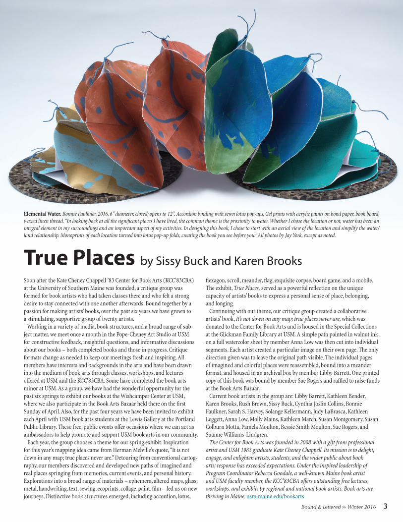
Elemental Water. Bonnie Faulkner. 2016. 6" diameter, closed; opens to 12". Accordion binding with sewn lotus pop-ups. Gel prints with acrylic paints on bond paper, book board, waxed linen thread. “In looking back at all the significant places I have lived, the common theme is the proximity to water. Whether I chose the location or not, water has been an integral element in my surroundings and an important aspect of my activities. In designing this book, I chose to start with an aerial view of the location and simplify the water/land relationship. Monoprints of each location turned into lotus pop-up folds, creating the book you see before you.” All photos by Jay York, except as noted.
True Places

12 Bound & Lettered b Winter 2016
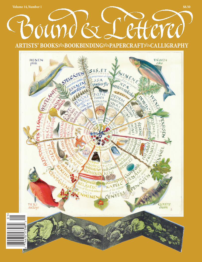
As a geographer, I’ve always been interested in maps and how maps influence our perception of the land. I grew up as a fifth-generation Vancouver Islander whose European ancestors had come out to British Columbia on the lure of a map that had terra incognita writ-ten all over it. Of course, when they got here, it was anything but. They found a richly inhabited and deeply beautiful landscape, and I think the artists amongst my family were challenged as to how to
express it all from their European worldview and traditions. My mother’s great-grandfather painted the burial cairns of the local Songhees people, and some of those paintings now sit in the British Museum. My great-grandmother, who was in the same sketch club as the famous Canadian artist Emily Carr, painted the wild coastal landscapes in watercolors, choosing a medium that would allow her a life en plein air. My mother’s father was an artist
BRIONY PENNUplands Wheel. This was a commission for a park in Victoria that
is so rich in species but so threatened by visitors unaware of its fragile beauty, whether they are mountain bikers or dog walkers. In the face of
that kind of pressure, the artwork’s aim was to encourage people to stop and recognize all the beauty of the natural world.

Bound & Lettered b Winter 2016 27
Etching an Initial onto a Wine Glassby Meg Kennedy
Adding a decorative initial onto a curved surface (like a wine glass) is not as difficult as you might think. Below is the method that I have developed, which uses Armour Etch Glass Etching Cream. The process can also be adapted for more involved designs that go around the glass even more – though it makes sense to start with a simple initial on one side of the glass. Of course, Armour Etch works on flat surfaces too, both regular glass and glass mirrors. Armour Etch offers a kit, but I find that good old-fashioned contact paper (self-adhesive covering or lining paper) and a bone folder work fine.
Materials∙Jar of Armour Etch Cream∙Synthetic-bristle paintbrush∙Wine glass∙Craft knife with new #11 blade∙Small piece of light-colored contact paper (approx. 3" x 5")∙Bone folder (for smoothing contact paper)
30 Bound & Lettered b Winter 2016
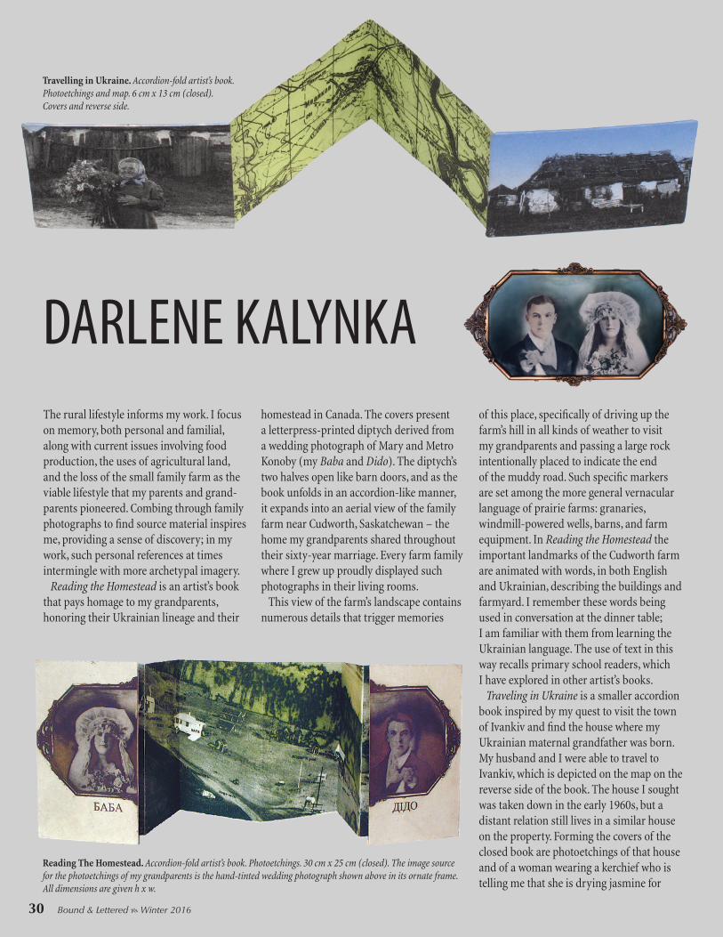
The rural lifestyle informs my work. I focus on memory, both personal and familial, along with current issues involving food production, the uses of agricultural land, and the loss of the small family farm as the viable lifestyle that my parents and grand-parents pioneered. Combing through family photographs to find source material inspires me, providing a sense of discovery; in my work, such personal references at times intermingle with more archetypal imagery. Reading the Homestead is an artist’s book that pays homage to my grandparents, honoring their Ukrainian lineage and their
homestead in Canada. The covers present a letterpress-printed diptych derived from a wedding photograph of Mary and Metro Konoby (my Baba and Dido). The diptych’s two halves open like barn doors, and as the book unfolds in an accordion-like manner, it expands into an aerial view of the family farm near Cudworth, Saskatchewan – the home my grandparents shared throughout their sixty-year marriage. Every farm family where I grew up proudly displayed such photographs in their living rooms. This view of the farm’s landscape contains numerous details that trigger memories
of this place, specifically of driving up the farm’s hill in all kinds of weather to visit my grandparents and passing a large rock intentionally placed to indicate the end of the muddy road. Such specific markers are set among the more general vernacular language of prairie farms: granaries, windmill-powered wells, barns, and farm equipment. In Reading the Homestead the important landmarks of the Cudworth farm are animated with words, in both English and Ukrainian, describing the buildings and farmyard. I remember these words being used in conversation at the dinner table; I am familiar with them from learning the Ukrainian language. The use of text in this way recalls primary school readers, which I have explored in other artist’s books. Traveling in Ukraine is a smaller accordion book inspired by my quest to visit the town of Ivankiv and find the house where my Ukrainian maternal grandfather was born. My husband and I were able to travel to Ivankiv, which is depicted on the map on the reverse side of the book. The house I sought was taken down in the early 1960s, but a distant relation still lives in a similar house on the property. Forming the covers of the closed book are photoetchings of that house and of a woman wearing a kerchief who is telling me that she is drying jasmine for
DARLENE KALYNKA
Reading The Homestead. Accordion-fold artist’s book. Photoetchings. 30 cm x 25 cm (closed). The image source for the photoetchings of my grandparents is the hand-tinted wedding photograph shown above in its ornate frame. All dimensions are given h x w.
Travelling in Ukraine. Accordion-fold artist’s book. Photoetchings and map. 6 cm x 13 cm (closed). Covers and reverse side.

36 Bound & Lettered b Winter 2016
How many of us began our calligraphic journey pouring over the pages of the Speedball Textbook and trying to imitate the examples shown? I certainly did, beginning with the 20th edition in the 1970s. Over the years, I’ve purchased a couple of new editions (and Speedball nibs by the dozens) and even picked up an older one, the 19th edition from 1965. Nothing, however, compares with the most recent edition, the 24th, which made its debut last December. Celebrating Speedball’s centennial, this 120-page, spiral-bound paperback, edited by Angela Vangalis and Randall Hasson, is filled with exemplars and work by nearly eighty leading callig-raphers. Including some of the finest examples published in previous editions, as well as new material and instructional sections that represent contemporary lettering styles, this 100th-anniversary edition will provide inspiration and serve as a resource for lettering artists of all skill levels. This classic manual was first published in 1915 by William H. Gordon and Ross F. George as a 40-page pamphlet that sold for fifty cents. Each of the next eight editions was entitled Modern Pen Lettering, until 1929 when it became The Speedball Textbook. A delightful, new fold-out timeline shows the covers of every edition and gives the lineage of “new” alphabets introduced in each. The covers themselves reveal an evolution of American graphic design. According to this timeline, the Speedball Textbook was issued in a horizontal format until the 13th edition in 1938. The 24th edition returns to that format, with a wonderful spiral binding that stays open for ease of reference. Showcasing the work of renowned scribes from around the globe and including everything from Trajan’s column to comic book art, this new edition introduces American Cursive, Bone, Fraktur, Greek Uncial, and Spencerian Script alphabets, along with expanded pressurized lettering techniques. There are also new sections on sign painting, chalkboard lettering, and lettering for digital fonts, as well as a glossary and an index. Full-color throughout, this book belongs in every calligrapher’s library.
Speedball Textbook: A Comprehensive Guide to Pen and Brush Lettering, 24th Edition. Edited by Angela Vangalis and Randall Hasson. 2015, 120pp, 87⁄8 x 5½ inches, paperbound with wire spiral. $14.99
Speedball Textbook Book Review by Meg Kennedy
3
using color, we’ve been able to do spectacular things with graphic images and printing.”
A black tie dinner demands the classic look of hand-lettered calligraphy. “I don’t think that’s ever going to go away,” said Pat. “We’ll suggest doing something very elegant and stately, like a very dressy copperplate or a very refined Italic.”
However, calligraphy may not work in every graphic project. “Especially if there’s artwork, I find that calligraphy will fight it a little bit,” Pat said. “In the end we’re conveying a mood through a piece, so I’m going to be selective and it has to fit the project.”
Sometimes a font is selected with calligraphy in mind. “When we choose typography for a menu, we try to match the place card to the menu in color and
style,” Pat said. “If we used a serif Roman font, it’s going to be more difficult to match on the place card,” Pat noted. “We’ll use a very calligraphic-inspired font that we can emulate on the place card.”
Tools and ProcessFor their hand lettering, the White House
calligraphers write on Canson Pro Layout Marker paper using Moon Palace sumi ink and pointed nibs such as the Gillott 303 and flexible Zebras, along with Mitchell nibs for italic and Coit pens for banners and such.
The Ray Charles invitation combined hand lettering with piano keys created in Illustrator by Becky Larimer, who placed them on a royal blue background. Then Debra Brown chose a simple italic hand to coordinate with the linear quality of the keys, but lettered on a fixed slant to play against their various angles.
Pat Blair lettered the St. Patrick’s Day reception invitation in uncial and had it printed in white on die-cut stock.
yle,” Pat saaid. “If we used a serif Roman nt, it’s ggggoing to be more difficult to atch on the place card,” Pat nonnn ted. “We’ll use a very lligraphic-inspired font that we can emulate on the
t Blair lettered the St. trick’s Day receptionvitation in uncial and d it printed in n white die-cut stock.
Debra Brown lettered the menu for the dinner honoring British Prime Minister David Cameron in an elegant copperplate.
In 2008, the Washington Calligraphers Guild published one of the most popular issues of their journal, Scripsit. That issue, Pens & Protocol, focused on the official calligraphy of Washington, DC. It featured calligraphers who worked for various governmental entities and the calligraphy they produced: certificates and awards; invitations, menus, and place cards; greeting cards and other calligraphic ephemera. While the guild had a fair number of extra copies printed (in addition to the copies mailed to their members), the issue sold out and is no longer available. Fortunately for us, Lorraine Swerdloff has produced Pens & Protocol, Volume 2, which is copiously illustrated. For this second volume, the highlighted calligraphers share more about work process and the pens and papers they use, and we get a greater glimpse into their world of state dinners and less formal events. You learn that the White House calligraphers themselves actually place individual menus and place cards on the tables, and that they are present at some events to hand out escort envelopes with directions to the guests’ seats, among other fascinating details. Included are White House calligraphers, Pat Blair, Debra Brown, and Becky Larimer; Sammy Little’s work for presidential inaugural luncheons; the calligrapher to the Vice President, Lee Ann Clark; the State Department’s calligrapher, Jennifer Nicholson; Marta Legeckis’ work for the Department of the Interior; and Mohamed Zakariya’s commission for President Obama of a Quran passage in Arabic to be given to King Abdullah of Saudi Arabia. In addition, there is a section on United States postal stamps, with lettering by Julian Waters, Jessica Hische, Michael Doret, and Zakariya. – John Neal
Pens & Protocol: The Calligraphy of Official Washington, Volume 2. This is Scripsit: Volume 39, Number 2, which was sent to current members of the WCG. A limited number of copies are available for sale from the guild and other sellers. 40pp, 8½ x 11 inches, paperbound. $20.00
Pens & Protocol, Volume 2

38 Bound & Lettered b Winter 2016
WALNUT INK TESTSby Carol DuBoschWalnut and sepia colored inks are popular with calligraphers. I have a favorite, but I liked the idea of trying out several different inks to see how they compare. For the test, I wrote with three different writing tools – a Luthis Dragonfly folded pen (abc), a chisel-cut Mitchell Round Hand nib (xyz), and a Zebra G nib (Alphabet). I used three different papers that are commonly used for calligraphy: Arches Text Wove (for finished pieces), Gilbert Bond (for practice), and Canson Pro Layout Marker (for work for reproduction). As expected, the relative smooth-ness of the paper affected the edge quality of the strokes, with Arches Text Wove giving a textured edge, the Canson Pro Layout Marker giving a smooth edge, and the Gilbert Bond being somewhere in between. Some inks gave superior results on all three papers; other inks bled on one or more papers, though all will likely give good results on highly sized watercolor papers like Arches or Fabriano Artistico.
Crystal Walnut. This is my go-to walnut ink, and has been for many years. I mix the crystals with distilled water, using enough crystals to create a quite dark ink, as it can easily be diluted in small bits as needed. This ink is lightfast, is dye-based, and has a luminosity that I enjoy. It holds a line and doesn’t bleed (unless the paper is unsuitable for inks). I trust this ink in my Pilot Parallel Pens, loading it directly into the barrel of the pen rather than filling empty Pilot cartridges with the ink. This ink performs well in the ink-lift trick done on Rives BFK (see page 40). Crystal Walnut ink easily washes off hands and doesn’t stain. (Some vendors, including John Neal Books, call this “Walnut Ink Crystals.”)
Daniel Smith Walnut Ink. This ink acted like a dilute version of Crystal Walnut (as I mix it) in every way tested. It has qualities I value in a walnut ink, however not the intensity and richness of color. It is pigmented and lightfast (see page 40). It comes in a tall, 2oz plastic bottle with a narrow opening unsuitable for dipping.
Higgins Sepia Calligraphy. The red tones of this ink define the color as quite different than the other walnut inks. This ink is dye-based and stained my hands. Higgins Sepia held its line well, except for a small bit of feathering on the Gilbert paper. The ink did not perform well on the
Crystal Walnut
Daniel Smith Walnut
Higgins Sepia
Walnut Drawing Ink (Tom Norton’s)
Pelikan 4001 Brilliant Brown
Gilbert Bond
Canson Pro Layout Marker
Arches Text Wove