breaking news! the story behind designing gis for broadcasting · 2014. 7. 8. · breaking news!...
TRANSCRIPT
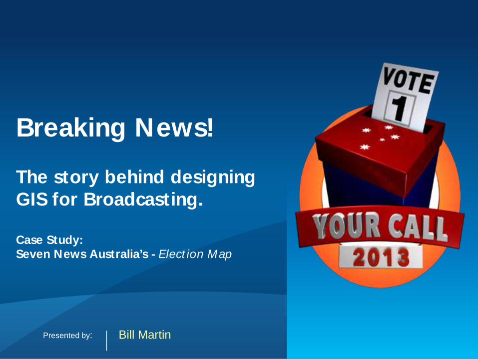
Breaking News! The story behind designing GIS for Broadcasting. Case Study: Seven News Australia’s - Election Map
Bill Martin Presented by:
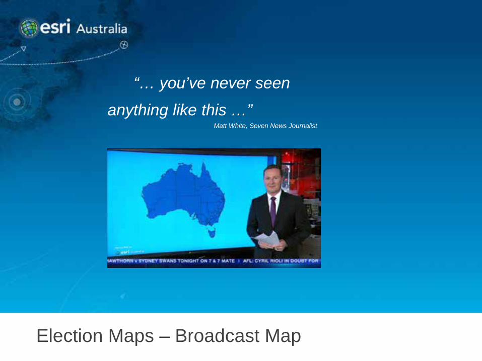
Election Maps – Broadcast Map
“… you’ve never seen
anything like this …”
Matt White, Seven News Journalist
Geo-geek description
A really cool Toy… • ArcGIS Runtime SDK for WPF • WPF XAML UI/Animation • SQL Server RDBMS • 82” Perceptive Pixel touch screen
What opportunity did we see?
A Marketing and brand driven opportunity… • Challenging Google’s benchmark • Breaking with GIS traditions • Reframe how GIS could look for mainstream media • Introducing GIS to non-traditional markets
5 weeks to go
• 5 weeks until the election • An industry not entered previously • Large scale hosted web application • A restricted live broadcast environment • The doubters said it couldn’t be done
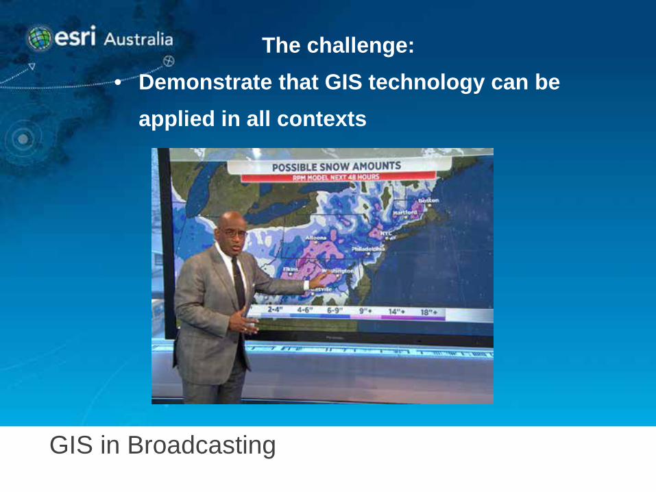
The challenge: • Demonstrate that GIS technology can be
applied in all contexts
GIS in Broadcasting
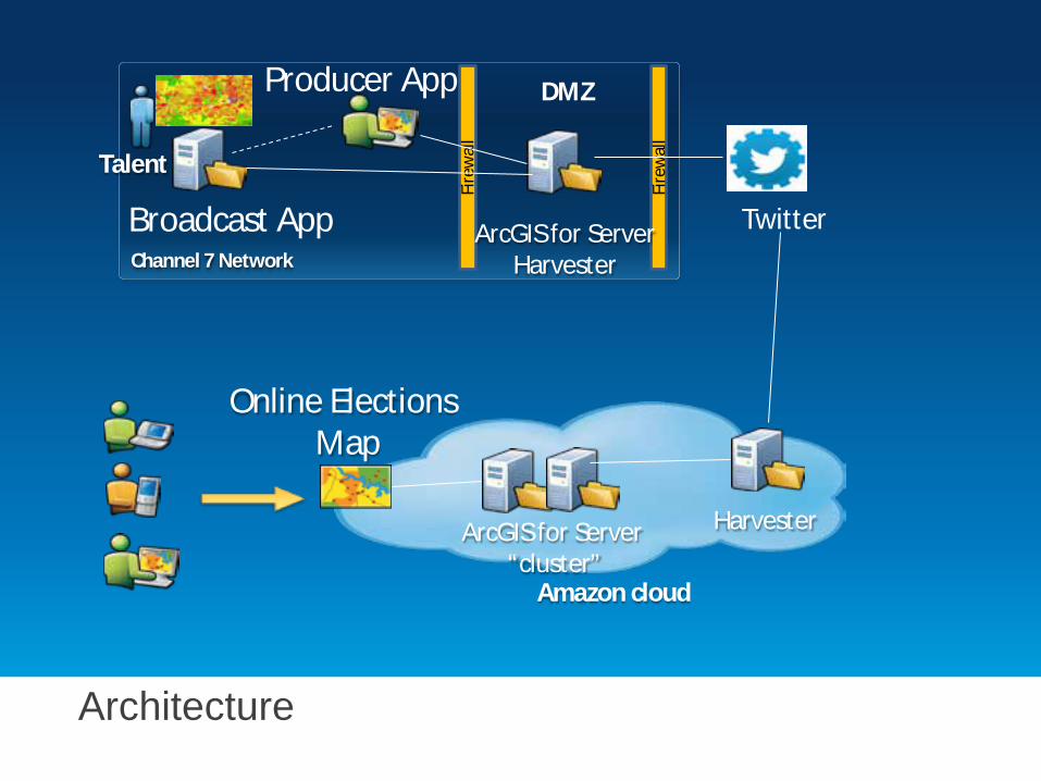
Architecture
Channel 7 Network
Producer App
Broadcast App
Fire
wal
l
Fire
wal
l
ArcGIS for Server Harvester
DMZ
ArcGIS for Server “cluster”
Harvester
Online Elections Map
Amazon cloud
Talent
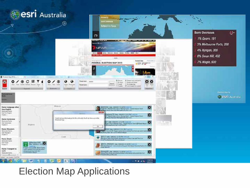
Election Map Applications
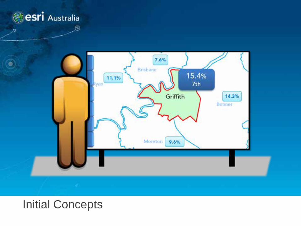
Initial Concepts
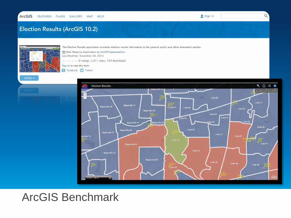
ArcGIS Benchmark
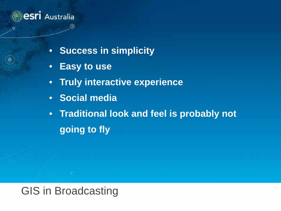
GIS in Broadcasting
• Success in simplicity • Easy to use • Truly interactive experience • Social media • Traditional look and feel is probably not
going to fly
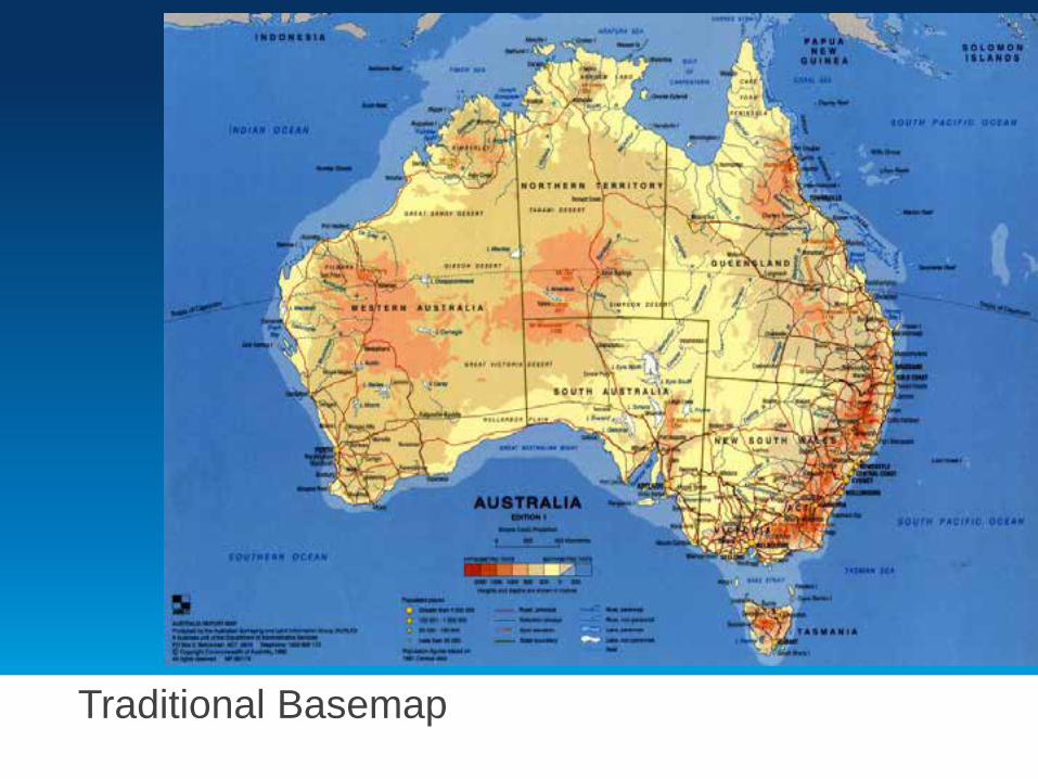
Traditional Basemap
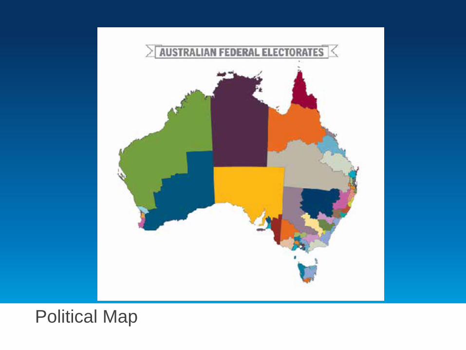
Political Map
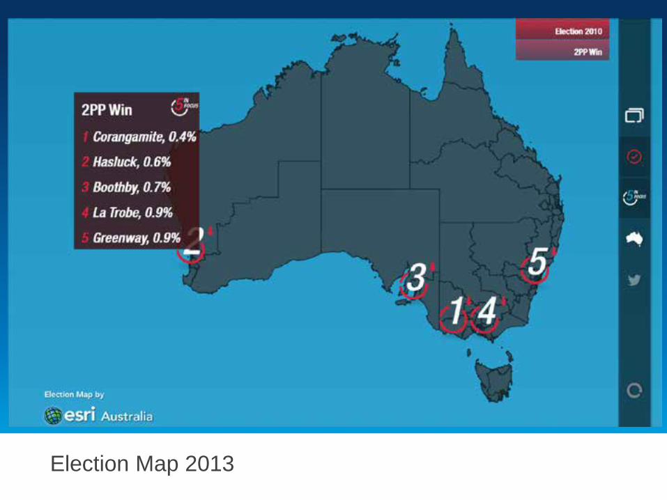
Election Map 2013
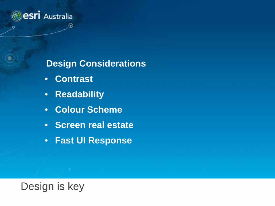
Design is key
Design Considerations • Contrast • Readability • Colour Scheme • Screen real estate • Fast UI Response
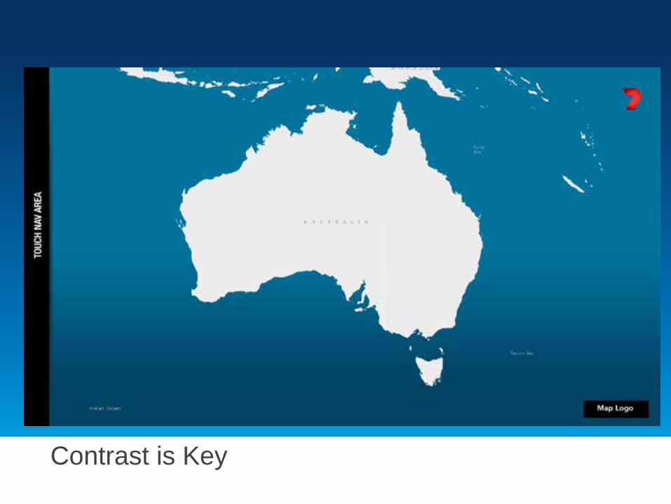
Contrast is Key
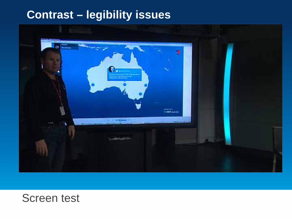
Screen test
Contrast – legibility issues
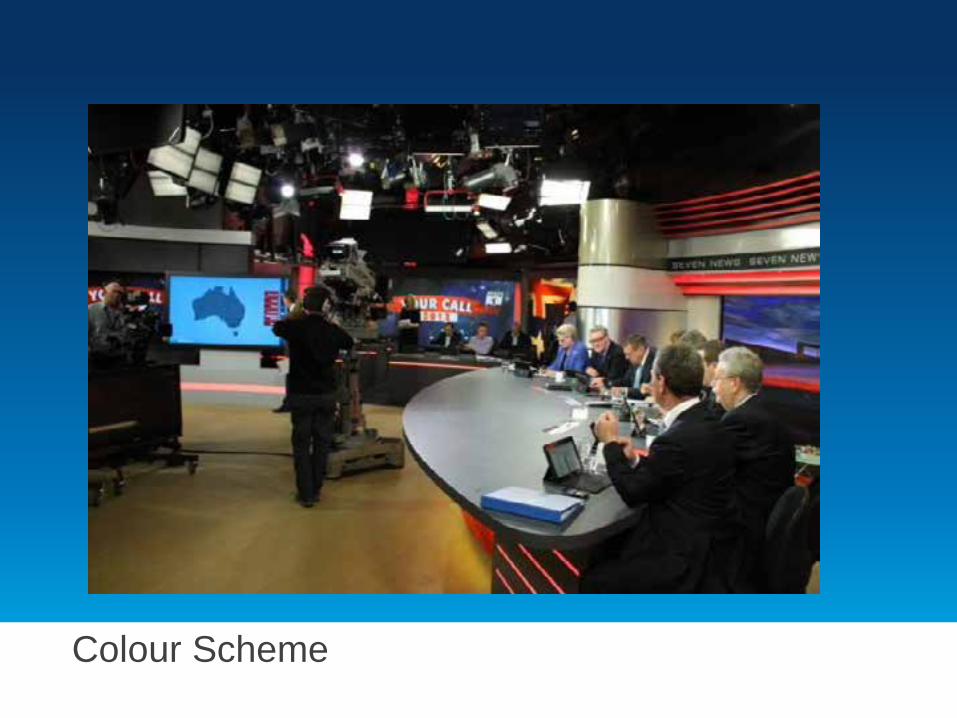
Colour Scheme
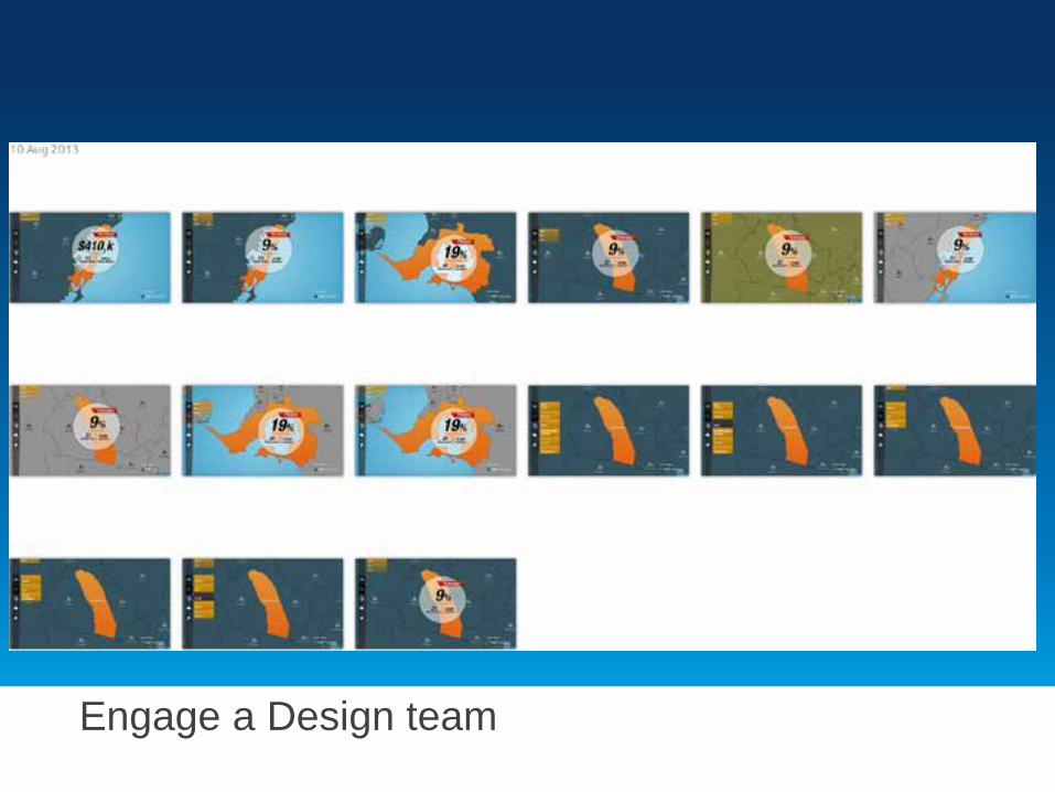
Engage a Design team
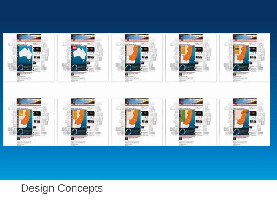
Design Concepts
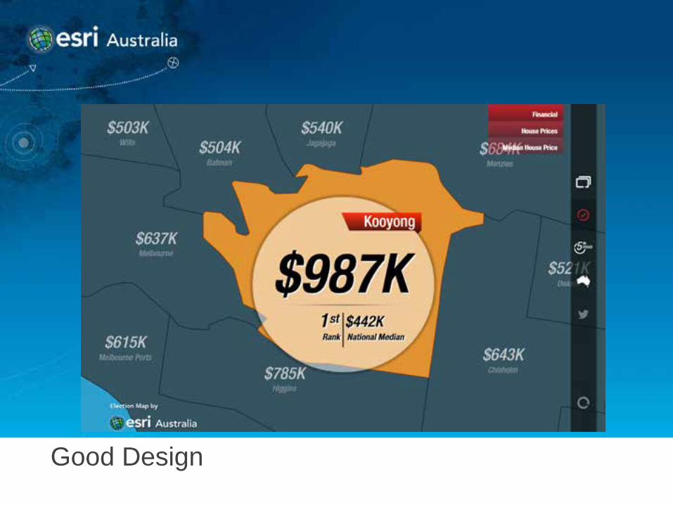
Good Design
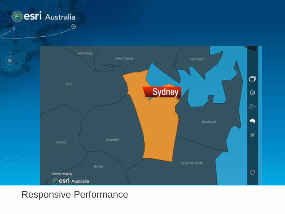
Responsive Performance
3 Weeks to go
• 3 weeks to go • Vision for the production accepted by 7 • Requirements changing regularly • All styling of the applications completed • Prototype of the Broadcast App signed off by 7 • Initial release of the Web application • Twitter stream complexities dominate the issues
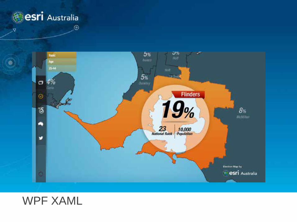
WPF XAML
· Custom style for the Electorate Info Window allowed control of show/hide animation <Style x:Key="ElectorateInfoWindowStyle" TargetType="{x:Type esri:InfoWindow}"> … … <Grid…><Grid.RenderTransform><ScaleTransform ScaleY="0" ScaleX="0"/>… <VisualState x:Name="Show"> <!—When showing appear from the centre--> <Storyboard> <!—Use a story board with double animations to animate appearance over 1.5 seconds--> <DoubleAnimationUsingKeyFrames Storyboard.TargetProperty="(UIElement.RenderTransform).(ScaleTransform.ScaleX)" …> <DiscreteDoubleKeyFrame KeyTime="0:0:0" Value="0"/> <EasingDoubleKeyFrame KeyTime="0:0:1.5" Value="1"> …
XAML Code
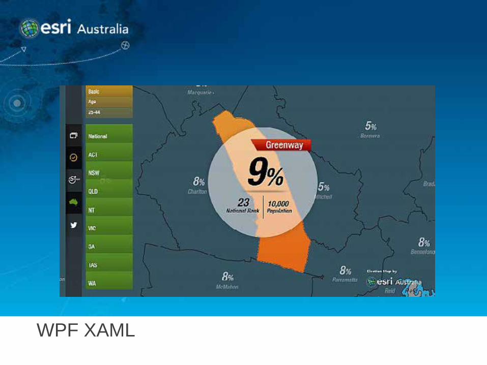
WPF XAML
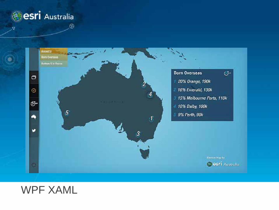
WPF XAML
XAML Code
· Create an Info Windows for electorate stats and tweets and apply custom style and templates <esri:InfoWindow x:Name="ElectorateInfoWindow" …
Style="{StaticResource ElectorateInfoWindowStyle}" ContentTemplate="{StaticResource ElectorateInfoWindowTemplate}" … />
<esri:InfoWindow x:Name="TwitterInfoWindow" …
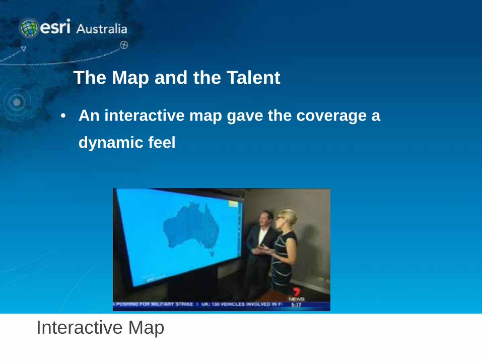
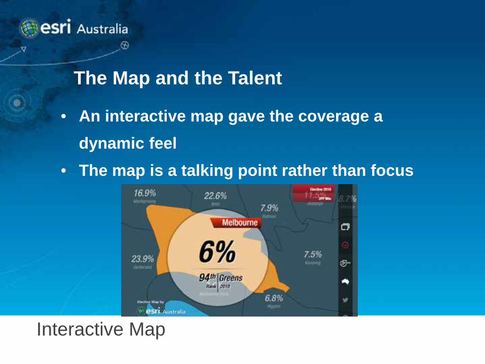
Interactive Map
The Map and the Talent
• An interactive map gave the coverage a dynamic feel
Interactive Map
The Map and the Talent
• An interactive map gave the coverage a dynamic feel
• The map is a talking point rather than focus
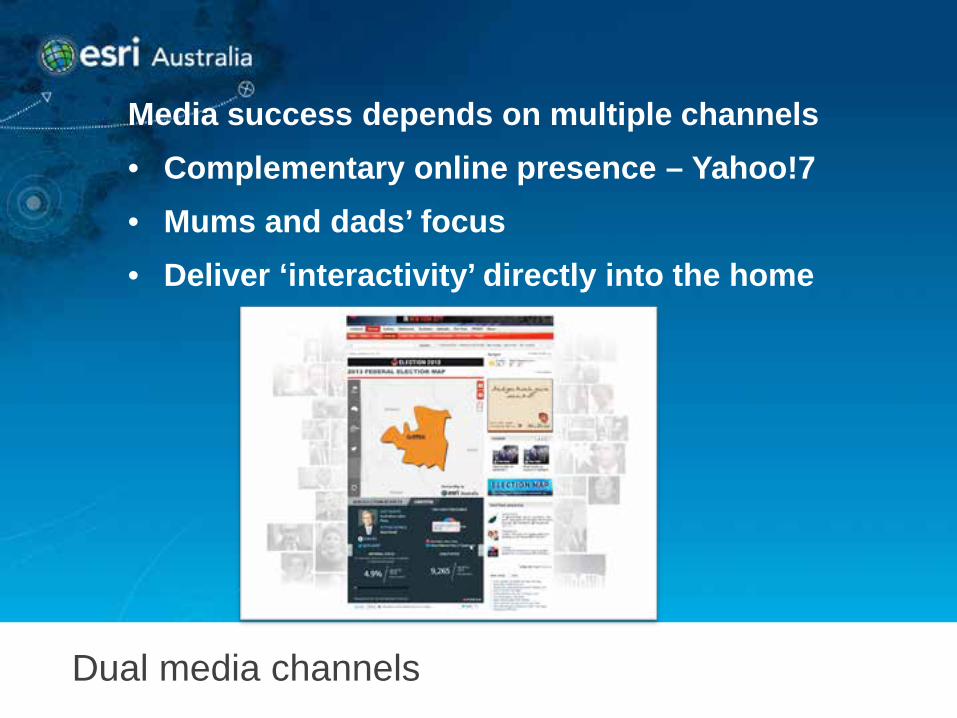
Dual media channels
Media success depends on multiple channels • Complementary online presence – Yahoo!7 • Mums and dads’ focus • Deliver ‘interactivity’ directly into the home
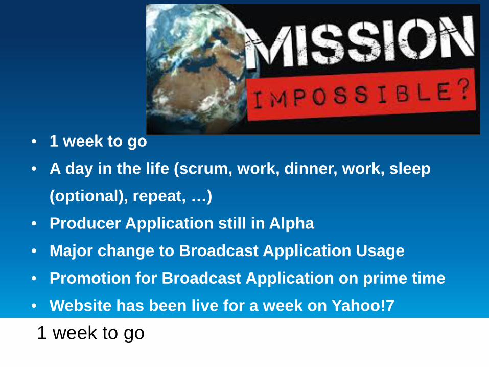
1 week to go
• 1 week to go • A day in the life (scrum, work, dinner, work, sleep
(optional), repeat, …) • Producer Application still in Alpha • Major change to Broadcast Application Usage • Promotion for Broadcast Application on prime time • Website has been live for a week on Yahoo!7
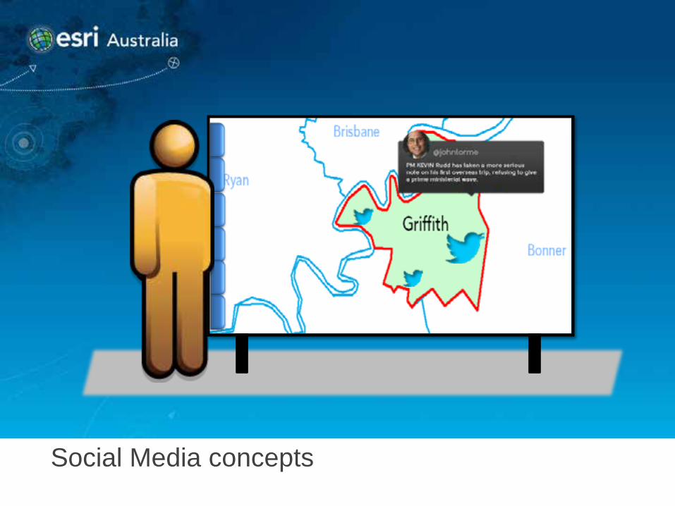
Social Media concepts
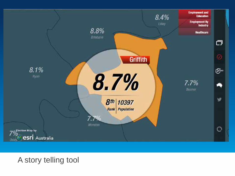
A story telling tool
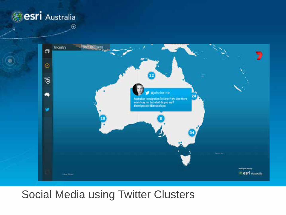
Social Media using Twitter Clusters
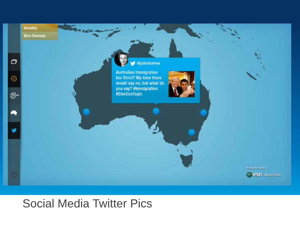
Social Media Twitter Pics
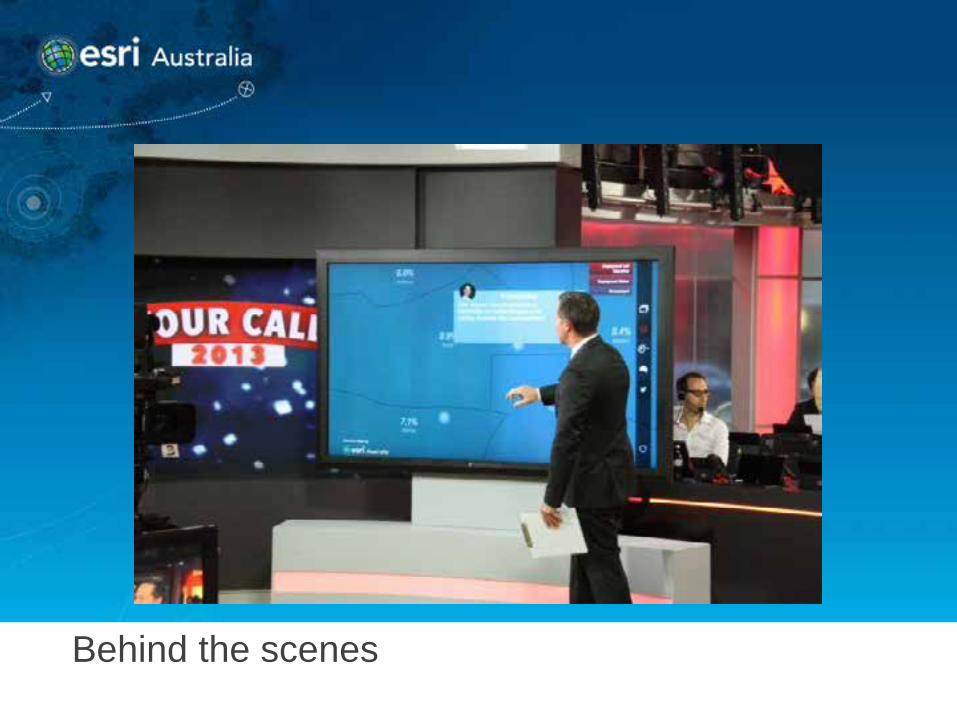
Behind the scenes
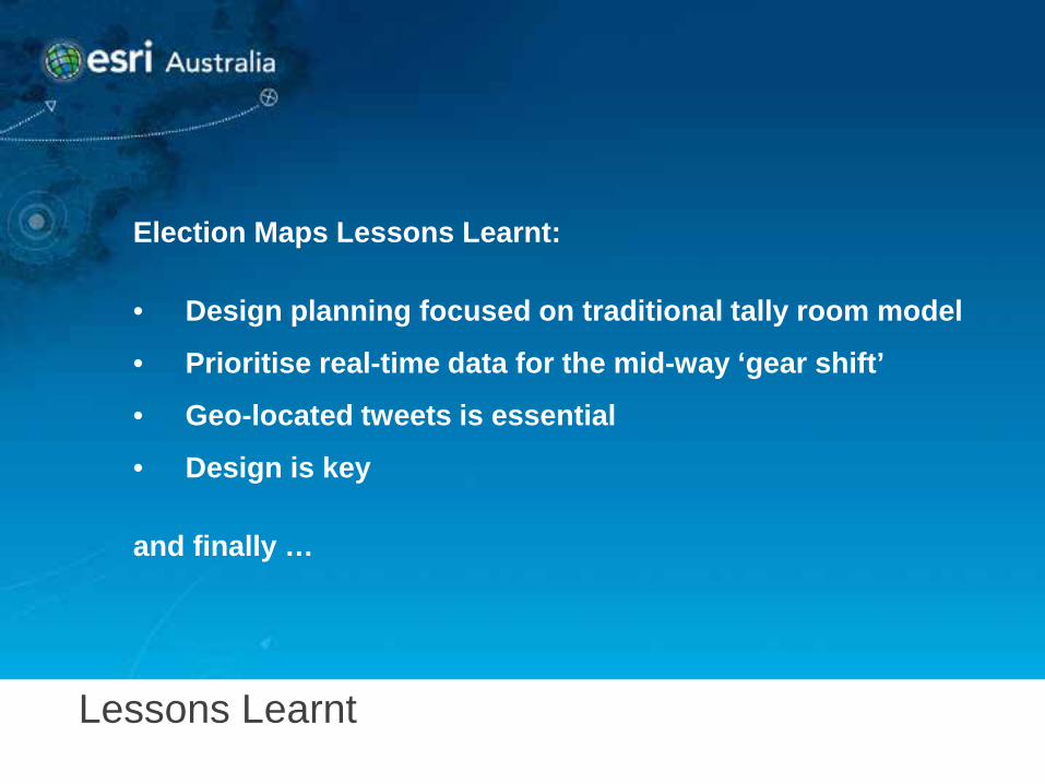
Lessons Learnt
Election Maps Lessons Learnt: • Design planning focused on traditional tally room model
• Prioritise real-time data for the mid-way ‘gear shift’
• Geo-located tweets is essential
• Design is key
and finally …

Never say never
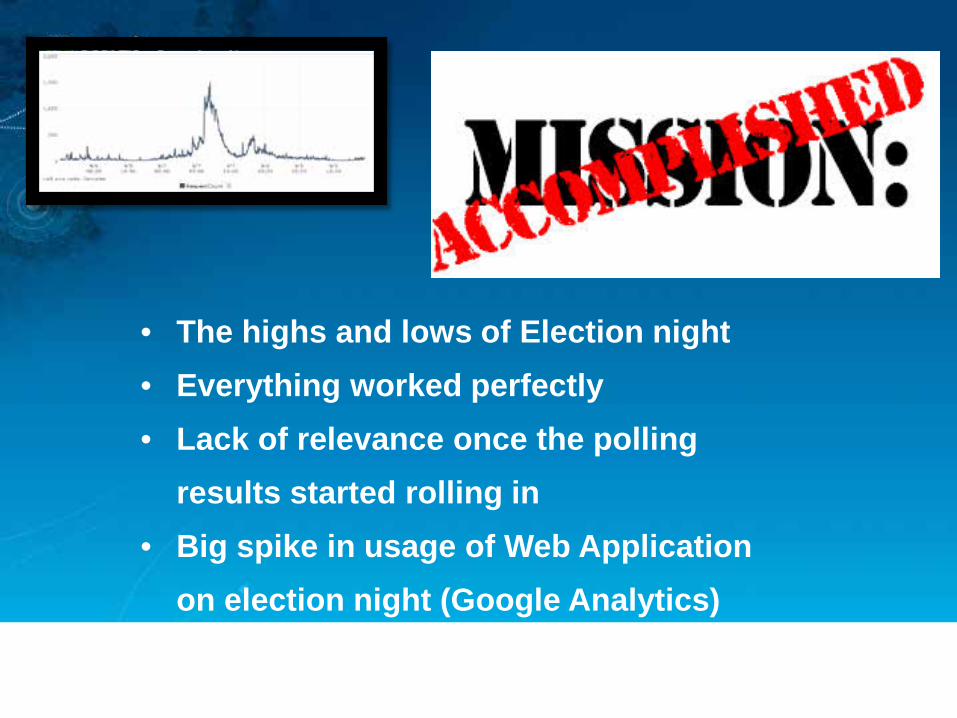
• The highs and lows of Election night • Everything worked perfectly • Lack of relevance once the polling
results started rolling in • Big spike in usage of Web Application
on election night (Google Analytics)