building accessible web components without tears
TRANSCRIPT
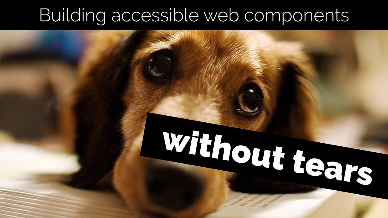
without tears
Building accessible web components

Four painful questions

Have you ever tried to navigate through your web site or
application using the keyboard only (no mouse)?
1
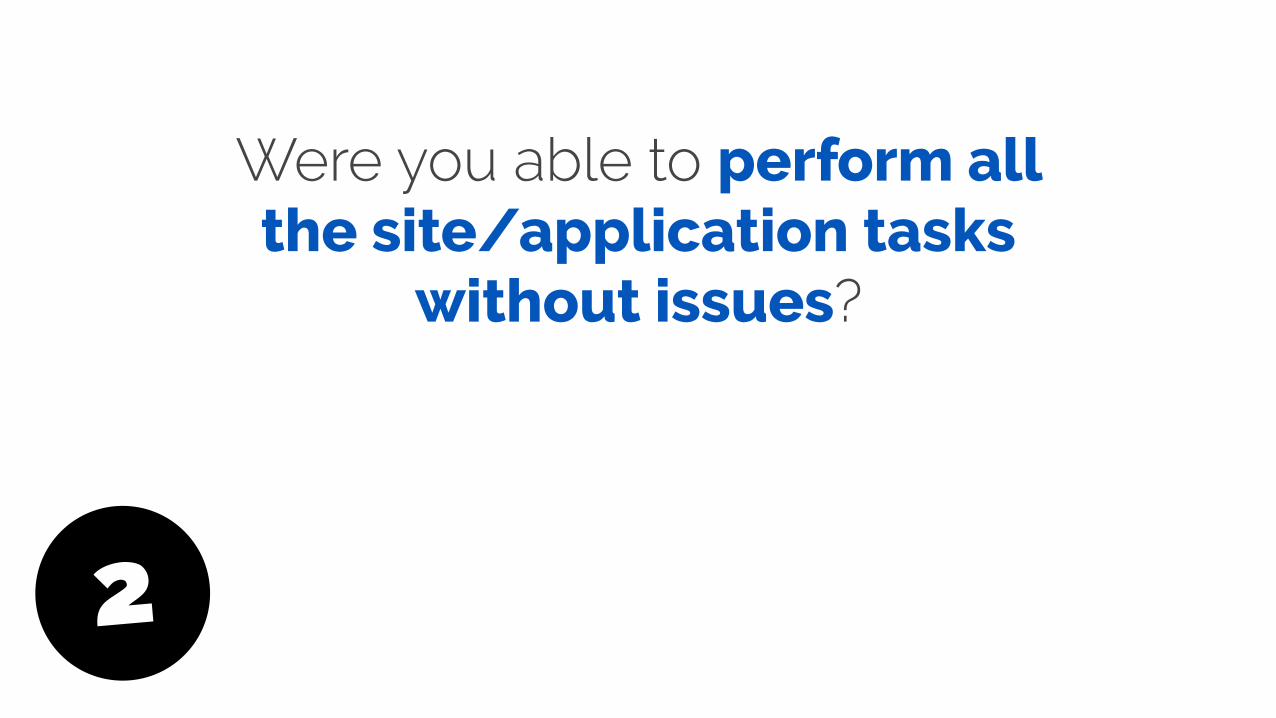
Were you able to perform all the site/application tasks
without issues?
2
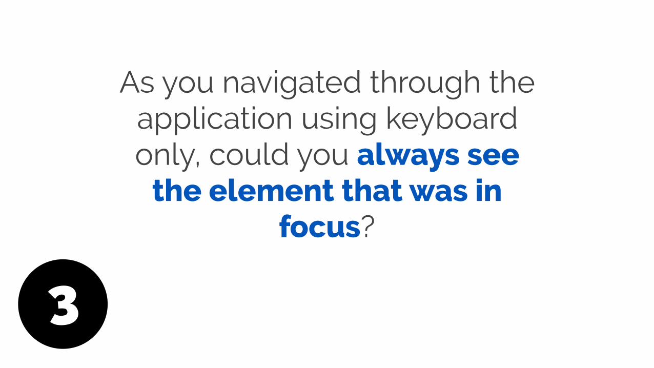
As you navigated through the application using keyboard only, could you always see
the element that was in focus?
3
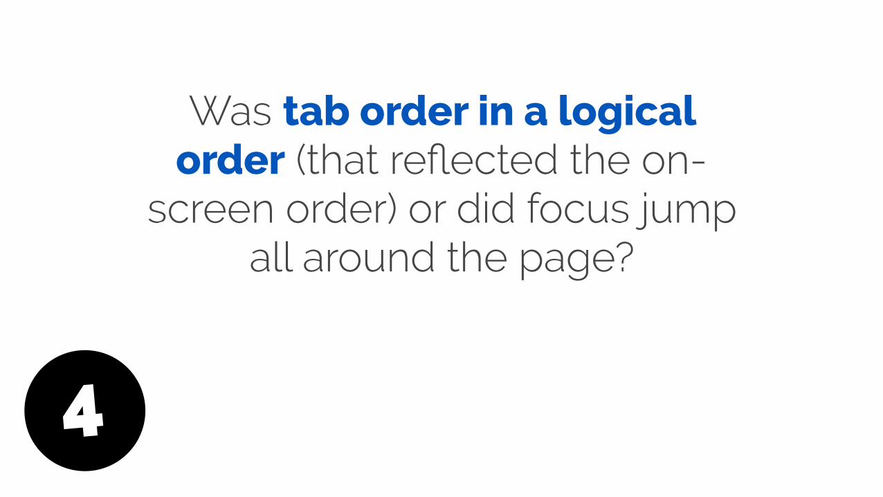
Was tab order in a logical order (that reflected the on-
screen order) or did focus jump all around the page?
4
The myth of “Full stack”

Over the last 5 years, there seems to have been
a major change in front end development.

Developers are now being asked to be fluent in all sorts of libraries and frameworks - to be “full stack” developers.
But many “full stack” developers seem to have
forgotten some of the core web principles…
Like… understanding basic HTML, CSS, accessibility, and
using progressive enhancement.

“Why can’t I wrap a span
around a div?”
Web accessibility begins with
semantic markup

https://www.flickr.com/photos/tinto/16027598548
Why should I care?

One of our core roles as web professionals is making sure
our sites /applications can be used by the widest possible
audience.
This means everyone, including people with
disabilities that include: Visual, Auditory, Motor skill and
Cognitive

This also means making our sites and apps accessible for
Assistive Technologies:

Input devices: Accessible keyboards, Track pads, Head wands, Puffers,
Switches, Touch screens, Voice activation software, etc.
Output devices: Text-based browsers, Screen
Readers, Magnifiers, Refreshable Braille Devices
etc.

Assistive Technologies are
more than just screen readers

Don’t panic!
All of this may sound time consuming and costly, but it
doesn’t have to be.
I'm going to talk about some quick things you can do to
make some common application components more
accessible.
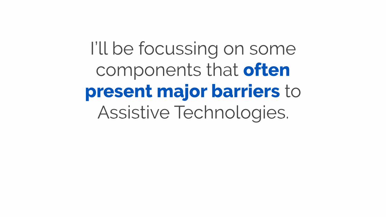
I’ll be focussing on some components that often
present major barriers to Assistive Technologies.

Online tests

I have a range of online tests available, which show how
different assistive technologies work with application
components.
http://maxdesign.com.au/jobs/sample-accessibility/

WAI ARIA
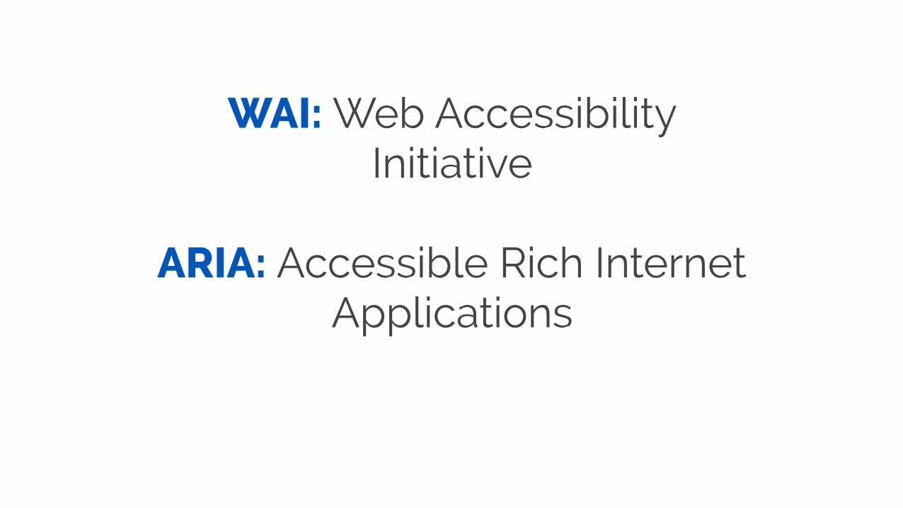
WAI: Web Accessibility Initiative
ARIA: Accessible Rich Internet Applications
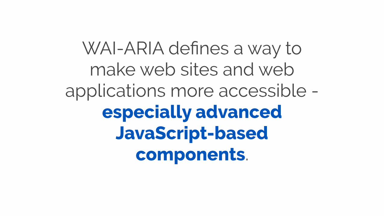
WAI-ARIA defines a way to make web sites and web
applications more accessible - especially advanced
JavaScript-based components.
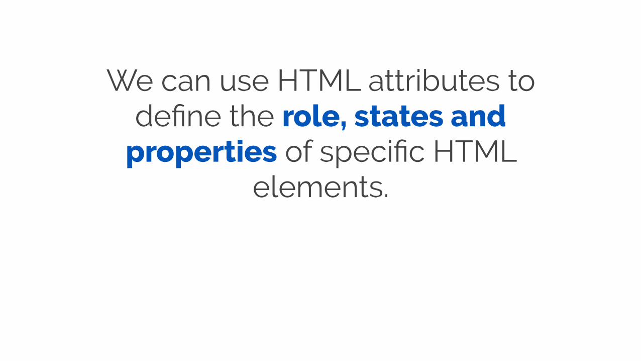
We can use HTML attributes to define the role, states and
properties of specific HTML elements.
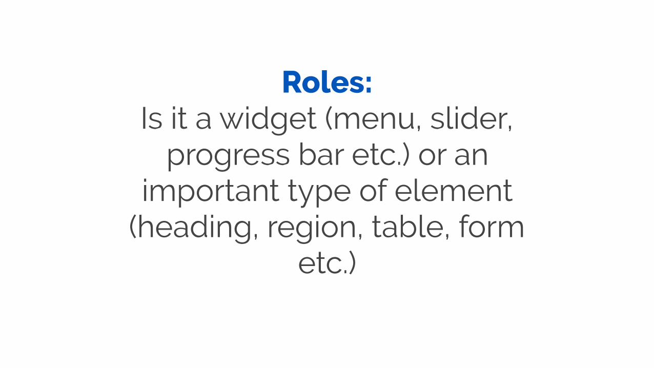
Roles: Is it a widget (menu, slider,
progress bar etc.) or an important type of element
(heading, region, table, form etc.)

<ul role="menu"> ... </ul>
<main role="main"> ... </main>
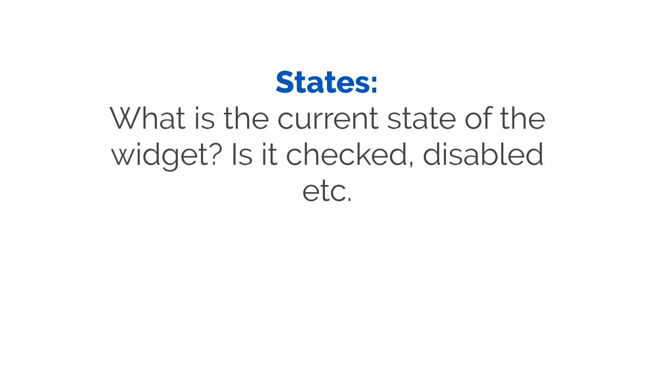
States: What is the current state of the widget? Is it checked, disabled
etc.
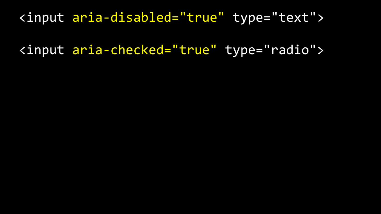
<input aria-‐disabled="true" type="text">
<input aria-‐checked="true" type="radio">
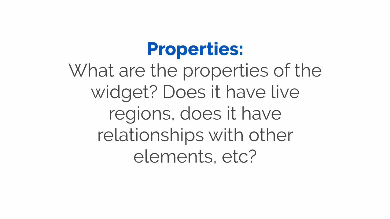
Properties: What are the properties of the
widget? Does it have live regions, does it have
relationships with other elements, etc?
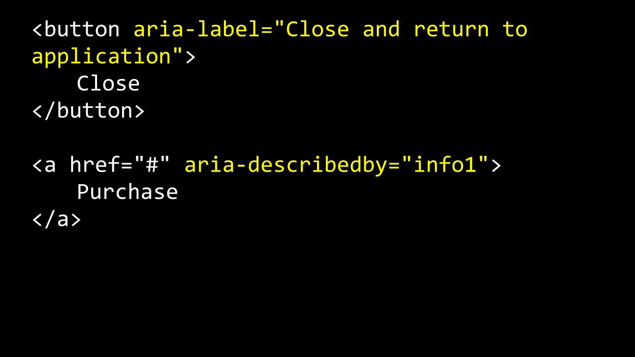
<button aria-‐label="Close and return to application"> Close </button>
<a href="#" aria-‐describedby="info1"> Purchase </a>

ARIA allows us to make specific HTML
elements more meaningful for ATs
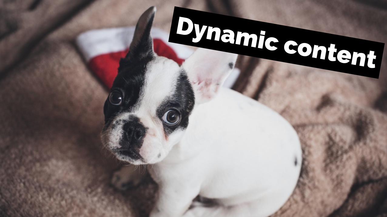
Dynamic content
The problem
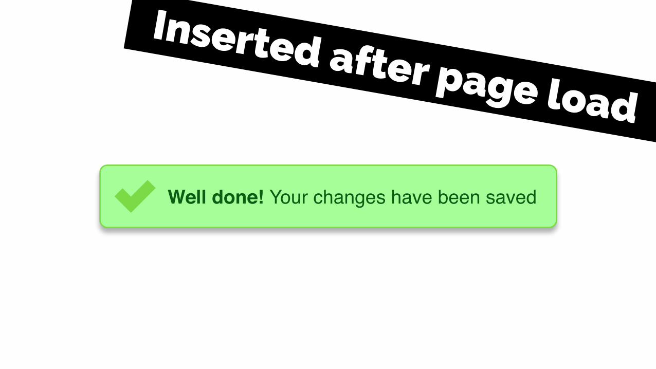
Well done! Your changes have been saved
Inserted after page load
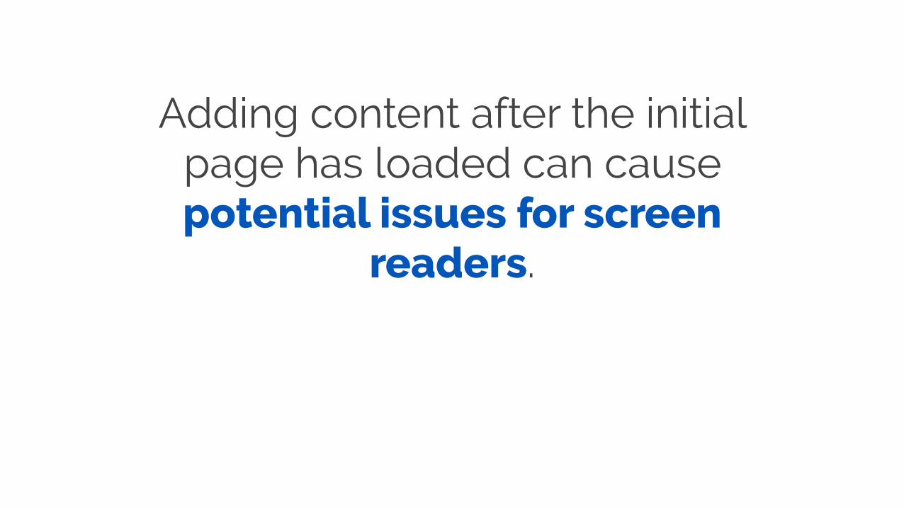
Adding content after the initial page has loaded can cause potential issues for screen
readers.
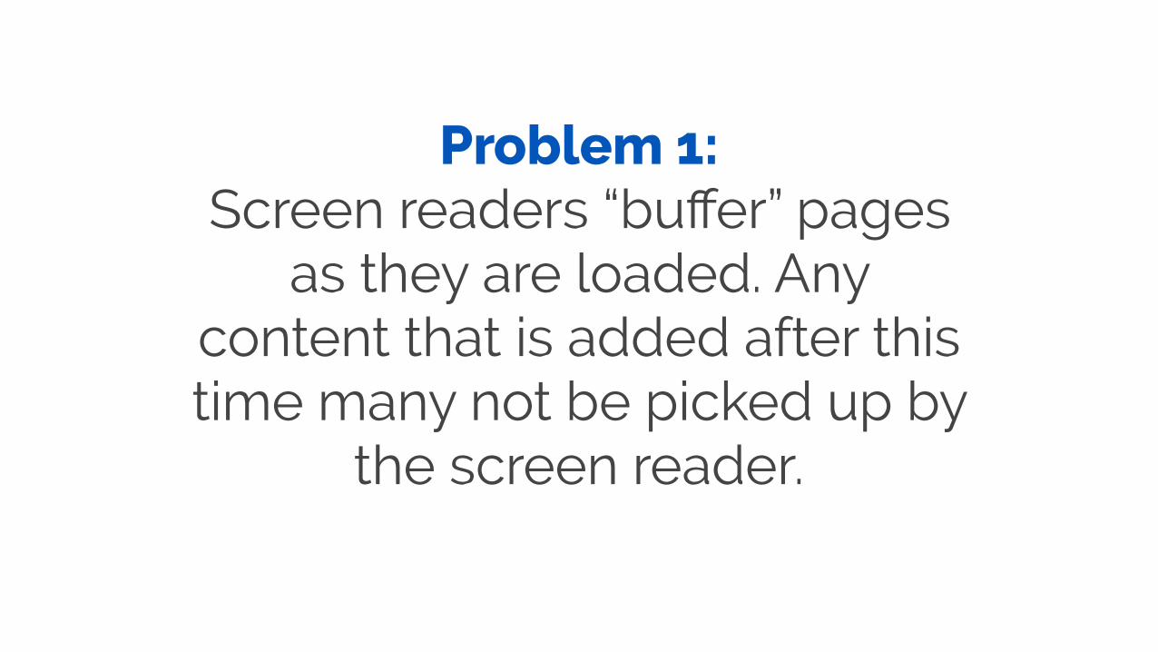
Problem 1: Screen readers “buffer” pages
as they are loaded. Any content that is added after this time many not be picked up by
the screen reader.
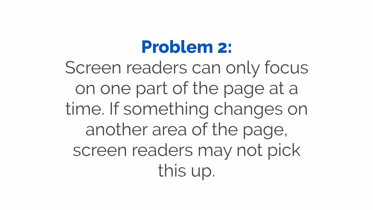
Problem 2: Screen readers can only focus
on one part of the page at a time. If something changes on
another area of the page, screen readers may not pick
this up.
A solution
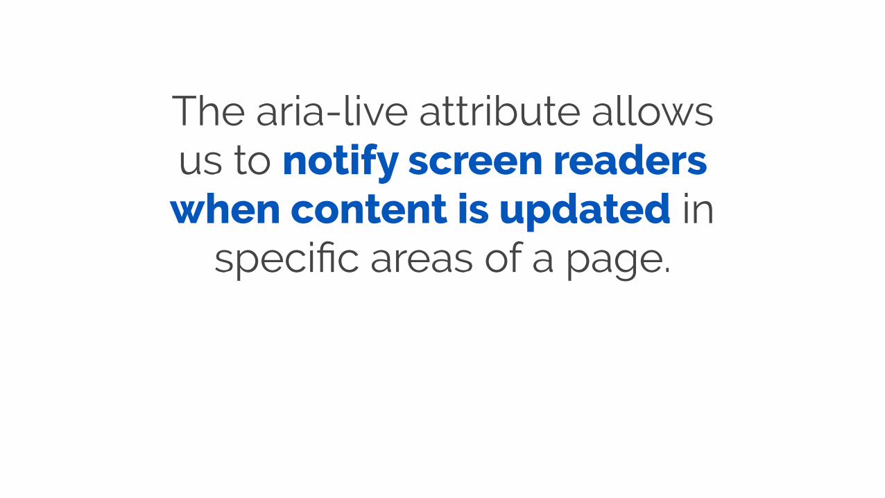
The aria-live attribute allows us to notify screen readers when content is updated in
specific areas of a page.
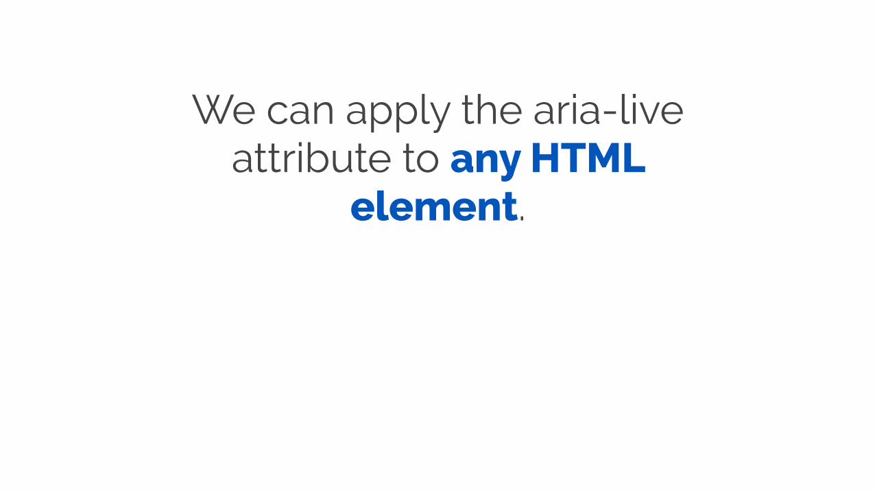
We can apply the aria-live attribute to any HTML
element.
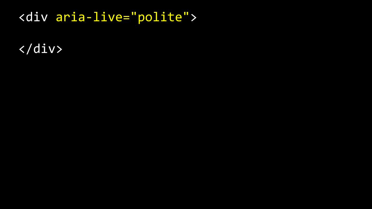
<div aria-‐live="polite">
</div>

If we then use JavaScript to inject/hide/show content within this element, screen
readers will be made aware of any DOM changes within that
element.

The aria-live attribute can be used for any page regions that are likely to get updates after
the initial page is loaded.

Success alerts! Your changes are saved
Info alerts! Some info to be aware of
Warning alerts! Something has changed
Error alerts! Fix the error and try again
Alert messages

Dynamic stock info

Sortable tables
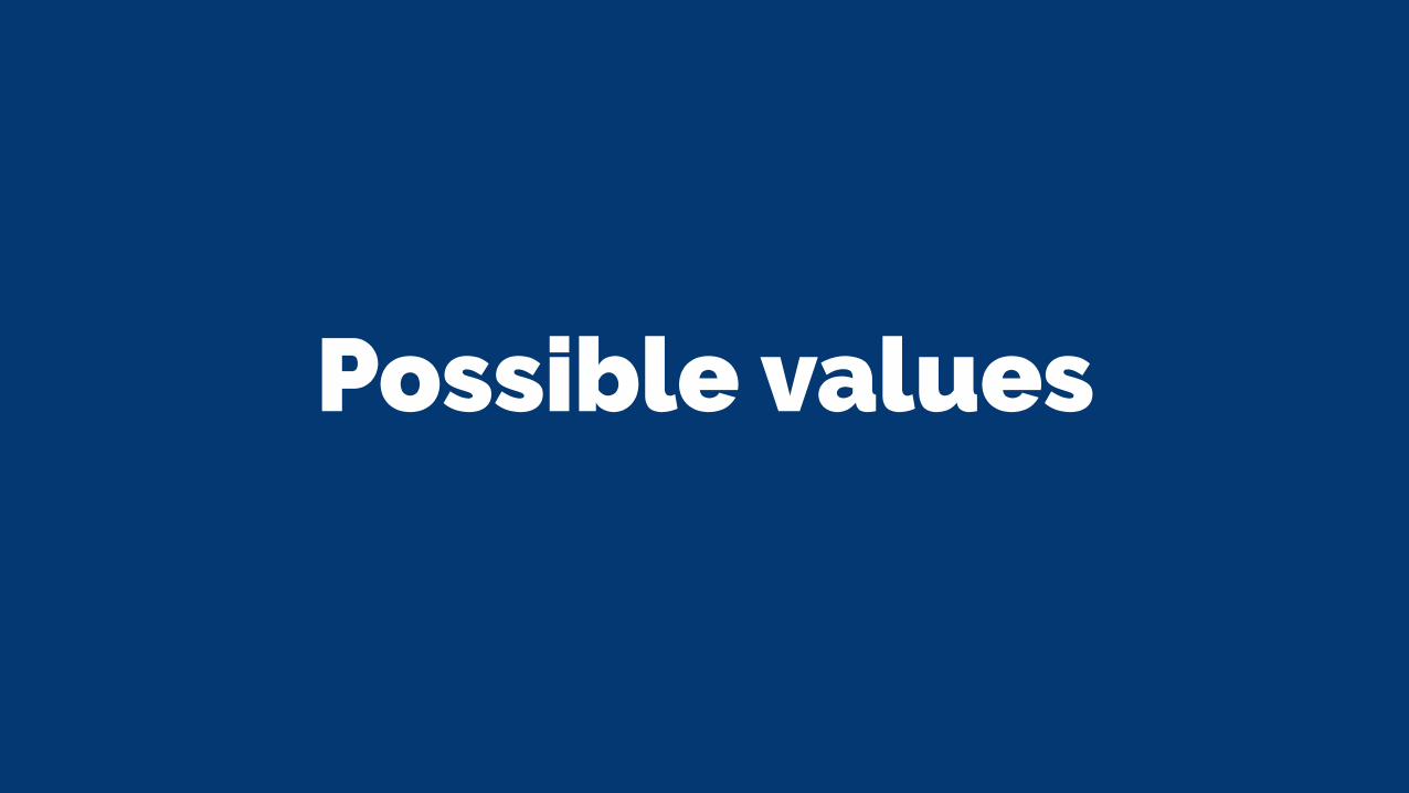
Possible values
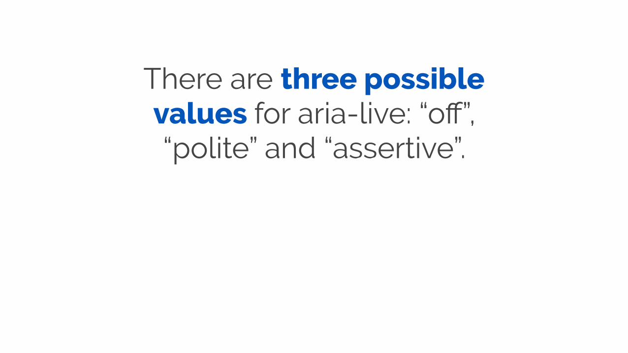
There are three possible values for aria-live: “off”, “polite” and “assertive”.
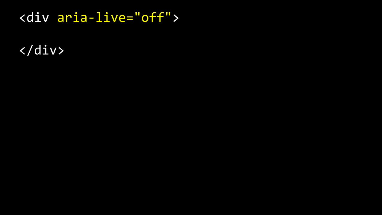
<div aria-‐live="off">
</div>

Assistive Technologies should not announce updates unless
the assistive technology is currently focused on that
region.

Should be used for information that is not
critical for users to know about immediately.

<div aria-‐live="polite">
</div>

Assistive Technologies should announce updates at the next graceful opportunity
(e.g. end of current sentence).
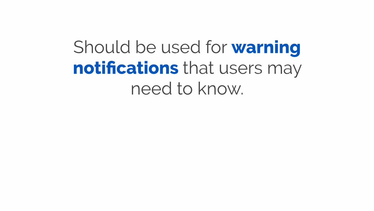
Should be used for warning notifications that users may
need to know.

<div aria-‐live="assertive">
</div>

Assistive Technologies should announce updates
immediately.
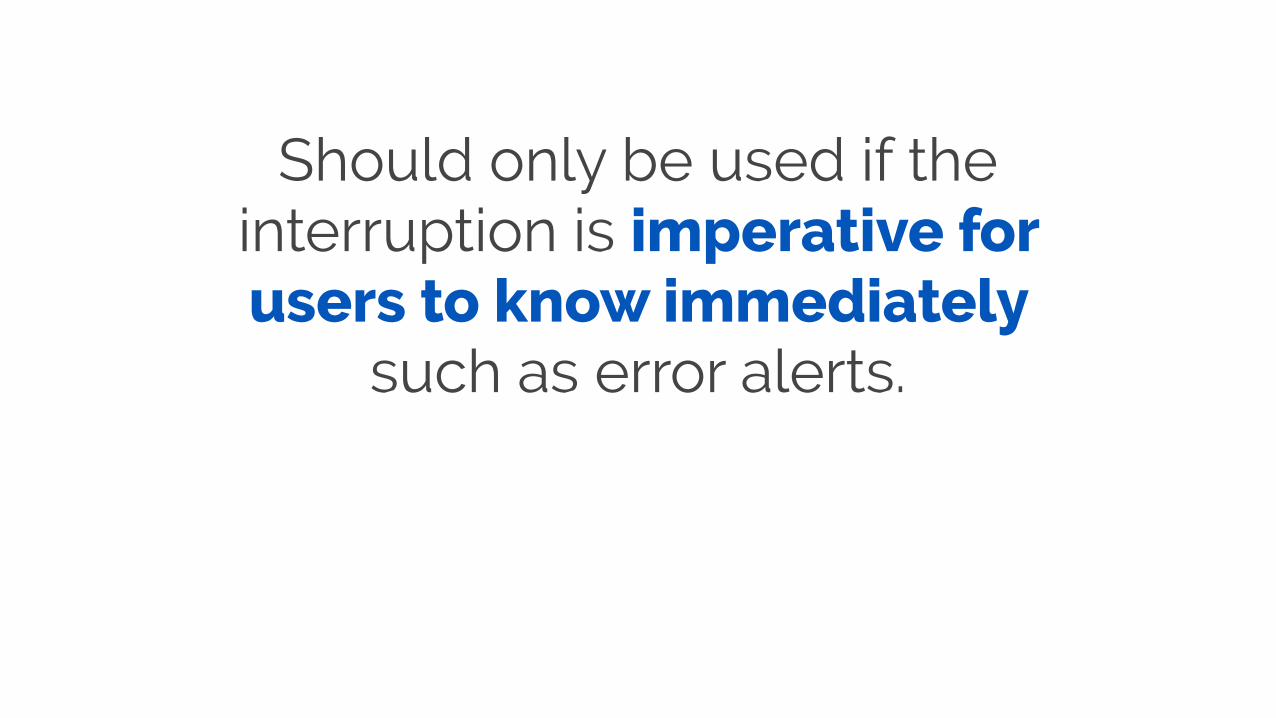
Should only be used if the interruption is imperative for users to know immediately
such as error alerts.
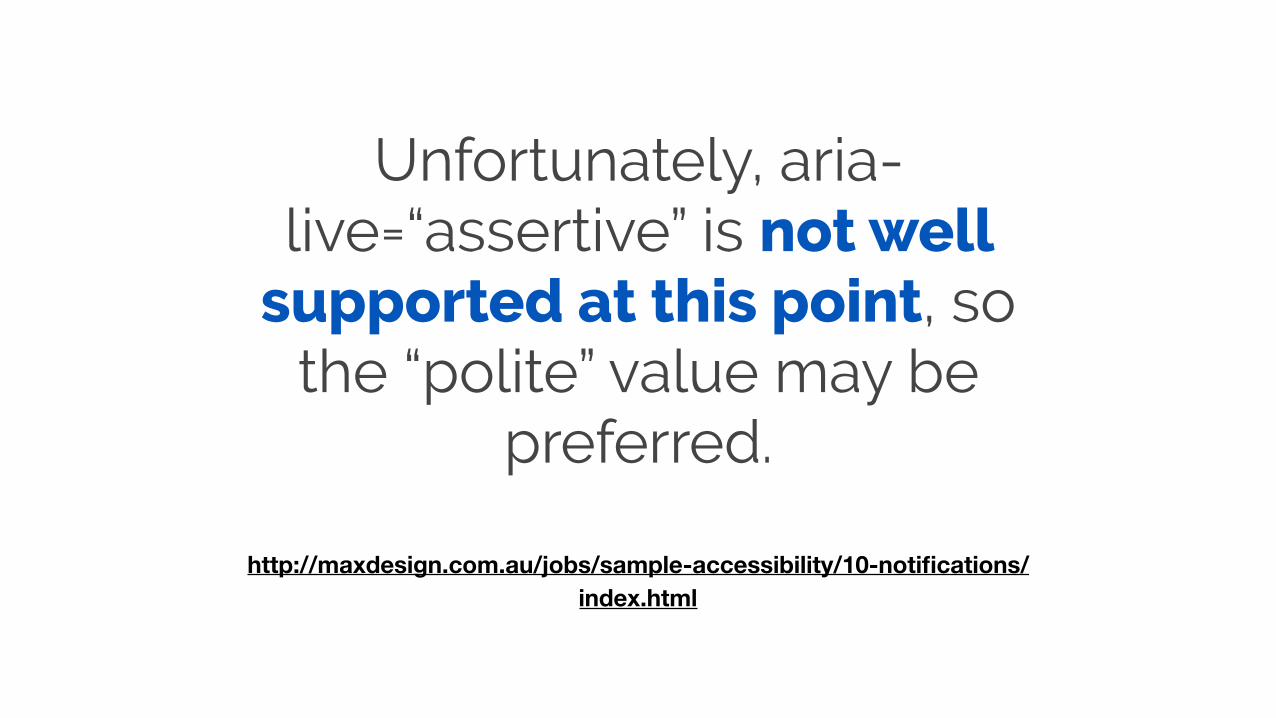
Unfortunately, aria-live=“assertive” is not well
supported at this point, so the “polite” value may be
preferred.
http://maxdesign.com.au/jobs/sample-accessibility/10-notifications/index.html

aria-relevant
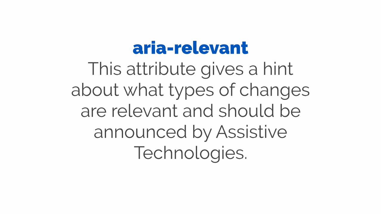
aria-relevant This attribute gives a hint
about what types of changes are relevant and should be
announced by Assistive Technologies.

<!-‐-‐ Insertion of nodes into the live region should be considered relevant -‐-‐> <div aria-‐relevant="additions"> </div>
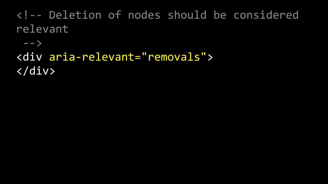
<!-‐-‐ Deletion of nodes should be considered relevant -‐-‐> <div aria-‐relevant="removals"> </div>
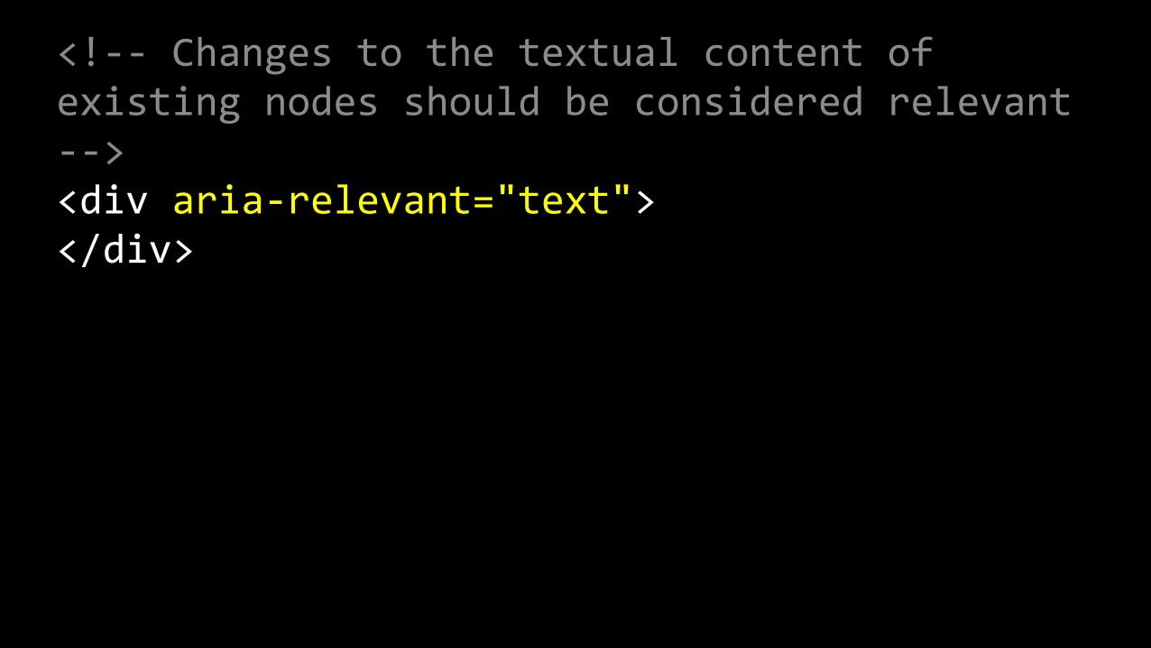
<!-‐-‐ Changes to the textual content of existing nodes should be considered relevant -‐-‐> <div aria-‐relevant="text"> </div>
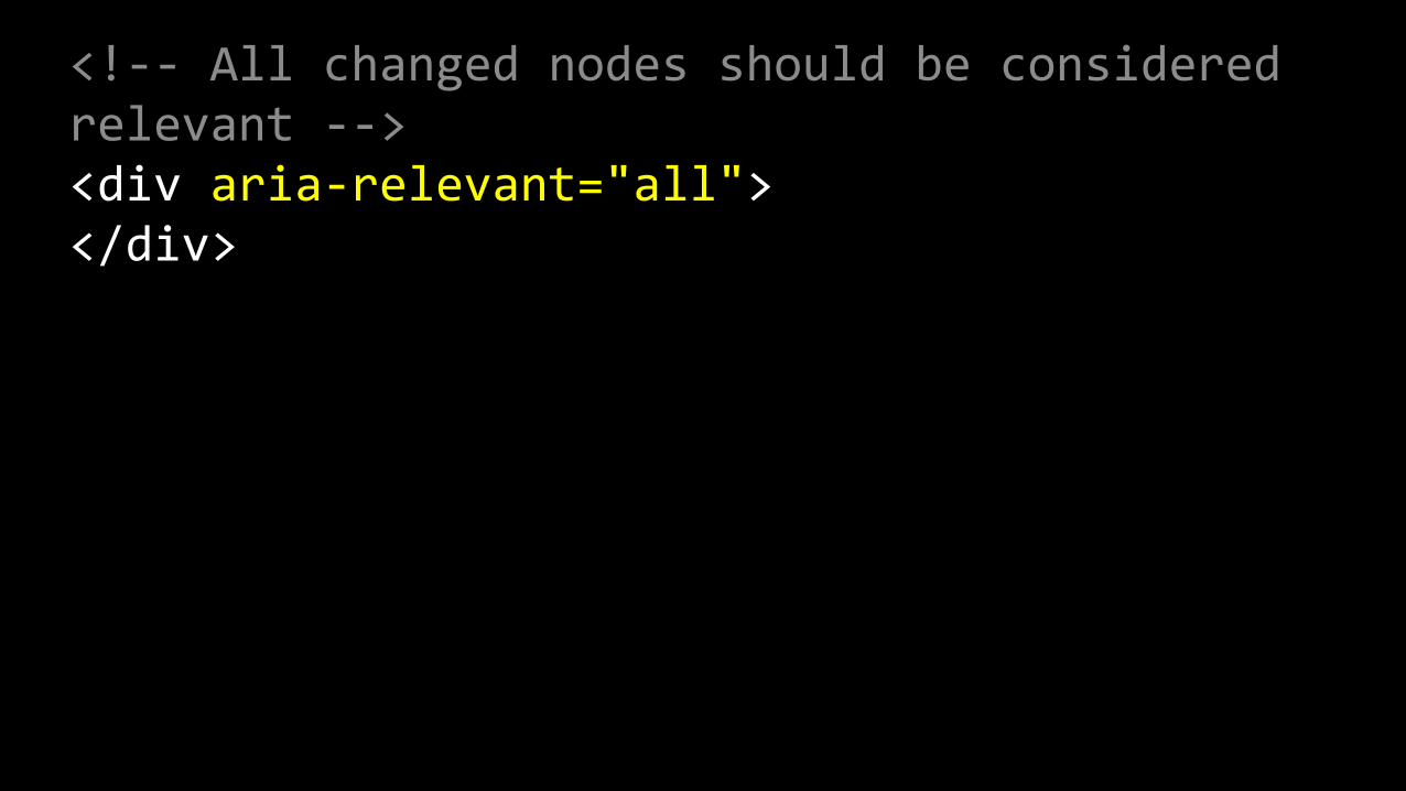
<!-‐-‐ All changed nodes should be considered relevant -‐-‐> <div aria-‐relevant="all"> </div>
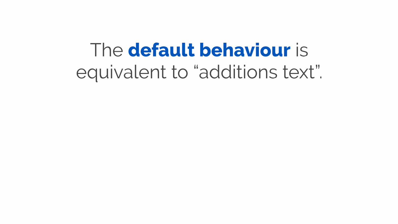
The default behaviour is equivalent to “additions text”.
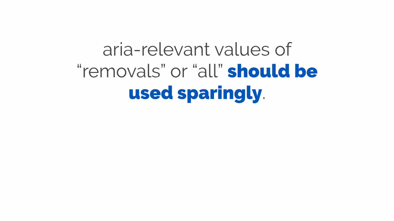
aria-relevant values of “removals” or “all” should be
used sparingly.

role=alert
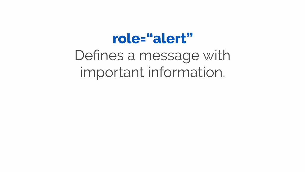
role=“alert” Defines a message with important information.
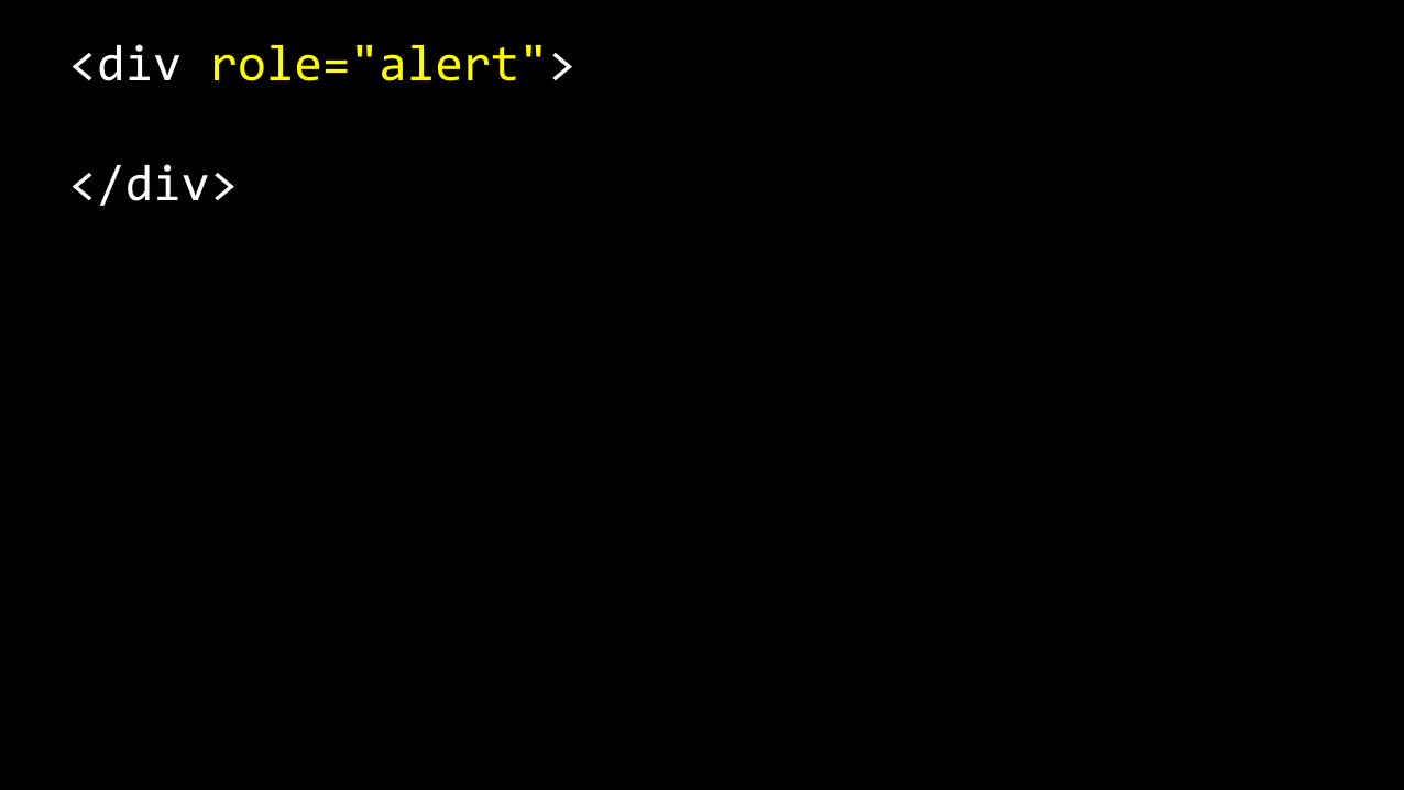
<div role="alert">
</div>

Elements with the role=“alert” have an implicit aria-live
value of “assertive”.

aria-live: easy to apply, major benefits

Accessible Errors
https://www.pexels.com/photo/animal-dog-pet-sad-7289/
Screen reader modes
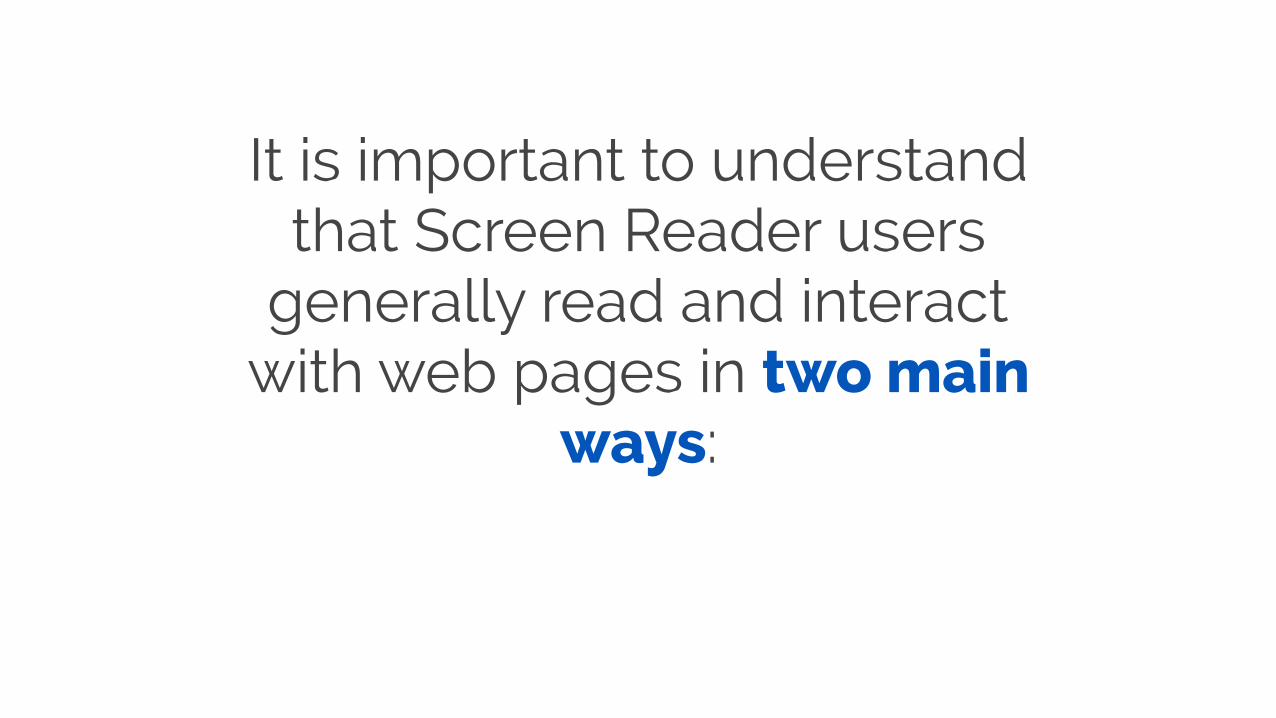
It is important to understand that Screen Reader users
generally read and interact with web pages in two main
ways:

‘Read’ mode: Users can read and navigate the page but can not enter
data into form controls.
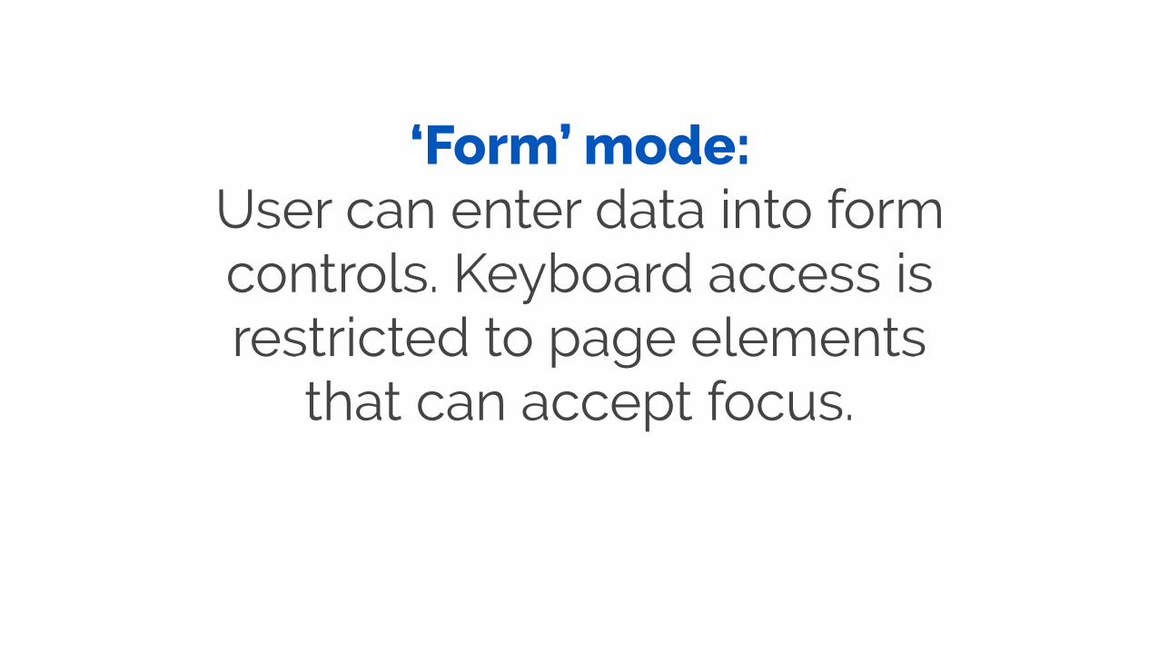
‘Form’ mode: User can enter data into form controls. Keyboard access is restricted to page elements
that can accept focus.
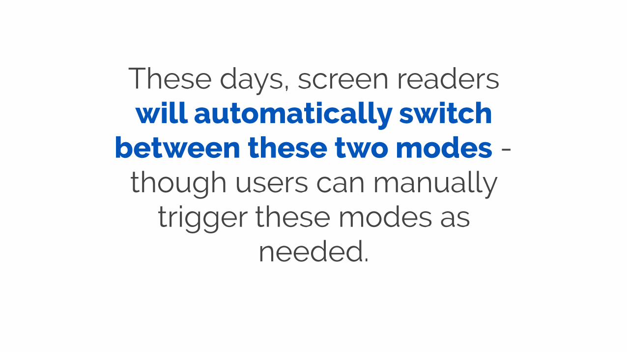
These days, screen readers will automatically switch
between these two modes - though users can manually
trigger these modes as needed.
Why do these two modes
matter?
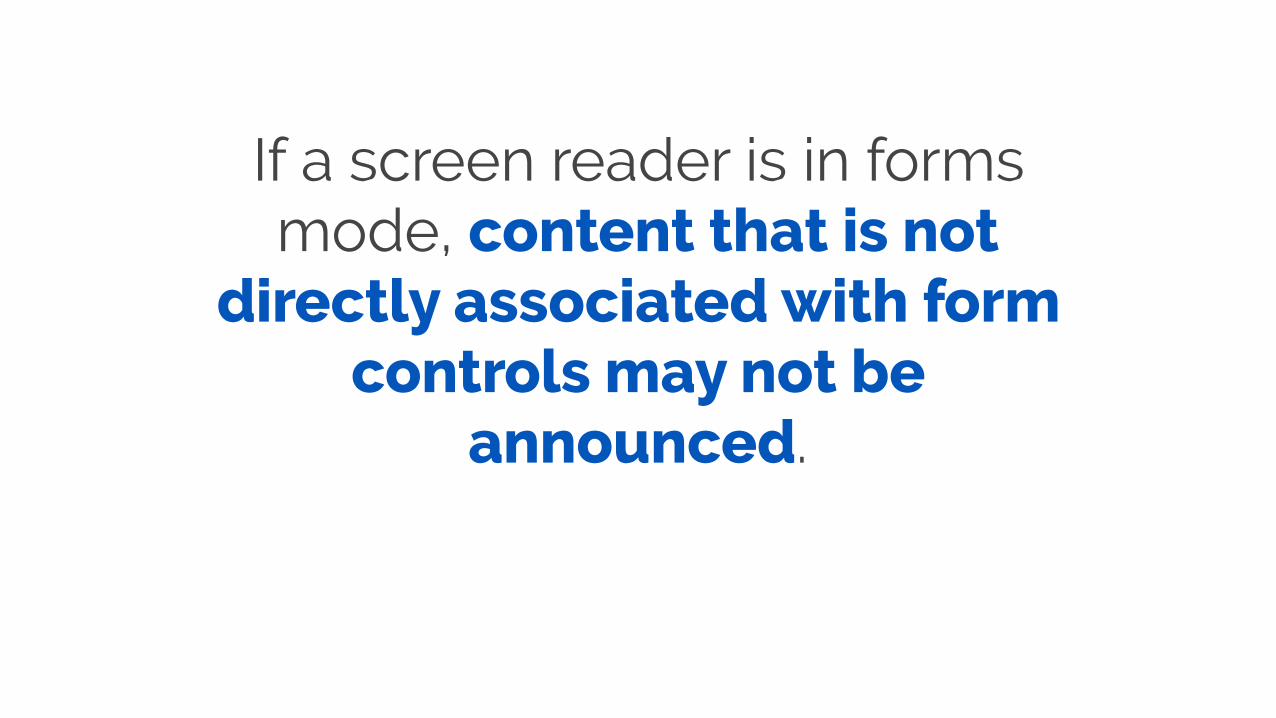
If a screen reader is in forms mode, content that is not
directly associated with form controls may not be
announced.
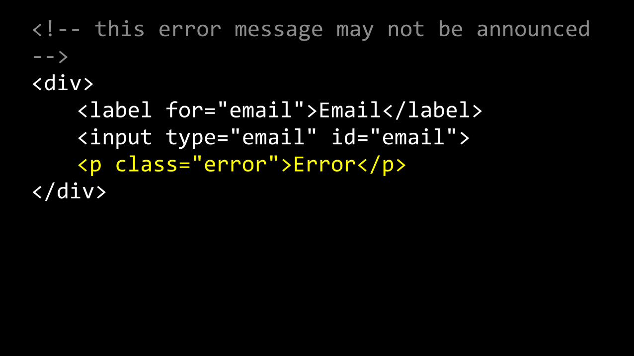
<!-‐-‐ this error message may not be announced -‐-‐> <div> <label for="email">Email</label> <input type="email" id="email"> <p class="error">Error</p> </div>
Types of form validation
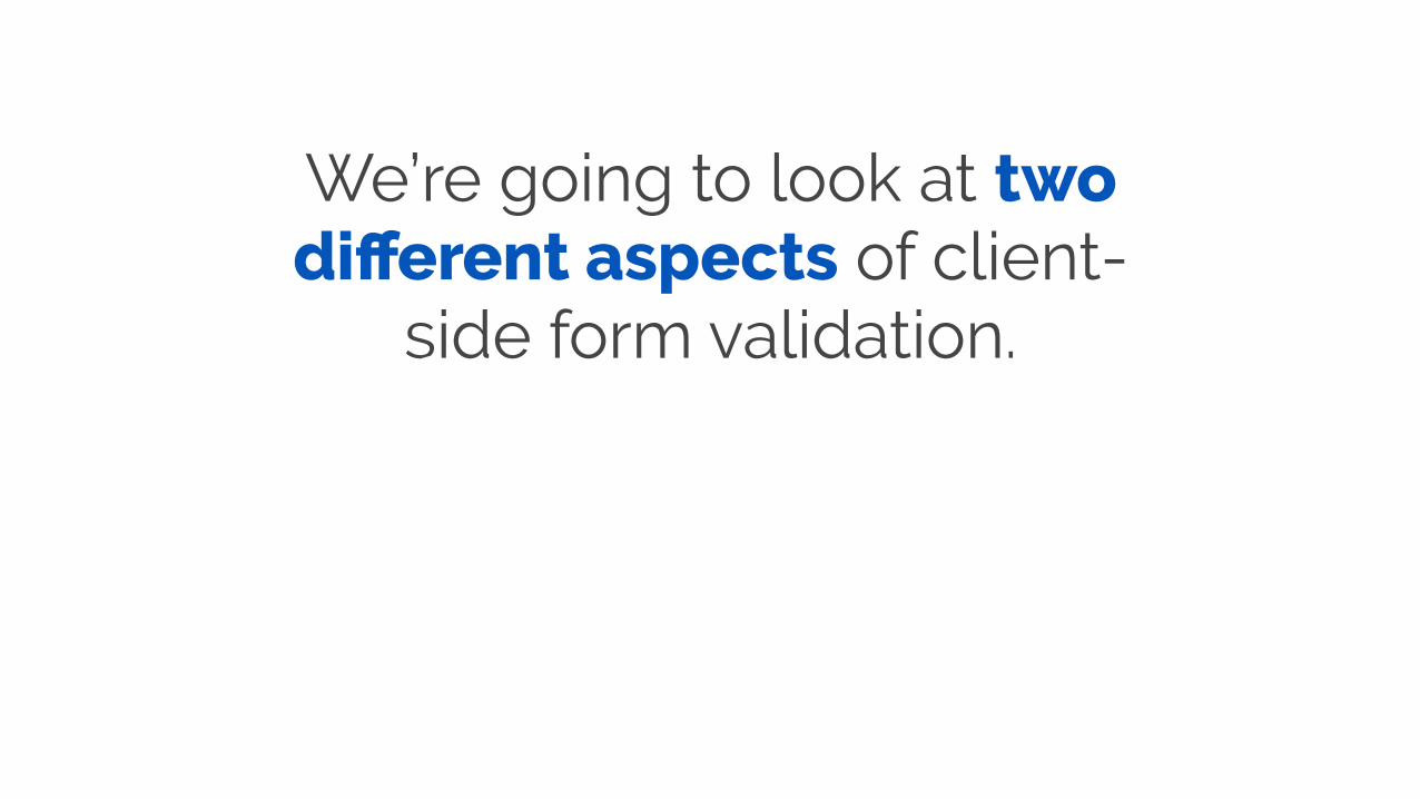
We’re going to look at two different aspects of client-
side form validation.
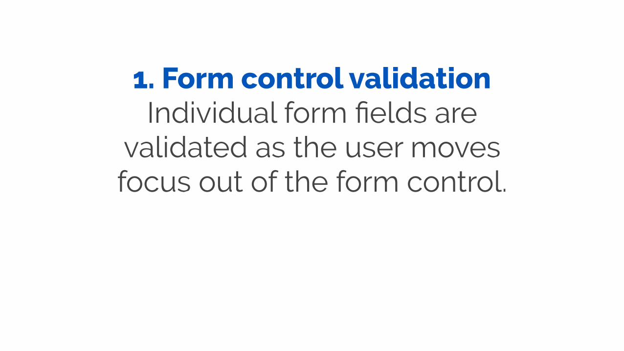
1. Form control validation Individual form fields are
validated as the user moves focus out of the form control.
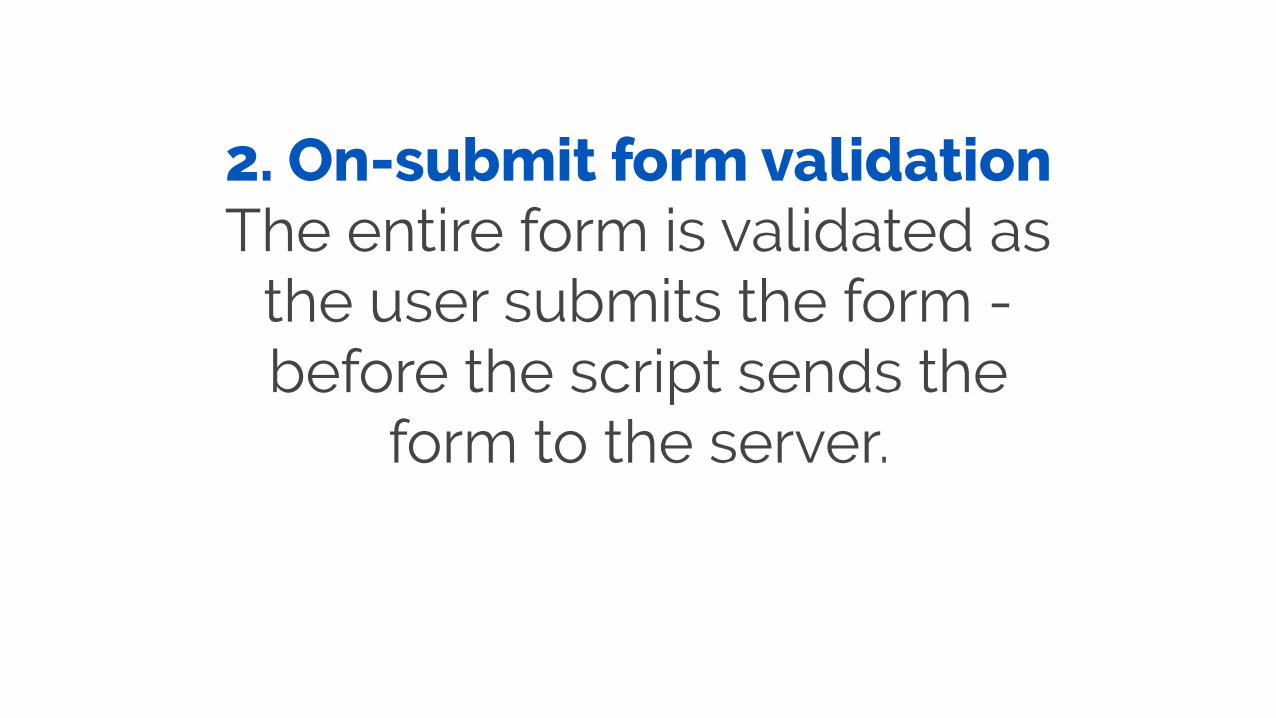
2. On-submit form validation The entire form is validated as
the user submits the form - before the script sends the
form to the server.

The problem
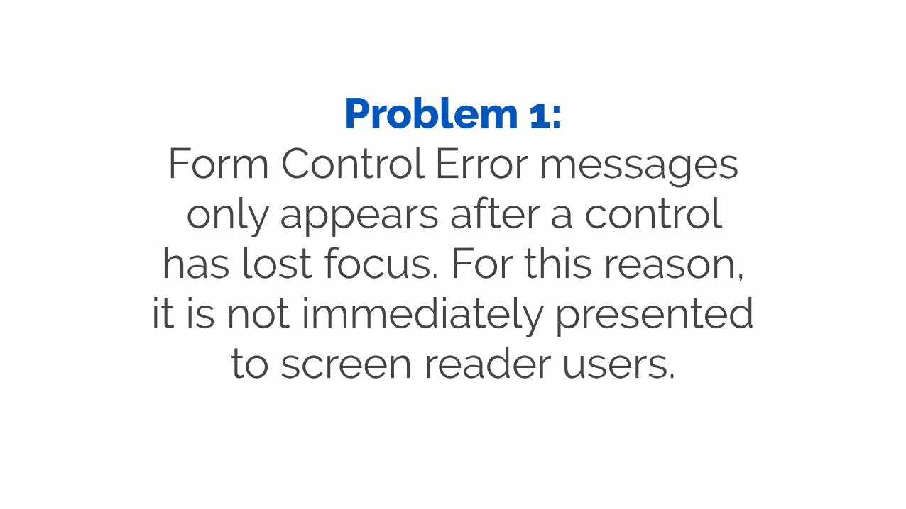
Problem 1: Form Control Error messages only appears after a control
has lost focus. For this reason, it is not immediately presented
to screen reader users.
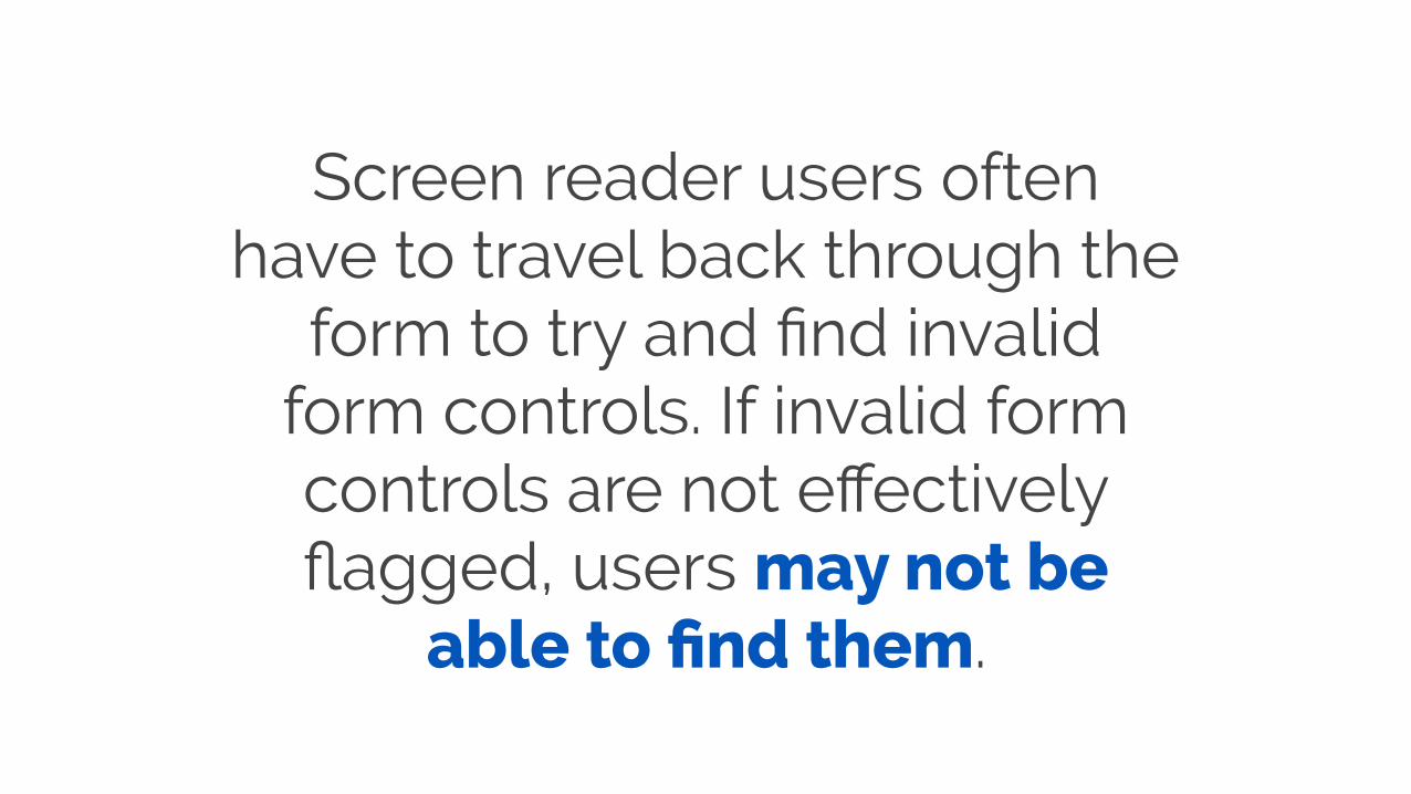
Screen reader users often have to travel back through the
form to try and find invalid form controls. If invalid form controls are not effectively flagged, users may not be
able to find them.

Problem 2: Screen reader users are often not informed that the overall
form contains errors.

In the worst cases, focus remains on the form submit button, even after the form
has been found to be invalid, and screen reader users have
no idea why the form won’t submit.
A solution for form control validation
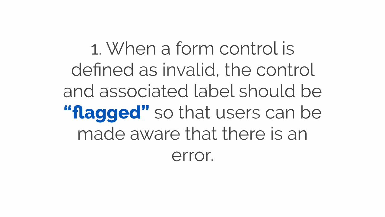
1. When a form control is defined as invalid, the control
and associated label should be “flagged” so that users can be
made aware that there is an error.
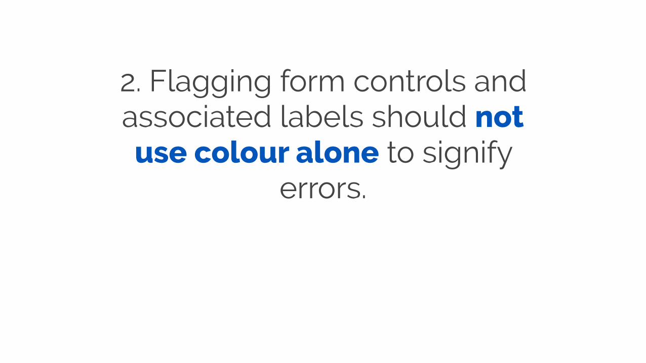
2. Flagging form controls and associated labels should not use colour alone to signify
errors.
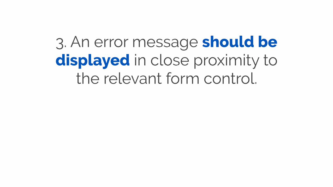
3. An error message should be displayed in close proximity to
the relevant form control.

Error: The phone number must include a 10 digit number
Phone
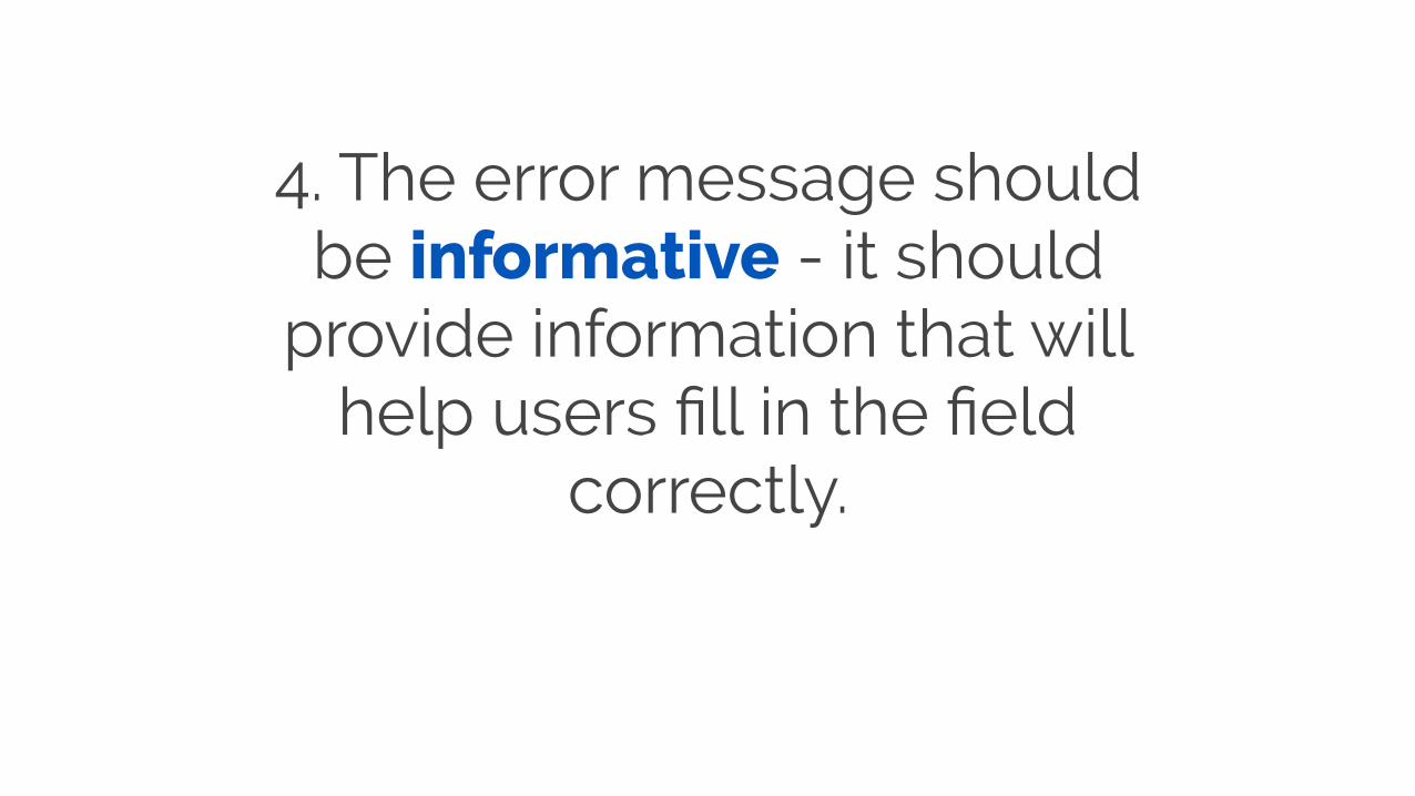
4. The error message should be informative - it should
provide information that will help users fill in the field
correctly.

5. The error message should be programmatically
associated with the form control.
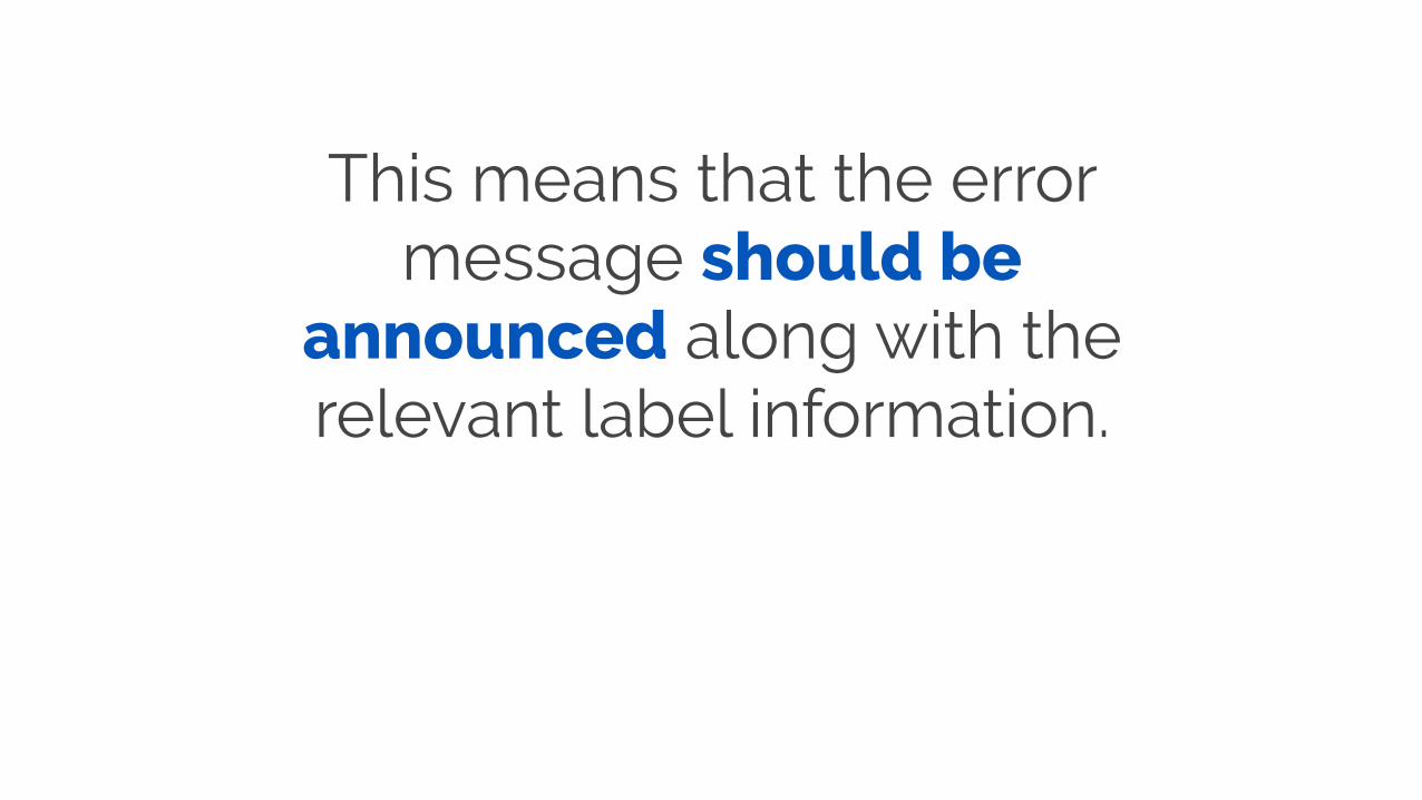
This means that the error message should be
announced along with the relevant label information.
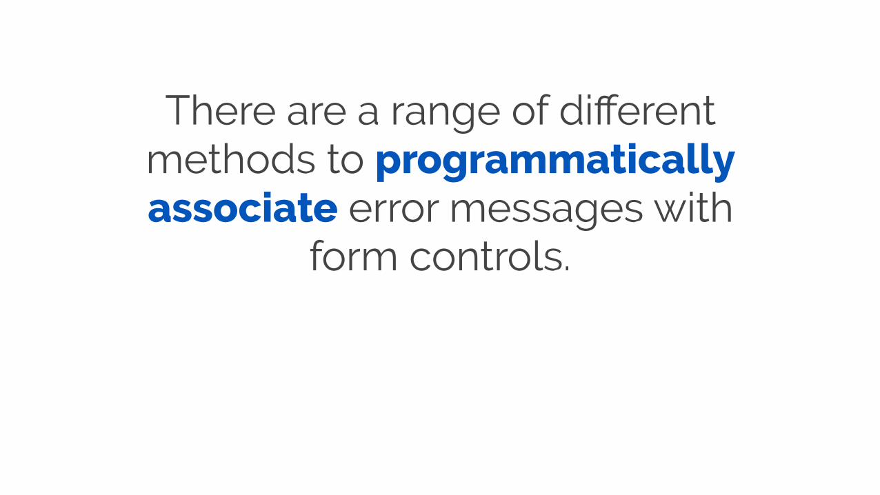
There are a range of different methods to programmatically associate error messages with
form controls.
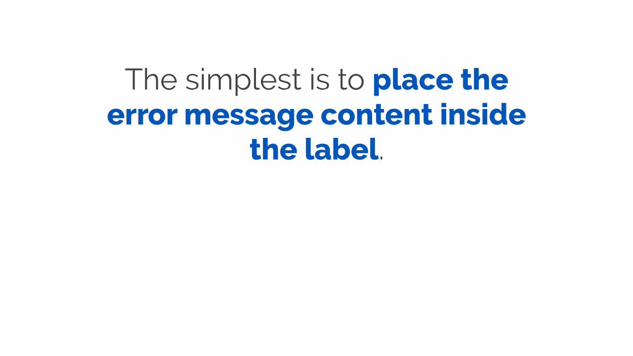
The simplest is to place the error message content inside
the label.

<div> <label for="email"> Email <input type="email" id="email"> <span class="error">Error</span> </label> </div>
A solution for on-submit
form validation
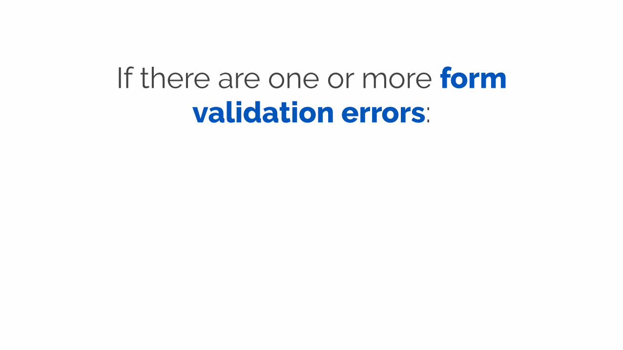
If there are one or more form validation errors:

1. An error message should appear at the top of the form alerting users that there are
errors.
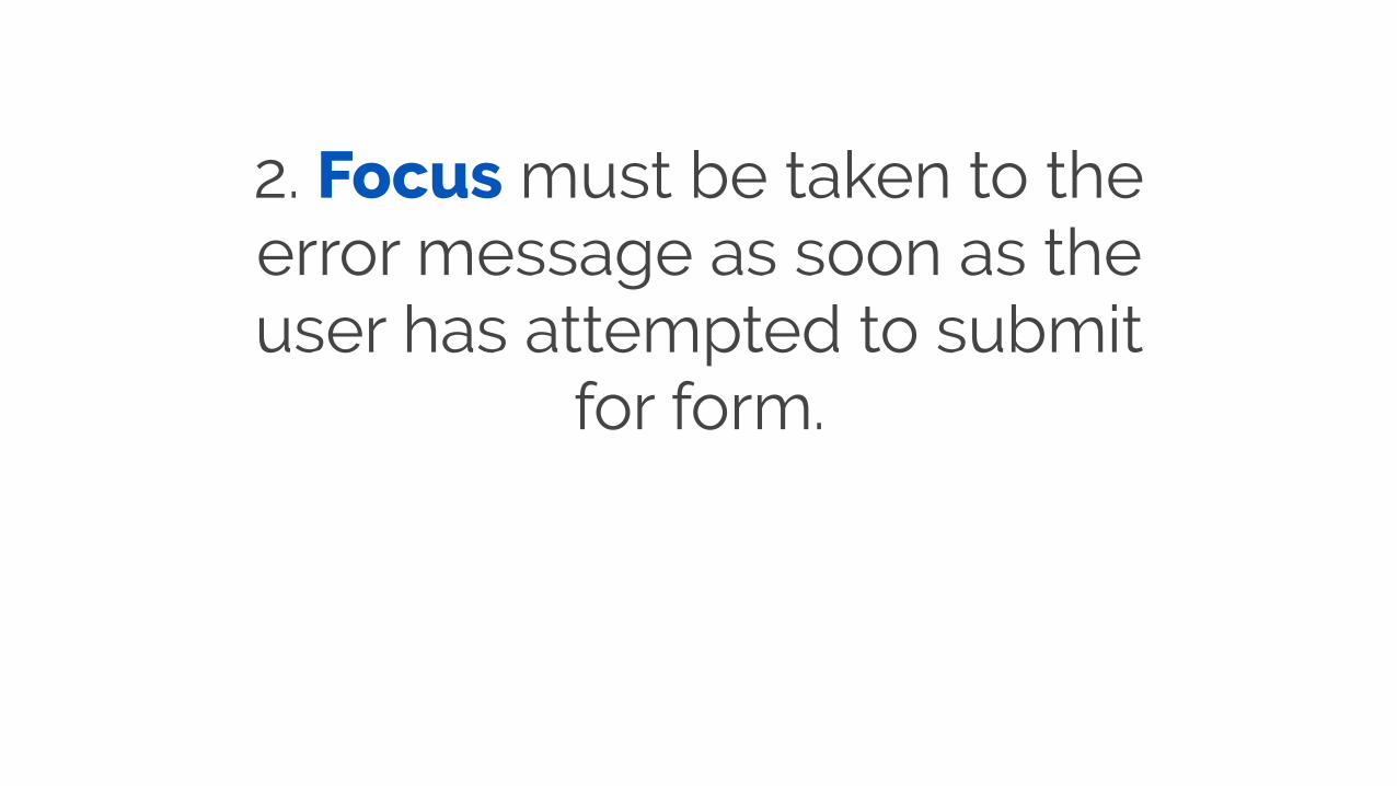
2. Focus must be taken to the error message as soon as the user has attempted to submit
for form.

3. The error message should list all errors.
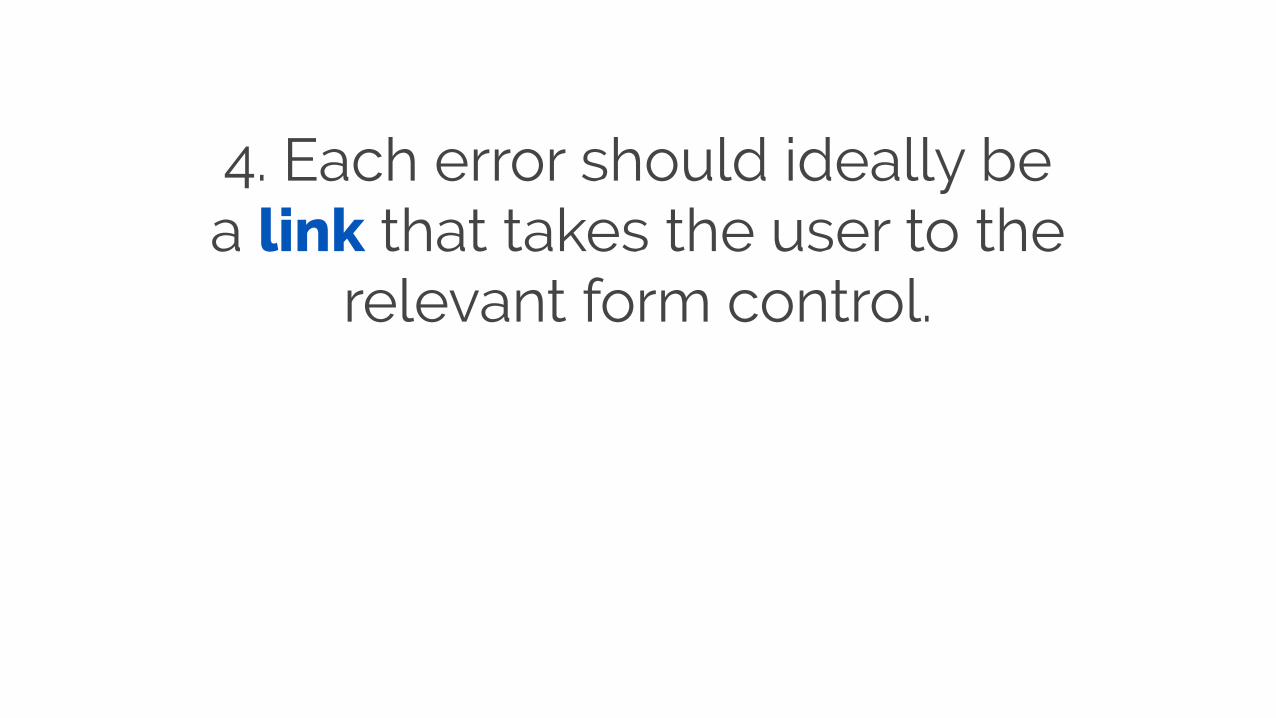
4. Each error should ideally be a link that takes the user to the
relevant form control.
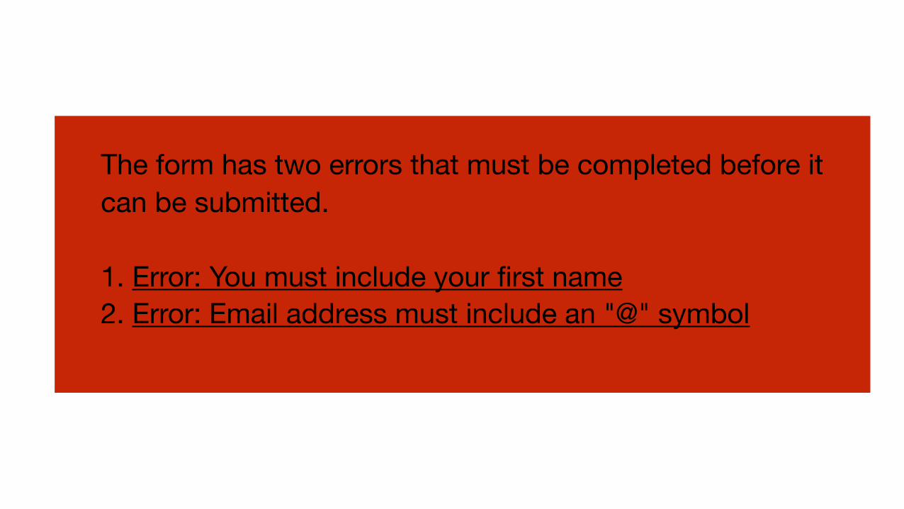
The form has two errors that must be completed before it can be submitted.
1. Error: You must include your first name2. Error: Email address must include an "@" symbol

Optionally, error messages can be placed inside a hide/show function that allows users to choose whether they see the
list of errors or not.

The form has two errors that must be completed before it can be submitted.
View all errors
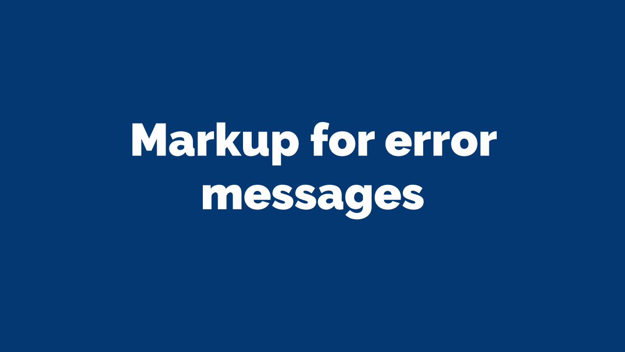
Markup for error messages
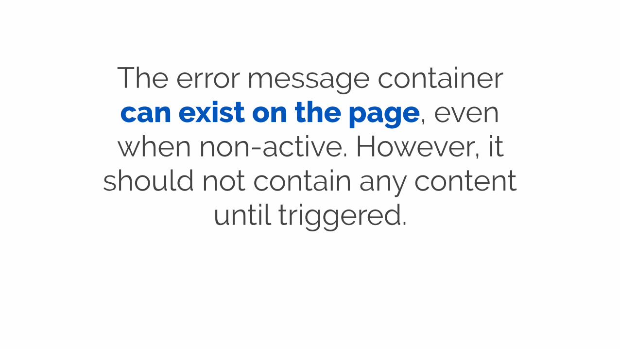
The error message container can exist on the page, even when non-active. However, it
should not contain any content until triggered.
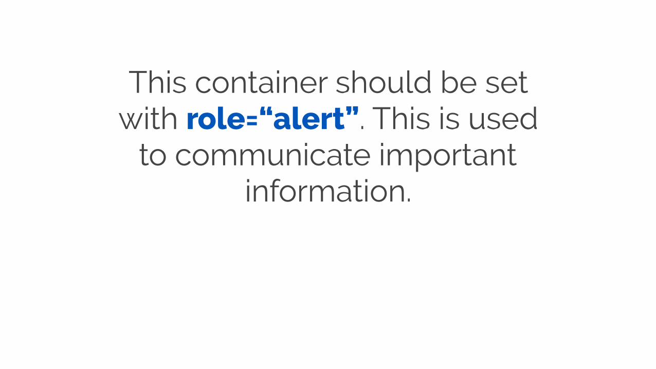
This container should be set with role=“alert”. This is used
to communicate important information.

<div class="error-‐message-‐container" role="alert">
</div>
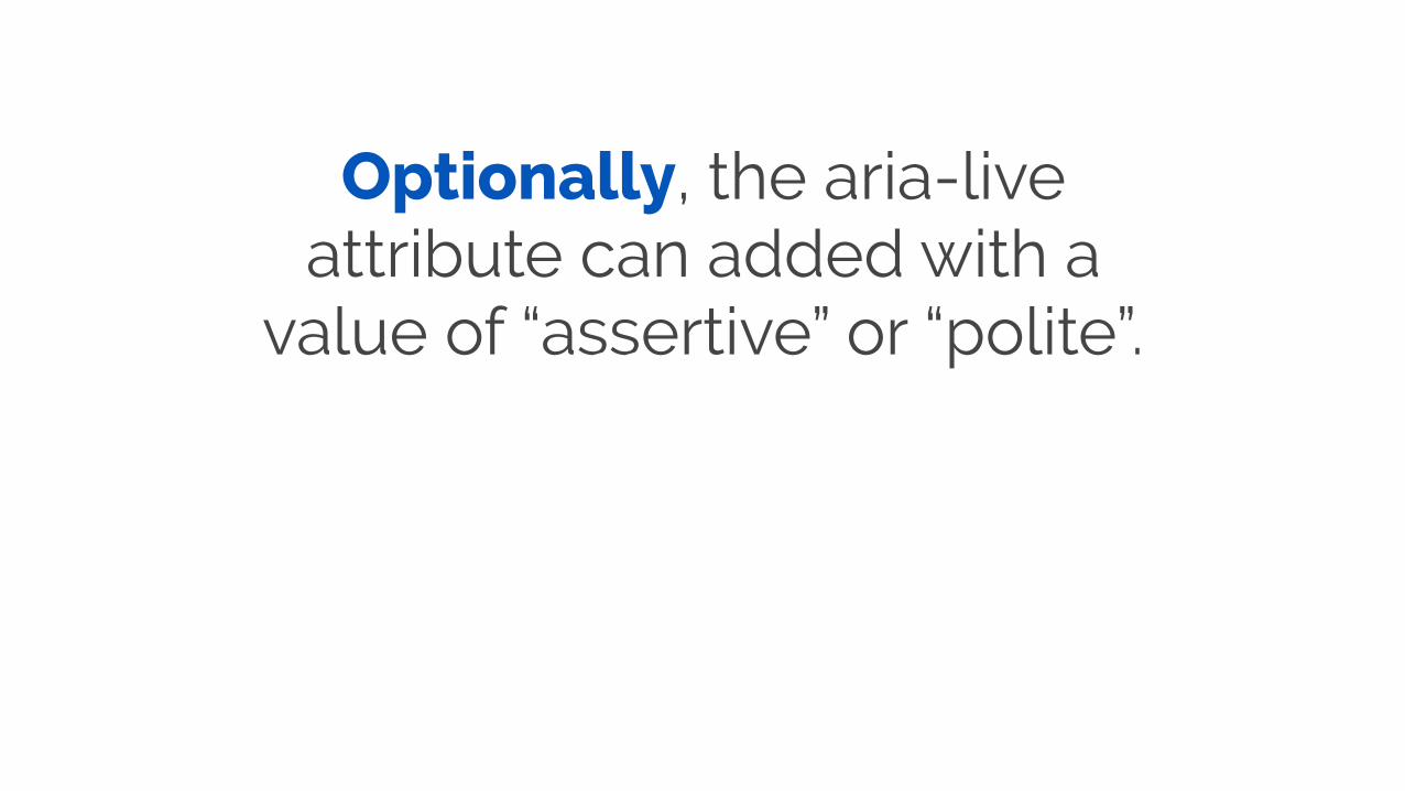
Optionally, the aria-live attribute can added with a
value of “assertive” or “polite”.
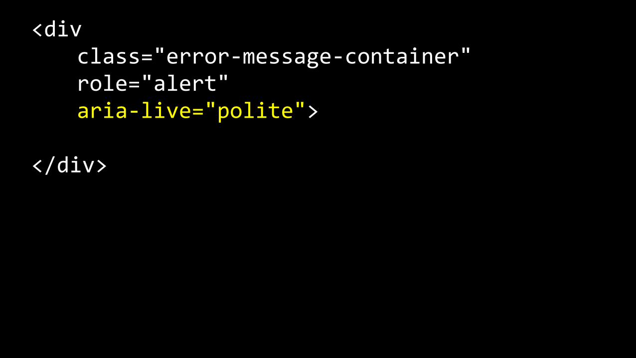
<div class="error-‐message-‐container" role="alert" aria-‐live="polite">
</div>
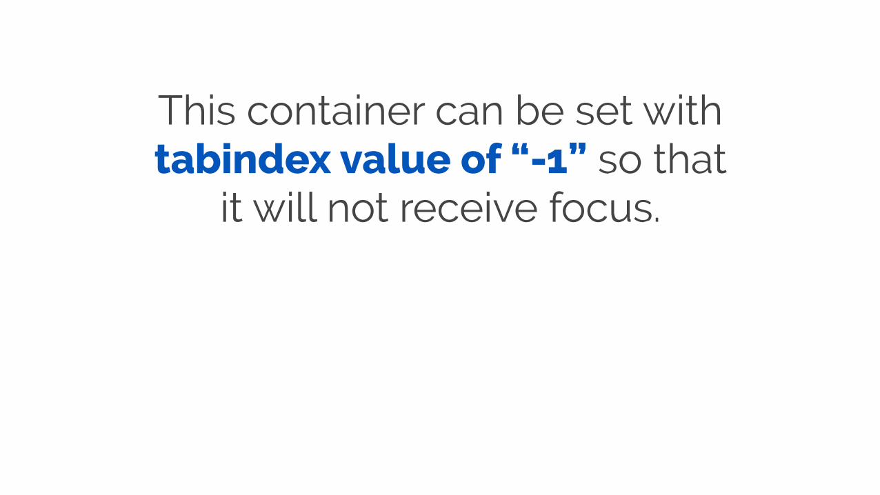
This container can be set with tabindex value of “-1” so that
it will not receive focus.
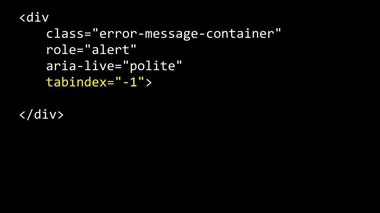
<div class="error-‐message-‐container" role="alert" aria-‐live="polite" tabindex="-‐1">
</div>
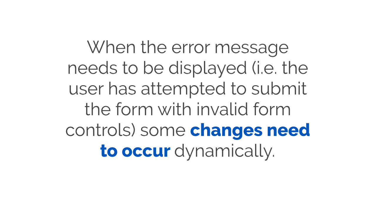
When the error message needs to be displayed (i.e. the user has attempted to submit
the form with invalid form controls) some changes need
to occur dynamically.
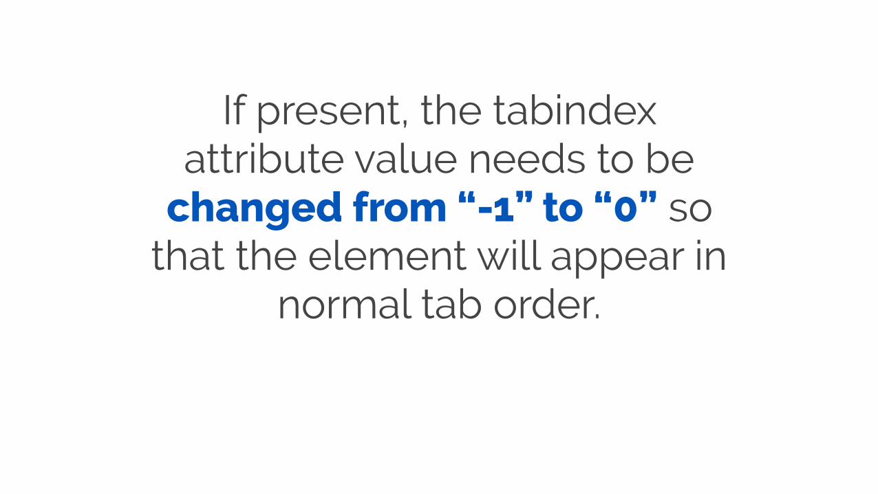
If present, the tabindex attribute value needs to be
changed from “-1” to “0” so that the element will appear in
normal tab order.
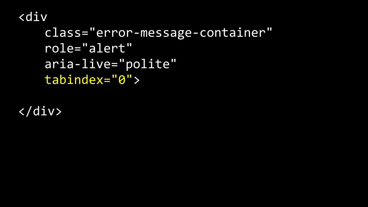
<div class="error-‐message-‐container" role="alert" aria-‐live="polite" tabindex="0">
</div>
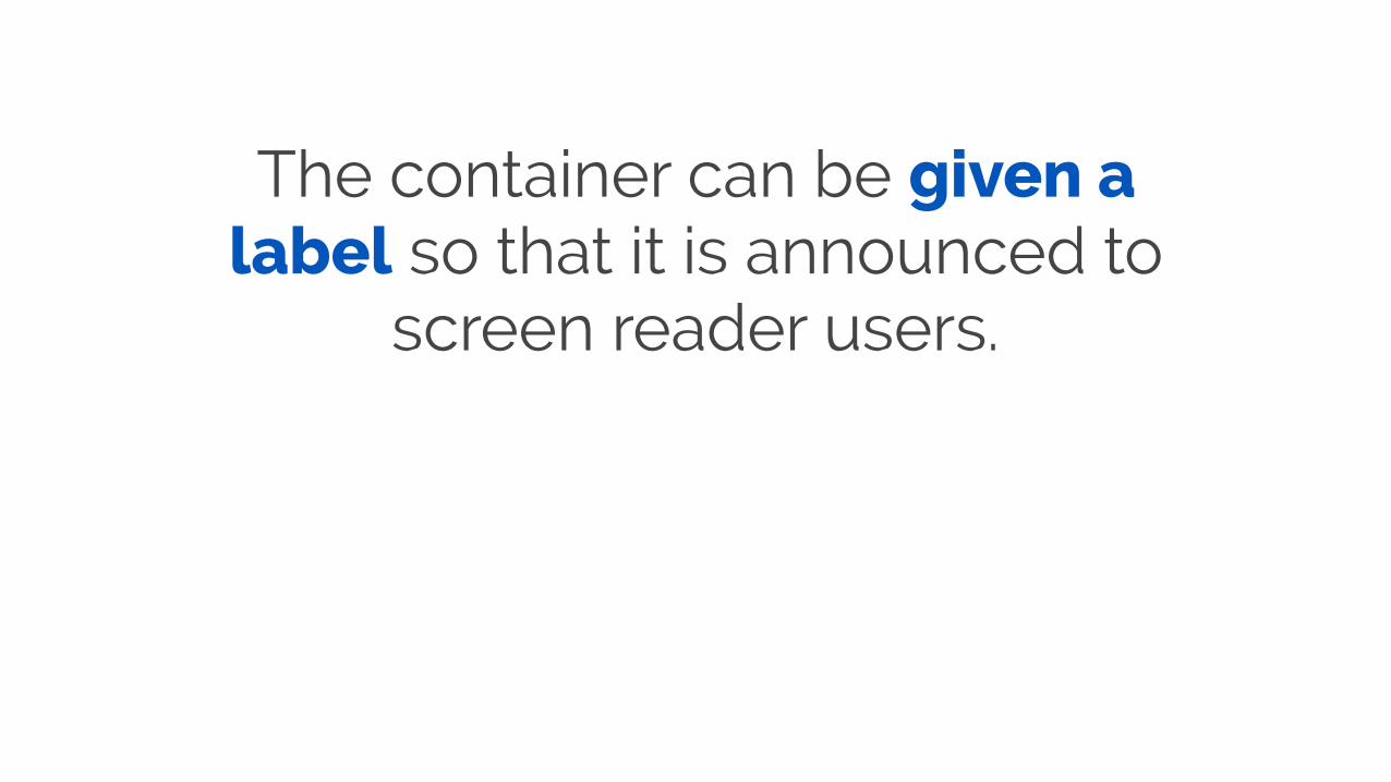
The container can be given a label so that it is announced to
screen reader users.
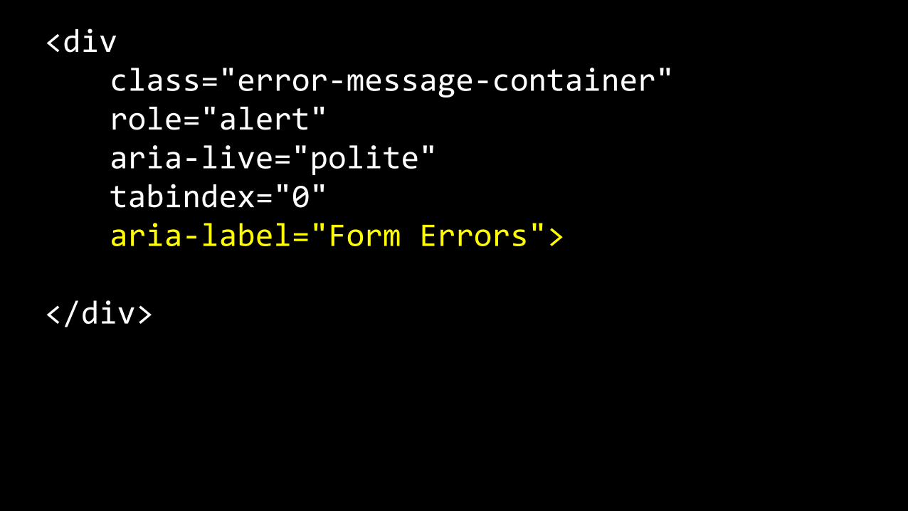
<div class="error-‐message-‐container" role="alert" aria-‐live="polite" tabindex="0" aria-‐label="Form Errors">
</div>
Accessible form errors:
simple solutions, major benefits.

Accessible modals

The problem
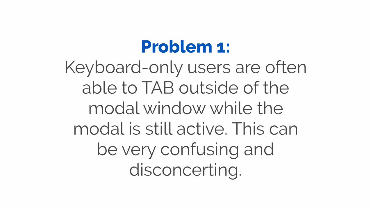
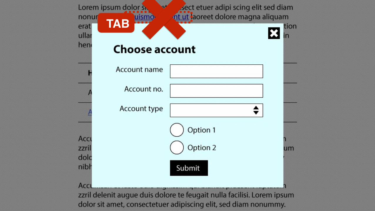
Problem 1: Keyboard-only users are often
able to TAB outside of the modal window while the
modal is still active. This can be very confusing and
disconcerting.

Problem 2: Screen reader users are
sometimes not informed that an action will trigger a modal.
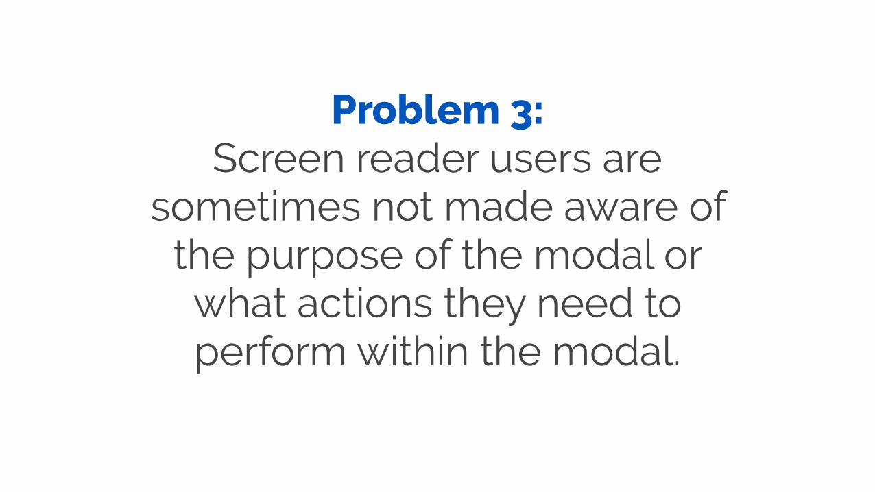
Problem 3: Screen reader users are
sometimes not made aware of the purpose of the modal or what actions they need to perform within the modal.

Problem 4: Screen reader users are
sometimes sent to the top of the parent page after a modal window has been closed. This
can be confusing.

A solution
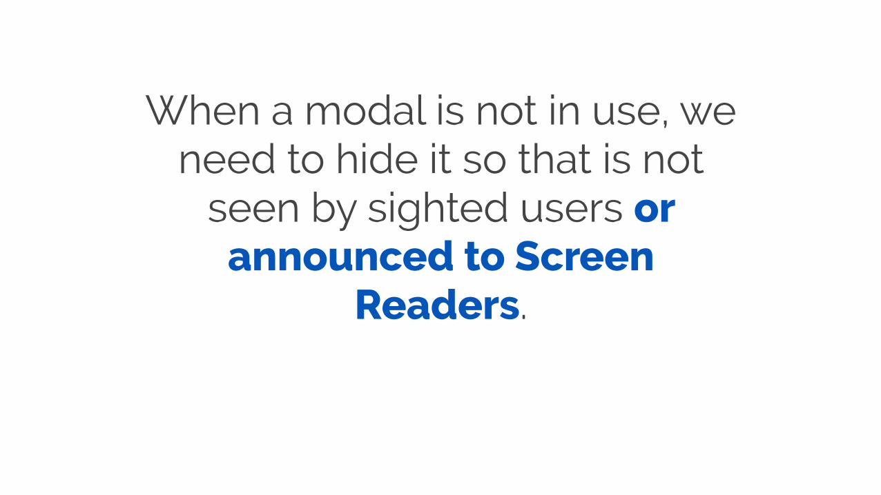
When a modal is not in use, we need to hide it so that is not
seen by sighted users or announced to Screen
Readers.
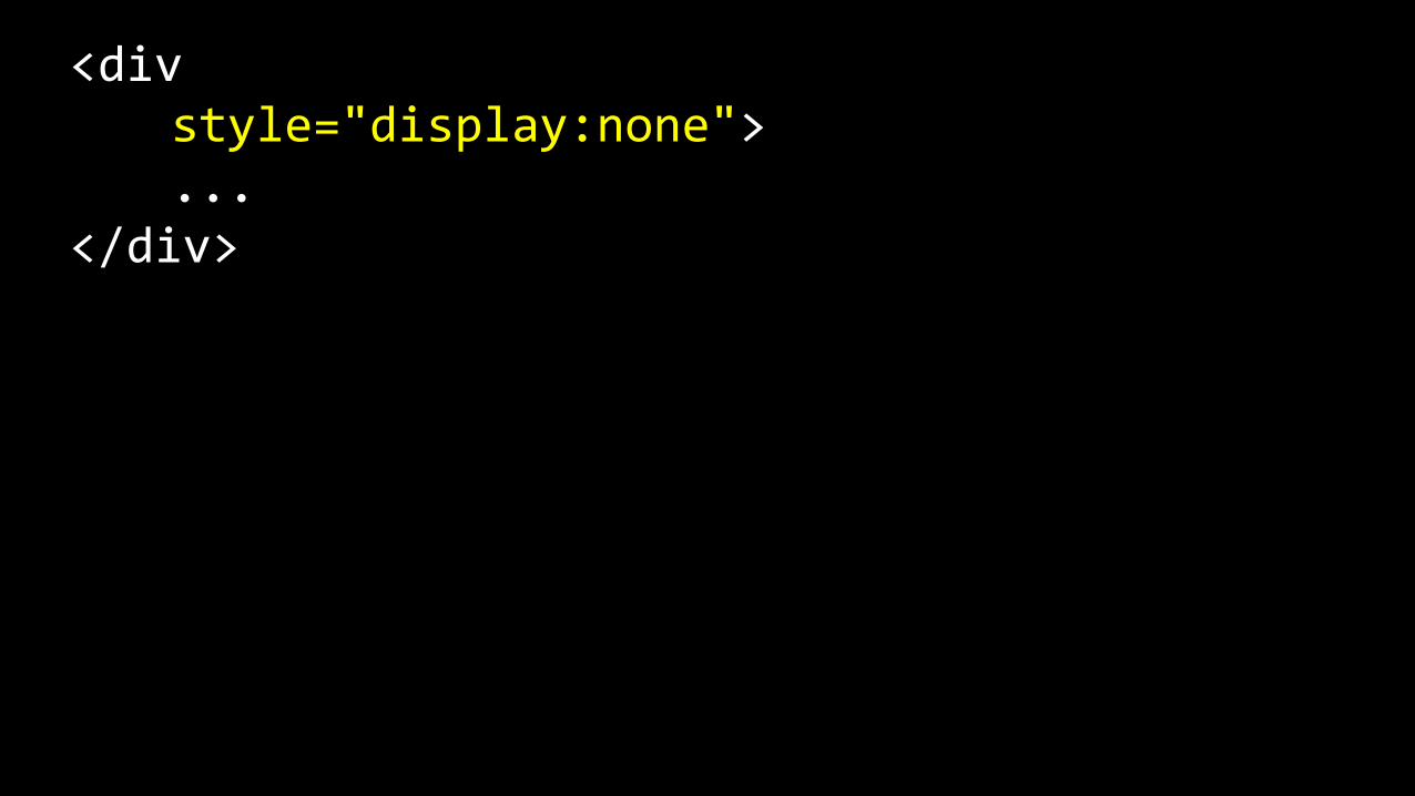
<div style="display:none"> ... </div>
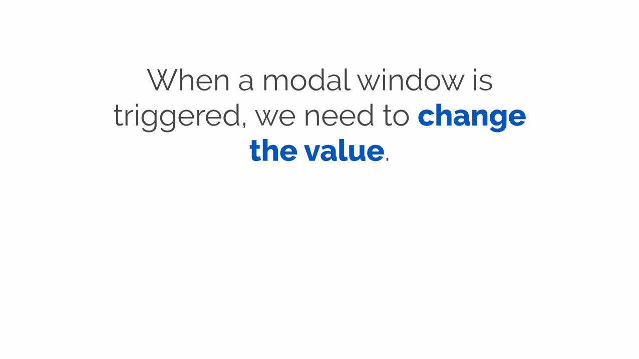
When a modal window is triggered, we need to change
the value.
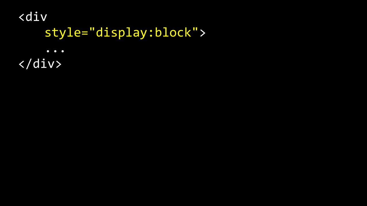
<div style="display:block"> ... </div>
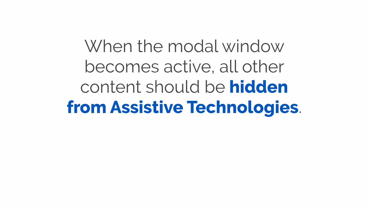
When the modal window becomes active, all other content should be hidden
from Assistive Technologies.
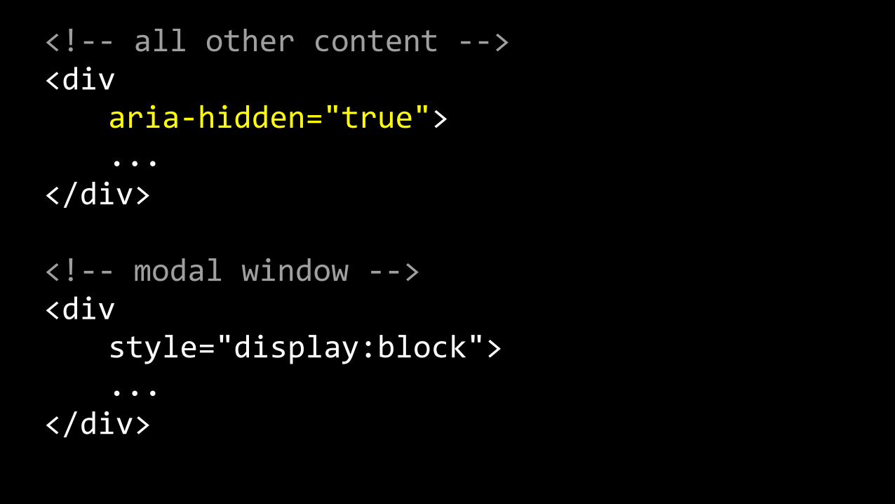
<!-‐-‐ all other content -‐-‐> <div aria-‐hidden="true"> ... </div>
<!-‐-‐ modal window -‐-‐> <div style="display:block"> ... </div>
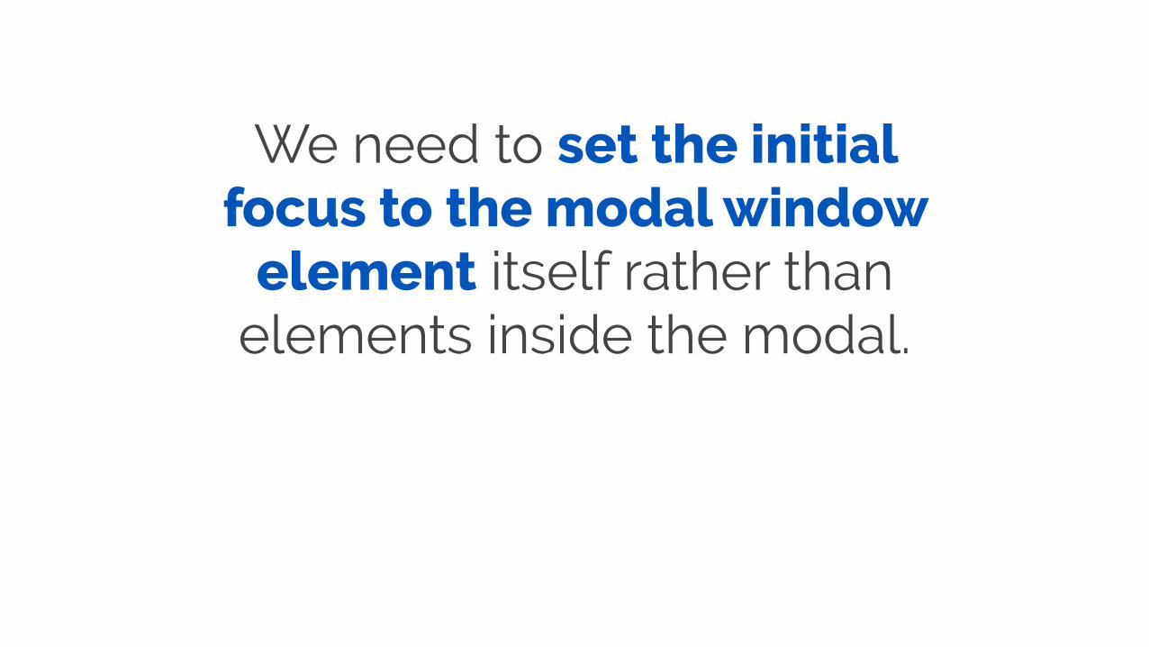
We need to set the initial focus to the modal window
element itself rather than elements inside the modal.

Initial focus

Initial focus

This is important because we are going to give the modal a
label.

If we set focus on an element inside the window, the label
will not be announced to Assistive Technologies.
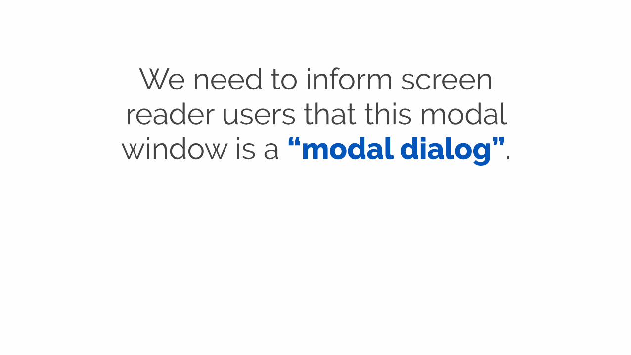
We need to inform screen reader users that this modal window is a “modal dialog”.
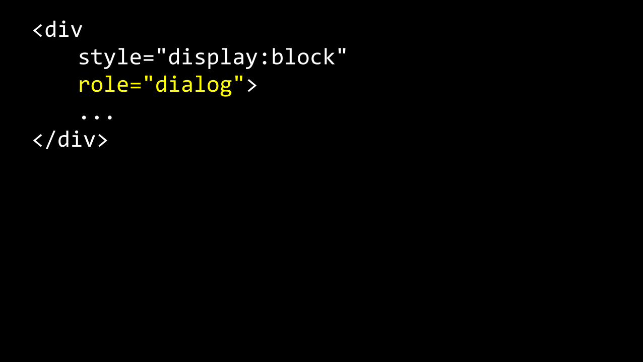
<div style="display:block" role="dialog"> ... </div>
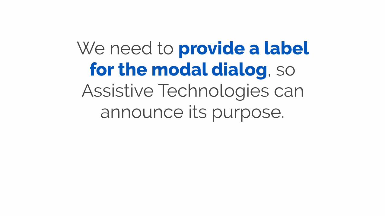
We need to provide a label for the modal dialog, so
Assistive Technologies can announce its purpose.
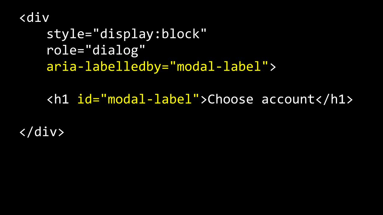
<div style="display:block" role="dialog" aria-‐labelledby="modal-‐label">
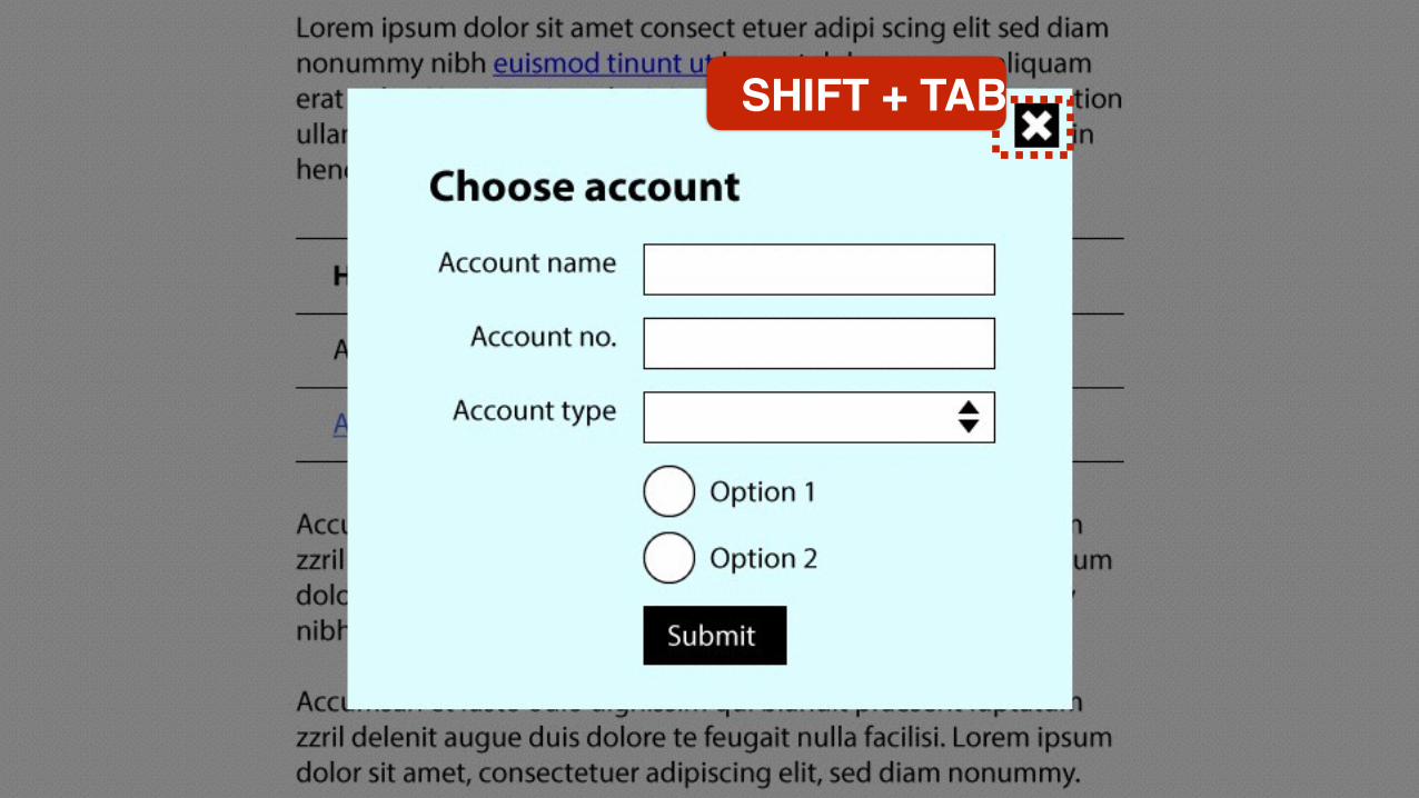
<h1 id="modal-‐label">Choose account</h1>
</div>
In some circumstances, we may need to provide a more detailed description of the purpose of the modal dialog.
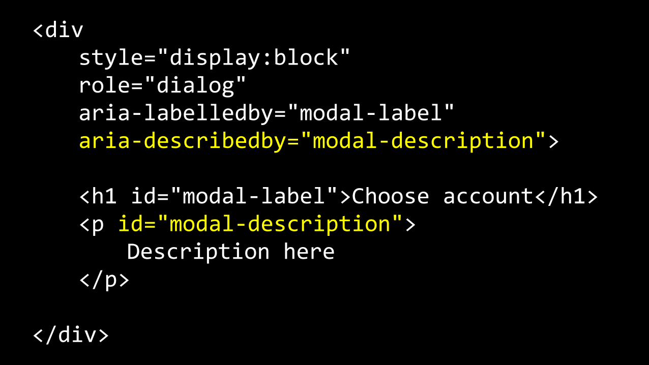
<div style="display:block" role="dialog" aria-‐labelledby="modal-‐label" aria-‐describedby="modal-‐description">
<h1 id="modal-‐label">Choose account</h1> <p id="modal-‐description"> Description here </p>
</div>

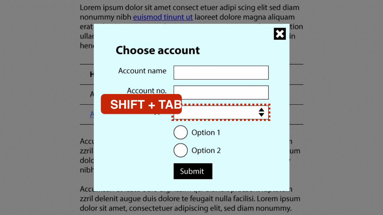
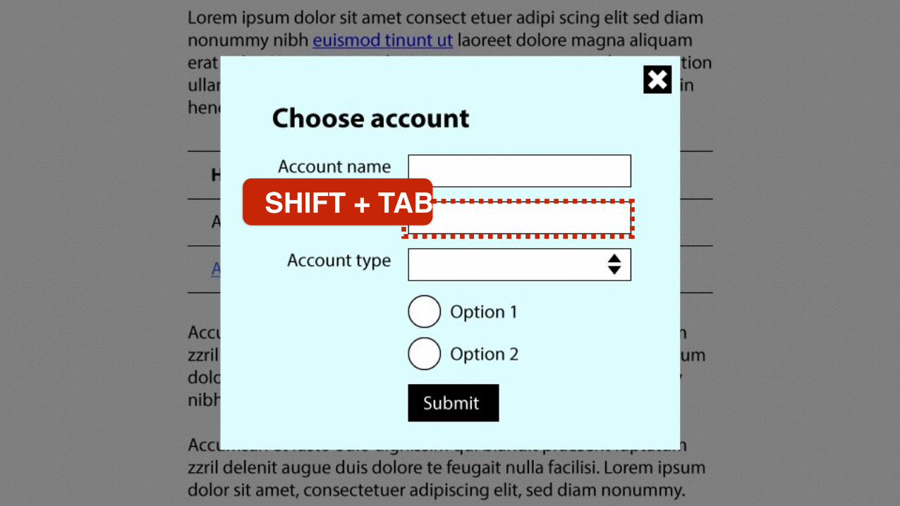
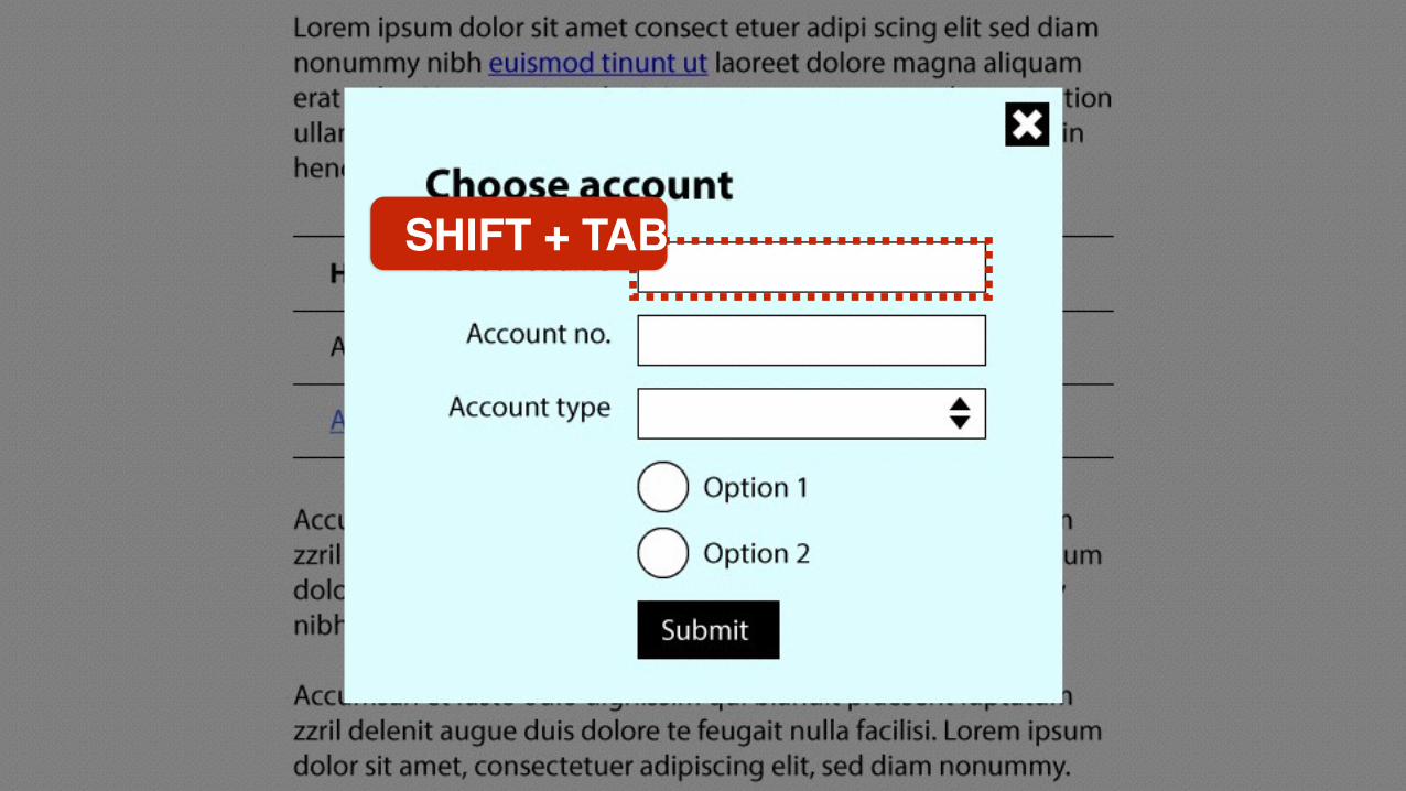
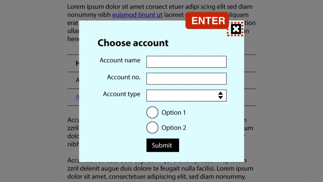
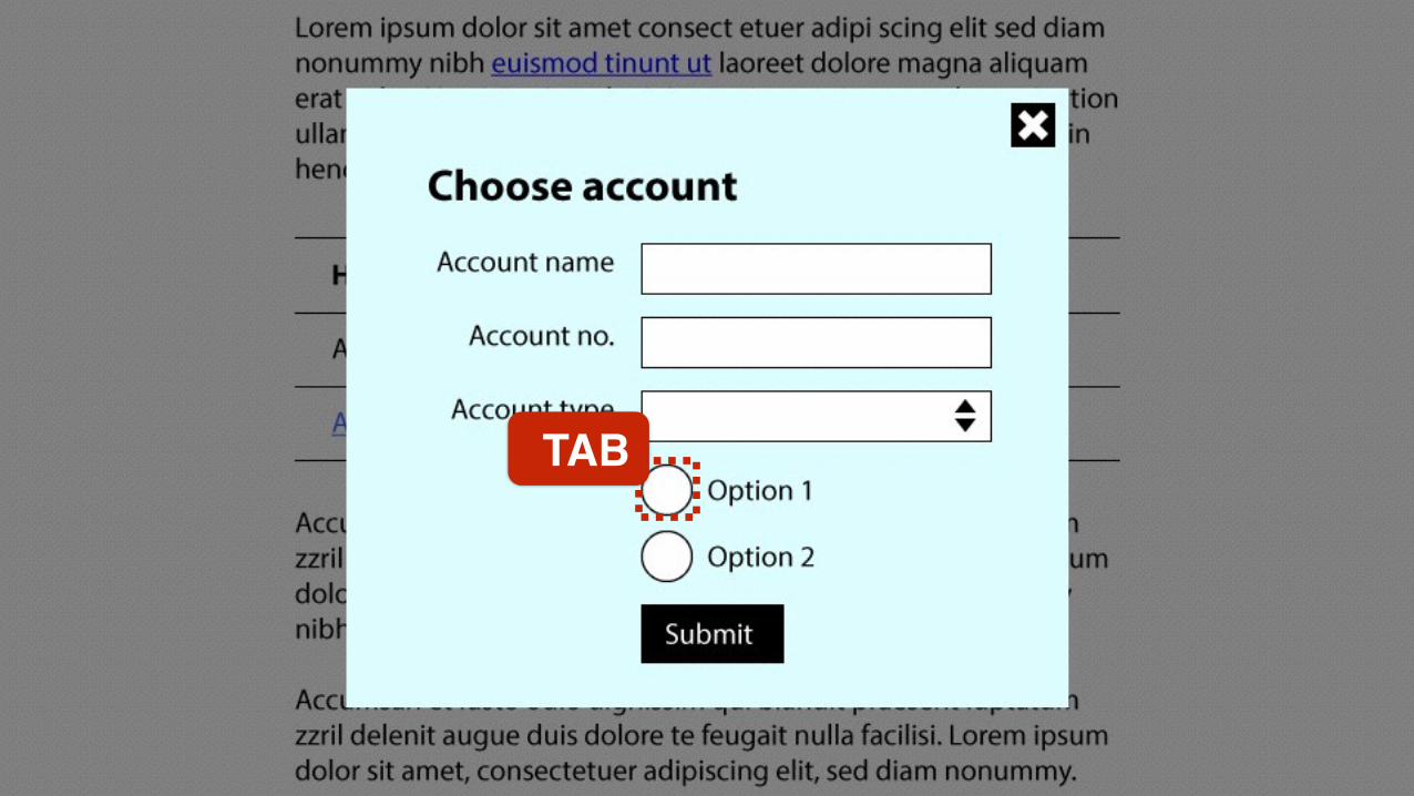
Keystrokes
TAB

TAB
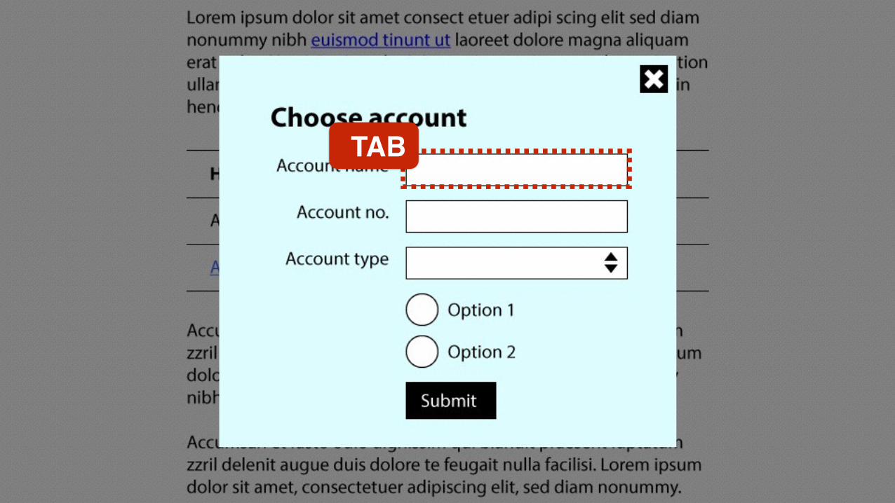
TAB

TAB
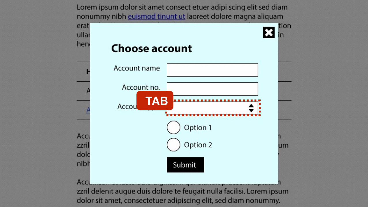
TAB
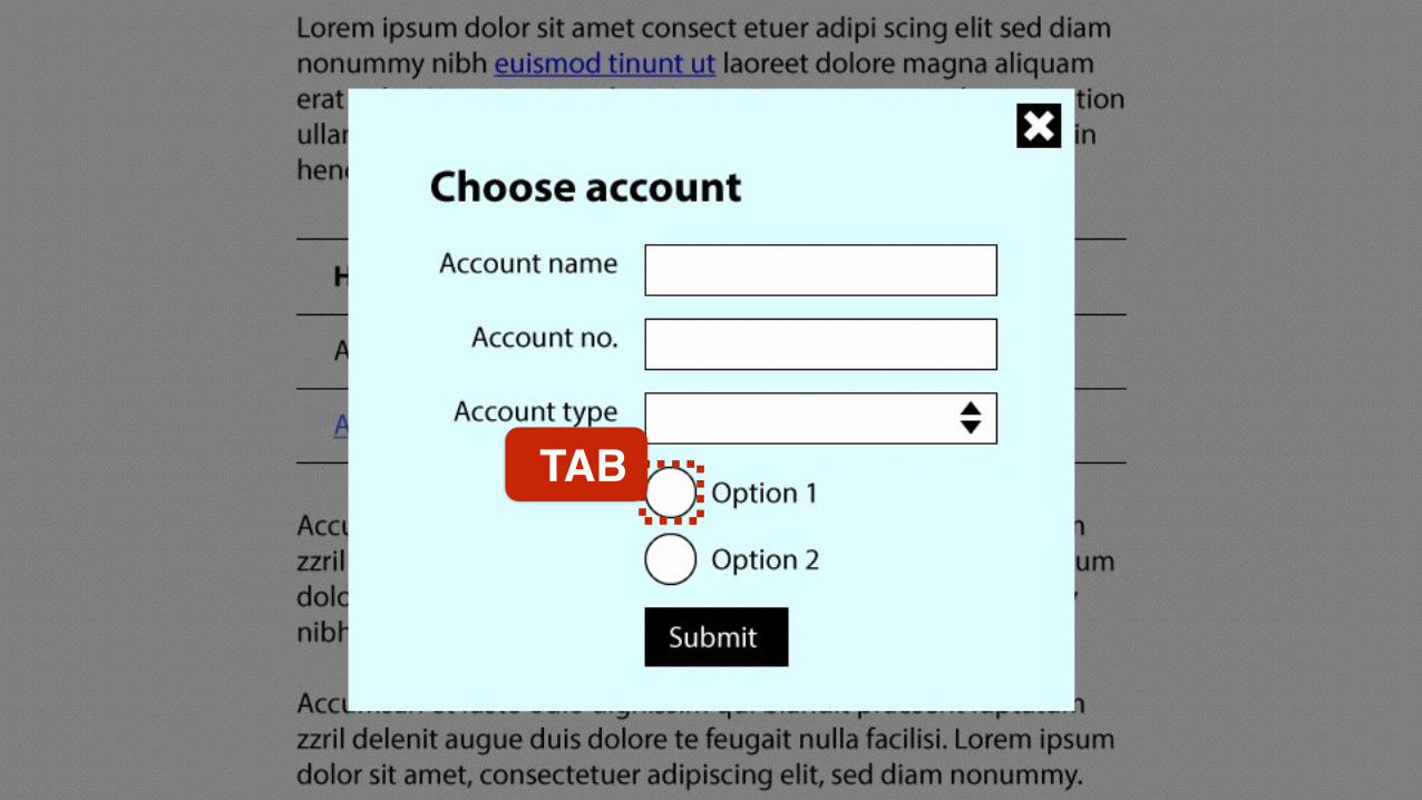
TAB

TAB
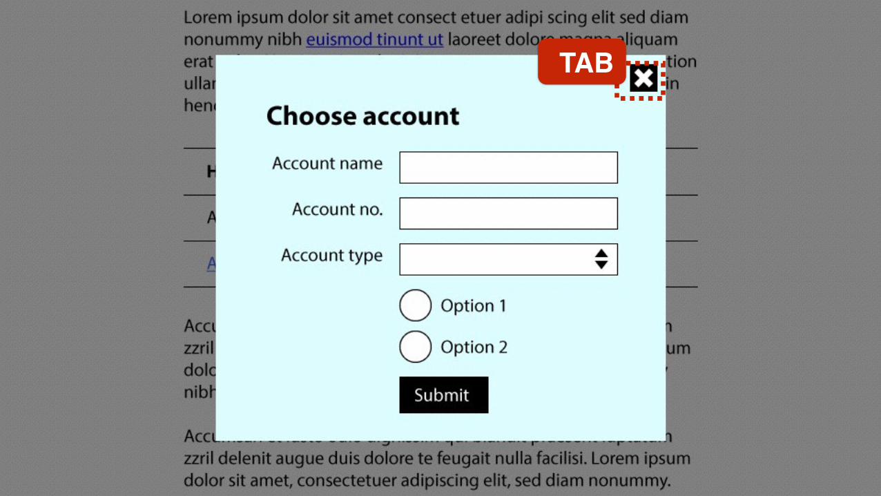
TAB
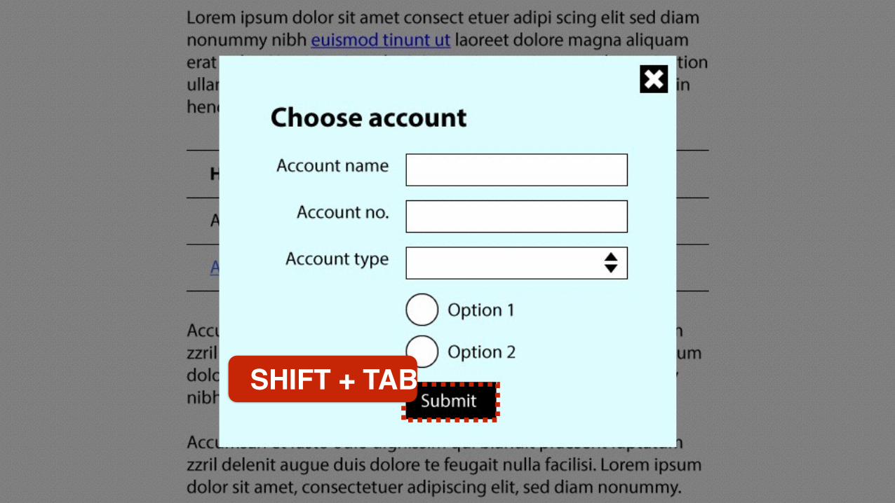
SHIFT + TAB

SHIFT + TAB
SHIFT + TAB
SHIFT + TAB
SHIFT + TAB
SHIFT + TAB

SHIFT + TAB
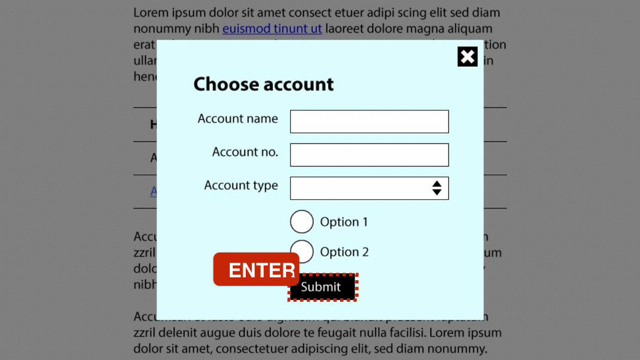
ENTER
ENTER
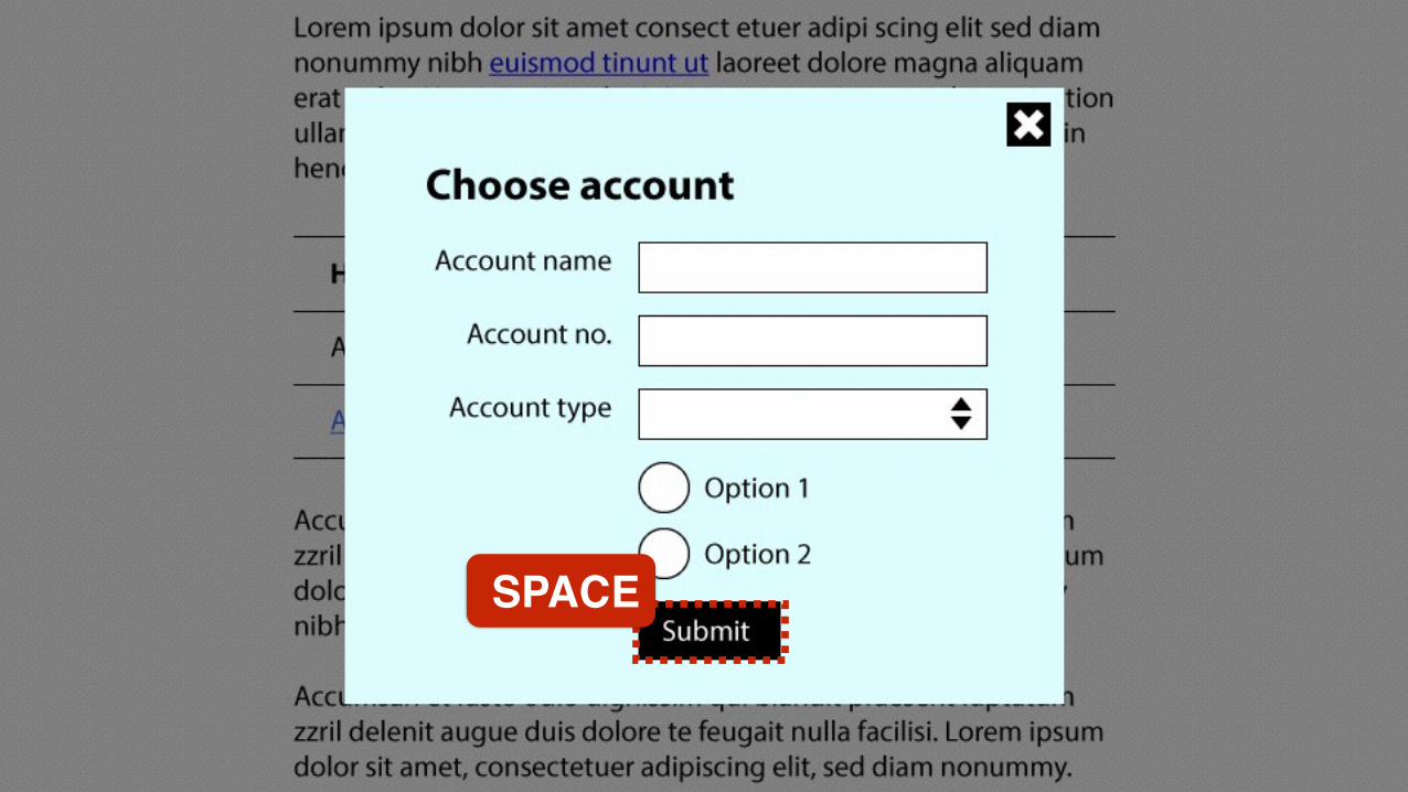
SPACE
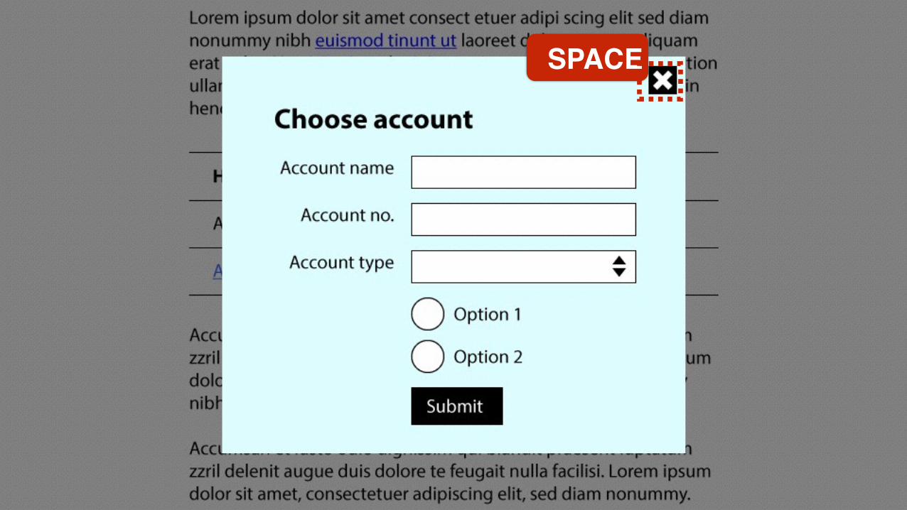
SPACE
TAB
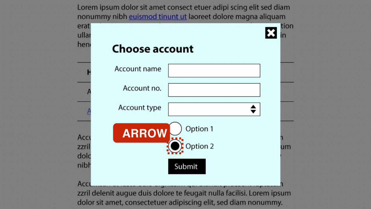
ARROW
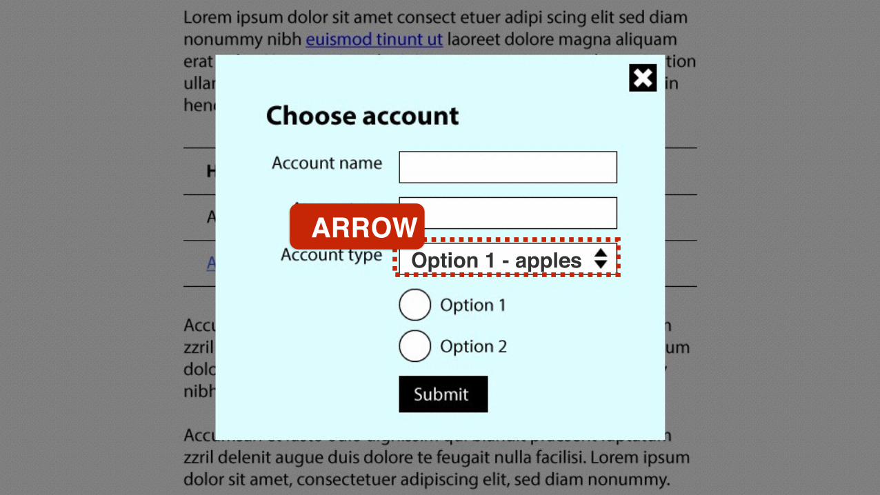
Option 1 - applesARROW

Option 2 - pearsARROW
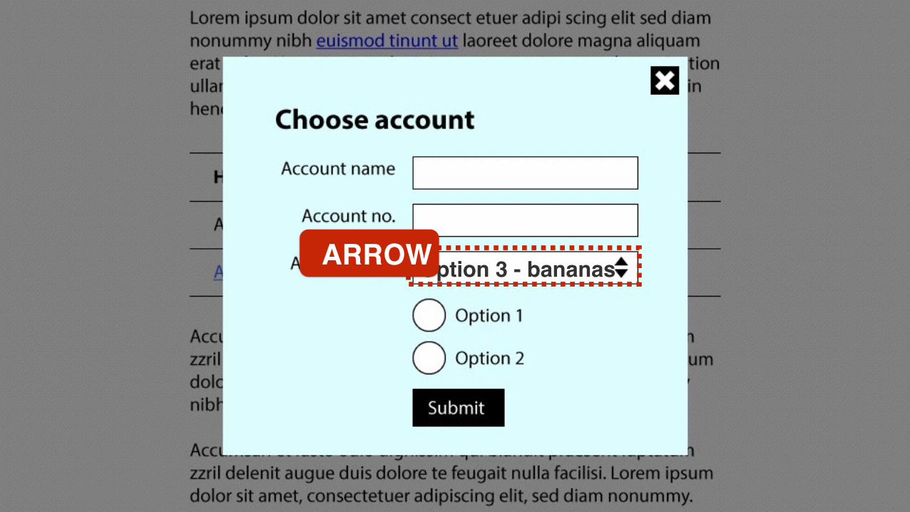
Option 3 - bananasARROW
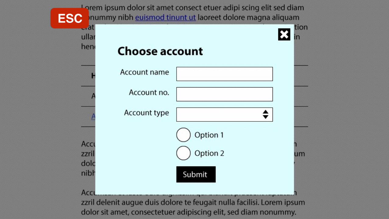
ESC
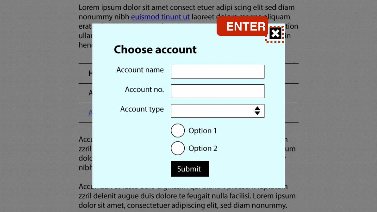
Adding meaning to important
actions

For some important actions inside the modal window,
Assistive Technologies should be given additional
information to let them know what will happen.
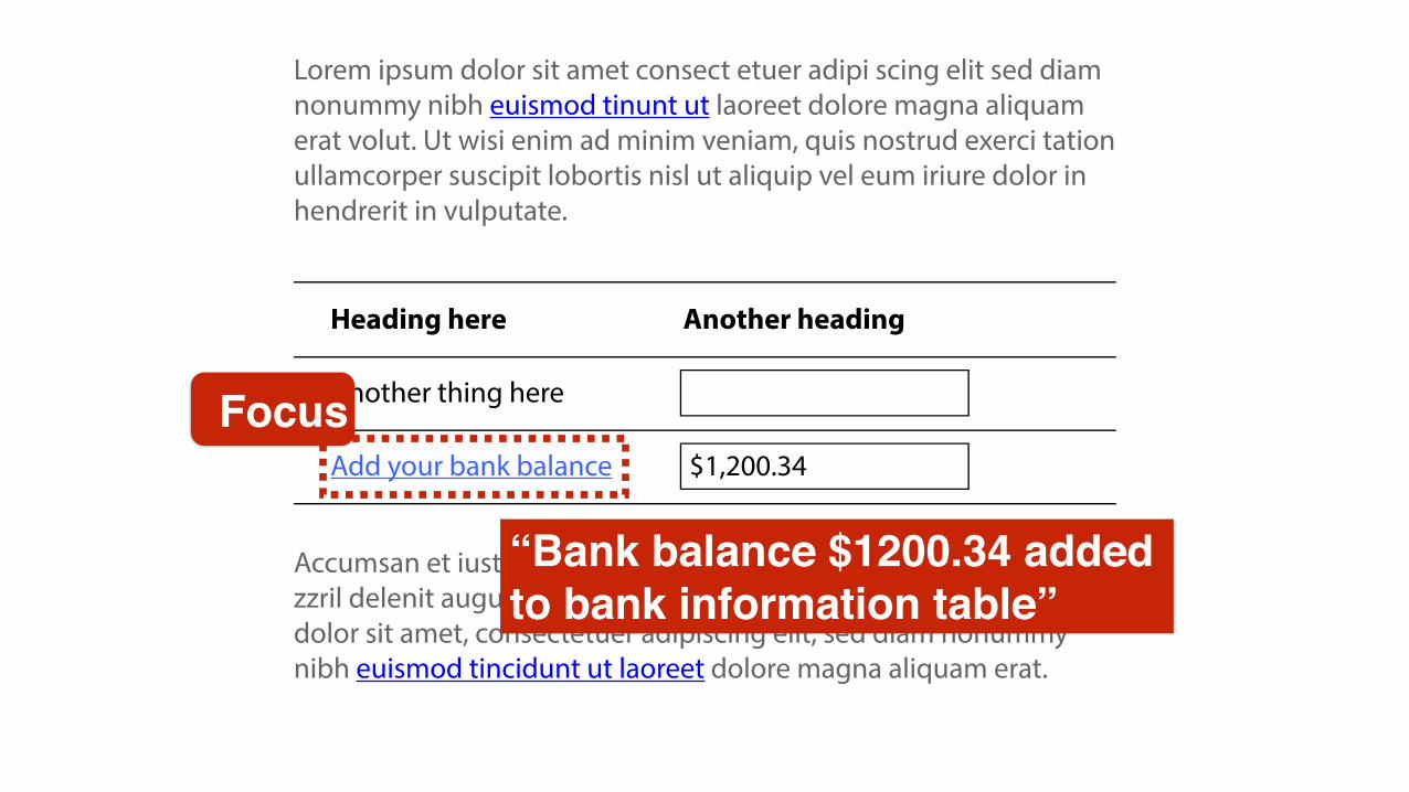
As screen reader users are submitting form data, they
should be informed that:
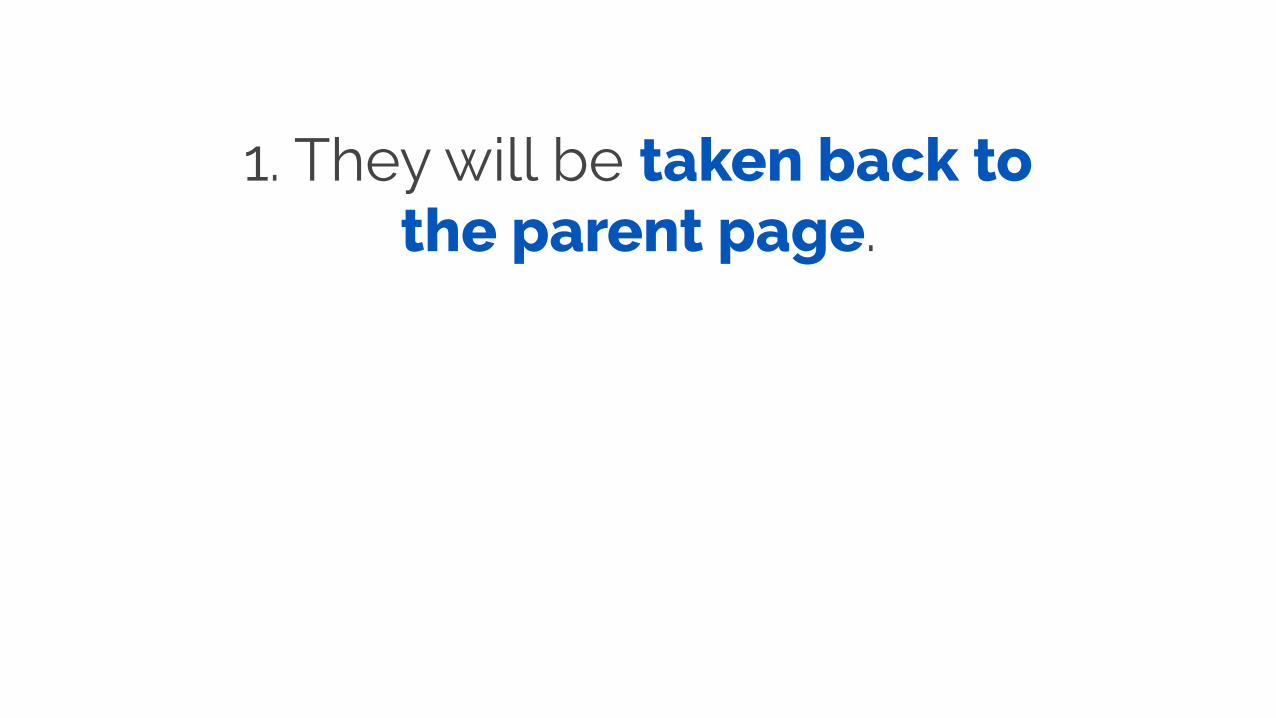
1. They will be taken back to the parent page.
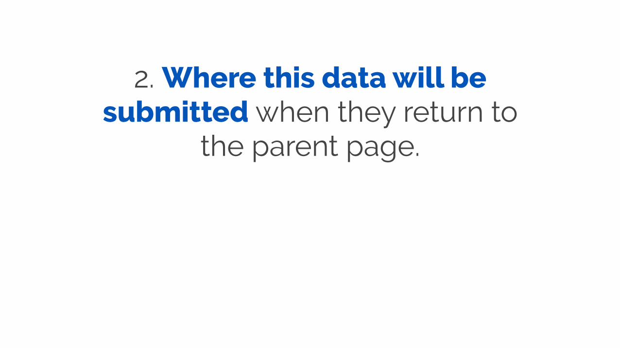
2. Where this data will be submitted when they return to
the parent page.

ENTER
“Submit and return to bank balance information. Your data will be added to the Balance table”

As screen reader users focus on the “Close” function, they
should be informed that closing will take them back
to the parent page.
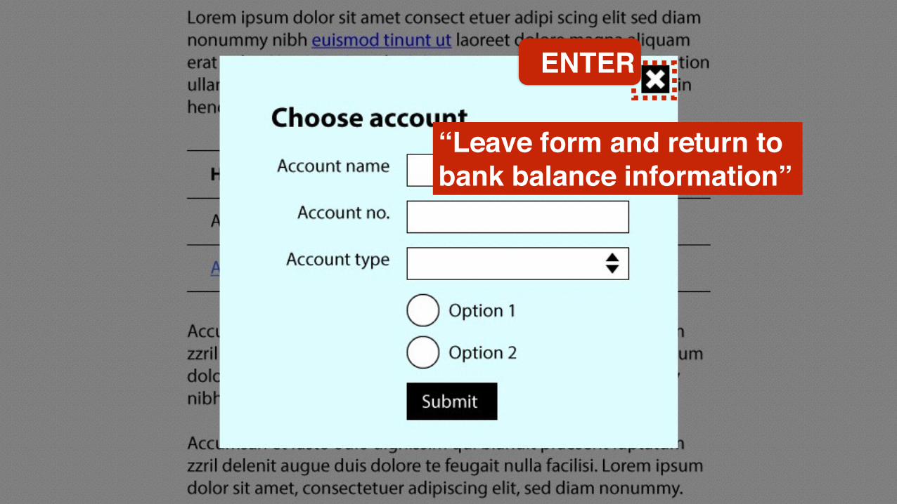
ENTER
“Leave form and return to bank balance information”
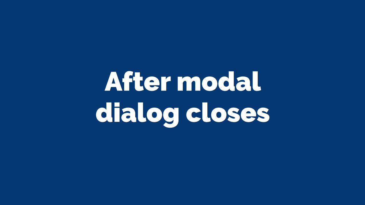
After modal dialog closes
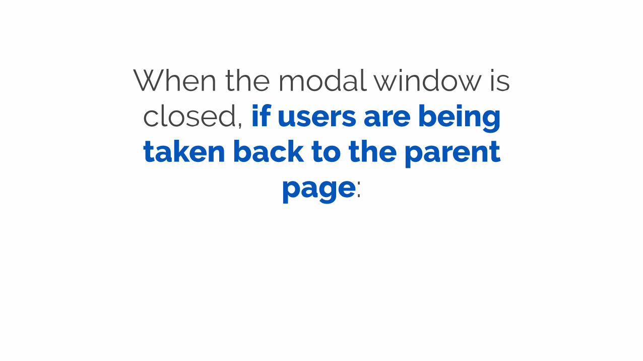
When the modal window is closed, if users are being taken back to the parent
page:

1. Focus should be placed on the relevant component of the parent page. The most
common practice is to move focus back to the element that
invoked the dialog.

The user should not be thrown back to the top of the parent page unless there is a
good reason!
2. The user should be informed where they are and
what change has occurred.
ENTER
Lorem ipsum dolor sit amet consect etuer adipi scing elit sed diam nonummy nibh euismod tinunt ut laoreet dolore magna aliquam erat volut. Ut wisi enim ad minim veniam, quis nostrud exerci tation ullamcorper suscipit lobortis nisl ut aliquip vel eum iriure dolor in hendrerit in vulputate.
Accumsan et iusto odio dignissim qui blandit praesent luptatum zzril delenit augue duis dolore te feugait nulla facilisi. Lorem ipsum dolor sit amet, consectetuer adipiscing elit, sed diam nonummy nibh euismod tincidunt ut laoreet dolore magna aliquam erat.
Heading here
Another thing here
Add your bank balance
Another heading
$1,200.34
Focus
“Bank balance $1200.34 added to bank information table”
Modals are a pain, but we can make them less painful
Accessible tabs
https://www.flickr.com/photos/quandc/16426960180

The problem
In-page tabs can present issues for screen reader as
well as keyboard-only users.
Problem 1: Screen reader users are often confused by the relationship
between tabs and panels.
Problem 2: Keyboard-only users are often unable to navigate through the
tabs and panels simply or intuitively.

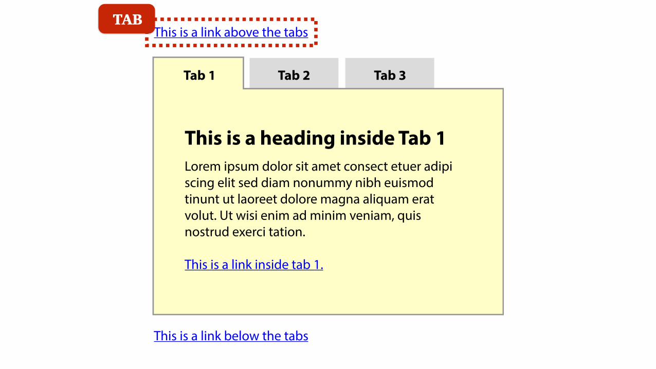
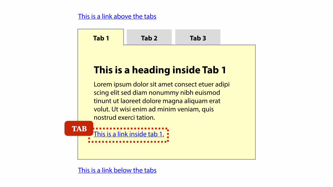
A solution

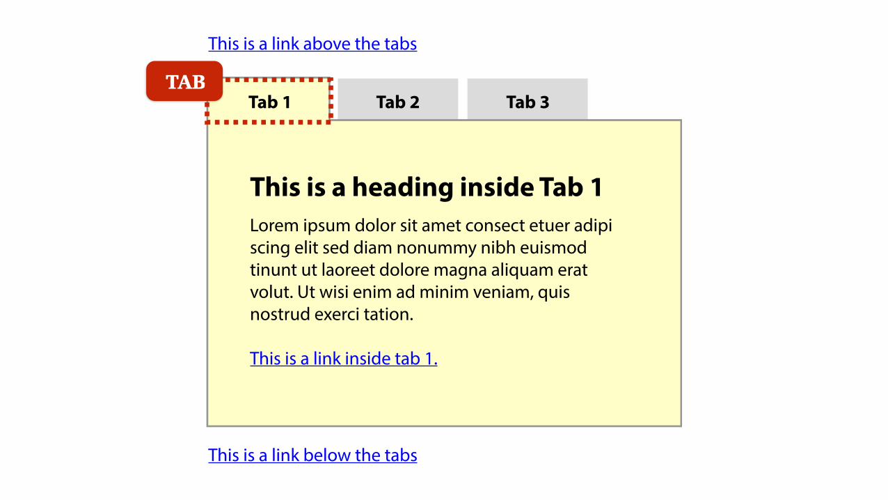
The preferred keyboard-only navigation method for in-
page tabs uses TAB keystrokes to move onto the active tab
and active panel, and ARROW keys to move across tabs.
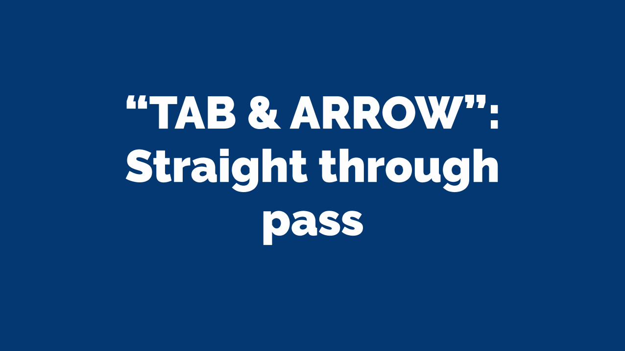
“TAB & ARROW”: Straight through
pass
Tab 1 Tab 2 Tab 3
This is a heading inside Tab 1Lorem ipsum dolor sit amet consect etuer adipi scing elit sed diam nonummy nibh euismod tinunt ut laoreet dolore magna aliquam erat volut. Ut wisi enim ad minim veniam, quis nostrud exerci tation.
This is a link inside tab 1.
This is a link above the tabs
This is a link below the tabs
TAB

Tab 1 Tab 2 Tab 3
This is a heading inside Tab 1Lorem ipsum dolor sit amet consect etuer adipi scing elit sed diam nonummy nibh euismod tinunt ut laoreet dolore magna aliquam erat volut. Ut wisi enim ad minim veniam, quis nostrud exerci tation.
This is a link inside tab 1.
This is a link above the tabs
This is a link below the tabsTAB

“TAB & ARROW”: Across the tabs
pass
Tab 1 Tab 2 Tab 3
This is a heading inside Tab 1Lorem ipsum dolor sit amet consect etuer adipi scing elit sed diam nonummy nibh euismod tinunt ut laoreet dolore magna aliquam erat volut. Ut wisi enim ad minim veniam, quis nostrud exerci tation.
This is a link inside tab 1.
This is a link above the tabs
This is a link below the tabs
TAB

Tab 1 Tab 2 Tab 3
This is a heading inside Tab 2Lorem ipsum dolor sit amet consect etuer adipi scing elit sed diam nonummy nibh euismod tinunt ut laoreet dolore magna aliquam erat volut. Ut wisi enim ad minim veniam, quis nostrud exerci tation.
This is a link inside tab 2.
This is a link above the tabs
This is a link below the tabs
ARROW
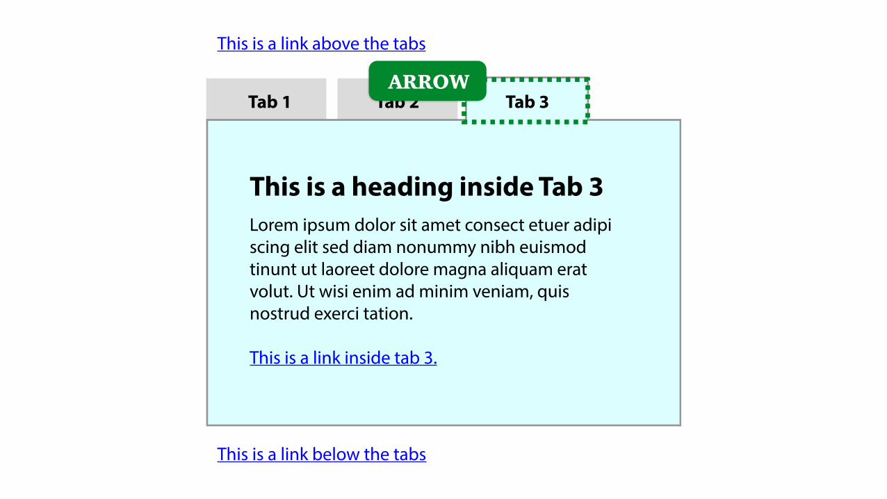
Tab 1 Tab 2 Tab 3
This is a heading inside Tab 3Lorem ipsum dolor sit amet consect etuer adipi scing elit sed diam nonummy nibh euismod tinunt ut laoreet dolore magna aliquam erat volut. Ut wisi enim ad minim veniam, quis nostrud exerci tation.
This is a link inside tab 3.
This is a link above the tabs
This is a link below the tabs
ARROW
Tab 1 Tab 2 Tab 3
This is a heading inside Tab 3Lorem ipsum dolor sit amet consect etuer adipi scing elit sed diam nonummy nibh euismod tinunt ut laoreet dolore magna aliquam erat volut. Ut wisi enim ad minim veniam, quis nostrud exerci tation.
This is a link inside tab 3.
This is a link above the tabs
This is a link below the tabs
TAB
Tab 1 Tab 2 Tab 3
This is a heading inside Tab 3Lorem ipsum dolor sit amet consect etuer adipi scing elit sed diam nonummy nibh euismod tinunt ut laoreet dolore magna aliquam erat volut. Ut wisi enim ad minim veniam, quis nostrud exerci tation.
This is a link inside tab 3.
This is a link above the tabs
This is a link below the tabsTAB

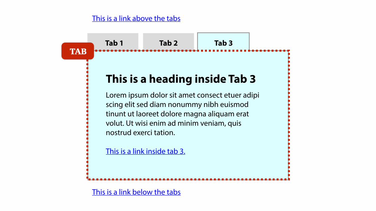
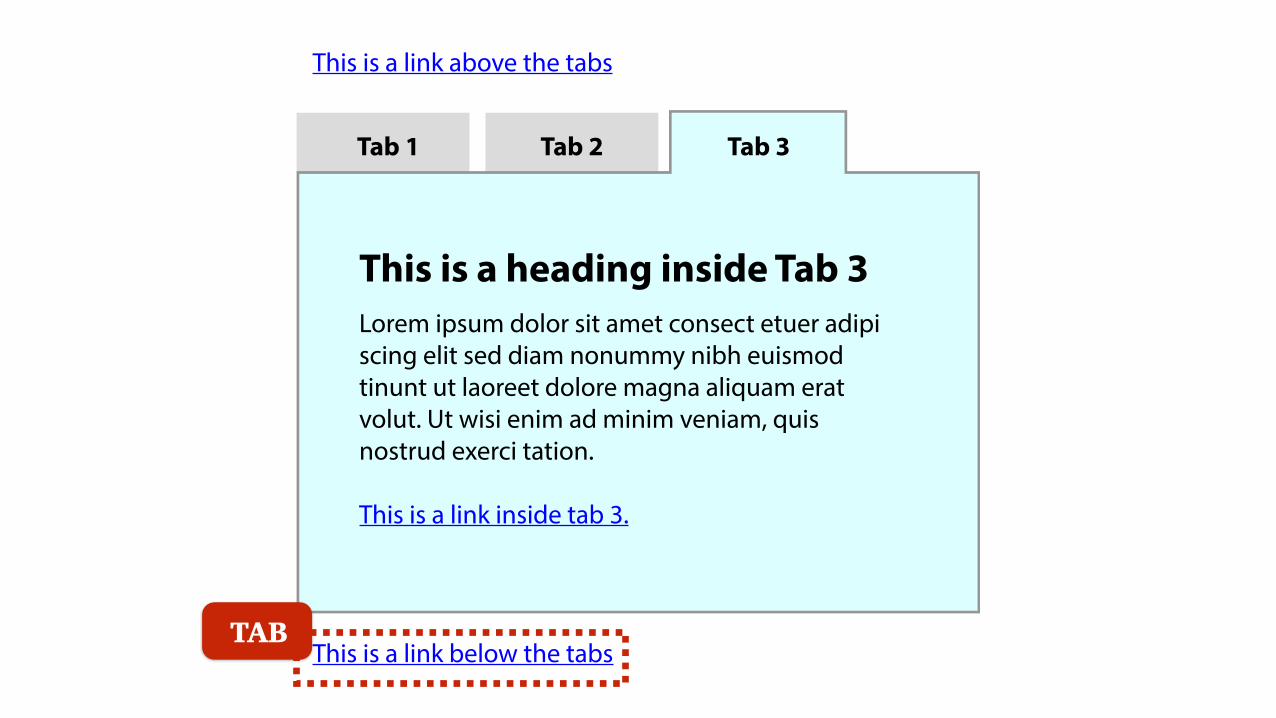
Where to put focus for panels?
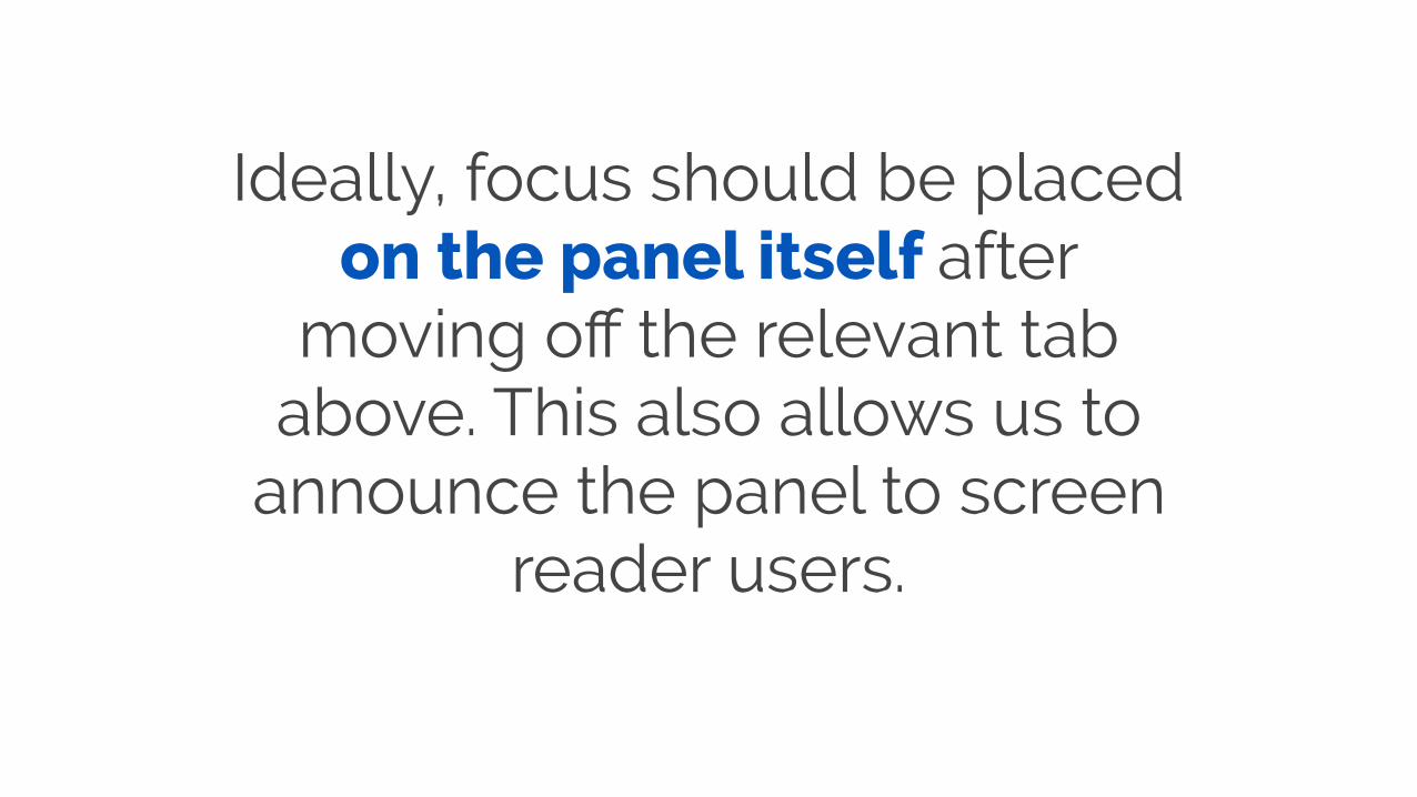
Ideally, focus should be placed on the panel itself after
moving off the relevant tab above. This also allows us to
announce the panel to screen reader users.

Tab 1 Tab 2 Tab 3
This is a heading inside Tab 1Lorem ipsum dolor sit amet consect etuer adipi scing elit sed diam nonummy nibh euismod tinunt ut laoreet dolore magna aliquam erat volut. Ut wisi enim ad minim veniam, quis nostrud exerci tation.
This is a link inside tab 1.
This is a link above the tabs
This is a link below the tabs
TAB

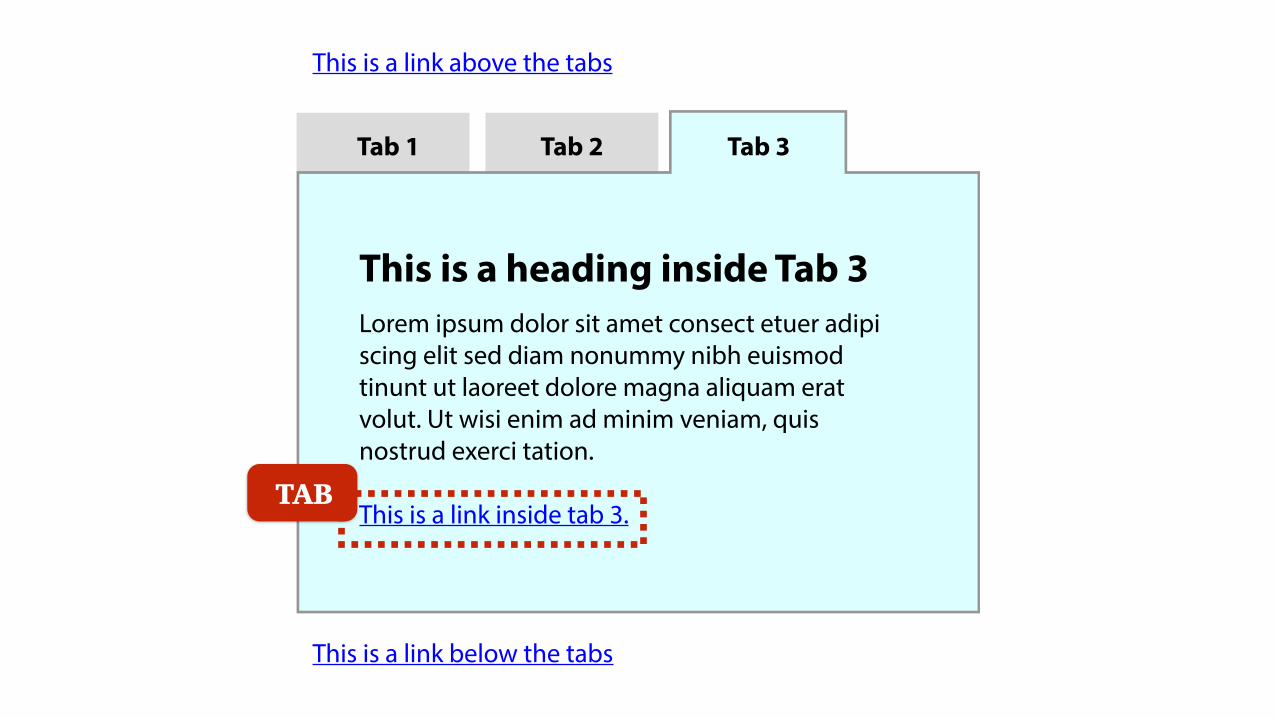
Focus can then move to any focusable items inside the
panel as needed.

Tab 1 Tab 2 Tab 3
This is a heading inside Tab 1Lorem ipsum dolor sit amet consect etuer adipi scing elit sed diam nonummy nibh euismod tinunt ut laoreet dolore magna aliquam erat volut. Ut wisi enim ad minim veniam, quis nostrud exerci tation.
This is a link inside tab 1.
This is a link above the tabs
This is a link below the tabs
TAB

What about markup?
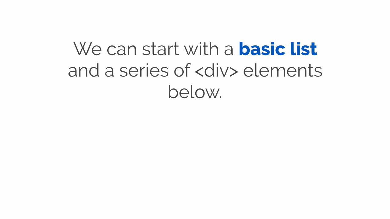
We can start with a basic list and a series of <div> elements
below.
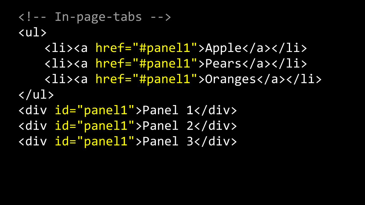
<!-‐-‐ In-‐page-‐tabs -‐-‐> <ul> <li><a href="#panel1">Apple</a></li> <li><a href="#panel1">Pears</a></li> <li><a href="#panel1">Oranges</a></li> </ul> <div id="panel1">Panel 1</div> <div id="panel1">Panel 2</div> <div id="panel1">Panel 3</div>
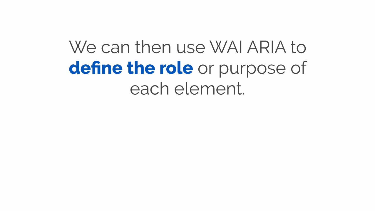
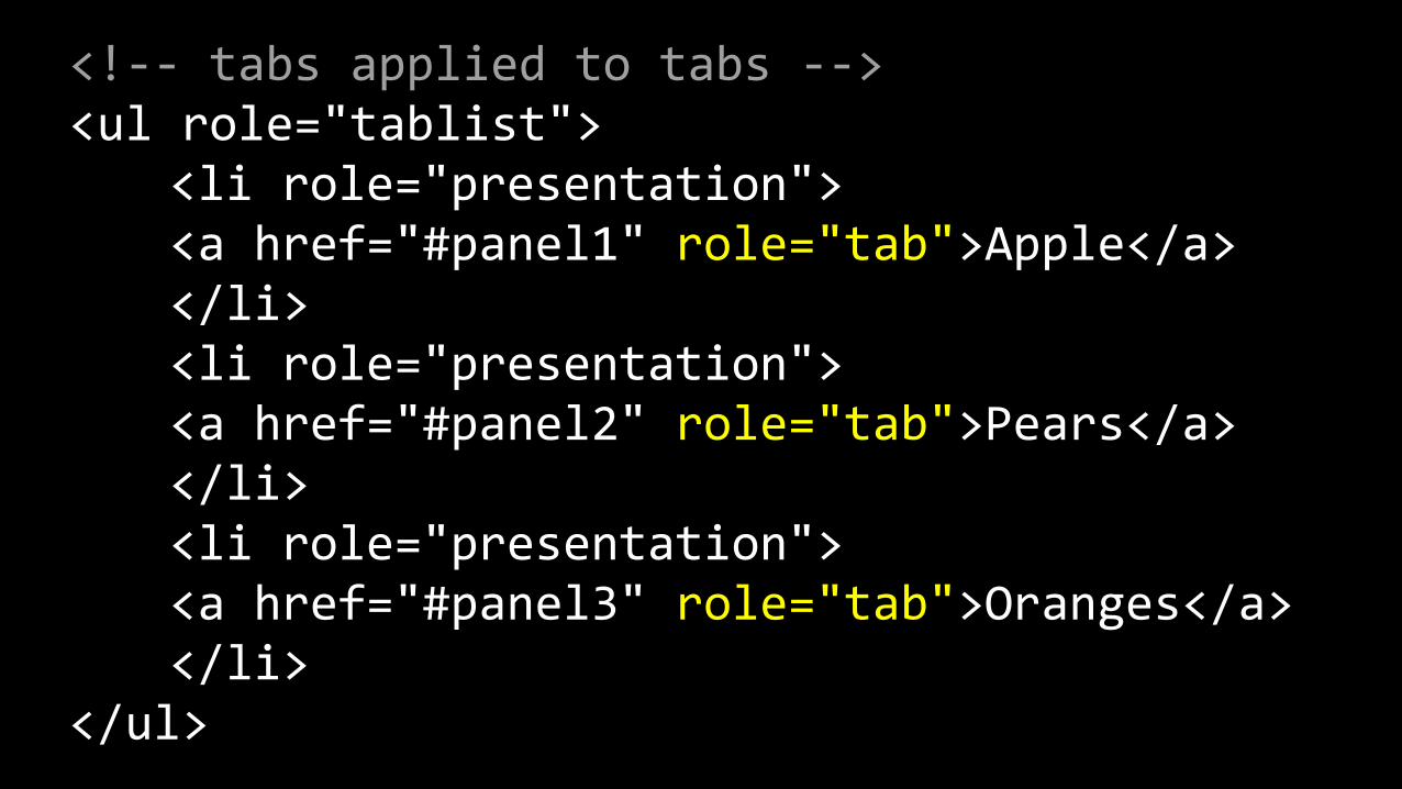
We can then use WAI ARIA to define the role or purpose of
each element.

<!-‐-‐ tablist applied to UL -‐-‐> <ul role="tablist">
</ul>

<!-‐-‐ presentation applied to LI -‐-‐> <ul role="tablist"> <li role="presentation"> </li> <li role="presentation"> </li> <li role="presentation"> </li> </ul>
<!-‐-‐ tabs applied to tabs -‐-‐> <ul role="tablist"> <li role="presentation"> <a href="#panel1" role="tab">Apple</a> </li> <li role="presentation"> <a href="#panel2" role="tab">Pears</a> </li> <li role="presentation"> <a href="#panel3" role="tab">Oranges</a> </li> </ul>
<!-‐-‐ tabpanel applied to panels -‐-‐> <div id="panel1" role="tabpanel"> Panel 1 </div> <div id="panel1" role="tabpanel"> Panel 2 </div> <div id="panel1" role="tabpanel"> Panel 3 </div>

Next up, we need to define the controls for the tab panels
- using aria-controls.

<!-‐-‐ relating panels to tabs -‐-‐> <a href="#panel1" role="tab" aria-‐controls="panel1">Apple</a>
<div role="tabpanel" id="panel1">

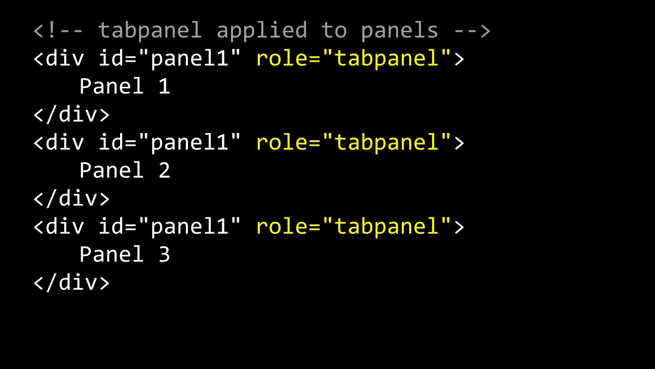
We also need to add labels to the tab panels using aria-
labelledby.
<!-‐-‐ relating tabs to panels -‐-‐> <a href="#panel1" role="tab" aria-‐controls="panel1" id="tab1">Apple</a>
<div role="tabpanel" aria-‐labelledby="tab1" id="panel1">
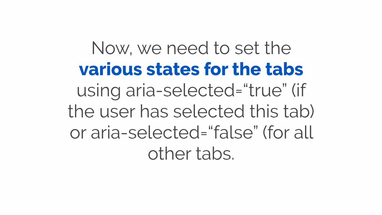
Now, we need to set the various states for the tabs using aria-selected=“true” (if
the user has selected this tab) or aria-selected=“false” (for all
other tabs.
<!-‐-‐ selected tab -‐-‐> <a href="#panel1" role="tab" aria-‐controls="panel1" aria-‐selected="true" id="tab1">Apple</a>
<!-‐-‐ inactive tab -‐-‐> <a href="#panel2" role="tab" aria-‐controls="panel2" aria-‐selected="false" id="tab2">Pears</a>

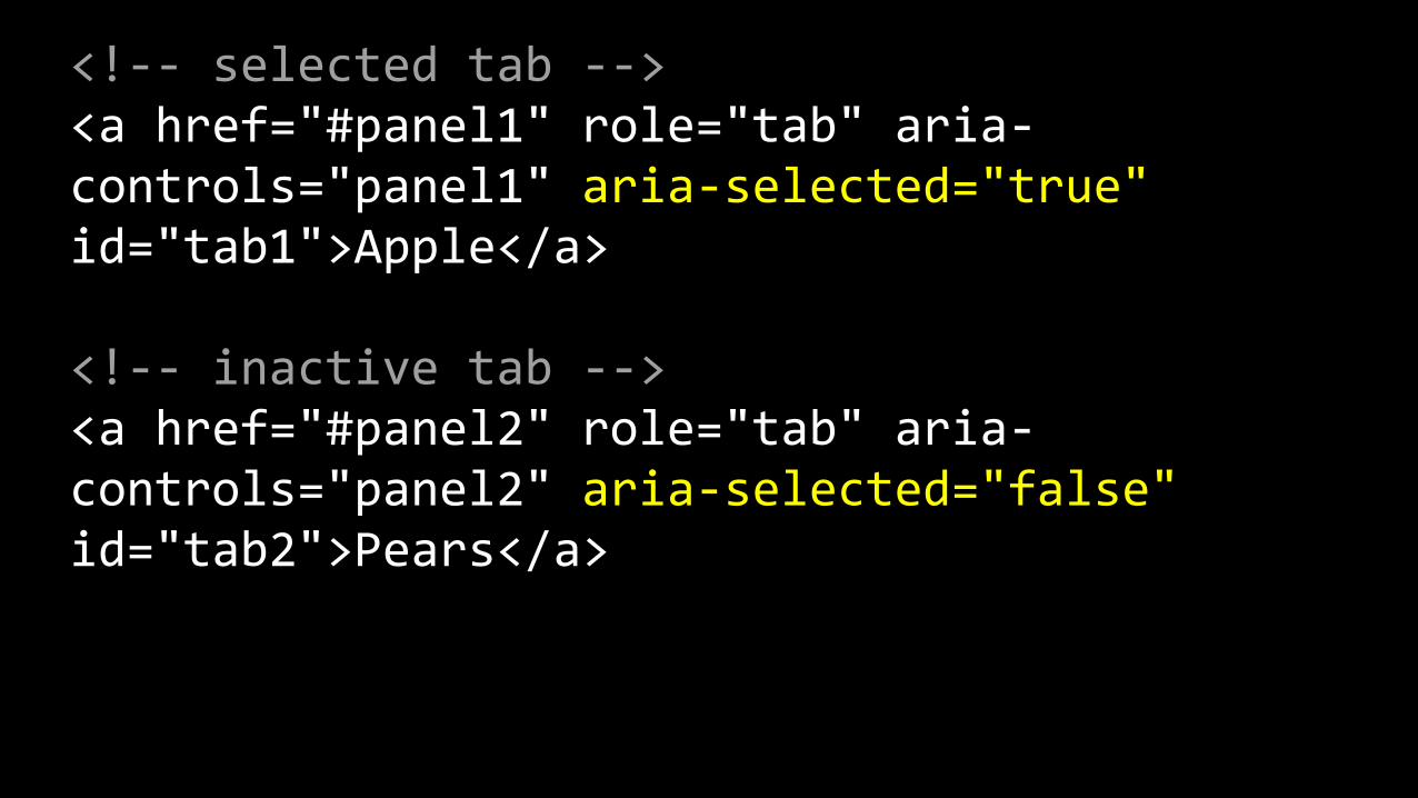
And the various states for the tabs panels using aria-hidden
and aria-expanded.
<!-‐-‐ active panel -‐-‐> <div role="tabpanel" aria-‐hidden="false" aria-‐expanded="true" aria-‐labelledby="tab1" id="panel1">
<!-‐-‐ inactive panel -‐-‐> <div role="tabpanel" aria-‐hidden="true" aria-‐expanded="false" aria-‐labelledby="tab2" id="panel2">
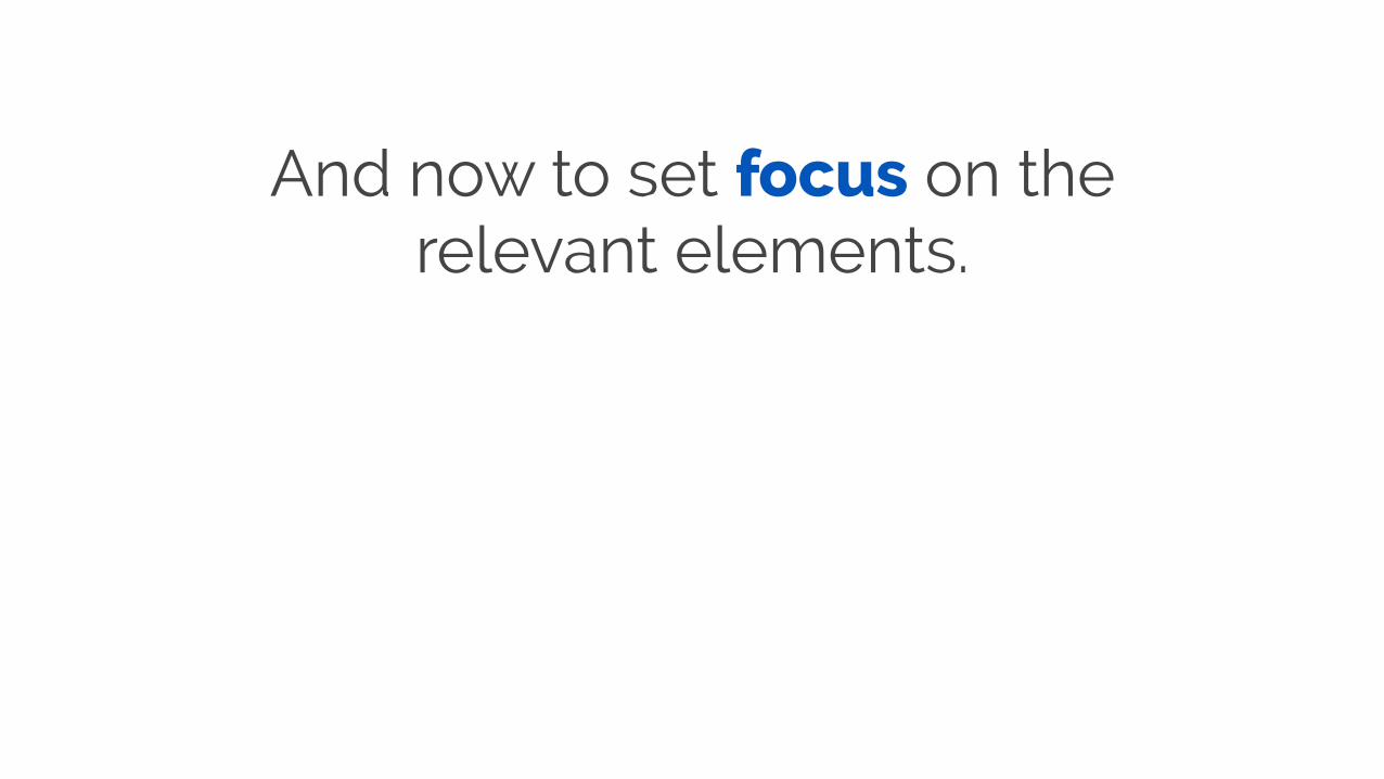
And now to set focus on the relevant elements.
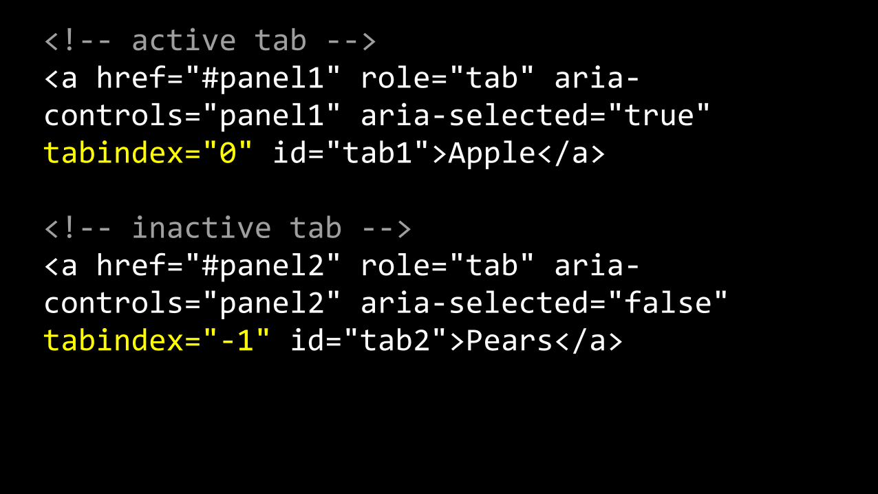
<!-‐-‐ active tab -‐-‐> <a href="#panel1" role="tab" aria-‐controls="panel1" aria-‐selected="true" tabindex="0" id="tab1">Apple</a>
<!-‐-‐ inactive tab -‐-‐> <a href="#panel2" role="tab" aria-‐controls="panel2" aria-‐selected="false" tabindex="-‐1" id="tab2">Pears</a>

JavaScript can be used to swap these various option as
needed.

Breakdown
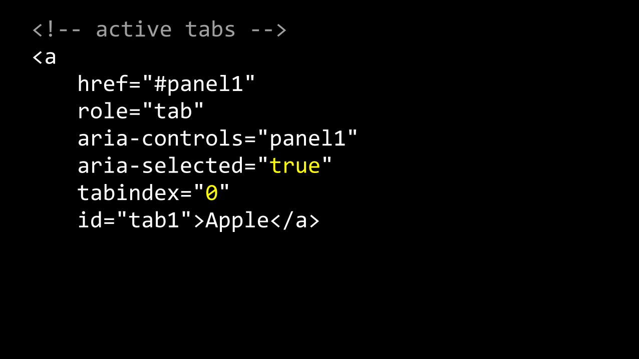
<!-‐-‐ active tabs -‐-‐> <a href="#panel1" role="tab" aria-‐controls="panel1" aria-‐selected="true" tabindex="0" id="tab1">Apple</a>
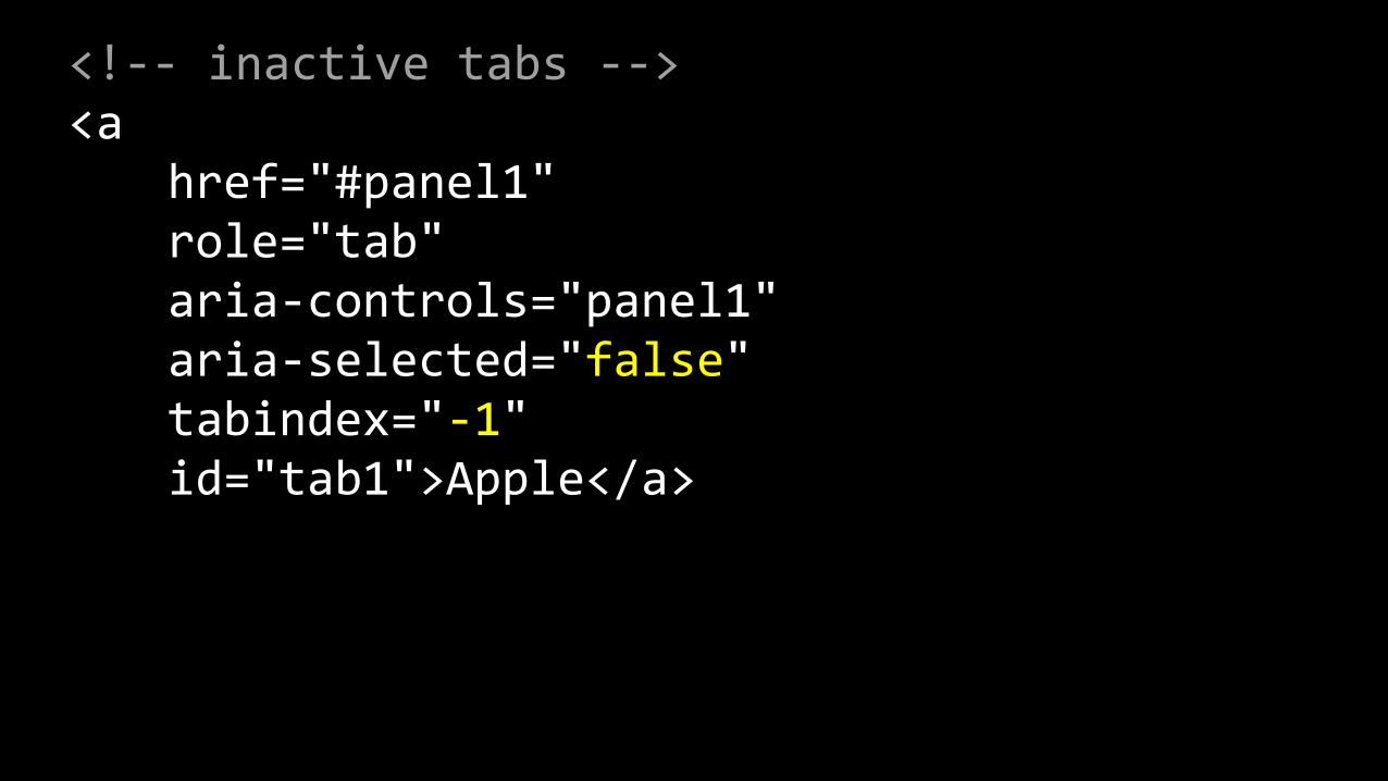
<!-‐-‐ inactive tabs -‐-‐> <a href="#panel1" role="tab" aria-‐controls="panel1" aria-‐selected="false" tabindex="-‐1" id="tab1">Apple</a>

<!-‐-‐ active panels -‐-‐> <div role="tabpanel" aria-‐hidden="false" aria-‐expanded="true" aria-‐labelledby="tab1" id="panel1" class="panel">

<!-‐-‐ inactive panels -‐-‐> <div role="tabpanel" aria-‐hidden="true" aria-‐expanded="false" aria-‐labelledby="tab1" id="panel1" class="panel">
OK, that was intense, but you don’t have to do
all of it

Moving forward
https://www.flickr.com/photos/kakissel/5484265811
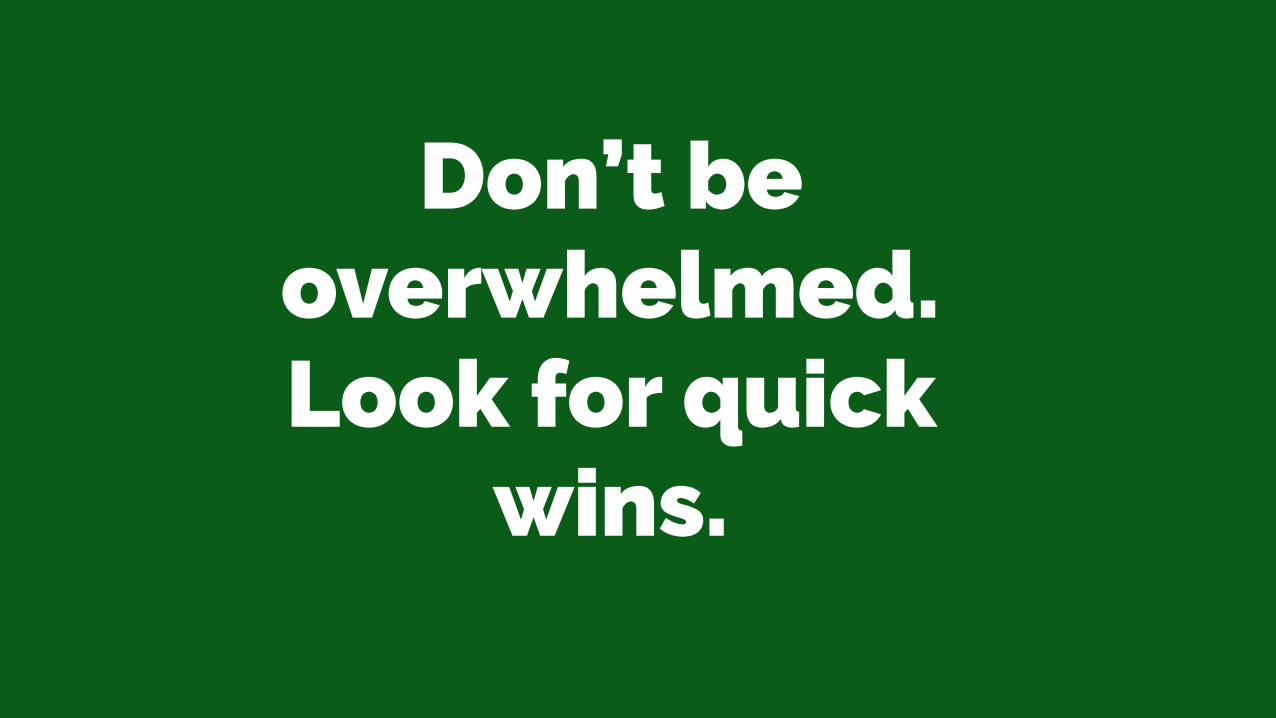
Don’t be overwhelmed. Look for quick
wins.
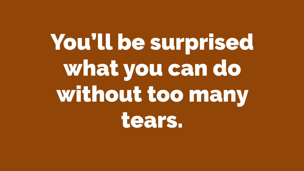
You’ll be surprised what you can do
without too many tears.
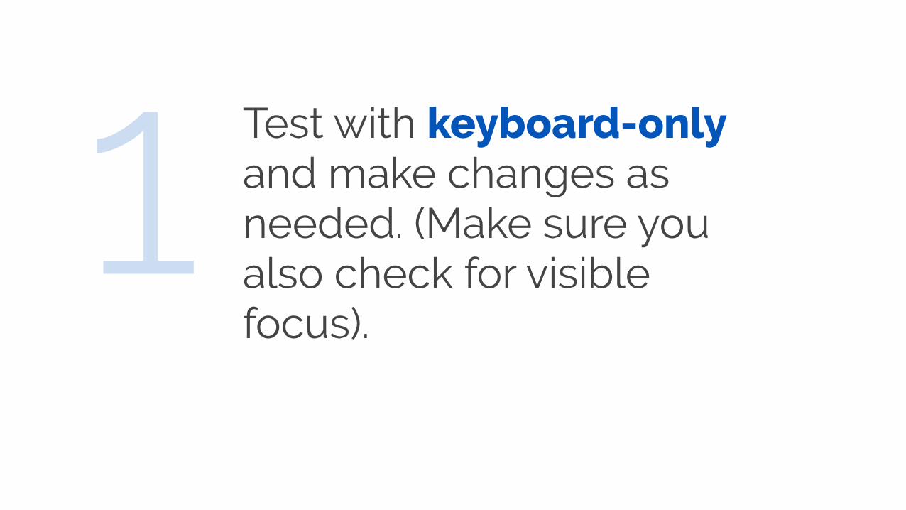
Test with keyboard-only and make changes as needed. (Make sure you also check for visible focus).
1
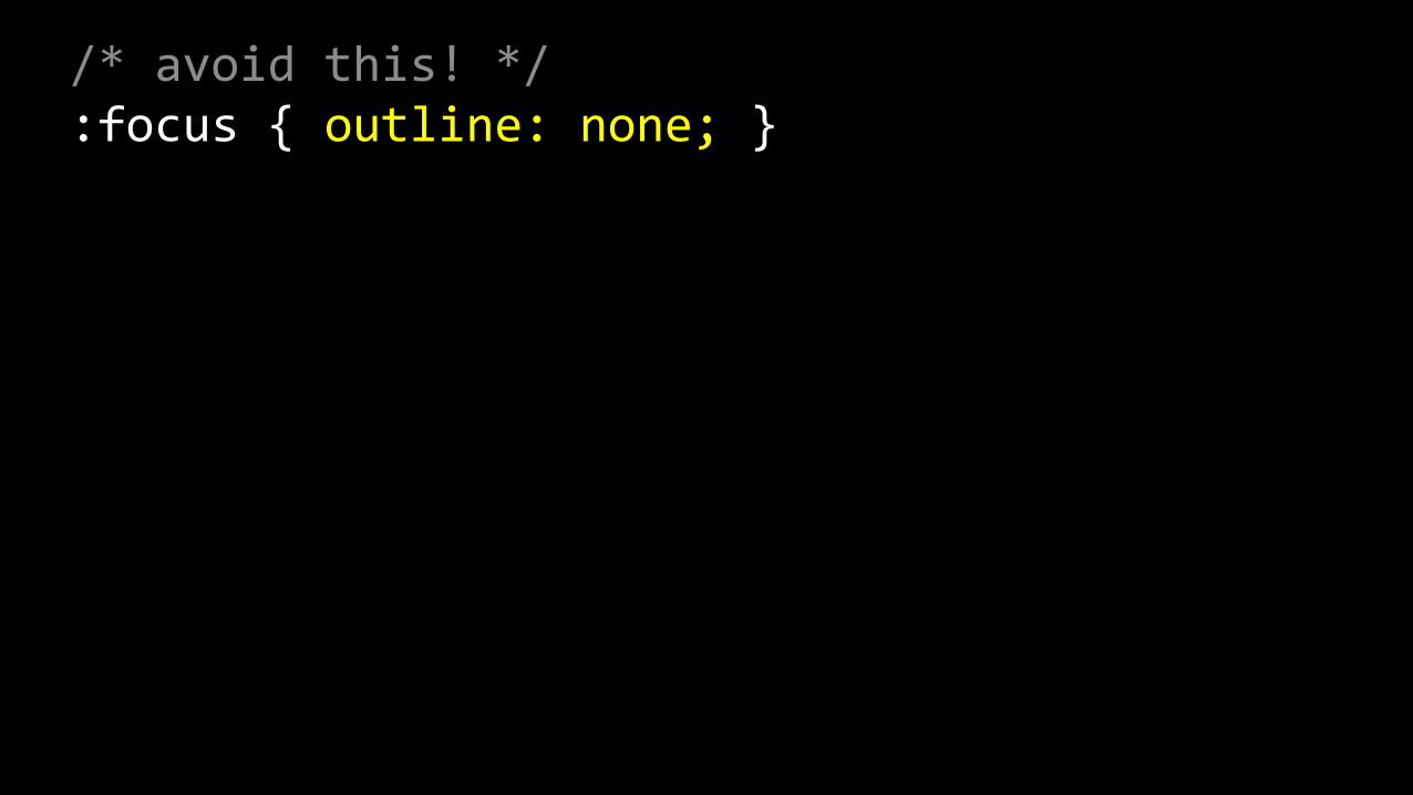
/* avoid this! */ :focus { outline: none; }
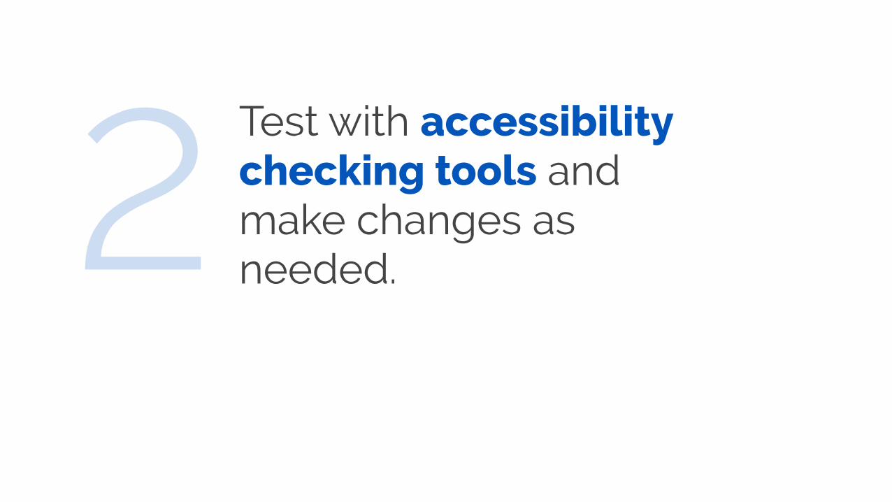
Test with accessibility checking tools and make changes as needed.2
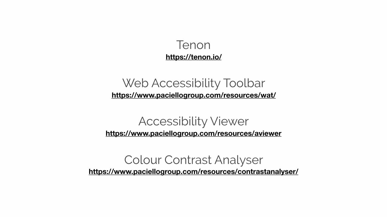
Tenon https://tenon.io/
Web Accessibility Toolbar https://www.paciellogroup.com/resources/wat/
Accessibility Viewer https://www.paciellogroup.com/resources/aviewer
Colour Contrast Analyser https://www.paciellogroup.com/resources/contrastanalyser/
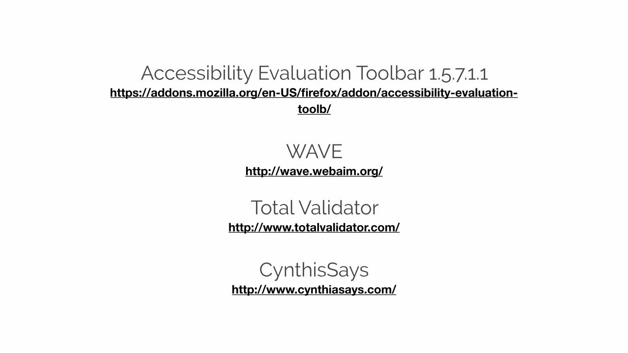
Accessibility Evaluation Toolbar 1.5.7.1.1 https://addons.mozilla.org/en-US/firefox/addon/accessibility-evaluation-
toolb/
WAVE http://wave.webaim.org/
Total Validator http://www.totalvalidator.com/
CynthisSays http://www.cynthiasays.com/

Test with one or more screen readers and make changes as needed.3
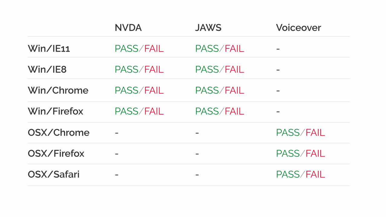
Win/IE11
Win/IE8
Win/Chrome
Win/Firefox
OSX/Chrome
OSX/Firefox
OSX/Safari
NVDA
PASS/FAIL
PASS/FAIL
PASS/FAIL
PASS/FAIL
-
-
-
JAWS
PASS/FAIL
PASS/FAIL
PASS/FAIL
PASS/FAIL
-
-
-
Voiceover
-
-
-
-
PASS/FAIL
PASS/FAIL
PASS/FAIL
Get expert assistance and conduct a formal accessibility audit of your website or web application and action as needed.
4

When is the best time to focus on
accessibility?

The best time to focus on accessibility is right at the beginning of development
process, when creating the individual components in
your pattern library.

Get busy & have fun!

Russ Weakley Max Design
Site: maxdesign.com.auTwitter: twitter.com/russmaxdesignSlideshare: slideshare.net/maxdesignLinkedin: linkedin.com/in/russweakley