chapter 6 wealth (1.31mb)
TRANSCRIPT

The State of Working America
12th EditionLAWRENCE MISHEL • JOSH BIVENSELISE GOULD • HEIDI SHIERHOLZ
This chapter is from The State of Working America, 12th Edition, an Economic Policy Institute book published by Cornell University Press in November 2012.
Data from this chapter should be attributed to the Economic Policy Institute’s The State of Working America, 12th Edition.
EPI DIGITAL EDITION
Wealth

3 7 5
WealthUnrelenting disparities
Preceding chapters have focused on what individuals and families bring in over a given time period, whether wages earned hourly or income received in a year. !is chapter analyzes wealth. A family’s (or individual’s) wealth, or net worth, is the sum of assets, such as a home, bank account balances, stock holdings, and re-tirement funds (such as 401(k) plans and individual retirement accounts), minus liabilities, such as mortgages, credit card balances, outstanding medical bills, stu-dent loans, and other debts, at a point in time. As with wages and other income, wealth is a key determinant of a family’s standard of living. Wealth makes it easier for families to invest in education and training, start a small business, or fund re-tirement. In addition, wealth—particularly liquid assets such as checking account balances, stocks, and bonds—can help families cope with "nancial emergencies related to unemployment or illness. More tangible forms of wealth, such as cars, computers, and homes, can directly a#ect a family’s ability to participate fully in work, school, and community life. Chapter 3 highlighted the class barriers evident in the strong correlation be-tween family wealth in one generation and family wealth in subsequent genera-tions in the United States. In the United States, children of poor parents are much more likely than other children to be poor as adults, and children of wealthy parents are much more likely than other children to be wealthy as adults. !is lack of mobility violates a core American principal of equal opportunity for all. !is chapter further investigates wealth in the United States, uncovering some important, if disturbing, "ndings. !e distribution of wealth in the United States is profoundly unequal—even more unequal than the highly skewed distributions of wages and income
C H A P T E R6

T H E S T A T E O F W O R K I N G A M E R I C A3 7 6
described in earlier chapters. In 2010, the wealthiest 1 percent of all households controlled a much larger share of national wealth (35.4 percent) than did the entire bottom 90 percent of households (which controlled just 23.3 percent of national wealth). !e distribution of wealth has also become much more unequal over time. Between 1983 and 2010, nearly three-fourths (74.2 percent) of the total growth in household wealth accrued to the top 5 percent of households in the wealth distribution. For the bottom 60 percent of households, wealth declined from 1983 to 2010. !e median household had 22.0 percent less wealth in 2010 than it did in 1983, with median household wealth dropping from $73,000 to $57,000 over those 27 years. In 2010, more than 1 in 5 households (22.5 percent) had either zero or negative wealth. Racial and ethnic disparities in wealth are profound. !e median net worth of black households was $4,900 in 2010, compared with $1,300 for Hispanic households and $97,000 for white households. Furthermore, about a third of black and Hispanic households (33.9 percent and 35.8 percent, respectively) had zero or negative wealth, compared with 18.6 percent of white households. For all the talk of the “democratization of the stock market” since the 1980s, a surprisingly small share of households hold any stocks, including stocks held indirectly through retirement accounts and pension funds. In 2010, less than half (46.9 percent) of households owned any stock, and less than one-third (31.1 percent) of households owned more than $10,000 in stocks. !e median black household and the median Hispanic household owned no stocks at all. While stock market ups and downs garner much attention in the news media, housing equity is a far more important source of wealth for most households. In 2010, households in the middle "fth of the wealth distribution had an average net worth of $61,000, $39,300 of which was in home equity. !is means that home equity made up nearly two-thirds (64.5 percent) of the wealth of “typical” households (those in the middle of the wealth distribution). !erefore, though the destruction of home equity and other forms of wealth by the bursting of the housing bubble and resulting Great Recession a#ected households across the entire distribution, the wealth of middle-class households and those below was hit particularly hard. From 2007 to 2010 the average wealth of the top 1 percent of households dropped 15.6 percent, but median wealth dropped an astounding 47.1 percent. !e middle "fth of households saw their housing equity drop 44.6 percent between 2007 and 2010, and in 2010 house-holds in the bottom 40 percent of the wealth distribution had negative housing equity on average for the "rst time on record.
Table notes and !gure notes at the end of this chapter provide documentation for the data, as well as information on methodology, used in the tables and !gures that follow.

W E A L T H 3 7 7
Net worthWealth, or net worth, is the sum of all assets minus the sum of all liabilities. Assets include resources such as homes, bank account balances, stock holdings, and funds in 401(k) plans and individual retirement accounts. Liabilities include mortgages, credit card debt, outstanding medical bills, student loan debt, and other debts. Cal-culations of net worth exclude assets held in de"ned-bene"t pension plans because workers do not legally own these assets and thus do not bene"t or su#er when these assets gain or lose value. For similar reasons, Social Security and Medicare are also excluded from net worth. (However, we later review the contributions of Social Security and de"ned-bene"t pension plans to retirement security. Given the low levels of wealth held by most households, living standards in retirement greatly rely on implicit wealth from de"ned-bene"t pension plans and Social Security.) Net worth can be further subdivided into net non"nancial (tangible) assets, and net "nancial assets. Net tangible assets are assets such as real estate and du-rable goods, minus mortgage debt. Net "nancial assets are assets such as stocks, bonds, mutual funds, and bank account balances, minus nonmortgage debt. Fig-ure 6A shows average net worth per household, along with net tangible assets and net "nancial assets, from 1965 to 2012.
�������� ���������������������������������������������������������������� ����������������������� ��������
��
��������
��������
��������
�������
�������
��������
��������
��� ���� ��� �� � �� ���� ��� ���� ��� ����
���������
���������������������
���������������������
� �;@3@5;3>�3EE7FE�?;@GE�@A@?ADF9397 674F�� !AGE;@9�3@6�5A@EG?7D�6GD34>7E�?;@GE�:A?7 ?ADF9397E'AF7���3F3�3D7�CG3DF7D>K�3@6�7JF7@6�8DA?�F:7�8;DEF�CG3DF7D�A8������FA�F:7�8;DEF�CG3DF7D�A8�� ����,:3676�3D73E67@AF7�D757EE;A@E�
,AGD57���GF:ADEP�3@3>KE;E�A8��767D3>�+7E7DH7��A3D6��>AI�A8��G@6E��55AG@FE�3@6��GDD7@F�)ABG>3F;A@�,GDH7K�!AGE;@9�/353@5K�,GDH7K ��� ���������� �-34>7 ��

T H E S T A T E O F W O R K I N G A M E R I C A3 7 8
For decades, the real average net worth of U.S. households grew at a relatively steady and modest pace—about 1.2 percent per year from 1965 to 1994. In the mid-1990s, net worth began to grow at a faster pace on average but also became increasingly volatile, as illustrated by two peaks (1999 and 2006) that were each followed by precipitous declines. During the "rst steep run-up in wealth, from 1994 to 1999, net worth, fueled by the dot-com bubble, grew 42.1 percent; as that bubble de$ated, net worth declined 12.9 percent from 1999 to 2002. Net worth rebounded at a rapid pace from 2002 to 2006, but much of the increase was due to a growing housing bubble, which began in$ating around 1997. After the housing bubble burst in 2006, net worth plummeted, dropping over 25 per-cent between 2006 and early 2009. Since 2009 it has rebounded slightly, growing over 12 percent between early 2009 and early 2012. Net "nancial assets make up the majority of average net worth (though, as discussed later in the chapter, average net worth "gures are skewed by the net worth of the very wealthy; most households have greater tangible assets, in par-ticular housing value, than "nancial assets). Figure 6A shows that the trajectory of net "nancial assets closely mirrors that of overall net worth. However, between 1997 and 2005, growth in net worth was also bolstered by growth in tangible assets as the housing bubble in$ated. Between 1997 and 2005 net tangible assets grew about 70 percent; after the housing bubble burst, they fell, dropping back to their pre-bubble levels by 2011. !e data underlying Figure 6A are from the Federal Reserve Board’s Flow of Funds Accounts of the United States. !ese data are timely, but they do not allow for an analysis of how wealth is distributed across the population. We turn to the Survey of Consumer Finances (SCF) to conduct a distributional analysis, presented in the next set of tables and "gures. !is dataset, collected every three years by the Federal Reserve Board, is one of the country’s primary sources of data on wealth. !e latest data available are from 2010. As mentioned, the distribution of wealth in the United States is dramati-cally more unequal than even the extremely unequal distributions of wages and income. Table 6.1 shows the income distribution and the wealth distribution for 2010. It provides shares of total household income and wealth held by the top 1 percent, the next 9 percent (those between the 90th and 99th percentiles), and the bottom 90 percent of households in the income or wealth distributions. !e 1 percent of households with the highest incomes received 17.2 percent of all income. At the same time, the 1 percent of households with the most wealth held 35.4 percent of all net worth. !e entire bottom 90 percent of the income distribution received just 55.5 percent of all income, but that astoundingly small share dwarfs the share of wealth held by the bottom 90 percent of the wealth dis-tribution, which was only 23.3 percent.

W E A L T H 3 7 9
!e distribution of wealth has become more unequal over time, with the top 10 percent, and especially the top 5 percent, of the wealth distribution holding an increasing share of the country’s total wealth. Table 6.2 shows the share of wealth held by households in various segments of the wealth distribution. !e top 5 percent of wealth holders have consistently held over half of all wealth, with their share increasing from 56.1 percent in 1983 to 63.1 percent in 2010. !e bottom four-"fths of wealth holders have consistently held less than 20 percent of all wealth; their share decreased from 18.7 percent in 1983 to 11.1 percent in 2010, with all of that lost share migrating upward to the top 10 percent. !e middle "fth of households held 2.6 percent of total wealth in 2010, its lowest recorded share. In 1983, middle-"fth households had 5.2 percent of wealth, which means their share of all wealth was cut in half between 1983 and 2010. Table 6.3 shows overall average and median wealth, as well as average wealth by wealth group. As seen in Figure 6A, over the long run, average wealth grows along with an expanding economy, but also experiences short-run $uctuations due to business cycle dynamics, i.e., economic booms and busts. In 1983, average household wealth was $284,400; by 2007, it had roughly doubled to $563,800, its peak before the onset of the Great Recession. By 2010, average household wealth had dropped to $463,800, 17.7 percent below its 2007 level, but still 63.1 percent above its 1983 level and, as we saw in Figure 6A, it was again on an up-ward trajectory as the economy began to recover from the recession. However, since all of the gains in wealth have gone to the top portion of the wealth distribution, median wealth, or the wealth of the typical household, has fared very poorly over the last three decades. Median wealth grew just 47.5 per-cent between 1983 and 2007, from $73,000 to $107,800, but with the housing bust and resulting Great Recession, all those gains and more were lost. Median wealth fell to $57,000 in 2010, meaning there was a 22.0 percent decline in the wealth of the typical household over the 27 years between 1983 and 2010. Over
�������� �������������������������������� �������������������� ������ ����
����������������
��������������� ��������� ����� ��������
���������� �� �����
����!��������������� ��� ����
������ ��� ���
�� ����� �����
������� ���� ������

T H E S T A T E O F W O R K I N G A M E R I C A3 8 0
the same period, average wealth of the top 5 percent of households grew 83.1 percent, from nearly $3.2 million in 1983 to over $5.8 million in 2010. Declines in average wealth due to the housing bust and resulting Great Reces-sion were bigger in percentage terms for the bottom four-"fths of households than for groups in the top "fth of the wealth distribution. For example, between 2007 and 2010, middle-"fth household wealth dropped 45.3 percent while wealth of the top "fth dropped 14.0 percent. !is is unsurprising given that households with less wealth tend to have a much larger share of their wealth in their homes. !is feature of the wealth distribution, which will be discussed later in this chap-ter, underscores how the expansion and collapse of the housing bubble caused enormous damage to the balance sheets of middle-class households. Table 6.3 shows that average household wealth grew $179,400 between 1983 and 2010, from $284,400 to $463,800. Figure 6B spotlights the increase in wealth inequality over this period by showing which groups in the wealth
�������� ����������!��������� ��#�����������������!������ � �"����
������
��������� ��
� � � � � � � � ���� ���� ����� �"� �
� �"����
��������� ��������
��� ���� �� � ���� ��� ��� �� ���� ����
������ ���� ���� �� ���� ���� ��� �� ��� ����
�� ��� �� � ��� ��� ��� ��� �� �� ����
����� �� � ��� �� ��� ��� �� ��� ���
����� ��� �� �� �� �� ��� ��� ���� ���
��������� ���� ���� ��� � ����� ����� � ��� ����� ��� ���
������������� ������
��� �� ��� � �� �� � ���� ����
������������� ������
�� � �� � �� � ��� ��� �
������ ��� �� ��� ��� �� ��� ��� ���� ���
� &�)���&�#�$��!&���
� �� �� �� �� ��� ��� � ��
�"#�� ���� ���� ���� ��� ���� ���� � �� ��� ��
����� ������ ������ ������ ������ ������ ������ ������
�����&������!����%�!�&�("$&����"'%��"����%%�&%� �!'% ���&%�
�"'$�����"��� ���

W E A L T H 3 8 1
����
����
���
�����
����
������
��������
���
�������
����
����
����
�����
���
��� ����
����
� ��
����
�
����
��
���
� ��
���!
����
����
���
���
���
����
���
����
��#
���
���
#��
���
�#
����
���
#��
��
�"��
���
����
��
����
��
���
���
�� �
����
��
��
���
���
����
������
���
���
���
����
���
���
���
����
�����
����
����
����
�����
���
� ��
���!�
����
����
�
� ��
� ���
�����
�����
����
���
��
�� �
�����
�����
���
������
����
���
���
�����
�����
�����
����
��
��
�� �
����
� ��
���
����
���
����
���
����
����
�����
� ��
��
���
���
���
����
���
��
�����
���
����
����
����
�����
���
���
���
�����
����
����
���
� ��
� ��
���
���
����
���
����
��� �
����
����
���
����
� �
� ��
����
���
����
���
��
���
�� �
� ��
��
�����
������
����
����
����
����
� ��
����
����
���
��
� ��
���
����
� ���
���
����
�� ��
���
����
����
����
� ��
����
����
����
�� �
����
����
��
��
��
��
��
���
���
���
���
������
��
��
���
���
���
���
���
��
����
���
���
�
����
���
����
����
�� �
���
����
����
����
����
����
���
��
����
���
����
���
���
���
��
��
���
���
���
��
����
���
�����
�����
������
���
��
����
��
����
���
� ��
���
� �
���
���
���
���
����
����
��
����
���
�
�����
����
����
������
�����
�����
����
����
����
�����
����
����
���
�� �
����
����
����

T H E S T A T E O F W O R K I N G A M E R I C A3 8 2
distribution actually claimed that increase in average household wealth. Nearly 40 percent (38.3 percent) of the increase in average household wealth between 1983 and 2010 accrued to the top 1 percent of the wealth distribution, and nearly three-fourths (74.2 percent) accrued to the top 5 percent of the distribution. For the bottom 60 percent of households, wealth declined from 1983 to 2010. Figure 6C presents increasing wealth inequality in another way. !e "gure shows the ratio of the average wealth of the top 1 percent of households in the wealth distribution to the wealth of the median household. In 1962, the ratio was 125-to-1. In other words, the wealth of the wealthiest 1 percent of households averaged 125 times the wealth of the median household. However, that large disparity is dwarfed by today’s wealth gap; in 2010, the wealthiest 1 percent of households had on average 288 times more wealth than the median household. With Figure 6D we extend our analysis beyond the top 1 percent to the net worth of the “ultra wealthy,” the 400 wealthiest people in the United States as captured in the “Forbes 400.” !e average annual net worth of the top 400 rises as asset bubbles in$ate, drops when asset bubbles burst, and quickly bounces back. !e rise of the dot-com bubble at the end of the 1990s and its fall, and then the rise of the housing bubble in the mid-2000s and its fall, are apparent in the "gure. While the net worth of the ultra-wealthy dropped from 2007 to 2009, it began
�������� �� ������������� ������ ������������������������������ ���������� ���������
���������� ����
���
�����
�����
����� ���
��
��
�
���
��
���
��
���
��
��
� �����������������
������������� ������
������������� ������
������������� ������
�������� ���
����������
�����������
����������
�� ��������
,AGD57��0A>88 �� ���

W E A L T H 3 8 3
�������� ����� �������������������������������������������� ���������
������
���
��� ��� �� ���
����
���
���
���
���
���
��
���
���
���
���
��
���
��� �� � �� �� � ���� ���� ���� ����
,AGD57��0A>88 �� ���
�������� ���� ��� ��� ������������������������������ ���������������� ���������������������������� ���� ���
���� ������������
���� ������������
����
���
����
���
����
���
����
���
����
���
���
���� ��� ���� ���� ���� ���� ��� ����
'AF7��,:3676�3D73E�67@AF7�D757EE;A@E�
,AGD57���GF:ADEP�3@3>KE;E�A8��DAA?�3@6�,:3K��� ��3@6 ������ �H3D;AGE K73DE�

T H E S T A T E O F W O R K I N G A M E R I C A3 8 4
to rise again in 2010 and continued to rise in 2011. Overall, from 1982 to 2011, average wealth of the top 400 increased by 234 percent, from $1.1 billion to $3.8 billion. In 2011, the collective net worth of these 400 individuals was $1.5 tril-lion. !e price of admission to the top 400 has also increased substantially; in 2011, the minimum for being in the top 400 was $1.1 billion, nearly three times the $368.8 million threshold in 1982. And, perhaps unsurprisingly given the ris-ing wealth inequality already documented in this chapter, gains were even greater for the wealthiest of the ultra-wealthy; in 1982, the net worth of the wealthiest person in the top 400 was $9.9 billion, but by 2011 it was six times higher, at $59.0 billion. At the extreme other end of the wealth spectrum are a signi"cant share of households with low, zero, or negative net worth. Table 6.4 reports the share of all households with zero or negative net worth, and net worth of less than $10,000, from 1962 to 2010. In 2010, more than 1 in 5 households (22.5 percent) had zero or negative net worth, while another 12.6 percent had net worth of more than zero but less than $10,000. !us, more than one-third (35.1 percent) of U.S. households had wealth holdings so low that they were extremely vulnerable to "nancial distress and insecurity. !e share of households in this precarious posi-tion had held fairly steady for two-and-a-half decades, increasing 0.5 percentage points, from 27.7 percent to 28.2 percent, between 1983 and 2007. However, it
�������� ����������� ��������"������"�����"������� �#���������� ��������
��������������!�����"����
������!��� �����������������������"����
����������"���������������������
� � ���� ��� ����
� � ���� ���� � �
� � � �� ��� ����
� � ���� ���� ����
���� � �� ���� ����
���� ���� ��� ����
���� ���� ���� ���
������
� �#� � ���� �� ��
� �#���� �� ���� ���
����#���� �� �� ���
������������� ������

W E A L T H 3 8 5
increased dramatically—by 6.9 percentage points—from 2007 to 2010, during the Great Recession and its aftermath.
The racial divide in net worth!e legacy of economic disadvantage for racial and ethnic minorities is apparent in persistent and profound racial and ethnic disparities in wealth, disparities that are far greater than racial and ethnic disparities in wages and incomes. Here we examine disparities in net worth by race and ethnicity; later in this chapter we examine disparities in assets and liabilities. Table 6.5 shows that in 2010 the median net worth of black households was $4,900, just 5.0 percent of the median net worth of white households, $97,000. In 2010, the median net worth of Hispanic households was an even lower $1,300, just 1.4 percent of median white household net worth. Persistent, large disparities also appear in shares of households with low net worth. In 2010, black and Hispanic households were nearly twice as likely as white households to have zero or negative net worth; 33.9 percent of black
�������� �������� �������"���������������������� ��������"����$������������!��"��������#������������������#� ���%����
������
��� �� �� ���� ���� �������%����
����%����
����� ������� ������������������� ����
���� ���� ��� ���� ��� ���� ���� ��� ������
�������� & & ��� ��� ��� �� & �����
����� � �� ��� ���� ��� � ���� ��� �� ��
����� ������������� ������������������
�������"����
���� ��� �� ���� ���� ��� & &
�����������"����
& & ��� �� ��� �� & &
����������������������������� ������� ��������
���� ���� ����� ���� ����� ����� ����� ���� ��
�������� & & ��� � �� ��� � �� & ��
����� �� � ��� �� �� ��� �� ���
�����#�����������"���#�% !#���� $"�� ����""�#"����$" ���#"�
� $!����� ��� ���

T H E S T A T E O F W O R K I N G A M E R I C A3 8 6
households and 35.8 percent of Hispanic households had zero or negative net worth, compared with 18.6 percent of white households. !ese persistent wealth disparities are apparent in Figure 6E, which presents median wealth by race and ethnicity between 1983 and 2010. !e "gure also shows the damage to all groups’ wealth during the Great Recession and its aftermath. Be-tween 2007 and 2010, median white household wealth dropped $54,100. !is was more in absolute terms than the $8,300 decline in median Hispanic household wealth and the $4,800 decline in median black household wealth. However, black and Hispanic households started from much lower levels of wealth and experi-enced considerably larger percentage declines in wealth. Median white household wealth declined 35.8 percent between 2007 and 2010, while median black house-hold wealth dropped 49.7 percent and median Hispanic household wealth was all but wiped out over this period, dropping 86.3 percent.
AssetsAs mentioned previously, net worth or wealth is determined by two compo-nents—assets and liabilities. !is section further investigates assets, while the following section will further investigate liabilities. !ere are myriad assets house-holds may possess, including houses, stocks, bonds, and bank account balances.
�������� ������������������������� ���������������������������������� ��������
��������
������������
���� ������
��������
���� ������
��
�������
�������
������
�������
��������
��������
��������
�������
���� ��� ���� ���� ���� ���� ���� ���� ��� ����
�����
,AGD57��0A>88 �� ���

W E A L T H 3 8 7
!e distribution of assets varies signi"cantly by the type of asset. Some assets, such as stocks and bonds, are highly concentrated among a relatively small share of households. Other assets, such as houses, are more widely held. !e distributional di#erences of these assets are strongly related to overall wealth holdings. Wealthy households, for example, tend to hold a much higher percentage of their wealth in "nancial assets such as stocks and bonds, whereas less-a%uent households, partic-ularly those in the middle of the wealth distribution, typically hold most of their wealth in housing equity. !is di#erence is one reason middle-class households were disproportionately a#ected when the housing bubble burst. Table 6.6 shows that while the distribution across wealth groups of di#erent types of household assets varies, it always strongly favors those at the top. In 2010 the wealthiest 5 percent of households owned about two-thirds (67.1 percent) of all stock, and an even larger share (79.9 percent) of stock not held in retirement accounts. Households in the bottom 80 percent of the wealth distribution held just 8.3 percent of all stock, and even less, 3.5 percent, of stock not held in retire-ment accounts. In comparison, housing equity is less skewed. However, the top 5 percent of households still held a highly disproportionate share (34.3 percent) of housing equity, a bigger share than the 29.9 percent held by the entire bottom 80 percent of households.
��������� ����"��� �#�!%�!�� �!������#!�������!!�"!���$��!!�"�"$��� ����
����"��� �#� "���!�
"���!���"�������
�"� ����"����#�"!��
��#!�����#�"$
��"���!!�"!
��""���� ��� ���� ���� �����
��������� �� �� ��� ����
��� ����� ����������� ���� �� ���� ���
��� ����� ����������� ��� ���� � �� ���
����� ��� ���� �� ���
��� ����� ����������� �� �� ��� ���
����� ��� ���� �� ���
��)�,�����)��&�'��$) "� ��� �� ��� ���
����)�,���)��&�'��$) "� �� �� ��� ��
����� ����� ����� ����� �����
� �$�"*��(�� '��)�%+$�'(� &�%��()%�!�(��'�(��$�� $� '��)�%+$�'(� &�)�'%*���#*)*�"��*$�(��)'*()(���$�����(���%���&"�$(������!��&"�$(���$��%)��'�'�) '�#�$) ���%*$)(
�� �$�"*��(�� '��)�%+$�'(� &�%��()%�!�(��'�(��$�� $� '��)�%+$�'(� &�)�'%*���#*)*�"��*$�(��$� )'*()(
�%*'�����%"�� ����

T H E S T A T E O F W O R K I N G A M E R I C A3 8 8
Table 6.7 shows how the various wealth groups’ holdings of di#erent types of assets have changed over time. In 2010, the wealthiest 1 percent of households owned an average of $3.5 million in total stocks (including stocks held in retire-ment accounts). !e next 9 percent (those between the 90th and 99th percentiles) owned an average of $509,200 in total stocks. In comparison, the middle "fth of households held just $8,900 in stocks on average, and the bottom two-"fths of households held $1,700. !ese data con"rm that stock ownership is not at all pervasive in or below the middle class, even taking into account stocks held indirectly in retirement plans. Excluding stocks held in retirement accounts, the typical wealth holder—represented by households in the middle "fth—owns next to nothing in stock, just $1,700. Stock holdings are further investigated later in the chapter. In 2010, the wealthiest 1 percent of households held an average of $1.3 mil-lion in housing equity (housing assets minus mortgages). !is was 24.7 percent less than their $1.7 million in housing equity in 2007, but still well above the $1.1 million in housing equity they held in 2001. Households lower in the wealth distribution fared much worse when the housing bubble burst. !e middle "fth held just $39,300 in housing equity on average in 2010, 44.6 percent less than in 2007 and 15.5 percent less than the $46,500 average home equity they had 27 years earlier, in 1983. In 2010, households in the bottom two-"fths of the wealth distribution had negative housing equity. !is means that on average, homeown-ers in the bottom two-"fths were “underwater” on their home loans in 2010, i.e., they owed more on their homes than their homes were worth. Housing is further investigated later in the chapter. Table 6.8 shows average and median household assets (stocks, housing eq-uity, and total assets) by race and ethnicity from 1983 to 2010. As shown in Table 6.7, households in the bottom 80 percent of the wealth distribution generally hold little in stocks, even including stocks held in retirement accounts. Table 6.8 shows that in 2010, the median black and median Hispanic households held no stocks, even including stocks held in retirement accounts, while the median white household held just $1,200 in stocks. Table 6.9, discussed later, provides a more direct look at the startlingly low share of households with any signi"cant stock holdings, showing that the strong public narrative of the “democratization” of the stock market since the 1980s is at odds with the facts. Although housing equity, as already mentioned, is more widely held than other forms of wealth such as stocks, the median black household and the median Hispanic household had zero housing equity over the entire period, while the median white household had $45,000 of housing equity in 2010 (a drop of more than one-third—37.1 percent—from their $71,500 in housing equity in 2007). !e median is a better indication of the “typical” household in a given cat-egory than the average, since the median is the value at which half of households

W E A L T H 3 8 9
�������� �(�$�����"'%��"����%%�&%���*�)���&���$"'#��!���%%�&�&*#��� �+������&�"'%�!�%�"������ �"���$%�
����&�����&� �$����")!�"��&"#����&�
�%%�&�&*#��"&&" &)"
������ �"'$&���&�+� �&�
#�$��!&���
�&�+� &�#�$��!&���
�"#���
������
� � ��� ��� ��� �� � ���� ��������
� � �� ��� ��� ���� ���� ������
� � �� �� ���� ��� ����� �����
� � ��� ���� ���� ����� � ��� ���� ��
���� ��� ��� �� ����� ����� ������
���� �� ��� �� ����� ��� �� ���
���� ��� �� ��� �� � ���� �����
������������ ������������������������
� � ���� ��� ��� ����� � ��� �����
� � �� �� ���� ��� ���� ����
���� ��� �� ��� ���� � ��� ������
���� �� ��� ��� �� ��� �������
���� ��� ��� �� � �� � ��� �� ���
�������������
� � ��� ����� ���� � �� ����� ������
� � � �� ���� ���� ����� � ���
� � �� � ���� ���� ����� ���
� � � �� � �� ���� ����� ����
���� ��� �� ����� ����� ���� ������
���� �� ���� ���� ����� ��� ������
���� ���� ���� ���� ���� ���� ������
���� �������
� � ����� � �� ���� ������ ������ ����� ��
� � ���� ����� ���� � �� ��� ��� ������
� � ���� ���� ����� �� ������� ��������
� � ��� ���� ����� ��� ����� ���� ��
���� ��� �� ����� ����� ������ ����� �
���� ��� ����� ���� ���� ������ ��������
���� �� ���� ����� ����� ������ ��������
�������� �� ������

T H E S T A T E O F W O R K I N G A M E R I C A3 9 0
have more and half have less. However, because median housing equity for black and Hispanic households is zero over the entire period, we turn to averages to pro-vide some sense of how housing wealth has changed over time for these groups.
�������� %�!�����������������$"�������""�#"���&�!�����#�����#&������""�##& ������'������#��$"���"�������� �����!"�
������ %�!���
���#� ����� ��" ���� ���#� ����� ��" ����
�� �
��� ���� ���� ���� ���� ���� ���
���� ��� ��� ��� � �� �� ��
���� ��� ��� ��� � �� ��� ���
���� �� ��� ��� ���� ��� ���
��� � ��� ��� ���� �� ���
���� � ��� ��� ��� �� ���
���'��� � � � �� � � � ��� �����
���'���� ��� � � ����� ��� ����
� ����������
��� � ��� ���� ���� ����� ���� �� �
���� �� ��� ��� � �� ���� ���
���� ���� ��� ��� ��� ��� ���
���� ��� ��� ��� ��� ��� � �
��� �� ��� ��� ���� ��� ����
���� � �� ��� ��� ��� ���� ����
���'��� ��� � � ����� ����� ���
���'���� ����� � � ����� ����� �����
� ����������
��� � �� ��� ��� �� �� ����� ���
���� ��� ��� ��� � ��� ��� ���
���� ���� ��� ��� �� � ����
���� ���� �� �� ����� ��� ����
��� �� ���� �� ���� ���� ����
���� � �� �� ��� ��� ��� ���
���'��� ��� �� ���� ���� ��� � �����
���'���� ����� ����� � � � ���� ���� �����
������������� ���

W E A L T H 3 9 1
!e average black household had $39,400 in housing equity in 2010, very close to the housing equity of the average Hispanic household ($39,700), and slightly less than a third of the housing equity of the average white household ($124,600). Between 2007 and 2010, the average black household lost 27.8 percent in hous-ing equity, compared with a loss of 24.4 percent for the average white household. !e average Hispanic household saw its home equity cut almost in half (falling 49.1 percent) between 2007 and 2010. In 2010, the median black household held $28,100 in total assets, more than the $20,000 in total assets of the median Hispanic household but signi"cantly less than the $205,000 in total assets of the median white household.
Stocks!is subsection and the next will look in more depth at two major asset categories, stocks and housing, respectively. While the stock market has experienced ups and downs throughout the last 50 years, stocks have been extremely volatile in the last two decades, as evident in Figure 6F, in which the two recent bubbles are unmis-takable. !e in$ation-adjusted value of the Standard & Poor’s composite index of the 500 largest U.S. "rms (the S&P 500) increased 230 percent between 1989 and 2000, then lost over a third of its value between 2000 and 2003, after the dot-com bubble burst. !e market regained more than 60 percent of those losses
��������� ������������� �� ���������
�
���
���
���
��
��
���
�� ���� ��� ���� ��� �� � �� ���� ��� ���� ��� ����
����
���
����
�����
������
����
����
� ,F3@63D6�3@6�)AADPE�� �EFA5=�BD;57�;@67J�36<GEF76�8AD�;@8>3F;A@�GE;@9��)".+,�3@6�;@67J76�FA ��� �� �'AF7��,:3676�3D73E�67@AF7�D757EE;A@E�
,AGD57���GF:ADEP�3@3>KE;E�A8�F:7 �� � ������ ��� ������������� ��AG@5;>�A8��5A@A?;5��6H;E7DE � ���
T H E S T A T E O F W O R K I N G A M E R I C A3 9 2
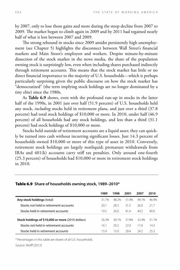
by 2007, only to lose those gains and more during the steep decline from 2007 to 2009. !e market began to climb again in 2009 and by 2011 had regained nearly half of what it lost between 2007 and 2009. !e strong rebound in stocks since 2009 amidst persistently high unemploy-ment (see Chapter 5) highlights the disconnect between Wall Street’s "nancial markets and Main Street’s employers and workers. Despite minute-by-minute dissection of the stock market in the news media, the share of the population owning stock is surprisingly low, even when including shares purchased indirectly through retirement accounts. !is means that the stock market has little or no direct "nancial importance to the majority of U.S. households—which is perhaps particularly surprising given the public discourse on how the stock market has “democratized” (the term implying stock holdings are no longer dominated by a tiny elite) since the 1980s. As Table 6.9 shows, even with the profound run-up in stocks in the latter half of the 1990s, in 2001 just over half (51.9 percent) of U.S. households held any stock, including stocks held in retirement plans, and just over a third (37.8 percent) had total stock holdings of $10,000 or more. In 2010, under half (46.9 percent) of all households had any stock holdings, and less than a third (31.1 percent) had stock holdings of $10,000 or more. Stocks held outside of retirement accounts are a liquid asset; they can quick-ly be turned into cash without incurring signi"cant losses. Just 14.3 percent of households owned $10,000 or more of this type of asset in 2010. Conversely, retirement stock holdings are largely nonliquid; premature withdrawals from IRAs and 401(k) accounts carry sti# tax penalties. Only around one-fourth (25.3 percent) of households had $10,000 or more in retirement stock holdings in 2010.
�������� �� �������������������������������� �����
� � ���� ���� ����
������������������ ������� �� � ���� ����� ���� ����
�������������� ����� ������������� ���� ��� ��� ���� ���
���������� ����� ������������� ���� ���� �� ��� ���
��������������������������������� ������������� ���� ���� ��� ��� ����
�������������� ����� ������������� ���� ��� ���� � �� ��
���������� ����� ������������� ���� ���� ��� ��� ���
� ��!���#���"����#��"�#������!��"��!�"� ������������ $"�� ��"�
� $!����� ��� ������

W E A L T H 3 9 3
!e imbalanced distribution of stock assets has persisted over time, as seen in Figure 6G. From 1989 to 2007, the wealthiest 1 percent of households never held less than one-third of all stock wealth. !e top "fth of households consistently held about 90 percent of stock wealth, leaving approximately 10 percent for the bottom four-"fths of households. Because these data include stocks held in pen-sion plans and retirement accounts, the shares capture the e#ect of the broad shift from de"ned-bene"t pension plans to de"ned-contribution pension plans (a shift discussed both in Chapter 4 and later in this chapter). !is "gure shows that the vast “democratization of the stock market” since the 1980s—wherein the masses gained signi"cant shares of the market through investment vehicles such as mu-tual funds, IRAs, and 401(k)s—never actually happened.
HousingWhile stock market $uctuations garner much attention, housing equity is a far more important form of wealth for most households. In 2010, households in the middle "fth of the wealth distribution had an average net worth of $61,000 (Table 6.3), and $39,300 of that was in home equity (Table 6.7). In other words, home equity constituted nearly two-thirds (64.5 percent) of the wealth of house-holds with “typical” wealth levels (i.e., those in the middle of the wealth dis-tribution). Homeownership has long been associated with solid footing on the
�������� ��������������� �������������� ������������ ���� ���������
��
���
���
���
���
���
��
��
���
���
����
���� ���� ���� ���� ���� ���� ���� ��� ����
������
�� ���������
����" ���������������
����" ���������������
������������ ��������!��������
,AGD57��0A>88 �� ���

T H E S T A T E O F W O R K I N G A M E R I C A3 9 4
economic ladder. However, the housing boom and bust made that association more tenuous. !is section examines homeownership and the e#ect of the hous-ing meltdown on household wealth.
HomeownershipFigure 6H shows changes in the homeownership rate between 1965 and 2011. In 1965, 63 percent of homes were owned by the people who lived in them. !e homeownership rate $uctuated somewhat in the following 30 years, includ-ing sharp increases in the late 1970s and declines in the early 1980s, but never exceeded 65.6 percent. But in the mid-1990s, homeownership rates began to rise dramatically, increasing from 64.0 percent in 1994 to 69.0 percent in 2004. !en, after the housing bust in 2006, the homeownership rate registered an un-precedented decline, falling to 66.1 percent in 2011. As with other measures related to wealth, homeownership rates vary dramati-cally by income and demographics. Figure 6I shows, unsurprisingly, that higher-income households are more likely to own their homes. In 2009 (the most recent data available for this measure), 88.8 percent of households in the top fourth of the income distribution were homeowners, compared with just 47.0 percent in the bottom fourth. Figure 6J shows homeownership rates by race and ethnicity
�������� ���������������� ������ ���������
���� ����
���� ����
���� ���
��
��
��
��
��
��
�
�
��
��
��
��� ��� ��� ���� ���� ���� ���� ���� ���� ����
'AF7��-:7�:A?7AI@7DE:;B�D3F7�;E�F:7�E:3D7�A8�A55GB;76�:AGE;@9�G@;FE�AI@76�4K�F:7;D�A55GB3@FE��,:36763D73E�67@AF7�D757EE;A@E�
,AGD57���GDD7@F�)ABG>3F;A@�,GDH7K�!AGE;@9�/353@5K�,GDH7K ��� ���������� �-34>7 ��

W E A L T H 3 9 5
�������� ���������� ������������ ���� ��������������� ����
�����
����
���
�����
��
���
���
���
���
��
��
���
���
��
����
������������� ������������� ������������ ����������
,AGD57���GF:ADEP�3@3>KE;E�A8�.�,���7@EGE��GD73G �� ��
�������� �������������������������� ����������� ���������
����������
��� ��� �
����
���
��
���
��
��
�
��
�
���
��
���
� � � �� � � � � � ���� ��� ����
��������
�����
������
�����
� �E;3@�;@5>G67E�'3F;H7�!3I3;;3@�)35;8;5�"E>3@67D���3F3�8AD�F:;E�BABG>3F;A@�3D7�G@3H3;>34>7�BD;AD�FA �����'AF7���3F3�3D7�G@3H3;>34>7�8DA?������FA������3@6�3D7�EG4EF;FGF76�8AD�4K�F:7�����������3H7D397��,:36763D73E�67@AF7�D757EE;A@E�
,AGD57���GDD7@F�)ABG>3F;A@�,GDH7K���),���@@G3>�,A5;3>�3@6��5A@A?;5�,GBB>7?7@F�3@6��),�!AGE;@9/353@5K�,GDH7K ����������� � ������ �-34>7 ���

T H E S T A T E O F W O R K I N G A M E R I C A3 9 6
from 1975 to 2011. In 2011, nearly three-fourths (73.8 percent) of white house-holds, more than half (58.0 percent) of Asian households, less than half (44.9 percent) of black households, and less than half (46.9 percent) of Hispanic house-holds owned their homes. Minority homeownership rates rose more than the white homeownership rate as the housing bubble in$ated and fell further when it collapsed, with black households hit particularly hard; the black homeownership rate fell from 49.1 percent in 2004 to 44.9 percent in 2011.
The housing meltdownAs Table 6.7 showed, the collapse of the housing bubble had an enormous im-pact on the home equity of homeowners. Figure 6K shows the change in home prices from 1953 through the "rst quarter of 2012. !e dramatic run-up in home prices from the mid-1990s to 2006 is striking, with annual increases from mid-2003 through mid-2005 in the double- or near-double-digits. However, this was ignored by central bankers and others responsible for the economic health of the country, who did nothing to halt the bubble’s expansion. Home prices peaked in early 2006. !en the bubble burst and home prices began falling sharply, losing 35.7 percent between the "rst quarter of 2006 and the "rst quarter of 2009 and another 11.1 percent between the "rst quarter of 2009 and the "rst quarter of 2012. By early 2012, with home prices back at their 1998 values, it was likely
�������� � �������� ���������
��
���
���
���
��
���
���
� � � � � � � � � �� � �� � �� � �� � � � � ���� ����
���
�������
�����
����
��
����
��
'AF7���3F3�3D7�CG3DF7D>K�3@6�7JF7@6�8DA?�F:7�8;DEF�CG3DF7D�A8������F:DAG9:�F:7�8;DEF�CG3DF7D�A8�� ����,:36763D73E�67@AF7�D757EE;A@E�
,AGD57��,:;>>7D �� ���

W E A L T H 3 9 7
that the housing bubble had fully de$ated and home prices were back on their long-run trajectory. As mentioned earlier, home equity is the current market value of a home mi-nus the outstanding balances of mortgages (including home equity loans). Figure 6L shows the ratio of homeowners’ equity to the value of their homes, i.e., the share of home value that homeowners own outright. !is share was fairly stable through the 1970s and 1980s, averaging 68.2 percent from 1969 through 1989, though it did decline somewhat throughout the 1980s. Around 1989, the share began a substantial decline, and had fallen to just under 58 percent by the middle of 1997. Homeowners’ share of overall home value then $uctuated around 60 percent until early 2006, the peak of the housing bubble. !is means that as home prices escalated dramatically between 1997 and 2006, the share of home value that homeowners owned did not. !is is largely because homeowners increasingly took out home equity loans (as will be shown later in Figure 6O) and because homebuyers were increasingly likely to provide a relatively small down payment. Underlying this activity was the belief—fueled by the news media and unchal-lenged by central bankers or others in charge of the country’s economic health—that home prices would continue to rise or, at worst, level o# after rising so spectacularly. !rough home equity loans, homeowners used their accumulated equity to "nance
�������� ��������������� ��������������������������� ���������
������� ��
��� ���������
�������������
���
��
���
��
��
�
��
�
���
��
� � �� � � � �� � � � � � ���� ���
'AF7���3F3�3D7�CG3DF7D>K�3@6�7JF7@6�8DA?�F:7�8;DEF�CG3DF7D�A8������F:DAG9:�F:7�8AGDF:�CG3DF7D�A8�� ���,:3676�3D73E�67@AF7�D757EE;A@E�
,AGD57���GF:ADEP�3@3>KE;E�A8��767D3>�+7E7DH7��A3D6��>AI�A8��G@6E �55AG@FE

T H E S T A T E O F W O R K I N G A M E R I C A3 9 8
spending during a time of stagnating incomes and wages (as discussed in chapters 2 and 4). Families scrambled to get into the housing market because they thought buying a home would be a smart investment and that they would be priced out of the market if they waited. At the same time, barriers to homeownership were lowered for many homebuyers previously excluded from the market due to credit risk factors such as low income, a small down payment, or a troubled credit history. !ese and other buyers were targeted with new mortgage products, such as sub-prime mortgages with higher interest rates, and adjustable-rate mortgages with rates that escalated after initial terms. Borrowers took out large home loans under the widespread belief that home prices would continue to rise and they could use their accumulating equity to re"nance down the road. !is false sense of security was never corrected by promi-nent policymakers, who should have used their regulatory powers to keep the housing bubble from in$ating in the "rst place and, barring that, alerted Ameri-cans to the risks associated with the obvious "nancial market bubble. Housing values began to fall in 2006, but home equity loans and mortgages did not, propelling a sharp decline in home equity as a share of home value, from 59.6 percent in the "rst quarter of 2006 to 37.2 percent in the "rst quarter of 2009. !e ratio of home equity to value has since made up very little of that lost ground, and was at 38.2 percent in the fourth quarter of 2011. !is means that creditors, including banks, own far more of the nation’s housing stock than people do. As discussed earlier in this chapter, home equity is the primary source of wealth for a large majority of households, and therefore this decline in home equity has severely weakened the economic security of many, if not most, homeowners. When housing prices began to drop in 2006, re"nancing became more dif-"cult as home equity fell, and mortgage delinquencies began to climb. Figure 6M shows the number of foreclosures per 1,000 owner-occupied dwellings from 2000 through 2011. From 2000 to 2005, there were an average of 2.4 foreclosures per 1,000 owner-occupied dwellings each quarter. Foreclosures rose steeply as home prices fell, reaching a peak of 7.5 foreclosures per 1,000 owner-occupied dwell-ings in the second quarter of 2009—more than triple the rate before the housing bubble burst. Overall, there were more than a million foreclosures in the "rst half of 2009. By the fourth quarter of 2011, the rate of foreclosures had dropped to 3.8 per 1,000 owner-occupied households, still far higher than before the housing bust. !erefore, while housing prices are no longer dropping, foreclosures remain elevated, underscoring that the fallout from the rise and fall of the housing bubble is far from over.
Retirement insecurity Most Americans working today will enjoy less retirement security than their par-ents, a historic reversal that predates the Great Recession. According to the Center

W E A L T H 3 9 9
for Retirement Research at Boston College, 41 percent of early baby boomers now entering retirement are at risk of a signi"cant drop in living standards in retirement, even if they draw down all their savings, including home equity. !e outlook is even worse for late baby boomers (48 percent of whom are at risk) and Gen Xers (56 percent of whom are at risk) (Munnell, Webb, and Golub-Sass 2009). !is increase in retirement insecurity is driven in large part by the gradual increase in the o&cial Social Security full retirement age (from age 65 for those born in 1937 or earlier to age 67 for those born in 1960 or later), which is equivalent to an across-the-board bene"t cut for workers who retire at any given age, and the shift in the private sector from traditional de"ned-bene"t pensions to 401(k)-style de"ned-contribution plans. !ough participation in employer-sponsored plans has stagnated at or below 50 percent for decades, when de"ned-bene"t pensions were the norm many work-ers were still able to accrue substantial bene"ts over their working lives. However, the share of workers in employer-sponsored plans who were enrolled in de"ned-bene"t pensions dropped from 88 percent in 1983 to 32 percent by 2010, while the share enrolled in de"ned-contribution plans rose from 38 percent to 81 per-cent in the same period (Figure 6N). Of households approaching or entering into
�������� ���� ���������������������������� ����� ���������
������� ���
���
���
���
���
���
���
��
��
���
���
���� ���� ���� ���� ���� ���� ��� ��� ���� ���� ���� ����
������� ��
'AF7���3F3�3D7�CG3DF7D>K�3@6�7JF7@6�8DA?�F:7�8;DEF�CG3DF7D�A8�� �F:DAG9:�F:7�8AGDF:�CG3DF7D�A8�� ���,:3676�3D73E�67@AF7�D757EE;A@E�
,AGD57���GF:ADEP�3@3>KE;E�A8��767D3>�+7E7DH7��3@=�A8�'7I�1AD=��� ����3@6��GDD7@F�)ABG>3F;A@�,GDH7K�!AGE;@9�/353@5K�,GDH7K ��� ���������� �-34>7 ��

T H E S T A T E O F W O R K I N G A M E R I C A4 0 0
retirement (i.e., headed by someone age 55–64) who had one or more retirement accounts in 2010, the median value of all retirement accounts was $100,000, less than twice the median income for this age group, and a fraction of savings needed to maintain living standards in retirement, absent substantial other savings or pension bene"ts besides Social Security (Bricker et al. 2012).
LiabilitiesAssets are one side of the ledger that tallies net worth; liabilities, or debts, are the other. Debt is not necessarily a problem; access to debt allows households to buy houses and cars, invest in education, and purchase other high-cost items that may provide services over many years. Debt may also be used to cope with short-term economic setbacks such as unemployment or illness. Debt becomes a burden only when required debt payments crowd out other economic obligations or oppor-tunities or when it is accumulated for purposes that don’t provide a worthwhile return (economic or otherwise). Table 6.10 shows total debt, assets, and net worth across the wealth distribu-tion from 1962 to 2010. For the middle "fth (i.e., households with “typical” levels
������� ������������������������������ ������������������������������������ ��� �����!�������!�������������� �� �������� �� ����
���
������
���
��
���
���
���
���
���
��
��
���
���
����
��������������� ��������������������
����
����
'AF7��,:3D7E�;@�3�9;H7@�K73D�366�GB�FA�?AD7�F:3@�� �B7D57@F�4753GE7�EA?7�IAD=7DE�3D7�7@DA>>76�;@�4AF:FKB7E�A8�B>3@E��(8�IAD=7DE�I;F:�B7@E;A@�5AH7D397����B7D57@F�I7D7�7@DA>>76�;@�4AF:�FKB7E�A8�B>3@E�;@�����5A?B3D76�I;F:����B7D57@F�;@ � � �
,AGD57���GF:ADEP�3@3>KE;E�A8�&G@@7>> �� ���
��������������������������������������������������������������������������������������,4EIK��,4EIK�������������� ������ ������������������������!"����!"���������������������������������������������� ������ ������������������������������������������������������������������������������������������������������������������������������������������������������������������������������������������������������������������������������������������������������������������������������������������

W E A L T H 4 0 1
�������� �(�$�����"'%��"������&���%%�&%���!��!�&�)"$&����*�)���&���$"'#�� �+������&�"'%�!�%�"������ �"���$%�
����&�����&� �$����")!�"��&"#����&�
�"&&" &)" ������ �"'$&���&�+� �&�
#�$��!&���
�&�+� &�#�$��!&���
�"#���
� �����
� � ���� �� �� �� �� ���� ����� �����
� � ��� ���� ���� � �� �� ����
� � �� � � ��� � �� � ����
� � ��� �� ���� ��� ���� ����
���� ��� �� ��� ���� ��� ���
���� ���� ���� ��� ��� ��� � ��
���� ��� ��� ��� ���� ���� ����
� ������ �
� � ���� ���� �� �� ������ ����� �������
� � ��� ��� �� ����� ����� ��� ��
� � ��� �� ���� ���� ���� �����
� � ��� ��� ��� ���� ��� � ������
���� � �� �� ����� ��� ���� ������
���� �� ��� ��� ���� �� �� ������
���� ���� ��� ����� ����� �� ��� ������
�� ��� �
� � �� � �� ���� ���� ����� ��������
� � ��� ��� ���� ���� ������ �� ����
� � � � ���� ���� ��� ��� �����
� � � ��� �� ���� �� ��� ��� ��
���� �� ��� � � ����� ������ �����
���� �� � ���� ����� ���� �������
���� ���� ��� ��� ���� ��� �������
������������� ���

T H E S T A T E O F W O R K I N G A M E R I C A4 0 2
of wealth), average debt increased by 183.3 percent between 1983 and 2007, from $34,900 to $98,900. After the housing bust and the Great Recession, households began to pay down debt; between 2007 and 2010, average debt of middle-"fth households dropped by 10.8 percent, from $98,900 to $88,100. However, debt of the middle "fth was still 152.6 percent higher in 2010 than in 1983. Because assets of middle-"fth households grew only 36.6 percent between 1983 and 2010, middle-"fth net worth dropped between 1983 and 2010, from $74,200 in 1983 to $61,000 in 2010. Table 6.11 shows median household debt by race and ethnicity between 1983 and 2010. Median debt of black households was $8,300 in 2010, down from $12,100 in 2007 but $6,700 greater than in 1983. Median debt of Hispanic households was $10,000 in 2010, also down from 2007 but $4,800 greater than in 1998 (the earliest data available). Median white household debt increased from $7,900 in 1983 to $37,000 in 2010. Racial and ethnic minority households typi-cally have much less debt than white households. Median black household debt was 22.4 percent of median white household debt in 2010, while median His-panic household debt was 27.0 percent of median white household debt. How-ever, as shown in Table 6.8, racial and ethnic minority households also typically have fewer assets than white households, which is why racial and ethnic minority households tend to have much lower net worth than white households (as shown in Table 6.5).
��������� ��������� ��������������"������������������"�����#�������� ������������� ��������
����� ����� ��������������������������������������!����
������� �������������������������
!����
��� ���� ��� � ��� �
��� ��� ��� � ��� �
��� ��� �� ��� ���� ����
���� �� ��� ��� ��� ���
��� ��� ��� ���� ��� ���
���� ��� �� ���� �� ���
������
���#��� ���� ����� � � �
���#���� � ��� ���� � �
������������� ����

W E A L T H 4 0 3
Table 6.12 presents a breakdown of total debt by the purpose of the debt from 1989 to 2010. One minor caveat about these data is that even though funds technically are borrowed for a particular purpose, they may in fact be used for something else. For example, a family may have the means to buy a house out-right but nevertheless takes out a mortgage and uses the freed-up funds for other purposes. Even so, the data provide a useful picture of how debt is used. With the notable exceptions of student loan debt and debt related to vehicle purchases, the distribution of debt by purpose has not changed substantially over this period, despite the considerable growth in debt levels, as shown in Table 6.10. !e large majority of family debt—71.4 percent in 2010—is tied to the pur-chase or improvement of a primary residence. !is share grew from 66.5 percent in 1989 to 72.3 percent in 1995, but has since held relatively steady. Debt from the purchase of goods and services, which includes credit card debt, accounted for 5.7 percent of all debt in 2010, a moderate decrease from 6.2 percent in 2007. !e 2007 share was little changed from 6.1 percent in 1989. One category that has signi"cantly declined is the share of debt accounted for by vehicle purchases, which fell from 10.6 percent in 1989 to 4.7 percent in 2010.
Student loan debtDebt incurred for education has substantially increased in the last two decades, as Table 6.12 shows. In 2010, education debt’s share of overall debt was 5.2 percent, more than double its 1989 share, 2.4 percent. !ough not shown in the table, the share of families with education debt also increased, from 15.2 percent to 19.2 percent between 2007 and 2010 alone. !e level of student loan debt has also risen substantially. Among families with education debt, the average amount of that debt increased 14.0 percent—from $22,500 to $25,600—between 2007 and
�������� ��!" ��#"������������&����"��&��"!��# ��!�� �'����
� �� � ���� ���� ����
� ��� &� �!������ ���� ����� ����� ����� ��� � ����
�"�� � �!����"����� ��� "& � �� �� �� ��� ���
��$�!"���"!��%��#����� �����!"�"� ��� ��� ��� �� ��� ���
�������! ���� ��� ��� �� � ��
���!�����!� $���! ��������� ������ ������� ��� �� ��� � ��� ��
��#��"��� �� ��� �� ��� ��� ��
�"�� ��� �� �� ��� �� ��
����� ����� ����� ����� ����� ����� �����
��# �����#"�� !&�����%!�!�������� �����!� $����� ��������������� ���� ��"���� ������
T H E S T A T E O F W O R K I N G A M E R I C A4 0 4
2010. !e median level of education debt of these families rose 3.4 percent over the same period, from $12,600 to $13,000 (Bricker et al. 2012). Students assuming education loans are taking an implicit gamble that their extra human capital will be rewarded in the job market upon graduation. For this gamble to pay o#, the job opportunities must be there. For many students graduating into the weak labor markets of the Great Recession and its aftermath, this gamble has led to great economic distress, through no fault of their own. And although most student loans have a six-month grace period before payments must begin, recent graduates without stable income may miss payments or default on their loans. According to researchers at the Federal Reserve Bank of New York, 27 percent of student loan debt holders had at least one past-due balance in the third quarter of 2011 (Brown et al. 2012).
Debt relative to disposable personal incomeFigure 6O shows debt as a share of disposable income, for all debt and for vari-ous types of debt, from 1946 to 2011. Debt as a share of disposable personal income (personal income minus personal current taxes) was the highest on re-cord in 2007, at 137.6 percent. !at share dropped to 118.7 percent in 2011, as households reduced consumption and paid down debt relative to the housing bubble years. As suggested by the data in Table 6.12, mortgage debt is the largest debt category. Mortgage debt as a share of disposable income declined from a 101.2 percent high in 2007 to 84.8 percent in 2011, the steepest drop on record. Con-sumer credit debt (consisting mostly of credit card debt and auto loans) also fell as a share of disposable income, from 24.5 percent in 2007 to 21.7 percent in 2011. As homeownership rates and home values increased in the bubble years, so did home equity loans, as shown in Figure 6O. !e steep growth rate in home equity loans during the bubble years indicates that households were increasingly spending their accumulated equity rather than saving it. While in retrospect this was a mistake, it was arguably a rational choice at the time, given the conventional wisdom that the housing boom would not bust—a belief that central bankers and others responsible for the economic health of the country did not debunk. Home equity loans as a share of disposable income dropped dramatically when the hous-ing boom ended, from a peak of 10.9 percent in 2007 to 7.5 percent in 2011.
Debt serviceAs mentioned previously, debt is not necessarily a problem; access to credit can allow for great economic opportunities. Problems arise when debt payments be-gin to crowd out other economic obligations. A useful measure for assessing debt burden is the "nancial obligations ratio: the ratio of debt payments (including minimum required payments on mortgages, consumer debt, automobile leases,

W E A L T H 4 0 5
�������� ������� � ��������������� ����������������������������� ����������� ���� ���������
�����������
������� ���
������
� �
��
���
��
���
��
����
����
���
����
��� ��� ���� ���� �� � ���� ����
�������#
��!#�������#
�������#�������!#��������#
��������
����������
�����
���
��
�
���
��
���
��
���
��� ��� ���� ���� �� � ���� ����
������ $�#%����"�
���"$��!��!���#
���"$��!��!���#����#����������� $�#%�����"
� �3F3�8AD�:A?7�7CG;FK�>A3@E�3D7�G@3H3;>34>7�BD;AD�FA ��� �'AF7��,:3676�3D73E�67@AF7�D757EE;A@E�
,AGD57���GF:ADEP�3@3>KE;E�A8��767D3>�+7E7DH7��A3D6��>AI�A8��G@6E �55AG@FE

T H E S T A T E O F W O R K I N G A M E R I C A4 0 6
homeowners’ insurance, property tax payments, and rent) to disposable personal income, expressed as a percent. Table 6.13 provides the "nancial obligations ratio for renters and homeowners. In 2011, renters spent an average of 24.1 percent of their disposable income on minimum debt payments, while homeowners spent an average of 14.4 percent (9.5 percent on mortgages and 4.9 percent on consumer debt). For renters, this was a moderate decline from 25.2 percent in 2007, due to households reduc-ing consumption and paying down debt relative to the bubble years and to the downward pressure on the cost of rent as vacancy rates increased. From 1980 to 2007, the "nancial obligations ratio for renters changed little, increasing by 0.9 percentage points, from 24.3 percent to 25.2 percent. Homeowners, on the other hand, substantially increased their share of dispos-able income devoted to minimum debt payments in the decades prior to the Great Recession: !e share increased from 13.8 percent in 1980 to 17.5 percent in 2007, largely driven by an increase in mortgage payments. !e "nancial obligations ratio for homeowners dropped signi"cantly in the Great Recession and its aftermath, falling to 14.4 percent in 2011, also due to households reducing consumption and
�������� ��������������������������������������������������������������������������������������������� ����� ����!����
������� ���� ����
���� ���� �������� �������
���� ��� ���� ��� ����
���� ��� ���� ��� ���
���� �� ���� ��� �
���� �� ���� ��� �
���� ��� ���� ��� ���
������
����!���� ��� ��� �� ���
����!���� ��� ���� ��� ���
����!���� ���� � �� ���
����!���� ���� ��� ���� ����
����!���� ��� �� �� ���
�$)�������� #�#� �!�$�! ��) $#(�'�) $� (�)���'�) $�$�����)�%�."�#)(�� #�!*� #��" # "*"�'�&* '���%�."�#)($#�"$')����(���$#(*"�'����)���*)$"$� !��!��(�(���$"�$,#�'(/� #(*'�#����%'$%�').�)�-�%�."�#)(���#�'�#)��)$�� (%$(��!��%�'($#�! #�$"��
�$*'��������'�!���(�'+���$�'� �����

W E A L T H 4 0 7
paying down debt relative to the bubble years, and to the fact that those who were able to hold on to their homes were better able to a#ord them. Another measure of household debt service—the debt service ratio—is report-ed by income percentile in Table 6.14. As with the "nancial obligations ratio, the debt service ratio is a ratio of minimum debt payments to income, expressed as a percent. !e debt service ratio, however, is a narrower measure than the "nancial obligations ratio because it does not include payments such as rent; it includes only payments on mortgage and consumer debt. Because these data include renters but do not count rental payments as debt, the values are pushed down, and dispropor-tionately so at the lower end of the income scale. Nevertheless, Table 6.14 shows that households in the top 10 percent of the income distribution spend much less of their income on debt service than the bottom 90 percent of households. In 2010, households in the top 10 percent spent 9.4 percent of their income on servicing debt, less than half of the average of the bottom 90 percent, which was 19.6 percent. Table 6.14 also shows the particularly large increase (from 17.7 percent to 23.5 percent) in household debt service as a share of income for households in the bottom "fth between 2007 and 2010. !is was due predominantly to a decline in income during the Great Recession and its aftermath rather than an increase in debt service.
�������� ���!� ��#����� ��� �������������$����������$����������"�� ��%����
��!!����� �������
��!!�����!�
���������!�
���������!�
�"�!����!�
��!�%�!�
������!���
��!����!!����
�� ���� ���� ���� ����� ��� � ����� �� �
�� ��� ���� ���� ���� ���� ���� ���
���� ���� ���� � �� ���� � �� ���� ���
���� � � � �� ���� ���� ���� ���� ��
���� ��� ���� ���� ��� ���� ���� ��
������
��%����
�� �� �� �� �� �� ���
����%����
��� ��� ��� ���� ���� �� ���
�$(����$)'��$!�����(�'�&*�����'�(���&�(�$�$��%�+"�#('�$#�"$&(������#���$#')"�&����(�($���"�!+ �#�$"��
�$)&�����&�� �&��(��!����������#������&�!���'�&*���$�&� �������

T H E S T A T E O F W O R K I N G A M E R I C A4 0 8
It is important to note that neither the "nancial obligations ratio nor the debt service ratio captures the additional costs incurred by low-income families who must turn to nontraditional lending services and rapid-cash providers, such as pawn shops, nonbank check-cashing services, and payday lenders. !e extraor-dinary fees often charged by these entities constitute a signi"cant source of debt service expense for many low-income families.
HardshipDebt service payments equal to more than 40 percent of household income are generally considered to represent economic hardship. Table 6.15 looks at such hardship by income group. In all years, high debt burdens were, unsurprisingly, negatively associated with income. In 2010, 2.9 percent of households in the top 10 percent had high debt burdens, compared with 15.4 percent of middle-"fth households. In other words, close to 1 in 6 middle-income families spent more than 40 percent of their income on debt service. For households in the bottom "fth, it was more than 1 in 4 (26.1 percent). Furthermore, as with the data in Table 6.14, the data in Table 6.15 (and Table 6.16, following) include renters but not rental payments, so the share of low-income households struggling to meet debt and housing obligations is likely higher than the "gures here indicate.
�������� ��� �������#!�����!�$�"����������"��# ���!���%�������� �#�� ��&����
���������"� � �����$�����"������"�
��""�� ������ ������ ��# "���"�&�"�
�� ���"����������
�� ���� ���� ����� ���� �� ����
�� ���� ��� ���� ��� �� ���
���� ��� ���� ��� ��� �� ���
���� ���� ���� ��� ���� ��� ��
���� ���� ���� ��� ���� �� ���
������
��&���� �� ��� �� �� �� ���
����&���� ���� ���� ��� ���� ���� ����
�"&�������������&��'$��!��%���$�&�"�"�����&�%�$(����#�) �!&%�&"��!�" ���$��&�$�&��!�� #�$��!&�
�"'$�����$����$��&���� ������

W E A L T H 4 0 9
Another measure of the impact of debt on economic hardship is the share of households, by income level, that were late paying bills. In 2007, 7.1 percent of all households were at least 60 days late in paying at least one bill. Table 6.16 shows the share of households late paying bills by income group. Not surprisingly, the share of households behind on their bills is strongly related to income. In 2007, very few (0.2 percent) of the top 10 percent of households were late in paying at least one bill, compared with 8.3 percent of middle-"fth households and 15.1 percent of bottom-"fth households. However, the share of households late in pay-ing bills increased for all income groups in the Great Recession and its aftermath. By 2010, 2.1 percent of households in the top 10 percent of the income distribu-tion were late paying at least one bill, compared with one out of every ten middle-"fth households (10.2 percent) and more than one out of every "ve bottom-"fth households (21.2 percent).
Bankruptcy!e opportunity to start anew through fair and reasonable bankruptcy is important for those who face insurmountable debt. !e importance of this option is supported by research showing that misfortune—including job losses, medical emergencies, and divorce—precedes the vast majority of personal bankruptcies (Sullivan, Warren, and Westbrook 2000). Declaring bankruptcy allows an individual to obtain debt relief through either discharging or restructuring nonmortgage debt (in bankruptcy
��������� ��� �������#!�����!���"����%��������!���%��������� �#�� ��&����
���������"� � �����$�����"������"�
��""�� ������ ������ ��# "���"�&�"�
�� ���"����������
�� ����� ����� ���� ���� ���� ���
�� ���� ��� ���� ��� �� ���
���� �� ��� �� �� ��� ��
���� ���� ���� �� �� ��� ���
���� ���� ���� ���� ��� �� ���
������
��&���� ��� ��� � ���� ��� ����
����&���� ��� � ��� � � ���
� $�������$�����#� &#�� %#�� ��#�&�$����'�!�'���$�!�#$��%�������'#� " � "��
� %"�����"����"��$���� ������

T H E S T A T E O F W O R K I N G A M E R I C A4 1 0
proceedings, only nonmortgage debts may be discharged; a bankruptcy court does not have the authority to modify mortgage loans on a primary residence). Figure 6P tracks the rate of personal bankruptcies from 1989 through 2011. !e rate of bankruptcies generally increased from 1989 through 2005, along with stagnating incomes and an increasing debt burden. At the 2005 peak, 9.6 out of 1,000 adults declared personal bankruptcy. !e large jump in 2005 was partly due to people seeking to "le bankruptcy prior to the October 2005 implementa-tion of a new bankruptcy law that made personal bankruptcy more complicated and dramatically more expensive. As a result, the number of bankruptcy "lings plummeted 70 percent from 2005 to 2006. However, as the Great Recession took hold and millions of people lost jobs and incomes, bankruptcies again began to rise. In 2010, despite the new law making bankruptcy more di&cult and expen-sive, seven out of every 1,000 adults declared personal bankruptcy. !at declined somewhat to 6.1 in 2011.
�������� ������ ���������� ��� �������������� ���������
���� ��
��� ���
���� ��
�
�
�
�
��
��
���� ���� ���� ���� ��� ���� ���� ���� ���� ��� ���� ����
������������ �����������������������������
'AF7��,:3676�3D73E�67@AF7�D757EE;A@E�
,AGD57���GF:ADEP�3@3>KE;E�A8�43@=DGBF5K�EF3F;EF;5E�8DA?�F:7��?7D;53@��3@=DGBF5K�"@EF;FGF7��H3D;AGE�K73DE��3@6>34AD�8AD57�EF3F;EF;5E�8DA?�F:7��GDD7@F�)ABG>3F;A@ ,GDH7K

W E A L T H 4 1 1
Wealth of U.S. citizens compared with citizens’ wealth in peer countries!is chapter has demonstrated the low wealth holdings of the majority of Ameri-cans. But how does the wealth of people in the United States compare with that of people in peer countries? Figure 6Q shows the median wealth per adult in the United States and in 19 other advanced, industrialized nations. At $52,752, U.S. median wealth is the fourth-lowest among these 20 countries. Median wealth in Australia, Italy, Belgium, Japan, the United Kingdom, Switzerland, Ireland, France, Canada, Austria, Norway, and Finland is at least 60 percent higher than the median wealth in the United States. Table 6.17 provides the data on median wealth per adult presented in Figure 6Q along with the mean (or average) wealth per adult. In each country, mean wealth is substantially greater than median wealth. !e median is a better indica-tion than the mean of the wealth of the “typical” adult, since the median is the value at which half of adults have less wealth and half have more wealth. However, the table also shows the ratio of mean-to-median wealth, which is a useful mea-sure of wealth inequality. !e higher the ratio (i.e., the higher the mean is above the median), the more wealth is held by a minority of people, and the greater the wealth inequality.
�������� ���������������������������������� ��� ����������������������� ��������
�� ������� �������� �������� �������� ��������
,AGD57���GF:ADEP�3@3>KE;E�A8��D76;F�,G;EE7�+7E73D5:�"@EF;FGF7 �� ���

T H E S T A T E O F W O R K I N G A M E R I C A4 1 2
!e mean wealth in the United States, $248,395, places the United States "rmly in the middle of its peers, 10th out of the 20 countries. However, since U.S. median wealth is so low, the ratio of mean-to-median wealth in the United States is very high. At 4.7, the United States has the fourth-highest ratio of mean-to-median wealth, meaning the United States has a very high level of wealth in-equality relative to most of its peer countries.
�������� �����"��"��!��"�*�� '��$�%���( '��"�����)�"�����#("'%��&�������������� �# �%&�
�����" ���" ���"�'#�!����"
(&'%� �� ������ �� ���� ���
(&'%�� ����� ������ �
�� ��(! ���� ����� ��
��"��� ������ ������ ��
�"!�%� �� � ����� ��
��" �"� � �� ������� ��
�%�"�� ����� �� �� �
��%!�"+ ���� ������ ��
�%���� ����� ������ ��
�%� �"� ������ ������ ���
�'� + ������ ���� ���
��$�" ��� �� ������ ���
��'��% �"�& ��� �� ���� ��
��*���� �"� ��� � ����� ��
�#%*�+ ����� ����� ���
�$��" ������ ������ ���
�*���" ���� ����� �
�*�',�% �"� ������� ������� ���
�"�'�����"��#! ����� ������ ��
�"�'����'�'�& ���� ����� ���
� $!�����$#� !"&�����%"�"� ���!���#��$�""����"��!�����"#�#$#� �����

W E A L T H 4 1 3
Conclusion!e data presented here have highlighted the highly unequal distribution of wealth in the United States—with wealth inequality exceeding even the profoundly un-equal distributions of income and wages described in earlier chapters. !is dis-cussion also exposed the fallacy that all or even most American households are invested in the stock market. Fewer than half of U.S. households have any stock holdings (including in retirement accounts and pension funds), and less than a third have stock holdings worth $10,000 or more. Most families depend on labor income alone to meet their "nancial obligations, and have very little in the way of a "nancial cushion that can be cashed in during times of economic hardship. !e loss of wealth due to the housing bust and the Great Recession further increased an already vast wealth divide. !e richest 1 percent of American house-holds saw 15.6 percent of their wealth eliminated between 2007 and 2010, but the middle "fth saw nearly half (45.3 percent) of their wealth eliminated. Many families that thought they had solid footing in the middle class have faced fore-closure and/or lengthy spells of unemployment. Moreover, the recovery (o&cially underway since June 2009) has been tepid—especially in the labor market—and has yet to bring substantial relief to those su#ering from this economic shock. !e rebound in stocks is of little help, given that most households have little to no stock holdings. To begin building wealth for the majority of U.S. households—wealth that is not in$ated by an asset bubble—we must restore our economy to one in which wages and incomes across the distribution grow as the overall economy grows.

T H E S T A T E O F W O R K I N G A M E R I C A4 1 4
Table and !gure notesTablesTable 6.1. Distribution of income compared with distribution of wealth, 2010. !e table is based on unpublished analysis of 2010 Survey of Consumer Finances (SCF) data prepared in 2012 by Edward Wol# for the Economic Policy Institute. !e de"nition of wealth used in this analysis of the SCF is the same de"nition of wealth used in the analysis of the SCF conducted by Bricker et al. (2012), except that the Bricker et al. analysis includes vehicle wealth, while this analysis does not.
Table 6.2. Change in wealth groups’ shares of total wealth, 1962–2010. See note to Table 6.1.
Table 6.3. Change in average wealth, by wealth group, 1962–2010. See note to Table 6.1.
Table 6.4. Share of households with low net worth, 1962–2010. See note to Table 6.1.
Table 6.5. Median household wealth, and share of households with zero or negative wealth, by race and ethnicity, 1983–2010. See note to Table 6.1.
Table 6.6. Wealth groups’ shares of household assets, by asset type, 2010. See note to Table 6.1.
Table 6.7. Average household assets, by wealth group and asset type, 1962–2010. See note to Table 6.1.
Table 6.8. Average and median household assets, by race/ethnicity and asset type, 1983–2010. See note to Table 6.1.
Table 6.9. Share of households owning stock, 1989–2010. See note to Table 6.1.
Table 6.10. Average household debt, assets, and net worth, by wealth group, 1962–2010. See note to Table 6.1.
Table 6.11. Median household debt, by race and ethnicity, 1983–2010. See note to Table 6.1.
Table 6.12. Distribution of family debt by its purpose, 1989–2010. Data for years 2001–2010 are from Bricker et al. (2012). Data for prior years are from the Federal Reserve Board’s Survey of Consumer Finances, Tables Based on the Internal Data.
Table 6.13. Household !nancial obligations as a share of disposable personal income, for renters and homeowners, 1980–2011. Data refer to annual averages from the Federal Re-serve Board (FRB), Household Debt Service and Financial Obligations Ratios. Per the FRB, the !nancial obligations ratio (FOR) adds automobile lease payments, rental payments on tenant-occupied property, homeowners’ insurance, and property tax payments to the debt service ratio (an estimate of the ratio of debt payments on outstanding mortgage and consumer debt, to disposable personal income). !e homeowner mortgage FOR includes payments on mortgage debt, homeowners’ insurance, and property taxes, while the homeowner consumer FOR includes payments on consumer debt and automobile leases.

W E A L T H 4 1 5
Table 6.14. Debt service as a share of family income, by income group, 1989–2010. Data are from Bricker et al. (2012), Table 17.
Table 6.15. Share of households with high debt burdens, by income group, 1989–2010. Data are from Bricker et al. (2012), Table 17.
Table 6.16. Share of households late paying bills, by income group, 1989–2010. Data are from Bricker et al. (2012), Table 17.
Table 6.17. Median and mean wealth per adult in 20 advanced countries, 2011. Data are from the Credit Suisse Research Institute’s Global Wealth Databook 2011. Note that in inter-national comparisons of income it is standard practice (including at EPI) to convert currencies using “purchasing power parity” (PPP) exchange rates instead of market exchange rates. PPPs are based on the price of buying a given “basket” of goods and services in each country, thereby equalizing the purchasing power of currencies. It should be noted that for these data, market exchange rates, not PPP exchange rates, are used to convert currencies to U.S. dollars. !e authors of the report argue that there is a case to be made for using market exchange rates for international comparisons of wealth because in every country a large share of personal wealth is owned by households in the top few percentiles of the distribution, and these households tend to move their assets across borders with relative frequency. Results are not available using PPP exchange rates. It also should be noted that the ratio of mean to median is the same regardless of what exchange rates are used.
FiguresFigure 6A. Average household net worth, net !nancial assets, and net tangible assets, 1965–2012. Data for net worth and assets are from the Federal Reserve Board’s Flow of Funds Accounts, Table B.100, “Balance Sheet of Households and Nonpro"t Organizations.” !e data were adjusted for in$ation using the CPI-U-RS (Consumer Price Index Research Series Using Current Methods), and divided by the number of U.S. households based on Census Bu-reau data. !e household data are from the Current Population Survey/Housing Vacancy Sur-vey Historical Tables, Table 7, “Annual Estimates of the Housing Inventory: 1965 to Present” (http://www.census.gov/hhes/www/housing/hvs/historic/index.html). !e number of “owner occupied” homes was taken as a percentage of “total occupied” homes to calculate a percentage of homeownership.
Figure 6B. Share of total household wealth growth accruing to various wealth groups, 1983–2010. Data are derived from Table 6.3.
Figure 6C. Ratio of average top 1% household wealth to median wealth, 1962–2010. Data are derived from Table 6.3.
Figure 6D. Average annual net worth of “Forbes 400” wealthiest individuals, 1982–2011. Data for 1982 to 1999 are adapted from Broom and Shay (2000) Table 2, “‘Forbes 400’ In-dividual Fortunes.” Data from 2000 to 2011 are from Forbes annual lists of the richest 400 Americans. All data are adjusted to 2011 dollars using the CPI-U-RS.
Figure 6E. Median household wealth, by race and ethnicity, 1983–2010. See note to Table 6.5.

T H E S T A T E O F W O R K I N G A M E R I C A4 1 6
Figure 6F. U.S. stock market, 1955–2011. Data on the Standard & Poor’s composite index of the 500 largest U.S. "rms (the S&P 500) are from the Economic Report of the President (Council of Economic Advisers 2012), tables B-95, “Historical Stock Prices and Yields, 1949–2003,” and B-96, “Common Stock Prices and Yields, 2000–2011,” de$ated by the CPI-U-RS in 2011 dollars and indexed to 1960=100.
Figure 6G. Wealth groups’ shares of total household stock wealth, 1983–2010. Data are derived from Table 6.6; see table note to Table 6.6.
Figure 6H. Annual homeownership rate, 1965–2011. Annual data are from the Current Population Survey/Housing Vacancy Survey, Historical Tables, Table 7, “Annual Estimates of the Housing Inventory: 1965 to Present,” http://www.census.gov/hhes/www/housing/hvs/historic/index.html. To calculate the rate of homeownership, the number of owner-occupied homes was taken as a percentage of total occupied homes.
Figure 6I. Homeownership rate, by household income group, 2009. Data are from the U.S. Census Bureau’s American Housing Survey, National Data, Table 3-12, “Owner Occu-pied Units,” http://www.census.gov/housing/ahs/data/ahs2009.html, most recently published in 2009. Due to budget constraints, the two-year schedule for this survey was delayed in 2012, and 2011 data were not available in time for this publication.
Figure 6J. Homeownership rate, by race and ethnicity, 1975–2011. Data prior to 1994 are taken from the Current Population Survey (CPS) Annual Social and Economic Supple-ment, provided by the Census Bureau upon request. Data from 1994 onward are taken from the CPS/Housing Vacancy Survey, Annual Statistics: 2011, Table 22, “Homeownership Rates by Race and Ethnicity of Householder” (http://www.census.gov/hhes/www/housing/hvs/an-nual11/ann11ind.html). As with other CPS microdata analyses presented in this book, race/ethnicity categories are mutually exclusive (i.e., white non-Hispanic, black non-Hispanic, and Hispanic any race).
Figure 6K. Home prices, 1953–2012. Home price data are from Robert Shiller, of Yale Uni-versity, who publishes a quarterly series of home price data, which was featured in his book Irrational Exuberance (http://www.econ.yale.edu/~shiller/data.htm). !e home price index is set to 1997Q1=100.
Figure 6L. Total homeowner equity as a share of total home values, 1969–2011. Data are from the Federal Reserve Board’s Flow of Funds Accounts, Table B.100, “Balance Sheet of Households and Nonpro"t Organizations.”
Figure 6M. Foreclosures per 1,000 owner-occupied dwellings, 2000–2011. Data on fore-closures are from the Federal Reserve Bank of New York’s Quarterly Report on Household Debt and Credit; data series “Number of Consumers with New Foreclosures” (http://www.newy-orkfed.org/newsevents/news/research/2012/an120227.html). !e number of owner-occupied dwellings was taken from the Current Population Survey/Housing Vacancy Survey, Historical Tables, Table 8, “Quarterly Estimates of the Housing Inventory: 1965 to Present” (http://www.census.gov/hhes/www/housing/hvs/historic/index.html).

W E A L T H 4 1 7
Figure 6N. Enrollment in de!ned-bene!t versus de!ned-contribution pension plans among workers with pension coverage, 1983 and 2010. Figure produced from data in Mun-nell (2012), Figure 4.
Figure 6O. Household debt as a share of disposable personal income, all and by type of debt, 1946–2011. Data on disposable personal income, consumer credit liability, total liabili-ties, and mortgage liabilities are from the Federal Reserve Board’s Flow of Funds data, Table B.100, “Balance Sheet of Households and Nonpro"t Organizations.” Data on home equity loans are from Flow of Funds data, Table L.218, “Home Mortgages,” and are unavailable prior to 1990. !e various liabilities are taken as shares of disposable personal income for display in the graphs.
Figure 6P. Consumer bankruptcies per 1,000 adults, 1989–2011. Data on bankruptcies are American Bankruptcy Institute Annual and Quarterly U.S. Bankruptcy Statistics, “An-nual Business and Non-business Filings by Year” (http://www.abiworld.org/Content/Naviga-tionMenu/NewsRoom/BankruptcyStatistics/Bankruptcy_Filings_1.htm). Data on the adult population are calculated with Current Population Survey labor force statistics, “Civilian Non-institutional Population Series, Ages 18 and Over.”
Figure 6Q. Median wealth per adult in 20 advanced countries, 2011. See note to Table 6.17.

4 1 8