color use and abuse
DESCRIPTION
COLOR Use and Abuse. Color Do’s: Use Color Purposefully. Use Color to:. Unify/Separate Content Emphasize/De-emphasize Content Direct readers where to look first Add personality to content. Designing with Color. Use Color in:. Info-graphics Folio presentations Backgrounds Duotones. - PowerPoint PPT PresentationTRANSCRIPT
Design ~ Color Use & Abuse
COLOR Use and Abuse
Design ~ Color Use & Abuse
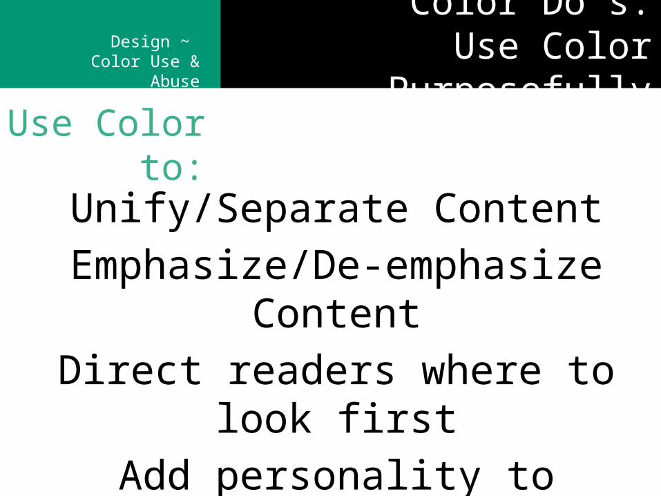
Color Do’s:Use Color Purposefully
Unify/Separate Content
Emphasize/De-emphasize Content
Direct readers where to look first
Add personality to content
Use Color to:
Design ~ Color Use & Abuse Designing with Color
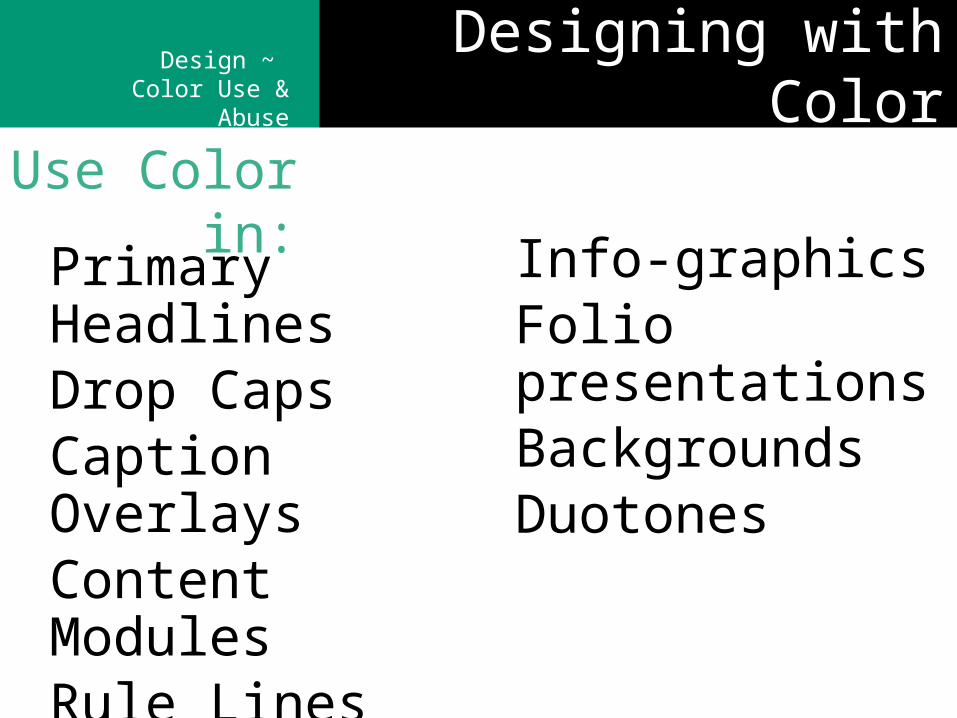
Primary HeadlinesDrop CapsCaption OverlaysContent ModulesRule Lines
Info-graphicsFolio presentationsBackgroundsDuotones
Use Color in:
Design ~ Color Use & Abuse Color Strategies
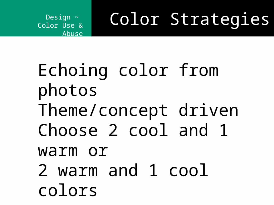
Echoing color from photosTheme/concept drivenChoose 2 cool and 1 warm or2 warm and 1 cool colors
Design ~ Color Use & Abuse Color Don’ts
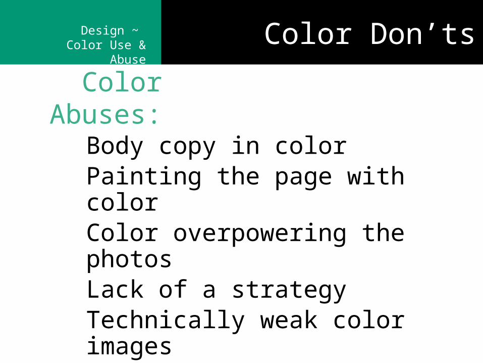
Body copy in colorPainting the page with colorColor overpowering the photosLack of a strategyTechnically weak color images
Color Abuses:
Design ~ Color Use & Abuse
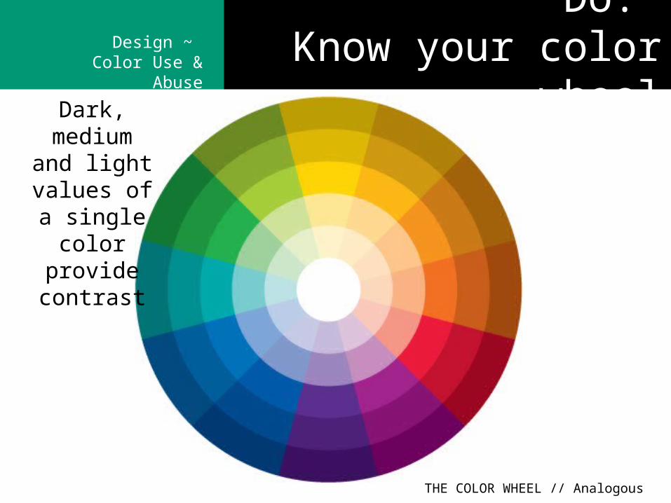
Dark, medium and light
values of a single color
provide contrast
THE COLOR WHEEL // Analogous
Do: Know your color wheel
Design ~ Color Use & Abuse
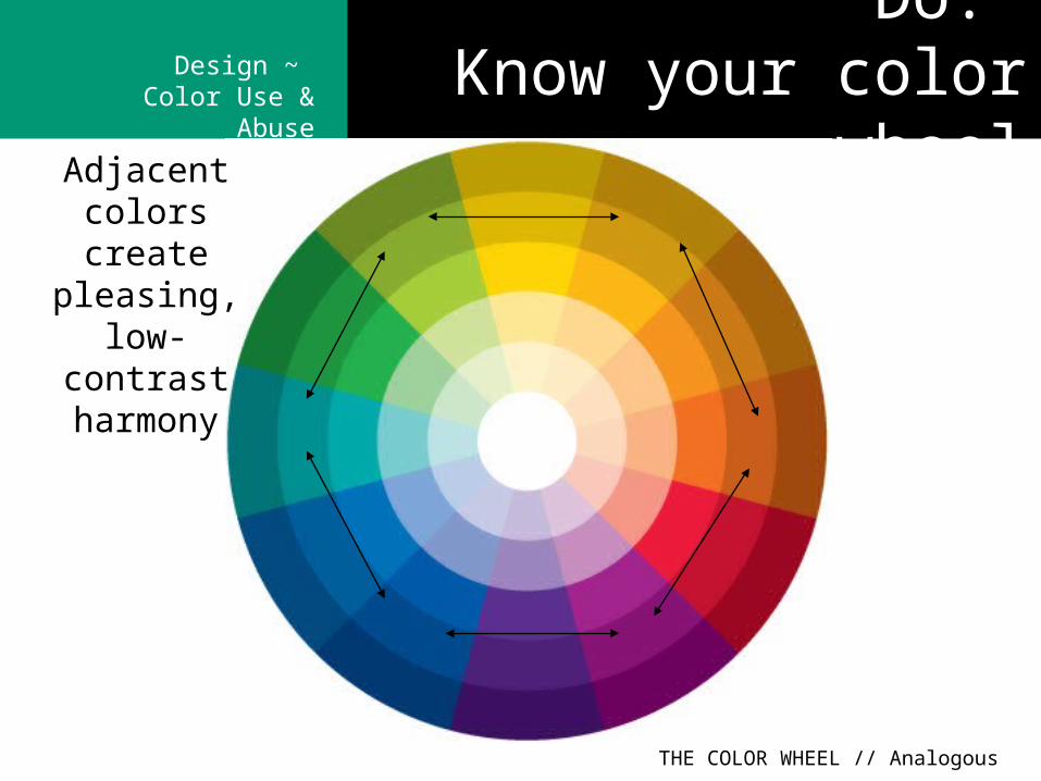
Adjacent colors create pleasing,
low-contrast harmony
THE COLOR WHEEL // Analogous
Do: Know your color wheel
Design ~ Color Use & Abuse
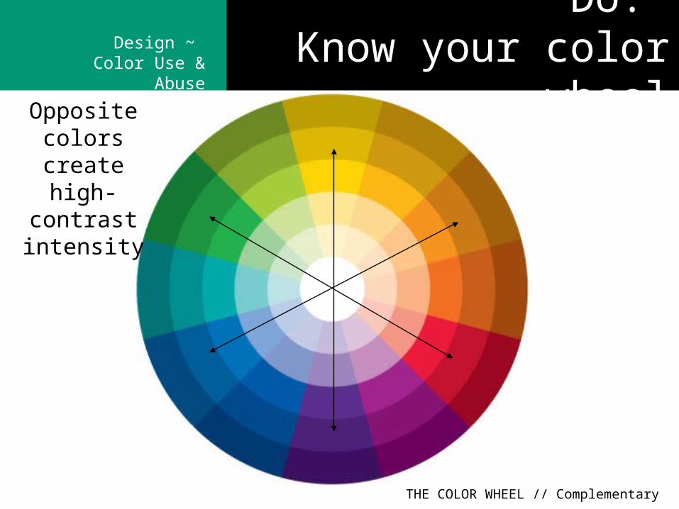
THE COLOR WHEEL // Complementary
Opposite colors create high-
contrast intensity
Do: Know your color wheel
Design ~ Color Use & Abuse
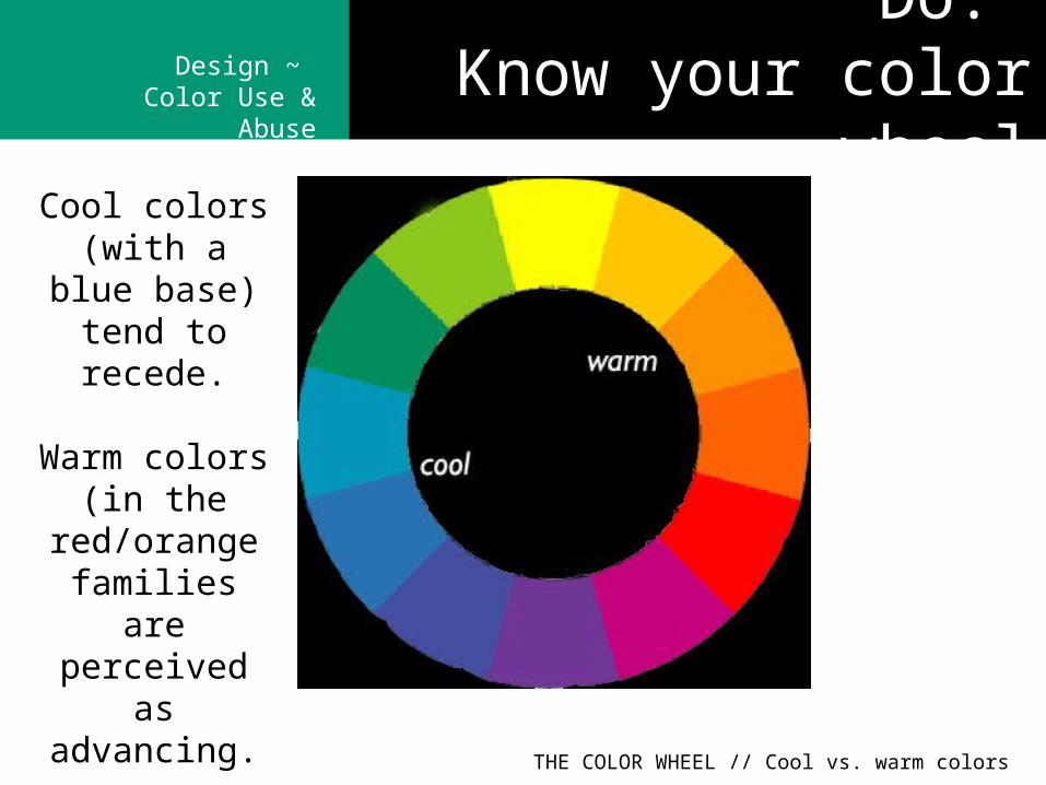
THE COLOR WHEEL // Cool vs. warm colors
Cool colors (with a blue base) tend to
recede.
Warm colors (in the red/orange
families are perceived as advancing.
Do: Know your color wheel
Design ~ Color Use & Abuse
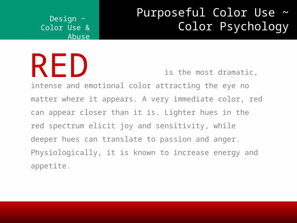
is the most dramatic, intense and
emotional color attracting the eye no matter where it
appears. A very immediate color, red can appear closer than
it is. Lighter hues in the red spectrum elicit joy and
sensitivity, while deeper hues can translate to passion and
anger. Physiologically, it is known to increase energy and
appetite.
RED
Purposeful Color Use ~ Color Psychology
Design ~ Color Use & Abuse
COLOR | Use & Abuse
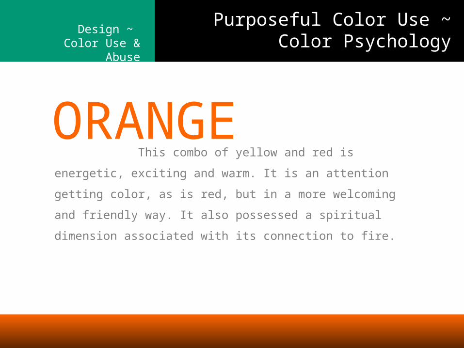
This combo of
yellow and red is energetic, exciting and warm. It is an
attention getting color, as is red, but in a more welcoming
and friendly way. It also possessed a spiritual dimension
associated with its connection to fire.
ORANGE
Purposeful Color Use ~ Color Psychology
Design ~ Color Use & Abuse
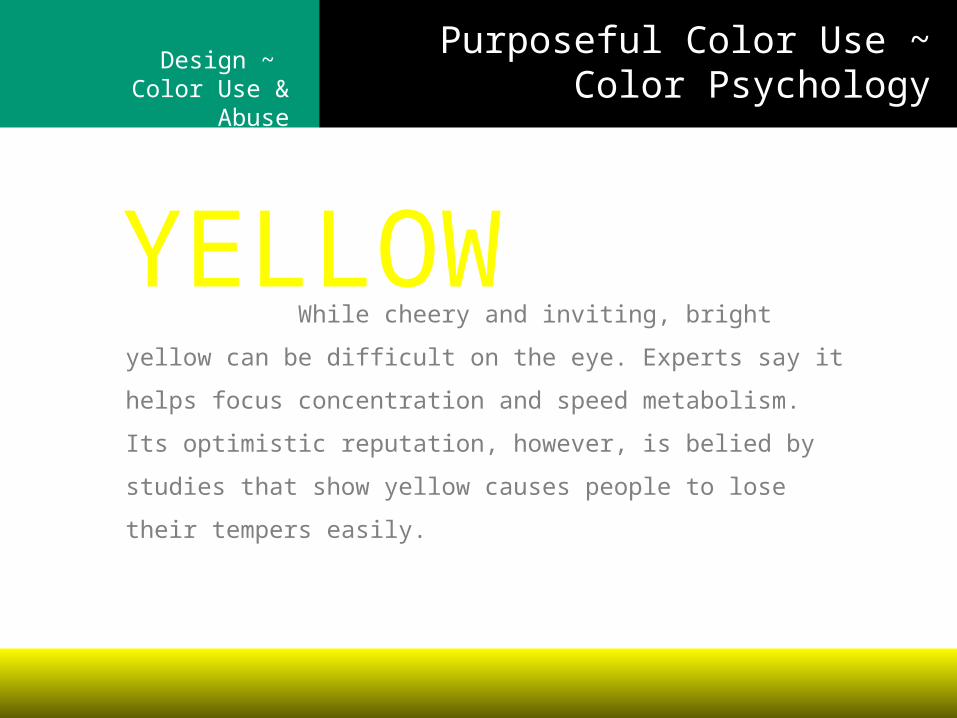
While cheery and
inviting, bright yellow can be difficult on the eye. Experts
say it helps focus concentration and speed metabolism. Its
optimistic reputation, however, is belied by studies that
show yellow causes people to lose their tempers easily.
YELLOW
Purposeful Color Use ~ Color Psychology

Design ~ Color Use & Abuse
Falling between blue and
yellow, green is more versatile than either of its primary
colors. Green represents nature, tranquility and health. It is
also the color of money and darker greens are considered
masculine and conservative. Lighter greens can be relaxing.
GREEN
Purposeful Color Use ~ Color Psychology
Design ~ Color Use & Abuse
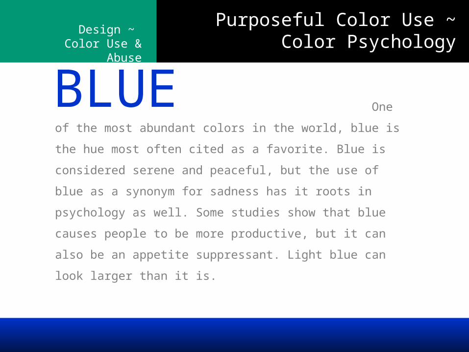
One of the most abundant
colors in the world, blue is the hue most often cited as a
favorite. Blue is considered serene and peaceful, but the
use of blue as a synonym for sadness has it roots in
psychology as well. Some studies show that blue causes
people to be more productive, but it can also be an appetite
suppressant. Light blue can look larger than it is.
BLUE
Purposeful Color Use ~ Color Psychology
Design ~ Color Use & Abuse
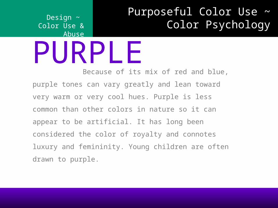
Because of its mix
of red and blue, purple tones can vary greatly and lean
toward very warm or very cool hues. Purple is less
common than other colors in nature so it can appear to
be artificial. It has long been considered the color of
royalty and connotes luxury and femininity. Young
children are often drawn to purple.
PURPLE
Purposeful Color Use ~ Color Psychology
Design ~ Color Use & Abuse
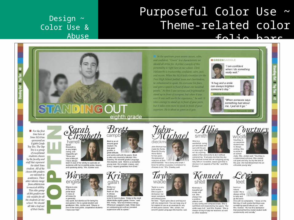
Purposeful Color Use ~ Theme-related color folio bars
Design ~ Color Use & Abuse
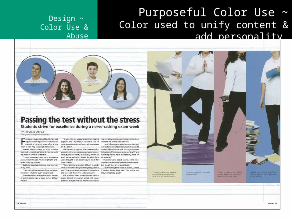
Purposeful Color Use ~Color used to unify content & add personality
Design ~ Color Use & Abuse
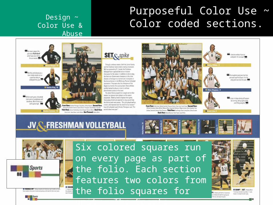
Six colored squares run on every page as part of the folio. Each section features two colors from the folio squares for unity. The Sports section colors are blue/yellow
Purposeful Color Use ~ Color coded sections.
Design ~ Color Use & Abuse
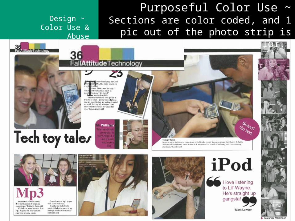
Purposeful Color Use ~Sections are color coded, and 1 pic out of the
photo strip is duotone in the section color.
Design ~ Color Use & Abuse
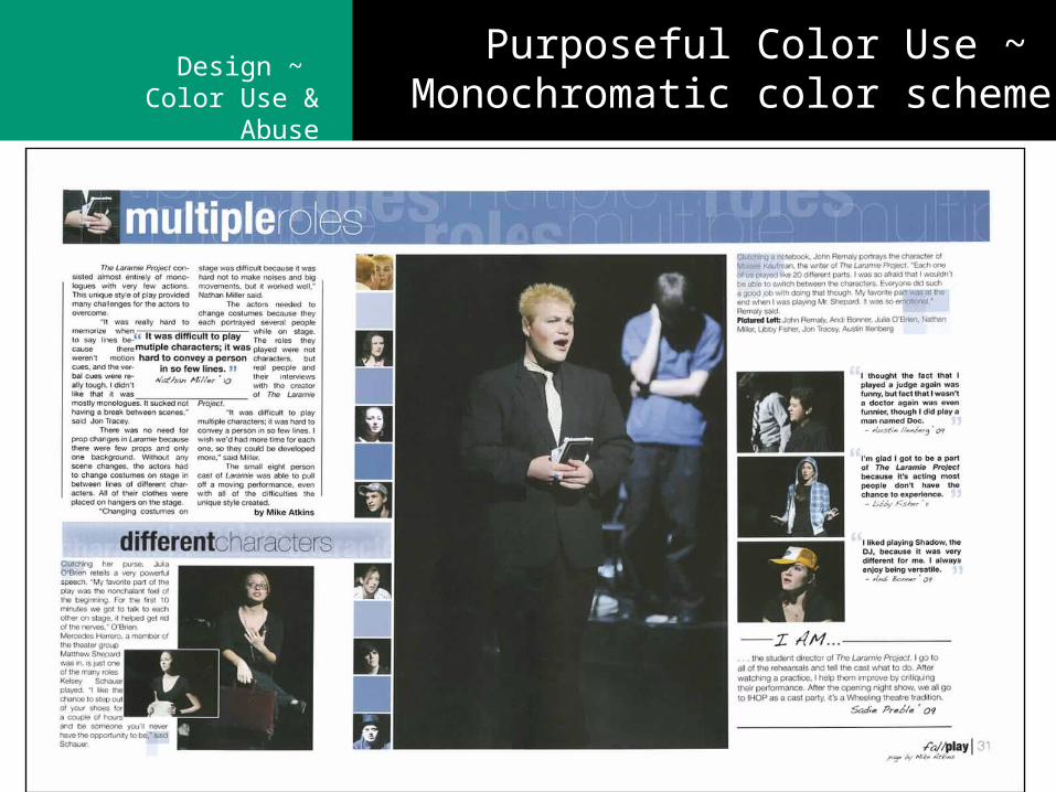
Purposeful Color Use ~ Monochromatic color scheme
Design ~ Color Use & Abuse
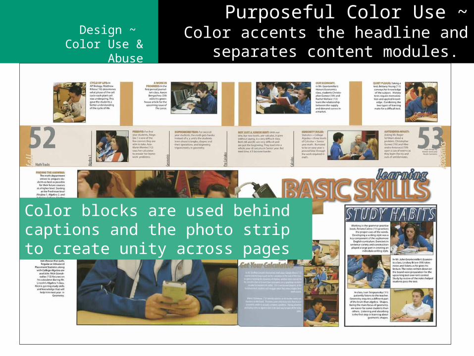
Purposeful Color Use ~Color accents the headline and separates content
modules.
Color blocks are used behind captions and the photo strip to create unity across pages
Design ~ Color Use & Abuse
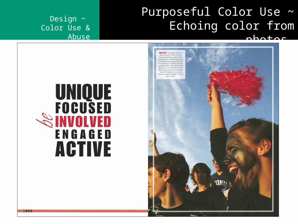
Purposeful Color Use ~ Echoing color from photos
Design ~ Color Use & Abuse
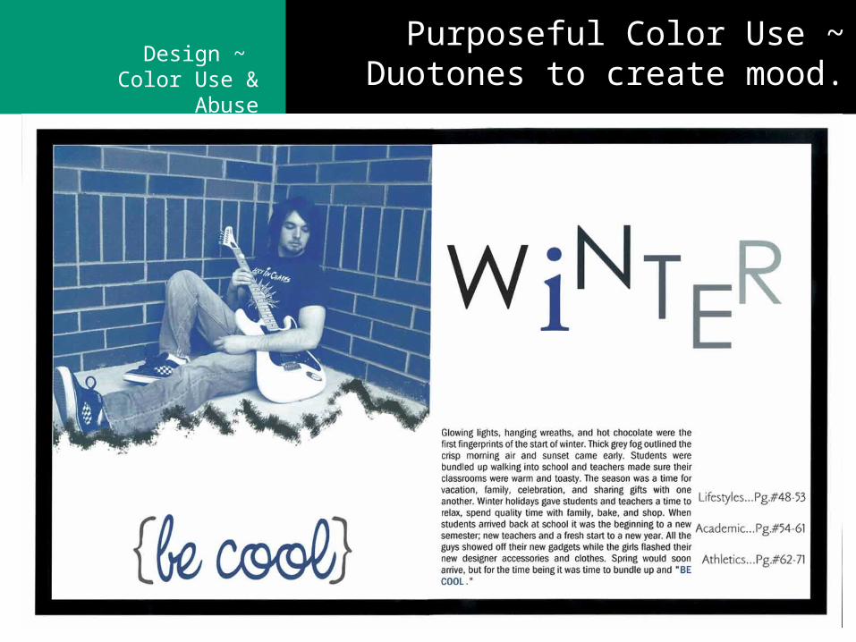
Purposeful Color Use ~ Duotones to create mood.
Design ~ Color Use & Abuse
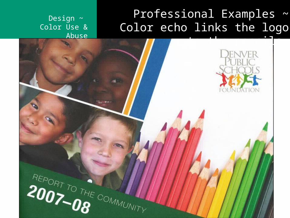
Professional Examples ~ Color echo links the logo to the pencils
Design ~ Color Use & Abuse
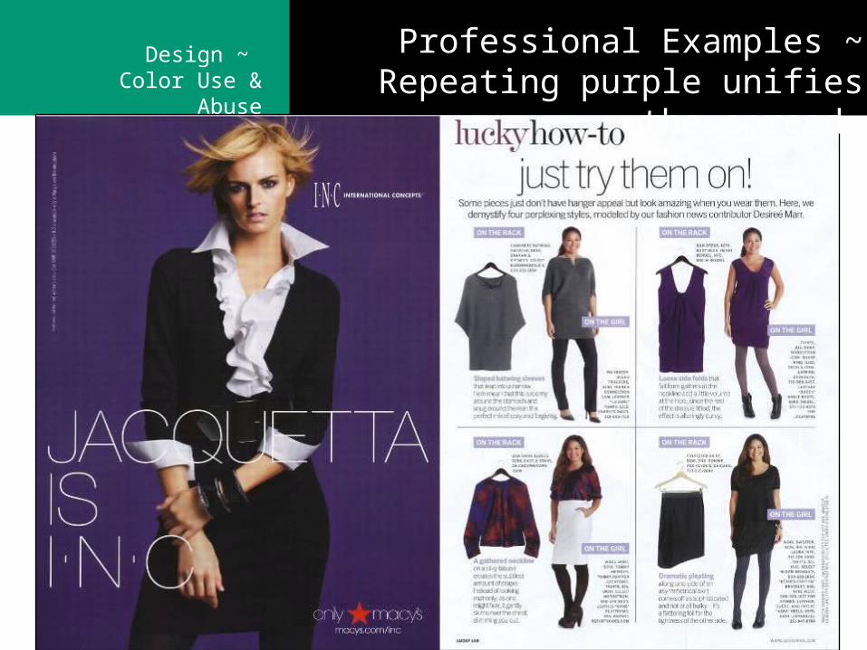
Professional Examples ~ Repeating purple unifies the spread
Design ~ Color Use & Abuse
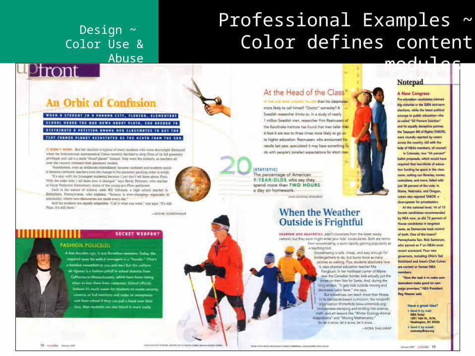
Professional Examples ~ Color defines content modules
Design ~ Color Use & Abuse
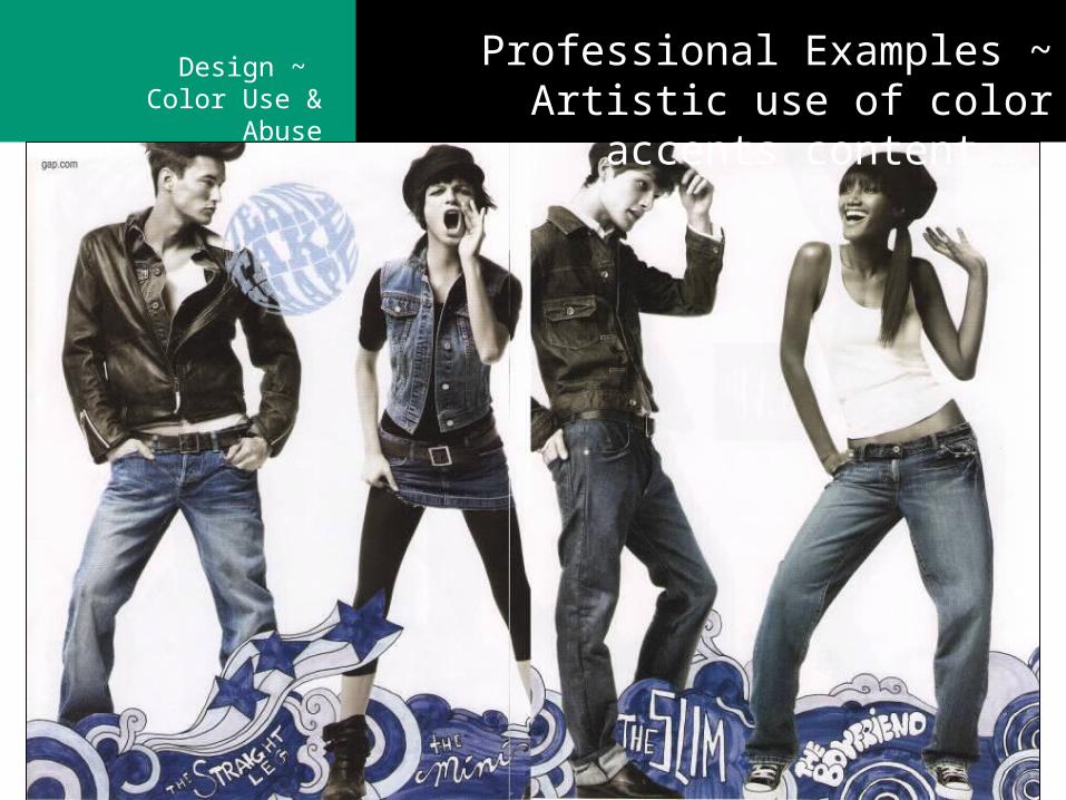
Professional Examples ~Artistic use of color accents content.
Design ~ Color Use & Abuse
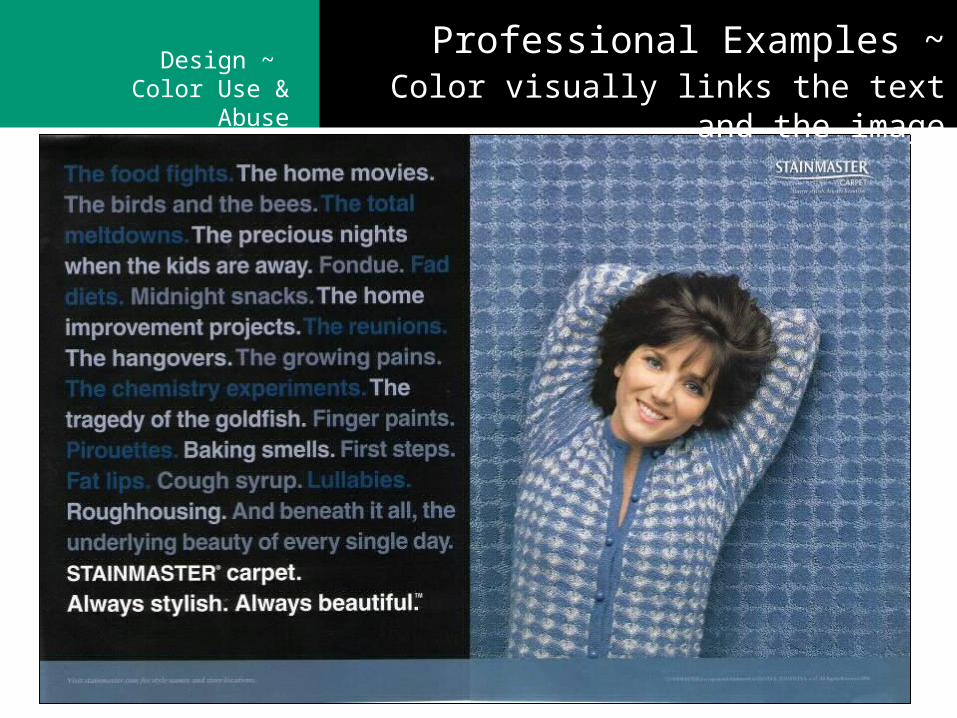
Professional Examples ~ Color visually links the text and the image