coping with volume and variety in temporal event sequences: … · 2017-11-09 · event sequences:...
TRANSCRIPT

1077-2626 (c) 2015 IEEE. Personal use is permitted, but republication/redistribution requires IEEE permission. See http://www.ieee.org/publications_standards/publications/rights/index.html for more information.
This article has been accepted for publication in a future issue of this journal, but has not been fully edited. Content may change prior to final publication. Citation information: DOI 10.1109/TVCG.2016.2539960, IEEETransactions on Visualization and Computer Graphics
1
Coping with Volume and Variety in TemporalEvent Sequences: Strategies for Sharpening
Analytic FocusFan Du, Ben Shneiderman, Catherine Plaisant, Sana Malik, and Adam Perer
Abstract—The growing volume and variety of data presents both opportunities and challenges for visual analytics. Addressing thesechallenges is needed for big data to provide valuable insights and novel solutions for business, security, social media, and healthcare.In the case of temporal event sequence analytics it is the number of events in the data and variety of temporal sequence patterns thatchallenges users of visual analytic tools. This paper describes 15 strategies for sharpening analytic focus that analysts can use toreduce the data volume and pattern variety. Four groups of strategies are proposed: (1) extraction strategies, (2) temporal folding, (3)pattern simplification strategies, and (4) iterative strategies. For each strategy, we provide examples of the use and impact of thisstrategy on volume and/or variety. Examples are selected from 20 case studies gathered from either our own work, the literature, orbased on email interviews with individuals who conducted the analyses and developers who observed analysts using the tools. Finally,we discuss how these strategies might be combined and report on the feedback from 10 senior event sequence analysts.
Index Terms—Big data, temporal data, temporal event sequences, workflow, visual analytics, visualization, analytic focus.
F
1 INTRODUCTION
THE growing volume and variety of data presents bothopportunities and challenges for visual analytics [62].
While big data provide valuable insights and novel solu-tions for business, security, social media, and healthcare, italso presents challenges due to two of its defining charac-teristics – volume and variety [68]. To obtain cleaner andmore structured data, applications have been developed toassist in the data cleaning and wrangling process [4], [28].Now, researchers are exploring ways to reduce the datavolume and variety so as to sharpen the analytic focus.Visual analytics processes are likely to be more rapid whendata volume is reduced and patterns are likely to be morediscoverable when data variety is trimmed.
The analytic focusing problem is also being addressed inother fields such as knowledge discovery and sensemaking,but this paper emphasizes temporal event sequences, wherepoint and interval events are organized into records. Forexample, in healthcare, point events may represent doctorvisits or tests while interval events may represent a week-long hospitalization or taking a medication for 6 months. Apatient record can be represented as a sequence of events,each event being of a particular event category. Descriptiveinformation may be carried in record attributes (e.g. thegender of the patient), and event attributes (e.g. the nameof the physician who placed the order).
A growing number of visual analytics and statisticaltools have been built for temporal event sequences. These
• Fan Du, Ben Shneiderman, and Sana Malik are with the Department ofComputer Science and the Human-Computer Interaction Lab, Universityof Maryland. E-mails: {fan,ben,maliks}@cs.umd.edu.
• Catherine Plaisant is with UMIACS and the Human-Computer Interac-tion Lab, University of Maryland. E-mail: [email protected].
• Adam Perer is with IBM T.J. Watson Research Center. E-mail:[email protected].
tools often have difficulty in dealing with the growingvolume and variety of data:
• Volume of data: a dataset may consist of millionsof records and hundreds of millions of events, whichmakes it hard to load and may result in long interactivelatency during exploration.
• Variety of patterns: a single record may contain thou-sands or millions of events that fall into thousands ofdifferent event categories. Even in smaller datasets thesequential patterns of most records are unique and thisvariety makes it difficult to generate an overview or toreveal common patterns and anomalies. This definitionof pattern variety complements the traditional defini-tion of variety in big data which refers to the variety ofdata sources (structured, unstructured, semistructured).
While it is useful to have awareness of the data vari-ety, analysts need useful ways of sharpening the analyticfocus, leading to useful visualizations of global patterns andanomalies of interest. Just as camera images need to be infocus on objects or faces of interest and telescopes are bestwhen tuned to spectral ranges (visual, ultraviolet, radio, x-ray, etc.), so too analytic tools will be most effective if userscan focus their attention. The idea of an analytic pipeline orworkflow is well established in mature application domainssuch as pharmaceutical drug discovery or NASA’s remotesensing data analysis, but visual analytics in general andthe analysis of temporal event sequences in particular arejust beginning to have such workflows.
While it is useful to provide a comprehensive overviewof the data at the start, analysts need ways to sharpen theanalytic focus and gain answers to their research questions.Achieving this goal requires data analytic tools to (1) pro-duce effective visualization of global patterns and anomaliesof interest, and (2) keep visualizations simple with only
1077-2626 (c) 2015 IEEE. Personal use is permitted, but republication/redistribution requires IEEE permission. See http://www.ieee.org/publications_standards/publications/rights/index.html for more information.
This article has been accepted for publication in a future issue of this journal, but has not been fully edited. Content may change prior to final publication. Citation information: DOI 10.1109/TVCG.2016.2539960, IEEETransactions on Visualization and Computer Graphics
2
necessary information.This paper describes 15 strategies for sharpening analytic
focus that analysts can use to control the data volume andpattern variety. It refines and expands on a set of 10 strate-gies proposed in a short article [56]. In addition, the paperincludes numerous examples of the use of those strategies,selected from 20 case studies, and illustrates how new tech-nologies and user interfaces can support these strategies.After describing the individual strategies and when theywere used during the analysis process, we discuss howanalysts often iterate over multiple strategies and reporton three longer case studies in greater detail. Finally, wesummarize the feedback of 10 event sequence analysts whoreviewed the list of strategies and propose a basic workflowfor applying the strategies.
2 RELATED WORK
This section discusses applications in the related domainsof data cleaning and wrangling, knowledge discovery andsensemaking, and temporal event sequence analysis. It alsosummarizes measures for data volume and pattern variety.
2.1 Data Cleaning and WranglingReal-world data are often challenging with respect to vol-ume and variety. To obtain cleaner and more structureddata, many applications have been developed to assist inthe data cleaning and wrangling process [4], [23], [28], [50],[51]. Particularly, Gschwandtner et al. proposed a taxon-omy [26] for dirty time-oriented data and developed a clean-ing tool [25] targeting its special characteristics. Wranglingtools have also been built for the manipulation of time-series data such as transforming continuous numeric datainto temporal event sequences [10], [19], [32], [43]. Whilecleaning and wrangling fix essential problems in the data(such as correcting erroneous values or integrating multipledata sources [27]), we assume in this paper that the dataare ready for exploration, and discuss the next step ofsharpening the analytic focus by reducing the data volumeand pattern variety.
2.2 Data FocusingData focusing has been described in the field of knowledgediscovery and sensemaking, where focusing techniques areemployed to reduce the data volume by extracting sub-sets of data [52]. While statistical and machine learningalgorithms are designed to handle huge data volumes,they may achieve even better results on subsets than onthe entire data [5]. Instance and feature selection are twoimportant tasks for data focusing in knowledge discoveryand sensemaking, targeted at reducing the number of tuplesand attributes, respectively. A unified instance selectionframework has been proposed and evaluated, which createsa focused sample of the entire data by selecting represen-tative prototypes from groups of similar tuples [35], [52],[53]. The goal of feature selection is to choose a subset offeatures to optimize the feature space according to certaincriteria. Motoda and Liu summarized four groups of ma-jor feature selection algorithms [44]. These data focusingtechniques are related to some of our extraction strategies.
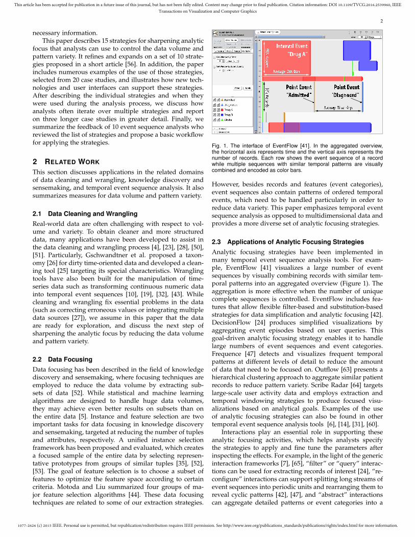
Fig. 1. The interface of EventFlow [41]. In the aggregated overview,the horizontal axis represents time and the vertical axis represents thenumber of records. Each row shows the event sequence of a recordwhile multiple sequences with similar temporal patterns are visuallycombined and encoded as color bars.
However, besides records and features (event categories),event sequences also contain patterns of ordered temporalevents, which need to be handled particularly in order toreduce data variety. This paper emphasizes temporal eventsequence analysis as opposed to multidimensional data andprovides a more diverse set of analytic focusing strategies.
2.3 Applications of Analytic Focusing StrategiesAnalytic focusing strategies have been implemented inmany temporal event sequence analysis tools. For exam-ple, EventFlow [41] visualizes a large number of eventsequences by visually combining records with similar tem-poral patterns into an aggregated overview (Figure 1). Theaggregation is more effective when the number of uniquecomplete sequences is controlled. EventFlow includes fea-tures that allow flexible filter-based and substitution-basedstrategies for data simplification and analytic focusing [42].DecisionFlow [24] produces simplified visualizations byaggregating event episodes based on user queries. Thisgoal-driven analytic focusing strategy enables it to handlelarge numbers of event sequences and event categories.Frequence [47] detects and visualizes frequent temporalpatterns at different levels of detail to reduce the amountof data that need to be focused on. Outflow [63] presents ahierarchical clustering approach to aggregate similar patientrecords to reduce pattern variety. Scribe Radar [64] targetslarge-scale user activity data and employs extraction andtemporal windowing strategies to produce focused visu-alizations based on analytical goals. Examples of the useof analytic focusing strategies can also be found in othertemporal event sequence analysis tools [6], [14], [31], [60].
Interactions play an essential role in supporting theseanalytic focusing activities, which helps analysts specifythe strategies to apply and fine tune the parameters afterinspecting the effects. For example, in the light of the genericinteraction frameworks [7], [65], “filter” or “query” interac-tions can be used for extracting records of interest [24], “re-configure” interactions can support splitting long streams ofevent sequences into periodic units and rearranging them toreveal cyclic patterns [42], [47], and “abstract” interactionscan aggregate detailed patterns or event categories into a

1077-2626 (c) 2015 IEEE. Personal use is permitted, but republication/redistribution requires IEEE permission. See http://www.ieee.org/publications_standards/publications/rights/index.html for more information.
This article has been accepted for publication in a future issue of this journal, but has not been fully edited. Content may change prior to final publication. Citation information: DOI 10.1109/TVCG.2016.2539960, IEEETransactions on Visualization and Computer Graphics
3
high-level overview [47], [64]. Showing results in a timelymanner is critical for maintaining users’ performance [36]but becomes difficult as the data volume grows. To addressthis issue, we introduce two iterative strategies to guideusers starting from small and scaling up iteratively.
2.4 Measuring Volume and Variety
We separate the measures of volume and variety. Users ofrelational databases measure data volume by their size, usu-ally in bytes, number of rows, or number of columns [3]. Fortemporal event sequences, the relational table approach is apoor fit, so visual analytic tools define their own data stor-age formats, invalidating traditional metrics. Since recordsand events are the basic elements of event sequences, areasonable method to measure the volume of temporalevent sequence data is by number of records and events.
Users of visualization tools measure the visual complex-ity by the number of distinct elements displayed on thescreen [17]. For example, the number of dots in a scatterplot,the number of bars in a bar chart, and the number of nodesor links in a node-link diagram. EventFlow researchers mea-sured the visual complexity of temporal event sequences bythe number and average height of the aggregated chunkson the display [42]. These visual complexity metrics re-flect the variety of the underlying data but are specific tothe application. In this paper we will use a more generaltool-independent metric for the variety of temporal eventsequence data: the number of unique complete sequences,which indicates the number of patterns in the temporalevent sequences and decreases as the data is simplified. Webelieve that meaningful insights are more likely to be foundif data analysts can reduce the variety of patterns based ontheir analytical goals.
3 A TAXONOMY OF ANALYTIC FOCUSING STRATE-GIES
This taxonomy of analytic focusing strategies for temporalevent sequences is based on (1) the authors’ combinedexperience in developing and evaluating multiple temporalevent sequence analysis tools and dozens of case studieswith real data and users, (2) the information containedin case studies gathered from the literature, and (3) emailinterviews with 8 individuals who conducted such casestudies and developers who observed analysts using thetools. Many of the case studies mentioned as examplesbelow used EventFlow [41], but several other visual analytictools (e.g. [46], [47], [48], [58], [61], [64]) are also presented.For each strategy, we include multiple examples taken fromcase studies. We describe the rationale for using the strategyand when possible indicate the resulting reduction in num-ber of records or events (data volume) and unique completesequences (pattern variety). In the older case studies, thereduction numbers could not always be collected becausethe original data were not available anymore, partners hadmoved on, or the functionality used to apply the strategyhad changed and the operations could not be reproduced.
Fig. 2. Rather than visualizing all patients, CareFlow [46] employs aGoal-Driven Record Extraction strategy (S1) to focus users on only themost relevant 300 patients by applying similarity analytics, which resultsin a comprehensible flow graph of only 47 nodes and 111 edges.
3.1 Extraction Strategies
S1: Goal-Driven Record Extracting
The experience from case studies strongly indicates that thequestion at hand often requires only a fraction of the recordsfound in large datasets. For example, in the ASTHMA casestudy [40], the U.S. Army Pharmacovigilance Center had 15million patient histories. When the analytical goal was todetermine how medications for asthma had been prescribedin the past six years, they extracted a set of 182,000 records.For Washington Hospital Center, among their over 1 millionpatients only 3,600 had been administered the radiologyCONTRAST whose effect was being studied [61]. In a studyof EPILEPSY at the Rennes University Hospital, out of1.1 million epileptic patients only 4,800 had the inclusioncriteria for the study. In these case studies, less than 1% ofthe total records were extracted.
Traditional query and extraction tools (e.g. i2b2 [2] orBTRIS [1] in the world of medicine) are needed beforethe focused analysis can begin. More advanced techniquesare also possible, such as refining the extraction by se-quential pattern or integrating statistics with analytics tofilter the records by relevant features. In a Frequence [47]case study on FOURSQUARE check-in data, the analystswere interested in users who lived in New York City andhad an active Twitter account. After extracting recordsby users’ geographical and Twitter activity attributes, thenumber of records (users) was reduced by 91% (from over200,000 to 17,739). Then, to investigate the check-in patternof “Professional→Food”, the analysts further refined theextraction and retained records that contained this pattern.
CareFlow [46] was integrated with patient similarityanalytics [59] to focus on only clinically relevant patients.In the HEART case study, the database originally contained50,625 patients. Using standard extraction techniques, re-searchers were able to determine that 4,644 met the criteriafor heart failure. However, the complexity of these patients,who often suffered from many comorbidities, was tamedby filtering the dataset to show only patients with clinicalproximity, determined by the devised similarity measuresfrom analytics [59]. CareFlow could then be productivelyused to discover the common temporal patterns for the

1077-2626 (c) 2015 IEEE. Personal use is permitted, but republication/redistribution requires IEEE permission. See http://www.ieee.org/publications_standards/publications/rights/index.html for more information.
This article has been accepted for publication in a future issue of this journal, but has not been fully edited. Content may change prior to final publication. Citation information: DOI 10.1109/TVCG.2016.2539960, IEEETransactions on Visualization and Computer Graphics
4
most clinically similar patients. For instance, in Figure 2,limiting the view to the 300 most similar patients provides acomprehensible overview of the treatment progression, witha flow graph of only 47 nodes and 111 edges.
Based on our observations and interviews, this strategyis most often applied at the start of an analysis. Analystscontinue using it during the analysis to eliminate errors andoutliers or to focus on groups of records of interest. Forexample, when the analytical goal is to construct cohorts(e.g. [30], [66]), record extraction occurs at the very end,possibly followed by loading the extracted data in othertools (e.g. [38], [67]) for further exploration.
S2: Goal-Driven Event Category Extracting
Some studies require a large portion of the records in adatabase, but only a small fraction of the events in eachrecord. For example, the EPILEPSY study only extractedthe “seizure” events and the ten preceding administrationsof anti-epileptic drugs. In the ASTHMA study [40], onlyevent categories that represented asthma related medica-tions were retained. This reduced the number of eventsby 34% (from 1,607 to 1,054) and the number of uniquecomplete sequences by 33% (from 98 to 66). In another studyrelated to PROSTATE CANCER radiation treatment [45],the analytical goal was finding what durations and intensityof radiation produce the fewest bone fractures yet stillcurtail the cancer. The analysts removed events such as eye,dental exams, and even the procedure’s details to trim thedataset and greatly focus the analysis.
We observed that analysts often start working with evenfewer event categories than those extracted and progres-sively add the remaining categories as needed to refinethe analysis. In the ASTHMA case study [40], researchersstarted with each category of medications one by one andthen looked at two at a time. Even three drugs at onceturned out to introduce too much pattern variety and re-quired applying other strategies to simplify the display. Inanother case study called DEVIATION [15], the goal ofthe National Children’s Hospital analysts was to see if arequired set of actions were taken in the correct order andwhat were the deviations. The data volume was small soevents of all categories could be seen at once. However,the sequences were so diverse that no clear patterns for thedeviations could be seen at first. The analysts started overwith only two event categories (the first two event categoriesof the sequence performed in correct order), resulting in animmediate 98% reduction in the number of unique completesequences and allowing them to easily spot a widespreadprotocol deviation. They then included other event cate-gories one by one to find more complex deviations.
Based on our observations and interviews, this strategyis often used at the beginning of an analysis, to help analystsget started with a simpler view. Tools have been developedto guide the choice of a small number of meaningful eventcategories to look at. For example, Choose2 [39] suggestspairs of event categories based on metrics such as “maxi-mize record coverage” (Figure 3). This strategy continues tobe useful during the analysis, with some users exploring afew event categories at a time but in a systematic fashion.
Fig. 3. The interface of Choose2 [39]. It automatically selects a pair ofevent categories to help users get started.
S3: Identifying Features Linked to OutcomeThe holy grail of event sequence analysis remains under-standing what sequences of events lead to a better out-come than others, leading to hypotheses about causation.Outcomes are often defined by inclusion of certain eventsin a record. For example, the ultimate outcome of thetreatment of patients in the emergency department can bewhether they were discharged alive or discharged dead, andthe outcome of an online shopping clickstream is whetherthe person purchased something or not [37]. Identifyingfeatures (e.g. event categories, patterns) whose occurrencesare correlated to an outcome is a useful step in the analysisof records with different outcomes.
In the HEART case study using CareFlow [46], the out-come was defined as negative if a patient was re-admittedinto a hospital (or died) within 12 months of the initialdiagnosis of heart disease. Of the 300 similar patients shownin Figure 2, 76 patients had negative outcomes and 224 hadpositive outcomes. In this visualization, outcome is encodedvisually, with positive outcomes as green and negative out-comes as red. As almost 75% of the patients managed to stayhealthy, most of the event sequences are green. However,users can change the outcome measure interactively to testnew hypotheses, or filter to only patients with a certainoutcome. For instance, if users wish to examine only thepaths that led to mortality, the display would update toshow the progression of only the 10 patients who died.
This strategy is typically used at the beginning of ananalysis and guides the extraction of records, event cate-gories, and patterns. When the data exhibit extraordinarycomplexity, analysts might simplify the data before usingthis strategy to ensure meaningful features. Tools havebeen designed for comparing temporal event sequences andidentifying features linked to outcomes [24], [38], [47], [67].
S4: AligningA common question in event sequence analysis is “whathappened before and after a particular event of interest?(e.g. emergency room visit)”, often in the context of a cause-and-effect investigation. A useful strategy is to align allrecords by the occurrence of a selected alignment event [60](e.g. the first, Nth, or last occurrence). A side effect of thealignment is that records without the alignment event areremoved from the visualization.
This alignment strategy has been commonly used. Forexample, in the LIVER case study [34], the analyst wantedto understand how patients developed liver disease afterstarting to use total parenteral nutrition (TPN) and records

1077-2626 (c) 2015 IEEE. Personal use is permitted, but republication/redistribution requires IEEE permission. See http://www.ieee.org/publications_standards/publications/rights/index.html for more information.
This article has been accepted for publication in a future issue of this journal, but has not been fully edited. Content may change prior to final publication. Citation information: DOI 10.1109/TVCG.2016.2539960, IEEETransactions on Visualization and Computer Graphics
5
were aligned by the 1st TPN event so that the liver diseaseevents after the alignment point could be reviewed. In theTWITTER case study [64], the analysts aligned the userlogs by the first use of the feature of interest to analyzewhat other events preceded and followed the use of thatfeature. In the BASKETBALL case study [42], the analystsaligned the play-by-play sequence records by offense-to-defense transitions to investigate how well the Universityof Maryland team performed during these transitions.
Analysts might use the aligning strategy at any timeduring the analysis, but aligning is often followed by atemporal windowing (S5) to focus on events just before, justafter, or just around the alignment.
S5: Temporal WindowingIn many cases only a relatively small window of timematters for a given analytical goal. The window selectionmight be arbitrary (e.g. only the most recent two weeks ofdata or the first 10 events) or goal driven (a period aroundalignment events). The window size could be defined bya time duration or number of events. In the case study ofPROSTATE CANCER treatment [45], the window was set tobe 10 years from each patient’ diagnosis of prostate cancer.In the TWITTER case study [64], to understand users’ be-havior at their first website visit, the analysts examined only10 events from the beginning of each session. Additionalexamples of the use of this strategy are given in the detailedcase studies of Section 4.
Temporal windowing is typically applied at the begin-ning of an analysis for specifying the time span of interest orcomplying with the data scope imposed by an InstitutionalReview Board (IRB) review. It often follows aligning (S4)to extract events around the alignment point. When therecords being studied are very long, temporal windowingdramatically reduces both data volume and pattern variety.
S6: Selecting Milestone EventsIn many situations the large volume of data comes fromstreams of repetitious events. A typical strategy we ob-served is to keep only the events corresponding to “mile-stones”. For example in social media log analysis, such asthe use of Twitter, individual records typically include 100sor 1,000s of tweeting events. Sharpening the analytic focusmight require thoughtful selection of milestone events suchas the 1st, 10th, 100th, and possibly 1,000th tweets in eachperson’s record. This dramatically reduces the clutter oftweets and allows analysts to study the timing of those mile-stones in respect to other events. For example, relationshipto retweets, mentions, replies, etc. becomes clearer. Similarly,analysts might choose to retain only the dates of the 1st,10th, 100th, and 1,000th followers. In the medical domain,we observed analysts only keeping the 1st diagnosis ofdiabetes instead of keeping all occurrences (the diagnosishas to be recorded at every doctor visit even if the diseasenever goes away). Analysts sometimes picked the 3rd or 5th,just to be sure the 1st one was not a coding error.
In the LOG case study (described in Section 4.3), theanalysts found that events of some categories repeatedlyoccurred within a short period of time, and selected mile-stone events to simplify the records. For every 50 events ofthe same category, only the first one was selected (i.e. the
1st, 51st, 101st, etc). Looking at a month of activity of oneperson, this strategy reduced the number of events by 98%(from 12,012 to 290) and the number of unique completesequences by 30% (from 27 to 19) while still representing thevarying amount of activities in each day. The most commondaily pattern could be immediately identified.
This strategy has been used after visual review of theraw data, i.e. at the start of the analysis. The non-milestoneevents were then hidden from view, or removed entirelyfrom the data when data volume was an issue.
S7: Random Sampling of RecordsIf the previous strategies fail to sufficiently reduce the datavolume, random sampling of records – such as extractingevery 10th record – may become a reasonable strategy. Inthe ASTHMA study [40], from a total number of 182,000patients, the U.S. Army Pharmacovigilance Center selecteda random sample of 100 asthma patients under age 65 with anew LABA (Long-Acting Beta Agonists) prescription. Withrandom sampling of records, analysts are likely to want toextract as many records as possible or to balance groups ofcohort, so tools that iteratively alter the size of the selectedset would be useful. There is often some benefit in gettinga rough indication of the prevalence of the patterns beingsought [22].
Random sampling was only used as a last resort (e.g.when the data didn’t even load). Two other potential strate-gies, random sampling of events or event categories withinrecords, were not observed in the case studies and do notseem useful (even though selecting milestone events in astream could be considered as a form of “goal orientedsampling” of events).
3.2 Folding StrategyS8: Temporal FoldingSome datasets have records that are long streams which maybe more successfully analyzed by folding (or splitting) eachrecord into yearly, monthly, or weekly units. In the radiol-ogy CONTRAST case study [61], each patient record wassplit into segments centered around each administration ofcontrast material. In the FOURSQUARE case study [47], tobreak down the long streams of users’ check-in events, theanalyst folded each stream with a 6-hour sliding window,yielding short sequences of events that occur exactly withinthe window. In a study of interpersonal VIOLENCE [49]conducted at Yale University, the 90-day record of each ofthe 141 participants consisted of detailed events such asdrug and alcohol use as well as incidents of arguments,physical violence, sexual abuse, etc. The pattern varietywas overwhelming until the long streams were broken intoweekly records, thereby revealing weekend conflicts anddrug use. Further breaking the records by day showed yetdifferent patterns.
Interactive or automatic folding may detect cyclic phe-nomena and reduce the variety of patterns to visualize.Folding alone does not address data volume issues as thenumber of folded records increases – although the numberof events remains constant. However, once the temporalfolding is done, pattern variety may be reduced, and recordextraction may become useful again (e.g. keeping only days

1077-2626 (c) 2015 IEEE. Personal use is permitted, but republication/redistribution requires IEEE permission. See http://www.ieee.org/publications_standards/publications/rights/index.html for more information.
This article has been accepted for publication in a future issue of this journal, but has not been fully edited. Content may change prior to final publication. Citation information: DOI 10.1109/TVCG.2016.2539960, IEEETransactions on Visualization and Computer Graphics
6
Fig. 4. An illustration of grouping using pre-existing hierarchies.
with violent events). In the case studies, analysts usuallystarted by inspecting a sample of the data in visualizationtools to decide how to fold, e.g. that it was better to use4am as the end of the day instead of midnight in theVIOLENCE case [49]. None of the tools used in the casestudies included built-in folding features so it was done inthe source database and then the analysis restarted.
3.3 Pattern Simplification Strategies
S9: Grouping Event CategoriesWith the explosion of the number of event categories, aggre-gation becomes necessary [18]. For example, seeing globalpatterns is impossible when there are over 400 types oflung cancer and over 200 types of bone cancer. Replacingall lung cancers with a single event category and all bonecancers with a single event category reduces the patternvariety. While the number of events remains the same, thesimplification sharpens the analytic focus and allows theanalysts to determine that lung cancers often spread tobones, but bone cancers rarely spread to the lungs.
In an EventFlow case study with the Children’s Na-tional Hospital (WORKFLOW) the analysts reduced thepattern variety by aggregating 61 emergency departmentprocedures into 18 meaningful groups – using their do-main knowledge. This strategy reduced the number ofunique complete sequences by 39% (from 449 to 274). ScribeRadar [64] supports a 6-level hierarchy for event categories,from the high-level “client” events (e.g. web, iPhone, andAndroid) to the low-level “action” events (e.g. click andhover). It used page-level events (e.g. home, profile, search)in the TWITTER case study for investigating how peoplebegin spending time on Twitter, and drilled into section-level events (e.g. the follower and following sections inthe profile page) to analyze where people performed the“follow” action.
Sometimes, events can be grouped using existing on-tologies. Since most medical events (e.g. diagnoses andmedications) are organized in a standard ICD9 code hier-archy, case studies using Frequence [47] and Care PathwayExplorer [48] took advantage of them to mine frequentpatterns of medical events at different levels of detail. Forexample, Figure 4 shows a set of events under cardiacdisorders in the diagnosis hierarchy, which contains fourdifferent levels. The first level is the Hierarchy Name, whichis the highest level in the Hierarchical Condition Categories(HCC) used in Medicare Risk Adjustment provided by
Fig. 5. Illustrations of color encoding before (a) and after (b) visualgrouping in the WORKFLOW case study.
Centers for Medicare and Medicaid Services (CMS). Thislevel has 38 distinct event categories. The second level isthe more detailed Hierarchical Condition Categories (HCC),which contains 195 different codes. The third level contains1,230 unique Diagnosis (DX) group names (the first 3 digitsof the ICD9 code). The fourth-level contains 14,313 differentcodes of the International Classification of Diagnosis 9thedition (ICD9). Similar hierarchies exist for other data types,such as medications, procedures, and labs. All levels in thesehierarchies are a many-to-one mapping to the higher levels.
While grouping event categories is often used to pre-process the data before analysis (e.g. to aggregate drugsnames by classes [40], [46]), dynamic aggregation (i.e. un-doing and redoing the grouping) may be needed to providevariable levels of detail during the analysis. For example,in the WORKFLOW case study, the analysts began bygrouping a large number of event categories into high-levelones. Then, other strategies were applied and observationswere made. To verify the findings, analysts needed to undoseveral groupings to see a detailed display with low-levelevent categories. This requires dynamic undo capabilitiesthat go beyond the standard rolling back to a past state.
Besides grouping event categories by modifying theunderlying data, we also observed analysts mapping similarevent categories with similar colors, helping them to reducethe number of distinct colors on the display and perceiveevent categories with similar colors as a group (Gestalt prin-ciple of similarity [29]). This visual grouping approach doesnot reduce data volume or number of unique sequences,but seemed particularly useful when analysts were tryingto generate a more focused visualization including low-levelevent categories. Figure 5 shows examples of color encodingbefore and after visual grouping in WORKFLOW.
S10: Coalescing Repeating Point Events into OneWhen dealing with patient histories, a major simplificationis to convert multiple point events, such as 25 normal bloodpressure readings over 12 months into a simpler more mean-ingful single interval event that shows normal blood pres-sure during the 12 months. In the HYPERTENSION casestudy, researchers analyzed a cohort of 1,294 patients withhypertension enrolled in a chronic disease managementprogram at the Vanderbilt University Medical Center [58].Researchers were interested in understanding the trends of

1077-2626 (c) 2015 IEEE. Personal use is permitted, but republication/redistribution requires IEEE permission. See http://www.ieee.org/publications_standards/publications/rights/index.html for more information.
This article has been accepted for publication in a future issue of this journal, but has not been fully edited. Content may change prior to final publication. Citation information: DOI 10.1109/TVCG.2016.2539960, IEEETransactions on Visualization and Computer Graphics
7
blood pressure in these patients, as keeping blood pressurein control is critical for reducing morbidity and mortality. Intotal, there were 192,864 blood pressure measurements forall 1,294 patients. However, to model control, all consecu-tive instances of in-control and out-of-control assessmentswere merged into intervals. This reduced the number ofblood pressure measurement events by 97% (from 192,864to 6,537), yielding only about 5 intervals per patient.
In most cases, analysts apply this strategy in visualiza-tion tools so as to inspect the effect and decide on the levelof simplification needed. However, it may also be appliedin the source database to reduce the data volume, especiallywhen the number of repeating events is very large.
S11: Coalescing Repeating Interval Events into One
The pharmacovigilance ASTHMA project raised this issuefor patients who received repeated prescriptions for thesame medication [40]. Patients often refilled the prescrip-tion early, which appeared as an overlap of two intervals,or delayed their refill, which appeared as a gap betweenthe intervals. Analysts simplified the patterns by mergingintervals with overlaps of less than 15 days or gaps of lessthan 10 days resulting in long intervals indicating the “drugepisode”. For a subset of 100 asthma patients, applying thisstrategy on the LABA events (prescriptions of Long-ActingBeta Agonists) reduced the number of LABA events by 19%(from 355 to 288), and the number of unique LABA patternsby 45% (from 31 to 17). This strategy is another version ofS10 for interval events. One additional occasion of applyingthis strategy is after an S10, for simplifying the intervalevents produced by S10.
S12: Converting Hidden Complex Events into One
In many application domains, some high level complexevents such as a heart attack or surgery may consist of20-100 events that all happened within a time period (e.g.certain blood tests or imaging over multiple days). Thesedetail events may not be relevant to the analysis, so allof them can be identified and replaced by a single event.Data mining approaches such as knowledge-based temporalabstraction [55] or frequent pattern mining [9] might also beable to identify such complex events, leading to suggestedsimplifications. EventFlow [41] allows users to search for aspecific event pattern – including temporal constraints andthe absence of events – and replace it with a shorter patternor even a single event (Figure 6).
In the HYPERLIPIDEMIA case study of Care PathwayExplorer [48], a cohort of 14,036 patients with hyperlipi-demia was analyzed. The patients had a total of 70,379diagnosis events and 97,189 medication events during theirfirst year after diagnosis. At this level, few insights werefound so the analysts decided to focus on specific sub-cohorts with pre-conditions. After filtering to patients witha hypertension pre-condition, the patient count was reducedto 2,800 patients, featuring 14,979 hyperlipidemia-relateddiagnoses and 24,898 medication events. Then, frequentsequence mining analytics were run to reduce this event setinto only 28 frequent event sequences that could be visual-ized easily using a Sankey diagram. Unveiling these hiddenevent sequences led to interpretable insights, such as finding
Fig. 6. The Search & Replace interface of EventFlow [41]. Users cansearch for a pattern and replace it with another pattern. In this figure, apattern of four point events is converted into an interval event.
that patients with higher low-density lipoprotein cholesterollevels tend to use higher levels of pain medication.
Besides converting events in the actual data, we alsosaw analysts assign rainbow colors to sequences that forma process. For example, in the DEVIATION case study [15],the analysts assigned red, orange, green, blue, and purpleto the five procedures that should be performed in order tofollow the protocol (Figure 9b). The rainbow colors helpedthe analysts easily detect correct sequences and deviations.
This strategy seems to be more useful after other extrac-tion and simplification strategies have been used. Inspectingthe data in visualization tools helps analysts search for thosecomplex events and spot variations.
S13: Bucketing by Time Period
When the number of events per record and the variety ofpatterns is so high that most sequences become unique, apowerful strategy is to bucket events by a fixed time period(such as one minute when dealing with computer usage orweeks when dealing with long term medication use). Eventsoccurring during the time period are replaced by one event– or just a few. Analysts can define rules to summarize eachtime period, e.g. using the most common event category, acombination of the most common and least common eventcategory, or dynamic characteristics of the data such as theoccurrence of spikes, increases or drops, etc. This strategycreates events at regular intervals and produces patternswhich can be further simplified using the other analyticfocusing strategies. Reviewing sample raw data helps definethe bucketing strategy. We have seen this strategy onlyexecuted using external scripts. As of today, it has not beenimplemented in the tools we surveyed.
3.4 Iterative Strategies
Extraction strategies can be executed in traditional databasesystems, then the extracted results loaded in the interactivevisual analytic tools. However, when volume and varietyremained a problem after the initial extraction, most ana-lysts started by looking at a small subset of data or chose apartitioning strategy.

1077-2626 (c) 2015 IEEE. Personal use is permitted, but republication/redistribution requires IEEE permission. See http://www.ieee.org/publications_standards/publications/rights/index.html for more information.
This article has been accepted for publication in a future issue of this journal, but has not been fully edited. Content may change prior to final publication. Citation information: DOI 10.1109/TVCG.2016.2539960, IEEETransactions on Visualization and Computer Graphics
8
TABLE 1Examples of 20 case studies using multiple analytic focusing strategies gathered from the literature, or based on email interviews with individualswho conducted the analyses and developers who observed analysts using the tools. A bullet point indicates a strategy was used in a case study.
ASTHM
A[40
]
BASKETBALL
[42]
CONTRAST[61
]
DEVIATIO
N[15
]
DRUG[13
]
EHRCOHORTS [20
]
EPILEPSY
[41]
FOURSQUARE
[47]
HEART[46
]
HYPERLIPID
EMIA
[48]
HYPERTENSION
[58]
LIVER
[34]
LOG[41
]
MEM
uRY[33
]
MOTIO
N[12
]
PROSTATE
CANCER[45
]
PROSTATE
CANCER2 [11
]
TWIT
TER[64
]
VIOLENCE
[49]
WORKFLOW
[41]
S1: Goal-Driven Record Extracting • • • • • • • • • • • • • • • • • •S2: Goal-Driven Event Category Extracting • • • • • • • • • • • • • • • •S3: Identifying Features Linked to Outcome • • • • • •S4: Aligning • • • • • • • • • • • • • • • •S5: Temporal Windowing • • • • • • • • • • • • • •S6: Selecting Milestone Events • • • •S7: Random Sampling of Records • •S8: Temporal Folding • • • • • • •S9: Grouping Event Categories • • • • • • • • • • • • • • • •S10: Coalescing Repeating Point Events into One • • • • • • • • • •S11: Coalescing Repeating Interval Events into One • • • •S12: Converting Hidden Complex Events into One • • • • •S13: Bucketing by Time Period •S14: Analyzing Small Subset then Larger One • •S15: Partitioning • • • •
S14: Analyzing A Small Subset then A Larger OneIt is common practice to conduct visual inspections of evensmall subsets of data to facilitate the data cleaning andwrangling process. Our interviews and case studies indicatethat analysts also find the visual inspection of a subset ofdata to be effective for guiding the choice of extractionstrategies (e.g. identifying interesting event categories) andfor devising meaningful simplification strategies (e.g. merg-ing short intervals into longer ones). Since visual inspectionof the transformation results allows analysts to refine theirwork and further sharpen analytic focus, the data transfor-mations need to be defined and tested within the interactivevisual analytic tool. Analysts can define and test the extrac-tion, temporal folding, and pattern simplification strategieson a subset of data. When they are satisfied with the results,they may apply the strategies to larger subsets or the entiredata. In the case of EventFlow [41], most of the strategieshave been implemented and can be saved, allowing themto be reapplied on a larger dataset at load time before thevisualization is generated. Those data transformations couldalso be executed in the source database as well, or in aseparate analytic focusing tool. Progressive Visual Analyticstechniques [21], [57] may provide complementary solutions.
S15: PartitioningWe also observed analysts use a “divide and conquer”strategy by partitioning a large dataset into disjoint subsetsthat could be analyzed independently without losing anyinformation. One common practice is to partition by eventcategories. For example, in a dataset of patients’ drug pre-scriptions, disjoint subsets can be created for patients whohave only taken certain drugs, such as only Drug A, onlyB, A and B. This partition method is particularly effectivefor data where event categories are unevenly distributed(i.e. each record contains only some of the event categories).Another approach is to create the subsets based on recordattributes. For example, a large set of customer historiesmight be partitioned by the state of residence, or age groups.After the partition, each disjoint subset contains a complete
(i.e. all records satisfying the condition are included) but asmall portion of the entire data, which preserves the tempo-ral patterns among events of different categories. Sometimesthe differences of patterns in each partition are significant,so the analysis by partitions may produce clearer insightsthan trying to analyze the full dataset.
4 EXAMPLES OF COMBINING MULTIPLE STRATE-GIES
Our case study review shows that most case studies ap-plied multiple strategies, as summarized in Table 1, whichincludes 20 case studies using 12 different visualizationtools [11], [12], [20], [33], [41], [46], [47], [48], [58], [60], [61],[64]. To illustrate how analysts combine and iterate overmultiple strategies, we describe three case studies in detail.
4.1 DEVIATION Case StudyIn the DEVIATION case study [15], researchers at theNational Children’s Hospital were studying how well therecommended trauma treatment protocol (ATLS [8]) hadbeen followed. ATLS specifies two order-sensitive surveys.Specifically, the primary survey consists of four injury eval-uations: Airway (A), Breathing (B), Circulation (C), andDisability (D), and is followed by the secondary survey foridentifying other injuries. In this case study, the hospitalwanted to find out what percentage of the patients weretreated following the correct protocol and what the devia-tions were. The dataset was small (215 records, 1,991 events)but the variety of patterns was surprisingly large – whichwas unexpected since the protocol should be followed con-sistently (Figure 9a). The analysts could not readily discernthe common deviations and had to apply a series of focusingstrategies to reach their goal.
First, the analysts chose only two event categories (Air-way and Breathing) (S2: category extract), resulting in a98% reduction in the number of unique complete sequences(from 208 to only 4), which allowed them to immediatelyspot a common problem: 14% of the patients were treated

1077-2626 (c) 2015 IEEE. Personal use is permitted, but republication/redistribution requires IEEE permission. See http://www.ieee.org/publications_standards/publications/rights/index.html for more information.
This article has been accepted for publication in a future issue of this journal, but has not been fully edited. Content may change prior to final publication. Citation information: DOI 10.1109/TVCG.2016.2539960, IEEETransactions on Visualization and Computer Graphics
9
in a B→A order, while the airway evaluation was missingfor 2% of the patients. The analysts then added Circulationevents, which fell in two different categories: “central pulse”and “distal pulse”. Since the two event categories of pulsechecks were both acceptable circulation evaluations, theanalysts combined them into a single one named “anypulse” (S9: category grouping). This made clear that 17% ofthe patients received two consecutive pulse checks (once foreach type of checks), which was an acceptable practice. Toremove the noise, the analysts replaced any two consecutive“any pulse”events with a single one, at the time of the earlierpulse check (S10: n points to one).
Finally, the analysts added the event categories for dis-ability evaluation and secondary survey. This produced anoverview of all events related to the protocol (Figure 9b).The analysts found that the most prevalent pattern wasA→B→C→D followed by a secondary survey. This indi-cated that 48% of the patients had been correctly treatedfollowing the protocol. To focus on the deviations, theanalysts removed the records that were in the correct order(S1: record extract), which made it easier to review the 28deviations. They spot that the most common deviation wasto perform the disability evaluation during the secondarysurvey, which occurred in 21% of the cases. Compared withthe original data, the successive analytic focusing strategieshad reduced the number of events by 73% (from 1,991 to542), and the number of unique complete patterns by 87%(from 208 to 28).
4.2 DRUG Case Study
In the DRUG case study [13], analysts from the business andpharmacy schools aimed to describe the patterns of hyper-tension drug prescriptions, for example, when patients starttaking multiple drugs, switch from one drug to another, orinterrupt their prescriptions (i.e. significant gaps, indicatingpoor adherence to the drug regimen). The drug datasetcontained 790,638 patients with 9,435,650 prescriptions of5 drugs, extracted using a combination of record extrac-tion (S1: record extract) and temporal windowing with atwo year window (S5: windowing). Each prescription isan interval event of 30 or 60 days, and each drug is anevent category. Aggregation of similar drugs into largerdrug classes had already been done in the database prior toextraction (S9: category grouping). The entire dataset failedto load into the visualization tool, so the analysts started bylooking at a sample of a few thousand of records (S14: smallthen large). This led them to decide to partition the dataset(S15: partitioning) by separating out the patients who onlyever took 1 drug. This reduced the number of events by36% (6,052,157 remaining for the patients who had used atleast 2 drugs during their treatment). The analysts continuedthe process and partitioned the data into 31 disjoint subsetsthat could be analyzed separately (i.e. each permutation forpatients who took 1 drug, 2 drugs, then 3, 4 and the lastsubset for patients who used all 5 of the drugs).
The partitioning allowed the largest subset (713,971events, i.e. less than 8% of the original data) to fit in thevisualization tool for visual inspection. The analysts startedwith a medium size subset consisting of 37,613 patients whotook only 2 drugs (Figure 10a). They merged the repeating
Fig. 7. The displays of the disjoint subsets of patients who took the yel-low drug only (a), the purple drug only (b), and both drugs (c) (with lightblue representing the use of a single drug, dark blue representing theconcurrent use of the two drugs, and gray representing interruptions).The analysts resized the displays by the number of records in eachsubset to keep track of their relative sizes.
short intervals of the same event category into long ones,by removing small gaps and overlaps in the prescriptions(S11: n intervals to one). This strategy reduced the numberof events by 74% (from 588,847 to 151,274), and the numberof unique complete sequences by 84% (from 26,906 to 4,417).To focus on overlaps and interruptions among prescriptions,the analysts searched and replaced the overlap and inter-ruption patterns with new events (S12: pattern to one).Since new events were created, this strategy increased thenumber of events by 57% (from 151,274 to 237,078), and thenumber of unique complete sequences by 51% (from 4,417 to6,659). Finally, the analysts grouped the event categories ofsingle drugs into a new category (S9: category grouping),representing the periods when patients were taking onlyone drug of any kind. The number of events stayed the samebut the number of unique complete sequences was reducedby 42% (from 6,659 to 3,871).
In total, for this 2-drug subset the above strategiesreduced the number of events by 60% (from 588,847 to237,078) and the number of unique complete sequences by86% (from 26,906 to 3,871). A focused display was producedand helped the analysts to answer their research questions(Figure 10b). The analysts reapplied these strategies to sim-plify the other 30 subsets and combined their findings.
The partitioning strategy requires analysts to keep inmind the relative size of each subset. We observed them re-sizing the displays of different subsets to match the relativenumber of patients. For example, in Figure 7 the analysts

1077-2626 (c) 2015 IEEE. Personal use is permitted, but republication/redistribution requires IEEE permission. See http://www.ieee.org/publications_standards/publications/rights/index.html for more information.
This article has been accepted for publication in a future issue of this journal, but has not been fully edited. Content may change prior to final publication. Citation information: DOI 10.1109/TVCG.2016.2539960, IEEETransactions on Visualization and Computer Graphics
10
were analyzing 3 subsets, looking at the patterns of twodrugs (alone or combined) for a total of 166,478 patientrecords. They repeated this display layout for all possiblepairs of drugs, compared their relative number of records,and then moved on to patients using 3, 4 or 5 drugs. Auseful addition would be visual tools for representing therelative size of partitions.
4.3 LOG Case Study
LOG is a recent case study in which security researcherswere interested in developing new methods for detectinginsider threats. The dataset [16] contained approximately180 million events from the monitoring of computer usage,consisting of 6 categories (e.g. login, email, web browsing,etc.) with an average of 33 thousand events per user. Ablack-box anomaly detection algorithm [54] was used tocompute a suspiciousness score per person per day. Unfor-tunately, the algorithm did not provide any explanations forthe suspiciousness scores, so EventFlow was used to helpthe researchers understand what might be anomalous in thetemporal event patterns of the person-days determined to besuspicious. The records of users with low scores during thewhole period were removed (S1: record extract). Temporalwindowing was used to keep only one month worth ofdata around the suspicious person-days (S5: windowing),and temporal folding was applied to cut the month-longstreams into smaller day-long records (S8: folding). Thesethree strategies together reduced the data volume by 99%,keeping only 1,311,337 events. As the researchers needed toreview one user at a time, they partitioned the remainingdata and created a subset for each suspicious user, yielding56 disjoint subsets of 23,416 events on average (S15: parti-tioning). Each subset was then loaded into the visualizationtool for visual inspection.
Since the computer usage events of the same categoryoften repeatedly occurred within a short period of time andcreated visual clutter, the researchers coalesced repeatingevents (S10: n points to one) using EventFlow’s “Search &Replace” operation. Repeating point events adjacent to eachother within 10 minutes were converted into an interval,starting at the time of the first point event and ending atthe time of the last one. For a medium size subset of 12,012events, the number of unique complete sequences remainedthe same, but the visual clutter was eliminated due to a 96%reduction in the number of events (from 12,012 to 462).
To further simplify the data, the researchers then lookedfor patterns representative of suspicious days (S3: link tooutcome) using a separate High Volume Hypothesis Testingtool (CoCo [38]), which supports comparing two groups oftemporal event sequences. For each subset, CoCo identifiedevent categories that occurred significantly more or lessprevalently in high scored days than low scored days.Thus, analysts inspected a display that used only thesedifferentiating event categories (S2: category extract). Forthe above medium size subset, this strategy further reducedthe number of events by 92% (from 462 to 24), and thenumber of unique complete sequences by 74% (from 27 to7). Comparisons in temporal patterns between days withhigh and low scores were made based on the simplifiedvisualization. As we continue this case study, we hope that
Fig. 8. The number of interviewees who used each strategy before. Datacollected from our interviews with 10 event sequence analysts. Darkblue represents frequent use while light blue indicates occasional use.
sets of series of strategies can be combined into a semi-automated workflow.
5 FOLLOW-UP INTERVIEWS WITH ANALYSTS
To validate the proposed list of strategies, we interviewedsenior event sequence analysts. An invitation was broad-casted to a mailing list of people who had shown interestin EventFlow. Ten responded to participate and providedfeedback on the focusing strategies (4 by video conferencing,6 by email). On average, these participants had 5 years ofexperience in event sequence analysis on a wide range ofdatasets including electronic health records, computer logs,public transportation logs, and students’ academic records.Case studies from 4 of the participants had been reviewedearlier and had guided our development of the strategies.The 6 others were new. We described the 15 strategies andasked the participants which ones they had used before andhow often. For those strategies they had never used, weasked them to provide possible reasons (e.g. not useful fortheir data). Then, we asked if they thought that having thelist of strategies would be useful for their future studies, orfor helping novice analysts to get started. Finally, the partici-pants gave general comments in an open-ended conversion.
Use of the StrategiesFigure 8 shows the use of the strategies reported by the in-terviewees. Overall, each strategy had been used by at leastthree interviewees in their studies. Particularly, S1 (recordextract), S2 (category extract), S9 (category grouping), andS15 (partitioning) were the most popular strategies and havebeen used by almost all interviewees, while S6 (milestone),S7 (random sample), S8 (folding), and S12 (pattern to one)were used by less than half of them.
The most common reason for not using a strategy is“it is not useful for my data.” For example, an intervieweecommented on S6 (milestone): “If you have many events youmay want to use this [strategy], but our data is very sparse.”Another one who analyzed students’ academic records com-mented on S7 (random sample) “our data is small and wewant to see the whole population” and on S10 (n points to one)

1077-2626 (c) 2015 IEEE. Personal use is permitted, but republication/redistribution requires IEEE permission. See http://www.ieee.org/publications_standards/publications/rights/index.html for more information.
This article has been accepted for publication in a future issue of this journal, but has not been fully edited. Content may change prior to final publication. Citation information: DOI 10.1109/TVCG.2016.2539960, IEEETransactions on Visualization and Computer Graphics
11
“the repetitions have meanings in our data and we want to keepthem.” Besides, the interviewees also mentioned they hadnever thought about some of the strategies and would trythem. Particularly, S8 (folding) and S12 (pattern to one) werenoted by three interviewees as inspiring. One who workedon healthcare explained S12 could help him “aggregate themedical processes and make the data cleaner.” “I have not thoughtabout it. This inspires me!” he stated.
All interviewees thought the list of strategies would beuseful for their future studies. One mentioned “it helps methink about different ways of analyzing the data” and anotherstated “it reminds me of something I have used before so I don’thave to start from scratch [when analyzing a new dataset].” Asfor helping novice analysts get started, some intervieweesthought the strategies were useful: “They (novices) may notknow which [strategies] are the best but can start by checkingthem one by one ... they can get more ideas after that.” Also,one suggested: “[Providing] examples of how other analysts usethe strategies would be helpful.” Some interviewees expressedcaution: “Using the strategies requires basic analytic skills anddomain knowledge ... they [novices] may get overwhelmed easily.”
Missing Strategies
In the open-ended conversations, interviewees mentionedpossible new strategies that are not included in the list ofobserved strategies. One interviewee analyzed drug pre-scription patterns where many events were logged usingthe same timestamps as the patients’ visits. He requesteda strategy for dealing with the complexity caused by theconcurrency (e.g. aggregating the concurrent events into anevent set). Another whose data was sparse with some eventsdistributed far from the others asked for a strategy fordeciding when to remove the timestamps and only keepingthe sequential information. Besides, grouping similar eventsequences and only showing a few representatives in eachgroup was suggested for creating thumbnails of complexdatasets. As the field of event sequence analysis expandsand new strategies emerge, our list of strategies can beexpanded to guide new users.
Undo Support
Another topic discussed by several interviewees was theneed for undo support. One interviewee stated: “Usersshould feel safe that every step they take can be consistently andcleanly backtracked without fear of corrupting the visualizationor, worse, the underlying data.” Some others emphasized“you don’t have to restart when you make a mistake” and onesuggested “it (undo) would enable going back and forth to seethe effect [of a strategy].” Despite its importance, designingan undo model and its interface for the analytic focusingstrategies described in this paper remains a challenge andwill be our future work.
6 ANALYTIC FOCUSING WORKFLOW
In the 20 case studies we examined, the workflow for reach-ing insight varied greatly, depending on the data, the goalof the analysis, and the experience of the analyst. Still allanalyses applied one or more extraction strategies and oneor more simplification strategies, while folding and iterative
strategies were valuable strategies to consider. With the be-lief that complex workflows are often derived from an ide-alized one, we propose a basic workflow to guide analysts.Beginning at the raw data, extraction strategies are appliedto extract relevant records, event categories, or events (S1-7), thereby significantly reducing the data volume. Whendealing with activity streams, the event sequences could beextremely long and would be more meaningful if analystsapply the folding strategy (S8) to replace a long sequencewith many shorter ones so that cyclic patterns are easier torecognize. Pattern simplification strategies (S9-13) are usedafter extraction and folding. Data analysts, who are drivenby analytical goals, need to visually inspect the data duringthe workflow to pick the strategies, review the results andtune the parameters. Useful insights are more visible in thesimplified data.
However, this linear workflow does not guarantee usefulinsights. Analysts usually develop customized workflowsbased on their data, analytical goals, and intermediate find-ings. Besides, when large datasets inhibit loading and carry-ing out exploration, starting from a small sample (S14) or apartition (S15) enables exploratory operations to determinethe best workflow. Analysts can use the captured workflowas a macro to reapply the operations on the full dataset orother partitions.
Event sequence analysis is still a new domain comparedto the analysis of other data types, so future prototypes andcase studies will likely lead to a refined workflow.
7 CONCLUSION
The paper described a set of 15 strategies for sharpeninganalytic focus that analysts can use to reduce the data vol-ume and pattern variety including (1) extraction strategies,(2) temporal folding, (3) pattern simplification strategies,and (4) iterative strategies. For each strategy, we providednumerous examples of use and of the impact on volumeand/or variety. The strategies are based on 20 case studiesconducted with domain experts using real data, and refinedbased on interviews which allowed us to provide details notavailable in the original research papers describing the pro-totypes. The case studies reveal the richness and diversityof application domains that can benefit from visual analytictools for temporal event sequences and demonstrate thegrowing community of users who put them to work.
ACKNOWLEDGMENTS
We thank the analysts and developers who shared theirexperience and case studies with us, and the reviewersfor their valuable feedback. We appreciate the partial sup-port for this research from the Center for Health-relatedInformatics and Bioimaging (CHIB) at the University ofMaryland, Oracle, and Leidos.
REFERENCES
[1] Biomedical Translational Research Information System. http://www.btris.nih.gov/. Accessed: 2015-07-08.
[2] Informatics for Integrating Biology and the Bedside. https://www.i2b2.org/. Accessed: 2015-07-08.
[3] Limits in SQLite. https://www.sqlite.org/limits.html. Accessed:2015-07-08.

1077-2626 (c) 2015 IEEE. Personal use is permitted, but republication/redistribution requires IEEE permission. See http://www.ieee.org/publications_standards/publications/rights/index.html for more information.
This article has been accepted for publication in a future issue of this journal, but has not been fully edited. Content may change prior to final publication. Citation information: DOI 10.1109/TVCG.2016.2539960, IEEETransactions on Visualization and Computer Graphics
12
Fig. 9. The displays of the DEVIATION case study using EventFlow [41], before (a) and after (b) applying analytic focusing strategies. From thesimplified display (b), analysts could see that approximately half of the records contained events in the correct order (shown at the top), and thecommon deviations were clearly visible below.
[4] Open Refine. http://openrefine.org/. Accessed: 2015-07-08.[5] D. W. Aha and R. L. Bankert. A comparative evaluation of
sequential feature selection algorithms. In Learning from Data,pages 199–206. Springer, 1996.
[6] W. Aigner, S. Miksch, H. Schumann, and C. Tominski. Visualizationof time-oriented data. Springer, 2011.
[7] R. Amar, J. Eagan, and J. Stasko. Low-level components of analyticactivity in information visualization. In Information Visualization,2005. InfoVis 2005. IEEE Symposium on, pages 111–117, Oct. 2005.
[8] American College of Surgeons Committee on Trauma. Advancedtrauma life support student course manual. American College ofSurgeons, 2008.
[9] J. Ayres, J. Flannick, J. Gehrke, and T. Yiu. Sequential patternmining using a bitmap representation. In Proceedings of the 8thACM SIGKDD International Conference on Knowledge Discovery andData Mining, KDD ’02, pages 429–435, 2002.
[10] I. Batal, L. Sacchi, R. Bellazzi, and M. Hauskrecht. A temporalabstraction framework for classifying clinical temporal data. InAMIA Annual Symposium Proceedings, volume 2009, pages 29–33,2009.
[11] J. Bernard, D. Sessler, T. May, T. Schlomm, D. Pehrke, andJ. Kohlhammer. A visual-interactive system for prostate cancerstratifications. In Proceedings of the IEEE VIS Workshop on Visualiz-ing Electronic Health Record Data, 2014.
[12] J. Bernard, N. Wilhelm, B. Kruger, T. May, T. Schreck, andJ. Kohlhammer. MotionExplorer: Exploratory search in humanmotion capture data based on hierarchical aggregation. Visualiza-tion and Computer Graphics, IEEE Transactions on, 19(12):2257–2266,2013.
[13] M. V. Bjarnadottir, S. Malik, E. Onukwugha, T. Gooden, andC. Plaisant. Understanding adherence and prescription patternsusing large-scale claims data. PharmacoEconomics, pages 1–11,2015.
[14] M. Burch, F. Beck, and S. Diehl. Timeline Trees: Visualizingsequences of transactions in information hierarchies. In Proceedingsof the Working Conference on Advanced Visual Interfaces, AVI ’08,pages 75–82, 2008.
[15] E. Carter, R. Burd, M. Monroe, C. Plaisant, and B. Shneiderman.Using EventFlow to analyze task performance during trauma
resuscitation. In Proceedings of the Workshop on Interactive Systemsin Healthcare, 2013.
[16] Defense Advanced Research Projects Agency. Anomaly detectionat multiple scales (ADAMS) broad agency announcement DARPA-BAA-11-04.
[17] S. G. Eick and A. F. Karr. Visual scalability. Journal of Computationaland Graphical Statistics, 11(1):22–43, 2002.
[18] N. Elmqvist and J.-D. Fekete. Hierarchical aggregation for in-formation visualization: Overview, techniques, and design guide-lines. Visualization and Computer Graphics, IEEE Transactions on,16(3):439–454, 2010.
[19] P. Federico, S. Hoffmann, A. Rind, W. Aigner, and S. Miksch.Qualizon graphs: Space-efficient time-series visualization withqualitative abstractions. In Proceedings of the Working Conferenceon Advanced Visual Interfaces, AVI ’14, pages 273–280, 2014.
[20] P. Federico, J. Unger, A. Amor-Amors, L. Sacchi, D. Klimov, andS. Miksch. Gnaeus: Utilizing clinical guidelines for knowledge-assisted visualization of EHR cohorts. In EuroVis Workshop onVisual Analytics, 2015.
[21] J.-D. Fekete. ProgressiVis: A toolkit for steerable progressiveanalytics and visualization. In 1st Workshop on Data Systems forInteractive Analysis, page 5, 2015.
[22] D. Fisher, I. Popov, S. Drucker, and m. schraefel. Trust me, I’mpartially right: Incremental visualization lets analysts explore largedatasets faster. In Proceedings of the SIGCHI Conference on HumanFactors in Computing Systems, CHI ’12, pages 1673–1682, 2012.
[23] H. Galhardas, D. Florescu, D. Shasha, E. Simon, and C.-A. Saita.Declarative data cleaning: Language, model, and algorithms. InProceedings of the 27th International Conference on Very Large DataBases, VLDB ’01, pages 371–380, 2001.
[24] D. Gotz and H. Stavropoulos. DecisionFlow: Visual analytics forhigh-dimensional temporal event sequence data. Visualization andComputer Graphics, IEEE Transactions on, 20(12):1783–1792, 2014.
[25] T. Gschwandtner, W. Aigner, S. Miksch, J. Gartner, S. Kriglstein,M. Pohl, and N. Suchy. TimeCleanser: A visual analytics approachfor data cleansing of time-oriented data. In Proceedings of the 14thInternational Conference on Knowledge Technologies and Data-drivenBusiness, pages 18:1–18:8, 2014.
[26] T. Gschwandtner, J. Gartner, W. Aigner, and S. Miksch. A taxon-

1077-2626 (c) 2015 IEEE. Personal use is permitted, but republication/redistribution requires IEEE permission. See http://www.ieee.org/publications_standards/publications/rights/index.html for more information.
This article has been accepted for publication in a future issue of this journal, but has not been fully edited. Content may change prior to final publication. Citation information: DOI 10.1109/TVCG.2016.2539960, IEEETransactions on Visualization and Computer Graphics
13
Fig. 10. The displays of the DRUG case study using EventFlow [41], before (a) and after (b) applying analytic focusing strategies. In (a), greenand purple bars represent the prescriptions of two drugs. In (b), bars in light blue represent the use of a single drug, in dark blue represent theconcurrent use of the two drugs, and in gray represent interruptions.
omy of dirty time-oriented data. In Multidisciplinary Research andPractice for Information Systems, pages 58–72. Springer, 2012.
[27] S. Kandel, J. Heer, C. Plaisant, J. Kennedy, F. van Ham, N. H. Riche,C. Weaver, B. Lee, D. Brodbeck, and P. Buono. Research directionsin data wrangling: Visualizations and transformations for usableand credible data. Information Visualization, 10(4):271–288, 2011.
[28] S. Kandel, A. Paepcke, J. Hellerstein, and J. Heer. Wrangler:Interactive visual specification of data transformation scripts. InProceedings of the SIGCHI Conference on Human Factors in ComputingSystems, CHI ’11, pages 3363–3372, 2011.
[29] K. Koflka. Principles of Gestalt psychology. New York: Har, 1935.[30] J. Krause, A. Perer, and H. Stavropoulos. Supporting iterative
cohort construction with visual temporal queries. Visualization andComputer Graphics, IEEE Transactions on, 22(1):91–100, 2016.
[31] M. Krstajic, E. Bertini, and D. Keim. CloudLines: Compact dis-play of event episodes in multiple time-series. Visualization andComputer Graphics, IEEE Transactions on, 17(12):2432–2439, 2011.
[32] T. Lammarsch, W. Aigner, A. Bertone, M. Bogl, T. Gschwandtner,S. Miksch, and A. Rind. Interactive visual transformation forsymbolic representation of time-oriented data. In Human-ComputerInteraction and Knowledge Discovery in Complex, Unstructured, BigData, pages 400–419. Springer, 2013.
[33] T. Lammarsch, W. Aigner, A. Bertone, S. Miksch, and A. Rind.Mind the time: Unleashing temporal aspects in pattern discovery.Computers & Graphics, 38:38–50, 2014.
[34] G. Lipori. The use of recursive partitioning via temporal visualtoolsets to efficiently isolate patient cohorts. Technical report,Human-Computer Interaction Lab Symposium, 2013.
[35] H. Liu and H. Motoda. On issues of instance selection. Data Miningand Knowledge Discovery, 6(2):115–130, 2002.
[36] Z. Liu and J. Heer. The effects of interactive latency on exploratoryvisual analysis. Visualization and Computer Graphics, IEEE Transac-tions on, 20(12):2122–2131, 2014.
[37] S. Malik and E. Koh. High-volume hypothesis testing for large-scale web log analysis. In Extended Abstracts on Human Factors inComputing Systems, CHI ’16, 2016.
[38] S. Malik, B. Shneiderman, F. Du, C. Plaisant, and M. V. Bjarnadottir.High-volume hypothesis testing: Systematic exploration of eventsequence comparisons. ACM Transactions on Interactive IntelligentSystems, 6(1), 2016.
[39] M. L. Mauriello, B. Shneiderman, F. Du, S. Malik, and C. Plaisant.Simplifying overviews of temporal event sequences. In ExtendedAbstracts on Human Factors in Computing Systems, CHI ’16, 2016.
[40] T. E. Meyer, M. Monroe, C. Plaisant, R. Lan, K. Wongsuphasawat,T. S. Coster, S. Gold, J. Millstein, and B. Shneiderman. Visualizingpatterns of drug prescriptions with EventFlow: A pilot study ofAsthma medications in the military health system. Technicalreport, DTIC Document, 2013.
[41] M. Monroe. Interactive event sequence query and transformation.Ph.D. dissertation, University of Maryland, 2014.
[42] M. Monroe, R. Lan, H. Lee, C. Plaisant, and B. Shneiderman. Tem-poral event sequence simplification. Visualization and ComputerGraphics, IEEE Transactions on, 19(12):2227–2236, 2013.
[43] R. Moskovitch and Y. Shahar. Medical temporal-knowledge dis-covery via temporal abstraction. In AMIA Annual SymposiumProceedings, volume 2009, pages 452–456, 2009.
[44] H. Motoda and H. Liu. Feature selection, extraction and con-struction. Communication of Institute of Information and ComputingMachinery, 5:67–72, 2002.
[45] E. Onukwugha, Y. Kwok, C. Yong, C. Mullins, B. Seal, and A. Hus-sain. Variation in the length of radiation therapy among mendiagnosed with incident metastatic prostate cancer. In 55th AnnualMeeting of the American Society for Radiation Oncology, 2013.
[46] A. Perer and D. Gotz. Data-driven exploration of care plans forpatients. In Extended Abstracts of the SIGCHI Conference on HumanFactors in Computing Systems, CHI EA ’13, pages 439–444, 2013.
[47] A. Perer and F. Wang. Frequence: Interactive mining and visual-ization of temporal frequent event sequences. In Proceedings of the19th International Conference on Intelligent User Interfaces, IUI ’14,pages 153–162, 2014.
[48] A. Perer, F. Wang, and J. Hu. Mining and exploring care pathwaysfrom electronic medical records with visual analytics. Journal ofBiomedical Informatics, 56:369–378, 2015.
[49] S. Powsner and T. Sullivan. Data preparation for EventFlow: Acase study of over 12000 daily reports from women in abusiverelationships. Technical report, Human-Computer Interaction LabSymposium, 2014.
[50] E. Rahm and H. H. Do. Data cleaning: Problems and currentapproaches. IEEE Data Eng. Bull., 23(4):3–13, 2000.

1077-2626 (c) 2015 IEEE. Personal use is permitted, but republication/redistribution requires IEEE permission. See http://www.ieee.org/publications_standards/publications/rights/index.html for more information.
This article has been accepted for publication in a future issue of this journal, but has not been fully edited. Content may change prior to final publication. Citation information: DOI 10.1109/TVCG.2016.2539960, IEEETransactions on Visualization and Computer Graphics
14
[51] V. Raman and J. M. Hellerstein. Potter’s wheel: An interactive datacleaning system. In Proceedings of the 27th International Conferenceon Very Large Data Bases, volume 1 of VLDB ’01, pages 381–390,2001.
[52] T. Reinartz. Focusing solutions for data mining: Analytical studies andexperimental results in real-world domains. Springer-Verlag, 1999.
[53] T. Reinartz. A unifying view on instance selection. Data Miningand Knowledge Discovery, 6(2):191–210, 2002.
[54] T. E. Senator, H. G. Goldberg, A. Memory, W. T. Young, B. Rees,R. Pierce, D. Huang, M. Reardon, D. A. Bader, E. Chow, I. Essa,J. Jones, V. Bettadapura, D. H. Chau, O. Green, O. Kaya, A. Za-krzewska, E. Briscoe, R. I. L. Mappus, R. McColl, L. Weiss, T. G.Dietterich, A. Fern, W.-K. Wong, S. Das, A. Emmott, J. Irvine, J.-Y.Lee, D. Koutra, C. Faloutsos, D. Corkill, L. Friedland, A. Gentzel,and D. Jensen. Detecting insider threats in a real corporatedatabase of computer usage activity. In Proceedings of the 19thACM SIGKDD International Conference on Knowledge Discovery andData Mining, KDD ’13, pages 1393–1401, 2013.
[55] Y. Shahar. A framework for knowledge-based temporal abstrac-tion. Artificial Intelligence, 90(12):79 – 133, 1997.
[56] B. Shneiderman and C. Plaisant. Sharpening analytic focus tocope with big data volume and variety. Computer Graphics andApplications, IEEE, 35(3):10–14, 2015.
[57] C. Stolper, A. Perer, and D. Gotz. Progressive visual analytics:User-driven visual exploration of in-progress analytics. Visualiza-tion and Computer Graphics, IEEE Transactions on, 20(12):1653–1662,2014.
[58] J. Sun, C. D. McNaughton, P. Zhang, A. Perer, A. Gkoulalas-Divanis, J. C. Denny, J. Kirby, T. Lasko, A. Saip, and B. A. Malin.Predicting changes in hypertension control using electronic healthrecords from a chronic disease management program. Journal ofthe American Medical Informatics Association, 21(2):337–344, 2014.
[59] J. Sun, F. Wang, J. Hu, and S. Edabollahi. Supervised patientsimilarity measure of heterogeneous patient records. SIGKDDExplor. Newsl., 14(1):16–24, 2012.
[60] T. D. Wang, C. Plaisant, A. J. Quinn, R. Stanchak, S. Murphy,and B. Shneiderman. Aligning temporal data by sentinel events:Discovering patterns in electronic health records. In Proceedings ofthe SIGCHI Conference on Human Factors in Computing Systems, CHI’08, pages 457–466, 2008.
[61] T. D. Wang, C. Plaisant, B. Shneiderman, N. Spring, D. Roseman,G. Marchand, V. Mukherjee, and M. Smith. Temporal summaries:Supporting temporal categorical searching, aggregation and com-parison. Visualization and Computer Graphics, IEEE Transactions on,15(6):1049–1056, 2009.
[62] P. C. Wong and J. Thomas. Visual analytics. IEEE ComputerGraphics and Applications, 24(5):20–21, 2004.
[63] K. Wongsuphasawat and D. Gotz. Exploring flow, factors, andoutcomes of temporal event sequences with the Outflow visual-ization. Visualization and Computer Graphics, IEEE Transactions on,18(12):2659–2668, 2012.
[64] K. Wongsuphasawat and J. Lin. Using visualizations to monitorchanges and harvest insights from a global-scale logging infras-tructure at Twitter. In Visual Analytics Science and Technology, IEEEConference on, pages 113–122, 2014.
[65] J. S. Yi, Y. ah Kang, J. Stasko, and J. Jacko. Toward a deeperunderstanding of the role of interaction in information visual-ization. Visualization and Computer Graphics, IEEE Transactions on,13(6):1224–1231, 2007.
[66] E. Zgraggen, S. M. Drucker, D. Fisher, and R. DeLine. (s|qu)eries:Visual regular expressions for querying and exploring event se-quences. In Proceedings of the SIGCHI Conference on Human Factorsin Computing Systems, CHI ’15, pages 2683–2692, 2015.
[67] J. Zhao, Z. Liu, M. Dontcheva, A. Hertzmann, and A. Wilson. Ma-trixWave: Visual comparison of event sequence data. In Proceedingsof the SIGCHI Conference on Human Factors in Computing Systems,CHI ’15, 2015.
[68] P. Zikopoulos, C. Eaton, and Others. Understanding big data:Analytics for enterprise class Hadoop and streaming data. McGraw-Hill Osborne Media, 2011.
Fan Du is a computer science Ph.D. student atthe University of Maryland and a member of theHuman-Computer Interaction Lab. He receivedhis bachelor’s degree from Zhejiang Universityin 2013. His research focuses on data visualiza-tion and human-computer interaction, especiallyon analyzing electronic health records and useractivity logs.
Ben Shneiderman is a distinguished univer-sity professor in the Department of ComputerScience and was the founding director (1983-2000) of the Human-Computer Interaction Labo-ratory at the University of Maryland. He receivedthe ACM SIGCHI Lifetime Achievement Awardin 2001. His research interests include human-computer interaction, information visualization,and user interface design. He is a fellow of theACM, AAAS, and IEEE and a member of theNational Academy of Engineering.
Catherine Plaisant received the doctoratd’Ingenieur degree in France in 1982. Sheis a senior research scientist at the Human-Computer Interaction Laboratory of theUniversity of Maryland Institute for AdvancedComputer Studies. She enjoys most workingwith multidisciplinary teams on designing andevaluating new interface technologies that areusable and useful. She has written more than100 refereed technical publications on thesubjects of information visualization, evaluation
methods, electronic health record interfaces, digital libraries, onlinehelp, and so on. She coauthored with Ben Shneiderman the fifth editionof Designing the User Interface.
Sana Malik is a Ph.D. student in Computer Sci-ence and a member of the Human-ComputerInteraction Lab at the University of Maryland,College Park. She received her MS from Uni-versity of Maryland in 2014 and her BS fromUniversity of Delaware in 2011, both in Com-puter Science. Her research interests are infor-mation visualization, temporal event sequences,and data analytics.
Adam Perer received BS degree in computerscience from Case Western Reserve University,in 2002, and the MS and PhD degrees in com-puter science from the University of Maryland,College Park, in 2005 and 2008, respectively. Heis currently a research scientist in the HealthcareAnalytics Research Group at IBM T.J. WatsonResearch Center in New York. He was previ-ously a research scientist in IBM Research’s Vi-sual Communication Lab in Cambridge and IBMResearch’s Social Technologies Group in Haifa.
His research focuses on making sense of big data through visualizationand interactive analytics. He is a coauthor of more than 20 conferenceand journal papers in the fields of information visualization, visual an-alytics, and human-computer interaction. He serves on the organizingand program committees of leading visualization conferences, includingInfoVis and EuroVis.