creative cv
DESCRIPTION
Creative CV by Laura VerbatenTRANSCRIPT


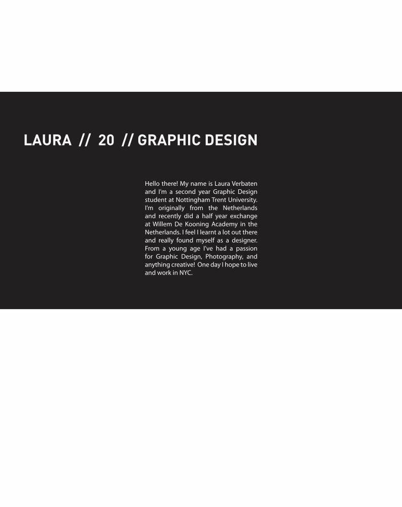
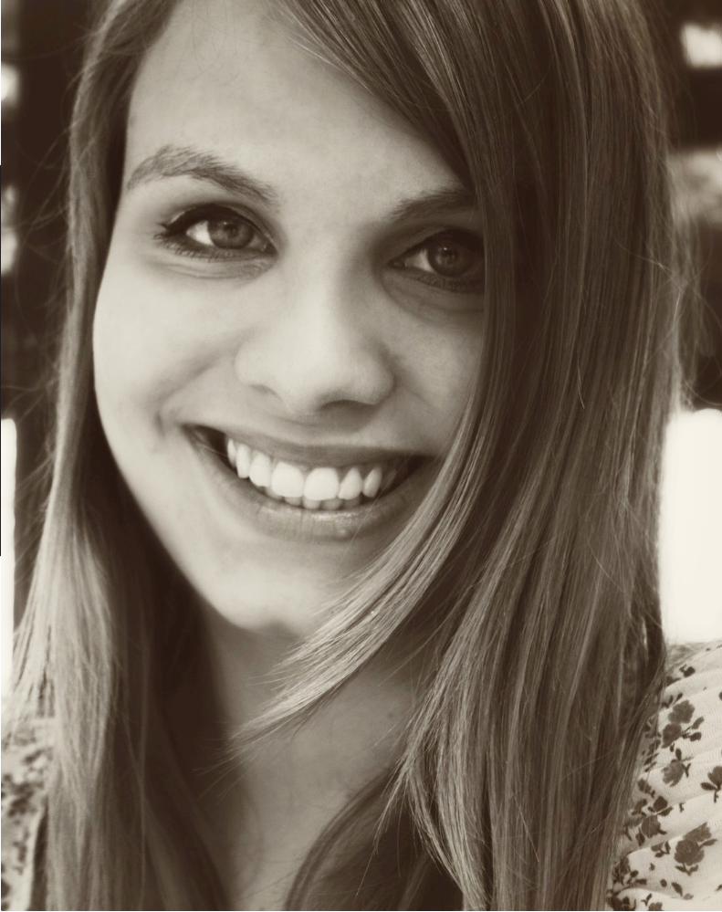
Hello there! My name is Laura Verbaten and I’m a second year Graphic Design student at Nottingham Trent University. I’m originally from the Netherlands and recently did a half year exchange at Willem De Kooning Academy in the Netherlands. I feel I learnt a lot out there and really found myself as a designer. From a young age I’ve had a passion for Graphic Design, Photography, and anything creative! One day I hope to live and work in NYC.
LAURA // 20 // GRAPHIC DESIGN
D E S I G N
P O R T F O L I O
D E S I G N
P O R T F O L I O
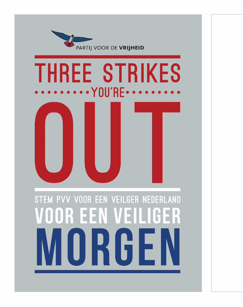
2 separate political posters (both dutch). The first poster is a poster for the PVV (Party for Freedom), it’s is a right-wing political party in the Netherlands. It has programme items like administrative detention and strong assimilationist stance on the integration of immigrants into Dutch society. One of their main points is “Three strikes you’re out”, which is regarding stronger punishments. Underneath it says: “Vote for the PVV, for a safer Netherlands, for a safer tomorrow.” The poster makes use of the colours of the dutch flag to show the patriotic character of the party.
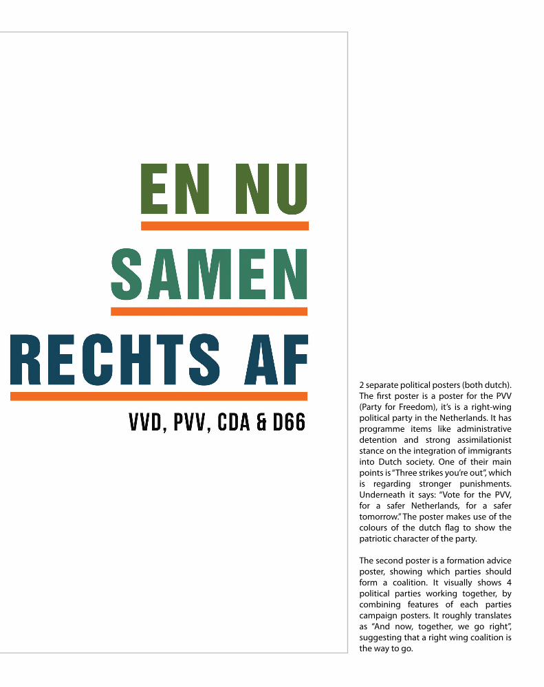
The second poster is a formation advice poster, showing which parties should form a coalition. It visually shows 4 political parties working together, by combining features of each parties campaign posters. It roughly translates as “And now, together, we go right”, suggesting that a right wing coalition is the way to go.

Explore the
agificet
Red Sea . . .
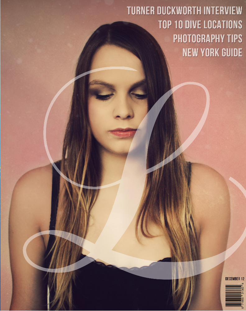
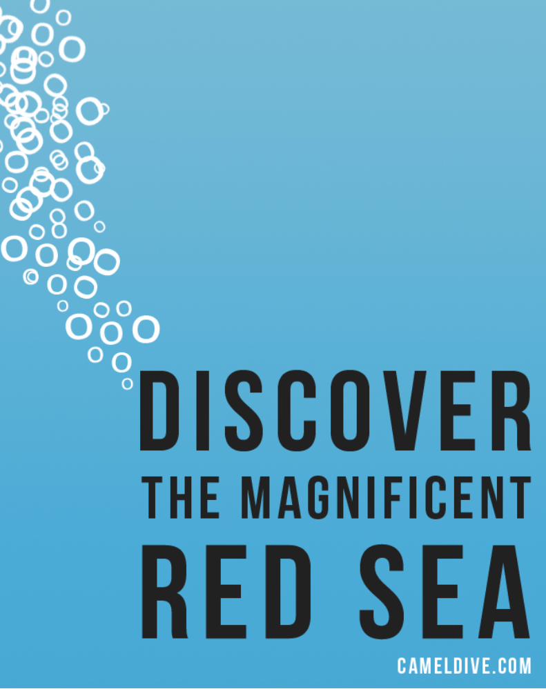
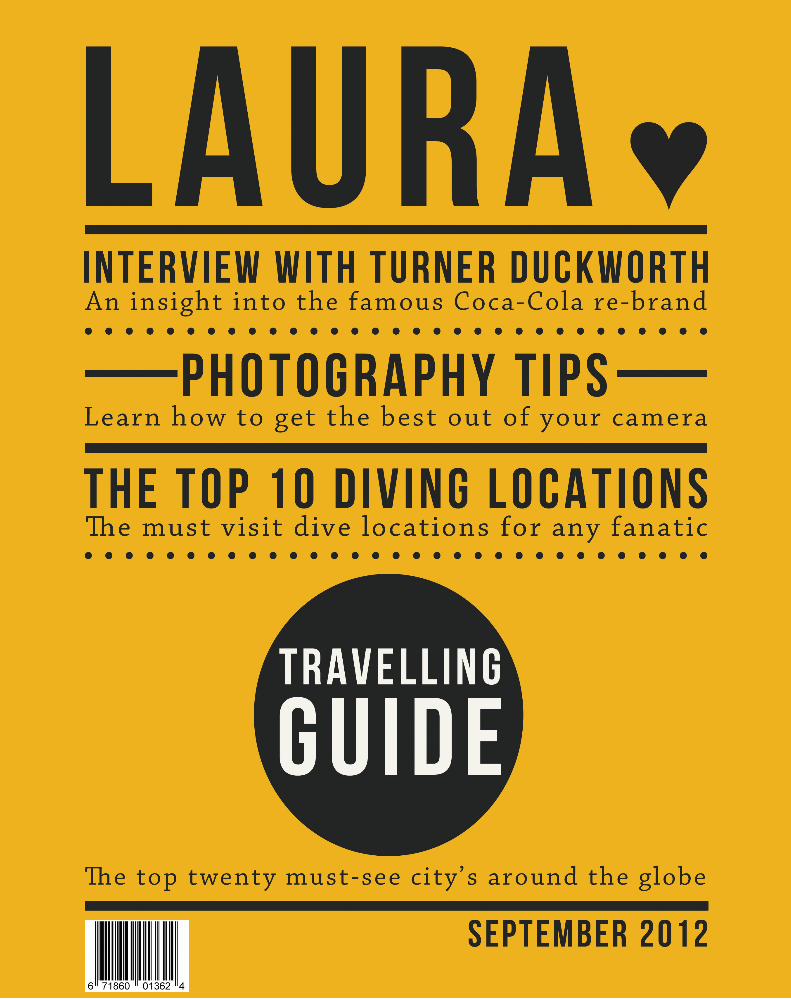
A front cover and back advertisement for a self magazine (Laura). One with the use of photography and the other purely typographic (see next spread). I wanted the photographic cover to be mysterious, to draw the reader in. I didn’t want the photograph to give too much about myself away. The purely typographic cover makes use of patterns and perfectly aligned text, which are two things that I love. The photographic and typographic advertisement both show my love for Scuba Diving.
Explore the
agificet
Red Sea . . .
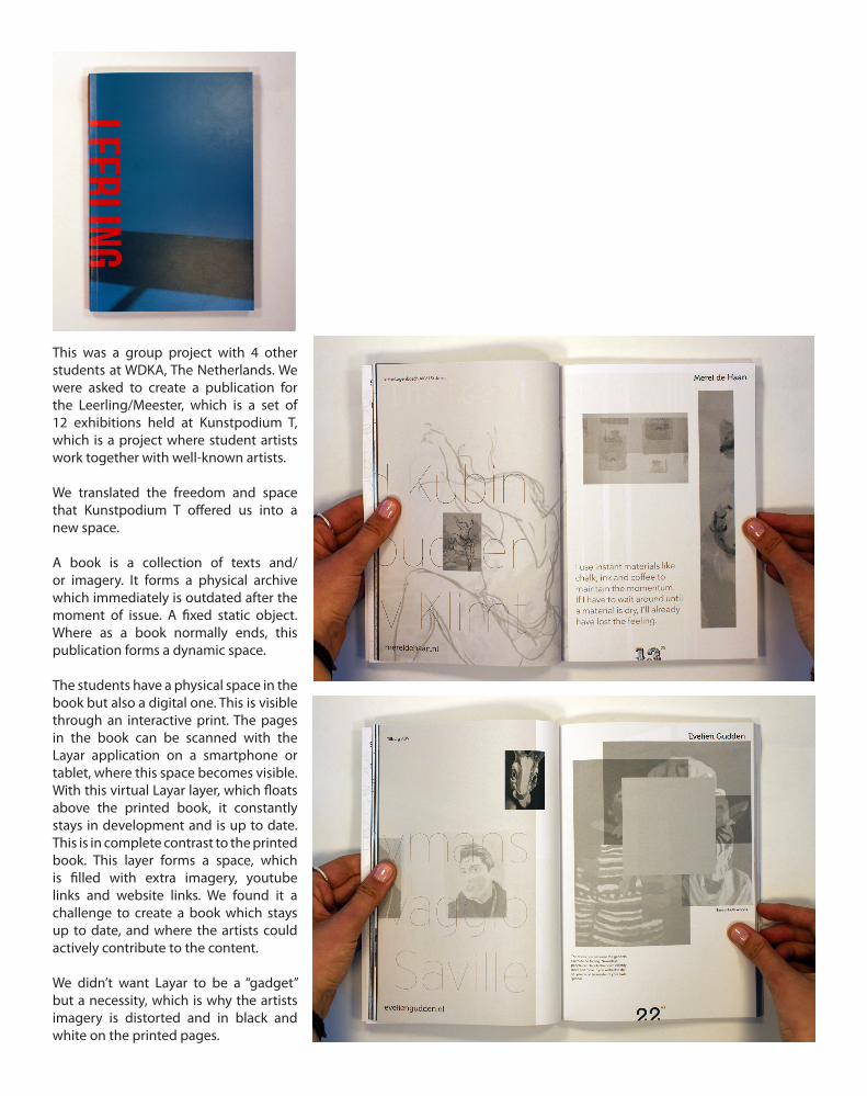
This was a group project with 4 other students at WDKA, The Netherlands. We were asked to create a publication for the Leerling/Meester, which is a set of 12 exhibitions held at Kunstpodium T, which is a project where student artists work together with well-known artists.
We translated the freedom and space that Kunstpodium T offered us into a new space.
A book is a collection of texts and/or imagery. It forms a physical archive which immediately is outdated after the moment of issue. A fixed static object. Where as a book normally ends, this publication forms a dynamic space.
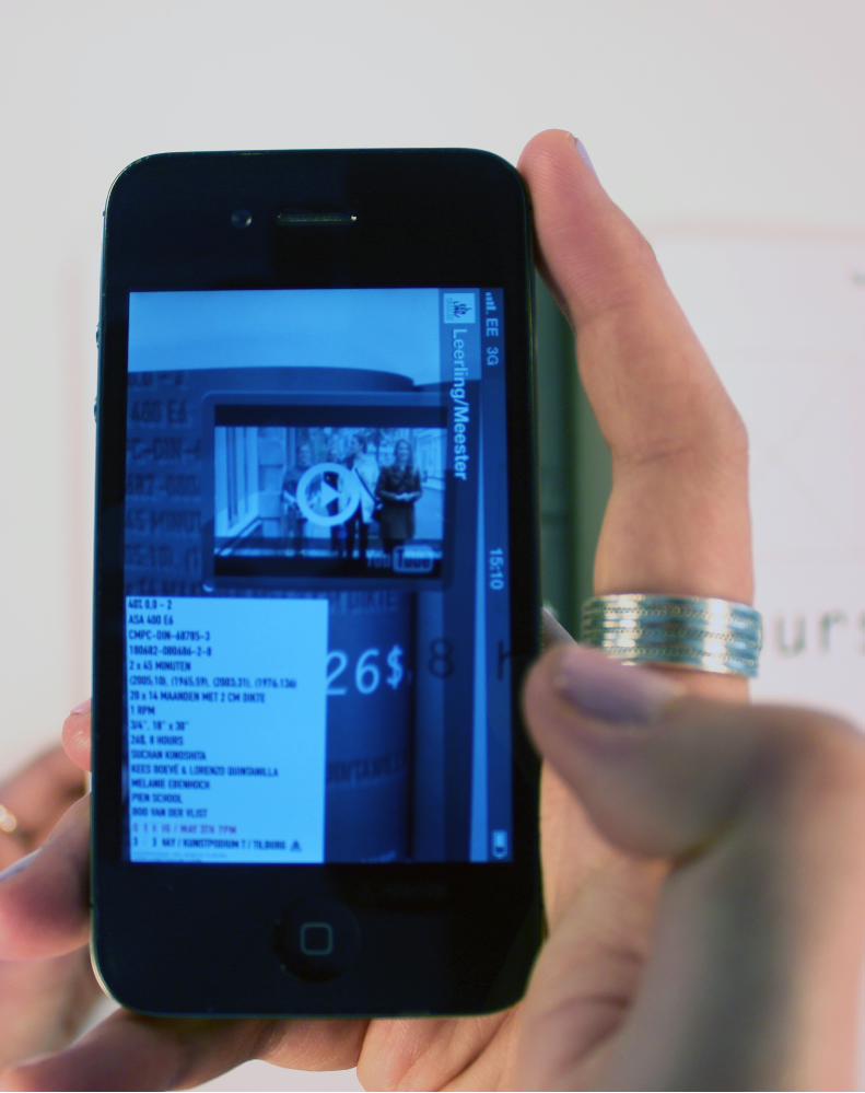
The students have a physical space in the book but also a digital one. This is visible through an interactive print. The pages in the book can be scanned with the Layar application on a smartphone or tablet, where this space becomes visible.With this virtual Layar layer, which floats above the printed book, it constantly stays in development and is up to date. This is in complete contrast to the printed book. This layer forms a space, which is filled with extra imagery, youtube links and website links. We found it a challenge to create a book which stays up to date, and where the artists could actively contribute to the content.
We didn’t want Layar to be a “gadget” but a necessity, which is why the artists imagery is distorted and in black and white on the printed pages.
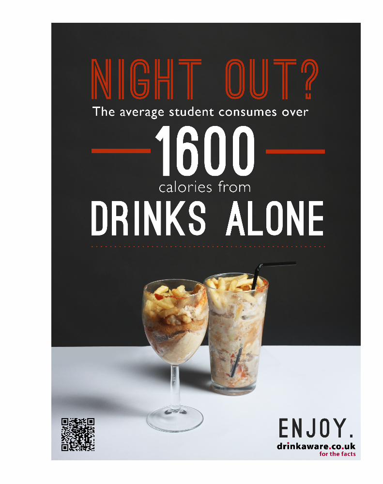

Alcohol Awareness campaign for Drink Aware. I decided to take a slightly different spin on it. Rather than looking at what damage alcohol does to your organs I looked at the calories consumed on the average night out, comparing them to well known high calorie/fatty foods. I created a range of posters which all link together. I also designed an app which will calculate the amount of calories consumer on a night out, the QR code will link to the download link for this app.
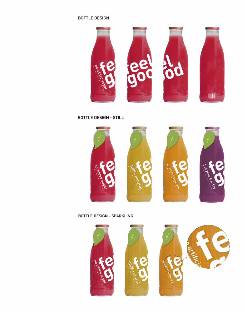
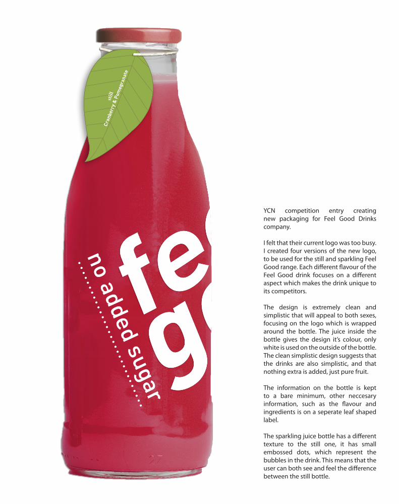
YCN competition entry creating new packaging for Feel Good Drinks company.
I felt that their current logo was too busy. I created four versions of the new logo, to be used for the still and sparkling Feel Good range. Each different flavour of the Feel Good drink focuses on a different aspect which makes the drink unique to its competitors.
The design is extremely clean and simplistic that will appeal to both sexes, focusing on the logo which is wrapped around the bottle. The juice inside the bottle gives the design it’s colour, only white is used on the outside of the bottle. The clean simplistic design suggests that the drinks are also simplistic, and that nothing extra is added, just pure fruit.
The information on the bottle is kept to a bare minimum, other neccesary information, such as the flavour and ingredients is on a seperate leaf shaped label.
The sparkling juice bottle has a different texture to the still one, it has small embossed dots, which represent the bubbles in the drink. This means that the user can both see and feel the difference between the still bottle.
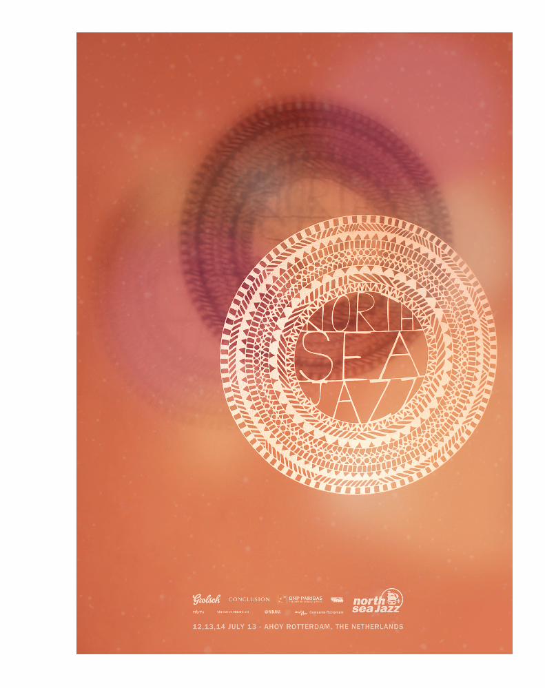
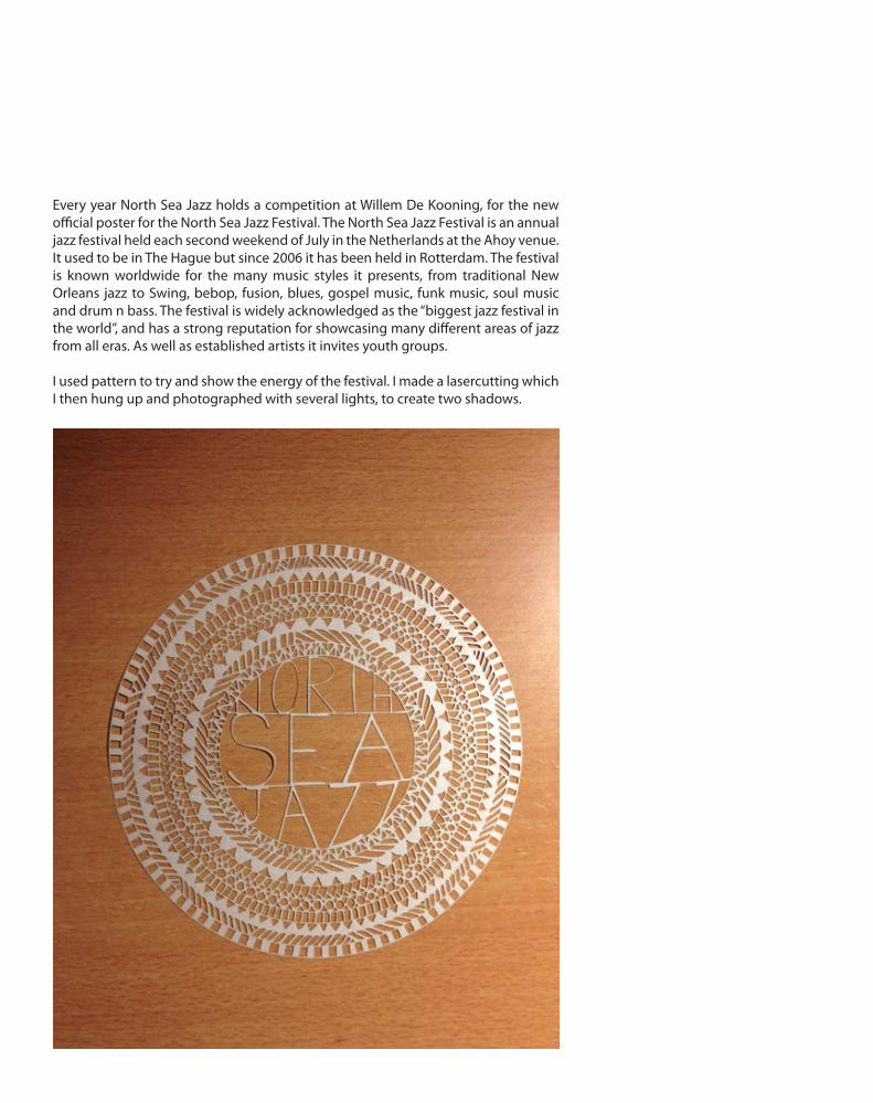
Every year North Sea Jazz holds a competition at Willem De Kooning, for the new official poster for the North Sea Jazz Festival. The North Sea Jazz Festival is an annual jazz festival held each second weekend of July in the Netherlands at the Ahoy venue. It used to be in The Hague but since 2006 it has been held in Rotterdam. The festival is known worldwide for the many music styles it presents, from traditional New Orleans jazz to Swing, bebop, fusion, blues, gospel music, funk music, soul music and drum n bass. The festival is widely acknowledged as the “biggest jazz festival in the world”, and has a strong reputation for showcasing many different areas of jazz from all eras. As well as established artists it invites youth groups.
I used pattern to try and show the energy of the festival. I made a lasercutting which I then hung up and photographed with several lights, to create two shadows.
P H O T O G R A P H Y
P O R T F O L I O
P H O T O G R A P H Y
P O R T F O L I O

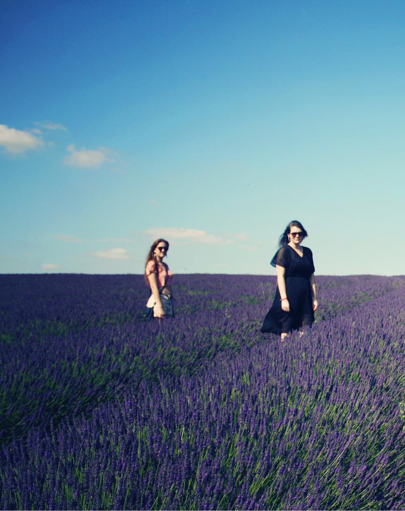
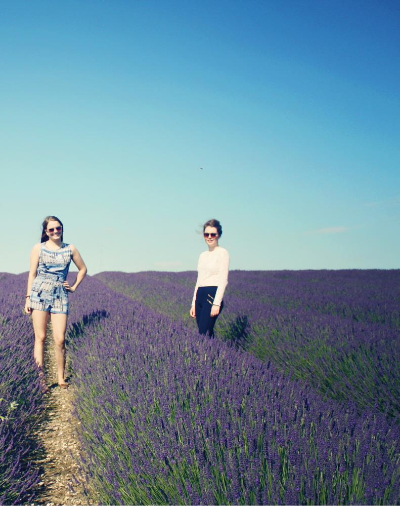
H I T C H I N L A V E N D E R
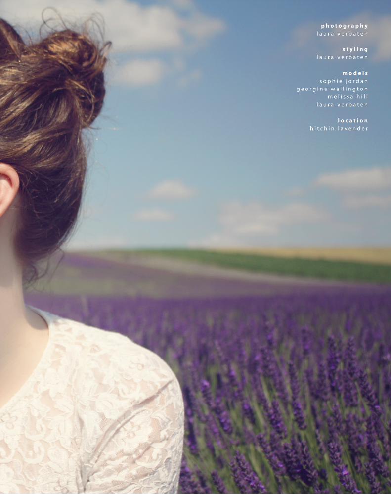
p h o t o g r a p h yl a u r a v e r b a t e n
s t y l i n gl a u r a v e r b a t e n
m o d e l ss o p h i e j o r d a n
g e o r g i n a w a l l i n g t o nm e l i s s a h i l l
l a u r a v e r b a t e n
l o c a t i o nh i t c h i n l a v e n d e r
H I T C H I N L A V E N D E R
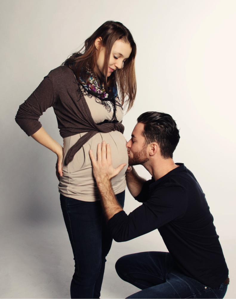
p h o t o g r a p h yl a u r a v e r b a t e n
s t y l i n gl a u r a v e r b a t e n
m o d e l sr o m a n a m a i e r
m a r k u s g r u b e r
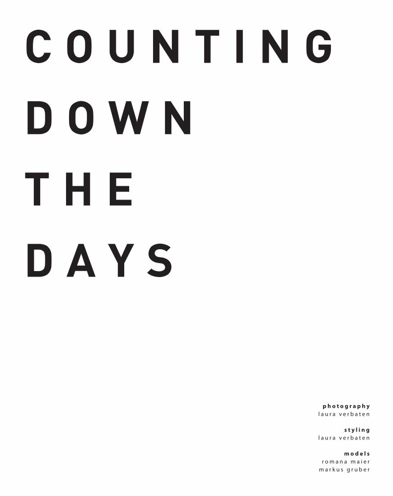
C O U N T I N G
D O W N
T H E
D A Y S
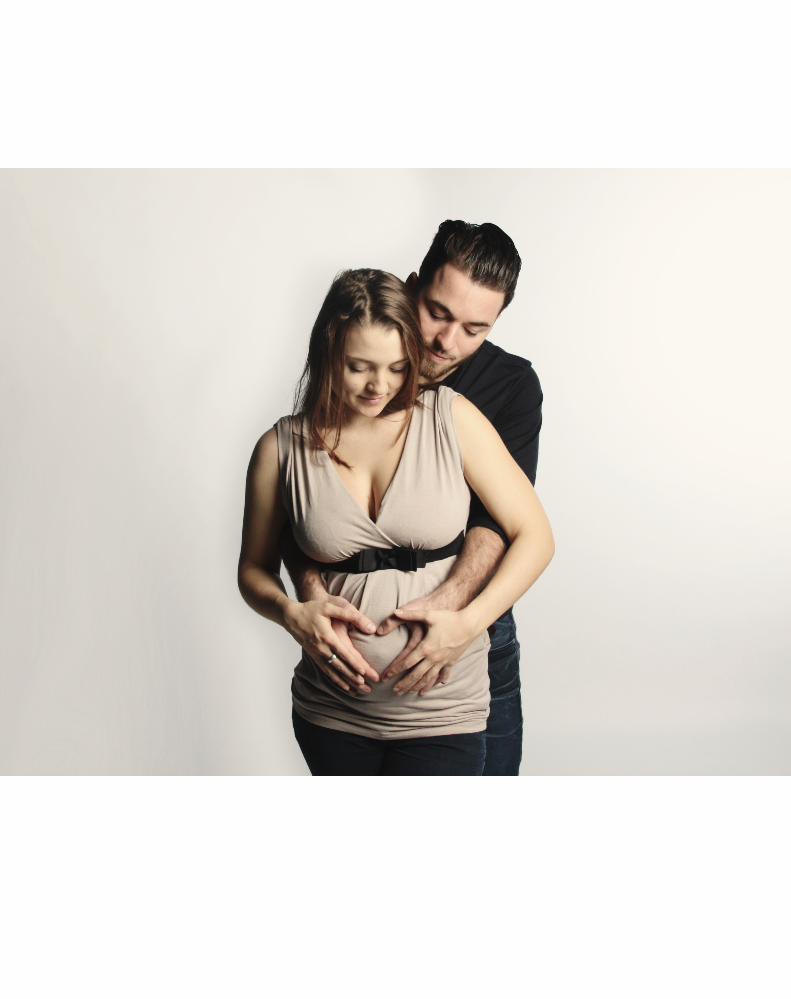
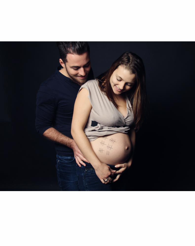
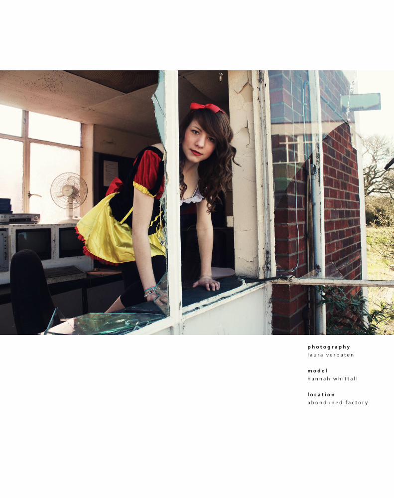
p h o t o g r a p h yl a u r a v e r b a t e n
m o d e lh a n n a h w h i t t a l l
l o c a t i o na b o n d o n e d f a c t o r y
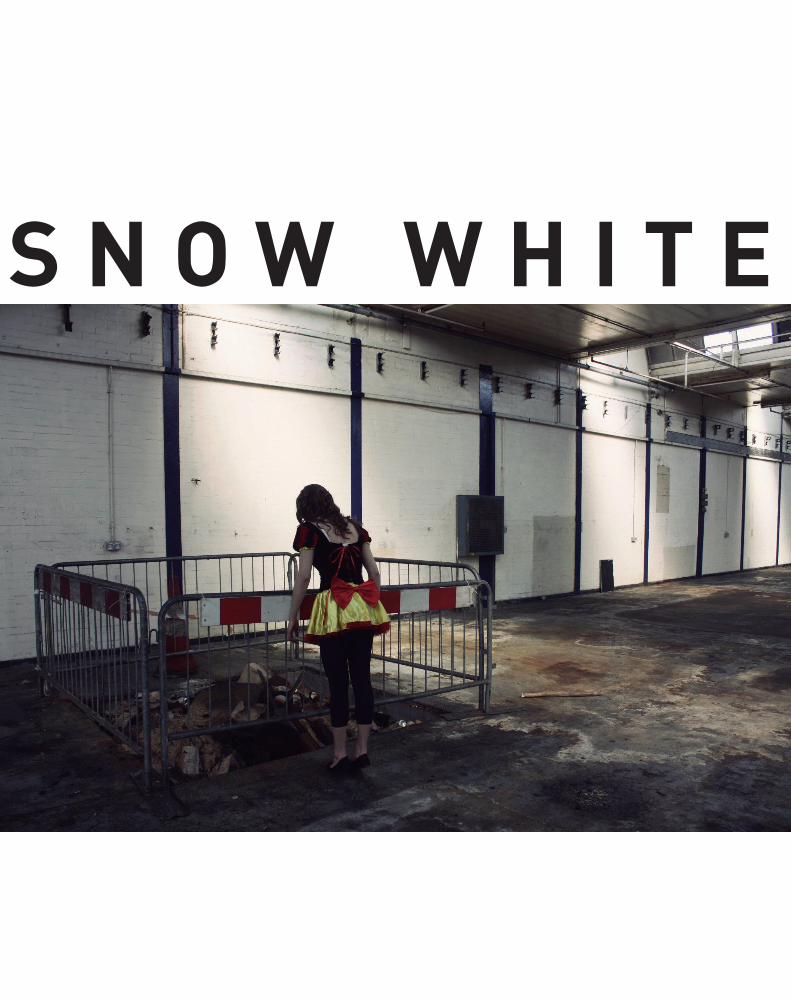
S N O W W H I T E


I ’M SURE I ’LL GET ALONG SOMEHOW...
EVERYTHING’S GOING TO BE ALRIGHT.
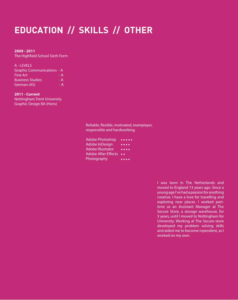
2009 - 2011The Highfield School Sixth Form
A - LEVELSGraphic Communications - AFine Art - A Business Studies - AGerman (AS) - A
2011 - CurrentNottingham Trent UniversityGraphic Design BA (Hons)
EDUCATION // SKILLS // OTHER
Reliable, flexible, motivated, teamplayer, responsible and hardworking.
Adobe Photoshop Adobe InDesign Adobe Illustrator Adobe After Effects Photography
I was born in The Netherlands and moved to England 13 years ago. Since a young age I’ve had a passion for anything creative. I have a love for travelling and exploring new places. I worked part-time as an Assistant Manager at The Secure Store, a storage warehouse, for 3 years, until I moved to Nottingham for University. Working at The Secure-store developed my problem solving skills and aided me to become inpendent, as I worked on my own.
* * * * ** * * ** * * ** ** * * *
W W W . L A U R A V E R B A T E N . C O . U K
L V E R B A T E N @ L I V E . C O . U K
PLEASE VIEW THE REST OF MY
WORK AND SEND ME AN E-MAIL


