data, interactives and visualisations
TRANSCRIPT
DATA, INTERACTIVES & VISUALIZATIONS
EsraDogramaci @esrad for CEJ/IBA, Karachi, April 2017
What is data journalism? 1
Any story led by numbers
Reporting facts in a way that people understand, about issues that matter
Your role is to bring data to life - tell the story.
But first, who is your audience?
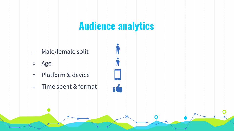
Audience analytics
◉ Male/female split
◉ Age
◉ Platform & device
◉ Time spent & format
Visualizing data Examples 2

The good ones
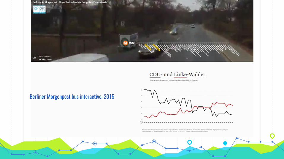
“Berliner Morgenpost bus interactive, 2015
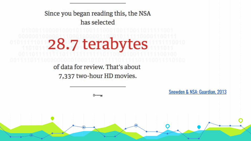
“Snowden & NSA: Guardian, 2013

“
BBC Sport: Who is your Olympic body match, 2016.
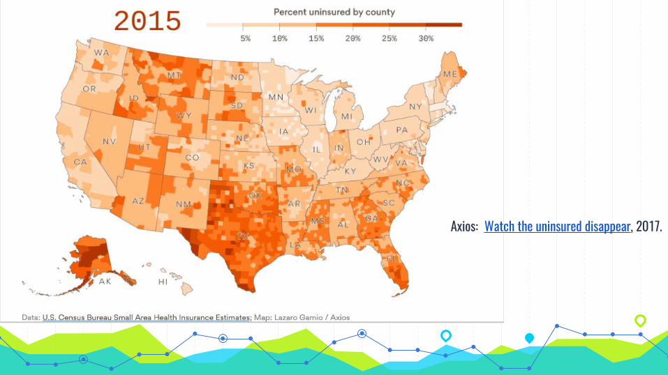
“Axios: Watch the uninsured disappear, 2017.
“
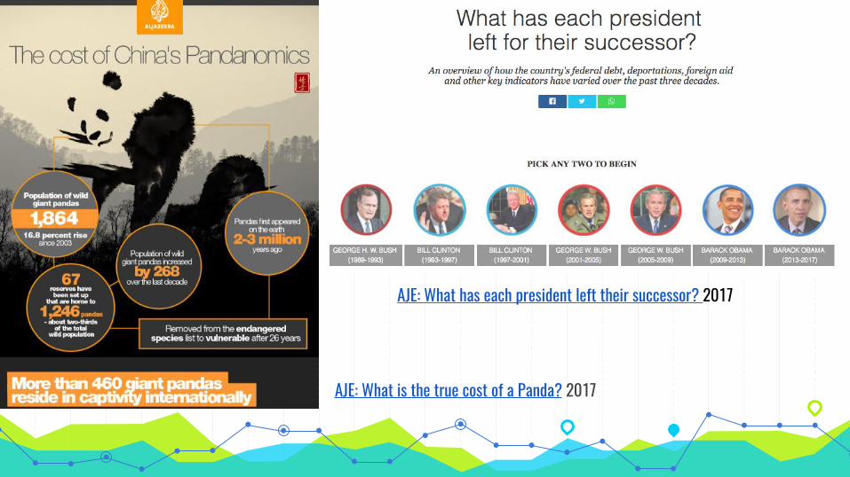
AJE: What is the true cost of a Panda? 2017
AJE: What has each president left their successor? 2017

The complex
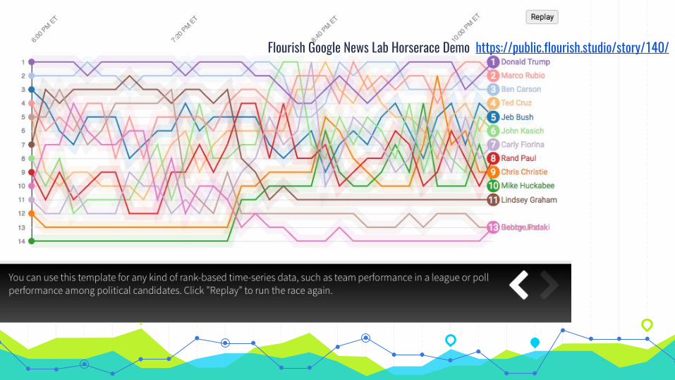
“Flourish Google News Lab Horserace Demo https://public.flourish.studio/story/140/
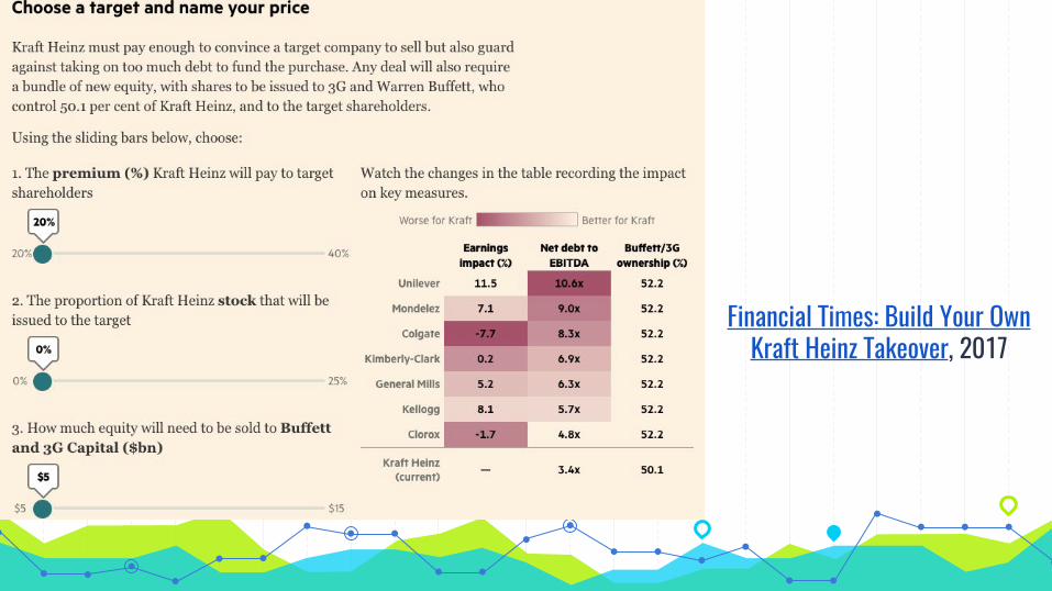
“Financial Times: Build Your Own
Kraft Heinz Takeover, 2017
Sometimes,
‘Simplicity is the ultimate sophistication’ -Leonardo Da Vinci
Remember, there is a fine line between
Impressive + Incomprehensible
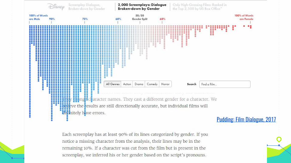
“
Pudding: Film Dialogue, 2017
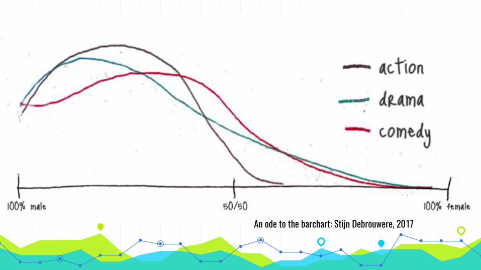
“
An ode to the barchart: Stijn Debrouwere, 2017
“
“

Let’s get started 3
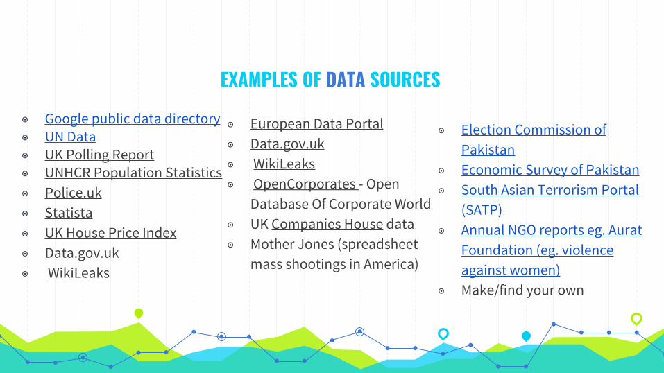
◉ Google public data directory◉ UN Data◉ UK Polling Report◉ UNHCR Population Statistics◉ Police.uk ◉ Statista◉ UK House Price Index◉ Data.gov.uk◉ WikiLeaks
EXAMPLES OF DATA SOURCES
◉ European Data Portal ◉ Data.gov.uk◉ WikiLeaks◉ OpenCorporates - Open
Database Of Corporate World◉ UK Companies House data◉ Mother Jones (spreadsheet
mass shootings in America)
◉ Election Commission of Pakistan
◉ Economic Survey of Pakistan◉ South Asian Terrorism Portal
(SATP)◉ Annual NGO reports eg. Aurat
Foundation (eg. violence against women)
◉ Make/find your own
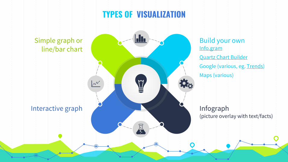
TYPES OF VISUALIZATION
Build your own Info.gram
Quartz Chart Builder
Google (various, eg. Trends)
Maps (various)
Infograph (picture overlay with text/facts)
Simple graph or line/bar chart
Interactive graph
Over to you Find a data set,
start to create stories
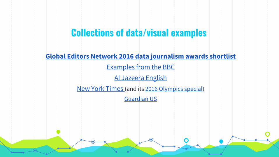
Collections of data/visual examples
Global Editors Network 2016 data journalism awards shortlist Examples from the BBC
Al Jazeera English New York Times (and its 2016 Olympics special)
Guardian US

THANK YOU & SHOUT OUT This presentation was put together with ideas & resources from:
Marianne BouchartAlia Chughtai Stijn DebrouwereTom Felle Aron PilhoferSimon Rogers
Template by SlidesCarnival