design specification report
TRANSCRIPT
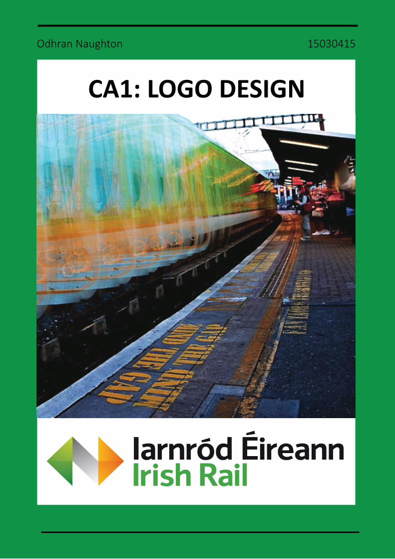
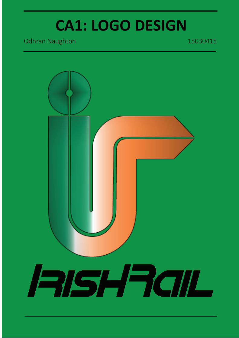
CA1: LOGO DESIGN
Odhran Naughton 15030415

DESIGN SPECIFICATION REPORTINTRODUCTION
Irish Rail/Iarnród Éireann is a relatively modern brand of transport founded in 1987; evolving from the CIÉ Railways Division. Over the past three decades the company has undergone a diverse range of changes to their visual Identity. Their original ‘four rails’ logo is a simple design with vibrant red coloured tracks abstractly spelling out their initials.1 The branding took quite a drastic change with the Irish form of its name taking center stage in 1994. Mar-keted as Iarnród Éireann, the logo incorporated a bold and loud orange and black colour scheme in keeping with growing boom in the Ireland of the mid to late 1990’s.2 Moving into the early 2000’s, the brand took on a modern twist to match the internet’s inevitable inva-sion. The main component of the logo is simply; ‘irishrail.ie’, with a curved light green line resting underneath.3 The current logo moves away from the company’s symbolism of the past with a sleek green, white/grey and gold image tinted with highlights and shadows.4 It has a futuristic feel reflecting the clean, crisp aesthetics of the present day. It has similarities to some other railway brands including British Rail who also utilize arrows in opposite direc-tions. By examining Irish Rail’s past one can easily notice how each logo accurately reflects the values and imagination of that particular era. By respecting the history of the brand and using foresight to predict the future efficient we can create a brand identity that merges both nostalgia and innovation to efficiently represent Irish Rail.
Irish Rail Logo Evolution:
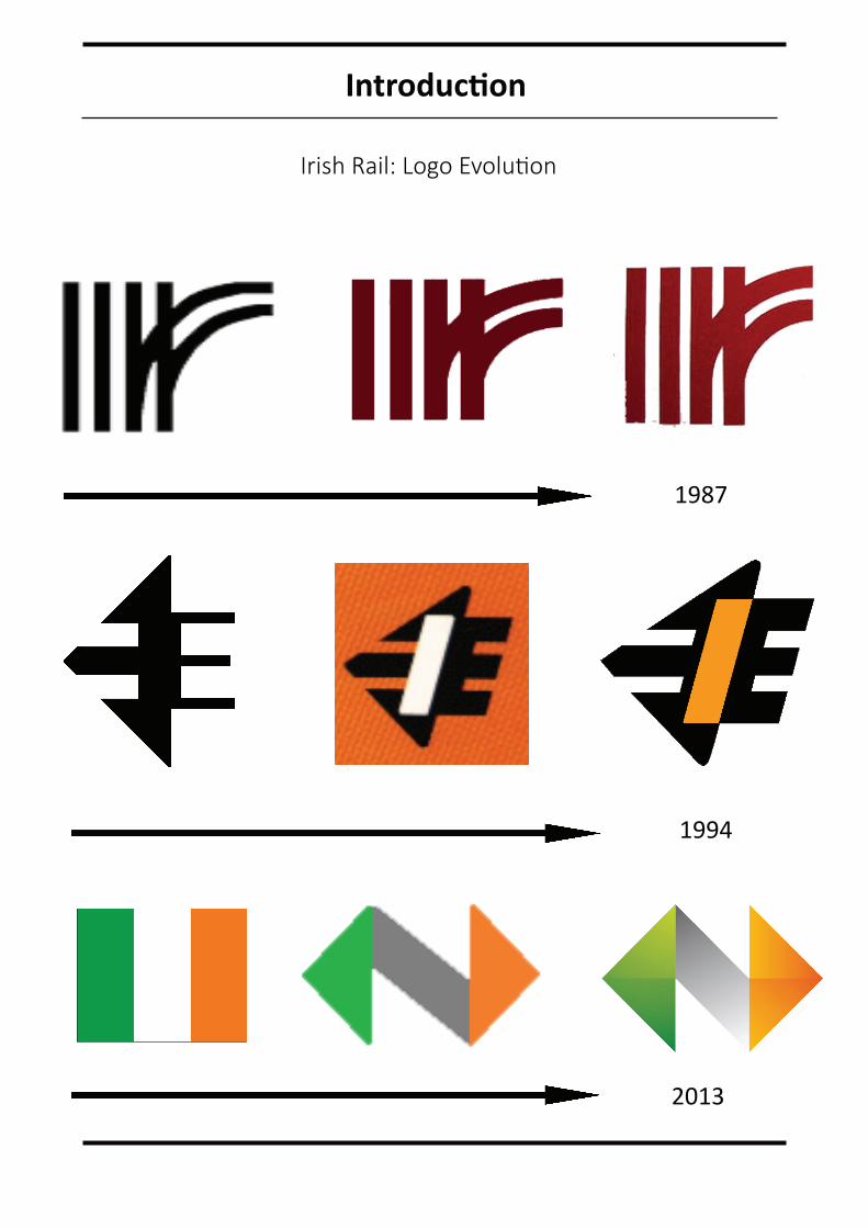
1987
1994
2013
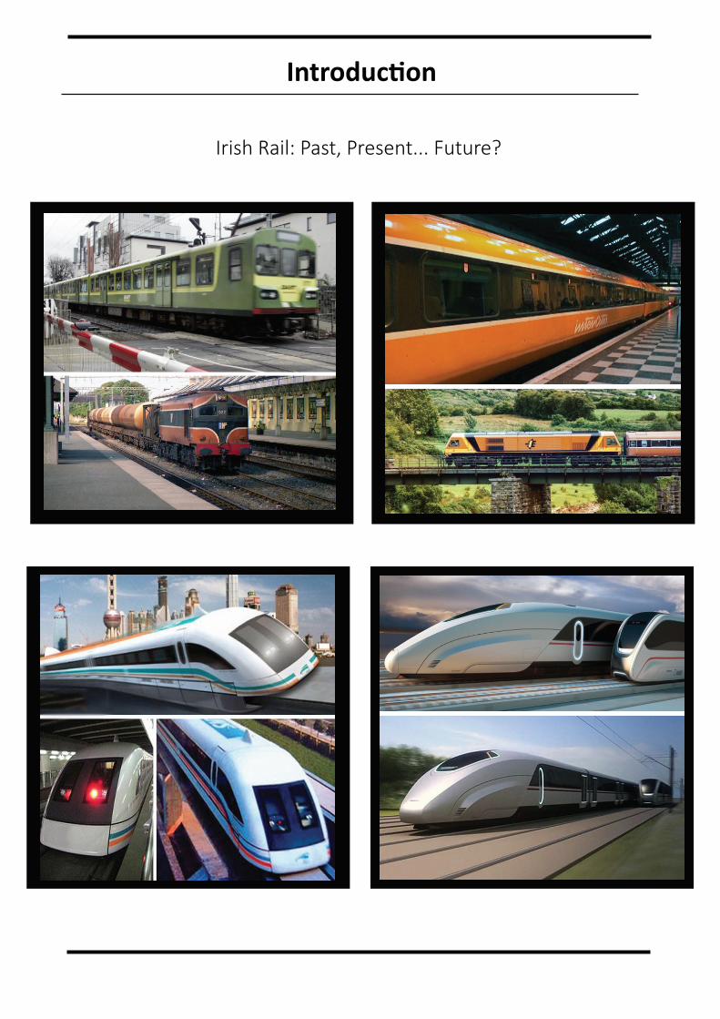
Irish Rail: Past, Present... Future?
EXECUTIVE SUMMARY
Purpose of the document:
This report is designed to showcase the creation of the new logo for Irish Rail. It will consist of explanations for the methods, software tools and techniques that were used to design the logo and typeface. It will present the initial rough sketches right through to the final, finished artwork that will be used with all of Irish Rail’s products, services and marketing projects. It will highlight the creativity and innovation that was involved in designing the logo, specifi-cally in relation to the shapes, lines, typography, layout, positioning and colours used. Accompanying the written information will be visual aids and examples to communicate how the project gradually developed and improved throughout the process. There will be a focus on where the idea for the logo spawned from including inspiration from the history of Irish Rail to classic logo designs from the past and interpretations of the styles and trends of the future. The logo was designed over several weeks, changing shape, colour, text and effects to produce a unique finished product. Therefore, the function of this document is to present a complete and detailed report of the construction, development and thought process that went behind the new and improved visual identity for Irish Rail.
Methodology, Tools & Techniques:
The process of creating the Irish Rail logo design and typography is accurately reproduced on the following pages. Both the logo and type was created using Adobe Illustrator and later edited with Adobe Photoshop. The straight line and the arc tool was used to construct the lines and curves to shape the logo and to ensure its proper proportions. These lines were then formed into shapes using the shape builder tool. This method of logo design also ensures that the correct dimensions can be incorporated with any type of media in any size whether it’s on the head of a letter, on the side of a train or on an outdoor billboard.
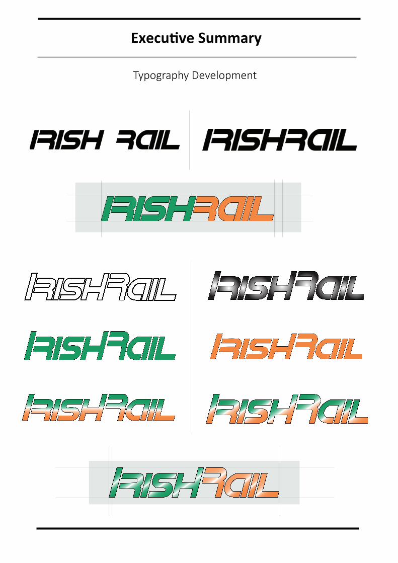
This same technique was used to create an authentic and distinct typeface instead of relying on a generic font to enhance the form of the logo. While it is imperative that the typeface be in harmony with the logo and design system, it is as important that the message be easily read and understood. The ‘Bauhaus 90’ font was the initial font tested with an early draft of the logo. Although the lettering matched up very well with the shapes and curves of the logo, the boldness and rigidness of the letters appeared flat and dated. Many shape combi-nations were tested out while designing the logo and text in order to build on and compare the variations.
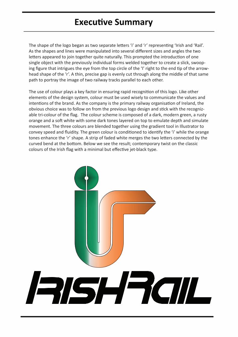
The shape of the logo began as two separate letters ‘i’ and ‘r’ representing ‘Irish and ‘Rail’. As the shapes and lines were manipulated into several different sizes and angles the two letters appeared to join together quite naturally. This prompted the introduction of one single object with the previously individual forms welded together to create a slick, swoop-ing figure that intrigues the eye from the top circle of the ‘I’ right to the end tip of the arrow-head shape of the ‘r’. A thin, precise gap is evenly cut through along the middle of that same path to portray the image of two railway tracks parallel to each other.
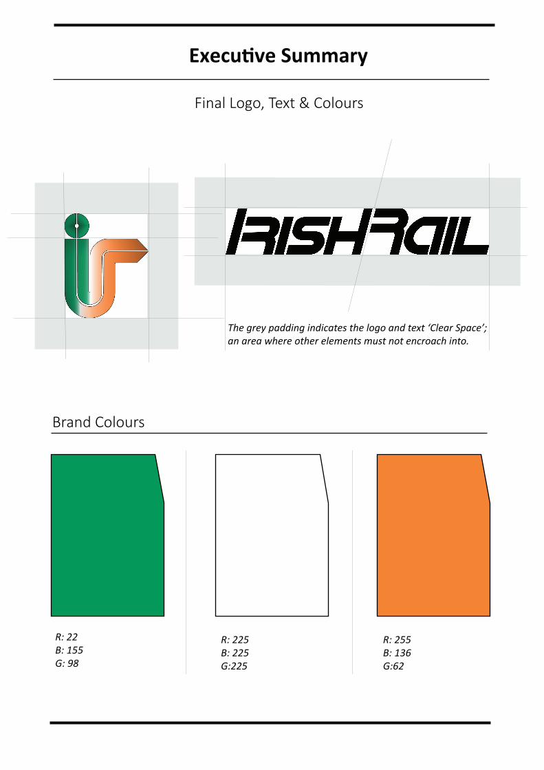
The use of colour plays a key factor in ensuring rapid recognition of this logo. Like other elements of the design system, colour must be used wisely to communicate the values and intentions of the brand. As the company is the primary railway organisation of Ireland, the obvious choice was to follow on from the previous logo design and stick with the recogniz-able tri-colour of the flag. The colour scheme is composed of a dark, modern green, a rusty orange and a soft white with some dark tones layered on top to emulate depth and simulate movement. The three colours are blended together using the gradient tool in Illustrator to convey speed and fluidity. The green colour is conditioned to identify the ‘i’ while the orange tones enhance the ‘r’ shape. A strip of faded white merges the two letters connected by the curved bend at the bottom. Below we see the result; contemporary twist on the classic colours of the Irish flag with a minimal but effective jet-black type.
Executive Summary

Executive Summary
Typography Development
Executive Summary
Executive Summary
Brand Colours
R: 22B: 155G: 98
R: 255B: 136G:62
R: 225B: 225G:225
The grey padding indicates the logo and text ‘Clear Space’;an area where other elements must not encroach into.
Final Logo, Text & Colours
Executive Summary
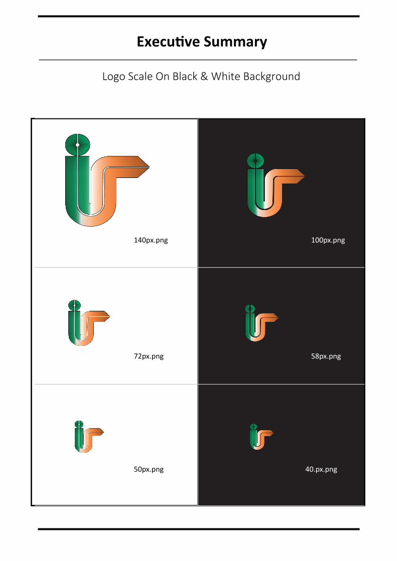
Logo Scale On Black & White Background
140px.png 100px.png
72px.png 58px.png
50px.png 40.px.png
Executive Summary
Executive Summary
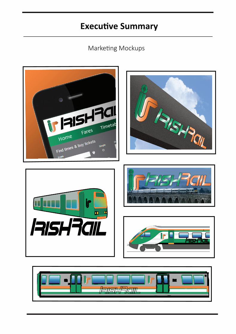
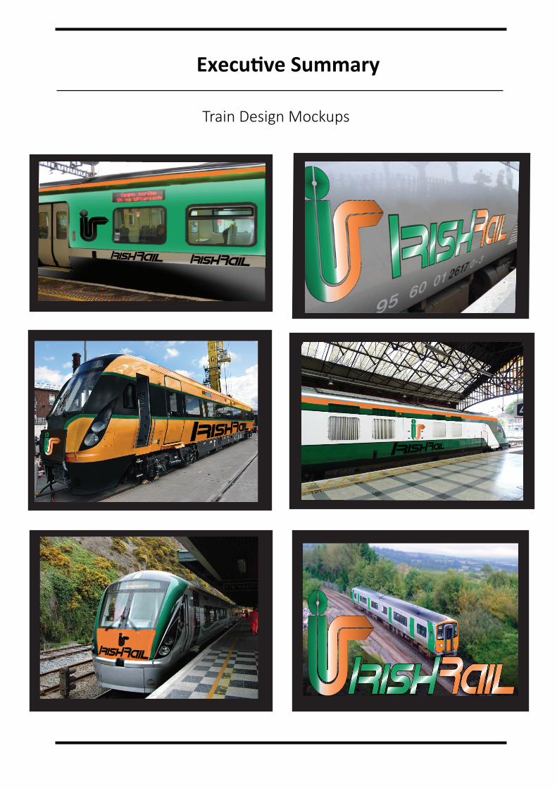
Train Design Mockups
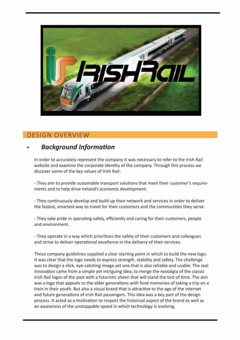
DESIGN OVERVIEW
Background Information
In order to accurately represent the company it was necessary to refer to the Irish Rail website and examine the corporate identity of the company. Through this process we discover some of the key values of Irish Rail:
- They aim to provide sustainable transport solutions that meet their customer’s require-ments and to help drive Ireland’s economic development.
- They continuously develop and build up their network and services in order to deliver the fastest, smartest way to travel for their customers and the communities they serve.
- They take pride in operating safely, efficiently and caring for their customers, people and environment.
- They operate in a way which prioritises the safety of their customers and colleagues and strive to deliver operational excellence in the delivery of their services.
These company guidelines supplied a clear starting point in which to build the new logo. It was clear that the logo needs to express strength, stability and safety. The challenge was to design a slick, eye-catching image yet one that is also reliable and usable. The real innovation came from a simple yet intriguing idea; to merge the nostalgia of the classic Irish Rail logos of the past with a futuristic sheen that will stand the test of time. The aim was a logo that appeals to the older generations with fond memories of taking a trip on a train in their youth. But also a visual brand that is attractive to the age of the internet and future generations of Irish Rail passengers. This idea was a key part of the design process. It acted as a motivation to respect the historical aspect of the brand as well as an awareness of the unstoppable speed in which technology is evolving.
Design Overview
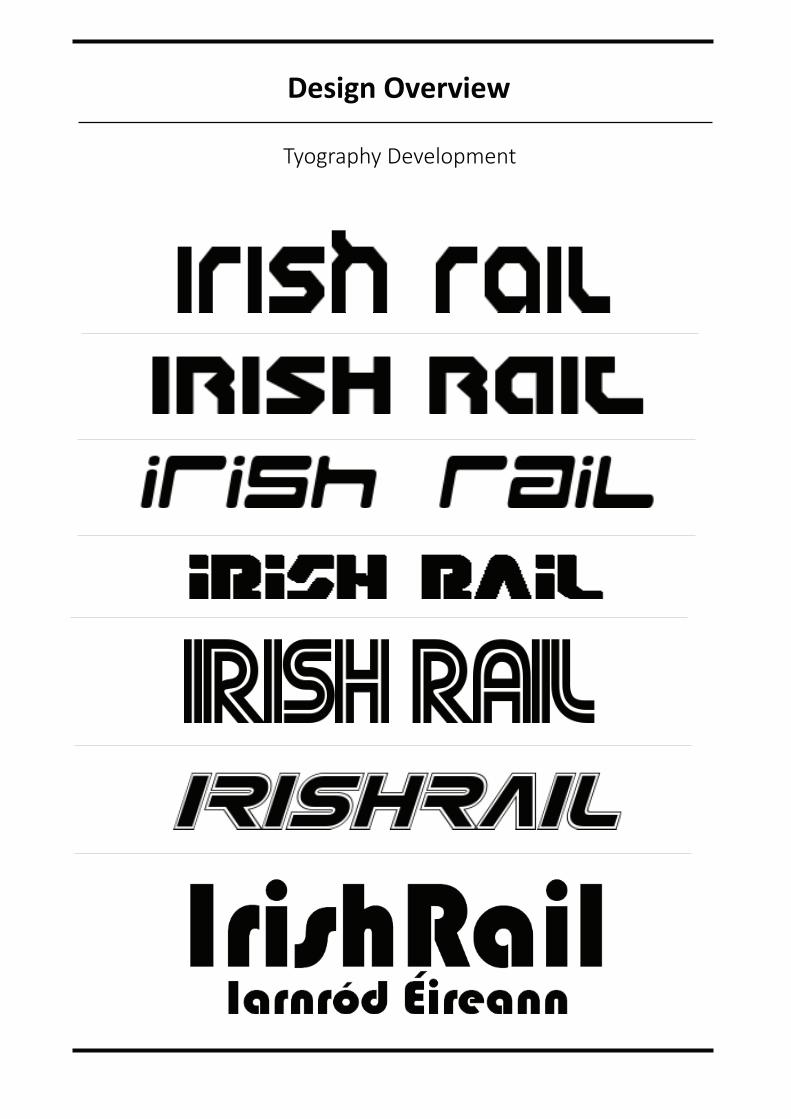
Tyography Development
Design Overview
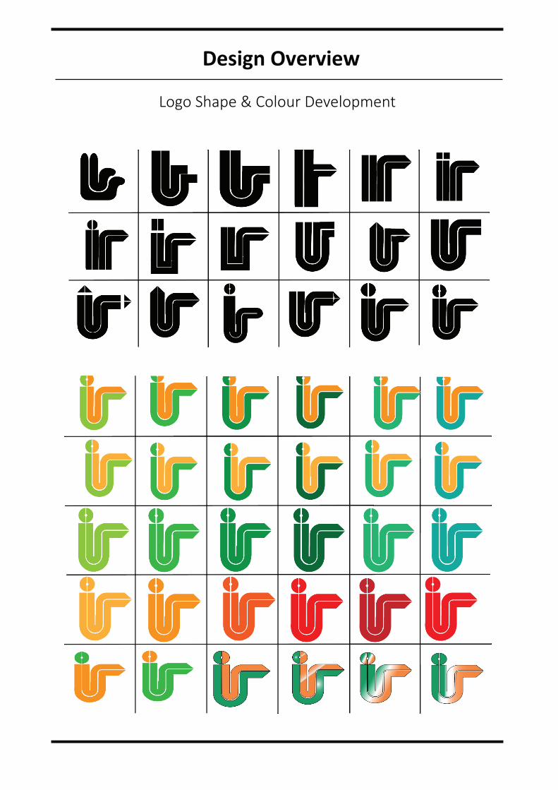
Logo Shape & Colour Development
Design Overview
Design Overview
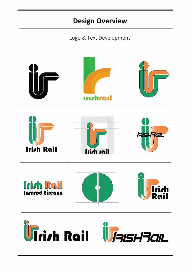
Logo & Text Development
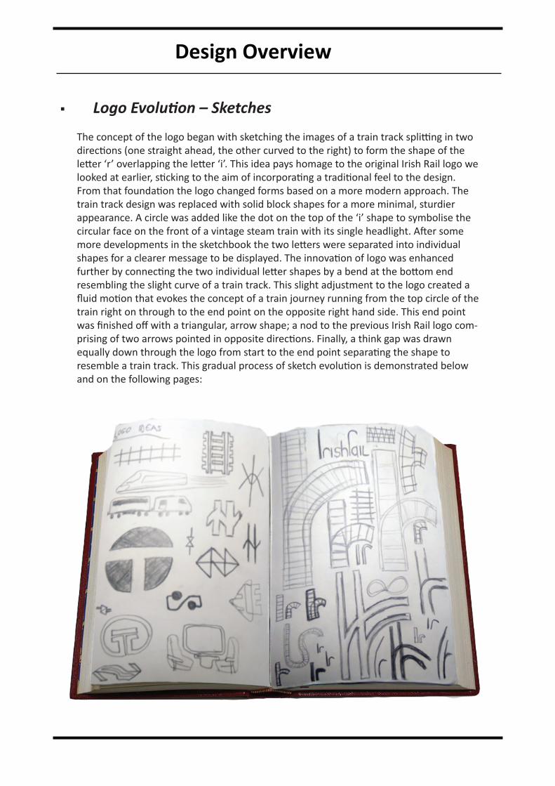
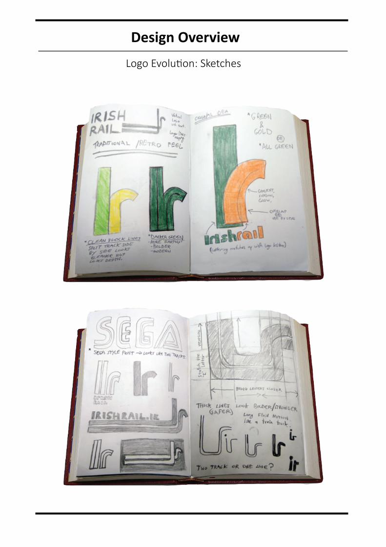
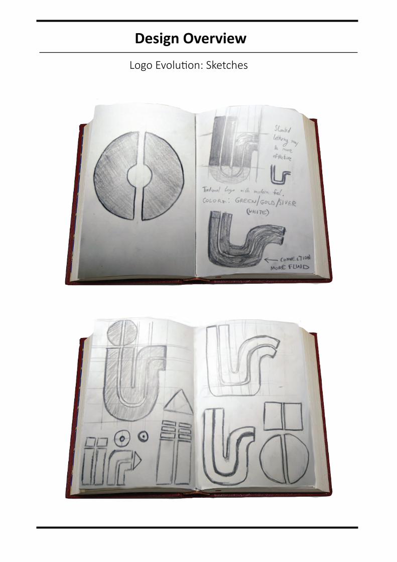
Logo Evolution – Sketches
The concept of the logo began with sketching the images of a train track splitting in two directions (one straight ahead, the other curved to the right) to form the shape of the letter ‘r’ overlapping the letter ‘i’. This idea pays homage to the original Irish Rail logo we looked at earlier, sticking to the aim of incorporating a traditional feel to the design. From that foundation the logo changed forms based on a more modern approach. The train track design was replaced with solid block shapes for a more minimal, sturdier appearance. A circle was added like the dot on the top of the ‘i’ shape to symbolise the circular face on the front of a vintage steam train with its single headlight. After some more developments in the sketchbook the two letters were separated into individual shapes for a clearer message to be displayed. The innovation of logo was enhanced further by connecting the two individual letter shapes by a bend at the bottom end resembling the slight curve of a train track. This slight adjustment to the logo created a fluid motion that evokes the concept of a train journey running from the top circle of the train right on through to the end point on the opposite right hand side. This end point was finished off with a triangular, arrow shape; a nod to the previous Irish Rail logo com-prising of two arrows pointed in opposite directions. Finally, a think gap was drawn equally down through the logo from start to the end point separating the shape to resemble a train track. This gradual process of sketch evolution is demonstrated below and on the following pages:
Design Overview
Design Overview
Design Overview
CONCLUSION
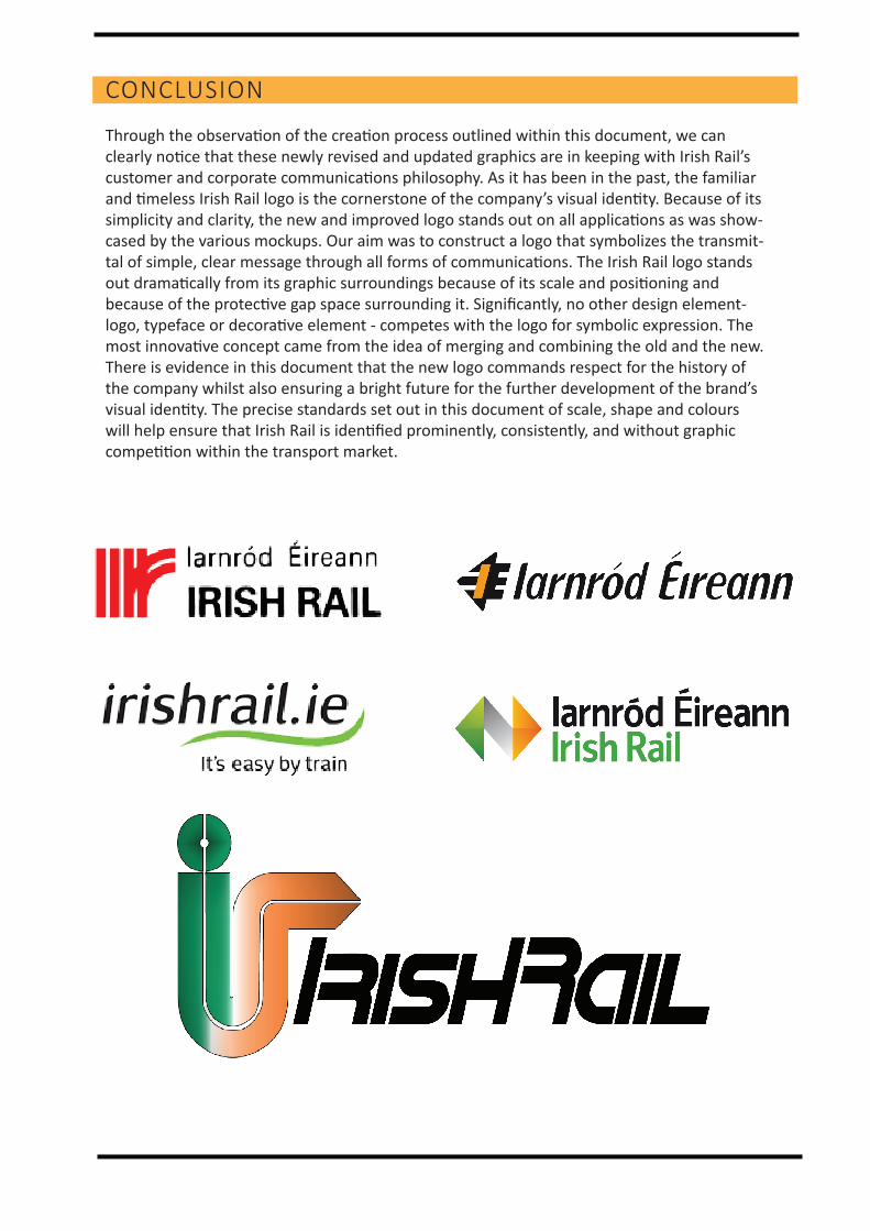
Through the observation of the creation process outlined within this document, we can clearly notice that these newly revised and updated graphics are in keeping with Irish Rail’s customer and corporate communications philosophy. As it has been in the past, the familiar and timeless Irish Rail logo is the cornerstone of the company’s visual identity. Because of its simplicity and clarity, the new and improved logo stands out on all applications as was show-cased by the various mockups. Our aim was to construct a logo that symbolizes the transmit-tal of simple, clear message through all forms of communications. The Irish Rail logo stands out dramatically from its graphic surroundings because of its scale and positioning and because of the protective gap space surrounding it. Significantly, no other design element-logo, typeface or decorative element - competes with the logo for symbolic expression. The most innovative concept came from the idea of merging and combining the old and the new. There is evidence in this document that the new logo commands respect for the history of the company whilst also ensuring a bright future for the further development of the brand’s visual identity. The precise standards set out in this document of scale, shape and colours will help ensure that Irish Rail is identified prominently, consistently, and without graphic competition within the transport market.
CA1: LOGO DESIGNOdhran Naughton 15030415