design thoughts - idc school of design, indian institute
TRANSCRIPT

1Design Thoughts … August 2010
DesignThoughts
August 2010
Industrial Design Centre,
Indian Institute of Technology Bombay


DesignThoughts
Edited by
Ravi Poovaiah
August 2011
Industrial Design Centre,
Indian Institute of Technology Bombay
© 2010 Industrial Design Centre, IIT Bombay
All rights reserved. No portion of this book may be
reproduced, stored in a retrieval system, or transmitted
in any form or by any means—electronic, mechanical,
photocopy, recording, scanning, or other—except for brief
quotations in critical reviews or articles, without the
prior written permission of the publisher.
ISBN 978-81-906815-0-6
Printed in India
This journal has been typeset by Girish Dalvi, a PhD
student at IDC in Adobe Indesign CS4. The body copy
English typeface is Swift, designed by Gerard Unger and
released by Linotype.
The cover page shows the patterns of the Kundan
Jewellery contributed by Parag vyas,Ph.D.student at IDC.

1 Introduction Ravi Poovaiah
2 NaturaDomestica:natureand/of/inhomes Neelakantan P. K., Uday Athavankar
11 GroundedTheory:AnEffectiveMethodforUser ExperienceDesignResearch Pramod Khambete, Uday Athavankar
25 OnDefiningVisualNarratives Sherline Pinenta, Ravi Poovaiah
47 InvestigationofthemostpreferredBilingual CombinationofWords:AnExperimentwitha selectedPlaceIdentificationSignboard Nanki Nath, Ravi Poovaiah 59 IdentificationandClassificationofSemanticUnits UsedinFormationofPatternsinKundan Jewellery,aMethodicalApproach. Parag K. Vyas, V.P. Bapat
Contents
Cont
ents


1Design Thoughts … August 2010
Introduction
This is the third issue of Design Thoughts. Our doctoral students with their
passion for research along with their faculty mentors have written the papers
for this issue.
Once again, here is a collection of thoughts on design – a spectrum that covers
in some sense what dedicated efforts on research can do for the field of design.
The first paper by Neelakantan along with his faculty adviser Professor Uday
Athavankar looks at how naming of the apartment blocks by builders in Mumbai
is meant to invoke a desirable relation between nature and the urban home.
Pramod Khambete and his guide Professor Athavankar investigate ‘Grounded
Theory’ as an effective method for user experience design research. This paper
is followed by Sherline Pimenta, who is on the verge of completing her doctoral
thesis. She, along with me as her faculty advisor, looks at how to define Visual
Narratives. Nanki Nath, working with me, has looked at the problems of reading
bilingual text on sign boards. Parag Vyas, working with Professor Vijay Bapat and
on the verge on completing his doctoral work, has written about identification
and classification of semantic units used in formation of patterns in Kundan
jewellery - a traditional type of Indian jewellery.
Hope you enjoy reading the works that are spread across and delving with
naming and architecture, to understanding user experience and bilinguality
in signage systems, to storytelling in visual imagery and investigating the
semantics behind patterns in jewellry making.
Do enjoy reading this issue — we look forward to your feedback and suggestions.
Good thoughts,
Ravi Poovaiah,
Editor,
Design Thoughts
Intr
oduc
tion

Design Thoughts … August 20102
Neelakantan P. K., Uday Athavankar
NatureandHomes
What does it mean to live in homes which go by names
like ‘Vasant Lawns’, ‘Hyde Park’, ‘M K Meadows’, etc?
The celebrated residential tower-buildings, dominant
expressions of Indian metropolitan urbanity have shown
a marked preference for such christening; increasingly
so in the recent past. These names are remarkable for
the presence of natural elements like ‘Lawns’, ‘Park’ and
‘Meadows’. Cursorily, one finds expressed in them, perhaps
at a symbolic level, an association with the foreign, the
exotic, and the natural in various forms. At least in
figurative terms their occurrence in the name provides
a glimpse of their import. This paper takes this keenness
of the name to express nature as symptomatic of a deeper
relation between nature and the urban home.
The recurring motif of nature functioning probably
for evocative appeal points at least to its being a prized
element in naming the home. Does this strong presence,
indicate to its being crucial, maybe even necessary in
conceptualizing the home? An inquiry of this sort can be
prematurely aborted with an obvious reason: that these
names do not go beyond being indicative of an expressed
desire for that which is lacking in congested urbanity1.
1. With these names, the apartments also seem to make claims to have reserved more area so as to provide for such activi-ties. In a space-starved Mumbai, one knows only too well the impossibility or falseness of such intentions, if they exist. It is more a result of building bye-laws which demand open spaces proportional to the height of the building, than that of any any well-meaning intent The question to ask is not whether really there is a meadow or not. Or maybe it is not surprising after all,
This reason can be extended to connect the purpose of
this evocation to the softening of the dreary urban reality.
Even so, in no way does it inform us about the modality of
expression of this desire. No clue is supplied as to which
aspect of the complex category of nature is regarded
suitable and subsequently structured for purposes of home-
making. Even if the virtual presence of nature is a result
of the actual distance from nature, it tells us nothing of
the manner in which nature is comprehended. Therefore,
it is imperative to ask: ‘How is nature comprehended’?
But the question: ‘How is nature conceptualized in the
apartment-block home’, can only be posed with the
awareness of it being nested within a bigger question:
‘How is the apartment block-home conceptualized’? This
investigation might be worthwhile therefore not just in
grasping how nature is being interpreted for the home,
but also for possible insights into the conceptualization
of the urban home itself.
NatureofHomes
The Urban House is a thing Architects design, Builders
construct and people occupy. Such houses become homes
through inhabiting or dwelling. The home can therefore
be understood as a practice2. The above question regarding
that nature would only be prized in places where it is not easily available, like the oasis in the desert. It would be well neigh impossible to find a meadow in Mumbai.
2. In Shelly Mallet, ‘Understanding home: a critical review of the literature, in The Sociological Review, Vol. 52, Issue 1, pg 62, the phenomenological position of viewing the home as a verb and therefore not as a thing, but as a practice, especially helps observe how people perform the home.
NaturaDomestica:natureand/of/inhomes

3Design Thoughts … August 2010
the home-concept can be rephrased: ‘How do people do
the home?’ allowing the role of nature within this perfor-
mance to be examined. The house in a material-physical
sense is an object of design; a most common architectural
type. The home as a concept which involves intangibles is
multi-dimensional3. In Urban India, especially metropolis-
es like Mumbai, the Home cannot be thought of separately
from the Apartment-block. The space-starved and skewed
urbanity of Indian cities is legendary. So also are the exor-
bitant real estate, the homelessness and the vertical stack
of compartments called home.
Literature on urban homes in India is dominated by
discussion regarding lack of housing facilities and housing
for the poor. Popular perception of urban homes, especially
the intangible aspect of apartment-building homes, does
not seem to have merited much discussion (except from
a real-estate perspective). Various media like magazines,
newspapers, movies and television could be potential
sources for deposits of popular home images. These
provide alternative indirect sources, other than direct
discussion and interviews with people, to gain access to
popular comprehension of home. The builder’s brochure
for apartment-blocks is one such source which might make
available insights into the function of nature in urban
homes.
ImagesofHome
If the architect’s drawings and renditions form part of
the specialist discourse on the house, then the builders/
developers brochure/marketing materials forms part of the
popular discourse on the home. The brochure, produced by
the builders, is primarily intended for eliciting investment
3. Ibid. describes the home as a subject is at the intersection of various disciplines like architecture, psychology, sociology, his-tory, anthropology, philosophy, etc.
for residential projects through bookings from prospective
inhabitants. For this purpose, not only does it describe
the house, but also happens to communicate intangible
aspects concerned with the ‘feel’ of the home. This dual
aspect takes the form of: the functional description
(represented by technical drawings like plans) and the
conceptualization of the home (represented by general
images involving people and the tag-lines).
Both find representation through pictorial/visual and lin-
guistic material. These materials also include evocative
images and poetic texts of a very general nature. The bro-
chure is a device to present an alluring image of the home
with promises to actualize it. In doing so it also never fails
to clarify its own status on the back flap – that all material
contained in the brochure are of a conceptual nature and
all images and drawings including the plans are subject to
change; the developer holding the right to those changes4.
4. Kabra and Associates, Builders and Developers, in their brochure, An abode for every dream, NOTE: “All the plans,
Figure 1: The private housing brochure and its contents

Design Thoughts … August 20104
The Brochure acts as a source which attempts to articulate
the meaning of a good home. It attempts to describe the
home and tries to capture its attributes. It also professes
what a home should be. The role of nature in both these
operations could be gathered. The simulacral status attrib-
uted to the object via advertizing hence demands alertness
when treating the brochure as a popular source5.
PerformingHome
An assortment of around forty contemporary private hous-
ing brochures (both actual and e-brochures) from various
metro-cities in the country form the basic advertisement
material pool for the ensuing analysis. Around two-thirds
of the brochures are from Mumbai. These are then sub-
jected to analysis which is primarily semantic in nature.
As discussed above, some images and texts in the brochure
explicitly deal with communicating the feel of the home;
a significant number of which figure nature.
This theorizing is restricted to: (1) the middle/upper-middle
class, (2) young and middle-aged couples whom the bro-
chures seem to target, (3) Indian metro-cities (not smaller
drawings, amenities, facilities, etc. are subject to the approval of the respective authorities and would be changed if necessary. This discretion remains with the developers”. This is true for all brochures.
5. Jean Baudrillard in his ‘The Consumer Society: Myths and Structures’, London: Sage, 1998, describes third-order simula-tion which is a model which generates what is described as ‘hyperreality’ – which is actually a world without a real origin. The real is not part of the equation here. According to him, hyperreality becomes in post-modern situation, the dominant way of experiencing and understadning the world. The housing brochure falls into this cateogry of the ‘pure image’ because of two reasons: (1) the object (apartment) does not yet exist, and (2) the disclaimer which attributes all images to the status of concept. Both these push the status of the home described to that of an ideal.
cities and towns), (3) ‘new’ homes (the brochures sell new
homes), (4) the seller’s view-point and portrayal of people’s
ideal home desire. The adopted method of analysis involves
freeing the images and text from the brochure-context
so as to enable their grouping into conceptual categories,
which might not do justice to the brochure-experience as
a whole, intended to perform as a marketing-device. The
brochure might produce home-meaning as whole, which
might not be reducible to its parts, therefore the limitation.
The aim is to observe and examine the nature-component
within this home-meaning production; the premise being
that the images will be revelatory with respect to nature’s
role in ideal home projection. Indications of nature in the
form of elements are already provided by the home-names.
The deposition of these representations in the images will
be studied. Further, considering the home as a practice,
activities of people in natural settings (through physical
gestures and the setting in which these occur) will be
examined. Only the general images from the brochure
are separated out for analytic treatment; the functional
descriptive images of the object are ignored. The images
are isolated from the brochure such that they are whole,
uncropped, as they were originally intended to be viewed.
This reading of the advertizing material focuses on the
content and not on the design of the brochure.
ImagesofNature
The possibility that names might be functioning purely
at a symbolic level, prods us to observe the logo of various
apartment-blocks for further indications to its existence.
Flowers and leaves, in terms of recurrent occurrence, side-
line trees, mountains, lawns and landscape (see figure:
2). In some few cases, nature is restricted to the symbolic
color green.

5Design Thoughts … August 2010
Nature conveyed through both photographic images and
graphical renderings in the form of: (1) Vegetation, (2)
Water, and (3) Sky, offer more insights. As vegetation it
makes its appearance through the following elements:
(a) lawns/grasslands, (b) potted plants, (c) flowers, and (d)
trees (see Figure 3). This manifestation happens essentially
through two formats: the whole – which attempts to pre-
sent a comprehensive view of nature and the part – which
reveals only fragments, generally in close-ups. Each of these
elements in terms of the photograph (refer to Figure 3)
appears as:
Lawns/Grasslands: In formats showing nature in the whole,
the grassland/lawn appears extending till the horizon,
touching the clear blue sky. Other whole-formats include
perspective views of the building which reveal the presence
of the lawn in the garden, around the apartment-block.
The birds’ eye-view or site-plan especially shows the lay-
out of the landscape around the building — all that is not
the paved area is covered by green (indicating lawn). Part-
formats display fragments — a patch of lawn; sometimes
blades of grass.
Potted plants: Potted plants have an invariable presence
in all terraces/balconies. Such spaces are almost always
shown for their possibilities of opening to the outside and
containing ‘green’. The balcony/terrace being the only bit
of private open space (not to mention the allure of this
Figure 2: Along with the name, the home-logo indicates the
presence of natural elements
Figure 3: The forms in which Natural elements appear in the
brochures
grasslands/lawns potted plants flowers trees water sky
art-
for
mat
wh
ole
form
at

Design Thoughts … August 20106
aspect) in the urban context, is highly coveted. The pro-
jection of this valued space is proof of a strong desire for
the house-nature interface. Though isolated views of this
transition space itself are few in number, the images that
portray the buildings from the outside display spaces like
the balcony and the terrace. The presence of potted plants
is evident in the external perspectives of apartments, in the
rows of green smudging the parapet-lines of the balcony.
Even in the plan-drawings, there is a strong desire to show
the ‘openness’ of the space through depiction of plants.
Therefore to possess a bigger balcony indicates more nature
and very obviously, more expense! The threshold space is
where the ‘spillover’ of the house onto the outside takes
place; a private outside. But potted plants populate not just
these threshold spaces, but also the interiors of the house.
They are very conspicuously present in the all the interior
views of the rooms.
Flowers: Flowers appear in the grasslands, as flowering
plants in the landscaped areas, they appear in logos, in the
brochure, in the interior in flower-vases, in people’s hands.
Symbolically, the close-up images attempting to capture the
freshness and the blooming beauty of nature might stand
in for a lot of things. Like they are displayed on a variety of
communication devices like marriage invitations, greeting
cards, etc. The flowers all appear to belong to exotic varieties,
the kinds that grow in hill-stations and in cold climes. The
brochure is interspersed with close-up images of nature —
flowers, lawn, tender leaves, etc. these close-ups naturally
blur the background thus erasing the context.
Trees: Whole-formats show trees crowning the landscape in
the distance, at the margins. Sometimes dense tree-cano-
pies are seen at a distance. They are conspicuously present
in all site-plans. In the Part-format, snapshots of parts of
trees – like trunks, branches and boughs are shown.
Water: As in the case of the images discussed above, the
ones depicting water-bodies have less to do with providing
a better idea of the place or site than evoking qualities other
than that of the context. Rarely do they have a contextual
basis – the presence of a natural water-body on or its close-
ness to the site. Even if they do, the attempt to depict the
context is always too exaggerated, glamorized and exotic.
Irrespective of their presence/absence on the site, images
of water-bodies materialize in the brochure in two forms:
(1) as the ocean stretching away onto the horizon or the
lake and (2) as the quintessential swimming pool – images
of the pool-side with colorful parasols, reclining chairs for
sun-bathing, etc.
Sky: The clear blue sky is a favorite with all the brochures,
appearing mostly as spring-time and by no means summer;
occasionally as the sunset sky!
What does the presence of these elements and the manner
of their presentation tell us about the role of nature? Let
us examine more closely the elements and the modality of
their being made evident.
The display of the grassland/lawn, is on the one hand, a
broad and sweeping landscape extending till the horizon.
On the other hand, it presents itself in finer form as blades
of grass. This presentation as both lawn and blades of grass
signifies the requirement to see it both as a whole and as
detail. The part-format, in so far as they are close-ups (which
predominantly they happen to be), attempt to showcase
detail. Activities like sitting, sleeping, playing, sprawling,
occur in close contact with the lawn. Trees generously
scattered especially over site plans and elevations might have
a purpose more than anything of projecting the developed
site as aesthetic and beautiful. But in the close-up format,
it appears as a fragment. The sweeping fields of flowers, in
the whole-format, other than offering an abundant visual

7Design Thoughts … August 2010
part-format, it appears as a view from the home-interior
framed by the window.
On the one hand, the vastness of the grassland, the trees as
elements of site plans and elevations, the sweeping fields
of flowers, the huge expanse of the water-body, and the
immensity of the sky and the horizon, project nature to
be experienced as an abundant, grand spectacle. On the
other hand, the patch of lawn, blades of grass, the tree-
trunk and canopy, the bunch of flowers/single flower, the
water-body as a swimming-pool, the sky/horizon as a framed
element (through the window) of the interior, etc indicate
the experience of nature up-close, as something to be lived
close to; to be maintained at close quarters, made part of,
organized and incorporated into daily life.
treat, appear in the part-format, in close-ups, as single
flowers or bunches of flowers. If in the whole-format, the
potted plant is part of a space, like the terrace or the interior,
then in the part-format, the potted plant itself is the central
element of the image. In the first case, it is shown as having
been included into the living space; in the second, the
potted plants’ property of ‘containing nature’, shows the
potential for its inclusion into daily life. Both are part of
the desire to incorporate and get intimate with nature.
While representing water-bodies, in the first case, the
visual quality of nature as beautiful and vast is projected.
In the second, it is nature as contained for recreational
purposes. The sky appears either as horizon against which
human activity is silhouetted and something to be gazed
at or as background for the apartment building itself. In
Figure 4: Space-Activity matrices for both Exterior (Nature)
images and Interior images

Design Thoughts … August 20108
PerformingNature
‘What is the ascribed role of nature in the performance of
the home?’ This query shifts the primary focus of examina-
tion from elements of nature to activities performed ‘in’
natural settings. This question, based on the premise of
treating the home as a verb, i.e. as a practice, helps gather
connections between the activities, nature and the home6.
The depiction of nature through elements as an expansive,
unrestrained space (as seen in the case of elements of na-
ture), both directly and indirectly seem present even in
relation to activities. In addition, are instances of natural
space receding into the background as setting permitting
the activity to dominate. Thus, there are three categories
of representing the quality of nature as a space which is:
(1) Expansive, (2) Indexes expansiveness, and (3) a Setting/
background. The activities themselves, based on the level
of the physical effort read from their gestures can be cat-
egorized into: (1) high (portraying tremendous physical
action), (2) medium (actions perched between high action
and quieter ones) and (3) low (physical activity at a mini-
mum) (see Figure 4). Though the focus is on activities in
natural settings (basically the exterior), comparison and
contrast with activities in the interior, would not only make
known activities shared between the two, but also the ones
exclusive to the exterior.
High-activity (shown incapable here of indexing space),
finds expression in the unbounded and unrestrained
expansive quality of exterior natural space; this exuberance
being tamped a little in the interior, which very obviously
6. This question subscribes to the view that the home is a practice. This means the home needs to seen as performance. Therefore here, the concentration is specifically on the per-formance of the home. and the role nature would play in this performance. How the home is practiced or how people ‘do’ the home in Shelly Mallet, ‘Understanding home: a critical review of the literature, in The Sociological Review, Vol. 52, Issue 1, pg 62
is devoid of sweeping spatiality (Figure 4). High activity is
restricted to using interior space like a setting; its quality
being fully realized only in the exterior. Medium activity, on
the other hand, in both the exterior and the interior formats,
is associated with space only as a setting. Lacking the
gravity of low-activity and the exuberance of high-activity,
the commonplace and mundane medium-activity require
the employment of space as setting. Low-activity, present
in all three forms of space in the exterior, is excluded only
from the category expansive of the interior-format. It is
solely in low-activity that the expansiveness of space gets
indexed. In the category expansive, people performing low-
activity function as figures, turned away from the camera,
part of the expanse.
If the indexical quality is a function of the low-activity
images, then the setting-like quality belongs purely to the
medium-activity images. Both these traits are shared by
the exterior (nature) and interior (room-space). It is only
the expansive quality associated with both low-activity
and high-activity that belongs exclusively to the exterior-
nature. This is perhaps the attribute, lacking in the interior,
which is being compensated for by the category expansive.
As already indicated by the indexical, this open spatiality is
something that only nature seems to unambiguously offer.
High-activity images primarily employ nature as a
spectacular setting highlighting the grandness of the extra-
ordinary gestural expressions. Medium-activity images
portray nature as being another space for the performance
of the more ordinary activities of familial bonding. Low-
activity images utilize nature as a finer component of
the contemplative and reflexive relation people have
with themselves and with nature. Nature appears thus in
two roles: (1) as that which imparts in both a direct and
implied fashion, a spectacular, vast spatial atmosphere; an
anti-thesis of the restricted confines of the interior-home
room-space, and (2) as a component, very much like the
9Design Thoughts … August 2010
interior-room, to be incorporated into the intimate texture
of home-life.
LeisurelyNature
These characterizations of nature through the settings,
even remotely, fail to affiliate with urban spaces. Much
of the depicted activity in no way appears conventionally
domestic. As much as they seem to belong outside the city,
they also belong outside the domestic realm. The human
figures engaged in activities that seem chiefly extra-ordinary
and extra-daily, can definitely not be done on a normal
working day. If routine performances and the mundane
everyday are out of question, what exactly are they busy
in? Their remoteness from the domestic certainly reminds
one of places and activities associated with holidays and
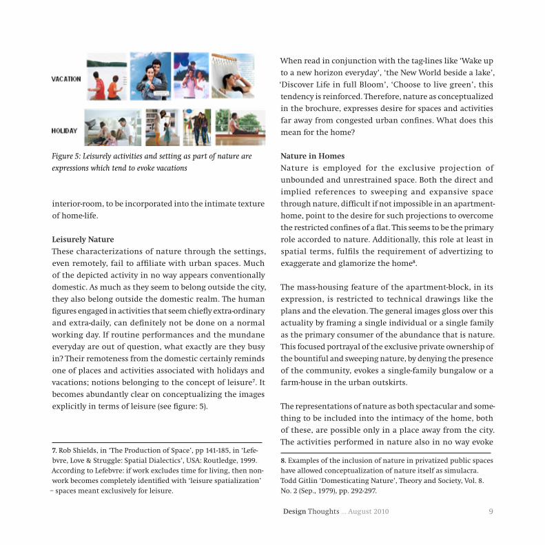
vacations; notions belonging to the concept of leisure7. It
becomes abundantly clear on conceptualizing the images
explicitly in terms of leisure (see figure: 5).
7. Rob Shields, in ‘The Production of Space’, pp 141-185, in ‘Lefe-bvre, Love & Struggle: Spatial Dialectics’, USA: Routledge, 1999. According to Lefebvre: if work excludes time for living, then non-work becomes completely identified with ‘leisure spatialization’
– spaces meant exclusively for leisure.
When read in conjunction with the tag-lines like ‘Wake up
to a new horizon everyday’, ‘the New World beside a lake’,
‘Discover Life in full Bloom’, ‘Choose to live green’, this
tendency is reinforced. Therefore, nature as conceptualized
in the brochure, expresses desire for spaces and activities
far away from congested urban confines. What does this
mean for the home?
NatureinHomes
Nature is employed for the exclusive projection of
unbounded and unrestrained space. Both the direct and
implied references to sweeping and expansive space
through nature, difficult if not impossible in an apartment-
home, point to the desire for such projections to overcome
the restricted confines of a flat. This seems to be the primary
role accorded to nature. Additionally, this role at least in
spatial terms, fulfils the requirement of advertizing to
exaggerate and glamorize the home8.
The mass-housing feature of the apartment-block, in its
expression, is restricted to technical drawings like the
plans and the elevation. The general images gloss over this
actuality by framing a single individual or a single family
as the primary consumer of the abundance that is nature.
This focused portrayal of the exclusive private ownership of
the bountiful and sweeping nature, by denying the presence
of the community, evokes a single-family bungalow or a
farm-house in the urban outskirts.
The representations of nature as both spectacular and some-
thing to be included into the intimacy of the home, both
of these, are possible only in a place away from the city.
The activities performed in nature also in no way evoke
8. Examples of the inclusion of nature in privatized public spaces have allowed conceptualization of nature itself as simulacra. Todd Gitlin ‘Domesticating Nature’, Theory and Society, Vol. 8. No. 2 (Sep., 1979), pp. 292-297.
Figure 5: Leisurely activities and setting as part of nature are
expressions which tend to evoke vacations

Design Thoughts … August 201010
domesticity. They point towards a very non-urban place. The
disposition of the leisurely activities in nature towards holi-
day and vacation, reinforce the tendency of representations
of nature (as spectacular and as something to be lived close
to) to point to places outside the city. This projected land-
scape appears on the one hand as exotic and on the other
as well-managed. This combination of both the exotic and
well-managed quality of the landscape is only possible in a
holiday-home or a hotel or resort. Therefore the question:
‘Does the home (a place of relatively stable, permanent resi-
dence) desire to pull in features from another dwelling-type
like the resort9 (a place associated with travel culture and
mobility)? From this perspective, the aspect of the exotic
and foreignness in the name (eg: ‘Jasper’ in ‘Jasper Lawns’)
begins to makes sense.
9. ‘A resort you will never check out of’ advertized on a hoarding by Vijay Group, Vijay Vilas, Thane
Figure 6: Artists rendition of Sky-villas in Unitech Developers,
‘Unitech Grande-Noida’, Noida10
What do representations of nature and activities performed
therein suggest in terms of a home-nature relation impos-
sible to actualize in the urban realm? Does it indicate an
expression of the urban romanticism for dwelling-types like
bungalows and farmhouses? Or does it announce the com-
ing of a new type resulting out of a negotiation between a
desire for the single-family house and the apartment-home?
At least the recent concept of sky-villas, which are essen-
tially apartment-blocks consisting exclusively of duplex
flats (see Figure 6),, having liberal terrace-area, advertized
as being vertical bungalows, advocate this negotiation.
References:
Jean Baudrillard, The Consumer Society, London: Sage, 1998
Rob Shields, ‘The Production of Space’, pp 141-185, in Lefebvre,
Love & Struggle: Spatial Dialectics, USA: Routledge, 1999
Shelly Mallet, Understanding home: a critical review of the literature, in
The Sociological Review, Vol. 52, Issue 1, pg 62
Todd Gitlin, Domesticating Nature, Theory and Society, Vol. 8. No. 2
(Sep., 1979), pp. 292-297.
ImagesfromthefollowingHousingBrochures:
Omaxe, Park Woods, Baddi
Parshvanath, Exotica, Gaziabad
Skylark Housing Pvt. Ltd, Skylark Apartments, Mohali
Runwal Group, Runwal Pride, Mumbai
Wadhwa Developers, Palm Beach Residency, Navi Mumbai
Marickar Group, Morning Glory, Cochin
Marvel, Zephyr, Pune
Lodha Group, Lodha Imperia, Mumbai
Vijay Group, Vijay Vilas, Thane
Arihant Universal, Arihant Darpan, Mumbai
10. http://www.scribd.com/doc/2928437/unitechgrandenoida

11Design Thoughts … August 2010
Pramod Khambete, Uday Athavankar
Introduction
The term “Experience” is generally considered to be self-
explanatory, but remains ill defined. Chamber’s dictionary
defines the verb experience simply as “to feel or undergo”[1].
Noting that experience is an elusive notion, Knutson and
Beck (2003) propose that it however has two essential dimen-
sions: it results from participation (of an individual in a
situation) and is internal in nature; therefore individual-
ized [2].
While “Experience” has always been implicitly a part of all
design activity and outcomes in various domains like ar-
chitecture, product design and visual design, the notion of
“Experience Design” is somewhat recent. Varied views prevail
about the term Experience Design; what it means, whether
one can design experiences at all, and even whether such
a construct is necessary. Nonetheless, one must acknowl-
edge that the term is now well ensconced in the lexicons
of several disciplines. Particularly, the domains of market-
ing, service marketing, and Human Computer Interactions
(HCI) (!) have embraced the terms such as Experience, User
Experience and Customer Experience, from their own per-
spectives. Starting with Pine and Gilmore’s late ‘90s concept
of Experience Economy and assertions that fundamentally
firms should “stage” experience for their customers [3], we
seem to be now living in a paradigm that treats experience
environments and experience networks as the primary
source of customer value[4].
User Experience Design can be viewed to be about things
that are actively experienced: something that involves the
dynamics of space, time, objects, the states of the partici-
pants and the context in which the experience occurs. It
is something “whose design needs to be grounded in the
nature of that experience”[5] (The term User Experience
is used henceforth to encompass the phrase Customer
Experience as well. The difference is not relevant for the
purpose of current discussion). Further, most experiences
of using products and applications today have a greater or
lesser degree of social dimension. The technology dimen-
sions are also changing dramatically, as exemplified in
the ubiquitous mobile connectivity. One can surely affirm
that User Experience Design is now important enough to
attract increased research attention. Further, there is a like-
lihood that the research problems would be complex, even
“wicked”[6], and socially rooted. Clearly a wide repertoire of
research methods is essential in this scenario.
Research is understood as an inquiry aimed at contribution
to the body of knowledge. However, practitioners are likely
to interpret the term Design Research as the process of ac-
quisition of knowledge to ground, inform, and inspire the
design outcomes. The discussion that follows is carried out
with the former perspective. Undoubtedly, it is informative
to the practitioners as well.
User Experience Research and Qualitative Research
Methods
Qualitative research methods have a long history, starting
from colonial ethnography carried out in the 17th century
[7]. Since then the methods have been used extensively in
GroundedTheory:AnEffectiveMethodforUserExperienceDesignResearch

Design Thoughts … August 201012
social sciences, health sciences, humanities, business and
HCI domain. Design activity is immersive, aimed at insights
and solutions based on the designer’s individualistic un-
derstanding of the problem and the context. Therefore,
designers and design researchers alike might have a natural
affinity towards qualitative methods, several of which have
a post-positivist underpinning that questions the idea of a
shared, single reality. As a result, they may have the tempta-
tion to jump to the erroneous conclusion that qualitative
research methods are always appropriate in the domain of
User Experience Design. In reality, the choice of research
methods is linked to the problem being investigated. For in-
stance, if the problem involves finding correlation between
perceptions of the experience provided by a particular
feature of a product (e.g. colour) and the age of the user,
quantitative methods are preferable. However, qualitative
methods may be suitable if the intent is to discover which
contextual issues and the details of user’s interactions with
the product lead to such perceptions. In general, one can
say that qualitative research is appropriate if the problem is
framed to understand a phenomenon, and how experience
is created and given meaning by the participants.
Before determining whether to opt for qualitative research,
researchers should answer questions such as [8]: What am
I aiming to find out? Am I interested in study of the phe-
nomenon in detail, or in comparisons and variations in the
different aspects or variables? How have other researchers
approached similar situations? Will quantitative or qualita-
tive methods inform me more?
Once the researcher decides to do qualitative research, there
is a wide array of methods from which one or an appropri-
ate combination must be chosen. The methods include case
study, ethnography, grounded theory, focus group, action
research, discourse analysis, narrative research and several
others.
It is worthwhile to discuss at this juncture the importance
of the researcher’s position about ‘theory’ in the context
of the research problem being studied, as it influences the
choice of the method. Does the researcher plan to test an
existing theory, and the outcome of research would be its
confirmation and refinement or, is there an aim to build a
theory? In the former, the research would commence with
forming hypotheses or propositions based on established
theories. In the later case, “theory” is interpreted somewhat
flexibly, accepting that the initial assumptions would quite
likely change gradually as the data suggests new ideas, lead-
ing to the construction of the theory. Theory, according to
this perspective, is not a rigid, stable, testable formalization,
but rather a collection of ideas that undergo redefinition.
The viewpoints represent two ends of a continuum on
which various methods can be positioned. Ethnography,
which generally starts with a commitment to some type
of cultural theory, lies at the former end, while Grounded
Theory, which aims to develop new concepts and theoretical
ideas, emerging out of the data and the context, lies at the
other end [9].
Therefore, if the researcher’s goal is to develop substantive
theory, particularly, in areas where existing knowledge is
limited, or to provide a fresh perspective to the existing
knowledge about the phenomenon being studied, Grounded
Theory is a suitable approach.
GroundedTheory:ABriefOverview
Grounded Theory refers at once to a methodology, method
as well as the outcome of the research process [9]. It con-
tains well defined procedures for analyzing empirical data,
typically leading to middle range theories, i.e., theories
that pertain to specific aspects of the phenomenon being
studied, rather than broad, macro level theories. In the
words of Barney Glaser and Anselm Strauss, the originators
of Grounded Theory, such theories, “fall between ‘minor

13Design Thoughts … August 2010
working hypotheses’ of everyday life, and ‘All Inclusive’
grand theories”[10]. The use of Grounded Theory procedures
leads to a coherent, well connected set of concepts that
describes as well as explains the phenomenon under study.
Being based on empirical data, the concepts possess predic-
tive power when used in the right context. The usefulness
of the approach in the User Experience Design domain
is evident, as frequently the research could be driven by
the intent to immediately apply its outcome, rather than
develop a ‘grand theory’.
Grounded Theory, though originally developed for appli-
cation in social research, has gained wide acceptance in
various other domains such as business research, market-
ing, organization and leadership studies, technological
changes and organizational changes, consumer behaviour,
consumer experience, and even Information System (IS)
research[9]. During the period 1985 to 2007, thirty top IS-
Centric journals published 126 articles where the authors
had used Grounded Theory. Interestingly, 95 of them were
published during the period 2001 to 2007. The year 2007
alone accounted for 18 of them [11]. The wide and growing
acceptance of the approach indicates that various scholars
have found it to be useful.
Since its “discovery” in 1967, three major variants of
Grounded Theory have emerged. One the ‘original’,
Glaserian; second proposed by Anselm Strauss and Juliet
Corbin and third, the “Constructivist” Grounded Theory of
Kathy Charmaz. The philosophical underpinnings of these
are not identical, and as a result the procedures differ too.
Glaser has maintained that Strauss and Corbin version is
not Grounded Theory at all, insisting that it has departed
from the fundamental philosophical position. However, in
practice, researchers have found the Glaserian approach
difficult to apply, as it does not provide practical guidelines,
but relies on the ability of the researcher to conceptualize.
Strauss and Corbin version, however, does provide such
guidance, at times criticized as excessively prescrip-
tive. In practice, however, both methods are accepted as
Grounded Theory and apparently more researchers are
using Straussian method [12].
It is beyond the scope at present to discuss, compare,
contrast and critique the variations. The reader may want
to look for details in the original books ([10],[13]), views
of scholars as well as examples of its application (e.g.
[11],[12],[14],[15]) for gaining in depth understanding. For
the current introductory purpose, it may be adequate to
outline the basics of Grounded Theory drawn from Corbin
and Strauss[13], with specific reference to [16], which is a
short, yet comprehensive overview.
One of the strengths of Grounded Theory is that it permits
the use of a single or multiple sources of data, providing
enormous flexibility to the researcher. The sources can in-
clude interviews, participant observation, focus groups, life
histories, and narration of experiences. Even data originat-
ing from newspapers, video tapes, and government records
is acceptable [16]. However, the data collection must be done
systematically, in accordance with the tenets of the method.
The data collection proceeds on the basis of theoretical
sampling. In this method data collection, analysis and cod-
ing progress hand in hand. Typically the first set of data is
analyzed and coded immediately, and the results inform the
next set of data collection activity – which data to collect,
from where to collect and which aspects need special atten-
tion. Every concept that is discovered is treated as the basic
unit of analysis. However, initial concepts and categories
are treated as provisional, and become part of the theory by
repeatedly being present in the subsequent data. Therefore,
an important aspect of the activity is constant comparison
of the concepts and categories as they emerge with the
previously discovered ones for progressive refinement, and

Design Thoughts … August 201014
eventual formulation of the theory. For instance several bits
of data might belong to the same concept (e.g. from the
case study that follows, regarding ATM usage … the state-
ments “I kept the slip coming out of the ATM till the entry
was seen in the account” and “I prefer to go to the branch
because they stamp on my deposit counterfoil”, both point
to a concept “Need to possess evidence of transaction”). The
concepts are grouped based on their relationships to formu-
late categories, which are at a higher level of abstraction.
The process ends when theoretical saturation is reached.
It means that additional data does not lead to discovery
of new concepts and categories. Therefore, in Grounded
Theory there is no prescribed or minimum sample size. The
yardstick for judging adequacy of the sample size is whether
the sample selection was broad and diverse enough to en-
sure thorough coverage of various aspects of the problem
being researched.
Data analysis and coding procedure is described below:
• Open Coding: It is an interpretive process in which
data are broken down analytically with the intent to
gain insights about the phenomenon under study. The
events, actions and interactions are compared to arrive
at concepts and categories. Categories are arrived at
from the concepts looking for similarities.
• Axial Coding: The aim here is to understand the dy-
namic relationships amongst the categories, which
form the basis of the emergent theory. The factors that
are determined and used include: the conditions that
give rise to the category, the context in which it oc-
curs, the actions / interactions that express it and the
consequences of the actions/ interactions. Tentative
hypotheses are formed through a deductive process
at this stage.
• Selective Coding: It is the process to arrive at a ‘core
category’, which unifies all the categories and leads
to the theory.
The method also emphasizes that the researcher should
write extensive memos, which provide additional material
for richer insights.
In Grounded Theory, validity of the emergent theory is
essentially tied up with the rigour with which the process
is applied. As such, in order to enable the readers to judge
the validity, researchers should report[14]:
Adequatedetailsofcollectionandinterpretationofthe
data: The aim should be to demonstrate clearly how, why
and from where concepts and categories were derived. The
method demands that the theory should be traceable back
to the data, and this should be the guiding principle.
Welldevelopedconceptsandcatagories: Concepts and
categories should be sufficiently developed and presented
to enable comparison with relevant literature in order to
demonstrate the compatibility, relationship and, quite
likely, the extension to the knowledge.
Presentationofthetheory: Unifying of the concepts and
integrating them into categories and relationships. The
emergent ‘theory’ should have explanatory power within
the specific context.
It is recognized that Grounded theory is a difficult approach,
requiring utmost care, diligence, sensitivity and the ability
to conceptualise. It can also be time consuming. Similarly,
the researcher needs to be vigilant that the concepts and
eventually the theory emerge from the data and are not
‘forced’ onto it.
Considering that several problems in User Experience
Design areas are likely to have little previous literature and
existing theories to fall back upon, and context in which

15Design Thoughts … August 2010
the experiences occur plays crucial role, Grounded Theory
could be a potent tool for generating new knowledge.
A case study is presented below to illustrate the application
of Grounded Theory.
Case:DiscoveryoftheReasonsforSelectionofTouch
Points
The application of Grounded Theory illustrated below per-
tains to an investigation into customers’ decision process
in selection of a Touch Point for carrying out transactions,
in their banking and telecom service relationship. The term
“Touch Point” is defined for the purpose of this study as:
a. An entity with which a User interacts to perform
a transaction aimed at achieving a goal,
b. OR an entity that plays a mediating role while a
User performs a transaction aimed at achieving
a goal
c. The Provider has control on the presence and
behavior of a Touch Point
Touch Point is a concept being investigated by the author
and this investigation was continuation of an earlier
study[17] in which factors that were uncovered included
Lack of Convenience, Security and Control as the top rea-
sons for not preferring a Touch Point. While the previous
study focused on the factors influencing the choice, the
present study aimed to build on this knowledge by inves-
tigating further the factors that play a role in the decision
process in selection of a Touch Point.
Since Touch Point is a new construct, and there is limited
knowledge based on framing the problem of customers’
choices from the experiential perspective, Grounded Theory
was thought to be the suitable method.
Before progressing with the details it is necessary to
clarify the context. This investigation forms one part of
the author’s doctoral studies which are in progress, and
it was executed in a constrained time frame. Corbin and
Strauss (2008) acknowledge that constraints may exist,
and recommend going ahead with a less that fully devel-
oped theoretical formulation [13]. Therefore, a theoretical
scheme that met the objective of informing and guiding
further work but did not lead up to a Core category was
developed. However, every care was taken to maintain the
spirit of Grounded Theory and diligent adherence to the
procedure. It is acknowledged therefore that the follow-
ing case study is a useful illustration, rather than an ideal
instance of the application of Grounded Theory.
Researchers have used Scenarios, Critical incidents, as
well mix as of methods such as focus group coupled with
interview e.g. [18][19][20]. It was therefore decided to opt
for semi-structured interviews, using scenarios and criti-
cal incidents as anchors. This approach was thought to be
useful to provide an orientation to the respondents without
creating a bias and maintaining the open ended nature of
the interviews.
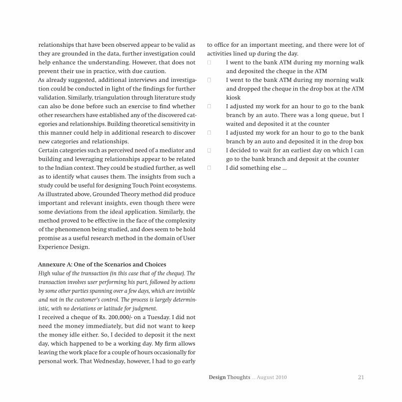
Six scenarios written in a realistic manner that depicted
situations pertaining to transactions in banking and
telecom Services relationship, such as depositing a high
value cheque and resolving a query were administered. The
respondents were required to choose only one item from
the options given. The options were constructed in a man-
ner that they embedded a tradeoff among factors such as
Security, Convenience, Control, Need for Human contact,
Ease of Use and Social cost (These factors were identified in
the previous study). The respondents were encouraged to
imagine that they had actually encountered the situation.
A sample scenario appears in the Annexure A.

Design Thoughts … August 201016
A depth interview using the answers as anchors was con-
ducted after all the answers were collected. The respondents
were allowed to deviate from the scenario and talk about
other transactions, other service relationships, episodes and
explanations, in order to elicit rich information. In order
to further enrich the data, elicitation of critical incidents
was done as a part of interview in line with Chell (2004)[21].
The interaction with the respondents was face to face, except
for one telephonic interview, and each one lasted for about
forty five minutes. An audio recording of the interviews was
done with participants’ permission, which was used later
for transcription. Extensive memos were written during the
interviews to note additional details.
The sample comprised educated individuals (at least
graduates) from urban areas. It was ensured that they had
awareness and access to a range of Touch Points to carry out
the transactions related to the relationships, even if they
might not have actually used all Touch Points.
Twelve respondents were selected through purposive sam-
pling. The sample was skewed with nine male respondents
and the rest female. The age of the respondents was from
twenty five to sixty five, and evenly distributed. It must be
noted that due to constraints on availability of the partici-
pants, three interviews took place before it was possible to
commence analysis. This was a deviation from the ideal
Grounded Theory approach, which requires commencing
analysis immediately after the first interview. However,
Corbin and Strauss (2008)[13] recognize such eventualities,
and recommend coding such ‘given’ data in exactly the
same manner as data collected through the ideal method.
The interviews were transcribed and broken into meaning-
ful, coherent chunks. The guiding principle was that each
chunk should prima facie indicate a single idea. To illustrate,
the two chunks, “Because, may be my other transactions are
related to that amount … in short it should be accepted by
the bank wellintime”, followed by, “… and if it is not done
so, I should haveareceipt,in case there is some problem”
express two different ideas and contexts, one pertaining to
the consequences of the transaction not being completed
within certain time period, and the other about having
evidence of the transaction. Therefore, they were treated
as two separate units to be analyzed, in spite of being part
of an unbroken narration. Each interview typically resulted
in approximately two hundred such analyzable units of
conversation.
Each unit was analyzed and coded through an interpretive
process to identify the ‘concept’ that was being talked about.
Instead of coming up with a short label for the concept, the
concept was articulated in free format, to retain the essence
of the idea. For Example, the above mentioned sentence
part “and if it is not done so, I should haveareceipt,in
case there is some problem” was seen as representing the
concept ‘Need of evidence that the user has done her part
successfully, as further processing of the transaction was
not visible to the user’, which takes into account the context
in which the sentence occurred. This advantage would have
been lost with short labels. The field memos were referred to
capture the nuances of the ideas and context. Following the
tenets of coding, categories were built by first developing
concepts and then suitably aggregating them.
As stated earlier, the Grounded Theory prescribes use of
theoretical sampling, with no prescribed minimum number
of interviews. Theoretical saturation was reached by the
time six interviews had been analyzed and coded, with steep
reduction in the new concepts and categories getting uncov-
ered as the analysis progressed. It was decided therefore to
keep analysis of remaining interviews in abeyance.
Thirty Five categories emerged by this stage. While cat-
egories like convenience and need for human mediation

17Design Thoughts … August 2010
were not a surprise, some of the interesting categories are
described below. The structure followed is: the concept/
category discovered, followed by illustrative quotations
from the interviews.
a.Magnitudeofadverseconsequencesoffailureofthe
transaction
Magnitude of the adverse consequences, financial or
even legal, in case the transaction fails was an important
consideration (“… these days there is lot of misuse of SIM
cards … if it falls in wrong hands, terrorists or criminals,
it would be traced to us …”). Another determinant was
dependence of other transactions on the successful comple-
tion of transaction on hand, indicating that users take into
account collateral consequences as well (“may be my other
transactions are related to that amount … in short it should
be accepted by the bank well in time”).
b.PerceivedNeedofPhysicalEvidence
This category surfaced very often, and may have roots in the
Indian context where rectification of mistakes can often be
cumbersome. Some relevant participant quotes:
• While choosing to deposit a cheque in an ATM machine,
which was perceived as cumbersome, instead of the drop
Box: “.. if it is not done so (cheque credited into the ac-
count in time), I should have a receipt, in case there is
some problem”.
• Going to a Bank Branch to deposit a high value cheque
even though it involves cost and need to spend time:
“Confirmation … and proof that this amount has gone
in the right account.… yes … they stamp the receipt
(counterfoil) … which is a proof.”
The desire to obtain evidence was noticed particularly
in transactions where the customer completes actions
required on her part successfully, but subsequent process
needed to successfully conclude the transaction is not
visible, not within the customer’s control, and took time
till completion.
c.Abilitytomitigatelikelyadverseconsequences
This seems to be related to the desire to possess physical
evidence. It appears that in cases where physical evidence
(such as printed receipt) is not provided by the Touch Point
(or the ecosystem), the customer may create some ‘evidence’.
For instance, a respondent who opted for Call Center to get
a mistake rectified, said she would send a mail to the bank
“Because this makes it official … means it will go on their
record that I have done something …” or another respond-
ent said, “… when I speak with a call center … I note down
the time, date and with whom I spoke … that name … So,
in cross checking they can always say that no one from our
side spoke … but at least this record is there”.
d.Assurancereceivedthroughothermeans/Touch
Points
This category is related but distinct from the previous one;
in that it pertains to the measures a Provider takes, which
involve effective use of the Touch point ecosystem. For exam-
ple: “(after issuing a cheque) if it is more than five thousand
rupees, I get a message (SMS) from them … your account
has been debited”, or in case of a call center “I take up this
matter with them … then they commit … but after 15 min
or half an hour, you get a confirmation SMS from them ….
that this is your request number, and it is being processed”
There are several established practices, such as offering the
facility of ‘Virtual Credit cards’, or someone calling up if a
credit card is used from a place the customer is not expected
to be present. However, the knowledge of the importance
customers attach to such assurance does indeed help to spur
other possible Touch Point ecosystem design interventions
that can provide a gratifying user experience.
e.Perceivedneedtoreachordealwithaspecificindividual
atserviceprovider’sendforsuccessofthetransaction

Design Thoughts … August 201018
This is an interesting category, which appears to be con-
nected with the Indian context. One can speculate that the
origin lies in the users’ experience with the bureaucracy
in government as well as other organizations, as well as
the perception that individuals rather than the business
processes drive the result. For instance a respondent who
chose to go to a franchisee for resolving the issue with ex-
cess bill said “Because, he will know with whom to speak
for this problem …”. It seems to be an important considera-
tion in case of transactions that are open ended in nature
and where failure can lead to higher magnitude of adverse
impact or if there is urgency.
f.UnderstandingoftheTouchPointoperation,including
theback-endprocesses
Whether or not the customer understands how the Touch
Point and the back-end processes work seems to be relevant.
This is particularly important when a transaction spans a
period of time and a several activities needed to complete
it happen invisibly at the provider’s end. For example, a
respondent who selected Net Banking for creating a Fixed
Deposit said: “if there is a problem in the software, then
I should get an error message … if don’t get the error mes-
sage then that means the server is updated … (there is no
apprehension of failure) that is why it is my most preferred
way of transaction”.
g.Leveraging/buildingrelationships
This category as well seems to be related to the Indian
context, where personal interactions and relationships do
matter. For instance , a respondent who selected a fran-
chisee for adding subscription said, “The reason is, I had
taken the first connection from him … so I have a business
association … relation with him … and by selling this add
on connection if someone is going to get any benefit … then
why not he? Who is working for me ….”. There was also a
hint of mutual give and take in: “… perhaps … I may get the
option of selecting the number …”!
h.AssociatedSocialCosts/Benefits
One of the reason given by a respondent for preferring a
bank representative as against requesting his spouse was
“… It is a service they provide and when you can do the job
sitting at your table, then why ask someone else?”. Another
respondent, who chose the option to request someone to
go to the bank branch to deposit a high value cheque, said
she will instruct the person: “If there is no queue, then
(deposit it at) the counter else in the drop box”, and gave
the reason as “… because, even that person should not end
up spending too much time”. There is evidence that the
likely social costs or benefits are taken into account, and
as demonstrated in the second quote, a user may even take
a higher risk to avoid incurring the social cost.
i.User’sValueSystem
Value system as a consideration was an interesting find.
Some illustrative quotes are:
• A respondent decided to wait for an earliest day when
he could go to the bank branch to deposit a high value
cheque, thereby incurring financial loss “… because (I)
cannot compromise the office work for that …”.
• A value that a ‘human being’ should benefit, rather than
an organization is reflected in: “They are any way going
to charge me X amount. But if it (the benefit) is going
to accrue to this person … … who has been giving me
service throughout … it should go to him.”
Apart from the categories, some informative nuances of
other factors were discovered as well. For instance, an
interesting dimension emerged in connection with the
category ‘Perceived need for Human mediation’. There
was evidence of respondents seeking human mediation
in open ended situations or when they felt that a two way

19Design Thoughts … August 2010
unstructured communication is needed. However, it seems
that the human mediation is also sought to overcome
perceived difficulties in dealing with organizations. For
instance, consider: “Rather, I find him (an agent) as a media-
tor between the company and the customers … instead of
I dealing with the company directly … their own person …
their own representative is dealing with them … he might
get some priority … he will know with whom to speak for
this problem … I don’t know all this …”.
Another significant finding was the emergence of two dis-
tinct categories related to technology. One was ‘Comfort in
using the Technology’, which is relevant in the usage stage.
Another was ‘Confidence about the Technology used’ in the
Touch Point, which is part of the higher level category of
Perceptions and influences the decision. Technology comfort
(or its negative counterpart Technology Anxiety) is a known
construct that has been studied by several researchers from
different perspectives [22][23][24] . However, ‘Confidence
about the Technology used’ appeared to be related to the
Touch Point ecosystem being deployed, and affecting the
outcome of the transaction in an instrumental manner,
and perhaps a new aspects that can be investigated further.
The next level of abstraction was carried out by analyzing
the categories in terms of their relationship with each other,
the relationship with the transaction involved and what
role they play in the decision to select a Touch Point. This
resulted into higher order categories:
Further, each of these categories can be associated with the
stage in the encounter in which it plays a role. The stages
are: During the Decision Process to select a Touch Point,
During Usage and Post Usage.
The process led to arriving at useful insights as well as
directions to build a model of decision process in selecting
a Touch Point.
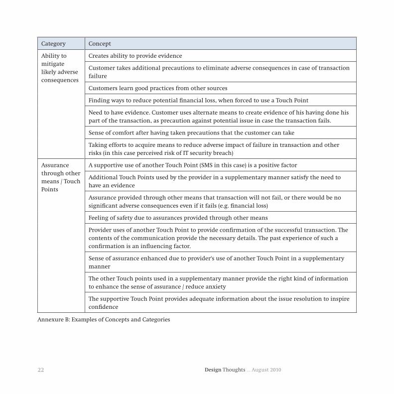
Just to provide a glimpse of the strength of the method,
it is worth mentioning that the basic level approximately
three hundred concepts were identified, which aggregated
in thirty five distinct categories (see Annexure B for exam-
ples). Each of them can potentially be a User Experience
design input. It is not possible to elaborate on all the find-
ings due to the constraints of space, and the details given
above should adequately illustrate the kind of insights one
could obtain by using the Grounded Theory. The interested
readers are welcome to contact the author for additional
information.
Sr No
Higher Order Category
Description Illustrative context
1 ConditionsSituations and contexts, generally beyond the user's control
Transaction requires a physical artifact
2 ExperienceThe actual experience the user gets while deciding or using a Touch Point
Feeling of control
3 State The User’s state of knowledge and being Past Experience - Positive or negative
4 PerceptionsThe user’s perceptions about aspects of the Touch Point operation of usage
Perception of Security associated with the Touch Point
5 Disposition The user's mental outlook and inclinations User's Value System
Table1:HigherOrderCategories

Design Thoughts … August 201020
Categories with significant relevance to the design of Touch
Point ecosystem experience were discovered. For instance,
the insight that confidence about a Touch Point is linked to
the user having clear understanding of the operations of the
system as a whole, not only points to the need of suitable
User Experience design but even the necessity to engage
with the customer over a period of time to build awareness.
Reducing the perceived need for physical evidence is at once
part of the design solution at the Touch Point Ecosystem
level, as well as the efforts to provide visibility of back end
processes.
The group of categories that have been clubbed under the
higher order category ‘Perceptions’ would also have impli-
cations on design of the User Experience, and further on
service design. For example, ‘Perceived need to reach or
deal with a specific individual at service provider’s end for
success of the transaction’, which can not only be stressful
to the customer but could involve avoidable costs, can be
tackled through suitable Touch Point ecosystem design, and
awareness building.
Certain components of the categories are interesting as well,
and may have implications on design of Touch Point user
experience. For instance, ability to combine several tasks
in one service encounter was a component of ‘Convenience’
(“I try to avoid going to the bank, but if I have to, I try
to combine it with other work …”). This phenomenon was
noted in an earlier study related to citizen – government
interactions[25], but the authors labeled it as “efficiency”,
connecting it with the efforts required to use a channel.
However, in the categories that have emerged in the present
study, ‘costs’ are associated with ‘conditions’ and ‘conveni-
ence’ is linked to ‘Perceptions’, which appears to be a more
appropriate representation. Another interesting component
of convenience was ease of finding vehicle parking space!
While this may or may not be in the control of the provider,
it is a factor they can (and quite likely do) take into account.
Arguably, several categories that were discovered would
probably not have been discovered with the use of some
other methods. Examples are: user’s value system playing
a role, strong need for evidence and perceived need to be
able to reach a specific individual in an organization. This
also points to the fact that experience being a complex
phenomenon, the approach of formulating hypotheses and
testing them may provide only a partial picture. However,
the insights rooted in the subtleties and complexity of the
experience can be uncovered with the use of Grounded
Theory. It therefore seems to be a suitable method for car-
rying out research in User Experience domain and worthy
of inclusion in the repertoire of methods used by the
researcher.
A collateral finding pertains to the methods used. The use
of scenarios and critical incidents was found to be effective
in giving a focus to the interviews without losing the advan-
tages of the unstructured interview technique. It also, quite
likely, helped in reducing the known dichotomy between
expressed intent and the actual actions.
The respondents participating in the study were educated,
residing in urban areas and having access to multiple Touch
Points. While this was an appropriate sample for the pur-
pose of this study, it is likely that the findings could have
been different had the sample been drawn from, say, small
towns or rural India. As such, the conclusions cannot be
generalized. However, since the population similar in char-
acteristics like the chosen sample is large and the insights
would surely be relevant in designing User Experience suit-
able to such kind of people.
The theoretical sampling limit was reached when analysis
of six interviews was complete. While the categories and the
21Design Thoughts … August 2010
relationships that have been observed appear to be valid as
they are grounded in the data, further investigation could
help enhance the understanding. However, that does not
prevent their use in practice, with due caution.
As already suggested, additional interviews and investiga-
tion could be conducted in light of the findings for further
validation. Similarly, triangulation through literature study
can also be done before such an exercise to find whether
other researchers have established any of the discovered cat-
egories and relationships. Building theoretical sensitivity in
this manner could help in additional research to discover
new categories and relationships.
Certain categories such as perceived need of a mediator and
building and leveraging relationships appear to be related
to the Indian context. They could be studied further, as well
as to identify what causes them. The insights from such a
study could be useful for designing Touch Point ecosystems.
As illustrated above, Grounded Theory method did produce
important and relevant insights, even though there were
some deviations from the ideal application. Similarly, the
method proved to be effective in the face of the complexity
of the phenomenon being studied, and does seem to be hold
promise as a useful research method in the domain of User
Experience Design.
AnnexureA:OneoftheScenariosandChoices
High value of the transaction (in this case that of the cheque). The
transaction involves user performing his part, followed by actions
by some other parties spanning over a few days, which are invisible
and not in the customer’s control. The process is largely determin-
istic, with no deviations or latitude for judgment.
I received a cheque of Rs. 200,000/- on a Tuesday. I did not
need the money immediately, but did not want to keep
the money idle either. So, I decided to deposit it the next
day, which happened to be a working day. My firm allows
leaving the work place for a couple of hours occasionally for
personal work. That Wednesday, however, I had to go early
to office for an important meeting, and there were lot of
activities lined up during the day.
I went to the bank ATM during my morning walk
and deposited the cheque in the ATM
I went to the bank ATM during my morning walk
and dropped the cheque in the drop box at the ATM
kiosk
I adjusted my work for an hour to go to the bank
branch by an auto. There was a long queue, but I
waited and deposited it at the counter
I adjusted my work for an hour to go to the bank
branch by an auto and deposited it in the drop box
I decided to wait for an earliest day on which I can
go to the bank branch and deposit at the counter
I did something else …
Design Thoughts … August 201022
Category Concept
Ability to mitigate likely adverse consequences
Creates ability to provide evidence
Customer takes additional precautions to eliminate adverse consequences in case of transaction failure
Customers learn good practices from other sources
Finding ways to reduce potential financial loss, when forced to use a Touch Point
Need to have evidence. Customer uses alternate means to create evidence of his having done his part of the transaction, as precaution against potential issue in case the transaction fails.
Sense of comfort after having taken precautions that the customer can take
Taking efforts to acquire means to reduce adverse impact of failure in transaction and other risks (in this case perceived risk of IT security breach)
Assurance through other means / Touch Points
A supportive use of another Touch Point (SMS in this case) is a positive factor
Additional Touch Points used by the provider in a supplementary manner satisfy the need to have an evidence
Assurance provided through other means that transaction will not fail, or there would be no significant adverse consequences even if it fails (e.g. financial loss)
Feeling of safety due to assurances provided through other means
Provider uses of another Touch Point to provide confirmation of the successful transaction. The contents of the communication provide the necessary details. The past experience of such a confirmation is an influencing factor.
Sense of assurance enhanced due to provider's use of another Touch Point in a supplementary manner
The other Touch points used in a supplementary manner provide the right kind of information to enhance the sense of assurance / reduce anxiety
The supportive Touch Point provides adequate information about the issue resolution to inspire confidence
Annexure B: Examples of Concepts and Categories

23Design Thoughts … August 2010
References
1. Chambers: Free English Dictionary In: Chambers: Dictonary,
Language Reference. (Accessed 2009) Available at: http://www.
chambersharrap.co.uk/chambers/features/chref/chref.py/main?qu
ery=Experience&title=21st
2. Knutson, B., Beck, J.: Identifying the Dimensions of the
Experience Construct: Development of the Model. In Williams, J.,
Uysal, M., eds. : Current Issues and Development in Hospitality
and Tourism Satisfaction. Routledge (2003) 23-36
3. Pine II, J., Gilmore, J.: Welcome to the Experience Economy.
Harvard Business Review 76(4), 95 - 105 (1998)
4. Prahalad, C., Ramaswamy, V.: Future of Competition: Co-
Creating Unique Value with Customers. Harvard Business School
Press (2004)
5. Buxton, B., Sketching User Experiences: Getting the Design
Right and the Right Design. Morgan Kaufmann / Elsevier Inc.,
San Francisco, CA 94111 (2007)
6. Wikipedia: Wicked problem - Wikipedia, the free encyclopedia.
In: www.wikipedia.org. Available at: http://en.wikipedia.org/wiki/
Wicked_problem
7. Given, L., ed.: The Sage Encyclopedia of Qualitative Research
Methods 1. SAGE Publications, Inc., Thousand Oaks, USA (2008)
8. Silverman, D.: Doing Qualitative Research : A Practical
Handbook 2nd edn. Sage Publications, London, United Kingdom
(2007)
9. Eriksson, P., Kovalainen, A.: Qualitative Methods in Business
Research 1st edn. SAGE, London (2008)
10. Glaser, B., Strauss, A.: The Discovery of Grounded Theory:
Strategies for Qualitative Research 1st edn. Transaction
Publishers, New Brunswick, USA (1967 (Reprinted 2006))
11. Matavire, R., Brown, I.: Investigating the Use of “Grounded
Theory” in Information System Research. In : SAICSIT,
Wilderness, South Africa, pp.139-147 (2008)
12. van Niekerk, J., Roode, J.: Glaserian and Straussian Grounded
Theory: Similar or Completely Different. In : SAICSIT’09,
Riverside, Vanderbijlpark, South Africa., pp.96-103 (2009)
13. Corbin, J., Strauss, A.: Basics of Qualitative Research:
Techniques and Procedures for Developing Grounded Theory 3rd
edn. Sage Publicatiuons, Thousand Oaks, California, USA (2008)
14. Goulding, C.: Grounded Theory: some reflections on
paradigm, procedures and misconceptions. University of
Wolverhampton, UK (June 1999)
15. Hunter, K., Hari, S., Egbu, C., Kelly, J.: Grounded Theory: Its
Diversification and Application Through two Examples From
Research Studies on Knowledge and Value Management. The
Electronic Journal of Business Research Methodology Volume
3(Issue 1), 57-68 (2005)
16. Corbin, J., Strauss, A.: Grounded Theory Research : Procedures,
Canons and Eveluative Criteria. Qualitative Sociology Volume
13(1), 3-21 (1990)
17. Khambete, P., Tripathi, S., Athvankar, U.: Sustained Service
Provider-Customer Relationships in the Indian Context: Factors
Influencing the Choice of Touch Points. In : IFIP HWID2009
Working Conference on Usability in Social, Cultural and
Organizational Contexts, Pune, India, pp.201-213 (2009)

Design Thoughts … August 201024
18. Dabholkar, P., Bagozzi, R.: An Attitudinal Model of Technology
- Based Self - Servi ce: Moderating Effects of Consumer Traits and
Situational Factors. Journal of the Academy of Marketing Science
30(3), 184-201 (2002)
19. Bitner, M., Ostrom, A., Meuter, M.: Implementing successful
self-service technologies. Academy of Management Executive Vol.
16, 96-109 (2002)
20. Patricio, L., Fisk, R., e Cunha, J.: Improving satisfaction with
Bank Service offerings: measuring the contribution of each
delivery channel. Managing Service Quality Volume 13 (Number
6), 471-482 (2003)
21. Chell, E.: Critical Incident Technique. In Cassel, C., Symone, G.,
eds. : Essential Guide to Qualitative Methods in Organizational
Research. Sage, London, Thousand Oaks, New Delhi (2004) 45
22. Dabholkar, P.: Consumer evaluation of new technology-based
self service options: An investigation of alternate models of
service quality. International Journal of Research in Marketing
13, 29-51 (1996)
23. Meuter, M., Ostrom, A., Bitner, M., Roundtree, R.: The influ-
ence of technology anxiety on consumer use and experiences
with self-service technologies. Journal of Business Research 56,
899– 906 (2003)
24. Pikkarainen, T., Pikkarainen, K., Karjaluoto, H., Pahnila, S.:
Consumer acceptance of online banking: an extension of the
technology acceptance model. Internet Research Volume 14(3),
224–235 (2004)
25. Pieterson, W., van Dijk, J.: Channel Choice Determinants;
An exploration of the factors that determine the choice
of a service channel in citizen initiated contacts. In :
8th Annual International Digital Government Research
Conference, Philadelphia, PA, USA , pp.173 - 182 (2007)
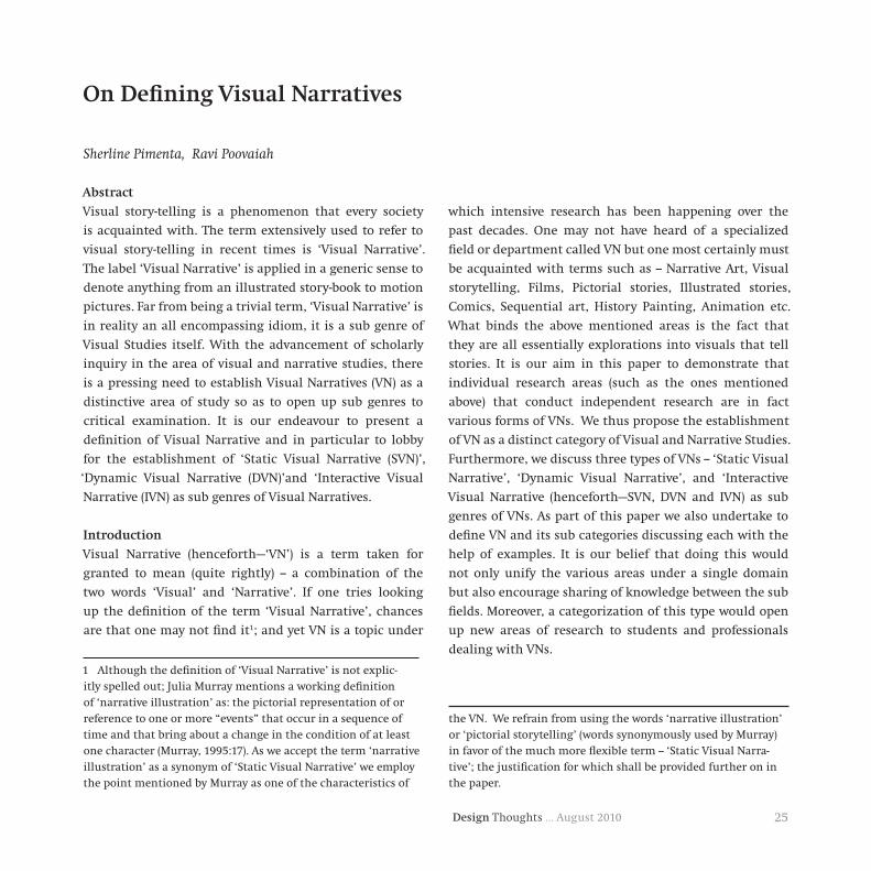
25Design Thoughts … August 2010
Sherline Pimenta, Ravi Poovaiah
Abstract
Visual story-telling is a phenomenon that every society
is acquainted with. The term extensively used to refer to
visual story-telling in recent times is ‘Visual Narrative’.
The label ‘Visual Narrative’ is applied in a generic sense to
denote anything from an illustrated story-book to motion
pictures. Far from being a trivial term, ‘Visual Narrative’ is
in reality an all encompassing idiom, it is a sub genre of
Visual Studies itself. With the advancement of scholarly
inquiry in the area of visual and narrative studies, there
is a pressing need to establish Visual Narratives (VN) as a
distinctive area of study so as to open up sub genres to
critical examination. It is our endeavour to present a
definition of Visual Narrative and in particular to lobby
for the establishment of ‘Static Visual Narrative (SVN)’,
‘Dynamic Visual Narrative (DVN)’and ‘Interactive Visual
Narrative (IVN) as sub genres of Visual Narratives.
Introduction
Visual Narrative (henceforth—‘VN’) is a term taken for
granted to mean (quite rightly) -- a combination of the
two words ‘Visual’ and ‘Narrative’. If one tries looking
up the definition of the term ‘Visual Narrative’, chances
are that one may not find it1; and yet VN is a topic under
1 Although the definition of ‘Visual Narrative’ is not explic-itly spelled out; Julia Murray mentions a working definition of ‘narrative illustration’ as: the pictorial representation of or reference to one or more “events” that occur in a sequence of time and that bring about a change in the condition of at least one character (Murray, 1995:17). As we accept the term ‘narrative illustration’ as a synonym of ‘Static Visual Narrative’ we employ the point mentioned by Murray as one of the characteristics of
which intensive research has been happening over the
past decades. One may not have heard of a specialized
field or department called VN but one most certainly must
be acquainted with terms such as -- Narrative Art, Visual
storytelling, Films, Pictorial stories, Illustrated stories,
Comics, Sequential art, History Painting, Animation etc.
What binds the above mentioned areas is the fact that
they are all essentially explorations into visuals that tell
stories. It is our aim in this paper to demonstrate that
individual research areas (such as the ones mentioned
above) that conduct independent research are in fact
various forms of VNs. We thus propose the establishment
of VN as a distinct category of Visual and Narrative Studies.
Furthermore, we discuss three types of VNs -- ‘Static Visual
Narrative’, ‘Dynamic Visual Narrative’, and ‘Interactive
Visual Narrative (henceforth—SVN, DVN and IVN) as sub
genres of VNs. As part of this paper we also undertake to
define VN and its sub categories discussing each with the
help of examples. It is our belief that doing this would
not only unify the various areas under a single domain
but also encourage sharing of knowledge between the sub
fields. Moreover, a categorization of this type would open
up new areas of research to students and professionals
dealing with VNs.
the VN. We refrain from using the words ‘narrative illustration’ or ‘pictorial storytelling’ (words synonymously used by Murray) in favor of the much more flexible term -- ‘Static Visual Narra-tive’; the justification for which shall be provided further on in the paper.
OnDefiningVisualNarratives

Design Thoughts … August 201026
Searchforawordthatsignifiesavisualthattellsastory
Let us begin by looking at the meanings of some of
the terms used by researchers that imply VNs that are
established fields of study2 —
Films: also referred to as movie3 or motion pictures. (...)
shortened form of moving picture (1896) (Harper, Online
Etymology Dictionary). Movies are made up of a series of
still photographs, each of which shows a slight change in
motion, when projected; they give the illusion of a moving
image (Pincus, 1972).
NarrativePainting: has an element of literacy,(...). In a
narrative picture, the viewer is seeing a moment in a story
that allows the viewer to understand what happened prior
to and after the moment caught by the artist (from: http://
www.humanitiesweb.org).
HistoryPainting: is a term used to describe paintings that
focus on a serious narrative or include exemplary actions.
In this sense the word history relates to the Italian istoria
(narrative or story). History painting is not necessarily an
accurate or documentary description of actual events. Such
works are often large in scale. Their subjects derive from
the Bible, mythology, secular literature, or historical events.
They can also be allegorical (from the website: National
Gallery of Art, Washington DC).
Animation: Animation (from the Latin word, animare,
to breathe life into) is the visual art of making a motion
2 It is not our purpose here to present an exhaustive list of terms used, thus only those terms that are frequently used have been examined.
3 movie (American informal) a cinema film (The Oxford Diction-ary, 1989:534).
picture from a series of still drawings(Encyclopaedia of Irish
and World Art).
PictorialNarratives4 : This term is made up of two words –
Pictorial (from the word ‘Picture’) and Narrative. Pictorial5
– Etymologically the word comes 1646, from the Latin word
pictorius “of a painter,” from Latin pictor “painter,” from
pp. stem of pingere “to make pictures”. The noun meaning
“journal in which pictures are the main feature” is first
recorded 1844 (“pictorial.” Online Etymology Dictionary).
Narrative – This means to engage in the act of narration.
SequentialArt: A train of images deployed in sequence
(Eishner, 1996:6). ‘(...) that deals with the arrangement
of pictures or images and words to narrate a story or
dramatize an idea’ (Eishner, 2006:5). Eishner uses the term
‘sequential art’ as an art form that has its expression in the
form of comic books6 .
Comics: from the word ‘Comic’ originating from the
Greek κωμικός, kōmikos “of or pertaining to comedy”. The
term derives from the mostly humorous early work in the
medium, and came to apply to that form of the medium
including those far from comic. In 1996, Will Eisner
published Graphic Storytelling and Visual Narrative, in
which he defined comic (books) as “the printed arrangement
of art and balloons in sequence” (Eisner, 1996:6).
4 Term used by scholars such as: Franz Wickoff, ; H.G.Gomrich, ; Whitney Davis, 1992;Virve Sarapik, 2000; Ira Westgard, 2006.
5 pictorial adj: 1. of or expressed in a picture or pictures. 2. il-lustrated by pictures.picturen. 1. representation of a person or people of object(s) etc. made by painting, drawing, or photography, especially as a work of art. (1989, The Oxford Paperback Dictionary).
6 See, Eishner, Will, Comics and Sequential Art, 2006.

27Design Thoughts … August 2010
Scott McCloud7 defined sequential art and comics as:
“juxtaposed pictorial and other images in deliberate
sequence, intended to convey information and/or to
produce an aesthetic response in the viewer” (McCloud,
1993: 7-9). R. C. Harvey, in his essay Comedy at the Juncture
of Word and Image, states: “...comics consist of pictorial
narratives or expositions in which words (often lettered
into the picture area within speech balloons) usually
contribute to the meaning of the pictures and vice versa”
(Harvey, 2001:76).
NarrativeIllustration: the pictorial representation of or
reference to one or more “events” that occur in a sequence
of time and that bring about a change in the condition of
at least one character 8 (Murray, 1995:17).
We do not suggest that these terms are wrong, but if
examined in detail, it will be found that these terms refer
to the VN in a limited way. In fact they can be grouped on
the basis of particular aspects of the VN, namely:
1) Compositional nature of the VN:
Sequential Art: The word sequential alludes specifically to
the aspect of arrangement.
2) With reference to the theme of the VN:
History Painting: The terms ‘History’ refers to the subject
matter of the VN; while ‘Painting’ refers to the type of
representation technique9 .
3) Certain characteristic of the VN:
7 Scott McCloud in his book, ‘Understanding Comics’ explores the definition of comics, its historical development and the fun-damental vocabulary employed by this particular type of VN.
8 Julia Murray mentions this as working definition of ‘narrative illustration’.
9 Also Religious Painting: where ‘Religious’ refers to the subject matter of the painting.
Comics10 : Comics have over the years developed a distinct
identity of its own with its characteristic sequential nature
of the pictures, and the predominance of pictures over
words. This feature distinguishes comics from picture
books and other illustrated visuals.
4) Representational technique of the VN:
a) Narrative Painting, Narrative Illustration: This term can
be divided into two. The first word ‘narrative’ is used to
highlight the narrative quality of the visual much like an
adjective. Narrative is used as qualifier and is added as
a prefix to refer to any visual that has a narrative aspect.
While the second word informs us about the graphic or
material state of the visual i.e. it could be a painting, an
illustration or scroll or panels etc.
b) Painting, Illustration: Many a times visuals are referred
to the representation style employed to execute the story11
. Painting for example is used with reference to the fact
that some form of paint has been used to depict the story.
Illustration is used to suggest the visual is figurative or
graphic in nature.
c) Pictorial Art, Graphic storytelling, Pictorial storytelling:
These terms again stress the pictorial and graphic quality
of the visual; while the narrative aspect is suggested to in
the second part of the word.
d) Animation: “action of imparting life,” from Latin
animationem (nom. animatio ), noun of action from
animatus , pp. of animare. Meaning “vitality” is from
1610s. Cinematographic sense is from 1912 (From Online
Etymology Dictionary, Harper, 2010).
5) With reference to the material employed to create the
VN:
10 Comics is the only VN to have come to be known as a sepa-rate field in its own right
11 In such cases the fact that it is a narrative is taken for granted.

Design Thoughts … August 201028
Film: This kind of VN gets its name from the equipment
used to create the VN. The ‘film’ a rolled strip or sheet coated
with light sensitive material used for taking photographs
or making a motion picture (film: The Oxford Paperback
Dictionary, 1989).
As can be clearly seen all of the above terms are varied
aspects of (what we call) the VN12 . While all of the above
terms are apt to refer to visuals that tell stories, none of
them capture the essence of the phenomenon in question13
. Thus while they are all according to our definition
essentially VNs they (each one of them) are a certain type
of VN. The problem with this kind of categorization is
that it is very limited in nature and restricts the study of
the VN. Moreover, there are problems with each term as
they are so narrowly defined. For example, a VN can have a
religious theme (subject), could be painted (representation
technique) on a wooden panel (medium), using the comics
12 Arriving at the term ‘Visual Narrative (VN)’: We were in search of a word narrow enough that gives a holistic description of the phenomenon at hand and at the same time wide enough to include a wide variety of visuals that told stories. The two terms that came close to the effect we were trying to achieve were – Pictorial Narrative and Visual Narrative. We found the word ‘Pictorial’ limited to describing only graphic images whereas we wanted to include narrative sculpture and visual stories occurring on other objects such as bowls, panels etc. as well. Another reason that strongly affected our decision to favour the word ‘visual’, is the fact that the term ‘pictorial’ does not take into account ‘text’ that is sometimes part of the image. Examples of these kinds are comics, illustrated story books etc. Therefore we chose the word ‘visual’ over ‘pictorial’; thus achiev-ing the flexibility we were looking for. But in essence both the terms Visual Narratives and Pictorial Narratives can be used as synonyms if one wants to refer strictly to VNs that are purely pictorial in nature.
13 This can be likened to the story of the Blind men and the Elephant. While each of the Blind men was right in describing what an Elephant looked like all of them were in some way also wrong.
style and be executed in the form of an animation film.
Thus we can have a combination of aspects in a single VN.
This proves that the categories presently in use are not
watertight. A single VN can be classified under multiple
terms depending on the presence of a particular aspect. But
this does not guarantee that the other aspects are absent.
It is as a remedy to this shortcoming that we propose the
following
1) Use of the term VN as a category at the first level to
indicate any kind of visual that has narrative content.
2) Based on the functionality of the VN they can be
categorised into A) SVNs, B) DVNs, C) IVNs; at the second
level.
3) At the third level, one can be very precise and refer to a
certain feature of the VN e.g. film, history painting, picture
book, etc.
With this aim in mind we set about defining VN and its
sub genres in this paper. At this point we would like to
mention the reason we feel it necessary to define the VN
and its sub types.
RationalfordefiningVNanditssubgenres
The obvious question that arises is justification for the
recognition of the VN as a specialized field of investigation
and its sub genres. One of the main reasons why this
integration is very much needed is the fact that the
various categories under study are in reality one and the
same phenomenon (as has been proved earlier in the
paper). Acknowledgement of the VN as a unified body of
investigation will facilitate cross-pollination of ideas and
methodologies thus expanding the knowledge base. Once
the VN is accepted as an independent body its structure
so far illusive immediately surfaces. This opens up a new
path of exploration that of the VN as an entity in itself. The
VN can now be studied at the ideological and structural
level. The SVN, DVN and IVN in turn achieve independent
entity status and can be studied at various levels. An

29Design Thoughts … August 2010
in-depth study of each type of the sub genres of VNs can be
conducted and results compared.
VNs have up to now been investigated from various
perspectives e.g. art historical, semiotic, archaeological
etc. What has been lacking since a long time is the
investigation into what makes a VN. What are its various
components? How does it function? The defining of the
VN as a conceptual body having a structure lends itself to
structural examination that helps answer those questions;
the answers to which will lead to further the knowledge of
the construction and a better understanding of the VN. This
information will be of immense benefit to students and
practitioners of visual communication alike. Having said
this we now move towards examining the concept of VN.
TheVisualNarrative(VN)
The distinctive feature of the VN is the presence of a story.
In order to form a conclusive definition & establish the
term ‘Visual Narratives’ as a distinct genre of visual studies;
we need to support our claim by specifying the manner in
which we use the terms Visual, Narrative and Story.
Visual: As to what comprises a ‘Visual’ is quite clear and
agreed upon i.e A Visual is something that can be seen
using the human eye. We accept the dictionary meaning
of Visual as related to the sense of sight.
Narrative / Story are terms that seem to have been used
interchangeably as synonyms of each other. Our first task
therefore is to relook at the terms Narrative and Story.
Narrative: Hayden White pointed out in his book The
Content of the Form that the word “narrative” goes back to
the ancient Sanskrit “gna”, a root term that means “know”
and that comes down to us through Latin words for both
“knowing” (“gnarus”) and “telling” (“narrow”) (Cited in The
Cambridge introduction to narrative14, H. Porter Abbott,
2000: 10). There have been debates as to what constitutes a
narrative without a concrete conclusion being reached. We
shall therefore here enumerate only those meanings of the
word ‘Narrative’ in the sense we feel is appropriate in the
given context. Simply put, narrative is the representation
of an event or a series of events (Porter Abbott, 2000:13).
Murray in her paper mentions that most scholars agree
‘that a fundamental marker of narrative is action, which
produces change (...). Another fundamental element of
narrative is time (Murray, 1998:605). Accordingly we will
primarily use the word ‘Narrative’ - meaning -- to tell a story.
Story: According to the dictionary meaning a story is - a
description, either true or imagined, of a connected series
of events and often, the characters involved in them
(Cambridge International Dictionary of English, 1995).
Differencebetweenastoryandanarrative: A distinction
is made by Hawthorn who defines a story as a sequence of
events. Narrative according to him, focuses our attention on
to a story, through the direct mediation of a ‘telling’ which
we both stare at and through, which is at once central and
peripheral to the experience of the story, both absent and
present in the consciousness of those being told the story
(Hawthorn, 1985). Scholes, Phelan and Kellogg suggest
two distinguishing characteristics for a literary work to be
termed as narrative: the presence of a story and a story-
teller (Scholes, Phelan and Kellogg, 1988:4). ‘The difference
between story and narrative discourse is, (...,) a difference
between two kinds of time and two kinds of order’ (H.
Porter Abbott, 2000:16). Seymour Chatman makes the
difference between Narrative and Story to be that of ‘time’
and ‘order’ – what he calls the “chrono-logic”. ‘Narrative
14 See, Brian Richardson, 2000, Recent Concepts of Narrative and the Narratives of Narrative Theory.

Design Thoughts … August 201030
entails movement through time not only “externally”
(the duration of the presentation of a novel, film play)
but also “internally” (the duration of the sequence of
events that constitutes a plot). The first operates in the
dimension of narrative called Discourse..., the second in
that called Story(...)’(Chatman,1980). Brian Richardson
marks the difference in the order of occurrence and order
of presentation, which can be read as the distinction
between story and narration (Richardson, 1987:300)15 . In
conclusion we can say a ‘Narrative’ is the representation of
a story while a ‘Story’ is a sequence of events.
DefiningaVisualNarrative
Visual Narrative can be defined as a visual that essentially
and explicitly narrates a story; where –
Visual signifies – something that can be seen using the
human eye.
Story signifies – a series of events linked by causality,
temporality or sequence or the order of occurrence.
Narrative signifies – the act of telling a story or the story
itself or the order of presentation.
Fig. 1 is an example of a Visual Narrative (Puss in Boots). The
story that forms the content in this VN is ‘Puss in Boots’.
It is narrated over a scenes and one of these scenes is what
we see in the image.
Visual Narrative (VN) is synonymous with visual stories,
narrative images, picture stories, narrative pictures.
The characteristic features of a VN are:
1. The presence of a story is the most essential feature
of the VN. The story could belong to any genre: fiction,
mythology, fairy tale, folklore, fables, religious stories, etc.
The VN in fig. 1 is a fairy tale revolving around a magical
cat who wears boots called ‘Puss in Boots’.
15 Richardson makes this distinction in the context of drama.
Fig. 1: An example of a VN– a scene from ‘Puss in Boots’16
2. The visual is constructed with the idea of communicating
a story to the onlooker. For e.g. the aim of the scene in
fig.1 is to convey to the audience a visual description of an
event that occurred in the story; in this case the manner
in which the king and queen received the extra-ordinary
cat at their court.
3. There is a presence of actors (participants). An Actor is
a character in the story who performs an action. It is the
most essential component of the VN. The most commonly
used method of recognizing an SVN is through identifying
the actor or the situation that the actors in a visual build
up. If the actor is absent from the SVN the visual would be
16 Image taken from the book, ‘The Mini Treasure Chest of Great Fairy Tales’; published by Tormont International Ltd. Hong Kong. Illustrations: Tony Wolf, Piero Cattaneo. The copyright of this image lies with Dami Editore, Italy.

31Design Thoughts … August 2010
incapable of representing an event17 . In fig.1 we see the
King, Queen and Puss in Boots, in addition we also see two
courtiers – these are the actors (participants) of the visual
story.
4. The VN has a ‘universe18’ of its own. The participants
in fig. 1 exist in a virtual story world i.e. a universe that
mimics the real or imagined world but is different from
the viewer’s world. The participants of the story exist in
this universe that has its own time deixis and spatial
dimensions.
5. A VN could be expressed on any medium e.g. paper,
stone, an electronic device, etc. Demonstrating this idea
are a number of VNs displayed on various materials Fig.s
2a – 2d.
Fig. 2a: VNs can be viewed on iPods ’
17 “Events” occur in a sequence of time and that bring about a change in the condition of at least one character (Murray, 1995:17).
18 It is a world that exists within the visual narrative that is represented; it is there that a coherent grouping of people and things dwell, who are systematically connected in place and in action. Etienne Souriau explains the concept of ‘universe’ in the paper titled ‘Time in the Plastic Arts’.
Fig. 2b: VN on a silver bowl19
Fig. 2c: VN on paper20
19 Leningrad, Hermitage. Silver Bowl: Scenes from Euripides. Image from the book: Kurt Weitzmann, ‘Illustrations in Roll and Codex: A study of the origin and method of text illustration’, 1970, Princeton University Press.
20 A page from a comic book: Edge, Way of the Rat, published by CG Entertainment, September 2002. The copyrights for this images lies with Cross Generation Entertainment, or CrossGen, was an American comic book publisher that operated from 1998 to 2004.
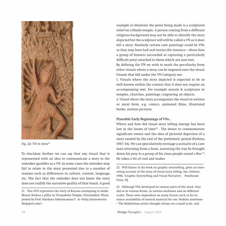
Design Thoughts … August 201032
Fig. 2d: VN in stone21
To elucidate further we can say that any visual that is
represented with an idea to communicate a story to the
onlooker qualifies as a VN. In some cases the onlooker may
fail to relate to the story presented due to a number of
reasons such as differences in culture, context, language,
etc. The fact that the onlooker does not know the story
does not nullify the narrative quality of that visual. A good
21 This SVN represents the story of Ravana attempting to shake Mount Kailasa a pillar in Virupaksha Temple, Pattadakkal. Photo posted by Prof. Harihara Subramanian.V at <http://stonestories.blogspot.com/>.
example to illustrate the point being made is a sculptural
relief on a Hindu temple. A person coming from a different
religious background may not be able to identify the story
depicted but the sculpture will still be called a VN as it does
tell a story. Similarly certain cave paintings could be VNs
as they may have had oral stories (for instance -- about how
a group of hunters succeeded at capturing a particularly
difficult prey) attached to them which are now lost.
By defining the VN we wish to mark the peculiarity from
other visuals where a story can be imposed onto the visual.
Visuals that fall under the VN Category are-
1. Visuals where the story depicted is expected to be so
well known within the context that it does not require an
accompanying text. For example murals & sculptures in
temples, churches, paintings / engraving on objects.
2. Visual where the story accompanies the visual in written
or aural form. e.g. comics, animated films, illustrated
books, motion pictures.
PlausibleEarlyBeginningsofVNs...
Where and how did visual story telling emerge has been
lost in the looms of time22 . The desire to commemorate
significant events and the idea of pictorial depiction of a
story existed by the end of the prehistoric period (Perkins,
1957: 54). We can speculatively envisage a scenario of a cave
man returning from a hunt, narrating the way he brought
down his prey to a group of his clans people round a fire 23.
He takes a bit of coal and makes
22 Will Eisner in his book on graphic storytelling, gives an inter-esting account of the story of visual story telling. See, Eishner, 1996, ‘Graphic Storytelling and Visual Narrative’, Poorhouse Press, NJ.
23 Although VNs developed in various parts of the word, they did so in various forms, in various mediums and on different scales. These were dependent on many factors such as for in-stance availability of natural material for use. Perkins mentions
– ‘The Babylonian artists thought always on a small scale, and

33Design Thoughts … August 2010
they have their pros and cons. Some of the points in its
favour is the capability to mimic the event, conditions,
characters in great detail and as close to the truth (real or
imagined) as possible. Being visual it has a high reach-out
rate as people who are illiterate or do not know to read a
particular script can still make some sense of the visual.
On the other hand VNs like other types of narratives are
deeply rooted in the cultural and social practises. Due to
this reason it cannot be a completely universally understood
language. Designers employ culture specific artistic codes
developed to represent the story in a visual form. These
codes need to be decoded by the viewer to read into the VN.
One requires an understanding of the norms, beliefs and
functioning of the culture to which the VN belongs in order
to make sense of it. Another drawback of the VN lies in the
very fact that it is visual. Since purely visual signs can have
multiple readings, one needs to know the story represented
in the visual to interpret the VN correctly.
VNs have existed and continue to exist around the world.
These are being explored from diverse perspectives within
the domain of visual studies. There have been pioneering
investigations in the area of VNs but as separate and isolated
subjects. By defining VN as a domain we can streamline
these bodies of work and integrate them into a broader
framework. Prominent topics studied as VN are comics,
narrative sculptures, story-book illustrations, graphic
novels, animation and live action films. All of the above
mentioned topics share a commonality of being visually
communicated stories. VNs as one can see forms a large
area, there is a dire need to categorize them so as to open
up more areas of investigation.
There exists a distinction between ‘arts of time’ and ‘arts
of space’; a view to which many scholars subscribe. The
some markings on the cave wall to illustrate his point and
help his audience imagine the way he went about it. Thus
primarily the visual narrative works as an aid to the viewer
to visualize the way the event happened.
Plausible reasons for the VNs to come into existence could
be:
To explain the manner in which an event took place24
To give an idea of what the characters looked like i.e. size,
shape, and scale25
To express in visual form, as a historic record of the event26
To serve as a social visual message to the masses27
As a medium to reach people who were illiterate (those not
familiar with the alphabet)28.The VN due to its visual quality
makes a strong impact and has been used extensively over
the years. Undisputedly a powerful medium of expression,
the vehicles of artistic expression were portable objects: vases, plaques, stelae, cylinder seals. Large scale mural relief work, such as that known in Egypt from the Old Kingdom on, was impos-sible in alluvial Babylonia, which had no suitable stone.’ (Perkins, 1957:54)
24 An excellent example of a VN that functions towards this end is the graphic novel.
25 Examples of VNs that have a descriptive aim are paintings that show Narashimha or Durga.
26 The ‘Trajan Column’ is a good example of this kind. Erected by Emperor Trajan himself it ‘(...) commemorates his war-like achievement viz., the conquest of Decebalus and the annexation of the whole of Dacia to the empire as a Roman province, after two difficult and bloody wars’ (Pollen, 2005:5). See John Hunger-ford Pollen, A Description of the Trajan Column, 2005, Elibron Classics, London.
27 The sculptures at Bharut that tell Jataka tales were created with this aim in mind.
28 Pope Gregory the Great ‘believed that the mimetic aspects of pictographic forms made stories, and the ideas they conveyed, universally communicable’ (Lavin,1990:1)

Design Thoughts … August 201034
‘arts of space’ produce static or fixed images that are two
dimensional (painting) or three dimensional (sculpture);
they thus lie outside the time category. They are in essence
structurally distinct from music and poetry, which develop
within a physically prolonged time (Francastel, 1967:182).
This difference is also echoed in Indian though ‘The
evolution of the world means a course of constant change
and modification due to this change. They are of two kinds:
temporal (kriyā vivarta = action modification) and spatial
(mūrti vivarta = image modification). The former indicates
the state of continuity (sādhya) and the latter the state of
stagnation (sidha). Pictorial art or a material image (mūrti) belong to the order of spatial modification because it is
static and limited in extent, where as language (and poetry)
belongs to the order of temporal modification’ (Sukla, 2000:
235)29. The argument of the nature of temporality between
the arts of time and space was first brought up by Lessing in
the context of poetry and painting. Both music and graphic
novels handle time, but in a radically distinct manner. It
is with reference to this nature of time that discussions
began in earnest30 .
Another point of distinction is the manner in which we
perceive images. In the visual world, there is a difference
between passive reception and active perceiving (Arnheim,
1969: 14). Our eyes do very different things when we look
and when we see, and both are necessary for visual problem
solving (D. Roam, 2009:74). While viewing a film the story
29 He goes on to state - “Painting, for its very medium and the nature of its modification is a limited sign system, and is there-fore inferior to poetry, both the means (language) and manner (narrative) of representation of which indicate Time in its eternal continuity” (Ananta Charana Sukla, Art and Representation: Contributions to Contemporary Aesthetics, 2000:235), a view strikingly similar to that presented by Lessing in his Laocoon.
30 For a though provoking view point on the nature of time in VNs see Etienne Souriau ‘Time in the Plastic Arts’.
unfolds in front of the viewer, in the case of the comics
the task of unfolding the story is left to the viewer. Both
kinds of VNs are planned in different ways using dissimilar
mediums. Mc Cloud elucidates the difference between
comics and film –‘Each successive frame of a movie is
projected on exactly the same space –the screen—while
each frame of comics must occupy a different space. Space
does for Comics what Time does for Film’ (McCloud, 1993:7).
Perhaps the best approach to differentiate between the
two kinds of narrative is described in the following words:
‘The filmmaker says ‘look I’ll show you’ the space maker
says ‘here I’ll help you discover’ (Rheingold, 1991, cited in
Bolter and Grushin, 2000: 162, cited in Visual-Narrative and
Virtual Reality).
Gӧran Sonesson describes ‘the continuous sequence of
moving pictures, as in a film, and, sometimes, on television’
as ‘temporal series’ and ‘the temporal set’, ‘ which consists
in a number of static pictures united by a more or less
common theme, as in comic strips, graphic novels and
photo novels. Here, temporal links are partly mimicked
by traditional reading order, and partly projected by the
reader.’ (Sonesson, 1995)31
31 In addition to the two kinds of Visual Narratives, Sones-son also talks about a third kind what he calls the multi-phase picture, which is a single, static picture, containing persons and events which are known to represent various phases taken from the same event series, or action scheme. Thus, the temporal link is projected onto the picture, solely from our knowledge of the story, from the title, or from recognition of logical of physical impossibility (as in the case of things you cannot do at the same time), etc. See, Gӧran Sonesson, Mute Narratives: New Issues in the Study of Pictorial texts, Interart Poetics. Acts of the congress “Interart Studies: New Perspectives”, Lund, May 1995. Lagerroth, Ulla-Britta, Lund, Hans, & Hedling, Erik, (eds.). Rodophi, Amsterdam & Atlanta 1997; 243-252.
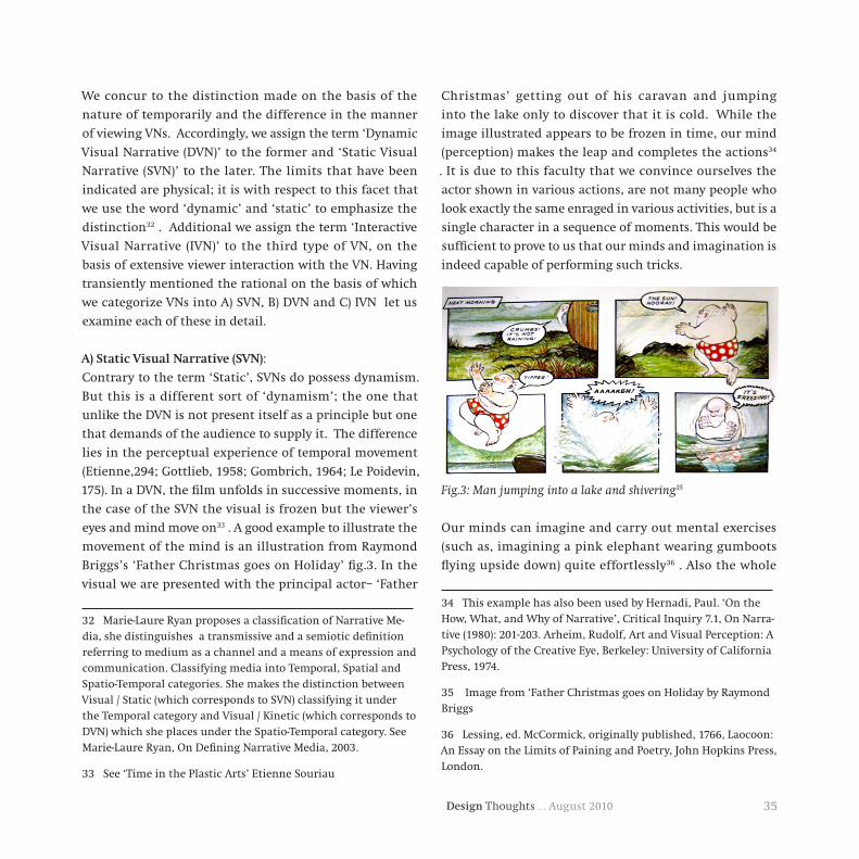
35Design Thoughts … August 2010
We concur to the distinction made on the basis of the
nature of temporarily and the difference in the manner
of viewing VNs. Accordingly, we assign the term ‘Dynamic
Visual Narrative (DVN)’ to the former and ‘Static Visual
Narrative (SVN)’ to the later. The limits that have been
indicated are physical; it is with respect to this facet that
we use the word ‘dynamic’ and ‘static’ to emphasize the
distinction32 . Additional we assign the term ‘Interactive
Visual Narrative (IVN)’ to the third type of VN, on the
basis of extensive viewer interaction with the VN. Having
transiently mentioned the rational on the basis of which
we categorize VNs into A) SVN, B) DVN and C) IVN let us
examine each of these in detail.
A)StaticVisualNarrative(SVN):
Contrary to the term ‘Static’, SVNs do possess dynamism.
But this is a different sort of ‘dynamism’; the one that
unlike the DVN is not present itself as a principle but one
that demands of the audience to supply it. The difference
lies in the perceptual experience of temporal movement
(Etienne,294; Gottlieb, 1958; Gombrich, 1964; Le Poidevin,
175). In a DVN, the film unfolds in successive moments, in
the case of the SVN the visual is frozen but the viewer’s
eyes and mind move on33 . A good example to illustrate the
movement of the mind is an illustration from Raymond
Briggs’s ‘Father Christmas goes on Holiday’ fig.3. In the
visual we are presented with the principal actor– ‘Father
32 Marie-Laure Ryan proposes a classification of Narrative Me-dia, she distinguishes a transmissive and a semiotic definition referring to medium as a channel and a means of expression and communication. Classifying media into Temporal, Spatial and Spatio-Temporal categories. She makes the distinction between Visual / Static (which corresponds to SVN) classifying it under the Temporal category and Visual / Kinetic (which corresponds to DVN) which she places under the Spatio-Temporal category. See Marie-Laure Ryan, On Defining Narrative Media, 2003.
33 See ‘Time in the Plastic Arts’ Etienne Souriau
Christmas’ getting out of his caravan and jumping
into the lake only to discover that it is cold. While the
image illustrated appears to be frozen in time, our mind
(perception) makes the leap and completes the actions34
. It is due to this faculty that we convince ourselves the
actor shown in various actions, are not many people who
look exactly the same enraged in various activities, but is a
single character in a sequence of moments. This would be
sufficient to prove to us that our minds and imagination is
indeed capable of performing such tricks.
.
Fig.3: Man jumping into a lake and shivering35
Our minds can imagine and carry out mental exercises
(such as, imagining a pink elephant wearing gumboots
flying upside down) quite effortlessly36 . Also the whole
34 This example has also been used by Hernadi, Paul. ‘On the How, What, and Why of Narrative’, Critical Inquiry 7.1, On Narra-tive (1980): 201-203. Arheim, Rudolf, Art and Visual Perception: A Psychology of the Creative Eye, Berkeley: University of California Press, 1974.
35 Image from ‘Father Christmas goes on Holiday by Raymond Briggs
36 Lessing, ed. McCormick, originally published, 1766, Laocoon: An Essay on the Limits of Paining and Poetry, John Hopkins Press, London.

Design Thoughts … August 201036
school of ‘mental imagery’ is built around this ability of
man to - ‘see(ing) in the mind’s eye’. This phenomenon can
take place because our imagination, unlike our perception,
is under the control of our will (and experienced as such)
(Thomas, Nigel J.T., 2010). It is this power of visualization
that is called upon to appreciate an SVN
Lessing in his book37 mentions James Harris (1709-80) (as)
one of the foremost scholars to suggest the possibility of
conveying temporal movement through images says about
painting –‘Painting can imitate only by means of colour and
figure. It can represent only one moment in time. Although
it is motionless it can indicate motions and sounds as
well as actions which are known (i.e. history)’ (Lessing,
1766: xvi.)”. We concur to the possibility of representing
temporarily in a static image and thus propose the Static
Visual Narrative. The characteristic features of the SVN are:
1. The SVN executed on a medium occupies surface area. For
example an illustrated comic book runs over many pages,
or a mural painting may cover an entire wall. The viewer
has to unravel the story by exploring the surface area
covered by the visual. Thus the story unfolds across space.
2. In the case of the SVN the image is fixed on the surface
of the medium. That is to say it remains materially
unchanging. Le Poidevin defines ‘A static image (as) one
that represents by virtue of properties which remain largely
unchanged throughout its existence’ (Le Poidevin, 1997:175).
For example once a story has been painted or printed on a
piece of paper it does not undergo much change except for
maybe fading with time.
3. SVNs bank on the spectator’s prior knowledge of the
narrative. Only then can the viewer fully enjoy reading
37 Lessing, ed. McCormick, originally published, 1766, Laocoon: An Essay on the Limits of Paining and Poetry, John Hopkins Press, London.
the SVN, as the intent of the visual narrative is to engage
the spectator within it. ‘Perception’ and ‘Memory’ play
an important role in this respect. The viewer has to recall
the event in story and match it to the event portrayed in
the SVN. The spectator already knows what has happened
(the past) and what is to come (the future) but engages in
unravelling the SVN as the designer has presented38 .
4. The visual is fixed but the viewer or the viewer’s eye is
mobile. The SVN is viewed by a moving spectator, who finds
connections between juxtaposed scenes that communicate
a meaning. The spectator turns the pages or stands back
in front of a sculptural panel; it is the eye that moves
and explores the visual. Souriau illustrates this point by
citing the example of viewing a statue ‘ His (the viewer’s)
movement around the statue brings to view, as it were,
melodically, the various profiles, the different projections,
shadow, and light; thus the most complete appreciation of
the aesthetic complexity of the work is gained only be the
moving spectator’ (Souriau, 1949:295).
5. The viewer of the SVN decides the speed at which to view
the image. The SVN by the fact that it is fixed permits the
spectator to travel around the visual at leisure, allowing for
pauses at any given point for as long as is desired or quickly
skimming through the visual.
6. In an SVN the order of viewing is not determined; the
spectator decides the order in which to view the SVN. A
choice can be made as to where to begin viewing the SVN.
Having known the story, one can decide to begin viewing
the story from any given point in the narrative and go
backwards or forwards accordingly. One can even begin
38 Professor Hernshaw refers to this as ‘temporal integration’, the bundling together in one extended stretch of time of memo-ries and expectations (as quoted by E.H. Gombrich, 1964).

37Design Thoughts … August 2010
with the end and view the whole narrative in a flashback
kind of manner. In other words the SVN can be read from
beginning to end, vice versa or begin in media res as per
the preference of the viewer.
7. The viewer is in full control of the contemplation time or
as Goswamy refers to it ‘the ruminative viewing’ i.e. time
taken to carefully regard a work of art (Goswamy, 1998).
The spectator is in control of the time taken for viewing
the SVN.
Fig. 4: SVN representing the story of Adam and Eve, Gates
of Paradise39
Having explored the SVN, we now move towards the DVN.
8. Perception of movement in the SVN results from the
active participation of the spectator. The viewer has to look
39 Panel from Lorenzo Ghiberti’s “Gates of Paradise”, Florence Baptistery, Italy. Image Source –Web Gallery of Art.
at the SVN recall the story and engage in the process of
narration. The SVN makes great demands on the viewer’s
‘Imagination’. The beauty of the SVN is that it only provides
cues to the story in the form of visuals. It is up to the viewer
to use those cues as a base to build the narrative.
An excellent example of a SVN is a panel from the Gates of
Paradise that represents the story of Adam and Eve.
Show in the SVN (Fig.4), at the left bottom corner, we see
God in the act of creating Adam (moment 1 – M1).
Next, in the centre unfolds the creation of Eve (moment 2
– M2). Show in low relief towards the left is Adam and Eve
being tempted by the Devil in the form of a snake (moment
3 – M3). Finally on the right side, we see the couple being
thrown out of the Garden of Eden by the angels on the
orders of God (moment 4 – M4). Broadly speaking the
narrative flows from left to right, but the viewer can read
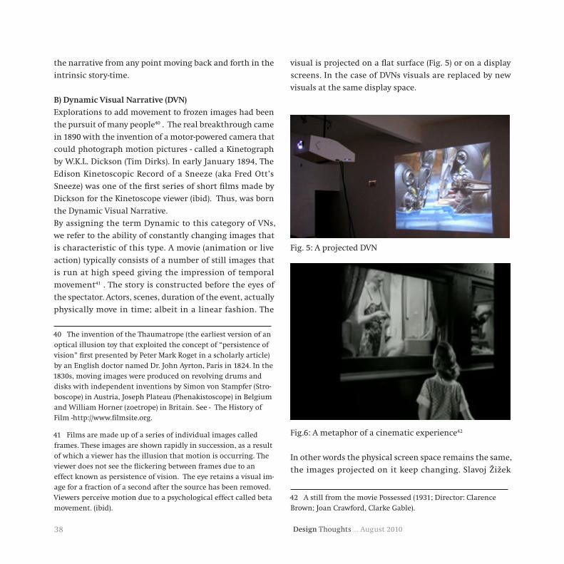
Design Thoughts … August 201038
the narrative from any point moving back and forth in the
intrinsic story-time.
B)DynamicVisualNarrative(DVN)
Explorations to add movement to frozen images had been
the pursuit of many people40 . The real breakthrough came
in 1890 with the invention of a motor-powered camera that
could photograph motion pictures - called a Kinetograph
by W.K.L. Dickson (Tim Dirks). In early January 1894, The
Edison Kinetoscopic Record of a Sneeze (aka Fred Ott’s
Sneeze) was one of the first series of short films made by
Dickson for the Kinetoscope viewer (ibid). Thus, was born
the Dynamic Visual Narrative.
By assigning the term Dynamic to this category of VNs,
we refer to the ability of constantly changing images that
is characteristic of this type. A movie (animation or live
action) typically consists of a number of still images that
is run at high speed giving the impression of temporal
movement41 . The story is constructed before the eyes of
the spectator. Actors, scenes, duration of the event, actually
physically move in time; albeit in a linear fashion. The
40 The invention of the Thaumatrope (the earliest version of an optical illusion toy that exploited the concept of “persistence of vision” first presented by Peter Mark Roget in a scholarly article) by an English doctor named Dr. John Ayrton, Paris in 1824. In the 1830s, moving images were produced on revolving drums and disks with independent inventions by Simon von Stampfer (Stro-boscope) in Austria, Joseph Plateau (Phenakistoscope) in Belgium and William Horner (zoetrope) in Britain. See - The History of Film -http://www.filmsite.org.
41 Films are made up of a series of individual images called frames. These images are shown rapidly in succession, as a result of which a viewer has the illusion that motion is occurring. The viewer does not see the flickering between frames due to an effect known as persistence of vision. The eye retains a visual im-age for a fraction of a second after the source has been removed. Viewers perceive motion due to a psychological effect called beta movement. (ibid).
visual is projected on a flat surface (Fig. 5) or on a display
screens. In the case of DVNs visuals are replaced by new
visuals at the same display space.
Fig. 5: A projected DVN
Fig.6: A metaphor of a cinematic experience42
In other words the physical screen space remains the same,
the images projected on it keep changing. Slavoj Žižek
42 A still from the movie Possessed (1931; Director: Clarence Brown; Joan Crawford, Clarke Gable).

39Design Thoughts … August 2010
gives an interesting metaphor to express what he calls
– ‘the magic of the cinematic experience’43 (Žižek, 2006).
He compares the cinematic experience to be like that of a
person standing in front of a passing train. The viewer is in
a fixed spot, the train moves in before her and she can see
what is going on inside the train through the windows44 .
Žižek demonstrates this with a clip from the film ‘Possessed’
where the actor stands in front of a train at is passes slowly
by her allowing her a view of the happenings at the various
windows of the many compartments (Fig. 6).
Characteristic of a DVN are.
1. The visual is constantly being replaced by new visuals on
a stationary screen, moving the story ahead. Thus the story
unfolds over time.
2. A DVN is composed of many still images that move at
a high speed in a set sequence once they are given the
command to move. The visual does not remain fixed to the
screen unless paused intentionally. Thus the visual is in a
state of constant motion.
3. In the case of the DVN, the story unfolds over time and
the viewer need not know the story beforehand to make
sense of the visual. The viewer (through the progression of
the narrative) is introduced to the characters and is briefed
about the background and circumstances of the story. The
plot is revealed as time progresses and a narrative is woven
43 Slavoj Žižek explores a number of films from a psychoanalyt-ic theoretical perspective in a two-and-a-half-hour documentary directed and produced by Sophie Fiennes. The film The Pervert’s Guide to Cinema (2006) is scripted and presented by Slavoj Žižek himself.
44 One cannot but notice the similarity in the form of a train having many windows and a film reel with frames.
sometimes using devices like flash-forwards and flashbacks,
as in the case of the movie ‘Momento45’ .
4. The DVN moves in time while the viewer watches from a
more or less fixed location. In other words the viewer views
the film from a fixed position i.e. in front of the screen.
5. Which event should unfold in how much time is pre
decided in a DVN. Progression of the narrative is due
to an automated process that moves the film further in
time. The viewer has limited control over the time one
can spend viewing each event of the narrative in a DVN.
The control is only limited to rewind or forward. In other
words the viewer has no control over the pace of the film;
it is fixed, constant, precisely measured and determined by
the creator. Although experiments involving ‘interactive
cinema’46 have been tried where the audience take an
active role in the unfolding of the plot, but it has been
limited to determining the direction in which the story
moves.
6. The spectator has no say in the order the events of the
film unfold. The sequence in which the events unfold is set.
45 Momento – (2000; Director: Christopher Nolan).
46 According to an article about the latest in film technology and cinema viewing – the German movie, Last Call, is the first ever interactive horror movie. When you go into the theatre, you text your phone number to a speed-dial database. During the movie, the protagonist makes a phone call to a random audience member and asks their advice. “Should I go up or down?” “Left or right?” “Should I help the creepy man wrapped in bandages, rocking back and forth on the floor, or should I look out for my-self?” Voice recognition software means the character identifies what the audience member wants them to do and follows his or her instructions. See article – Horror Movie Takes Direction from Audience, http://www.tomsguide.com.

Design Thoughts … August 201040
The viewer has no choice but to wait and watch how the
story progresses.
Sometimes the whole narrative goes back to the start point
and begins to unfold again from a different point of view
like in the movie ‘Run Lola Run’47 . The flashbacks, flash-
forward’s etc, happen only in ‘narrative time’ as far as real
time is concerned it has progressed in a linear fashion.
7. The time of contemplation exits but is cut short as the
visuals in a DVN change frequently. This just about gives
the viewer the chance to update oneself on the progression
of the plot. Being preoccupied with this though; the
contemplation time is something that a viewer snatches
whenever possible while the DVN is in progress.
8. Perception of movement results from the physical change
of visuals over time.
An important characteristic that distinguishes the DVN
and makes it stand apart from the SVN is its ability to
incorporate sound. Having looked at the DVN let us now
turn our attention to the IVN.
C)InteractiveVisualNarrative(IVN)
Rapid technological advances in the 20th century led to
the evolution of yet another type of VN. As with the SVN
and DVN, Interactive Visual Narratives (IVNs) are those,
which fulfil three conditions – 1) that it is essentially visual
in nature, 2) has a narrative aspect to it and 3) involves
interaction from the viewer. Thus IVNs are a distinct
category from interactive stories that could be only text
based or oral narrative based.
The IVN began with the invention of the virtual space and
navigation systems to access it. Beginning with the humble
2D animation of events as the viewer clicks a button to move
ahead, IVN has how moved into the world of augmented
47 Run Lola Run – (1998; Director: Tom Tykwer).
reality where the viewer becomes part of the story. Here,
we find a combination of characteristic of the DVN and the
SVN. While in the DVN the visual is preset to move at a
given speed in a predefined manner; in the SVN the visual
lacks mobile capacity. In the IVN, one can experience the
SVN which has dormant dynamic capability that can be
activated on the intervention of the viewer. Thus the IVN
can behave like the SVN or the DVN or can be composed
with features of both SVN and DVN as designed by the
creator. Additionally, like the DVN the IVN has the ability
to incorporate sound and movement in virtual story space.
Let us take a look at the characteristic features of the IVN.
1. Although the IVN essentially unfolds across time as it is
to be viewed through the medium of a screen, it has the
possibility of being designed as a SVN and thus unfolding
in space as well. For example the IVN can be paused by the
viewer in order to view the visual that can be designed as
a SVN.
2. The visual in an IVN can be designed to behave like an
SVN at sometimes and the DVN at others. For example one
event of the story may be rendered as an SVN and another
as a DVN.
3. In an IVN the viewer in some cases may need to know the
story beforehand. It is also possible for the viewer not to
have an understanding of the story as the viewer explores
the plot as she moves on.
4. The IVN has the mixed possibility of 1) being frozen in
time while the viewer moves, 2) moving in time while the
viewer watches from a more or less fixed location and also
3) moving with the viewer ( as the case when the viewer
plays the role of a character). The distinguishing feature of
the IVN is the possibility of the viewer to interact with the
visual. There is a whole range of IVN’s that exist today that

41Design Thoughts … August 2010
has various levels of viewer interaction. On one end of the
spectrum is the IVN where the viewer interaction is limited
to moving from one event to another, as in fig. 7, and on
the other end is the total story experience were the viewer
enters into the story world as a character and navigates
through the plot, as in fig. 8.
Fig.7: An IVN where the viewer controls the movement from
one event to the next48 .
5. As the progression of the narrative is due to viewer
intervention, the viewer makes a choice with regards to
the pace of the unfolding of the story.
6. With regards to the order of unfolding of the story there
are three possibilities that can occur – 1) if the IVN appears
like an SVN, then the viewer is free to make a choice in
arranging the sequence of events 2) if the IVN is presented
in the DVN form then the viewer has no say in the order of
appearance of the event and 3) the IVN can also allow the
viewer to make a choice of the order in which the events
of the story unfold.
48 A screen shot from BBC’s site CBeebies - http://www.bbc.co.uk/cbeebies/
Fig.8: An IVN where the viewer plays a character in the
story49 .
7. The time of contemplation varies in the IVN. Sometimes
the viewer can mull over a part of the visual for as long as
one desires, at other times the viewer may have to act fast.
8. The perception of movement in an IVN can be caused by
the participation of the viewer (if the IVN is designed as an
SVN) or the changing of visuals (if the IVN is designed as
a DVN). Additionally, the perception of movement can be
actual if the viewer is part of the story.
The launch of the application for the Apple iPad – an
interactive book called ‘Alice in Wonderland for the iPad’
earlier this year50 is a pointer towards the direction in
49 A screen shot of the ‘Samantha Swift and the Golden Touch Game. About the game: On a quest to recover Alexander the Great’s Scroll of Wealth, archaeologist and adventurer Samantha Swift realizes that there’s more to this mission than she first thought. Now she’s racing against the clock to keep ancient pow-ers from falling into the wrong hands! Travel to exotic locations as you discover the ancient secrets and mystery shrouding the famed Golden Touch!. Source: http://www.shinegame.com.
50 Alice for the iPad-Lite: Atomic Antelope, Release Date: April 01’10; source - http://apps.ipad-magic.com accessed 21 June’10.

Design Thoughts … August 201042
which the future of VN is shaping. (...)Atomic Antelope
embellished the pages with interactive, Monty Pythonesque
animations that move when you touch or tilt the iPad
(Dahliquist). The USP of the application of the laws of
physics and gravity to the characters of the story opens new
avenues of thought. Another feature to take note of is the
possibility of experiencing the story differently every time
one goes through it. With the advancement in technology
IVN can transform the whole visual narrative experience.
In conclusion we present a table marking the distinguishing
characters of the SVN, DVN and IVN.
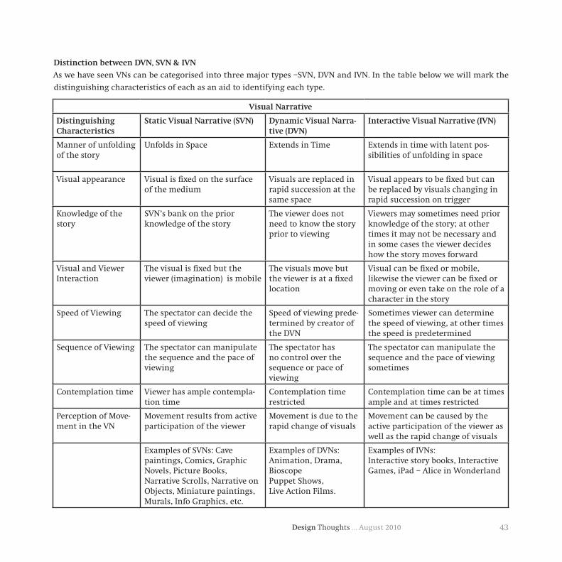
43Design Thoughts … August 2010
DistinctionbetweenDVN,SVN&IVN
As we have seen VNs can be categorised into three major types –SVN, DVN and IVN. In the table below we will mark the
distinguishing characteristics of each as an aid to identifying each type.
VisualNarrative
DistinguishingCharacteristics
StaticVisualNarrative(SVN) DynamicVisualNarra-tive(DVN)
InteractiveVisualNarrative(IVN)
Manner of unfolding of the story
Unfolds in Space Extends in Time Extends in time with latent pos-sibilities of unfolding in space
Visual appearance Visual is fixed on the surface of the medium
Visuals are replaced in rapid succession at the same space
Visual appears to be fixed but can be replaced by visuals changing in rapid succession on trigger
Knowledge of the story
SVN’s bank on the prior knowledge of the story
The viewer does not need to know the story prior to viewing
Viewers may sometimes need prior knowledge of the story; at other times it may not be necessary and in some cases the viewer decides how the story moves forward
Visual and Viewer Interaction
The visual is fixed but the viewer (imagination) is mobile
The visuals move but the viewer is at a fixed location
Visual can be fixed or mobile, likewise the viewer can be fixed or moving or even take on the role of a character in the story
Speed of Viewing The spectator can decide the speed of viewing
Speed of viewing prede-termined by creator of the DVN
Sometimes viewer can determine the speed of viewing, at other times the speed is predetermined
Sequence of Viewing The spectator can manipulate the sequence and the pace of viewing
The spectator has no control over the sequence or pace of viewing
The spectator can manipulate the sequence and the pace of viewing sometimes
Contemplation time Viewer has ample contempla-tion time
Contemplation time restricted
Contemplation time can be at times ample and at times restricted
Perception of Move-ment in the VN
Movement results from active participation of the viewer
Movement is due to the rapid change of visuals
Movement can be caused by the active participation of the viewer as well as the rapid change of visuals
Examples of SVNs: Cave paintings, Comics, Graphic Novels, Picture Books, Narrative Scrolls, Narrative on Objects, Miniature paintings, Murals, Info Graphics, etc.
Examples of DVNs:Animation, Drama, BioscopePuppet Shows,Live Action Films.
Examples of IVNs:Interactive story books, Interactive Games, iPad – Alice in Wonderland

Design Thoughts … August 201044
Conclusion
As human beings we have found a novel way of telling
stories by illustrating those using visuals. We do this with
a motive of communicating to an audience; explaining
what, how, where, and in what manner the event took
place. We employ the help of VNs to do this. The technique
of illustrating stories has existed and continues to exist
today. There is a large body of work that primarily deals
with research on visual stories. These have been carried
out and investigated in isolation by scholars under
various headings such as comics, narrative art, animation,
films etc. As we have proved through this paper that the
fields mentioned above fundamentally have a common
characteristic; in that they all narrate stories using visuals.
We have thus established the need to acknowledge this
feature and recognize the VN as a distinct category. It is
therefore essential to segregate, distinguish and define
‘Visual Narratives (VN)’ as a sub category within the vast
domain of Visual Studies. We propose VN be established as
a distinguished field of study under the domain of Visual
Studies.
Furthermore, VNs can be expressed using moving images
or a fixed image and in recent times with an advancement
of technology a combination of both the moving and fixed
types. To these we assign the terms Static Visual Narratives
(SVN), Dynamic Visual Narratives (DVN) and Interactive
Visual Narratives (IVN) respectively based on the obvious
difference with respect to the temporal aspect and viewer
interaction. Comics, animation, history paintings are types
of VNs. A visual that tells a story on a static medium (wood,
metal, canvas, books, walls, objects etc) is a SVN. As the
film or animation expounds the story employing rapidly
changing images; the film is a DVN. Interactive storytelling
sites, and interactive games with a narrative aspect are
examples of the IVN. These sub types operate as further
categories under the umbrella of VNs. Defining VN and its
sub types and providing a systematic categorization of VNs
marks it as a specialized area of work. Doing so establishes
the VN as a distinct entity and provides scope for structural
analysis. This in turn helps students of VNs identify where
their research area fits; and shows them similar areas of
studies where they can interact and share their findings,
furthering the interest of the domain. The system proposed
in this paper aims at bringing together isolated areas of
work that can help understand the varied aspects of VNs. In
addition it opens up new areas of research for the student
of VN.
WorksCited
National Gallery of Art. (2010). Watson and the Shark . Retrieved
June 15, 2010, from National Gallery of Art, Washington DC: http://
www.nga.gov
Abbott, H. P. (2008). The Chambridge Introduction to Narrative.
Application iPad Alice for the iPad-Lite – Atomic Antelope. (2010).
(iPad Applications) Retrieved June 21, 2010, from iPad Magic: http://
apps.ipad-magic.com
Arheim, R. (1974). Art and Visual Perception: A Psychology of the
Creative Eye. Berkeley: University of California Press.
Arheim, R. (1969). Visual Thinking. Berkeley: University of California
Press.
Atomic Antelope . (n.d.). Alice for the ipad. Retrieved June 18, 2010,
from http://www.atomicantelope.com/alice/
Barry, A. M. (1997). Visual Intelligence: Perception, Image And
Manipulation in Visual Communication. Albany: State University
of New York Press.
Blake, R., & Lee, S.-H. (2005). The Role of Temporal Structures in

45Design Thoughts … August 2010
Human Vision. Behavioral and Cognitive Neuroscience Reviews , 4
(21), 21-42. SAGE full-text collections. IIT Bombay Lib., 30 September
2009. <http://bcn.sagepub.com>.
CG Entertainment, Inc. (2002). Edge No.5, Chapter1: The Way of the
Rat. Florida: CG Entertainment, Inc.
Chatman, S. (1980). Story And Discourse: Narrative Structure in
Fiction and Film. London: Cornell University Press.
Dahliquist, D. (n.d.). Alice for the IPad Brings Pop-up Books Into the
21st Century. (PCWorld Communications, Inc. 501 Second St., San
Francisco, CA 94107, USA.) Retrieved June 19, 2010, from PCWorld
Communications: http://www.pcworld.com
Dami Editore, Italy. The Mini Treasure Chest of Great Fairy Tales.
Hong Kong: Tormont International Ltd.
Dirks, T. (1996, May). AMC Filmsite. (T. Dirks, Editor, L. Rainbow
Media Holdings, Producer, & American Movie Classics LLC)
Retrieved May 18, 2010, from Filmsite.org: http://www.filmsite.org
Douglas Harper, H. (n.d.). “movie.” Online Etymology Dictionary.
Retrieved June 2010, 22, from dictionary.reference.com:
<Dictionary.com http://dictionary.reference.com/browse/movie>.
Douglas Harper, H. (n.d.). “pictorial.” Online Etymology Dictionary.
Retrieved June 17, 2010, from <Dictionary.com http://dictionary.
reference.com/browse/pictorial>.
Eisner, W. (2008). Graphic Storytelling and Visual Narrative. Florida:
Poorhouse Press.
Encyclopedia of World Art. (1967). Space And Time (Pierre
Francastel) (Vol. XIII). London: McGraw-Hill Publishing COmpany
Ltd. .
Encylopedia of Irish and Word Art. (n.d.). (N. Collins, Á. N.
Muireadhaigh, Editors, & visual-arts-cork.com) Retrieved June 16,
2010, from Encylopedia of Irish and Word Art: http://www.visual-
arts-cork.com
Gifford, K. (1998). “Narrative Painting”. (K. Gifford, Editor)
Retrieved June 15, 2010, from Humanities Web Website: http://www.
humanitiesweb.org/?s=g&p=t&a=d&ID=143
Gombrich, E. H. (1964). Moment and Movement in Art. Journal of
the Warburg and Courtauld Institutes , 27, 293-306.
Gombrich, E. H. (1982). The Image And The Eye: Further studies in
the psychology of pictorial representation. Oxford: Phaidon Press
Ltd.
Goswamy, B. N. (1998). Coming to Terms with Time: Apects of
Narrative in the Visual Arts. In J. Jain (Ed.), Picture Showmen:
Insights into the Narrative Tradition in Indian Art (Vol. 49, pp. 32-
41). Mumbai: Marg Publications.
Hawkins, J. M. (1989). The Oxford Paperback Dictionary (Third ed.).
Oxford: Oxford University Press.
Hernadi, P. (1980). On the How, What, and Why of Narrative.
Critical Inquiry , 7 (1, On Narrative), 201-203.
iTunes. (n.d.). Alice for the iPad by Atomic Antelope. (A. Inc.,
Producer) Retrieved June 18, 2010, from http://itunes.apple.com
Kepes, G. (1995). Language of Vision. New York: Dover Publication.
Kress, G., & Leeuwen, T. v. (1996). Reading Images: The Grammar of
Visual Design. London: Routledge.
Le Poidevin, R. (1997). Time and the Static Image. Philosophy , 72
(280), 175-188.

Design Thoughts … August 201046
McEntegart, J. (2010, March 11). Horror Movie Takes Direction From
the Audience. (Best of Media Group) Retrieved May 18, 2010, from
Tom’s Guide US: http://www.tomsguide.com
Murray, J. K. (1995). Buddhism and Early Narrative Illustration in
China. Archives of Asian Art , 48, 17-31. JSTOR. IIT Bombay Lib.,
Mumbai, Maharashtra. <http://www.jstor.org>.
Murray, J. K. (1998). What is “Chinese Narrative Illustration”? The
Art Bulletin , 80 (4), 602-615. JSTOR. IIT Bombay Lib., Mumbai,
Maharashtra. <http://www.jstor.org>.
Perkins, A. (1957). Narration in Bablonian Art. American Journal
of Archaeology , 61 (1), 54-62. JSTOR. IIT Bombay Lib., Mumbai,
Maharashtra. <http://www.jstor.org>.
Pick, H. L., & Saltzman, E. J. (Eds.). (1978). Modes of Perceiving and
Processing Information: A volume based on conferences sponsored
by the Committee on Cognitive Research of the Social Science
Research Council. New Jersey: Lawerence Erlbaum Associates.
Pincus, E. (1972). Guide to Filmmaking. Signet, New American
Library, A Division of Penguin Books, USA Inc.
Pollen, J. H. (2005). A Description of the Trajan Column,. London:
Elibron Classics.
Richardson, B. (2000). Recent Concepts of Narrative and the
Narratives of Narrative Theory. Arts Publication . Northern Illinois
University.
Ricoeur, P. (1980). Narrative Time. Critical Inquiry , 7 (1, On
Narrative), 169-190.
Roam, D. (2009). The Back of the Napkin: Solving Problems and
Selling Ideas with Pictures. London: Marshall Cavendish Limited.
Robin Varnum, C. T. (Ed.). (2001). The Language of Comics: Word
and Image. University Press Of Mississippi.
Rudrum, D. (2005). From Narrative Representation to Narrative
Use: Towards the Limits of Definition. Narrative , 13 (2), 195-204.
Scholes, R., Phelan, J., & Kellogg, R. (2006). The Nature of Narrative.
New York: Oxford Universtiy Press.
Souriau, E. (1949). Time in the Plastic Arts. The Journal of Aesthetics
and Art Criticism , 7 (4, Special Issue On Aesthetics in France), 294-
307. JSTOR. IIT Bombay Lib., Mumbai, Maharashtra. <http://www.
jstor.org>.
Strain, M. (2010, May 21). Curiouser and curiouser: Alice in
Wonderland through the iPad. (Can Do Media Inc.) Retrieved June
19, 2010, from Vancouver Observer: http://www.vancouverobserver.
com
Sukla, A. C. (2000). Art and Representation: Contributions to
Contemporary Aesthetics.
Thomas, N. J. (Last modified 2010, April 2). “Mental Imagery”.
(E. N. Zalta, Editor, & Metaphysics Research Lab, CSLI, Stanford
University) Retrieved May 19, 2010, from The Stanford Encyclopedia
of Philosophy (Summer 2010 Edition): <http://plato.stanford.edu/
archives/sum2010/entries/mental-imagery/>.
Ware, C. (2008). Visual Thinking for Design. Amsterdam: Morgan
Kaufmann Publishers.
Weitzmann, K. (1970). Illustrations in Roll and Codex: A study of
the origin and method of text illustration. Princeton: Princeton
University Press.
47Design Thoughts … August 2010
InvestigationofthemostpreferredBilingualCombinationof
Words:AnExperimentwithaselectedPlaceIdentificationSignboard
Nanki Nath & Ravi Poovaiah
Abstract
Bilingualism, a combination of two languages provides
two different forms of same meaning for a word. This
phenomenon, though a global trend to display information
on signboards, has varied forms in different places of India.
In such diversity, preferences would vary to a high degree.
This variation created interest to investigate the preferences
and respective preference criterion of people for bilingual
combinations of the word. The objective of the study
was to find the most preferred bilingual combination of
selected words. Standard typography legibility tests were
conducted with five selected English typefaces (based on
the British Typographic standard for classification - BS
2961:1967), each arranged separately on the selected size.
Similarly, five Hindi typefaces were separately tested out
for legibility rating .
The results were further combined together to create
maximum number of bilingual combinations in a way
that every English typeface combined with every Hindi
typeface. This created diversity in combinations. The
final stimulus was presented in form of nine bilingual
combinations, put together on two selected exterior walls.
The pattern of arrangement for the nine combinations was
different in both the spaces. All the tests were conducted
from 20, 40 and 60 feet viewing distances.
The data collected was then categorized as collection of
observations, which were further classified into matrix of
results under categories – Letters, Words, Combinations,
Qualities and Grid. The results of the study highlight
maximum preference for the bilingual combination of DV-
Yogesh and Helvetica Bold. . The two important findings
were that legibility was affected not only by the design
of the individual letterforms, but also by the way they
are integrated to each other. The preference test for
combinations record that from the maximum distance of
60 feet people concentrated on words more than letters.
Another important finding indicated that majority of the
people read english words first and then hindi words.
Introduction
Bilingualism (the term with its legitimate roots in
linguistics) is a simple representation of two or more
languages on a panel. Such bilinguals are mostly used for
information signs outside buildings, traffic signs, warning
signs, commercial signs. They are placed in places with
a legally controlled bilingualism (in bilingual regions or
national borders). Bilingualism aims to accommodate
equally the discourse of existing populations in a space.
This phenomenon, though a global trend to display
information appears on signboards and many other
information providing interfaces. It is a matter of dual
existence of a language. Hence, the use of typography
becomes even more critical as it is the visual form given
to a language. India’s official language being hindi was
approved by Article 343 of our constitution that specifies
Hindi in devanagri script as the official language of the
Union. There have been research studies in form of
issues related to devanagri script in print, invention of
new devanagri typefaces for print and electronic use or
some studies also explore classification of currently used
devanagri typefaces, in order to understand the distinction
between different typefaces from Indian point of view3.

Design Thoughts … August 201048
However, there has been no probe so far as to gather issues
regarding the typographic configuration of devanagri
typefaces used bilingually with english on Indian
signboards. One could say that there are issues since
people have a general view about not noticing signboards,
or panels using texts with readability issue (specially in
case of hindi letterforms). But, these hindi letters are
combined with english and other local languages in
order to overcome language comprehension by people of
different cultures in a heterogeneous culture of India.
The curiosity to understand the bilingual dynamics
between the two languages on a sign panel arose from the
above mentioned arguments.
Method
The statement of inquiry for this experiment was to find
the most preferred bilingual combination (of hindi and
english together) for a selected information sign. The tests
were divided into 2 parts explained below.
Pilotstudy
Initial pilot study was conducted using an existing
identification sign inside IIT-B. A questionaire was
developed to conduct the initial pilot test. The study was
conducted between (9:00a.m. to 11:00 a.m. duration of the
day). The respondent answers were audio recorded. The
mini-study gave insights to remove the question(s) leading
to non-response. The viewing distance of 60, 40 and 20 feet
were pre-decided and finalized for later experiments. The
text (STAFF CLUB) of the selected signage was used as a
reference text to create sample designs for final tests.

49Design Thoughts … August 2010
Initial Questionnaire format:
Q.1. Rate the written text at : 60 40 20 (in feet)
Perfectly Legible
Legible
50-50
Barely legible
Illegible
Q.2. What do you see first, english or hindi text ?
Q.3. What languages can you easily read ?
Q.4. What problems do you find with signboards in
general ?
Emerging points: Subjects found the variations of sign
typography in this signage misleading. There were
confusions regarding what was seen first (hindi or english
text). The text constantly fluctuates (especially at 60 feet)
due to presence of two bilingual hierarchies. Also, the
reverse type has its specific legibility and visibility issues.
The dark background dissolves the letters by edges that
appear as visually constricting letterforms of the text.
Taking into account all these points, the design elements
to be included for the stimulus for the final tests
were crafted.
Hence, further experiment design included following
features:
a) Use of black text on white background to achieve
maximum contrast.
b) Use of one size for English and Hindi text in the
bilingual combinations (along with appropriate matching
of english with hindi typeface).
c) To have no restriction on the time given to a respondent
to observe and rate the typefaces.
ExperimentStructure
The experiment plan was divided into two scenarios:
A and B
The interface for sample presentation was a wall of
an exterior structure in both scenarios A & B (details
mentioned further). The subjects were asked to view the
stimuli from fixed distances of 60, 40 and 20 feet for
both tests. Experiments were conducted during pre-noon
daylight condition. The dimensions for sample design
were 42cm X 29 cm. in both scenarios.
SCENARIOA
Test1.StandardTypographyLegibilityTests:They were
conducted separately for five english and five hindi
typefaces.
Test2.Preferencetest:Resulting best rated three English
and three hindi typefaces were combined together to
create maximum of nine bilingual combinations. Here,
the nine combinations were placed in a 3 X 3 grid structure.
Sample size: Total of 20 respondents participated in Test 1.
The same no. also participated in test 2.
SCENARIOB
PreferenceTest(Randomization)
The situation in Scenario B takes the basis of the
preference test idea of Scenario A. The same sample
bilingual combinations were used in Scenario B. The
significant distinctions here were the arrangement of the
nine samples, which were arranged in a horizontal row
on an exterior wall at a different place. The timings for
the conducting the test were kept the same (as in Scenario
A). Also, the preferences of 30 different respondents were
audio-recorded in this case.
The horizontal arrangement for first 15 respondents was
constant. But, the arrangement was flipped horizontally
for the remaining 15 of 30 respondents. The idea behind a
horizontal arrangement and variation within it was to see
whether the changes would affect the choice of the most
preferred bilingual combination and the related criterion
or not? Would the resulting chosen combination be the

Design Thoughts … August 201050
same as was in preference test of Scenario A ? Therefore,
randomization in the arrangement of sample designs
became crucial.
Participants
ScenarioA
20 respondents who volunteered for the study included
9 males and 11 females, in the age-groups ranging from
20-58 years. The details like their names, age, occupation,
height, vision factor, languages easily read were recorded.
ScenarioB
30 respondents who participated in the test included 19
males and 11 females, in the age groups ranging from
12-78 years, with maximum people coming between the
age groups of 30’s to 40’s. The details like their name, age,
occupation, vision etc. were hand written by the researcher
on separate hard-printed questionnaire developed for the
study.
The design format for the same is given below:
Experiment Design
Scenario A
A total of nine bilingual combinations were explored (with
each English typeface occurring with each Hindi typeface).
The samples were presented to the subjects in one-by-one
sequential order. For each stimulus, subjects were asked
to rate it on a five-point standard legibility scale from
distance 60, then 40 and lastly 20 feet (starting from the
farthest distance to the shortest one).
Test 1 The five-rate legibility scale used:
Perfectly Legible 50-50 / Barely Illegible
Legible Neutral Legible
Test 1 Sample designs
1.StimulusforEnglishtext(Se):
i). The basis for selecting following five English typefaces
was to use classic typefaces with majority of them that
have been used in signage designs : Helvetica – Bold, DIN
Bold, Frutiger 55 Roman, Whitney Medium and Franklin
Gothic Medium. Also, the choice was based on the British
Standards Classification of Typefaces (BS 2961:1967),
which includes: Grotesque, Neo-grotesque, Geometric and
Humanist classifications.
ii). Here, a Grotesque (Helvetica Bold) and a Neo-grotesque
(Franklin Gothic Medium) was accompanied by the
Humanist characters (Frutiger 55 Roman & Whitney
Medium) along with DIN typeface (Deutsche Industrie-
Norm=German Industrial Standard), a Geometric typeface.
2.StimulusforHinditext(Sh):
The basis for selecting following Hindi typefaces was to
use a combination of uniform with non-uniform stroke
width options : DV-Prakash Bold, DV-NIDMahendraBold,
DV – Yogesh Bold, DV – Surekh Bold, DV – TT Natraj Bold.
The criteria were a deliberate choice to understand what
are the likable character preference(s) for indian sign
panel, whether the uniform stroke hindi typeface or the
non-uniform stroke hindi typeface
The basis for the selection of devanagari typeface doesn’t
follow a standard, since no standard for selection exists.

51Design Thoughts … August 2010
The stimuli were presented separately following a sequence of Se1 to Se5 (for English) and Sh1 to Sh5 (for Hindi)
This issue needs to be resolved by the type designers in
Indian context. Extensive research is going on in creating
devnagari typefaces for print, electronic legibility. Added
to these attempts, devanagri issues vis’-a-vis’ Indian signs
and their semantic requirements need a research based
investigation.
3.Typographicconsiderations:
a. Simple optical scaling method to match the cap height
of all typefaces (english and hindi separately) has been
used in the sample designs. Keeping the the x-height by
increments, arriving at almost 85% of the uppercase
height for devanagari (Hindi) typeface, to create a visual
balance in terms of word shapes that are distinctive
but uniform.
Example of Stimulus (Se4), Helvetica Bold matched with Prakash Bold

Design Thoughts … August 201052
Opticalscaling
100% Cap height (English text) - 85% of Cap height (Hindi
text)
b. The visual harmony of letters is established between
letterforms by adjusting the three following type elements
adjacently: range in the cap height / kerning / word
spacing (in %). In creating individual characters, the
objective became emphasizing the distinctive quality of
each letter whilst maximizing the adjacent white space –
to facilitate clarity at distance and minimize the effects of
tight kerning. The prime objective was always clarity, the
aesthetic judgment criterion is secondary.
Test1RESULTS
Data was collected in excel sheets for both Se1 to Se5
(english text) and Sh1 to Sh2 (hindi text) to calculate the
mean and standard deviations for each of the 10 fonts at
the specified distances.
1. At 60 feet, there are maximum deviations for Frutiger 55
(Se3) and DIN Bold (Se2). The deviation value for Whitney
medium (Se4) is the least, and hence is the most legible of
all others.
At 40 feet, DIN Bold (Se2) and Frutiger 55 Roman (Se3) have
almost same legibility rate. The best ratings have been
obtained for Helvetica Bold (Se1).
At 20 feet, the legibility goes good from Helvetica Bold (Se1)
to Frutiger 55 Roman (Se3) and Whitney Medium (Se4).
2. At 60 feet, there are maximum deviations in DV –Yogesh
(Se3), DV –NIDMahendraBold (Se2) and DV-Prakash (Se3).
At 40 and 20 feet, the most legible values indicate towards
DV – Yogesh Bold and DV – Prakash Bold.
3.Final combinations for test 2:
Se1, Se4 and Se3 (on the basis of least deviations at 20 and
40 feet)
Se1, Se3 and Se2 (on the basis of least deviations at 20 and
40 feet)
Inferences:
a.LEGIBILITY RELATION
Lesser the deviation from the mean value for a typeface,
better its value rate of legibility.
b.VISION AND VISIBILITY
The values in 60 feet are fluctuating responses from
subjects, analyzing it qualitatively one can speculate the
reasons for the same. The 20 subjects for this test were
a combination of normal, far-sighted and shortsighted
vision of different age groups. Visibility from distance gets
influenced by the vision quality of a person.
Test2
Bilingual combinations of the best three English and
Hindi typefaces, as results of test 1, were developed with
each Hindi typeface conjoined with every English typeface.
A maximum of 9 such bilingual combinations could be
created, with Hindi text placed above the English text.

53Design Thoughts … August 2010
Diagram representing number of preferences for all nine bilingual
combinations at 60, 40 and 20 feet:
The subjects were asked to choose the most preferred
bilingual combination from the fixed distances, starting
from 60 feet to 40 feet and finally from 20 feet. The second
part of the questionnaire was to gather the reasons behind
their choice of the bilingual chosen.
Test2RESULTS
Diagram representing number of preferences for all nine
bilingual combinations at 60, 40 and 20 feet:

Design Thoughts … August 201054
60f 40f 20fSb1 16 14 17 Sb2 4 1 3Sb3 3 0 2Sb4 3 4 0Sb5 0 0 0Sb6 0 0 0Sb7 0 2 2Sb8 0 0 0Sb9 0 0 0
ThemostpreferredcombinationwasSb1 (DV–Yogesh
BoldandHelveticaBold)
At60feet
Clarity was observed by 18 people column-wise. Most of
them liked first column and chose the first combination
(Sb1) as the most preferred combination. At 60 feet, 14
people expressed that they could see “words” in English-
Hindi together as a combination at first sight. The bold
look of words STAFF CLUB in the first column for English
Typeface (Helvetica Bold) was the criterion for combination
preference for all 18 people. Also, a few of them liked the
use of white space between English letters in Helvetica
Bold.
The rest 2 subjects being communication designers keenly
observed the counterspaces and the character design of
the typeface options. Some critical observations made by
one of them being :
1. Best typographic combination was Sb4 ( DV- Prakash
Bold with Helvetica Bold) from 60 and 40 feet, due to
generous counter-spaces in Hindi – letters matching with
negative spaces of Helvetica letters.
2. Second most preferable combinations were Sb5 and Sb6
(where, DV – Prakash has been combined with Whitney
Sans and Franklin Gothic); due to better font matching
between Hindi and English typeface.
3. DV – Yogesh has wide-spread negative spaces which do
not match perfectly when seen from longer distances (60
and 40 feet). But, from 20 feet, the eye is able to adjust to
the ratio of negative spaces in a better way. Yogesh letters
with Helvetica letters provide convincing proportion as a
combination both vertically and horizontally. The kerning
is visible from 20 feet. The open letters of DV – Yogesh
in comparison to DV – Prakash provides much better
combination with kerned letters of Helvetica at 20 feet.
At40feet
1 Majority of the subjects found all combinations designed
with same typefaces. Here, observations and choices
emerged more by comparing typeface combinations in
individual rows.
2. Contrast from letter to letter between English and Hindi
typefaces amongst the nine combinations could be viewed
comfortably from this distance by 15 subjects.
3 Here, these subjects concentrated on letters and
expressed views accordingly [ e.g. ] (ta) of Se1 very clear,
clear counters here, but in last row hindi letters have
disturbing cuts especially letter [(ba) ] - [Se7 ka “phh” kaafi
alag hai, better than in Se4 and Se1].
4. Here, DV – NIDMahendraBold typeface in Sb7, 8 and
9 combinations was unanimously selected as the most
“complicated but good-looking” typeface. Among the three,
Sb7 emerged the most preferable combination because of
clear and bold English letterforms.
At20feet
At the distance of 20 feet, 15 subjects found all the
combinations bold and clear in comparison to the same
combinations when viewed from 60 and 40 feet. Hindi

55Design Thoughts … August 2010
B1(Arrangement 1) B2(Arrangement 2)
Combinations S.no. 60f 40f 20f Combinations S.no. 60f 40f 20f
DV- NID Mahendra BoldFranklin Gothic Medium
Sb1 3 1 1 DV – YogeshFranklin GothicMedium
Sb1 0 0 0
DV – Prakash BoldWhitney Sans Medium Sb2 0 0 0 DV – Yogesh
Whitney Sans Medium Sb2 2 4 2
DV – YogeshHelvetica Bold Sb3 9 12 14 DV – Prakash Bold
Helvetica Bold Sb3 6 3 6DV – Prakash BoldFranklin Gothic Medium
Sb4 3 0 0DV – NID Mahendra BoldWhitney Sans Medium
Sb4 3 1 0DV – NID Mahendra BoldHelvetica Bold
Sb5 0 0 0DV – NID Mahendra BoldHelvetica Bold
Sb5 3 1 2DV – NID Mahendra BoldWhitney Sans Medium
Sb6 0 0 0DV – Prakash BoldFranklin Gothic Medium
Sb6 0 1 2
DV – Prakash BoldHelvetica Bold Sb7 3 2 1 DV – Yogesh
Helvetica Bold Sb7 8 10 13
DV – YogeshWhitney Sans Medium Sb8 0 2 1 DV – Prakash Bold
Whitney Sans Medium Sb8 1 3 0
DV – YogeshFranklin Gothic Medium
Sb9 0 1 1DV- NID Mahendra BoldFranklin Gothic Medium
Sb9 1 1 1
letterforms in comparison to English letterforms, were
analyzed with enhanced interest shown by the subjects.
Other noteworthy responses:
1. The most favourable bilingual combination from this
distance (20 feet) was Sb1 ( DV – Yogesh Bold with Helvetica
Bold ). In general, clarity and bold look of English letters
was considered best compatible with Hindi letters in the
first two rows (including combinations Sb1 to Sb6). Both
Sb1 and Sb7 were likeable combinations because of the
bold character of English typeface (Helvetica Bold). Sb1
combination was considered simple and most clear of all
(due to simple Hindi letters complimenting the letters of
English). On the contrary, Sb7 was the second most
likeable combination (because it provided “stylish
curvaceous” Hindi letters, DV – NIDMahendraBold created
a unique combination with English letters of Helvetica
Bold).
2. Hindi typeface in second row was considered simple
(especially in cases of Sb4 and Sb6). The Hindi typeface
“Prakash – Bold” has uniform stroke width, which makes
it least complicated in terms of shape. An interesting
response by one of the subjects was that Prakash Bold has
letters which could be generally seen in children’s books,
with letters having simple, straight forms with almost no
extra curves. (the observation was particularly targeted to
letters like “ta” and “phh”.

Design Thoughts … August 201056
RESULTS
Results below consider preference opinions of 18 subjects.
Two subjects out of total twenty had no. of variations
in opinions. One of the subjects had one-sided visual
impairment (his left eye had correct vision at long distance
and the right eye had correct vision at short distance). The
observations made by this subject has been specifically
decribed below.
60feet
B1
1. For all 18 subjects, clarity in word “Staff” became the
major preference criterion from the distance of 60 feet.
2. 12 subjects expressed the view of considering English
words first and then concentrating on Hindi words. Here
again, the combination of Sb3 ( DV – Yogesh Bold with
Helvetica Bold) was the most preferred combination of all.
(see table).
3. In three responses from 60 feet, Sb1 was considered
equivalent to Sb4 as best English – Hindi combinations.
This is interesting, since the Hindi typeface used in
both are very different. The reason though given by the
respondents was better clarity of English letters than
Hindi letters in both combinations.
B2
1. The maximum no. of preferable responses for Sb7
have six responses, where Sb3 was considered equally
preferable combination as Sb7. The major criterion being
clear English words and different kind of hindi typeface
(different than the much bolder hand-painted letters seen
generally on signboards in India).
2. Sb4 and Sb5 could be considered second best preferred
combinations at 60 feet. In this case, both were rated
equally preferable by three respondents. The criteria being,
40feet
B1
1. Here, Hindi letters were considered first by the
respondents. Then the shapes of English letters were
viewed in comparison to Hindi letters. The major criteria
for selection of combination Sb3 here was shapes of letters
(phh, ta, la); shapes of letters (S, F and C) in comparison to
English letterforms in other combinations.
E.g. of one of the opinions “Letters S, F and C of helevtica
bold in combination 3 are better looking, provide better
contrast with Hindi letters; in comparison to S, F and C
English letters used in combination 8” . In combination 8,
Whitney Sans was combined with the same Hindi typeface
DV – Yogesh used in combination Sb1 with Helvetica Bold.
Since, from 40 feet, letter shapes became clearer, it was
easier for the subject to observe the use of same Hindi
typeface in the two combinations, with actual difference
of forms in the English letters.
2. Similarly, Sb3 was compared with others in three more
such responses. (in one, compared to Sb8 again and in
the rest two, compared to Sb7 – DV – Prakash Bold with
Helvetica Bold).
B2
1. Letter shapes and contrast between Hindi and English
letters were observed for the first time from 40 feet.
2. Among 10 favoured answers for Sb7, 3 responses
considered Sb7 and Sb3 equally preferable bilingual
combinations for a signboard. The preference criterion
being bold and clear English letters, big letter shapes in
DV – Yogesh for Sb7 and simple, better shapes of Hindi
letters in Sb3.
20feet
B1
Sb7 (DV – Yogesh with Helvetica Bold), was chosen
unanimously as the most favoured combination of all

57Design Thoughts … August 2010
The criteria from 20 feet being best proportion of English
to Hindi letters, best contrast between English to Hindi
letters and the bold appearance of English letters.
B2
1. Sb7 again has maximum no. of preferences as a
combination. But, here Sb7 was considered equivalent in
terms of English to Hindi letter compatibility with Sb3 in
4 responses. The reason being likeability of English letters
(Helvetica Bold) used in both combinations. All the four
respondents observed the use of same English typeface for
both the combinations.
2. Two respondents with corrective vision compared
Hindi letters “ta” and “ba” in both Sb7 and Sb3 to reach a
conclusion as to which combination is the most preferable
one for a name identification signboard.
3. Not only individual letter shapes, but also the space
between letters were taken into consideration while
selecting the final combination by all 18 respondents.
CONCLUSION
Most preferred Bilingual Combination
1. The most preferred combination was DV – Yogesh Bold
(Hindi) with Helvetica Bold (English). The preference
criterion for the selection, though varied in both Scenarios,
but in a nutshell, Helvetica Bold was considered with
“Bold”, “Big” and “clear” words and letters.
2. In Scenario B, idea of randomization in the arrangement
of combinations was applied. One could see that when the
arrangement was changed (as could be seen in the results
of B2), the overall preference was the same combination
(as in Scenario A), but the preference is shared with other
combination using the same English typeface.
3. From above points, one could conclude that in a
bilingual combination of English with Hindi typeface
(under a controlled design element of using black text
against white background), the kind of English typeface
used becomes one of the most important selection
criterion, followed by compatibility of Hindi typeface to
English typeface.
Words,thenletters
Integrated letters (or words) become important on a
sign panel when viewed from a long distance. At shorter
distances, “letters” and their details become more
important, probably because the details of positive
negative spaces, details in the integrated letters could be
seen in clearly from short distances.
1. Also, at the distance of 60 feet, “words” in English were
compared to other English typefaces. The distinction
between typefaces could not be observed by the
respondents at first sight of all nine combinations. They
took more time to convey their preferences.
2. At distances of 40 and 20 feet, the viewer’s started
commenting on “letter shapes”. Observations, comparisons
between English and Hindi typefaces centered around the
qualities of letters.
3. Also, at the distance of 60 feet, “words” in English were
compared to other English typefaces. The distinction
between typefaces could not be observed by the
respondents at first sight of all nine combinations. They
took more time to convey their preferences.
4. At distances of 40 and 20 feet, the viewer’s started
commenting on “letter shapes”. Observations, comparisons
between English and Hindi typefaces centered around the
qualities of letters.
Aboutdevanagriletters
Responses in relation to Hindi typefaces have considered
“individual letterforms” rather than “integration of
letters” as words. (viewed from the distance of 40 and 20
feet sequentially). For 60 feet, there has been negligible
argument about letterforms or the visual look of hindi

Design Thoughts … August 201058
Though, there have been responses of likability of hindi
letters (in typeface like DV-NIDMahendra bold of having
“stylish”, “unique”, “unusual letterforms”), the final
preference criterion were again clear, uniform letter
shapes (with least or no variation), letters with generous
white spaces around them, letters with least complicated
curves. All these could be best viewed in the devanagri
typeface “DV – Yogesh Bold”.
Hence, emerging findings in relation to this case study
indicate following future scope of research intervention in
the area of bilingual typography:
1. Review the visual issues related to character design of
devanagri letterforms used on signboards in India.
2. An inquiry into the hindi letterforms would combine
the analysis and understanding of English typography and
standards currently used. Whether there arises a need to
create a new display typeface or create essential standards
(which are currently not existing for signboards), could
not be investigated in isolation. The bilingual function of
the Hindi along with English words on Indian signboards
becomes an objective research inquiry.
Bibliography
Bix, Laura. “The Elements of Text and Message Design and Their
Impact on Message Legibility: A Literature Review.” Journal of
Design Communication (2002).
Craig, J. Designing with Type: A Basic Course in Typography. New
York: Watson-Guptill Publications, 1980
.
E, Arnold. Ink on Paper. New York: Harper and Row Publishers,
1972.
Frohloch, R.R. Basic Typography. Handbook of technique and
design. Zurich, 1972.
Frutiger, Adrian. Adrian Frutiger Typefaces - The Complete
Works. Basel Boston Berlin: Birkhauser Verlag AG, 2009.
Frutiger, Adrian. Signs and Symbols Their design and meaning.
Trans. Andrew Blunm Studio Editions. London, 1989.
Frutiger, Adrian. Type Sign Symbol. Zurich: ABC Verlag, 1980.
Gill, Eric. An essay on Typography. Surrey: Lund Humpshires
Publishers, 1988.
Gluth, Stuart. “Roxane, a study in visual factors effecting leg-
ibility.” Visible Language 33.3 (1999): 236-253.
Lupton, Ellen. Thinking with Type: A Critical Guide for Designers,
Writers, Editors and Students. New York: Princeton Architectural
Press, 2004.
Reil, Garrett. “Dual Language Signs.” Design Research Journal
and Visual Blog. 2009 <http://www.gerrettreil.ie/design-research-
blog files/category-dual-language-signs.php>.
Ritchie, Tej K. Bhatia and William C. Handbook of Bilingualism.
Oxford: Blackwell Publishing, 2006.
Spiekermann, E.G. Stop Stealing Sheep and find out how type
works. 1 ed. California: Adobe Press, 1992.
Yaffa, Joshua. “The Road to Clarity.” 2007. New York Times. 2009.

59Design Thoughts … August 2010
Identification&ClassificationofSemanticUnitsUsedinFormation
ofPatternsinKundanJewellery,aMethodicalApproach.
Parag K. Vyas, V.P. Bapat
Abstract
India has a rich tradition of jewellery and there are a
number of styles of jewellery making in practice, each
with its uniqueness, special forms and style. Kundan is a
type of traditional Indian jewellery that uses a framework
of gold crafted in intricate details it utilizes chips of
diamond, raw or minimally polished for the purpose of
setting. Backside of kundan jewellery is embellished with
hard enamel, typically red green and red blue colours
that make back side of jewellery equally pleasurable to
look at; an unusual but important feature that makes the
jewellery wearable from both sides.
Kundan work has fine geometry and achieves amazing
level of symmetry using rough shapes of gemstones
that may or may not be a symmetrical or homogeneous
assortment. It requires excellent craftsmanship and
intelligent arrangement of stones in their place to achieve
an aesthetically pleasing composition.
In recent times, kundan has made a comeback as a
prominent style. Articles are very expensive both in
fiscal and work demanding terms. The process of making
jewellery starts by taking a strip of gold and bending it in
a variety of shapes in multitude, those are subsequently
assembled on a base plate. Kundan, Jewellery is handcrafted
piece by piece to assume form clusters that in turn form a
complete piece.
This study is focussed at identification of smallest semantic
units that are used in kundan jewellery. For purpose of
identification literature, artworks, works in progress were
studied in depth. Jewellery showrooms, Shop floor surveys
were conducted along with in depth
interviews with experts in field. Findings were presented
to group of experts and academics, their suggestions were
incorporated in documentation.
A total of ninety one smallest semantic units that are
used in design of kundan jewellery, were identified
during path of research. These were classified into five
categories based on geometry. These semantic units alone
or in combination with other units in meticulous manner
create kundan jewellery.
Introduction
India has a rich tradition of jewellery and there are
number of styles of jewellery making in practice, each
with its uniqueness, special forms and style. Kundan
jewellery is a particular type (of jewellery) that utilizes
chips of diamond, raw or minimally polished for the
purpose of setting, thereby giving an article its classical
look (Figure1). This type of jewellery is motivated by the
old Indian concept of retaining maximum weight of
diamonds and gemstones, used as they were naturally
found or minimally faceted. This typical use of diamonds
and gemstones is in contrast to western concept of
polishing them for maximum brilliance or fire, in formal
brilliant cuts (Pagel-Thiessen1993:174) (Snowman 1990:182-
185). Properties of carat weight and quality of cut (that
determines the fire inside the diamond) are diametrically
opposite to each other. If a polisher tries to retain weight it
compromises optical properties and vice versa.
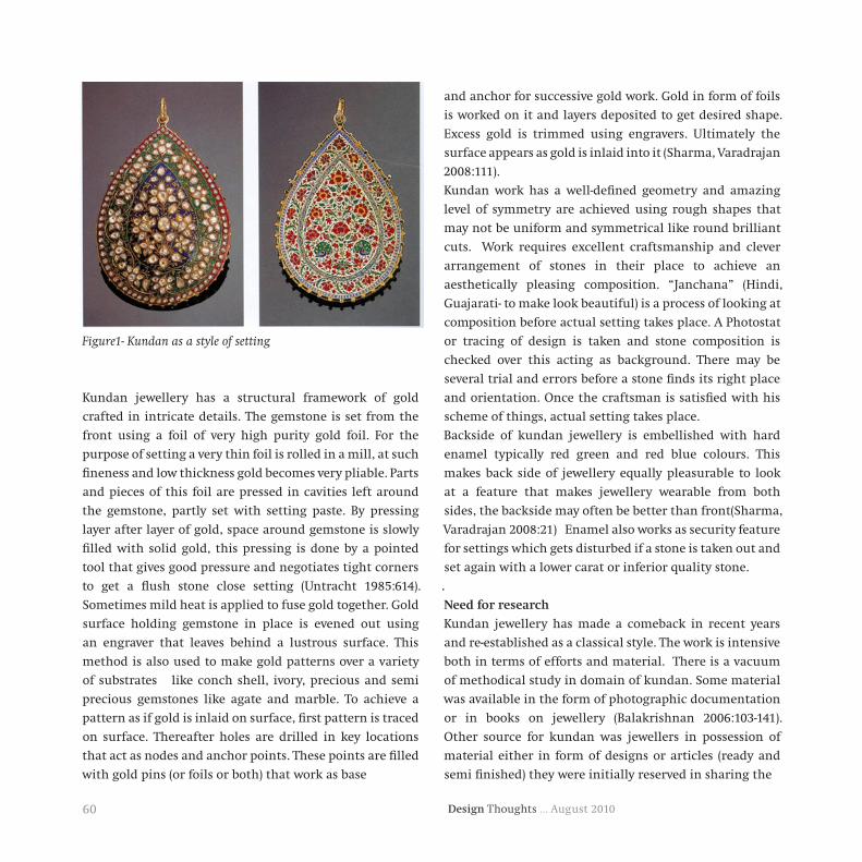
Design Thoughts … August 201060
Figure1- Kundan as a style of setting
Kundan jewellery has a structural framework of gold
crafted in intricate details. The gemstone is set from the
front using a foil of very high purity gold foil. For the
purpose of setting a very thin foil is rolled in a mill, at such
fineness and low thickness gold becomes very pliable. Parts
and pieces of this foil are pressed in cavities left around
the gemstone, partly set with setting paste. By pressing
layer after layer of gold, space around gemstone is slowly
filled with solid gold, this pressing is done by a pointed
tool that gives good pressure and negotiates tight corners
to get a flush stone close setting (Untracht 1985:614).
Sometimes mild heat is applied to fuse gold together. Gold
surface holding gemstone in place is evened out using
an engraver that leaves behind a lustrous surface. This
method is also used to make gold patterns over a variety
of substrates like conch shell, ivory, precious and semi
precious gemstones like agate and marble. To achieve a
pattern as if gold is inlaid on surface, first pattern is traced
on surface. Thereafter holes are drilled in key locations
that act as nodes and anchor points. These points are filled
with gold pins (or foils or both) that work as base
and anchor for successive gold work. Gold in form of foils
is worked on it and layers deposited to get desired shape.
Excess gold is trimmed using engravers. Ultimately the
surface appears as gold is inlaid into it (Sharma, Varadrajan
2008:111).
Kundan work has a well-defined geometry and amazing
level of symmetry are achieved using rough shapes that
may not be uniform and symmetrical like round brilliant
cuts. Work requires excellent craftsmanship and clever
arrangement of stones in their place to achieve an
aesthetically pleasing composition. “Janchana” (Hindi,
Guajarati- to make look beautiful) is a process of looking at
composition before actual setting takes place. A Photostat
or tracing of design is taken and stone composition is
checked over this acting as background. There may be
several trial and errors before a stone finds its right place
and orientation. Once the craftsman is satisfied with his
scheme of things, actual setting takes place.
Backside of kundan jewellery is embellished with hard
enamel typically red green and red blue colours. This
makes back side of jewellery equally pleasurable to look
at a feature that makes jewellery wearable from both
sides, the backside may often be better than front(Sharma,
Varadrajan 2008:21) Enamel also works as security feature
for settings which gets disturbed if a stone is taken out and
set again with a lower carat or inferior quality stone.
.
Needforresearch
Kundan jewellery has made a comeback in recent years
and re-established as a classical style. The work is intensive
both in terms of efforts and material. There is a vacuum
of methodical study in domain of kundan. Some material
was available in the form of photographic documentation
or in books on jewellery (Balakrishnan 2006:103-141).
Other source for kundan was jewellers in possession of
material either in form of designs or articles (ready and
semi finished) they were initially reserved in sharing the

61Design Thoughts … August 2010
Figure2. Kundan Necklace, smallest semantic units & form
same. This style of jewellery has a visual language of its
own but no cataloguing is available, to understand and
describe, in a systematic manner.
Methodology
Research in domain of jewellery needed an approach
demanding delicacy and subtlety. Information and
resources are not easily available and rather protected for
the fear of competition by other jewellers. This research
was conducted by adopting proven research methodology,
as suggested by researchers (Hair et al. 2005, Kothari
2002) from time to time for different cases. In present
study, Jewellers and kundansaaz were approached for
preliminary learning. Each and every approachable person
was interviewed at length. These interviews were intended
for following purpose
a) To understand the importance of kundan Jewellery in
India
b) Understand their essential visual features, their usage
in Kundan and application in design
It took time, efforts and confidence building measures
to win their trust to have access to these resources. These
interviews helped in better understanding of subject from
professional’s point of view.
For purpose of study, material from various sources was
collected and studied (Shajahan2004:137). Primary sources
were photographs in books, photographs of articles,
sketches and renderings by those practicing kundan.
Study material from various sources were compiled and
studied in a methodical way by labelling individual
semantic units and tabulate them. This whole exercise led
to identification of a total of 99 basic semantic units along
with their basic descriptions. These findings were validated
by series of experts (four Jewellers, five kundansaaz and
four designers) practicing kundan Jewellery. Finally 99
unites were retained, while those found to be replicating
in terms of shape or not carrying unique design measures,
were deleted. A chart of these semantic units was prepared
as a foundation for further classification.
SmallestSemanticUnits
Jewellery has an overall form for any given article like ring,
pendent, bracelet, neck piece or ear pieces. This overall
form is a collection of sub assemblies as form clusters
(Figure2). A Form clusters in turn is made of units that
are geometric or inspired by nature. These are “smallest
semantic units” elemental building blocks of jewellery,
they are used alone or in combination with other such
units an aesthetically pleasing composition to make a
“form cluster”.

Design Thoughts … August 201062
Figure3- Progression from basic curves that make smallest semantic
units to a set of jewellery
A progression from basic curves that make smallest
semantic units to a set of jewellery comprising of various
articles could be seen as
•Curves
•Smallest semantic units
•Form clusters
•Jewellery (overall form)
•Set of articles (following a theme)
Illustration (Figure3) is to articulate length and breadth
of research, which is from smallest semantic units to
overall jewellery form. Accordingly, Semantic units
identifiable by names are basic units of construction
of jewellery, if further divided into curves, meaning is
lost. Semantic units have their own symbolism and draw
inspiration from nature, both plant and animal (Sharma,
Varadrajan 2008:10). In this study 99 smallest semantic
units are identified that were individually identifiable
by their names like Koile, daudi paan and jau etc. These
smallest semantic units, by way of analogy of letters (and
ligatures) of alphabet, were used in combination with
other semantic units to constitute form clusters (words),
these in turn are used to form the article (sentences) and
sets (paragraphs as, several coherent lines on a theme).
(Jewellery articles, a neck piece, two bangles, a mangteeka
and a pair ear rings constitute a basic set.
Analysis(Tabulation)
The semantic units were recognized by their names; it
was derived by their particular geometric shapes and used
in communication among kundanssaz community. The
rational was based on resemblance to a known geometric

63Design Thoughts … August 2010
Figure4- Smallest Semantic Units identified by their names

Design Thoughts … August 201064
Figure 5b- Naming based on appearance and resemblance
Figure5a- Naming based on appearance and resemblance
shape like polygon, closed curve or forms from nature like
birds, flowers and leaves.
This identification of a smallest semantic unit with a
name makes description and articulation of a design more
effective, illustrated as follows (Figure4).
ClassificationofSmallestSemanticUnits
A cataloguing provides a platform for further study that
acts as reference. This tabulation is a register from which
semantic units are further classified into five categories
for ease of understanding.
In diamond polishing industry, a manner of naming
based on appearance and resemblance to a known form
(Figure5a&b) was followed in classification of fancy
brilliant cut diamonds (Pagel-Thiessen1993:171-173).
Drawing reference, this classification was based on basic
geometric shape or resemblance. These categories provide
a methodical way to look at them as a group following
similar geometric ideology (ibid 255-258).
This method of classification was found suitable and
adapted for classifying Semantic units used in kundan
relatively large category hence, further divided in four sub
categories.
Further fancy cuts of diamonds
Fish Butterfly Cross Star Horse’s head

65Design Thoughts … August 2010
jewellery. Identified 99 semantic units were classified
into five broad categories. Category of sphenoid was a
relatively large category hence, further divided in four sub
categories.
1. Two axis of symmetry- These smallest semantic units
had two axis of symmetry that is they were symmetric
around two axes, vertical as well as horizontal. Conics
(Circle& ellipses) and various uniform polygons fall in this
category. Forms that were made by replacing sides of an
even sided polygon by a modified curve also come under
this category.
2. One axis of symmetry- These smallest semantic units had
one axis of symmetry, either vertical or horizontal. Shapes
like Heart, club, spade, cup, half moon and polygons with
unequal opposing sides fell in this category.
3. Rotational symmetry- these smallest semantic units
were made up of floral motifs that were having rotational
symmetry (inversion around a point is visible). Indian
swastika is a classical example of such an inversion, in this
study there was one such member kery chowfuliya.
4. Sphenoid- These smallest semantic units were made
up of splines that follow shape of an alphabet (s,c &n) or
a wing. Koilee, pankh, Phool and Phool kali constitute
this category. This is a large group that was further
divided into four sub categories as the name of alphabet
suggests S-shape, N-shape, C-shape and Fan shape. This sub
classification was driven by the semblance of the shape of
alphabet and visual flow of smallest semantic unit.
5. Conjoined–these semantic units were an assemblage of
more than one individual unit, which acquire a meaning
of their own and are treated as a smallest semantic unit.
They had a full thought encompassed within themselves,
reflecting in their name. Kamal, chidi and machhli are
such semantic units. These semantic units by analogy,
for purpose of understanding could be compared to
Sanyuktakshar or beej mantra (seed syllable) that is a
syllable and a mantra within itself.

Design Thoughts … August 201066
Sr.No. Name Semantic
Units Description Classification
1 ChokiA square, used in both vertical and slant configuration
Two axis of symmetry
2Tikhi Choki / Shakkar para
A square with concave curve forming sharp points
Two axis of symmetry
3Austpel / Austpehal
An octagon with equal sides & chamfer Two axis of symmetry
4 Gole Choky A square with liberal fillets Two axis of symmetry
5 Lamba AustpelAn octagon with adjoining unequal but equal opposing sides & chamfer
Two axis of symmetry
6 Tikha AustpelA trapezoidal octagon with two equal opposing sides other two long and short
One axis of symmetry
7 Gole A circle Two axis of symmetry
8 Oval / Nim goleAn ellipse or a pillow shape with major axis used vertically
Two axis of symmetry
9 Tikha Chofuliya A floral motif with four petals made of two concave curvatures meeting at a point
Two axis of symmetry
10 Gole Chofuliya A floral motif with four petals Two axis of symmetry
11 Gole chhakliyaA floral motif with five or more petals or cluster of petals
One axis of symmetry
12 Heart/ Daudi A heart shape resembling a beetle leaf One axis of symmetry
13 Teda daudi pan A heart shape with point tilted to one side Sphenoid - C Shape
14Tikha Daudi Pan
A beetle leaf shape, skewed and compressed, also called teekha paan
Sphenoid - S Shape
15 Keri Daudi A shape with two pointed ends and a bulge in between
Sphenoid - C Shape
16 Keri A mango shape, a often used form in all major styles
Sphenoid - C Shape
17 Keri DandiA mango shape, a often used form in all major styles, one point slightly elongated to resemble stem of fruit
Sphenoid - S Shape

67Design Thoughts … August 2010
18 Kery ChofulA floral motif with four petals made of two concave curvatures meeting at a point and tilted in a direction
Rotational symmetry
19 Siru / bund A Drop or Pear Shape shaped like a pendeloque One axis of symmetry
20 Gole Trikon A triangle or trilobite made by replacing sides of a triangle by an arc of a circle One axis of symmetry
21 Tikha Pyala A cup shape resembling a goblet or chalice top, one point made of two concave curves One axis of symmetry
22 Daudi Pyala A cup shape roughly resembling a goblet or chalice top, slight skew to one side Sphenoid - C Shape
23 PyalaPatti A shape resembling a combination of a chalice and a leaf Sphenoid - C Shape
24 Pyalapatti1 A shape resembling a combination of a chalice and a leaf, slender and skewed to a side Sphenoid - N Shape
25 Pyalapatti2 A shape resembling a combination of a chalice and a leaf, stylized Sphenoid - S Shape
26 Pyala patti3 A shape resembling a combination of a chalice and a leaf, elongated and skewed to a side Sphenoid - S Shape
27 Ful Pyala A cup shape resembling a goblet or chalice top, one point made of two concave curves, asymmetric and skewed
Sphenoid - C Shape
28 Shankhala A conch shape bulbous on top and pointed to bottom One axis of symmetry
29 Shankh Ful A conch like spiral shape growing outwards Sphenoid - C Shape
30 Chhipla A shape resembling a lobe of pearl oyster Sphenoid - S Shape
31 Chhipla1 A shape resembling a skewed lobe of pearl oyster Sphenoid - S Shape
32 Chhipla2 A shape resembling a lobe of pearl oyster with a depression on one side Sphenoid - N Shape
33 Chand A Half moon shape like a sickle blade One axis of symmetry
34 Teda Chand A skewed half moon shape Sphenoid - C Shape
35 Chidi1 An abstract bird in flight shape Sphenoid - S Shape
36 Chidi2 An abstract bird in flight shape, elongated Sphenoid - S Shape

Design Thoughts … August 201068
37 Chidi3 An abstract bird in flight shape, steep skew vertically
Sphenoid - S Shape
38 Shiru pan A leaf shape sans vein, made of skewed drop Sphenoid - C Shape
39 PankhA wing shape with detail cuts depicting individual feathers
Sphenoid - Fan Shape
40 JauA shape resembling wheat or barley seed made of two arcs of a circle
Two axis of symmetry
41 Koyali A shape resembling leaf made of two sinewy curves Sphenoid - S Shape
42 Koyali1 A shape resembling leaf made of two sinewy curves, with a slight bulge on one side
Sphenoid - N Shape
43 Lamb KoyaliA shape resembling leaf made of two sinewy curves, with a lean appearance
Sphenoid - N Shape
44 Koyali dandiA stylized koyali with a taper towards top, heavy bottom
Sphenoid - N Shape
45 Dand Koyali A stylized koyali with a taper towards top, heavy bottom, one point slightly elongated to resemble stem
Sphenoid - N Shape
46 Koyali Mindi A stylized koyali with point slightly elongated to resemble stem terminating in one circle called mindi
Sphenoid - N Shape
47 Gole Koyali A stylized koyali with a prominent bulge to accommodate large stones
Sphenoid - N Shape
48 Daudi Koyali A stylized koyali with partial features of daudi paan
Sphenoid - N Shape
49Koyali Khach gole
A stylized koyali with a prominent bulge to accommodate large stones and a notch to one side
Sphenoid - N Shape
50 Khanch Koyali1 A stylized koyali with a notch to one side Sphenoid - N Shape
51 Khach koyali2A stylized koyali with slender appearance and a notch to one side
Sphenoid - S Shape
52 Khach koyali3 A stylized koyali with partial features of daudi paan with a prominent s shape
Sphenoid - S Shape
53gole koyali dandi
A stylized koyali with a mindi fused in body Sphenoid - S Shape
54 Ti-Koyali mindi A stylized koyali with three prominent apex showing in one with a mindi fused in body shape
Sphenoid - C Shape

69Design Thoughts … August 2010
55 Ti-koyali A stylized koyali with three prominent apex showing in one shape
Sphenoid - C Shape
56 Koyali PankhA stylized koyali with three prominent apex showing in one with a mindi fused in end, fan like appearence
Sphenoid - S Shape
57 Koyali pankh2A stylized koyali with two prominent apex showing in one shape with fan like appearence
Sphenoid - Fan Shape
58Koyali Patti pyala
A chalice shape with three prominent apex, sharing partial features of a koyali and and a patti
Sphenoid - C Shape
59 Koyali fulA flower shape composed from a combination of koyalies
Conjoined
60 Mirchi A shape resembling a chilli pod stylized like a Sphenoid - C Shape
61 Kalli A shape resembling a flower bud just opening Sphenoid - S Shape
62 kaliipattiA shape resembling a flower bud with partial features of a leaf
Sphenoid - S Shape
63 Dandi Kalli A shape resembling a flower bud with end stylized and elongated to resemble stem
Sphenoid - C Shape
64 patti dandiA leaf shape with end stylized and elongated to resemble stem
Sphenoid - S Shape
65 fulpattiA shape resembling a flower petal with partial features of a leaf
Sphenoid - S Shape
66 Fulpatti1A shape resembling a skewed flower petal with partial features of a leaf
Sphenoid - S Shape
67 Ful DandiA floral motif with two petals and one stylized point elongated to resemble a bud
Sphenoid - S Shape
68 Mindi JoA shape resembling wheat or barley seed with partial features of koyli and mindi
Sphenoid - N Shape
69 bel patti A leaf shape with a long and stylized stem Sphenoid - N Shape
70 PandadiA leaf shape with a prominent bulge to accommodate large stones
Sphenoid - N Shape
71 Jasud patti A shape like petal of a hibiscus flower Sphenoid - C Shape
72 golepatti A leaf shape with an apex and two lobes Sphenoid - N Shape
73 Patti A shape resembling a broad leaf with a vein One axis of symmetry

Design Thoughts … August 201070
74 Nim pattiA shape resembling a neem leaf with a vein and cuts
Sphenoid - C Shape
75 Kamal A stylized lotus shape with five apex One axis of symmetry
76 Adha Ful Flower with three petals and one mindi One axis of symmetry
77 Khach NakhiyaA shape like an animal nail with a depression to one side
Sphenoid - C Shape
78 NakhiyaA shape like an animal nail with a depression to one side stylized like tiger claw
Sphenoid - C Shape
79 Parag raj A shape like stamen of a flower Sphenoid - C Shape
80 Bati A shape resembling a flame of a clay lamp Sphenoid - C Shape
81 Batak A bird shape resembling a duck or swan Sphenoid - C Shape
82 MoreA stylized peacock motif made of paan, koeli mindi and kali
Conjoined
83 Chidi pattiA shape like a club in cards, with one lobe having an apex
Conjoined
84 Patti A highly stylized leaf, opening like fern shoots Conjoined
85 Panch patti fulA symmetrical flower with five pointed petals top petal centrally placed with or without a hollow centre
Conjoined
86Tikha che fulliya
A symmetrical flower with six pointed petals top petal centrally placed with or without a hollow centre
Conjoined
87 Pattiya Cluster of leaves usually three or more Conjoined
88 Ful A highly stylized flower blossoming Conjoined
89 Kamal patti A lotus motif with or without stem and leaves Conjoined
90 Ful pyala A floral motif with two petals and lamba pyala Conjoined
91 Machhli A highly stylized fish motif Sphenoid - N Shape

71Design Thoughts … August 2010
ImplicationofResearch&Conclusion
This research provided besides a cataloguing, an
understanding of semantic units that can be applied to
design as tabulated in (Table 1). There was no definite way
available to understand and articulate Semantic units. This
cataloguing provides a basis for communication by making
known, a part of, visual language of kundan. Used in form
of a visual aid this can make communication easier and
effective between a jeweller and his clients.
FutureResearch
Study further continues into domain to understand form
clusters created by these semantic units. Their uniqueness
and their interplay with each other create overall form
of jewellery. The form clusters, using a mother circle are
developed as a research tool to gauge user preference.
This study is expected to provide a way to mathematically
interpret design aspects, which have a positive influence on
liking/ disliking of that article.
Definitions
Form cluster - Kundan work is made of smallest semantic
units used alone or in combination with others. A
compilation of semantic units in a certain manner
constitute a cluster.
Piece (or Article) - An article, like necklace, is made of form
clusters (of semantic units) following a pattern and largely
same visual language. Pattern is formed by repetition or
scaling or a variety of other devices. These elements make
the articles like the alphabet makes the words that in turn
make sentences and paragraphs.
92 Cut Patti A leaf cut from the sides Sphenoid - C Shape
93 Gole Pyala A cup shape resembling a goblet or chalice with a round top
Sphenoid - C Shape
94 Mindi Dandi A shape resembling a comma made of a mindi and a dandi
Sphenoid - C Shape
95 Patang A kite shape made of two convex and two concave arches
One axis of symmetry
96 Tikha Pan A beetle leaf shape, skewed and compressed, with three apex
Sphenoid - N Shape
97 Mindi style A stylized s mirrored and terminating into two mindi shaped
Sphenoid - N Shape
98 Ful Kalli A flower and a bud shape stylized termination Conjoined
99 Gole Trikone1 A triangle or trilobite with rounded corners One axis of symmetry
Table1- smallest semantic units, description and classification

Design Thoughts … August 201072
Set- A set is a compilation of various articles like ring,
bangles, necklace etc. following same visual language.
Glossaryofterms
Carat- used in context of diamonds, refers to the measure
of weight 200 milligrams. Used in context of gold refers to
alloy composition in parts of 24. (Example, 22 carat gold is
an alloy that has 22 parts gold and two parts of any other
alloy metal, usually silver or copper, per 24 parts of metal
mixed weight by weight. They are abbreviated and referred
to as ‘C’ and ‘k’ respectively in their individual contexts.
Fire- used in context of diamonds, refers to the optical
property of total internal refraction.
Stone- used in context of gemstones, usually diamond or a
precious/semi precious stone.
Brilliant cuts- used in context of diamonds, refers to
polishing (cuts) with high (to very high) optical properties
of total internal reflection in various shapes. (Round, oval,
pillow, heart, teardrop etc)
Kundan- The word kundan in Hindi means “Pure gold,” and
is applied to a flush stone closed setting type commonly
practiced in India in the ancient past and still in use today
for both cabochon and faceted stones.
Kundansaaz- A Jeweler who makes kundan articles,
especially setting stones flush. Also call ed Karighar.
Photograph&Source
Diamond Grading ABC, Handbook For Diamond Grading
Dance of the Peacock: Jewellery Traditions of India
Jewels of The Nizam
Compilation of Design works – M. Panchal & Vinay S.
References
Untracht Oppi, Jewelry Concepts And Technology, Doubleday &
Company, Inc., Garden City New York, 1985
Pagal- Theisen Verena, Diamond Grading ABC Handbook For
Diamond Grading, Rubin & son bvba, Antwerp 1993
Snowman A. Kenneth, The Master Jewelers, Thames and Hudson
Ltd., London, 1990
Balakrishnan Usha R. & Kumar, Meera Sushil, Dance of the Peacock:
Jewellery Traditions of India, India Book House Pvt. Ltd, 2004
Balakrishnan Usha R. & Kumar, Meera Sushil, Jewels of the Nizam,
India Book House Pvt. Ltd, 2006
Untracht Oppi, Traditional Jewellery of India, Thames And Hudson
Ltd., London 1997
Sharma R. D.,Varadrajan M., Handcrafted in India, Lustre Press
2008
Shajahan S Dr., Research Methods for Management, Jaico
publishing house 2004


© Industrial Design Centre, Indian Institute of Technology Bombay