digipak designs and development
TRANSCRIPT

Final Artwork Product
For my first initial cover design, I took a photo which I hadtaken on location in Cromer – the beach where we shot part ofour music video – and imposed it on top of some driftwood tocreate a wooden, earthy tone to the picture. I then added sometext for the track title and the artist; I made sure the artistsname was larger than the track title as I wanted to ensure I wasclearly promoting the artist (it would be the first thing that theaudience’s eye would be drawn to).
(Cover Design) Idea One:
However, some initial feedback I gathered suggested that mydesign was too simplistic, with nothing to grab the audience’sattention. I wanted to create a cover design which was moreexciting and dynamic, so I developed some more designs.

For this design, I took a screenshot from my music video of Livand I holding hands, which I cut out and imposed onto atextured background (a photo of some driftwood I had taken atCromer, where art of our video is set). I enlarged the image so itbecame the focus of the cover, but thought I could add moreinterest through adding myself and Liv’s faces imposed on thepicture too. I blended the images together to create a faded,vintage look before adding the title of the track in a script font.Final Artwork Product
(Cover Design) Idea Two:

Design One
Design Two
For these designs, the choice of font was an issue. While my feedbacksuggested that the font choice in design one (inspired by artists of asimilar genre, such as Bon Iver) matched the natural, earthy tone of theartwork, some suggested that it was difficult to read unless you knewbeforehand what the text said. This lead to me changing my font choice tothe typeface in design two; however, I felt that having the title in blockcapitals was a bit messy, so I considered yet another option. The final fontchoice (as seen in design three) I think is the most effective; it is simplebut easy to read and stands out against the rest of the cover.
Feedback and Font Developm
ent
Final Artwork Product

This was a rough design for a six panel digipak, incorporating the front cover panel I had alreadydesigned. However, there are some issues with the design. The back panel is too simplistic for a backpanel; while I had designed a minimalist look on purpose (I would have added text later) feedbacksuggested the design was too plain and boring. The panorama inside panels I found to be dull; the greyfront and back panels miserable. I needed to add some interest to create a more dynamic design.
Cover PanelBack PanelMiddle Panel
Inside Panels
Six Panel D
igipak (Rough D
esign)

(Bac
k Pan
el)
Con
stru
ctio
n:
I took a photo of Liv and I in the forest to use as my back panel image. Idecided that Liv’s arm looked a bit clumsy in the shot, so using thequick selection tool I cut out her arm, and using parts of the forest, treetrunk and Liv’s coat, I edited the image so that it looked as though herarm was simply placed by her side. I overlaid a texture over the photo tocreate a warm, earthy tone. It was the same one I used on my frontpanel, so a consistent theme was kept to link the two images together.

Back Panel Feedback & DevelopmentMy back panel was based on an initial idea I had of having a picture of thegirls silhouettes cast by the sun. We took a variety of photos to achieve this(see the rough photos) but the ones which I liked the most were the onestaken in the forest itself, as they had depth and warmth through the deepgreens and yellows. The eroded texture of the cover helped add to thisdepth. However, feedback from my first design suggested that the textshould be moved from over the girls as it removed from the dynamicimpact of the image. I also adjusted the positing on the barcode andalbum details, (the second design was far better received), as well asadjusting the size of the cover so it would fit the CD case dimensions.
Version One Version Two
Rough Photos

Other Back Panels (Rejected)
Design One Design Two
These were two rough ideas I had for my back cover, but I decided against both of them.(NOTE: I rejected the images before I put the track listing and album details onto them.Design one in a screenshot from my music video, cut out and imposed onto an image ofthe ocean. However, I felt the image was missed emotional impact – the faded image felta bit mellow-dramatic and slightly soppy, which I did not want to achieve. Therefore, Idisregarded the image. The second design was an image of our silhouettes with sunflares. However, when I showed this image for feedback, some people found that the lightwas too strong, so they couldn’t make out the image of Liv beneath it. Even when Isoftened the colour scheme, the flares were still too strong, which lessened the impact ofthe image. Therefore, I also rejected this design, as I also felt the design was too boring(it didn’t have the impact of some of the other photographs I used for my final designs).
Rough Photos

Design TwoDesign One
Final Artwork Product
The main problem with my cover design was that, whenI compared it to my back panel designs, it no lookeddull and miserable. I decided I would have to make thedesign more eye-catching and warm in tone. Therefore,I used the background image of the river and itsfoliage, matching the green Autumn tones also seen inmy pack panel (set in the forest). The overlay of thehands were no longer set as colour burn but soft light,making the image less harsh and instead more earthy.People commented that the front and back panels now felt like acontinuation of one another, which was positive. But the choice of fontwas now a problem. Some found it difficult to read the title in designone, so I changed the font choices in design two. The two fontscomplemented each other, but again the script font was difficult to read.So, I changed the font completely to Timeless, added a border to thetitle (design three), but I shortened the lines for the final design.
Design Three
Further Development (+ Font)
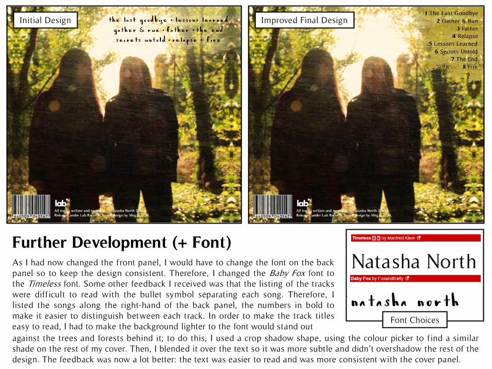
As I had now changed the front panel, I would have to change the font on the backpanel so to keep the design consistent. Therefore, I changed the Baby Fox font tothe Timeless font. Some other feedback I received was that the listing of the trackswere difficult to read with the bullet symbol separating each song. Therefore, Ilisted the songs along the right-hand of the back panel, the numbers in bold tomake it easier to distinguish between each track. In order to make the track titleseasy to read, I had to make the background lighter to the font would stand out
Further Development (+ Font)
Font Choices
against the trees and forests behind it; to do this, I used a crop shadow shape, using the colour picker to find a similarshade on the rest of my cover. Then, I blended it over the text so it was more subtle and didn’t overshadow the rest of thedesign. The feedback was now a lot better: the text was easier to read and was more consistent with the cover panel.
Initial Design Improved Final Design

Next, I had to create the panels 2 and 3 for my digipak. I decided early onthat I wanted to have the two faces of the characters from my music video onthe panels. I took screenshots from my music video and used the magneticlasso tool to cut out the images; I then turned down the saturation on theimages so they would look grey and faded. For the image of Liv, I had to flipthe image so it looked like she was looking at my character. I also layered awooden texture over the images to make them look more earthy and worn.
Inside Panels Development and Feedback
Panel 2 Final Product
Panel 3 Final ProductRough Photos
Feedback for the panels were positive. Some noted that the grey tones of thebeach link to the music video where the scenes were in low saturation,reflecting the melancholy tone. This also contrasts the highly saturated,brightly coloured front and back panel in the forest, which reflects the musicvideo that had more upbeat and happy scenes. Also,people liked having the two girl’s faces as it addedmore interest than simply having the beach huts.
Photoshop LayersHappy/Sad Music Video Screenshots

I decided I wanted to develop a cover to go onto the CD disc so it would be moreinteresting for the consumer. Firstly, I took a picture of the beach huts (so itwould correspond with the images in the inner panels ) and faded the photo so itlooked like the colour had been drained, connoting something old and sad.However, I didn’t want the design from the inner panels to be ruined, so I tookthe image of panel 3 (the panel where the CD would be kept – see image below)and inserted it onto the CD cover. However, in my research, disc covers promotethe artist and album name, so I put the title of the album and the name of theartist on the CD for my final design in order to promote Natasha North.
CD Cover Design Development
Final Artwork Product CD Layout
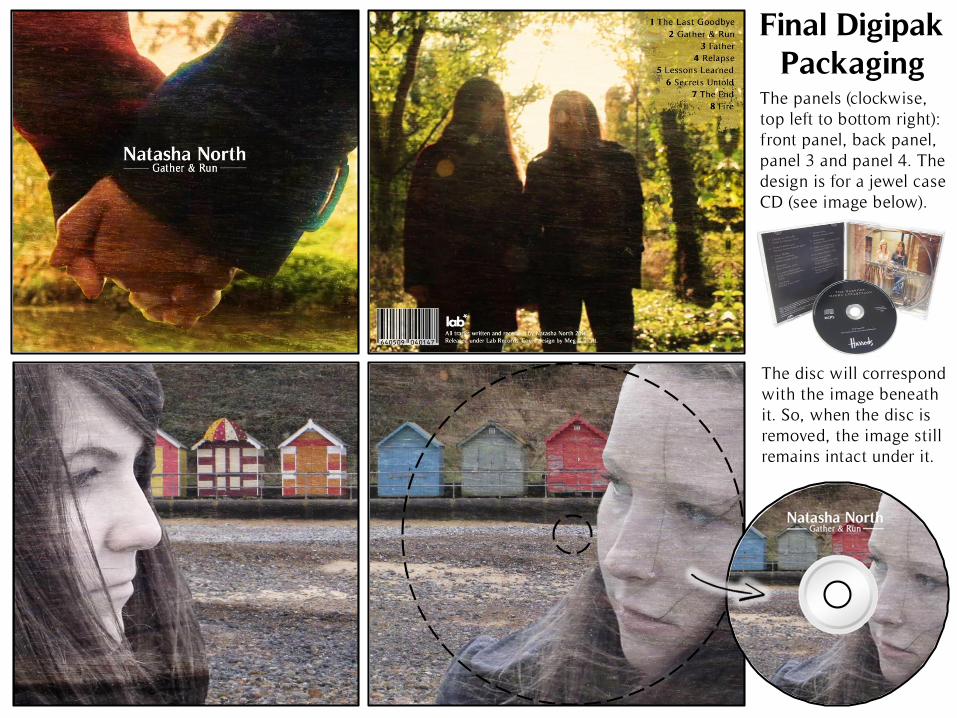
Final Digipak Packaging
The panels (clockwise, top left to bottom right): front panel, back panel, panel 3 and panel 4. The design is for a jewel case CD (see image below).
The disc will correspond with the image beneath it. So, when the disc is removed, the image still remains intact under it.
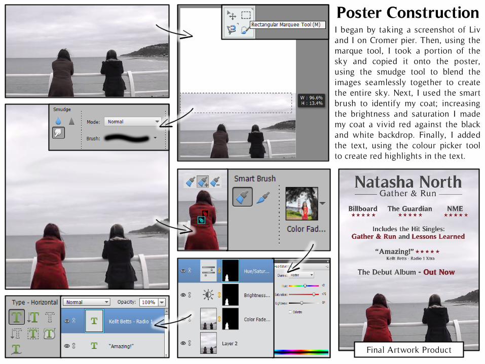
Poster Construction
Final Artwork Product
I began by taking a screenshot of Livand I on Cromer pier. Then, using themarque tool, I took a portion of thesky and copied it onto the poster,using the smudge tool to blend theimages seamlessly together to createthe entire sky. Next, I used the smartbrush to identify my coat; increasingthe brightness and saturation I mademy coat a vivid red against the blackand white backdrop. Finally, I addedthe text, using the colour picker toolto create red highlights in the text.