doc2
TRANSCRIPT

Target Audience
The target audience for this is due to the pictures and the amount of writing I would say about 15 – 45 year old mainly female as they are stereotypically the ones who own or like horses but this magazine is also aimed at men you can tell this as there is a man on the cover , this could also be linked to attracting the female audience to, these people are usually interested in horses or have horses of their own as when you look at exactly what is written it is aimed towards an older audience and the younger audience my not know much about who the people are on the cover or what the cover lines mean as they would be too young to understand or just under educated , the social status of the people who would buy this magazine would be people in the upper middle class because
Task 1

Text
The text on the cover of this magazine in quite a formal font it is also bold so that it catches the audience eye when they look at it the main cover, on this magazine the white writing with the yellow background which say ‘adrenaline control’ attracts you attention the most this has been placed he as when you read something there is the first place you look so they put that there to catch you attention so you but the magazine they have then used more white writing with a red background to make you want to buy the magazine further as where that is placed is the last place you look when reading therefore these things put together anchor the audience.
Colours
The colours on the magazine are quite natural except from the yellow and red background behind two of the cover lines, the yellow background just being used to get the reader attention because its bright and the red being used because the writing in front of it says vet report’ which to many horse overs means danger as the colour represents, the cover is natural because it is a picture of an eventer called Paul Tapner going through a water jump at badminton horse trails, this is the cover because he won at badminton and because of this success he was chosen to be on the cover to again anchor the audience because if the reader knows about horses they would know about his struggle to get his victory, overall all of the text on the cover in formal and the magazine it made to inform their specific audience.
Design & layout
Using the Gutenberg principle to analyse the cover in the primary optical are is the name of the magazine and one of the main cover lines ‘adrenaline control’, in the strong fallow area there is the horse and the rider heard with no writing, in the terminal area is two cover lines ‘ all you need to know about horsebox tax’ and ‘sprinter scare’s return following heart condition’ followed by the barcode,
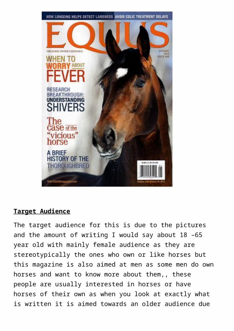
Target Audience
The target audience for this is due to the pictures and the amount of writing I would say about 18 –65 year old with mainly female audience as they are stereotypically the ones who own or like horses but this magazine is also aimed at men as some men do own horses and want to know more about them,, these people are usually interested in horses or have horses of their own as when you look at exactly what is written it is aimed towards an older audience due to the lack of bright colours which ‘horse & hound’ has and the younger audience my not know much about who the people are on the cover or what the cover lines mean as they would be too young to understand or just under educated which terms such as

Text
The text on the cover of this magazine in quite a informal font it is also bold so that it catches the audience eye when they look at it the main cover but it the sizes of the font on each cover line varies in size to get the reader attention this is a good things but it also makes the magazine look aimed at a younger audience than what the actual text suggests, on this magazine the green and orange writing is what catches you attention first as in is placed in the first place you look when you read a magazine cover, also the blue writing at the bottom is placed there for the same reason as this is the last place the readers look when looking at a magazine cover this would have been put there to make sure that the reader will buy the magazine to read more about the cover line .
Colours
The colours on the magazine are quite strange at the actual title is orange and so is the main cover line this may have been used to get the attention of the reader but the actual background picture is quite natural and un- edited, the colours on the cover lines also adds up to make the reader buy such as the red writing which says ‘the case of the “vicious” horse’ this being in red shows danger making the reader want to know what the story is about leading to the buying the magazine to find out what the cover line in implying.
Design & layout
Using the Gutenberg principle to analyse the cover in the primary optical are is the name of the magazine, the little tag line which says ‘the horse owners resource’ and a flash which says ‘

Target audience
The target audience for this two page spread is again the same as the target audience for the whole magazine as the words used in the body text are there are words used such as ‘he has always had confidence in his ability’ this to someone young and uneducated about horses would not know what this means therefore there would be no reason for younger people to buy this kind on equine magazine.
Text
The text in this two page spread in formal and very informational as it has information about people such as john Whittaker and guy Williams two very well-known people in the show jumping world, the text used to anchorage the audience is subheading which says ‘international classes’ and the headline

Colours
The colours used on this two page spread are mainly reds oranges, red suggests danger and energy as all of the text on the page is about show jumping which is a very dangerous sport to be part of but at the same time require energy from both horse and rider, there is also oranges which is used alongside black to make sure the black stands out.
Design & Layout
In the primary optical area there is ‘0.67’ which catches the reader attention straight away as it big and stands out, in the strong fallow area there is a quote from guy Williams saying ‘I’m not planning on doing that much talking’ this is placed here as the way people read text is from left to right so once you have looked in the primary optical area you move straight across the this part when you will see a well-known show jumper and a small article about him, in the weak fallow area there is a picture of charlotte flack on her horse jumping the puissance and an article next to it related to the picture and finally in the terminal area there is the rest of different article and a picture which is captioned ‘the new Michael mac memorial trophy goes to guy Williams and Casper de muze’ this is placed here as this is the final-laced anyone looks when reading a magazine.