Download - Capital Mind Premium

CAPITAL MIND PREMIUM Sample Posts

Copyright (C) WizeMarkets Education Services LLP, Bangalore, 2013-14.
Capital Mind Premium Posts
Capital Mind Premium has been around since November 2013, and in the process,
we’ve sent out a substantial number of high quality letters containing excellent
charts, data and analysis.
What follows is a sample set that you can view before you purchase a subscription.
And we’re getting better, every day!
Here are three of the posts we have done in the past.
THE EQUAL WEIGHTED INDEX 2
THE RESIDEX AND THE INDIAN HOUSING PRICE SLOWDOWN 6
AN INTRODUCTION TO OPTION PRICING AND THE VIX 22
Sample these posts and then go ahead and buy now!

Copyright (C) WizeMarkets Education Services LLP, Bangalore, 2013-14.
THE EQUAL WEIGHTED INDEX
Following up from the Macronomics piece this week (Your Guide to the Market Index) let’s consider a
strategy to build an index that contains all stocks but weights them equally.
Consider this argument. Certain stocks are at the top of the heap today. But they will lose their top
criteria and others will take their place. Reliance headed the market-cap table for a very long time, until
it was pushed out by others, and now there’s a fight between ITC and TCS for the spot.
That means putting all (or most) of your money on the top guys is pointless - in the longer term, the
smaller stocks in the Nifty will get heavier in weightage and overtake the big guys. If we then had a
strategy to allocate more money to the index “lightweights” and less to the index heavyweights, we
should do better in the longer term.
A simple way to do this is to weigh all stocks equally. Whatever 50 are chosen, we invest in the same
proportion, and when some rise and others falls, we “rebalance”. Because we don’t want to spend too
much time on this we will want to rebalance on a regular basis, but not too frequently.
When would this fail? When the “top” stocks - called the “heavy weights” do much better than the
others. This could be due to massive large investor activity, such as in 2007 when foreign investors
piled on to India and bought in size - and only the heavyweights had any reasonable size. This could
also be due to skewed growth, where a few sectors which are “heavy” in weight take the advantage
from those that are lighter.
But over the long term, you should have outperformance if the theory is right.
Let’s look at the outer edges of this equal weighted rebalance frequency and see how the results fare.
THE CNX 100 EQUAL WEIGHT
We have an index on the NSE, called the CNX 100 Equal Weighted Index. All the top 100 stocks are
invested in, in equal proportions and rebalanced once a quarter. When you rebalance, you’ll sell part of
the stocks that have become a larger percentage of your portfolio than 1% (since 100 stocks make
100% of your portfolio) and buy those that have become less than 1%, effectively restributing the
portfolio.
Here’s the performance since 2003:

Copyright (C) WizeMarkets Education Services LLP, Bangalore, 2013-14.
We’ve seen the markets in two phases
Lighter weighted stocks beat the growth of heavyweights, and the equal weighted index was
moving much faster than the regular Index. (2003-2007, 2009 to 2011)
Heavyweights outperformed, and the Nifty began to move faster - indicated by the shaded areas
above.
Of course, in the 10 year term, the equal weighted index has done much better - nearly 15% higher
than in the Nifty.
But in the shorter term we’ve seen a large period of lightweight underperfomance, and it could be that
the down-cycle has just completed.
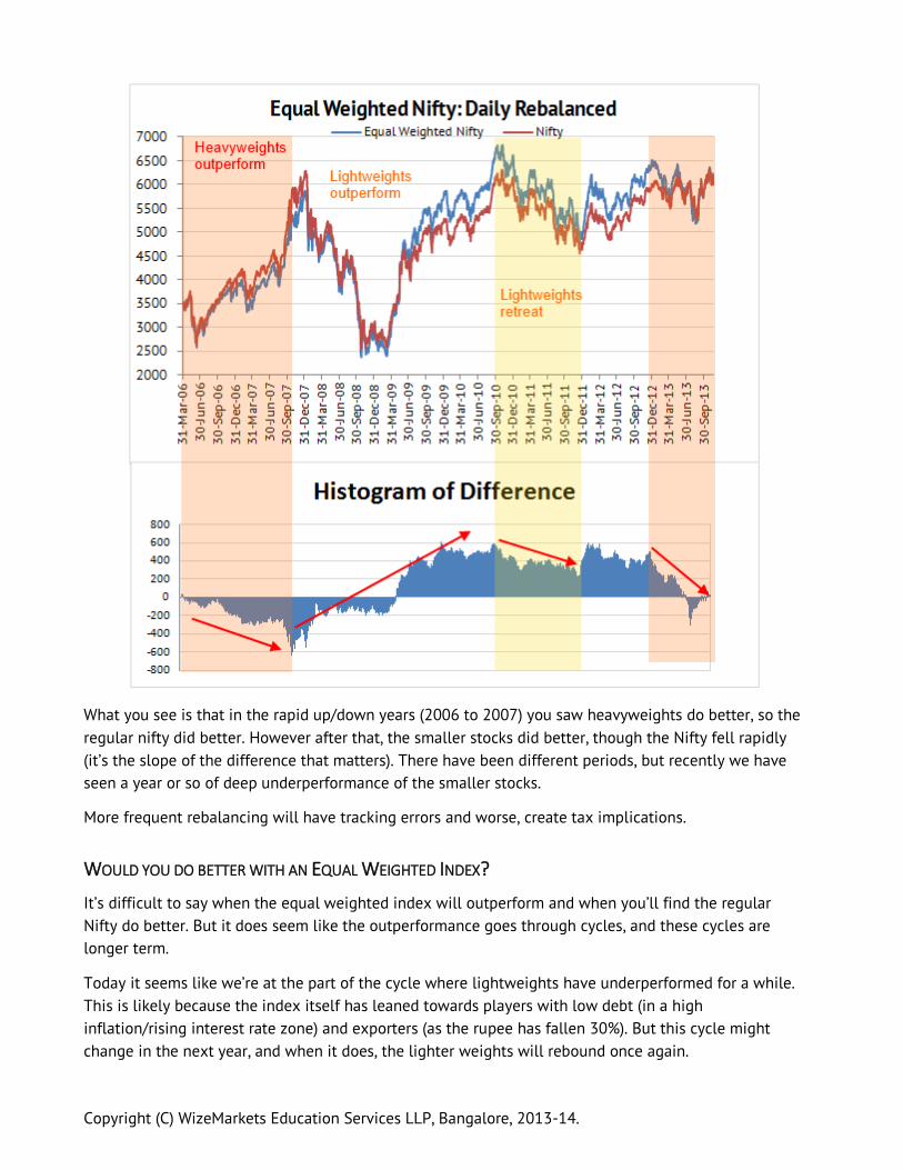
THE DAILY REBALANCER: A CAPITAL MIND ANALYSIS
We could then do a daily rebalancing, at the end of each day. This is painful, but is the other extreme of
a quarterly rebalancing. I’ve taken just 7 year data for this, from 2006 but for the Nifty (i.e. not the CNX
100)
Copyright (C) WizeMarkets Education Services LLP, Bangalore, 2013-14.
What you see is that in the rapid up/down years (2006 to 2007) you saw heavyweights do better, so the
regular nifty did better. However after that, the smaller stocks did better, though the Nifty fell rapidly
(it’s the slope of the difference that matters). There have been different periods, but recently we have
seen a year or so of deep underperformance of the smaller stocks.
More frequent rebalancing will have tracking errors and worse, create tax implications.
WOULD YOU DO BETTER WITH AN EQUAL WEIGHTED INDEX?
It’s difficult to say when the equal weighted index will outperform and when you’ll find the regular
Nifty do better. But it does seem like the outperformance goes through cycles, and these cycles are
longer term.
Today it seems like we’re at the part of the cycle where lightweights have underperformed for a while.
This is likely because the index itself has leaned towards players with low debt (in a high
inflation/rising interest rate zone) and exporters (as the rupee has fallen 30%). But this cycle might
change in the next year, and when it does, the lighter weights will rebound once again.
Copyright (C) WizeMarkets Education Services LLP, Bangalore, 2013-14.
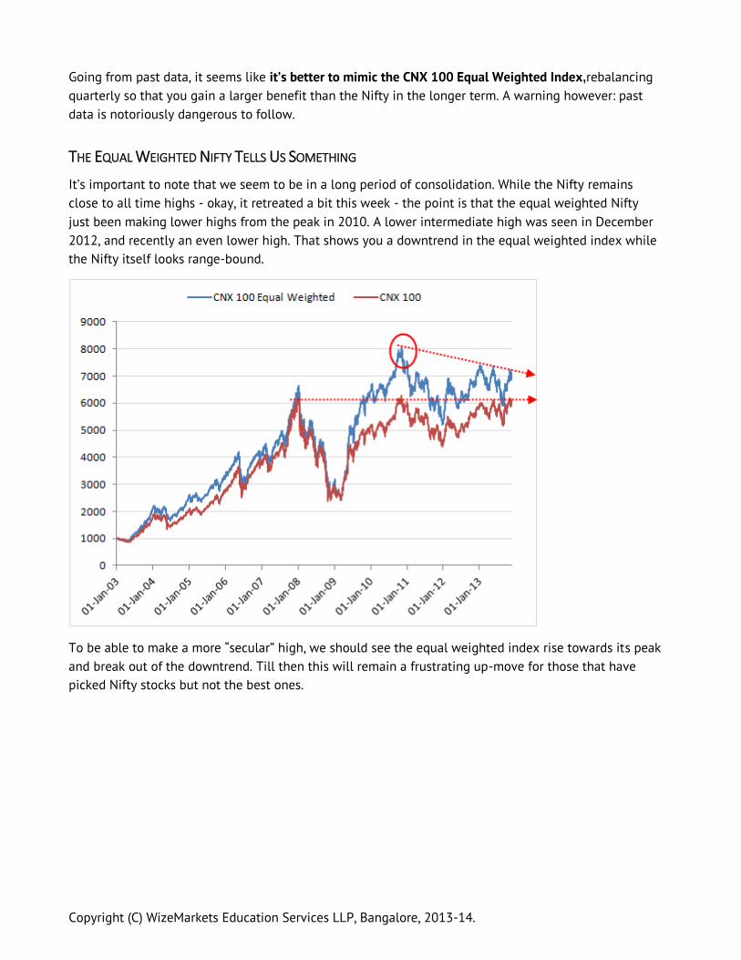
Going from past data, it seems like it’s better to mimic the CNX 100 Equal Weighted Index,rebalancing
quarterly so that you gain a larger benefit than the Nifty in the longer term. A warning however: past
data is notoriously dangerous to follow.
THE EQUAL WEIGHTED NIFTY TELLS US SOMETHING
It’s important to note that we seem to be in a long period of consolidation. While the Nifty remains
close to all time highs - okay, it retreated a bit this week - the point is that the equal weighted Nifty
just been making lower highs from the peak in 2010. A lower intermediate high was seen in December
2012, and recently an even lower high. That shows you a downtrend in the equal weighted index while
the Nifty itself looks range-bound.
To be able to make a more “secular” high, we should see the equal weighted index rise towards its peak
and break out of the downtrend. Till then this will remain a frustrating up-move for those that have
picked Nifty stocks but not the best ones.

Copyright (C) WizeMarkets Education Services LLP, Bangalore, 2013-14.
THE RESIDEX AND THE INDIAN HOUSING PRICE SLOWDOWN
The National Housing Bank (NHB) publishes an index of housing prices, called the RESIDEX. This is
available per-city, and has about 26 cities in there. We have five year price history of only 15 cities and
11 have recently been added.
The methodology involves price collection using private agencies, real estate agents, home loan
information on prices from housing finance companies and banks etc. The data is collected and then a
weighted average price index is calculated.
In this edition of Macronomics, we take a look at the price indexes of various cities and construct some
interesting sub-indexes to see how prices have fared, looking at September 2013 prices.
A note of caution: We completely understand that the data could be flawed and you might not notice
these price trends where you are. Price gathering is in its infancy here. Plus, there is a huge “cash”
component to housing prices that might not be recorded. So use this at your own risk. I will, for the
sake of the argument, assume this is valid data.

Copyright (C) WizeMarkets Education Services LLP, Bangalore, 2013-14.
THE METROS
DELHI: LOWEST GROWTH SINCE SEP 2010
Prices in the capital have risen substantially in recent times, nearly doubling from the 2007 values. But
this quarter seems to show a dip in prices from the peak in March 2013.
With a +6.7% over last year, the year-on-year price growth is at the lowest since Sep 2010.

Copyright (C) WizeMarkets Education Services LLP, Bangalore, 2013-14.
MUMBAI SHOWS 12%+ RISE
The financial capital stays strong with over 12% increase year on year. Prices have more than doubled
since 2007, even if we’re seeing a flattening of the index. The next quarter will be crucial as we seem
to have a lower base in Sep 2012 to compare with.

Copyright (C) WizeMarkets Education Services LLP, Bangalore, 2013-14.
CHENNAI SHOWS SIGNS OF HAVING PEAKED
Chennai seems to have tapered out, and only this quarter shows a marginal increase over last year (and
over Q1). The heady growth of the 2009-2011 years seems to be behind us, and a few quarters of price
stagnation indicates that prices could have peaked, even if temporarily.

Copyright (C) WizeMarkets Education Services LLP, Bangalore, 2013-14.
KOLKATA FLIRTS WITH A RANGE
Kolkata prices rose sharply in 2009-10, to quickly double their 2007 values. But they seem to have
stagnated since, hanging around within a range of 190-200. (2007=100)

Copyright (C) WizeMarkets Education Services LLP, Bangalore, 2013-14.
BENGALURU STAYS WARM
The garden city keeps its head above water at +9.2% in the year, though like the other metros, it shows
some kind of flattening out. BLR has seen a huge dip in the 2008-09 times and has recovered to the
2007 levels, at least.
Copyright (C) WizeMarkets Education Services LLP, Bangalore, 2013-14.
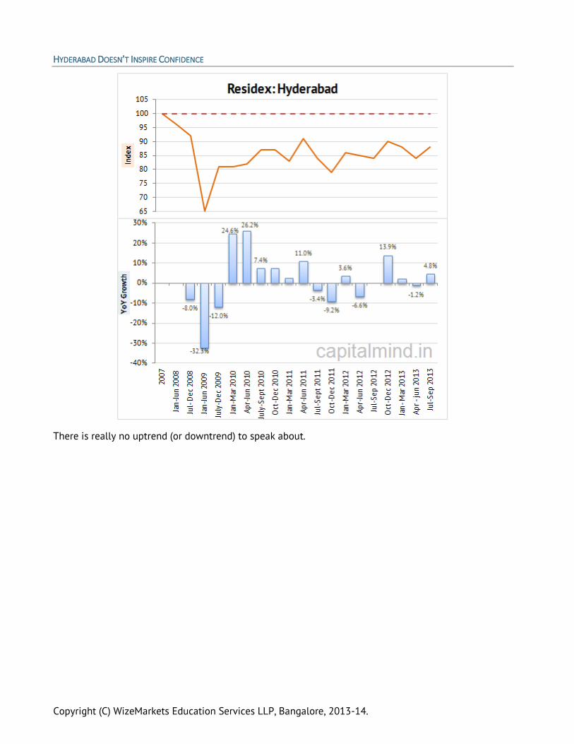
HYDERABAD DOESN’T INSPIRE CONFIDENCE
There is really no uptrend (or downtrend) to speak about.
Copyright (C) WizeMarkets Education Services LLP, Bangalore, 2013-14.
TIER 2 CITIES
Let’s quickly look at five cities I’ve classified as Tier 2.
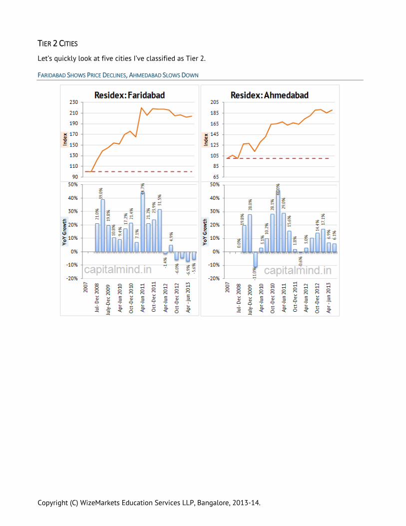
FARIDABAD SHOWS PRICE DECLINES, AHMEDABAD SLOWS DOWN

Copyright (C) WizeMarkets Education Services LLP, Bangalore, 2013-14.
LUCKNOW HAS STRONG UPTREND; JAIPUR STALLS RECOVERY
Note that Jaipur still has 27% increase in prices, which is quite substantial. But the quarter on quarter
growth is negative, like you see in the slope above.

Copyright (C) WizeMarkets Education Services LLP, Bangalore, 2013-14.
PUNE AT 9%
Copyright (C) WizeMarkets Education Services LLP, Bangalore, 2013-14.
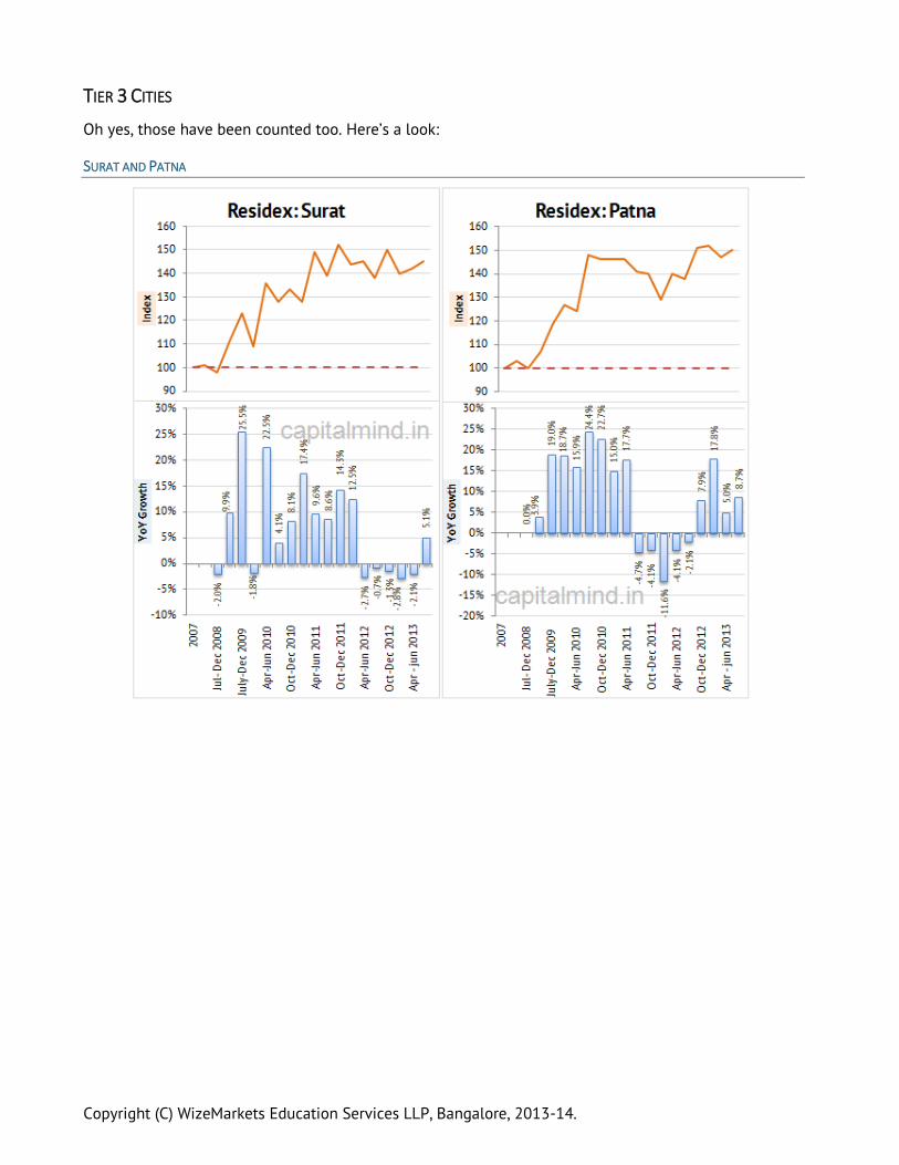
TIER 3 CITIES
Oh yes, those have been counted too. Here’s a look:
SURAT AND PATNA

Copyright (C) WizeMarkets Education Services LLP, Bangalore, 2013-14.
KOCHI AND BHOPAL
THE MACRO INDEXES
At Capital Mind, we’ve built a simple average of these indexes and plotted their growth over the last
few quarters. Let’s look at a consolidated Index growth for these cities.

Copyright (C) WizeMarkets Education Services LLP, Bangalore, 2013-14.
THE METROS
(Delhi, Mumbai, Kolkata, Chennai, Bangalore, Hyderabad)
While the September quarter shows an improvement, it fits into an overall downtrend. However, growth
remains above zero, year on year.
TIER 2 CITIES
(Pune, Ahmedabad, Lucknow, Jaipur, Faridabad)
Again, an overall downtrend is visible, with the lowest growth since 2010.

Copyright (C) WizeMarkets Education Services LLP, Bangalore, 2013-14.
TIER 3 CITIES
(Bhopal, Patna, Surat, Kochi)
Not much of a trend visible here.
Note: There are other cities in the index, but I haven’t tabulated them as they don’t have a five year
history.

Copyright (C) WizeMarkets Education Services LLP, Bangalore, 2013-14.
INTRODUCING THE CAPITAL MIND ALL INDIA INDEX
Using the above 15 cities, we’ve created a Capital Mind All India Index, which is:
Metros (40% weight)
Tier 2 cities (30%)
Tier 3 cities (30%)
Which looks like this:
WHERE ARE WE GOING?
These prices may not be accurate, but the trends could be. NEARLY EVERY CITY SHOWS A FLATTENING OF
PRICES IN THE LAST TWO QUARTERS. Some show a dip in prices. This means there is some level of correction
happening.
There might NOT BE ENOUGH TRANSACTIONS, as prices go down and people hold on to property instead of
selling them. So whatever transactions happen are distress sales, so prices look lower than they should
be. It’s difficult to classify what real prices are if there’s not enough numbers of transactions.

Copyright (C) WizeMarkets Education Services LLP, Bangalore, 2013-14.
However in a cycle where INTEREST RATES ARE RISING, you lose 9-10% on every year you keep holding the
property. But people have tremendous holding power for property which can take at least two more
years after a price stagnation to show a rapid fall.
If you look at real estate stocks - many of whom have fallen over 90% - you would think the situation is
far worse.
Real estate prices are STICKY ON THE DOWNSIDE and as long as there is no recession we won’t see prices
fall dramatically - but if we should slow down some more, we are likely to see distress sales increase
and transactions follow as well (“Who Gets Out First!”).
INDIA ISN’T AS HEAVILY DEPENDANT ON REAL ESTATE AS THE US. Only 10% of the banking system is comprised
of home loans - Large corporates take nearly 5 times that amount as loans. However, a fall in housing
prices has other economic implications - since it is usually the last to fall, it will signal when the
economy is REALLY in a bad way.
There is HARDLY ANY TRADABLE SIGNAL IN HERE, other than that there is no recovery. You should not
attempt to buy or sell houses based on a macro-index that is an agglomeration of prices that have little
relevance to your individual case. However, the macro trend shows a slow down in pricing, so it serves
as a warning for the real estate speculator that it might just be time to head for the exit.

Copyright (C) WizeMarkets Education Services LLP, Bangalore, 2013-14.
AN INTRODUCTION TO OPTION PRICING AND THE VIX
Here’s an introduction to the VIX, THE VOLATILITY INDEX. The VIX is a volatility index that determines
what option prices imply that our volatility is. This is an “expectation” of volatility in the market.
A QUICK PRIMER: Options give a buyer the right, but not the obligation to buy or sell a stock or index at a
given price (“Strike price”) at or upto a given day (“Expiry Date”). Call options are when you get the right
to buy and put options, to sell.
For example, a Nifty 6100 call option expiring Feb 2014 was trading at Rs. 86 today, when the Nifty
was at 6040. That means someone was willing to pay Rs. 86 to be able to buy the Nifty at 6100 till Feb
26. So his break-even price is Rs. 6186.
But why 86? Since the Nifty is at 6040 today, how does he come about to the figure of 86 rupees? Why
does it go up to 140 when the Nifty goes up to 6100?
HOW DO YOU VALUE OPTIONS?
There are many answers, but this has been studied since the 60s. Fischer Black and Myron Scholes
eventually created a valuation method for options that is called the BLACK SCHOLES METHOD. There’s yet
another called the BINOMIAL MODEL. I won’t go into the details, but you can get to the price using these
parameters:
1. Stock Price
2. Strike Price + Is it a call or put
3. Time to expiry (days)
4. Implied Volatility (I’ll get to this)
5. Risk Free Rate of return
6. Dividend Yield
The idea is to ascribe a number to the chance that the stock or index will go above the strike price,
using the above parameters. It uses some flawed assumptions like a bell curve and a “normal”
distribution, which hardly ever is the case in reality, but I’ll come to that later)
The first three are easy to understand. Obviously, the STRIKE PRICE and STOCK PRICE has an impact. I will
pay lesser for a 6500 call when the Nifty is at 6100, and higher when the Nifty is at 6400. And it’s the
reverse for a put.
The TIME TO EXPIRY is the amount of time we have when the stock will be volatile. A Feb 6500 call
bought on the 1st of the month, when there is nearly the whole month left, will be priced higher than
the same call bought 1 day before expiry. Because the Nifty can go up 0.4% a day (on average), and
within 20 days it will move from 6100 to more than 6500, taking the call in the money. But if the call
expires tomorrow, a move from 6100 to 6500 is far less likely.
#5 is the RISK FREE RATE, used to calculation the cost of the opportunity, which you can assume around
10% nowadays, per year. This is basically telling you: if you could put your money elsewhere, at no risk,

Copyright (C) WizeMarkets Education Services LLP, Bangalore, 2013-14.
at rate X, you are effectively borrowing money from that resource, at that rate of X. The higher that rate,
the higher you need the stock to move to give you an even return.
The DIVIDEND YIELD has a small impact on the cash flow, and is not very relevant when at the tiny 1% or
2% levels Indian stocks seem to see. But you can plug it into the formula to see how it impacts option
prices.
BUT IMPLIED VOLATILITY?
What is #4? Or “IMPLIED VOLATILITY”? Essentially, it is how volatile you believe the underlying stock will
be. The more volatile the expectation, the higher the price of the option.
The IMPLIED VOLATILITY figure will reveal how volatile the stock is expected to be in the days left to
expiry. To keep it less complex, implied volatility is quoted as an annual percentage. So if I say an “IV”
of 40%, that means the stock might be expected to move with a volatility of 40% a year. This doesn’t
mean the stock will move up 40% or down 40%, but that 40% is the mathematical estimate of the
variance of prices expected in a year.
How does one figure out what implied volatility should be? Should you expect a 10% or a 40% move?
The answer you are most likely to hear is: Look at the stock’s history and find out how it has moved
over the last year/quarter/month. Use that volatility figure to calculate the option price.
Utter bullshit.
This is too much theory and too little practice. (Okay, if you had nothing else to price an option, that’s
what you’ll have to use but I would double any number that it threw because it’s bound to be wrong)
Historical volatility has very little to do with implied volatility, in the real world. Because the past
doesn’t tend to repeat in the immediate future and such assumptions can lead to disastrous results.
For instance, if in April you look at the Feb+March volatility patterns and assume that for April, you’re
toast. Why? Because April is usually results season, and if the stock’s announcing results, it’s likely to be
more volatile. If insiders know certain results or events they can buy options and raise their prices, and
it will increase the option prices, and probably show implied volatility to be higher than historical
volatility, rightfully so. (There’s an event!).
SO HOW DO YOU USE IMPLIED VOLATILITY?
Now the idea isn’t to price options – it’s to look at option prices and figure out what the implied
volatility is. And then, not to compare against historical volatility, but to compare the implied volatility
against the IVs earlier, or against the IV of other options, or perhaps other stocks. A comparative implied
volatility figure gives us a better picture than historical moves.
Certain stocks are more volatile than others, and indexes, being a collection of stocks, tend to be less
volatile than the stocks themselves. I’ve written a small program to calculate the implied volatility of
different options of the same stock based on their last traded price. This is that of Reliance Industries
today.

Copyright (C) WizeMarkets Education Services LLP, Bangalore, 2013-14.
Since the stock is at 815, you’ll see that the most traded are the puts with strikes below 820 – they are
“out of the money” (OTM) since the stock price is above the strike. And the same with calls – the higher
traded are calls above 820.
If you consider 820 as the nearest strike to the current price, option with the 820 strike are “at the
money” options. The implied volatility tends to be very low for At The Money (ATM) options, with it
increasing for calls going up, and for puts going down on the scale. This causes what is called a
“VOLATILITY SMILE”.
SO WHAT IS THE VIX?
What, then is the VIX? It’s simply a MARKET-SOURCED WEIGHTED AVERAGE OF THE IMPLIED VOLATILITY ON NIFTY
OPTIONS.
According to the NSE, they take about seven strike prices around the current Nifty prices (Calls above,
and puts below, so only OTM options) and weight them according to price and strike. Then they
calculate (mathematical term follows) the square root of the variance and normalize it for 30 days.
The VIX isn’t useful in isolation. A VIX of 22 doesn’t mean that there will be 22% volatility in the index
(less than 2% a month). We know that indices move more than 2% in a week! Volatility assumptions are
dangerous.

Copyright (C) WizeMarkets Education Services LLP, Bangalore, 2013-14.
VIX can of course be compared to the past VIX data; and in general, we know that markets price
volatility higher on the way down than on the way up (i.e. people tend to pay more for Out-Of-The-
Money options when the market’s falling than when it’s rising).
The market’s come all the way down from the highs of 6400 in December, and the VIX has increased
from below 15 to end Friday at 18.55.
You’ll notice that the VIX was going down as the market was rising in 2012. At times when the market
fell, the VIX rose.
This translates to: Options get relatively more expensive when markets dip and relatively less
when markets rise.

Copyright (C) WizeMarkets Education Services LLP, Bangalore, 2013-14.
THE LONG TERM VIX
We have data only since 2008, and the VIX has seen quite a ride:
The current VIX is at at 18, which, while higher than recent lows, is way lower than earlier times. This
has also happened as the trading in options has blossomed. However we at Capital Mind believe the
VIX is unnaturally low, even at 18.
In the last 1516 days that we have data of the VIX for, only in 352 days (20% of the time) has the VIX
been lower than 18.55, the current value. I believe our regulators have wanted to see “stability” in
prices, but markets are not built for stability - they are built for extremes of fear and greed interspersed
with times of low volatility. We don’t know how long those low-vol times will stay but the volatility will
come back and come back fast.
TRADING WITH THE VIX
The NSE has just announced VIX trading from 26 Feb, 2014.
Futures expire every Tuesday. (These are weekly futures)
Three week contracts - current, next and far weeks.
Price quotes are multiplied by 100. So a VIX of 18.52 is a price of Rs. 1852. (This allows for
more precision - that is, four decimal points worth).
Contract size of 10 lakh. So a VIX of 1852 means a single contract will have around 500 VIX on
them. (Since Rs. 10 lakh divided by VIX lately.
Copyright (C) WizeMarkets Education Services LLP, Bangalore, 2013-14.
We will soon be able to trade the VIX up and down, and thus hedge our portfolio for an up move on the
VIX. Option sellers can offset some of their positions through a VIX future, since the sold options will
increase in value when the IV increases.
Expect another detailed letter when the VIX futures are introduced.
Note: Always check stock volatility levels when you write stock options. This is NOT the VIX. Each stock
has a different level.
CAPITAL MIND PREMIUM will soon be providing Options Data on such metrics, such as a stock wise
“VIX”, so you can see how much volatility is expected on every stock (not just the VIX). We’ll use a filter
to exclude low volume options and stocks that don’t have much options volume, and provide it as part
of a Daily Options Worksheet. We’ll also bring the above chart to life and give you an interactive tool to
plot implied volatilities of all stocks, even going back in time to see how the IVs moved. (Free for all
Premium subscribers)
If you like what you’ve read, please subscribe to Capital Mind Premium at
http://capitalmind.in/subscribe. There’s a lot more interesting data and analysis coming!


