draw #3
DESCRIPTION
Draw #3 features an interview with Dick Giordano, who gives a step-by-step demonstration on inking techniques and theories. There's also an interview with Disney animator and director Chris Bailey, who shows how he took his character Major Damage from 2-D to 3-D. Editor Mike Manley gives a "how-to" on web comics, and Bret Blevins shows you how to put "Figures in Action." Also, Columnist Paul Rivoche (Mister X) begins a series on skills "Design for comics and animation," that examines setting and perspective, plus there's a discussion of trademarks and copyrights, drawing tips, and more!TRANSCRIPT

THE PROFESSIONAL “HOW-TO” MAGAZINE ON COMICS AND CARTOONINGTHE PROFESSIONAL “HOW-TO” MAGAZINE ON COMICS AND CARTOONINGNUMBER 3WINTER 2002
$595
IN THE U.S.A.
MR
.XT
M&
©20
02V
OR
TE
XC
OM
ICS
.AR
T©
PAU
LR
IVO
CH
E.
AN INTERVIEW WITH DISNEY’S CHRIS BAILEY
INKING DEMOBY DICK GIORDANO
FIGURES IN ACTIONBY BRET BLEVINS
DESIGN FORCOMICSAND ANIMATIONBY PAUL RIVOCHE
A HOW-TODEMO ONWEB COMICSBY MIKE MANLEY
PRODUCTREVIEWSBY ANDE PARKS
AN INTERVIEW WITH DISNEY’S CHRIS BAILEY
INKING DEMOBY DICK GIORDANO
FIGURES IN ACTIONBY BRET BLEVINS
DESIGN FORCOMICSAND ANIMATIONBY PAUL RIVOCHE
A HOW-TODEMO ONWEB COMICSBY MIKE MANLEY
PRODUCTREVIEWSBY ANDE PARKS

WINTER 2002 • VOL. 1, NO. 3
DRAW! WINTER 2002, Vol. 1, No. 3 was produced by Action Planet Inc. and published by TwoMorrows Publishing. Michael Manley, Editor, John Morrow, Publisher.Editorial Address is PO Box 2129, Upper Darby, PA 19082. Subscription Address: TwoMorrows Publishing, 1812 Park Dr., Raleigh, NC 27605. DRAW! and its logo are trade-marks of Action Planet Inc. All contributions herein are copyright 2002 by their respective contributors. Action Planet Inc. and TwoMorrows Publishing accept no responsibilityfor unsolicited submissions. All artwork herein is copyright the year of production, its creator (if work-for-hire, the entity which contracted said artwork); the characters featuredin said artwork are trademarks or registered trademarks of their respective owners; and said artwork or other trademarked material is printed in these pages with the consentof the copyright holder and/or for journalistic, educational and historical purposes with no infringement intended or implied. Batman, Superman, Mary Marvel/Shazam, TheDemon, Wild Dog, Sarge Steel, Phantom Lady, Azrael, Speedy, Supergirl, Jonni Thunder, Kung-Fu Fighter are TM and © 2002 DC Comics • Captain America, The NewMutants, Bucky, The Human Torch, Forge, Sleepwalker are TM and © 2002 Marvel Characters, Inc. • Major Damage TM and © 2002 Chris Bailey • Dr. Direct © 2002 BrooksInstrument • Stephanie Starr © 2002 Mike Friedrich and Dick Giordano • Kim Possible, Black Pete, Hercules, Nessus, Clerks the animated series TM and © 2002 The WaltDisney Corporation • John Carter of Mars TM and © 2002 The Edgar Rice Burroughs Estate. This entire issue is © 2002 Action Planet Inc. and TwoMorrows Publishing andmay not be reprinted or retransmitted without written permission of the copyright holders. Printed in Canada. FIRST PRINTING.
SUBSCRIBE TO DRAW! Four quarterly issues for $20 US Standard Mail, $32 US First Class Mail ($40 Canada, Elsewhere: $44 Surface, $60 Airmail).We accept US check, money order, Visa and Mastercard at TwoMorrows, 1812 Park Dr., Raleigh, NC 27605, (919) 833-8092, E-mail: [email protected]
ADVERTISE IN DRAW! See page 2 for ad rates and specifications.
Editor & Designer • Michael Manley Publisher • John Morrow
THE PROFESSIONAL”HOW-TO” MAGAZINE ONCOMICS & CARTOONING
Logo Design • John Costanza Front Cover Illustration • Paul Rivoche
FEATURESINKING – TECHNIQUES AN INKING DEMONSTRATION BY DICK GIORDANO . . . . . . . . . . . . . . . . . . . . . . . . . . . . . . . . . . . . .3
DESIGN DESIGNING FOR COMICS AND ANIMATION PART ONE: OBSERVATION AND MEMORY BY PAUL RIVOCHE . . . . . . . . . . . . . . . . .12
THE CRUSTY CRITIC PRODUCT REVIEWS BY ANDE PARKS . . . . . . . . . . . . . . . . . . . . . . . . . . . . . . . . . . . . . . . . . . . . . . . . . .22
ANIMATION AN INTERVIEW WITH CHRIS BAILEY . . . . . . . . . . . . . . . . . . . . . . . . . . . . . . . . . . . . . . . . . . . . . . . . . . . . . . . . . . . .26
WEB COMICS A DEMONSTRATION BY DRAW! EDITOR MIKE MANLEY . . . . . . . . . . . . . . . . . . . . . . . . . . . . . . . . . . . . . . . . . . . . .38
SKETCHBOOK DRAWINGS AND SKETCHES BY BRET BLEVINS . . . . . . . . . . . . . . . . . . . . . . . . . . . . . . . . . . . . . . . . . . . . . . . . . . .53
GREAT WEBSITES A FEW RECOMMENDATIONS ON WHAT AND WHERE TO SURF . . . . . . . . . . . . . . . . . . . . . . . . . . . . . . . . . . .58
FIGURE DRAWING DRAWING THE FIGURE IN ACTION BY BRET BLEVINS . . . . . . . . . . . . . . . . . . . . . . . . . . . . . . . . . . . . . . .59
LETTERS COMMENTS FROM READERS ON OUR SECOND ISSUE . . . . . . . . . . . . . . . . . . . . . . . . . . . . . . . . . . . . . . . . . . . . . . . . . . . . .74
Proofreaders • John Morrow & Eric Nolen-Weathington

2 DRAW! • WINTER 2002
We’re back for our third issue and we’ve come out swinging! DRAW! isnow available in most Tower Books across the nation and in Tower Recordsstores that have large magazine sections. Publisher John Morrow and I plan oncontinuing the expansion of DRAW! into other venues, but you can help us out alot by asking your local comic retailer or art store to keep plenty of copies ofDRAW! in stock. DRAW! isn’t a magazine that goes out of date. Every issuestays eternally fresh!
We’ve added several new regular columns to DRAW! starting this issuewith a new article on drawing and design by Paul Rivoche. Paul’s probably bestknown in comic circles as one of the artistic forces behind Mr. X, but Paul hasalso been working in advertising, illustration and animation, providing inspirationand designs for the last half decade on the WB cartoons Batman, Superman,Batman Beyond and the current hit Justice League. I can’t tell you how happy Iwas when Paul agreed to come on board and do a column for DRAW!
We also have an inking demo by industry legend Dick Giordano. Dickhelped tutor and give lots of young artists a start in the comics biz, and he con-
tinues to spread and share his knowledge with his article on inking. Animator Chris Bailey has worn many hats and styles in his career.From his days at Don Bluth Studios to his Academy Award-nominated work on Runaway Brain for Disney, to the 3-D world of computeranimation and now comics. Chris gives us a lowdown on taking his comic book creation Major Damage from 2-D pencil drawings to a 3-Danimated short.
Our own Crusty Critic Ande Parks kicks off his new regular article as our reviewer of art products by reviewing several brands ofmarkers. Ande really put the pens through their paces and I think you will find his recommendations very useful, including ordering infor-mation and availability.
Bret Blevins returns again for more figure drawing and we also get a glimpse into his legendary sketchbooks in the new Sketchbooksection that we’ve introduced this issue. I think sketchbooks are the place to see the artist’s best work, I think an artist is honest more oftenin his sketchbook. I plan on running pages from a new guest artist in every issue. We’ve also added a new page devoted to websites. Everyissue I will run a few reviews and links to cool, interesting, informative and instructional cartooning, illustration- and animation-relatedwebsites. So if you have some favorite sites send them along to me in an e-mail. There is also an article by your’s truly on my work on theDr. Direct web comic and trade show give-away comic book I produced for Brooks Instrument. I also included some great comic strip ads,which used to run in the weekly Sunday funnies section.
Again our message board is up and running so be sure to surf over and give us some feedback, or post a drawing in our Critique sec-tion. And this spring we will be launching a website for DRAW! magazine. Look for more info on this in our next issue.
Best,
Mike Manley, editor
FROM THE EDITOR
Ask a pal for some reference, and this is what you get!
ILLUS
TRAT
ION
BYBR
ETBL
EVIN
SE-mail: [email protected] Website: www.actionplanet.com
Snail mail: PO Box 2129, Upper Darby, PA 19082
ADVERTISE with TWOMORROWSFULL PAGE: 7.5”wide x 10”tall — $300HALF PAGE: 7.5”wide x 4.875”tall — $175QUARTER PAGE: 3.75”wide x 4.875” tall — $100INSIDE COVER OR BACK COVER: Please Inquire
GETTHETWOMORROWSTWO-FER!
Prepay for two same-size ads in DRAW!,Comic Book Artist,Alter Ego,or any combination, and save! (Display ads are notavailable for The Jack Kirby Collector.)
FULL PAGE: 7.5”wide x 10”tall — $500 ($100 savings)HALF PAGE: 7.5”wide x 4.875”tall — $300 ($50 savings)QUARTER PAGE: 3.75”wide x 4.875” tall — $175 ($25 savings)INSIDE COVER OR COLOR BACK COVER: Please Inquire
Rates at left are for black-&-white ads, supplied on disk(TIFF, EPS, or QuarkXPress files acceptable) or as camera-readyart.Typesetting service available at 20%markup.Due to ouralready low ad rates, no agency discounts apply.
Send ad copy and check ormoney order in US funds to:TwoMorrows1812 Park DriveRaleigh NC 27605
Questions?Phone: (919) 833-8092Fax: (919) 833-8023E-Mail: [email protected]
We also accept Visaand MasterCard! Pleaseinclude card numberand expiration date.
The DRAW! message board is up and running, so please post feedbackand ask questions at: http://66.36.6.76/cgi-bin/Ultimate.cgi

nking is an art form. Some people might have a problem withthat statement. Heck, some of the uninitiated don’t even know
what inking is... and that includes some folk who are intocomics as well as those who are not. When I explain to the aver-age person what I do as an inker, a typical response runs alongthe lines of: “Oh, I see! What you do is trace the pencil drawingin ink!” Well, yes... and no! While “tracing” pencil drawings inink is a necessary first step in order to reproduce pencil draw-ings, inking them is not merely tracing them.
Today, the inker makes a valid (often-invaluable) contribu-tion to the finished art... or he probably won’t be inking for long.
DRAW! • WINTER 2002 3
INKING DICK GIORDANO
Historical Sidebar: Comic book inking at the onset of theindustry tended to be somewhat crude. The rudimentary repro-duction process didn’t take kindly to artistic fine-linework buthandled heavy-handed linework well. As reproduction tech-niques improved, so did the quality of the inking which evolvedinto a highly refined art form that put everything needed on thepaper (special effects, lighting, etc.) in black and white. The bet-ter inkers were trying in this way to reduce the negative effectsof poor coloring. Their art was thought to be color-proof.
Today, of course, we live in a high-tech time where comput-er color separations produce such beautiful results that it is nolonger necessary for the inker to put everything on the art board.Computer color art rules!
Having said all that, I feel that before I proceed I mustemphasize that the following exploration of inking and inkingtechniques is not the right approach or the best approach... it is
AUTHOR’S NOTE: Unfortunately, the printed page isn’t thebest forum for instruction on inking. Since I won’t be ableto “show” you much, I’ll have to “tell” you most. Thanksfor your patience and understanding.
DICK GIORDANOON INKING COMICS
ABOVE: Editor Mike Manley’s pencils from Batman #509,inked by Giordano.
BATM
ANIS
TMDC
COMI
CS.A
LLCH
ARAC
TERS
AND
ARTW
ORK
©20
02DC
COMI
CS
BATM
ANIS
TMDC
COMI
CS.A
LLCH
ARAC
TERS
AND
ARTW
ORK
©20
02DC
COMI
CS
I

INKING DICK GIORDANO
4 DRAW! • WINTER 2002
merely my approach. Many editors in the business today obvi-ously are not smitten with my approach. My last regular DC ink-ing gig (Power of Shazam!) ended nearly three years ago and myvery brief Thor run ended after just four issues (I believe) whenJohn Romita, Jr. stepped down from penciling that title morethan a year ago. I think though, that my approach to the processof inking is still primarily valid and with the addition of yourpersonal bells and whistles, may well lead you to a rewardingcareer... or at least, an improvement in your skill level.Onward!
The primary goal of a comics inker is to ink the work in front ofhim as well as it can be inked and to complete the work on time.Your definition of quality work must include timely completion.You can’t say “do you want it good; or do you want itThursday?” The obvious response (and I’ve used it) is “I want itgood and I want it Thursday!” If you’re not capable of doingthat, you have an obligation to make that known to your client.(Aside: I have often found that the client will find a little leewayin “Thursday.” That will allow you the extra time you need andallow him to work with the artist he had originally assigned it to.It’s a win/win strategy that works if you’re honest about yourcapabilities.) A secondary goal will be to fully understand theneeds of a particular job. This sometimes requires reading signsand/or interpreting what your client describes as his needs; yourclient often isn’t an artist and cannot clearly articulate what he islooking for. Often examining the penciled art closely willprovide clues to what needs to be done. Take nothing for grant-ed. Be alert.
Again, may I stress the following is my process. Doesn’t workfor everyone and very few inkers that I know (the “older” ones)follow all the points on my procedural list. Maybe none of themdo. Still at the risk of appearing hide-bound, it is a procedurethat I’ve followed for decades... and still do.
READ THE JOB: If it’s unlettered, I ask for the plot or thescript. I need to know what’s happening (good guys, bad guys,time of day, locale, etc.) before I start inking.
If it’s unlettered I make my own. If the job has already beenlettered, I ask my client for a set of copies made before beinglettered. I work better if I know what those lines that go up tothe balloons and come out the other side are. Most lettererserase balloons after lettering often leaving a “halo” around theballoon. This missing art is important for me to know.
GET SCRAP IF CHARACTERS OR LOCALES IN YOURSTORY HAVE APPEARED IN PREVIOUS ISSUES:This helps me maintain the continuity of the story. The pencilart, tone and goal of the story, and your client’s input are factorsin determining a stylistic approach.
I START ON PANEL 1 PAGE 1 AND INK PANELS INORDER: I like to ink the story in the way that the reader willread it. Helps keep consistency and continuity.
ALL PEN: Of course, you fill large black areas with a brush.Filling in blacks with a pen is a sickness! This style works wellif your job is to be color separated by a no-holds-barred computeroperated by a color artist who knows what he’s doing.
ALL BRUSH: Proof of my Dinosaurism! When I started work-ing professionally in the early ’50s, all or nearly all the cartoon-ists inked their work primarily with a brush. It was faster andproduced linework that was bold enough to be reproduced, whilestill enhancing and retaining the integrity of the pencil art. Thoseof us of that bent often claimed “we draw with our brush.”Among the popular syndicated cartoonists of that day that used abrush to ink the majority of their work were Milton Caniff,Frank Robbins, Will Eisner, and Alex Raymond, (thoughRaymond used a fair amount of pen, especially in X-9 and FlashGordon).
PEN AND BRUSH: Obviously allows you to draw on the beststylistic qualities of both tools. I’ve done several jobs latelyusing pen to do the basic drawing (heads, hands, outlining fore-ground elements and inking backgrounds completely, or nearlyso). Then I went back in with a brush and inked elements likefolds and hair, accented the pen outlines to account for lightsource and filled in large black areas. This style was more illus-trative than modern comic book inking.
* Of course, there are infinite variations on how you can uti-lize these techniques. A Chinese menu approach, (one fromColumnA, one from Column B) can lead you to a variationthat will work for you.
PENS—NON DIP: I regularly use 2 types of non-dip pensthat are reliable and provide fixed-width lines:
1) Rotring Rapidoliner. Set of 4 in sizes .25, .35, .50 and.80 mm widths. This pen comes with a metal tip with a valveoperation similar to a regular Rapidograph but doesn’t clog aseasily. Cleaning by shaking the valve in the barrel is muchquicker so you can start working seconds after removing the cap.When you run out of ink you merely pop a new ink cartridge inwhich comes with a brand new point. The regular Rapidographhas a refillable cartridge—same old (clogged) point!
GOALS
PROCESS
IN ORDER
GET PHOTOCOPIES OF THE PAGES
BASIC TECHNIQUES AND TOOLS.DECIDE ON AN APPROPRIATE INK
STYLE TO EMPLOY:
TOOLS I USE:

KUNG-FU FIGHTER TM & © 2002 DC COMICS.
INKING DICK GIORDANO
DRAW! • WINTER 2002 7
LEFT: Kung-Fu Fighter, aclassic cover penciled &inked by Giordano.Note the use of“finger painting” in thesmoke using finger-prints. Giordano inkedthis cover using abalance of both penand brush.
ALLC
HARA
CTER
SAND
ARTW
ORK
©20
02DC
COMI
CS

TOOLS—TECHNIQUE
ABOVE: More pencils by DRAW! editor Mike Manley fromBatman #509.
LEFT: The same page inked by Giordano showing hismasterful skill at texture and drapery. Mostly brush withsmall details and backgrounds in pen.
TOP RIGHT: Pencils and inks by Giordano. Heads, hands,outline all inked in pen. All the rendering was done witha brush.
BOTTOM RIGHT: Last Kiss #2. Pencils and inks byGiordano.
GIORDANO: “This is a neo-stylized version of the style Iused on Mike Sekowsky’s Wonder Woman. The majordifference is mostly the pen backgrounds with brush-work accents.”
ALLC
HARA
CTER
SAND
ARTW
ORK
©20
02DC
COMI
CS
INKING DICK GIORDANO
DRAW! • WINTER 2002 11
THEC
RUCIB
LETM
DCCO
MICS
.ALL
CHAR
ACTE
RSAN
DAR
TWOR
K©
2002
DCCO
MICS
ALLC
HARA
CTER
SAND
ARTW
ORK
©20
02DC
COMI
CS

12 DRAW! • WINTER 2002
DESIGNING FOR COMICS AND ANIMATIONPART ONE: OBSERVATION AND MEMORY
DRAWING AND DESIGN PAUL RIVOCHE
recently received this e-mail question from someone who wasinterested in learning about background design:
“I guess what I’m asking is where do you begin?... where do you gofrom?... what speaks to you and says ‘put this here... put this sunkenliving room here in relation to this... this kind of track lighting is agood choice... etc... I’m sorry if I’m not making much sense....”
My answer went: don’t worry, you’re making sense. It can seemoverwhelming at first. There are many things to consider, and it canbe difficult to sort out which to tackle first. So in the interest of“beginning at the beginning,” and instead of writing a typical by-the-numbers article about design filled with strict prescriptive for-mulas, I thought I’d start by discussing something that underpinsany creative drawing: visualization. My aim is to provoke thoughtabout and examination into this often-overlooked area; by no meanscan I cover all its aspects, but I will instead try to outline a few keypoints. After this, in subsequent articles, I’ll get into more specificsabout various aspects of the process of actually creating a design.
In the haste to get something down on paper as proof ofimprovement, it’s all too easy to concentrate solely on learn-ing more about drawing and all its various ramifications, butforget to learn more about visualizing, which comes beforedrawing. “Visualizing” is a very important step in the processwhich results in a final drawing on paper. After all, every-thing man-made which we see around us started as an idea orimage in someone’s head; then it became a drawing of somekind, and then finally was produced in the physical world.There is a chain of events there. But whether the final resultis an object, or a drawing, everything starts in the mentalworld, in those “dream-images” in our mind’s eye. So itstands to reason that if we can improve our visualization, our“dream-images,” then our drawings should also improve.
Loosely speaking, you could say that there are two kindsof drawing: the first sort is when we draw something right infront of us, and attempt to represent it literally; the secondtype is when we “draw from our imagination,” inventingfreely without a guide in front of us. These two kinds of
DREAMING DESIGN:
© 2002 WARNER BROS. ANIMATION
I

DRAW! • WINTER 2002 13
on paper so others can see them. If that sounds like a strangedescription, perhaps it is, but it’s the best way I can describewhat we do. I’m sure you know what I mean. You see something“inside” (in your mind’s eye)—and try and simultaneously traceit down “outside” (in the real world, on the paper in front ofyou). It’s a tricky juggling act, no doubt about it, because youhave to simultaneously split your attention between inside andoutside. It’s not easy to accurately capture that elusive imagefloating around in your imagination!
“Inside,” you need to form a mental image that’s as clearas possible, and also be able to visualize variations on it, toplay with it until it’s as close to “right” as possible. “Outside,”you have to deal with the drawing on your paper, and all theattendant technical challenges of line, volume, pattern, perspec-tive, and so on.
drawing, although different, are much more closely related thanit may seem at first glance, and practicing both yields muchgreater results than choosing only one or the other. They have alot in common: both involve a sort of “copying and comparing,”and both involve visualization and memory. When you draw areal object in front of you, you “copy” down onto the paper whatyou see, constantly comparing the real object and your drawingin order to get them as close as possible. And when you drawfrom imagination, you also “copy and compare”—except in thiscase you do it from a subject seen only in your “mind’s eye.” Butlook more closely: in both cases, you first visualize, then try tohold a clear memory of that visualization as you copy it downon the paper. Even when you draw a subject right in front ofyou, your visualization and memory skills are at work: for themoment that you look away from the subject and glance at yourpaper, you are then drawing a memory-image of the subject, notthe subject itself! You are drawing your own personal form-con-ception of the subject (its masses, structures, details,etc.)—be ita truck, a knee, a flower, or whatever. It’s here where the linkbetween the two kinds of drawing exists: if you use “drawingfrom real objects” to expose, examine, and refine your own per-sonal form-conceptions, memorizing the realities of the forms asthey truly are, those improved form-conceptions will be therelater when you draw from imagination. The more accurately youlearn to “see” real forms in front of you, by drawing from life,the more accurately you’ll be able to “see” those elusive formsfloating through your mind’s eye.
The process of creative design really all starts with the flex-ibility of your imagination. You need to develop the ability todream-in-daylight: to dream with your eyes open, while sitting atthe drawing board, and then “catch” those dreams and put them
ABOVE: Experimentation is a lot of the fun of designing.Don’t lock yourself in too soon—feel free to play aroundand explore the boundaries of your design, the moreextreme the better. You can never know what better idealies just beyond the next drawing... These were roughideas for a bomb-carrying helicopter piloted by Batman’snemesis, Mr. Freeze.
ABOVE: These were rough model sheets done to sort outdesign possibilities for a comic book project. I would dodrawings like this to sort out the exact look of key ele-ments, and also to get “warmed up.” I like to have all theinformation I need organized on one handy piece of paper.From Legion Worlds #3, from DC Comics.
DRAWING AND DESIGN PAUL RIVOCHE©
2002
WARN
ERBR
OS.A
NIMA
TION
ALLC
HARA
CTER
SAND
ARTW
ORK
©20
02DC
COMI
CSAL
LCHA
RACT
ERSA
NDAR
TWOR
K©
2002
DCCO
MICS

22 DRAW! • WINTER 2002
PRODUCT REVIEWS ANDE PARKS
COLUMN #1: PERMANENT DRAWING MARKERS© 2002 Ande Parks
e live in a glorious, modern age. Science has given us justabout every gadget, toy and comfort we could have ever
dreamed of. Unfortunately, the commercial artist’s tools of thetrade have been largely neglected. The search for the perfectbrush, pen or even paper, is an ever-increasingly difficult chore.Many artists are adapting, using computers more and morerather than struggling with inferior traditional supplies. For mostof us, though, there is still some value in knowing which sup-plies are well-made and where to get them.
Thus, the Crusty Critic vows to scour the globe (or at leastthe Internet) to find the finest and most affordable art suppliesavailable to the modern-day cartoonist. I shall examine everysable brush hair, drag every pencil across every sheet of Bristolboard, and smudge every ink… so that you don’t have to!
First, though, I should make it clear that the opinions you’llfind in this column are just that. I will make every effort to be asobjective as I can. Whenever possible, the tools here will bejudged impartially and using uniform standards. It is inevitable,though, for some subjectivity to find it’s way into the equation.The pen that fits my hand most comfortably may cause blistersfor others. The ink which pleases my eye may be offensive tosome. This humble critic can only present the options and offerhis honest appraisal. It’s up to you to find out if you agree.
This issue’s column will be dedicated to markers. Oncereserved for sketching and drawing on the road, it seems thatmarkers are now being used more and more in the studio. Thequality and diversity of markers has vastly improved over thelast decade. The inks are more permanent, and there are a widearray of sizes and points. There are also a number of goodbrush-markers available, giving cartoonists the flexibility of a
THE CRUSTYCRITIC brush in a clean, portable package. The Crusty Critic hit the vir-
tual market of the Internet to find as many brands as possible,and found a lot of good markers… and a few great ones.
THE MARKERSThere are so many markers available today, that I had to limitmyself somehow. I decided to test only disposable markers. I didnot include any product that had a replaceable ink cartridge.That excluded a few nice brush-pens, and some technical pensthat use cartridges. For the most part, I ended up with disposabletechnical pen-style markers. These pens are sized likeRapidographs, generally from about 0.1 mm to 0.8 mm in thick-ness. I also found a few nice brush-markers, which feature asynthetic, flexible brush head. Finally, I found one marker whichI love, but which doesn’t fit into either of those categories.
W
Image #1: Ordway PencilsI scanned the pencils as a bitmap at 600 dpi. Aftersaving, I converted the image to grayscale, and thenRGB. I then used the magic wand and the “select similar”command to select all of the black pixels, which werethen filled with a light blue. I printed the image on agood sheet of Bristol, which I had cut down to fit myinkjet printer. I selected a paper with just a bit of tooth.The smoother the paper, the longer the drying time.
ILLUS
TRAT
ION
BYJO
HNHE
EBIN
K
CAPT
AIN
AMER
ICA, B
UCKY
AND
THE H
UMAN
TORC
HAR
E TM
AND
©20
02MA
RVEL
CHAR
ACTE
RSIN
C.

26 DRAW! • WINTER 2002
ANIMATION CHRIS BAILEYMA
JOR
DAMA
GETM
&©
2002
CHRI
SBAI
LEY
FROM 2-D to 3-DAn interview with Director andanimator Chris Bailey
DRAW!: Chris, tell us a bit about your childhood and whathooked you into comics and animation? I understand you grewup in Portland, Oregon. Was there any one comic or artist thatinspired you?
CB: I grew up in northeast Portland and went to Reynold’s HighSchool. I had a pretty average suburban life; played some sportsin school and drew for the school paper. For as long as I canremember, I liked comics, cartoons and action adventure. Idevoured shows like Voyage to the Bottom of the Sea, Sea Hunt,Man from U.N.C.L.E., Star Trek, Lost in Space, etc... andwatched all kinds of cartoons, from Bugs Bunny to Space Ghost.I enjoyed the few Disney films I saw growing up, but I didn’tbecome a fan. I would just check out during the musical num-bers. And no matter how dire the situation in a Disney film, Inever believed a character was actually in danger. Just when thesituation would get really grim and I was into it, they’d throw insome dopey gag to reassure the kids that everything would beokay. I hated that! I was much more interested stories where thecharacters could die.
My older brother read comics and I started picking them upfrom him before I could read. I would follow the stories just bylooking at the pictures. Later, I recall staying with some friendsout of town who were really into Marvel comics. They hadstacks and stacks and they introduced me to those animatedshows in the ’60s. I thought they were great! They even had thebubble gum cards that when put together, formed a picture of aMarvel Comics cover. I couldn’t have been any older than 6 or 7at the time. When I first started to put artist names to the
comics, it was Gil Kane, John Buscema, John Romita, and HerbTrimpe that I responded to the most. In retrospect, it wasbecause of their clear, simple staging and broad posing of thecharacters. If there were too many crowded panels on a page ornot enough pages with the main hero on them, I’d pass. I wouldcopy panels from all their books as I was teaching myself how todraw. I loved Gil’s work because it was like looking at a cadaver.He knew where all the muscles were and how they connected tothe bones. His poses were strong and graceful, too. JohnBuscema’s Thor and FF sucked me in with the broad acting ofthe characters and clear staging, John Romita practically definesappeal and Herb Trimpe because he drew the Hulk smashing thehell out of jets and everything! The raw aggression in his workand the Hulk’s problem with authority were irresistible to me.By the time I was 12 or so, I was convinced that I’d be a comicsartist.
Tuesday and Thursday were comics days at the local 7-11. Iwould take a different bus home from school on those days thatlet out closer to the store. I was such a regular customer that theclerk would keep the bundle of comics unbroken behind thecounter until I showed up so that nothing would sell out before Igot there. I could cherry pick the comics in the best condition.Comics and large cola Slurpees were a staple in my life foryears. In Jr. High School, a friend told me about a comic bookstore called Old Weird Harold’s that sold back issues. Life wasgood.
DRAW!:You attended the California Institute of the Arts rightout of high school. Was it an intimidating place to go? Was ithard to get into?
ACADEMY AWARD NOMINATED DIRECTOR(RUNAWAY BRAIN) AND ANIMATOR, CHRIS BAILEYHAS FINALLY FOUND A PROJECT TO WEB HIS TWOLOVES, COMIC AND ANIMATION TOGETHER—MAJOR DAMAGE. BAILEY’S COMPUTER ANIMATEDSHORT ABOUT A YOUNG BOY WHO BECOMES HISFAVORITE COMIC BOOK SUPER HERO.
DRAW! EDITOR MIKE MANLEY INTERVIEWED BAILEYFROM HIS CALIFORNIA HOME, IN-BETWEEN MIXINGEPISODES OF BAILEY’S CURRENT PROJECT,DIRECTING AND CO-PRODUCING THE NEW ANIMATEDSERIES KIM POSSIBLE. FOR THE DISNEYCHANNEL.

DRAW! • WINTER 2002 27
ANIMATION CHRIS BAILEY
CB: I decided to apply to Cal Arts’ character animation programduring my junior year in high school. None of my teachers hadeven heard of it. I had just rediscovered cartoons after watchinga Chuck Jones “Pepe Le Pew” cartoon on TV. Literally that sameday, I read in The Comics Journal about an animation schoolsponsored by Disney that gave college credit. The key was thecollege credit as I felt my parents expected me to go to regularcollege, not a cartoon school. If Joe Kubert’s school gave collegecredit at the time, I probably would have moved back east andgone there.
Becoming an animator had never occurred to me before thatday. While I liked cartoons, I knew that Warner’s didn’t makethose great Bugs Bunnys anymore and Disney was just chuggingout one clunker after another every four years. But I figured thatif the animation biz didn’t work out then whatever I learnedthere could be applied to comics. I spent the next six monthsworking on a portfolio which included a 30-second animationtest and I was accepted in the Spring of my senior year. It’sfunny, it never occurred to me that I wouldn’t get in, so I neverbothered to apply to other schools. That was pretty stupid in ret-rospect. Many of my classmates at Cal Arts had been rejectedonce or twice before finally getting accepted.
My animation test was of a super-hero sitting in a CaptainKirk-like chair on the bridge of a spaceship. Another spaceshipappeared on the view screen and he jumped up to a console,pushed a button and destroyed the ship. Then raised his fist intriumph. It was terrible. I painted the cels with Testers modelpaint. I knew nothing about timing so I would clock myself witha stop watch running down my hallway over and over. My broth-er Jeff built an animation stand and we shot it on 8mm film.
I didn’t have an animation desk or a light table to animate orin-between with, so I used my portable TV as a substitute. Iturned it on its back and flipped the channel to static and usedtape to register the drawings. The curved surface was a pain todraw on. Later, I decided to “borrow” the light table from theschool newspaper room overnight and on weekends. After awhile, it was spending more time at my house than at the schooland they reminded me whose it was. My art teacher and journal-ism advisor were very supportive. All my teachers were, as amatter of fact. For short reports, I would occasionally ask if Icould do them as three-page comics stories and I don’t recallanyone ever saying no.
The thing about the other students at Cal Arts was that mostof them were Disney geeks to the same degree that I was acomics geek. It had never dawned on me that Disney geeksexisted. They knew all the animators names and what they haddrawn in which movies and I had only seen a few of the filmswhile growing up. I didn’t know who or what they were talkingabout half of the time. There were some former animators anddirectors from Disney on the faculty who would tell Walt storiesand people would hang on their every word. It wasn’t intimidat-ing, it was new and cool.
DRAW!:Were you following comics all along the way, or didyou stop buying them as you got more into animation?
CB: I’ve always bought comics. The more money I had, themore comics I bought. Sometimes I would follow artists andsometimes writers. Rarely would I buy a book based solely oncharacter unless something new visually was being done with it.The more I was drawn into animation, the more it shaped mytastes in comics art. I became less a fan of the illustrators likeNeal Adams and more a fan of people like Will Eisner; thoseartists who brought an exaggerated sense of acting and drama totheir work as opposed to straight realism.
DRAW!:Who were your favorite artists, who inspired youalong the way? I see you are a big John Buscema and Jack Kirbyfan.
TOP: Melvin story sketch. The expression was inspiredby the dialogue track which was voiced by Chris’s son,Kevin Bailey.
BOTTOM: Finished render of animation. Fielding wasadjusted to accommodate the Major Damage poster inthe background.
MAJO
RDA
MAGE
TM&
©20
02CH
RISB
AILE
Y
MAJO
RDA
MAGE
TM&
©20
02CH
RISB
AILE
Y
28 DRAW! • WINTER 2002
ANIMATION CHRIS BAILEY
CB: I love the broader, simpler Marvel artists from the ’60s and’70s. Marie Severin is a favorite of mine as well as the otherartists I mentioned. I liked her silly super-heroes from Not BrandEchh! and own a Subby page of hers. I didn’t get Kirby as a kidand thought all of his characters looked like they were made ofmetal. I actually liked Colletta’s inks on Thor because it softenedhim up. Talk about being young and dumb! Now I love Kirby’scomics except for the ones with Colletta’s inks. I have a pagefrom the Silver Surfer graphic novel that he and Stan did that Inever get tired of looking at. Joe Sinnott’s inking is gorgeous.
John Buscema is amazing. The man can’t make a bad draw-ing. He brought a level of illustration and acting to the Kirbydynamics that defined Marvel for me. I was regularly readingthe FF during his first run on the book and loved it. I think it’sfunny that he now talks about how silly those characters are andhow he doesn’t get super-heroes. To me, he was co-creatingsome of the best fiction of my life.
One thing that both John Buscema and Gene Colan have incommon that I like was the sense of weight their characters had.Buscema’s characters were always so well-planted on the groundand Gene’s Iron Man felt like he weighed 1000 pounds! Thatwas always something that I’ve tried to get into my animation.For Major Damage, we experimented with several differenttypes of walks on the Tiki Terrors to communicate their weight.If you look closely, you can see the difference from shot to shot.
One trick that always caught my eye was when comicsartists would “animate” a character moving through a panel. Ithink John Byrne did it a lot. I liked it when I could “feel” theforces at work. Usually there was a drawing that didn’t work inthe sequence and it would stick out like a sore thumb to me. Itried the effect myself once in high school on a personal comicpage and in-betweened the hell out of it. I think it was ShangChi leaping into the air and kicking some guy in the face. I drewabout a dozen poses between the extremes. Total overkill! Eventhough I wasn’t consciously thinking about becoming an anima-tor, animation was clearly an influence in my life.
DRAW!: Did your influences change as you developed as anartist?
CB: Sure. When I was young, complicated detail in drawingimpressed me and I thought simple cartooning was for peoplewho couldn’t do illustration. Eventually, I realized that the peo-ple who drew the Disney films and the great Warner cartoonscould draw circles around most comics artists. I started to appre-ciate the Hirschfield, Chuck Jones, Vip Parch, Kley, HarveyKurtzman and others. Caricature overtook my interest in realism.Not the big head kind of caricature you find at the local carni-val, but genuine caricature. I saw that believability is not thesame as realism. To me, the “real” characters in a Disney filmwere never as real as the cartoon characters, even though I couldtell the realistic characters were traced over actors.
One of the best things about being an animator at Disneywas to draw in different styles. Working on Hercules, I animatedNessus, the River god, who was designed by Gerald Scarfe. Hewould do this thing where one side of the character would besmooth and elegant, but the other would be contrasted with lots
of detail. An elegant arm would be punctuated with a violent,gnarled hand with arthritic joints. His drawings were likeHirschfield characters on crack.
DRAW!:Were you into any video games or computer anima-tion at all at that time? Things like Tron, etc.?
CB: Sure, but no more than the average kid. There wasn’t awhole lot of computer animation or animation period to beinspired by in the late ’70s/early ’80s. I wanted to do comics.Films like Star Wars were inspiring for all its monsters andcomic book trappings, but getting into the movies didn’t seem asaccessible as a career in comics and I never gave it muchthought. Pretty ironic considering where I wound up.
DRAW!: Did you ever try and get into comics during this time?You know, do samples, make the convention rounds?
CB: I never did the convention rounds, but while working atDon Bluth Animation in the mid-’80s, Bruce Timm and I collab-
MAJO
RDA
MAGE
TM&
©20
02CH
RISB
AILE
Y
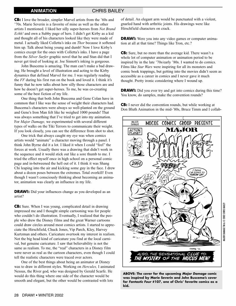
ABOVE: The cover for the upcoming Major Damage comicwas inspired by Marie Severin and John Buscema’s coverfor Fantastic Four #107, one of Chris’ favorite comics as akid.
DRAW! • WINTER 2002 29
MAJO
RDA
MAGE
TM&
©20
02CH
RISB
AILE
Y
MAJO
RDA
MAGE
TM&
©20
02CH
RISB
AILE
YANIMATION CHRIS BAILEY
orated on a Dirk the Daring comics page. I penciled and heinked.We heard there was some interest on the part of a comicspublisher for a Dragon’s Lair comic and we wanted to throw ourhats into the ring as the creative team. Nothing ever came fromit. Later, after the studio closed down, I submitted someDaredevil pages to Marvel. Tom Defalco sent me a nice rejec-tion letter, but encouraged me to send in more samples. By thetime the letter came, I had another job in animation so I neverpursued it.
My Daredevil had these big Dirk the Daring feet. I thoughtit looked “real” at the time, but I had been drawing Dirk for solong it has skewed my sense of normalcy. DD’s feet were huge.
DRAW!:What would you say that was the most importantthing you got out of going to art school?
CB: The culture. I don’t mean the culture from the book learning,but from the artists and faculty. My sense of what was gooddrawing, acting and design was focused by my relationships there.My design instructor, Bill Moore, often said that everything hetaught was to be found in nature. He didn’t draw, at least in class,but I learned more about drawing, animation and timing fromhim than any of my other instructors. He had this funny quoteabout people and art... that when people said that they didn’t knowmuch about art, but they knew what they liked, he said what theymeant was that they liked what they knew... which wasn’t verymuch. He made you want to keep searching and learning.
DRAW!: After you graduated from college, what were some ofyour first jobs? You mentioned you worked with Don Bluth for awhile.
CB: I started as an assistant animator at a small studio doingshort cartoons for about 6 months before it closed down. Theowner went to jail on some kind of fraud charge or somethingand the studio was some kind of front. From there, I went toBluth to animate on Space Ace. A bunch of my Cal Arts friendshad found work over there and were actually animating, not justassisting. That was unheard of back then. Everyone knew youhad to assist before you got to animate. Space Ace was a funproject to work on even if the atmosphere at Bluth’s wasn’t. Thestudio atmosphere felt cult-like to me and I had to work in adark little annex that leaked in the rain. I worked on Space Ace,Dragon’s Lair II and was starting work on a forth game whenBluth went out of business. I was there all of eight months.
For what it’s worth, I think Space Ace was the best thingBluth ever did. It was a great learning experience and a dreamcome true to be animating cartoony super-heroes and monstersright out of school. For the first time, animated super-heroesmoved like super-heroes. Up until then, animated super-heroesmight have resembled the characters from the comics, but theymoved like cardboard cutouts. Space Ace moved how I thought
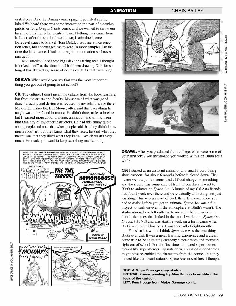
TOP: A Major Damage story sketch.BOTTOM: Pre-viz painting by Alan Battino to establish thelook of the cartoon.LEFT: Pencil page from Major Damage comic.
MAJO
RDA
MAGE
TM&
©20
02CH
RISB
AILE
Y

38 DRAW! • WINTER 2002
THE DOCTOR IS IN
WEB COMICS MIKE MANLEY
DRAW! EDITOR MIKE MANLEY GIVES A STEP-BY-STEPON PRODUCING THE ADVENTURES OF DR. DIRECT WEB COMIC STRIP
n the face of it you wouldn’t think pre-cision mass flow or liquid processes
sound like they would be very interestingsubjects, unless you were an engineer or ascientist of some sort. Well this was theproblem a local ad agency PraxisCommunications wanted solved when theyapproached me early last year, and inquiredabout me producing an Internet comic stripfor their client Brooks Instruments. Brooksmakes a device called Quantim, which theywanted to try and push in a different andunique way. They felt that a comic stripwould be the way to go. Maybe make it a bitmore fun, and make their product stand outin the crowd. So after a bit of back and forthwith the agency, they settled on the idea ofdoing a weekly web-based comic trip featur-ing Dr. Direct, a sort of goofy scientist type.Each week the Doctor, aided by his faithfuldog Kepler and his bird Gaspard, would rideto the rescue of some scientist in distress onhis motorcycle.
Praxis had been producing short promofilms and video bits using a live action Dr.Direct (sans dog and bird) helping techni-cians and scientists in trouble by introducingthem to Brooks’ Quantim device.
Advertising agencies have been usingcomics and comic strips to sell products fordecades. We all remember the Hostess FruitPie ads in Marvel and DC comics featuringour favorite heroes defeating the nefariousvillains with the irresistible golden flakycrusts and delicious fruit fillings. The news-paper Sunday Funnies section had long beenfull of very similar ads hawking dish soap,tooth polish, candy and even cigarettes! Yes,while Jack and Jill read the Sunday comicsection, they also got to read comic stripsdrawn by agency artists depicting theSmooth of Phillip Morris cigarettes.
Oh, how times have changed. Manyfamous cartoonists and comic strip charac-ters also lent their four-color salesmanshipto help Madison Avenue sell products to themillions of comic readers every week.
The first stage was to get the designsfor the characters down and develop the for-
THE EVOLUTION OF A CHARACTER
Working from the visual reference of the actor who portrayedDr. Direct in the videos, I proceeded to do a series of rough designsof the characters. There were certain requests made by the client.They wanted the dog to be similar to the dog Grommet from the NickPark, Wallace and Grommet films. They also wanted the Doc to havea sort of smart-aleck bird.
I started out just doodling rough and fast. The Doctor waseasy since I already had a visual reference to work from. I referredthe client to my website and they asked for a style similar to themore cartoonish or animated look of some of the work I had fea-tured there. One of the technical concerns I wanted to lick right awaywas the web-based format.
I did a series of designs of the Doctor, and really pushed forthe version with the “dot” eyes which luckily the agency and clientboth liked. I wanted the Doctor to have a slightly childlike appear-ance and I feel that doing things like “dot” eyes is a lot of fun. I wasalso drawing inspiration from cartoons like the Jay Ward style(Rocky and Bullwinkle as well as the old Captain Crunch ads) andcartoonists like Hank Ketcham (Dennis the Menace) and his clear andelegant line style. I felt that type of approach would work well andbe fun to do.
THE FINAL DESIGN
©20
02BR
OOKS
INST
RUME
NT
O

DRAW! • WINTER 2002 39
WEB COMICS MIKE MANLEY
mat. The agency had a writer already lined up that they hadworked with before. The writer was an old Marvel Comics fanand looked forward to working on something probably a littlemore outside of his usual milieu. His writing was pretty sharp,witty and more to the point he did a very good job of conveyingthe technical aspects and “the pitch” of the Quantim device,something that is frankly pretty hard to do and make funny.
One of the first things I had to do was get everyone on thesame page as to style and format. What worked best for theclients needs vs. artistic considerations and format. I gave theagency a little crash-course in comics and web comics. Thoughmost people have read the comics and funnies, even very talentedpeople often don’t have any clue how comics are made. So oncewe were all on the same page we came up with a format thatwould solve a few big criteria, readability, and easy download/file size. At 72 dpi and with the amount of copy that would berequired I realized that at times the visuals were certainly goingto be taking second place to the copy. Thus a simple clear easyto read style was a must. Also the simpler the style, the easier(in theory) the strip would be able to produce every week. Ialready had experience in doing web comics from my own webstrip G.I.R.L. Patrol (www.actionplanet.com). I had learnedthrough trial and error the differences between regular printcomics and the web. You just don’t have the resolution to dodetail at the small file size that the strip would need to be to loadinto the viewers web browser without a long download time.One of the things I enjoy the most about working on web comicsis the color and color combinations you can get in RGB asopposed to print CMYK. You can get really intense colors; colorcombinations right next to each other that would be impossiblein print.
The client also wanted the strip available to print out so aversion of the strip was converted and prepared by the agency tobe downloaded via PDF in Adobe Acrobat. This way fans wholike the strip could print it out and pin it up at work. You couldhave your cake and eat it too.
After settling on a color scheme for each character, I made asmall color palette for each character in Photoshop, which spedup the coloring process. I kept the palettes open when coloringthe characters, holding down the option key to quickly samplethe desired color and using the paintbucket to fill in selected areas.
ABOVE: After the Doctor was done I worked next on hiscanine cohort, who is actually the brains of the outfit,Kepler. I started sketching, doodling. I initially wanted tokeep him looking like anything but Grommet and wentfor a sheepdog type look. But I ended up coming aroundto a smother look.
ABOVE MIDDLE: The bird Gaspard was the easiest, sinceHe was a parrot. I can’t help but hear comedian GilbertGodfried’s voice in my head when reading his dialogue. Iwonder why? The goal was always to make the silhou-ettes of the characters read very cleanly since they wouldat times have to be quite small in the panels to accommo-date the copy.
RIGHT: This is the final design of the Doc and gang thatwas approved by the client.
ABOVE: The palette I made for each character to speed upthe coloring process.
THE FINAL DESIGN
THE FINAL DESIGN
©20
02BR
OOKS
INST
RUME
NT©
2002
BROO
KSIN
STRU
MENT
©20
02BR
OOKS
INST
RUME
NT
BRET BLEVINSFIGURE DRAWING
60 DRAW! • WINTER 2002
he bodies writhing, twisting, leaping and flying across thefollowing pages are dancing with gravity. This creates a
sense of heaving weight in motion—the essential characteristicof convincing figure action. Without an awareness of gravity adrawn figure seems to lack mass and substance—it “floats” onthe paper. Believable action conveys a sense of friction against aresisting atmosphere.
To achieve this it’s best to start with an accurate conceptionof the body’s true physical nature—as heavy, fluid flesh turningand twisting on a rigid skeletal framework. This sense of musclesliding over bone is the crucial guiding motif of powerful imagesof figures in action. (In drawings or photography.) Often a figuredrawing is weak and disappointing because it was conceived as aposeable arrangement of fixed anatomy, resulting in a stiff, doll-like appearance.
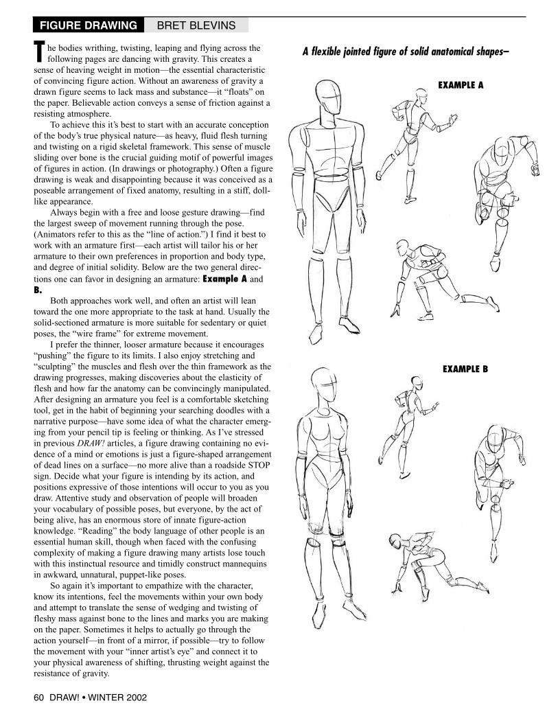
Always begin with a free and loose gesture drawing—findthe largest sweep of movement running through the pose.(Animators refer to this as the “line of action.”) I find it best towork with an armature first—each artist will tailor his or herarmature to their own preferences in proportion and body type,and degree of initial solidity. Below are the two general direc-tions one can favor in designing an armature: Example A andB.
Both approaches work well, and often an artist will leantoward the one more appropriate to the task at hand. Usually thesolid-sectioned armature is more suitable for sedentary or quietposes, the “wire frame” for extreme movement.
I prefer the thinner, looser armature because it encourages“pushing” the figure to its limits. I also enjoy stretching and“sculpting” the muscles and flesh over the thin framework as thedrawing progresses, making discoveries about the elasticity offlesh and how far the anatomy can be convincingly manipulated.After designing an armature you feel is a comfortable sketchingtool, get in the habit of beginning your searching doodles with anarrative purpose—have some idea of what the character emerg-ing from your pencil tip is feeling or thinking. As I’ve stressedin previous DRAW! articles, a figure drawing containing no evi-dence of a mind or emotions is just a figure-shaped arrangementof dead lines on a surface—no more alive than a roadside STOPsign. Decide what your figure is intending by its action, andpositions expressive of those intentions will occur to you as youdraw. Attentive study and observation of people will broadenyour vocabulary of possible poses, but everyone, by the act ofbeing alive, has an enormous store of innate figure-actionknowledge. “Reading” the body language of other people is anessential human skill, though when faced with the confusingcomplexity of making a figure drawing many artists lose touchwith this instinctual resource and timidly construct mannequinsin awkward, unnatural, puppet-like poses.
So again it’s important to empathize with the character,know its intentions, feel the movements within your own bodyand attempt to translate the sense of wedging and twisting offleshy mass against bone to the lines and marks you are makingon the paper. Sometimes it helps to actually go through theaction yourself—in front of a mirror, if possible—try to followthe movement with your “inner artist’s eye” and connect it toyour physical awareness of shifting, thrusting weight against theresistance of gravity.
A flexible jointed figure of solid anatomical shapes–
EXAMPLE A
EXAMPLE B
T

Or a spindly “wire frame” that allows wilder initial posing.
BRET BLEVINSFIGURE DRAWING
DRAW! #3Inking demo by DICK GIORDANO, CHRIS BAILEY interview,Web Comics demo by MIKE MANLEY, “Drawing The Figure InAction” by BRET BLEVINS, “Designing For Comics &Animation” by PAUL RIVOCHE, reviews of art supplies byANDE PARKS, and more! Includes a color section!
(80-page magazine) SOLD OUT(Digital edition) $2.95
http://twomorrows.com/index.php?main_page=product_info&cPath=98_59&products_id=427
IF YOU ENJOYED THIS PREVIEW,CLICK THE LINK TO ORDER THIS
ISSUE IN PRINT OR DIGITAL FORMAT!
DRAW! • WINTER 2002 61
It’s usually wise to start with the spine—typically the longest sectionof a line of action, and (except occasionally in a drawing of extremeforeshortening) invariably the center of the movement, because it is thecentral support of the body—the head, arms, hips and legs radiate outfrom it. Example C.