escaping rgbland: selecting colors for statistical graphics - eeecon
TRANSCRIPT

Escaping RGBland: Selecting Colors for
Statistical Graphics
Achim ZeileisWirtschaftsuniversitat Wien
Kurt HornikWirtschaftsuniversitat Wien
Paul MurrellThe University of Auckland
Abstract
Statistical graphics are often augmented by the use of color coding information containedin some variable. When this involves the shading of areas (and not only points or lines)—e.g., as in bar plots, pie charts, mosaic displays or heatmaps—it is important that the colorsare perceptually based and do not introduce optical illusions or systematic bias. Based onthe perceptually-based Hue-Chroma-Luminance (HCL) color space suitable color palettes arederived for coding categorical data (qualitative palettes) and numerical variables (sequentialand diverging palettes).
Keywords: qualitative palette, sequential palette, diverging palette, HCL colors, HSV colors,perceptually-based color space.
1. Introduction
Color is an integral element of graphical displays in general, and many statistical graphics inparticular. It is easy to create color graphics with any statistical software package and colorimages are therefore virtually omnipresent in electronic publications such as technical reports,presentation slides, or the electronic version of journal articles (e.g., in Computational Statistics& Data Analysis) and increasingly also in printed journals. However, more often than not, colorchoice in such displays is sub-optimal because selecting colors is not a trivial task and there isrelatively little guidance about how to choose appropriate colors for a particular visualization.When selecting colors for a statistical graphic, there are three main obstacles to overcome:The colors should not be unappealing. It is not necessary for the colors in a statistical plotto reflect fashion trends, but basic principles such as avoiding large areas of fully saturated colors(Tufte 1990) should be adhered to. The requirement is not that the user should have a degree ingraphic design, but that the software should provide users with an intuitive way to select colorsand control their basic properties. Thus, it is necessary to employ a color model or color spacethat describes colors in terms of their perceptual properties: hue, brightness, and colorfulness.A color model typically supported by software packages involves the specification of colors asRed-Green-Blue (RGB) triplets. However, this specification corresponds to color generation on acomputer screen (see Poynton 2000) rather than corresponding to human color perception. Forhumans, it is virtually impossible to control the perceptual properties of a color in this color spacebecause there is no single dimension that corresponds to, e.g., the hue or the brightness of thecolor. As a consequence, various perceptually-based color spaces have been suggested, where eachdimension of the color space can be matched with a perceptual property. One approach widelyimplemented in software packages involves Hue-Saturation-Value (HSV) triplets (Smith 1978),a simple transformation of RGB triplets (see Wikipedia 2007b). Unfortunately, the dimensionsin HSV space map poorly to perceptual properties and the use of HSV colors encourages theuse of highly saturated colors. A perceptually-based color model that mitigates these problemsinvolves Hue-Chroma-Luminance (HCL) triplets (see Ihaka 2003), resulting from a transformationof CIELUV color space (see Wikipedia 2007a). This is the color space we advocate in this article.
This is a preprint of an article published in Computational Statistics & Data Analysis, 53, 3259–3270.Copyright© 2009 Elsevier B.V. doi:10.1016/j.csda.2008.11.033

2 Escaping RGBland: Selecting Colors for Statistical Graphics
The colors in a statistical graphic should cooperate with each other. The typical purposeof color in a statistical graphic is to distinguish between different areas or symbols in the plot—todistinguish between different groups or between different levels of a variable. This means thatthere will typically be several colors, or a palette of colors, used within a plot and that those colorsshould be related to each other.A natural solution for this task is to vary (at least) one perceptual property of the colors, e.g.,the hue or the brightness, keeping other properties fixed. In a perceptually-based color space,this corresponds to selecting colors by traversing paths through this space along its dimensions.This approach is implemented in many color picker tools (Moretti and Lyons 2002; Meier et al.2004), however, these are typically based on the HSV model. As argued above, the dimensionsin HSV space are not truly independent and hence it is not possible to vary just one perceptualproperty while keeping the others fixed. This means that it is relatively difficult to select setsof HSV coordinates that yield colors that are “in harmony” (see Munsell 1905). For statisticalgraphics, this is important because it can introduce size distortions in the perception of shadedareas and can produce optical illusions (Cleveland and McGill 1983). These problems can againbe addressed by employing the HCL color space. In addition to the earlier point that HCL spaceis useful because it allows humans to understand where within the space a particular HCL tripletis located, HCL also allows us to understand motion within the color space because distancesbetween colors have an intuitive and rational meaning.The colors should work everywhere. The final issue to deal with is that, in an ideal situation,colors should be selected so that they continue to work in any context. For example, differentareas of a plot should still be distinguishable when the graphic is displayed on an LCD projectorrather than a computer screen, or when it is printed on a grayscale printer, or when the personviewing the graphic is color-blind. These goals cannot always be attained, but attention shouldbe paid to these issues and in many situations it is also possible to resolve any problems.An example of this approach is ColorBrewer.org (Harrower and Brewer 2003), an online tool forselecting color schemes for maps. It provides a collection of prefabricated palettes, informationabout the suitability for printers or color-blind viewers, and guidance on how to choose a suitablepalette for coding various types of information. The drawback to this tool is that it only providesa fixed set of colors for each palette and there is no way to extend the existing palettes.Following Brewer (1999) and Harrower and Brewer (2003), we take a similar approach and dis-tinguish three types of palettes: qualitative, sequential and diverging. The first is tailored forcoding categorical information and the latter two are aimed at numerical or ordinal variables.Unlike ColorBrewer.org, we suggest a general principle for selecting colors by traversing pathsalong perceptual axes in HCL color space. Consequently, the user can decide which path exactlyshould be taken and how many colors should be selected. Furthermore, by matching the pathswith perceptual meaning, the suitability of a palette for color-blind viewers or grayscale printingcan be assessed.The remainder of the paper is organized as follows: Section 2 provides some motivating examples,showing how typical HSV-based graphics can be enhanced by using HCL-based palettes. Section 3gives a brief introduction to the underlying HSV and HCL color spaces before Section 4 suggestsstrategies for deriving HCL-based qualitative, sequential, and diverging palettes. Some more illus-trations are presented in Section 5. Section 6 offers some general remarks on the implementationin statistical software as well as some details on the implementation in the R system for statisticalcomputing (R Development Core Team 2008). Section 7 concludes the paper with a discussion.
2. Motivation
To show what can be gained by selecting appropriate color schemes, we present two examples fortypical color graphics, contrasting commonly-used HSV palettes with more suitable HCL palettes.Both examples and all HSV palettes are taken from (the electronic version of) recent publicationsin Computational Statistics & Data Analysis (Volume 51).
Copyright© 2009 Elsevier B.V.

Achim Zeileis, Kurt Hornik, Paul Murrell 3
Figure 1: Bivariate density estimation of duration (x-axis) and waiting time (y-axis) for OldFaithful geyser eruptions. The palettes employed are (counterclockwise from top left) an HSV-based rainbow, HSV-based heat colors, HCL-based heat colors and grayscales.
Our first illustration is a heatmap, a very popular display for visualizing a scalar function of twoarguments. Here, we use a bivariate kernel density estimate (for the Old Faithful geyser eruptionsdata from Azzalini and Bowman 1990)—other typical applications include classification maps (asin Tenenhaus et al. 2007, Figure 2), function surfaces (as in Harezlak et al. 2007, Figure 8), ormeasurements on a spatial grid (as in Gelfand et al. 2007, Figure 3). Figure 1 shows a heatmapbringing out the relationship between the duration of an eruption of the Old Faithful geyserin Yellowstone National Park and the waiting time for this eruption. It reveals a multi-modal
Copyright© 2009 Elsevier B.V.

4 Escaping RGBland: Selecting Colors for Statistical Graphics
distribution: short waiting times (around 50 minutes) are typically followed by a long eruption(around 4 minutes) whereas long waiting times (around 80 minutes) can be followed by either along or short eruption (around 2 minutes).A simple and very effective palette for such a display is a set of gray colors as in the top rightpanel of Figure 1. This is often (appropriately) used in printed papers when the journal doesnot offer color graphics—however, in journals that support color graphics (or on presentationslides and in interactive usage in statistical software packages), many users prefer to have coloreddisplays and most often use HSV palettes (as in the two left two panels). These palettes code thevariable of interest by varying hue in an HSV color wheel, yielding a “rainbow” of colors, as doneby Harezlak et al. (2007, Figure 8) or Tenenhaus et al. (2007, Figure 2). The palette in the upperleft panel codes increasing density by going from a blue to a red hue (via green and yellow)—asimilar strategy are the “heat colors” in the lower left panel that increase from yellow to red. Thelatter works somewhat better than the former, however both palettes exhibit several drawbacks.The modes in the map look much more like “rings” rather than a smoothly increasing/decreasingdensity. The heatmap looks very flashy which—although good for drawing attention to a plot—makes it hard to hold the attention of the viewer for a longer time because the large areas shadedwith saturated colors can be distracting and produce after-image effects (Ihaka 2003).In contrast, the gray colors used in the top right panel do not exhibit the same disadvantages,coding the variable of interest much better and without flashy colors. If, however, the user wantsto increase the contrast by adding some color to the plot, this could be done by using a betterbalanced version of the heat colors (as shown in the bottom right panel). These colors also increasefrom a yellow to a red hue while using the same brightness levels as in the grayscale palette (seealso Ware 1988; Levkowitz and Herman 1992, for similar approaches). Thus, when convertedto a grayscale or printed out on a grayscale printer (as in the printed version of ComputationalStatistics & Data Analysis), the upper and lower right panel would look (virtually) identical. Bothpalettes have in common that they give increasing perceptual emphasis to regions with increasingdensity, resulting in a heatmap that highlights the (small) interesting high-density regions and notto the large low-density regions surrounding them. By balancing the lower right panel with respectto its brightness levels (i.e., light/dark contrasts), it is assured that the graphic is intelligible forcolor-blind readers and that the same graphic works in colored electronic versions and printedgrayscale versions of a publication.The second example is presented in Figure 2 (taken from Kneib 2006, Figure 5, left), depictingposterior mode estimates for childhood mortality in different regions of Nigeria. Spatial variations(not included in the model) in childhood mortality are brought out by shading a map according tothe corresponding model deviations, revealing decreased mortality in the south-west and increasedmortality in the north-east. Kneib (2006) uses an HSV-based palette coding the deviations by thehue, going from green via yellow to red (see the upper left panel of Figure 2). Similar approachesare used by Harezlak et al. (2007, Figure 8) and Tenenhaus et al. (2007, Figure 2). Our first HCL-based palette in the middle left panel also employs green and red hues for negative and postivedeviations respectively, but codes neutral values (around 0) by a neutral light gray. Compared tothe HSV-based palette, this offers again a number of advantages: only the interesting areas arehighlighted by high-chroma colors; flashy colors are avoided making it easier to look at the displayfor a longer time; positive and negative deviations with the same absolute size receive the sameperceptual weight by being balanced with respect to their brightness.Another advantage of the HCL-based palette becomes apparent when we collapse the red-greendistinctions in the colors to emulate what a person with protanopia (a common red-green colorblindness) would see. The right panel of Figure 2 displays the respective palettes from the leftpanel, but transformed for protanopic vision using the tools of Lumley (2006). In the upper rightpanel, the low-mortality regions in the south-west just “disappear” because they are transformedto virtually the same yellow as the average-mortality regions. In contrast, in the middle rightpanel, regions with increased and decreased mortality remain clearly distinguishable. Only thetype and amount of color is changed (red turns gray, green turns yellow/brown) but regions withlarge deviations are still easily indentifiable by being balanced towards darker grays. To avoid
Copyright© 2009 Elsevier B.V.

Achim Zeileis, Kurt Hornik, Paul Murrell 5
Figure 2: Posterior mode estimates for childhood mortality in Nigeria. The color palettes em-ployed are (from top to bottom) an HSV-based rainbow and two HCL-based diverging palettes.In the right panels red-green contrasts are collapsed to emulate protanopic vision.
Copyright© 2009 Elsevier B.V.

6 Escaping RGBland: Selecting Colors for Statistical Graphics
that one of the two “branches” of the palette is only gray in the protanopic version, we could alsoemploy a purple (rather than a red) hue for positive deviations. This is used in the lower panelsof Figure 2 showing that after collapsing red-green distinctions, a useful yellow/brown–gray–bluepalette remains from the original green–gray–purple palette. Thus, the lower left panel could beused ensuring that it works for both normal and protanopic vision. Similar arguments hold fordeuteranopic vision.
3. Color spaces
For choosing color palettes, it is helpful to have a basic idea how human color vision works. It hasbeen hypothesized that it evolved in three distinct stages: 1. perception of light/dark contrasts(monochrome only), 2. yellow/blue contrasts (usually associated with our notion of warm/coldcolors), 3. green/red contrasts (helpful for assessing the ripeness of fruit). See Kaiser and Boyn-ton (1996), Knoblauch (2002), Ihaka (2003), and Lumley (2006) for more details and references.Furthermore, physiological studies have shown that light is captured by three distinct receptors(so-called cones) in the retina and hence coded in three dimensions by the human visual system.The perception of this coding, i.e., the subjective experience of this light, is less well-understood;however, current psychophysical theories all describe perception in terms of three dimensions(Knoblauch 2002). Therefore, colors are typically described as locations in 3-dimensional spaces.The three dimensions used by humans to describe colors are typically:
� hue (dominant wavelength),
� chroma (colorfulness, intensity of color as compared to gray),
� luminance (brightness, amount of gray).
Thus, they do not correspond to the axes described above, but rather to polar coordinates in thecolor plane (yellow/blue vs. green/red) plus a third light/dark axis. Color models that attempt tocapture these perceptual axes are also called perceptually-based color spaces.A popular implementation of such a color space, available in many graphics and statistics softwarepackages, are HSV colors. They are a simple transformation of RGB colors defined by a triplet(H,S, V ) with H ∈ [0, 360] and S, V ∈ [0, 100]. Although simple to specify and easily available inmany computing environments, HSV colors have a fundamental drawback: its three dimensionsmap to the three dimensions of human color perception very poorly. The three dimensions areconfounded: The brightness of colors is not uniform over hues and saturations (given value, seeFigure 3)—therefore, HSV colors are often not considered to be perceptually based.
Figure 3: HSV-based and HCL-based color wheel.
Copyright© 2009 Elsevier B.V.

Achim Zeileis, Kurt Hornik, Paul Murrell 7
To overcome these drawbacks, various color spaces have been suggested that more closely map tothe perception dimensions, the most prominent of which are the CIELUV and CIELAB spacesdeveloped by the Commission Internationale de l’Eclairage (2004). These color spaces are still notperfect—such an ideal is never truly attainable because color perception will always differ betweenindividuals—but they facilitate color matching for humans (Zhang and Montag 2006) and offer asignificant improvement over HSV, as Figure 3 illustrates.Ihaka (2003) argues that CIELUV colors are typically preferred for use with emissive technologiessuch as computer screens which makes them an obvious candidate for implementation in statisticalsoftware packages. By taking polar coordinates in the UV plane of CIELUV, HCL colors areobtained, defined by a triplet (H,C, L) with H ∈ [0, 360] and C, L ∈ [0, 100]. Given a certainluminance L, all colors resulting from different combinations of hue H and chroma C have thesame level of brightness, i.e., are balanced towards the same gray and thus look virtually identicalwhen converted to a gray scale. However, the admissible combinations of chroma and luminancecoordinates (within the space’s boundaries) depend on the hue chosen. The reason for this is thatsome hues lead to light and others to dark colors, e.g., full chroma yellow is brighter (i.e., hashigher luminance) than full chroma blue.The balancing of HCL colors gives us the opportunity to conveniently choose color palettes whichcode categorical and/or numerical information by translating it to paths along the three perceptualaxes. However, some care is required for dealing with the irregular shape of the HCL space whichwill be addressed in the following sections.
4. Color palettes
4.1. Qualitative palettes
Qualitative palettes are sets of colors for depicting different categories, i.e., for coding a categoricalvariable. Usually, these should give the same perceptual weight to each category so that no groupis perceived to be larger or more important than any other one. Typical applications of qualitativepalettes in statistics would be bar plots (see Ihaka 2003), pie charts or highlighted mosaic displays(see Section 5).Ihaka (2003) describes a simple strategy for choosing such palettes: chroma and luminance are keptfixed and only the hue is varied for obtaining different colors which are consequently all balancedtowards the same gray. This effect is illustrated in Figure 3 which shows a color wheel obtained byvarying the hue only in HSV coordinates (H, 100, 100) and HCL coordinates (H, 50, 70). Clearly,not only the hue but also the amount of chroma and luminance varies for the HSV wheel.Figure 4 (top panel) depicts how the HCL-based color wheel is constructed. It shows the hue/chromaplane of HCL space given a luminance of L = 70. Not all combinations of hue and chroma areadmissible, however for a chroma of C = 50 a full color wheel can be obtained. For choosing thehues in a certain palette, various strategies are conceivable. A simple and intuitive one is to usecolors as metaphors for categories (e.g., for political parties), another approach would be to usesegments from the color wheel corresponding to nearby or distant colors. The latter is shown inFigure 4 (bottom panel) which depicts examples for generating qualitative sets of colors (H, 50, 70).In the upper left panel colors from the full spectrum are used (H = 30, 120, 210, 300) creating a‘dynamic’ set of colors. The upper right panel shows a ‘harmonic’ set with H = 60, 120, 180, 240.Cold colors (from the blue/green part of the spectrum: H = 270, 230, 190, 150) and warm colors(from the yellow/red part of the spectrum: H = 90, 50, 10, 330) are shown in the lower left andright panel, respectively.
Copyright© 2009 Elsevier B.V.

8 Escaping RGBland: Selecting Colors for Statistical Graphics
dynamic [30, 300] harmonic [60, 240]
cold [270, 150] warm [90, −30]
Figure 4: Qualitative palettes: construction and examples. Top: Construction in the hue/chromaplane for L = 70, the dashed circle correponds to a radius C = 50 with chosen angles H =0, 120, 240. Bottom: Examples by varying hue in different intervals for given C = 50 and L = 70.
4.2. Sequential palettes
Sequential palettes are used for coding numerical information that ranges in a certain intervalwhere low values are considered to be uninteresting and high values are interesting. Suppose weneed to visualize an intensity or interestingness i which (without loss of generality) is scaled tothe unit interval. A typical application in statistics are heatmaps (see Figure 1).The simplest solution to this task is to employ light/dark contrasts (Levkowitz and Herman 1992),i.e., rely on the most basic perceptual axis. The interestingness can be coded by an increasingamount of gray corresponding to decreasing luminance in HCL space:
(H, 0, 90− i · 60),
where the hue H used does not matter, chroma is set to 0 (i.e., no color), and luminance ranges in
Copyright© 2009 Elsevier B.V.

Achim Zeileis, Kurt Hornik, Paul Murrell 9
Figure 5: Sequential palettes: construction and examples. Top: Construction is shown in thechroma/luminance plane for two hues H = 260 (left) and H = 120 (right). Colors are chosenby varying either only luminance or both luminance and chroma. Bottom: Examples by varyingonly luminance (first row), chroma and luminance (second row), and hue, chroma and luminance(remaining rows).
[30, 90] avoiding the extreme colors white (L = 100) and black (L = 0). Instead of going linearlyfrom light to dark gray, luminance could also be increased nonlinearly, e.g., by some functioni′ = f(i) that controls whether luminance is increased quickly with intensity or not. We foundf(i) = ip to be a convenient transformation where the power p can be varied to achieve differentdegrees of non-linearity.
Copyright© 2009 Elsevier B.V.

10 Escaping RGBland: Selecting Colors for Statistical Graphics
Furthermore, the intensity i could additionally be coded by colorfulness (chroma), e.g.,
(H, 0 + i′ · Cmax, Lmax − i′ · (Lmax − Lmin)).
This strategy is depicted in the top left panel of Figure 5 for a blue hue H = 260 with Lmax = 90and different combinations of maximal chroma (Cmax = 0, 80 and 100, respecitvely) and minimalluminance (Lmin = 30, 30 and 50, respectively). The first two combinations are also shown in thefirst two rows of the bottom panel in Figure 5. The top right panel of Figure 5 shows that theexact same strategy is not possible for the green hue H = 120. While the gray colors withoutchroma can be chosen in the same way, there is a stronger trade-off between using dark colors(with low luminance) and colorful colors (with high chroma). Hence, the second path from lightgray to full green ends at a much lighter color with Lmin = 75.To increase the contrast between the colors in the palette even further, the ideas from the previoussequential palettes can also be combined with qualitative palettes by simultaneously varying thehue as well:
(H2 − i · (H1 −H2), Cmax − i′ · (Cmax − Cmin), Lmax − i′′ · (Lmax − Lmin)).
One application is an HCL-based version of “heat colors” that increase from a light yellow (e.g.,(90, 30, 90)) to a full red (e.g., (0, 100, 50)). To make the change in hue visible, the chroma needs toincrease rather quickly for low values of i and then only slowly for higher values of i. This can beachieved by choosing an appropriate transformation i′ for chroma and a different transformationi′′ for the luminance. Such a strategy is adopted for the palettes shown in the last three rows inFigure 5 using different pairs of hues as well as different chroma and luminance contrasts.
4.3. Diverging palettes
Diverging palettes are also used for coding numerical information ranging in a certain interval—however, this interval includes a neutral value. Examples for this include residuals or correlations(both with the neutral value 0) or binary classification probabilities (with neutral value 0.5) thatcould be visualized in mosaic plots (e.g., as in Zeileis et al. 2007, Figure 3), classification maps (e.g.,as in Tenenhaus et al. 2007, Figure 2) or model-based shading in maps such as Figure 2. Analo-gously to the previous section, we suppose that we want to visualize an intensity or interestingnessi from the interval [−1, 1] (without loss of generality).Given useful sequential palettes, deriving diverging palettes is easy: two different hues are chosenfor adding color to the same amount of ‘gray’ at a given intensity |i|. Figure 6 (top panel)shows the chroma/luminance plane back to back for the hues H = 0 and 260 with two differentpaths—giving slightly different emphasis on luminance or chroma contrasts—from a full red overa neutral gray to a full blue. As the top panels of Figure 5 illustrates, the pair of hues shouldbe chosen carefully because the admissible values in the chrome/luminance plane differ acrosshues. Clearly, for deriving symmetric palettes, only colors from the intersection of the admissiblechroma/luminance planes can be used. The particular hues H = 0 and 260 used in Figure 6 (toppanel) were chosen because they correspond to similar geometric shapes in the chroma/luminanceplane, allowing for both large chroma and luminance contrasts. If potential viewers of the resultinggraphic might be color-blind, the pair of hues should be taken from the yellow/blue axis of thecolor wheel rather than the green/red axis as contrasts on the latter axis are more difficult todistinguish for color-blind people (Lumley 2006).Figure 6 (bottom panel) shows various examples of conceivable combinations of hue, chroma andluminance. The first palette uses a broader range on the luminance axis whereas the others mostlyrely on chroma contrasts.
Copyright© 2009 Elsevier B.V.

Achim Zeileis, Kurt Hornik, Paul Murrell 11
Figure 6: Diverging palettes: construction and examples. Top: Construction is shown in thechroma/luminance plane for hues H = 0 and H = 260 (back to back). Colors are chosen bysimultaneously varying luminance and chroma. Bottom: Examples with different pairs of huesand decreasing luminance contrasts.
Copyright© 2009 Elsevier B.V.

12 Escaping RGBland: Selecting Colors for Statistical Graphics
5. Illustrations
This section provides several more demonstrations of how HCL-based color palettes can be used toproduce statistical plots that are less “flashy” and more perceptually balanced, so that the viewercan extract information from the plots more easily and more accurately.
Although problematic for many tasks, pie charts can be useful for visualizing whether a set ofpie segments constitutes a majority. A typical application is shown in the top row of Figure 7,visualizing the distribution of seats in the German parliament “Bundestag” following the 2005election. In this election, five parties were able to obtain enough votes to enter the Bundestag—however, neither the governing coalition of SPD and Grune nor the opposition of CDU/CSU andFDP could assemble a majority. Given that no party would enter a coalition with the leftists “DieLinke”, this lead to a big coalition of CDU/CSU and SPD. In graphical displays, the parties areusually matched by using colors as metaphors: red for the social democrats SPD, black for theconservative CDU/CSU, yellow for the liberal FDP, green for the green party “Die Grunen” andpurple for the leftist party “Die Linke”. The left panel shows fully saturated HSV colors as usuallyfound in the (German) media whereas the right panel uses less flashy HCL colors with the samehues (except for the CDU/CSU where a blue hue instead of the extreme “color” black is used). Theadvantage of the latter is again that they are easier to hold in focus for a longer time. Furthermore,they are all balanced towards the same gray and have the same amount of color, resulting in aperceptually balanced palette that does not introduce undesired graphical distractions. While it
CDU/CSU
FDPLinke
Grüne
SPD CDU/CSU
FDPLinke
Grüne
SPD
ThüringenSachsen
BerlinSachsen−Anhalt
BrandenburgMecklenburg−Vorpommern
Saarland
Baden−Württemberg
Bayern
Rheinland−Pfalz
Hessen
Nordrhein−Westfalen
Bremen
Niedersachsen
HamburgSchleswig−Holstein
CDU/CSU FDP SPD GrLi
ThüringenSachsen
BerlinSachsen−Anhalt
BrandenburgMecklenburg−Vorpommern
Saarland
Baden−Württemberg
Bayern
Rheinland−Pfalz
Hessen
Nordrhein−Westfalen
Bremen
Niedersachsen
HamburgSchleswig−Holstein
CDU/CSU FDP SPD GrLi
Figure 7: German election 2005 with HSV-based (left) and HCL-based (right) qualitative palette.Top: Pie chart for seats in the parliament. Bottom: Mosaic display for votes by province.
Copyright© 2009 Elsevier B.V.
Achim Zeileis, Kurt Hornik, Paul Murrell 13
Hair
Eye
Black
Gre
enH
azel
Blu
eB
row
n
Brown Red BlondHair
Eye
BlackG
reen
Haz
elB
lue
Bro
wn
Brown Red Blond
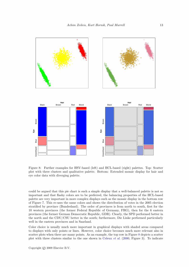
Figure 8: Further examples for HSV-based (left) and HCL-based (right) palettes. Top: Scatterplot with three clusters and qualitative palette. Bottom: Extended mosaic display for hair andeye color data with diverging palette.
could be argued that this pie chart is such a simple display that a well-balanced palette is not soimportant and that flashy colors are to be preferred, the balancing properties of the HCL-basedpalette are very important in more complex displays such as the mosaic display in the bottom rowof Figure 7. This re-uses the same colors and shows the distribution of votes in the 2005 electionstratified by province (Bundesland). The order of provinces is from north to south, first for the10 western provinces (the former Federal Republic of Germany, FRG), then for the 6 easternprovinces (the former German Democratic Republic, GDR). Clearly, the SPD performed better inthe north and the CDU/CSU better in the south; furthermore, Die Linke performed particularlywell in the eastern provinces and in Saarland.
Color choice is usually much more important in graphical displays with shaded areas comparedto displays with only points or lines. However, color choice becomes much more relevant also inscatter plots when there are many points. As an example, the top row in Figure 8 depicts a scatterplot with three clusters similar to the one shown in Celeux et al. (2000, Figure 3). To indicate
Copyright© 2009 Elsevier B.V.

14 Escaping RGBland: Selecting Colors for Statistical Graphics
cluster membership, three different colors (green, yellow, red) are employed. The HSV colors inthe left panel are again very flashy and differ strongly with respect to luminance: the yellow ismuch lighter and hardly visible. In contrast, the HCL colors in the right panel use the same hues,but are balanced with respect to chroma and luminance, i.e., the amount of color and gray.As our final example, the bottom row in Figure 8 (taken from Friendly 2002, Figure 11, left/middle)visualizes the cross-tabulation of hair end eye color of 592 students in a mosaic display. Clearly,hair and eye color are not independent and the pattern of association is highlighted by meansof residual-based shading. Cells associated with Pearson residuals whose absolute value exceeds(2 or) 4 are shaded (light) blue/red. This shows that there are significantly more students withblack hair and brown eyes, blond hair and blue eyes, red hair and green eyes than expected underindependence. Conversely, fewer students than expected have blond hair and brown/hazel eyes orblack hair and blue eyes. Comparing the HSV and HCL colors in the bottom row of Figure 8, it isshown again that the HCL colors are better balanced (between the red and blue colors) and lessflashy. Even the cells associated with small residuals (below 2) are somewhat easier to read whenshaded in a light grey rather than white. More details and extensions to residual-based shadingscan be found in Zeileis et al. (2007).
6. Software
Implementing the different color palettes suggested in the previous section is extremely easy if thesoftware environment chosen already provides an implementation of HCL colors: from the formulasprovided above the HCL coordinates for a palette can be conveniently computed. Somewhat morework is required if the software package does not yet provide an HCL implementation. In thatcase, additional functionality is needed for translating HCL coordinates to the software package’scolor system which may vary between different packages, but standardized RGB (sRGB) is oftenused. The typical way of coordinate conversion is to go first from HCL to CIELUV by simplytransforming the polar H and C coordinates back to the original U and V . Subsequently, CIELUVis converted to CIEXYZ which in turn is converted to sRGB. The details of these conversions aresomewhat technical and tedious (and hence omitted here), however the conversion formulas arestill straightfoward to implement and can, for example, be found in Wikipedia (2007a) or Poynton(2000).The R system for statistical computing (R Development Core Team 2008) provides an open-source implementation of HCL (and other color spaces) in the package colorspace, originally writ-ten by Ross Ihaka. The coordinate transformations mentioned above are contained in C codewithin colorspace that are easy to port to other statistical software systems. Version 1.0-0 ofcolorspace (Ihaka et al. 2008) also includes an implementation of all palettes discussed above.(Originally, the code for the palettes was in the vcd package, Meyer et al. 2006, but it was re-cently moved to colorspace to be more easily acessible.) Qualitative palettes are provided byrainbow_hcl() (named after the HSV-based function rainbow() in base R). Sequential palettesbased on a single hue are implemented in the function sequential_hcl() while heat_hcl()offers sequential palettes based on a range of hues. Diverging palettes can be obtained bydiverge_hcl(). Technical documentation along with a large collection of example palettes isavailable via help("rainbow_hcl", package = "colorspace"). Furthermore, R code for repro-ducing the example palettes in Figures 4, 5 and 6 (and some illustrations) can be accessed viavignette("hcl-colors", package = "colorspace").The default color palettes in the ggplot2 package (Wickham 2008) are also based on HCL colors,using similar ideas to those discussed in this article.
7. Discussion
Many statistical graphics—especially when displayed on a computer screen, e.g., as in interactiveusage, electronic papers or presentation slides—employ colors to code information about a certain
Copyright© 2009 Elsevier B.V.

Achim Zeileis, Kurt Hornik, Paul Murrell 15
variable. Despite this omnipresence of color, there is often only little guidance in statistical softwarepackages on how to choose a palette appropriate for a particular visualization task—auspicioustools such as ColorBrewer.org notwithstanding. We try to address this problem by suggestingcolor schemes for coding categorical information (qualitative palettes) and numerical information(sequential and diverging palettes) based on the perceptually-based HCL color space.
We provide paths through HCL space along perceptual axes of the human visual system so thatcolors selected along these paths match human perceptual dimensions. This gives the users thepossibility to conveniently experiment with the HCL-based palettes by varying several simple andintuitive graphical parameters. For qualitative palettes, these are the coordinates on the chromaand luminance axis, respectively, controlling whether the colors are light or dark and how colorfulthey are. For sequential and diverging palettes, the user can decide whether contrasts in thechroma or luminance direction (or both) should be employed. In our experience (as illustrated inSection 2), chroma contrasts work sufficiently well if a small set of colors is used. However, whena larger set of colors is used (e.g., for heatmaps where extreme values should be identifiable) it ismuch more important to have a big difference in luminance.
Based on these conceputal guidelines and the computational tools readily provided in the R systemfor statistical computing (and easily implemented in other statistical software packages), userscan generate palettes varying these graphical parameters and thus adapting the colors to theirparticular graphical display.
Acknowledgments
We are thankful to Michael Hohle, Ross Ihaka, Thomas Kneib, Ken Knoblauch, Thomas Lumley,David Meyer, and Brian D. Ripley for feedback, suggestions, and discussions. Furthermore, weare indebted to an anonymous associate editor and three referees for their reviews that helpedimproving the manuscript.
References
Azzalini A, Bowman AW (1990). “A Look at Some Data on the Old Faithful Geyser.” AppliedStatistics, 39, 357–365.
Brewer CA (1999). “Color Use Guidelines for Data Representation.” In Proceedings of the Sectionon Statistical Graphics, American Statistical Association, pp. 55–60. Alexandria, VA. URLhttp://www.personal.psu.edu/faculty/c/a/cab38/ColorSch/ASApaper.html.
Celeux G, Hurn M, Robert CP (2000). “Computational and Inferential Difficulties with MixturePosterior Distributions.” Journal of the American Statistical Association, 95(451), 957–970.Figure 3.
Cleveland WS, McGill R (1983). “A Color-Caused Optical Illusion on a Statistical Graph.” TheAmerican Statistician, 37, 101–105.
Commission Internationale de l’Eclairage (2004). Colorimetry. 3rd edition. Publication CIE15:2004, Vienna, Austria. ISBN 3-901-90633-9.
Friendly M (2002). “A Brief History of the Mosaic Display.” Journal of Computational andGraphical Statistics, 11(1), 89–107. Figure 11 (left, middle).
Gelfand AE, Banerjee S, Sirmans CF, Tu Y, Ong SE (2007). “Multilevel Modeling Using SpatialProcesses: Application to the Singapore Housing Market.” Computational Statistics & DataAnalysis, 51, 3567–3579. doi:10.1016/j.csda.2006.11.019. Figure 3.
Copyright© 2009 Elsevier B.V.

16 Escaping RGBland: Selecting Colors for Statistical Graphics
Harezlak J, Coull BA, Laird NM, Magari SR, Christiani DC (2007). “Penalized Solutions toFunctional Regression Problems.” Computational Statistics & Data Analysis, 51, 4911–4925.doi:10.1016/j.csda.2006.09.034. Figure 8.
Harrower MA, Brewer CA (2003). “ColorBrewer.org: An Online Tool for Selecting ColorSchemes for Maps.” The Cartographic Journal, 40, 27–37. URL http://ColorBrewer.org/.
Ihaka R (2003). “Colour for Presentation Graphics.” In K Hornik, F Leisch, A Zeileis(eds.), Proceedings of the 3rd International Workshop on Distributed Statistical Comput-ing, Vienna, Austria. ISSN 1609-395X, URL http://www.ci.tuwien.ac.at/Conferences/DSC-2003/Proceedings/.
Ihaka R, Murrell P, Hornik K, Zeileis A (2008). colorspace: Color Space Manipulation. R packageversion 1.0-0, URL http://CRAN.R-project.org/package=colorspace.
Kaiser PK, Boynton RM (1996). Human Color Vision. 2nd edition. Optical Society of America,Washington, DC.
Kneib T (2006). “Mixed Model-Based Inference in Geoadditive Hazard Regression forInterval-censored Survival Times.” Computational Statistics & Data Analysis, 51, 777–792.doi:10.1016/j.csda.2006.06.019. Figure 5 (left).
Knoblauch K (2002). “Color Vision.” In S Yantis, H Pashler (eds.), Steven’s Handbook of Experi-mental Psychology – Sensation and Perception, volume 1, third edition, pp. 41–75. John Wiley& Sons, New York.
Levkowitz H, Herman GT (1992). “Color Scales for Image Data.” IEEE Computer Graphics andApplications, 12(1), 72–80. doi:10.1109/38.135886.
Lumley T (2006). “Color Coding and Color Blindness in Statistical Graphics.” ASA StatisticalComputing & Graphics Newsletter, 17(2), 4–7. URL http://stat-graphics.org/newsletter/v172.pdf.
Meier BJ, Spalter AM, Karelitz DB (2004). “Interactive Color Palette Tools.” IEEE ComputerGraphics and Applications, 24(3), 64–72. URL http://graphics.cs.brown.edu/research/color/.
Meyer D, Zeileis A, Hornik K (2006). “The Strucplot Framework: Visualizing Multi-wayContingency Tables with vcd.” Journal of Statistical Software, 17(3), 1–48. URL http://www.jstatsoft.org/v17/i03/.
Moretti G, Lyons P (2002). “Tools for the Selection of Colour Palettes.” In Proceedings of the NewZealand Symposium On Computer-Human Interaction (SIGCHI 2002). University of Waikato,New Zealand.
Munsell AH (1905). A Color Notation. Munsell Color Company, Boston, Massachusetts.
Poynton C (2000). “Frequently-Asked Questions About Color.” URL http://www.poynton.com/ColorFAQ.html, accessed 2007-11-06.
R Development Core Team (2008). R: A Language and Environment for Statistical Computing.R Foundation for Statistical Computing, Vienna, Austria. ISBN 3-900051-07-0, URL http://www.R-project.org/.
Smith AR (1978). “Color Gamut Transform Pairs.” Computer Graphics, 12(3), 12–19. ACMSIGGRAPH 78 Conference Proceedings, URL http://www.alvyray.com/.
Tenenhaus A, Giron A, Viennet E, Bera M, Saporta G, Fertil B (2007). “Kernel Logistic PLS: ATool for Supervised Nonlinear Dimensionality Reduction and Binary Classification.” Computa-tional Statistics & Data Analysis, 51, 4083–4100. doi:10.1016/j.csda.2007.01.004. Figure 2.
Copyright© 2009 Elsevier B.V.

Achim Zeileis, Kurt Hornik, Paul Murrell 17
Tufte ER (1990). Envisioning Information. Graphics Press, Cheshire, CT.
Ware C (1988). “Color Sequences for Univariate Maps: Theory, Experiments and Principles.”IEEE Computer Graphics and Applications, 8(5), 41–49. doi:10.1109/38.7760.
Wickham H (2008). ggplot2: An Implementation of the Grammar of Graphics. R package ver-sion 0.7, URL http://CRAN.R-project.org/package=ggplot2.
Wikipedia (2007a). “CIELUV Color Space — Wikipedia, The Free Encyclopedia.” URL http://en.wikipedia.org/wiki/CIELUV_color_space, accessed 2007-11-06.
Wikipedia (2007b). “HSV Color Space — Wikipedia, The Free Encyclopedia.” URL http://en.wikipedia.org/wiki/HSV_color_space, accessed 2007-11-06.
Zeileis A, Meyer D, Hornik K (2007). “Residual-Based Shadings for Visualizing (Condi-tional) Independence.” Journal of Computational and Graphical Statistics, 16(3), 507–525.doi:10.1198/106186007X237856.
Zhang H, Montag ED (2006). “How Well Can People Use Different Color Attributes?” ColorResearch & Application, 31(6), 445–457. doi:10.1002/col.20257.
Copyright© 2009 Elsevier B.V.