evaluation 5 how did you attract your audience
TRANSCRIPT

HOW DID YOU ATTRACT/ADDRESS YOUR AUDIENCE?

FEATURESIn my music magazine questionnaire, I asked whether respondents would be more likely to buy my product if I included an incentive, i.e. a free CD, in which case, the majority of people said ‘yes’. As a result, I included this into my magazine, particularly on the front cover, so as to attract my audience even more; this is also a convention which I conformed to. I placed it above the masthead to make it even more noticeable for the reader.
Moreover, I considered the answers I received about what respondents would be interested in reading about or would expect to find, which is essentially what I ended up including, which is included in my contents page to reflect their answers. It is also worth mentioning the competition in particular. A handful of people suggested that they would be attracted if they saw a competition, which is why I included this into my front cover, but near the bottom, near the bar code as it wasn’t a high priority. The competition itself is for 2 tickets to Reading Festival, which is particularly popular amongst my particular target audience, who are interested in indie-rock music.
This is the same case for the contents I included in my magazine, within the front cover and contents page, this includes the well-known bands and singers which would definitely attract my audience, as they are the types of musicians I believe my audience would listen to, as mentioned in previous evaluations. The most popular artists have also been accentuated through the different, interesting fonts I selected.

IMAGESAs already mentioned in previous evaluations, the use of images was extremely significant in terms of sending out the correct image to my audience. The front cover image was even more important as this is the first image that the customer would be able to see on my magazine before looking aside, hence it needed to be appealing. Again, as mentioned, the mise-en-scene was a significant element in taking my photos, and I feel that this image was successful in attracting the audience. The eye contact established within this image is particularly effective, as Joshua Hudson can create this sense of relationship with the readers. This was a convention that I had seen every magazine, from music magazines to lifestyle magazines demonstrating, which shows that it is a particularly useful feature to include so as to include the audience. His facial expression further reinforces this inviting relationship with Josh which is carried on throughout the magazine to the DPS. He is smiling invitingly, which is a great ice-breaker for first-time readers of my magazine, and portrays Josh in a positive light. It is also reassuring that, in relation to my questionnaire, the majority of respondents did not mind reading a magazine based off of mostly unknown or upcoming artists, hence I have experimented using this upcoming artist to appeal to the audiences’ curiosity, whilst also including news and information about popular, well-known bands and artists that creates a sense of balance within my magazine, whilst also sustaining my magazine’s ideology. In relation to this facial expression and body language, whilst he looks inviting but still casual and laid-back, if I were to improve this image further, I would possibly have Josh with both hands in his pocket, with maybe less of a smile to possibly look more kooky and casual, to fit with the indie-rock attitude of my audience which is carefree and almost cheeky and witty. Nevertheless, the image definitely attracts my audience, particularly when relating it to theories such as Michael Brake’s ‘respectable’ perception of youths as opposed to ‘delinquents’ and such, given that Josh clearly appears successful and using his creative talents positively and productively. In terms of gender, it may also relate to David Gauntlett’s magazine theory that ‘these [male] magazines are all about the social construction of masculinity.’ Clearly this image evokes a sense of Josh’s masculinity which many of my readers, who are predominantly male, will aspire to be like Josh, not in terms of his sexual masculinity, but the level of success and maturity he is portraying. Given the fact that he is solo, it may also be the case that some female readers will view Josh as vulnerable which may relate to Eva Marie-Jacobson’s female gaze in which the female readers will objectify him.
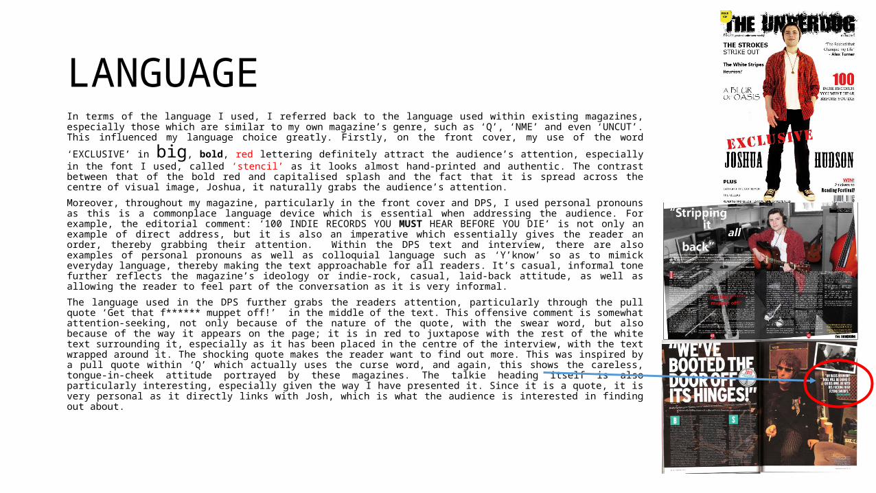
LANGUAGEIn terms of the language I used, I referred back to the language used within existing magazines, especially those which are similar to my own magazine’s genre, such as ‘Q’, ‘NME’ and even ‘UNCUT’. This influenced
my language choice greatly. Firstly, on the front cover, my use of the word ‘EXCLUSIVE’ in big, bold, red lettering definitely attract the audience’s attention, especially in the font I used, called ‘stencil’ as it looks almost hand-printed and authentic. The contrast between that of the bold red and capitalised splash and the fact that it is spread across the centre of visual image, Joshua, it naturally grabs the audience’s attention.
Moreover, throughout my magazine, particularly in the front cover and DPS, I used personal pronouns as this is a commonplace language device which is essential when addressing the audience. For example, the editorial comment: ‘100 INDIE RECORDS YOU MUST HEAR BEFORE YOU DIE’ is not only an example of direct address, but it is also an imperative which essentially gives the reader an order, thereby grabbing their attention. Within the DPS text and interview, there are also examples of personal pronouns as well as colloquial language such as ‘Y’know’ so as to mimick everyday language, thereby making the text approachable for all readers. It’s casual, informal tone further reflects the magazine’s ideology or indie-rock, casual, laid-back attitude, as well as allowing the reader to feel part of the conversation as it is very informal.
The language used in the DPS further grabs the readers attention, particularly through the pull quote ‘Get that f****** muppet off!’ in the middle of the text. This offensive comment is somewhat attention-seeking, not only because of the nature of the quote, with the swear word, but also because of the way it appears on the page; it is in red to juxtapose with the rest of the white text surrounding it, especially as it has been placed in the centre of the interview, with the text wrapped around it. The shocking quote makes the reader want to find out more. This was inspired by a pull quote within ‘Q’ which actually uses the curse word, and again, this shows the careless, tongue-in-cheek attitude portrayed by these magazines. The talkie heading itself is also particularly interesting, especially given the way I have presented it. Since it is a quote, it is very personal as it directly links with Josh, which is what the audience is interested in finding out about.

PROFESSIONALISM
Overall, I feel that with the several techniques I have employed, including the features which were inspired by the answers I received from my questionnaire on Survey Monkey, as well as the images and the language I used, I have managed to sustain a sense of professionalism within my product. As most of this was conventions of music magazines that I aimed to follow so as to create a music magazine similar to existing ones that I have researched, which would make it believable, I feel that I have managed to create a professional looking product which my audience would believe, so much so as to buy my product.