exploratory font selection using crowdsourced attributesdonovan/font/fontselection.pdf · to appear...
TRANSCRIPT

To appear in ACM TOG 33(4).
Exploratory Font Selection Using Crowdsourced Attributes
Peter O’Donovan*University of Toronto
Janis Lıbeks*University of Toronto
Aseem AgarwalaAdobe
Aaron HertzmannAdobe / University of Toronto
Abstract
This paper presents interfaces for exploring large collections offonts for design tasks. Existing interfaces typically list fonts in along, alphabetically-sorted menu that can be challenging and frus-trating to explore. We instead propose three interfaces for font se-lection. First, we organize fonts using high-level descriptive at-tributes, such as “dramatic” or “legible.” Second, we organize fontsin a tree-based hierarchical menu based on perceptual similarity.Third, we display fonts that are most similar to a user’s currently-selected font. These tools are complementary; a user may search for“graceful” fonts, select a reasonable one, and then refine the resultsfrom a list of fonts similar to the selection. To enable these tools, weuse crowdsourcing to gather font attribute data, and then train mod-els to predict attribute values for new fonts. We use attributes to helplearn a font similarity metric using crowdsourced comparisons. Weevaluate the interfaces against a conventional list interface and findthat our interfaces are preferred to the baseline. Our interfaces alsoproduce better results in two real-world tasks: finding the nearestmatch to a target font, and font selection for graphic designs.
1 Introduction
Typography is fundamental to graphic design. A well-chosen fontcan make a design more beautiful and more effective in communi-cating information. Font selection is also subtle: many professionaldesigners take entire courses on typography, and, for novices, theprocess can be frustrating and opaque. Surprisingly, the standardinterface for selecting fonts — a long list of font names — hasnot changed in decades, and often overwhelms users with too manychoices and too little guidance. As a result, users often proceed withthe default font, or stick with a few familiar, but poor, choices.
The problem of font selection is challenging for many reasons.First, the space of possible fonts is quite large. Most computers arenow equipped with hundreds of fonts, and online repositories pro-vide hundreds of thousands. Second, there is no obvious method forcategorization that supports a user’s goals. Modern font listings usecategorizations like “serif” or “display,” but these must be hand-annotated, and they don’t necessarily correspond to a user’s goals.Font names themselves are rarely meaningful. Third, there are a va-riety of font selection tasks with different goals and requirements.One designer may wish to match a font to the style of a particularimage. Another may wish to find a free font which looks similarto a commercial font such as Helvetica. A third may simply be ex-ploring a large set of fonts such as Adobe TypeKit or Google WebFonts. Current methods for font selection fail to address any of theseneeds well. Exhaustively exploring the entire space of fonts usingan alphabetical listing is unrealistic for most users.
This paper proposes interfaces for selecting fonts based on the ideathat fonts can be described by attributes: adjectives that describetheir visual personality or appearance, such as “formal,” “friendly,”or “legible.” We use these attributes as the basis for three font se-lection interfaces that are designed to support different types of ex-ploration and search. First, we describe an Attribute Interface thatallows a user to select one or more descriptive attributes; the sys-tem then shows a list of fonts that are sorted by how highly they
* Both authors contributed equally
score along the selected axes, e.g., we can show fonts that are bothfriendly and legible. Second, we propose a Group Interface thatshows the user a hierarchical menu of fonts, clustered accordingto their visual similarity. Third, both interfaces include a Search-By-Similarity feature which gives a list of fonts sorted by similar-ity to their currently-selected font, allowing users to fine-tune theirchoices. These interfaces allow users to search in a variety of ways,from high-level exploration using attributes or font groups, to re-finement of font choices using the similarity search.
In this work, we propose an approach that estimates attribute valuesand visual font similarity by learning models from crowdsourceddata. We first collect a set of attributes commonly used by design-ers to describe fonts, and then compute attribute values for a set offonts using crowdsourced data. We also learn a function that pre-dicts the visual similarity of fonts from crowdsourced data. Finally,we learn to predict attribute values and font similarity from geo-metric features of fonts, so that our system can handle new fontswithout any further data collection. The dataset and interfaces areavailable at the project page.
We evaluate our approach by two real-world design tasks, testedwith in-person experiments and online with Amazon MechanicalTurk. First, we test users’ ability to find a specific font in an in-terface, given an image of text in that font. For this task, users arethree times more likely to find the font by using either of our in-terfaces, compared to a conventional linear list. Second, we per-form a more subjective test of selecting a good font for a givendesign. Our proposed interfaces show a statistically-significant im-provement over the conventional list, though the effect size is smallsince font choices are highly subjective and multimodal. Participantsurveys show that users frequently prefer our interfaces to the con-ventional interface.
2 Related Work
To our knowledge, no prior work directly studied font selection in-terfaces. There is work in a number of related areas.
Font Traits and Features. Researchers have studied the person-ality traits of certain typefaces and how they affect the appropri-ateness of typefaces for specific tasks. Shaikh [2007] provides anextensive list of typeface personality attributes that have been usedin academic publications since 1920. Li and Suen [2010] and Mack-iewicz and Moeller [2004] present small scale studies that explorethe range of personality values for tens of fonts using a Likert scale.Shaikh et al. [2006] performed an online study with hundreds ofparticipants where 20 fonts were rated for 15 adjective pairs (i.e.,“sad/happy”) and design type appropriateness. Users consistentlyattributed personality traits to fonts, and felt specific documenttypes were more appropriate for certain fonts. For example, chil-dren’s documents were seen as more appropriate for “funny” fonts.Lewis and Walker [1989] showed that when a word’s meaning doesnot match its font personality traits, participants take longer to an-alyze the word. These results suggest that attributes are useful infont interfaces. We differ from prior work in that we build a work-ing attribute-based interface. We also use data from a much largerstudy (31 attributes and 200 fonts) to train predictive models.
Optical Character Recognition systems use low-level raster featuresfor text recognition [Srihari 1999; Solli and Lenz 2007]. We use
1

To appear in ACM TOG 33(4).
(a) (b) (c)
Figure 1: Font selection interfaces. The interfaces are shown next to the graphic being designed so that users can see font choices in context.(a) Attribute selection menu. The user may select one or more attributes and/or complements. When mousing over an attribute, examples offonts with and without the attributes are shown on the right. (b) As the user selects attributes, a list of fonts with the given attributes are shownin the list; here, the user has selected delicate and not thin. (c) The user can fine-tune their selection by viewing fonts ordered by similarity toa query font. Fonts are shown with the term ’handgloves’ rather than their name to make them easier to compare.
vector features, which are not available in the OCR setting, andshould be higher-quality indicators of style.
Another approach for representing fonts is HP’s PANOSE stan-dard [Laurentis 1993], which assigns a set of category numbersbased on visual characteristics like weight or serif style. Propri-etary mapping software can then be used to search by similarity.Unfortunately, there are no automatic methods of classifying fontswith PANOSE numbers, with Doyle [2005] reporting an adoptionrate of less than 10% in his analysis of the system. We instead usean empirical approach to measure font similarity, and train modelsbased on crowdsourced data.
Commercial Font Interfaces. While the majority of font selectioninterfaces in existing applications are simple linear lists, more so-phisticated approaches have been developed. Several websites al-low searching by font similarity, including Identifont, MyFonts’WhatTheFont, and Fontspring. The TypeDNA Photoshop pluginallows searching by similarity, as well as 4 attributes (“weight,”“width,” “italic,” and “optical”). Unfortunately, the details of thesesearching algorithms are proprietary and may be partly based onhand annotation, so it is difficult to directly compare with our ap-proach. Sites like Fonts.com and Dafont have a large number ofattributes and categories for fonts, including subjective attributes.Unlike our automatic approach however, these binary labels arehand-annotated.
Attributes. Object attributes have recently become an active topicin computer vision. While binary attributes have been used for im-age search [Kumar et al. 2011; Tao et al. 2009], recent work for esti-mating relative attributes [Parikh and Grauman 2011] has been usedin search interfaces. Our work is also inspired by this approach.
Chaudhuri et al. [2013] use relative attributes to help users findparts to assemble into 3D models. Though their focus is 3D mod-elling, they also show a proof-of-concept web-design interfacewhere page elements such as fonts or background color are auto-matically swapped using an attribute slider. The system also usesfont features, including size and Fourier coefficients to measureshape. However, their dataset only included 30 WordPress tem-plates, and their attribute model and interface were not evaluatedin any way. By contrast, our work focuses on font selection, uses a
much larger dataset, and includes a rigorous evaluation.
WhittleSearch [Kovashka et al. 2012] is especially similar to ourwork as it allows searching image collections using relative at-tributes. However, we simplify the interaction considerably, as wellas introduce cluster and similarity-based interfaces that supportfluid switching between different types of search.
Exploratory Search. Interfaces that support exploratory searchthrough large datasets are a common topic for the HCI and infor-mation retrieval communities [White et al. 2006]. One approachis to visualize high-dimensional data points plotted within a low-dimensional embedding such as t-SNE [van der Maaten and Hinton2008]. We experimented with a t-SNE interface, but found it diffi-cult to interpret the 2D layout; it is hard to know where to look inthis space for a particular font, particularly with thousands of fonts.Another approach that we take is to create hierarchical categoriza-tions of the data; for example, Huang et al. [2013] hierarchicallycluster 3D shapes based on a hand-designed distance metric. A re-lated problem is the exploration of continuous parametric spacesfor design [Marks et al. 1997; Talton et al. 2009]; our approachis more appropriate for exploring a discrete design space. We alsoexperimented with an adaptive grid interface, similar to Marks etal. [1997], where users could select several fonts and the systemwould adaptively display similar fonts. In practice this approachwas far more time-consuming than our group interface; numerousselections were required to converge on reasonable fonts, and theapproach did not provide a high-level view of the entire font space.
3 User Experience
We first describe our interfaces from the perspective of a user (seethe Supplemental Video for a demonstration). We offer two ways tobegin exploring fonts, as well as a Search-by-Similarity option tofine-tune an initial font selection.
Attribute Interface. The attribute interface is useful when a userhas a conceptual rather than mental image of the desired font. Forexample, a user may want “happy” and “playful” fonts for a child’sbirthday card, “formal” fonts for legalese, or “legible” fonts for awall sign. The interface uses a menu listing the set of attributes
2

To appear in ACM TOG 33(4).
Figure 2: Group interface. The interface shows a three-level per-ceptual clustering of fonts. Mousing over the clusters allows a userto quickly get a sense of the range of options, and to explore indi-vidual clusters. Once a user has selected a font, they may furtherrefine their query by searching for similar fonts as in Figure 1.
available (Figure 1a). The user selects an attribute by clicking it,or by clicking on the adjacent “not” button to select fonts that donot exhibit an attribute (e.g., picking “not strong” produces “weak”fonts). When the user mouses-over an attribute, five example fontswith that attribute are shown as examples, as well as five fonts lack-ing that attribute. Once the user selects an attribute, or a combina-tion of attributes, fonts are shown sorted in order according to howwell they match the selected constraints (Figure 1b). Multiple at-tributes may also be selected, in which case fonts are sorted by theaverage of how well they match the selected attributes.
Group Interface. The group interface supports a more visual ex-ploration of the space of fonts for users who will recognize de-sirable fonts on sight. The group interface organizes the space offonts into a tree-based hierarchy of visually similar fonts (Figure 2).That is, the leftmost list contains twelve groups of visually similarfonts, with a representative sample shown from each. When the usermouses-over a font, the middle list shows subgroups of that font’sgroup. Each subgroup is shown by a representative font. Mousing-over any of these reveals their subgroups. The user clicks on a fontin any list to select it. The groups are created automatically with abottom-up hierarchical clustering algorithm.
Search-by-Similarity. Both of the above methods are useful forquickly identifying a reasonably appropriate font. Once a user hasmade an initial choice with either of the above methods, the Search-by-Similarity option (Figure 1c) helps the user refine their choice.This option lists fonts ordered by their visual similarity to the se-lected query font. Users can replace the query font with another bypressing a button next to any selected font. They may again showthe most similar fonts to the new selection, thus exploring the spaceof fonts “near” their current favorites.
For all three interfaces the current design is shown to the right, andthe user may choose between three text sizes (“small,” “medium,”and “large”); users can also save “favorite” fonts to a separate list.We display all fonts with a word “handgloves” that is often used bytypographers for font comparison [Garfield 2011] since it containsmany different letter strokes and shapes. Removing font namesfrom the interface also reduces familiarity biases during evaluation.
To support these interface tools, we require models for relative at-tributes and font similarity. We next describe our approach for train-ing these models from crowdsourced data.
Image A Image B
Figure 3: Example of a study task for the attribute “wide.”
4 Estimating and Predicting Font Attributes
This section describes our technique for estimating and predictingrelative font attributes. We gather pairwise comparison data by ask-ing Mechanical Turk workers to compare a small set of trainingfonts according to different attributes. We then estimate relativescalar values for each training font and attribute, and use these val-ues to train a model that maps from fonts to attributes. We thencompute attributes values for a much larger font database using thismodel. We gather data from novices on MTurk instead of profes-sionals because novices are the target users of our interfaces.
4.1 Font Selection
We gathered a large and diverse set of 1278 fonts that combines1138 fonts from Google Web Fonts with a selection of web-fontsthat appear frequently on a relatively small set of ⇡3800 design-oriented web-pages, seeded from the Adobe Typekit Blog. Type-faces within the same font family often have very different person-alities, and so we treat each separately, e.g., Gill Sans is treated asa separate font from Gill Sans Light and Gill Sans Bold. We thenrandomly sampled a training set of 200 fonts for the MTurk exper-iments.
4.2 Attribute Selection
We chose 31 attributes from a list of font personality attributes gath-ered by Shaikh [2007], reflecting adjectives that we expect noviceusers would use to describe fonts. We included concrete attributessuch as “thin” and “angular,” and more nebulous concepts like“friendly” and “sloppy.” We also added 6 common typographicalbinary attributes: capitals, cursive, display, italic, monospace, serif.All 37 attributes are listed in Fig. 1. Relative attribute values rangefrom 0 to 100, whereas binary attribute values may be either 0 or100. We hand-label the 6 binary attributes in the training set, leav-ing the relative attributes to be estimated through crowdsourcing.We also performed an earlier version of this study with 36 relativeattributes, and then pruned five after finding high correlations withother attributes. For example,“masculine” and “strong” were highlycorrelated, so “masculine” was removed.
4.3 Attribute Estimation
The goal of estimation is to determine a scalar value describing howmuch a given font embodies a given attribute. For example, a fontthat is often considered “stronger” than other fonts should have ahigher value for the “strong” attribute. Directly asking people toprovide these scores would be unreliable. Instead, we follow a stan-dard approach and ask comparison questions. A Mechanical Turkworker is shown a pair of fonts, and asked to rate which is better de-scribed by the attribute (Figure 3). We use a two-alternative forced
3

To appear in ACM TOG 33(4).
Dramatic Legible Delicate Thin
100 100 100 100
66.44 66.70 66.65 66.32
33.62 33.73 33.34 33.37
0 0 0 0
Figure 4: Examples of estimated attribute values. We show the fonts with the least of the attribute (v = 0), most (v = 100), and intermediatevalues (v = 33, 66).
choice (2AFC) design, i.e., raters cannot answer “no difference,” inorder to allow us to better measure small differences.
Given these pairwise comparisons, we can then estimate theattribute value for each font. We use a Maximum Likelihoodapproach to attribute value estimation using the Bradley-Terrymodel [1952]. See the survey by Tsukida and Gupta [2011] for de-tails. However, we augment it with a model of rater reliability, sim-ilar to item-response theory and the work of Welinder et al. [2010].
The measured pairwise responses is a set of tuples D =
{(a, fi, fj , u, q)}, where a is an attribute, fi and fj are the twofonts being compared, u is the rater’s ID, and q is the rater’s choice.q = 1 if the rater judges font fi to have more of the attribute a thanfont fj ; q = 0 otherwise. In the standard approach, the likelihoodof a rater’s response q given the fonts and attribute is modeled asfollows. Let vi,a and vj,a be the unknown values of attribute a forthe two fonts. A rater is more likely to answer q = 1 if vi,a > vj,a,and q = 0 otherwise. However, the rater’s response is more ran-dom (harder to predict) if the difference in attribute values is small.In the extreme case where vi = vj , the rater’s response is entirelyrandom (p(q = 1) = 0.5). To model the rater’s response, we use alogistic function:
p(q = 1|fi, fj , a) =1
1 + exp(vj,a � vi,a)(1)
When performing MTurk evaluations, some raters may be more re-liable than others. Hence, we introduce a per-user reliability weightru. Raters with low ru produce more-random answers; raters withru = 0 are completely random, and raters with ru < 0 tend toproduce wrong answers. In the reliability model, the likelihood ofa comparison is:
p(q = 1|fi, fj , a, u) =1
1 + exp(ru(vj,a � vi,a))(2)
Given the pairwise comparisons D, the negative log-likelihood ob-
jective function is:
E(v, r) = � ln p(D|v, r) (3)
= �X
k
q
kln p(q = 1|fk
i , fkj , a
k, u
k) (4)
�X
k
(1� q
k) ln
⇣1� p(q = 1|fk
i , fkj , a
k, u
k)
⌘
where k indexes over all training tuples. We jointly minimize thisobjective with respect to all attribute values v and all rater reliabil-ities r by gradient descent. The resulting attribute values are scaledto lie in the range 0 to 100. We gathered the comparison data bya large-scale study on Mechanical Turk, described in Appendix A.Figure 4 shows examples of the estimated values.
We find that raters agree more on certain attributes than others.The attribute “thin” is easiest to fit, with 93.16% of the rater re-sponses correctly predicted given our estimated attributes values,while “sharp” is the hardest with only 62.02% correctly classified.The average over all 31 attributes is only 69.64%, indicating sub-stantial disagreement. Details for individual attributes are given inthe Supplemental Material.
4.4 Attribute Prediction
We now describe an approach to learning a mapping from geomet-ric font features to font attributes, using the estimated attributes astraining data. The features, denoted xi for font i, are computed fromfont files using the raw glyph outline control points and points sam-pled from the glyph outline curves. Features were selected in partto capture typographic font qualities (italics, thickness), as well asother vector-based qualities. We include features which measure thesize, area, orientation, stroke width, and spacing of characters. Weinclude vector-based features such as curvature, number of curvesper glyph, arc lengths, etc. See Appendix B for more details.
We use these features to learn separate models for each of our 37attributes. We learn the attribute values using Gradient Boosted Re-gression (GBR) Trees [Friedman 2000] with a maximum depth of
4

To appear in ACM TOG 33(4).
Reference Font
Figure 5: Example task for font distance study. The rater decideswhich bottom font is more similar to the reference font above.
2, and also a linear LASSO model [Tibshirani 1996]. On leave-one-out cross-validation tests, the GBR had better performance with amean average error of 8.51 compared to LASSO’s 10.76; we there-fore use this model for all further tests.
4.5 Model Evaluation
To evaluate our approach, we repeatedly train a model on the com-parisons for 199 fonts and test on the hold-out font comparisons.We report the negative log-likelihood (NLL) of the test data and theclassification rate (the fraction of comparisons correctly predicted).We also report an upper-bound “oracle” classifier which choosesthe majority opinion. When comparing the models, the likelihoodis a more accurate continuous measure of performance as it uses theattribute distances. For example, the classification rate for two at-tribute values would be the same if the two attributes are very closeor far apart, as long as the relative ranking is correct. Intuitively,such a discontinuous measure is not ideal since we expect that whenthe attribute distances are very small, users will have a harder timeranking them correctly. The models with and without user reliabil-ity have a similar classification rate of 65.63% and 65.62%, respec-tively. However, the model with user reliability has a NLL of 0.6087versus 0.6124 without user reliability, indicating some value to theapproach.
An alternative approach would be to use the pairwise comparisondata to directly train the mapping from geometric features to at-tributes. The method of Parikh and Grauman [2011] takes this ap-proach by using a ranking SVM (SVMrank). We can also adapt theapproach in Section 4.3 to similarly learn weights for a distanceof geometric features rather than attributes. Both of these methodsperform equivalently to ours, and produce a classification error of65.62% and 65.69%, respectively. See the Supplemental Materialfor more details.
5 Font Distance Metric
In this section we describe an approach to learning to predictthe perceptual similarity between fonts, which is required for theSearch-by-Similarity tool. A naive similarity metric would simplyuse the Euclidean distance between vectors of geometric font fea-tures, or between vectors of the 37 estimated attributes. However,it is unclear which attributes or features are more or less importantwhen people evaluate the overall perceptual similarity. For exam-ple, it is possible that a difference in the “thin” attribute is moreindicative of a visual difference than “serif.”
We next describe the problem formulation and related work in met-ric learning, and then describe the results of our similarity studyusing MTurk. Our results show that font attributes outperform ge-ometric font features for modeling font similarity, demonstratingtheir usefulness as a mid-level representation for fonts.
Model NLL ClassificationSubspace(w/o user reliability) 0.4912 75.95Subspace 0.4833 75.83SVM 67.16Oracle (upper bound) 80.79
Table 1: We compare our metric learning with and without userreliability modeling, as well as the SVM approach of Schultz andJoachims [2004]. We report the negative log-likelihood (NLL) ofthe test data, as well as the classification rate: the fraction of re-sponses that are correctly predicted. The oracle is the upper-boundon the classification rate, given user disagreement. NLL data is un-available for the Oracle and SVM algorithms, as they do not outputprobabilities.
5.1 Metric Learning
Learning distance metrics is a well-studied problem in machinelearning [Kulis 2011]. The goal is to learn to compute the distancedi,j between any two objects i and j. We learn a linear metric pa-rameterized by an embedding matrix W:
di,j = ||W(xi � xj)|| (5)
where xi and xj are feature vectors for fonts i and j, respectively.W has dimensionality m ⇥ n, where the size of the feature vectoris n = 37, and m = 7, as selected by cross-validation.
To obtain data to train the model, we conduct a crowdsourced studyfocused on font similarity. Workers are presented with a referencefont A and two fonts (B and C) and are asked to decide whetherB or C is more similar to A than the other. An example task isshown in Figure 5. Triplets were randomly sampled from the 200font training set. See the Supplemental Material for study detailsincluding number of triplets, payment, and control questions.
We use a logistic model of a rater’s triplet comparisons [Tamuz et al.2011], augmented with a model of rater reliability [Welinder et al.2010]. In particular, we train our model from a set of font triplets:D = {(fi, fj , fk, q, u)}, where fj and fk are the two fonts beingcompared to font fi, u is the rater ID, and q is the rater’s choice.q = 1 if the rater judges font fj is closer to font fi than font fk,q = 0 otherwise. To model the probability of q, we use a logisticfunction similar to the one in Section 4.3:
p(q = 1|fi, fj , fk, u,W) =
1
1 + exp(ru(di,j � di,k))(6)
where ru is a per-user reliability weight. Given the triplets D, learn-ing entails maximum likelihood estimation of W and the rater re-liabilities r by gradient descent minimization of the negative log-likelihood, as in Sec. 4.3.
We evaluate the method using leave-one-out cross-validation, inwhich one font is omitted from training, and then classificationis tested on triplets that include the hold-out font; results are av-eraged over each choice of hold-out font. In Table 1 we compareour method with and without user reliability modelling, as well asthe SVM approach of Schultz and Joachims [2004]. For the SVMmodel, we found the RBF kernel produced the best results, with theparameters set using cross-validation. The upper bound on the per-formance is given by an oracle algorithm which always chooses themajority opinion for each triplet. Our probabilistic model outper-forms the SVM approach, likely due to the considerable disagree-ment between users in our data. We also find that user reliabilityhelps slightly, as evidenced by a lower NLL.
5
To appear in ACM TOG 33(4).
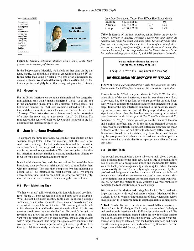
Figure 6: Baseline selection interface with a list of fonts. Back-ground photo courtesy of Nono Fara.
In the Supplemental Material, we include further tests on the dis-tance metric. We find that learning an embedding distance W per-forms better than using a vector of weights or an unweighted Eu-clidean distance. We also find that using attributes (Sec. 4.4) as fea-tures x performs slightly better than using just geometric features.
5.2 Grouping
For the Group Interface, we compute a hierarchical font categoriza-tion automatically with k-means clustering [Lloyd 1982] on fontsin the embedding space. Fonts are clustered in three levels in abottom-up manner; the 1278 fonts are first clustered into 130 clus-ters, and then the centroids of each cluster are further clustered into12 groups. The cluster sizes were chosen based on the constraintsof a three-tier menu, and a target menu size of 10-12 items. Thefont nearest the center of each top-level group is shown in the firstcolumn of the interface (Figure 1c).
6 User Interface Evaluation
To compare the three interfaces, we conduct user studies on twoseparate design tasks. In the font-matching task, the user is pre-sented with the image of a font, and attempts to find the font withina user interface. In the design task, the user attempts to select a fontthat is best suited to a given design. We compare against a baselinelist-selection interface, similar to existing applications (Figure 6),in which fonts are shown in a random order.
In each trial, the user first reads the instructions for one of the threeinterfaces, then performs a brief tutorial task to familiarize themwith the interface. The user then completes five font-matching ordesign tasks. The interfaces are reset between tasks. We imposea two-minute time limit on each task, in order to prevent highly-motivated users from exhaustively searching the lists of fonts.
6.1 Font Matching Task
We first test users’ ability to find a given font within each user inter-face (Figure 7). Font recognition sites and apps such as MyFonts’WhatTheFont help users identify fonts used in existing designs,such as signs and advertisements; these sites are heavily used anddemonstrate the usefulness of the task. The user might not be ableto find the exact font within the two-minute time limit; in this case,the user should seek the most similar font. To simplify the task, thefavorites box allows the user to keep a running list of the most rele-vant fonts for later review. For each interface, 10 task were createdwith 5 target fonts each. The target fonts are selected randomly, but,workers receive the same sequence of target fonts, regardless of theinterface. Additional study details are in the Supplemental Material.
Interface Distance to Target Font Effect Size Exact MatchBaseline 55.08± 2.13 - 5%Attribute 52.97± 2.57 0.07 15%Group 47.36± 2.20 0.26 15%
Table 2: Results of the font matching study. Using the group in-terface, workers on average selected a closer font than using thebaseline and found the exact font more often. For the attribute inter-face, workers also found the exact target more often, though therewas no statistically significant difference for the mean distance. Thedistance between fonts is computed as the Euclidean distance in thelearned embedding space of Sec. 5, with 95% confidence intervals.
Figure 7: Example of a font matching task. The users use the inter-face to make the bottom font match the top as closely as possible.
Results from the MTurk study are shown in Table 2. We find that,using either of the new interfaces, a user is three times more likelyto correctly find the target font, as compared to the baseline inter-face. We also compare the mean distance of the selected font to thetarget font for the new interfaces compared to the baseline, accord-ing to our learned metric (Sec. 5). The group interface performssignificantly better than the baseline interface (using a two-sidedt-test between the distances, p < 0.05). The effect size was 0.26,computed as |µn�µb|
�b, where µn and µb are the means of the new
and baseline interface, and �b is the baseline standard deviation.There was no statistically-significant difference between the meandistances of the baseline and attribute interfaces (effect size 0.07).When users found inexact matches, they found better matches us-ing the group interface rather than the attribute interface, perhapsbecause users had trouble identifying appropriate attributes for cer-tain fonts.
6.2 Design Task
Our second evaluation uses a more subjective task: given a design,pick a suitable font for the main text, such as title or heading. Eachdesign consists of a background image and modifiable text fields,with the background image usually containing text which the usercannot modify. We use 15 relatively simple designs created by threeprofessional designers that reflect a variety of formal and informalevent posters, invitations, announcements, and advertisements, sim-ilar to designs that an average user might create on their own (Fig-ure 8). As with the matching task, workers have two minutes tocomplete the font selection task on each design.
We conducted the design task using Mechanical Turk, and within-person studies with local university students. Mechanical Turkworkers allow us to gather large amounts of data, whereas in-personstudies allow us to perform more in-depth qualitative comparisons.
MTurk Study. For each interface we asked MTurk workers tochoose fonts for 15 designs. Each study task contained 5 designsand used a single interface, with 1350 designs collected in total. Wethen evaluated the designs created using the new interfaces againstthe designs created by the baseline interface. 2AFC testing was per-formed with designs selected from the baseline interface and eitherthe attribute or group interface, and evaluated by 8 workers. See theSupplemental Material for study details.
6

To appear in ACM TOG 33(4).
100 100 100 100
51 50 49 49
0 0 0 0
75 32 59 56Figure 8: Examples of the estimated design scores from crowd-sourced pairwise comparisons. The top three rows show MTurk designsranging from 0 (worst) to 100 (best). The bottom row are the original designer font choices, along with the estimated relative score.
Results are shown in Table 3. Our interfaces give a statisticallysignificant improvement over the baseline (two-sided t-test withp < 0.05). However, the difference in preference effect size isrelatively small, perhaps reflecting the highly variable preferencesand abilities of MTurk workers at font selection and evaluation. Wefound considerable disagreement between MTurk raters: averagevotes had about a 74% majority, where 100% would indicate unan-imous vote and 50% would indicate an exact tie.
We also compare the MTurk font selections to those originally cho-sen by the professionals that created each design (Table 3), using thesame 2AFC study design as above. Each designer’s font selectionwas compared to 12 baseline interface font selections, with randomcomparisons added to prevent a familiarity bias. This comparisonprovides a rough upper bound on the performance of new inter-
faces, as the designers selected the fonts when creating the originaldesign, so the font should be a good choice for the design. Remark-ably, the designer font choices were preferred over MTurk selec-tions only 53.19% of the time, suggesting there is substantial noiseand subjective preference in the evaluation.
We can also estimate a relative score using pairwise comparisons inthe same manner as in Section 4.3. Figure 8 shows an example ofthe best, worst, and middle font selections for 4 of the 15 designs.We also include the scores of the original designer font choices.
Designer vs. MTurk Evaluation. The high level of disagreementbetween workers when evaluating fonts makes it unclear whethernovices are capable of evaluating font selections. We therefore alsocollected pairwise comparisons from three professional designers,and compared the consistency of font selections among MTurk
7

To appear in ACM TOG 33(4).
Interface Raw MajorityGroup vs. Baseline 51.39%± 0.86 51.93%± 1.63
Attribute vs. Baseline 51.83%± 0.84 52.60%± 1.65
Designer vs. Baseline 53.19%± 3.47 56.62%± 8.33
Table 3: MTurk interface evaluation. Font selections from the newinterfaces are compared against the baseline in forced AB compar-isons. We report the raw percentage of people who preferred thedesign created by the new interface, as well as the percentage ofcomparisons where one interface had a clear majority (i.e., had 2 ormore votes more than the alternative). The new interfaces performstatistically better than the baseline interface, though the effect sizeis small due to the high variance in user ability and font evalua-tion. We also compare the baseline interface fonts against the de-signer’s original fonts, which provides a rough upper bound on theperformance. Note the significant noise in the raw results, thoughdesigner’s fonts are generally preferred. 95% confidence intervalsare shown. The higher confidence intervals for the designer versusthe new interfaces is due to a smaller sample size (180 vs. 3600).
workers to the consistency among professionals. Surprisingly, theconsistency among the two groups was similarly low; the mean ofthe absolute values of the Kendall tau correlations among MTurkworkers was 0.369 versus 0.365 for professionals. The consistencybetween groups was 0.322. Kendall tau values ranges from -1 to 1,where -1 or 1 indicate perfect correlation between the ranks, and 0indicates no correlation. These results suggest that font evaluationis highly subjective for both novices and professionals. The agree-ment between novices and professionals is also only slightly lowerthan between professionals themselves, suggesting MTurk evalua-tions are reasonable. See the Supplemental Material for details.
Qualitative MTurk Evaluation. Our tasks also included fields forproviding general comments and suggestions on the task and inter-face. We received many positive comments, including “I thoughtthe interface was easy to use. It was helpful in picking out fontsbased on attributes that you thought the design should have (i.e.“happy” for birthday card)”, “This would be an EXCELLENT toolfor setting typefaces. Amazingly easy to use/edit. Fun!”, “The at-tribute selector was very helpful!”, “Its a great concept...Peoplelike me who are not pros would love this. Even professionals wouldlove this.”, “This actually seems like a really neat tool. As someonewho occasionally needs choose a font I’m often overwhelmed withthe flat list of choices. I look forward to finding this out in the wild.”
Some users also provided suggestions or negative comments. Mostcomments were related to task constraints (e.g., requesting moretime for the task), or requesting more features (e.g., selecting boldor italic fonts, increasing the sizes of certain interface elements). Afew users wished for the font groups to be labelled.
In-Person Testing. We also conducted in-person studies where 31participants compared the three interfaces. 17 of the participantswere second-year undergraduate design students and the otherswere students with little design experience. Participants created 5designs with each interface, and rated each interface based on vari-ous factors (overall preference, ease-of-use, ease-of-learning) usinga 5-point Likert scale, and then commented on the interfaces.
Participants significantly preferred the attribute interface to theother interfaces, using the Mann-Whitney U test with p < 0.05.However, there was no statistical difference between the group andthe baseline interfaces. The median of the preference ratings were4, 3, and 3 for attribute, group, and baseline interfaces. The meanpreference ratings and 95% confidence intervals were 3.81 ± 0.36
and 3.07 ± 0.33 for the attribute and group interfaces, comparedto 2.81 ± 0.33 for the baseline. The effect sizes on the mean rat-ings were 1.07 and 0.28 for the attribute and group interfaces, com-
puted as in Sec. 6.1. In the comments, participants often positivelydescribed the attribute interface. The group interface received moremixed reviews; some users preferred it to the other interfaces, whileothers found the large number of groups confusing, as well as sim-ilarity between some groups. A supervised categorization with asmaller number of groups may help this issue. People found thebaseline interface the easiest to learn, given its similarity to exist-ing interfaces. However, many users commented on the difficultyof dealing with large numbers of fonts in that interface. People alsofound the Search-by-Similarity feature to be quite useful, giving ita score of 3.90 ± 0.27, with a median of 4. See the SupplementalMaterial for study details and more analysis of user feedback.
7 Future Work
We have proposed interfaces for font selection based on estimatingattributes of fonts through a combination of crowdsourcing and ma-chine learning. While we focus on fonts, this approach can extendto any domain where users must search large datasets. Potential do-mains include vector illustration (e.g., a sketchy drawing of a car),music (e.g., playful electronic music), and videos (e.g., a cute videoof a dog).
Font attributes and font similarity are inherently subjective proper-ties; however, there is enough agreement among human opinionsto build reasonably effective models of these properties. Nonethe-less, one limitation of our approach is that it learns the averagedresponse over all users, and ignores variation among individuals.Modelling an individual’s perception of attributes or similarity isan open question; collaborative filtering techniques are one possi-bility for modelling individuals.
We have only scratched the surface of what can be done to improvefont selection and make the difficult task of graphic design easier.Most immediately, it may be possible to combine the group and at-tribute interfaces into a single, more intuitive experience. We couldalso learn an “auto” button to automatically suggest a font for adesign using a model trained from professional designs. Selectingfonts that are visually compatible (e.g., choose a header font to gowith a specific body font) is also challenging; we could learn a jointmodel of compatible fonts from a corpus of designs. Finally, our setof attributes is limited; we could use natural language techniques tomap any text to our existing set of attributes.
Acknowledgements
Thanks to John Hancock for his technical assistance. This work wassupported in part by Adobe, NSERC, and CIFAR.
References
BRADLEY, R. A., AND TERRY, M. E. 1952. Rank Analysis of In-complete Block Designs: I. The Method of Paired Comparisons.Biometrika 39.
CHAUDHURI, S., KALOGERAKIS, E., GIGUERE, S., ANDFUNKHOUSER, T. 2013. AttribIt: Content Creation with Se-mantic Attributes. In Proc. UIST.
DOYLE, J. R. 2005. Evaluating the IBM and HP/PANOSE FontClassification Systems. Online Information Review 29, 5.
FRIEDMAN, J. H. 2000. Greedy Function Approximation: A Gra-dient Boosting Machine. Annals of Statistics 29.
GARFIELD, S. 2011. Just My Type. Profile Books.
HUANG, S.-S., SHAMIR, A., SHEN, C.-H., ZHANG, H., SHEF-FER, A., HU, S.-M., AND COHEN-OR, D. 2013. Qualita-
8

To appear in ACM TOG 33(4).
tive Organization of Collections of Shapes Via Quartet Analysis.ACM Transactions on Graphics 32, 4.
KOVASHKA, A., PARIKH, D., AND GRAUMAN, K. 2012. Whittle-Search: Image Search with Relative Atribute Feedback. In Proc.CVPR.
KULIS, B. 2011. Metric Learning: A Survey. In Foundations andTrends in Machine Learning.
KUMAR, N., BERG, A. C., BELHUMEUR, P. N., AND NAYAR,S. K. 2011. Describable Visual Attributes for Face Verificationand Image search. In IEEE PAMI.
LAURENTIS, M. S. D. 1993. Panose 2.0 White Paper. Tech. rep.,Hewlett-Packard Document.
LEWIS, C., AND WALKER, P. 1989. Typographic Influences onReading. British Journal of Psychology 80.
LI, Y., AND SUEN, C. Y. 2010. Typeface Personality Traits andTheir Design Characteristics. In Proc. DAS.
LLOYD, S. P. 1982. Least Squares Quantization in PCM. IEEETransactions on Information Theory 28, 129–137.
MACKIEWICZ, J., AND MOELLER, R. 2004. Why People PerceiveTypefaces to Have Different Personalities. In Proc. IPCC.
MARKS, J., ANDALMAN, B., BEARDSLEY, P. A., FREEMAN, W.,GIBSON, S., HODGINS, J., KANG, T., MIRTICH, B., PFISTER,H., RUML, W., RYALL, K., SEIMS, J., AND SHIEBER, S. 1997.Design Galleries. In Proc. SIGGRAPH.
PARIKH, D., AND GRAUMAN, K. 2011. Relative Attributes. InProc. ICCV.
SCHULTZ, M., AND JOACHIMS, T. 2004. Learning a DistanceMetric from Relative Comparisons. In Proc. NIPS.
SHAIKH, A., CHAPPARO, B. S., AND FOX, D. 2006. Perceptionof Fonts: Perceived Personality Traits and Uses. Usability News.
SHAIKH, A. 2007. Psychology of Onscreen Type. PhD thesis,Wichita State University.
SOLLI, M., AND LENZ, R. 2007. FyFont: Find-Your-Font in LargeFont Databases. In Proc. SCIA, 432–441.
SRIHARI, S. 1999. Multifont Classification Using TypographicalAttributes. In Proc. ICDAR.
TALTON, J. O., GIBSON, D., YANG, L., HANRAHAN, P., ANDKOLTUN, V. 2009. Exploratory Modeling with CollaborativeDesign Spaces. ACM Transactions on Graphics 28, 5.
TAMUZ, O., LIU, C., BELONGIE, S., SHAMIR, O., AND KALAI,A. 2011. Adaptively Learning the Crowd Kernel. In Proc.ICML.
TAO, L., YUAN, L., AND SUN, J. 2009. Skyfinder: Attribute-basedSky Image Search. ACM Transactions on Graphics 28, 3.
TIBSHIRANI, R. 1996. Regression Shrinkage and Selection Viathe Lasso. Royal. Statist. Soc B 58.
TSUKIDA, K., AND GUPTA, M. R. 2011. How to Analyze PairedComparison Data. Tech. rep., University of Washington.
VAN DER MAATEN, L., AND HINTON, G. 2008. Visualizing DataUsing t-SNE. Journal of Machine Learning Research 9.
WELINDER, P., BRANSON, S., BELONGIE, S., AND PERONA, P.2010. The Multidimensional Wisdom of Crowds. In Proc. NIPS.
WHITE, R., KULES, B., DRUCKER, S., AND SCHRAEFEL, M.2006. Supporting Exploratory Search. Commun. ACM 49, 4.
Appendix A: Attribute MTurk Study Details
Each Human Intelligence Task (HIT) on MTurk consists of 16 com-parison tasks, along with four control tasks for quality control. Twoof the four control tasks check for consistency; we repeat two of the16 tasks with the order of the fonts swapped. The other two con-trol for correctness; we add two font pairs with the attribute “thin”which are unambiguous and should have a clear answer. We discardany HITs in which the worker fails two or more control questions;the final rejection rate was 8.1%. Workers were paid $0.07 per HIT.
For each attribute, the total number of comparison tasks is mn2 ,
where m is the number of fonts, and n is the number of pair-wise comparisons per font. The division by 2 appears since twofonts appear in each comparison. For our dataset, m = 200 andn = 8, providing 800 comparison tasks for each attribute, with fontpairs selected randomly. Each comparison task was completed by 8unique workers, providing 8n = 64 individual responses for eachfont/attribute pair. Over all attributes and fonts, this produces a finaldataset of 198,400 individual responses for 639 unique workers. Inthe Supplementary Material, we justify our choice of n = 8 with astudy which varied this parameter.
Appendix B: Font Features
Size and Area. For both the lower and upper case ‘X’, we measurethe width, height, and width/height ratio. We find each character’sarea, and the ratio of the area with the bounding box. We then findthe min/max/mean over all characters. We also compute the heightof the biggest ascender or descender in the character set: the lengththat extends above/below the mean line of the font.
Spacing. We measure the horizontal and vertical spacing betweenupper and lower case ‘X’ . That is, for the horizontal spacing, wemeasure the space between the two characters ‘xx’ and ‘XX’. Wealso compute vertical spacing for characters with descenders.
Outlines. For each character, we compute the sum of the outlinearc lengths, as well as the minimum and maximum of the set. Wethen compute the min/max/mean for all characters.We also find themean number of independent curves for each character.
Curvature Histograms. We compute curvature histograms forcurved and non-curved characters. The curvature points are com-puted by iterating over the character, and computing the angle be-tween adjacent points. We use 10-bin histograms, along with his-togram entropies. We then compute the Earth Mover’s Distance be-tween lower and upper case curvature histograms. For each charac-ter, we also find the max and mean curvature, and the entropy ofthe curvature histograms, then compute the min/max/mean over allcharacters.
Orientation and Width. To measure the orientation of the charac-ters, such as italic or slanted fonts, we create a point set from thecharacter ‘L’, compute PCA on the points, then find the angles andmagnitudes of the first two principal components. We estimate thestroke width by taking the horizontal width of ‘l’, ‘I’, and the ‘1’.We also estimate the stroke width by the character ‘O’, both alongthe x-axis and the y-axis, as well as the ratio of both widths.
9