graphic narrative evaluation (improved)
TRANSCRIPT
Graphic Narrative Evaluation
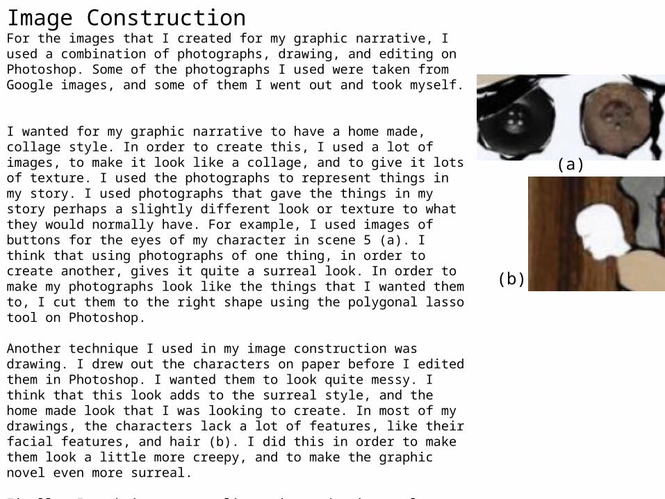
Image ConstructionFor the images that I created for my graphic narrative, I used a combination of photographs, drawing, and editing on Photoshop. Some of the photographs I used were taken from Google images, and some of them I went out and took myself.
I wanted for my graphic narrative to have a home made, collage style. In order to create this, I used a lot of images, to make it look like a collage, and to give it lots of texture. I used the photographs to represent things in my story. I used photographs that gave the things in my story perhaps a slightly different look or texture to what they would normally have. For example, I used images of buttons for the eyes of my character in scene 5 (a). I think that using photographs of one thing, in order to create another, gives it quite a surreal look. In order to make my photographs look like the things that I wanted them to, I cut them to the right shape using the polygonal lasso tool on Photoshop.
Another technique I used in my image construction was drawing. I drew out the characters on paper before I edited them in Photoshop. I wanted them to look quite messy. I think that this look adds to the surreal style, and the home made look that I was looking to create. In most of my drawings, the characters lack a lot of features, like their facial features, and hair (b). I did this in order to make them look a little more creepy, and to make the graphic novel even more surreal.
Finally, I each image an outline using a drawing tool on Photoshop. I did this in order to continue with the hand made look, and to also help each image tie in together better. It also made the characters outlines stand out more, as I had just drawn them in a light pencil.
My final images look quite messy, and thrown together, though I don’t necessarily think that that is a bad thing. I aimed to achieve a surreal, home made, collage look. I think that the way each image is roughly thrown together, and the rough outlines I drew in on Photoshop, have enabled me to achieve this look.
(a)
(b)
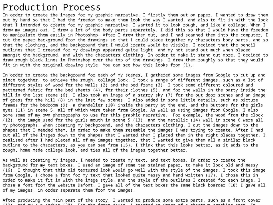
Production Process In order to create the images for my graphic narrative, I firstly them out on paper. I wanted to draw them out by hand so that I had the freedom to make them look the way I wanted, and also to fit in with the look that I intended to create for my graphic narrative. I wanted it to look rough, and like a collage. When I drew my images out, I drew a lot of the body parts separately. I did this so that I would have the freedom to manipulate them easily in Photoshop. After I drew them out, and I had scanned them into the computer, I cut the paper background from the drawings so that I could piece together my characters body parts, and so that the clothing, and the background that I would create would be visible. I decided that the pencil outlines that I created for my drawings appeared quite light, and my not stand out much when placed amongst the background, and with the characters clothing. In order to make it stand out more, I decided to draw rough black lines in Photoshop over the top of the drawings. I drew them roughly so that they would fit in with the original drawing style. You can see how this looks from (1).
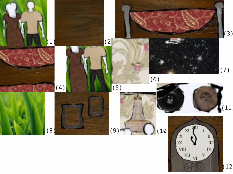
In order to create the background for each of my scenes, I gathered some images from Google to cut up and piece together, to achieve the rough, collage look. I took a range of different images, such as a lot of different styles of wood for the walls (2) and the bed frame (3). I took some different coloured and patterned fabric for the bed sheets (4), for their clothes (5), and for the walls in the party inside the hill in the last scene (6). I also took an image of a starry sky (7) for the out door scenes and an image of grass for the hill (8) in the last few scenes. I also added in some little details, such as picture frames for the bedroom (9), a chandelier (10) inside the party at the end, and the buttons for the girls eyes (11) in scene 5, all of which were taken from Google. As well as using images from Google, I also some some of my own photographs to use for this graphic narrative. For example, the wood from the clock (12), the image used for the girls mouth in scene 5 (13), and the metallic (14) wall in scene 6 were all my photographs. When creating my background, and the characters clothing, I cut the images down to the shapes that I needed them, in order to make them resemble the images I was trying to create. After I had cut all of the images down to the shapes that I wanted them I placed them in the right places together. I realised after I had placed all of my images together, that I wanted to give them all a similar black outline to the characters, as you can see from (15). I think that this looks better, as it adds to the rough, home made collage look, and ties all of the images together better.
As well as creating my images, I needed to create my text, and text boxes. In order to create the background for my text boxes, I used an image of some tea stained paper, to make it look old and messy (16). I thought that this old textured look would go well with the style of the images. I took this image from Google. I chose a font for my text that looked quite messy and hand written (17). I chose this in order to make it fit in with the image style, and the style of the outlines I created for each image. I chose a font from the website Dafont. I gave all of the text boxes the same black boarder (18) I gave all of my images, in order separate them from the images.
After producing the main part of the story, I wanted to produce some extra parts, such as a front cover (19), and my own ending (20). For the front cover, I created an image of a chestnut cracking open. In order to produce this, I rotoscoped an image of a chestnut opening from Google. I only rotoscoped the outer shell, and I just put that in plain black. For the nut inside, I took another image from Google of a sheet of gold. I cut that image down to be the same shape as the nut, in order to make it look like it. For the ending that I created, I wanted it to be mostly just text, so like the text boxes, I used the image of the tea stained paper for the background. I also used the hand written looking text again. The only image I used on this page was an image I created of a drum (21). I just used this image to illustrate what I was saying in the text. The drum looks as if there is liquid gold splashing off it as the drum stick hits it. In order to create the drum and stick, I took an image of a from Google, and then I drew a messy black outline of it on Photoshop, much like the outline I used for the images featured in my story. The, to create the gold splash, I took another image from Google of a sheet of gold, and cut that image on Photoshop to the shape that I wanted it, in order to make it look like liquid splashing up from the drum.
(1) (2)(3)
(4) (5)(6)
(7)
(8) (9) (10)
(11)
(12)
(13) (14) (15) (16)
(17)
(18)
(19)
(20)
(21)
AnchorageIn order to make sure that the reader knew exactly what was happening in each scene, I needed to make sure that I anchored each image properly. This means to describe the scene in a way that tells the audience what is going on. The way in which you anchor something can have an effect on the way the audience perceives the scene, and the response that they have to it.
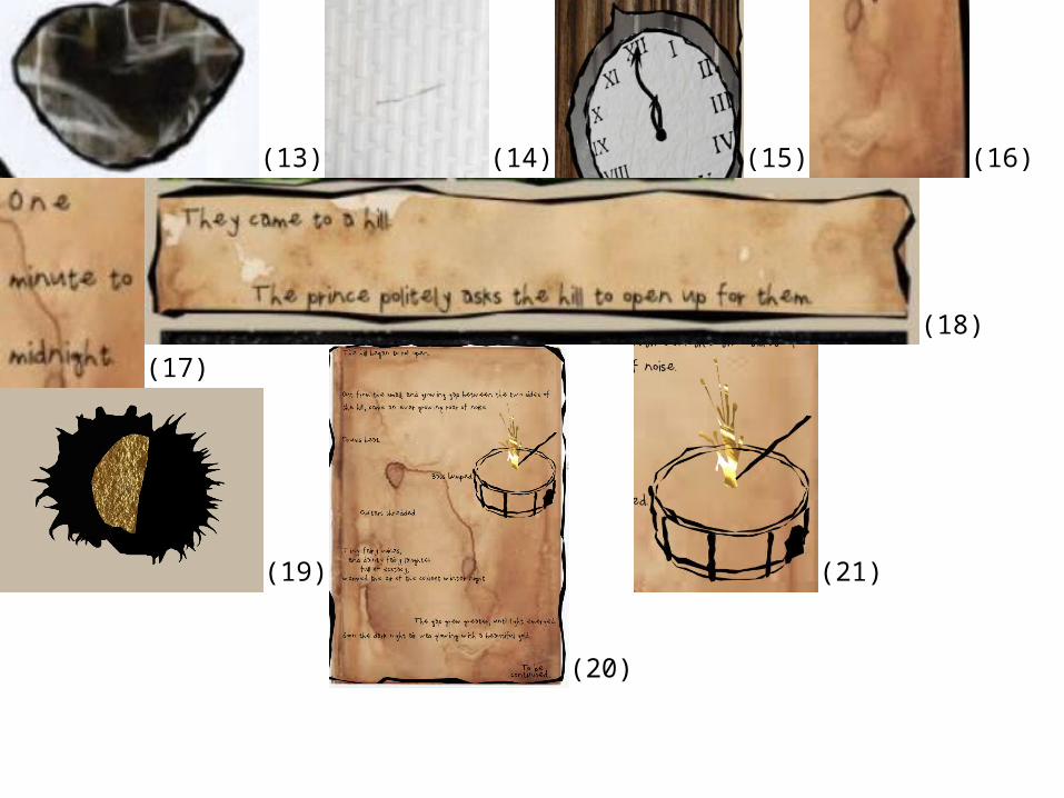
For each scene, I described the story in a simple way, telling the audience exactly what is going on. I think that there is little room for any interpretation in my writing. I have put minimal description in my writing, as I think that the reader will be able to see what the scene is like from the images I have created. You can see from (22) how the text I have written is quite blunt and straight forward.
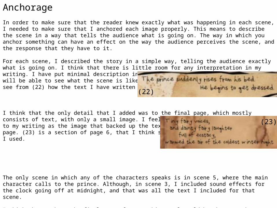
I think that the only detail that I added was to the final page, which mostly consists of text, with only a small image. I feel that I needed to add more detail to my writing as the image that backed up the text on that page was on the previous page. (23) is a section of page 6, that I think shows the level of description that I used.
The only scene in which any of the characters speaks is in scene 5, where the main character calls to the prince. Although, in scene 3, I included sound effects for the clock going off at midnight, and that was all the text I included for that scene.
I think that perhaps the final page of my graphic novel would be the page where anchorage would have the most effect on the reader, and their view of the story. On previous pages, the basic text, and the use of imagery, as not enabled the reader to use their imagination much. However, I think that the descriptive text and the lack of imagery on the final page would allow the reader to use their own imagination more. I think that the text will help them to visualize the story in their own way, perhaps with the influence of the style of the previous images used.
(22)
(23)
SignificationIn my graphic novel, I have included many different signs, that have been used to send a message to the audience about the story, and its mood.
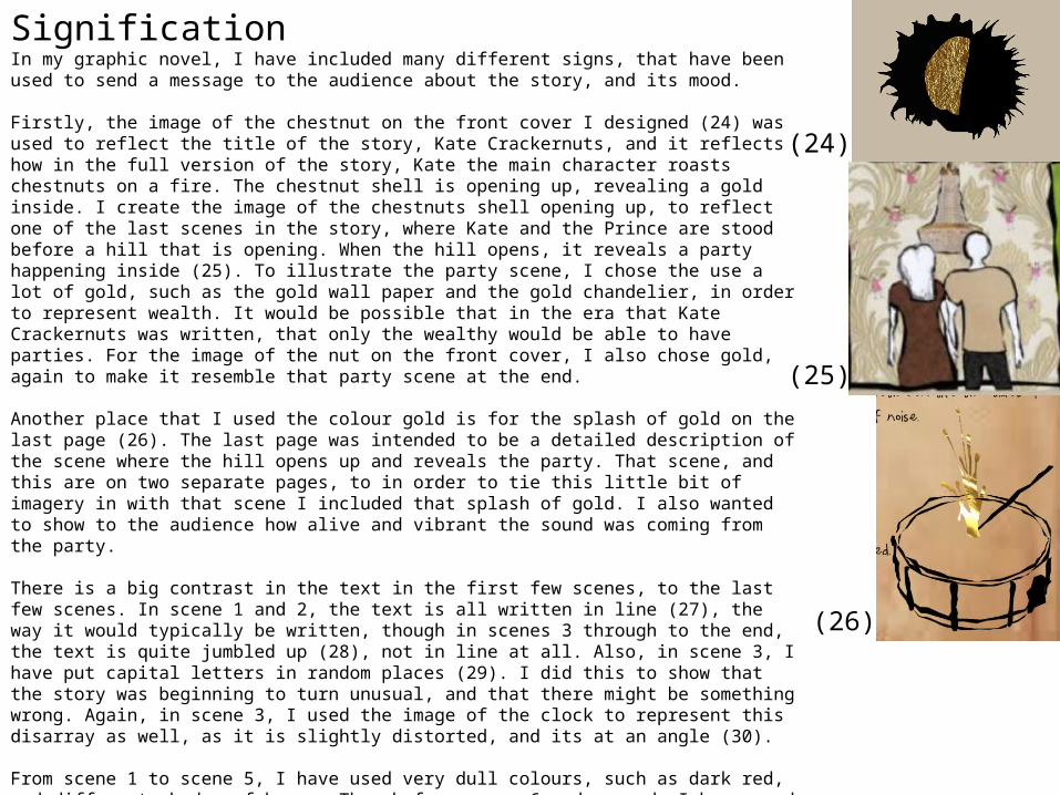
Firstly, the image of the chestnut on the front cover I designed (24) was used to reflect the title of the story, Kate Crackernuts, and it reflects how in the full version of the story, Kate the main character roasts chestnuts on a fire. The chestnut shell is opening up, revealing a gold inside. I create the image of the chestnuts shell opening up, to reflect one of the last scenes in the story, where Kate and the Prince are stood before a hill that is opening. When the hill opens, it reveals a party happening inside (25). To illustrate the party scene, I chose the use a lot of gold, such as the gold wall paper and the gold chandelier, in order to represent wealth. It would be possible that in the era that Kate Crackernuts was written, that only the wealthy would be able to have parties. For the image of the nut on the front cover, I also chose gold, again to make it resemble that party scene at the end.
Another place that I used the colour gold is for the splash of gold on the last page (26). The last page was intended to be a detailed description of the scene where the hill opens up and reveals the party. That scene, and this are on two separate pages, to in order to tie this little bit of imagery in with that scene I included that splash of gold. I also wanted to show to the audience how alive and vibrant the sound was coming from the party.
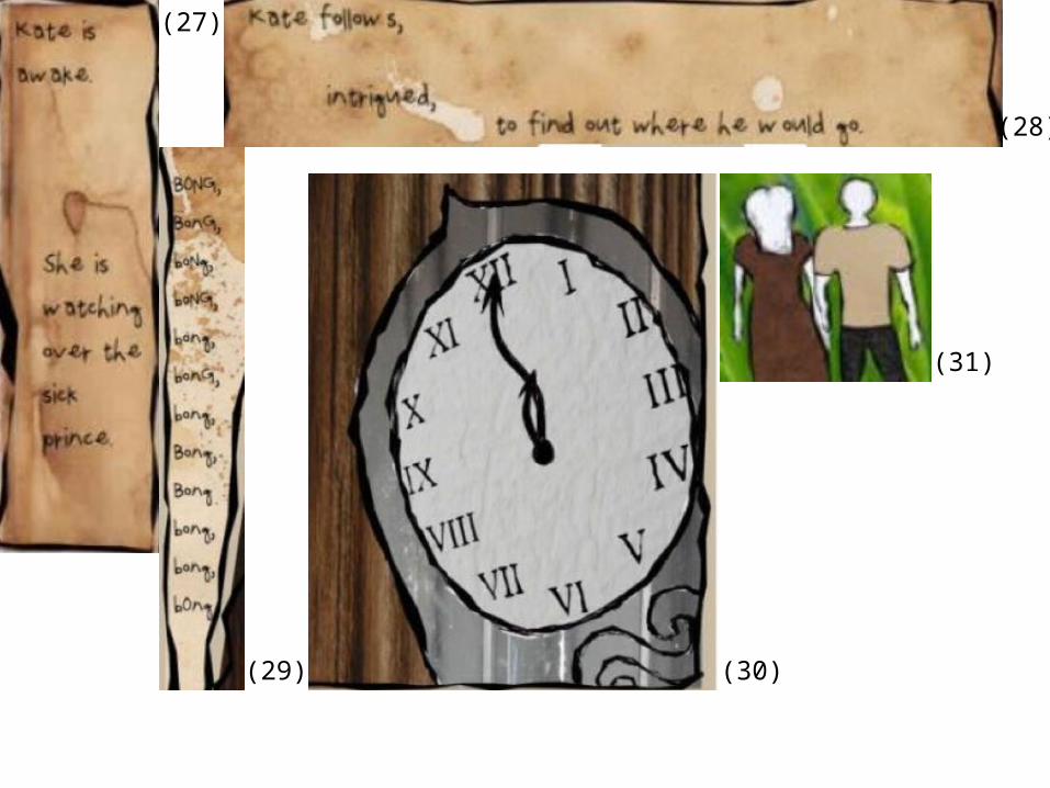
There is a big contrast in the text in the first few scenes, to the last few scenes. In scene 1 and 2, the text is all written in line (27), the way it would typically be written, though in scenes 3 through to the end, the text is quite jumbled up (28), not in line at all. Also, in scene 3, I have put capital letters in random places (29). I did this to show that the story was beginning to turn unusual, and that there might be something wrong. Again, in scene 3, I used the image of the clock to represent this disarray as well, as it is slightly distorted, and its at an angle (30).
From scene 1 to scene 5, I have used very dull colours, such as dark red, and different shades of brown. Though from scene 6 and onwards I have used some brighter colours, such as the shiny metallic colours of silver and gold, the bright starry sky, and the bright green grass. This was done to show that things were dull, and normal to begin with, but then turned interesting, and perhaps better.
I have also used Kate’s and the prince’s clothing as a way of showing the audience that they are equals. They are both in quite plain, shapeless clothing (31). Kate’s plain shapeless dress doesn’t distract the audience from her actions in the story, and it shows that audience that they are far more important that the way that she is dresses.
(24)
(25)
(26)
(27)
(28)
(29) (30)
(31)
Representation
I think that this story has a very positive representation of women, especially compared with many other fairy tales.
In the story of Kate Crackernuts, the main character Kate is represented as being brave, and also being caring. In the full story, Kate performs a series of brave and caring acts, such as volunteering to look after the sick Prince through the night, knowing the fate of others who have attempted to look after him. She also runs away with another character, Anne, in order to seek her help for her disfigured face. The narrator of the story also describes Kate as “a brave girl”.
In the story, Kate is meant to be a princess, though despite this she is just referred to as Kate throughout the story, and the prince is just referred to as the prince. Often in fairy tales, the princess and the prince would be referred to as princess and prince, however I think that the fact that the princess is referred to by her name perhaps suggests that she is much more human than just a princess. Though it could also suggest that her acts, of which are outside of the ordinary for a princess, could be making her appear as lesser.
In the images in my story, both the prince and the princess are in similarly coloured clothing, both very dull, and very shapeless clothing. Typically in fairy tales the prince and the princess would be in very elaborate clothing. The princess would usually be in a very light corseted dress, that would have a huge skirt. Kate’s dress is very plain and loose fitting. I did this because I wanted the reader to not take notice of the way that the character looked, though what she was ding, as I wanted to represent her acts as far more important.
Historical and Cultural ContextIn many ways, I think that Kate Crackernuts goes against the cultural conventions of its time. The story Kate Crackernuts was written in 1889, in a time where women had few rights, and little choice. The expectations of women at the time would be to marry young and have children, and to stay home and look after them and the house.
From reading Vladimir Propp’s character theory, he suggests that there are 8 different types of characters features in fairy tales and stories. One character he suggests is the hero, who is sent on a mission, gains power from a donor and weds the princess. His theory clearly doesn’t reflect the character in my story, as the hero character in my story is the princess, though at the end of the story they do get married. Another or Propp’s characters is the princess, who he claims is not often included in the actual narrative, but is the hero’s prize if he succeeds. This character theory also differs from the princess in my story, as she is the main character in the story. At the end, when she marries the prince, neither she nor he is the prize for any success. I think that this shows that this story goes against a lot of cultural expectations.
I look at another story, written around the same time as Kate Crackernuts. The story was the Twelve Dancing Princesses, and follows a similar concept to Kate Crackernuts. The story is of twelve princesses, who all go to sleep and wake up each morning with their dancing shoes looking worn as though they had been dancing all night. In this story, it is a man who is to find out why each girls shoes seem worn. The story is much more classic to its time than Kate Crackernuts, where the gender roles are very stereotypical and the father gives away the daughter to any man who proves himself and helps him solve the mystery. Where as in Kate Crackernuts, the father of the prince asks the princess for help, and Kate is the one being described as brave, which is more stereotypical of male characters. Again, I think that this shows that Kate Crackernuts in many ways goes against the conventions of its time.