graphing in sas softwareanalytics.ncsu.edu/sesug/2001/p-209.pdf · graphing in sas software...
TRANSCRIPT

Graphing in SAS SoftwarePrepared by
International SAS® Training and Consulting
Destiny Corporation – 100 Great Meadow Rd Suite 601 -Wethersfield, CT 06109-2379
Phone: (860) 721-1684 - 1-800-7TRAININGFax: (860) 721-9784
Email: [email protected]: www.destinycorp.com
Copyright © 2001 Destiny Corporation
Proc Gplot
Proc GPLOT is the standard Sas procedure that allows us to creategraphs in plot form.
The GPLOT procedure allows you to plot one variable against another,each pair derived from the same observation in the input data set.
We can produce relatively simple plots using a few statements and thenenhance the result.
With GPLOT we can do the following:
� Draw reference lines on the plot
� Overlay plots
� Use any symbol to represent the points
� Reverse the order on the vertical scale
� Plot character variables (<= length 16)
� Select colors, symbols, interpolation methods, line styles
� Produce 'bubble' charts
� Plot a second vertical axis
� Produce logarithmic plots
Simple Plots
Proc GPLOT uses the Share Price Data Set and produces a scatter plotfor two variables.
The Plot statement first specifies the Y-axis.
A Gplot step may contain any number of Plot statements.
A Quit statement is required at the end of the program code because theprocedure resides in memory.
Note: Confirm that the Create Listing option in the Results tab in thePreferences window is checked. This is critical for SAS to be able to storethe output created (in list format) and create a graph from this output.
SAS creates the following list output and graph output:
Connecting the Dots
By default, the values on the graph are left unconnected. This is probablythe most accurate depiction of the data, because once lines are drawnbetween data points, we begin making assumptions about the data.
The Symbol statement is used to specify the line drawn between the datapoints. Join and Spline are two methods used by the symbol statement toconnect the dots.
An example of the Symbol statement with the Join option is displayedbelow:

Once specified, the symbol statement remains in effect until it is canceledby another specification or by specifying the following:
Goptions Reset=Global;
This is only one way of joining the points on a graph.
The symbol statement controls the type of line drawn, its color, width, linestyle and the symbol used to mark the data points. Now let’s resubmit thecode using the Spline option, which applies a smoothing effect to thepoints being connected.
Incorporating the rcli95 option in the Symbol Statement:
Labeling the Axes
In the previous example, the range of vertical axis of the graph(representing bp) is mapped by default. It ranges from 310 to 380 inscale.
We can change the default settings for both axes by specifying theranges for the axes, as displayed in the code below:
We can change the presentation of the graph, in this manner.
The symbol statement has been repeated here for clarity. It is notnecessary, since it was submitted previously.

Adding Titles, Footnotes and Legends
There is no legend on the graph even though the legend was requested.
We will see how to display legends using a different form of the plotstatement, in a subsequent section.
Legends can be constructed with footnote statements on simple plots.
Once specified, the Title, Footnote and Symbol statements remain ineffect until canceled.
Overlaying
The overlay option is used to place multiple graphs on a page.
This is illustrated in the code below:
Notice the colors of the plot lines.
One symbol statement has been used in this graph, all with the optioni=join.
The second plot requested was not produced. The SAS log informs usthat the values to be plotted lie outside the axis range specified: either thevaxis or the haxis specification is not sufficient to cover all the data.
Since the values of date are the same for all share prices, we canassume that the vaxis needs to be extended.
Let’s re-submit the code after making modifications to the vaxis, asdisplayed:
The graph now displays all the plots as requested in the code.

Global Statements
Symbol statements cycle round the list of colors if not color is specified
Symbol statements are Global.
The program below first resets the global statements to the default andthen sets the Symbol, Title and Footnotes again.
This is clearly inefficient, and has been shown solely for illustrationpurposes.
Symbol statements are additive, in addition to being global in nature.
The result of Symbol1 displayed in the previous code is:
Symbol1 i=join;+ Symbol1 c=red;
= Symbol1 i=join c=red;
The graph shows one symbol statement being used, a joined red line.
The other plots do not have symbol statements and a join is notdisplayed. They have begun to cycle round the list of colors for thedevice.
Cycling Colors
If the Symbol statement is not given a color, then it cycles round the listof colors for the device, generating a symbol statement each time.
Given a device with the following colors:
goptions colors=(black,red,green,blue,orange,brown);
Consider the effect of the following Symbol statements:
Symbol1 c=green i=join;
Symbol2 i=join;Symbol3 c=blue i=join;
Results in the following symbol statements generated:
symbol c=green i=join;* 1st statement generated;symbol c=black i=join;* 2nd generated;symbol c=red i=join;* 3rd generated, etc...;symbol c=green i=join;symbol c=blue i=join;symbol c=orange i=join;symbol c=brown i=join;symbol c=blue i=join;
Pointing to a Symbol Statement
The Plot statement can point to a Symbol Statement. It points to the nthgenerated symbol statement, as displayed below:
The values inform SAS how to assign the Symbol Statements.
Line Control
Proc Gplot controls lines using the Symbol Statement. The symbolstatement can accept many options Symbols.
SYMBOL STATEMENT LINE = OPTIONS
SYMBOL STATEMENT VALUE= OPTIONS
SYMBOLS CODE(SYMBOLS)
Variations
Examples of Symbol Statements:
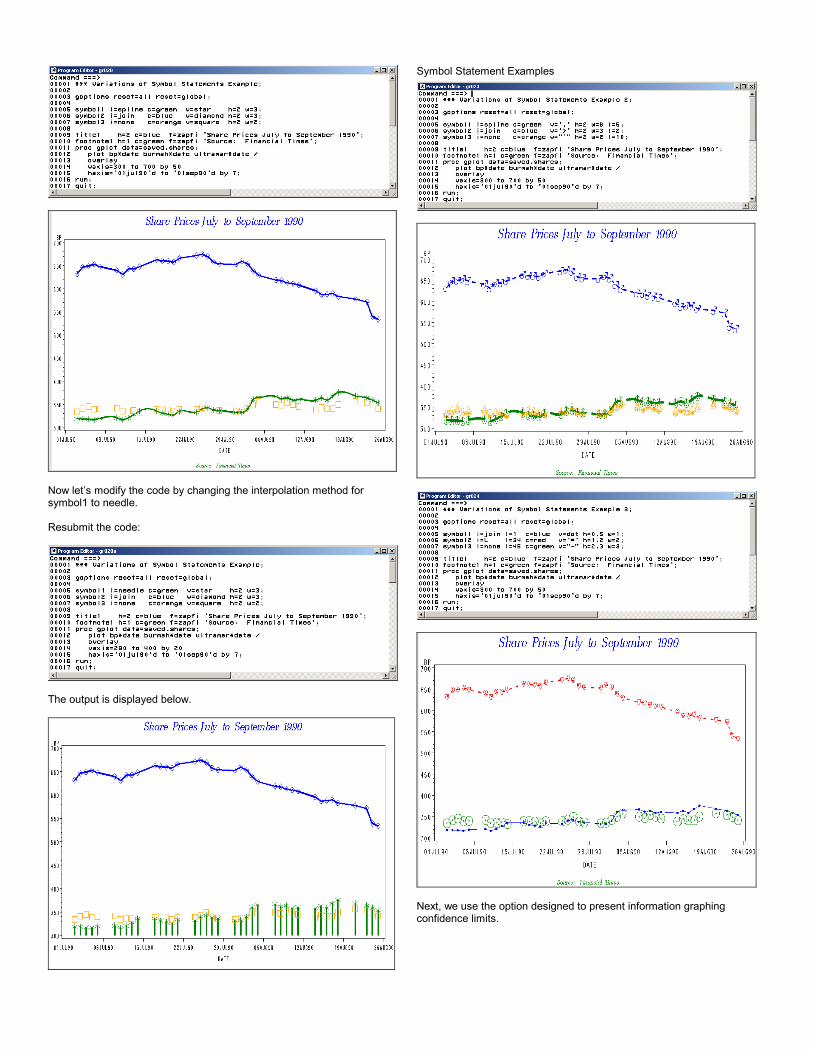
Now let’s modify the code by changing the interpolation method forsymbol1 to needle.
Resubmit the code:
The output is displayed below.
Symbol Statement Examples
Next, we use the option designed to present information graphingconfidence limits.

X*Y=Z and Axis Control
A normal plot statement of the form:
Plot A*C B*C / Overlay;
The above code displays two plots on one graph, but no legend showingwhich line corresponded to A, and which to B.
X*Y=Z
Using the X*Y=Z form of the Plot statement generates automatic Legendswhich display what each line represents.
Plot X*Y=Z;
To do this, the data must be in a certain structure.
Review the Flu data set:
Output in list form:
Output in HTML form:
We could Plot A*Date B*Date C*Date D*Date E*Date /Overlay; but thiswould not generate a legend.
We need to rearrange the data for the Y*X=Z form.
Rearranging Data

We can now Plot Cases*Date=Category;
For each Category, A, B, C, D, E a separate line will be drawn on thegraph.
The output is displayed below.
The five Symbols statements generated will match with the five linesdrawn, one for each value of category.
Always review the SAS log for notes and messages. They inform youabout plots that lie outside the available range.
Introduction to Charts
SAS/GRAPH can create different chart styles.
Let’s illustrate with a few examples.
Vertical Bar Chart Example
Submit the following code:
Horizontal Bar Chart Example
Notes:

Unless otherwise specified, SAS displays the frequency of the selectedvariable for display, by default.
Each bar or block represents a value of a variable, either character ornumeric.
Bars can be grouped, sub-grouped and various patterns and colors canbe used to enhance the presentation.
By default, Horizontal Bar Charts display graph statistics on the grapharea next to the graph.
Pie charts can be of two types, Pie Charts and Star Charts.
Terminology
Physical Forms
The physical form of a chart is determined by the type specified in SAScode:
Proc Gchart Data=SAS_data_set; Vbar Variable / Options ;
The Vbar statement requests a vertical bar chart.
The variable after Vbar determines the number of bars the graph willcontain.
Options on the statement control other aspects of the graph.
For example, the Demograf data set has a variable named gender, whichhas two values: F and M.
If we specify the following:
The following chart is displayed.
By default, the vertical axis displays the frequency or the number ofobservations in the data set.
In this case, there are 21 females and 14 males.
Midpoints
For numeric variables, SAS/GRAPH will chart the midpoints of a datarange.
Sometimes this produces unexpected results.
Let's consider the same vertical bar chart as before, but use a numericvariable such as Age that takes on values from 15 to 65.
As seen from the graph, it does not produce one bar for each value in thedata.
The data range (2 to 65) is divided into ranges, and the midpoint of eachrange is charted:
DISCRETE
The discrete option suppresses the calculation of these ranges andforces the procedure to produce one bar for each value in the data.
Submit the code below for illustration purposes.
The graph will be displayed, as follows:

The Discrete option is valid for all types of charts.
Valid Options for GCHART
Some options are common to the Vbar, Hbar, Block, Pie and StarStatements, while others are specific to the type of chart being drawn.
The table below lists options the types of chart(s) to which they can beapplied.
Bar Charts
Vertical Bar Charts
The Vbar Statement produces Vertical Bar Charts, also known asHistograms.
Character Variables
The discrete option does not add value when used with a charactervariable since each value in the data is given a bar.

The Response Axis
The response axis is controlled with the SUMVAR (summing variable)option.
By default, the sumvar option displays the sum for the specified variable.
Statistics for SUMVAR
By default, the statistic displayed for Salary is SUM.
The response axis can display several different statistics, such as Mean,Sum (total), Freq, Cumulative Percent, Cumulative Frequency.
The option controlling statistics is TYPE.
Type and Sumvar work together to control which variable and statistic isdisplayed on the response axis.
Controlling the Bars
The Midpoints option allows specification of which bars to chart. Usequotation marks around character values.
The usual SAS shortcuts can be coded when using Midpoints, e.g. 10 to100 by 10.

Selecting Observations
The Where clause can be used to subset certain observations you wishto chart.
Sub-Dividing the Bars
The SUBGROUP option allows us to use another variable to divide thebars:
Note that an automatic legend is produced when subgroup is specified.
Grouping Bars
In addition to sub-dividing bars, they can also be grouped together usingthe GROUP option. This is displayed below.
Additional Options
Additional options are available that can control the appearance of thereport.
The following example illustrates Frame, Gspace, Space, Ref, Patternid,Nozeros, Ascending, Sum and Raxis.
The above code has four pattern statements (lines 5-8) and the pattern id(line 13) changes patterns by sub-group.

The graph used four different patterns.
The space between the bars and the space occupied by the bars is set totwo.
A reference line is drawn at 10,000, and the bars are drawn in ascendingorder.
No space is left for non-existent bars, and patterns change across thesub-groups.
The response axis is ordered with the Raxis option.
Block Charts
Block Charts are specified with the Block statement.
They use more space on the graphics area than a Vbar or Hbar and youmay need to increase Hpos and Vpos. This is displayed on the next page.
Manhattan Charts
The GROUP option produces Manhattan Charts.
Note how the use of the discrete option changes the graph.
Also called Manhattan Charts, this Grouped Block Chart displays the dataacross the two axes.
Note the values of Hpos and Vpos.
The original values of Hpos=80, Vpos=62 have been increased by 50%each.
The aspect ratio then remains the same.
Calculations: 80+40 = 120 62+31=93
Pie Charts
Pie Charts can be displayed using pies and stars.
Both types are capable of displaying data in a circular pie form.
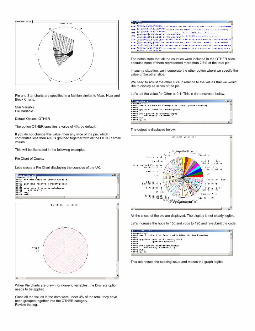
Pie and Star charts are specified in a fashion similar to Vbar, Hbar andBlock Charts:
Star VariablePie Variable Default Option: OTHER
The option OTHER specifies a value of 4%, by default.
If you do not change this value, then any slice of the pie, whichcontributes less than 4%, is grouped together with all the OTHER smallvalues.
This will be illustrated in the following examples.
Pie Chart of County
Let’s create a Pie Chart displaying the counties of the UK.
When Pie charts are drawn for numeric variables, the Discrete optionneeds to be applied.
Since all the values in the data were under 4% of the total, they havebeen grouped together into the OTHER category.Review the log.
The notes state that all the counties were included in the OTHER slicebecause none of them represented more than 2.6% of the total pie.
In such a situation, we incorporate the other option where we specify thevalue of the other slice.
We need to adjust the other slice in relation to the values that we wouldlike to display as slices of the pie.
Let’s set the value for Other at 0.1. This is demonstrated below.
The output is displayed below:
All the slices of the pie are displayed. The display is not clearly legible.
Let’s increase the hpos to 150 and vpos to 120 and re-submit the code.
This addresses the spacing issue and makes the graph legible.

Now let’s fill all the slices in the pie with solid colors.
Let’s add a pattern option, as follows:
We see that about half the total number of slices in the pie are solid. Thisis because the large number of slices requires more than one patternspecification.
We need to keep adding pattern statements (pattern1, pattern2, pattern3)until all the slices are solid.In this example, we need to add three pattern statements to make all theslices in the pie solid colors.
There are so many slices in this pie that they have exhausted threepatterns.
Finally, we see that all the slices have been assigned solid colors.
Review the log and you will see messages stating that not all the slices inthe pie were labeled.
This is addressed in the following section.
Labeling just the Midpoint
Let’s take the previously submitted code and add the slice, value andpercent options.
Submit the code.

We see that the output is displayed as follows.
Regional Percentages
In the previous examples, by default the frequency was displayed on thecharts.
When the SUMVAR option is absent, the frequency, or the number ofobservations in the data set, is charted.
Let’s label each slice of the pie, as displayed in the following code.
We see that there are no warning messages in the Log.
Contour Plots
Contour plots present output in three-dimensional forms.
There are two procedures used for plotting in three dimensions:
1. GCONTOUR
2. G3D
In GCONTOUR the response to two independent variables is displayedas different contour lines
G3D is a 3-dimensional perspective representation, either as a 'sheet' ofjoined points or a scatter plot.
In this section, we will demonstrate how to produce the various shapes ofa plot.
It is beyond the scope of this course to explain all the options andfeatures available.
The next sections explain how to create basic shapes and enhance plotsusing features like patterns, axis and legend specifications and definitionsof different plotting symbols.
The data set used for our examples is typical of monitoring drug dosages.
The two independent variables used are the dosage, which is recorded inmilligrams and the frequency of dosage, which is shown in hours.
The response to the dosage and frequency is measured in terms of thepatients' pulse rate.
Here is a sample of the data:
Dose is measured in milligrams and regulary is measured in number ofhours.
The goal here is to lower the patients’ pulse rate as much as possiblebased on the combination of dosage and regulary.
The first example shows the default contour plot produced with the Y*X=Nform of plot statement.
The vertical axis is the Y, the horizontal is the X and the contour, or theresponse axis, is represented by values of the N.

The SAS System has chosen the line types, axis gradations and contoursteps.
We can infer a pattern from the data that the patient response is gettingbetter with increased dose and regularity.
We can also see that dosages greater than around 75 milligrams at 4-hour intervals (regulary) do not decrease the pulse rate - in fact, itincreases again.
The goal is to find the point at which the pulse rate is minimized. Thistrend will be shown in many ways in the following graphs.
This example shows that for a given regularity of dosage, increasingdosage results in a decrease in pulse rate. After reaching a certaindosage level pulse rates start to rise again.
The most effective dosage seems to be 75 mg at four-hour intervals.
Increasing the dosage to 110 mg has a less positive response.
LEVELS= Option
The first way we can enhance the plot is to specify the contour levels.
This is done by the LEVELS= option on the plot statement.
As usual, options on a plot statement follow a /.
The levels are going to start at 80 and increase in increments of 15 up to140. The legend reflects this information.
Note that the start value (80) is below any value in the data, and a note inthe LOG states the same.
Pattern Option
The pattern option displays the graph as 'bricks' of X and Y combinations.The contour passes through it to be patterned according to value.
The join option joins together areas of equal response.
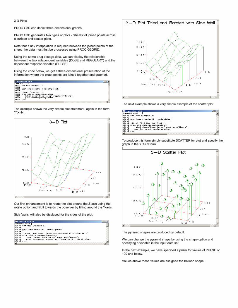
3-D Plots
PROC G3D can depict three-dimensional graphs.
PROC G3D generates two types of plots - 'sheets' of joined points acrossa surface and scatter plots.
Note that if any interpolation is required between the joined points of thesheet, the data must first be processed using PROC G3GRID.
Using the same drug dosage data, we can display the relationshipbetween the two independent variables (DOSE and REGULARY) and thedependent response variable (PULSE).
Using the code below, we get a three-dimensional presentation of theinformation where the exact points are joined together and graphed.
The example shows the very simple plot statement, again in the formY*X=N.
Our first enhancement is to rotate the plot around the Z-axis using therotate option and tilt it towards the observer by tilting around the Y-axis.
Side 'walls' will also be displayed for the sides of the plot.
The next example shows a very simple example of the scatter plot.
To produce this form simply substitute SCATTER for plot and specify thegraph in the Y*X=N form.\
The pyramid shapes are produced by default.
We can change the pyramid shape by using the shape option andspecifying a variable in the input data set.
In the next example, we have specified a prism for values of PULSE of100 and below.
Values above these values are assigned the balloon shape.

G3GRID Procedure
We can use the G3GRID to smooth the values in our input data set andproduce an improved G3D.
See the user guide for the amazing algorithm!