greg castillo - uc berkeley college of environmental...
TRANSCRIPT


Thanks to the folks who helped in the development and production of the thesis:
Advisors:Neyran TuranGreg Castillo
Ron Rael
Colleagues:Marc Rios
Santiago ValesJaekyung Han
Pablo HernandezAdam CardenasElizabeth Romo
Elizabeth Leonardo LagardeCarlos Ramirez Esquivel
Special thanks to Jonathan Solis and David Ferreria

Content
abstract...
many thin buildings...
the mcmansion...
a slice of home...
semaphores of thin...
4
6
34
60
138
A Slice of Home by Albert Orozco


We are in an era where we no longer associate a home to what is closest or most familiar to us. When we think of a home we think about room sizes, comfortability, luxury, and an overall aesthetic of wealth. We can say that we have grown accustomed to a certain living standard and a certain size criteria in American homes. The McMansion, the giant and excessive single family home, is the clearest example of what I am trying to describe. We often see these homes designed and sold through a pristine lens, creating pictorial -gorgeous interiors, when in fact they are full of ugly errors (veneers covering assembly disconnections, the convoluted use of roof systems, material assembled in awkward ways, frames hot glued to the wall, and the list continues. The McMansion is intrigu-ing because of its size, dimension, ornamentation, and aesthetic to perpetuate a superficial thinness within these types of homes.
My thesis takes thin slices out of the McMansion to hyper-expose these superficial aesthetic elements through a series renderings, models, and obliques. I am specifically interested in the thinness of wainscoting, window frames, moldings, columns, floor & wall tiles, railings, and especially wallpaper because these are elements that contributes to an overall deception of these McMansion interiors. This thesis is an exposure of the general superficial aspects of this kind of living.
abstract 5

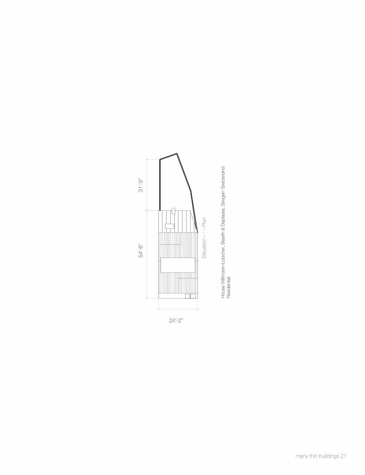
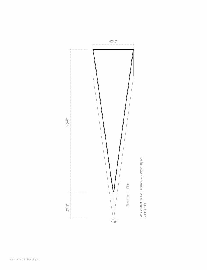
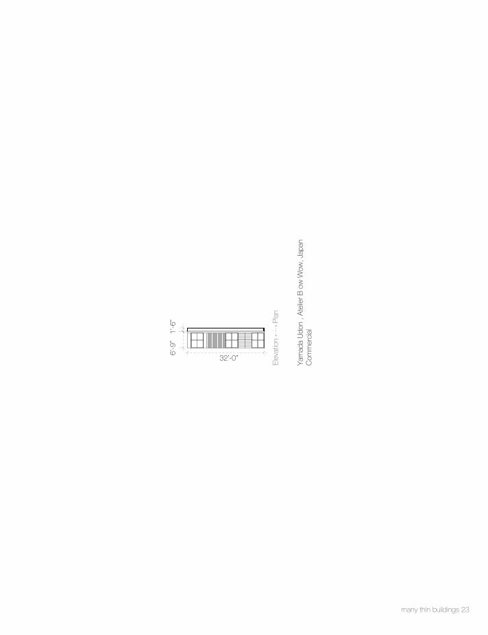
Many thin buildings
In this thesis I cataloged many different types of thin buildings. These thin buildings ranged from commercial, residential, to institutional buildings that were defined as thin by their virtue of
size
dimension
aesthetic
& a judgment of how thin form is perceived to the eye.
These buildings are thin due to a necessity to fill space within urban cities and residential suburbs. In telling of all these thin buildings the underlying understanding is that these buildings challenge the culture of living by creating thin space.
6 many thin buildings

many thin buildings 7
Pet
Arc
hite
ctur
e #4
5, A
telie
r B o
w W
ow, J
apan
Res
iden
tial
Pla
nEl
evat
ion
2’-6”
10’-3”
15’-9
”19
’-9”

8 many thin buildings
Ker
et H
ouse
, Jak
ub S
zczę
sny,
War
saw
Res
iden
tial
Pla
nEl
evat
ion
2’-9”
18’-2
”34
’-1”
4’-7”

many thin buildings 9
久梅園
, Jap
anR
esid
entia
l
Pla
nEl
evat
ion
49’-11”
32’-0
”4’
-0”

10 many thin buildings
Oud
e H
oogs
traat
22,
Am
ster
dam
Res
iden
tial
Pla
nEl
evat
ion
3’-0”
7’-0”
38’-0
”16
’-0”
4’-0”

many thin buildings 11
7’-4”
15’-1
0”35
’-3”
scul
p(IT
) Liv
e/W
ork,
Pie
ter P
eerli
ngs
and
Silv
ia M
erte
ns, A
ntw
erp
Res
iden
tial

12 many thin buildings
7’-6”
24’-0
”43
’-10”
Slim
Hou
se E
xten
sion
, Alm
a-na
c, L
ondo
nR
esid
entia
l

many thin builings 13
Pla
nEl
evat
ion
7’-7”
11’-9
”47
’-0”
Toro
nto'
s Li
ttle
Hou
se, A
rthur
Wee
den
Res
iden
tial +
Ret
ail

114 many thin buildings
Pla
nEl
evat
ion
47’-0
”11
’-9”
7’-7”
Toro
nto'
s Li
ttle
Hou
se, A
rthur
Wee
den
Res
iden
tial

many thin buildings 15
7’-9”
31’-7
”33
’-7”
Toky
o H
ouse
, YU
UA
Arc
hite
cts
& A
ssoc
iate
s, J
apan
Res
iden
tial

16 many thin buildings
11’-1”
38’-1
”52
’-7”
Gur
o D
ong
Min
i Hou
se, A
IN G
roup
, Seo
ul, S
outh
Kor
ea

many thin buildings 17
11’-10”
35’-4
”36
’-2”
4 M
eter
Wid
e H
ouse
, Ate
lier H
AJO
Arc
hite
cts,
Tok
yo, J
apan
Res
iden
tial
11'-10"

18 many thin buildings
Pla
nEl
evat
ion
29’-2
”15
’-7”
12’-0”
404
Sho
tgun
Hou
se N
ew O
rlean
s

many thin buildings 19
St.
Thom
as S
treet
, Jon
atha
n Ta
te, N
ew O
rlean
sR
esid
entia
l
Pla
nEl
evat
ion
13’-2”
35’-2
”45
’-3”
10’-4”

20 many thin buildings
Pet
Arc
hite
ctur
e, A
telie
r B o
w W
ow, J
apan
Res
iden
tial
Pla
nEl
evat
ion
17’-6”
55’-0
”70
’-0”
many thin buildings 21
Pla
nEl
evat
ion
54’-6
”
24’-2”
31’-9
”
Hou
se W
illim
ann-
Lots
cher
, Bea
rth &
Dep
laze
s, S
evge
in S
witz
erla
ndR
esid
entia
l
22 many thin buildings
Pet
Arc
hite
ctur
e #7
5, A
telie
r B o
w W
ow, J
apan
Com
mer
cial
Pla
nEl
evat
ion
40’-0”
140’
-0”
25’-2
”
1’-0”
many thin buildings 23
Yam
ada
Udo
n , A
telie
r B o
w W
ow, J
apan
Com
mer
cial
Pla
nEl
evat
ion
32’-0”
6’-9
”1’
-6”

24 many thin buildings
Pet
Arc
hite
ctur
e #4
5, A
telie
r B o
w W
ow, J
apan
Com
mer
cial
Pla
nEl
evat
ion
2’-6”
3’-2”
6’-2
”20
’-5”

many thin buildings 25
Kos
uge
Sho
p , A
telie
r B o
w W
ow, J
apan
Com
mer
cial
Pla
nEl
evat
ion
8’-0”19
’-6”
25’-2
”
3’-3”

26 many thin buildings
Cof
fee
Sal
oon
Kim
oto,
Ate
lier B
ow
Wow
, Jap
anC
omm
erci
al
Pla
nEl
evat
ion
11’-9”
3’-4
”
4’-3” 10’-1”
11’-3
”

many thin builings 27
Pla
nEl
evat
ion
52’-0”
27’-6
”5’
-0”
The
Ski
nny
Bui
ldin
g, P
ittsb
urgh
Com
mer
cial

28 many thin buildings
Pla
nEl
evat
ion
25’-3
”
94’-0”
6’-0
”
Sam
Key
Bui
ldin
g, V
anco
uver
, Brit
ish
Col
umbi
aC
omm
erci
al

many thin buildings 29
Bar
Sus
hi, A
telie
r Bow
Wow
, Jap
anC
omm
erci
al
Pla
nEl
evat
ion
6’-9”
21’-8
”24
’-6”

30 many thin buildings
Bar
Per
Mus
ica
Sou
l, A
telie
r B o
w W
ow, J
apan
Com
mer
cial
Pla
nEl
evat
ion
52’-0
”21
’-9”
8’-9”
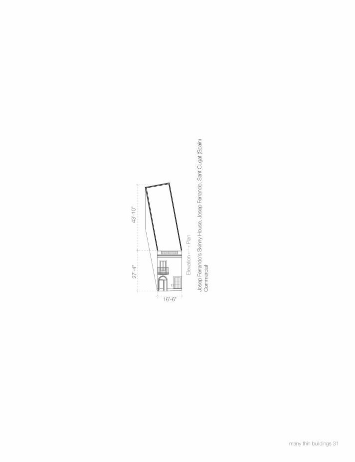
many thin buildings 31
Pla
nEl
evat
ion
16’-6”
27’-4
”43
’-10”
Jose
p Fe
rrand
o's
Ski
nny
Hou
se, J
osep
Fer
rand
o, S
ant C
ugat
(Spa
in)
Com
mer
cial

32 many thin buildings
Pla
nEl
evat
ion
73’-1
1”94
’-4”
18’-0”
The
Hei
nem
an B
uild
ing
130
Bus
h S
t SF
Gov
ernm
ent

many thin buildings 33
Luck
y D
rop
Hou
se T
okyo
Rel
igio
us

The McMansion I approach this problem of size through the McMansion which represents to me the biggest home for a person. I have taken the McMansion and analyzed it through a method of slicing, to create a variety of thin plans out of the McMansion. These slices are not all the same in width dimension, they vary in width because they are specifically cut to create program variety, a richness in building components, sectional opportunity and more importantly a registra-tion of the remnant walls left of the McMansion in these new homes. By slicing the McMansion out of a typical 6,000 sq ft McMansion I produced 19 slices, 8 that are showcased in model form and four that have been rendered and designed.
34 the mcmansion
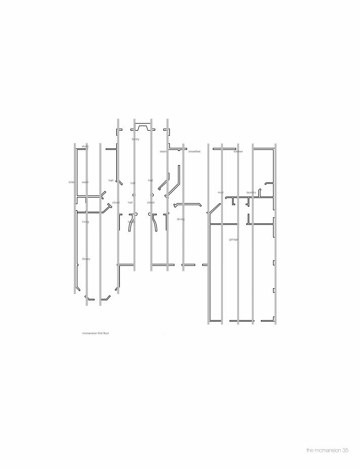
the mcmansion 35
lobby
garage
laundrymud
kitchenstairs breakfast
dining
closet
living
toilet wash Hallhallhall
family
study
hallcloset
library
mcmansion first floor 81.14

36 the macmansion
toilet
shower
toilet
closet
master bath
bath
bed
closet
master bedmaster den
linenhall
open to below
open to below
sitting
bedroom
closetbath
bathcloset
bed
mcmansion second floor
78.3
4

analysis of cuts through the mcmansion showing first and second floor
the mcmansion 37

38 the mcmansion
bed
clos
etsi
tting
bed
bath
25'-3
1/4
"5'
-4 3
/4"
16'-1
0"13
'-10
3/4"
66'-2
1/4
"
5'-8"
stud
yTo
ilet
libra
ryliv
ing
5'-8"
66'-2
1/4
"
19'-4
1/2
"6'
-11"
35'-1
1/2
"

the mcmansion 39
stud
yw
ash
livin
glib
rary
6'-3"
66'-2
1/4
"
35'-9
1/4
"6'
-5"
19'-6
1/4
"
bed
sitti
ngba
th
clos
etbe
dcl
oset
bath 5'
-4 1
/2"
15'-0
3/4
"10
'-3 1
/4"
31'-2
"
66'-2
1/4
"
6'-3"

40 the mcmansion
stud
ylib
rary
livin
gha
ll
was
h
8'-0 1/2"
76'-1
1/2
"
8'-4
3/4
"13
'-2 3
/4"
9'-1
1 3/
4"23
'-5 1
/2"
14'-6
1/2
"
sitti
ngbe
dba
thcl
oset
bed
hall
14'-3
1/4
"16
'-6 1
/4"
5'-5
"14
'-7"
7'-1
1"
76'-1
1/2
"
8'-0 1/2"
10'-9
"

the mcmansion 41
hall
18'-1
1 1/
4"15
'-5 1
/4"
21'-1
1/4
"
71'-3
3/4
"
7'-4 1/4"
hall
Clo
set
lobb
yfa
mily
7'-4 1/4"
71'-3
3/4
"
22'-6
1/2
"11
'-5 3
/4"
6'-1
1 1/
2"14
'-2 1
/2"

42 the mcmansion
hall
21'-1
1/4
"15
'-5 1
/4"
18'-1
1 1/
4"
61'-1
1 3/
4"
7'-7 1/2"
fam
ilylo
bby
hall
7'-7 1/2"
26'-4
1/4
"7'
-8"
20'-6
3/4
"
61'-1
1 3/
4"

the mcmansion 43
hall
21'-1
1/4
"15
'-5 1
/4"
18'-1
1 1/
4"
7'-4 1/2"
61'-1
1 3/
4"
hall
lobb
yfa
mily
clos
et
20'-9
1/4
"14
'-0"
6'-7
"13
'-8 1
/2"
61'-1
1 3/
4"
7'-4 1/2"

44 the mcmansion
dini
ngbr
eakf
ast
stai
rs
14'-5
"8'
-3 1
/4"
25'-1
1/2
"
61'-1
1 3/
4"
7'-2 3/4"
stai
rsha
llbe
droo
m
19'-0
3/4
"13
'-11
3/4"
14'-9
1/4
"
7'-2 3/4"
61'-1
1 3/
4"
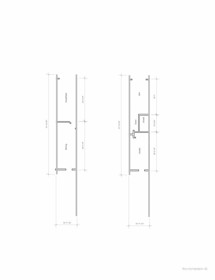
the mcmansion 45
dini
ngbr
eakf
ast
22'-5
3/4
"25
'-4 1
/4"
10'-11 1/2"
51'-1
0 3/
4"
den
clos
et
linen
clos
et
20'-2
1/4
"18
'-7"
51'-1
0 3/
4"
10'-11 1/2"
9'-0
3/4
"

46 the mcmansion
kitc
hen
mud
gara
ge
22'-4
1/2
"8'
-6"
39'-6
1/2
"
6'-3 3/4"
73'-8
1/4
"
mas
ter b
edcl
oset
bath
11'-0
1/4
"9'
-1 1
/4"
18'-5
1/2
"
73'-8
1/4
"
6'-3 3/4"

the mcmansion 47
kitc
hen
mud
gara
ge
19'-1
0 1/
2"10
'-11
1/2"
39'-7
1/4
"
7'-3 3/4"
73'-8
1/4
"
mas
ter b
edcl
oset
show
erTo
ilet
clos
et
32'-0
3/4
"7'
-2"
6'-7
1/4
"6'
-0 1
/2"
18'-7
1/4
"
73'-8
1/4
"
7'-3 3/4"

48 the mcmansion
gara
gem
udki
tche
n
19'-1
0 3/
4"10
'-11
1/4"
39'-7
1/2
"
5'-2 3/4"
73'-8
1/4
"
mas
ter b
ath
clos
etm
aste
r bed
19'-8
1/2
"32
'-1 1
/2"
18'-7
3/4
"
73'-8
1/4
"
5'-2 3/4"

the mcmansion 49
kitc
hen
laun
dry
gara
ge
19'-1
1"10
'-11
1/4"
39'-7
1/4
"
73'-8
1/4
"
10'-0 1/2"
mas
ter b
edm
aste
r bat
h
20'-2
3/4
"18
'-4 1
/4"
10'-0 1/2"
73'-8
1/4
"

analysis of room sized and squarefootage within a mcmansion
50 the macmansion

the mcmansion 51
master bed
bed
master bath
bedroom
bed
6'-8
"
14'-9 1/2"
19'-3
1/4
"
16'-9 1/4"
18'-1
1/2
"
16'-2"
14'-2
"
13'-0 3/4"3'-7 3/4"
12'-3
"
16'-11 1/2"
16'-4
"
24'-4"
17'-1
0 1/
2"
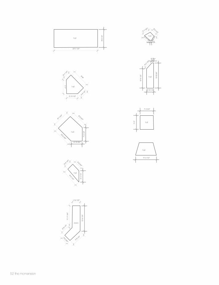
52 the mcmansion
hall
hall
hall
hall
stairs
hall
hall
hall
hall
11'-5 1/2"
7'-3 3/4"
7'-7
"
10'-6
1/2
"
4'-2 1
/2"
13'-6
3/4
"
3'-10 1/4"
11 1/4"
2'-8
3/4"
3'-7 3/4" 3'-0 1/2"
11 1/4"
3'-11 1/2"
4'-0 3/4"
11'-1
1 3/
4"
5'-8 1
/4"
7'-6 1
/4"
13'-9
1/4
"
4'-2 1/2"
3'-8 1
/4"
9'-4 1/4"
4'-9 3/4"
6'-3
1/4
"
23'-7 1/4"
9'-9
1/4
"
7'-3
1/2
"
9'-1 3
/4"
10'-0 3/4"
8'-9 3/4"
5'-10 3/4"
4'-6 1
/2"
9'-8"
5'-10 1/2"
7'-7"
3'-7 1
/4"

the mcmansion 53
closet
closetcloset
linen
closet
closet
closet
closetcloset
closet
linen
4'-6
1/4
"
4'-9 1/2"
4'-5"
9'-0
1/2
"
2'-3"
9'-1
1 3/
4"2'-5 1/4"
31'-4
"
11'-7 1/4"
9'-0
1/2
"
2'-3"
9'-1
1 3/
4"
2'-5 1/4"
6'-3
1/4
"
5'-1 1/4"
1'-6
1/4
"4'
-11
1/4"
3'-8 1/4"
6'-3
1/4
"
5'-1 1/4"
1'-6
1/4
"
4'-11 1/4"
3'-8 1/4"
8'-6
1/2
"
10'-7 1/4"
4'-6
1/4
"
4'-9 1/2"
4'-5"
2'-5 1/4"
9'-1
1 3/
4"
2'-3"9'
-0 1
/2"
3'-8 1
/2"
3'-3"
6'-0"
4'-1
1"
5'-9"
5'-0
"
5'-9 1/2"

54 the mcmansion
toilet
wash
toilet
bath
shower
bath
bath
toilet
5'-1
1"
6'-6 1/4" 3'-5 3
/4"
4'-11 1/2"
3'-8"
5'-1
1"
1'-1
0 1/
2"8'
-0"
5'-11 1/2"
9'-1
0 1/
2"
6'-4 1/4"
9'-1
0 1/
4"
6'-1 3/4"
5'-4
1/4
"
5'-4
1/4
"
3'-7 3/4"
5'-1
1 1/
2"
5'-7 3/4"
10'-3
"
5'-9"
6'-8
"
3'-10 3/4"

the mcmansion 55
sitting
study
living
family
breakfast
kitchen
library
dining
6'-0 1
/4"
8'-7"
5'-11 3/4"
20'-0
3/4
"
17'-1 1/4"
20'-0
"
6'-11 3/4"
7'-0 1/2" 7'-0 1
/2"
8'-5
3/4
"16'-10 1/4"
8'-5
"
19'-2 1/2"
19'-2
"
7'-2 3
/4"
5'-8"
9'-0"11
1/2"
9'-10
"
19'-2
"
19'-1"
13'-1
1 3/
4"
4'-11 3/4"
20'-7"
19'-9
3/4
"
19'-1
1 1/
2"
9'-3 1
/2"9'-2 1/2"
7'-3 3/4"
20'-1
0 3/
4"
16'-11 1/2"
10'-10 1/2"
9'-5 1/2"
9'-4 1/4"
13'-9
1/2
"
9'-2 3
/4"
12'-6
1/2
"
18'-1
0 1/
2"
16'-2"
6'-11 3/4"
16'-10 1/4"
8'-5
"
7'-0 1
/2"
7'-0 1/2"
8'-5
3/4
"

56 the mcmansion
lobby
master den
laundry
mud
6'-7 1/2"
12'-10"
13'-9
1/2
"
19'-10 1/4"
10'-5
1/2
"9'-11 3/4"
15'-3 3/4"
3'-1
1 1/
4"
9'-5"
8'-6 1/4"
10'-5
1/2
"

the mcmansion 57
garage
38'-1
0 1/
4"
25'-9 1/2"

58 the mcmansion

the mcmansion 59

A slice of home
60 a slice of home

As mentioned earlier the project consist of 8 models and 4 building designs. These buildings have been labeled as marble, decor, plaster, and travertine (wallpaper materials that have been applied to each of the buildings). The drawings speak to the design of the interior and exterior of the building with a hint of site context, while the models speak about an attitude to site, suburbia, and form.
a slice of home 61


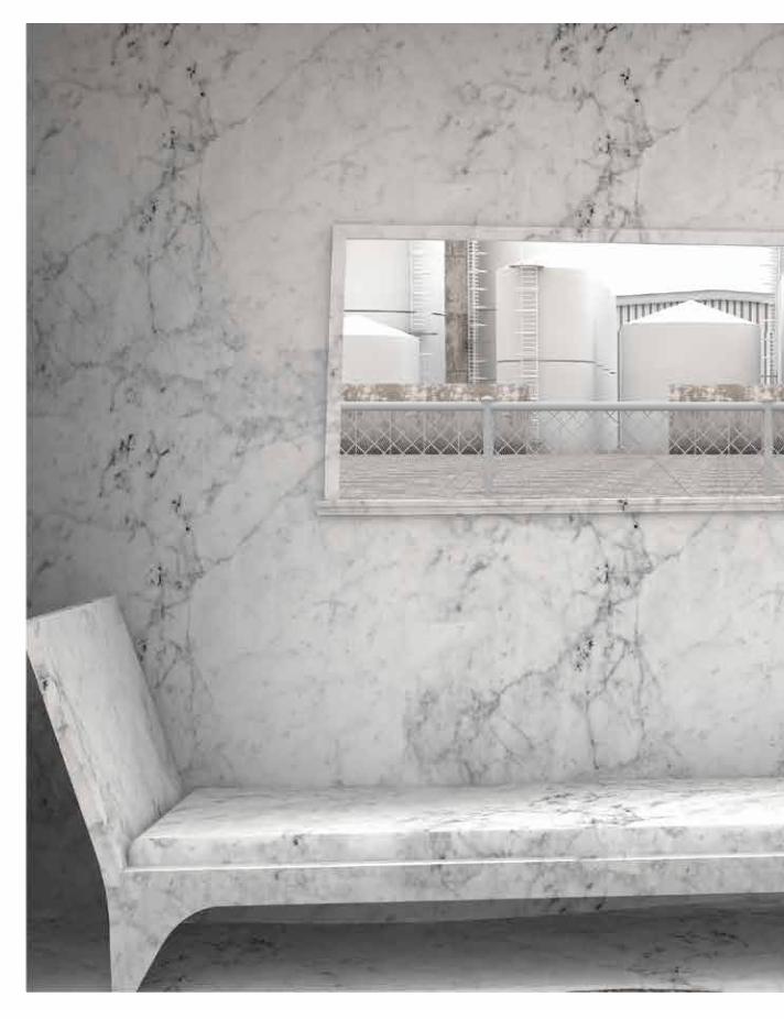
marble Marble wallpaper was chosen as a material as it is commonly used as counter-top material for
McMansion interiors.
The thin slices out of the McMansion were not enough to talk about thin space. I’ve programmed the space by arranging furniture within the extracted slices. I’ve then taken the poche of the slice and moved it to meet the edge of furniture, reminiscing walls, columns, stairs, etc. I included furniture as part of the design process because to me the details that make up a home are the kitchen table, books, paintings, bed, a toilet, a couch, and a kitchen.
64 a slice of home

a slice of home 65

66 a slice of home
3'-0"
2'-4 1/2"
2'-5"
1'-10"
2'-1 3/4"
1'-8"
2'-0 3/4"
9'-9
3/4
"7'
-3 3
/4"
2'-1
1 3/
4"8'
-8 1
/4"
stai
rsst
udy/
dini
ngen
tranc
ebe
d
first floor

a slice of home 67
3'-0"
18'-7
3/4
"9'
-10
1/2"
3'-0 1/2"
1'-11"
1'-3 1/4"
2'-0 1/2"
2'-9 1/2"
hall
bath
second floor

68 a slice of home
13'-0
"
3'-5 1/2"
37'-9
3/4
"
width
heig
htle
nght
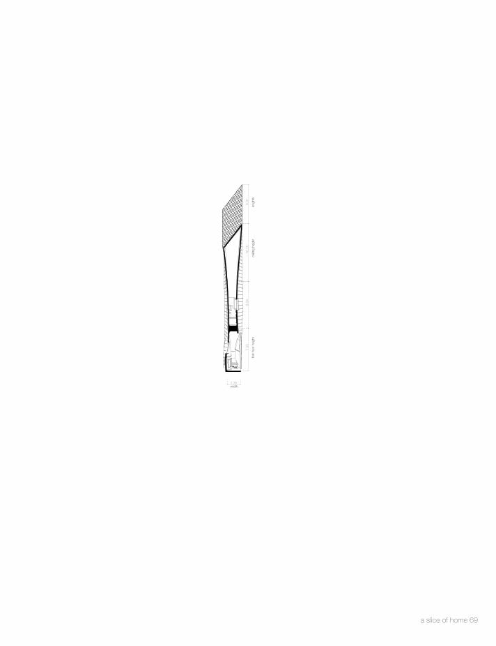
a slice of home 69
7.55
8.34
10.2
56.
91
2.38width
first
floo
r hei
ght
ceilin
g he
ight
leng
hth


a slice of home 79

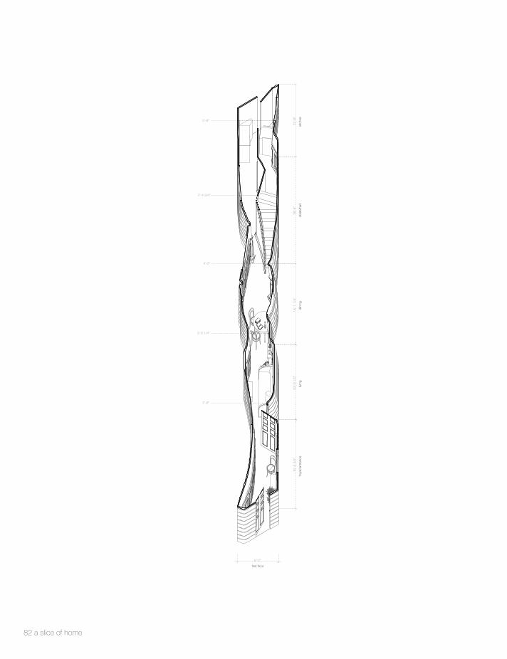
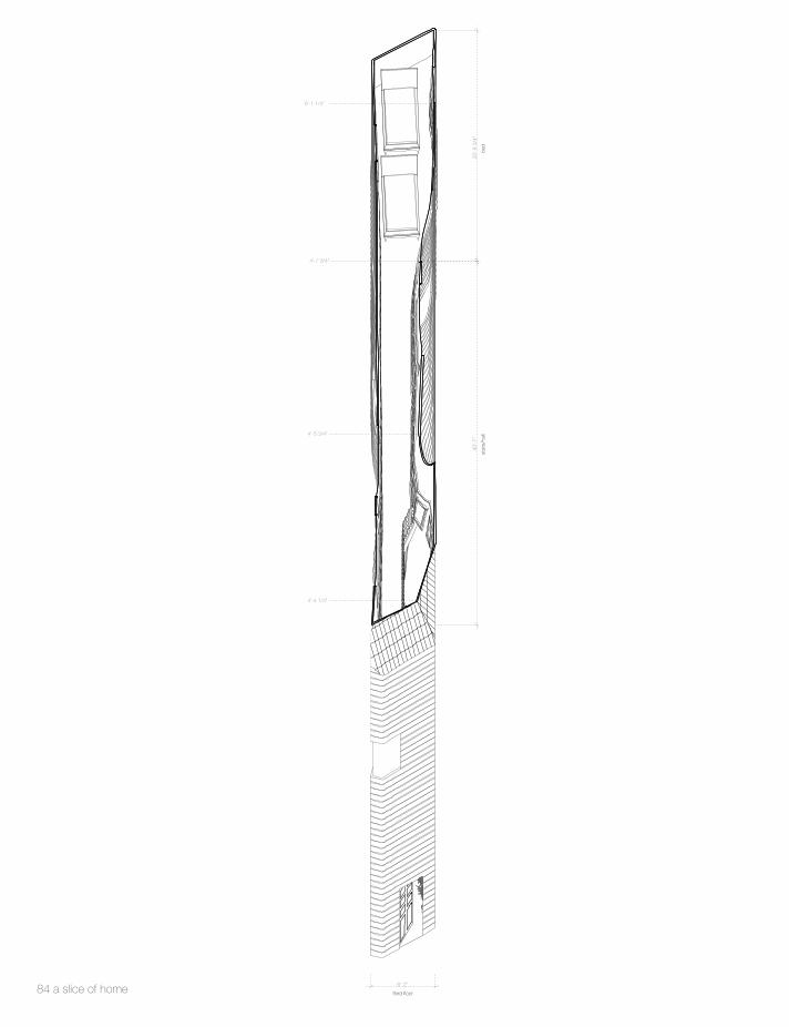
decor
Decor wallpaper was chosen as a material as it is commonly used in McMansion hallways,
bedrooms, and living rooms. In both the renderings and obliques you will notice that the stairs, column, and other building elements become part of the poche, aswell as everything else that touches the poche. Every home was attributed “essential living spaces” that a home generally has.
80 a slice of home

a slice of home 81
15'-5
3/4
"
6'-2"
3'-8 1/4"
2'-4 3/4"
4'-0"
5'-8"
12'-8
"18
'-6"
14'-1
1/4
"13
'-0 1
/2"
2'-9"
foye
r/en
tranc
eliv
ing
dini
ngst
airs
/hal
lki
tche
n
first floor
82 a slice of home

20'-8
1/4
"
6'-2"
5'- 11 1/4"
2'-8 3/4"
3'-0"
38'-1
1"13
'-7 1
/2"
5'-11 1/4"
stai
rsha
llba
th
second floor
a slice of home 83
40'-7
"
6'-1 1/4"
25'-8
3/4
"
4'-7 3/4"
4'-5 3/4"
4'-4 1/4"
6'-2"
bed
stai
rs/h
all
third floor84 a slice of home

width
3'-0"
14'-3
1/4
"
first
floo
r hei
ght
12'-3
"10
'-3"
12'-5
"55
'-4 3
/4"
seco
nd fl
oor h
eigh
tth
ird fl
oor h
eigh
the
ight
leng
hth
a slice of home 85

width
6'-2"
12'-5
"17
'-8 3
/4"
31'-9
3/4
"55
'-4 3
/4"
leng
thhe
ight
leng
thhe
ight
86 a slice of home


plaster
Plaster wallpaper was chosen as a material as it is commonly used throughout the interiors of
McMansion walls. It was important to render these interior as elevations to give a deception of space within these thin homes. These interior eleva-tions use a similar concept to how McMansion’s are photographed and showcased to buyers. The details in the renderings are meant to give a sense of home and place to these buildings. The interior elevations are accompanied by rendering that show thin space to exaggerate and expose the stage sets of these interior elevation renderings. These rendering are deceptively thin.
96 a slice of home

a slice of home 97

2'-9 1/4"
2'-7 1/2"
4'-0 1/4"
1'-10 1/2"
3'-8"
2'-3 3/4"
3'-0"
4'-4 3/4"
3'-0 1/4"
7'-2
3/4
"12
'-6 1
/2"
9'-1
0 3/
4"7'
-8 3
/4"
15'-1
1/2
"10
'-0"
4'-5"first floor
entra
nce
Livi
ng
dini
ngki
tche
n ha
ll st
airs
98 a slice of home
4'-2 1/4"
3'-6 1/2"
1'-7 1/2"
3'-9 1/2"
1'-6 1/2"
4'-2 3/4"
1'-11 1/4"
4'-6"
4'-5"
14'-7
1/2
"11
'-10
1/2"
10'-3
3/4
"26
'-0 3
/4"
bed
bed
bath
ha
ll/st
airs
second floor
a slice of home 99
24'-3
"11
'-5"
12'-9
1/4
"14
'-7 3
/4"
4'-10"
bed
stud
yba
th
hall
stai
rs
third floor
100 a slice of home
11'-9
1/2
"22
'-10"
28'-0
3/4
"
2'-6"
8'-2
1/4
"
width
first
floo
r hei
ght
seco
nd fl
oor h
eigh
tth
ird fl
oor h
eigh
tle
nght
h
a slice of home 101

68'-9
1/4
"28
'-1"
4'-6 1/4"
width
heig
htle
nght
102 a slice of home


travertine
Travertine wallpaper was chosen as a material as it is commonly used in McMansion flooring.
I have taken photographs from Lewis Baltz, Robert Adams, and from Frank Golhe from their exposition titled New Topographic, I’ve modeled those scenes and imagined-modeled the rest of the scenes, and rendered them in the windows of my interior images. Like them, I think that there is a reality to the edge of suburbia that is not depicted in these McMansion photographs. The realities of suburbia are the endless cookie cutter homes, homes that meet industrial sites, and heavily dense suburban sites. These images were rendered with the implication that a people were once in the space, to bring the viewer into the scene. An uninhabited picture has the possibility of the viewer projecting him or herself into the picture as the renderings are full of person-made environments.
My thesis if full of traces of people, there presence is in their absence. Similarly the sense of absence is also brought into the depiction of site as home and site are not disconnected, they are complimentary as placement realities of suburbia.
112 a slice of home

a slice of home 113

15'-1
1 1/
2"7'
-5 1
/4"
2'-1
1 1/
2"5'
-5 1
/4"
4'-9"
5'-2
1/2
"
first floor
kitc
hen
side
ent
ranc
eha
lldi
ning
stai
rs
114 a slice of home

8'-9
"10
'-8 3
/4"
14'-8
1/4
"
4'-9"
bed
bath
stai
rs
second floor
a slice of home 115

3'-2"
1'-9 3/4"
16'-3
3/4
"10
'-5 3
/4"
width
first
floo
r hei
ght
seco
nd fl
oor h
eigh
t
116 a slice of home

20'-5
3/4
"28
'-10
1/2"
4'-9"
leng
hthe
ight
width
a slice of home 117


the models Which brings me to my proposition of forms in these types of sites. I definitely have a problem with the size of the McMansion, the con-voluted aesthetic of the exterior, but more importantly the place-less-ness of how the McMansions have been represented to us all. In the end, I am proposing a disconnection between actualities to the Mc Mansion, and Making a new cultural reality with these thin homes.
a slice of home 127


A perception of thin: semaphores of thinness
Introduction:
Today we live in an era where thin has become the trend of contemporary living. Objects such
as phones, laptops, furniture, paper, and other typical everyday items have been made thin to mark a
presence of this new era. Rooms have been re-designed as thin to increase occupancy and make
space appear bigger. Buildings have been designed thin to maximize the use of space within a city
grid and create a less intrusive approach to building in heavily populated areas. Lastly, people such
Loana Spangenberg, the skinniest model in the world, is one of many models who have become the
image of the thin body in this new period. There’s the fundamental question when an object, a room,
a building or a person become thin.
Thin becomes repurposed at every scale, but what encompassed these things is the
perception of thin. How an image is translated by the eye, then by the retina, to the optic nerve, to the
optic chiasm, into the lateral geniculate nucleus, to the primary visual cortex, and lastly into the visual
processing zone of the brain that determines whether that image is thin, thick, or neither. Is thinness a
virtue of literal dimension or a representation of size? Do dimensions play a role in defining thinness or
is thin just a visual representation of space?
Mark Wigley says that there is no thin without thick. But there is also a space between thin and
thick, a zone that is neither thin nor thick in which dimensional qualities are so contrary that they are
not even perceived1. Thin becomes a question of perception encountering dimension and the
1 Wigley, Marc. How thin is thin? El Croquis N. 179/180, 2008-20015. Print.
threshold when object, room, building and person are read as “thin.” By examining the Loos café
museum chair, the McMansion living room, SANAA’s 21st Century Museum, and Atelier Bow Wow’s
pet architecture, I will try to hyper-define various templates for thinness of perception and scale that
communicate “thin.”
138 semaphores of thinness

Loos Café Museum Chair
Typical McMansion living room
SANAA’s 21st Century Museum
Atelier’s Pet architecture in Tokyo, Japan
semaphores of thinness 139

The Loos Café Museum Chair
We can start by looking at an object: the chair. The chair is an object that we use in everyday
life. On a global average people sit about 7.7 hours every day, architecture students sometimes 19
hours a day. Not only is the chair something we use in everyday life, but when we enter a restaurant,
museum, living room, kitchen, and other rooms we always encounter chairs as artifacts that shape the
character and manner of space. The chair is compelling when describing thin because it is an item in
a room used by the body which gives an overall aesthetic to a space.
The Loos Chair was design by architect Adolf
Loos, a person known for designing solid, white houses
with simplified exteriors, while creating interiors to be
spatially complex through his use of materials.2 The
Loos Chair can be interpreted to have this very
complexity in its form. The bentwood frame with its
exaggerated linear form make this chair thin. We can
say that this 1899 chair has withstood time: the object
can still be perceived as thin today. This chair has
elements of thick, thin, and neither when seeing the
overall form of the chair, but the pieces that make this chair are thin members that contribute to the
overall thin aesthetic of the chair.
“Elegance, nostalgia, and color,” were the three concepts used to create the chair.3 To be
more specific, thinness in this chair are achieved through the curved pieces of wood and their way of
joining them. The joinery is seamless, hidden from the human eye. The thin elements and the
2 Frampton, Kenneth. Modern architecture: a critical history. London: Thames and Hudson, 2006. Print 3 Frampton, Kenneth. Modern architecture: a critical history. London: Thames and Hudson, 2006. Print
manifestation of the chair gives a perception of this chair being thin. Seeing this chair proliferate
through a space, more commonly in a café, adds a layer of transparency; a quality of thin.
140 a slice of home

The McMansion Living Room
We can say that we have grown accustomed to certain living standards and a certain size
criteria in American homes. The McMansion, the giant and excessive single family home, is the
clearest example of this. It can be evaluated by its size, dimension, ornamentation, and aesthetic to
perpetuate a superficial thinness within these types of homes. I take the McMansion living room as a
point of analysis because it is the room where guest and inhabitants enter at some point in the day. It
can be said that it is the room that is the most ornamented and detailed as it represents the home.
The wainscoting, window
frames, moldings, columns, floor
& wall tiles, railings, and especially
wallpaper are just a few of
elements that contributes to an
overall deception of thinness
within these interior. Wallpaper for
example gives depth and richness to a space at first glance, but its superficiality comes through when
light enters the room and this wallpaper no longer seems to fit in space. Columns are placed in these
living rooms as ornamented features and even bookshelf filled with empty plastic books. The image of
these composed superficial aesthetic elements make these rooms seem as glamorous-spacious
spaces, but the actuality is that you become surrounded by thin elements that make space seem
paper thin.
Thinness in these interiors is perceived through the ornamentation and presentation of these
decorated walls, but another factor that contributes to this are the double height ceilings that make
these rooms appear as endless space. There is no indication of how walls meet because joints are
covered by the over excessive use of moldings. Thin is achieved in the McMansion due to the
fakeness of these interiors. It can be almost juxtaposed to how steel construction might be covered by
concrete to make a deception of the material usage, “you see something, but it smells like something
else”.4 Thin in these interiors is not a formal expression, but a material one that contribute to a notion of
thinness.
Krumwiede, Keith. An Atlas of Another America: An Architectural Fiction. Zu ̈rich: Park , 2016. Print
a slice of home 141

The 21st Century Museum by SANAA
Louis Khan said, “Consider the momentous event in architecture when the wall parted and the
column became”.5 When we think of a wall material as a means to achieve a transparence between
space, division, and space, the division becomes the line in space that separates two things. We can
look at the 21st century Museum as both an interior and exterior that talks about thinness in their use of
materials.
The 21st century is round in form and is
surrounded by a pane of glass that makes a
transparency between outside and inside. That
glass uses very thin mullions or connectors that
accentuate this transparent division. The interior
further contributes to this transparency as
volumes are situated within the round form that
take you once gain outside.6 In order to get
privacy between inside and outside or inside
and access paths they use a thin curtain that still
communicates the usage of thin materials to achieve this transparency. Lastly, the thin white columns
further help to experience this notion of transparency within the building to the outside.
I use this example because this transparency is due to a process of selecting thin materials to
achieve an experience of thin. Thin becomes layers of transparency that help takes the person in
moments of being outside while circulating the interior of this space. Both dimension of the material
5 Hays, K. Michael. Architecture theory since 1968. Cambridge: The MIT Press, 2002. Print 6 Poveda, Paloma. El Croquis 155. SANAA 2008 - 2011 ( Kazuyo Sejima & Ryue Nishizawa ). Madrid: El Croquis, 2011. Print
and its properties contribute to a notion of circulating through thin space, meaning “Thinning the
building thickens the air.”7
7 Wigley, Marc. How thin is thin? El Croquis N. 179/180, 2008-20015. Print.
142 a slice of home

4
Pet Architecture
We live in an era of exuberance and catastrophe, but we can also say that we live in an era of
residue because the laws and regulations in our system are always flawed with errors. More and more
we are finding these errors in moments in detail in our urban cities. These errors are lots that have
been abandoned or rendered useless because of their narrow size. Pet Architecture are a series of
thin buildings that have been extruded from the foot print of these abandoned plots. These buildings
captivate the experience of living and walking through thin space.
Atelier Bow Wow designed these buildings in Tokyo to talk about the misappropriation of urban
development in large populated cities. These buildings range from
department stores, to homes, to apartment complexes, to
restaurants, galleries, and any typical building you would see
developed in cities. These type of spaces are less about the thin
material, thin objects, or a thin look, they are about connecting an
experience with the body to the building. They appropriate to a
new culture of living within a building and a new way of perceiving
space in urban cities.
The example in the image, Pet Architecture 29, is a
restaurant that was developed between two spaces. The lot
measures approximately 2.5 feet in width and 33 feet in length.8 It has all the utilities of a kitchen and
bathroom. It has seating for its guest. The interaction between cook, waiter, and guest must be entirely
different as moving through this type of space requires collaboration and precision between
individuals.
8 Imai, Kesaharu. Pet architecture guide book. Tokyo: World Photo Press, 2003. Print.
a slice of home 143

This and all other Per Architecture models are examples of literal thin space. Perception of thin
is real, non-imaginative, and part of a bodily experience that requires people to cope with the building’s
form. These compact spaces have been built from abandoned lots, to maximize space within an
existing grid, but the reality is that these type of spaces challenge the building standards and code to
push for more compact spaces9. We see an excess of people in both suburbs and urban cities.
Rather than build up, it might help to examine ways to design compact, thin spaces for people to use.
9 Ross, Benjamin. Dead end: suburban sprawl and the rebirth of American urbanism. Oxford: Oxford U Press, 2014. Print
144 a slice of home

The Line, the Poche, and the Conclusion
The line or the poche is what determines the threshold between thick, neither, or thin. Much
recent architectural productions have elaborated on the potentials of the thin line. For example Stop
City uses the thin line as a boundary definer by using eight thin
walls. In plan they represent thin lines that encase a region of the
urban fabric. In perspective, these encasement causes two
properties to differentiate between two spaces. The US- Mexico
Border uses the thin line as a barrier that divides two countries.
This border line is just a fence with slight aperture that manages
to barrier two great landscapes. Lastly, a grammar for the city
uses thin as a space creator; creating a figure ground condition in
plan.10
The experience of the thin might be perceived as just a
line that creates a condition between two or more things, but a
line is more than just a condition. It is a space that has not been
explored and it’s an architectural proposition for thin space.
These and the above examples are all propositions of how we
experience a perception of thin. There is a perception of thin
through the concealment of joinery, a perception of thin through
the usage of superficial aesthetic, a perception of thin through
the use a material, and a perception of thin through literal thin
space.
I mention the line because it is a poche that talks about
thin in its truest form. A line without association to something else
10 Hays, K. Michael. Architecture theory since 1968. Cambridge: The MIT Press, 2002. Print
a slice of home 145

becomes neither thin nor thick. There’s always a factor or that image that contributes to a person’s
perception of thin.
In conclusion perception is mostly an association with distance from something. For example,
the Loos Chair is a thin object, but when seen from a 10 foot distance, the chair becomes so thin that
it becomes part of the bigger whole. An array of these chairs gives depth and thin richness to space.
Thin becomes part of an aesthetic that pushes space to become serene, elegant, and beautiful. The
McMansion Living room is thin as in fake. Everything you see in these type of spaces are a
combination of superficial elements that make space appear thin; as if there was a large, thin, empty
box. This type of space is intriguing because there’s an association with distance when standing in
this type of living room. When standing at the entrance you are seeing everything from a 20 foot
distance. Everything looks together, full, and even beautiful. As you get closer to all its detail, all you
imagined begins to disappear. When you realize the true superficial nature of these interiors, your
perception of this space becomes thin. SANAA’s museum is the opposite of the McMansion interior.
The farther you are from the glass, everting seems so transparent, light, and thin. What is even more
fascinating about distance in this building is the image that it captures through the usage of glass.
View becomes part of this thinness. The farther you are from the glass the more vivid the image looks,
but the closer you are the more surreal the image seems. There’s a thinness to edge of nature,
suburbia, and our cities. Thinness is an association to how we built and perceive this type of edge and
it is best captured through view. Lastly, there’s a relationship between distance and perception of thin
when looking at buildings like Pet Architecture. From a 300 foot distance this building form might be so
thin in relation to the other building elevations, that when you step closer to the building, that thinness
becomes associated with thickness. When you walk through these spaces, space is thin, but the
146 a slice of home
experience of walking through this space is full. Partially because you become a filler of this form and
experience literal thin space.
These semaphores of thinness contribute to a conversation of perceiving thin. Thin carries with
it size, distance, beauty, aesthetic, detail and ornamentation, which are all anomalies that are
perceived in thinness. This manifesto has been an exploration of tensions between the avant-garde
historical culture of architectural thinness and banality of everyday materiality of thinness. How does
representation explore the clash of profound and superficial cultures of thinness? These examples
mentioned in the manifesto contribute to a conversation of thinness within the architectural black box.
a slice of home 147

Works Cited
1. Evans, Robin. "The Rights of Retreat and the Rites of Exclusion." Notes Towards the Definition of Wall 1989: 335-39. Print.
2. Frampton, Kenneth. Modern architecture: a critical history. London: Thames and Hudson,
2006. Print.
3. Hays, K. Michael. Architecture theory since 1968. Cambridge: The MIT Press, 2002. Print.
4. Imai, Kesaharu. Pet architecture guide book. Tokyo: World Photo Press, 2003. Print.
5. Krumwiede, Keith. An Atlas of Another America: An Architectural Fiction. Zu ̈rich: Park , 2016. Print.
6. Masheck, Joseph. Adolf Loos: the art of architecture. London: I.B. Tauris, 2013. Print.
7. Poveda, Paloma. El Croquis 155. SANAA 2008 - 2011 ( Kazuyo Sejima & Ryue Nishizawa ). Madrid: El Croquis, 2011. Print.
8. Ross, Benjamin. Dead end: suburban sprawl and the rebirth of American urbanism. Oxford:
Oxford U Press, 2014. Print.
9. Wigley, Marc. How thin is thin? El Croquis N. 179/180, 2008-20015. Print.
148 a slice of home

a slice of home 149

