hip to be square –
TRANSCRIPT

Listaháskóli Íslands
Grafísk hönnun
Hönnunar- og arkitektúrdeild
Hip to be Square –
Bauhaus meets Bebop
BA Essay
Sönke Holz
Leiðbeinandi:
Stefán Pálsson
Haustönn 2013

2
Abstract
This paper explores the relationship between jazz record covers and European modernist graphic
design in America in the 1950s and 60s. It focuses on releases by the jazz label Blue Note and
analyses the influence of European immigrants and their culture on the struggle of black American
jazz musicians for recognition and equality in a predominate white society.
After examining the origin and history of jazz, the paper breaks down how the invention of the
gramophone and the rise of the record industry paved the way for the success of early jazz music.
It furthermore takes a look at the history of modernist graphic design and how World War II and the
difficult conditions in Europe and especially Germany lead to a modernist revolution in America.
The paper ends with a closer look at Blue Note record covers and the design development
throughout the years, focusing on designer Reid Miles and his innovative use of typography.
The paper concludes that jazz and especially Bebop and modernist graphic design makes for a
fruitful couple. Both are striving forces for something new, breaking with old traditions on their
search for new ways of expression. The European, modern look might also have had an impact on
overcoming racial barriers, giving black musicians a better platform for their art and changing the
perception of white America towards the black community.

3
Table of contents
1. Introduction...................................................................................................................................... 4
2. Jazz – history and meaning...............................................................................................................6
3. The rise of the record industry and jazz ........................................................................................ 7
3.1 From shellac to vinyl ................................................................................................................ 7
3.2 Ten inch canvases...................................................................................................................... 8
4. Modernist graphic design in America ..............................................................................................9
4.1 Teaching European design ideas ............................................................................................. 11
5. Blue Note – A new home for modern jazz .................................................................................... 12
5.1 Shaping the look of jazz to come.............................................................................................13
5.2 Reid Miles' typography ...........................................................................................................18
6. Conclusion......................................................................................................................................23
Bibliography....................................................................................................................................... 24
4
1. IntroductionI have been a collector of vinyl records for almost two decades now, and besides my interest in jazz
music I have always been very impressed by and attracted to the cover design of jazz records.
Especially the sleeve art of the 1950s and 60s always caught my attention and I believe that the
design has influenced my interest in graphic design and typography.
Lately I came to ask myself why jazz music from that era which basically showcases Afro American
musicians expressing their struggle for acceptance and freedom in a predominate white society, was
packaged in record sleeves designed in an European influenced modernist style and what role the
design of the album sleeves played for the success of the music as well as helping to break down the
racial barriers.
In this paper I will look at the history of jazz and modernist graphic design in America and how the
two rather opposite art forms found to each other. I picked the record label Blue Note founded by
two German emigrants in New York, to show the importance of foreigners in America for the break
through of jazz which is often called “the only native American art form” but would not have been
what it is today without Europeans who realized its potential.
For a long time jazz didn't get the recognition it deserved in its own America. Critics in Europe on
the other hand were very aware of of the importance of jazz for its cultural values. Without jazz
America wouldn't have an art form that could be called purely American. Only here the blend of
African tradition and European culture that made jazz so special was possible.
Benny Goodman who played both as a jazz clarinetist and a classical musician described the
difference between the two with “Expression”. Jazz players don't just play the notes written on the
paper. They interpret each piece and add their own character in long solos and improvisations.1
The rise of jazz would not have been possible without the invention of the gramophone making it
possible to record songs and listen to them, spreading the the music across the country and the
world. Record sleeves eventually became 12 inch canvases for graphic designers, enriching the
record packaging with works of art to attract customers.
1 Levine, Lawrence W., “Jazz and American Culture”, Ed. Robert O'Meally, The Jazz Cadence of American Culture, Columbia University Press, New York, 1998, p. 444.
5
In the 1950s the cover art on peoples records often was the best art in their house. The music was as
innovative as the cover design showing influences of european Bauhaus or the Italian Futurist
movement. Modern Jazz sleeves reflected the changes in the music as in American society. The jazz
label Blue Note and especially the cover design of Reid Miles shaped the look of the jazz scene and
created the cool, hip and modern image of the foremost black musicians helping indirectly to push
forward the needed changes in American society.2
By the end of the 1960s jazz had entered its avant-garde period and musicians got to play in the
White House, showing its wider acceptance in a society characterized by racial segregations.
Mixed-race jazz groups got to stay in the same hotel and black musicians appeared on popular TV
shows.3
These changes can of course not only be credited to the modern sleeve design, but the European and
modern look might have changed the picture white America had of the black community and the
music that would never have come to existence without slavery.
The modern Jazz movement that came up in the 1940s was very important to the public perception
and their understanding of jazz. This generation of musicians made people understand that the
sound of newness was from now on a steady attribute of jazz. Revolution and rebellion against
commercializing black music and making its sound a mere reflection of what it intended to be in the
beginning by watering it down letting every improvisation become nothing but a cliché.4
2 Miles, Barry, Grant Scott, and Johnny Morgan, The Greatest Album Covers of all Time, Collin&Brown, London, 2005, p.22.3 Miles, p. 38.4 Gioia, Ted, The Imperfect Art – Reflections On Jazz And Modern Culture, Oxford University Press, New York, 1988, p.111.
6
2. Jazz – history and meaningAround 1900 a musical style called “blues” emerged among the African-American communities in
the south of the United States. It was based on spirituals, work songs, shouts and chants telling
often melancholic stories of loss and pain on the slave plantations.5
In the second half of the 19th century blues would form the foundation for a new musical style
called “jazz”. Born in the melting pot of New Orleans jazz is the product of the cities' blend of
musical and cultural styles. Opera, marching bands, folk and church music formed an exciting
mixture of european composing techniques and african traditions in rhythm and drumming.
From Ragtime over Dixieland to Chicago style, jazz reached its peak in popularity in the 1920s and
30s during the so called “swing era”. The danceable swing style of the big bands had an optimistic
and spirit-lifting feel to it, which was very welcome during the economic recession around 1930.
During World War II it got increasingly difficult to find musicians for the big bands as many of
them were fighting the war overseas. Also the costs of touring with a band of 12 to 25 players were
way too high and a lot of jazz clubs closed as people stopped going out and rather saved their
money.
Around that time many musicians grew tired of the light minded and purely entertaining style of
swing and started meeting up in small groups after concerts to play experimental jam sessions. This
was the birth of Bebop.6
Bebop was a reflection of the lives of young black musicians exploring the possibilities of their
instruments looking for creative freedom as well as freedom within society. It was characterized by
faster tempos, complex harmonies and often considered jazz for intellectuals.7
For many Afro American musicians jazz was more than just music. It was a social force that talked
about freedom and self expression. Jazz brought people together no matter if they were black or
white. It also gave black musicians a sense of power and direction in their lives meanwhile
everything around them seemed to belong to white people or was controlled by them.8
5 <http://www.allaboutjazz.com/php/article.php?id=18724#.UgTypWRyddg> [accessed 4 July 2013].6 <http://www.scaruffi.com/history/blues.html> [accessed 13 July 2013].7 Nisenson, Eric, Blue – The Murder of Jazz, Da Capo Press, Cambridge, Massachusetts, 1997, pp. 107-108.8 Levine, p. 440.

7
3. The rise of the record industry and jazz An important influence on the development of an improvised art form such as jazz was the
invention of a device that could record and replay sounds: in 1877 Thomas Edison presented the
phonograph to the world.9
German-born American inventor Emile Berliner would take Edisons idea and develop it further.
By the turn of the century he initiated the move from the cylinder based phonograph to the so called
gramophone utilizing flat double sided discs – the gramophone record.10
Now musicians all across the country could listen to each others improvisations, learn and help
develop new styles and techniques no matter where they were located.11
Of course jazz existed before it was recorded but the invention of the gramophone and the birth of
the recording industry did not only help to spread the music but also stopped jazz from dying out as
a passing trend – an obscure folk music limited to the area of New Orleans. In 1917 the Original
Dixieland Jass Band recorded the first jazz record.12
3.1 From shellac to vinyl In the early days of music recording, music was sold on 78 rpm records made of a shellac based
material. The records came in brown paper sleeves and the main purpose of the packaging was to
protect the records.
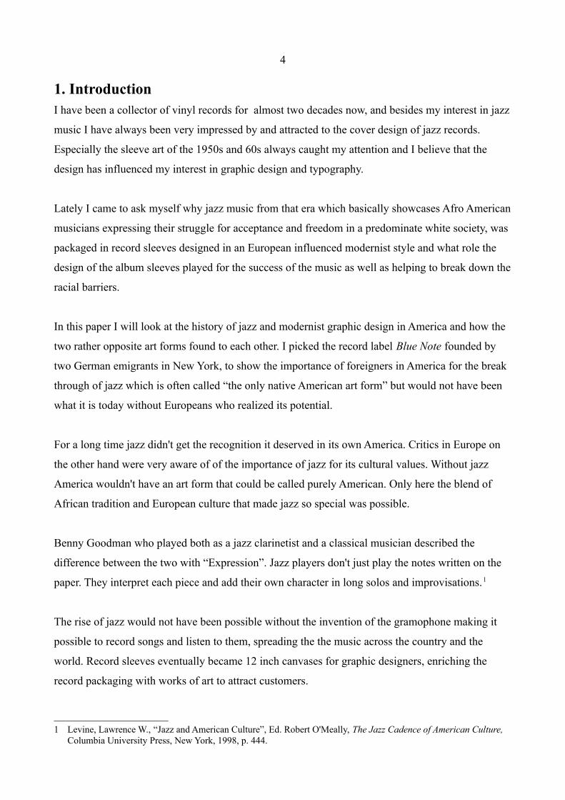
Visually there was nothing to attract the customers interest. Often advertising was printed on the
sleeves, having absolutely no connection to the music on the actual record (Fig. 1&2). Generally the
sleeves had a circular cut-out so that the label with the artists information could be seen. The
recording time was limited according to the size of the record. Normally each side could hold
between 2 and 3 minutes so that longer music pieces had to be split across several records.
In 1931 RCA Victor presented the first commercially available microgroove LP which ran on 331/3
rpm and was made out of vinyl plastic which could hold more music and was less fragile than the
old 78 rpm records. It would still take until 1948 for the vinyl LP to become the industry standard.13
9 <http://www.time.com/time/specials/packages/article/0,28804,1999143_1999210_1999211,00.html> [accessed 19 July 2013].
10 <http://www.stern.de/kultur/musik/emil-berliners-160-geburtstag-google-doodle-fuer-den-erfinder-der-schallplatte-1687091.html> [accessed 19 July 2013].
11 Gioia, p. 63.12 Gioia, p. 64.13 <http://www.vinyl-record.co.uk/Pages/VinylRecordHistory.htm> [accessed 2 june 2013].
8
Fig. 1 78rpm shellac disc sleeves Fig. 2
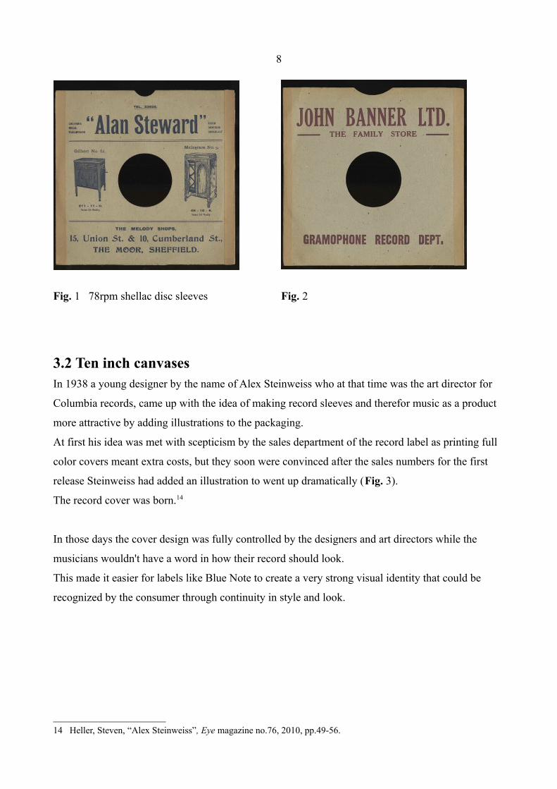
3.2 Ten inch canvasesIn 1938 a young designer by the name of Alex Steinweiss who at that time was the art director for
Columbia records, came up with the idea of making record sleeves and therefor music as a product
more attractive by adding illustrations to the packaging.
At first his idea was met with scepticism by the sales department of the record label as printing full
color covers meant extra costs, but they soon were convinced after the sales numbers for the first
release Steinweiss had added an illustration to went up dramatically (Fig. 3).
The record cover was born.14
In those days the cover design was fully controlled by the designers and art directors while the
musicians wouldn't have a word in how their record should look.
This made it easier for labels like Blue Note to create a very strong visual identity that could be
recognized by the consumer through continuity in style and look.
14 Heller, Steven, “Alex Steinweiss”, Eye magazine no.76, 2010, pp.49-56.

9
Fig. 3: The first Steinweiss cover 1938
4. Modernist graphic design in America
In the 19th century America was lacking an identity of its own and relied heavily on influences from
Europe like for example the Victorian style with its ornaments and decorative typefaces which were
very popular around that time in the U.S.
Modernism became popular after 1900 as a radical rejection of these traditional values of the
Victorians, who worshipped complexity, natural forms, fussiness, decoration and an ornamental
style.
A spirit of innovation and the urge for something new were in the air after World War I and the
philosophy of Modernism, the philosophy of simplicity, seemed to be the answer. If you could leave
out the unnecessary, the necessary would get a chance to speak up and get the attention it deserved.
Get rid of the old, get rid of everything that is not needed, create a new language for a new time.
After the end of the Prussian Empire and the chaos and disorganisation of the post war years, old
values and traditions were questioned and a need for reconstructing and order could be found all
over Europe and especially in Germany and France.
Artistic groups and movements like Die Brücke and Dada in Germany, the Constructivists in Russia
or the Futurists in Italy were trying to break with the past, seeking for something new and modern.15
In 1927 Jan Tschichold and Kurt Schwitters formed the Ring neuer Werbegestalter, a group of
artists and designers that believed in a new approach to typography and graphic design. In 1928
Tschichold released his book The new Typogaphy, which showed the rules of Modernism used in
15 Remington, R. Roger, American Modernism – Graphic Design, 1920 to 1960, Laurence King Publishing, London, 2003, p.16.
10
graphic design: asymmetric page organisation, use of photography over illustrations, use of primary
colours and sans serif typefaces, especially the font Futura.16
Kurt Schwitters: “ Futura is the appropriate typeface in all sizes and all styles for all purposes.”17
The Nazis on the other hand labeled Futura as alien, proto-Communist and un-German.
For Modernist graphic designers it was important to free them self from the past and create
something new that was purely in the here and now. Therefor they had to reject traditional forms
and decorative elements, find solutions that were simple and direct, use systematic methods rather
than intuitive ones and think about the relationship of form and content. Geometric shapes like the
triangle, circle and square were as much part of their visual language as the use of primary colours
and sans serif typefaces.18
Progressive designers in America watched the developments in Europe with great interest. Many of
them were tired of the old styles and felt that time had come for something totally new and fresh.
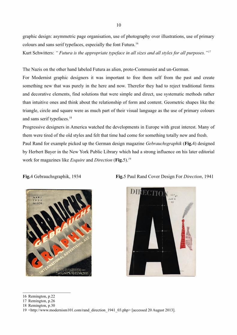
Paul Rand for example picked up the German design magazine Gebrauchsgraphik (Fig.4) designed
by Herbert Bayer in the New York Public Library which had a strong influence on his later editorial
work for magazines like Esquire and Direction (Fig.5).19
Fig.4 Gebrauchsgraphik, 1934 Fig.5 Paul Rand Cover Design For Direction, 1941
16 Remington, p.2217 Remington, p.2618 Remington, p.3019 <http://www.modernism101.com/rand_direction_1941_03.php> [accessed 20 August 2013].
11
In the 1930s New York became the mecca for Modernism and many young american designers
moved there, looking for a job, wanting to be part of the new movement. New York became for
many what Berlin had once been: the capital of Modernism and the centre of creativity of the 1930s.
The atmosphere was cosmopolitan, people no matter if they were american or immigrated from
Europe, came together to take risks and create something new and powerful. Modernism had found
a new home.20
“Despite the unpopularity at the moment in some fields of human endeavour, credit must be given
to the German for a unique art of design.” Egbert Jacobson
This comment reflected a common attitude among Americans towards Germany after World War I.
At this time many European designers began to show interest in the changes and creative
opportunities in America.21
The attitude towards design coming from Europe and especially Germany seems similar to the
“A prophet has no honor in his own country” – kind of recognition jazz was getting in its mother
land. Music critics in Europe realized the importance of the new jazz style while graphic artists in
the States were appreciating the fresh visual approach that was being created overseas.
4.1 Teaching European design ideas
When Hitler closed down the Bauhaus in 1933 Josef Albers, Walter Gropius, Herbert Bayer, Laszlo
Moholy-Nagy and Marcel Breuer had to search for a new safe home.
American art schools were rather slow in embracing the new modernist theories and there was only
limited access to information on the whole movement in the United States in the 1930s. There was
almost no education on an academical level and interested individuals had to find the information
for them self.
But the skilled immigrants from Europe should soon make modernist ideas more widely available.
Bauhaus founder Walter Gropius would create his “American Bauhaus” in Massachusetts, Laszlo
Moholy Nagy set up the “New Bauhaus” in Chicago, Josef Albers started teaching at the Black
Mountain College in North Carolina and Herbert Bayer taught in New York between 1939 and
20 Remington, p.52.21 Remington, pp.45-46.
12
1940. When the War ended in 1945 soldiers were given free education – the so called “G.I. Bill”
legislation – and changes had to be made in design education. Many of these veterans were eager to
get on a career in the design field and yet the only major educational programme for design was
available in Chicago established by Laszlo Moholy-Nagy as the “New Bauhaus.”
Josef Albers made Black Mountain College an important place for European immigrants and the
American avant-garde. Here ideas were discussed and the school was highly important for the later
established graphic design programme at Yale University School of Art which would become a
major source for the next generation of crucial designers in America.22
There was a great dynamic, improvisational Zeitgeist in the America of the 1950s with its booming
economy and an optimistic postwar approach to life. The music of the time was progressive jazz
and the beat generation as a voice from the underground emerged through individuals like Jack
Kerouac and allen Ginsberg.23
5. Blue Note – A new home for modern jazz The jewish Alfred Lion born Alfred Löw in Berlin was forced to leave Nazi Germany with his
mother in 1933 to Chile. In 1937 he immigrated to America and found a new home in New York
city.24 In 1939 Lion, who was a jazz lover ever since he had heard the first big bands back in Berlin
when he was only 16 years old, decided to found his own jazz record label and was joined by his
childhood friend Francis Wolff, who also had to escape from Germany due to his jewish heritage.
Wolff had experience as a commercial photographer and his skills would soon help to shape the
look of their record label: Blue Note.25
Although Alex Steinweiss presented the first record sleeves with cover art work in 1938 for
Columbia, most labels held on to the cheaper plain paper wrappers for at least 10 more years.
But Alfred Lion and Francis Wolff were from the start of their label very concerned about the look
and presentation of their product.
Although a couple of different designers were responsible for the Blue Note look, Paul Bacon, Gill
Mellé, John Hermansader and Reid Miles were the most influential.
22 <http://www.blackmountainstudiesjournal.org/wp/?page_id=48> [accessed 20 August 2013].23 Remington, pp.132-136.24 Cook, Richard, Blue Note Records – The Biography, Justin, Charles & Co., Boston, 2004, p.8.25 Cook, p.13.
13
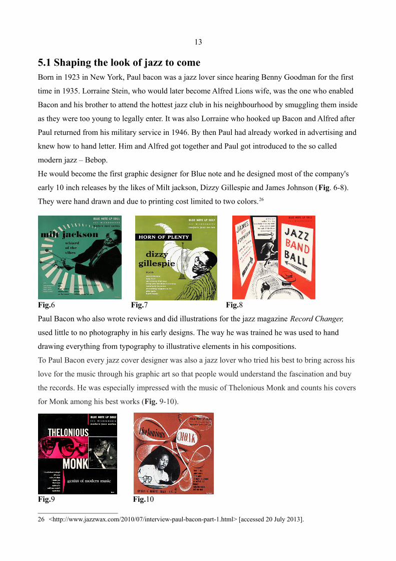
5.1 Shaping the look of jazz to comeBorn in 1923 in New York, Paul bacon was a jazz lover since hearing Benny Goodman for the first
time in 1935. Lorraine Stein, who would later become Alfred Lions wife, was the one who enabled
Bacon and his brother to attend the hottest jazz club in his neighbourhood by smuggling them inside
as they were too young to legally enter. It was also Lorraine who hooked up Bacon and Alfred after
Paul returned from his military service in 1946. By then Paul had already worked in advertising and
knew how to hand letter. Him and Alfred got together and Paul got introduced to the so called
modern jazz – Bebop.
He would become the first graphic designer for Blue note and he designed most of the company's
early 10 inch releases by the likes of Milt jackson, Dizzy Gillespie and James Johnson (Fig. 6-8).
They were hand drawn and due to printing cost limited to two colors.26
Fig.6 Fig.7 Fig.8
Paul Bacon who also wrote reviews and did illustrations for the jazz magazine Record Changer,
used little to no photography in his early designs. The way he was trained he was used to hand
drawing everything from typography to illustrative elements in his compositions.
To Paul Bacon every jazz cover designer was also a jazz lover who tried his best to bring across his
love for the music through his graphic art so that people would understand the fascination and buy
the records. He was especially impressed with the music of Thelonious Monk and counts his covers
for Monk among his best works (Fig. 9-10).
Fig.9 Fig.10
26 <http://www.jazzwax.com/2010/07/interview-paul-bacon-part-1.html> [accessed 20 July 2013].
14
As one of the early jazz-album cover designers and art directors, Paul Bacon was free to follow his
artistic instincts and invent a fresh, new cover look. Everything was allowed as long as the customer
's first impression of a cover was gripping enough and communicated the genius of the musicians
and the joy of the music.
Bacon who was strongly influenced by Alex Steinweiss' technique, had total freedom in the early
days of Blue Note. Alfred and Francis trusted him and he knew what they were looking for. Rather
than having too literal images, he tried to express a feeling, a mood what jazz at that time was
about.
“We didn’t have much color in the early days. All we had to attract the buyer’s eyes was fun and
whimsy in the illustration and color treatment.”27
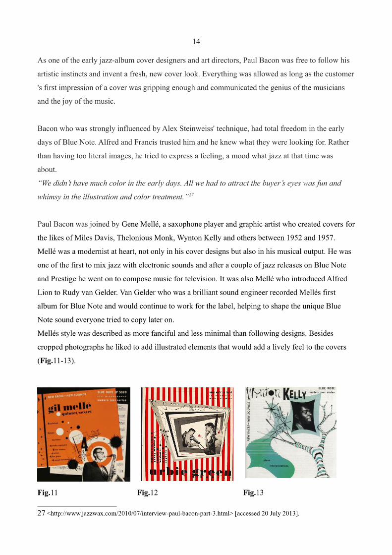
Paul Bacon was joined by Gene Mellé, a saxophone player and graphic artist who created covers for
the likes of Miles Davis, Thelonious Monk, Wynton Kelly and others between 1952 and 1957.
Mellé was a modernist at heart, not only in his cover designs but also in his musical output. He was
one of the first to mix jazz with electronic sounds and after a couple of jazz releases on Blue Note
and Prestige he went on to compose music for television. It was also Mellé who introduced Alfred
Lion to Rudy van Gelder. Van Gelder who was a brilliant sound engineer recorded Mellés first
album for Blue Note and would continue to work for the label, helping to shape the unique Blue
Note sound everyone tried to copy later on.
Mellés style was described as more fanciful and less minimal than following designs. Besides
cropped photographs he liked to add illustrated elements that would add a lively feel to the covers
(Fig.11-13).
Fig.11 Fig.12 Fig.13
27 <http://www.jazzwax.com/2010/07/interview-paul-bacon-part-3.html> [accessed 20 July 2013].

15
With graphic artist John Hermansader the Blue Note look would move away from Bacons and
Mellés more illustrated style towards a more bold look. The design became more minimal, relying
heavily on the use of typography, photos and shapes. The influence of design schools like the
German Bauhaus became more obvious (Fig.14-15).28
After studying design in Memphis in his early 20s, Hermansader continued his studies at the New
Bauhaus in Chicago which was opened in 1937 by László Moholy-Nagy. From there it took him
straight to the american mecca of modernism, New York where he established his own design
company. He became friends with fellow jazz lover and designer Paul Bacon who introduced him to
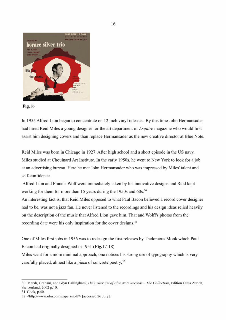
the releases of the Blue Note label. In 1953 Hermansader created his first cover for Blue Note
(Fig.16). He stayed with the label for two more years.29
His use of sans serif typefaces mixed with more calligraphic lettering can be seen as a transition
between the early Blue Note 10 inch releases which were mainly the work of Paul Bacon and the
later microgroove covers designed by Reid Miles. Hermansaders graphics in combination with
Wolff's photography laid the ground for what would become the trade mark Blue Note look.
Fig.14 Fig.15
28 <http://www.jazzwax.com/2010/07/interview-paul-bacon-part-2.html> [accessed 20 July 2013].29 <http://amodernist.blogspot.com.es/2011/09/john-hermansader-for-blue-note-records.html> [accessed 28 June
2013].
Herbert Bayer 1928 Bauhaus
16
Fig.16
In 1955 Alfred Lion began to concentrate on 12 inch vinyl releases. By this time John Hermansader
had hired Reid Miles a young designer for the art department of Esquire magazine who would first
assist him designing covers and than replace Hermansader as the new creative director at Blue Note.
Reid Miles was born in Chicago in 1927. After high school and a short episode in the US navy,
Miles studied at Chouinard Art Institute. In the early 1950s, he went to New York to look for a job
at an advertising bureau. Here he met John Hermansader who was impressed by Miles' talent and
self-confidence.
Alfred Lion and Francis Wolf were immediately taken by his innovative designs and Reid kept
working for them for more than 15 years during the 1950s and 60s.30
An interesting fact is, that Reid Miles opposed to what Paul Bacon believed a record cover designer
had to be, was not a jazz fan. He never listened to the recordings and his design ideas relied heavily
on the description of the music that Alfred Lion gave him. That and Wolff's photos from the
recording date were his only inspiration for the cover designs.31
One of Miles first jobs in 1956 was to redesign the first releases by Thelonious Monk which Paul
Bacon had originally designed in 1951 (Fig.17-18).
Miles went for a more minimal approach, one notices his strong use of typography which is very
carefully placed, almost like a piece of concrete poetry.32
30 Marsh, Graham, and Glyn Callingham, The Cover Art of Blue Note Records – The Collection, Edition Olms Zurich, Switzerland, 2002 p.10.31 Cook, p.40.32 <http://www.ubu.com/papers/solt/> [accessed 26 July].
17
The Thelonious Monk artwork is initially outstanding. “Thelonious” is split across two lines, with
hyphen between “o” and “n”, in bold black type, while “Monk” is in bright white against the one-
colour background – a brown-yellow on the first volume, and an orange-red for the second. A photo
of Monk is cropped into a small rectangle at the top of the frame. “Genius Of Modern Music” is
run, lower case and in small font size, to the left of “Monk”.
Fig.17 Fig.18
Modern music – according to the name of the Thelonious record – combined with a modern graphic
style. Reid Miles minimal approach was shocking at the time the records came out. His reduced
composition communicated everything that was needed. It's now and here. This is the future:
“Fifty bucks an album,” Miles remembered. “They loved it, thought it was modern, they thought it
went with the music … one or two colours to work with at that time and some outrageous
graphics!”33
Frank Wolff and Alfred Lion believed that their choice of daring cover art was the right way to
introduce their artists as many of them were unknown and the covers helped to get the audiences
attention. They would also rather pick a picture of the musician to put on the cover than any
attention seeking photography with maybe a sexual reference (Fig.19-20) although a lot of their
distributors thought that that would sell much better.
Fig.19 Fig.20
33 Cook, p.89.

18
For Blue Note artistic freedom and sticking to a label and genre defining style was much more
important than sales figures. Therefor the cover art represented the style of the music, Bebop and
Hard Bop, more than being an important sales attribute. Blue Note was about musical and graphical
visions rather than about marketing. Lion and Wolff loved the music as much as they were font of
modern looking cover art. If their preference for this kind of style was connected to their german
heritage, where they might have been exposed to early Bauhaus works, can only be assumed.
5.2 Reid Miles' typography
When the music became more radical and challenging, the design of the record covers had to go
along. Even though the other designers at Blue Note before him had contributed great album covers,
it was Miles who added the needed punch and newness that let the records stand out.
His use of typography was unseen. By taking the by 1956 well known European graphic design
style and adding a new twist to it he showed in his work what the jazz of the Bebops was about:
taking the traditional and shaking it up, improvisation that put a spot light on the soloist. For Blue
Note Reid Miles was the graphical soloist. Musicians at that time almost didn't care about the look
of their records, as long as they got paid for playing their music.
Referring to the earlier mentioned quote by Benny Goodman about jazz and expression, one could
say that Reid Miles treated the given design style like a jazz musician. Instead of copying it and
using it the way it was “meant to be used”, Miles added his own feelings and interpretation to the
images and typography.
Considering that he didn't even like or listen to the music he was designing for but still managed to
capture the essence of the records shows that a certain distance to the work might be the secret to a
successful design job.
In the 1960s his style developed towards an even more progressive and expressive typography
where his interplay with the letters resulted in some of his most amazing works. While the
popularity of jazz was on the decline as rock&roll and more psychedelic music were taking over the
market, Miles' covers seemed to get stronger and even more daring with every release.34
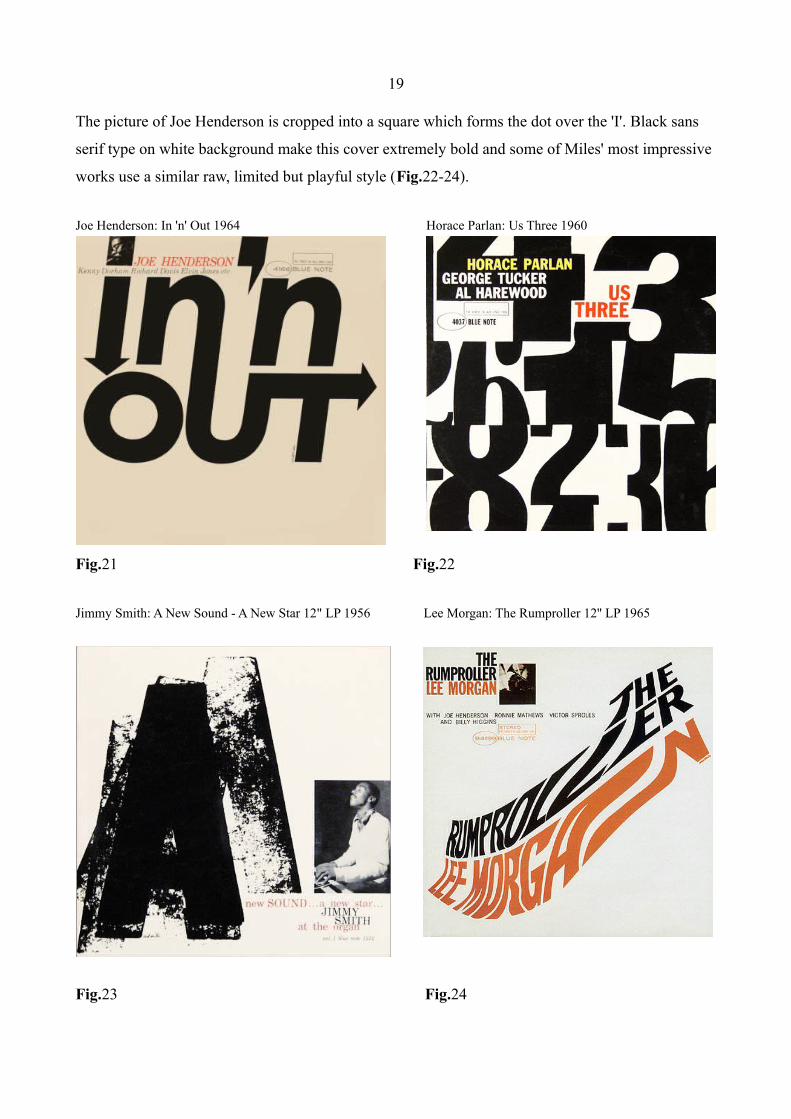
Covers like Joe Hendersons release from 1964 (Fig.21) show a deep understanding of typography
and the skill to take the design to another level. The way the lower case 'n' and the 'u' are connected
and the 'T' transformed into an arrow add a lot of movement and “swing” to the album title.
34 <http://www.birkajazz.com/archive/blueNote4000.htm> [accessed 9 August 2913].
19
The picture of Joe Henderson is cropped into a square which forms the dot over the 'I'. Black sans
serif type on white background make this cover extremely bold and some of Miles' most impressive
works use a similar raw, limited but playful style (Fig.22-24).
Joe Henderson: In 'n' Out 1964 Horace Parlan: Us Three 1960
Fig.21 Fig.22
Jimmy Smith: A New Sound - A New Star 12" LP 1956 Lee Morgan: The Rumproller 12'' LP 1965
Fig.23 Fig.24
20
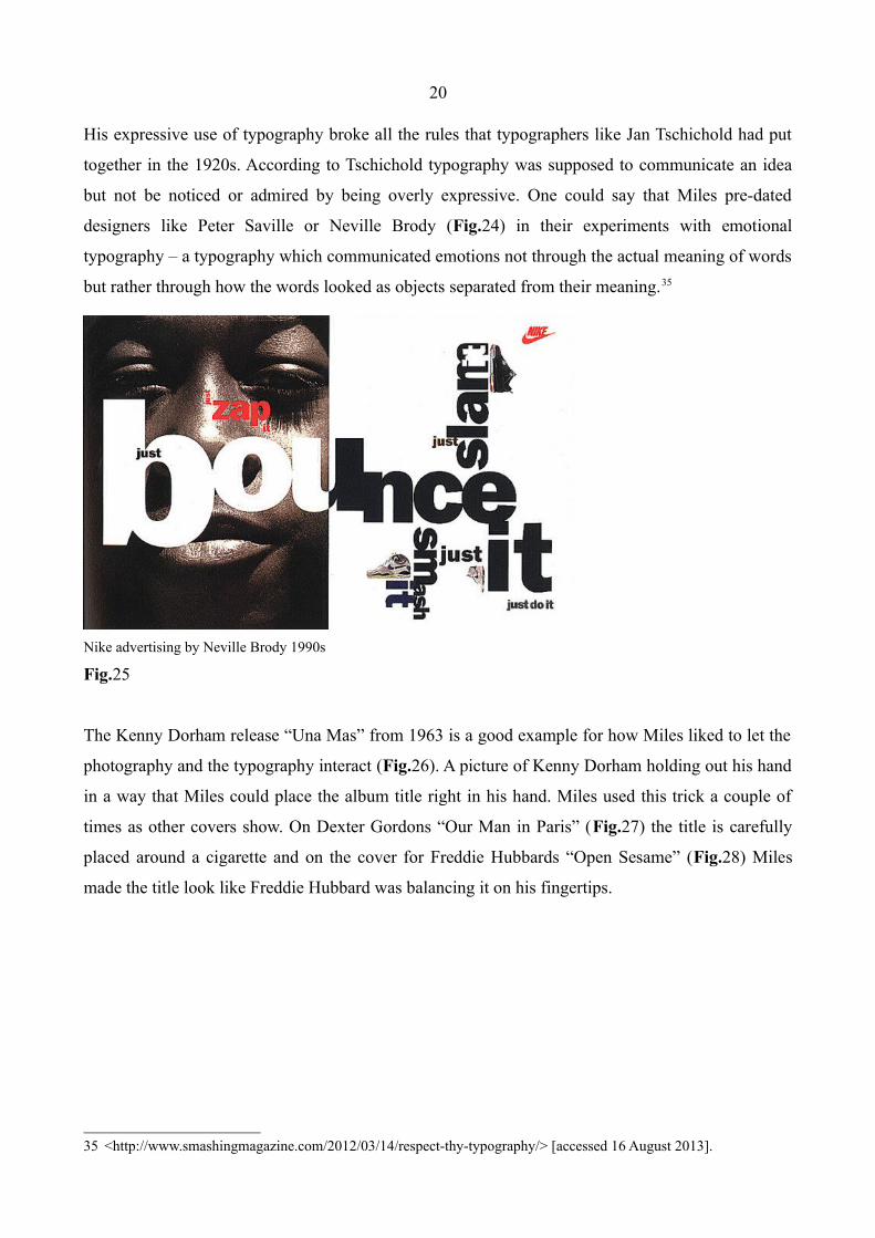
His expressive use of typography broke all the rules that typographers like Jan Tschichold had put
together in the 1920s. According to Tschichold typography was supposed to communicate an idea
but not be noticed or admired by being overly expressive. One could say that Miles pre-dated
designers like Peter Saville or Neville Brody (Fig.24) in their experiments with emotional
typography – a typography which communicated emotions not through the actual meaning of words
but rather through how the words looked as objects separated from their meaning.35
Nike advertising by Neville Brody 1990s
Fig.25
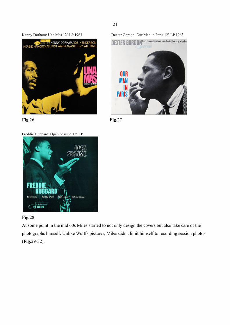
The Kenny Dorham release “Una Mas” from 1963 is a good example for how Miles liked to let the
photography and the typography interact (Fig.26). A picture of Kenny Dorham holding out his hand
in a way that Miles could place the album title right in his hand. Miles used this trick a couple of
times as other covers show. On Dexter Gordons “Our Man in Paris” (Fig.27) the title is carefully
placed around a cigarette and on the cover for Freddie Hubbards “Open Sesame” (Fig.28) Miles
made the title look like Freddie Hubbard was balancing it on his fingertips.
35 <http://www.smashingmagazine.com/2012/03/14/respect-thy-typography/> [accessed 16 August 2013].
21
Kenny Dorham: Una Mas 12'' LP 1963 Dexter Gordon: Our Man in Paris 12'' LP 1963
Fig.26 Fig.27
Freddie Hubbard: Open Sesame 12'' LP
Fig.28
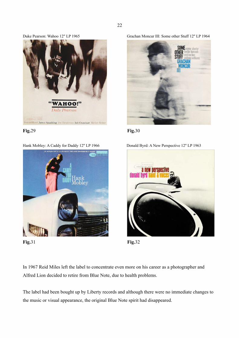
At some point in the mid 60s Miles started to not only design the covers but also take care of the
photographs himself. Unlike Wolffs pictures, Miles didn't limit himself to recording session photos
(Fig.29-32).
22
Duke Pearson: Wahoo 12" LP 1965 Grachan Moncur III: Some other Stuff 12'' LP 1964
Fig.29 Fig.30
Hank Mobley: A Caddy for Daddy 12'' LP 1966 Donald Byrd: A New Perspective 12'' LP 1963
Fig.31 Fig.32
In 1967 Reid Miles left the label to concentrate even more on his career as a photographer and
Alfred Lion decided to retire from Blue Note, due to health problems.
The label had been bought up by Liberty records and although there were no immediate changes to
the music or visual appearance, the original Blue Note spirit had disappeared.
23
6. Conclusion
At first sight jazz, the music that originated from slavery, and European modernist design concepts
might be a strange couple. But taking a closer look reveals that both were striving forces for
something new, breaking with traditions. Especially the Bebop style which came up in the 1940s
represented revolutionary ideas both musically and socially.
Combined with the radical and groundbreaking designs that immigrants from Europe brought to
America, jazz became an important part of the black freedom movement.
The Blue Note look, mainly established by Reid Miles, represented an American version of the
European design school. Miles' approach was nothing else but a personal interpretation of the style
and can only be described with one word: jazz.
If the look of the album covers helped selling records or breaking down racial barriers can not truly
be said, but it definitely helped defining a certain feel and life style, showing that the visions of
black musicians had to be taken seriously.
One could say that World War II and the reign of the National Socialist Party in Germany lead to the
rise of modernist graphic design in America as many artists during that time emigrated to the U.S.
Ironically this also had a positive influence on the success of jazz, a music form banned in Nazi
Germany, due to European designers and jazz lovers such as the Blue Note founders. Their taste
in music and in design shaped a whole culture and the way jazz was looked upon both in America
and the rest of the world.
Besides that it lead to some amazing records, both musically and cover design wise.

24
Bibliography
Cook, Richard, Blue Note Records – The Biography, Justin, Charles & Co., Boston, 2004.
Gioia, Ted, The Imperfect Art – Reflections On Jazz And Modern Culture, Oxford University Press,
New York, 1988.
Heller, Steven, “Alex Steinweiss”, in Eye magazine no.76, 2010, pp.49-56.
Herdeg, Walter, Record Covers – The Evolution of Graphics Reflected in Record Packaging, The
Graphis Press, Zurich, 1974.
Levine, Lawrence W., “Jazz and American Culture”, Ed. Robert O'Meally, The Jazz Cadence of
American Culture, Columbia University Press, New York, 1998, pp.431-447.
Marsh, Graham, and Glyn Callingham, The Cover Art of Blue Note Records – The Collection,
Edition Olms Zurich, Switzerland, 2002.
Miles, Barry, Grant Scott, and Johnny Morgan, The Greatest Album Covers of all Time,
Collin&Brown, London, 2005.
Nisenson, Eric, Blue – The Murder of Jazz, Da Capo Press, Cambridge, Massachusetts, 1997.
Remington, R. Roger, American Modernism – Graphic Design, 1920 to 1960, Laurence King
Publishing, London, 2003.

25
Web documents
“A Brief History of the Blues”,
<http://www.allaboutjazz.com/php/article.php?id=18724#.UgTypWRyddg> [accessed 4 July 2013].
“Black Mountain College”,
<http://www.blackmountainstudiesjournal.org/wp/?page_id=48> [accessed 20 August 2013].
“Blues Music”,
<http://www.scaruffi.com/history/blues.html> [accessed 13 July 2013].
“Concrete Poetry”,
<http://www.ubu.com/papers/solt/> [accessed 26 July].
“Design Icon Blue Note”,
<http://www.computerarts.co.uk/features/design-icon-blue-note> [accessed 26 July].
“Gramophone”,
<http://www.stern.de/kultur/musik/emil-berliners-160-geburtstag-google-doodle-fuer-den-erfinder-der-schallplatte-1687091.html> [accessed 19 July 2013].
“Jazz Wax – Interview Paul Bacon”,
<http://www.jazzwax.com/2010/07/interview-paul-bacon-part-1.html> [accessed 20 July 2013].
<http://www.jazzwax.com/2010/07/interview-paul-bacon-part-2.html> [accessed 20 July 2013].
<http://www.jazzwax.com/2010/07/interview-paul-bacon-part-3.html> [accessed 20 July 2013].
“John Hermansader for Blue Note”,
<http://amodernist.blogspot.com.es/2011/09/john-hermansader-for-blue-note-records.html> [accessed 28 June 2013].
“LP Record”,
<http://www.vinyl-record.co.uk/Pages/VinylRecordHistory.htm> [accessed 2 june 2013].
“Paul Rand”,
<http://www.modernism101.com/rand_direction_1941_03.php> [accessed 20 August 2013].

26
“Phonograph”,
<http://www.time.com/time/specials/packages/article/0,28804,1999143_1999210_1999211,00.html> [accessed 19 July 2013].
“Respect Thy Typography”,
<http://www.smashingmagazine.com/2012/03/14/respect-thy-typography/> [accessed 16 August 2013].
“The Birka Jazz Archive – Blue Note”,
<http://www.birkajazz.com/archive/blueNote4000.htm> [accessed 9 August 2013].
27
Images:
Fig.1&2
<http://www.eyemagazine.com/blog/post/wax-museum> [accessed 13 July 2013].
Fig.3
<http://restless--wind.tumblr.com/post/8236454279/ten-cool-album-covers-alex-steinweiss-designed> [accessed 22 July 2013].
Fig.4
<http://www.designers-books.com/wp-content/uploads/2011/01/1934-03.jpg> [accessed 18 August 2013].
Fig.5
<http://www.modernism101.com/rand_direction_1941_03.php> [accessed 20 August 2013].
Fig.6–14
<http://www.birkajazz.com/archive/blueNote10inch.htm> [accessed 13 July 2013].
Fig.15
<http://kingydesignhistory2012.wordpress.com/2012/05/22/post-9-kay-herbert-bayer-1930s/> [accessed 10 July 2013].
Fig.16–18
<http://www.birkajazz.com/archive/blueNote1500.htm> [accessed 23 July 2013].
Fig.19
<http://www.flickriver.com/photos/tags/georgeshearing/interesting/> [accessed 17 August 2013].
Fig.20
<http://loungetastic.blogspot.com/2011/04/larry-page-orchestra-instrumentally.html> [accessed 17 August 2013].

28
Fig.21–24&26–32
<http://www.birkajazz.com/archive/blueNote4000.htm> [accessed 2 August 2013].
Fig.25
<http://vbutka.studentsofdesign.com/2013/01/22/neville-brodynike-poster/> [accessed 15 July 2013].