hubbert’s valley: consequences of an unexpected oil … · consequences of an unexpected oil...
TRANSCRIPT

EYE ON THE MARKETS P E C I A L E D I T I O N
Consequences of an unexpected oil price decline
H U B B E R T ’ S V A L L E Y :
A special edition feature by Michael Cembalest Chairman of Market and Investment Strategy for J.P. Morgan Asset Management

EYE ON THE MARKET J .P . MORGAN January 2015
Hubbert’s Valley: the Consequences of an Unexpected Oil Price Decline The impacts of financial asset and natural resource price declines are often magnified when few investors or businesses anticipate them. That was the case when fraud preceded US tech and telecom companies failing in 2001 and 2002; when inadequate disclosure of high-risk exposures and underwriting practices preceded the conservatorship of US Government-Sponsored Enterprises and the failure of Lehman Brothers in 2008; and when Greece disclosed in November 2009 that its fiscal deficit was 13%, more than twice the number it had been publishing. Surprise is a contributing factor to the current oil price decline, although lack of disclosure is not the issue. Instead, given all the talk about Peak Oil and Hubbert’s theory of depleting natural resources that serves as its foundation, a jump in excess oil supply in 2014 was a surprise to most investors and oil producers/consumers. That part of the supply jump was increased production by some of the most chaotic countries on earth compounded the surprise further.
This document reviews the economic, financial market and geopolitical implications of the current oil price decline. While I believe that oil prices will be higher 18-24 months from now (when some currently operating US shale oil wells are depleted and not replaced), there’s a long way to go before we get there. Now is the time to evaluate the consequences of cheaper oil, assuming prices below $70 on WTI are sustained. For posterity, this document went to print on Thursday, January 22nd, 2015 when WTI oil prices were around $46 per barrel. Michael Cembalest J.P. Morgan Asset Management
Hubbert’s Peak is a theory of natural resource production that estimates a bell-shaped production curve. It uses past actual production to produce a fitted curve of both past and future production. Hubbert’s original upper-bound estimates that were published in 1956 predicted that US oil production would peak around the year 1970, after which it would gradually decline at roughly the same pace at which it rose. As recently as 2008, Hubbert’s Peak theories were still doing a good job predicting the peak and subsequent lifecycle of US crude oil production. Horizontal drilling and shale oil production changed all that, as shown in the chart below.
0
500
1,000
1,500
2,000
2,500
3,000
3,500
4,000
1900 1920 1940 1960 1980 2000 2020 2040
Defying Hubbert's peakMillion barrels per year, annual US crude production
Source: Dr. Thomas Huber, Gustavus Adolphus College; EIA; JPMAM. January 2015.
Hubbert's peak approximation
Actual US crude production
1

EYE ON THE MARKET J .P . MORGAN January 2015
Table of Contents Page Getting started 3 The current oil price decline: supply factors 5 The current oil price decline: demand factors 7 The elasticity of marginal costs of oil production during a period of declining oil prices 10 Equity markets and oil price declines 12 Economic impacts of the oil price decline 15 The oil price decline and high yield bond markets 19 The impact of lower oil prices on the US natural gas industry 22 Geopolitics and oil prices 23 Close-up on Russia 25 A petro-sectarian map of the Middle East 29 Other exhibits: operating costs of current production, real oil price since 1861 30 Acronyms and Disclaimers 31
2

EYE ON THE MARKET J .P . MORGAN January 2015
Getting started The first thing to keep in mind is that oil is a very volatile commodity. In the span of the few years shown in the first chart, oil rose from $60 to $140 per barrel, and fell back to $40 before rising again. Oil prices are highly sensitive to changes in supply and demand, and are more volatile than other energy, industrial metal, precious metal and agricultural commodities (volatilities from the period 2007 to 2009 are shown in the table). Price swings of +/- 20% are frequent events, so the notion of sharp oil price changes is not that abnormal.
That said, price declines of 35%-40% are less frequent, and occurred 7 times since 1974. Given where inventory levels are now, we are not expecting a V-shaped recovery in oil. That’s why it makes sense to consider the possible implications of oil prices below $70 sustained for a period of 3-4 years.
$0
$20
$40
$60
$80
$100
$120
$140
$160
2005 2006 2007 2008 2009 2010 2011 2012 2013 2014 2015Source: Bloomberg. January 22, 2015.
Oil: 2005 - presentUSD per barrel
WTI Crude
$2.00
$2.50
$3.00
$3.50
$4.00
$40
$50
$60
$70
$80
$90
$100
$110
Jan-13 Jul-13 Jan-14 Jul-14 Jan-15Source: Bloomberg. American Automobile Association. January 22, 2015.
Oil & gasoline: January 2013 - presentUSD per barrel USD per gallon
WTI CrudeGasoline
250
270
290
310
330
350
370
390
1990 1992 1994 1996 1998 2000 2002 2004 2006 2008 2010 2012 2014Source: US Department of Energy. December 2014.
US crude inventories at highest levels since 1990Million barrels of crude oil (ex. Strategic Petroleum Reserve)
Last reported value for each calendar year
Annualized volatility, 2007-2009Oil 54%Natural Gas 51%Gasoline 50%Lumber 46%Copper 43%Corn 38%Soybeans 33%Platinum 32%Zinc 30%Gold 25%Aluminum 18%Source: Bloomberg.
3

EYE ON THE MARKET J .P . MORGAN January 2015
As stated on page 1, the unexpected nature of the oil price decline may magnify its impact. One sign that a price decline was not anticipated: the large US$1 trillion increase in debt taken on by the world’s largest energy companies since oil began rising in 2003 from $30 a barrel. A world of Peak Oil is more of what they had in mind. Even before oil prices began falling in 2014, the number of these companies with positive free cash flow had fallen sharply, given the rising cost of conventional and unconventional oil extraction.
The consequences of large oil price declines can be substantial, particularly when looking at specific oil-producing countries or US regions. In the 1980’s, the oil price decline was a major contributing factor to bank failures in Texas, and to the severity of the US Savings and Loan crisis. As we explain later in the document, banks appear to have lower oil exposures this time around (leaving the bulk of the problem with high yield bond investors), but this time capsule helps illustrate what can happen when oil prices fall suddenly after a debt-fueled capital spending expansion.
45%
50%
55%
60%
65%
70%
75%
80%
$200
$400
$600
$800
$1,000
$1,200
2002 2004 2006 2008 2010 2012 2014Source: Bloomberg. Q3 2014.
Fundamentals of the top 100 global energy companiesUSD, billions Percent
Total debt
Percentage of companies with positive free cash flow
$10
$15
$20
$25
$30
$35
$40
0
100
200
300
400
500
600
1975 1977 1979 1981 1983 1985 1987 1989 1991 1993 1995
US (ex. Texas)Texas
Source: Federal Reserve Bank of Dallas, FDIC, EIA, Bloomberg.
Bank failures occurring in Texas vs. the rest of the country Number of institutions USD per barrel
Crude oil
1 Petrobras 11 Statoil2 PetroChina 12 Enbridge3 Rosneft 13 JX Holdings4 Total 14 Chevron5 China Petroleum 15 TransCanada6 Gazprom 16 Exxon Mobil7 BP 17 ConocoPhillips8 Royal Dutch Shell 18 Williams Cos9 Kinder Morgan 19 Repsol10 Eni 20 BG Group
Source: Bloomberg. Q3 2014.
Top 20 Energy Companies by Debt Outstanding
4

EYE ON THE MARKET J .P . MORGAN January 2015
The current oil price decline: supply factors The most significant long-term supply factor has been growth in US shale. As shown in the first chart, OPEC, non-OPEC ex-US and US conventional production has been roughly flat for several years. However, the steady rise in US shale oil production brought down marginal costs sharply. The second chart is an estimate of breakeven costs for new projects, computed each year. By 2014, the next 20 million barrels per day of future production could be obtained at marginal costs of $80 per barrel, compared to estimates in 2009 that were over $120 per barrel. While not all oil is fungible (light, sweet, heavy, sour, etc.), US shale radically changed US oil production and imports. Rising US production is mostly “light/sweet” and has displaced similar grades imported from Africa (down 90% since 2010).
-4-3-2-10123456
1998 2000 2002 2004 2006 2008 2010 2012 2014
Source: Energy Information Administration. September 2014.
Apart from US shale, global production flat since 2006Increase in production since 1998, million barrels per day
Non-OPECex-US
US shale
US conventional
OPEC
$20
$40
$60
$80
$100
$120
0 5 10 15 20 25 30 35
Estimated peak cumulative production, mm barrels per day
Source: Goldman Sachs, "400 projects to change the world", JPMAM. 2014.
Shale oil era has reduced estimated future marginal costsBreakeven cost for new projects, USD per barrel
201420132012
201120102009
2014 with cost deflation impact
4.5
5.5
6.5
7.5
8.5
9.5
10.5
1991 1994 1997 2000 2003 2006 2009 2012
Source: Energy Information Administration. October 2014.
US: falling net imports, rising domestic productionMillion barrels per day of crude oil
Net imports
Domestic production
5

EYE ON THE MARKET J .P . MORGAN January 2015
The most notable short-term supply factor is the unexpected spike in production by OPEC “basket-case” countries: Libya, Iraq, Iran and Nigeria. To be clear, the military, economic and social backdrop in most of these countries is terrible, and in some cases, getting worse. However, despite these conditions, these countries staged a production rebound in late 2014 of a million barrels per day after a similar y/y production decline during 2013. In the face of growing inventories, Saudi Arabia, Qatar and the UAE have not supported a quota cut in OPEC production, which accelerated the oil price decline when announced last November. In our view, there is not much Iran and Venezuela can do on their own to change the dynamics of oil pricing without cooperation from the Saudis. The table shows the largest 4 prior oil price declines and how Saudi Arabia functioned as the swing producer, a role it is apparently no longer willing to play.
-2,000
-1,500
-1,000
-500
0
500
1,000
1,500
2,000
Jan-13 Jul-13 Jan-14 Jul-14
Libya IranIraq NigeriaTotal
Source: Bloomberg. December 2014.
Production rebound in turbulent OPEC countriesY/Y production change, thousand barrels per day
28
29
30
31
32
2010 2011 2012 2013 2014
Source: Bloomberg, OPEC, JPMAM. December 2014.
OPEC producing more than its quotaMillion barrels per day
Quota
Production
Saudi Arabia refusing swing producer role this time aroundPercent decline in the price of oil and output
1996-1999 2000-2002 2006-2007 2008-2009 2014-2015Oil Price -61.2% -48.9% -34.0% -74.9% -59.5%Saudi Output -14.1% -19.2% -8.8% -18.1% -3.3%OPEC Output -11.7% -18.3% -4.1% -15.6% -2.4%Source: Bloomberg. January 2015.
6

EYE ON THE MARKET J .P . MORGAN January 2015
The current oil price decline: demand factors Global GDP growth is a substantial driver of oil demand, and both growth and growth surprises outside the US have been weaker than expected since 2010. The primary culprits: a China slowdown, and the slowest trend growth in Europe (other than during wartime) in around 100 years. As for the 2010 spike in oil demand in China, it appears to be a by-product of an unsustainably large fiscal stimulus program and accumulation of strategic reserves, rather than an organic reflection of Chinese oil demand needs.
-4%
-2%
0%
2%
4%
6%
2001 2003 2005 2007 2009 2011 2013 2015Source: EIA, IMF, JPMAM. Q3 2014.
Lower GDP growth only explains part of the demand declineY/Y % change
Global GDP growth
Oil demand EIA Forecast
102
105
108
111
114
117
120
123
$30
$50
$70
$90
$110
$130
$150
2006 2008 2010 2012 2014Source: UBS, Bloomberg. January 20, 2015.
Global growth expectations falling with oil pricesUSD per barrel Index
Brent crude
Global growth ex-US surpriseindex
5%
7%
9%
11%
13%
15%
17%
19%
21%
2004 2006 2008 2010 2012 2014Source: China National Bureau of Statistics. December 2014.
Slowing growth of the "old" ChinaY/Y real growth, percent
Industrial production
GDP
0
200
400
600
800
1,000
2003 2004 2005 2006 2007 2008 2009 2010 2011 2012 2013 2014Source: BP, EIA. December 2014.
Annual growth in Chinese crude oil demandThousand barrels per day
Accumulation of strategic reserves and aftermath of 2009 stimulus program
-10%
0%
10%
20%
30%
40%
50%
60%
1825 1835 1845 1855 1865 1875 1885 1895 1905 1915 1925 1935 1945 1955 1965 1975 1985 1995 2005
Source: Pre-1950 data f rom "Statistics on World Population, GDP and Per Capita GDP, 1-2008 AD", Angus Maddison. 1950 - present data f rom The Conference Board.
Remembrance of things past: a return to 19th century stagnation in Europe6-year percentage change in real GDP; excluding wartime and subsequent rebuilding periods
SpainItaly France
7

EYE ON THE MARKET J .P . MORGAN January 2015
Weaker growth outside the US is not the only demand factor at work. Irrespective of economic growth levels, there have been substantial improvements in oil intensity in many countries. Oil intensity refers to the barrels of oil needed to produce a given unit of GDP. As shown in the first chart, since 2005, China experienced huge improvements in oil intensity, which declined by almost 35%. Large intensity improvements have also taken place in the developed world. One contributing factor to improved oil intensity: the adoption of higher fuel economy standards; historical and future standards are shown in the second chart.
Transportation is not the only source of improved energy intensity. The EIA also projects energy intensity improvements in commercial, industrial and residential use. But the oil/transportation benefits are larger than the electricity intensity benefits estimated by the EIA. Outside the US, oil intensity levels are falling due to declines in subsidies and price controls in some countries, more conservation, improvements in internal combustion engines, and fuel-switching among countries that still use petroleum as a material fuel source for electricity generation.
65
70
75
80
85
90
95
100
2005 2006 2007 2008 2009 2010 2011 2012 2013 2014Source: Bloomberg, BP, national statistical offices, JPMAM. Sept 2014.
Decline in oil intensity across economiesIndex, 2005=100, barrels of crude oil demand per unit of real GDP
Grc, NethJpn, US, Fra
UKIta, Prt, Esp
Tai
China declining at 4.3% per year
25
30
35
40
45
50
55
60
2000 2005 2010 2015 2020 2025Source: International Council on Clean Transportation. November 2014.
Actual and projected fuel economy for new passenger vehicles by country, Miles per gallon
EUSouth Korea
China
US
Japan
8

EYE ON THE MARKET J .P . MORGAN January 2015
An additional demand factor is worth mentioning as it relates to the speed and magnitude of the oil price decline: the impact of hedging unwinds. In early 2014, some industrial consumers of oil (e.g., airlines) hedged against increasing oil prices. To understand the impact of what happened when oil fell instead of rising, consider the following stylized example.
Assume that in January 2014, Airline A wants to hedge against higher oil prices when spot prices are $92. They buy a call option struck at $110. To finance the call option, they simultaneously sell a put option on a cash neutral basis (i.e., the premium on the call is equal to the premium on the put). The put option is struck at $601. Everything is fine (oil is ranging around the original spot price), and then oil starts to plummet in August. The put option the Airline sold is rapidly resulting in a mark-to-market loss, since oil prices are getting close to the put strike and there’s plenty of time value left. Airline A could wait to see where oil is at expiry, but if so, they could incur a massive loss if oil ends up at $45. So, when oil hits $70 or so, they decide to close out the short put position.
To whom did they sell the put option? To a broker-dealer that is typically not in the business of taking long or short views on oil; they would instead attempt to maintain a market-neutral position by “delta-hedging” their exposure. Delta-hedgers typically trade in the opposite direction of the market, so as oil prices fall, they’re buying to add to their long position. When Airline A closes out the put position (on a cash basis, probably), the delta-hedging broker-dealer has no further need for the oil exposure they have been accumulating, and sells it as fast as possible. That’s the options food chain at work, and explains part of the rapid price decline in the late fall.2
1 While the spot price is $92 in this example, the forward price is $84. The forward price is roughly equidistant between the call strike and the put strike, which is why the put and call option premiums are roughly the same. 2 See disclosure in endnotes.
$40
$50
$60
$70
$80
$90
$100
$110
$120
Jul-12 Jan-13 Jul-13 Jan-14 Jul-14 Jan-15Source: Bloomberg. January 22, 2015. Assumes cashless hedge structure executed on January 16, 2014 for calendar year 2015.
Hypothetical hedging strategy for oil consumerUSD per barrel
Short Put strike
Long Call strike
WTI Crude
Forward reference price
Date of hedge implementation
9
EYE ON THE MARKET J .P . MORGAN January 2015
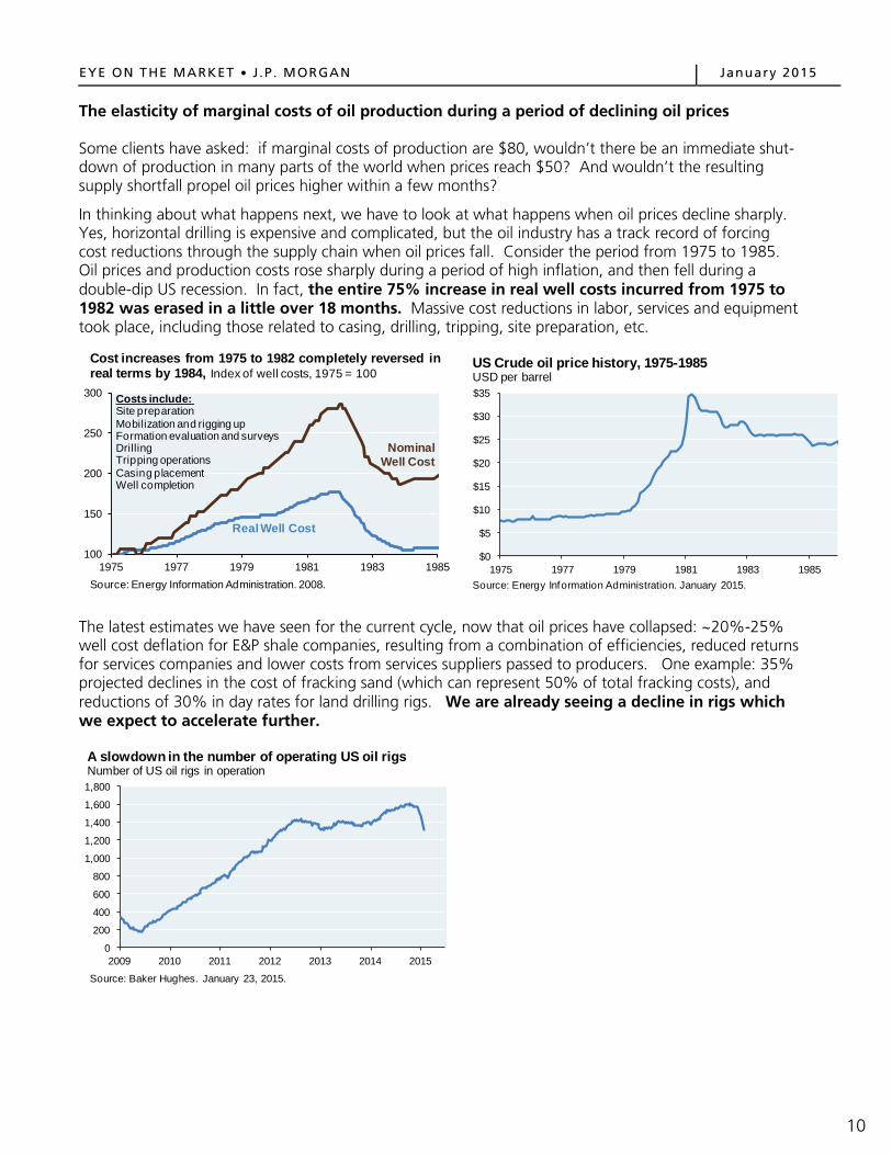
The elasticity of marginal costs of oil production during a period of declining oil prices Some clients have asked: if marginal costs of production are $80, wouldn’t there be an immediate shut-down of production in many parts of the world when prices reach $50? And wouldn’t the resulting supply shortfall propel oil prices higher within a few months?
In thinking about what happens next, we have to look at what happens when oil prices decline sharply. Yes, horizontal drilling is expensive and complicated, but the oil industry has a track record of forcing cost reductions through the supply chain when oil prices fall. Consider the period from 1975 to 1985. Oil prices and production costs rose sharply during a period of high inflation, and then fell during a double-dip US recession. In fact, the entire 75% increase in real well costs incurred from 1975 to 1982 was erased in a little over 18 months. Massive cost reductions in labor, services and equipment took place, including those related to casing, drilling, tripping, site preparation, etc.
The latest estimates we have seen for the current cycle, now that oil prices have collapsed: ~20%-25% well cost deflation for E&P shale companies, resulting from a combination of efficiencies, reduced returns for services companies and lower costs from services suppliers passed to producers. One example: 35% projected declines in the cost of fracking sand (which can represent 50% of total fracking costs), and reductions of 30% in day rates for land drilling rigs. We are already seeing a decline in rigs which we expect to accelerate further.
100
150
200
250
300
1975 1977 1979 1981 1983 1985Source: Energy Information Administration. 2008.
Cost increases from 1975 to 1982 completely reversed in real terms by 1984, Index of well costs, 1975 = 100
Real Well Cost
Nominal Well Cost
Costs include:Site preparationMobilization and rigging upFormation evaluation and surveysDrillingTripping operationsCasing placementWell completion
$0
$5
$10
$15
$20
$25
$30
$35
1975 1977 1979 1981 1983 1985Source: Energy Information Administration. January 2015.
US Crude oil price history, 1975-1985USD per barrel
0
200
400
600
800
1,000
1,200
1,400
1,600
1,800
2009 2010 2011 2012 2013 2014 2015
Source: Baker Hughes. January 23, 2015.
A slowdown in the number of operating US oil rigs Number of US oil rigs in operation
10

EYE ON THE MARKET J .P . MORGAN January 2015
Before getting into US shale production and how it might fall with lower oil prices, it’s important to highlight two things. First, existing production is less at risk since it only has to cover current operating costs (which exclude upfront capital costs) and which tend to be below $40 per barrel. Wells now in operation will probably keep pumping until they are depleted, unless they lose access to credit markets [a chart on current operating costs appears below, and is explained further on page 30]. What is at risk is future shale oil production, which has to generate enough profitability to cover both operating and capital costs. That’s why I expect oil prices to be higher in two years, at which time some higher cost share locations will be depleted and not replaced. Second, when thinking about marginal costs and whether prices are high enough to justify production, we look at the forward curve rather than the spot market; more producers sell in the forward market than in the spot market. The forward market for oil is shown in the next chart.
The bar chart below looks at full-cycle breakeven costs by shale region, as estimated by J.P. Morgan Securities LLC. Taken at face value, this chart suggests that the lower third of shale locations would eventually cease future production at $60 oil (based on forward prices). However, as explained on the prior page, we anticipate cost reductions that could bring breakevens down in some locations.
$45
$55
$65
$75
$85
$95
$105
0 12 24 36 48 60
Source: Bloomberg. January 20, 2015.
WTI crude oil futures curveUSD per barrel
6 months ago
1 month ago
Current
Months until delivery
$0
$10
$20
$30
$40
$50
$60
0 10 20 30 40 50 60 70 80 90
Operating cost with royaltiesOperating cost without royalties Canada oil sands
VenezuelaUKCanada (exc. oil sands)
UAEChina
Saudi Arabia
Iraq
Mexico
ChinaUS
RussiaIran
Source: Morgan Stanley Commodity Research. December 2014.
Cash costs of current productionOperating cost, USD per barrel
Cumulative global oil production, mm barrels per day
US NigeriaRussia
US
$91$81
$72$71
$69$68
$67$65
$63$62
$61$60
$58$57$56
$53$52$52
$51$50
$47$45
$43$42
$41$34
$0 $20 $40 $60 $80 $100
Three Forks - McKenzieUlinta
Bakken - MontanaThree Forks - Northern
Bakken - DivideBakken - North Nesson
Three Forks - Feather EdgeBakken - South McKenzie
Permian - AvalonThree Forks - Sanish
Eagle FordBakken - Dunn County
UticaNiobrara - VT
Three Forks - NessonPermian - Wolfberry
Permian - ClinePermian - Delaware Sands
Permian - WolfbonePermian - Wolfcamp
Bakken West NessonPermian - Bone Spring
Bakken - MessonNiobrara - HZ
Bakken - MountrailBakken - Sanish
Source: J.P. Morgan Securities LLC. December 2014.
Breakeven prices by region and formationFull lifecycle breakevens, $/bbl
2-year forward WTI price
11
EYE ON THE MARKET J .P . MORGAN January 2015
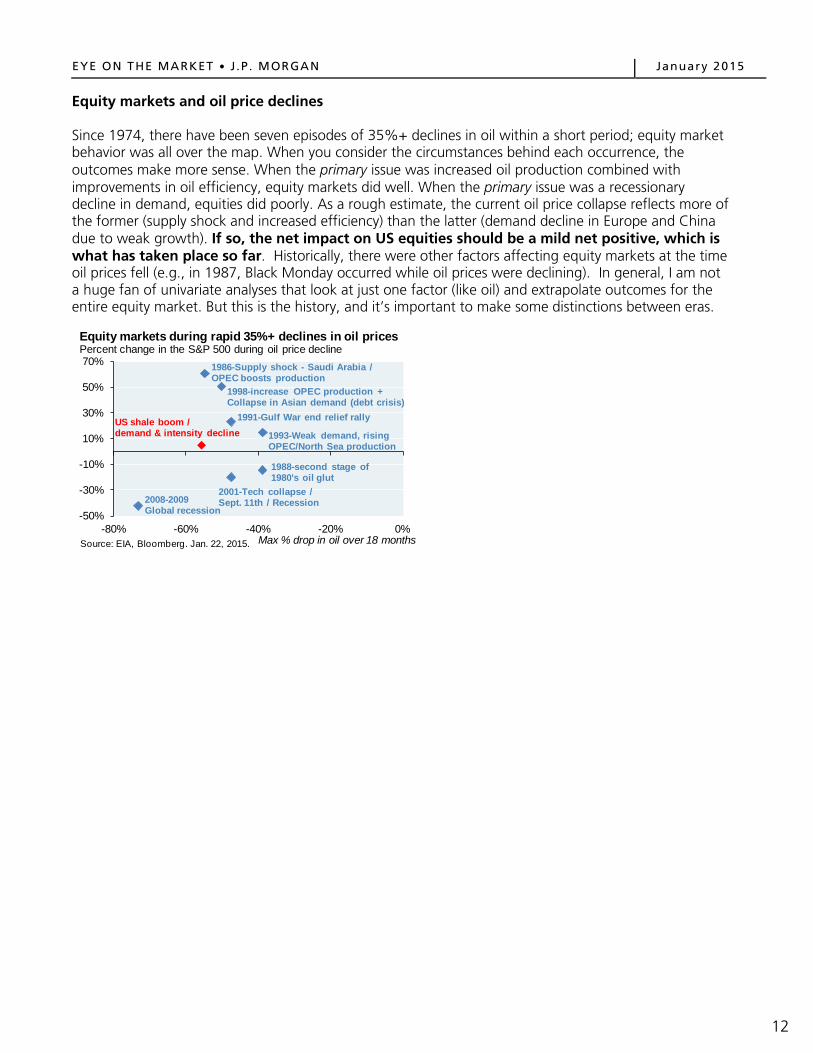
Equity markets and oil price declines Since 1974, there have been seven episodes of 35%+ declines in oil within a short period; equity market behavior was all over the map. When you consider the circumstances behind each occurrence, the outcomes make more sense. When the primary issue was increased oil production combined with improvements in oil efficiency, equity markets did well. When the primary issue was a recessionary decline in demand, equities did poorly. As a rough estimate, the current oil price collapse reflects more of the former (supply shock and increased efficiency) than the latter (demand decline in Europe and China due to weak growth). If so, the net impact on US equities should be a mild net positive, which is what has taken place so far. Historically, there were other factors affecting equity markets at the time oil prices fell (e.g., in 1987, Black Monday occurred while oil prices were declining). In general, I am not a huge fan of univariate analyses that look at just one factor (like oil) and extrapolate outcomes for the entire equity market. But this is the history, and it’s important to make some distinctions between eras.
-50%
-30%
-10%
10%
30%
50%
70%
-80% -60% -40% -20% 0%
Equity markets during rapid 35%+ declines in oil pricesPercent change in the S&P 500 during oil price decline
Max % drop in oil over 18 months
2008-2009 Global recession
2001-Tech collapse / Sept. 11th / Recession
1988-second stage of 1980's oil glut
US shale boom / demand & intensity decline 1993-Weak demand, rising
OPEC/North Sea production
1991-Gulf War end relief rally
1998-increase OPEC production + Collapse in Asian demand (debt crisis)
1986-Supply shock - Saudi Arabia / OPEC boosts production
Source: EIA, Bloomberg. Jan. 22, 2015.
12

EYE ON THE MARKET J .P . MORGAN January 2015
Within the energy sector, there has been some differentiation in terms of stock price declines. Offshore drillers have fared the worst, while pipeline companies and refiners have held up better. Are energy stocks cheap enough yet? According to Empirical Research Partners, price-to-free cash flow valuations for large cap oil and oil service companies were trading at the 15th and 9th percentiles of their historical valuation range last December (in other words, close to the most inexpensive valuations on record). However, these valuations were computed based on 12-months trailing free cash flow, a time when oil averaged around $90 per barrel. As a result, oil stocks are most interesting if oil prices were to rise again as they did in the late 1980’s. The history of oil price rebounds after a large collapse is shown in the table. V-shaped recoveries do happen (when prices reach the prior peak within 2 years), but rarely during the first year after the collapse.
The underperformance of energy stocks relative to the market is similar to prior oil price drawdowns, including the severe oil-related selloff in the mid 1980’s. Two points of comparison for energy stocks in the current cycle vs. July 1986:
• Price to book value ratios have fallen to 0.5x vs. the overall market, same as July 1986 • Relative price to sales ratios are now 0.6x compared to 0.5x in July 1986 (similar as well)
The bottom line is that oil stocks look interesting mostly under scenarios of a return to $75 oil within the next 2-3 years.
5%
-6% -9% -14% -22%-31% -34% -40% -47%
-50%
-40%
-30%
-20%
-10%
0%
10%
Rus
sell
1000
Pip
elin
es
Ref
iner
s
Inte
grat
eds
Rus
sell
1000
E
nerg
y
Cru
de
Pro
duce
rs
Equ
ipm
ent &
S
ervi
ces Coa
l
Off
shor
e D
rille
rs
Source: Bloomberg. January 22, 2015.
Energy down across the boardPercent, performance for energy sub-industries since 2014 oil peak
Oil price behavior after prior 35%+ declinesPrice index, trough = 100Decline Peak Trough Y+1 Y+2 Y+3 Recovery1984-1986 222 100 122 102 121 U-Shape1987-1988 164 100 158 267 190 V-Shape1990-1991 191 100 95 100 93 N/A*1992-1994 164 100 133 147 168 V-Shape1997-1998 201 100 275 288 268 V-Shape2000-2001 191 100 163 184 201 V-Shape2008-2009 375 100 213 254 319 U-Shape2014-Today 214 100 N/A N/A N/A N/ASource: EIA - crude price history, JPMAM. January 2015. *Temporary and brief price spike due to the Gulf War.
13
EYE ON THE MARKET J .P . MORGAN January 2015
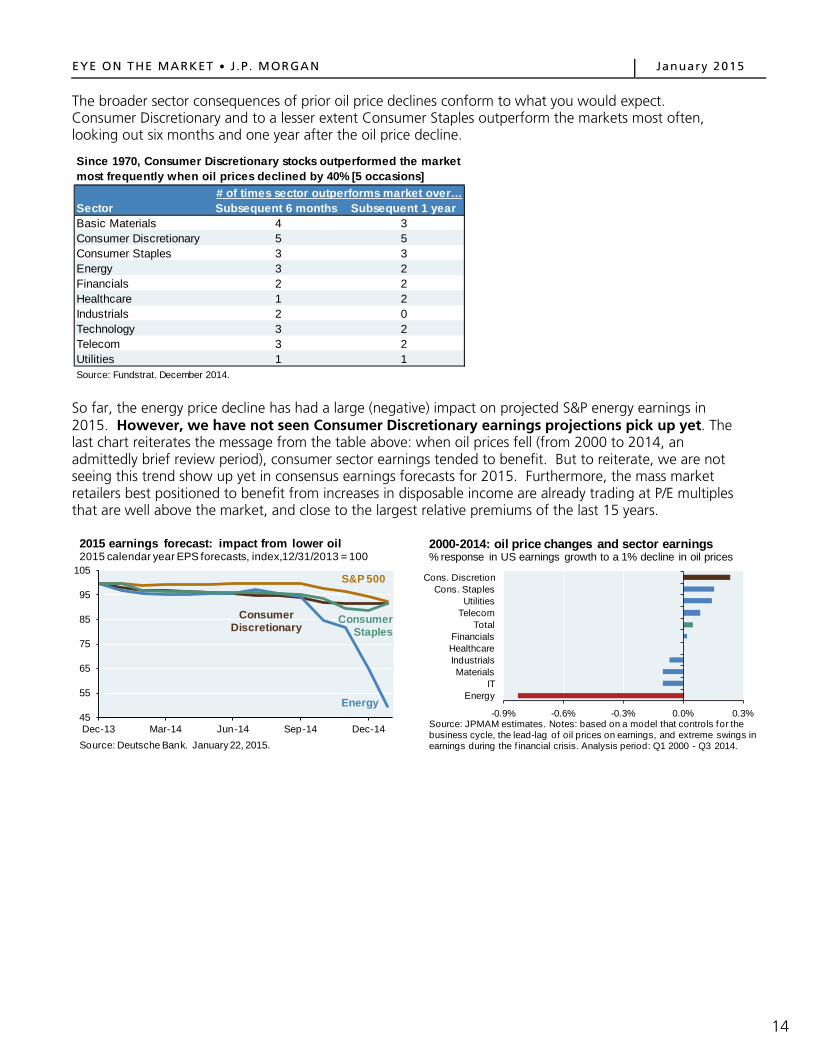
The broader sector consequences of prior oil price declines conform to what you would expect. Consumer Discretionary and to a lesser extent Consumer Staples outperform the markets most often, looking out six months and one year after the oil price decline.
So far, the energy price decline has had a large (negative) impact on projected S&P energy earnings in 2015. However, we have not seen Consumer Discretionary earnings projections pick up yet. The last chart reiterates the message from the table above: when oil prices fell (from 2000 to 2014, an admittedly brief review period), consumer sector earnings tended to benefit. But to reiterate, we are not seeing this trend show up yet in consensus earnings forecasts for 2015. Furthermore, the mass market retailers best positioned to benefit from increases in disposable income are already trading at P/E multiples that are well above the market, and close to the largest relative premiums of the last 15 years.
Subsequent 6 months Subsequent 1 yearBasic Materials 4 3Consumer Discretionary 5 5Consumer Staples 3 3Energy 3 2Financials 2 2Healthcare 1 2Industrials 2 0Technology 3 2Telecom 3 2Utilities 1 1Source: Fundstrat. December 2014.
Sector# of times sector outperforms market over…
Since 1970, Consumer Discretionary stocks outperformed the market most frequently when oil prices declined by 40% [5 occasions]
45
55
65
75
85
95
105
Dec-13 Mar-14 Jun-14 Sep-14 Dec-14Source: Deutsche Bank. January 22, 2015.
2015 earnings forecast: impact from lower oil2015 calendar year EPS forecasts, index,12/31/2013 = 100
Energy
Consumer Discretionary
S&P 500
Consumer Staples
-0.9% -0.6% -0.3% 0.0% 0.3%
EnergyIT
MaterialsIndustrialsHealthcareFinancials
TotalTelecomUtilities
Cons. StaplesCons. Discretion
Source: JPMAM estimates. Notes: based on a model that controls for the business cycle, the lead-lag of oil prices on earnings, and extreme swings in earnings during the f inancial crisis. Analysis period: Q1 2000 - Q3 2014.
2000-2014: oil price changes and sector earnings% response in US earnings growth to a 1% decline in oil prices
14

EYE ON THE MARKET J .P . MORGAN January 2015
Economic impacts of the oil price decline The economic and equity market impacts of an oil price decline can be quite different. The reason: as shown below, energy has a much larger impact on S&P 500 earnings and market capitalization than it does on economic measures such as employment and GDP. The US economy is very consumer-sensitive, while the S&P 500 and Russell 1000 indexes are more impacted by energy and other industrial companies.
Before going into greater detail on economic impacts, it’s worth considering the transmission mechanism of lower oil prices. To do so, we use a sources and uses table of primary energy. The majority of petroleum (around 70%) is used in the US for transportation. Most of the remainder (25%) is used by industry, either as a fuel or as a feedstock. Oil used for residential/commercial heating and electricity generation is so small we can ignore it. Looking at the other side of the exhibit, we see the following: over 90% of transportation fuel is based on petroleum, and industry is split equally in its reliance on petroleum and natural gas. The bottom line: the benefits of lower oil prices accrue to households and businesses through reduced outlays on transportation fuel, and feedstock fuel for industries that have not and/or cannot switch to cheaper natural gas.
0%
2%
4%
6%
8%
10%
12%
14%
Employment GDP S&P Market Cap S&P EarningsSource: BLS, BEA, Bloomberg, J.P. Morgan Asset Management. Dec. 2014
Energy is a much larger share of the market than of the US economy, Energy sector, percent of total
Economic Measures
Market Measures
0%
10%
20%
30%
40%
50%
60%
70%
80%
90%
100%
Sources UsesSource: U.S. Energy Information Administration. Data as of year-end 2013.
Sources and uses of primary energy in the USPercentage of total
Renewables (10%)
Coal (19%)
Petroleum (36%)
Natural Gas (27%)
Electric Power (39%)
Res. & Commercial (11%)
Industrial (22%)
Transportation (28%)
Nuclear (8%)
Breakdown by source / use (%)
34%
25%
71%
92%
42%
40%
15

EYE ON THE MARKET J .P . MORGAN January 2015
With that framework, what are the economic benefits of lower oil prices? We have to consider the fact that increases in household and corporate disposable income are offset by declines in oil-related capital spending. According to Empirical Research Partners, US E&P stocks already announced 2015 capital spending reductions of 10%-15%.
Our analysis indicates that there will be a modest net positive economic impact in the US from the oil price decline. Our original estimate range of a 0.1% to 0.4% GDP boost was computed when oil prices were $65. At oil prices of $40-$45 per barrel for WTI, the net effect on 2015 and 2016 GDP could be a little larger, by another 0.10%-0.15%.
How long might it take for such net benefits to materialize? Based on prior oil price declines, 6-7 months for stronger personal consumption; 7-9 months for higher non-energy-related capital spending; and 10-12 months for stronger employment growth. Since oil started falling last fall, by mid-2015 we expect the benefits to start showing up in US economic data.
Source: J.P. Morgan Asset Management. December 2014.
0.1% to 0.4%
Estimated effects of $65 oil on US GDP
Consumption Benefit0.5% to 0.6%
Capital Spending Drag-0.5% to -0.2%
Net effect
11.1%
Oil/gas/mining:$171 bn
Annual businessspending on
equipment/structures: $1.5 tn
Capital spending detail
16

EYE ON THE MARKET J .P . MORGAN January 2015
Some people are surprised to find out that energy-related jobs have been only 3% of the ~10 million jobs created since February 2010. In North Dakota and Texas, energy-related job gains had a multiplier effect, such that more energy intensity resulted in greater overall job growth, and not just more energy jobs. However, in other energy-intensive states we do not see a similar pattern.
To be sure, there is a big slowdown in energy-related hiring on the horizon; the next chart shows the tight connection between oil prices and energy jobs. However, given the relatively slow throw-weight that energy jobs have had in the recovery, we do not think that a hiring slowdown in energy will have a disproportionately negative impact on a US job market that is now growing at the fastest pace (and with more job openings) since the year 2000.
97%
Energy jobs are a very small share of recent US job gainsMillions of jobs added since labor market trough in February 2010
Source: US Department of Labor. Goldman Sachs. November 2014.
97%
2%1%
Oklahoma
Wyoming
Texas
Kansas
West Virginia
Louisiana
New Mexico
Colorado
Alaska
North Dakota
0.0%
1.0%
2.0%
3.0%
4.0%
5.0%
0.0% 1.0% 2.0% 3.0% 4.0% 5.0%
Source: Bureau of Economic Analysis. 2013.
Inconsistent multiplier effect from oil & gas job growthAnnualized growth rate of total jobs since 2009
Energy intensity of job market
National Average
-100%
-50%
0%
50%
100%
150%
-20%
-15%
-10%
-5%
0%
5%
10%
15%
20%
25%
1990 1994 1998 2002 2006 2010 2014
Source: Bloomberg, Bureau of Labor Statistics. January 2015.
Energy companies are likely to begin reducing payrolls%, Y/Y Change %, Y/Y Change, Adv. 9 months
WTI Crude Prices
Oil Industry Payrolls
1.5%
2.0%
2.5%
3.0%
3.5%
-800
-600
-400
-200
0
200
2000 2002 2004 2006 2008 2010 2012 2014Source: Bureau of Labor Statistics. December 2014.
Fastest pace of employment gains since 2000Thousands, 6-month moving average Percent
Change in non-farm
payrolls
Job openings rate
17

EYE ON THE MARKET J .P . MORGAN January 2015
Looking globally, one measure for comparing countries is oil consumption to GDP, net of domestic production. In that regard, much of Southeast Asia stands to benefit the most when compared to positive net consumption measures in Europe and Japan. Europe in particular is an interesting case. The likely benefits from lower oil prices are greatest in countries whose energy spending as a % of consumption is high; where energy taxes are lower, passing on more of the oil price decline to consumers; where savings rates are lower, so more of the increase in disposable income gets spent; and where oil intensity (barrels of oil per unit of GDP) is high. Synthesizing these factors, the oil price windfall stands a greater chance of being spent in Asia than in Europe.
-15%
-10%
-5%
0%
5%
10%
Thai
land
Taiw
anK
orea
Indi
aS
outh
Afr
ica
Chi
leG
reec
eP
hilip
pine
sP
olan
dH
unga
ryC
zech
Rep
.Tu
rkey
Indo
nesi
aC
hina
Per
uB
razi
lM
alay
sia
Egy
ptM
exic
oC
olom
bia
Rus
sia
UA
EQ
atar
Japa
n
Spa
inG
erm
any
Fran
ce UK
Italy US
Aus
tralia
Can
ada
Nor
way
Source: BP, country statistical offices, J.P. Morgan Asset Management. 2013.
Lower oil prices benefit most emerging market and developed market countriesOil consumption less oil production as % of GDP
-28%
-34%
18

EYE ON THE MARKET J .P . MORGAN January 2015
The oil price decline and high yield bond markets First, the good news. When compared to prior eras (e.g., the 1980’s), US banks are less in the line of fire from the oil price decline. As shown below, most of the debt taken on by US oil & gas producers this time around comes from the (ever-generous) high yield bond market, rather than from bank loans. OK, now the bad news. As the oil boom progressed, energy became a larger and larger portion of the high yield bond market, rising from 4% in 2000 to almost 20% by 2014.
That explains why high yield energy spreads have surged since July (we show two measures below; they differ based on the weighting to E&P vs. midstream/pipelines). Looking back to the mid 1990’s, this is as wide as high yield energy bonds have traded relative to the overall high yield market (second chart). The only comparable episode was in 1997-1998, when oil prices fell from $22 to $11, prompting The Economist to publish their (infamously mistimed) cover entitled, “Drowning in Oil”. Since 1999, high yield energy bonds have traded much tighter than the market overall, particularly during the collapse of technology and financial sectors.
0%
10%
20%
30%
40%
50%
60%
70%
2000 2002 2004 2006 2008 2010 2012 2014
Source: US Census, Gavekal Research. January 2015. Note: all mining industries shown (roughly 75%-78% oil & gas extraction).
Energy debt mostly sourced from high yield marketPercent of shareholders' equity, short-term and long-term debt
Other debt (bonds, commercial paper, etc.)
Bank loans
Total debt
2%
4%
6%
8%
10%
12%
14%
16%
18%
20%
$0
$10
$20
$30
$40
$50
$60
$70
1996 1998 2000 2002 2004 2006 2008 2010 2012 2014
Source: J.P. Morgan Securities LLC. 2014 data through November.
Growing impact of high yield energy companiesBillion USD Percent
Energy companies' share of total annual high yield issuance
High yield issuance by
energy companies
300
400
500
600
700
800
900
1,000
1,100
Jan-12 Jul-12 Jan-13 Jul-13 Jan-14 Jul-14 Jan-15
Source: J.P. Morgan Securities LLC, Bloomberg. January 22, 2015.
High Yield under pressureSpread to worst, basis points
JPM domesticHY Energy
Bloomberg USD HY Energy
JPM domestic HY
-400
-300
-200
-100
0
100
200
300
1995 1997 1999 2001 2003 2005 2007 2009 2011 2013 2015Source: J.P. Morgan Securities LLC. January 22, 2015.
Energy high yield pressure pointsHigh Yield Energy spreads minus High Yield spreads, basis points
Oil falls from $22 to $11, Economist "Drowning in Oil" cover
19

EYE ON THE MARKET J .P . MORGAN January 2015
Looking at the charts above, it might seem like energy high yield bonds are attractive distressed debt opportunities for investors. However, consider the following perspective of the default environment should oil prices remain where they are. Last December, colleagues at J.P. Morgan Securities estimated the leverage of oil and gas companies, using both $75 and $65 oil, and $3.50 and $2.50 natural gas3. They then estimated annual and cumulative default rates for the high yield market under these scenarios. [As another sign of how unexpected the oil price decline is, they did not run the analysis assuming $50 oil]. Under their more bearish scenario, almost 40% of the high yield energy market defaults by 2017. If that’s the case, investors would need to be careful when looking for value in the high yield energy sector; looking for oversold non-energy names is a lower-risk (lower-return) endeavor.
3 “Energy Outlook and the Impact on US High Grade and High Yield Markets”, J.P. Morgan Securities LLC, December 2014.
At $75 WTI, $3.50 gas
At $65 WTI, $2.50 gas
2015 3.9% 3.9%2016 4.7% 20.3%2017 3.0% 15.1%Average 3.9% 13.3%Cumulative 11.6% 39.3%Source: J.P. Morgan Securities LLC. December 2014.
High Yield Energy Estimated Annual Default Rate
Scenarios
20

EYE ON THE MARKET J .P . MORGAN January 2015
The entire energy complex is not all in credit free-fall, of course; it depends on each company’s cash flow and debt profile. As shown below, there is a rough symmetry between net debt to cash flow and the credit spreads of high grade and high yield energy companies. One of the characteristics of high grade energy companies is a low enough level of debt to be able to ride out periods like this.
0.0x0.5x1.0x1.5x2.0x2.5x3.0x3.5x4.0x4.5x5.0x
CVX
XOM
OXY
EOG
APCPXDEG
NSW
NC
OP
CO
GC
LRAPAD
VNC
HK
NBL
NFX
CXO
QEP
EPEO
ASLPIM
POH
KU
PL
Source: Bloomberg. Q3 2014.
Variation in high grade and high yield balance sheets...Net debt to Q3 EBITDA (annualized)
High gradeHigh yield
0
200
400
600
800
1,000
1,200
1,400
1,600
CVX
XOM
OXY
EOG
APCPXDEG
NSW
NC
OP
CO
GC
LRAPAD
VNC
HK
NBL
NFX
CXO
QEP
EPEO
ASLPIM
POH
KU
PL
Source: Bloomberg. January 14, 2015.
...leads to difference in credit spreadsCredit spread over Treasuries, basis points
2,700
High gradeHigh yield
21

EYE ON THE MARKET J .P . MORGAN January 2015
The impact of lower oil prices on the US natural gas industry As oil fell from $108 to $75, natural gas prices held firm. However, once oil fell through $70, gas prices declined as well. What might the long-term impact of lower oil prices be on shale gas? Will gas users switch to petroleum products? Not as much as you might think. First, as shown below, hub pricing for natural gas is still cheaper than propane, a frequently used petroleum-based fuel by industrial users. Furthermore, in many parts of the energy ecosystem4, oil and gas do not function as easy substitutes due to high switching costs and a lack of infrastructure (i.e., the high cost of converting and building natural gas cars, and residential/commercial areas where natural gas pipelines have not yet been built). Lower oil and refined product prices could slow both the adoption of CNG cars, and slow the buildout of additional gas pipelines in areas where they don’t exist yet. These factors could slightly dampen the outlook for future gas demand, but are likely to be negligible regarding current gas demand.
All is not lost for natural gas’ future, however: the optimistic case rests on electricity generation, the largest primary energy use and where gas should continue to take share from coal (facing new rules regarding emissions of mercury, acid gases and toxic metals) and nuclear (rising costs). As shown in the bar chart, the EIA projects 185 GW of new electricity generation capacity from 2014-2030; 75% is expected to come from natural gas. Gas production volumes may decline from less spending on shale oil plays that are rich in gas, and on wet shale gas whose price is linked to oil. And in parts of the US (New England, Mid-Atlantic), gas is more expensive than Henry Hub, reducing its attractiveness vs. propane. Even so, electricity generation will still be the primary driver of the US natural gas industry. If so, federal and localized fracking rules may be a bigger potential obstacle than lower oil prices.
4 As shown in the sources and uses chart on page 15, industrial users are in practice the only part of the energy ecosystem where both oil and gas could be used interchangeably. Electricity generation does not rely on oil, nor does residential and commercial heating to any material degree.
$2.50
$3.00
$3.50
$4.00
$4.50
$5.00
$5.50
$6.00
$6.50
$40
$50
$60
$70
$80
$90
$100
$110
Jan-13 Jul-13 Jan-14 Jul-14 Jan-15Source: Bloomberg. January 22, 2015. Nat gas prices based on Henry Hub.
Oil & natural gas: January 2013 - presentUSD per barrel USD per MMBtu
WTI Crude
Natural gas
0.0x
0.2x
0.4x
0.6x
0.8x
1.0x
1.2x
2002 2004 2006 2008 2010 2012 2014Source: Bloomberg, EIA. January 22, 2015. Note: natural gas based on Henry Hub pricing; propane based on Mont Belvieu hub pricing
Even after 40%+ decline in propane/oil, natural gas still cheaper per mmBTU, Natural gas/propane price ratio [at hub]
0
10
20
30
40
50
60
0
10
20
30
40
50
60
1985 1988 1991 1994 1997 2000 2003 2006 2009 2012 2015 2018 2021 2024 2027 2030
Other renewablesSolarWindNatural gasNuclearHydropower/otherCoal
2000 marked the beginning of the natural gas century in the United StatesGigawatts, electricity generating capacity additions [Source: EIA, 2013]
EIA Forecasts
nuclear era ends
debt fuelednatural gas boom-bust
subsidy-fueled wind power expansion
wind subsidies lapse
As per the EIA, the future is mostly about natural gas
22
EYE ON THE MARKET J .P . MORGAN January 2015
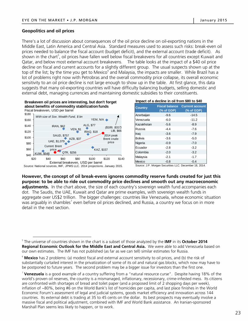
Geopolitics and oil prices There’s a lot of discussion about consequences of the oil price decline on oil-exporting nations in the Middle East, Latin America and Central Asia. Standard measures used to assess such risks: break-even oil prices needed to balance the fiscal account (budget deficit), and the external account (trade deficit). As shown in the chart5, oil prices have fallen well below fiscal breakevens for all countries except Kuwait and Qatar, and below most external account breakevens. The table looks at the impact of a $40 oil price decline on fiscal and current accounts for a slightly different group. The usual suspects shown up at the top of the list; by the time you get to Mexico6 and Malaysia, the impacts are smaller. While Brazil has a lot of problems right now with Petrobras and the overall commodity price collapse, its overall economic sensitivity to an oil price decline is not large enough to show up in the table. At first glance, this data suggests that many oil-exporting countries will have difficulty balancing budgets, selling domestic and external debt, managing currencies and maintaining domestic subsidies to their constituents.
However, the concept of oil break-evens ignores commodity reserve funds created for just this purpose: to be able to ride out commodity price declines and smooth out any macroeconomic adjustments. In the chart above, the size of each country’s sovereign wealth fund accompanies each dot. The Saudis, the UAE, Kuwait and Qatar are prime examples, with sovereign wealth funds in aggregate over US$2 trillion. The bigger challenges: countries like Venezuela, whose economic situation was arguably in shambles7 even before oil prices declined, and Russia, a country we focus on in more detail in the next section.
5 The universe of countries shown in the chart is a subset of those analyzed by the IMF in its October 2014 Regional Economic Outlook for the Middle East and Central Asia. We were able to add Venezuela based on our own estimates. The IMF has not published (as far as we can tell) similar estimates for Russia. 6 Mexico has 2 problems: (a) modest fiscal and external account sensitivity to oil prices, and (b) the risk of substantially curtailed interest in the privatization of some of its oil and natural gas blocks, which now may have to be postponed to future years. The second problem may be a bigger issue for investors than the first one.
7 Venezuela is a good example of a country suffering from a “natural resource curse”. Despite having 18% of the world’s proven oil reserves, the country is a mismanaged, inflationary, recessionary, crime-infested mess. Its citizens are confronted with shortages of bread and toilet paper (and a proposed limit of 2 shopping days per week), inflation of ~80%, being #6 on the World Bank’s list of homicides per capita, and last place finishes in the World Economic Forum’s assessment of legal and judicial systems, goods market efficiency and innovation across 144 countries. Its external debt is trading at 35 to 45 cents on the dollar. Its best prospects may eventually involve a massive fiscal and political adjustment, combined with IMF and World Bank assistance. An Iranian-sponsored Marshall Plan seems less likely to happen, or to work.
ALG, $77IRAN, $62
IRAQ, $18
KUW, $548 QTR, $256
SAUD, $757
UAE, $1,079
YEM, N/A
AZB, $37
KAZ, $157
VEN, $1
2014 peak Brent crude
priceCurrent Brent
price
$40
$60
$80
$100
$120
$140
$160
$180
$20 $40 $60 $80 $100 $120 $140
Source: National sources, IMF, JPMS LLC. 2014 projections. January 2015.
Breakeven oil prices are interesting, but don't forget about benefits of commodity stabilization fundsFiscal breakeven, USD per barrel
External breakeven, USD per barrel
($189, $317)LIB, $66
With size of Sov. Wealth Fund, $ bn
Impact of a decline in oil from $80 to $40
Azerbaijan -9.6 -14.5Venezuela -6.0 -11.2Kazakhstan -5.6 -8.9Russia -4.4 -7.6Iraq -3.6 -7.9Bolivia -3.6 -5.0Nigeria -0.9 -7.0Ecuador -2.8 -3.2Colombia -2.0 -3.2Malaysia -2.1 -1.7Mexico -0.8 -0.4
Fiscal balance(% of GDP)
Current account(% of GDP)
Country
Source: J.P. Morgan Securities LLC. December 18, 2014.
23

EYE ON THE MARKET J .P . MORGAN January 2015
Saudi Arabia is an interesting case, since oil receipts account for 85%-90% of total government revenues, and it spends a lot of money on defense and social programs. How long can they afford to spend if oil prices remain where they are? The answer: for a longer period of time than “fiscal breakeven prices” suggest. Saudi Arabia is often described as having a $750 billion sovereign wealth fund, but the reality is a little more complicated. The Saudi Arabian Monetary Agency (SAMA) has 2.8 trillion Riyals of mostly liquid assets (cash and foreign securities), which is equivalent to US $750 billion. SAMA liabilities include 1.7 trillion Riyals of government deposits, and 1.1 trillion of liabilities to banks, other entities and money in circulation. So, strictly speaking, the Saudi government has 1.7 trillion Riyals (US$450 billion) of liquidity that it could draw upon if needed. Before the oil price decline, Saudi Arabian government oil receipts were higher than spending. This year, the gap will be negative and is projected at ~10% of GDP. What would happen if the government financed such gaps by drawing down on its deposits at SAMA? The second chart shows 4 scenarios from the IMF regarding Saudi deposits at SAMA. Assuming no change in spending and $65 oil, its deposit account would fall to zero by 2018. A modest fiscal adjustment (3% of GDP) would push the full depletion date to around 2021.
As a result, if oil averages $65, the Saudis will probably have to cut spending to prevent a sharp decline in their SAMA deposit account. However, there are 2 release valves they could draw upon to smooth things out. First, the Saudi government could issue debt. In the wake of the 1991 Gulf War, Saudi Arabia issued debt, which it has now mostly paid down (its debt/GDP ratio is only 2%). Secondly, the Saudi government has access to all of the assets of SAMA if needed, and not just its deposit account. In other words, they have the ability to jump ahead of other SAMA creditors in an emergency. As a result, we believe the Saudis will continue to spend large sums to maintain political, sectarian and social stability, although perhaps not as much as in 2014. A petro-sectarian map on page 29 helps explain the importance of government subsidies, oil deposits and sectarian issues in more detail.
020406080
100120140160180
1970 1974 1978 1982 1986 1990 1994 1998 2002 2006 2010Source: Saudi Arabian Monetary Agency, IMF. 2012.
Saudi Arabia government expendituresBillion 2012 Saudi Riyals
Defense
Education
Health
Housing
-500
0
500
1,000
1,500
2,000
2013 2014 2015 2016 2017 2018 2019
Source: IMF Article IV Consultation. September 2014. *Oil is Brent Crude
Impact of government spending and oil prices on government deposits at SAMA, Billion Saudi Riyals
$90 oil, 3% fiscal adjustment
$90 oil, no adjustment
$65 oil, no adjustment
$65 oil, 3% fiscal adjustment
24

EYE ON THE MARKET J .P . MORGAN January 2015
Close-up on Russia: bad things come in threes The oil price decline has resurfaced memories of the 1980’s when the Soviet Union disintegrated. As shown in the first chart, right before the Soviet collapse, Russian oil exports to the West fell in half. A fascinating paper on the subject drew parallels to the end of Spain’s control over the Iberian Peninsula in the 1500’s, which also coincided with a loss of commodity inflows. However, as the second chart demonstrates, the disastrous economic performance of the Soviet Union was well underway even before the 1980’s began. Instead of oil prices being seen as the catalyst for its collapse, it might make more sense to see it as the last straw for a colossally inefficient economic system, one which dedicated 40% of budget revenues and 20% of GDP to the military.
What about this time? Russia is again suffering hardships due to an oil price collapse, since 54% of its exports are crude oil and other petroleum products; another 14% relates to natural gas. Russia might have been able to handle the oil price decline if that were the only problem it faced. However, sanctions (which have sharply curtailed reduced Russian bond and loan issuance in foreign currency) and capital flight are compounding the problem. These three factors (oil, sanctions and capital flight) have resulted in a 50% decline in the Ruble despite the government spending $100 billion to defend it. Central bank policy rates are 17% (the highest since Russia’s default in 1998), and inflation jumped to 11% in December 2014. Lower hard currency revenues will make it harder for Russia to deliver the pension and public sector salary increases that have been the hallmarks of Putin’s presidency. The notion put forth by Russian policymakers that lower oil prices have a silver lining (“it will force restructuring and productivity improvements”) doesn’t sound very convincing. Making Russia’s economy more productive would require weakening the power and influence of its oligarchs, and allow for the development of a truly independent class of small and medium-sized businesses. Don’t hold your breath.
0
5
10
15
20
25
30
0
5
10
15
20
25
30
35
1525 1535 1545 1555 1565 1575 1585 1595 1605 1615 1625 1635 1645Source: "The Soviet Collapse: Grain and Oil", Yegor Gaidar, April 2007.
Commodity declines and the end of empiresPesos, millions USD, billions
1971
1975
1979
1983
1987Gold inflows to Spain (bars)
Russian oil exports to capitalist countries
1973
1977
1981
1985
1989
By the end of the eras shown,Spain lost control of Portugal, Aragon and Catalonia, and Russia lost control of E. Eur
0.000.050.100.150.200.250.300.350.400.450.50
1950 1954 1958 1962 1966 1970 1974 1978 1982Source: "The Soviet Economic Decline: Historical and Republican Data", Easterly and Fischer, May 1994.
Economic collapse of the Soviet UnionRate of return on invested capital
Total economy
Industry
2%
4%
6%
8%
10%
12%
14%
16%-40%
-30%
-20%
-10%
0%
10%
20%2006 2008 2010 2012 2014
Source: Russian Federal Statistics Office, J.P. Morgan. December 2014.
Another episode of a falling Ruble and rising inflationY/Y% change (both axes)
Trade-weighted Ruble index (inverted)
Inflation
Weaker Ruble
$0$5
$10$15$20$25$30$35$40$45$50
2002 2004 2006 2008 2010 2012 2014
Source: BondRadar, Reuters, J.P. Morgan Securities LLC. 2014.
Impact of sanctions on Russian corporate debt issuance Billion USD, trailing 6 months
Loan Issuance
Bond Issuance
25

EYE ON THE MARKET J .P . MORGAN January 2015
Even after a failed currency defense, Russia still has almost $400 billion in foreign exchange reserves (more than enough to cover 2015 sovereign and corporate debt maturities of $130 billion), and also has among the world’s largest proven natural gas reserves. Even so, the situation is worse than in 2008-2009, when reserves exceeded $600 billion and Russian sovereign and corporate debt levels were lower.
The bottom line is that if oil remains at $50-$60, Russia is looking at something like a 5-6% recession in 2015, and another smaller recession in 2016. Russia has FX reserve ammunition to try and ride this out a bit longer (a lot more than it did during the 1990’s, when its reserves fell below its short-term foreign liabilities), but at some point, will probably have to put in capital controls to prevent losing too many foreign exchange reserves. Some Russian companies will end up defaulting, in part due solely to lack of access to foreign exchange. I’m not sure that this is the stuff of regime change; more likely, just another in a historical line of long, cold, depressing Russian winters of deprivation for many of its citizens.
$0
$100
$200
$300
$400
$500
$600
1992 1994 1996 1998 2000 2002 2004 2006 2008 2010 2012 2014
Russian international reservesBillion USD
Source: The Central Bank of the Russian Federation. January 2015.
0 200 400 600 800 1,000 1,200
NorwayIndonesia
ChinaIraq
AustraliaAlgeriaNigeria
VenezuelaUAE
Saudi ArabiaUnited StatesTurkmenistan
QatarRussia
Iran
Source: BP Statistical Review of World Energy. 2013.
Proven natural gas reserves in the top 15 countries
Trillion Cubic Feet
-$5
$0
$5
$10
$15
$20
$25
$30
4Q 1Q 2Q 3Q 4Q 1Q 2Q
Source: Ariel Cohen, Heritage Foundation. June 1999.
The 1998 Russian defaultBillion USD
19971996 1998
Non-resident holdings of short-term Russian bonds
Net foreign liabilities of Russian banks
Russian FX Reserves
0
5
10
15
20
25Jan-96 Jul-96 Jan-97 Jul-97 Jan-98 Jul-98Source: Wall Street Journal, Haver Analytics.
Russia's 1998 exchange rate collapseRubles per dollar
What about a relaxation of sanctions? Anything is possible (and countries like Austria, Hungary and France would like to lift sanctions now), but as of the time of this writing (January 20, 2015), the fighting in the Ukraine is getting worse. Both Russia and Crimean separatists have been bringing in reinforcements and equipment to the battle at the Donetsk Airport. Furthermore, Russia announced a cessation of natural gas exports to and through the Ukraine. Six other countries are affected: Greece, Bulgaria, Macedonia, Croatia, Romania and Turkey.
26

EYE ON THE MARKET J .P . MORGAN January 2015
As economic conditions in Russia deteriorate, who’s in the line of fire? Italian, Turkish and Austrian banks stand out as having the largest exposures as a % of their overall foreign lending. However, in the rest of the world, Russian exposure is generally less than 1% of total foreign claims, and outside Eastern Europe, exports to Russia as a % of GDP are less than 0.4% (0.1% for the US). Furthermore, as emerging markets crises go, Russia is at the low end regarding its external debt relative to exports (second chart). Most of the data we have seen suggests that the global banking system could handle an increase in Russian corporate defaults without too much damage.
While the global banking system might be able to handle it, there will be some disappointed long-term investors in Russian assets. Since 1990, Russia has been the 3rd largest foreign direct investment destination after China and Brazil. Investors in public equity markets have been cautious on Russia for some time. As shown below, Russian P/Es are by far the lowest in the EM world, even when computed on a sector-neutral basis (which adjusts for the fact that Russia has an overweight to energy).
0% 1% 2% 3% 4%AustriaTurkey
ItalyKorea
FranceIndiaNeth
SwedenEurope
USGermany
JapanSwitzerland
UKBelgium
Source: BIS consolidated statistics, Q2 2014.
Foreign claims on ultimate risk basis, percent of total foreign claimsLending to Russia as a % of foreign claims
0%
100%
200%
300%
400%
500%
1994 1997 1998 1999 2000 2001 1998 2014
MEX THA IDN BRA TUR ARG RussiaSource: Institute of International Finance. October 2014.
Russia's external position is less extreme than historical crises, External debt as % of exports
0%2%4%6%8%
10%12%14%16%18%
PH
P
PE
R
CZK TA
I
HU
N
CH
I
TLD
MA
L
SA
F
IDR
PLD
TUR
IND
KO
R
ME
X
RU
S
BR
Z
Source: Bridgewater. November 5, 2014.
Russia 3rd largest EM investment destination after China and Brazil, Share of DM investment in EM (ex-China) since 1990
4x
7x
10x
13x
16x
19x
22x
2006 2007 2008 2009 2010 2011 2012 2013 2014
Source: MSCI. J.P. Morgan Securities. November 2014.
The Russian equity discountP/E multiples for MSCI equity indexes, sector neutral, 12-mo fwd
TaiwanIndia
MexicoBrazilKoreaChinaRussia
South Africa
27

EYE ON THE MARKET J .P . MORGAN January 2015
The oil price decline is important to watch as it relates to Russia’s planned re-militarization. As shown below, Europe has gradually been disarming. NATO capabilities have degraded, as evidenced by NATO difficulties in Libya with strategic airlift and air-to-air refueling operations. In 2012, only 3 of 28 member states (other than the US) reached NATO’s targeted 2% of GDP spending on defense. One quote on the subject: “We are moving toward a Europe that is a combination of the unable and the unwilling.” [Camille Grand, Fondation pour la Recherche Stratégique]. The US now shoulders 75% of the NATO budget, up from 50% during the Cold War. A European Defense Agency report indicates that European countries spent half of their defense budgets on personnel vs. less than one third in the US, creating an even greater gap from a military equipment perspective.
What is Russia’s military up to? In October 2008, the Russian-Georgia war exposed serious defects in Russian military preparedness, after which Moscow initiated a sweeping set of reforms. Recent indications: Russia reinstated long-range bomber patrols, stationed Iskander cruise missiles in Kaliningrad (between Poland and Lithuania on the Baltic Sea), is upgrading its nuclear submarines, tanks, military satellites and MIRVs, intends to replace 70% of its air force over the next few years, plans to build a long-range stealth bomber and targets one million active duty personnel by 2020. In other words, Putin’s Russia is planning to re-arm8, a process which appears to have already begun; see chart above (right) on defense spending increases since 2008. However, low oil prices will almost surely make Russia’s military re-modernization more difficult, compounding challenges Russia’s military already faces9.
8 Russian military spending is just 14% of US levels in dollar terms, but dollar comparisons may understate some of Russia’s military strengths. Russia does not spend the huge sums that the US spends on aircraft carriers, transport planes/helicopters (“lift capacity”), unmanned drones and naval cruisers, destroyers and amphibious assault ships. However, Russia’s fleets of bomber aircraft, infantry fighting vehicles, main battle tanks, artillery units and guided missile submarines are not that different from the US, at least in number. 9 Russia’s military already faces a number of other hurdles that are worth noting: • Demographics: the number of male eighteen-year-olds is projected to decline by 35% from 2007 to 2017,
making it harder to reach conscription targets; more than 20% of all military posts are unfilled. • Russia is aiming to improve the technical proficiency of its weaponry by a factor of 7 by 2020, which will require
more innovation and productivity than it has displayed recently. Only 15%-20% of procurement projects planned for the first half of 2013 were completed on time.
• Russia’s nuclear arsenal still consumes an estimated 40% of its military budget, reducing the amount left for everything else.
• A Russian military prosecutor estimated that 20% of the defense budget is embezzled each year.
1.0%
1.5%
2.0%
2.5%
3.0%
3.5%
4.0%
4.5%
5.0%
1992 1995 1998 2001 2004 2007 2010 2013Source: Stockholm International Peace Research Institute. 2013.
Military spendingPercent of GDP, with 2013 spending in 2011 USD
Russia, ($85 bn)United States, ($619 bn)
Europe, ($278 bn)
70
80
90
100
110
120
130
140
150
2008 2009 2010 2011 2012 2013Source: "The Military Balance 2014", IISS, February 2014.
Defense spending changes since 2008 financial crisisIndex, 2008 = 100
Chi
Rus
Brl, JpnInd US, Fra Ger UK
Ita
28

EYE ON THE MARKET J .P . MORGAN January 2015
A petro-sectarian map of the Middle East, with a focus on Saudi Arabia Why are Saudi health, housing and education subsidies so important? Because some of them are paid to its Shia population in the Eastern Province, where the oil is (see box on map). Saudi oil is primarily found in Shia inhabited districts of Hasa, Qatif and Hofuf, and in the continental shelf extending from the Eastern Province into the Persian Gulf.
Some recent subsidy history: following the collapse of Mubarak’s regime in Egypt, Saudi Arabia announced a social welfare package for citizens worth $10.7 billion, featuring pay raises for government employees, new jobs and loan forgiveness schemes. By the end of the month, the payments totaled $37 billion. The trend continued, as King Abdullah announced an additional $93 billion in social spending ($66.7 billion on 500,000 housing units, $4.3 billion on more medical facilities, and an additional 2 months' wages for all government workers and two extra payments for university students worth around $500).
29

EYE ON THE MARKET J .P . MORGAN January 2015
Other exhibits: cash costs of current production, and some oil history dating back to 1861 As it relates to future production, analysts typically compare the forward price of oil to total costs of production, including cash costs, capital costs, financing costs, etc. The reason future production and marginal cost dominate most analyses: oil fields are constantly depleting, so any assessment of the future needs to take into account how high oil prices have to be to incent future exploration and production of new wells. The marginal cost chart on page 5 is an example of this kind of analysis.
However, when considering whether existing wells have an incentive to keep producing, we need to consider cash costs only, since capital and financing costs are already “sunk”. The first chart below shows cash costs of production. The blue line shows on-site operational costs only, while the brown line includes mineral rights/land royalty payments to private sector owners or governments, payments which are often structured as a % of revenues. The royalty payments below were estimated last November when oil prices were around $75. Since oil has fallen further since then, total cash costs may now be 10%-30% lower across the middle section of the curve. As a result, with spot prices around $45-$50 and forward prices closer to $60, most existing wells in the world will keep producing.
The final chart shows the real price of oil (adjusted for inflation) since 1861. The latest correction still leaves oil priced more expensively in real terms than it was a decade ago.
$0
$10
$20
$30
$40
$50
$60
0 10 20 30 40 50 60 70 80 90
Operating cost with royaltiesOperating cost without royalties Canada oil sands
VenezuelaUKCanada (exc. oil sands)
UAEChina
Saudi Arabia
Iraq
Mexico
ChinaUS
RussiaIran
Source: Morgan Stanley Commodity Research. December 2014.
Cash costs of current productionOperating cost, USD per barrel
Cumulative global oil production, mm barrels per day
US NigeriaRussia
US
$0
$20
$40
$60
$80
$100
$120
$140
1860 1884 1908 1932 1956 1980 2004
Source: BP, Bloomberg, BLS. January 22, 2015.
Real oil prices: industrial revolution to today2012 USD
30

EYE ON THE MARKET J .P . MORGAN January 2015
Acronyms BEA: Bureau of Economic Analysis; BIS: Bank of International Settlements; BLS: Bureau of Labor Statistics; BTU: British thermal unit; CNG: Compressed natural gas; E&P: Exploration & production; EBITDA: Earnings before interest, taxes, depreciation and amortization; EIA: Energy Information Administration; EPS: Earnings per share; FDIC: Federal Deposit Insurance Corporation; FX: Foreign exchange; GW: Gigawatt; HY: High yield; IMF: International Monetary Fund; JPMAM: J.P. Morgan Asset Management; MIRV: Multiple independently targetable reentry vehicle; NATO: North Atlantic Treaty Organization; OPEC: Organization of Petroleum Exporting Countries; P/E: Price-to-earnings; SAMA: Saudi Arabian Monetary Agency; WTI: West Texas Intermediate JPMorgan Chase & Co. and its affiliates do not provide tax advice. Accordingly, any discussion of U.S. tax matters contained herein (including any attachments) is not intended or written to be used, and cannot be used, in connection with the promotion, marketing or recommendation by anyone unaffiliated with JPMorgan Chase & Co. of any of the matters addressed herein or for the purpose of avoiding U.S. tax-related penalties. Each recipient of this material, and each agent thereof, may disclose to any person, without limitation, the US income and franchise tax treatment and tax structure of the transactions described herein and may disclose all materials of any kind (including opinions or other tax analyses) provided to each recipient insofar as the materials relate to a US income or franchise tax strategy provided to such recipient by JPMorgan Chase & Co. and its subsidiaries.
The material contained herein is intended as a general market commentary. Opinions expressed herein are those of Michael Cembalest and may differ from those of other J.P. Morgan employees and affiliates. This information in no way constitutes J.P. Morgan research and should not be treated as such. Further, the views expressed herein may differ from that contained in J.P. Morgan research reports. The prices/quotes/statistics referenced herein have been obtained from sources deemed to be reliable, but we do not guarantee their accuracy or completeness, any yield referenced is indicative and subject to change. References to the performance or characteristics of our portfolios generally refer to the discretionary Balanced Model Portfolios constructed by J.P. Morgan. It is a proxy for client performance and may not represent actual transactions or investments in client accounts. The views and strategies described herein may not be suitable for all investors. This material is not intended as an offer or solicitation for the purchase or sale of any financial instrument. To the extent referenced herein, real estate, hedge funds, and other private investments may present significant risks, may be sold or redeemed at more or less than the original amount invested; there are no assurances that the stated investment objectives of any investment product will be met. JPMorgan Chase & Co. and its subsidiaries do not render accounting, legal or tax advice and is not a licensed insurance provider. You should consult with your independent advisors concerning such matters.
In the United Kingdom, this material is approved by J.P. Morgan International Bank Limited (JPMIB) with the registered office located at 25 Bank Street, Canary Wharf, London E14 5JP, registered in England No. 03838766 and is authorised by the Prudential Regulation Authority and regulated by the Financial Conduct Authority and Prudential Regulation Authority. In addition, this material may be distributed by: JPMorgan Chase Bank, N.A. Paris branch, which is regulated by the French banking authorities Autorité de Contrôle Prudentiel and Autorité des Marchés Financiers; JPMorgan Chase Bank, N.A. Bahrain branch, licensed as a conventional wholesale bank by the Central Bank of Bahrain (for professional clients only); JPMorgan Chase Bank, N.A. Dubai branch, regulated by the Dubai Financial Services Authority.
In Hong Kong, this material is distributed by JPMorgan Chase Bank, N.A. (JPMCB) Hong Kong branch except to recipients having an account at JPMCB Singapore branch and where this material relates to a Collective Investment Scheme in which case it is distributed by J.P. Morgan Securities (Asia Pacific) Limited (JPMSAPL). Both JPMCB Hong Kong branch and JPMSAPL are regulated by the Hong Kong Monetary Authority. In Singapore, this material is distributed by JPMCB Singapore branch except to recipients having an account at JPMCB Singapore branch and where this material relates to a Collective Investment Scheme (other than private funds such as a private equity and hedge funds) in which case it is distributed by J.P. Morgan (S.E.A.) Limited (JPMSEAL). Both JPMCB Singapore branch and JPMSEAL are regulated by the Monetary Authority of Singapore.
With respect to countries in Latin America, the distribution of this material may be restricted in certain jurisdictions. Receipt of this material does not constitute an offer or solicitation to any person in any jurisdiction in which such offer or solicitation is not authorized or to any person to whom it would be unlawful to make such offer or solicitation.
Not all option strategies are suitable for all investors. Certain strategies may expose investors to significant potential risks and losses. For additional risk information, please request a copy of “Characteristics and Risks of Standardized Options.” We advise investors to consult their tax advisors and legal counsel about the tax implications of these strategies. Investors are urged to carefully consider whether options or option-related products or strategies are suitable for their needs.
Bank products and services offered by JP Morgan Chase Bank, N.A, and its affiliates. Securities are offered through J.P. Morgan Securities LLC, member NYSE, FINRA and SIPC, and its affiliates globally as local legislation permits. If you no longer wish to receive these communications please contact your J.P. Morgan representative. Past performance is not a guarantee of future results.
© 2015 JPMorgan Chase & Co. All rights reserved.
Investment products: Not FDIC insured • No bank guarantee • May lose value
31

EYE ON THE MARKET • SPECIAL EDITION JANUARY 2015
MICHAEL CEMBALEST is Chairman of Market and Investment Strategy for J.P. Morgan Asset Management, a global leader in investment management and private banking with $1.6 trillion of client assets under management worldwide (as of December 31, 2013). He is responsible for leading the strategic market and investment insights across the firm’s Institutional, Funds and Private Banking businesses.
Mr. Cembalest is also a member of the J.P. Morgan Asset Management Investment Committee and a member of the Investment Committee for the J.P. Morgan Retirement Plan for the firm’s more than 250,000 employees.
Mr. Cembalest was most recently Chief Investment Officer for the firm’s Global Private Bank, a role he held for eight years. He was previously head of a fixed income division of Investment Management, with responsibility for high grade, high yield, emerging markets and municipal bonds.
Before joining Asset Management, Mr. Cembalest served as head strategist for Emerging Markets Fixed Income at J.P. Morgan Securities. Mr. Cembalest joined J.P. Morgan in 1987 as a member of the firm’s Corporate Finance division.
Mr. Cembalest earned an M.A. from the Columbia School of International and Public Affairs in 1986 and a B.A. from Tufts University in 1984.

A M E R I C A SBrazil ChileColombiaMexicoPeruUnited States
A S I A Hong KongSingapore
E U R O P EFrance GermanyItalySpainSwitzerlandUnited Kingdom
M I D D L E E A S TDubai