interaction design – part ii by a.surasit samaisut copyrights 2009-2010 : all rights reserved
TRANSCRIPT

Interaction Design – Part II by A.Surasit Samaisut
Copyrights 2009-2010 : All Rights Reserved

Page 2
Designing Interface
Part I
• Organizing the Content
• Getting Around
• Organizing the Page
• Commands and Actions
Part II
• Showing Complex Data
• Getting Input From Users
• Builders and Editors
• Making It Look Good

Page 3
Showing Complex Data – Overview Plus Detail
Place an overview of the graphic next to a zoomed "detail view." As the user drags a viewport around the overview, show that part of the graphic in the detail view
• You show a data set drawn as a large information graphic -- especially an image or a map. You want users to stay oriented with respect to the "big picture," but you also want them to zoom down into the fine details. Users will browser through the data, inspect small areas, or search for points of interest. High-level overviews are necessary for finding those points of interest, but users don't need to see all available detail for all data points at once -- zooming in on a small piece is sufficient for getting fine detail

Page 4
Showing Complex Data – Overview Plus Detail

Page 5
Showing Complex Data – Overview Plus Detail

Page 6
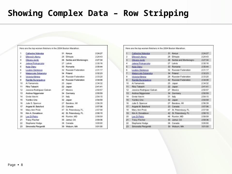
Showing Complex Data – Row Stripping
Use two similar shades to alternately color the backgrounds of the table rows
• You use a table, but the table's rows are difficult to separate visually, especially when there are many columns (or multiple lines to a row)

Page 7
Showing Complex Data – Row Stripping
Page 8
Showing Complex Data – Row Stripping

Page 9
Showing Complex Data – Sortable Table
Show the data in a table, and let the user sort the table rows according to the column values
• The interface shows multivariate information that the user may want to explore, reorder, customize, search through for a single item, or simply understand on the basis of those different variables

Page 10
Showing Complex Data – Sortable Table
Show the data in a table, and let the user sort the table rows according to the column values
• The interface shows multivariate information that the user may want to explore, reorder, customize, search through for a single item, or simply understand on the basis of those different variables

Page 11
Showing Complex Data – Sortable Table

Page 12
Showing Complex Data – Tree-Table
Put hierarchical data in columns, like a table, but use an indented outline structure in the first column to illustrate the tree structure
• The UI displays multivariate information, so a table works well to show the data (or allow them to be sorted, as in a Sortable Table). But the items are primarily organized as a hierarchy, so you also want a tree to display them most of the time. Your user are relatively sophisticated with respect to GUI usage; this is not an easy pattern for naive computer users to understand (and the same can be said about most hierarchical views, including Cascading Lists

Page 13
Showing Complex Data – Tree-Table

Page 14
Getting Input From Users – Input Hints
Beside an empty text field, place a sentence or example that explains what is required
• The interface presents a text field, but the kind of input it requires isn't obvious to all users. You don't want to put more than a few words into the text field's label

Page 15
Getting Input From Users – Input Hints

Page 16
Getting Input From Users – Input Prompt
Prefill a text field or dropdown with a prompt that tells the user what to do or type
• The UI presents a text field, dropdown, or combo box for required input. Normally you would use a good default value, but you can't in this case -- perhaps there is no reasonable default, as in the Orbitz form above. The user needs only a short reminder of what is required

Page 17
Getting Input From Users – Input Prompt

Page 18
Getting Input From Users – Input Suggestion

Page 19
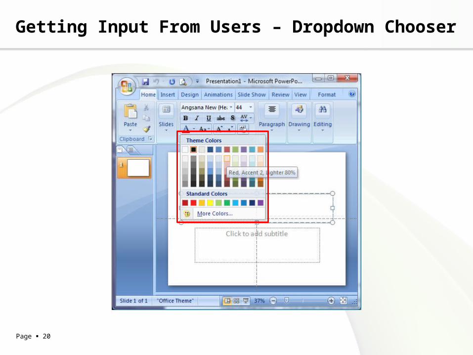
Getting Input From Users – Dropdown Chooser
Extend the concept of a menu by using a dropdown or pop-up panel to contain a more complex value-selection UI
• The user needs to supply input that is a choice from a set (such as in the color example above), a date or time, a number, or anything other than free text typed at a keyboard. You want to provide a UI that supports that choice -- a nice visual rendering of the choices, for instance, or interactive tools -- but you don't want to use space on the main page for that; a tiny space showing the current value is all you want
Page 20
Getting Input From Users – Dropdown Chooser

Page 21
Getting Input From Users – Dropdown Chooser

Page 22
Getting Input From Users – Illustrated Choices
Use pictures instead of words (or in addition to them) to show available choices
• The interface presents a set of choices that differ visually, such as colors, font families, or object alignment

Page 23
Getting Input From Users – Illustrated Choices

Page 24
Builders and Editors – Edit-in-Place
Use a small, dynamic text editor to let the user change text "in place": position the editor directly over the original text, rather than using a separate panel or dialog box
• The builder UI contains text that the user may want to change sometimes. The names of objects, text elements in a graphic layout, labels, and even property values are good candidates

Page 25
Builders and Editors – Edit-in-Place

Page 26
Builders and Editors – Edit-in-Place

Page 27
Builders and Editors – Smart Selection
Make the software smart enough to automatically select a coherent group of items, rather than making the user do it
• The user works with selectable objects of any kind -- text, pixels, geometric objects, even tree items or table cells. The selectable items are organized into coherent visual groups, like words or sentences in a text editor, or pixels of contiguous color in an image

Page 28
Builders and Editors – Smart Selection

Page 29
Make It Look Good – Deep Background
Place an image or gradient into the page's background that visually recedes behind the foreground elements
• Your page layout has strong visual elements (such as text blocks, groups of controls, or windows), and it isn't very dense or busy. You want the page to look distinctive and attractive; you may have a visual branding strategy in mind. You'd like to use something more interesting than flat white or gray for the page background

Page 30
Make It Look Good – Deep Background

Page 31
Make It Look Good – Few Hues, Many Values
Choose one, two, or at most three major color hues to use in the interface. Create a color palette by selecting assorted values (brightnesses) from within those few hues
• You decide on a color scheme for an application or site. You want to avoid a flashy, rainbow-colored, "angry fruit salad" look, but you still want the interface to have some character

Page 32
Make It Look Good – Few Hues, Many Values

Page 33
Interaction Design – Summary
Organizing the Content
• Two-Panel Sector, Extras on Demand, Wizard
Getting Around
• Clear Entry Points, Global Navigation, Color-Coded Sections, Animated Transition
Organizing the Page
• Centre Stage, Titled Sections, Card Stack, Movable Panels, Responsive Enabling
Commands and Actions
• Action Panel, Smart Menu Items, Progress Indicator, Multi-level Undo

Page 34
Interaction Design – Summary
Showing Complex Data
• Overview Plus Detail, Row Stripping, Sortable Table, Tree-Table
Getting Input From Users
• Input Hints, Input Prompt, Dropdown Chooser, Illustrated Choices
Builders and Editors
• Edit-in-Place, Smart Selection
Making It Look Good
• Deep Background, Few Hues, Many Values

Page 35
Evaluating Test