intercity bus and passenger rail study
TRANSCRIPT

Intercity Bus and Passenger Rail Study
Prepared for the Michigan Department of Transportation
University of Michigan, College of Architecture and Urban Planning

Intercity Bus and Passenger Rail Study
Prepared for the Michigan Department of Transportation
July 2009 (Revised December 2009)
Prepared by Joe Grengs, University of Michigan
Research Assistants
Chuang-Chung Hu, University of Michigan Mari Weitz, University of Michigan
This report was prepared under the sponsorship of the Michigan Department of Transportation (Contract Number 2007-0315). It represents results of research carried out by the author and does not necessarily represent the views of the sponsoring agency or the University of Michigan.

i
Acknowledgements
This work was performed under the sponsorship of the Michigan Department of Transportation (MDOT), Bureau of Transportation Planning, Intermodal Policy Division. The contents of this report reflect the views of the author, who is responsible for the facts and accuracy of the data analysis. The author thanks Kathy Hundt for much assistance in her role as project manager, and also Regina Johnson for administering the data collection. Thanks to research assistants Chuang-Chung Hu and Mari Weitz for their contributions to this work.

ii
Table of Contents
1 Introduction and Summary .......................................................................................................... 1
A Sample of Findings ............................................................................................................... 1
2 Method ........................................................................................................................................ 5
2.1 Rail Passenger Survey Method ............................................................................................. 5
2.2 Bus Passenger Survey Method ............................................................................................. 5
2.3 Trip Terminology................................................................................................................... 6
3 Rail Passenger Analysis ................................................................................................................ 7
3.1 Rail Passenger Demographics ............................................................................................... 7
Household Income ................................................................................................................... 7
Vehicle Ownership ................................................................................................................... 9
Passengers by Gender .......................................................................................................... 11
Place of Residence ................................................................................................................. 12
Age ......................................................................................................................................... 14
Employment Status ............................................................................................................... 14
Household Size ...................................................................................................................... 16
Location Prior to Boarding Station ........................................................................................ 16
3.2 Rail Service Use ................................................................................................................... 17
Counties of Trip Origin ........................................................................................................... 17
Counties of Trip Destination .................................................................................................. 19
Distribution of Trip Origin Counties ...................................................................................... 20
Purpose of Trip ...................................................................................................................... 26
Trip Purpose by Destination Counties ................................................................................... 27
Catchment Area of Rail Stations ............................................................................................ 28
Boardings Per Capita ............................................................................................................. 29
Mode of Travel to Boarding Station ...................................................................................... 31
Mode of Travel Away From Alighting Station ....................................................................... 33
Cross-Tabulation of Travel Modes ......................................................................................... 35
Travel Time To and From Boarding and Alighting Stations ................................................... 36
Alternative Mode of Travel ................................................................................................... 40
Trips in the Past Year ............................................................................................................. 41
Reasons for Increasing Use of Rail......................................................................................... 42

iii
Important Factors for Choosing Rail ...................................................................................... 43
3.3 Rail Service Characteristics ................................................................................................. 43
Rating Importance of Rail Amenities at Stations ................................................................... 43
Importance of Activities on the Train .................................................................................... 44
Denied an Amtrak Reservation.............................................................................................. 45
Rail Schedules ........................................................................................................................ 45
4 Bus Passenger Analysis .............................................................................................................. 46
4.1 Bus Passenger Demographics ............................................................................................. 46
Household Income ................................................................................................................. 46
Vehicle Ownership ................................................................................................................. 47
Passengers by Gender ........................................................................................................... 47
Place of Residence ................................................................................................................. 48
Age ......................................................................................................................................... 51
Traveling Companions ........................................................................................................... 51
Employment Status ............................................................................................................... 52
Nights Away From Home ....................................................................................................... 53
Level of Education ................................................................................................................. 54
Household Size ...................................................................................................................... 55
Location Prior to Bus Station ................................................................................................. 55
4.2 Bus Service Use ................................................................................................................... 56
Counties of Trip Origin ........................................................................................................... 56
Counties of Trip Destination .................................................................................................. 57
Distribution of Trip Origin Counties ...................................................................................... 58
Purpose of Trip ...................................................................................................................... 63
Trip Purpose by Destination Counties ................................................................................... 63
Catchment Area of Bus Stations ............................................................................................ 64
Boardings Per Capita ............................................................................................................. 65
Mode of Travel to Boarding Station ...................................................................................... 68
Mode of Travel Away From Alighting Station ....................................................................... 69
Cross-Tabulation of Travel Modes ......................................................................................... 71
Travel Time To and From Boarding and Alighting Stations ................................................... 72
Alternative Mode of Travel ................................................................................................... 76
Alternative Mode of Travel and Income ............................................................................... 77

iv
Reason for Choosing Intercity Bus ......................................................................................... 78
Trips in the Past Year ............................................................................................................. 78
Reasons for Increase in Bus Use ............................................................................................ 79
4.3 Bus Service Characteristics ................................................................................................. 80
Safety While Waiting For and Riding the Bus ........................................................................ 80
Importance of Bus Service ..................................................................................................... 82
Importance of Bus Service Connections ................................................................................ 82
Likelihood of Using Intercity Bus Services for Next Trip ........................................................ 83
Overall Rating of Intercity Bus ............................................................................................... 84
5 Comparisons Between Rail and Bus Modes .............................................................................. 85
5.1 Demographic Comparison of Passengers Between Modes ................................................ 85
Household Income ................................................................................................................. 85
Age ......................................................................................................................................... 86
Employment Status ............................................................................................................... 87
Vehicle Ownership ................................................................................................................. 88
Gender of Passengers ............................................................................................................ 89
5.2 Service Use Comparisons Between Modes ........................................................................ 89
Purpose of Trip ...................................................................................................................... 89
Counties of Trip Origin ........................................................................................................... 91
Counties of Trip Destination .................................................................................................. 92
Mode of Travel To and From Boarding and Alighting Stations ............................................. 94
Place of Residence ................................................................................................................. 96
Alternative Mode of Travel ................................................................................................... 97
Trips in the Past Year ............................................................................................................. 98
5.3 Service Characteristics Comparison ................................................................................... 99
6 Conclusion ............................................................................................................................... 100
Observations of Rail Service ................................................................................................ 102
Observations of Bus Service ................................................................................................ 103
Recommendation for Future Surveys.................................................................................. 104
7 Appendices .............................................................................................................................. 105
7.1 Rail Survey Instrument ..................................................................................................... 106
7.2 Bus Survey Instrument ..................................................................................................... 110
7.3 Summary of Survey Questionnaires ................................................................................. 114

v
7.4 Comparing Survey Questions Between Studies ............................................................... 115
7.5 Summary of Comments Provided by Survey Respondents: Rail ...................................... 116
7.6 Summary of Comments Provided by Survey Respondents: Bus ...................................... 121
7.7 Summary Tables Comparing Rail Routes .......................................................................... 124
7.8 Rail Schedules ................................................................................................................... 128
7.9 Bus Schedules ................................................................................................................... 130

vi
List of Tables
Table 1. States of Residence, Rail Passengers .............................................................................. 12
Table 2. Passengers Residing in Michigan Cities, Rail Passengers ................................................ 12
Table 3. Employment Status of Rail Passengers by Age ............................................................... 15
Table 4. Location before Coming to Train Station, Rail Passengers ............................................. 16
Table 5. Rail Passengers Purpose by Trip, Three Rail Lines .......................................................... 27
Table 6. Trip Purpose by Top Five Destination Counties, Rail Passengers ................................... 28
Table 7. Rail Boardings per Capita at Rail Stations ........................................................................ 31
Table 8. Travel Mode to Boarding Station, Rail Passengers ......................................................... 33
Table 9. Travel Mode from Alighting Stations, Rail Passengers ................................................... 35
Table 10. Comparing Modes of Travel To and From Station ......................................................... 36
Table 11. Travel Time to Boarding Stations, Rail Passengers ....................................................... 39
Table 12. Travel Time from Alighting Stations, Rail Passengers ................................................... 39
Table 13. Likelihood of Increasing Rail Usage, Average Rating, Rail Passengers .......................... 42
Table 14. Reason for Choosing Rail, Rail Passengers .................................................................... 43
Table 15. State of Residence, Bus Passengers .............................................................................. 49
Table 16. Passengers Residing in Michigan Cities, Bus Passengers .............................................. 49
Table 17. Number of Traveling Companions, Bus Passengers ..................................................... 51
Table 18. Employment Status by Age, Bus Passengers ................................................................. 53
Table 19. Location Prior to Bus Station ........................................................................................ 55
Table 20. Trip Purpose by Top Five Destination Counties, Bus Passengers ................................. 64
Table 21. Bus Boardings per Capita at Bus Stations ...................................................................... 67
Table 22. Travel Mode to Boarding Stations, Bus Passengers...................................................... 69
Table 23. Travel Mode from Alighting Stations, Bus Passengers ................................................. 71
Table 24. Comparing Modes of Travel To and From Station ........................................................ 72
Table 25. Travel Time to Boarding Station, Bus Passengers ......................................................... 74
Table 26. Travel Time from Alighting Station, Bus Passengers .................................................... 75
Table 27. Likelihood of Increasing Bus Use, Average Rating, Bus Passengers .............................. 79
Table 28. Perceived Safety by Boarding Station, Bus Passengers ................................................. 81
Table 29. Perceived Safety by Boarding Station, by Gender, Bus Passengers .............................. 81
Table 30. Comparing the Survey Questionnaires ........................................................................ 114
Table 31. Comparing Survey Questions on Service Characteristics, Rail .................................... 115

vii
Table 32. Comparing Survey Questions on Service Characteristics, Bus .................................... 115

viii
List of Figures
Figure 1. Amtrak Routes and Stations in Michigan ......................................................................... 3
Figure 2. Bus Routes and Stations in Michigan ............................................................................... 4
Figure 3. Household Income Distribution, Rail Passengers ............................................................ 7
Figure 4. Household Income by Rail Service, Rail Passengers ........................................................ 8
Figure 5. Number of Vehicles per Household, Rail Passengers ...................................................... 9
Figure 6. Number of Vehicles per Household in Michigan, Rail Passengers ................................ 10
Figure 7. Gender by Age Group, Rail Passengers ......................................................................... 11
Figure 8. Location of Residence, Rail Passengers .......................................................................... 13
Figure 9. Age Distribution, Rail Passengers .................................................................................. 14
Figure 10. Employment Status, Rail Passengers ........................................................................... 15
Figure 11. Household Size, Rail Passengers .................................................................................. 16
Figure 12. Counties of Rail Trip Origin .......................................................................................... 18
Figure 13. Counties of Rail Trip Destination ................................................................................. 19
Figure 14. Rail Trip Distribution of Cook County .......................................................................... 21
Figure 15. Rail Trip Distribution of Oakland County ..................................................................... 22
Figure 16. Rail Trip Distribution of Washtenaw County ............................................................... 23
Figure 17. Rail Trip Distribution of Wayne County ....................................................................... 24
Figure 18. Rail Trip Distribution of Ingham County ...................................................................... 25
Figure 19. Reason for Taking Trip, Rail Passengers ...................................................................... 26
Figure 20. An Illustration of a Catchment Area: The Detroit Amtrak Station .............................. 29
Figure 21. Rail Boardings per Capita at Rail Stations .................................................................... 30
Figure 22. Mode of Travel to Boarding Station, Rail Passengers .................................................. 32
Figure 23. Mode of Travel from Alighting Station, Rail Passengers ............................................. 34
Figure 24. Travel Time to Boarding Station, Rail Passengers ........................................................ 37
Figure 25. Travel Time from Alighting Station, Rail Passenger ..................................................... 37
Figure 26. Likelihood of Choosing Alternative Mode of Travel, Rail Passengers ......................... 40
Figure 27. Alternative Method of Transportation Based on Income, Rail Passengers ................. 41
Figure 28. Number of Trips in the Past Year, Rail Passengers ...................................................... 42
Figure 29. Importance of Rail Station Amenities, Rail Passengers ............................................... 44
Figure 30. Importance of Specific Activities While on the Train .................................................. 45
Figure 31. Household Income Distribution, Bus Passengers ........................................................ 46

ix
Figure 32. Number of Vehicles per Household, Bus Passengers .................................................. 47
Figure 33. Gender by Age Group, Bus Passengers ....................................................................... 48
Figure 34. Residence Location for Bus Passengers ........................................................................ 50
Figure 35. Age Distribution, Bus Passengers ................................................................................ 51
Figure 36. Average Number of Traveling Companions by Age Group, Bus Passengers ............... 52
Figure 37. Employment Status, Bus Passengers ........................................................................... 52
Figure 38. Nights Away from Home, Bus Passengers .................................................................... 53
Figure 39. Highest Level of Education, Bus Passengers ................................................................ 54
Figure 40. Household Size, Bus Passengers .................................................................................. 55
Figure 41. Counties of Bus Trip Origin .......................................................................................... 56
Figure 42. Counties of Bus Trip Destination ................................................................................. 57
Figure 43. Bus Trip Distribution of Cook County .......................................................................... 58
Figure 44. Bus Trip Distribution of Wayne County ....................................................................... 59
Figure 45. Bus Trip Distribution of Ingham County ...................................................................... 60
Figure 46. Bus Trip Distribution of Genesee County .................................................................... 61
Figure 47. Bus Trip Distribution of Kent County ........................................................................... 62
Figure 48. Reason for Taking Trip, Bus Passengers ...................................................................... 63
Figure 49. Bus Boardings per Capita at Bus Stations .................................................................... 66
Figure 50. Mode of Travel to Boarding Station, Bus Passengers .................................................. 68
Figure 51. Mode of Travel from Alighting Destination, Bus Passengers ...................................... 70
Figure 52. Travel Time to Boarding Station, Bus Passengers ....................................................... 73
Figure 53. Travel Time from Alighting Station, Bus Passenger ..................................................... 73
Figure 54. Likelihood of Choosing Alternative Mode of Travel, Bus Passengers ......................... 76
Figure 55. Alternative Mode of Transportation Based on Income, Bus Passengers ..................... 77
Figure 56. Reason for Choosing Intercity Bus ................................................................................ 78
Figure 57. Number of Trips in the Past Year, Bus Passengers ....................................................... 79
Figure 58. Importance of Bus Service Connections ....................................................................... 82
Figure 59. Likelihood of Using Intercity Bus Lines Again ............................................................... 83
Figure 60. Experience on Intercity Bus .......................................................................................... 84
Figure 61. Comparison of Household Income, Rail and Bus Passengers ....................................... 85
Figure 62. Comparison of Age, Rail and Bus Passengers ............................................................... 86
Figure 63. Comparison of Employment Status, Rail and Bus Passengers ..................................... 87
Figure 64. Comparison of Number of Vehicles Owned, Rail and Bus Passengers ......................... 88

x
Figure 65. Comparison of Gender, Rail and Bus Passengers ......................................................... 89
Figure 66. Comparison of Trip Purpose, Rail and Bus Passengers ................................................ 90
Figure 67. Counties of Trip Origin, Rail and Bus Passengers ......................................................... 91
Figure 68. Comparing Rail Origins and Bus Origins ....................................................................... 92
Figure 69. Counties of Trip Destination, Rail and Bus Passengers ................................................ 93
Figure 70. Comparing Rail and Bus Destinations ........................................................................... 93
Figure 71. Comparison of Travel Mode to Station, Rail and Bus Passengers ................................ 95
Figure 72. Comparison of Travel Mode from Station, Rail and Bus Passengers ........................... 95
Figure 73. Comparing Place of Residence, Rail and Bus Passengers ............................................. 96
Figure 74. Alternative Mode of Travel, Rail and Bus Passengers .................................................. 97
Figure 75. Number of Trips in the Past Year, Rail and Bus Passengers ......................................... 98
Figure 76. Likelihood of Increasing Usage by Changing Services, Rail and Bus Passengers .......... 99

1
1 Introduction and Summary Seeking a more comprehensive understanding of issues involving the use of intercity bus and rail passengers, the Michigan Department of Transportation (MDOT) conducts surveys of travelers at approximately five year intervals. The aim is to better define factors such as trip origin and destination, purpose and quality, as well as perceptions of these issues. The surveys include rail passengers from all three Amtrak corridors (Figure 1) and most routes served by Greyhound and Indian Trails (Figure 2).
Using information on passenger demographics and use patterns, as well as service characteristics, this study evaluates survey responses to better:
• Identify patterns in travel behavior.
• Identify trends by comparison to previous surveys.
• Compare and contrast the use of the intercity bus and rail modes.
The goal of this study is to provide high quality information so that MDOT and its governmental agency partners can work with service providers and communities to maximize the benefits or intercity passenger service to Michigan citizens, businesses, and visitors.
A Sample of Findings
Bus passengers are more captive to the service while rail passengers tend to have more discretion in their decision to use intercity public transportation, a distinction that is reflected in the way passengers used services:
• Cost was the most important factor cited by bus respondents in the decision to use intercity bus services, and nearly one in four respondents indicated that they had no transportation options other than intercity bus.
• Among rail respondents, having a train that meets one’s scheduling needs and experiencing comfort while traveling were rated higher than cost in the decision to use rail services.
• Rail respondents were more likely to travel for vacation than bus respondents.
Amtrak Thruway Motorcoach Connections (Thruway) services are provided by commercial operators under contract to the National Rail Passenger Corporation. In Michigan these services are provided by multiple operators. Thruway respondents were provided a survey questionnaire designed for bus passengers, and they were included with bus passengers in the analysis. This may skew the profile of bus passengers and the results should be interpreted with this in mind.

2
• Responding rail passengers were less likely to have made repeat use of intercity services than bus respondents.
• Rail respondents were somewhat more likely to choose driving or flying as an alternative mode of transportation.
• When considering alternative services, rail respondents did not rate intercity bus highly as a possible option if rail services were not available, while bus respondents rated intercity passenger rail much more favorably as an alternative to bus services.
The most important service improvements expressed by survey respondents include:
• Rail respondents indicated a strong desire for improved on-time arrivals, which emerged as the single most important factor identified by the survey questions and by written comments.
• For bus respondents, the most important service improvement was to shorten the duration and reduce the frequency of layovers, a finding supported by both the survey questions and written comments.

3
Figure 1. Amtrak Routes and Stations in Michigan

4
Figure 2. Bus Routes and Stations in Michigan

5
2 Method This section provides a summary of the method used by the Michigan Department of Transportation (MDOT) used to carry out the intercity rail and bus passenger surveys this study analyzes.
2.1 Rail Passenger Survey Method Passengers on all Michigan rail services were surveyed. Those using the Blue Water and Pere Marquette (Trains 364, 365, 370 and 371) were surveyed Thursday, April 12 and Friday, April 13, 2007. Those using the Wolverine (Trains 350, 351, 352, 353, 354 and 355) were surveyed Thursday, March 22, Friday, March 23, Thursday, April 12 and Friday, April 13, 2007. Fridays were considered a weekend day for purposes of this survey. This led to a disproportionate number of surveys from the Wolverine service. Each adult passenger received a survey after they were settled in their seat. All 2,513 surveys collected were used in the analysis.
The method used for a survey in 2000 varied from this effort in the following ways:
• It was done in December instead of March and April.
• All services were surveyed over a four day period, though passengers on Blue Water and Pere Marquette trains were surveyed once in each direction over two days.
• It yielded 237 fewer responses.
2.2 Bus Passenger Survey Method Passengers on all Michigan bus services were surveyed. Those using Indian Trails were surveyed Thursday, March 29 through Saturday, March 31, 2007, Wednesday, April 4, Thursday April 5 and Wednesday April 11 through Friday April 13, 2007. Those using the Greyhound were surveyed Wednesday, April 4, Thursday April 5, and Wednesday April 11 through Friday April 13, 2007. Those using Metrocars were surveyed Wednesday, April 4 and Thursday April 5, 2007. Each adult passenger received a survey after they were settled in their seat.
Of 693 surveys collected, four were deemed unusable for lack of reliable information. Of the 689 surveys, 455 came from Indian Trails passengers, 194 from Greyhound and 40 from those using Metrocars.
Amtrak Thruway Motorcoach Connections (Thruway) respondents were given a survey designed for bus passengers and they were considered as bus passengers in the analysis.
Amtrak contracts with a company called Metrocars to provide bus service between East Lansing and Toledo, with stops at Ann Arbor, Dearborn, and Detroit. These passengers were provided surveys designed for bus passengers and were therefore analyzed as bus passengers.

6
The method used for a survey in 2000 varied from this effort in the following ways:
• It was done in June and July instead of March and April.
• A substantially larger number of questions were asked.
• It yielded 671 more responses.
2.3 Trip Terminology In order to consistently identify different aspects of a passenger's bus or rail journey, the following terms were used:
• Origin: The city or county location at which the person began the trip for which they are being surveyed.
• Boarding Station: The bus or rail station at which a respondent first boarded their bus or rail service.
• Alighting Station: The bus or rail station at which a respondent will leave their bus or rail service.
• Destination: The city or county location at which the person will end the trip for which they are being surveyed.
• Trip Purpose: The reason the person made the trip from their home to another location.

7
3 Rail Passenger Analysis This chapter analyzes the survey data collected from rail passengers using Amtrak's Blue Water, Pere Marquette, and Wolverine services. The chapter is divided into sections that detail demographics, usage, and service characteristic patterns. The analysis also contrasts the results of the 2007 survey to that conducted in 2000 where data items in the two surveys are comparable.1
3.1 Rail Passenger Demographics
Household Income
Rail passenger respondents reported household incomes at the higher end of the range. As shown in Figure 3, 27 percent of responding rail passengers had household incomes over $100,000. About three out of five respondents came from households with incomes over $50,000. Despite this, over eleven percent of respondents came from households with an income below $10,000.
Figure 3. Household Income Distribution, Rail Passengers
1 The 2000 survey was conducted while international service was in place. Between 2000 and 2007, the Chicago-Toronto International service was replaced with the Chicago-Port Huron Blue Water service.
0
5
10
15
20
25
30
Under $10k $10k -$19,999
$20k -$29,999
$30K -$39,999
$40k -$49,999
$50K -$74,999
$75K -$99,999
$100k or More
Perc
ent o
f Pas
seng
ers
Household Income
8
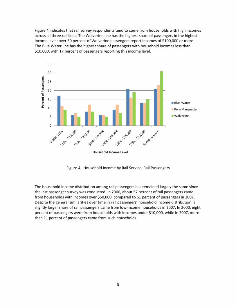
Figure 4 indicates that rail survey respondents tend to come from households with high incomes across all three rail lines. The Wolverine line has the highest share of passengers in the highest income level: over 30 percent of Wolverine passengers report incomes of $100,000 or more. The Blue Water line has the highest share of passengers with household incomes less than $10,000, with 17 percent of passengers reporting this income level.
Figure 4. Household Income by Rail Service, Rail Passengers
The household income distribution among rail passengers has remained largely the same since the last passenger survey was conducted. In 2000, about 57 percent of rail passengers came from households with incomes over $50,000, compared to 61 percent of passengers in 2007. Despite the general similarities over time in rail passengers’ household income distribution, a slightly larger share of rail passengers came from low-income households in 2007. In 2000, eight percent of passengers were from households with incomes under $10,000, while in 2007, more than 11 percent of passengers came from such households.
0
5
10
15
20
25
30
35
Perc
ent o
f Pas
seng
ers
Household Income Level
Blue Water
Pere Marquette
Wolverine

9
Vehicle Ownership
As Figure 5 shows, 27 percent of responding rail passengers came from a household with three or more cars, and 13 percent came from a household with no cars. To put this in perspective, 20 percent of all households in Michigan had three or more cars, and only 6.8 percent had no cars in 2007.2
Because a substantial share of passengers surveyed come from Chicago, where car ownership rates tend to be lower than for Michigan residents, we examined vehicle ownership among those passengers who reside in Michigan. Figure 6 reveals that when non-Michigan residents are taken out of the sample, the share of respondents with no vehicle in the household drops to about nine percent.
So rail respondents show a higher share than the statewide population at both ends of the distribution shown in the figure: they are more likely to come from a household with three or more cars, but also more likely to come from a household with no car.
Figure 5. Number of Vehicles per Household, Rail Passengers
2 U.S. Bureau of the Census. (2009). 2007 American Community Survey 1-Year Estimates, Michigan, from American FactFinder at <http://factfinder.census.gov/home/saff/main.html?_lang=en>.
0
5
10
15
20
25
30
35
40
0 1 2 3 or More
Perc
ent o
f Pas
seng
ers
Number of Vehicles

10
Figure 6. Number of Vehicles per Household in Michigan, Rail Passengers
In comparing how vehicle ownership has changed among rail passengers since the last survey was conducted, the data indicate virtually no change between 2000 and 2007. In 2000, about 25 percent of passengers were from households with one vehicle (compared to 23 in 2007), and about 68 percent of passengers were from households with more than one vehicle (compared to 65 percent in 2007).
0
5
10
15
20
25
30
35
40
45
0 1 2 3 or More
Perc
ent o
f Pas
seng
ers
Number of Vehicles

11
Passengers by Gender 3
On all rail lines the majority of passengers are women, with women making up 61 percent of the responding rail passengers. Figure 7 demonstrates that women make up a larger share of rail passengers than men across all age groups. The relative share of women and men is fairly consistent across age groups, with the exception of the youngest category: Between ages 12 and 17 years, rail passengers are nearly twice as likely to be female.
Figure 7. Gender by Age Group, Rail Passengers
The data indicate no change between the surveys conducted in 2000 and 2007. Like in 2007, women passengers were the majority of rail passengers in 2000, constituting 63 percent of responding rail passengers. The distribution of women across age groups in 2000 was also similar to the distribution in 2007.
3 The report uses the term “gender” in place of “sex” to be consistent with MDOT surveys.
01020304050607080
Perc
ent o
f Pas
seng
ers
Age
Women
Men

12
Place of Residence
Because the surveys were conducted in Michigan, it is not surprising that the vast majority of respondents reported residing within the state. As reported in Table 1, about 78 percent of responding passengers reported a Michigan residence. However, rail routes cross state lines and about 18 percent of survey respondents reported an Illinois residence. As Michigan rail services are centered on Chicago and the connections it provides throughout the Midwest, this is not surprising. Figure 8 provides a visual depiction of the geographic spread of residences among rail passengers, showing wide dispersion across the region, but a clustering around major urban centers.
Table 1. States of Residence, Rail Passengers
State of Residence Percent of Passengers Michigan 77.5 Illinois 18.2 Rest of US/Outside of US 5.3 Wisconsin 1.3 Indiana 1.2
Note: Based on observed data during the survey time frame.
Table 2 shows that of respondents reporting a Michigan residence, slightly more than thirty percent reside in five communities: Ann Arbor (11.9 percent), Kalamazoo (8.2 percent), Grand Rapids (4.3 percent), East Lansing (3.4 percent) and Detroit (3.1 percent).
Table 2. Passengers Residing in Michigan Cities, Rail Passengers
City of Residence Percent of Passengers Ann Arbor 11.9 Kalamazoo 8.2 Grand Rapids 4.3 East Lansing 3.4 Detroit 3.1 Remaining Michigan Cities 69.1
Note: Based on observed data during the survey time frame.

13
Figure 8. Location of Residence, Rail Passengers
Comparing the results to the previous survey of 2000, the data show little variation over time. In 2000, 74 percent of passengers resided in Michigan (compared to 77 percent in 2007) and 13 percent resided in Illinois (compared to 18 percent in 2007). The share of passengers living in Canada changed between 2000 and 2007: Four percent of riders in 2000 lived in Ontario, while only one half of one percent of passengers in 2007 lived in Ontario. This may be explained by the replacement of the Chicago-Toronto International service with the Chicago-Port Huron Blue Water service.

14
Age
Younger passengers are slightly more likely to ride passenger trains than older passengers. As shown in Figure 9, one out of three responding passengers was under the age of 25, and a little more than half of all passengers were under the age of 35. Older passengers are disproportionately underrepresented: Only about seven percent of responding passengers were 65 years or older.
Figure 9. Age Distribution, Rail Passengers
Employment Status
The survey questionnaire asked about employment status using the categories listed in Figure 10. Only four percent of responding passengers reported being unemployed, while 11 percent reported being retired. A substantial share of respondents identified themselves as students, with 14 percent as college students and nine percent as students that are not in college.
To further investigate employment status, we cross-tabulated it with age, as shown in Table 3. The table shows that, as expected, the majority of people under the age of 25 were students, and the overwhelming majority of people over 65 were retired.
0
5
10
15
20
25
30
Perc
enta
ge o
f Pas
seng
ers
Age of Passengers

15
Figure 10. Employment Status, Rail Passengers
Table 3. Employment Status of Rail Passengers by Age
Age (Years)
Employment Status
12–17 (%)
18–24 (%)
25–34 (%)
35–44 (%)
45–54 (%)
55–64 (%)
65–74 (%)
75 and over (%)
Full Time 2.4 18.0 71.1 65.2 66.1 48.1 11.6 1.7 Part Time 11.4 20.7 6.7 10.4 15.0 10.7 8.0 1.7 Unemployed 6.0 4.3 3.0 4.3 3.7 2.3 0.7 1.7 Homemaker 0.6 0.8 3.3 14.7 7.0 6.5 7.2 8.6 Retired 1.8 0.0 0.4 0.4 4.2 29.5 71.7 81.0 Other 1.8 1.2 1.5 3.6 2.7 2.6 0.0 3.4 Student 74.7 9.2 5.2 0.4 0.7 0.0 0.0 1.7 University/College 1.2 45.8 8.7 1.1 0.5 0.3 0.7 0.0
All 100.0 100.0 100.0 100.0 100.0 100.0 100.0 100.0
05
101520253035404550
Perc
ent o
f Pas
seng
ers
Employment Status

16
Household Size
The average household size of responding rail passengers was 2.9 people per household. Figure 11 illustrates the distribution of household size among rail passengers, showing that by far the most passengers come from two-person households, at about 32 percent of rail passengers.
Figure 11. Household Size, Rail Passengers
Location Prior to Boarding Station
As Table 4 shows, 54 percent of survey respondents arrived at the station to board their train from their home. Other significant points of origin were vacation locations, educational institutions, and the homes of friends and relatives.
Table 4. Location before Coming to Train Station, Rail Passengers
Location Percent of Passengers Home 54.0 Vacation 10.5 University/College 10.3 Visit Friends/Relatives 8.8 Place of Work 6.7 Work-related Activity 4.4 Personal Business 1.4 School (Other than College) 1.3 Other 1.2 Shopping 0.9 Entertainment 0.4
0
5
10
15
20
25
30
35
1 2 3 4 5 6 7 or more
Perc
ent o
f Pas
seng
ers
Persons per Household

17
3.2 Rail Service Use
Counties of Trip Origin
Figure 12 illustrates the geographic distribution of responding passengers based on their county of origin. The top five counties in the number of originating trips are: Cook (IL), Washtenaw, Oakland, Wayne, and Kalamazoo.
Between 2000 and 2007, rail trip origins shifted slightly. In 2000, the top five counties of origin in order of most trips produced were Cook (IL), Wayne, Kalamazoo, Kent and Washtenaw (compared in 2007 to Cook (IL), Washtenaw, Oakland, Wayne, and Kalamazoo). In 2000, 15 percent of rail passengers originated from Cook County, but by 2007, just 11 percent of trips originated in Cook.

18
Figure 12. Counties of Rail Trip Origin
19
Counties of Trip Destination
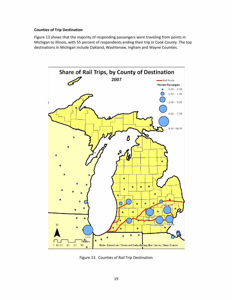
Figure 13 shows that the majority of responding passengers were traveling from points in Michigan to Illinois, with 55 percent of respondents ending their trip in Cook County. The top destinations in Michigan include Oakland, Washtenaw, Ingham and Wayne Counties.
Figure 13. Counties of Rail Trip Destination

20
Cook County has remained the most common destination for passengers over time. In 2000, 60 percent of passengers were traveling to Cook County; in 2007, this number decreased only slightly to 55 percent. Over this time period, the percent of passengers traveling to Oakland County increased from two percent to six percent of responding rail passengers. Kalamazoo County decreased in its share of respondent destinations from 2000 to 2007, dropping from the second to the seventh most common destination county among responding rail passengers.
Distribution of Trip Origin Counties
Figures 14 through 18 display the origins of trips to the five top destination counties: Cook, IL, Oakland, Washtenaw, Wayne and Ingham. For example, Figure 14 shows the share of responding passengers who traveled to Cook County by their county of origin. The map shows that the vast majority of passengers who traveled to Cook County originated in the counties of Southeast Michigan. Other counties with large shares of trips to Cook County included Ingham, Genesee, and Kent. Figure 15 shows that responding passengers who traveled to Oakland County came primarily from Cook and Kalamazoo counties. Passengers who traveled to Washtenaw and Wayne (Figure 16 and Figure 17), by contrast, came primarily from origins along the Wolverine route, an expected result because Washtenaw and Wayne are situated at the end of the route. Responding passengers who traveled to Ingham (Figure 18) came primarily from Cook and Kalamazoo counties.

21
Figure 14. Rail Trip Distribution of Cook County

22
Figure 15. Rail Trip Distribution of Oakland County

23
Figure 16. Rail Trip Distribution of Washtenaw County

24
Figure 17. Rail Trip Distribution of Wayne County

25
Figure 18. Rail Trip Distribution of Ingham County
26
Purpose of Trip
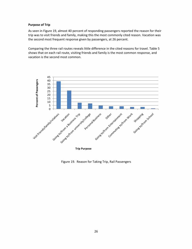
As seen in Figure 19, almost 40 percent of responding passengers reported the reason for their trip was to visit friends and family, making this the most commonly cited reason. Vacation was the second most frequent response given by passengers, at 26 percent.
Comparing the three rail routes reveals little difference in the cited reasons for travel. Table 5 shows that on each rail route, visiting friends and family is the most common response, and vacation is the second most common.
Figure 19. Reason for Taking Trip, Rail Passengers
05
1015202530354045
Perc
ent o
f Pas
seng
ers
Trip Purpose
27
Table 5. Rail Passengers Purpose by Trip, Three Rail Lines
Rail Line
Purpose of Trip Blue Water
(%) Pere Marquette
(%) Wolverine
(%)
Commuting to/from Work 2.4 3.2 3.2
Going to/from University/College 8.9 6.7 7.3
Visit friends/family/relatives 43.0 44.4 36.3
Vacation 17.3 18.4 29.9
Shopping 2.8 3.2 2.6
Personal Business 7.1 5.0 5.0
Other 5.0 5.0 3.0
Going to/from a business trip 9.5 9.1 8.4
Going to/from entertainment 3.7 4.4 3.2
Going to/from school 0.2 0.6 1.1
All 100.0 100.0 100.0
Trip Purpose by Destination Counties
For a closer investigation of the reasons for taking rail trips, Table 6 reports the breakdown of trip purposes for the top five destination counties. Visiting friends and family remains the dominant reason for travel by rail, with over half of all responding passengers reporting this trip purpose for travel to Oakland, Washtenaw, Wayne, and Ingham counties. Although visiting friends and family was the most common purpose in these four counties, Cook County is an exception to the pattern. The most commonly cited purpose for travel to Cook was vacation (39 percent of passengers), with visiting friends and family as the second-most commonly reported purpose (23 percent).
Traveling to attend college or university was a commonly cited reason in four of the five top destination counties. Indeed, this was the second most common reason for trips ending in Oakland and Ingham counties, and the third most common reason in Washtenaw and Wayne. Washtenaw attracted a high share of commutes (12 percent), and Cook attracted a large share of business trips (13 percent).

28
Table 6. Trip Purpose by Top Five Destination Counties, Rail Passengers
Top Five Destination Counties
Purpose of Trip Cook, IL
(%) Oakland
(%)
Wash- tenaw
(%)
Wayne (%)
Ingham (%)
Commuting 2.3 6.1 12.0 3.1 5.6 College/Univ. 3.6 18.3 10.7 13.8 14.8 Visit 23.2 61.0 53.3 52.3 63.0 Vacation 39.3 4.9 10.7 15.4 9.3 Shopping 4.6 0.0 0.0 0.0 1.9 Personal Business 3.6 4.9 2.7 9.2 1.9 Other 3.4 1.2 0.0 0.0 1.9 Business Trip 13.4 1.2 9.3 4.6 1.9 Entertainment 5.3 1.2 1.3 1.5 0.0 School 1.3 1.2 0.0 0.0 0.0
All 100.0 100.0 100.0 100.0 100.0
Note: Based on observed data during the survey time frame.
In comparing the results of the 2000 and 2007 surveys, two notable differences are observed in trips to Cook County (where Chicago is located). The first difference is in the share of trips made for shopping to Cook County, with a substantial drop between the survey years. In 2000, shopping was by far the most common reason cited for traveling to Cook County, at 31 percent of respondents. By 2007, shopping was among the least commonly cited reasons for trips to Cook County, at just five percent of trips. The second difference is in the share of trips made for vacation, with a dramatic increase between the survey years. In 2000, vacation was just 0.2 percent. In 2007, 39 percent of travelers to Cook County reported vacation as their purpose of travel.
These substantial differences between the surveys of 2000 and 2007 are a result of the season during which data were collected. In 2000, surveys were distributed in December, during the peak period of holiday shopping, while in 2007, surveys were distributed in the spring. The relative prominence between shopping and vacation were essentially reversed, likely as a result of the difference in seasons.
Catchment Area of Rail Stations
A comparison of per capita rail boardings provides a basis for understanding in relative terms how much a community uses rail service. Rail stations that are located in dense population settlements are expected to attract more riders than stations that are located in less densely populated places, all else being equal. To control for the differences in drawing power among stations, we created a “catchment area” around each station to investigate the relationship between boardings and local population. A catchment area is defined as the area surrounding a station within the median travel distance of trips from origin to rail station among all rail respondents. Figure 20 illustrates the case of the Detroit rail station. The dark shading is the

29
“catchment area,” which extends up to seven miles (the median travel distance to rail boarding stations among all rail respondents) along all roads in the vicinity of the station. The “catchment area population” is then defined as the population that lives within the boundary, based on block-level population from the 2000 Census of Population and Housing, Summary File 1.4
Figure 20. An Illustration of a Catchment Area: The Detroit Amtrak Station
Boardings Per Capita
Using the concept of the “catchment area,” Figure 21 and Table 7 show the number of boardings per catchment area population at rail stations. They reveal several notable findings:
• Even though Wayne County had the fourth highest level of boardings, the Detroit station had the second smallest number of boardings per catchment area population.
4 U.S. Bureau of the Census. (2002). 2000 Census of Population and Housing, Summary File 1, United States, Technical Documentation. Washington, DC: U.S. Government Printing Office.

30
• Washtenaw County had the third highest level of boardings and Ann Arbor had the highest number of boardings per catchment area population by a considerable margin.
• Considering the small population base upon which it draws, Durand attracts a disproportionately high number of riders.
Figure 21. Rail Boardings per Capita at Rail Stations

31
Table 7. Rail Boardings per Capita at Rail Stations
Mode of Travel to Boarding Station
Private vehicles were by far the most common way for responding rail passengers to arrive at a rail boarding station. Figure 22 shows that over half of responding rail passengers arrived at a station in some form of a private vehicle, either by driving themselves or being dropped off by others. Of these, 35 percent of passengers were dropped off by private vehicle, and 23 percent drove and parked at the station themselves. Taking a taxi is the third most common mode of travel, at 17 percent of passengers.
Station Boardings Catchment Area
Population (2000)
Boardings per Catchment Area Population (per
1,000)
Ann Arbor 387 154,772 2.50 Durand 19 13,851 1.37 Kalamazoo 195 149,295 1.31 Battle Creek 73 84,397 0.86 Holland 63 87,001 0.72 East Lansing 143 201,627 0.71 Lapeer 13 20,935 0.62 Jackson 51 83,335 0.61 Niles 16 33,525 0.48 Port Huron 28 59,813 0.47 Bangor 3 7,498 0.40 Grand Rapids 110 326,231 0.34 Dearborn 146 578,247 0.25 Dowagiac 3 12,540 0.24 Flint 48 203,947 0.24 St. Joseph/ Benton
Harbor 11 54,735 0.20
Pontiac 34 203,148 0.17 Birmingham 49 326,748 0.15 Royal Oak 47 516,497 0.09 Detroit 45 645,328 0.07 Albion 1 15,398 0.06

32
Figure 22. Mode of Travel to Boarding Station, Rail Passengers
Table 8 illustrates how the mode of travel to a station varied by the location of the trip origin. It shows that Cook County was an atypical location, likely because the City of Chicago offers a wide array of travel options to a rail station. For example, even though 35 percent of all respondents were dropped off at a station, among passengers boarding in Cook County, this figure is only 14 percent. This is likely a reflection of the high cost of driving a private vehicle in downtown Chicago – in terms of both parking and traffic congestion. Instead, passengers boarding trains in Cook County were far more likely than their counterparts in other counties to take a taxi, take a commuter train, or walk to the station.
0
5
10
15
20
25
30
35
40
Perc
ent o
f Pas
seng
ers
Mode of Travel

33
Table 8. Travel Mode to Boarding Station, Rail Passengers
Top Five Origin Counties
Travel Mode Cook, IL
(%) Washtenaw
(%) Oakland
(%) Wayne
(%) Kalamazoo
(%)
Dropped Off 14.2 42.8 61.7 39.8 48.7
Drove 2.5 40.7 32.8 51.3 16.9
Amtrak Thruway 1.0 0.0 0.0 0.0 0.5
Commuter Train 17.3 0.3 0.0 0.5 0.0
Taxi 36.2 6.0 4.7 3.7 5.1
Bicycle 0.0 0.3 0.0 0.0 0.0
Local Bus 5.5 1.0 0.0 1.6 20.5
Other 4.3 0.8 0.0 0.5 0.5
Walked 10.1 8.0 0.8 2.6 5.1
Intercity Bus 0.8 0.3 0.0 0.0 2.0
Connecting Amtrak 8.1 0.0 0.0 0.0 0.5
Total 100.0 100.0 100.0 100.0 100.0
Note: Based on observed data during the survey time frame.
Mode of Travel Away From Alighting Station
At the alighting station, where rail passengers leave the train at their destination, several differences are noted compared to the mode of travel to boarding stations. As shown in Figure 23, the way respondents left the alighting station differed from the way they arrived at the boarding station. First, respondents were more likely to be picked up by private vehicle at the alighting station (45 percent) than to be dropped off at the boarding station (35 percent). Second, as expected, respondents were less likely to drive themselves by private vehicle after leaving the alighting station (11 percent) than they were to arrive at a boarding station by driving (23 percent). Third, taxi was the second-most common mode at the alighting station (23 percent) but third-most common at the boarding station (17 percent).

34
Figure 23. Mode of Travel from Alighting Station, Rail Passengers
Table 9 shows that, as with boarding stations, the method of travel from alighting station varied by location. And again, probably reflecting the high cost of driving in Chicago, Cook County is atypical in the low share of passengers being picked up by private vehicle. The most common mode of travel in Cook County was by taxi, with about half of all responding passengers reporting this option. Among Michigan counties, Wayne County was unusual in the large share of passengers who drove themselves away from the station, with 30 percent of respondents taking this option.
0
5
10
15
20
25
30
35
40
45
50
Perc
ent o
f Pas
seng
ers
Mode of Travel

35
Table 9. Travel Mode from Alighting Stations, Rail Passengers
Top Five Destination Counties
Travel Mode Cook, IL
(%) Oakland
(%) Washtenaw
(%) Wayne
(%) Ingham
(%)
Picked Up 19.8 73.3 70.9 54.7 63.2 Drove 1.1 19.1 11.2 30.0 14.9 Amtrak Thruway 0.3 0.8 0.7 0.0 1.1 Commuter Train 8.6 0.0 0.0 0.7 1.1 Taxi 50.7 5.3 8.2 11.3 5.7 Bicycle 0.1 0.0 0.0 0.0 0.0 Local Bus 6.1 0.0 0.0 2.0 0.0 Other 1.8 0.8 1.5 1.3 0.0 Walked 10.8 0.8 7.5 0.0 12.6 Intercity Bus 0.5 0.0 0.0 0.0 1.1 Connecting Amtrak 0.3 0.0 0.0 0.0 0.0
Total 100.0 100.0 100.0 100.0 100.0
Note: Based on observed data during the survey time frame.
Cross-Tabulation of Travel Modes
To investigate further how people travel to and from rail stations, we cross-tabulated the mode of travel in Table 10. As an illustration of how to read the table, the first row shows that of the passengers who took a taxi to the boarding station, 8.2 percent of them took another taxi and 1.2 percent of them walked when leaving the alighting station at the end of their rail trip. The most notable finding from the table is for passengers who drove a private vehicle to the boarding station. These passengers were far more likely to take a taxi at the other end of their rail trip than any other kind of passenger, with nearly half of them taking a taxi from the alighting station. This result may be explained by differences among travelers in how they value time. Driving is the most temporally flexible mode of travel to a station and typically the most expensive. People who drive to a boarding station tend to be the kind of travelers who are willing to pay additional out-of-pocket costs for the savings in time that a taxi provides. Similarly, among passengers who took a taxi to a boarding station, 35.7 percent of them drove a private vehicle away from the alighting station.

36
Table 10. Comparing Modes of Travel To and From Station
Method from Alighting Station (%)
Method to
Boarding Station
Taxi
Wal
ked
Am
trak
Tr
ain
Com
mut
er
Trai
n
Bicy
cle
Loca
l Bus
Oth
er
Pick
ed U
p
Dro
ve
Inte
rcity
Bu
s
Thru
way
Bu
s
All
Taxi 8.2 1.2 1.0 1.4 0.0 1.2 1.7 49.5 35.7 0.0 0.0 100.0
Walked 7.4 8.6 0.0 4.9 0.0 4.9 1.8 59.5 12.3 0.6 0.0 100.0
Amtrak Train
7.6 2.5 1.3 0.0 0.0 0.0 1.3 58.2 19.0 1.3 8.9 100.0
Commuter Train
4.6 4.0 0.0 0.6 0.0 1.7 0.6 78.0 10.4 0.0 0.0 100.0
Bicycle 1 0.0 25.0 0.0 25.0 25.0 0.0 0.0 25.0 0.0 0.0 0.0 100.0
Local Bus 2.8 6.5 0.0 0.9 0.0 5.6 0.0 73.8 9.3 0.9 0.0 100.0
Other 10.4 4.2 2.1 0.0 0.0 0.0 8.3 62.5 12.5 0.0 0.0 100.0
Dropped off
23.8 8.0 3.8 8.1 0.1 4.0 2.6 43.0 5.0 0.8 0.7 100.0
Drove 48.7 8.7 1.5 6.9 0.3 5.5 1.5 20.6 5.0 0.5 0.7 100.0
Intercity Bus
18.2 13.6 0.0 4.5 0.0 0.0 4.5 50.0 4.5 0.0 4.5 100.0
Thruway Bus
27.3 0.0 4.5 9.1 0.0 0.0 4.5 45.5 0.0 0.0 9.1 100.0
Note: (1) The observed occurrences of bicycles are too few to be reliable.
Travel Time To and From Boarding and Alighting Stations
Figure 24 suggests that rail passengers tend to arrive at the boarding station from locations near the station. Nearly half of survey respondents (45 percent) reported arriving at their boarding station in 15 minutes or less. And nearly three out of four reported traveling for no more than 30 minutes.
At the other end of the trip, respondents reported slightly longer journeys. As shown in Figure 25, only 37 percent of survey respondents reported arriving at their final destination in 15 minutes or less. Only 66 percent reported traveling for no more than 30 minutes.
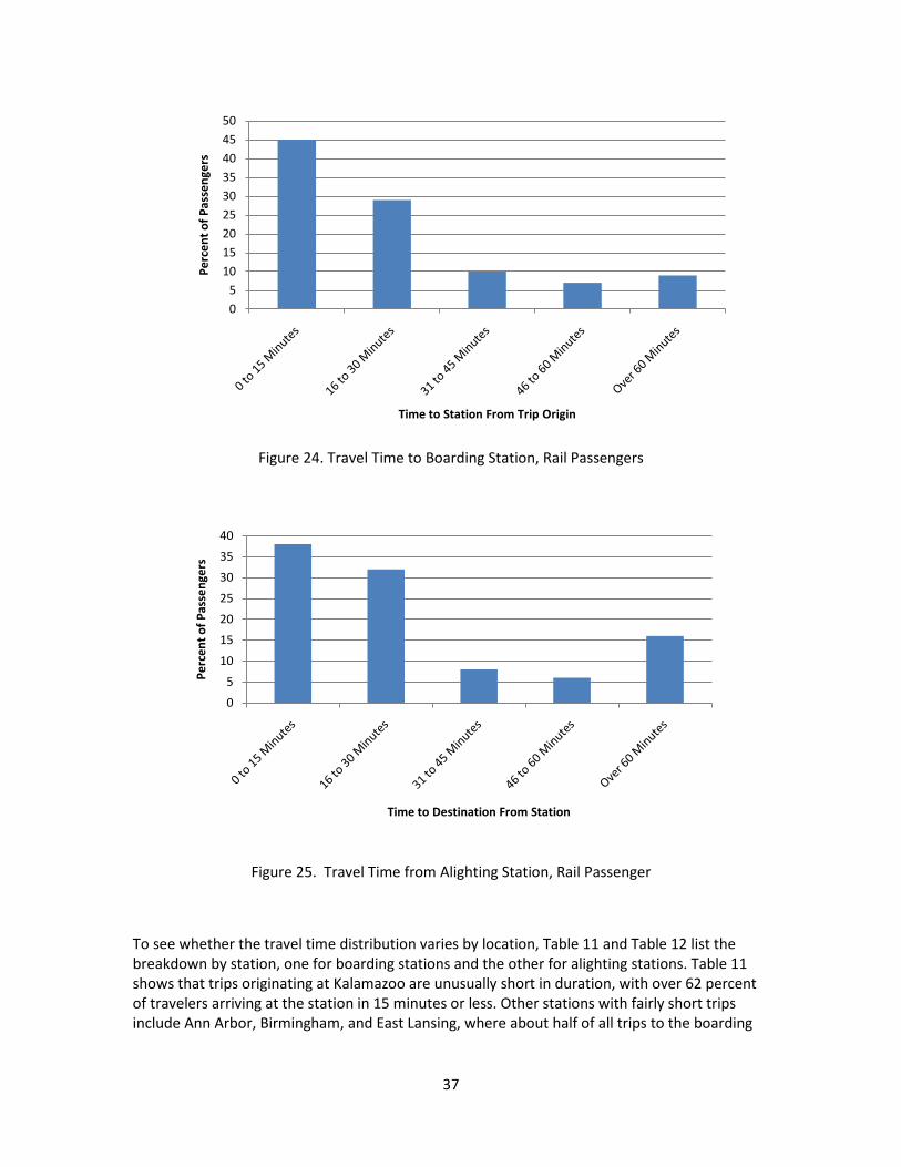
37
Figure 24. Travel Time to Boarding Station, Rail Passengers
Figure 25. Travel Time from Alighting Station, Rail Passenger
To see whether the travel time distribution varies by location, Table 11 and Table 12 list the breakdown by station, one for boarding stations and the other for alighting stations. Table 11 shows that trips originating at Kalamazoo are unusually short in duration, with over 62 percent of travelers arriving at the station in 15 minutes or less. Other stations with fairly short trips include Ann Arbor, Birmingham, and East Lansing, where about half of all trips to the boarding
05
101520253035404550
Perc
ent o
f Pas
seng
ers
Time to Station From Trip Origin
0
5
10
15
20
25
30
35
40
Perc
ent o
f Pas
seng
ers
Time to Destination From Station

38
station are within 15 minutes. Proximity to universities in Ann Arbor, East Lansing, and Kalamazoo may explain this result.
Other stations show unusually long trips to the boarding station. Battle Creek is a clear outlier in this case, with over half (51.4 percent) of all responding passengers reporting trips of more than 45 minutes to the station. No other Michigan station comes close to this high share of long-duration trips. The high travel time findings for arriving at Battle Creek are not due to a disproportionate share of respondents connecting at the station by Thruway services. Of the 11 respondents who reported travel to the Battle Creek boarding station of over 60 minutes, only one reported having arrived by Thruway, a share that is not significantly different than for other stations. Aside from Chicago – where 22 percent of trips are over 45 minutes – the next highest share is at the East Lansing station, where 15 percent of passengers report trips over 45 minutes to the boarding station. East Lansing, then, is a station that appears to attract rail passengers from either very near or very far, with little in between.
Table 12 reports the travel time breakdown for trips leaving an alighting station. In general, passengers report longer trips away from an alighting station than trips to a boarding station. The table shows that a substantially greater share of passengers must travel further to reach their final destinations. Seven out of the ten stations listed (those stations with the highest observed passengers) showed that over ten percent of passengers traveled over an hour to their final destination. The stations where trips tend to be among the shortest include East Lansing (49 percent of trips within 15 minutes) and Kalamazoo (44 percent). These data are consistent with the findings on trip duration to the boarding station presented in Table 11. For example, both East Lansing and Kalamazoo are stations where passengers report short trips both to and from the station. The data on alighting stations are also consistent with those found at boarding stations with regard to unusually long trips.
Battle Creek is again an outlier in terms of unusually long trips away from the alighting station after passengers deboard the train, with 46 percent of all responding passengers reporting trips of more than 45 minutes. The high travel time findings for leaving the Battle Creek station is likely due to a disproportionate share of respondents connecting at the station by Thruway services. Of the 17 respondents who reported travel away from the Battle Creek station of over 60 minutes, six reported having left the station by Thruway (and two others reported leaving by intercity bus). East Lansing and Grand Rapids are also stations with a high share of long trips, with nearly one out of four respondents reporting trips over 45 minutes. As with the case of boarding stations, East Lansing is a station where respondents reported trips away from the alighting station that are either near or far, with few trips in the medium range.

39
Table 11. Travel Time to Boarding Stations, Rail Passengers
Table 12. Travel Time from Alighting Stations, Rail Passengers
In comparing the data on travel time to and from stations between 2000 and 2007, the data are not directly comparable. In 2000, travel times to stations were estimated by assuming automobile travel times along the road network. In 2007, travel times were reported by passengers. On the whole, the data indicate that passengers traveled for longer durations to and from stations in 2007 compared to 2000. But this result is likely due to a tendency of self-reported times to be longer than those calculated by network analysis.
Percentage Travelling
0 -15 Minutes
(%)
Percentage Travelling
16 – 30 Minutes
(%)
Percentage Travelling
31 – 45 Minutes
(%)
Percentage Travelling
46 – 60 Minutes
(%)
Percentage Travelling Over 60 Minutes
(%) All (%)
1. Chicago 45.3 21.8 11.0 7.6 14.2 100.0 2. Ann Arbor 48.8 31.0 11.3 7.6 1.3 100.0 3. Kalamazoo 62.4 22.2 2.1 5.2 8.2 100.0 4. Dearborn 33.6 52.4 9.1 2.8 2.1 100.0 5. East Lansing 50.4 29.8 5.0 8.5 6.4 100.0 6. Grand Rapids 42.7 39.1 5.5 3.6 9.1 100.0 7. Battle Creek 30.6 12.5 5.6 23.6 27.8 100.0 8. Holland 37.1 32.3 22.6 3.2 4.8 100.0 9. Jackson 29.4 41.2 21.6 5.9 2.0 100.0 10. Birmingham 52.1 41.7 4.2 2.1 0.0 100.0
Percentage Travelling
0 -15 Minutes
(%)
Percentage Travelling
16 – 30 Minutes
(%)
Percentage Travelling
31 – 45 Minutes
(%)
Percentage Travelling
46 – 60 Minutes
(%)
Percentage Travelling Over 60 Minutes
(%) All (%)
1. Chicago 39.6 28.6 6.0 5.9 19.9 100.0 2. Ann Arbor 37.1 41.4 10.4 3.2 7.9 100.0 3. Kalamazoo 44.2 24.8 7.8 10.1 13.2 100.0 4. Dearborn 26.1 47.9 11.8 5.9 8.4 100.0 5. East Lansing 49.0 25.0 2.1 6.3 17.7 100.0 6. Grand Rapids 39.7 28.2 7.7 3.8 20.5 100.0 7. Detroit 33.3 33.3 11.1 7.9 14.3 100.0 8. Battle Creek 29.2 15.4 9.2 20.0 26.2 100.0 9. Birmingham 38.0 42.0 10.0 0.0 10.0 100.0 10. Royal Oak 32.7 49.0 10.2 2.0 6.1 100.0

40
Alternative Mode of Travel
Passengers were asked to indicate the likelihood of choosing among a set of alternative modes of travel if a train were not available. The results are reported in Figure 26. The figure indicates that driving a private vehicle was by far the most commonly cited alternative to the train, with 60 percent of passengers reporting that they would be “very likely” to drive if a train were not available (and fully 81 percent of passengers reported either “very likely” or “likely” to drive). Among rail passengers, taking a bus was not a likely alternative option. Over half of passengers reported that they would be “very unlikely” to take a bus if a train were not available (and three out of four passengers indicated that they would be either “very unlikely” or “unlikely” to take a bus as an alternative).
Figure 26. Likelihood of Choosing Alternative Mode of Travel, Rail Passengers
Figure 27 presents the data on likelihood of selecting an alternative method of travel by household income. The figure shows that as income increases respondents become more likely to drive and less likely to either not make the trip or to take the bus in the absence of a rail alternative. By contrast, it also shows that the lower the income, the more likely a passenger would choose to take a bus if a train were not available. This finding is not surprising because driving is the most costly (including all associated costs of owning and operating a vehicle) among the alternatives. It is also consistent with the data on household income among bus passengers indicated later in the report: the household income of rail passengers is higher than the household income of bus passengers.
0
10
20
30
40
50
60
70
Perc
enta
ge o
f Pas
seng
ers
Alternative Modes of Transportation
Very Likely
Likely
Unlikely
Very Unlikely

41
Figure 27. Alternative Method of Transportation Based on Income, Rail Passengers
The survey questions regarding alternative method of transportation differed slightly in the 2000 and 2007 surveys. In 2000, the survey asked which alternative option a respondent would choose. In 2007, the survey asked for a likelihood of using an alternative method of transportation. In spite of this difference, some comparisons can be made. In both 2000 and 2007, the most commonly chosen option if a train were not available was to drive (40 percent chose this option in 2000, while in 2007, 81 percent of passengers indicated either “very likely” or “likely” to drive). And in both 2000 and 2007, those in the highest income categories indicated they would prefer to drive or fly, while those in the lowest income categories would either take the bus or not make the trip.
Trips in the Past Year
Rail passengers tend to ride a train infrequently, as suggested by Figure 28. The figure shows that over 40 percent of responding passengers reported that they had taken no other rail trip during the past year. While the majority of rail passengers took no more than one other trip during the previous year, 11 percent of passengers took over five round trips in a year.
This trip-making behavior is consistent with the findings in 2000: in both 2000 and 2007, about 40 percent of rail passengers reported no other train trips in the previous year.
0
10
20
30
40
50
60
70
80
90
Perc
ent o
f Pas
seng
ers
Household Income
Drive
Fly
Not Make Trip
Bus

42
Figure 28. Number of Trips in the Past Year, Rail Passengers
Reasons for Increasing Use of Rail
Surveyed passengers were asked to rate the likelihood of using rail services more frequently, by rating several factors on a scale of 0 (least likely) to 10 (most likely). As shown in Table 13, the most highly rated reasons were: improved on-time arrivals (average rating of 7.84); more frequent train service (7.63); and rising gas prices (6.86). The lowest-rated factor, and by a wide margin, was providing more connections to intercity buses (such as Greyhound or Indian Trails).
Table 13. Likelihood of Increasing Rail Usage, Average Rating, Rail Passengers
Use Factor Average Improved On-Time Arrivals 7.84
More Frequent Train Service 7.63
Rising Gas Prices 6.86
More Connections to Other Trains 5.96
A Train Station Closer to Home 5.67
Easier to Purchase Tickets 5.66
Improved Personal Security at Stations 5.59
Improved Public Transit Service to Train Stations 5.56
More Connections to Intercity Buses 4.28
0
5
10
15
20
25
30
35
40
45
0 0.5 1 1.5 2 2.5 3 3.5 4 4.5 5 over 5.5
Perc
ent o
f Pas
seng
ers
Number of Round Trips

43
Important Factors for Choosing Rail
Rail passengers were asked about which considerations most influenced their decision to use rail over alternatives such as automobile, airline, or bus. The most important consideration, as shown in Table 14, was that the train schedule matched the traveler’s needs. Over half (54.9 percent) of responding passengers reported that this was “very important” in choosing rail over other options. Most respondents appear not to choose rail because of a dependency on the service: Two out of three respondents rated the No Other Option reason as either “unimportant” or “very unimportant”.
Table 14. Reason for Choosing Rail, Rail Passengers
Importance
Reason
Very Important
(%) Important
(%) Unimportant
(%)
Very Unimportant
(%) All (%)
Train Schedule Met Schedule Needs 54.9 37.2 6.5 1.4 100.0 Fast Overall Travel Time 38.3 45.5 14.0 2.2 100.0 Comfort While Traveling 50.5 42.4 5.7 1.3 100.0 High Cost of Gasoline 31.5 32.8 27.9 7.7 100.0 Total Cost of the Trip 46.8 39.7 10.4 3.1 100.0 Safety While Traveling 45.8 36.7 13.6 3.9 100.0 No Other Options 16.0 18.2 31.6 34.2 100.0
3.3 Rail Service Characteristics
Rating Importance of Rail Amenities at Stations
Rail passengers were asked to rate the importance of amenities and services at rail stations. The list of amenities and services is shown in Figure 29 below, along with the survey responses. At least eight out of ten passengers identified the following five amenities as either “very important” or “important”: a clean facility; lighting and security; signs to navigate through the station; comfort of seating; and parking availability. As Figure 29 shows, the most important station amenity identified is a clean facility, with nearly every responding passenger indicating either “very important” or “important.”
Rail passengers indicated little interest in several amenities. Services identified as the least important included car rental services, the availability of public telephones, and a newspaper or magazine stand. Over half of respondents identified car rental services as either “very unimportant” or “unimportant.”
A substantial share of respondents – ranging from about 60 to 90 percent of passengers – indicated that services that they experience at their seats in the station were very important, including the comfort of seating, the availability of power outlets, and access to the internet.

44
Figure 29. Importance of Rail Station Amenities, Rail Passengers
Importance of Activities on the Train
To evaluate what rail passengers value most while riding the train, respondents were asked to rate the importance of several activities. As illustrated in Figure 30, reading was the most important activity to passengers while on the train, with 92 percent of respondents providing a rating of “very important” or “important.” Passengers were least interested in playing cards or other games on the train. Almost 50 percent of respondents rated this activity to be either “unimportant” or “very unimportant.”
0102030405060708090
100
Perc
ent o
f Pas
seng
ers Very important + Important
Very unimportant + Unimportant

45
Figure 30. Importance of Specific Activities While on the Train
Denied an Amtrak Reservation
To assess whether passengers experience difficulty in obtaining tickets, respondents were asked if they had ever been denied a reservation because seats were sold out. The vast majority of respondents – 80 percent – had never been denied a reservation, but the remaining 20 percent indicated that they had experienced a reservation denial because seats were sold out. Among those responding passengers that had been denied a reservation, 56 percent reported that Amtrak provided alternative schedule options.
Rail Schedules
About one-quarter of responding rail passengers were not Michigan residents. Many of these respondents expressed an interest in spending more time in Michigan if the schedules were more flexible. About half of the non-Michigan respondents reported an interest in spending an additional night in Michigan if an earlier train was available.
0102030405060708090
100
Perc
ent o
f Pas
seng
ers Very Important + Important
Very Unimportant + Unimportant

46
4 Bus Passenger Analysis Chapter 4 examines survey data from passengers on intercity bus lines in Michigan. The survey included passengers riding Indian Trails, Greyhound, and Metrocars lines. This chapter is divided into three sections: passenger demographics, service use, and service characteristics.
4.1 Bus Passenger Demographics This section summarizes the characteristics of bus passengers, by analyzing characteristics such as household income, age, gender, and place of residence. The analysis also compares characteristics of bus passengers between 2001 and 2007 for data items that are comparable between the surveys conducted in those years.
Household Income
Bus passengers tend to be disproportionately from lower-income households. As shown in Figure 31, the most common income category among respondents was also the lowest category: 22 percent of responding bus riders came from households with an annual income of less than $10,000. Two out of every three respondents reported an annual household income of less than $40,000. For comparison, the median household income for the state of Michigan in 2007 was $47,950.5
So while about half of all Michigan residents came from households with incomes over $50,000, only about one in four responding bus passengers came from such households.
Figure 31. Household Income Distribution, Bus Passengers
5 U.S. Bureau of the Census (2008). Income, Earnings, and Poverty Data From the 2007 American Community Survey. Washington, DC: Government Printing Office.
0
5
10
15
20
25
Perc
ent o
f Pas
seng
ers
Household Income

47
In comparing the household income of bus passengers to the survey conducted in 2001, little change is observed in the income distribution over time. In both 2001 and 2007, the largest share of passengers came from the lowest income category, with approximately 22 percent of passengers reporting household incomes of less than $10,000 in both years.
Vehicle Ownership
As Figure 32 shows, one in five responding bus passengers reported having no car in the household, a figure that makes bus respondents substantially different than the typical Michigan resident: only 6.8 percent of households statewide had no vehicle in the household in 2007.6
Figure 32. Number of Vehicles per Household, Bus Passengers
Bus passengers in 2007 tend to come from households with more private automobiles than in 2001. In 2001, a substantial share of bus passengers did not own a car, about 33 percent. But the share of bus passengers without a car in 2007 decreased to 20 percent. The share of passengers with two or more cars increased during this period, from around 39 percent in 2001 to 47 percent in 2007.
Passengers by Gender
Overall, the distribution of men and women among bus passengers is nearly even, with men making up slightly more than half of all passengers at 52 percent. However, as seen in Figure 33, the relative share of women and men varies by age. Between the ages of 25 and 44, men outnumbered women substantially among respondents. But, over the age of 45, women outnumbered men.
6 U.S. Bureau of the Census. (2009). 2007 American Community Survey 1-Year Estimates, Michigan, from American FactFinder at <http://factfinder.census.gov/home/saff/main.html?_lang=en>.
0
5
10
15
20
25
30
35
0 1 2 3 or More
Perc
ent o
f Pas
seng
ers
Number of Vehicles

48
Figure 33. Gender by Age Group, Bus Passengers
In comparing to the previous study, little difference exists in the distribution of women and men in the years between 2001 and 2007. One notable difference is the share of women over the age of 74: In 2001, over 85 percent of bus passengers over 74 years were women, but by 2007, this figure dropped to about 60 percent.
Place of Residence
It is not surprising that the vast majority of bus riders reside within the state, since the surveys were conducted in Michigan. As reported in Table 15, about 78 percent of responding passengers reported a Michigan residence. Illinois is the most common residence among places outside of Michigan, at about four percent of bus passengers. Figure 34 provides a visual depiction of the geographic spread of residences among bus passengers, showing a wide dispersion across the state, but with some clustering around major urban centers.
0
10
20
30
40
50
60
70
80
Perc
ent o
f Pas
seng
ers
Age of Passengers
Women
Men

49
Table 15. State of Residence, Bus Passengers
State of Residence Percent of Passengers
Michigan 77.8 Rest of U.S.*/ Outside of U.S. 12.4 Illinois 3.9 Wisconsin 2.4 New York 1.8 Texas 1.8 Note: Based on observed data during the survey time frame.
* States not included in the table.
A larger share of bus passengers resided in Michigan in 2007 than in 2001. In 2001, only 60 percent of bus passengers reported a residence in Michigan while, in 2007, nearly 80 percent resided in Michigan.
Table 16 lists the place of residence among Michigan cities, showing that Detroit is home to the largest share of bus passengers, at nearly 10 percent. Grand Rapids, at about nine percent, is the second-most common city of residence among rail passengers.
Table 16. Passengers Residing in Michigan Cities, Bus Passengers
City of Residence Percent of Passengers Detroit 9.6 Grand Rapids 8.6 East Lansing 7.8 Flint 5.6 Kalamazoo 5.6 Remaining Michigan Cities 62.9
Note: Based on observed data during the survey time frame.

50
Figure 34. Residence Location for Bus Passengers

51
Age
Younger passengers are more likely to travel by bus than older passengers. As shown in Figure 35, nearly two out of five (39 percent) responding bus passengers were under the age of 25, and more than half (58 percent) were under the age of 35. Older passengers are considerably underrepresented among respondents, with only about three percent of responding passengers reporting an age of 65 years or older.
Figure 35. Age Distribution, Bus Passengers
Traveling Companions
Bus passengers are far more likely to travel alone than with companions. Table 17 shows that 79 percent of respondents were traveling alone, and another 16 percent were traveling with one companion. Traveling with more than one companion is rare by bus, constituting only a little more than five percent of respondents.
The number of traveling companions varies little by age. As Figure 36 demonstrates, the average number of traveling companions was between 1 and 1.5 for all age groups below 75 years. Passengers over 65 years of age appear to be slightly more likely to be traveling with a companion, although a very small number of responding passengers exist in these age categories, making it difficult to draw conclusive findings on older passengers from these data.
Table 17. Number of Traveling Companions, Bus Passengers
0
5
10
15
20
25
30
35
Perc
ent o
f Pas
seng
ers
Age of Passengers
Number of Traveling Companions Percent of Passengers Alone 79.0 1 15.7 2 0.9 3 or More 4.4

52
Figure 36. Average Number of Traveling Companions by Age Group, Bus Passengers
Employment Status
As shown in Figure 37, 18 percent of responding bus passengers reported being unemployed, while about eight percent reported being retired. A substantial share of respondents identified themselves as students, with about 10 percent as college students and eight percent as students that are not in college. To further investigate employment status, we cross-tabulated it with age, as shown in Table 18. The table confirms that, as expected, many respondents under the age of 18 were students (39 percent), and the majority of respondents over 65 were retired.
Figure 37. Employment Status, Bus Passengers
0.0
0.5
1.0
1.5
2.0
2.5
Ave
rage
Num
ber
of C
ompa
nion
s
Age Group
0
5
10
15
20
25
30
35
Perc
ent o
f Pas
seng
ers
Employment Status

53
Table 18. Employment Status by Age, Bus Passengers
Nights Away From Home
Figure 38 shows that over 60 percent of respondents spent between one and five nights away from home. Extended stays of more than two weeks away from home appear to be rare among bus passengers: Fewer than 10 percent of respondents spent more than 14 nights away from home.
Figure 38. Nights Away from Home, Bus Passengers
A slightly higher share of bus passengers spent between one and five nights away from home in 2007 compared to 2001: While 61 percent of passengers were away for one to five nights in 2007, this figure was 50 percent of passengers in 2001.
0
10
20
30
40
50
60
70
None 1-5 6-14 15-30 More than 30
Perc
ent o
f Pas
seng
ers
Nights Away from Home
Age (Years)
Employment Status
12–17 (%)
18–24 (%)
25–34 (%)
35–44 (%)
45–54 (%)
55–64 (%)
65–74 (%)
75 and over (%)
Full Time 0.0 15.8 45.0 46.2 49.4 26.7 8.3 14.3 Part Time 16.1 21.7 11.7 15.1 10.1 8.9 16.7 0.0 Unemployed 37.5 21.7 20.8 20.4 14.6 4.4 0.0 0.0 Homemaker 0.0 2.7 3.3 7.5 7.9 4.4 16.7 14.3 Retired 3.6 0.5 2.5 2.2 6.7 48.9 50.0 57.1 Other 1.8 3.8 7.5 6.5 6.7 4.4 8.3 14.3 Student 39.3 7.6 3.3 2.2 3.4 0.0 0.0 0.0 University/College 1.8 26.1 5.8 0.0 1.1 2.2 0.0 0.0
All 100.0 100.0 100.0 100.0 100.0 100.0 100.0 100.0

54
Level of Education
Figure 39 shows that only about one in five responding bus passengers are college graduates, and that 15 percent of bus respondents have not completed high school.
Figure 39. Highest Level of Education, Bus Passengers
0
5
10
15
20
25
30
35
Perc
ent o
f Pas
seng
ers
Education Level

55
Household Size
The average household size of bus passengers was 3.1 people per household. Figure 40 demonstrates the most frequent response for household size was two, with a response rate of 24 percent.
Figure 40. Household Size, Bus Passengers
Location Prior to Bus Station
A majority of responding passengers arrived at the bus boarding station from home. As Table 19 shows, 50 percent of respondents reported coming from home when arriving at the station. The second-most common location was a place of friends or relatives, with 18 percent of bus passengers reporting this location. Other significant origins include vacation places and college.
Table 19. Location Prior to Bus Station
Location Percent of Passengers Home 49.8 Visit Friends/Relatives 18.1 University/College 7.4 Vacation 6.1 Work-related Activity 4.7 Personal Business 4.4 Other 3.5 Place of Work 2.8 School (other than college) 2.6 Shopping 0.3 Entertainment 0.3
0
5
10
15
20
25
30
1 2 3 4 5 6 7 or More
Perc
ent o
f Pas
seng
ers
Persons Per Household

56
4.2 Bus Service Use
Counties of Trip Origin
Figure 41 shows the geographic distribution of the origins of responding bus passengers by county. Most respondents originated their trips in the southern half of the Lower Peninsula, with Kent, Ingham, Saginaw, Genesee, and Wayne being the top five counties of origin. Although few in number, the map shows that some responding passengers originated in the Upper Peninsula, including the counties of Marquette, Houghton, Iron, Delta, and Keweenaw.
Figure 41. Counties of Bus Trip Origin

57
In 2001, the top five counties of origin were Wayne, Kent, Genesee, Ingham, and Oakland. This shifted slightly between 2001 and 2007: by 2007, the top five counties of origin were Ingham, Cook, Wayne, Genesee, and Kent.
Counties of Trip Destination
Figure 42 shows the geographic distribution of final destinations for responding bus passengers. Cook County was the final destination for 13 percent of bus respondents. The top destinations for Michigan travelers were Cook, Wayne, Ingham, and Genesee.
Figure 42. Counties of Bus Trip Destination

58
Distribution of Trip Origin Counties
Figure 43 through Figure 47 show the origin counties reported for the top five destinations by responding bus passengers: Cook, Wayne, Ingham, Genesee and Kent Counties. For example, Figure 43 shows the share of trips traveling to Cook County by the county of origin. The map shows that most trips to Cook County originated in the counties of mid- Michigan, primarily Ingham and Kent counties.
Figure 43. Bus Trip Distribution of Cook County