introduction internet and the world wide · pdf fileslides based on course material © sfu...
TRANSCRIPT
CMPT 165 INTRODUCTION TO THE
INTERNET AND THE
WORLD WIDE WEB
Unit 6 Design Principles
Copyright © 2014 by Stephen Makonin Slides based on course material © SFU Icons © their respective owners 1

Learning ObjectivesIn this unit you will learn the following.
• Explain some principles of design. • Apply design principles to the creation of websites. • Evaluate the design of websites and other materials. • Create websites where the user can quickly navigate
to the desired information.
2Copyright © 2014 by Stephen Makonin
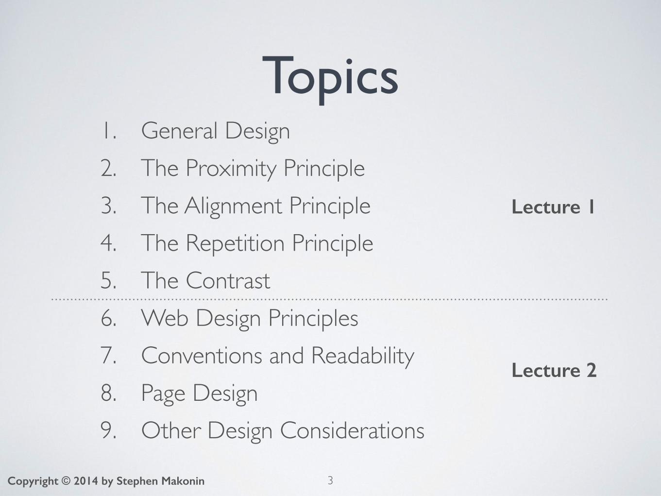
Topics1. General Design2. The Proximity Principle3. The Alignment Principle4. The Repetition Principle5. The Contrast6. Web Design Principles7. Conventions and Readability8. Page Design9. Other Design Considerations
3
Lecture 1
Lecture 2
Copyright © 2014 by Stephen Makonin
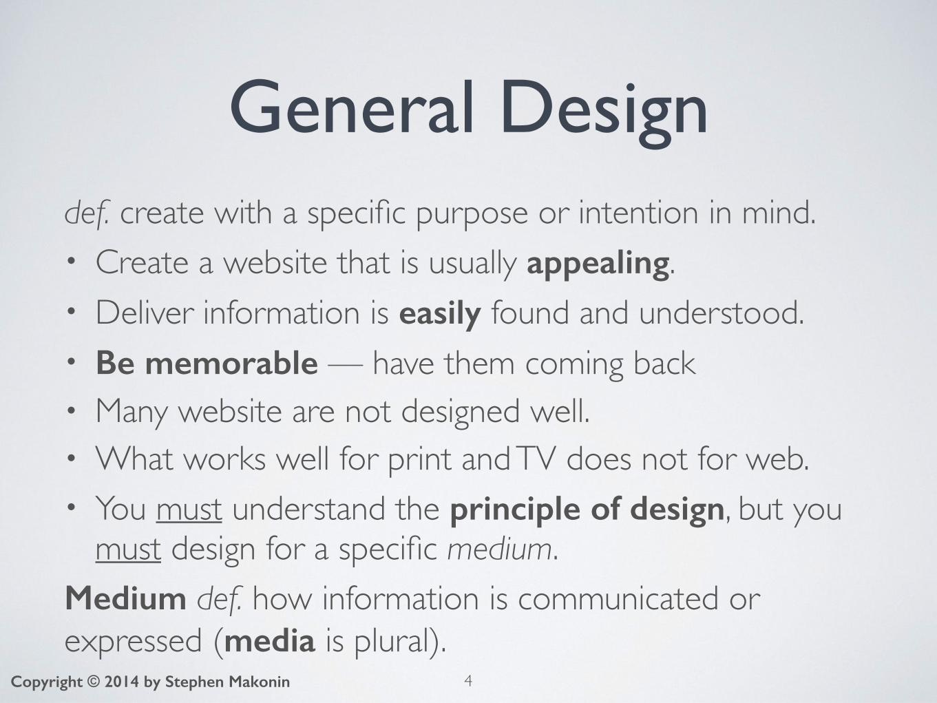
General Designdef. create with a specific purpose or intention in mind.• Create a website that is usually appealing.• Deliver information is easily found and understood.• Be memorable — have them coming back• Many website are not designed well.• What works well for print and TV does not for web.• You must understand the principle of design, but you
must design for a specific medium.Medium def. how information is communicated or expressed (media is plural).
4Copyright © 2014 by Stephen Makonin

Defining Good Design• Sometimes it is easier to define good design by given
examples of bad design.• When you visit a website ask yourself:
• What is the first thing I notice?• Where is me attention being focused?• Can I find the information that I am looking for?• What would make it easier to do so?
• The Non-Designer’s Design Book by Robin Williams suggests 4 principles:
proximity, alignment, repetition, and contrast5Copyright © 2014 by Stephen Makonin
🌎
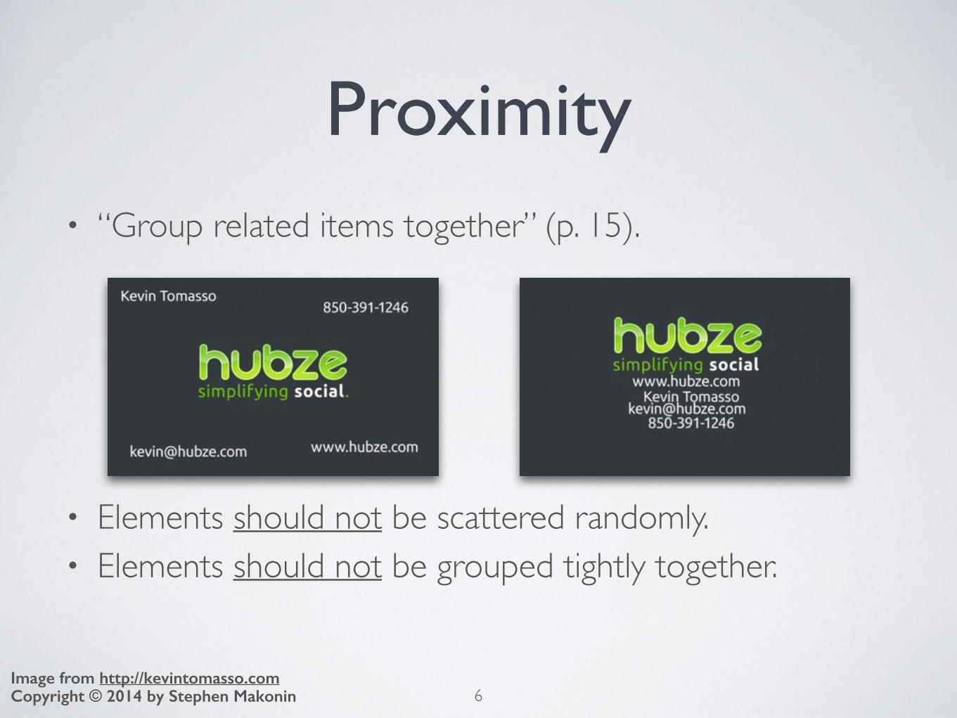
Proximity• “Group related items together” (p. 15).
• Elements should not be scattered randomly.• Elements should not be grouped tightly together.
6Copyright © 2014 by Stephen MakoninImage from http://kevintomasso.com
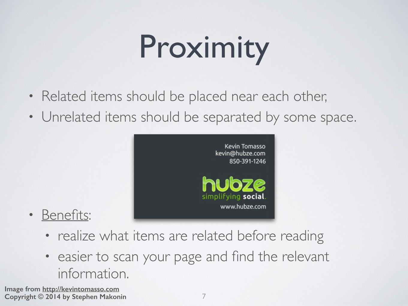
Proximity• Related items should be placed near each other,• Unrelated items should be separated by some space.
• Benefits: • realize what items are related before reading • easier to scan your page and find the relevant
information. 7Copyright © 2014 by Stephen Makonin
Image from http://kevintomasso.com

Proximity• Help your web page / document look organized• Before you create a web page spend time thinking about
• What information do I want on this page?• Can this information be broken down into smaller
subjects/groups?• These questions help organize you web page(s).• In the example we have separated:
• the business information from• the personal contact information
8Copyright © 2014 by Stephen MakoninImage from http://kevintomasso.com

Whitespacedef. blank space where there are no foreground objects (text and images).• Do not be afraid to use whitespace.• Help separate different subjects/topics.
9Copyright © 2014 by Stephen MakoninImage from http://kevintomasso.com
In the example whitespace
highlighted in red.

Alignmentdef. is the positioning of text and images on a page.
• “Nothing should be placed on the page arbitrarily. Every item should have a visual connection with something else on the page” (p. 31)
10Copyright © 2014 by Stephen MakoninImage from http://kevintomasso.com

Alignment• Text/images need to line up with other text/images.• It creates a common line for the eye to follow.• Centring does not always work.
• Right alignment creates a strong, clear line.
11Copyright © 2014 by Stephen MakoninImage from http://kevintomasso.com
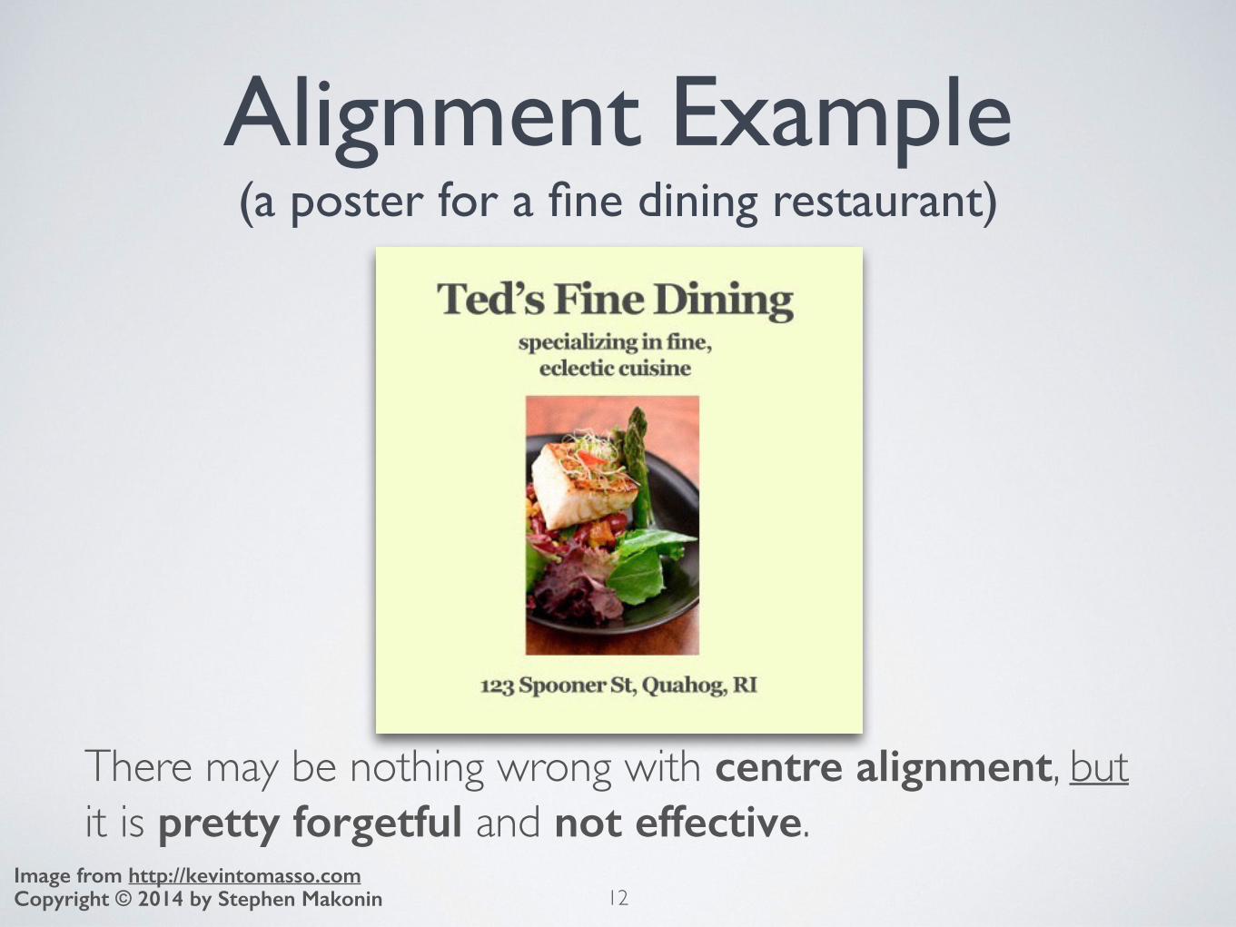
Alignment Example(a poster for a fine dining restaurant)
There may be nothing wrong with centre alignment, but it is pretty forgetful and not effective.
12Copyright © 2014 by Stephen MakoninImage from http://kevintomasso.com

Alignment Example(a poster for a fine dining restaurant)
No content change, right alignment and bar creates a more professional feel. Which one conveys fine dining?
13Copyright © 2014 by Stephen MakoninImage from http://kevintomasso.com
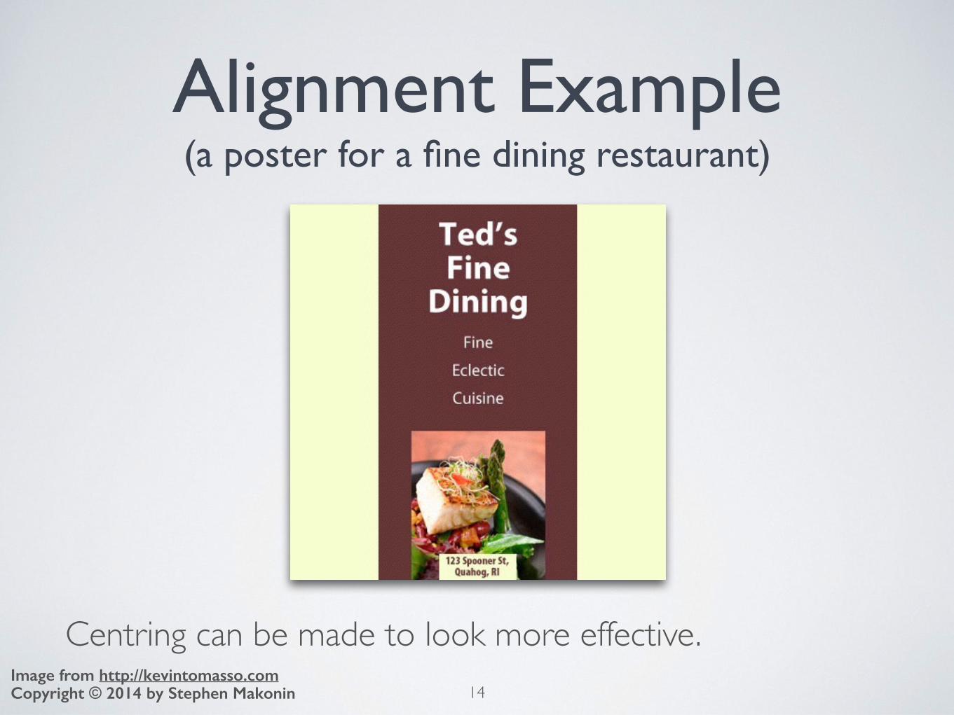
Alignment Example(a poster for a fine dining restaurant)
Centring can be made to look more effective.14Copyright © 2014 by Stephen Makonin
Image from http://kevintomasso.com
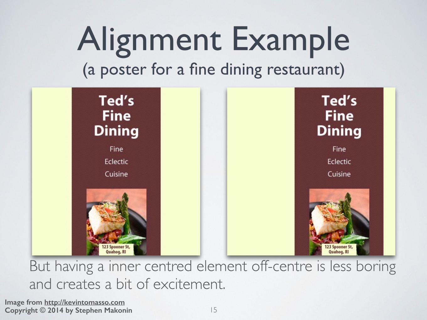
Alignment Example(a poster for a fine dining restaurant)
But having a inner centred element off-centre is less boring and creates a bit of excitement.
15Copyright © 2014 by Stephen MakoninImage from http://kevintomasso.com
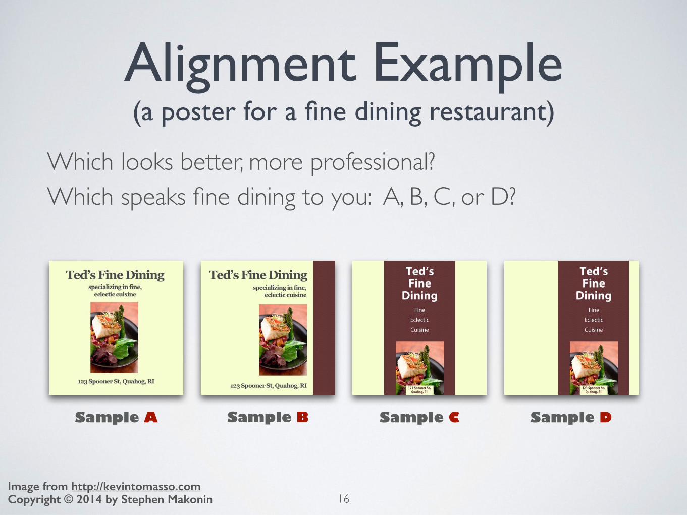
Alignment Example(a poster for a fine dining restaurant)
Which looks better, more professional?Which speaks fine dining to you: A, B, C, or D?
16Copyright © 2014 by Stephen MakoninImage from http://kevintomasso.com
Sample A Sample B Sample C Sample D

Text JustificationWhich looks better, more professional, left or right?
17Copyright © 2014 by Stephen Makonin

Repetitiondef. “repeat[ing] some aspect of the design throughout the entire piece” (p. 49).
• Use the same font, rule, bullet for the entire page.• Use a consistent
colour from your colour scheme for the same tag/element.
18Copyright © 2014 by Stephen MakoninImage from http://kevintomasso.com

Repetition• Alignment and repetition create a unify presentation.• A repeated element gives the user something to hang
on to and gives the presentation a consistent feel.
19Copyright © 2014 by Stephen MakoninImage from http://kevintomasso.com
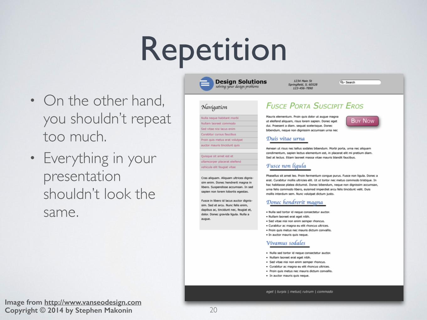
Repetition• On the other hand,
you shouldn’t repeat too much.
• Everything in your presentation shouldn’t look the same.
20Copyright © 2014 by Stephen MakoninImage from http://www.vanseodesign.com
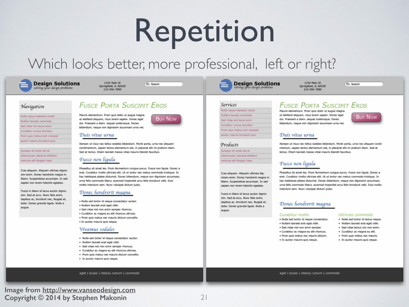
Repetition
21Copyright © 2014 by Stephen MakoninImage from http://www.vanseodesign.com
Which looks better, more professional, left or right?
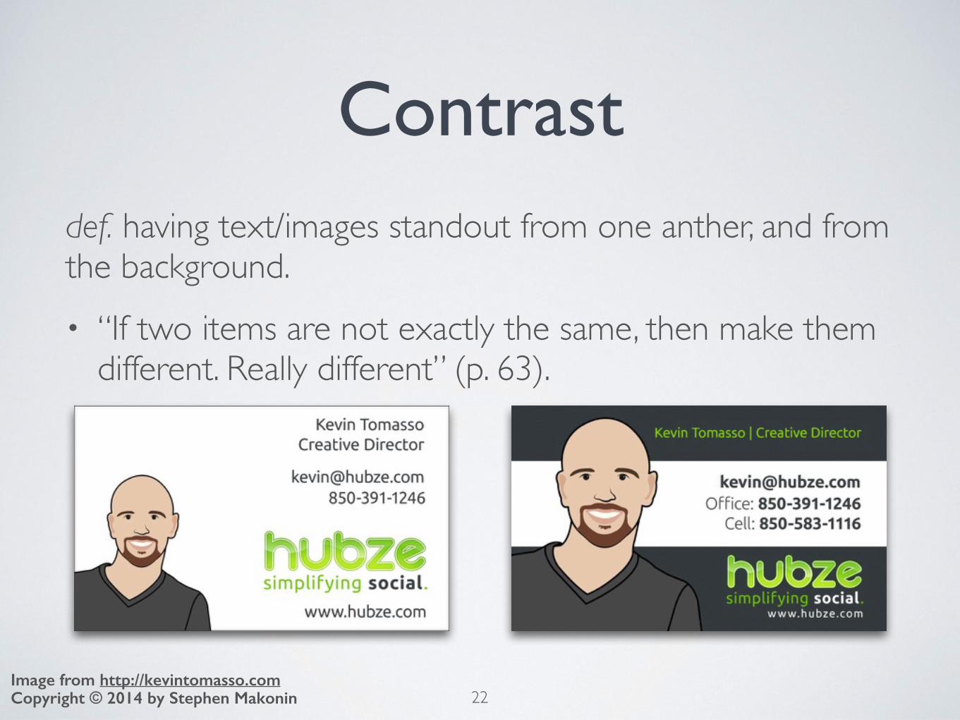
Contrastdef. having text/images standout from one anther, and from the background.• “If two items are not exactly the same, then make them
different. Really different” (p. 63).
22Copyright © 2014 by Stephen MakoninImage from http://kevintomasso.com
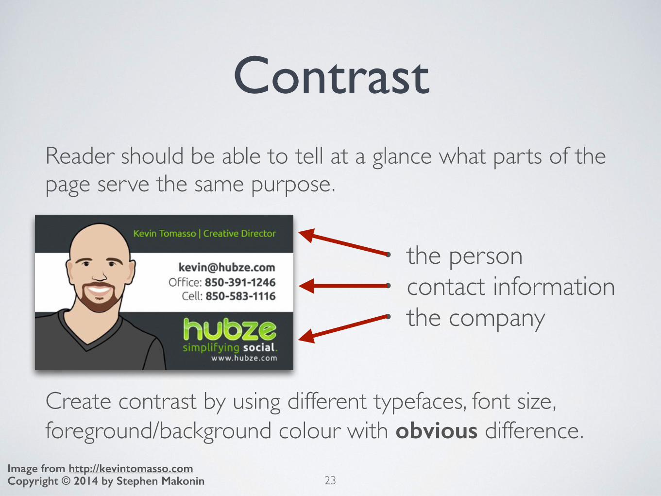
ContrastReader should be able to tell at a glance what parts of the page serve the same purpose.
23Copyright © 2014 by Stephen MakoninImage from http://kevintomasso.com
• the person• contact information• the company
Create contrast by using different typefaces, font size, foreground/background colour with obvious difference.

Vary TypefacesVary typefaces between headings and paragraph text.
24Copyright © 2014 by Stephen Makonin
Sample A
Sample B

Vary TypefacesVary typefaces between headings and paragraph text.
25Copyright © 2014 by Stephen Makonin
Sample A
Sample B

Vary Font SizeVary font sizes between headings and paragraph text.
26Copyright © 2014 by Stephen Makonin
Sample A
Sample B

Vary Font SizeVary font sizes between headings and paragraph text.
27Copyright © 2014 by Stephen Makonin
Sample A
Sample B

Contrast• Done be afraid to play around and try new ideas.• Remember too much is not good either.• If the result is ugly, then refine, tweak it , make small
changes.• Use a your pre-defined colour scheme to highlight and
separate subjects/topics.
28Copyright © 2014 by Stephen MakoninImage from Chapter six of Presentation Zen: Simple Ideas on Presentation Design and Delivery by Garr Reynolds
IMPORTANTto remember, are these 4 principles
29
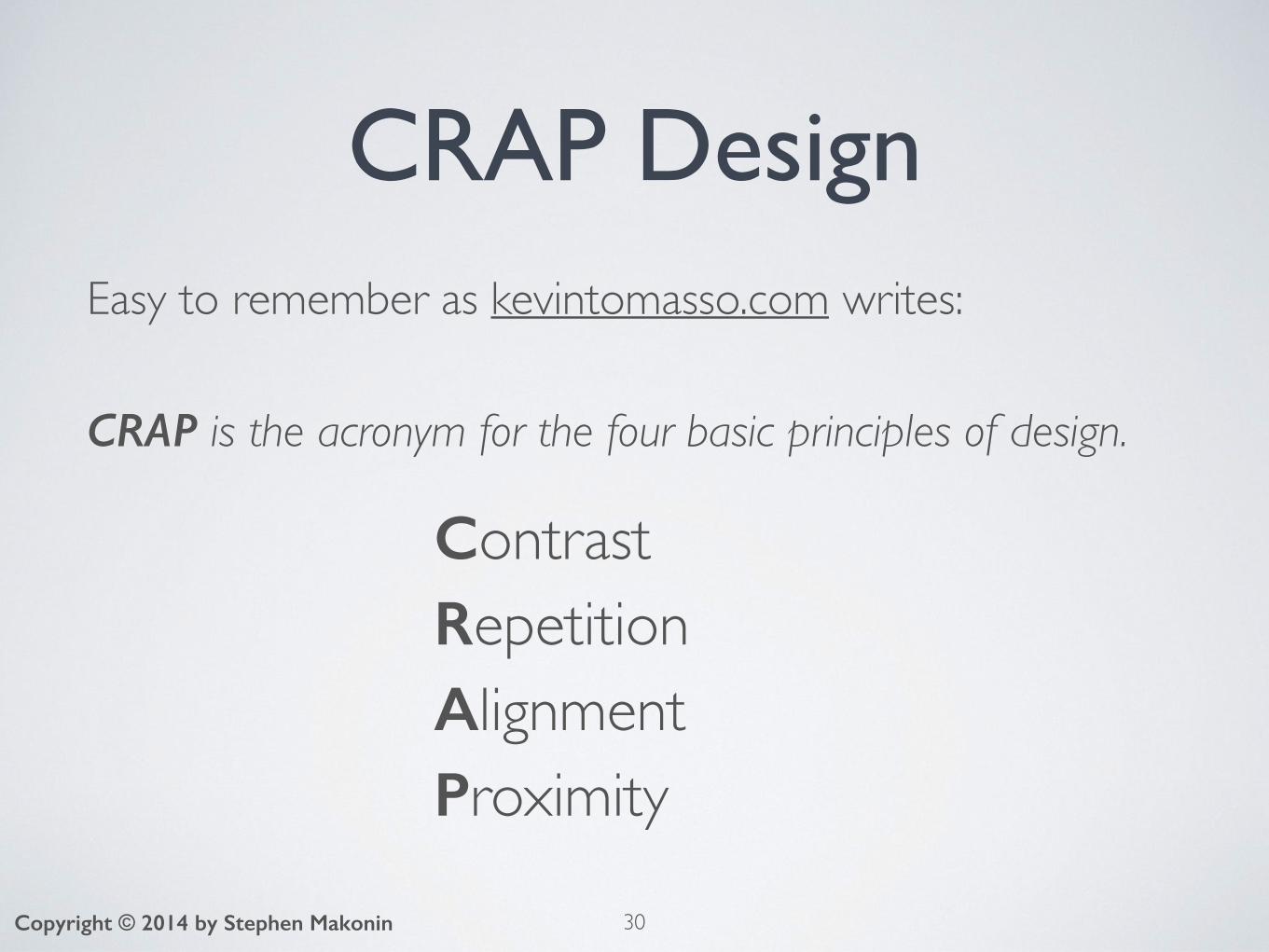
CRAP DesignEasy to remember as kevintomasso.com writes:
CRAP is the acronym for the four basic principles of design.
ContrastRepetitionAlignmentProximity
30Copyright © 2014 by Stephen Makonin
31
QUESTIONS?
Copyright © 2014 by Stephen Makonin

Website DesignAs with any form of media:• We use Contrast, Repetition, Alignment, and Proximity.• But how we use these 4 principles will be different.• Cannot use the visual layout of a poster for a web page.
• A poster can be any shape or size• The creator chooses.
• A website is limited by the screen size of the view’s computer• The creator has no choice!
• On a web page you would need to scroll.32Copyright © 2014 by Stephen Makonin

A Poster
33Copyright © 2014 by Stephen Makonin
Notice:• We can appreciate the
entire poster at a glance• We can focus on
specific aspects and information
• The poster info is both specific and subtle:• Specific through text• Subtle information
through art

The Poster as a Web Page
34Copyright © 2014 by Stephen Makonin

The Poster as a Web Page
35Copyright © 2014 by Stephen Makonin
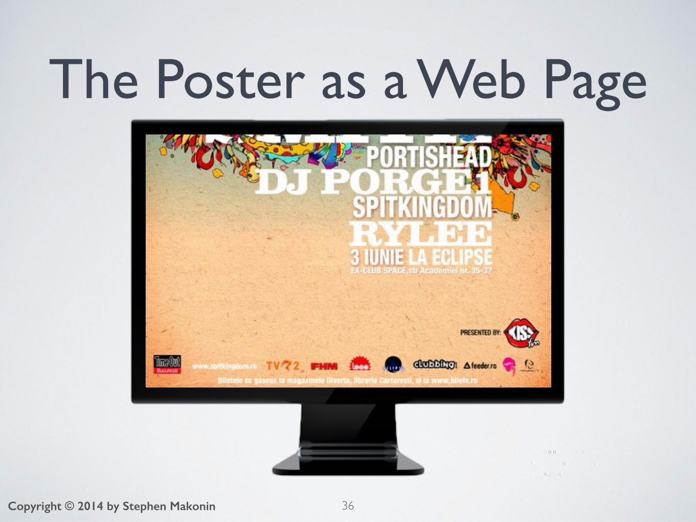
The Poster as a Web Page
36Copyright © 2014 by Stephen Makonin

37Copyright © 2014 by Stephen Makonin
The Poster as a Web PageAs we can see it is very hard to experience the entirety of the poster when we have to scroll down.
Subtle information is lost. The mood, the particular feeling the poster is trying to portray is not fully realized when scrolling
We are only given a small window from which to view what could be a masterpiece.

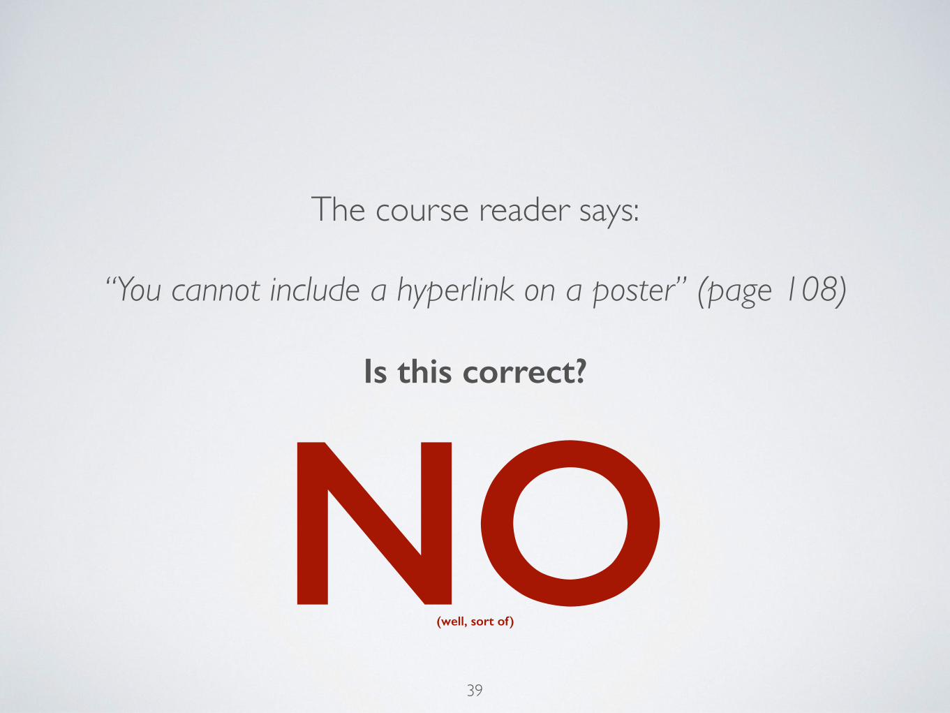
The course reader says:
“You cannot include a hyperlink on a poster” (page 108)
Is this correct?
38
The course reader says:
“You cannot include a hyperlink on a poster” (page 108)
Is this correct?
39
NO(well, sort of)

Where is the
hyperlink?
40Copyright © 2014 by Stephen Makonin
QR Codes
41Copyright © 2014 by Stephen Makonin
def. acronym for Quick Response Code• Scan with your mobile and you are:
• Taken to a website or specific URL with media• e.g. YouTube video, Dropbox files, map, iTunes, etc.
• Give contact information, or email address• Given event details for you calendar• Given a plain text, SMS, or email message• Use for wi-fi login, a Skype call
• See Wikipedia for an in-depth article• Goto QRStuff to create your own!
42
…but we digress!
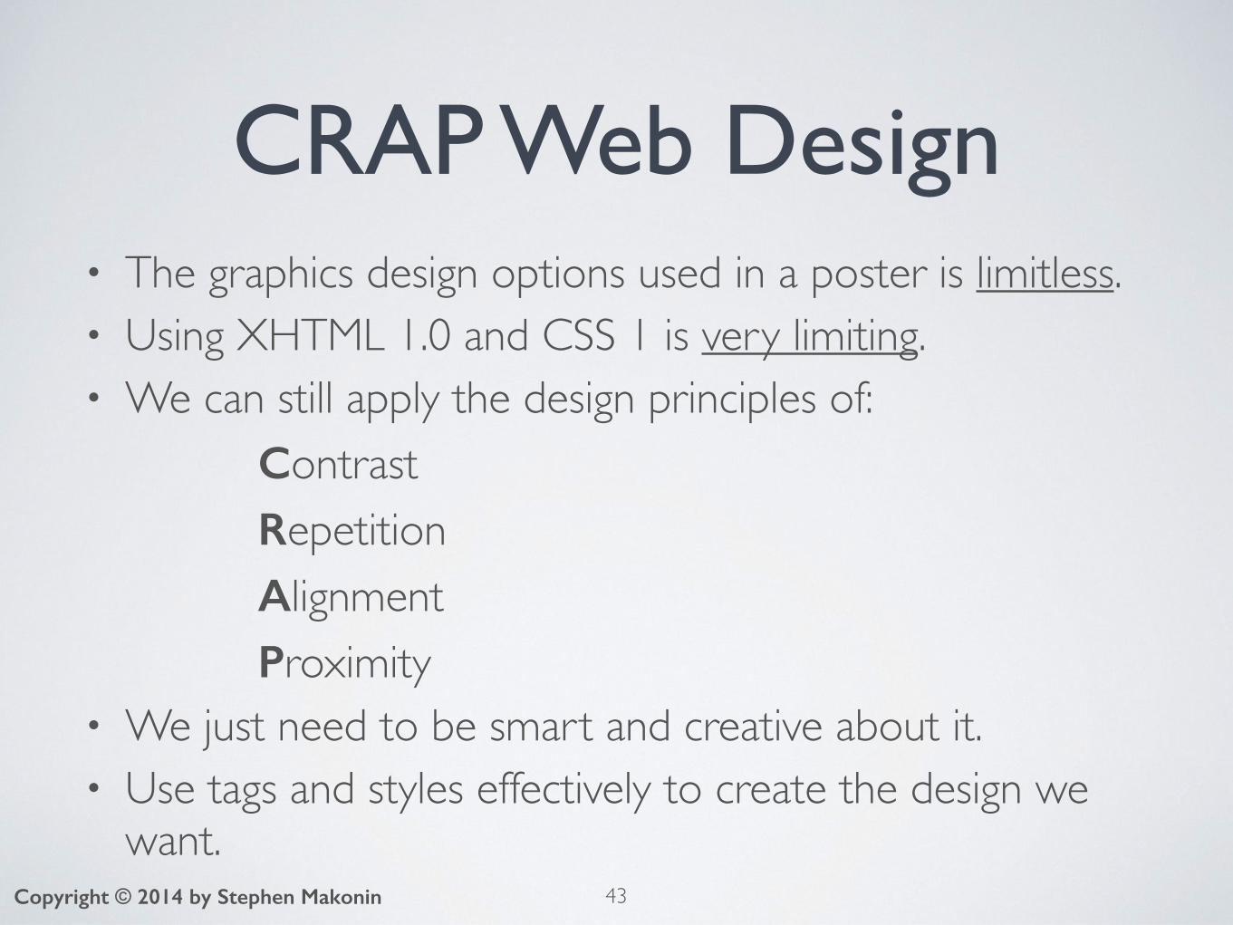
CRAP Web Design• The graphics design options used in a poster is limitless.• Using XHTML 1.0 and CSS 1 is very limiting.• We can still apply the design principles of:
ContrastRepetitionAlignmentProximity
• We just need to be smart and creative about it.• Use tags and styles effectively to create the design we
want.43Copyright © 2014 by Stephen Makonin

CRAP Web DesignC is for Contrast
44Copyright © 2014 by Stephen Makonin
To achieve contrast on a web page you need to:• Make sure your headings are really different then other
elements (e.g. paragraphs and lists):• Use font-‐family to vary the typeface.• Use font-‐size to vary the size of the font.
• Separate different sections with borders and/or different background colour or image.
• Have the foreground elements distinguishable from the background style.
• Make sure hyperlink as easy to spot and click on.
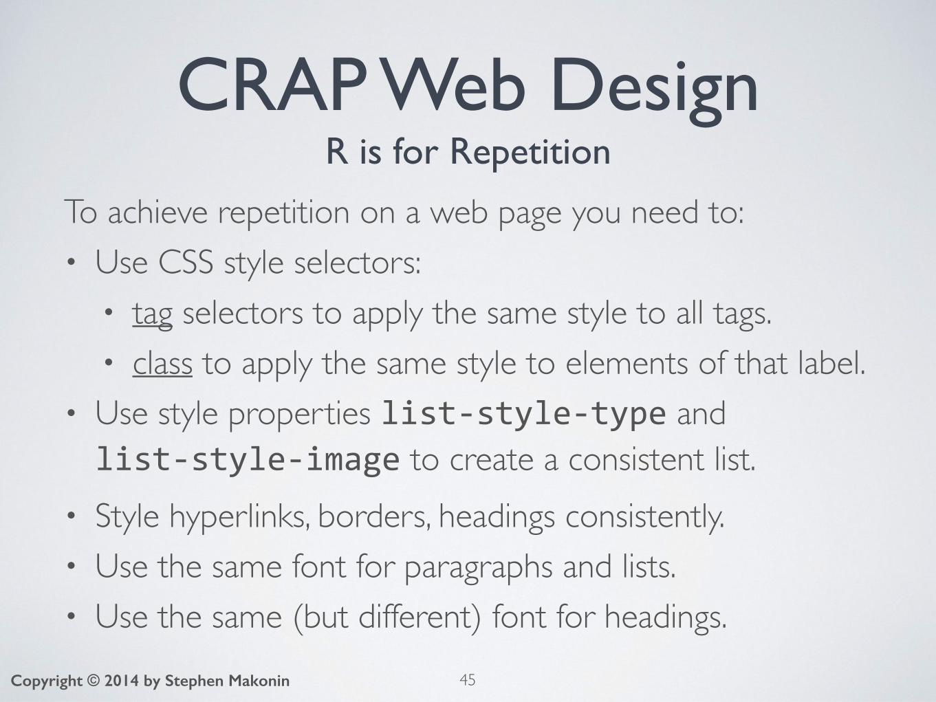
CRAP Web DesignR is for Repetition
To achieve repetition on a web page you need to:• Use CSS style selectors:
• tag selectors to apply the same style to all tags.• class to apply the same style to elements of that label.
• Use style properties list-‐style-‐type and list-‐style-‐image to create a consistent list.
• Style hyperlinks, borders, headings consistently.• Use the same font for paragraphs and lists. • Use the same (but different) font for headings.
45Copyright © 2014 by Stephen Makonin

CRAP Web DesignA is for Alignment
Web pages use strong left alignment. To achieve good alignment on a web page you need to:• Use CSS style properties:
• text-‐align to:• centre, right justify inline elements and content• full-text justification for paragraphs
• float to:• align block elements and images left or right
46Copyright © 2014 by Stephen Makonin
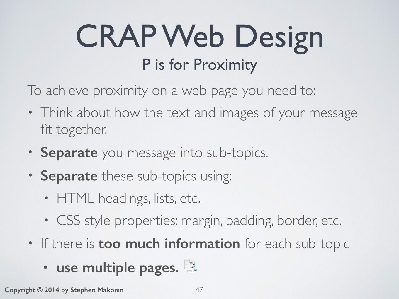
CRAP Web DesignP is for Proximity
To achieve proximity on a web page you need to:• Think about how the text and images of your message
fit together.• Separate you message into sub-topics.• Separate these sub-topics using:
• HTML headings, lists, etc.• CSS style properties: margin, padding, border, etc.
• If there is too much information for each sub-topic• use multiple pages. 📑
47Copyright © 2014 by Stephen Makonin
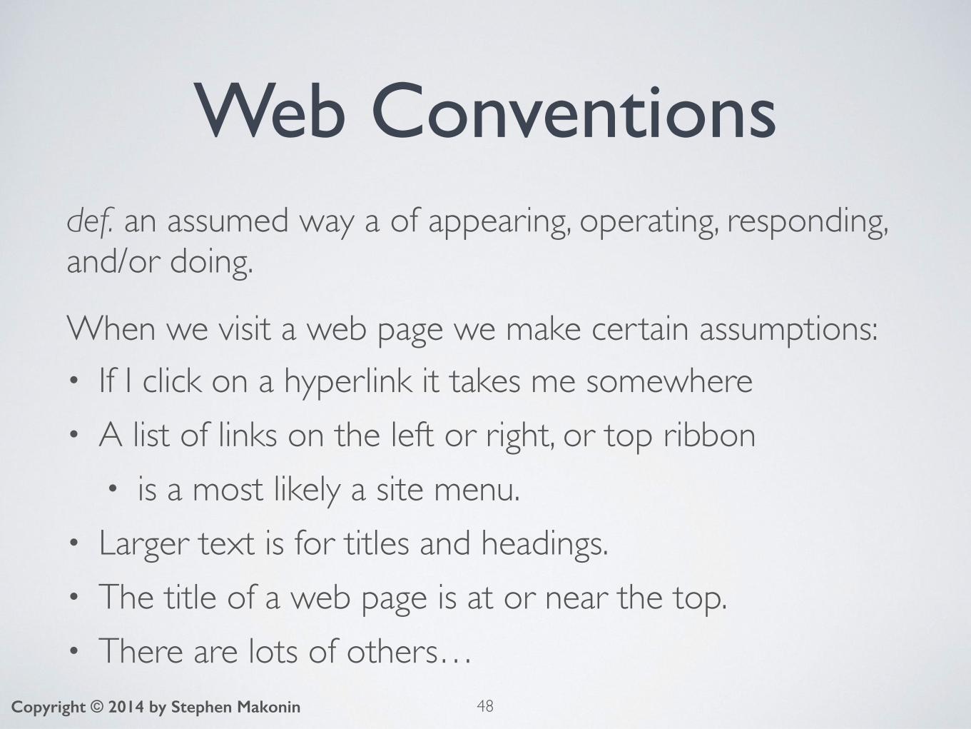
Web Conventionsdef. an assumed way a of appearing, operating, responding, and/or doing.
When we visit a web page we make certain assumptions:• If I click on a hyperlink it takes me somewhere• A list of links on the left or right, or top ribbon
• is a most likely a site menu.• Larger text is for titles and headings.• The title of a web page is at or near the top.• There are lots of others…
48Copyright © 2014 by Stephen Makonin

Using Conventions• Use these conventions to your advantage:
• allows the visitor to easily use your website.• visitor can concentrate on reading your message.• not figuring out how to navigate your website.
• Most conventions are de facto because they are commonly used amongst all websites.
• People visit other websites more often than yours.• Having a website that does not use conventions will
cause frustration and confusion.
49Copyright © 2014 by Stephen Makonin

Web Readability def. how well a visitor can read/understand your message.• Most do not read a website from top to bottom• They scan quickly trying to find the information they
want.
50Copyright © 2014 by Stephen MakoninImage from http://www.nngroup.com/articles/f-shaped-pattern-reading-web-content/
A Heat Map: tracked the eye movements of a person visiting a website.
It clearly shows that the web page is scanned for information on read from top to bottom.
Notice an “F” pattern?
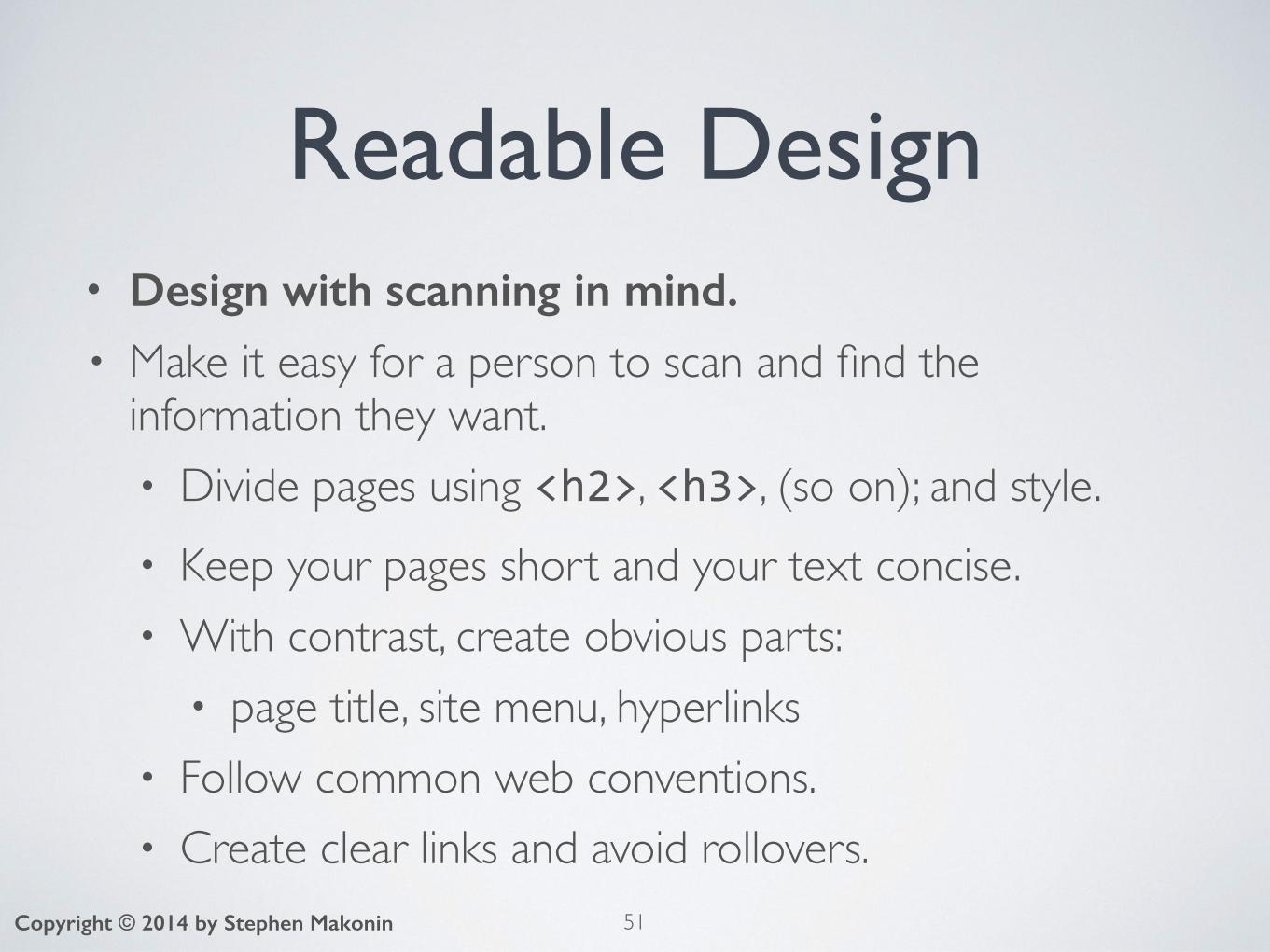
Readable Design• Design with scanning in mind. • Make it easy for a person to scan and find the
information they want.• Divide pages using <h2>, <h3>, (so on); and style.• Keep your pages short and your text concise.• With contrast, create obvious parts:
• page title, site menu, hyperlinks• Follow common web conventions.• Create clear links and avoid rollovers.
51Copyright © 2014 by Stephen Makonin

Writing for the WebWriting for a book or magazine:
Writing for a website:
52Copyright © 2014 by Stephen Makonin
Nebraska is filled with internationally recognized attractions that draw large crowds of people every year, without fail. In 1996, some of the most popular places were Fort Robinson State Park (355,000 visitors), Scotts Bluff National Monument (132,166), Arbor Lodge State Historical Park & Museum (100,000), Carhenge (86,598), Stuhr Museum of the Prairie Pioneer (60,002), and Buffalo Bill Ranch State Historical Park (28,446).
In 1996, six of the most-visited places in Nebraska were: • Fort Robinson State Park • Scotts Bluff National Monument • Arbor Lodge State Historical Park & Museum • Carhenge • Stuhr Museum of the Prairie Pioneer • Buffalo Bill Ranch State Historical Park

Clear Readable LinksThe old way:
The new, more better way:
53Copyright © 2014 by Stephen Makonin
<a href="xyz.html">Click here</a> for more information about XYZ.
We also have <a href="xyz.html">more information about XYZ</a>.
Click here for more information about XYZ.
We also have more information about XYZ.Search Engine Friendly
👍

Avoid Rollovers (if possible)
peek-a-boo? 😳
54Copyright © 2014 by Stephen Makonin
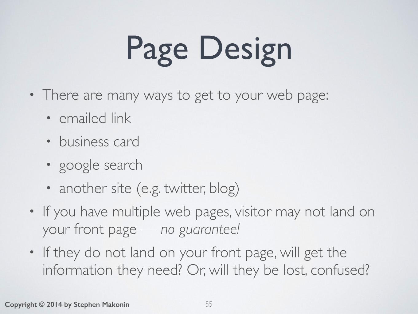
Page Design• There are many ways to get to your web page:
• emailed link• business card• google search• another site (e.g. twitter, blog)
• If you have multiple web pages, visitor may not land on your front page — no guarantee!
• If they do not land on your front page, will get the information they need? Or, will they be lost, confused?
55Copyright © 2014 by Stephen Makonin
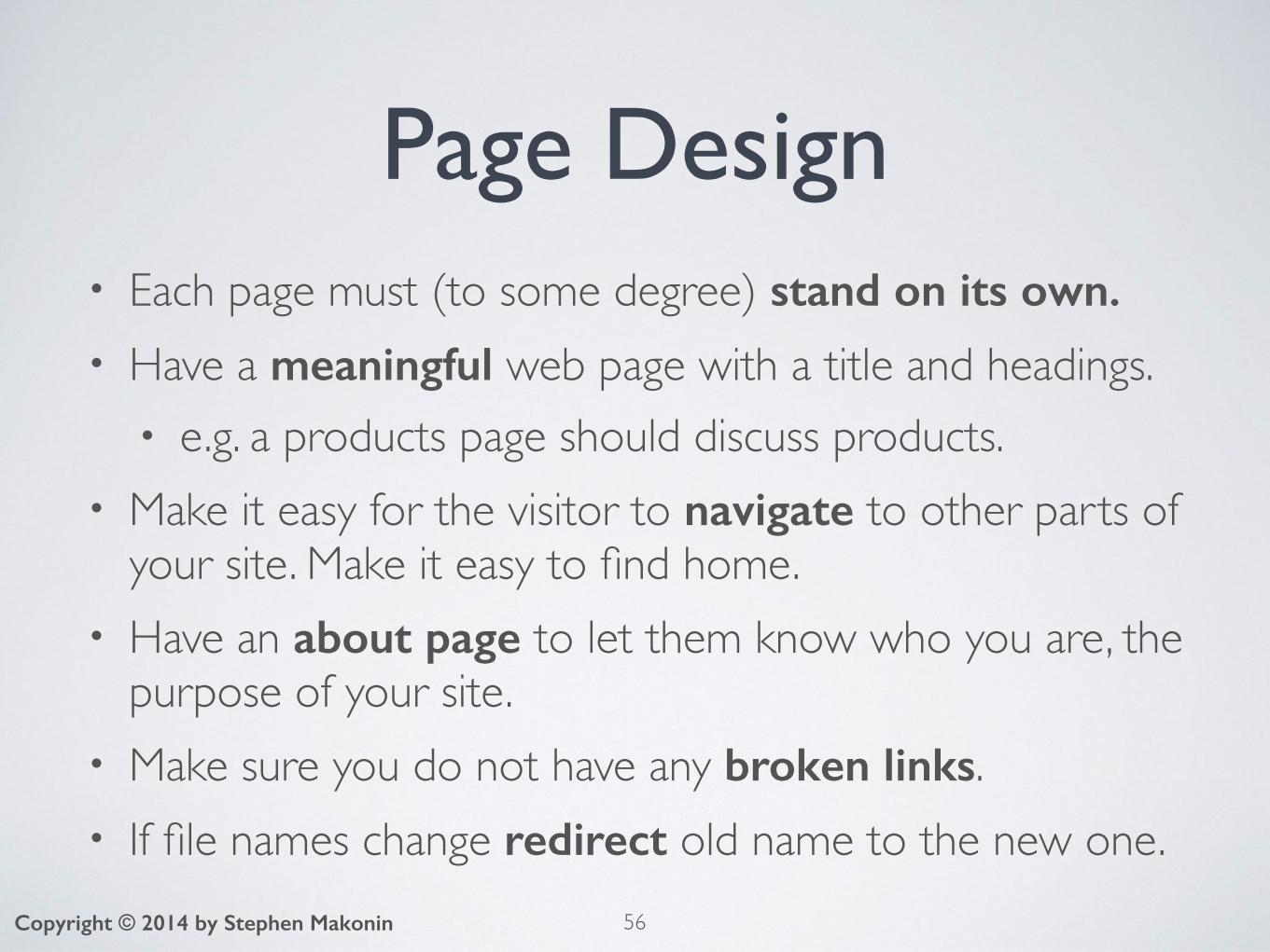
Page Design• Each page must (to some degree) stand on its own.• Have a meaningful web page with a title and headings.
• e.g. a products page should discuss products.• Make it easy for the visitor to navigate to other parts of
your site. Make it easy to find home.• Have an about page to let them know who you are, the
purpose of your site.• Make sure you do not have any broken links.• If file names change redirect old name to the new one.
56Copyright © 2014 by Stephen Makonin

Krug’s UsabilityKrug’s three facts of life:
1. We don’t read pages, we scan them.
2. We don’t make optimal choices, we satisfy.
3. We don’t figure out how things work, we muddle through.
57Copyright © 2014 by Stephen MakoninBuy from Amazon
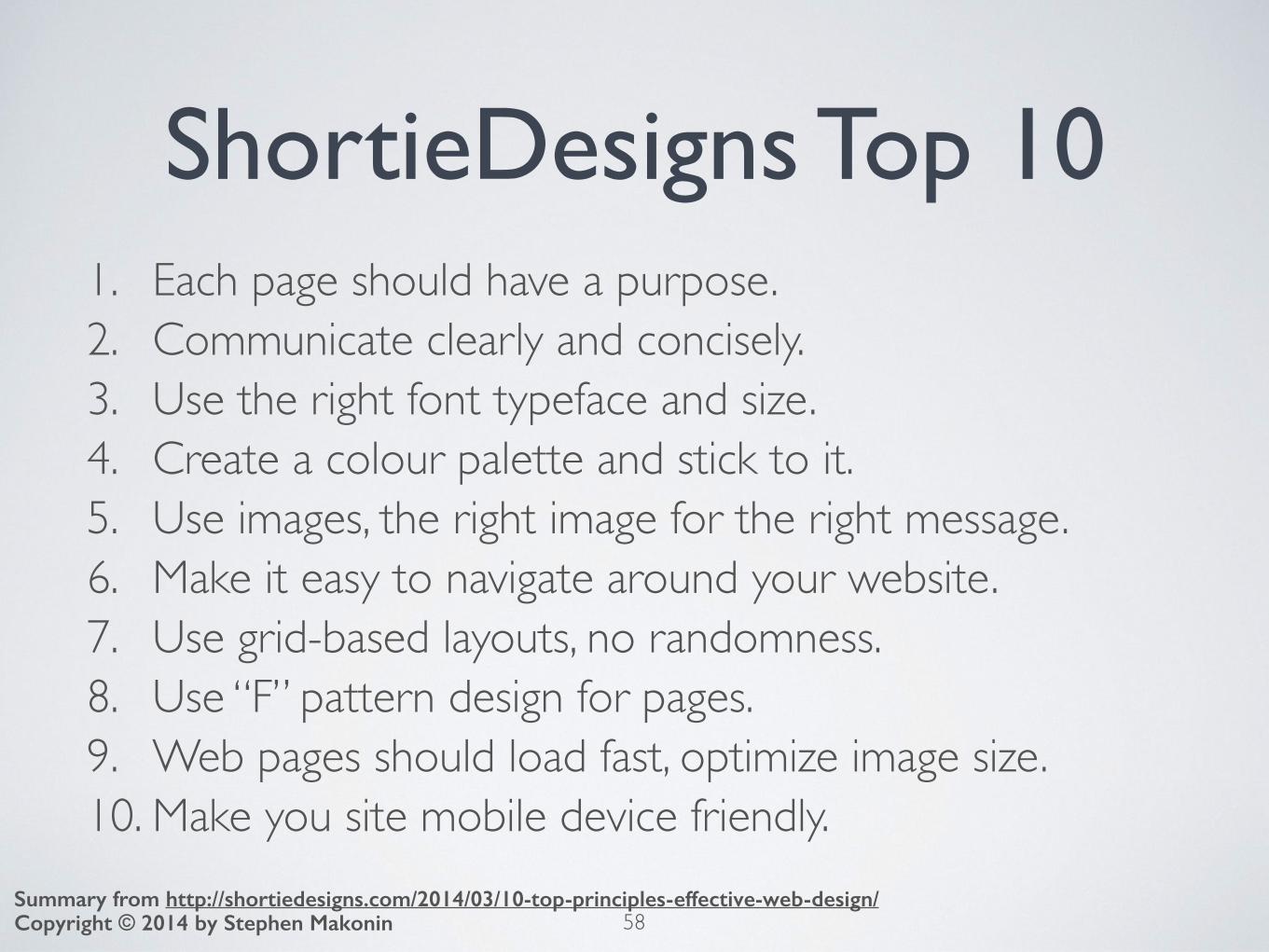
ShortieDesigns Top 101. Each page should have a purpose.2. Communicate clearly and concisely.3. Use the right font typeface and size.4. Create a colour palette and stick to it.5. Use images, the right image for the right message.6. Make it easy to navigate around your website.7. Use grid-based layouts, no randomness.8. Use “F” pattern design for pages.9. Web pages should load fast, optimize image size.10. Make you site mobile device friendly.
58Copyright © 2014 by Stephen MakoninSummary from http://shortiedesigns.com/2014/03/10-top-principles-effective-web-design/

Summary• Learnt about general design principles.• Looked at how to apply these to web pages.• Discussed the ideas of conventions and readability.• Provide a basis for use with assignments — practice. • Looked at other design considerations.
Next Unit: an introduction to programming.
59Copyright © 2014 by Stephen Makonin

60
QUESTIONS?
Copyright © 2014 by Stephen Makonin