lenovo final report
TRANSCRIPT

Page 1 of 19
Department of Industrial and Systems Engineering
ISE 589, Stochastic Modeling – Dr. Julie Ivy
Course Project Report
Lenovo Quality Issue Analysis and Alerting System
Authors- Yogesh Kulkarni
Bahar Ostadrahimi Kiran Prasad
Shruti Rai Timothy Sawicki
CB
D
H
30%
30%
20%
20%
10%
E
20%

Page 2 of 19
Table of contents
EXECUTIVE SUMMARY 3
INTRODUCTION 4
METRIC COMPARISON AND SELECTION 4
METHODOLOGY 8
ASSIGNING STATES TO CHANGE IN NCR 9
THREAT LEVELS 10
TRANSFORMING STATES IN TO THREAT LEVELS 11
INCORPORATING COSTS IN THE MODEL 12
DEVELOPING AND OPTIMAL POLICY 13
CONCLUSION 15

Page 3 of 19
Executive Summary
Lenovo currently suffers from an entirely reactionary, damage-control oriented quality
control policy, and seeks to alleviate this by implementing a more proactive method that
identifies potential quality issues anywhere from one to five weeks prior to their current initial
reaction. While achieving this, it is acceptable for the new approach to be overly sensitive and
generate some false alarms due to the 1:5 cost ratio associated with false alarms versus not
reacting properly to an actual issue.
Under these guidelines, several data sets and metrics provided by Lenovo were analyzed,
and it was ultimately decided that call center data and the ratio of negative comments to total
product to date proved the most useful for the cause. This NCR metric was then converted to a
rate change, of which the long term probabilities of seeing a particular rate change were found.
Finally, a 1 to 10 score system called a “Threat Level chain” (which intuitively operates much
like any generic tiered alert system) acts as a means of tracking past rate changes (with a slight
bias towards increases in threat levels). Once too many consistently large rate changes were
experienced, the model would eventually reach levels 8 through 10 and signal an alert. Some
assumptions used to create this model can easily be replaced by actual figures likely readily
available to Lenovo, though sensitivity analysis proved that the alerting outcomes should change
little, if at all.
This model successfully designated the necessity for action within the allotted time
windows for all four provided products (X, Y, Z, and B), and was overall fairly conservative on
false positives, only issuing two for even the largest data set (X). Despite these promising results,
it is believed that the model is primarily more appropriate for long term assessments, as rate
changes are extremely volatile and unreliable for short term usage (and early weeks were often
exempt accordingly), but further testing could in fact prove the validity for both. Since this is a
Markovian model, our research team recommends investigating the model’s capacity for
predicting potential issues versus detecting them via real-time trends as an easy next step.
Overall, the model seems promising and our research team feels extremely confident in its ability
and accuracy, of which can be further improved via some additional data-centric tweaking.

Page 4 of 19
Introduction
Lenovo’s quality control measures currently suffer from what they diagnose as a strictly
reactionary policy, where corrective actions for alleviating quality issues are taken only after
surpassing an already reputation-threatening and economically detrimental threshold of reports.
Lenovo desires a more anticipatory, proactive analytical method capable of detecting indicative
warning signs a few weeks’ sooner than their current methodology (anywhere from one to five
weeks). To aid in this objective, Lenovo provided a set of negative feedback data based on
comparable electrical components from four different products that are sourced from both social
media sites and Lenovo’s own call center, of which are translated into three related metrics. This
project aims to use one or more of these metrics as a basis for a model that dependably alerts within
the desired time frame.
However, the nature of prediction inherently lends to false positives being inevitable,
which come at a cost for Lenovo; the model must ensure that false positives only happen at a
maximum rate of four out of every five ‘warnings’, or recommendations to take action, in order
for the new model to be considered economically effective. With these considerations, the
methodologies of this project centralize on accurately dissecting each metric and analytically
assessing their capacities for prediction, modeling the behaviors of the preferred metrics, and
ultimately translating those behaviors into a consistent prediction and action scheme that addresses
Lenovo’s criteria through a Markov decision process.
Metric comparison and selection
The data provided by Lenovo consists of three different but relatable weekly measurements
of negative feedback, each dubbed as ‘Negative Count’ (NC), ‘Negative Percent’ (NP), and
‘Negative Comments Ratio’ (NCR). Both NP and NC operate as intuitively as their name suggests;
NC represents the total number of negative comments received for a component of the given
product in a given week, and relatedly, NP is the percentage of all negative comments for a given
product that were exclusive to that component within the product. Finally, NCR represents the
ratio of total negative comments for that component to the total number of that product shipped to
date.

Page 5 of 19
Given the definition of these metrics, our project team drew conclusions as to which
metric(s) would be more conducive to being the basis for the model. For instance, while the NC is
fundamental for computing the other two metrics, it only expresses what one would intuitively
assume in the first place; NC will almost certainly and unwaveringly trend upward over any
extension of time. Such expectations exist for a variety of reasons, including an overall numeric
increase in total distributed products, or the likely increase of failures over the lifetime usage or
age of a product. Furthermore, raw NC values are completely ambiguous in terms of indicating
the severity or likelihood of a problem, as there are no means of independently normalizing or
comparing it to the entire distribution numbers of the product. For instance, 15 negative comments
hold significantly more weight when only 100 products have been distributed versus 100,000
products. Consequently, this renders this metric largely useless without supplemental information.
The NP metric also suffers from this shortcoming in that although the number of negative
comments for that component are put in the context of all negative comments for the product, it is
impossible to assess the actual number of products affected. That is, if some week exhibits a 5%
NP, it is impossible to know whether that percentage relates to 100 or 100,000 total product units.
Consequently, NCR, by its construction, then offers a very distinct and essential advantage
in that it expresses the week’s negative comments relative to the total number of products
distributed to date, which means that each weekly NCR value is normalized and thus directly
comparable to one another without any additional alterations or referencing of the other two
metrics. More specifically, any change in NCR is a direct indication that there is an overall change
in the relative number of effective products. For instance, if one observes an NCR change from
0.0005 to 0.0006 for any two weeks, this irrefutably translates to an overall increase in negative
comments received relative to the number of products distributed. This behavior is extremely
valuable and lays a solid foundation for a reliable metric to build the model on.
Of course, this does not address the natural inclination of wanting to combine the NC or
NP metrics with NCR to create a more inclusive metric, but ultimately NCR renders these
considerations mostly irrelevant. More specifically, there is minimal, if any, practical or
immediately relevant information gained from such a procedure. The comment numbers
themselves are only useful for generating the metrics, and everything else needed is overall
provided by NCR; adding anything else is merely enabling further noise or unnecessary
Page 6 of 19
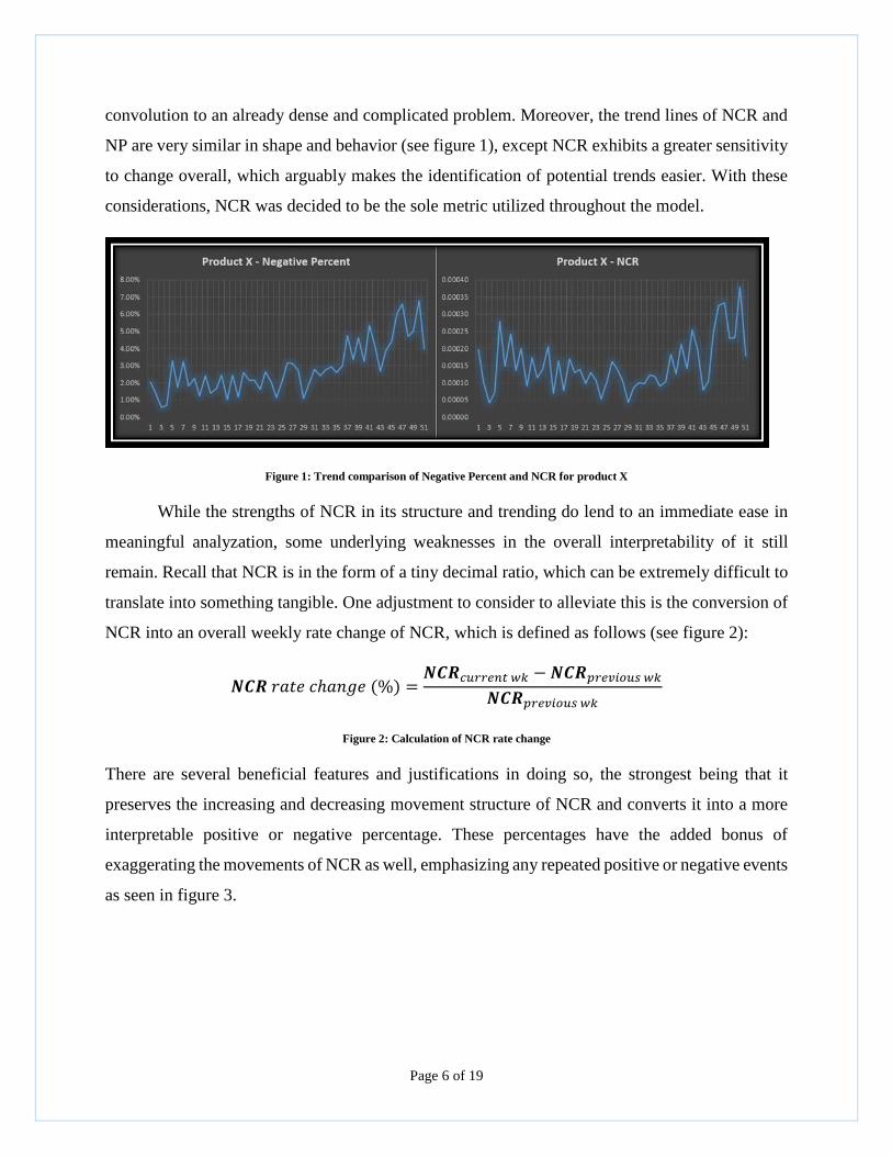
convolution to an already dense and complicated problem. Moreover, the trend lines of NCR and
NP are very similar in shape and behavior (see figure 1), except NCR exhibits a greater sensitivity
to change overall, which arguably makes the identification of potential trends easier. With these
considerations, NCR was decided to be the sole metric utilized throughout the model.
Figure 1: Trend comparison of Negative Percent and NCR for product X
While the strengths of NCR in its structure and trending do lend to an immediate ease in
meaningful analyzation, some underlying weaknesses in the overall interpretability of it still
remain. Recall that NCR is in the form of a tiny decimal ratio, which can be extremely difficult to
translate into something tangible. One adjustment to consider to alleviate this is the conversion of
NCR into an overall weekly rate change of NCR, which is defined as follows (see figure 2):
𝑵𝑪𝑹 𝑟𝑎𝑡𝑒 𝑐ℎ𝑎𝑛𝑔𝑒 (%) =𝑵𝑪𝑹𝑐𝑢𝑟𝑟𝑒𝑛𝑡 𝑤𝑘 − 𝑵𝑪𝑹𝑝𝑟𝑒𝑣𝑖𝑜𝑢𝑠 𝑤𝑘
𝑵𝑪𝑹𝑝𝑟𝑒𝑣𝑖𝑜𝑢𝑠 𝑤𝑘
Figure 2: Calculation of NCR rate change
There are several beneficial features and justifications in doing so, the strongest being that it
preserves the increasing and decreasing movement structure of NCR and converts it into a more
interpretable positive or negative percentage. These percentages have the added bonus of
exaggerating the movements of NCR as well, emphasizing any repeated positive or negative events
as seen in figure 3.

Page 7 of 19
Figure 3: Trend of rate change in NCR for Product X
Conversely, the rate change in NCR lends to some definitive weaknesses (though the most
detrimental of which can be mostly accommodated for). The largest is that rate changes in the
short run (anywhere from the first five to ten weeks) will be extremely volatile, if not completely
useless, largely due to the first few rate changes being incredibly inflated. As a simple example, a
change from one to five negative comments is a 400% increase. One solution, and the one utilized
by our team, is to exclude the first several weeks of data (per the user’s discretion), as early data
is arguably rarely definitive enough to base a decision on in the first place, and so one can
justifiably nullify most of the inherent weakness of using rate changes. Also, the overall trend line
is lost by converting it to a rate change. As such, if the data set constantly fluctuates, it can become
difficult to visualize the overall trending of the data via a rate change of NCR as compared to just
plotting the unaltered NCR. If necessary, one can simply use the rate change in tandem with the
visual aid of the unaltered NCR to alleviate this.
As a final remark with respect to the metrics themselves, there are of course two
independent sources of NCR data for every product, as Lenovo collected data from both social
media websites and their own call center. Ultimately, the entire data set is already fairly limited,
but the extreme sparsity of the social media set renders it extremely difficult to draw any
conclusions from as seen from figure 4. This, culminating with the availability of the more
dependable and populated call center data, ultimately concludes with social media data being
entirely exempt from this study.
-100.00%
-50.00%
0.00%
50.00%
100.00%
150.00%
6 8 11 13 15 17 19 21 23 25 27 29 31 33 35 37 39 41 43 45 47 49 51 53
Product X - % Change in NCR

Page 8 of 19
Figure 4: Trend Comparison of Call Center and Social Media NCR for Product X
Methodology
Before discussing the methodologies used, it is important to remark that many of the
coming operations or decisions are often interdependent and not natural bi-products of an obvious
“first A, then B” structure or progression with their creation. More specifically, some of the initial
framework had some structural stipulations or adjustments made based off of future findings or
creations. While potentially obvious in terms of how any development process goes, this mindset
may help with understanding some of the following procedures, as often some ideas may seem a
little disjointed and require the entire structure to be fleshed out to grasp its overall cohesion.
In terms of the data itself, only a subset of each of the product’s data was considered, as
our team acted with the assumption that only the data up until a case was resolved was actually
valid for detections due to the potential for the behavior of the product being drastically effected
after a problem resolution. This translates to including all data up to weeks 83, 21, 55, and 28 for
products X, Y, Z and B, respectively. It is also important to remark on another assumption: due to
the overall comparability of the items in this study and the limitations on the available data, the
data sets were combined, and a generalized model was created instead of four individualized
models. The individual data sets did not vary enough from the combined sets to be of any real
concern, and (as it turns out) the generalized model ends up detecting issues for all products in a
reasonable enough manner regardless. In the end, it is up to the user as to whether to a generalized
or individual model is more appropriate, but there will be some additional explanation as to why a
general model could be necessary further on.

Page 9 of 19
Assigning States to change in NCR
With these considerations, the rate change of NCR calculations for each product are
performed, and the general distribution of these rate changes are plotted altogether via a box and
whisker graph in order to obtain a better intuition of the rate changes. The goal of looking at these
distributions is to help properly divide the data into categorical percentage windows and use those
categories to map the weekly movements from one category to the next. Figure 5 below shows the
box plot of our data, along with the category distributions A through I.
Figure 5: Box Plot distribution for rate of change in NCR
There are two relevant matters to mention with regards to this category creation: first, the
number of categories is not an arbitrary decision; it is a product of wanting small enough windows
to accurately track movement, yet also not having them be so small that the data becomes too
spread out (this will prove relevant later). Secondly, the number of categories that house the
positive values is intentionally skewed to outnumber the categories that hold negative values. This
is to ensure later on that the model will end up being somewhat oversensitive by encouraging
movement towards an alerting state.
As previously mentioned, the weekly movements between each category can now be traced
by going back to the data sets and assigning the appropriate category to each weekly rate change,
and then tracking the weekly category transitions. For instance, the weekly changes from category
A to category B will have its own count associated with it. Through this, the probability of
changing from one category to another can be determined by the formula shown in figure 6:
𝑃(𝑐𝑎𝑡𝑒𝑔𝑜𝑟𝑦 𝑋 → 𝑌) =# 𝑜𝑓 𝑡𝑟𝑎𝑛𝑠𝑖𝑡𝑖𝑜𝑛𝑠 𝑓𝑟𝑜𝑚 𝑋 → 𝑌
𝑡𝑜𝑡𝑎𝑙 # 𝑜𝑓 𝑡𝑟𝑎𝑛𝑠𝑖𝑡𝑖𝑜𝑛𝑠 𝑖𝑛 𝑡ℎ𝑒 𝑑𝑎𝑡𝑎 𝑠𝑒𝑡
Figure 6: Calculation of Transition Probability in going from State X to State Y
Page 10 of 19
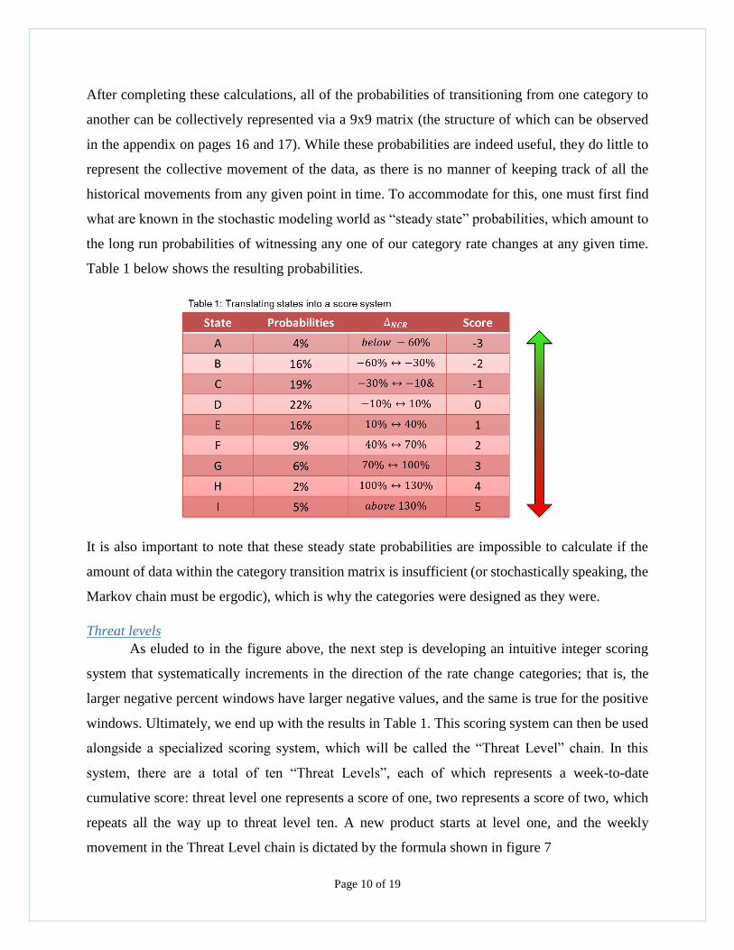
After completing these calculations, all of the probabilities of transitioning from one category to
another can be collectively represented via a 9x9 matrix (the structure of which can be observed
in the appendix on pages 16 and 17). While these probabilities are indeed useful, they do little to
represent the collective movement of the data, as there is no manner of keeping track of all the
historical movements from any given point in time. To accommodate for this, one must first find
what are known in the stochastic modeling world as “steady state” probabilities, which amount to
the long run probabilities of witnessing any one of our category rate changes at any given time.
Table 1 below shows the resulting probabilities.
It is also important to note that these steady state probabilities are impossible to calculate if the
amount of data within the category transition matrix is insufficient (or stochastically speaking, the
Markov chain must be ergodic), which is why the categories were designed as they were.
Threat levels
As eluded to in the figure above, the next step is developing an intuitive integer scoring
system that systematically increments in the direction of the rate change categories; that is, the
larger negative percent windows have larger negative values, and the same is true for the positive
windows. Ultimately, we end up with the results in Table 1. This scoring system can then be used
alongside a specialized scoring system, which will be called the “Threat Level” chain. In this
system, there are a total of ten “Threat Levels”, each of which represents a week-to-date
cumulative score: threat level one represents a score of one, two represents a score of two, which
repeats all the way up to threat level ten. A new product starts at level one, and the weekly
movement in the Threat Level chain is dictated by the formula shown in figure 7

Page 11 of 19
𝑇𝐿𝑐𝑢𝑟𝑟𝑒𝑛𝑡 = min(max(𝑇𝐿𝑝𝑟𝑒𝑣𝑖𝑜𝑢𝑠 + %𝑁𝐶𝑅 𝑆𝑐𝑜𝑟𝑒𝑐𝑢𝑟𝑟𝑒𝑛𝑡 , 1) , 10)
Figure 7: Formula for calculating Threat Level
where TL and %NCR are the respective score numbers associated with them. While the formula
can seem a bit convoluted, it merely means that the score is bounded between one and ten. In fact,
all of the probabilities relating to the categories that would cause movement beyond the bounded
region accumulate on the respective bounded threat level, as shown in figure 8 below, where we
are currently in threat level one.
Figure 8: Threat Level one and accumulating its backend probabilities.
Transforming states in to Threat Levels
The current threat level will of course change as time passes, and the probabilities of
shifting to a new threat level will equally transition with it; basically, the threat level change
probabilities are not influenced by the severity of the current threat level aside from the
accumulation factor discussed above. Also, as determined by the score structure, only a maximum
number of states can ever be jumped. As before, the total collective possible movements in threat
level can then be more easily represented as a matrix as shown in figure 9.

Page 12 of 19
However, this matrix only represents events unfolding while Lenovo simply sits idly by; a
pretty unrealistic scenario by any account. Lenovo can elect to try and circumvent further negative
activity at any point by investigating the potential quality issue. This ability will spawn another
assumption for the model, where it is assumed that any investigative action pursued by Lenovo
causes a reset in the Threat Level chain, regardless of the actual existence of a quality problem (in
terms of the matrix, every row changes to the same probability as threat level one).
Incorporating costs in the model
Naturally, there are consequences to investigating a potential quality problem, which
manifest as monetary costs. As provided by Lenovo, there is a 1:5 expenditure ratio when it comes
to false positives (investigating when there is no issue) versus false negatives (not investigating
when there is an issue), respectively; this encourages Lenovo to investigate and be on the safe side
(or being “oversensitive” to issues), but it will certainly add up if investigations are consistently
misappropriated. Also, the costs of properly investigating when there was an issue are assumed to
sit somewhere in the middle of this ratio (i.e. 2.5, though Lenovo will have that data), and not
investigating when there is no issue is assumed to have no cost.

Page 13 of 19
While the cost figures are static in nature, the actual incurred costs are entirely dependent
on the likelihood that a quality issue is present. Though Lenovo did not provide such figures, it
turns out that Lenovo had recently released a quality report regarding their mean laptop failure
rates per year, of which they estimated to be around 6.31%
(http://www.partnerinfo.lenovo.com/partners/us/products/downloads/thinkcentre-mseries/TBR-
Quality-Study-ExecSummary.pdf). Extrapolating from this, it is assumed that double this amount
would likely be an unquestionable cause for alarm, so that failure rate is assigned to threat level
ten, and this probability is then decremented for each previous threat level, giving the mean failure
rate to threat level three. The assumed probability of occurrence of a quality issue associated with
being in a threat level is shown in table 3.
Table 3: Probability of quality issue associated in each Threat Level
Then the cost for operating in any given threat level and choosing to investigate (I) or not (NI)
amounts to either 𝐶𝑜𝑠𝑡𝑇𝐿(𝐼) and 𝐶𝑜𝑠𝑡𝑇𝐿(𝑁𝐼) as defined by the formulas in figure 10:
𝐶𝑜𝑠𝑡𝑇𝐿(𝐼) = 𝑝(𝑄𝐼𝑇𝐿) ∗ 2.5 + (1 − 𝑝(𝑄𝐼𝑇𝐿)) ∗ 1
𝐶𝑜𝑠𝑡𝑇𝐿(𝑁𝐼) = 𝑝(𝑄𝐼𝑇𝐿) ∗ 5 + (1 − 𝑝(𝑄𝐼𝑇𝐿)) ∗ 0
Figure 9: Calculation of costs
where 𝑝(𝑄𝐼𝑇𝐿) refers to the probability of experiencing a quality issue as given in table 2.
Developing and optimal policy
With these costs and probabilities accounted for, the optimal decision policy is now easily assessed
with linear programming. The program essentially accounts for all potential costs and their relative

Page 14 of 19
likelihoods and then designates which threat levels should require an investigation based solely on
the economic efficiency of that decision. In this case, it ends up that threat levels eight, nine, and
ten should always trigger an investigation. One might question the degree of robustness in this
recommendation, as there were many assumptions made along the way to reach this conclusion.
A range of sensitivity analysis is provided within the appendix (page 18), which to summarize,
shows that the model is not susceptible to minor, or even moderate, changes in these assumptions.
In terms of translating this model into real world usage, an emulation of this model
alongside the data of product X gives an example as to its effectiveness in figure 11 below:
Figure 10: Results of application of optimal policy in Product X
As observed, the model is both well within the maximum of four false positives threshold (in fact,
they may not even be false positives at all, but such was assumed strictly for comparison purposes),
and it recommends an investigation slightly sooner than the five week window requested by
Lenovo. Similar proactive results were observed utilizing the same comparison for products Y, Z,
and B, where investigations are triggered a few weeks prior to Lenovo’s action time (and product
B designated an investigation where Lenovo did not incite one). Though it is difficult to remark
on the overall legitimacy of these seeming accuracies given the limited number of data sets, it does
appear fairly promising.
Recommendations
Despite the model’s overall accuracy, there are numerous expansions, additional
improvements, or trials that are recommended. Perhaps the most useful and easy exercise is
exploring the model’s accuracy in its predictions. That is, since the model is Markovian, one can
predict the average amount of time it will take to reach an alerting threat level given any current
threat level. Another approach would be developing a few different probability matrices, where a

Page 15 of 19
product potentially behaves differently after an investigation is correctly or incorrectly undergone,
which also alludes to changing the way the model “resets” to something perhaps more accurate
than just going back to the first threat level regardless of the situation. Also, given more data, the
model can be generated for each individual product versus constructing a generalized, pooled
model.
Conclusion
Overall, the model appears to operate well under the confines of Lenovo’s desires; the
model succeeded in predicting at least one to five weeks prior to Lenovo’s own alerting times for
every product, and at worst triggered up to only half of the allowable false alarms in the process.
The model itself is based on the assumptions that the first few weeks of data should be ignored
(the amount being at the user’s discretion), that Lenovo wishes to be oversensitive, that the costs
of correctly taking an investigative action fall somewhere between the 1:5 cost ratio provided, that
failure rate chances do not change even if a quality issue is resolved, and that failure rates are
similar to that of their own quality report (6.3%), and consequently, around double that number is
an immense cause for alarm. Given this model’s results, our research team highly recommends it
for at least long term predictions, but percentage rate changes could still be a little too volatile for
early predictions. With additional testing, short term predictions could also be confirmed as
similarly valid.

Page 16 of 19
Appendix
State Transition Matrix for Product X
States A B C D E F G H I
A 0% 0% 0% 0% 50% 0% 0% 0% 50%
B 0% 7% 7% 7% 7% 33% 33% 7% 0%
C 5% 14% 10% 24% 43% 5% 0% 0% 0%
D 0% 15% 30% 25% 25% 5% 0% 0% 0%
E 0% 6% 44% 33% 0% 6% 6% 0% 6%
F 11% 44% 22% 11% 0% 0% 0% 0% 11%
G 0% 33% 17% 17% 17% 17% 0% 0% 0%
H 0% 0% 100% 0% 0% 0% 0% 0% 0%
I 0% 67% 0% 0% 33% 0% 0% 0% 0%
State Transition Matrix for Product Y
States A B C D E F G H I
A 0% 25% 0% 75% 0% 0% 0% 0% 0%
B 0% 17% 33% 17% 0% 17% 0% 0% 17%
C 0% 0% 25% 0% 13% 25% 13% 0% 25%
D 9% 9% 9% 36% 9% 9% 0% 0% 18%
E 25% 0% 25% 25% 25% 0% 0% 0% 0%
F 0% 50% 0% 25% 25% 0% 0% 0% 0%
G 0% 100% 0% 0% 0% 0% 0% 0% 0%
H 0% 0% 0% 0% 0% 0% 0% 0% 0%
I 40% 0% 40% 0% 0% 0% 0% 0% 20%
State Transition Matrix for Product Z
States A B C D E F G H I
A 0% 0% 0% 0% 50% 50% 0% 0% 0%
B 0% 0% 0% 13% 25% 25% 13% 13% 13%
C 0% 10% 20% 10% 40% 10% 10% 0% 0%
D 0% 13% 27% 53% 0% 0% 0% 7% 0%
E 0% 30% 20% 30% 20% 0% 0% 0% 0%
F 25% 0% 25% 0% 25% 0% 25% 0% 0%
G 0% 67% 33% 0% 0% 0% 0% 0% 0%
H 0% 0% 0% 100% 0% 0% 0% 0% 0%
I 50% 50% 0% 0% 0% 0% 0% 0% 0%

Page 17 of 19
State Transition Matrix for Product B
States A B C D E F G H I
A 0% 0% 0% 50% 0% 0% 17% 0% 33%
B 0% 50% 0% 50% 0% 0% 0% 0% 0%
C 0% 0% 0% 0% 0% 0% 0% 0% 0%
D 27% 7% 0% 60% 0% 0% 0% 0% 7%
E 0% 0% 0% 0% 0% 0% 0% 0% 0%
F 0% 0% 0% 0% 0% 0% 0% 0% 0%
G 100% 0% 0% 0% 0% 0% 0% 0% 0%
H 0% 0% 0% 0% 0% 0% 0% 0% 0%
I 50% 0% 0% 50% 0% 0% 0% 0% 0%
State Transition Matrix for Generalized model (combined data set)
States A B C D E F G H I
A 0% 17% 0% 17% 33% 17% 0% 0% 17%
B 0% 4% 8% 8% 8% 33% 25% 8% 4%
C 3% 10% 13% 17% 40% 7% 3% 0% 7%
D 3% 14% 23% 40% 11% 3% 0% 3% 3%
E 0% 16% 32% 32% 8% 4% 4% 0% 4%
F 14% 29% 21% 14% 7% 0% 7% 0% 7%
G 0% 50% 25% 0% 13% 13% 0% 0% 0%
H 0% 0% 33% 67% 0% 0% 0% 0% 0%
I 22% 33% 22% 0% 11% 0% 0% 0% 11%

Page 18 of 19
Sensitivity Analysis: Proving Model Robustness –
A. Cost
B. Probability of occurrence of issue at each threat level

Page 19 of 19
Linear Programming equations:
𝑀𝑖𝑛 ∑ ∑ 𝐶𝑖𝑘 . 𝑌𝑖𝑘
𝐾
𝑘
𝑁
𝑖
𝑆𝑇
∑ 𝑌𝑖𝑘 − 𝛽 ∑ ∑ 𝑌𝑖𝑘 . 𝑃(𝑗 |𝑖, 𝑘)
𝐾
𝑘
𝑛
𝑖
𝐾
𝑘
= 𝑎𝑖𝑗
𝑌𝑖𝑘 ≥ 0 , ∑𝑎𝑗 = 1
𝑊ℎ𝑒𝑟𝑒 𝑎𝑗 =1
𝑛𝑢𝑚𝑏𝑒𝑟 𝑜𝑓 𝑠𝑡𝑎𝑡𝑒𝑠