lesson 1 frame the problem and explore the study area
TRANSCRIPT

1
THE VOLATILE LOS ANGELES RIVERis the reason America’s second-largest city was founded in its present southern California location by Spaniards in 1781. (The area was originally settled by the Gabrielino Native American Tribe thousands of years earlier.) Its water was tapped for drinking and irrigation, and a new city spread out from the river across the coastal plain. By the turn of the 20th century, the river was surrounded by a thriving urban center. Every few decades, raging floods would crest the banks at various points, submerging entire neighborhoods. After the historic floods of 1938 that claimed more than 100 lives and washed out bridges from Tujunga Wash to San Pedro, city leaders had seen enough. By 1941 the U.S. Army Corps of Engineers began to straighten, deepen, and reinforce the once wild waterway. Much of its length was eventually lined in concrete, and the river was more or less tamed.
Today, the City of Angels—home to nearly 4 million people—is a vibrant world center of business and culture. Running straight through the heart of the city, the Los Angeles River now serves ably as a flood-control channel. Sadly, this once-bucolic waterway that was so instrumental in the formation of the city became known as something ugly and marginal. Mile after mile of angled concrete appealed only to graffiti artists and filmmakers, and save for the occasional televised rescue of some hapless Angeleno swept away by a winter storm-fed torrent, the river remained a part of the city ignored by most. The negative perception has stuck with the neglected river for decades.
But in recent years, as the city has densified and much of southern California’s wildlands have been appropriated for development, new attention has focused on the river corridor and the scattered pockets of open space that line its length. While it must always serve its important flood control function, the river and adjacent lands are increasingly recognized as under-utilized, providing opportunities for regreening and psychic restoration for human beings in an overbuilt city. Adventuresome and resourceful citizens have discovered peaceful pockets of sanctuary along the river and made these places their own. A vital and concerned activist community has raised awareness of the river and pushed for its beautification and redevelopment.
Lesson
1 Frame the problem and explore the study area
Photo by Los Angeles Times Staff PhotographerCopyright © 1938, Los Angeles Times
Reprinted with permission

Lesson 1: Frame the problem and explore the study area2
In 2005, the city launched a major public works project focused on the human dimensions of the river. A landmark study, the Los Angeles River Revitalization Master Plan, demonstrated the significant potential to improve quality of life for citizens living near the river corridor through wise redevelopment. Mayor Antonio Villaraigosa said at the time: “We have an opportunity to create pocket parks and landscaped walkways...to create places where children can play and adults can stroll.”
According to Villaraigosa, “The Plan provides a 25- to 50-year blueprint for transforming the City’s 32-mile stretch of the river into an ‘emerald necklace’ of parks, walkways, and bike paths, as well as providing better connections to the neighboring communities, protecting wildlife, promoting the health of the river, and leveraging economic reinvestment.”
While the 2005 master plan identified some of the most obvious areas for large-scale regional redevelopment along the river, it stopped short of identifying smaller (and more affordable) neighborhood projects; that work would require a more involved study. With thousands of land parcels strung out along the river, identifying the best places for park development is like looking for that proverbial needle in a haystack. Many factors come into play, among them current land use, demographics, and accessibility.
Ant
hony
Fri
edki
n, P
hoto
grap
her
3
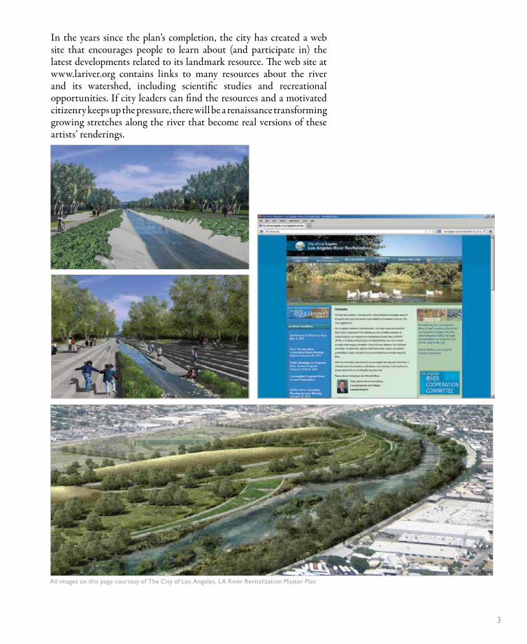
In the years since the plan’s completion, the city has created a web site that encourages people to learn about (and participate in) the latest developments related to its landmark resource. The web site at www.lariver.org contains links to many resources about the river and its watershed, including scientific studies and recreational opportunities. If city leaders can find the resources and a motivated citizenry keeps up the pressure, there will be a renaissance transforming growing stretches along the river that become real versions of these artists’ renderings.
All images on this page courtesy of The City of Los Angeles, LA River Revitalization Master Plan
Lesson 1: Frame the problem and explore the study area4
Here’s where you pick up the thread in this book. You’ll use the city’s real need for river redevelopment as a launching point for a park siting analysis using a geographic information system (GIS). A GIS is ideal for this type of decision-making because it allows you to analyze large amounts of data in a spatial context. In this book, you’ll spend a lot of time with Esri’s ArcGIS® for Desktop software, and by the end you’ll have completed a project from start to finish. Along the way, you’ll gain an excellent grasp of what a GIS can do.
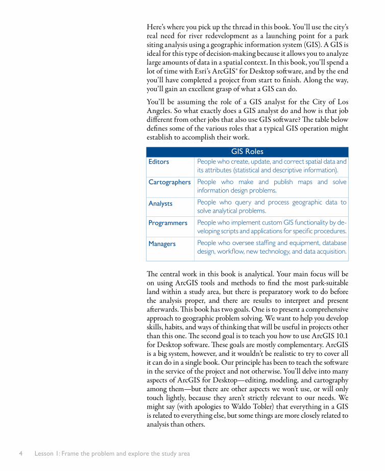
You’ll be assuming the role of a GIS analyst for the City of Los Angeles. So what exactly does a GIS analyst do and how is that job different from other jobs that also use GIS software? The table below defines some of the various roles that a typical GIS operation might establish to accomplish their work.
The central work in this book is analytical. Your main focus will be on using ArcGIS tools and methods to find the most park-suitable land within a study area, but there is preparatory work to do before the analysis proper, and there are results to interpret and present afterwards. This book has two goals. One is to present a comprehensive approach to geographic problem solving. We want to help you develop skills, habits, and ways of thinking that will be useful in projects other than this one. The second goal is to teach you how to use ArcGIS 10.1 for Desktop software. These goals are mostly complementary. ArcGIS is a big system, however, and it wouldn’t be realistic to try to cover all it can do in a single book. Our principle has been to teach the software in the service of the project and not otherwise. You’ll delve into many aspects of ArcGIS for Desktop—editing, modeling, and cartography among them—but there are other aspects we won’t use, or will only touch lightly, because they aren’t strictly relevant to our needs. We might say (with apologies to Waldo Tobler) that everything in a GIS is related to everything else, but some things are more closely related to analysis than others.
People who create, update, and correct spatial data and its attributes (statistical and descriptive information).
People who make and publish maps and solve information design problems.
People who query and process geographic data to solve analytical problems.
People who implement custom GIS functionality by de-veloping scripts and applications for specific procedures.
People who oversee staffing and equipment, database design, workflow, new technology, and data acquisition.
Editors
Cartographers
Analysts
Programmers
Managers
GIS Roles

Frame the problem 5
Frame the problemThe first step in the geographic approach to problem-solving is to frame the problem. What that means, first of all, is coming up with a short statement of what it is you want to accomplish. We want to find a suitable site for a park near the Los Angeles River.
Once you have the statement, you can begin to tease out its ambiguities. What factors make a site “suitable”? Fortunately for us, the city council has already established a concise and fairly specific set of guidelines. They want a park to be developed:
• On a vacant parcel of land at least one acre in size• Within the Los Angeles city limits• As close as possible to the Los Angeles River• Not in the vicinity of an existing park• In a densely populated neighborhood with lots of children• In a lower-income neighborhood• Where as many people as possible can be served
This limits the scope of our inquiry, but it’s far from a complete breakdown of the problem. Some of the guidelines are specific, but others are vague. Familiar concepts are sometimes the hardest to pin down. For example, what income level should count as “lower income”? How are the boundaries of a “neighborhood” established? We can’t solve the big problem until we’ve solved the little problems buried inside it. Usually, however, it’s not possible to address (or even foresee) all the little problems ahead of time.
Data exploration influences the framing of the problem. Do you have income data on hand? If so, is it for individuals or households? Is it average, median, or total? To the extent that the questions themselves are indefinite (what is lower income? how should it be measured?), the data you have available will help shape the answer.
Analysis also influences the framing of the problem. Given that we want a one-acre tract of vacant land, what do we do about adjacent half-acre lots? Is there a tool to combine them? If so, does it have undesired side effects, such as loss of information? Our data-processing capabilities (and our knowledge of them) may determine how we define a “one-acre parcel.”
Even the results of an analysis influence the framing of the problem. Suppose, after having carefully defined the guidelines, we run the analysis and don’t find any suitable sites. Do we report to the city council that there’s just no room for a park anywhere? More likely, we change some of our definitions and run the analysis again.
Framing the problem, therefore, is an ongoing process, one that will occupy us through much of the book.

6
Explore thestudy area 1a
1bDo exploratory
data analysis
What you’ll do in this lesson:
Lesson One roadmap
Youare
here:
1
2
3
4
5
6
7
8
9
Previewdata
Conduct theanalysis
Build thedatabase
Present analysis results
Shareresults online
Frame problemand explorestudy area
Edit data
Choosethe data
Automatethe analysis

Explore the study area 7
Exercise 1a: Explore the study areaIn this exercise, we’ll get to know the Los Angeles River and its surrounding area with maps and data. At the same time, we’ll learn the basics of working with ArcMap: how to navigate a map, how to add and symbolize data, and how to get information about map features.
1) Start ArcMap. We’ll open the ArcMap application.aClick the Windows Start button and choose All Programs
ArcGIS ArcMap 10.1. The application opens with the ArcMap - Getting Started dialog box in the foreground (Figure 1-1). bIn the left-hand window, if necessary, click My Templates.
cClick the Blank Map icon to select it and click OK.A blank map document opens. A map document is a file that contains one or more maps, layouts, and associated layers, tables, charts, and reports.
2) Add a basemap layer. A basemap is a layer of reference geography that forms a backdrop to your map.aOn the Standard toolbar at the top of the application window,
locate the Add Data button . bClick the small drop-down arrow next to the button.
▷ If you click the icon instead of the arrow, an Add Data dialog box will open. Close this dialog box and try again.
cOn the drop-down menu, choose Add Basemap.
Figure 1-1
Other templates are listed here. A template is a
predefined layout, or design, for a map. It may include graphic elements and data. The default template is a blank map.

Lesson 1: Frame the problem and explore the study area8
dIn the Add Basemap window, click Streets to select it (Figure 1-2), then click Add.
You’ll probably be prompted to enable hardware acceleration. (It depends on your computer configuration.)eIf you’re prompted to enable acceleration, click Yes.
This book makes frequent use of online map services; specifically the Streets and Imagery basemaps. One side effect is that there can be complications due to servers, web and network connections, and the processing power of your computer. Therefore, operations in some cases may be slower than you anticipate. Be reasonably patient as you work, and check the Understanding GIS web site (see page xii) for updated information if performance issues persist.
The World_Street_Map basemap layer is added to your map document (Figure 1-3). It has an entry in the Table of Contents
window on the left. At the top of the application is the main menu. Underneath it are two toolbars. The Standard toolbar has generic functions (such as New, Save, Print, Copy, Paste) and buttons to open other windows. The Tools toolbar has navigation tools (such as Zoom In, Zoom Out, and Pan) and other common tools for doing things with maps. There are lots of other toolbars besides these, and we’ll use a couple of them in this lesson.
On the right side of the application are two tabs named Catalog and Search. These tabs are hidden windows. We’ll use both windows a lot in the book, although we won’t get to the Search window for a few more lessons.
Figure 1-2
Figure 1-3
Click the Streets basemap.

Explore the study area 9
Figure 1-4
Basemap layersBasemap layers show reference geography such as street maps, imag-ery, topography, and physical relief. The ones available from the Add Basemap window in ArcMap® are remotely hosted map services that you can navigate, view, and use as backdrops to other data. Basemaps are stored at multiple scales, so that as you zoom in or out you see different amounts of detail. As you navigate a basemap, the various pieces of it (called tiles) that compose your current view are stored locally on your computer in a so-called display cache. When you zoom or pan to a new area, the map may be a little slow to draw, but any place you return to will redraw quickly because the data comes from your cache, not from the remote server.
Figure 1-5
Toolbars and windows can be moved around and resized. Figure 1-3 reflects the default arrangement.
3) Zoom in to Southern California. We’ll zoom in to our area of interest. aOn the Tools toolbar, click the Zoom In tool .
In the map window, click and drag to draw a box around Southern California, as shown in Figure 1-4.
▷ Your box doesn’t have to match exactly.
bUse the Zoom In tool again to get closer. When you see city names and major roads, use the Pan tool to center the view on the Los Angeles area.
cKeep zooming in (try the Fixed Zoom In button , too) until you can easily distinguish cities, freeways, and landmarks such as airports, as in Figure 1-5.
▷ If you zoom in further than you want, use the Zoom Out or Fixed Zoom Out tools to go back.
You probably noticed that no streets were visible at the global scale, and that as you kept zooming in, more and more detail appeared. This is because the basemap is a multiscale map: really a set of maps which turn themselves on and off to display features and symbology that are appropriate to your map scale.
Figure 1-5 shows greater Los Angeles, an area that includes hundreds of incorporated communities and nearby cities.
Draw a box around the area
you want to zoom to.

Lesson 1: Frame the problem and explore the study area10
4) Add a layer of project data. On top of the basemap, we’ll add a layer from the data that has been put together for this project and is stored on your computer. In Lesson 2, we’ll talk more about where this data comes from and how to acquire data of your own.aOn the Standard toolbar, click the Add Data button .
This time, click the icon itself, not the drop-down arrow.The Add Data dialog box opens to a default “home” location in your Documents\ArcGIS folder. We don’t have any project data here. To navigate to our data folder, we have to make a folder connection. bIn the row of buttons at the top of the Add Data dialog box,
click the Connect To Folder button . cIn the Connect To Folder dialog box, navigate to the folder
where you installed the data—probably C:\UGIS— (Figure 1-6) and click OK.
dIn the Add Data dialog box, navigate as follows:• Double-click the ParkSite folder to open it.• Double-click the Source Data folder.• Double-click ESRI.gdb.• Double-click Boundary.
We’ll discuss GIS data formats in the topic Representing the real world as data in Lesson 2. For now, we just want to dig down to our data. eIn the Add Data dialog box, click City_ply to select it
(Figure 1-7) and click Add. ▷ Or just double-click City_ply from the list.
Figure 1-6
Figure 1-7

Explore the study area 11
A layer of city boundaries is added to the map (Figure 1-8). Each city in the layer is called a feature. These features are polygons, which are one of the three basic shapes with which geographic objects are represented in a GIS. (The others are lines and points.)
In the Table of Contents, the order of entries matches the drawing order of layers in the map. City _ ply is listed above Basemap, and on the map, the cities cover the basemap. You can control a layer’s visibility with its check box in the Table of Contents.fIn the Table of Contents, click the check box next to City_ply.
The layer turns off.gClick its check box again to turn the layer back on.
5) Set layer properties. Every layer has properties you can set and change. For example, you just changed the visibility property of the City _ ply layer.aIn the Table of Contents, right-click the color patch
underneath the City_ply layer name.A color palette opens (Figure 1-9). Moving the mouse pointer over any color square shows its name as a tool tip.bOn the color palette, click any color you like to change
the layer color.On the map, the cities redraw in the color you chose.
Figure 1-8
The color of the layer is assigned at random, so yours may be
different.
Figure 1-9
Right-clickhere

Lesson 1: Frame the problem and explore the study area12
cIn the Table of Contents, right-click the City_ply layer name to open its context menu. At the bottom of the menu, choose Properties.
The Layer Properties dialog box opens. This is where you access the full set of properties for a layer.dIf necessary, click the General tab (Figure 1-10).
The layer’s name, City _ ply, is one of its properties. This name is cryptic (it stands for “city polygons”) and unattractive, so let’s change it.eIn the Layer Name box, delete the name and type Cities
instead. Click Apply.The name is updated in the Table of Contents.fIn the Layer Properties dialog box, click the Source tab.
This tab shows technical information about the layer, including the path to the data on your computer (Figure 1-11).
Figure 1-10
Each tab along the top has different layer properties.
Figure 1-11

Explore the study area 13
Renaming the layer in the map document doesn’t change the name associated with the source data (which is still City _ ply). A layer is a representation or rendering of the data, not the data itself. You can make any changes you want to a layer’s properties without affecting the data on which the layer is based.gClick OK on the Layer Properties dialog box to close it.
6) Get information about cities. Let’s see what we can find out about the cities on the map.aOn the Tools toolbar, click the Identify tool .bClick any city polygon on the map.
The city flashes green and an Identify window opens (Figure 1-12). In the top window, you see the name of the city you identified. In the bottom window, you see its attributes, or the information that this layer stores about cities. Some of them aren’t obviously meaningful, but others are. If POP2010 is population for the year 2010, and POP10_SQMI is population per square mile for the same year, then you know that Los Angeles (if that’s the city you identified) had 3,792,621 inhabitants at the time of the 2010 census and its population density was 8,018 people per square mile.cMove the Identify window away from the map, if necessary.
Click another city on the map.The Identify window updates with information about the new city. All the cities have the same set of attributes; it’s the values of the attributes that change.dIdentify a few more cities, then click somewhere on the basemap
where there isn’t a city.The Identify window is empty and a message at the bottom says, “No identified features.” eClose the Identify window.fIn the Table of Contents, right-click Cities and choose Open
Attribute Table (Figure 1-13).
Figure 1-12This example shows Los Angeles, but it
doesn’t matter which city you identify.
Figure 1-13

Lesson 1: Frame the problem and explore the study area14
gScroll across the table and look at the field names (the gray column headings).
This is a different presentation of the same information you saw when you identified cities.hScroll back to the beginning of the table, then scroll a little way
down through the records (the table rows).There are a lot of records in this table: in fact, 29,259 of them, as you can see at the bottom. Each corresponds to a unique feature—that is, a unique city—on the map. So there must be a lot of cities we’re not seeing in the current view.iLeave the table open, but move it out of the way of the map.
▷ You can dock it by dropping it on any blue arrow, or you can move it outside the ArcMap application window.
jIn the Table of Contents, right-click the Cities layer. On the context menu, choose Zoom To Layer.
The map zooms out to the geographic extent of the layer: the entire United States. You can’t distinguish individual cities at this scale.kOn the Tools toolbar, click the Go Back To Previous Extent
button .7) Select the record for Los Angeles. When you select a record in an attribute table, the corresponding feature is selected on the map. (Likewise, when you select a feature on the map, its record is selected in the table.) Selections are marked with a blue highlight.aScroll up to the top of the table. Make sure the table is wide
enough that you can see the POP2010 field. ▷ If necessary, widen the table by dragging its edge.
bRight-click the POP2010 field name. On the context menu, choose Sort Descending.
The records are sorted in the order of their populations, from largest to smallest. Los Angeles is now the second record in the table, right after New York.cAt the left edge of the table, click the small gray box next to the
Los Angeles record to select it (Figure 1-14).
Figure 1-14
1. Right-click and choose Sort Descending.2. Click the box
to select the record.

Explore the study area 15
On the map, the city of Los Angeles is highlighted in blue. You may be able to see the whole city already, but let’s make sure.dClose the attribute table. eIn the Table of Contents, right-
click Cities and choose Selection Zoom To Selected Features.
The map zooms in close on the selected feature and centers it in the view (Figure 1-15). The city’s odd shape is attributable to years of piecemeal expansion and incorporation. It has internal “holes” where it surrounds other cities, such as Beverly Hills, or unincorporated areas. It also has a long, narrow southern corridor that connects it to its harbor at the Port of Los Angeles.fOn the Tools toolbar, click the Clear Selected Features button
to unselect the feature.8) Filter the display of cities with a definition query. One of our project requirements is that the new park be inside the Los Angeles city limits. Therefore, we’re more interested in Los Angeles than in other cities. A layer property called a definition query lets us show only those features in a layer that interest us.aIn the Table of Contents, right-click the Cities layer and choose
Properties.bIn the Layer Properties dialog box, click the Definition Query
tab.cClick Query Builder to open the Query Builder dialog
box (Figure 1-16).
Figure 1-15
Figure 1-16
The completed query will be shown in this box.
Click here to start building the query.

Lesson 1: Frame the problem and explore the study area16
You build a query on an attribute table by specifying a field and setting a logical or arithmetic condition that values in that field have to satisfy. In our case, we want to find records with the value “Los Angeles” in the NAME field.dIn the list of field names at the top of the Query Builder dialog
box, double-click “NAME.” The field is added to the expression box at the bottom of the Query Builder.eClick the Equals button .fClick Get Unique Values.
The middle box in the Query Builder is populated with a list of all the city names in the NAME field. Since there are so many, it would be inconvenient to scroll to the one we want. gClick in the Go To box and start typing Los Angeles.
By the time you get to “Los An” the value “Los Angeles” will be highlighted in gray.hDouble-click Los Angeles.iCompare your expression to Figure 1-17. If it doesn’t match,
click Clear and rebuild it.
jClick Verify and click OK on the Verifying Expression message box.
▷ If you get an error message, click OK. Clear and rebuild the expression.
kClick OK on the Query Builder dialog box.
Figure 1-17
Field names}Unique values in the NAME field}}Operators
}The expression queries for the text string ‘Los Angeles’ in the NAME field

Explore the study area 17
The expression appears on the Definition Query tab (Figure 1-18).lClick OK on the Layer Properties dialog box.
On the map, only the city of Los Angeles is shown. The other cities are hidden by the definition query (Figure 1-19).
mIn the Table of Contents, right-click the Cities layer and choose Open Attribute Table.
The table shows just the record for Los Angeles.nClose the attribute table.
The other city features haven’t been deleted. Clearing the definition query would display them again. Layer properties affect the display of data in a map, not the essential properties of the data itself: the number of features, their shapes, locations, and attributes.
Figure 1-18
Figure 1-19
Layers and datasetsA layer points or refers to a dataset stored somewhere on disk (as speci-fied on the Source tab of the Layer Properties dialog box). A layer is not a physical copy of the data. A layer is a representation or rendering of the data. The dataset stores the shapes, locations, and attributes of features; the layer stores display properties, including what the layer is named, which of its features are shown or selected, how those features are symbolized, and whether they are labeled. Changes to layer properties do not affect the dataset that the layer refers to. You can make as many layers as you want from the same dataset and give them different properties. These layers can coexist in the same map document or in many different map documents.

Lesson 1: Frame the problem and explore the study area18
9) Add a layer of rivers. Let’s add a layer of local rivers to the map and see where the Los Angeles River fits into the picture.aOn the Standard toolbar, click the Add Data button . (Click
the icon itself, not the drop-down arrow.)The Add Data dialog box opens to your last location. There’s no river data here.bIn the row of buttons at the top of the Add Data dialog box,
click the Up One Level button (Figure 1-20).
cDouble-click Hydro.dClick River to select it and click Add.
A layer of rivers is added to the map and placed at the top of the Table of Contents.eOn the Tools toolbar, click the Identify tool , if necessary. fClick on any river to identify it.
You see the name of the river (many of them don’t have names) and its other attributes (Figure 1-21).
By default, the Identify tool identifies features from the topmost layer in the Table of Contents. If you miss a river, you’ll either identify the City of Los Angeles or nothing. That’s fine—leave the Identify window open and click again on a river.gClick on a few more rivers to identify them. Try to identify a
segment of the Los Angeles River.The river runs west to east across the city, turns south near the city’s eastern edge, and follows a freeway to San Pedro Bay.hClose the Identify window.
10) Make a definition query on the LA River. Just as we’re mainly interested in one city, we’re mainly interested in one river. We’ll make another definition query to show just the Los Angeles River.aIn the Table of Contents, right-click the River layer and choose
Properties. ▷ A shortcut is to double-click the layer name in the Table of Contents.
Figure 1-21
Figure 1-20

Explore the study area 19
bClick the Definition Query tab, if necessary.cClick Query Builder to open the Query Builder dialog box.dIn the list of field names at the top of the Query Builder
dialog box, double-click “NAME.” eClick the Equals button .fClick Get Unique Values.gClick in the Go To box and start typing Los Angeles
River.The value will be highlighted in gray before you finish typing.hDouble-click Los Angeles River.iCompare your expression to Figure 1-22. If it doesn’t match,
click Clear and rebuild it.jOptionally, verify the expression.kClick OK on the Query Builder dialog box.lOn the Layer Properties dialog box, click the Symbology tab.mOn the Symbology tab, click the button displaying the blue line
symbol to open the Symbol Selector. nChange the line width to 3 (Figure 1-23) and click OK on the
Symbol Selector.
Figure 1-22
Figure 1-23
Type a value or use arrows to change the
width.

Lesson 1: Frame the problem and explore the study area20
o On the Layer Properties dialog box, click the General tab.p In the Layer Name box, delete the layer name River and type Los
Angeles River (Figure 1-24). ▷ You can also rename a layer directly in the Table of Contents by clicking the name once to highlight it and clicking it again. (Be careful not to double-click or you’ll open the layer properties.)
qClick OK on the Layer Properties dialog box.On the map, the river is displayed with its new symbology (Figure 1-25). The Table of Contents reflects the new layer name.
11) Select Los Angeles River features with a query. On the map, the river looks like a single feature (just like the city), but it’s not. aIn the Table of Contents, right-click the Los Angeles River layer
and choose Open Attribute Table.At the bottom of the table, you see that 0 of 17 records are selected. That means that, in this particular layer, the Los Angeles River is composed of 17 features. Why would that be?bScroll down through the table.
All the records have the same name value. Most have the same type, but one is an artificial path. There are a few description values. The need to maintain different attribute values for different parts of a geographic object is a common reason that data—especially data representing linear features such as streets and rivers—is constructed this way (Figure 1-26). We’ll come back to this point in the next lesson.
Figure 1-24
Figure 1-25
Figure 1-26

Explore the study area 21
cIn the row of tools at the top of the table window, click the Select By Attributes button .
Having noticed “perennial” and “intermittent” values in the description field, we might want to know which parts of the river are which. We can find out with an attribute query. An attribute query is like a definition query in that both single out features in a layer on the basis of attribute values. The difference is that an attribute query highlights (selects) features that satisfy the expression rather than hiding features that don’t.dAt the top of the dialog box, make sure the Method drop-
down list is set to “Create a New Selection.”eIn the list of field names, double-click “description” to
add it to the expression box.fClick the Equals button .gClick Get Unique Values.hIn the list of unique values, double-click ‘Perennial.’iConfirm that your expression matches the one in
Figure 1-27 and click Apply.Twelve records are selected in the table. The corresponding features are selected on the map, showing you that the river is perennial for most of its length (Figure 1-28).
It’s not among our guidelines to locate the new park along the river’s perennial stretch, but it’s interesting that fairly simple data exploration may introduce new ways of thinking about your problem. jClose the Select By Attributes dialog box.kAt the top of the table window, click the Clear Selection button
. Clearing the record selection clears the feature selection on the map. (The reverse is true as well.)lClose the attribute table.
Selecting featuresYou make selections in order to work with a subset of features in a layer. You can use a selection to zoom the map in to a specific area, to make a new layer from the selected subset, to get statistical information about the subset, or for many other things.
Selections are also used in queries. Whether you do an attribute query (to find records with a certain attribute value) or a spatial query (to find features with a certain spatial relationship to other features), the records and features that satisfy the query are returned as a selection on the layer.
Figure 1-27
Figure 1-28

Lesson 1: Frame the problem and explore the study area22
12) Save the map document. This is a good time to save the map document. Save your maps often as you do these exercises—don’t wait to be reminded. a On the Standard toolbar click the Save button .
In the Save As dialog box, ArcMap should default to your My Documents\ArcGIS folder. In this book, we’ll save most of our maps to the ParkSite\MapsAndMore folder.bIn the panel of icons on the left side of the dialog box, click
Computer.cNavigate to C:\UGIS\ParkSite\MapsAndMore.dWhen you’re inside the MapsAndMore folder, replace the de-
fault file name with Lesson1 (Figure 1-29) and click Save.
13) Add a basemap of imagery. Imagery provides a detailed, photorealistic view of the ground, and we’ll rely on it to explore the LA River in more detail. Imagery also has other important uses, such as providing a background against which to edit features (Lesson 5), and “ground-truthing” analysis results (Lesson 6). aOn the Standard toolbar, click the drop-down arrow next to the
Add Data button and choose Add Basemap.bIn the Add Basemap window, click Imagery with Labels to select
it (Figure 1-30) and click Add.
Figure 1-29
Figure 1-30
The selection and arrangement of basemaps is subject to change, so
your screen may look different.
Click here to navigate

Explore the study area 23
The World_Imagery basemap layer is added to the bottom of the Table of Contents. You don’t see it on the map because it’s covered by the basemap of streets. A layer called Reference has simultaneously been added to the top of the Table of Contents. This layer consists of locations, boundaries, and labels and should be visible on the map. (You should see yellow place-names covering the city of Los Angeles feature, for instance.).
▷ If you don’t see these labels, click the Refresh button in the lower left corner of the map window.
We don’t need two basemaps in the map, so we’ll remove the basemap of streets.cIn the Table of Contents, right-click the name Basemap above
World_Street_Map (Figure 1-31) and choose Remove. The basemap is removed and the imagery is now visible. Your Table of Contents and map should look like Figure 1-32.
Figure 1-31
Figure 1-32
Here the Table of Contents is shown
floating free. By default it’s docked
in the ArcMap application window,
which is probably where it is on your
screen.
Right-click here.

Lesson 1: Frame the problem and explore the study area24
14) Create a bookmark. Certain views in a map are useful for orientation or reference. You can bookmark a view to make it easy to return to. aFrom the main menu, choose Bookmarks Create Bookmark.bIn the Create Bookmark dialog box, replace the default name with City of Los Angeles (Figure 1-33). Click OK.
cUse the Zoom In tool to zoom in on the river’s mouth in the harbor at Long Beach.
dOn the Standard toolbar, click the Map Scale drop-down arrow and choose 1:10,000 (Figure 1-34).
eUse the zoom and pan tools to explore the harbor.The imagery is very high resolution and you’ll see more detail as you keep zooming in. Eventually, you’ll reach a limit.fWhen you’re ready, from the main menu, choose Bookmarks
City of Los Angeles.The map view returns to the bookmarked extent.
Figure 1-33
Figure 1-34
At this scale, one unit of measure on the map is equivalent to ten thousand of the same units on the ground. Loosely, a thing on the map is ten thousand times smaller than its actual size.

Explore the study area 25
15) Change the symbology for Los Angeles. The boundary of Los Angeles is filled in with a solid color, so the imagery underneath is still covered up. Pretty soon we’re going to zoom in and follow the river’s course through the city. It will serve that purpose to resymbolize the city so that we just see its outline. aOpen the layer properties for the Cities layer. Click the
Symbology tab, if necessary.bOn the Symbology tab, click the button displaying the current
color symbol to open the Symbol Selector. cIn the Symbol Selector, click the Fill Color button to open the
color palette. ▷ You can click either the color square itself or the drop-down arrow.
dAt the top of the color palette, click No Color.This will make the symbol transparent.eChange the Outline Width value to 2.fClick the Outline Color button. On the color palette, click
Autunite Yellow (Figure 1-35).
Autunite Yellow
Figure 1-35

Lesson 1: Frame the problem and explore the study area26
gClick OK on the Symbol Selector. Click Apply on the Layer Properties dialog box and leave it open.The new symbology is displayed on the map (Figure 1-36).hClick the General tab and rename the layer Los Angeles.i Click OK on the Layer Properties dialog box.16) Save the layer as a layer file. It wasn’t hard to make this particular symbol, but often it does take time and effort to create good symbology. Having done so, you may want to reuse that symbology. In this book, for instance, we’ll draw the outline of Los Angeles in other map documents in coming lessons.
You can save layer properties to a file called a layer file, which has the file extension .lyr. A layer file is not a copy of the data, but you add it to a map document in the same way that you add data. The layer file stores all the properties of a layer—name, symbology, definition query, and so on—including the path to the layer’s source dataset. When you add a layer file to ArcMap, the layer draws with its properties already set.aIn the Table of Contents, right-click Los Angeles and choose Save
As Layer File (near the bottom of the context menu).The Save Layer dialog box opens to the ParkSite\MapsAndMore folder (Figure 1-37).bAccept the default name Los Angeles.lyr and click Save.
Figure 1-36
Figure 1-37
When you saved the map document in the MapsAndMore folder, this became the map’s “home” folder. Now other files associated with the map, such as layer files, will be saved to this location by default.

Explore the study area 27
We’ll remove the Los Angeles layer that’s currently in the map, then add the layer file to see how it works.cIn the Table of Contents, right-click Los Angeles and choose
Remove.The layer disappears from the map and the Table of Contents. dOn the Standard toolbar, click the Add Data button.eIn the Add Data dialog box, click the Look in: drop-down arrow
and click the ParkSite folder (Figure 1-38). fIn the dialog box, double-click the MapsAndMore folder.gClick Los Angeles.lyr to select it (Figure 1-39) and click Add.
The layer is added to the map with its properties set.hOpen the layer properties for Los Angeles. In the Layer Properties
dialog box, click the Source tab.As before, the layer points to the City _ ply feature class.iClose the Layer Properties dialog box.
Anytime you add the Los Angeles.lyr file to a map document, the layer will draw as a yellow outline with a definition query on the city of Los Angeles. Once the layer has been added to the map, however, it’s just the same as any other layer, and you can change its properties however you want. (Not that you want to change them.)
17) Follow the river. Let’s start developing a sense of the study area by following the river’s course through the city. aMaximize the ArcMap window if you haven’t done so already.bUse the Zoom In tool to zoom in on the river’s source in the
community of Canoga Park in northwest Los Angeles.The river officially starts where Bell Creek and the Arroyo Calabasas converge at Canoga Park High School. cOn the Standard toolbar, click the Map Scale drop-down arrow
and choose 1:24,000.
Figure 1-38
Figure 1-39

Lesson 1: Frame the problem and explore the study area28
dClick the Pan tool and slowly pan eastward along the river.Densely populated residential neighborhoods line both sides of the river until you get to the Sepulveda Dam Recreation Area (Figure 1-40), a large recreational area with golf courses and a lake. The river bottom is natural here, becoming concrete again at the Sepulveda Dam in the southeastern corner of the basin.
East of the Sepulveda Basin, the river follows a freeway for a while, and is again surrounded by fairly dense residential and commercial areas.eOn the keyboard, press and hold the Q key.
Now you roam continuously across the display in whichever direction you point the mouse. To control your speed, make small brushing movements with the mouse either with or against the direction of movement. As you roam, the imagery should draw smoothly and continuously, although your experience may vary. Other layers, such as the Los Angeles River layer, suspend drawing and catch up when you stop. fRelease the Q key to stop roaming.
▷ You can also use the four arrow keys on the keyboard to roam.
gContinue to pan (or roam) along the river.The river flows generally southeast for a while, then follows the northern edge of unincorporated Universal Studios (Figure 1-41). It continues east, then bends sharply south as it curves around Griffith Park (at 4,218 acres, one of the largest city parks in the United States). To the north of Griffith Park lies the city of Burbank; to the east is Glendale.
As it flows south, the river runs parallel to another major freeway. You’ll see the Silver Lake Reservoir and then Elysian Park, where the Los Angeles Dodgers play major league baseball.
Figure 1-40
Figure 1-41
Setting map scaleBy default, map scale is displayed in the form of a representative fraction, such as 1:24,000. This means, for any unit of measure, that one unit of dis-tance on the map is equivalent to 24,000 units in the real world. You can set the map to any scale you want by typing a number into the scale box and pressing Enter. You can also enter a verbal expression such as “1 inch = 1 mile” and it will be converted to a representative fraction. To change the way scale is displayed, or to change the list of predefined scales, click <Customize This List> at the bottom of the Map Scale drop-down list.
Sepulveda Dam Recreation Area
Universal Studios

Explore the study area 29
hSave bookmarks as place files. Dodger Stadium is a landmark that we may want to return to.
iCenter your view on Dodger Stadium, more or less as shown in Figure 1-42.
jFrom the main menu, choose Bookmarks Create Bookmark.kIn the Create Bookmark dialog box, name the bookmark Dodger
Stadium (Figure 1-43) and click OK.
Bookmarks are meant for use within a particular map document. The two we’ve created so far, however, might be useful in other maps. There’s a tool for managing saved places so that any map document can access them: it’s called My Places and we’ll use it in Lesson 3. For now, we’ll save our bookmarks as external files. When the time comes, we’ll be able to load them into My Places.lFrom the main menu, choose Bookmarks Manage
Bookmarks.You should see two bookmarks in the Bookmarks Manager, with City of Los Angeles highlighted on top (Figure 1-44).mNear the bottom of the Bookmarks
Manager dialog box, click Save Save All.
Figure 1-42
Figure 1-43
Figure 1-44

Lesson 1: Frame the problem and explore the study area30
The Save Bookmarks dialog box opens to the MapsAndMore folder.nIn the File name box, type Lesson 1 Places (Figure 1-45) and click Save. oClose the Bookmarks Manager.18) Pan to the city limits. We’ll follow the river until it crosses the LA city limits, which marks the boundary of our study area.aPan along the river as it runs south.This last section of river passes through an industrial landscape and leaves the city at the Redondo Junction train yards.bSave the map.cIf you’re going on to the next exercise
now, leave ArcMap and Lesson1.mxd open; otherwise, from the main menu, choose File Exit.
Exercise 1b: Do exploratory data analysis In this exercise, we’ll add park data and census data (containing demographic and socioeconomic information) to our map. Our goal is to pay attention to patterns in the data and thereby build an intuitive sense of likely and unlikely locations for the park. This intuition should give us confidence that the analysis results we get in Lesson 6 are plausible. Conversely, if the results contradict our gut feeling, we may be alerted to possible mistakes in the analysis.
1) Start ArcMap. We’ll start ArcMap, if necessary, and continue working with our map document from the last exercise.aIf ArcMap is open from the last exercise, go to Step 2.bOtherwise, start ArcMap.
▷ You may want to pin ArcMap to your Start menu or create a desktop shortcut to it.
Figure 1-45

Do exploratory data analysis 31
In the ArcMap - Getting Started dialog box, you should see Lesson1 under the heading “Recent.”cClick Lesson1 to highlight it (Figure 1-46) and click Open.
The map opens to a view of where the LA River leaves Los Angeles and enters the industrial city of Vernon.
2) Add a layer of parks. One of our geographic constraints is that the new park not be located too close to existing parks. We know there are a couple of big parks along the river, but let’s look at the whole situation. aOn the right side of the ArcMap application window, click the
Catalog tab to open the Catalog window (Figure 1-47). ▷ If you don’t have this tab, on the Standard toolbar, click the Catalog button .
The Catalog window lets you view and manage geographic files on disk. The top entry in the window is your home folder, which presently contains your map document, the layer file you saved in the last exercise, and some graphs that are part of the starting data and which you’ll use in Lesson 8. By default, the catalog recognizes only a limited number of file types to help you focus on geographic data.
The Catalog window has two states. When the pin icon in the upper right corner points sideways, the window closes if not in focus. When the pin icon points down, the window stays open. In this state, you can move and resize it. Leave the window in whichever state you prefer. bIn the Catalog window, click the plus sign next to Folder
Connections to expand it.cExpand C:\UGIS.
Figure 1-46
Figure 1-47
Click the Auto Hide button to toggle the
window’s state
If you don’t see Los Angeles.lyr, right-click the Home folder and
choose Refresh.

Lesson 1: Frame the problem and explore the study area32
This is the folder connection you created in the last exercise from the Add Data dialog box.dExpand the following items:
• ParkSite• SourceData• ESRI.gdb• Landmark
The Catalog window should look like Figure 1-48.eIn the Catalog window, click Parkland to select it.fDrag and drop Parkland anywhere over the ArcMap window.
The layer is added to the Table of Contents and the map. Dragging and dropping data from the Catalog window is the same as adding it with the Add Data button—it’s just faster.
3) Symbolize the layer. A shade of green is usually the right cartographic choice for parks. ArcMap may have chosen one by a stroke of luck, but probably not. We’ll symbolize the layer after taking a look at its extent.aIn the Table of Contents, right-click the Parkland layer and
choose Zoom To Layer (Figure 1-49).
bIn the Table of Contents, turn Parkland off and on a few times by clicking its check box. Leave it checked on.
The data extends well beyond Los Angeles, and the basemap shows that those big polygons to the north correspond to mountains. They’re probably national forests. Notice that the Parkland layer is also obscuring some of the labels on the map. cIn the Table of Contents, click the Reference layer to highlight
it. Drag it to the top of the Table of Contents (its position is marked by a horizontal black line) and drop it above the Parkland layer.
The labels now draw on top of the park features.
Figure 1-48
Figure 1-49
In figures, the Catalog window is usually shown floating free from ArcMap (as here).

Do exploratory data analysis 33
dIn the Table of Contents, click the color patch under the Parkland layer name to open the Symbol Selector (Figure 1-50).
▷ This is a shortcut to opening the Symbol Selector from the layer properties.
eIn the Symbol Selector, click the Fill Color button to open the color palette. Click Apple Dust (Figure 1-51).
fClick the Outline Color button to open the color palette again. Click Moss Green (Figure 1-51).
gClick OK on the Symbol Selector.The layer symbology is updated on the map.
4) Identify features. Let’s find out what attributes this layer has. aOn the Tools toolbar, click the Identify tool .bClick on one of the big park features in the mountains to
identify it.Among the attributes are the park’s name, its type, and its acreage (Figure 1-52).
cLeave the Identify window open. From the main menu, choose Bookmarks City of Los Angeles.
At this scale, you can make out the larger parks within the city.dTry to locate the parks mentioned on page 28: the Sepulveda
Dam Recreation Area, Griffith Park, and Elysian Park. Click on each with the Identify tool to see their attributes.
eWhen you’re done, leave the Identify window open and zoom to the Dodger Stadium bookmark.
Figure 1-50
Click here.
Figure 1-51
Figure 1-52

Lesson 1: Frame the problem and explore the study area34
fIdentify some of the neighborhood-sized parks in the view. gClose the Identify window.Our list of park requirements doesn’t have an upper size limit, but we can expect our candidates to be under ten acres. Our trip down the river in the last exercise didn’t reveal any great big tracts of open land that weren’t already parks.
5) Label parks. Some of the larger parks are already labeled in the Reference layer, but many of the smaller ones are not. aIn the Table of Contents, right-click Parkland and choose Label Features.The parks are labeled with their names in simple black text (Figure 1-53). The information is being taken from the NAME attribute in the Parkland attribute table.
The default labels aren’t ideal for this map. The black text disappears into the imagery wherever the label doesn’t fit inside the park. In addition, the labels appear on one line no matter how long they are.
bOpen the layer properties for the Parkland layer and click the Labels tab (Figure 1-54).
cIn the Text Symbol area, click the font size drop-down arrow and change the size from 8 to 9 (points).
dClick the color button. On the color palette, change the text color to Lemongrass (Figure 1-55).
Figure 1-53
ArcMap places labels dynamically. The position of labels in a view depends on the map scale, the extent, the presence of other features, and more. The label placement in your map may be different from what’s shown here.
Figure 1-54
If the layer attribute table has a NAME
field, ArcMap uses it by default.
Figure 1-55

Do exploratory data analysis 35
Light green text will show up better than black, but to be legible it will still need an outline, or halo.eClick the Symbol button to open the Symbol Selector.fOn the Symbol Selector, underneath the properties of the cur-
rent symbol, click Edit Symbol.gIn the Editor dialog box, click the Mask tab.hClick the Halo option and change the size to 1.
The default halo color is white, but we’re going to use something darker.iClick Symbol.
The Symbol Selector opens again.jClick the Fill Color button and change the fill color (the halo
color) to Moss Green (Figure 1-56).kClick OK on the Symbol Selector.
Your Editor dialog box should look like Figure 1-57.
l Click OK on all open dialog boxes.On the map, the park labels are visible against the basemap (Figure 1-58).
Figure 1-57
Figure 1-56
Figure 1-58

Lesson 1: Frame the problem and explore the study area36
The new symbology is a big improvement, but the labels would look better still if the text were stacked instead of strung out in a line. To make this change, we’ll switch from ArcMap’s default labeling system to its advanced system.mFrom the main menu, choose View Data Frame Properties.nIn the Data Frame Properties dialog box, if necessary, click the
General tab.The “data frame” refers generally to the map view. Data frame properties apply to the map view as a whole or to all the layers within it equally. You’ll work more with data frame properties in Lessons 3 and 8.oAt the bottom of the dialog box, click the Label Engine drop-
down arrow and choose Maplex Label Engine (Figure 1-59).ArcMap has two labeling “engines.” Both place labels on the map automatically according to a set of preferences that you can adjust. (For example, you might want labels placed to the left of features rather than to the right.) The Maplex Label Engine has a more robust set of preferences than the Standard Label Engine. We won’t explore label functionality very deeply in this book, but the Maplex Label Engine offers one immediate advantage: it stacks label text automatically.pClick OK on the Data Frame Properties dialog box.
On the map, the park labels are stacked, keeping them closer to their features (Figure 1-60).
Figure 1-59
Figure 1-60

Do exploratory data analysis 37
6) Set a scale range for the labels. The park labels look good at this fairly large scale, where there’s room to accommodate them. Let’s see what happens when we zoom out.aZoom to the City of Los Angeles bookmark.
At this smaller (zoomed-out) scale, the labels overwhelm the map (Figure 1-61). We could just turn them off, of course, whenever they seem to be too crowded. A nicer solution is to make their visibility dependent on the map scale.
bOpen the layer properties for the Parkland layer. Click the Labels tab if necessary.
cNear the bottom of the Labels tab, click Scale Range.dIn the Scale Range dialog box, click the “Don’t show labels when
zoomed” option.eClick in the “Out beyond” box and type 40,000.
Whenever the map scale crosses the 1:40,000 threshold, the park labels will turn off automatically.fCompare your Scale Range dialog box to Figure 1-62 and
click OK. Click OK again on the Layer Properties dialog box.
The park labels (that is, the ones that you set) disappear from the map.gZoom to the Dodger Stadium bookmark.
As long as the map scale is larger than 1:40,000 (which it should be), the labels show up again.
Figure 1-61
Figure 1-62

Lesson 1: Frame the problem and explore the study area38
You’ve probably noticed that some parks, such as Elysian Park and Echo Park, are labeled in both the Reference and Parkland layers. We can set the scale range of the Reference layer reciprocally to the Parkland labels.hOpen the layer properties for the Reference layer. Click the
General tab, if necessary.This layer, being a remotely hosted map service, has fewer properties you can set than a layer whose source data is on your computer.iIn the Scale Range area, click the “Don’t show layer when zoomed” option.jClick in the “In beyond” box and type 40,001.kCompare your dialog box to Figure 1-63 and click OK.The labels from the Reference layer should disappear from your map. (Most of these labels are actually for places other than parks, but we’ll accept their loss at large scales.)
l Zoom back and forth across the 1:40,000 scale threshold to test your settings.
At scales of 1:40,000 or larger, the Reference layer appears with a gray check box in the Table of Contents (Figure 1-64). This tells you that the layer is turned on, but is set not to show at the current map scale.
Scale rangesAs you’ve just seen, scale ranges can be set both for a layer’s labels and for the layer itself. In this case, the distinction was blurred because the Reference layer is composed of labels. But layers that are composed of features, such as parks or rivers, can have their scale ranges set in exactly the same way. When you design maps to be viewed at multiple scales, you normally want layers representing detailed data, such as buildings or utility lines, to be visible only at large (close-up) scales. You may want your map to include multiple copies of a layer, each with a different scale range and unique symbology. For example, one layer might represent trees with a generic point symbol at medium scales. A second layer might represent the same trees with a more detailed and realistic symbol at large scales.
Figure 1-63
Figure 1-64

Do exploratory data analysis 39
7) Dim the basemap. Without doing anything further to the labels, we can emphasize them a little more by dimming the imagery basemap. To do that, we’ll add a toolbar to the interface.aFrom the main menu, choose Customize Toolbars
Effects.The Effects toolbar is added (Figure 1-65). ArcMap has a lot of special-purpose toolbars, and we’ll use several of them in this book.
bDrag the toolbar to a position you like. ▷ You can dock it on the top, bottom, or either side of the ArcMap window, or leave it undocked anywhere on your screen.
cOn the Effects toolbar, click the drop-down arrow and choose the Basemap layer.
dClick the Adjust Dim Level button to open a slider bar.eSet the Dim Level to 10% (Figure 1-66).
On the map, the imagery fades slightly.
8) Add a layer of census tracts. The U.S. Census Bureau gathers socioeconomic data about households and aggregates it by various geographic units. One of these units is a census tract, which is a relatively small subdivision of a county.aOpen the Catalog window.b Under the SourceData folder, expand the census folder.c Drag and drop tracts.shp onto the map.
The tracts layer is added to the top of the Table of Contents. The tracts cover everything except the Parkland labels.d In the Table of Contents, right-click the tracts layer and choose
Zoom To Layer.The census tract data covers Los Angeles County, including the islands of Catalina and San Clemente.eZoom to the City of Los Angeles bookmark.fDrag the Reference layer to the top of the Table of Contents.
Figure 1-65
Figure 1-66
Lesson 1: Frame the problem and explore the study area40
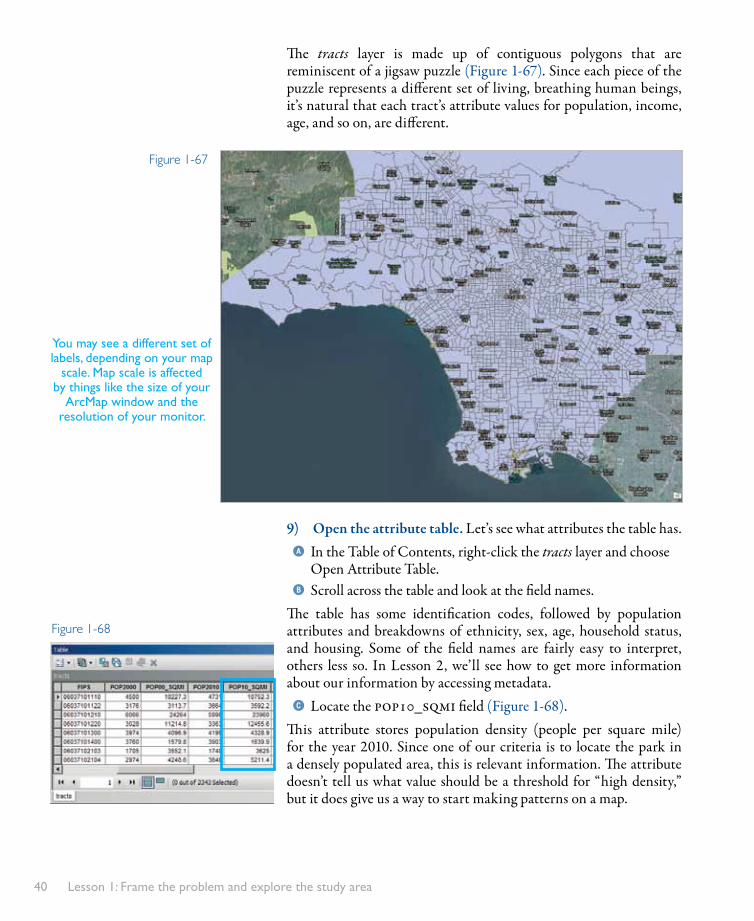
The tracts layer is made up of contiguous polygons that are reminiscent of a jigsaw puzzle (Figure 1-67). Since each piece of the puzzle represents a different set of living, breathing human beings, it’s natural that each tract’s attribute values for population, income, age, and so on, are different.
9) Open the attribute table. Let’s see what attributes the table has. aIn the Table of Contents, right-click the tracts layer and choose
Open Attribute Table. bScroll across the table and look at the field names.
The table has some identification codes, followed by population attributes and breakdowns of ethnicity, sex, age, household status, and housing. Some of the field names are fairly easy to interpret, others less so. In Lesson 2, we’ll see how to get more information about our information by accessing metadata.cLocate the pop10_sqmi field (Figure 1-68).
This attribute stores population density (people per square mile) for the year 2010. Since one of our criteria is to locate the park in a densely populated area, this is relevant information. The attribute doesn’t tell us what value should be a threshold for “high density,” but it does give us a way to start making patterns on a map.
Figure 1-67
Figure 1-68
You may see a different set of labels, depending on your map
scale. Map scale is affected by things like the size of your
ArcMap window and the resolution of your monitor.

Do exploratory data analysis 41
dRight-click the pop10_sqmi field name and choose Statistics (Figure 1-69).
The Statistics of tracts window displays summary statistics for the field. The lowest value is 0 (at least one tract must be unpopulated) and the highest is 98,150. The frequency distribution chart, or histogram, on the right shows you that most of the values are between 0 and about 25,000. The remaining values spread out in a long tail.eClose the Statistics of tracts window.fClose the table.
10) Symbolize census tracts by population density. Symbolizing a layer by an attribute, also called thematic mapping, allows us to see how values are spatially distributed.aOpen the layer properties for the tracts layer and click the
Symbology tab.By default, all features in a layer have a single symbol (Figure 1-70). That’s why all your census tracts are purple, or whatever color they happen to be.bIn the Show box, click Quantities.
Figure 1-69
Click here
Figure 1-70

Lesson 1: Frame the problem and explore the study area42
Under Quantities, four methods for symbolizing numeric attributes are listed. The default Graduated colors method will give each feature in the tracts layer a color that reflects its numeric value for a chosen attribute. cIn the Fields area, click the Value drop-down list and choose
POP10_SQMI (Figure 1-71).
A lot is going on here. The values for the POP10_SQMI attribute, which range from 0 to 98,150, are divided into five classes. The starting and ending values for each class are calculated by a “natural breaks” algorithm that separates clumps in the data. That’s why the range of values is different from class to class and why classes break at seemingly arbitrary numbers. Each class is associated with a symbol in a color ramp (probably yellow to dark red, but yours may be different if you happened to change it).
d Click Apply. Move the Layer Properties dialog box out of the way.On the map, the tracts are symbolized by population density (Figure 1-72).
11) Change the classification. Quantitative symbology is flexible, and you can present data in many ways. Because all we want right now is a general sense of viable areas for our project, and because we’re going to look at a couple of variables together, we should keep our presentation simple.a In the Layer Properties dialog box, click the Classes drop-down arrow and choose 3.
Figure 1-71
Figure 1-72

Do exploratory data analysis 43
bClick Classify to open the Classification dialog box (Figure 1-73).
The histogram shows you the distribution of values in relation to the current class breaks. We can change the algorithm used to set class breaks, or make manual adjustments as desired. cClick the Method drop-down arrow and choose Equal Interval
(Figure 1-74).dNow set the Classification Method to Quantile.
With three classes, we’ll easily be able to see high, medium, and low values. The Quantile method guarantees that an equal number of tracts will fall into each class. It should be noted that there are no inherently good or bad ways to classify data—different classifications may be more or less appropriate to the purpose of your map and the background knowledge of your audience.eIn the Break Values box to the right of the histogram, click the
first class break point (7715).The value becomes editable. At the bottom of the dialog box, a message tells you that there are 772 elements (in this case, census tracts) in this class.fReplace the highlighted value with 8,000 and press Enter.
The second class break point is selected and editable.gReplace the highlighted value (14196) with 16,000.hClick in some white space in the Histogram window to stop
editing class breaks (Figure 1-75).
Figure 1-74
Figure 1-75
Classes are evenly spaced. In this case, almost all the records fall in the first class.
Equal Interval
Quantile
Each class has an equal number of records. Class spacing is very different.
Figure 1-73

Lesson 1: Frame the problem and explore the study area44
At the top of the dialog box, the classification method has been reset to Manual because we’ve changed the class breaks. The histogram is updated, too. We no longer have a pure quantile classification, but having our classes break at round numbers makes intuitive sense.iClick OK on the Classification dialog box.
12) Change the symbology. We’ll make some changes to the symbology as well.aOn the Layer Properties dialog box, click the Color Ramp drop-
down arrow (or click on the ramp itself ).bScroll up and down to see the choices, then click the ramp again
to close the list.cRight-click the color ramp. On the context menu, click Graphic
View to uncheck it (Figure 1-76).
dClick the ramp’s name. In the drop-down list, click the Red Light to Dark ramp to select it (Figure 1-77).
eRight-click the ramp name and choose Graphic View to show the ramps by color again.
Underneath the color ramp is a box with three columns:• The Symbol column shows the symbol for each class.• The Range column shows the range of values for each class.• The Label column shows how each symbol will be described in
the Table of Contents. (By default, the label matches the range.)fClick the Symbol column heading and choose Properties for All
Symbols.gIn the Symbol Selector, click the Outline Color button. On the
color palette, choose No Color.hClick OK on the Symbol Selector.
We’re taking away the outlines because we don’t need to see the tract boundaries on the map. For now, we’re interested in them as areas, not specifically as tracts.iIn the Label column, click on the first label (0.000000 -
8000.000000) to make it editable. Type Low and press Enter.jReplace the second label with Medium. Press Enter.
Toggle Graphic View to see ramps by color or
nameFigure 1-76
Figure 1-77

Do exploratory data analysis 45
kChange the third label to High. Click outside the edit box to commit the edit.
lCompare your settings to Figure 1-78 and click Apply.
mIn the Layer Properties dialog box, click the Display tab. In the Transparent box at the top, replace the value 0 with 50 (Figure 1-79).
nClick OK on the Layer Properties dialog box.oIn the Table of Contents, drag and drop the tracts layer under-
neath the Los Angeles layer.On the map, we can now see where population is concentrated along the river, and we can see it in relation to existing parks (Figure 1-80).
Figure 1-78
Figure 1-79
Figure 1-80

Lesson 1: Frame the problem and explore the study area46
13) Measure distance from the river to parks. Making a few measurements will improve our ability to estimate distance on the map and will give us a better intuitive sense of how close to the river the new park should be.aZoom to the Dodger Stadium bookmark.bPan the map so that a number of parks are in the view. Feel free
to zoom in or out.cOn the Tools toolbar, click the Measure tool to open the
Measure dialog box.dIn the row of tools at the top of the Measure dialog box, make
sure the Measure Line tool is selected (Figure 1-81).eClick the Choose Units button and choose Distance Miles.
On the map, the mouse pointer changes to a ruler with inscribed crosshairs.fMove the mouse pointer over a park, such as Cypress Park
(northeast of Dodger Stadium on the east side of the river).The mouse pointer “snaps” to the park boundary. You can probably feel the effect in the mouse movement. It’s confirmed on-screen by a light gray square near the mouse pointer and a message such as “Parkland: Vertex” or “Parkland: Edge” (Figure 1-82).gClick to start a measurement.hMove the mouse pointer (you don’t have to drag) to the river.
The mouse pointer snaps to the river feature. The measurement result is displayed in the Measure dialog box (Figure 1-83).iDouble-click to end the measurement.jClick on another park and measure its distance to the river.
The new result replaces the previous one in the Measure dialog box.kMeasure the distances from a few more parks.
Confirm that Measure Line is selected.
Click here to choose the
measurement unit.
Figure 1-81
Figure 1-82
Figure 1-83
Your result will depend on where you start and end your measurement.
Do exploratory data analysis 47
Cypress Park, Elysian Valley Rec Center Park, and Downey Playground are close to the river. Elyria Canyon Park, a little over three quarters of a mile away (at its nearest edge), stretches the notion of proximity. Bear in mind that these measurements are straight-line distances, not distances along streets. lClose the Measure dialog box.
Although the dialog box is closed, the tool stays active until another tool is selected.mZoom to the City of Los Angeles bookmark.
14) Add a layer of census block groups. Another requirement for the new park is that it be located in a lower-income neighborhood. To symbolize an income attribute, we have to add another layer to the map. (It’s not that income data isn’t reported at the census tract level, it’s just that our particular tracts layer doesn’t happen to include it.)aOpen the Catalog window.
The same census folder that contains tracts.shp also has a dataset called block_groups.shp.bDrag and drop block_groups.shp on the map.
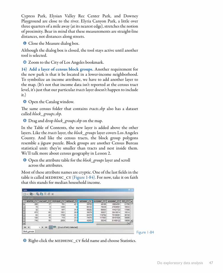
In the Table of Contents, the new layer is added above the other layers. Like the tracts layer, the block_groups layer covers Los Angeles County. And like the census tracts, the block group polygons resemble a jigsaw puzzle. Block groups are another Census Bureau statistical unit: they’re smaller than tracts and nest inside them. We’ll talk more about census geography in Lesson 2.cOpen the attribute table for the block_groups layer and scroll
across the attributes.Most of these attribute names are cryptic. One of the last fields in the table is called medhinc_cy (Figure 1-84). For now, take it on faith that this stands for median household income.
dRight-click the medhinc_cy field name and choose Statistics.
Figure 1-84

Lesson 1: Frame the problem and explore the study area48
The Statistics of block_groups window tells you that the lowest value in the field is 0 and the highest is 200,001. Median value is a midpoint. For each block group, half the households earn more than the median income and half earn less.eClose the Statistics of block_groups window.fClose the attribute table.gDrag the Reference layer to the top of the Table of Contents.
15) Symbolize census block groups by median household income. If we symbolize the block_groups layer with graduated colors, we won’t be able to evaluate income and population density at the same time. Instead, we’ll represent each block group’s median household income as a point drawn inside the block group polygon. The point sizes will be graduated according to the income value.aOpen the layer properties for the block_groups layer and click the
Symbology tab.bIn the Show box, click Quantities. Under Quantities, click
Graduated Symbols (Figure 1-85).cIn the Fields area, click the Value drop-down list and choose
MEDHINC_CY. dClick the Classes drop-down arrow and choose 3.eClick Classify to open the Classification dialog box.
By coincidence, the first break point is already a nice round number (50,000), so we don’t have to alter it.fIn the Break Values box to the right of the histogram, click the
second class break point (94370) to make it editable.gReplace the highlighted value with 100,000 and press Enter.hClick in some white space in the Histogram window to stop
editing class breaks (Figure 1-86). Click OK on the Classification dialog box.
Figure 1-85
Figure 1-86
Click anywhere in this area to
quit editing class break values.

Do exploratory data analysis 49
iIn the Layer Properties dialog box, click Template (underneath the Classify button) to open the Symbol Selector.
jIn the scrolling box of symbols, click Circle 2 to select it.kClick the Color button and change its color to Tourmaline
Green (Figure 1-87). lClick OK on the Symbol Selector.
This sets the color and shape of the symbols that will be used to represent income values.mClick Background (underneath Template) to open the Symbol
Selector again.nChange the fill color to No Color, then change the outline color
to No Color. Click OK.This makes the block group polygons themselves invisible. All we’ll see are the income dots spread around the map.oIn the Symbol Size boxes, replace the “from” value with 8 and the
“to” value with 24.pIn the Label column, click on the first label (0 - 50000) to make
it editable. Type Low and press Enter.qReplace the second label with Medium. Press Enter.rChange the third label to High. Click outside the edit box to
commit the edit.sCompare your settings to Figure 1-88. Click Apply and move
the Layer Properties dialog box out of the way.At the present scale, the symbols overwhelm the map (Figure 1-89).
Figure 1-87
Figure 1-88
Your view may look different depending on the size of your computer screen and ArcMap
window, but the effect should be similar.
Figure 1-89

Lesson 1: Frame the problem and explore the study area50
16) Set a scale range for the block_groups layer. Earlier, we set a maximum scale value for the Reference layer. Here, we’ll set a minimum value for the block_groups layer.aOn the Layer Properties dialog box, click the General tab.bIn the Scale Range area, click the “Don’t show layer when
zoomed” option.cClick in the “Out beyond” box and type 100,000 (Figure 1-90)
and click OK.
The symbols disappear from the map. In the Table of Contents, the layer’s check box indicates that the layer is turned on but is not visible at the current map scale (Figure 1-91).dZoom to the Dodger Stadium bookmark.eClick the Fixed Zoom Out button several times until some of
the Medium and High symbols begin to appear.Now we can start to get a general sense of household income and population density along the river, and look at these variables in relation to park locations (Figure 1-92).
Figure 1-90
Figure 1-91
Figure 1-92

Do exploratory data analysis 51
17) Search for likely park areas. Clearly, we’re taking an incomplete initial look at a complex problem. We haven’t considered all the requirements (for example, the presence of children). We’re not making any exact measurements of distance. Our data classifications are casual: we don’t yet have a good reason to say what values should count as high population density or low median household income in the context of our project. Nevertheless, we can form some meaningful impressions. We won’t be able to say of an area that a park should definitely go there, but we might be able to identify likely and unlikely areas. Later, it will be interesting to see how well these impressions are borne out by analysis.aOn the Standard toolbar, in the Map Scale box, highlight the
current value. Type 40,000 and press Enter.bPan south to where the river crosses the city boundary.cIn the Table of Contents, drag the Los Angeles River layer to the
position just below the Reference layer (Figure 1-93).We’ll follow the river to its source, marking good areas along the way. A really good area would have these properties:
• High population density (dark red)• Low median household income (small green dot)• No existing park nearby• Close to the river
dPan slowly north.Less than a mile north of the city limits, on the east side of the river, are a couple of tracts—one dark red and one medium red—with small green dots (Figure 1-94). They’re pretty close to the river, and even though there are some parks in the general vicinity, it’s probably worth marking the area.
Figure 1-94
Figure 1-93

Lesson 1: Frame the problem and explore the study area52
eFrom the main menu, choose Customize Toolbars Draw.The Draw toolbar is added.fDock the toolbar or float it, whatever you like best.gOn the Draw toolbar, click the Drawing drop-down menu and
choose Default Symbol Properties at the bottom.hOn the Default Symbol Properties dialog box, click the Fill but-
ton to open the Symbol Selector.iSet properties in the Symbol Selector as follows:
• Set the fill color to No Color.• Set the outline width to 3.• Set the outline color to Black.
jClick OK on the Symbol Selector.kCompare your Default Symbol Properties dialog box to
Figure 1-95 and click OK.
lOn the Draw toolbar, click the drop-down arrow next to the Rectangle tool. From the list of tools, choose the Ellipse tool.
mOn the map, click and drag a box over the area of interest. Release the mouse button to draw the ellipse (Figure 1-96).
You can reshape the ellipse by dragging its selection handles. You can move it by clicking and dragging it. The exact size and position of the shape doesn’t matter as long as you mark the general area.nClick off the graphic to unselect it.
Figure 1-95
Figure 1-96
GraphicsMap graphics, such as these created with tools on the Draw toolbar, are dif-ferent from features. Conceptually, features represent geographic objects while graphics tend to be visual aids. Technically, graphics are usually stored in map documents as annotation, not in feature classes on disk. (You’ll learn more about this in Lesson 8.) They aren’t maintained as layers in ArcMap, nor do they have attribute tables, but they can be managed from the Data Frame Properties dialog box (Annotation Groups tab). It is possible to con-vert features to graphics and graphics to features.

Do exploratory data analysis 53
18) Continue searching for park areas. We’ll keep following the river and looking for likely places for a park.aPan north.
A little farther north, again on the east side of the river, is a medium-density, lower-income area with just one park (Pecan Playground) in the general vicinity. We’d prefer a high-density neighborhood, but since we don’t yet have specific criteria for our analysis, we want to be inclusive rather than exclusive in our assessments. It’s up to you whether to mark this area or not—all that really matters is that you start to gain a sense of the study area.bOn the Drawing menu, click the Ellipse tool and draw an ellipse
around the area (Figure 1-97).cUnselect the graphic and keep panning along the river.
The area opposite Dodger Stadium, on the east side of the river, is medium-density, lower-income, and park poor.dDraw an ellipse around this area (Figure 1-98).
You may find that the shape of the ellipse doesn’t fit the area just the way you want.eOn the Draw toolbar, click the Rotate button .fPlace the mouse pointer over the graphic, then click and drag to
rotate the graphic. Orient the ellipse to fit the area better.gOn the Draw toolbar, click the Select Elements tool .hResize and reshape the ellipse by dragging selection handles.
You may need to switch back and forth between the Rotate and Select Elements tool to make the ellipse look the way you want (Figure 1-99). It’s not art, so don’t spend too much time on it.
Figure 1-97
Figure 1-98
Figure 1-99

Lesson 1: Frame the problem and explore the study area54
iUnselect the graphic and continue panning along the river. Mark areas that seem promising to you and reshape the ellipses as needed.
As you navigate around Griffith Park, remember that the yellow line marks the city limits. The areas north and east of the park aren’t part of Los Angeles and shouldn’t be considered. Once you get around this park, you may find fewer likely areas. But remember, there’s no right or wrong answer for this exercise.jAfter adding the last ellipse, from the main menu, choose
Edit Select All Elements.kAgain from the main menu, choose Edit Zoom To Selected
Elements.lClick anywhere on the map to unselect the graphic elements
(Figure 1-100).mSave the map document.
Figure 1-100

Do exploratory data analysis 55
19) Export the map. We’ll export this view of the map to an image in TIFF format. When we finish the analysis in Lesson 6, we’ll add the image and compare our guesses to the actual results.aFrom the main menu, choose File
Export Map.bAt the top of the Export Map dialog box,
click the Home button to navigate to the MapsAndMore folder.
cIn the Save as type box, click the drop-down ar-row and choose TIFF (*.tif ).
dReplace the file name with Lesson1Predictions.
eUnder Options, click the Format tab. At the bot-tom, check the box to write GeoTIFF tags.
GeoTIFF tags embed coordinate system information into the image file. The output will be an image that can be used in documents such as presentations or reports, but that will also align spatially with layers in ArcMap.fCompare your Export Map dialog box to
Figure 1-101 and click Save.The Export Map dialog box closes by itself.
20) Exit ArcMap. Toolbars that you leave on the interface will remain there in subsequent sessions. There’s nothing wrong with that, but too many toolbars can become a distraction.aFrom the main menu, choose Customize Toolbars Draw.
The Draw toolbar is removed.bRemove the Effects toolbar in the same way.cFrom the main menu, choose File Exit.
At this point, you already have a basic working knowledge of ArcMap. You know the problem to be solved and you have a sense of the study area. You’ve worked with some of the available data for the project, but you haven’t taken a careful, systematic look at it. That will be the focus of the next lesson.
Figure 1-101

Lesson 1: Frame the problem and explore the study area56
Symbology methodsThe default Single Symbol method (under Features) assigns the same symbol to all features in a layer. No attribute is symbolized.
Under the Categories heading are methods for sym-bolizing descriptive attributes. Here, the Unique Values method assigns different line widths to a roads layer ac-cording to whether the roads are freeways, highways, or streets.
The Charts heading has methods to compare numeric attributes by chart symbols. These pie charts compare percentages of owner-occupied homes (red), renter-occupied homes (blue), and unoccupied homes (yellow) for Southern California cities.
Under the Quantities heading are methods for symboliz-ing numeric data. In this example, census tracts are symbol-ized by population density. Low-density tracts are yellow, medium-density are orange, and high-density are brown.
The Multiple Attributes heading lets you symbolize descriptive and numeric attributes together. Here, the descriptive attribute is vacancy. Vacant lots are orange; developed lots are pink. The numeric attribute is land value. A small dot in a vacant lot means the value is low; a large dot means the value is high.