mobile first: a future friendly approach to ux design
TRANSCRIPT


a future-friendly approach to experience design
asher godfrey blumberg mobile UX designer // stumbleupon @ashergodfrey

1961 the first computer interface
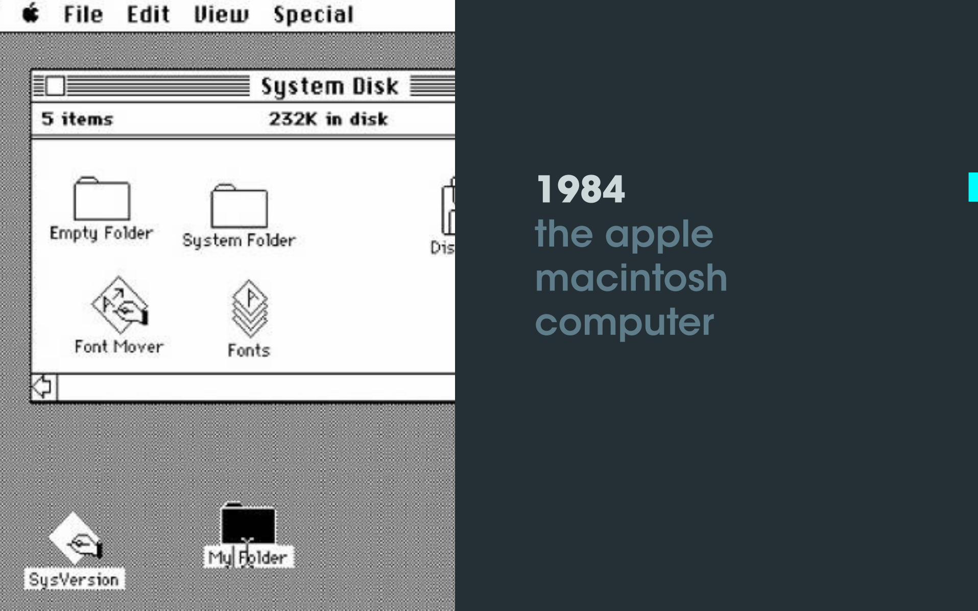
1984 the apple macintosh computer

2007 iPhone

2009 kinect

2011 siri

2011 nest

2013 oculus rift

2015 apple watch

2015 amazon echo

the future ?

future-friendly strategies will allow our designs to work and look the best on devices that haven’t even been invented yet.

we have such an intimate relationship with our mobile devices, we expect them to be extensions of ourselves.
~brad frost
photo credit: brad frost

reconciling iOS & android paradigms


a common design language
Create a design language that incorporates Apple’s “flat” iOS features and Google’s Material Design so as to feel native, yet unique enough that users realize they’re in a distinctly branded app
Play by the rules (in the beginning.) Read the iOS Human Interface & Material Design Guidelines
photo from ebli rumbaugh


iconography
One method is to style icons for their respective platforms, sticking to thin-stroked, hollow icons on iOS and going bolder on Android.
Alternatively, create custom icons that can live across both iOS & Android.

Stick with colors specified in your branding guide. This will help with consistency in the future when working across platforms.
colors

stumbleupon live style guide

google material design

above & beyond the guidelines
Be intentional and back it up by good reasoning when you take liberties with the guidelines.
Adapt your designs to varying contexts and blend different styles to create an authentic and meaningful UI.
photo from material design

pro tips

Use good naming conventions. When exporting assets for development, stick to layer names that match your naming conventions.
Use text styles for headlines and other repeating text types
Create symbols for repeating patterns or UI elements.
Take advantage of artboards for a multi-screen view so you can quickly see your flows and product depth. Doing this will help you stay focused on the big picture.


developer friendly specs
Ask the engineer what they are looking for in a spec. Some engineers might want flawless specs to achieve pixel perfection. Other engineers might not need super extensive markup, depends on the needs of the project.


Scope of Work, Project requirements (Target Audience, Goals, etc.), client design assets
friendly folder structures
research
Completed user research as well as research that still needs to be done
discovery inspiration
Anything you find that inspires you from pinterest, dribbble, behance, awwwards, designer news, etc..

User journeys, personas, scenarios, flows, Information Architecture, white boarding
friendly folder structures
visual design
Hi-fidelity mockups, Iconography, visual explorations
UX prototypes
InVision, Pixate, Origami, Keynote AfterEffects Framer, Hype Tumult, etc

best practices

value aesthetic integrity
Aesthetic integrity represents how well an app’s appearance and behavior integrates with its function to create a coherent dialogue
Take cues from classic designs and you may end up creating a timeless design.
photo via shutterstock

transform the noise into the signal
The noise can become the signal, meaning the interface should be part of the goal.
Create worthwhile experiences that value users’ attention spans.
Tools like StumbleUpon, Pocket, Readability, Feedly, Flipboard and Facebook offer users an escape from the bombardment of obnoxious distractions, i.e. animated ads, popups, blogrolls, while seamlessly delivering content.
photo via shutterstock

concise & contextual
Mobile mediums require vary in context of use so your method should be tailored with this in mind
Describe functionality in your app on a ‘need to know’ basis
Get rid of redundancy
Trim copy to be as short as possible
photo via shutterstock


design for affordance
An affordance in an interface is the interaction possibility of an element based on it’s size, shape and weight that intuitively implies its functionality and use.
Animation serves as an affordance. Animations can suggest that the current UI came from somewhere, and that the previous one went somewhere. Good transitions take advantage of this by enabling that affordance.
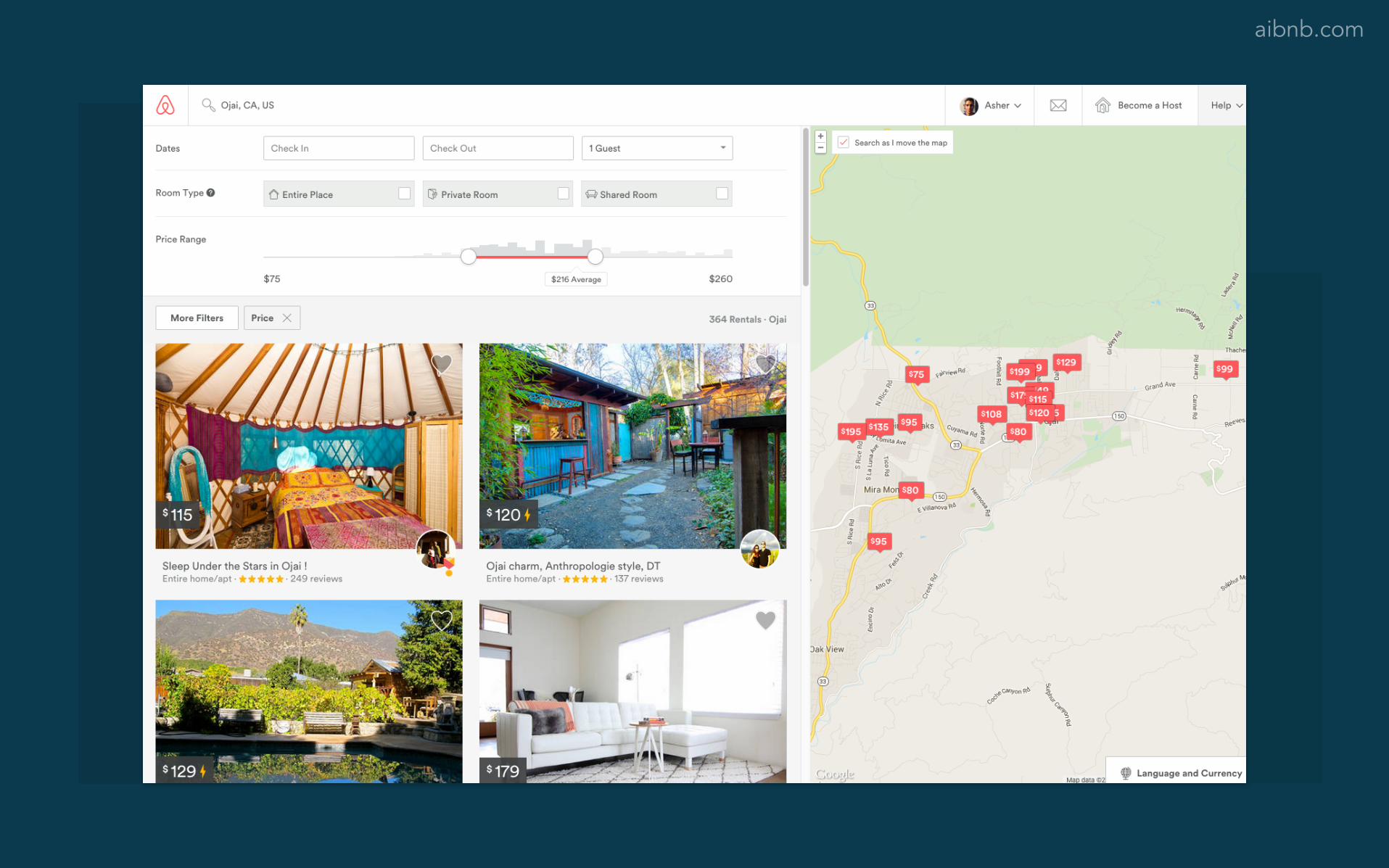
aibnb.com

gestures are the new tap
More apps are relying on gestures beyond the tap for their primary interactions.
The number of gesture interfaces on today's screens is growing. Pinch, zoom, a long press, force touch, swipe menus, pull-to-refresh, flingable cards, edge swipes, and draggable side menus are now the norm.
Takeaways: enforce more consistency, align with natural actions, include clear cues
photo from hbr.org

rotate
paul flavius fechita via dribbble
pull/unfold
cuberto via dribbble
clear
swipe/drag
rise
cover to reveal
peek

understanding #trends

mobile first wins
Think mobile first: scale up from mobile to tablet to desktop
Create a product that looks and functions well on mobile first given the many restraints that you face
Since you’ve already synthesized your product to it’s most vital elements you get to decide how to make it even more robust, instead of deciding of what to cut or water down
“Mobile first” is becoming less of a buzzword, it’s more of a requirement now.

photo credit: brad frost

responsive design
Responsive design is a technique. It boils down to creating experiences meant to look and function beautifully to fit any screen size or device
Responsive design involves fluid layouts, flexible images (and media objects), and media queries

design by Q42, Fabrique for The Van Gogh Museum in Amsterdam

why flat design?
Flat design limits visual elements, exposing only essential functionality
Flat design reduce the resource load on smaller devices
Flat design make it easier to convey meaning with animation and focus on the micro-interactions
Simple designs are easier to scan

frankchimero.com

post flat

flat design is just the beginning. the real trend is towards simplicity and immediacy, and we expect that to go further than ever in 2015.
~Jowita Ziobro
photo credit: ebli rumbaugh

experiential minimalism
Experiencing and learning a design with the minimal viable artistic elements communicating its concept.
The goal of minimalist design is to simplify technology by developing a story that people can understand.
A design is successful when it’s use case is clearly communicated
design by sebastien gabriel

pushing boundaries
The only way we can push forward and innovate is by taking creative risks. New and inspiring work gives others a spark to push their boundaries.
Even if you’re compelled to follow a layout or style trend, add a touch of creativity to make it unique.
photo via shutterstock

the best interface is no interface
~golden krishna
photo credit: piyatat hemmatat

the Sproutling

photo from peter sweeney

less interface = better interface
Minimal interfaces perform better.
We should strive to design interfaces that can fluidly interact with the complexities of the real world.
The interfaces we design may effectively become invisible over time, but that will only happen if we design them to be legible, readable, understandable and to foreground culture over technology.
photo via shutterstock

~ben watson, herman miller
photo credit: pixabay
as everything becomes available everywhere—in the physical and virtual world—more and more people will respond to designs that offer a mutable framework for personalization, individual expression, and adaptability.

photo credit: brad frost
