nfl teams typographic evolution
TRANSCRIPT

Popular NFL Teams: TYPOGRAPHIC EVOLUTION9

The old logo font of Arizona Cardinals is quite plain and generic; it features a sans serif of varying weights stacked to form “Arizona Cardinals,” and uses no distinguishing or ornamental characteristics.
1988 - 2004
Arizona Cardinals
The new word mark features a smaller “Arizona” contrasted against the larger set “Cardinals,” both in a sans serif typeface with discretionary hairline serifs.
2005 - Present

The Falcons did not adopt a word mark logo until 1998. This logo was a tilted, serif font with interesting decorative features, especially around the “F” and “A” in “Falcons.”
Atlanta Falcons
The new word mark utilizes a sans serif with discretionary hairline serifs that suggest movement. Interestingly, the Falcons went from unique to generic.
1996 - 2002
2003 - Present

The “winged and feathered” look of logo continued to Baltimore’s word mark, which featured an angular, decorative serif with many unique feathered accents.
Baltimore Ravens
Instead of keeping with the highly-stylized and unique look of their previous script logo. Baltimore’s new word mark did carry oversome angularity, and features of a decorative serif.
1996 - 1998
1999 - Present

This word mark was unique in the NFL, and lent itself well to the Panthers because of its “clawed out” look.
Carolina Panthers
It features a stacked “Carolina Panthers” and uses a sans serif typeface with a few claw-inspiredaccents.
1995 - 2011
2012 - Present

It is a unique combination of slab and traditional serif fonts, and features hard edged, geometric letterforms.
Cincinnati Bengals
The Bengals added their own twist to the word mark, carrying over the unique slab/traditional serif combo that made their original logo distinct. Structurally, however, the word mark bears a striking resemblance to those used by other NFL teams.
1997 - 2003
2004 - Present

The Denver Broncos have had only one word mark since their founding. It is a plain but powerful all-caps slab serif. It is in the same typeface as the large uppercase “D” in their second most recent primary logo.
Denver Broncos
Denver uses a large, stylized slab serif “Broncos” stacked on a sans serif, smaller “Denver.” This contrast offers a visually striking –if generic –look that many teams took to adopting shortly after Denver’s success
1968 - 1996
1997 - Present

It features stylized geometry, and a thick, angular sans serif. At the time of its unveiling, it was intended to be futuristic and sleek, resembling a jet wing
New York Jets
The new word mark is still a sans serif offers many more curved, organic lines compared to the Jets’ 1978-97 logo
1978 - 1997
1998 - Present

The word mark, strangely, was a rounded serif with contrasting stroke widths; not a common style among NFL teams.
Seattle Seahawks
The Seahawks’ new word mark implements angled serifs to complement the more edgy feel of the redesigned primary logo.
1978 - 1997
1998 - Present
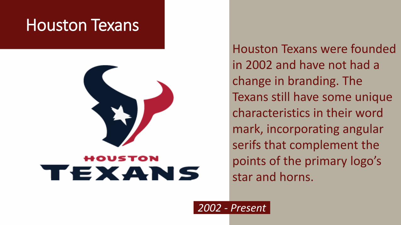
Houston TexansHouston Texans were founded in 2002 and have not had a change in branding. The Texans still have some unique characteristics in their word mark, incorporating angular serifs that complement the points of the primary logo’s star and horns.
2002 - Present
Take away• Changes define success in brands and identities. It is preferable to
adapt the emerging trends, else become a trend setter. Houston Texans is a great example, as they didn’t change their identity since their foundation. However, they are appreciated for the unique characteristics of their logo word mark.
• Since it is sports, I guess a newness is desirable. Your fans would like to know the unique elements that you incorporate in your identity and will appreciate that you keep up with market trends.

ReferencesTypographic Trends in American Sports Brands By Alan Jacobson, Graphic Communication Department, College of Liberal Arts, California Polytechnic State University, June 2012
Official NFL website, http://www.nfl.com/news, nfl news and events, about the team.
The best branding in the NFL, website, https://medium.com/@Milkshake_BK/the-best-branding-in-the-nfl-50325e6711e5, Official Medium page.
Think Typography is Dead? The Pro Graphic Designers of the NFL Prove Otherwise, website, http://www.burdetteketchum.com/insights/think-typography-is-dead#sthash.kVIlknzB.dpuf

Did You LIKE the presentation?
Share your opinions with us
Logo Design Guru