oil painting cheat sheets - amazon s3 · 2 colour mixing cheatsheets for oils choosing an oil...
TRANSCRIPT

O I L P A I N T I N G
Cheat SheetsAUTHOR BOB DAVIES
C o l o u r M i x i n g C h e a t s h e e t s f o r o i l s2
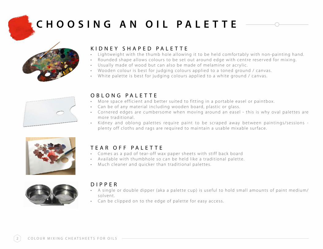
C H O O S I N G A N O I L P A L E T T E
K i d n e y s h a p e d p a l e t t e • L ight weight with the thumb hole a l lowing i t to be held comfor tably with non-paint ing hand.• Rounded shape a l lows colours to be set out around edge with centre reser ved for mix ing. • Usual ly made of wood but can a lso be made of melamine or acr y l ic . • Wooden colour i s best for judging colours appl ied to a toned ground / canvas .• White pa lette i s best for judging colours appl ied to a white ground / canvas .
o b l o n g p a l e t t e• More space ef f ic ient and better su i ted to f i t t ing in a por table ease l or pa intbox .• Can be of any mater ia l inc luding wooden board, p last ic or g lass .• Cornered edges are cumbersome when moving around an ease l - th is i s why ova l pa let tes are
more t radi t ional .• K idney and oblong palettes requi re pa int to be scraped away bet ween pa int ings/sess ions -
p lent y of f c loths and rags are requi red to mainta in a usable mixable sur face.
t e a r o f f p a l e t t e• Comes as a pad of tear- of f wax paper sheets with s t i f f back board• Avai lable with thumbhole so can be held l i k e a t radi t ional pa let te .• Much c leaner and quick er than t radi t ional pa let tes .
d i p p e r • A s ingle or double d ipper (ak a a pa let te cup) i s usefu l to hold smal l amounts of pa int medium/
solvent .• Can be c l ipped on to the edge of pa let te for easy access .

C o l o u r M i x i n g C h e a t s h e e t s f o r o i l s3
M I x I N G G r E E N SC e r u l e a n
b l u ep r i M a r y
b l u eC o b a l t
b l u eu l t r a M a r i n e
b l u ep t h a l o
b l u e
l e M o ny e l l o W
p r i M a r yy e l l o W
C a d M u i My e l l o WM e d i u M
y e l l o Wo C h r e
r a Ws i e n n a
Here are 5 common blues and 5 common ye l lows mixed, in most cases in roughly equal quant i t ies to produce 25 greens. The le f t ha l f o f each green i s a s t rong mix of the t wo colours .
The r ight ha l f i s a l ighter mix with approx imate ly 50% t i tan ium white added to create a t int .S imply adjust ing the rat ios of b lue, ye l low and white wi l l g ive you l i tera l ly hundreds more greens.

C o l o u r M i x i n g C h e a t s h e e t s f o r o i l s4
M I x I N G G r E Y SC e r u l e a n
b l u eC o b a l t
b l u ep r i M a r y
b l u eu l t r a M a r i n e
b l u ep t h a l o
b l u e
C a d M i u Mr e d
l i g h t
b u r n ts i e n n a
b u r n tu M b e r
r a Wu M b e r
r e do x i d e
Here are 5 b lues and 5 common reds/browns mixed in roughly equal quant i t ies to produce 25 greys . The le f t ha l f o f each grey i s a s t rong mix of the t wo colours . The r ight ha l f i s a l ighter mix with approx imate ly 50% t i tan ium white added to create a t int . Adjust ing the rat ios of b lue, reds/browns and white wi l l g ive you l i tera l ly hundreds more greys .

C o l o u r M i x i n g C h e a t s h e e t s f o r o i l s5
M I x I N G S K I N C O L O U r S
Just by us ing three pr imar y colours and white , many d i f ferent shades and t ints of sk in colour can be created.
On th is page, t wo sets of three pr imar ies have been used to create e ight d i f ferent sk in tones. With the addit ion of t i tan ium white these can be l ightened to create potent ia l ly an in f in i te number of var iat ions.
The propor t ions of the pr imar y colours have been adjusted in each one to prov ide a b ias towards red, b lue or ye l low. Each colour swatch shows roughly the propor t ions of each pr imar y used for each tone before white i s added.
a l i z a r i n C r i M s o nu l t r a M a r i n e b l u e
y e l l o W o C h r et i t a n i u M W h i t e
C a d M i u M r e dC a d M i u M y e l l o W
p t h a l o b l u et i t a n i u M W h i t e

C o l o u r M i x i n g C h e a t s h e e t s f o r o i l s6
M I x I N G S K I N C O L O U r S
Here are some fur ther var iat ions us ing common colours and are used by many top por t ra i t pa inters .These 6 mixes , p lus the ones on the prev ious page, can create the vast major i t y of sk in tones you’ l l ever need.
r a Ws i e n n a
+b u r n t
s i e n n a
u l t r a M a r i n eb l u e
+b u r n tu M b e r
r a Ws i e n n a
+u l t r a M a r i n e
b l u e+
b u r n ts i e n n a
C a d M i u Mr e d
+C e r u l e a n
b l u e
a l i z a r i nC r i M s o n
+u l t r a M a r i n e
b l u e+
b u r n ts i e n n a
b u r n ts i e n n a
+y e l l o Wo C h r e

C o l o u r M i x i n g C h e a t s h e e t s f o r o i l s7
C O L O r B I A S O F P r I M A r I E S
Al l pr imar y colour pa ints ( reds , b lues and ye l lows) have a ‘ leaning’ or ‘b ias’towards one of the other t wo pr imar ies . For example, A l i zar in Cr imson i s a redwith a b lue b ias , whereas Cadmium Red i s a red with a ye l low bias .
K nowing the b ias of the colours in your pa let te wi l l he lp you mix the secondar yand ter t ia r y co lours you want . I t wi l l a l so help you avoid mix ing muddy and dul l co lours
I f you want a v ibrant purple for example, mix a red with a b lue b ias and bluewith a red b ias . That way you are only mix ing t wo of the pr imar ies ( red and blue) .
I f you want a dul l purple , then mix a red with a b lue b ias and a b lue with a ye l lowbias . Now you are mix ing a l l three pr imar ies ( red + b lue + ye l low) . M ix ing a l lthree pr imar ies resul ts in a more neutra l tone.
N B : T h e l i s t s h e r e t h o u g h e x t e n s i v e , a r e n o t e x h a u s t i v e , a s m a n u f a c t u r e r s i n t r o d u c e o r d e l e t e c o l o u r s o n a c o n t i n u o u s b a s i s .
B L U E S W I T H AR E D B I A S
Y E L L O W S W I T H AR E D B I A S
R E D S W I T H AB L U E B I A S
R E D S W I T H AY E L L O W B I A S
B L U E S W I T H AY E L L O W B I A S
Y E L L O W S W I T H A B L U E B I A S
C o b a l tC y a n i n e
f r e n c h u l t r a m a r i n eu l t r a m a r i n e
p a y n e ’ s g r e yi n d a n t h r e n e , i n d i g o
C a d m i u m y e l l o w M e d i u mC a d m i u m y e l l o w d e e p
C h r o m ei n d i a nn a p l e s
n e w g a m b o g er a w s i e n n a
y e l l o w o c h r ep e r m a n e n t y e l l o w M e d i u m
M a r sQ u i n a c r i d o n e g o l d
p e r m a n e n t r o s ea l i z a r i n C r i m s o n
M a g e n t aQ u i n a c r i d o n e r o s e
r o s e M a d d e rC r i m s o n l a k e
o p e r a r o s es c a r l e t l a k e
C a r m i n e
C a d m i u mW i n s o r
V e r m i l l i o np e r e l y n e
p e r m a n e n tl i g h t
i n d i a nV e n e t i a n
p y r r o l ee n g l i s h r e d o x i d e
C e r u l e a np t h a l o
a n t w e r pi n t e n s e , M o n a s t i a l
M a n g a n e s et u r q u o i s e
C y a nr e m b r a n d t
p t h a l op r u s s i a n
p a r i sp e a c o c k
a u r e o l ea z o
l e m o nC a d m i u m l e m o n
C a d m i u m y e l l o w p a l eh a n s a y e l l o w l i g h t
t r a n s p a r e n tb i s m u t h

C o l o u r M i x i n g C h e a t s h e e t s f o r o i l s8
T r A N S P A r E N T & O P A Q U E C O L O U r S
Al l pa int co lours , regardless of the medium used, have var y ing degrees of t ransparenc y. K nowing how t ransparent or opaque a colour i s can help you when paint ing layers or g lazes .
Bear in mind though that some colours may be c lassed as t ransparent by one manufac turer and semi- opaque by another and you can check th is on the s ide of the pa int tube or the manufac turer ’s webs i te .
The l i s ts here are colours that are genera l ly cons idered t ransparent , semi t ransparent , opaque or semi opaque across the major i t y of brands.
R E D S
K E Y
Y E L L O W SB L U E S
a l i z a r i n C r i m s o nl i g h t r e dC a d m i u m r e dr o s e M a d d e rb r i g h t r e dp e r y l e n e r e do p e r a r o s eV e n e t i a n r e dp y r r o l r e dp e r m a n e n t r o s eQ u i n a c r i d o n e r e di n d i a n r e dp e r m a n e n t M a g e n t ap e r m a n e n t r o s ef r e n c h V e r m i l l i o n
t = t r a n s p a r e n t
s t = s e m i - t r a n s p a r e n t
s = s e m i - o p a q u e
o = o p a q u e
y e l l o w o c h r er a w s i e n n ag o l d o c h r eQ u i n a c r i d o n e g o l d n e w g a m b o g eb i s m u t h y e l l o wa u r e o l i nC a d m i u m y e l l o wC a d m i u m y e l l o w p a l el e m o n y e l l o wn a p l e s y e l l o wi n d i a n y e l l o wh a n s a y e l l o w l i g h t
C o b a l t b l u eC e r u l e a nf r e n c h u l t r a m a r i n e i n d i g op r u s s i a n b l u ei n d a n t h r o n e b l u ep t h a l o b l u e ( g r n s h d e )
r o y a l b l u ea n t w e r p b l u eM a n g a n e s e b l u ea n t h r a q u i n o n e b l u e
t o o t
s o s t t o
s t t t o t t o
s ot o t t o t o o t o tt
s to t t t t t o t t
s o

C o l o u r M i x i n g C h e a t s h e e t s f o r o i l s9
C O L O U r T r A N S P A r E N C Y C H A r T
The t ransparenc y of a co lour can eas i ly be tested by creat ing a char t such as th is .
On white paper, canvas or board, pa int a b lack s t r ipe down the centre , about 1/2” (1cm) wide. The prec ise width i sn’ t c r i t ica l . I f you don’t have b lack , you can create one with a s t rong mix of a b lue and a brown. Let the s t r ipe dr y, then pa int a s t reak of each of your co lours across the s t r ipe as shown. Use the pa int s t ra ight out of the tube, undi luted.
Once the pa int has dr ied, those that are t ransparent wi l l be bare ly v i s ib le on the b lack s t r ipe, such as here with u l t ramar ine b lue and a l i zar in cr imson. O thers l i k e ye l low ochre and ceru lean b lue wi l l a lmost obl i terate the b lack s t r ipe, indicat ing they are much more opaque.
r e do x i d e
r a Ws i e n n a
t i t a n i u MW h i t e
b u r n ts i e n n a
( 1 )
l e M o ny e l l o W
b u r n ts i e n n a
( 2 )
C a d M i u My e l l o W
C a d M i u Mr e d( 1 )
y e l l o Wo C h r e
C a d M i u Mr e d( 2 )
C a d M i u Mr e d
l i g h t
a l i z a r i nC r i M s o n
C e r u l e a nb l u e
u l t r a M a r i n eb l u e
p t h a l ob l u e

C o l o u r M i x i n g C h e a t s h e e t s f o r o i l s1 0
H O w T O M A K E A P E r S O N A L I S E dC O L O U r C H A r T
Too many le isure ar t i s ts wor r y about hav ing the ‘r ight ’ co lours , or the same ones they see being used by Ar tTutor inst ruc tors .
I t ’s fa r better (and cheaper ! ) to use the ones you have a l ready - at least for now. This way you wi l l learn to explo i t the colours at your d isposa l and i t wi l l a l low you to go out and se lec t new colours only i f i t becomes rea l ly obvious that you need them.
For th is exerc ise you are going to gather a l l o f your ex is t ing colours and mix any t wo of them. The resul ts of some mixes may surpr i se you and open up your eyes to poss ib i l i t ies you d idn’t rea l i se were there. I t ’s a ver y therapeut ic exerc ise as wel l .
C a d M i u My e l l o W
C e r u l e a nb l u e
C o b a l tb l u e
p t h a l ob l u e
p r i M a r yb l u e
u l t r a M a r i n eb l u e
C a d M i u Mr e d
a l i z a r i nC r i M s o n
r e do x i d e
b u r n ts i e n n a
p e r M a n e n tM a g e n t a
y e l l o Wo C h r e
r a Ws i e n n a
l e M o ny e l l o W
r a Wu M b e r
b u r n tu M b e r
d i o x a z i n ep u r p l e
h o o K e r sg r e e n
V i r i d i a n
i V o r yb l a C K

C o l o u r M i x i n g C h e a t s h e e t s f o r o i l s1 1
S T E P 1
I n the char t on the prev ious page I ’ve used 20 colours I had at my d isposa l . You may have less and d i f ferent ones and that ’s f ine. Gather them together now.
That char t was produced on a sheet of acr y l ic paper about 22” x 16” (40cm x 28cm or A2 s ize) . The f i r s t th ing to do i s to draw a ser ies of boxes in penci l about 2cm x 1cm. The ac tua l s ize s in’ t c r i t ica l as long as a l l the boxes f i t on the sheet !
Because I used 20 colours , I drew 10 boxes a long the top and 10 boxes down the s ide. I f you have 15 colours , you could do 8 a long the top and 7 down the s ide, for example. Once you have your boxes drawn, pa int a co lour in the top row and in le f t hand column as I have done here. Th is char t i s reproduced at a b igger s ize than the one prev ious ly, so only the f i r s t f ive boxes across the top and f ive f rom top to bottom are in v iew. I t doesn’t matter which colours go where, just p lace a unique colour in each box .
I f i l led in ha l f o f each box with pure colour and the other ha l f mixed with roughly 50% t i tan ium white , to create a t int .

C o l o u r M i x i n g C h e a t s h e e t s f o r o i l s1 2
S T E P 2
I n the top le f t hand empt y box , mix the colour d i rec t ly above i t and to the le f t o f i t . M ix them in roughly equal quant i t ies . You can see that I ’ ve a l ready f i l led in severa l boxes with cadmium red mixed with ye l low ochre, burnt s ienna and u l t ramar ine b lue, in th is case.
Pa int the le f t hand s ide of the box a s t rong colour and add about 50% white to your mix to create a t int on the r ight hand s ide. Th is wi l l show you how the colour changes across d i f ferent s t rengths, which can change i t qui te a lot .
Repeat th is for each of the boxes unt i l you have a fu l l char t s imi lar to the one shown on Page 10 .

C o l o u r M i x i n g C h e a t s h e e t s f o r o i l s1 3
L I M I T E d P A L E T T E S U G G E S T I O N S
L imit ing your pa let te can rea l ly improve your o i l pa int ing. Not only does i t he lp to improve colour harmony i t a l so mak es the dec is ion mak ing process eas ier - and that he lps you stay in the f low.
These t wo palettes are n ice ly ba lanced with a combinat ion of cool and warm pr imar ies . You can mix a lmost any colour you wantf rom these l imited se lec t ions and i t wi l l save you a lot of money on exot ic pa ints that you rare ly use a f ter you’ve bought them.
L I m I T E Dp A L E T T E 1
L I m I T E Dp A L E T T E 2
u l t r a m a r i n e b l u e ( w a r m )
p t h a l o b l u e ( c o o l )
C a d m i u m r e d ( w a r m )
a l i z a r i n C r i m s o n ( c o o l )
y e l l o w o c h r e ( w a r m )
l e m o n y e l l o w ( c o o l )
P l u s ( o p t i o n a l ) :
b u r n t s i e n n a o rl i g h t r e d
p a y n e s g r e y o ri n d i g o
C e r u l e a n b l u e
n e w g a m b o g e o rC a d m i u m y e l l o w
p t h a l o b l u e
C o b a l t b l u e
p e r m a n e n t r o s e
l i g h t r e d
h a n s a y e l l o w
r a w s i e n n a
P l u s ( o p t i o n a l ) :
b u r n t u m b e r
u l t r a m a r i n e b l u e
r a w u m b e r
V i r i d i a n

C o l o u r M i x i n g C h e a t s h e e t s f o r o i l s1 4
p A I n T I n gK n I v E S
p A L E T T EK n I F E
B r U S H / K N I F EM A r K S
S Y n T H E T I C F I L B E R T
Tradi t ional ly, o i l pa inters have used br i s t le brushes, made f rom course animal ha i r such as hog or horse ha i r. O ver recent years , synthet ic a l ternat ives have been developed - which are sof ter than br i s t le brushes but f i rmer than brushes used for watercolour for example.
Synthet ic brushes a l low the ar t i s t to create re lat ive ly smooth layers . Br i s t le brushes can be used to create more tex ture and leave brush marks in the pa int . Compare the brush marks of the t wo t ypes of f i lber t brush on the le f t .
p a l e t t e K n i f e V s p a i n t i n g K n i f e
A palette k n i fe i s used for mix ing colours on a pa let te . I t has a f la t and st ra ight b lade, wi th rounded edges and a wooden handle . Unl ik e a pa int ing k ni fe , there i s no ‘‘e lbow ’ or bent arm in the b lade - pa let te k n ives are a lways f la t .
Pa int ing k nives give the ar t i s t the abi l i t y to spread pa int th ick ly in an impasto s t y le and an ent i re pa int ing can be created with pa int ing k nives a lone. They are ava i lable with meta l or p last ic b lades and in a var iet y of shapes and s izes ( t ypica l ly pear shaped and t r iangular shaped) . Most pa int ing k nives have a crank ed arm or e lbow in the neck . Th is he lps to k eep the k nuck les away f rom the pa int ing sur face.
H O R S E H A I R F I L B E R T

C o l o u r M i x i n g C h e a t s h e e t s f o r o i l s1 5
B r U S H / K N I F EM A r K S
F L A T B R U S H F A n B R U S H
Idea l for c reat ing st ra ight edges and prominent tex tures with the hog vers ion . Great th in l ines can be achieved when the chise l edge i s explo i ted in the synthet ic var iet ies .
I t s unique shape can be pressed onto the canvas so the br i s t les c reate cur ved marks e i ther upwards or downwards, especia l ly wi th the hogshai r vers ions. Per fec t for f i r t rees !
Woodgra in tex ture i s a l so a s t ra ight for ward process . I n synthet ic var iet ies the ha i rs tend to c lump together so not as easy to repl icate these tex tures .

C o l o u r M i x i n g C h e a t s h e e t s f o r o i l s1 6
B r U S H / K N I F EM A r K S
F I L B E R T B R U S H R I g g E R B R U S H
A rea l a l l - rounder, wi th good contro l o f many pa int s t rok es . Many ar t i s ts f ind the f i lber t the i r defaul t brush for most work .
Produces a th in , f reehand l ine with the long t ip. Or igina l ly dev ised for pa int ing ropes and sh ip’s r igging, hence i ts name. Don’t over look i t s abi l i t y to be ‘scrubbed ’ s ideways or f l ick ed upwards, to create excel lent rock tex tures and f i ssures , smal l bushes and grasses etc .

C o l o u r M i x i n g C h e a t s h e e t s f o r o i l s1 7
B r U S H / K N I F EM A r K S
R O U n D B R U S H K n I F E
Another excel lent genera l purpose brush , capable of c reat ing a var iet y of marks .
Can eas i ly produce a th in and th ick l ine in the same st rok e by a l ter ing the pressure put on i t and as with the f lower head shown, can give a love ly peta l shape by ‘s tamping’ the length of the brush on the pa int sur face.
Pa int ing k nives are made in a var iet y of shapes - per fec t for heavy, impasto creat ions. At the i r best for loose work , as can be seen here they can create p leas ing 3D par t ia l ly mixed colours or be scraped out th in ly to explo i t the tex ture of the pa int sur face.
I n the mounta in example a th ick , dark base coat has been a l lowed to dr y and then th inner layers of l ighter co lours scraped over the top in a h i t and miss e f fec t to give a p leas ing ef fec t of snow in sunl ight and shadow.

C o l o u r M i x i n g C h e a t s h e e t s f o r o i l s1 8
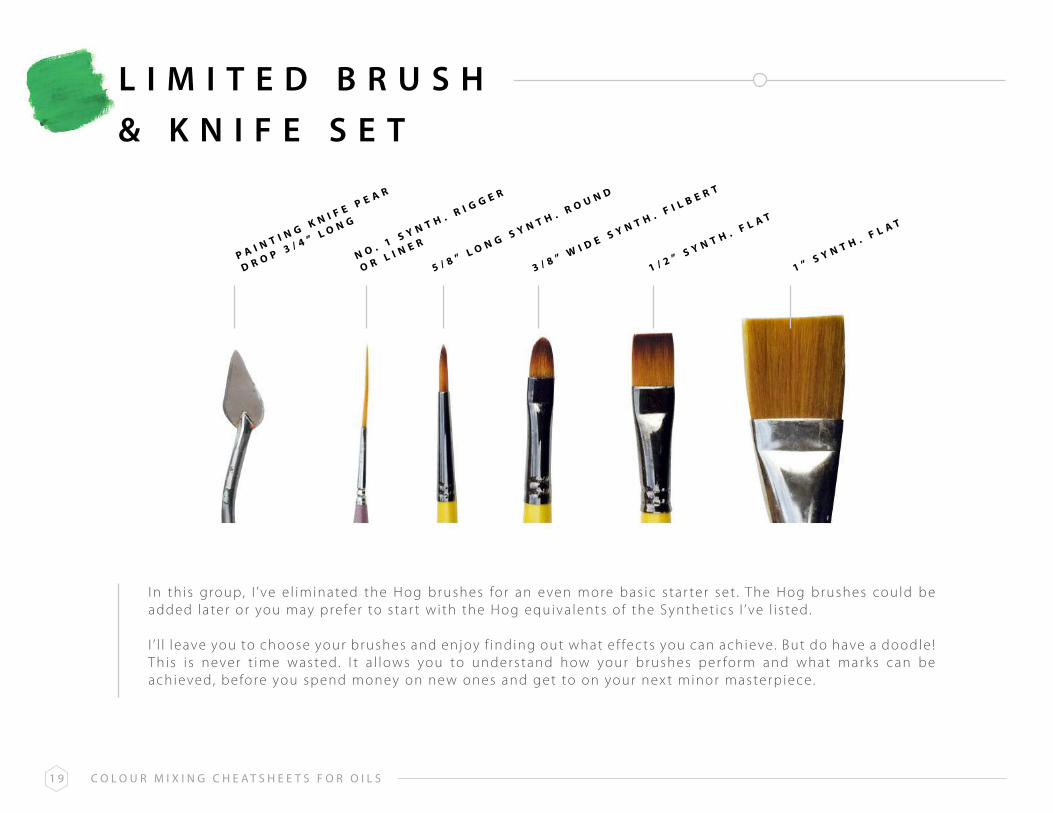
L I M I T E d B r U S H& K N I F E S E T
1 / 2 ” S Y n T H . F L A T
1 ” S Y n T H . F L A T
3 / 8 ” H O g F L A T
3 / 8 ” W I D E S Y n T H . F I L B E R T
3 / 8 ” W I D E H O g F I L B E R T
5 / 8 ” L O n g S Y n T H . R O U n D
1 ” W I D E H O g F A n
n O . 1 S Y n T H . R I g g E R
O R L I n E Rp A I n T I n g K n I F E p E A R
D R O p 3 / 4 ” L O n g
This i s a ver y bas ic s tar ter set , which can eas i ly be adjusted, depending upon whether you prefer addi t ional hogshai r brushes or more of the synthet ic var iet y.
NB : Don’t re ly exc lus ive ly on the number ing of brushes as an indicat ion of s ize as each manufac turer wi l l apply d i f ferent s tandards . So a No. 8 Round in one range could be the same as a No.5 Round in another.
Wherever poss ib le , check s izes yourse l f in an ar t s tore or, where th is i sn’ t poss ib le , see i f the webs i te prov ides in format ion as to the ac tua l s ize of the brush head; e .g. . 1/2” across the meta l fer ru le or 3/4” f rom the end of the fer ru le to the t ip of the brush , etc . The above have a l l been given a genera l indicat ion of s ize for th is reason, rather than the number being quoted.
C o l o u r M i x i n g C h e a t s h e e t s f o r o i l s1 9
L I M I T E d B r U S H& K N I F E S E T
I n th is group, I ’ ve e l iminated the Hog brushes for an even more bas ic s tar ter set . The Hog brushes could be added later or you may prefer to s tar t wi th the Hog equiva lents of the Synthet ics I ’ ve l i s ted.
I ’ l l leave you to choose your brushes and enjoy f inding out what e f fec ts you can achieve. But do have a doodle ! Th is i s never t ime wasted. I t a l lows you to understand how your brushes per form and what marks can be achieved, before you spend money on new ones and get to on your nex t minor masterp iece.
1 / 2 ” S Y n T H . F L A T
1 ” S Y n T H . F L A T
3 / 8 ” W I D E S Y n T H . F I L B E R T
5 / 8 ” L O n g S Y n T H . R O U n D
n O . 1 S Y n T H . R I g g E R
O R L I n E Rp A I n T I n g K n I F E p E A R
D R O p 3 / 4 ” L O n g

C o l o u r M i x i n g C h e a t s h e e t s f o r o i l s2 0
O I L M E d I U M S
Tradi t ional ly, a mix of l inseed o i l and turpent ine has been used to th in o i l pa ints and help i t f low more eas i ly when pa int ing. Turpent ine (k nown as a so lvent ) i s a l so used to c lean brushes and the pa lette .
A lot of a r t i s ts f ind the odour of turpent ine unpleasant and i t must be handled with care . Tradi t ional l inseed o i l ex tends the dr y ing t ime of the pa int (which i s a l ready s low to dr y) , so i t can become imprac t ica l for many le isure ar t i s ts . As a resul t , many other mediums for o i l pa int ing are now ava i lable , each with spec i f ic proper t ies , and th is can be ver y confus ing for the newcomer.
a l K y d g e l
l i Q u i n

C o l o u r M i x i n g C h e a t s h e e t s f o r o i l s2 1
O I L M E d I U M S
I f you are new to o i l pa int ing we recommend us ing just three produc ts to get s tar ted :
L O W O D O U R T H I n n E R S O R Z E S T - I T ( S O L v E n T )
This has a much l ighter and less of fens ive smel l than turpent ine. I t can a lso be mixed with a l i t t le pa int to prov ide a ver y th in , runny l iquid, which i s idea l for sk etching the in i t ia l out l ines of the p ic ture. Th is sk etch wi l l dr y quick ly.
A l ternat ive, more envi ronmenta l ly f r iendly, so lvents now ex is t and one of the most popular i s Zest- I t O i l Pa int Di lutant and Brush Cleaner. Th is i s complete ly non-tox ic and made f rom c i t rus f ru i t ac ids .
D R Y I n g L I n S E E D O I L ( m E D I U m )
This adds t ransparenc y, lust re and g loss to the pa int and a lso improves the f low. The dr y ing vers ion of l inseed o i l , a long with a lk yd medium or L iquin (see below) speeds up dr y ing t imes. M ixed with just a l i t t le pa int , i t a l so creates a c lear g laze when requi red.
A L K Y D m E D I U m O R L I q U I n ( m E D I U m )
These t wo mediums, ava i lable in e i ther a l iquid or ge l - l i k e cons is tenc y reduce the dr y ing t ime of pa int by at least ha l f . A pre -mixed bott le of of dr y ing l inseed o i l and e i ther a lk yd medium or L iquin i s ver y usefu l to k eep to hand for a l l o f your o i l pa int ings. As a rough guide use a rat io about three quar ters l inseed o i l and one quar ter a l ly medium or L iquin .
l i n s e e d o i l
d r y i n g l i n s e e d o i l
l o W o d o u r t h i n n e r s

C o l o u r M i x i n g C h e a t s h e e t s f o r o i l s2 2
F A T O V E r L E A N P r I N C I P L E
The term ’ fat over lean’ i s unique to o i l pa ints and confuses many aspi r ing o i l pa inters .
I t re lates to the o i l content of the pa int layer and not just to putt ing th ick or fat ter layers over th inner ones, as you might th ink .
I n s imple terms, ‘ fa t ter ’ layers of pa int ( i .e . those with a h igher o i l content ) should be put on top of ‘ leaner ’ layers ( those with less or no added o i l ) and genera l ly speak ing, not the other way round.
There are t wo main reasons for the ‘ fa t over lean’ pr inc ip le : - 1. Layers of paint with l i t t le or no oi l added ( lean) tend to be be quicker dr ying
and less f lexible. I f they are painted on top of oi l ier ( fat) layers, which dr y more s lowly, they could crack . The top layer of paint is dr y, whi le the layers underneath are st i l l wet and moving about.
2 . Oi l -r ich colours tend to dr y with a sheen, which makes i t more dif f icult for leaner layers to adhere to them.
The por t ra i t here gives a good idea of what could happen in ex t reme c i rcumstances. I f you ever look c lose ly at o ld pa int ings in ga l ler ies , you wi l l f ind many instances of pa int c rack ing and damaging the sur face.
* Photo cour tesy of k e l lepics/pixabay.com
C o l o u r M i x i n g C h e a t s h e e t s f o r o i l s2 3
F A T O V E r L E A N C H A r T
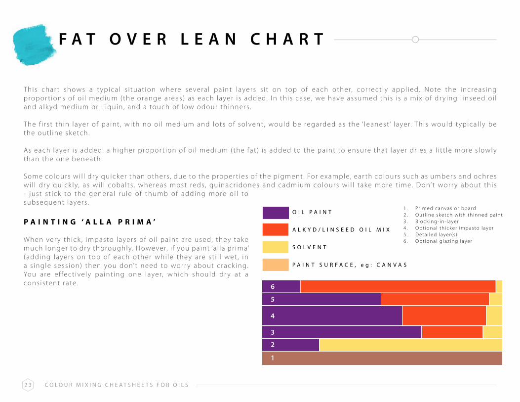
This char t shows a t ypica l s i tuat ion where severa l pa int layers s i t on top of each other, cor rec t ly appl ied. Note the increas ing propor t ions of o i l medium ( the orange areas) as each layer i s added. I n th is case, we have assumed th is i s a mix of dr y ing l inseed o i l and a lk yd medium or L iquin , and a touch of low odour th inners .
The f i r s t th in layer of pa int , wi th no o i l medium and lots of so lvent , would be regarded as the ‘ leanest ’ layer. Th is would t ypica l ly be the out l ine sk etch .
As each layer i s added, a h igher propor t ion of o i l medium ( the fat ) i s added to the pa int to ensure that layer dr ies a l i t t le more s lowly than the one beneath .
Some colours wi l l dr y quick er than others , due to the proper t ies of the p igment . For example, ear th colours such as umbers and ochres wi l l dr y quick ly, as wi l l cobal ts , whereas most reds, quinacr idones and cadmium colours wi l l tak e more t ime. Don’t wor r y about th is - just s t ick to the genera l ru le of thumb of adding more o i l to subsequent layers .
p A I n T I n g ‘ A L L A p R I m A ’
When ver y th ick , impasto layers of o i l pa int are used, they tak e much longer to dr y thoroughly. However, i f you pa int ‘a l la pr ima’ (adding layers on top of each other whi le they are s t i l l wet , in a s ingle sess ion) then you don’t need to wor r y about crack ing. You are e f fec t ive ly pa int ing one layer, which should dr y at a cons is tent rate .
o i l p a i n t
6
5
4
3
2
1
1 . Pr imed canvas or board2 . Out l ine sk etch with th inned pa int3 . B lock ing- in- layer4 . Opt ional th ick er impasto layer5 . Deta i led layer (s )6 . Opt ional g laz ing layer
a l K y d / l i n s e e d o i l M i x
s o l V e n t
p a i n t s u r f a C e , e g : C a n V a s

C o l o u r M i x i n g C h e a t s h e e t s f o r o i l s2 4
P A I N T S U r F A C E S
Oi l pa int ings can be produced on a wide var iet y of sur faces . The best k nown is s t retched canvas over a wooden f rame. However, canvas panels g lued to a heavy card base are more economica l and widely ava i lable in a var iet y of s izes .
Wood panels too are popular - ch ipboard, p ly, masonite (hardboard) or MDF - or even th ick card are a l l su i table , once pr imed (see nex t Sec t ion) .
The o i l pa int needs a toothed base to adhere to, so non-porous sur faces such as acr y l ic , g lass , meta l or porce la in , for example, a re genera l ly not recommended. However, i t may be poss ib le to prepare these wi th a pr imer that etches i t se l f into the sur face and thus prov ides a ’ k ey ’ or ‘ tooth’ for the pa int .
For the newcomer to o i l s though, i t ’s probably best to s t ick to one of the more t radi t ional sur faces ment ioned at the beginning of th is Sec t ion .

C o l o u r M i x i n g C h e a t s h e e t s f o r o i l s2 5
P A I N T I N G & P r E P A r A T I O N
Most o i l pa int ing sur faces need pr iming. Th is i s usual ly done with gesso, which works equal ly wel l for both acr y l ics and o i l s . One or t wo coats are usual ly suf f ic ient .
Pr iming a pa int sur face, whether canvas , wood panel etc . sea ls the f ibres and prevents the pa int f rom soak ing in and d isappear ing. The f ibres of an unpr imed canvas could be damaged eventual ly by the so lvents/o i l s in the pa int mix .
Most canvas boards and pre -st retched canvas panels come ready pr imed, so you only need to dec ide i f you want a white sur face or t int i t wi th d i lute acr y l ic or o i l pa int , before s tar t ing on the pa int ing i tse l f .
I nc identa l ly, you can’t pa int with acr y l ic pa int on top of an o i l pa int layer as the o i ly sur face wi l l prevent the acr y l ic pa int f rom adher ing proper ly. I n addi t ion , the o i l pa int under- layer wi l l dr y s lowly, whi le the acr y l ics on top would dr y much quick er, probably crack ing.
However, i t ’s per fec t ly poss ib le to b lock in your bas ic image us ing acr y l ics and then, once thoroughly dr y a f ter a few hours , to complete the work in o i l s .
Many ar t i s ts operate th is way to save t ime. I t works because the o i l pa int s t i l l has the tooth of the canvas to c l ing to, as the acr y l ic pa int and gesso pr imer wi l l have sett led qui te deeply into the f ibres .

C o l o u r M i x i n g C h e a t s h e e t s f o r o i l s2 6
V A r N I S H I N G
Many ar t i s ts l i k e to varn ish the i r o i l pa int ings upon complet ion . Varn ish ing can create an even sheen on a pa int ing, where var ious patches have become dul ler and the pa int has sunk fur ther into the sur face. I t can a lso enr ich colours , especia l ly dark er ones.
A l though gloss varn ish i s popular, you can buy a matte or sat in varn ish for a d i f ferent e f fec t .
Di r t and dust f rom the atmosphere sett les on a pa int ing over the years . Th is wi l l s i t on the varn ish layer rather than the pa int , which can be removed and re -appl ied, br inging the pa int ing back to i t s or igina l lust re .
A p p L Y I n g v A R n I S H
When apply ing varn ish , use a wide brush and hor izonta l brush st rok es . Use back and for th s t rok es that over lap s l ight ly, to avoid r idges and t idemarks , which wi l l be d i f f icu l t to h ide unless you remove a l l the varn ish and star t aga in .
Avoid the temptat ion to go over an area once you’ve varn ished i t as the par t ia l ly dr ied coat wi l l drag and become uns ight ly. I f you’ve missed a smal l a rea , let that coat dr y and go over i t aga in , th is t ime varn ish ing f rom top to bottom, to cover the area you missed.
* Photo cour tesy of M ik e/pexels .com

C o l o u r M i x i n g C h e a t s h e e t s f o r o i l s2 7
V A r N I S H I N G
For most o i l pa int ings, varn ish ing should not be cons idered for at least s ix months a f ter complet ion , or t welve months i f heavy impasto layers have been used.
To protec t the pa int ing in th is per iod, or i f you need to exhib i t i t shor t ly a f ter complet ion , use re - touching varn ish . Th is gives an ef fec t ive temporar y protec t ion , an even g loss and can be pa inted over i f you need to mak e amendments to the p ic ture. I t can be removed with so lvent before apply ing a more long last ing varn ish later on
Use the spray vers ion of retouching varn ish as th is wi l l drop gent ly and evenly onto the p ic ture, thus avoid ing any r i sk of dragging any not- qui te - dr y pa int with a brushed varn ish .
g l o s s V a r n i s h
g l o s s V a r n i s h
s a t i n V a r n i s h
M a t t e V a r n i s h
o r i g i n a l o i l p a i n t
V a r n i s h e f f e C t s
r e t o u C h i n g V a r n i s h

C o l o u r M i x i n g C h e a t s h e e t s f o r o i l s2 8
C O L O U r M I x I N G T E r M S
p R I m A R YC O L O U R S
S E C O n D A R YC O L O U R S
T E R T I A R YC O L O U R S
C O m p L E m E n T A R YC O L O U R S
H U E
T I n T
S H A D E
T O n E
v A L U E
There are three pr imar y colours which cannot be created by mix ing other co lours .They are : red, b lue and ye l low
Secondar y colours are mixed f rom t wo of the pr imar ies .They are green (b lue + ye l low) , orange ( red + ye l low) , purple ( red + b lue)
The s ix co lours created by mix ing a pr imar y with a secondar y i .e . b lue + green to create a b lue - green or turquoise
Colours oppos i te each other on the colour wheel . For example, orange i s oppos i te b lue on the colour wheel and so become each others’ complementar y colour. Complementar y colours are sa id to enhance each other when placed nex t to each other. When mixed with each other they have the oppos i te e f fec t , c reat ing a dul l , neutra l tone.
Complementar y colours inc lude : Orange and blue, Ye l low and purple , Green and red
This i s the br ightest , most v iv id vers ion of a pr imar y, secondar y or ter t ia r y co lour. So red for example, wi th no other co lour mix with i t and undi luted i s a hue. Pa int ing only with hues would resul t in a ver y br ight and gar i sh pa int ing.
Adding white to a co lour to l ighten i t , c reates a t int of that co lour.
Adding black to a co lour to dark en i t , c reates a shade of that co lour. I n acr y l ic pa int ing, adding a colour ’s complementar y to i t has a s imi lar e f fec t ( i .e . adding purple to ye l low has a s imi lar e f fec t as adding b lack to the ye l low) . You could a lso mix a b lack colour by mix ing the three pr imar y colours together and then add that b lack mix to another co lour ( spar ingly ) to create a shade.
Adding back and white to a co lour, c reates a tone of that co lour. Obvious ly b lack and white mak e grey and so a tone i s greyer vers ion of a co lour. These are a lso re fer red to as paste l co lours , or neutra l co lours . You’ l l use tones a lot in your pa int ings because the bulk of any subjec t matter i s made f rom them. You can then use shades for shadow areas , t ints for h ighl ight areas and a touch of br ight hues where you rea l ly want the colour to z ing.
Th is i s the l ightness or dark ness of a co lour. Whi le i t might seem obvious that b lue has a dark er va lue than ye l low, a ver y l ight b lue might be l ighter than a dark ye l low. The best way to judge the va lues in a photograph or pa int ing i s to mak e i t back and white . Th is wi l l mak e i t obvious which colours are dark er and l ighter than others .