overview of letters and memos
DESCRIPTION
letters and memosTRANSCRIPT

Overview of Letters and Memos
Chapters 6-8
Check Appendix A
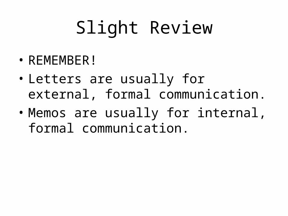
Slight Review
• REMEMBER!
• Letters are usually for external, formal communication.
• Memos are usually for internal, formal communication.
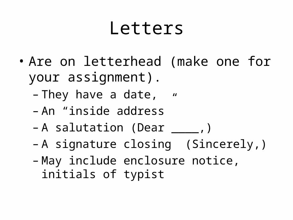
Letters
• Are on letterhead (make one for your assignment).– They have a date,– An “inside address”– A salutation (Dear ____,)– A signature closing (Sincerely,)– May include enclosure notice, initials of typist

Memos
• May or may not be on a letterhead
• Have a formatted Heading which includes:– Date (date of memo)– To (person receiving memo & title)– From (sender’s & title – initial by name in ink)– Subject (purpose of the memo)– NO SALUTATION– NO SIGNATURE CLOSING

Body Format
• Both letters and memos may have a block or modified block format
• Block Format – every line is left justified
• Modified Block Format – paragraphs are indented– This means signature close and dates on
letters appear midpage

Block Example (inside address, date and salutation)
Month day, year
• Business name• Address• City, ST zip
Dear Ms. Soandso

Block Example (body & close)• Yada yada yada and the quick brown fox jumped over the lazy
sleeping dog.
• Now is the time for all good men to come to the aid of their country. She sells seashells by the seashore. My dog has fleas, my dog has fleas, oh, help me please, my dog has fleas.
• Peter Piper picked a peck of pickled peppers, if Peter Piper picked a peck of pickled peppers, how many pickled peppers did Peter Piper pick?
• Sincerely,
• Suzy Nead

Modified Block» Month day, year
• Inside Address• Inside Address• Inside Address• Inside Address
• Dear Ms. (or Mr.)

Modified Block
• This is where the paragraphs are indented. But, remember to put dates and signatures mid-page.
• This particular computer program will not let me tab to mid-page, but you will get the idea.
• The rest of this is just to fill up space for a third paragraph.
» Sincerely,
» Suzy Nead
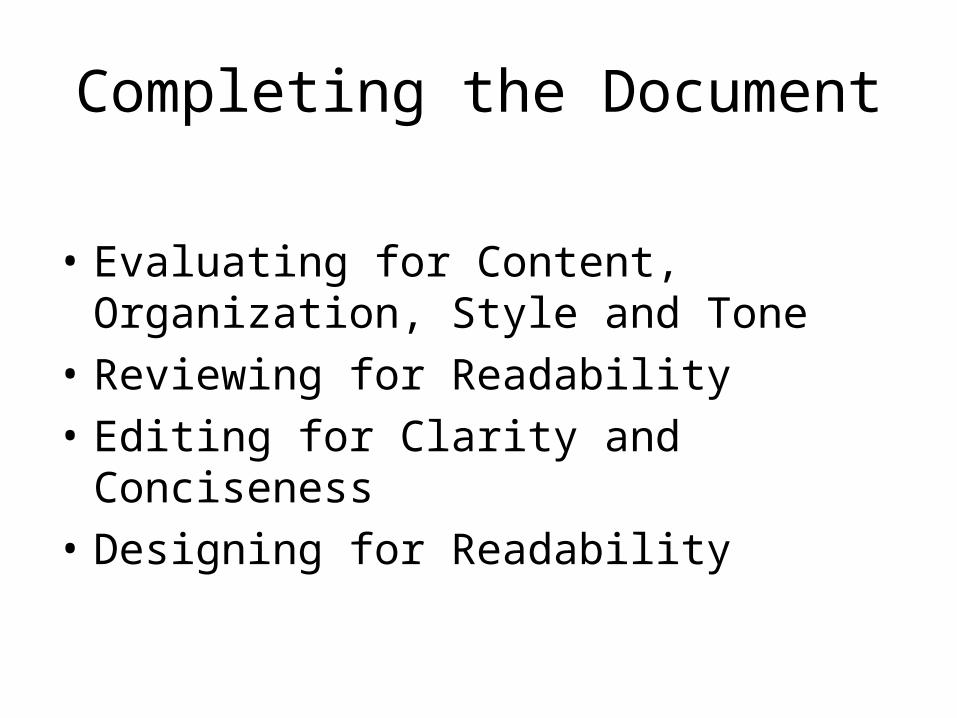
Completing the Document
• Evaluating for Content, Organization, Style and Tone
• Reviewing for Readability
• Editing for Clarity and Conciseness
• Designing for Readability

Evaluating Content, Organization, Style and Tone
• For Content:– Is the information accurate?– Is the information relevant to your audience?– Is there enough information to satisfy your
reader’s needs?– Is there a good balance between the general
and the specific?

• For Organization:
– Are all your points covered in the most logical order?– Do the most important ideas receive the most space,
and are they placed in the most prominent positions?– Would the message be more convincing if it were
arranged in another sequence?– Are any points repeated unnecessarily?– Are details grouped together logically, or are some
still scattered through the document?
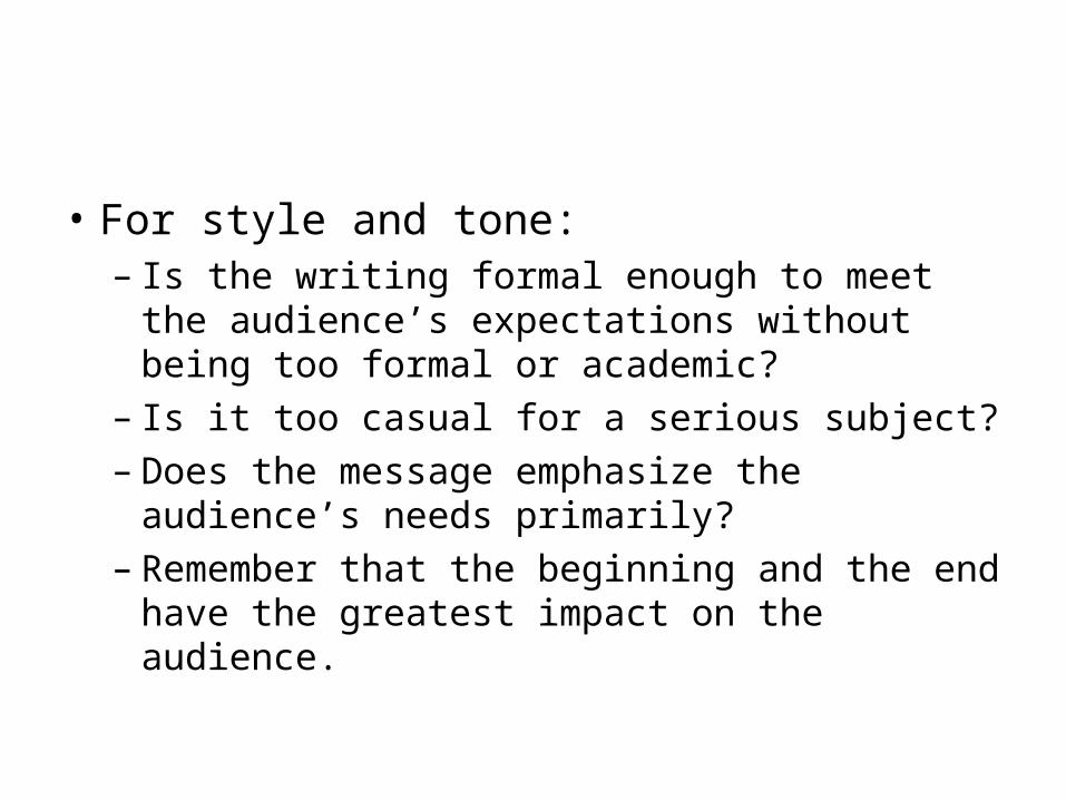
• For style and tone:– Is the writing formal enough to meet the
audience’s expectations without being too formal or academic?
– Is it too casual for a serious subject?– Does the message emphasize the audience’s
needs primarily?– Remember that the beginning and the end
have the greatest impact on the audience.
Reviewing for Readability
• Vary Sentence Length• Keep Paragraphs Short (And Varied in Length)• Use Bullets and Lists• Add Headings and Subheadings
– Headings show at a glance how the document is organized
– Headings and subheadings help focus attention– Headings and subheadings help connect ideas.

Revising for Clarity and Conciseness
• For Clarity:– Breakup overly long sentences– Rewrite hedging sentences – Reword long noun sentences– Replace camouflaged verbs– Clarify sentence structure– Clarify awkward references– Moderate enthusiasm

• For Conciseness:– Delete unnecessary words and phrases (who,
that, which, the)– Shorten long words and phrases– Eliminate redundancies– Recast “It is/There are” starters – I would like
to add “We at…” and “As you know…” to this item.

Designing for Readability
• Consistency – margins, typefaces, type size, spacing, type styles, and design elements
• Balance – Aesthetically pleasing with text, white space and art.
• Restraint – Simplicity, without too many changes in font, type size, etc
• Detail – Titles at bottom of page
White Space
• Any space free of text or artwork (designs, graphs, etc).
• Provide visual contrast and resting points for reader.
• Be generous, but not overwhelming with white space

Margins and Justification
• Flush left margin – all lines of text begin at left margin and have a ragged right margin
• Flush right margin – all lines of text end at the right margin but have a ragged left margin.
• Justified – all lines are justified both right and left, there are no jagged ends– Makes a document appear darker and more
formal
Typefaces
• Refers to the physical design of the letters
• Serif – have small crosslines (serifs) at the end of each letter stroke
• Sans serif – do not have crosslines

Type Styles
• Any modification that lends contrast or emphasis to the type.
• Italic• Bold • Underline• Highlighting• Decoration