peeking beneath the hood of uber - mislove · peeking beneath the hood of uber le chen northeastern...
TRANSCRIPT
Peeking Beneath the Hood of Uber
Le ChenNortheastern University
Boston, [email protected]
Alan MisloveNortheastern University
Boston, [email protected]
Christo WilsonNortheastern University
Boston, [email protected]
ABSTRACTRecently, Uber has emerged as a leader in the “sharing econ-omy”. Uber is a “ride sharing” service that matches willingdrivers with customers looking for rides. However, unlikeother open marketplaces (e.g., AirBnB), Uber is a black-box:they do not provide data about supply or demand, and pricesare set dynamically by an opaque “surge pricing” algorithm.The lack of transparency has led to concerns about whetherUber artificially manipulate prices, and whether dynamicprices are fair to customers and drivers.
In order to understand the impact of surge pricing on pas-sengers and drivers, we present the first in-depth investiga-tion of Uber. We gathered four weeks of data from Uber byemulating 43 copies of the Uber smartphone app and dis-tributing them throughout downtown San Francisco (SF)and midtown Manhattan. Using our dataset, we are able tocharacterize the dynamics of Uber in SF and Manhattan, aswell as identify key implementation details of Uber’s surgeprice algorithm. Our observations about Uber’s surge pricealgorithm raise important questions about the fairness andtransparency of this system.
Categories and Subject DescriptorsH.3.5 [Online Information Services]: Commercial ser-vices, Web-based services
KeywordsUber; Surge Pricing; Sharing Economy; Algorithm Auditing
1. INTRODUCTIONRecently, there has been an explosion of services that facil-
itate the so-called“sharing economy”. Websites like AirBnB,Care.com, TaskRabbit, and Fiverr allow individuals to ad-vertise their services and set their own schedules without thenecessity of working for a company. Typically, these web-sites function as marketplaces where participants set theirown prices and choose who to accept jobs from. By acting
Permission to make digital or hard copies of all or part of this work for personal orclassroom use is granted without fee provided that copies are not made or distributedfor profit or commercial advantage and that copies bear this notice and the full citationon the first page. Copyrights for components of this work owned by others than theauthor(s) must be honored. Abstracting with credit is permitted. To copy otherwise, orrepublish, to post on servers or to redistribute to lists, requires prior specific permissionand/or a fee. Request permissions from [email protected]’15, October 28–30, 2015, Tokyo, Japan.Copyright is held by the owner/author(s). Publication rights licensed to ACM.ACM 978-1-4503-3848-6/15/10 ...$15.00.DOI: http://dx.doi.org/10.1145/2815675.2815681 .
as open platforms, these websites are poised to unlock theproductive potential of millions of people.
Uber has emerged as a leader in the sharing economy.Uber is a “ride sharing” service that matches willing drivers(i.e., anyone with a car) with customers looking for rides.Uber charges passengers based on time and distance oftravel; however, during times of high demand, Uber usesa “surge multiplier” to increase prices. Uber provides twojustifications for surge pricing [11]: first, it reduces demandby pricing some customers out of the market, thus reducingthe wait times for the remaining customers. Second, surgepricing increases profits for drivers, thus incentivizing morepeople to drive during times of high demand. Uber’s busi-ness model has become so widely emulated that the medianow refers to the “Uberification” of services [4].
While Uber has become extremely popular, there are alsoconcerns about the fairness, efficacy, and disparate impactof surge pricing. The key difference between Uber and othersharing economy marketplaces is that Uber is a black-box:they do not provide data about supply and demand, andsurge multipliers are set by an opaque algorithm. This lackof transparency has led to concerns that Uber may arti-ficially manipulate surge prices to increase profits [25], aswell as apprehension about the fairness of surge pricing [10].These concerns were exacerbated when Uber was forced topublicly apologize and refund rides after prices surged dur-ing Hurricane Sandy [16] and the Sydney hostage crisis [19].
In order to understand the impact of surge pricing onpassengers and drivers, we present the first in-depth inves-tigation of Uber. We gather four weeks of data from Uberby emulating 43 copies of the Uber smartphone app anddistributing them in a grid throughout downtown San Fran-cisco (SF) and midtown Manhattan. By carefully calibrat-ing the GPS coordinates reported by each emulated app, weare able to collect high-fidelity data about surge multipliers,estimated wait times (EWTs), car supply, and passengerdemand for all types of Ubers (e.g., UberX, UberBLACK,etc.). We validate our methodology using ground-truth dataon New York City (NYC) taxicabs.
Using our dataset, we are able to characterize the dynam-ics of Uber in SF and Manhattan. As expected, supply anddemand show daily patterns that peak around rush hours.However, we also observe differences between these cities:although SF has many more Ubers than Manhattan, it alsosurges much more often. Surge prices are extremely noisy:the majority of surges last less than five minutes. Finally,by analyzing the movements and actions of Uber drivers, we
show that surge prices have a small, positive effect on vehiclesupply, and a large, negative impact on passenger demand.
Additionally, our measured data enables us to identifykey implementation details of Uber’s surge price algorithm.Based on our understanding of Uber’s algorithm, we makethe following observations:
• Uber has manually divided cities into “surge areas”with independent surge prices. Prices update every5 minutes and show high correlation with supply, de-mand, and estimated wait time over the previous 5-minute interval. This suggests that surge prices areset algorithmically, not manually, and that the algo-rithm is quite responsive.
• However, as April 2015, Uber began serving surgeprices to users that do not always match the pricesreturned by the Uber API. Furthermore, surge priceswere no longer uniform for users, even if they werein the same surge area at the same time. We reportedthis finding to Uber, and their engineers confirmed thatthis behavior was caused by a bug in their system.
• Although we show that surge prices cannot be fore-cast in advance, given knowledge of the surge pricingalgorithm, we demonstrate how passengers can signif-icantly reduce surge prices 10-20% of the time by ex-ploiting differences between surge areas.
Our observations about Uber’s surge price algorithm raiseimportant questions about fairness and transparency. Forexample, users may receive dramatically different prices dueto small changes in geolocation. Furthermore, the vague,changing aspects of the algorithm impacts drivers’ abilityto predict fares. Finally, the black-box nature of Uber’ssystem makes it vulnerable to exploitation by passengers(as we show), or possibly by colluding groups of drivers [2].
Outline. We begin in §2 by introducing Uber. In §3,we present and validate our data collection methodology.In §4, we characterize supply and demand on Uber, andanalyze Uber’s surge pricing algorithm in §5. Based on thesefindings, we present a strategy for avoiding surge prices in§6, followed by related work and discussion in §7 and §8.
2. BACKGROUNDIn this section, we briefly introduce Uber, surge pricing,
and technical details about the Uber service.
Uber. Founded in 2009, Uber is a “ride sharing” ser-vice that connects people who need transportation with acrowd-sourced pool of drivers. Unlike typical transporta-tion providers, Uber does not own any vehicles or directlyhire drivers. Instead, Uber drivers are independent contrac-tors (known as “partners”) who use their own vehicles andset their own schedules. As of May 2015, Uber is availablein 200 cities in 57 countries1, and claims to have 160K activedrivers in the U.S. alone [15].
Uber provides a platform that connects passengers todrivers in real-time. Drivers use the Uber Partner appon their smartphone to indicate their willingness to acceptfares. Passengers use the Uber Client app to determine theavailability of rides and get estimated prices. Uber’s systemroutes passenger requests to the nearest driver, and auto-matically charges passengers’ credit cards at the conclusion
1https://www.uber.com/cities
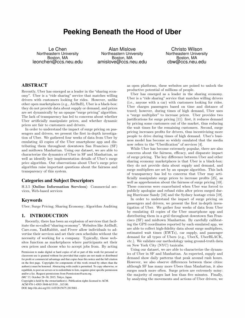
Figure 1: Screenshot of the Uber Partner app.
of each trip. Uber retains 20% of each fare and pays the restto drivers.
Depending on location, Uber offers a variety of differentservices. UberX and UberXL are basic sedans and SUVsthat compete with traditional taxis, while UberBLACKand UberSUV are luxury vehicles that compete withlimousines. UberFAMILY is a subset of UberX and UberXLcars equipped with car seats, while UberWAV refers towheelchair accessible vehicles. UberT allows users to requesttraditional taxis from within the Uber app. UberPOOL al-lows passengers to save money via carpooling, i.e., Uber willassign multiple passengers to each vehicle. UberRUSH is adelivery service where Uber drivers agree to courier packageson behalf of customers.
Surge Pricing. Uber’s fare calculation changes de-pending on local transportation laws. It typically incorpo-rates a minimum base fare, cost per mile, cost per minute,and fees, tolls, and taxes. The base fare and distance/timecharges vary depending on the type of vehicle (e.g., UberXvs. UberBLACK).
In 2012, Uber introduced a dynamic component to pricingknown as the surge multiplier. As the name suggests, fareprices are multiplied by the surge multiplier; typically themultiplier is 1, but during times of high demand it increases.Uber has stated that there are two goals of this system: first,higher profits may increase supply by incentivizing driversto come online. Second, higher prices may reduce demandby discouraging price-elastic customers.
Little is known about Uber’s surge price algorithm, orwhether the system as a whole is successful at addressingsupply/demand imbalances. As shown in Figure 1, surgemultipliers vary based on location, and recent measurementssuggest that Uber updates the multipliers every 3-5 min-utes [6]. Uber has a patent pending on the surge price algo-rithm, which states that features such as car supply, passen-ger demand, weather, and road traffic may be used in thecalculation [23].
Passenger’s Perspective. Uber’s apps provide differ-ent information to passengers and drivers. The Client appdisplays a map with the eight closest cars to the user (basedon the smartphone’s geolocation), and the Estimated WaitTime (EWT) for a car. The app provides separate eight-carinventories and EWTs for each type of Uber. Users are notshown the surge multiplier until they attempt to request acar (and only if it is >1). Although the app initially as-sumes that the user’s current location is their pickup point,

the user may move the map to choose a different pickuppoint. This new location may have a different EWT and/orsurge multiplier than the original location.
Driver’s Perspective. In contrast to the Clientapp, the Partner app displays very different information todrivers. As shown in Figure 1, the centerpiece of the Part-ner app is a map with colored polygons indicating areas ofsurge. Unlike the Client app, the locations of other cars arenot shown. In theory, this map allows drivers to locate ar-eas of high demand where they can earn more money. Inpractice, drivers often use the Partner and Client apps con-currently, to see the exact locations of competing drivers [3].The Partner app’s map also suggests that Uber calculatesdiscreet surge multipliers for different geographic areas. Weempirically derive these surge areas in § 5.
3. METHODOLOGYThere are three high-level goals of this study. First, we
aim to understand the overall dynamics of the Uber service.Second, we want to determine how Uber calculates surgemultipliers. Third, we want to understand whether surgepricing is effective at mitigating supply/demand imbalances.To answer these questions, we need detailed data about Uber(e.g., supply of cars, surge multipliers, etc.) across time andgeography.
In this section, we discuss our approach for collecting datafrom Uber. We begin by motivating San Francisco (SF) andManhattan as the regions for our study. Next, we discuss ourmethodology for collecting data from the Uber Client app,and how we calibrated our measurement apparatus. Finally,we validate our methodology using simulations driven byground-truth data on all taxi rides in NYC in 2013.
3.1 Selecting LocationsIn this study, we focus on the dynamics of Uber in SF
and Manhattan. As we discuss in §3.2 and §3.3, there arepractical issues that force us to constrain our data collectionto relatively small geographic regions. Furthermore, not allregions are viable or interesting: Uber does not offer ser-vice everywhere, and many places will have few cars andpassengers (i.e., rural areas).
We chose to focus on SF and Manhattan for four rea-sons. First, San Francisco and New York City have the 2ndand 3rd largest populations of Uber drivers in the U.S. (LosAngeles has the largest population) [15]. Second, SF wasUber’s launch city, and recent measurements suggest that itaccounted for 71% of all “taxi” rides in the city in 2014 (thehighest percentage of any U.S. city; Uber accounted for 29%of all rides in NYC during 2014) [27]. Third, SF and NYCare very different cities in terms of culture and access to pub-lic transportation, which may lead to interesting differencesin the dynamics of Uber.
Fourth and finally, Manhattan is a useful location to mea-sure Uber because there also exists a publicly availabledataset of all taxi rides in NYC for 2013 [22]. We lever-age this data in §3.5 to validate the accuracy of our Ubermeasurement methodology.
3.2 The Uber APINow that we have chosen locations, the next step is to
collect data from Uber in these two areas. Like manymodern web services, Uber provides an HTTP-based API
for third-party developers to retrieve information about thestate of the service. In our case, the estimates/price andestimates/time endpoints are most useful. The formertakes longitude and latitude as input, and returns a JSON-encoded list of price estimates (including surge multipliers)for all car types available at the given location. The latter issimilar, except it returns EWTs. Uber imposes a rate limitof 1,000 API requests per hour per user account.
While data from the Uber API is useful, it is not sufficientfor this study, since it does not include information aboutcar supply or passenger demand. Thus, we only rely on APIdata for specific experiments in §5.
3.3 Collecting Data from the Uber AppTo overcome the shortcomings of the Uber API, we lever-
age the Uber Client app. After a user opens the app andauthenticates with Uber, the app sends pingClient mes-sages to Uber’s server every 5 seconds. Each ping includesthe user’s geolocation, and the server responds with a JSON-encoded list of information about all available car types atthe user’s location. For each car type, the nearest eightcars, EWT, and surge multiplier are given. Each car is rep-resented by a unique ID, its current geolocation, and a pathvector that traces the recent movements of the car.
To gather this data, we wrote a script that emulates theexact behavior of the Client app. Our script logs-in to Uber,sends pingClient messages every 5 seconds, and records theresponses. By controlling the latitude and longitude sent bythe script, we can collect data from arbitrary locations. Wecreated 43 Uber accounts (each account requires a creditcard to create), giving us the ability to “blanket” a small ge-ographic area with measurement points. To simplify our dis-cussion, we refer to these 43 measurement points as“clients”.
While we were collecting data we never encountered ratelimits or had our accounts banned. This indicates that wevery likely were not detected by Uber. Although it is possi-ble that Uber detected our clients and fed them false data, itis much more plausible that Uber would have simply bannedour clients if they were concerned about our measurements.
Measuring Demand and Supply. Using the data re-turned by pingClient, we can approximate the aggregatesupply and demand within our measurement region. Tomeasure supply, we can simply count the total number ofunique cars observed across all measurement points; eachof these cars represents a driver who is looking to providea ride. To measure demand, we can measure the aggre-gate number of cars that go offline (disappear) between re-sponses; one of the reasons a car may go offline is becauseit picked up a rider (we discuss other potential reasons, andhow we handle them, below).
Limitations. Although pingClient returns more infor-mation than the Uber API, there are still four limitationsthat we must address. First, clients only receive informationabout the eight closest cars. Thus, to measure the overallsupply of vehicles in a geographic area, we must position the43 clients such that they completely cover the area. This sit-uation is further complicated by the fact that each client’svisibility changes as the density of Uber cars fluctuates (e.g.,cars are dense during rush hour but sparse at 4am). In §3.4,we perform calibration experiments to determine the appro-priate distance to space our clients.
Second, the demand we are able to estimate from our datais fulfilled demand, i.e., the number of cars that pick up pas-sengers. Uber does not provide public data about quantitydemanded, i.e., the number of passengers that request rides.The difference between fulfilled and quantity demand is thatsome passengers may request a ride but not receive one dueto supply shortages. Thus, in this study, when we refer to“demand”, we are talking about fulfilled demand.
Third, our measurement of demand may overestimate thetrue demand because there are three reasons why a car mightdisappear between one response and the next: 1) the cardrives outside our measurement area, 2) the driver acceptsa ride request, or 3) the driver goes offline. We can disam-biguate case 1 since the Client data includes the path vectorfor each car. Although we cannot disambiguate cases 2 and3, we can still use car disappearances as an upper-bound onthe fulfilled demand within the measurement area.
Fourth, data from the Client app does not allow us totrack individual Uber drivers over time. Although each car isassigned a unique ID, these IDs are randomized each time acar comes online. Unfortunately, there is no way to overcomethis limitation, and thus none of our experiments rely ontracking individual drivers.
Phantom Cars. Several press articles claim that Uber’sClient app does not display data about actual Uber cars; in-stead, they claim that the cars are “phantoms” designed togive customers the illusion of supply [26]. Uber has publiclydisputed these claims [5,32], explaining that the data shownin the Client app is as accurate as possible, given practicalconstraints like the accuracy of smartphone GPS measure-ments. Furthermore, Uber stated that car locations may beslightly perturbed to protect drivers’ safety. We have notobserved any evidence in our data to suggest that the carsare phantoms; on the contrary, the cars in our data exhibitall the hallmarks of human activity, such as diurnal activitypatterns (see §4). If Uber does present phantom cars, it islikely that they only do so in rural areas with low supply,rather than in major cities like Manhattan and SF.
Uber Driver App. As shown in Figure 1, the Driverapp also includes useful information (i.e., the surge map).However, only registered Uber drivers may log in to theDriver app. We attempted to sign-up as an Uber driver,but unfortunately Uber requires that drivers sign a docu-ment prohibiting data-collection from the Driver app. Weopted not to sign this agreement. Instead, in §5, we recon-struct the surge map based on data from the Uber API.
Ethics. While conducting this study, we were careful tocollect data in an ethical manner. First, we do not collectany personal information about any Uber users or drivers.We discussed our study with the Chair of our University’sInstitutional Review Board (IRB); she evaluated it as notbeing subject to IRB review because we did not collect per-sonal information or impact any user’s environment.
Second, we minimize our impact on Uber users anddrivers. Before we began our data collection, we conductedan experiment to see if our measurements would impactUber users by artificially raising the surge price. Fully dis-cussed below, our results strongly suggests that our mea-surements have no impact on the surge multiplier. More-over, at no point in this study did we actually request ridesfrom any Uber driver, and drivers are not able to observeour measurement clients in the Driver app.
Third, we minimized our impact on Uber itself by col-lecting just the data we need to perform the study. Theoverall effect of our measurements was the same as 43 extrausers running the Uber Client app. Given that Uber claimsmillions of users worldwide, we believe this is a worthwhiletradeoff in order to conduct this research.
Other Ride-Sharing Services. Although we at-tempted to collect data from other ride sharing services,these efforts were not successful. Lyft implements “primetime” pricing, but this data is only available after a userrequests a ride. Thus, there was no ethical way for us tocollect this data. Sidecar does not implement surge pric-ing; instead, drivers set their own rates based on time anddistance. These additional variables make it difficult to sys-tematically collect price information.
3.4 CalibrationThe next step in our methodology is determining the lo-
cations for our 43 clients in SF and Manhattan. This step iscrucial; on one hand, if we distribute the clients sparsely, wemay only observe a subset of cars and thus underestimatesupply and demand (recall that pingClient responses fromUber only contain the closest eight cars to each client). Onthe other hand, if the clients are too close together, the carsthey observe will overlap, and we will fail to observe supplyand demand over a sufficiently large geographic area.
To determine the appropriate placement of our 43 clients,we conducted a series of experiments between December2013 and February 2014. In our first experiment, we chosea random location in Manhattan and placed all 43 clientsthere for one hour. We then repeated this test over severaldays with different random locations around Manhattan andSF. The results of these experiments reveal two importantdetails about Uber: first, during each test, all 43 clientsobserved exactly the same vehicles, surge multipliers, andEWTs. This strongly suggests that the data received frompingClient is deterministic.
Second, when the clients were placed in areas where wewould not expect to see surge (e.g., residential neighbor-hoods at 4 a.m.), all 43 clients recorded surge multipliersof 1 for the entire hour. This strongly suggests that ourmeasurement methodology does not induce surges. As weshow in Figure 8, fulfilled demand in midtown Manhattanpeaks around 100 rides per hour, so 43 clients is a significantenough number that we would expect surge to increase if thealgorithm took “views” into account.
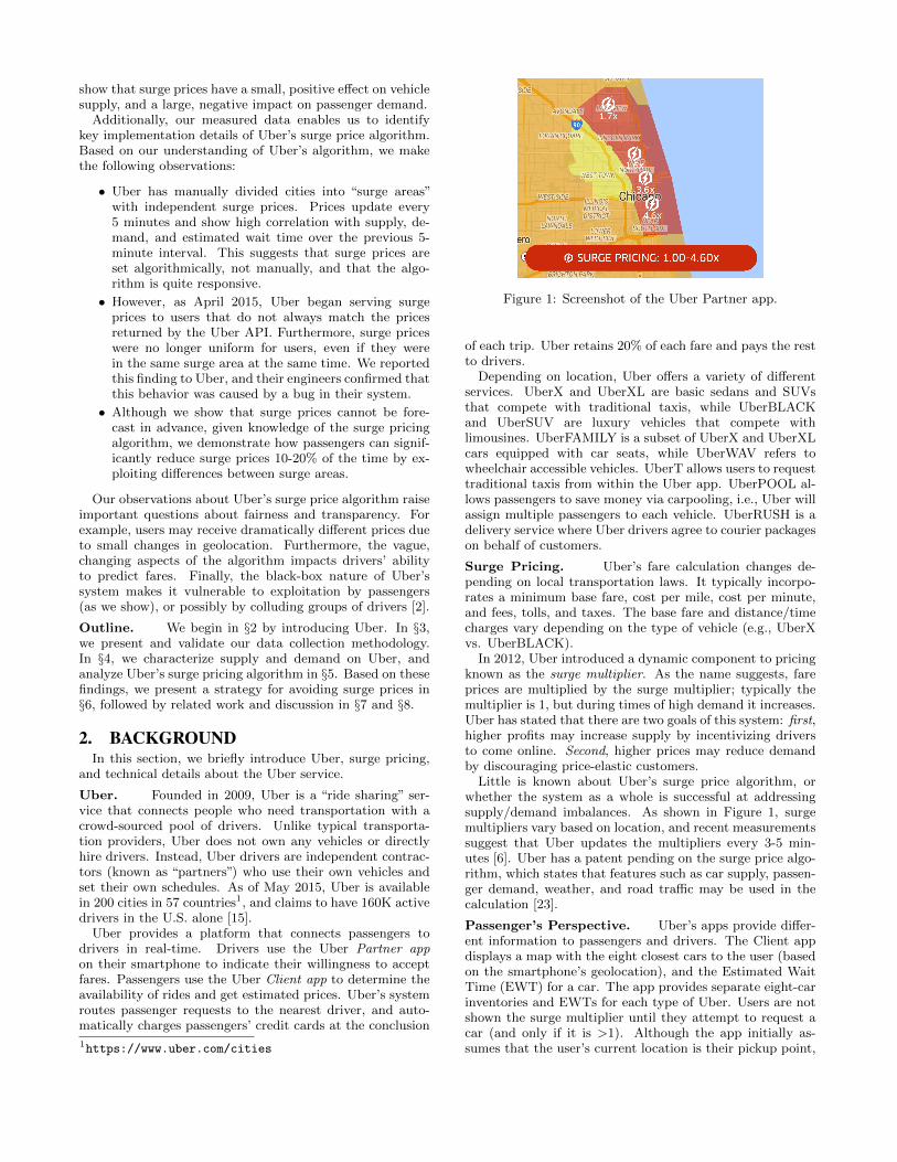
The goal of our next experiment is to measure the visibilityradius of clients. Intuitively, this is the distance from a clientto the furthest of the eight cars returned by pingClient.
0
200
400
600
800
1000
12am 3am 6am 9am 12pm 3pm 6pm 9pm 12am
Vis
ibili
ty R
adiu
s (
m)
Time of the Day
Midtown ManhattanDowntown SF
Figure 2: Visibility radius of clients in two cities.
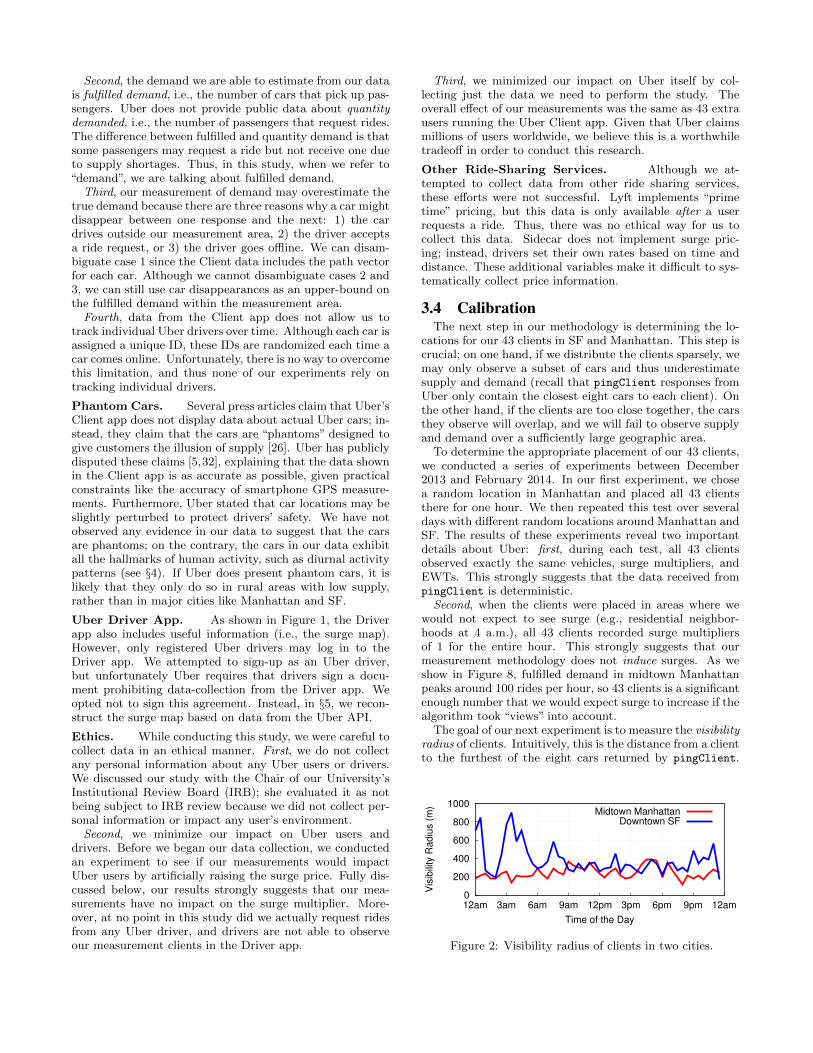
(a) Uber in downtown SF. (b) Uber in midtown Manhattan. (c) Taxis in midtown Manhattan.
Figure 3: Locations of our Uber and taxi measurement points in SF and Manhattan.
Once we know the visibility radius in SF and Manhattan,we can determine the placement of our 43 clients.
To calculate the visibility radius, we conduct the fol-lowing experiment. We 1) place 4 clients, denoted asC = {c1, c2, c3, c4}, at the same geolocation; 2) each of theclients “walks” 20 meters Northeast, Northwest, Southeastand Southwest (respectively) every 5 seconds; 3) the exper-iment halts when |
⋂c Vc| = 0, where Vci is the set of cars
observed by client ci; 4) record the distance Dc from eachc ∈ C to the starting point. Given this information, we cal-culate the visibility radius r (consider a 45◦-45◦-90◦ trianglewhere r is the leg and Dc is the hypotenuse) as:
r =1
4
∑c
Dc√2≈ 0.1768×
∑c
Dc
Figure 2 shows the measured radii in meters when theclients were placed in downtown SF and midtown Manhat-tan. We chose these specific locations because they are the“hearts” of these cities, and thus they are likely to have thehighest densities of Uber cars. As expected, the visibilityradius changes throughout the day, with the most obviousdifference being night/day in SF. There are also differencesbetween the cities: the average radius is 247 ± 2.6 metersin Manhattan, versus 387 ± 6.8 meters in SF.2
In the end, we chose 200 meters as the radius for ourdata collection in midtown Manhattan, and 350 meters indowntown SF. These values represent a conscientious trade-off between obtaining complete coverage of supply/demandand covering a large overall geographic area. Figures 3aand 3b depict the exact positions where we placed our clientsin SF and Manhattan.3
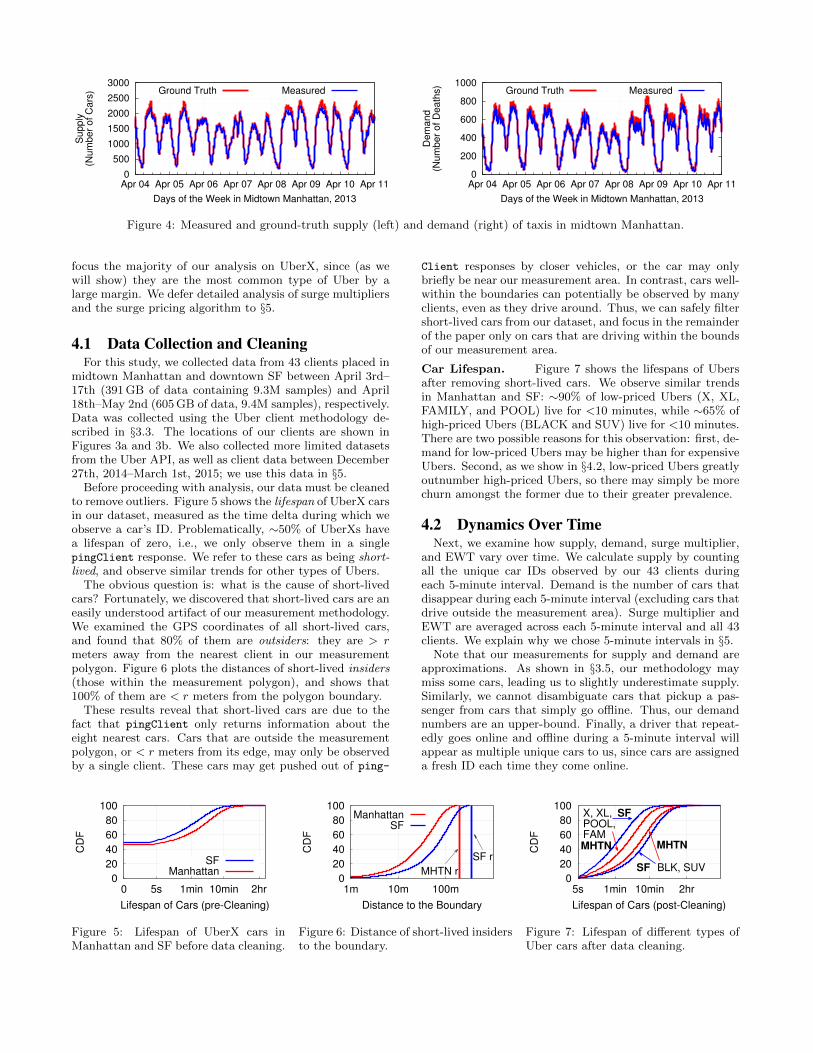
3.5 ValidationOur final step is to validate our measurement method-
ology. The fundamental challenge is that we do not haveground-truth information about supply and demand onUber; we attempt to mitigate this through careful placementof our clients, but the key challenge is having confidence thatwe will observe the vast majority of cars.
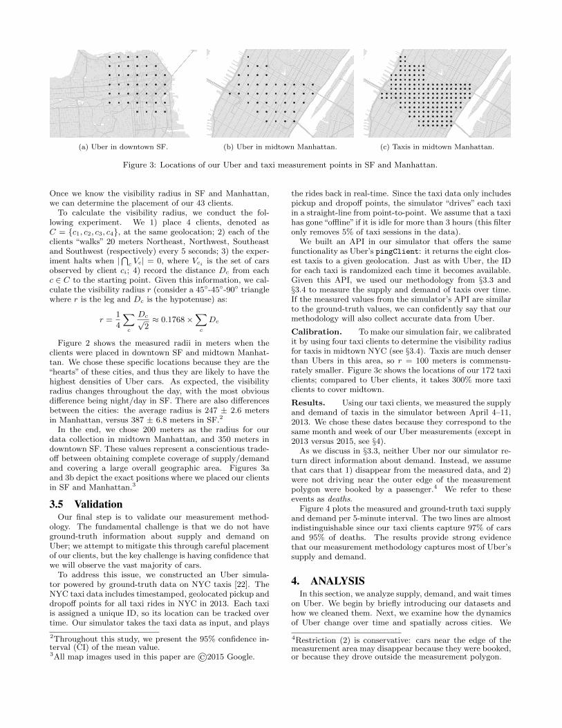
To address this issue, we constructed an Uber simula-tor powered by ground-truth data on NYC taxis [22]. TheNYC taxi data includes timestamped, geolocated pickup anddropoff points for all taxi rides in NYC in 2013. Each taxiis assigned a unique ID, so its location can be tracked overtime. Our simulator takes the taxi data as input, and plays
2Throughout this study, we present the 95% confidence in-terval (CI) of the mean value.3All map images used in this paper are ©2015 Google.
the rides back in real-time. Since the taxi data only includespickup and dropoff points, the simulator “drives” each taxiin a straight-line from point-to-point. We assume that a taxihas gone“offline” if it is idle for more than 3 hours (this filteronly removes 5% of taxi sessions in the data).
We built an API in our simulator that offers the samefunctionality as Uber’s pingClient: it returns the eight clos-est taxis to a given geolocation. Just as with Uber, the IDfor each taxi is randomized each time it becomes available.Given this API, we used our methodology from §3.3 and§3.4 to measure the supply and demand of taxis over time.If the measured values from the simulator’s API are similarto the ground-truth values, we can confidently say that ourmethodology will also collect accurate data from Uber.
Calibration. To make our simulation fair, we calibratedit by using four taxi clients to determine the visibility radiusfor taxis in midtown NYC (see §3.4). Taxis are much denserthan Ubers in this area, so r = 100 meters is commensu-rately smaller. Figure 3c shows the locations of our 172 taxiclients; compared to Uber clients, it takes 300% more taxiclients to cover midtown.
Results. Using our taxi clients, we measured the supplyand demand of taxis in the simulator between April 4–11,2013. We chose these dates because they correspond to thesame month and week of our Uber measurements (except in2013 versus 2015, see §4).
As we discuss in §3.3, neither Uber nor our simulator re-turn direct information about demand. Instead, we assumethat cars that 1) disappear from the measured data, and 2)were not driving near the outer edge of the measurementpolygon were booked by a passenger.4 We refer to theseevents as deaths.
Figure 4 plots the measured and ground-truth taxi supplyand demand per 5-minute interval. The two lines are almostindistinguishable since our taxi clients capture 97% of carsand 95% of deaths. The results provide strong evidencethat our measurement methodology captures most of Uber’ssupply and demand.
4. ANALYSISIn this section, we analyze supply, demand, and wait times
on Uber. We begin by briefly introducing our datasets andhow we cleaned them. Next, we examine how the dynamicsof Uber change over time and spatially across cities. We
4Restriction (2) is conservative: cars near the edge of themeasurement area may disappear because they were booked,or because they drove outside the measurement polygon.
0
500
1000
1500
2000
2500
3000
Apr 04 Apr 05 Apr 06 Apr 07 Apr 08 Apr 09 Apr 10 Apr 11
Supply
(Num
ber
of C
ars
)
Days of the Week in Midtown Manhattan, 2013
Ground Truth Measured
0
200
400
600
800
1000
Apr 04 Apr 05 Apr 06 Apr 07 Apr 08 Apr 09 Apr 10 Apr 11
Dem
and
(Num
ber
of D
eath
s)
Days of the Week in Midtown Manhattan, 2013
Ground Truth Measured
Figure 4: Measured and ground-truth supply (left) and demand (right) of taxis in midtown Manhattan.
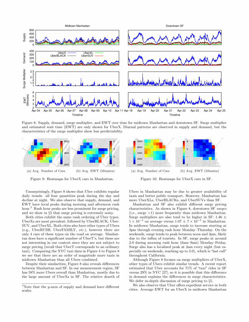
focus the majority of our analysis on UberX, since (as wewill show) they are the most common type of Uber by alarge margin. We defer detailed analysis of surge multipliersand the surge pricing algorithm to §5.
4.1 Data Collection and CleaningFor this study, we collected data from 43 clients placed in
midtown Manhattan and downtown SF between April 3rd–17th (391 GB of data containing 9.3M samples) and April18th–May 2nd (605 GB of data, 9.4M samples), respectively.Data was collected using the Uber client methodology de-scribed in §3.3. The locations of our clients are shown inFigures 3a and 3b. We also collected more limited datasetsfrom the Uber API, as well as client data between December27th, 2014–March 1st, 2015; we use this data in §5.
Before proceeding with analysis, our data must be cleanedto remove outliers. Figure 5 shows the lifespan of UberX carsin our dataset, measured as the time delta during which weobserve a car’s ID. Problematically, ∼50% of UberXs havea lifespan of zero, i.e., we only observe them in a singlepingClient response. We refer to these cars as being short-lived, and observe similar trends for other types of Ubers.
The obvious question is: what is the cause of short-livedcars? Fortunately, we discovered that short-lived cars are aneasily understood artifact of our measurement methodology.We examined the GPS coordinates of all short-lived cars,and found that 80% of them are outsiders: they are > rmeters away from the nearest client in our measurementpolygon. Figure 6 plots the distances of short-lived insiders(those within the measurement polygon), and shows that100% of them are < r meters from the polygon boundary.
These results reveal that short-lived cars are due to thefact that pingClient only returns information about theeight nearest cars. Cars that are outside the measurementpolygon, or < r meters from its edge, may only be observedby a single client. These cars may get pushed out of ping-
Client responses by closer vehicles, or the car may onlybriefly be near our measurement area. In contrast, cars well-within the boundaries can potentially be observed by manyclients, even as they drive around. Thus, we can safely filtershort-lived cars from our dataset, and focus in the remainderof the paper only on cars that are driving within the boundsof our measurement area.
Car Lifespan. Figure 7 shows the lifespans of Ubersafter removing short-lived cars. We observe similar trendsin Manhattan and SF: ∼90% of low-priced Ubers (X, XL,FAMILY, and POOL) live for <10 minutes, while ∼65% ofhigh-priced Ubers (BLACK and SUV) live for <10 minutes.There are two possible reasons for this observation: first, de-mand for low-priced Ubers may be higher than for expensiveUbers. Second, as we show in §4.2, low-priced Ubers greatlyoutnumber high-priced Ubers, so there may simply be morechurn amongst the former due to their greater prevalence.
4.2 Dynamics Over TimeNext, we examine how supply, demand, surge multiplier,
and EWT vary over time. We calculate supply by countingall the unique car IDs observed by our 43 clients duringeach 5-minute interval. Demand is the number of cars thatdisappear during each 5-minute interval (excluding cars thatdrive outside the measurement area). Surge multiplier andEWT are averaged across each 5-minute interval and all 43clients. We explain why we chose 5-minute intervals in §5.
Note that our measurements for supply and demand areapproximations. As shown in §3.5, our methodology maymiss some cars, leading us to slightly underestimate supply.Similarly, we cannot disambiguate cars that pickup a pas-senger from cars that simply go offline. Thus, our demandnumbers are an upper-bound. Finally, a driver that repeat-edly goes online and offline during a 5-minute interval willappear as multiple unique cars to us, since cars are assigneda fresh ID each time they come online.
0
20
40
60
80
100
0 5s 1min 10min 2hr
CD
F
Lifespan of Cars (pre-Cleaning)
SFManhattan
Figure 5: Lifespan of UberX cars inManhattan and SF before data cleaning.
0
20
40
60
80
100
1m 10m 100m
CD
F
Distance to the Boundary
MHTN r
SF r
ManhattanSF
Figure 6: Distance of short-lived insidersto the boundary.
0
20
40
60
80
100
5s 1min 10min 2hr
CD
F
Lifespan of Cars (post-Cleaning)
X, XL,POOL,FAMMHTN
SF
BLK, SUVSF
MHTN
Figure 7: Lifespan of different types ofUber cars after data cleaning.
0
200
400
600
800
Supply
Midtown Manhattan Downtown SF
0
100
200
300
400
Dem
and UberX
UberBLACK
UberXL
UberSUV
1 1.5
2 2.5
3 3.5
Surg
e M
ultip
lier
2
3
4
5
6
Apr 04 Apr 05 Apr 06 Apr 07 Apr 08 Apr 09 Apr 10 Apr 11
EW
T(M
inute
s)
Timeline
Apr 18 Apr 19 Apr 20 Apr 21 Apr 22 Apr 23 Apr 24 Apr 25
Timeline
Figure 8: Supply, demand, surge multiplier, and EWT over time for midtown Manhattan and downtown SF. Surge multiplierand estimated wait time (EWT) are only shown for UberX. Diurnal patterns are observed in supply and demand, but thecharacteristics of the surge multiplier show less predictability.
(a) Avg. Number of Cars (b) Avg. EWT (Minutes)
Figure 9: Heatmaps for UberX cars in Manhattan.
(a) Avg. Number of Cars (b) Avg. EWT (Minutes)
Figure 10: Heatmaps for UberX cars in SF.
Unsurprisingly, Figure 8 shows that Uber exhibits regulardaily trends: all four quantities peak during the day anddecline at night. We also observe that supply, demand, andEWT have local peaks during morning and afternoon rushhour.5 Rush hour peaks are less prominent for surge pricing,and we show in §5 that surge pricing is extremely noisy.
Both cities exhibit the same rank ordering of Uber types.UberXs are most prevalent, followed by UberBLACK, Uber-SUV, and UberXL. Both cities also have other types of Ubers(e.g., UberRUSH, UberFAMILY, etc.), however there areonly 4 cars of these types on the road on average. Manhat-tan does have a significant number of UberT’s, but these arenot interesting in our context since they are not subject tosurge pricing (recall that UberT corresponds to an ordinarytaxi). Comparing the NYC taxi data in Figure 4 to Figure 8we see that there are an order of magnitude more taxis inmidtown Manhattan than all Ubers combined.
Despite their similarities, Figure 8 also reveals differencesbetween Manhattan and SF. In our measurement region, SFhas 58% more Ubers overall than Manhattan, mostly due tothe large amount of UberXs in SF. The relative dearth of
5Note that the y-axes of supply and demand have differentscales.
Ubers in Manhattan may be due to greater availability oftaxis and better public transport. However, Manhattan hasmore UberXLs, UberBLACKs, and UberSUVs than SF.
Manhattan and SF also exhibit different surge pricingcharacteristics. As shown in Figure 8, downtown SF surges(i.e., surge >1) more frequently than midtown Manhattan.Surge multipliers are also tend to be higher in SF: 1.36 ±1 × 10⁻⁴ on average versus 1.07 ± 7 × 10⁻⁵ in Manhattan.In midtown Manhattan, surge tends to increase starting at3pm through evening rush hour Monday–Thursday. On theweekends, surge tends to peak between noon and 3pm, likelydue to the influx of tourists. In SF, surge peaks at around2.0 during morning rush hour (6am–9am) Monday–Friday.Surge also has a localized peak at 2am every night (but es-pecially on weekends, reaching up to 3.0), which is “last call”throughout California.
Although Figure 8 focuses on surge multipliers of UberX,other types of Ubers exhibit similar trends. A recent reportestimated that Uber accounts for 71% of “taxi” rides in SFversus 29% in NYC [27], so it is possible that this differencein demand explains the differences in surge characteristics.We defer in-depth discussion of surge pricing to §5.
We also observe that Uber offers expedient service in bothcities. Average EWT for an UberX in midtown Manhattan
0
20
40
60
80
100
1 2 4 8 16 32
CD
F
EWT in Minutes
Manhattan
SF
Figure 11: Distribution of EWTs forUberXs.
0
20
40
60
80
100
1 1.5 2 2.5 3 3.5 4 4.5
CD
F
Surge Multiplier
ManhattanSF
Figure 12: Distribution of surge multi-pliers for UberXs.
0
20
40
60
80
100
5s 1min 5min 1hr
CD
F
Surge Duration
April MHTNApril SFFeb. MHTN
April API
Figure 13: Duration of surges forUberXs.
is 3.0 ± 2 × 10⁻⁴ minutes, and 3.1 ± 2 × 10⁻⁴ minutes indowntown SF. In both cities, average EWT never exceedssix minutes. We observe similar trends for other types ofUbers, although rarer types (e.g., UberFAMILY) typicallyhave slightly longer EWTs.
4.3 Spatial Dynamics and EWTNext, we investigate the spatial dynamics of Uber. Fig-
ures 9(a) and 10(a) show the average number of uniqueUberX IDs seen per day by each of our 43 clients.6 Sinceeach square in these figures is an average, each one has adifferent confidence interval; the min and max CI for carsin Manhattan are ± 103 and ± 205 cars, respectively. Themin and max CI for cars SF is are ± 170 and ± 250. As onemight expect, the distribution of cars in both cities is skewedtowards commercial and tourist locations. In Manhattan,UberXs congregate between Times Square and 5th Avenue.In SF, UberXs are densest in Russian Hill, Telegraph Hill,the Embarcadero, and the Financial District (upper-rightcorner of Figure 10(a)), as well as around the University ofCalifornia, San Francisco (UCSF, lower-left corner).
In contrast, Figures 9(b) and 10(b) depict the distributionof EWTs across space. Each square is the average EWT forUberXs measured every five seconds over two weeks. Themin and max CI for Manhattan are± 6×10⁻⁶ and± 2×10⁻⁴
minutes, respectively; the min and max CI for SF are ±7 × 10⁻⁷ and ± 4 × 10⁻⁵. We observe that there is a com-plex relationship between car density and EWT. In somecases, locations with low car density have commensuratelyhigher EWTs (e.g., the lower-right corners in Figures 9(b)and 10(b)), suggesting that these areas are under-supplied.However, we also observe under-supply in several areas withhigh car density (e.g., Times Square and UCSF). This com-plex interplay between supply and demand supports Uber’scase for implementing dynamic pricing.
Figure 11 presents the overall distribution of EWTs inManhattan and SF for UberXs. 87% of the time, the wait foran UberX is ≤4 minutes. However, there are rare instancesof severe supply/demand imbalance when EWT can go ashigh as 43 minutes. Note that our EWT data comes from thehearts of Manhattan and SF, and may not be representativefor suburban areas.
5. SURGE PRICINGNow that we have an understanding of supply and demand
on Uber, we turn our attention to surge pricing. Surge pric-
6Note that these numbers are strict upper-bounds on thetrue number of UberX cars, since IDs are randomized eachtime a car comes online.
ing is one of Uber’s most controversial features [19,24], andthus it warrants special attention. We begin by analyzingthe basic characteristics of surge pricing. Next, we use ourmeasured data to extrapolate how Uber updates surge pricesover time and geography, and explore the features that Uberuses when calculating surge. Finally, we examine the impactof surge pricing on car supply and passenger demand.
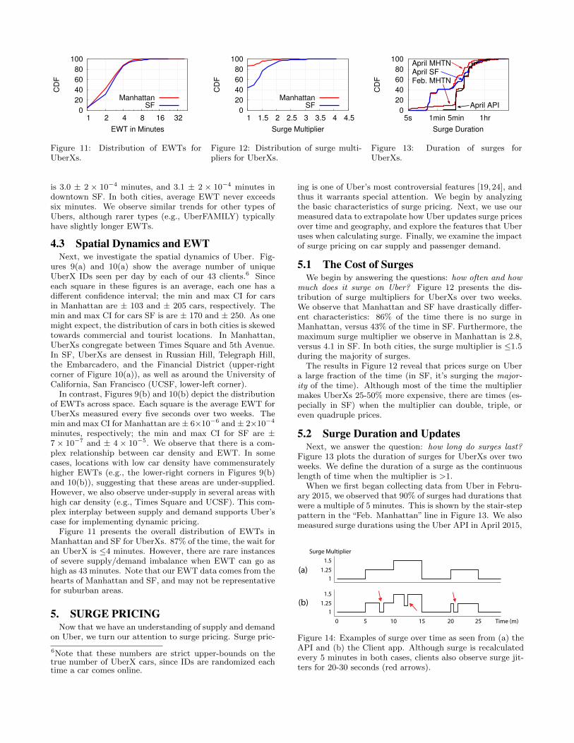
5.1 The Cost of SurgesWe begin by answering the questions: how often and how
much does it surge on Uber? Figure 12 presents the dis-tribution of surge multipliers for UberXs over two weeks.We observe that Manhattan and SF have drastically differ-ent characteristics: 86% of the time there is no surge inManhattan, versus 43% of the time in SF. Furthermore, themaximum surge multiplier we observe in Manhattan is 2.8,versus 4.1 in SF. In both cities, the surge multiplier is ≤1.5during the majority of surges.
The results in Figure 12 reveal that prices surge on Ubera large fraction of the time (in SF, it’s surging the major-ity of the time). Although most of the time the multipliermakes UberXs 25-50% more expensive, there are times (es-pecially in SF) when the multiplier can double, triple, oreven quadruple prices.
5.2 Surge Duration and UpdatesNext, we answer the question: how long do surges last?
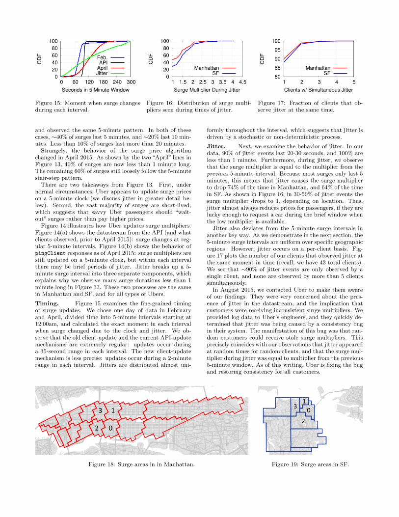
Figure 13 plots the duration of surges for UberXs over twoweeks. We define the duration of a surge as the continuouslength of time when the multiplier is >1.
When we first began collecting data from Uber in Febru-ary 2015, we observed that 90% of surges had durations thatwere a multiple of 5 minutes. This is shown by the stair-steppattern in the “Feb. Manhattan” line in Figure 13. We alsomeasured surge durations using the Uber API in April 2015,
(a)
(b)
11.25
1.5Surge Multiplier
0 5 10 15 20 25 Time (m)1
1.251.5
Figure 14: Examples of surge over time as seen from (a) theAPI and (b) the Client app. Although surge is recalculatedevery 5 minutes in both cases, clients also observe surge jit-ters for 20-30 seconds (red arrows).
0
20
40
60
80
100
0 60 120 180 240 300
CD
F
Seconds in 5 Minute Window
Feb.API
AprilJitter
Figure 15: Moment when surge changesduring each interval.
0
20
40
60
80
100
1 1.5 2 2.5 3 3.5 4 4.5
CD
F
Surge Multiplier During Jitter
ManhattanSF
Figure 16: Distribution of surge multi-pliers seen during times of jitter.
80
85
90
95
100
1 2 3 4 5
CD
F
Clients w/ Simultaneous Jitter
Manhattan
SF
Figure 17: Fraction of clients that ob-serve jitter at the same time.
and observed the same 5-minute pattern. In both of thesecases, ∼40% of surges last 5 minutes, and ∼20% last 10 min-utes. Less than 10% of surges last more than 20 minutes.
Strangely, the behavior of the surge price algorithmchanged in April 2015. As shown by the two “April” lines inFigure 13, 40% of surges are now less than 1 minute long.The remaining 60% of surges still loosely follow the 5-minutestair-step pattern.
There are two takeaways from Figure 13. First, undernormal circumstances, Uber appears to update surge priceson a 5-minute clock (we discuss jitter in greater detail be-low). Second, the vast majority of surges are short-lived,which suggests that savvy Uber passengers should “wait-out” surges rather than pay higher prices.
Figure 14 illustrates how Uber updates surge multipliers.Figure 14(a) shows the datastream from the API (and whatclients observed, prior to April 2015): surge changes at reg-ular 5-minute intervals. Figure 14(b) shows the behavior ofpingClient responses as of April 2015: surge multipliers arestill updated on a 5-minute clock, but within each intervalthere may be brief periods of jitter. Jitter breaks up a 5-minute surge interval into three separate components, whichexplains why we observe many surge durations less than 1minute long in Figure 13. These two processes are the samein Manhattan and SF, and for all types of Ubers.
Timing. Figure 15 examines the fine-grained timingof surge updates. We chose one day of data in Februaryand April, divided time into 5-minute intervals starting at12:00am, and calculated the exact moment in each intervalwhen surge changed due to the clock and jitter. We ob-serve that the old client-update and the current API-updatemechanisms are extremely regular: updates occur duringa 35-second range in each interval. The new client-updatemechanism is less precise: updates occur during a 2-minuterange in each interval. Jitters are distributed almost uni-
formly throughout the interval, which suggests that jitter isdriven by a stochastic or non-deterministic process.
Jitter. Next, we examine the behavior of jitter. In ourdata, 90% of jitter events last 20-30 seconds, and 100% areless than 1 minute. Furthermore, during jitter, we observethat the surge multiplier is equal to the multiplier from theprevious 5-minute interval. Because most surges only last 5minutes, this means that jitter causes the surge multiplierto drop 74% of the time in Manhattan, and 64% of the timein SF. As shown in Figure 16, in 30-50% of jitter events thesurge multiplier drops to 1, depending on location. Thus,jitter almost always reduces prices for passengers, if they arelucky enough to request a car during the brief window whenthe low multiplier is available.
Jitter also deviates from the 5-minute surge intervals inanother key way. As we demonstrate in the next section, the5-minute surge intervals are uniform over specific geographicregions. However, jitter occurs on a per-client basis. Fig-ure 17 plots the number of our clients that observed jitter atthe same moment in time (recall, we have 43 total clients).We see that ∼90% of jitter events are only observed by asingle client, and none are observed by more than 5 clientssimultaneously.
In August 2015, we contacted Uber to make them awareof our findings. They were very concerned about the pres-ence of jitter in the datastream, and the implication thatcustomers were receiving inconsistent surge multipliers. Weprovided log data to Uber’s engineers, and they quickly de-termined that jitter was being caused by a consistency bugin their system. The manifestation of this bug was that ran-dom customers could receive stale surge multipliers. Thisprecisely coincides with our observations that jitter appearedat random times for random clients, and that the surge mul-tiplier during jitter was equal to multiplier from the previous5-minute window. As of this writing, Uber is fixing the bugand restoring consistency for all customers.
0
1
2
3
Figure 18: Surge areas in in Manhattan.
01
2
3
Figure 19: Surge areas in SF.
-0.6
-0.4
-0.2
0
0.2
0.4
0.6
-60 -40 -20 0 20 40 60 0
0.2
0.4
0.6
0.8
1C
orr
ela
tion C
oeffic
ient
Pro
babili
ty
Time Difference in Minutes
Correlation
p-value
Manhattan SF
Figure 20: (Supply - Demand) vs. Surge for UberX.
-0.6
-0.4
-0.2
0
0.2
0.4
0.6
-60 -40 -20 0 20 40 60 0
0.2
0.4
0.6
0.8
1
Corr
ela
tion C
oeffic
ient
Pro
babili
ty
Time Difference in Minutes
Correlationp-value
Manhattan SF
Figure 21: EWT vs. Surge for UberX.
5.3 Surge AreasNext, we answer the question: how do surge prices vary
by location? Intuitively, it is clear that surge must varygeographically: a rural location is very different than TimesSquare.
To answer this question, we used the Uber API to querysurge prices throughout Manhattan and SF over the courseof eight days. During these tests, we queried data fromadjacent locations that obey our visibility radius constraints(see §3.4). Fortunately, since we know that surge pricesonly change every 5 minutes (and the API does not containjitter), this enabled us to scale up our measurements to largegeographic areas.
Using this data, we looked for clusters of adjacent loca-tions that always had equal surge multipliers. Figures 18and 19 show the regions of Manhattan and SF where thesurge multipliers are always in lock-step. These figures re-veal the granularity of Uber’s surge price algorithm: Uberpartitions cities into surge areas and computes multipliersindependently for each area. The numbered areas corre-spond to the locations where we collected client data (seeFigures 3a and 3b). Given the odd shape of some regions,it is likely that Uber defines surge areas manually. Notethat there are some areas where we did not observe suffi-cient surging samples during our measurements (e.g., UpperManhattan and Washington Heights); in these cases we can-not isolate individual surge areas, so it is possible these largeareas may be composed of several smaller areas.
5.4 Algorithm Features and ForecastingNext, we investigate the question: what features does Uber
use to calculate surge prices? Uber has a pending patentthat lists potential features [23], but it is unclear what fea-tures are truly used in the calculation.
To answer this question, we examine the cross correlationbetween observed supply, demand, and EWT versus surgeprice. In these tests, we treat each feature as a continuoustime series. For surge, the time series is simply the observedsurge multipliers during each 5-minute interval (we discardjitters since they are unpredictable). For supply, demand,and EWT we construct corresponding time series by averag-ing each quantity over the 5-minute window. We construct
independent time series for the four areas in Manhattan andSF where we collect client data, since each area has its ownsurge characteristics. As before, we focus on UberXs.
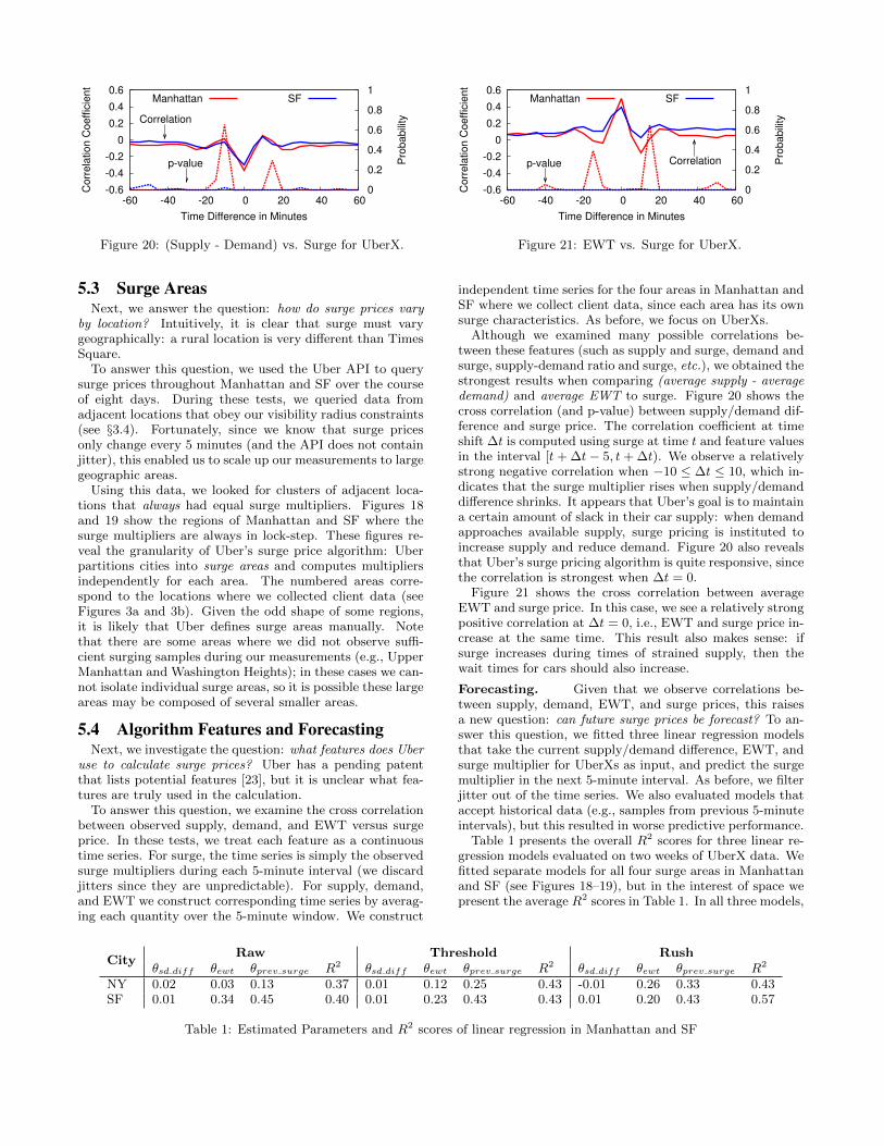
Although we examined many possible correlations be-tween these features (such as supply and surge, demand andsurge, supply-demand ratio and surge, etc.), we obtained thestrongest results when comparing (average supply - averagedemand) and average EWT to surge. Figure 20 shows thecross correlation (and p-value) between supply/demand dif-ference and surge price. The correlation coefficient at timeshift ∆t is computed using surge at time t and feature valuesin the interval [t+ ∆t− 5, t + ∆t). We observe a relativelystrong negative correlation when −10 ≤ ∆t ≤ 10, which in-dicates that the surge multiplier rises when supply/demanddifference shrinks. It appears that Uber’s goal is to maintaina certain amount of slack in their car supply: when demandapproaches available supply, surge pricing is instituted toincrease supply and reduce demand. Figure 20 also revealsthat Uber’s surge pricing algorithm is quite responsive, sincethe correlation is strongest when ∆t = 0.
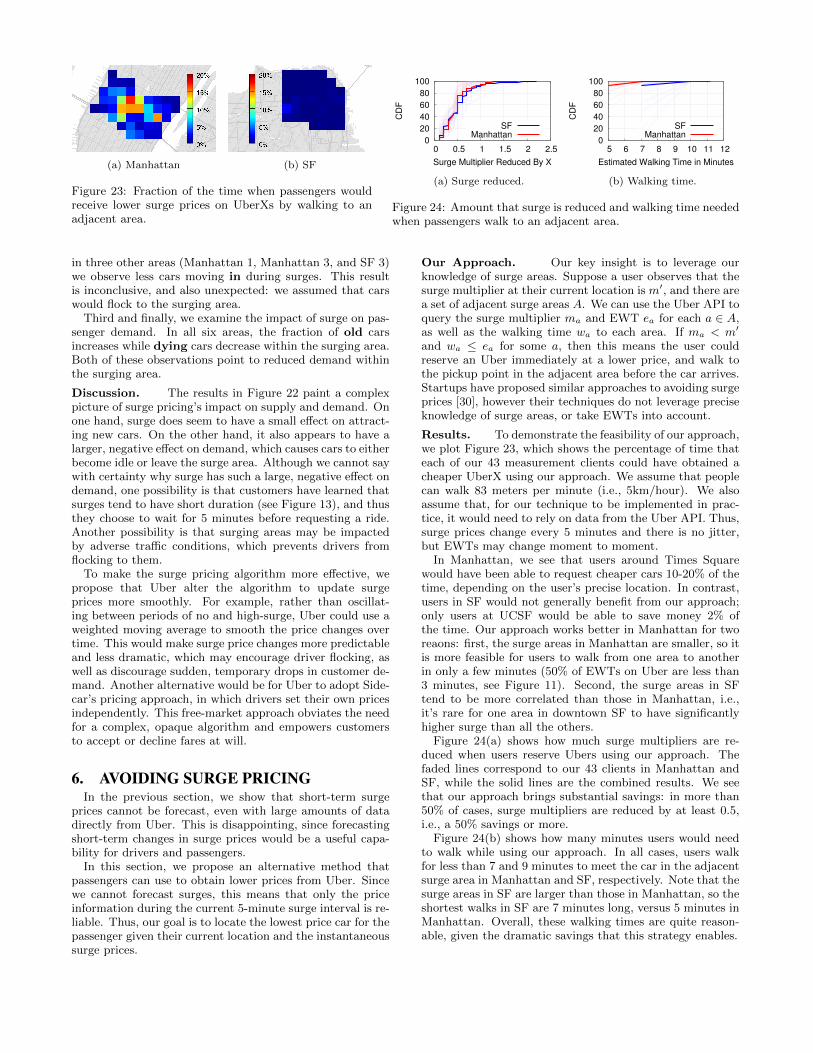
Figure 21 shows the cross correlation between averageEWT and surge price. In this case, we see a relatively strongpositive correlation at ∆t = 0, i.e., EWT and surge price in-crease at the same time. This result also makes sense: ifsurge increases during times of strained supply, then thewait times for cars should also increase.
Forecasting. Given that we observe correlations be-tween supply, demand, EWT, and surge prices, this raisesa new question: can future surge prices be forecast? To an-swer this question, we fitted three linear regression modelsthat take the current supply/demand difference, EWT, andsurge multiplier for UberXs as input, and predict the surgemultiplier in the next 5-minute interval. As before, we filterjitter out of the time series. We also evaluated models thataccept historical data (e.g., samples from previous 5-minuteintervals), but this resulted in worse predictive performance.
Table 1 presents the overall R2 scores for three linear re-gression models evaluated on two weeks of UberX data. Wefitted separate models for all four surge areas in Manhattanand SF (see Figures 18–19), but in the interest of space wepresent the average R2 scores in Table 1. In all three models,
CityRaw Threshold Rush
θsd diff θewt θprev surge R2 θsd diff θewt θprev surge R2 θsd diff θewt θprev surge R2
NY 0.02 0.03 0.13 0.37 0.01 0.12 0.25 0.43 -0.01 0.26 0.33 0.43SF 0.01 0.34 0.45 0.40 0.01 0.23 0.43 0.43 0.01 0.20 0.43 0.57
Table 1: Estimated Parameters and R2 scores of linear regression in Manhattan and SF

0
10
20
30
40
50
New
Old
In Out
Dyin
g
New
Old
In Out
Dyin
g
New
Old
In Out
Dyin
g
New
Old
In Out
Dyin
g
New
Old
In Out
Dyin
g
New
Old
In Out
Dyin
g
% o
f C
ars
EqualSurging
SF 3SF 2SF 0Manhattan 3Manhattan 2Manhattan 1
Figure 22: Transition probabilities of UberXs when all areas have equal surge, and when one area is surging.
we remove time intervals when the surge multiplier equals 1from the data7 before fitting, since this would make the pre-diction task too easy (e.g., you could achieve 86% accuracyin Manhattan by always predicting that the surge multiplierwill be 1, see §5.1).
We also provide the parameters learned in the linear re-gression models in Table 1. Note that the learned param-eters do not represent the relative importances of the vari-ables; they are simply the slopes of the fitting surfaces.
Unfortunately, even with our large corpus of data, fore-casting surge multipliers is an extremely difficult task. TheRaw model in Table 1 is the most permissive of our threemodels: it was fitted and evaluated on the entire time se-ries. We see that it has the worst performance, which sug-gests that either we are missing some key data that is usedin Uber’s surge calculation, or surge pricing is simply verynoisy. The Threshold model improves performance by be-ing more restrictive: it only attempts to predict the surgeat time t if surge was >1 at t − 1. We instituted this filterbecause surge cannot go below 1, i.e., we know less aboutthe state of the system when surge is 1 than when surge is>1.
Finally, the Rush model is the most restrictive: it wasfitted and evaluated on the subset of data correspondingto rush hours (6am–10am and 4pm–8pm). Although theperformance of the Rush model clearly benefits from thepredictable characteristics of rush hour traffic (see §4.2), itdoes not perform uniformly better than the more generalThreshold model.
In summary, our forecasting results demonstrate that itis very difficult to predict surge multipliers, even with largeamounts of supply and demand data. None of our mod-els exhibits strong predictive performance in absolute terms(i.e., R2 ≥ 0.9). This suggests that Uber relies on non-publicdata to calculate surge prices, and motivates us to examinealternative strategies for obtaining lower prices in §6.
5.5 Impact of Surge on Supply and DemandThe final question that we address in this section is: what
is the impact of surge prices on supply and demand? Uberhas stated that the goals of surge pricing are to increase sup-ply and intentionally reduce demand, and they claim thatthe system increased the number of drivers by 70-80% af-ter it was introduced [11]. However, it is unclear if andhow surge pricing continues to impact supply and demand,now that drivers and passengers have acclimated to the sys-
7The two exceptions to this data cleaning rule are intervalswhere surge=1 directly preceding or proceeding an intervalwhere surge>1.
tem. Furthermore, recent measurements of Uber suggestthat surge pricing redistributes existing supply, rather thanencouraging new drivers to come online [6], but these obser-vations have not been verified at-scale.
To answer these questions, we treat the cars in our dataas state-machines, and examine how they transition betweenstates when there is and is not surge. At a high-level, wedivide time into 5-minute intervals, and compare the statesof cars at the beginning and end of each interval. Cars thatappear for the first time in interval t are placed in the initial,new state, while cars that disappear go into the terminaldying state. Cars that start and end in surge area a areold. Finally, cars may transition into states that are relativeto surge areas, e.g., a car that moves from area ai to areaaj during t is placed in the move-in state relative to aj , andthe move-out state relative to ai.
Based on this model, we examine the behavior of carsduring times when all four surge areas have the same surgemultipliers (in Manhattan and SF, respectively), and timeswhen a single area has a surge multiplier that is at least 0.2higher than its neighboring areas (again, excluding jitter) inthe immediately proceeding interval. Intuitively, the formercase captures times when there is no monetary incentive fordrivers to choose one area over another, while in the lattercase there is a monetary incentive to relocate to the surgingarea.
Figure 22 shows the probability of cars in specific surgeareas being in each of our five states. The black bars showthe probabilities when all areas have equal surge multipliers,while red corresponds to times when the given area has amultiplier that is at least 0.2 higher than its neighbors. Forexample, the Manhattan Area 1 “New” bars show that 18%of new cars appear in the area when surge is equal in allfour Manhattan areas, whereas 20% of cars appear in thearea when it has higher surge than its neighbors. We omitresults for two areas because they rarely had higher surgeprices than their neighbors.
Results. First, we examine the impact of surge pricingon the behavior of new cars. In all six areas, we observethat the fraction of new cars increases when that area hashigher surge than its neighbors. Although this effect is notlarge (3.7% on average), it is consistent. This suggests thatsurge pricing is effective at drawing drivers onto the roads.
Second, we examine the impact of surge on the distribu-tion of existing supply. In five areas, we observe that thefraction of cars that move out of an area increases when itis surging. This is the opposite result of what we expected.Furthermore, in three areas (Manhattan 2, SF 0, and SF 2)we observe more cars moving in during times of surge, while
(a) Manhattan (b) SF
Figure 23: Fraction of the time when passengers wouldreceive lower surge prices on UberXs by walking to anadjacent area.
0
20
40
60
80
100
0 0.5 1 1.5 2 2.5
CD
F
Surge Multiplier Reduced By X
SFManhattan
(a) Surge reduced.
0
20
40
60
80
100
5 6 7 8 9 10 11 12
CD
F
Estimated Walking Time in Minutes
SFManhattan
(b) Walking time.
Figure 24: Amount that surge is reduced and walking time neededwhen passengers walk to an adjacent area.
in three other areas (Manhattan 1, Manhattan 3, and SF 3)we observe less cars moving in during surges. This resultis inconclusive, and also unexpected: we assumed that carswould flock to the surging area.
Third and finally, we examine the impact of surge on pas-senger demand. In all six areas, the fraction of old carsincreases while dying cars decrease within the surging area.Both of these observations point to reduced demand withinthe surging area.
Discussion. The results in Figure 22 paint a complexpicture of surge pricing’s impact on supply and demand. Onone hand, surge does seem to have a small effect on attract-ing new cars. On the other hand, it also appears to have alarger, negative effect on demand, which causes cars to eitherbecome idle or leave the surge area. Although we cannot saywith certainty why surge has such a large, negative effect ondemand, one possibility is that customers have learned thatsurges tend to have short duration (see Figure 13), and thusthey choose to wait for 5 minutes before requesting a ride.Another possibility is that surging areas may be impactedby adverse traffic conditions, which prevents drivers fromflocking to them.
To make the surge pricing algorithm more effective, wepropose that Uber alter the algorithm to update surgeprices more smoothly. For example, rather than oscillat-ing between periods of no and high-surge, Uber could use aweighted moving average to smooth the price changes overtime. This would make surge price changes more predictableand less dramatic, which may encourage driver flocking, aswell as discourage sudden, temporary drops in customer de-mand. Another alternative would be for Uber to adopt Side-car’s pricing approach, in which drivers set their own pricesindependently. This free-market approach obviates the needfor a complex, opaque algorithm and empowers customersto accept or decline fares at will.
6. AVOIDING SURGE PRICINGIn the previous section, we show that short-term surge
prices cannot be forecast, even with large amounts of datadirectly from Uber. This is disappointing, since forecastingshort-term changes in surge prices would be a useful capa-bility for drivers and passengers.
In this section, we propose an alternative method thatpassengers can use to obtain lower prices from Uber. Sincewe cannot forecast surges, this means that only the priceinformation during the current 5-minute surge interval is re-liable. Thus, our goal is to locate the lowest price car for thepassenger given their current location and the instantaneoussurge prices.
Our Approach. Our key insight is to leverage ourknowledge of surge areas. Suppose a user observes that thesurge multiplier at their current location is m′, and there area set of adjacent surge areas A. We can use the Uber API toquery the surge multiplier ma and EWT ea for each a ∈ A,as well as the walking time wa to each area. If ma < m′
and wa ≤ ea for some a, then this means the user couldreserve an Uber immediately at a lower price, and walk tothe pickup point in the adjacent area before the car arrives.Startups have proposed similar approaches to avoiding surgeprices [30], however their techniques do not leverage preciseknowledge of surge areas, or take EWTs into account.
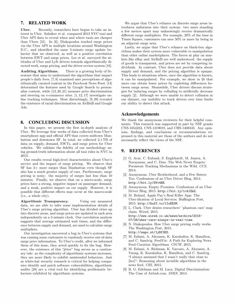
Results. To demonstrate the feasibility of our approach,we plot Figure 23, which shows the percentage of time thateach of our 43 measurement clients could have obtained acheaper UberX using our approach. We assume that peoplecan walk 83 meters per minute (i.e., 5km/hour). We alsoassume that, for our technique to be implemented in prac-tice, it would need to rely on data from the Uber API. Thus,surge prices change every 5 minutes and there is no jitter,but EWTs may change moment to moment.
In Manhattan, we see that users around Times Squarewould have been able to request cheaper cars 10-20% of thetime, depending on the user’s precise location. In contrast,users in SF would not generally benefit from our approach;only users at UCSF would be able to save money 2% ofthe time. Our approach works better in Manhattan for tworeaons: first, the surge areas in Manhattan are smaller, so itis more feasible for users to walk from one area to anotherin only a few minutes (50% of EWTs on Uber are less than3 minutes, see Figure 11). Second, the surge areas in SFtend to be more correlated than those in Manhattan, i.e.,it’s rare for one area in downtown SF to have significantlyhigher surge than all the others.
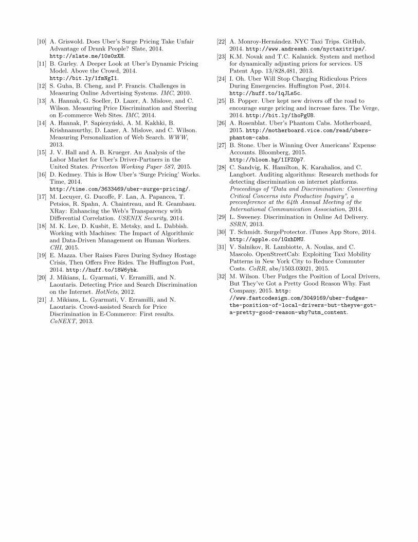
Figure 24(a) shows how much surge multipliers are re-duced when users reserve Ubers using our approach. Thefaded lines correspond to our 43 clients in Manhattan andSF, while the solid lines are the combined results. We seethat our approach brings substantial savings: in more than50% of cases, surge multipliers are reduced by at least 0.5,i.e., a 50% savings or more.
Figure 24(b) shows how many minutes users would needto walk while using our approach. In all cases, users walkfor less than 7 and 9 minutes to meet the car in the adjacentsurge area in Manhattan and SF, respectively. Note that thesurge areas in SF are larger than those in Manhattan, so theshortest walks in SF are 7 minutes long, versus 5 minutes inManhattan. Overall, these walking times are quite reason-able, given the dramatic savings that this strategy enables.
7. RELATED WORKUber. Recently, researchers have begun to take an in-terest in Uber. Salnikov et al. compared 2013 NYC taxi andUber API data to reveal when and where taxis are cheaperthan Ubers [31]. In [6], Diakopoulos tracked surge pricesvia the Uber API in multiple locations around WashingtonD.C., and identified the same 5-minute surge update be-havior that we observed, as well as a positive correlationbetween EWT and surge prices. Lee et al. surveyed the at-titudes of Uber and Lyft drivers towards algorithmically di-rected work, surge pricing, and the driver-review system [18].
Auditing Algorithms. There is a growing body of lit-erature that aims to understand the algorithms that impactpeople’s daily lives. [7,8] examined user perceptions of algo-rithmically curated content in the Facebook News Feed. [14]determined the features used by Google Search to person-alize content, while [13,20,21] measure price discriminationand steering on e-commerce sites. [1, 12, 17] investigate on-line tracking techniques. Most disturbingly, [9, 29] revealedthe existence of racial discrimination on AirBnB and GoogleAds.
8. CONCLUDING DISCUSSIONIn this paper, we present the first in-depth analysis of
Uber. We leverage four weeks of data collected from Uber’ssmartphone app and official API that covers midtown Man-hattan and downtown SF. In total, we collected 2.1 TB ofdata on supply, demand, EWTs, and surge prices for Ubervehicles. We validate the fidelity of our methodology us-ing ground-truth information about all taxi rides in NYC in2013.
Our results reveal high-level characteristics about Uber’sservice and the impact of surge pricing. We observe thatSF has 3× more surges than Manhattan even though SFalso has a much greater supply of cars. Furthermore, surgepricing is noisy: the majority of surges last less than 10minutes. Finally, we observe that on a micro-scale, surgeprices have a strong, negative impact on passenger demand,and a weak, positive impact on car supply. However, it ispossible that different effects may occur at the macro-scale(i.e., a whole city).
Algorithmic Transparency. Using our measureddata, we are able to infer some implementation details ofUber’s surge pricing algorithm. Uber has divided cities upinto discrete areas, and surge prices are updated in each areaindependently on a 5-minute clock. Our correlation analysissuggests that average estimated wait times, and the differ-ence between supply and demand, are used to calculate surgemultipliers.
Our investigation uncovered a bug in Uber’s systems thatwas causing some customers to randomly receive out-of-datasurge price information. To Uber’s credit, after we informedthem of this issue, they acted quickly to fix the bug. How-ever, the existence of this “jitter” bug serves as a caution-ary tale: as the complexity of algorithmic systems increases,they are more likely to exhibit unintended behaviors. Justas white-hat security research is critical for helping compa-nies identify and patch software vulnerabilities, algorithmicaudits [28] are a vital tool for identifying problematic be-haviors exhibited by algorithmic systems.
We argue that Uber’s reliance on discrete surge areas in-troduces unfairness into their system: two users standinga few meters apart may unknowingly receive dramaticallydifferent surge multipliers. For example, 20% of the time inTimes Square, customers can save 50% or more by being inan adjacent surge area.
Lastly, we argue that Uber’s reliance on black-box algo-rithms makes their system more vulnerable to manipulationthan other online marketplaces. The forces at play on mar-kets like eBay and AirBnB are well understood: the supplyof goods is transparent, and prices are set by competing in-dividuals. In contrast, Uber does not provide data aboutsupply and demand, and the pricing algorithm is opaque.This leads to situations where, once the algorithm is known,it can be manipulated. For example, we show in §6 thatusers can obtain lower prices by exploiting differences be-tween surge areas. Meanwhile, Uber drivers discuss strate-gies for inducing surges by colluding to artificially decreasesupply [2]. Although we were unable to detect collusion inour dataset, our inability to track drivers over time limitsour ability to detect this attack.
AcknowledgementsWe thank the anonymous reviewers for their helpful com-ments. This research was supported in part by NSF grantsCNS-1054233, CNS-1319019, and CHS-1408345. Any opin-ions, findings, and conclusions or recommendations ex-pressed in this material are those of the authors and do notnecessarily reflect the views of the NSF.
9. REFERENCES[1] G. Acar, C. Eubank, S. Englehardt, M. Juarez, A.
Narayanan, and C. Diaz. The Web Never Forgets:Persistent Tracking Mechanisms in the Wild. CCS,2014.
[2] Anonymous. Uber Brotherhood, and a Few SistersToo. Confessions of an Uber Driver Blog, 2014.http://bit.ly/SVv4RE.
[3] Anonymous. Empty Promises. Confessions of an UberDriver Blog, 2015. http://bit.ly/1c4JZmZ.
[4] M. Boland. Apple Pay’s Real Killer App: TheUber-ification of Local Services. Huffington Post,2015. http://huff.to/1IxEE3M.
[5] L. Clark. Uber denies researchers’ ’phantom cars’ mapclaim. Wired, 2015.http://www.wired.co.uk/news/archive/2015-
07/28/uber-cars-always-in-real-time.
[6] N. Diakopoulos. How Uber surge pricing really works.The Washington Post, 2015.http://wapo.st/1yBf3EO.
[7] M. Eslami, A. Aleyasen, K. Karahalios, K. Hamilton,and C. Sandvig. FeedVis: A Path for Exploring NewsFeed Curation Algorithms. CSCW, 2015.
[8] M. Eslami, A. Rickman, K. Vaccaro, A. Aleyasen, A.Vuong, K. Karahalios, K. Hamilton, and C. Sandvig.“I always assumed that I wasn’t really that close to[her]”: Reasoning about invisible algorithms in thenews feed. CHI, 2015.
[9] B. G. Edelman and M. Luca. Digital Discrimination:The Case of Airbnb.com. SSRN, 2014.
[10] A. Griswold. Does Uber’s Surge Pricing Take UnfairAdvantage of Drunk People? Slate, 2014.http://slate.me/10s0zXH.
[11] B. Gurley. A Deeper Look at Uber’s Dynamic PricingModel. Above the Crowd, 2014.http://bit.ly/1fmNgI1.
[12] S. Guha, B. Cheng, and P. Francis. Challenges inMeasuring Online Advertising Systems. IMC, 2010.
[13] A. Hannak, G. Soeller, D. Lazer, A. Mislove, and C.Wilson. Measuring Price Discrimination and Steeringon E-commerce Web Sites. IMC, 2014.
[14] A. Hannak, P. Sapiezynski, A. M. Kakhki, B.Krishnamurthy, D. Lazer, A. Mislove, and C. Wilson.Measuring Personalization of Web Search. WWW,2013.
[15] J. V. Hall and A. B. Krueger. An Analysis of theLabor Market for Uber’s Driver-Partners in theUnited States. Princeton Working Paper 587, 2015.
[16] D. Kedmey. This is How Uber’s ‘Surge Pricing’ Works.Time, 2014.http://time.com/3633469/uber-surge-pricing/.
[17] M. Lecuyer, G. Ducoffe, F. Lan, A. Papancea, T.Petsios, R. Spahn, A. Chaintreau, and R. Geambasu.XRay: Enhancing the Web’s Transparency withDifferential Correlation. USENIX Security, 2014.
[18] M. K. Lee, D. Kusbit, E. Metsky, and L. Dabbish.Working with Machines: The Impact of Algorithmicand Data-Driven Management on Human Workers.CHI, 2015.
[19] E. Mazza. Uber Raises Fares During Sydney HostageCrisis, Then Offers Free Rides. The Huffington Post,2014. http://huff.to/18W6ybk.
[20] J. Mikians, L. Gyarmati, V. Erramilli, and N.Laoutaris. Detecting Price and Search Discriminationon the Internet. HotNets, 2012.
[21] J. Mikians, L. Gyarmati, V. Erramilli, and N.Laoutaris. Crowd-assisted Search for PriceDiscrimination in E-Commerce: First results.CoNEXT, 2013.
[22] A. Monroy-Hernandez. NYC Taxi Trips. GitHub,2014. http://www.andresmh.com/nyctaxitrips/.
[23] K.M. Novak and T.C. Kalanick. System and methodfor dynamically adjusting prices for services. USPatent App. 13/828,481, 2013.
[24] I. Oh. Uber Will Stop Charging Ridiculous PricesDuring Emergencies. Huffington Post, 2014.http://huff.to/1qJLs5c.
[25] B. Popper. Uber kept new drivers off the road toencourage surge pricing and increase fares. The Verge,2014. http://bit.ly/1hoPgU8.
[26] A. Rosenblat. Uber’s Phantom Cabs. Motherboard,2015. http://motherboard.vice.com/read/ubers-phantom-cabs.
[27] B. Stone. Uber is Winning Over Americans’ ExpenseAccounts. Bloomberg, 2015.http://bloom.bg/1IFZ0p7.
[28] C. Sandvig, K. Hamilton, K. Karahalios, and C.Langbort. Auditing algorithms: Research methods fordetecting discrimination on internet platforms.Proceedings of “Data and Discrimination: ConvertingCritical Concerns into Productive Inquiry”, apreconference at the 64th Annual Meeting of theInternational Communication Association, 2014.
[29] L. Sweeney. Discrimination in Online Ad Delivery.SSRN, 2013.
[30] T. Schmidt. SurgeProtector. iTunes App Store, 2014.http://apple.co/1GxhDMU.
[31] V. Salnikov, R. Lambiotte, A. Noulas, and C.Mascolo. OpenStreetCab: Exploiting Taxi MobilityPatterns in New York City to Reduce CommuterCosts. CoRR, abs/1503.03021, 2015.
[32] M. Wilson. Uber Fudges the Position of Local Drivers,But They’ve Got a Pretty Good Reason Why. FastCompany, 2015. http://www.fastcodesign.com/3049169/uber-fudges-
the-position-of-local-drivers-but-theyve-got-
a-pretty-good-reason-why?utm_content.