phase 3 stats report
TRANSCRIPT

8/3/2019 Phase 3 Stats Report
http://slidepdf.com/reader/full/phase-3-stats-report 1/15
Running head: SURVEY ANALYSIS 1
Data Analysis Based off of Class Survey
Paige E. Schoneweis
Taft College

8/3/2019 Phase 3 Stats Report
http://slidepdf.com/reader/full/phase-3-stats-report 2/15
Survey Analysis 2
Abstract
In this observational study a survey was given to various subjects whom students selected and
then entered their answers back into a data base. For this report a calculator generated random
sample of 50 from the larger sampler was used for timely reasons. This sample is meant to
represent the population of Americans. The subject’s answers in this sample can be used to
analyze livelihood factors and social norms. The survey includes questions about appearance,
opinions and basic facts about each person.
Introduction
This data was gathered by students then entered into a database of 2627 total surveys. To get a
manageable random sample from the original population I used RanInt(1,2627,50) to pick which
surveys to analyze. On the one occasion when comparing men and women I once again
randomly selected 4 more women by doing the same process and skipping the ones that were
men or already in my sample. This was to have an equal amount of each sex. When dealing with
incorrect entries in the data set I only looked at the numbers “%” and other signs or words were
ignored. Also 5ft 4 I changed into 64 inches. For the graphs generated form the calculator STAT-
Edit, then entered various data into lists. 2nd -STAT PLOT was where I designed my graphs.
Participants
The people who were surveyed in this report were randomly chosen by students, 2627
total people. Paige Schoneweis wrote and analyzed in this report.
Research Design
People were asked to fill out a survey and the data was collected into one data set. From that, a

8/3/2019 Phase 3 Stats Report
http://slidepdf.com/reader/full/phase-3-stats-report 3/15

8/3/2019 Phase 3 Stats Report
http://slidepdf.com/reader/full/phase-3-stats-report 4/15
Survey Analysis 4
Proportions of people at Increasing Weight
Mean=167.64 Standard Deviation=38.55 n=50 Min=106 Med=161 Max=280
Proportions of people at Increasing Shoe Size
Mean=9.08 Standard Deviation=2.07 Min=5, Med=9, Max=13

8/3/2019 Phase 3 Stats Report
http://slidepdf.com/reader/full/phase-3-stats-report 5/15
Survey Analysis 5
Scatter Plot Of Height Vs. Weight
• Weight in pounds on horizontal axis & height in inches on vertical axis
• There is somewhat a trend ( positive correlation) of a greater weight with a greater height
but it is very weak and towards the center average height people have a large variety of
weights. Which makes me believe that a lot of people are overweight.
Scatter Plot of Height vs Shoe Size
• There is a much more clear possitive association with height vs shoe size. Height is on
the vertical axis and shoe size is on the horizontal. I believe this is because it is
uncontrollable and people are genetically given these characteristics, the trend being shoe
size increases as weight increases, weight is much more dependable on environmental
factors and life style. So that is why it is so much more “scattered.”
8/3/2019 Phase 3 Stats Report
http://slidepdf.com/reader/full/phase-3-stats-report 6/15
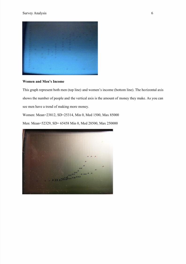
Survey Analysis 6
Women and Men’s Income
This graph represent both men (top line) and women’s income (bottom line). The horizontal axis
shows the number of people and the vertical axis is the amount of money they make. As you can
see men have a trend of making more money.
Women: Mean=23812, SD=25314, Min 0, Med 1500, Max 85000
Men: Mean=52329, SD= 65458 Min 0, Med 28500, Max 250000

8/3/2019 Phase 3 Stats Report
http://slidepdf.com/reader/full/phase-3-stats-report 7/15
Survey Analysis 7
Men’s income on Top and Womens Bottom
I would use a median value to compare the two, because there are outliers like people without
jobs. Men make about $52,329 and women make $23,812. The boxplot also shows how men
make a dominately larger amout of money through their income. The Third Quartile of the
Men’s boxplot is around the same amound as the Maximum income women make.
• The two Independent data sets have a p-value of .0279, with a significance level of 0.05 I
can conclude that men do make more money and reject the null which would be there is
no difference in incomes, because men clearly make much more.
Relationship Between Political Party and if the respondent feels President Obama will be
re-elected
See(Figure1)
• Other is all the other values that I did not chose to compare. Such as what independants
thought or if the answer was not a yes or a no.

8/3/2019 Phase 3 Stats Report
http://slidepdf.com/reader/full/phase-3-stats-report 8/15
Survey Analysis 8
Relationship btw. Political Party and Obama
• Democrats/Yes, Democrats/No, Republicans/ Yes, Republicans/No, The other section is
the undecided votes and the other political parties, many people also did not apply to a
distict party or did not know what their opinion was.
• These results do not produce a statistically significant choice from Democrats or
Republicans through a 2 proportion Ztest Pvalue(.8557)
• Odds ratio of Democrats to thinking Obama will be re-elected to Repulblicans was .4286
Democrats to 1 Republian. However, the assumptions were not reasonable and the
Interval was (.088, 2.09) so this result was considered insignificant.
• It appears that more democrats think Obama will be re-relected and more republicans
believe that he will not. Very few of the proportion of Republicans said yes (only 3).
However there is not significant evidence of this and it is probably just random chance.
Relationship Between Political Party and if the respondent is in Favor of the Health Care

8/3/2019 Phase 3 Stats Report
http://slidepdf.com/reader/full/phase-3-stats-report 9/15
Survey Analysis 9
Bill.
See (Figure 2)
Political Party and Health Care Bill
The Health care bill was more commonly not favored by either party, however Democrats most
strongly answered no.
• The proportion v-value of Democrates favoring the Health Care Bill more often than
Republicans was .3552. So I failed to reject the null hypothessis and assumed that the
results were random chance because there was not significance to resolve Democrats
more commonly approe of the Health Bill. The Odds ratio also concluded that for every
1.3091 Democrats 1 republican was in favor of the Health Care bill but the interval was
(.316, 5.431) to it is not considered significant.
The Relationship Between Political Party and the Death Penalty.

8/3/2019 Phase 3 Stats Report
http://slidepdf.com/reader/full/phase-3-stats-report 10/15
Survey Analysis 10
See(Figure3)
The relationship is republicans most commonly being in favor of the death penalty, democrats
were equally opposed and in favor.
• For this question it appears that Republicans more strongly vote for the Death Penalty.
The proportion p value was .0119 confirming this observation to be true by a significant
amount. The null is rejected and I could conclude that Republicans more often are in
favor of the Death Penalty than Democrats.
• The odds ratio was for every 5.625 Republican 1 Democrat said yes to the Death
Penalty. The Intercal was (.037, .849) so it was also significant.
The Relationship with Handedness and Favor for the Death Penalty
See(Figure 4)

8/3/2019 Phase 3 Stats Report
http://slidepdf.com/reader/full/phase-3-stats-report 11/15
Survey Analysis 11
I did not feel that a graph gives any real information for this. Of course handedness affecting
your thoughts would be a ridiculous assumption, however the data also proves this. It is
completely random.
• The odds ratio does not have reasonable assumptions and the p value is very large (.6491)
so I would fail to reject the null and conclude that there is not significant evidence that
right handed people are more often in favor of the Death Penalty.
Handedness and Amount of Water Consumed in Ounces

8/3/2019 Phase 3 Stats Report
http://slidepdf.com/reader/full/phase-3-stats-report 12/15
Survey Analysis 12
This data is also completely meaningless. Handedness can not affect the amount of water you
drink, that is a personal choice and a personal necessity. In a calculator I endered 1,2,3 for right,
left and ambidextrious people into list1 and the various amounts of water into list2. A plot of this
is not going to show any kinds of trends, there are the most right handed people, so of course
there was more water being consumed. The four ambidextrious people at the top had the least
amount of water the left were in the center and the right were spread out.
• The mean amount of water consumed with left and right handed people was 52.54 and
46.12. Considering they have greater populations than the 4 people with ambidextrious
handedness it shows that the greater the population the closer the means are going to be
with everyone. With using ANOVA I was able to conclude a p value of .1462 that one of
the groups was different.
Ethnicity and Change in Political Party

8/3/2019 Phase 3 Stats Report
http://slidepdf.com/reader/full/phase-3-stats-report 13/15
Survey Analysis 13
Considered (Republicans=4 Democrats=4)
White=5, Black=1, Hispanic=2 Out of the total 8 who considered changing
There were not many participants who changed their political party so first I just counted the
number of republicans who changed their political party and the number of democrats. It was
exactly equal. 5 white people changed, 1 black, and 2 hispanics. I think this is more closely
related to the proportion of each ethnicity actually surveyed from the beginning because there is
an obvious larger about of white people than any other.
• These two variables are independent. They had a p value of .6773 so there was absolutely
no evidence that there is a significant relationship between the two.
Relationship with Water and Weight
• The vertical axis is the amount of water consumed in ounces and the horizontal axis is the

8/3/2019 Phase 3 Stats Report
http://slidepdf.com/reader/full/phase-3-stats-report 14/15
Survey Analysis 14
weight of each person. The data looks pretty random without any trends but the most data
is in the middle so average people drank a normal amount of water, which could mean
that they are healthy and are not underweight or overweight partially because they drink
enough water. A mean of 60.68 ounces of water was consumed and a standard deviation
of 46.79 min was 0, med 51, max 160.
Discussion
A person’s political affiliation is expected to trend towards certain beliefs. This was clear with
the data concerning political party and the health care bill, death penalty, and Obama’s re-
election. Obama is a democrat so it is not surprising that the most democrats said they think he
will be re-elected and inversely not surprising the republicans said he would not. Democrats and
republicans did not facor the Health Care Bill, which might be related to where we live, or it just
being an unfavorable thing. Republicans were strongly in favor of the death penalty and
Democrats were slightly against it. The relationship with handedness and decisions was pointless
but good to have a contrastment to the graphs that are actually showing trends. Lastly ethnicity
seemed to be a failure, but mostly because there was not enough equal variety, and the amount of
water related to weight was interesting. I thought that bigger people would drink the most water
but there were not any trends besides the amount of ounces consumed started to decrease as
weight increased. I think this may be related to a concern with their health, obviously men weigh
more than women and are still not overweight but some subjects may be drinking soda insteasd
of water, or other fattening beverages therefore consuming less water and gaining weight. There
are studies that show a relationship with a lack of adequate water consumption and excess body
fat. (Leroy Perry, 1999)

8/3/2019 Phase 3 Stats Report
http://slidepdf.com/reader/full/phase-3-stats-report 15/15
Survey Analysis 15
Resources
Leroy Perry, R. (1999). Are you drinking enough water?. Retrieved from
http://www.naturodoc.com/library/nutrition/water.htm