portfolio 2012-15
TRANSCRIPT

Síne MacFarlanePortfolio 2012-15
Editorial Design, Book Design and Illustration,
Typographic Design, Packaging, Branding and Identity,
Storyboarding, Animation , Photography
contact: [email protected]

Editorial Design, spread 1:This design uses the concept of birds tweeting on pylon-wires to illustrate a poem about social media.

Editorial Design, spread 2:The scene for this design was photographed in the park at dusk. The blue, black and white palette is repeated in the body text.

Editorial Design, spread 3:The poem title ‘I just read it on the Internet’ ends on this page, having followed the white line of the tilted pylon from the start. Emotive words are highlighted in bold in the body text. Sketches of the birds and the pylon add interest.

Book Illustration and Design:‘Blackberry Picking?’ is an interpretation of the poem by Seamus Heaney.

The story hints at skullduggery but has a happy ending.

The illustrations and text are mixed-media. Dry-point etching, Indian ink, transfers of photographs (taken while picking blackberries) and oil pastels are used.

The story borrows phrases from the poem that contain strong visual imagery with a macabre tone.

Book Design:This design uses the typography and layout of the cover of a Daler Rowney sketchbook.

Graph paper background and hand-drawn elements are consistent with the sketchbook presentation style.


Typographic Design:Inspiration poster.An Islamic pattern and how it is built up is used to illustrate the concept of ‘involvement.’ The same motif serves as a grid for the text,

Typographic Design:Poster celebrating Eric Gill, creator of the Gill Sans typeface. A controversial characterfamous for his signature smock,and sans serif typeface used to this day on the London Underground station signage.

Typographic Design: Poster announcing an exhibition of typography in fashion. A rolled up cone-shaped brochure supports the poster.
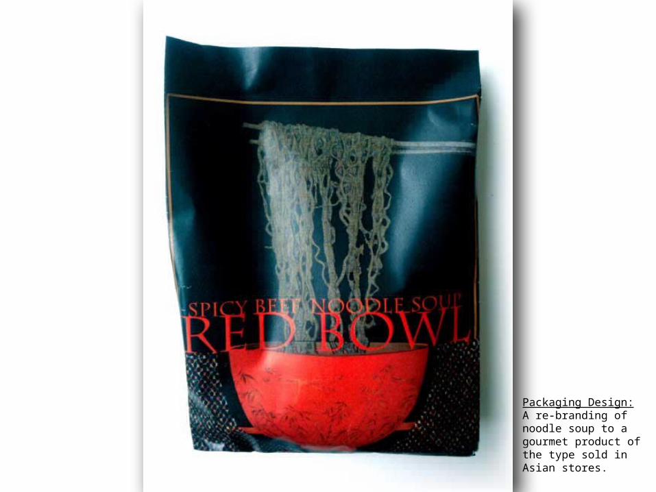
Packaging Design:A re-branding of noodle soup to a gourmet product of the type sold in Asian stores.

Branding and Identity: Living Links is a charity that provides support to people bereaved by suicide. I chose a gorse thistle to represent sorrow and hope co-existing and photographed it casting a shadow.

Branding and Identity: Skyrat is a teen fashion label. Branding includes logo design, stationery and T-shirts.

Interface, splashback and logo design for a mobile phone application.

Part of storyboard for 3-min animation based on a music soundtrack. Based onforor animation Design for Animation

Selection of screenshots from four different animations

Environmental Design: interpretation of ‘Fragments…’ by artist Shane Cullen

Photography:Macro-photo of melted sweets.
