poster progress
DESCRIPTION
posterTRANSCRIPT

7/18/2019 Poster Progress
http://slidepdf.com/reader/full/poster-progress-56d56898c55df 1/4
After deconstructing lm posters that had already been successful, I used the
typical conventions to create my poster. The rst step I made was choosing the
image that I wanted to use for the main focus. I chose this one because it is a
snapshot from the lm footage that captures the relationship.
In order to create a ‘dreamy’ eect, I drew a rectangle around the image so thatit was covered, then I used the blur tool to fade it out. As seen in my poster
deconstructions, posters such as ‘ear !ohn’ and ‘"egin Again’ the bac#ground
was blurred. As this is a typical convention of a $omantic genre, I tried to
establish my own ta#e on it.

7/18/2019 Poster Progress
http://slidepdf.com/reader/full/poster-progress-56d56898c55df 2/4
I decided on the primary colour for the font to
coincide with the colour of the blur around the
image. The title of the lm is the biggest and most obvious as this was a
convention in all of my deconstructions.
To highlight the te%t, I used the ‘stro#e’ and then selected the colour that I
wanted the outline to be. &rom audience feedbac# I was told that the font is
appropriate for the poster and therefore I did not change it, however, despite
this, I did e%periment with other fonts but came to the conclusion that I would
#eep it the way it is.
7/18/2019 Poster Progress
http://slidepdf.com/reader/full/poster-progress-56d56898c55df 3/4
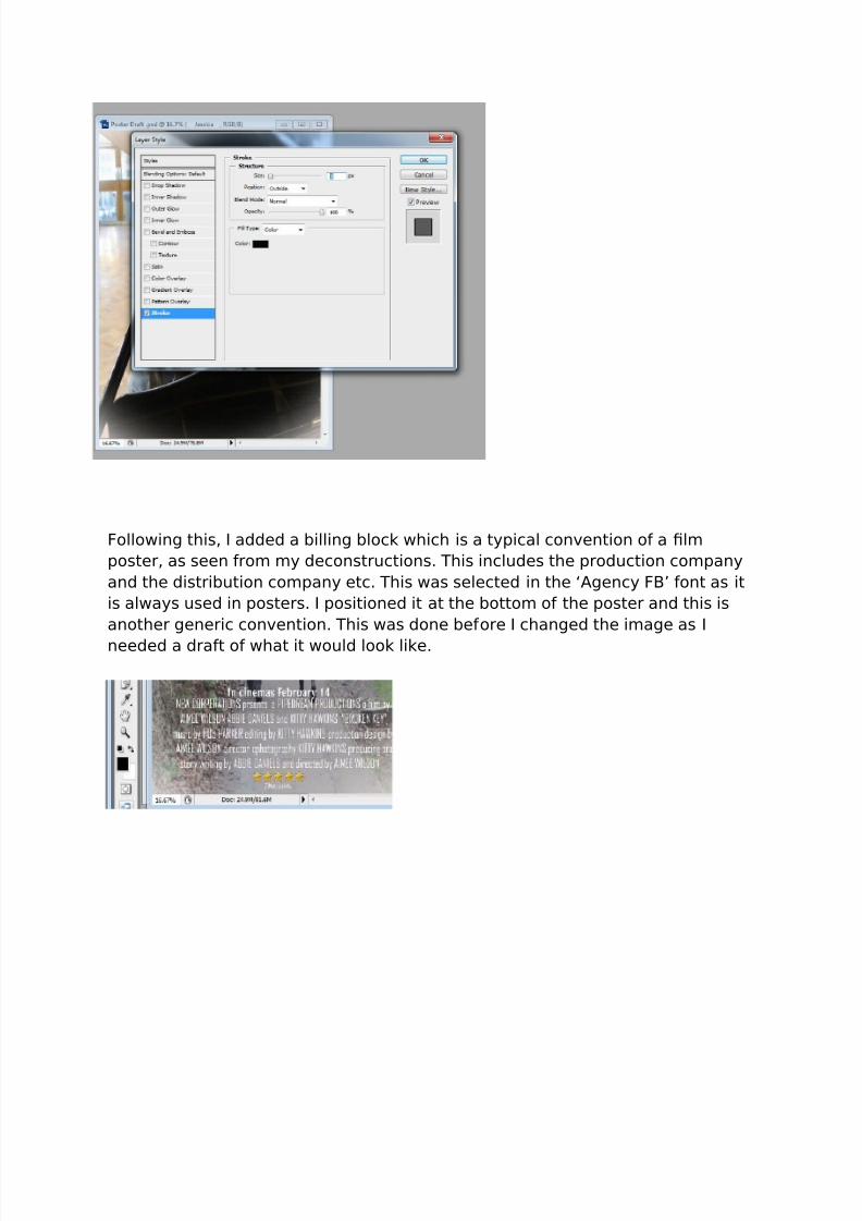
&ollowing this, I added a billing bloc# which is a typical convention of a lm
poster, as seen from my deconstructions. This includes the production company
and the distribution company etc. This was selected in the ‘Agency &"’ font as it
is always used in posters. I positioned it at the bottom of the poster and this is
another generic convention. This was done before I changed the image as I
needed a draft of what it would loo# li#e.

7/18/2019 Poster Progress
http://slidepdf.com/reader/full/poster-progress-56d56898c55df 4/4