pr11 production commentary
TRANSCRIPT

Unit 51 Page Layout and Design
Production Commentary
Slide 1: Design Programmes• For my design work I used Photoshop to create both my front cover and double
page spread. For word processing I used Microsoft word. This is because both are simple to use and are very effect for there intended purpose. When using Photoshop the tools I needed to most were colour replacement and the ability to cut out certain parts of an image. I also used the Healing brush tool to help smooth out the skin in my photo and make it seem more professional. Furthermore I used the text box tool along with the paint brush together to create a tinted gold effect, I could of done this with the gradient tool but wanted a different effect than the one given by that. For the same reason I used Photoshop for my double page spread.
• I used word to write my script for my double page script because it auto corrects my spelling and its easy for my to look over my work and change anything that need altering.
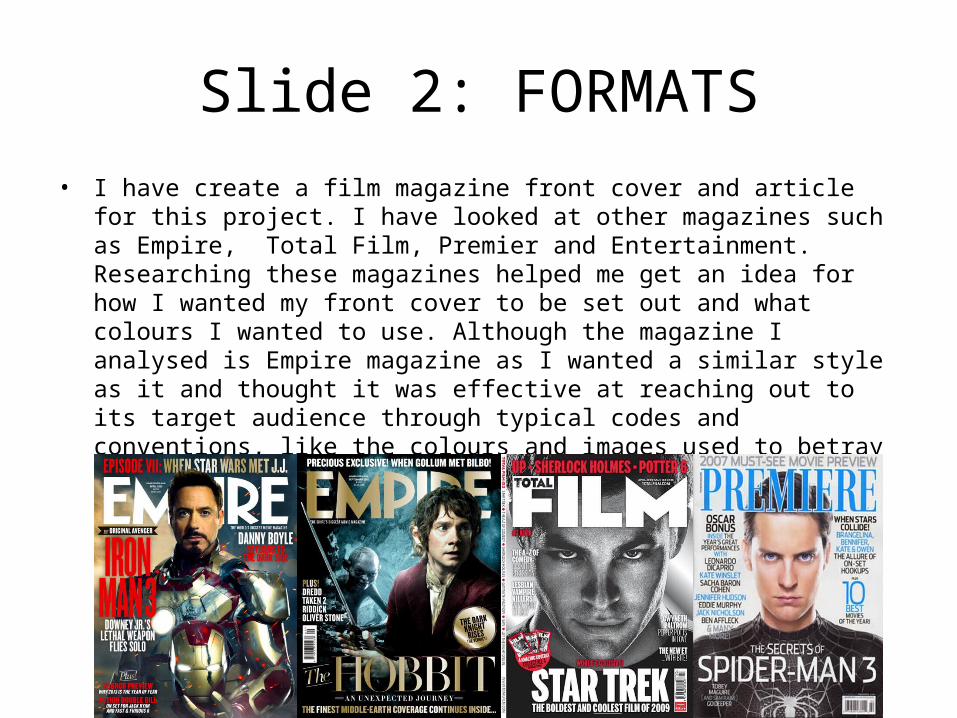
Slide 2: FORMATS• I have create a film magazine front cover and article for this project. I have looked
at other magazines such as Empire, Total Film, Premier and Entertainment. Researching these magazines helped me get an idea for how I wanted my front cover to be set out and what colours I wanted to use. Although the magazine I analysed is Empire magazine as I wanted a similar style as it and thought it was effective at reaching out to its target audience through typical codes and conventions, like the colours and images used to betray action. So I would defiantly say that my inspiration came from the empire magazine for both my front cover and double page spread.

Slide 3: Conventions & Visual Language
• I used simple fonts and bold letters to help illustrate the feel of exclusiveness of the magazine, I also used colours like gold and black for the same reason. The colour scheme is mostly washed out colours and the most dominant colour is defiantly light grey, this helps to make the eyes of the person on my front cover to stand out. My target audience is males, aged 20 – 30, to make my magazine stand out o this audience I included titles that would make them want to read it and also used a hitman style main image, for example the direct look and guns on the back wall made it clear that the magazine is about action which stereotypically is something males that age prefer. I placed my text on the front cover by using the Gutten Burg principle.

This is most likelyThe first place peopleWill look when seeingA magazine front coverSo it was important forMe to make sure the Masthead looked simpleBecause I didn’t want it To draw attention away From the main image. The Image is the
Most important partOf the front cover so I wanted it to stand outMore than the rest soI used light blue on theEyes and made the right Side brighter to draw attention away from theText and other to theImage.
This headline relates to the image on the front cover so I wanted to make sure it stood out the most so people know what the image is about.
Masthead
Lead Article
Cover Lines
Kicker
Barcode

Headline
Body Text
Gutters
Main Image

• I would say that the target audience for my magazine is 20 – 30 year old males. This is because action films are usually aimed at this age range and gender. Also my double page spread is about an action film that is brutal in my opinion so I would like my audience to be at an age were they can read an honest review but also be interested in the film, were as a child wouldn’t be. I think the social class for this magazine would be C, although I would like it too have seemed more exclusive and for a B class.