proof of original imagery used for my music magazine
TRANSCRIPT
PROOF AND EVALUATION OF ORIGINAL IMAGERY FOR MY MUSIC MAGAZINEDone by Eman Shah

This is a picture that I took of one of my friends. The image is big as it is used to be the main content on the magazine. Also it is the first view point that the reader will look at. The image conveys what kind of magazine it is. This is because the image is portrayed as dark which relates to rock, with also an electric guitar..
I decided to take a mid shot image because you can clearly see what she is wearing. She is wearing a black top and black jeans. This also relates that the magazine is going to be about rock because when we look at rock magazines we mainly see that the models who are featured wearing dark clothing. Her body language gives the front cover a rocky edge because she is contrasting the black that she is wearing with the cover lines
The reason why I picked this image was because of her facial expression which shows the emotions of confidence which is exhibited by the fact she is challenging the audience. I made sure that the lighting was correct when I took this photograph because if it was not correct I would then have to alter it. What I did alter was the background on Photoshop I used the quick selection tool to remove the background. I did this because on my front cover I wanted the background to be of a stage.
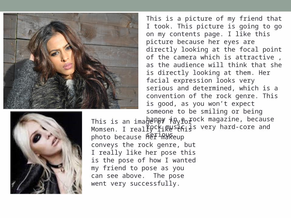
This is a picture of my friend that I took. This picture is going to go on my contents page. I like this picture because her eyes are directly looking at the focal point of the camera which is attractive , as the audience will think that she is directly looking at them. Her facial expression looks very serious and determined, which is a convention of the rock genre. This is good, as you won’t expect someone to be smiling or being happy in a rock magazine, because rock music is very hard-core and serious.
This is an image of Taylor Momsen. I really like this photo because her makeup conveys the rock genre, but I really like her pose this is the pose of how I wanted my friend to pose as you can see above. The pose went very successfully.

This image is on my contents page. I chose this image because the mise en scene makes her look very appropriate for the genre which is rock. A prop used includes a typical rock pose with a guitar and this is one convention of a rock magazine.
This is another original picture that I took, which is also on my contents page. I chose this image because as you can see there is things going on, you can also see drums, which is another convention of a rock magazine.

This is an original image that I took of my friend. This image is going to be on the double page spread. I have taken a mid shot which I have decided that will cover most of the first page, to make it look intriguing, as it will appeal to the audience. I like this shot of my friend because she is directly looking at the focal point of the camera which will emphasise to the audience that she is directly looking at them. This is good as it will bring a sense of insecurity.
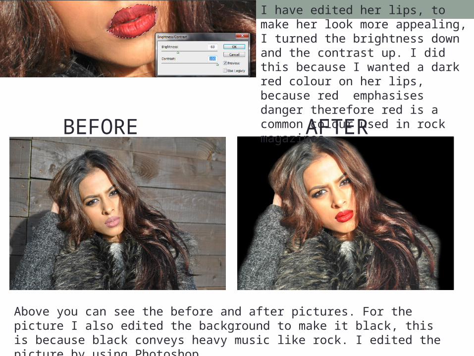
I have edited her lips, to make her look more appealing, I turned the brightness down and the contrast up. I did this because I wanted a dark red colour on her lips, because red emphasises danger therefore red is a common colour used in rock magazines.
BEFORE AFTER
Above you can see the before and after pictures. For the picture I also edited the background to make it black, this is because black conveys heavy music like rock. I edited the picture by using Photoshop.

I did not choose this image for my magazine because it does not look suitable. This is because the image looks dark and the clothing the girl is wearing does not reflect the rock music genre, so it will be inappropriate for this image to go on my magazine.
I did not choose this image because the eyes are not even facing directly at the camera, and also part of the head is missing. Also the picture does not have the correct expressions for a rock genre.
This image looks dark, what happened here was when I took this photograph the room was dark, and I forgot to put the flash on. So by me forgetting to put the flash on, the image came out dark and this is why I did not use it.

These pictures did not come out the way planned. This is because the pictures were taken at many different angles to show how effective the photos would turn out like. Also the first picture is blurry and is out of focus, so it will not be suitable putting the image on the magazine as it will not look effective. The second picture does not look realistic or good enough as it does not portray the image that I wanted.

I chose not to use this image that I took because she is not looking directly at the camera, she is looking down, so it would not be suitable if I used this image.
I really like this close up image that I took because the lighting looks amazing , but I chose not to use it because it is too close and you cannot see both of her eyes, whereas I want both of her eyes looking directly at the camera.
I did not choose to use this image for my double page because firstly the lighting is not good, and the image is too far out, and the viewers will not be able to focus on it correctly.
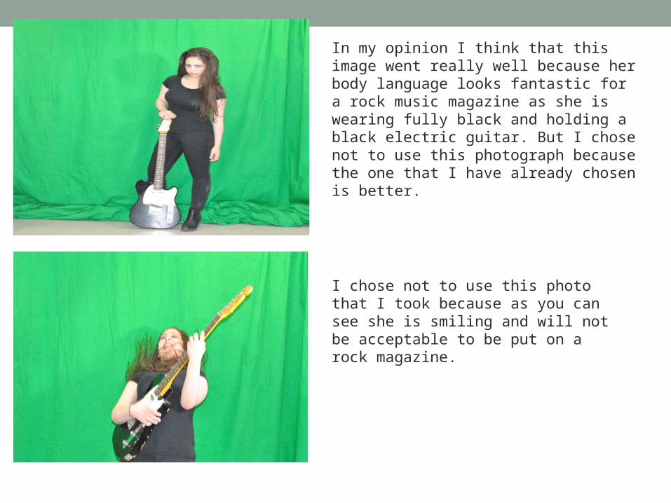
In my opinion I think that this image went really well because her body language looks fantastic for a rock music magazine as she is wearing fully black and holding a black electric guitar. But I chose not to use this photograph because the one that I have already chosen is better.
I chose not to use this photo that I took because as you can see she is smiling and will not be acceptable to be put on a rock magazine.
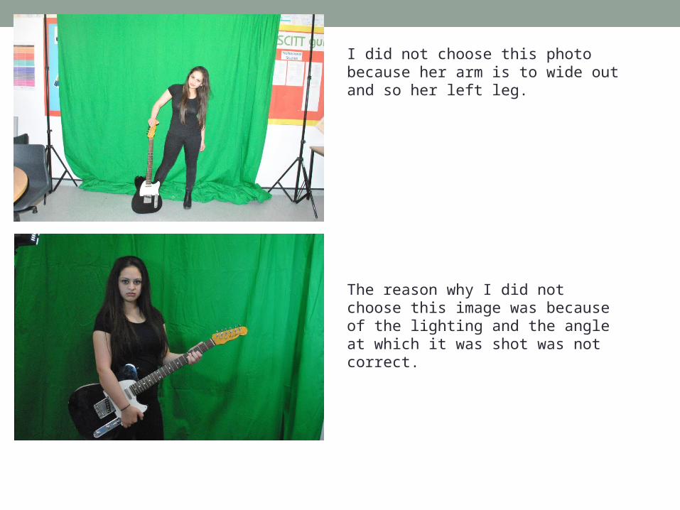
I did not choose this photo because her arm is to wide out and so her left leg.
The reason why I did not choose this image was because of the lighting and the angle at which it was shot was not correct.

I decided not to use this photograph, because for this photograph I wanted him to be very serious and angry looking, but as you can see his eyes are closed and his facial expression does not look angry at all, so it would not be good if I put this photo on to my magazine.
There is too much light in this photograph, which goes on to his face and makes his face seem very bright, although his facial expression in this photo is kind of angry looking I did not choose this photo because there is too much light going on to him.

Above is a photograph that I took of my friend. This photograph came out as planned which I found to be very successful because the lighting is perfect and also what he is wearing. This is because the red and black that he is wearing is portrayed in rock magazines and also his facial expression looks serious and he is directly looking at the focal point of the camera.
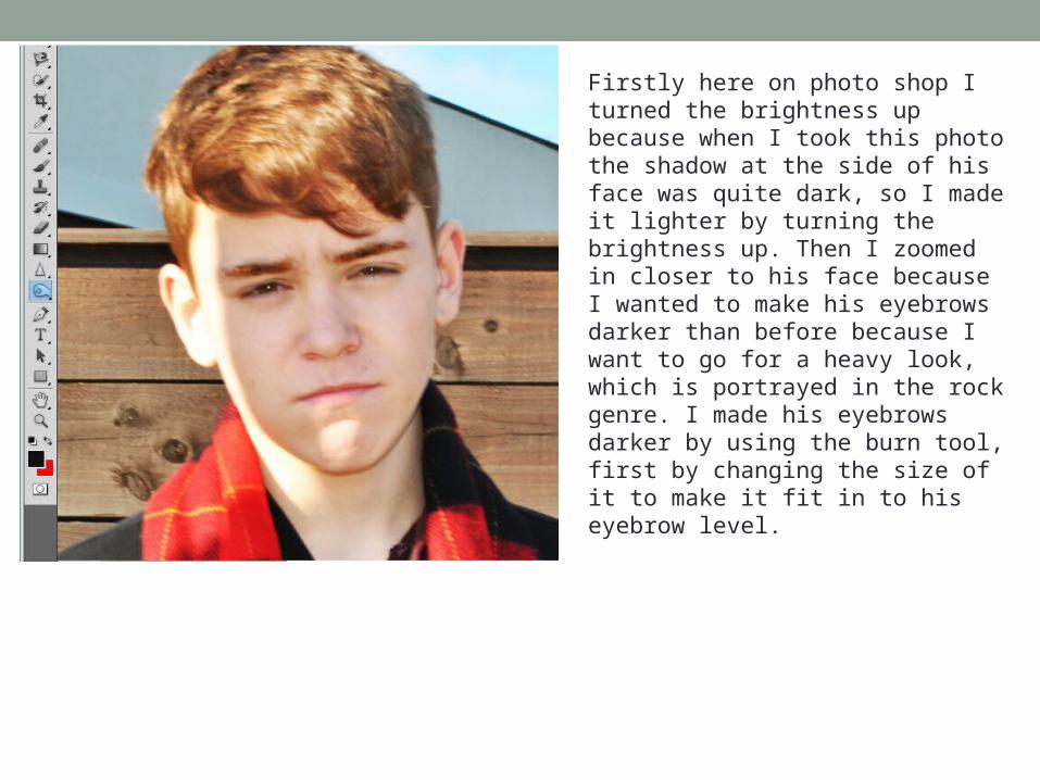
Firstly here on photo shop I turned the brightness up because when I took this photo the shadow at the side of his face was quite dark, so I made it lighter by turning the brightness up. Then I zoomed in closer to his face because I wanted to make his eyebrows darker than before because I want to go for a heavy look, which is portrayed in the rock genre. I made his eyebrows darker by using the burn tool, first by changing the size of it to make it fit in to his eyebrow level.
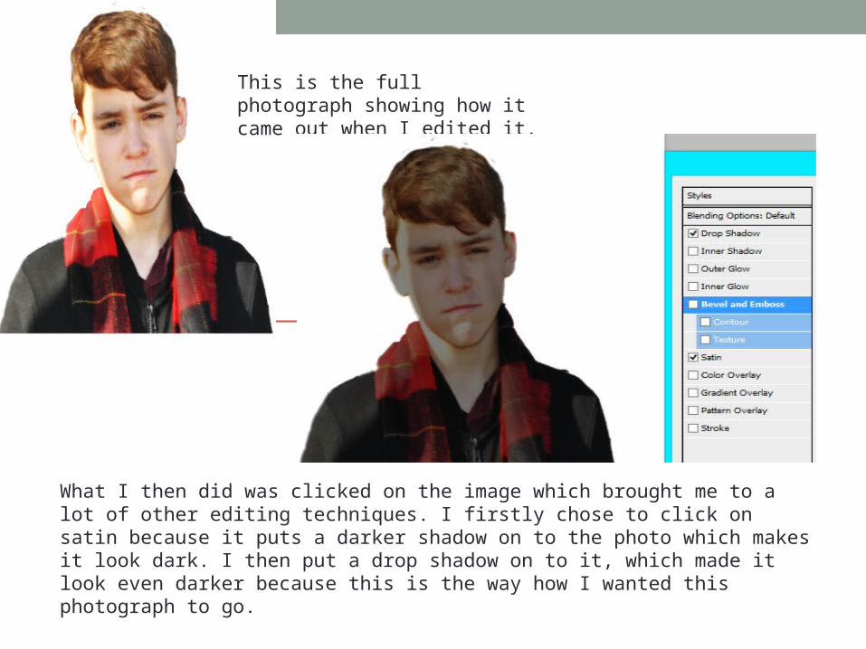
This is the full photograph showing how it came out when I edited it.
What I then did was clicked on the image which brought me to a lot of other editing techniques. I firstly chose to click on satin because it puts a darker shadow on to the photo which makes it look dark. I then put a drop shadow on to it, which made it look even darker because this is the way how I wanted this photograph to go.