question 4 and 5
TRANSCRIPT


Who would be the audience? The audience for my magazine would tend to be those
that are interested in rock music.
In order to understand who would want to be the target audience, it’s essential to collect a psychographic profile. My magazine is for those that don’t belong to a label or brand (reformers), for those that enjoy new things (explorers) and for those that enjoy individuality (rebels).

From a demographic profile;
aged between 14 to 30
Live in Britain
From a working class to a middle class background
Tend to be white
Play instruments or listen to music with drum and guitar solos in them- mostly rock music
Go to festivals and gigs like Glastonbury

Audience profile
During this task, I asked my target audience
what they would like to see in a magazine for them and what should be used for it. My audience tends to wear black like in the image on the right. This is incorporated into my magazine.


Audience To attract my audience, I used colours that
they would wear and favour. This being red, black and white. To help me with this, I looked at other magazines like mine and asked people who I thought would be likely to be my audience.

Double-page spreadMy double page spread compared to the NME’s have differences and similarity.
They differ in colours used as they use more of a clean white slate however they are similar in the layout of the images and the columns used. I choose to use black as the back ground to make my magazine more individualistic as my audience is individualistic. As my audience tends to wear a lot of black and have dark hair, the double-page spread reflects their interests.
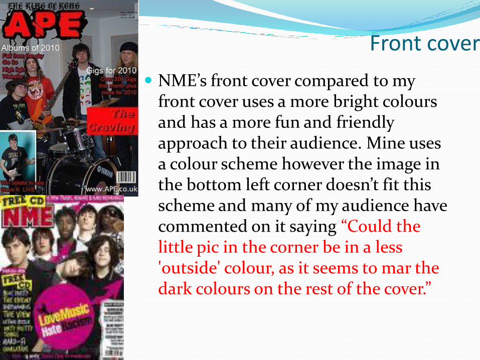
Front cover
NME’s front cover compared to my front cover uses a more bright colours and has a more fun and friendly approach to their audience. Mine uses a colour scheme however the image in the bottom left corner doesn’t fit this scheme and many of my audience have commented on it saying “Could the little pic in the corner be in a less 'outside' colour, as it seems to mar the dark colours on the rest of the cover.”

Contents
My contents page compared to NME’s is quite basic and is quite clean. Mine uses more images whereas the NME contents page uses a lot more writing. The contents page is too white in my opinion and it doesn’t reflect the audience. It doesn’t really go towards the magazine in its theme. The pictures I choose to use in the contents can be relate to the audience as they can reflect their lives.

Comments from the audience Contents David Norwood yep seems all gd just gotta sell to WHSmith lol
Dave Wyllie I like the layout and use of photos, plus it's a simple and easy to understand formate.
Steve Knight would prefer to see the layout of the photos more aligned with the other. this way the smart layout of the photos would contradict the the hectic ape logo in a positive way
Jess Spencer argh. too much white? compared to the rest, i expected it to be draker, but not bad :)
10 seconds ago ·

Comments from the audience Front page David Norwood wow nice i want the magazine lol
Dave Wyllie In my opinion i think that the colours are great, so to is the layout but the main title and the image in the corner don't look good together, mainly becuase the photo has solid bold lines and the title seems more appropriate for the genre, it tears out the page and looks amazing. Hope this helps :)
Steve Knight colours look great. Especially the use of the shadows in the smaller red text. i would prefer to see the main image smaller, perhapos half the size, and more focus on the top part of the cover as branding for the ape magazine
Jess Spencer Kool! Could the little pic in the corner be in a less 'outside' colour, as it seems to mar the dark colours on the rest of the cover.

Comments from the audience Double-page spread David Norwood I like it looks awesome colours are
good...and even seamus looks amazing in it lol
Steve Knight Left page looks very sharp and good. The 3 columns relate to the 3 band members, forming a nice symetry.The quote on the right page is probably slightly too large, and not in a structured position.
Jess Spencer good, dark colours relating to non-mainstream stuff, im guessing... the lift page is great, but the right page could have a black box with the quote in?

Response to comments With responding to the comments I received, I believe
that I got the colour scheme correct yet on the front cover I would change the background of the bottom left image to a darker colour. This would then be part of the magazine instead of being outside the theme. If I were to change anything, I would change the contents background to black to keep up with the colour scheme as there is “too much white”. I think I was fairly successful yet I would need to work on many things such as the contents pages background colour.