ray parker, color into drawing: paintings 1958-1971
DESCRIPTION
Painter Ray Parker's retrospective at the Haggerty Museum of Art, Milwaukee, WisconsinTRANSCRIPT


Ray ParkerPaintings 1958-1971Color into Drawing
HAGGERTY MUSEUM OF ART MARQUETTE UNIVERSITYMILWAUKEE, WISCONSIN

Acknowledgments The Haggerty Museum of Art is pleased to present the exhibition Ray Parker Paintings 1958-1971: Color into Drawing. This exhibition will serve to renew interest in the works of Ray Parker, a seminal figure among the abstract artists of the mid-twentieth cen-tury. His explorations with color and shape augment the efforts of colorfield and abstract expressionist art-ists. This exhibition is made possible with the gen-erous cooperation of the family of Ray Parker, and Joan and Brian Washburn of the Joan Washburn Gal-lery, New York. The Washburns and Parkers played an integral role in developing the exhibition by provid-ing information on the artist, and on individual paint-ings and drawings. The planning of the exhibition and production of the catalogue were greatly aided by the expertise of William Agee, Professor of Art History at Hunter College, New York who contributed a scholarly essay to the catalogue. The exhibition and related programming re-ceived the support of funding from the Martha and Ray Smith, Jr. Endowment Fund, the Family of Ray Parker, Louis S. Winter and the Joan Washburn Gallery.
Ray Parker Paintings 1958-1971: Color into Drawing July 20 - October 8, 2006Patrick and Beatrice Haggerty Museum of ArtMarquette University, Milwaukee, Wisconsin
© 2006 Marquette University, Milwaukee, Wisconsin. All rights reserved in all countries. No part of this book may be reproduced or transmitted in any form or by any means, electronic or mechanical, including photocopying and recording, or by any information storage or retrieval system without the prior written permission of the author and publisher.
Catalogue design and layout: Jerome Fortier
Catalogue printing: Special Editions Inc., Hartland, Wisconsin
Cover Image: Untitled, 1970, oil on canvas, 70 x 90 in., courtesy ofWashburn Gallery, New York
Photography credit for the plates: Josh Nevsky Page 4: Ray Parker, 1974 (photo credit: Bob Ellis)Page 36: Ray Parker, circa 1960 (photo anonymous), Ray Parker, circa 1970 (photo credit: Holly Tanner)
Introduction When I was first approached about an exhibition of Ray Parker’s paintings and drawings, his paintings were not foremost in my thoughts of major American artists of the second half of the Twentieth Century. Curious, nevertheless, I decided to investigate. The investigation revealed an artist of originality and a body of vital works. While sometimes linked with the Abstract Expressionists and the Color Field painters of this era, his approach to painting brings further simplification in the reductive efforts of painters to discover the essential elements of their art form. Color and shape and their relationship to the two dimensional space of the canvas, of course, remains the core. My investigation revealed a substantial career already in place during the artist’s lifetime. This claim is supported by the very strong critical statement of essayist William Agee in the opening lines to his essay for this volume, “From 1958 to 1965 Ray Parker made some of the best paintings done by any artist after 1950.” This is indeed a strong claim. It places Parker in competition with giants in the field such as Jackson Pollock, Kenneth Noland, Helen Frankenthaler, and others whose notoriety has fared somewhat better in the contemporary art consciousness. And yet his record of solo exhibitions at major institutions including the Solomon R. Guggenheim Museum in 1961, and the Phillips Collection, Washington, D. C. in 1979 offers support to Agee’s bold
assertion. His placement in major museum collections such as the Museum of Modern Art, New York, and the Whitney Museum of American Art, as well as the Tate in London and the National Gallery of Art in Washington. Despite these accolades, the lesson is that fame in the art world can be short lived in a constant and ever widening stream of creative output. Yet it is important to the preservation of our culture that we sustain our artistic heritage. The efforts of the Joan Washburn Gallery and the Parker Family deserve commendation. But it is also important that museums such as the Haggerty Museum support such efforts. Hence it is with gratitude that we bring attention to the work of Ray Parker and help to keep it in the repertory of important work by American artists. And were it not for Haggerty Friends Board Member Louis Winter, who first raised the possibility of such an exhibition, it might never have occurred.
Curtis CarterDirector
2 3

Table of Contents
IntroductionCurtis L. Carter, Director of the Haggerty Museum of Art,Marquette University
Ray Parker Paintings 1958-1971: Color into DrawingWilliam C. Agee, Evelyn Kranes Kossak Professor of Art History, Hunter College, New York
Works in the exhibition
Plates
Artist’s Biography
2
5
9
10
31

Ray Parker, 1974
4 5

From 1958 to 1965 Ray Parker (1922-1990) made some of the best paintings done by any artist after 1950. He called them the Simple Paintings.
Seen now, they reaffirm Parker as one of the most important artists of the period. Composed of but a few shapes—sometimes only one, sometimes as many as five—they are “simple” in name only, for neither their formation, their arrangement, their mood and feel, nor their effect is simple. The more we engage them, the more we open ourselves to their magical presence, the more complex and evocative they become.
The Simple Paintings were widely acclaimed when Parker first showed them, but for years afterward they were largely invisible, part of a hidden history of painting in the later 1950s, one that we are recovering only now, through a process more like classical archaeology than modern art history. The recovery of these lost treasures of American art began with the memorial show held in 1990 at Hunter College, where Parker had taught for many years. More recent exhibitions at the Joan Washburn Gallery in New York have explored the depth and variety that he developed in both larger and smaller formats. The current exhibition at the Haggerty Art Museum allows us to see these glorious paintings once more, now in the context of his later paintings of the 1960s and 1970s. In these works Parker moved from a process of formation of color shapes to fields of intense color activated by pure and free drawing.
The Simple Paintings are truly monumental: weighty, dense, literal, almost human in the presence of their shapes. As Parker later recalled, “I found shapes that floated, rested heavily, hung, nudged, bumped, touched, hovered in vast voids of separation, were many, were few, isolated, single, alone.” He further described them as “quiescent, bound by the gravity that makes bodies in orbit hang in a stillness where the slowest movement marks the space from one to another.”1 They recall Mark Rothko’s declaration that his shapes were like actors in a drama, but while
there are clear analogies, the Simple Paintings are of this world, here, with us, earthy, more like Robert Motherwell’s works than Rothko’s ethereal paintings. This is why the dimensions of even the largest paintings do not exceed six or seven feet, the space defined by the outstretched arms of a man—the oldest, dating to Leonardo’s Vitruvian man, and the most human measurement. It is why Parker could once remark that he felt “you could go up and put your arms around one of them.”
These paintings have a hard-won singularity, for they emerged from Parker’s earlier art only after he had been an accomplished painter for more than ten years. (It is worth noting that his earlier work had been recognized in 1950, when he was included in a new talent exhibition at the Museum of Modern Art.) Parker had developed his gift for color—the true medium of his art—in the “Stroke” paintings, which consisted of multiple painterly patches of abstract color related to the eliding color passages in Paul Cézanne’s late landscapes, and to the open touches of brilliant color in Henri Matisse’s Fauve works. Parker recalled that in front of one of these works his friend the painter Rollin Crampton held up fingers and thumbs to frame just two strokes, commenting, “Wouldn’t this be a beautiful painting?” The path was in fact more complex, for the shapes of Motherwell, as well as those of Rothko, hinted at Parker’s direction, but the artist felt that Crampton had predicted the course of his art, as well as that of much art of the later 1950s and the 1960s.
There is much truth in this, for in the later 1950s a generation of artists that included Parker, Kenneth Noland, Al Held, Jack Youngerman, and Frank Stella pushed toward a more distilled and clarified type of painting, moving beyond what they had felt had become the overworked surfaces and dulled color of much later Abstract Expressionism. The Simple Paintings were at the forefront of this drive. These younger artists retained the scale, immediacy, and power of Abstract Expressionism, which they held
Ray Parker Paintings 1958-1971: Color into Drawing William C. Agee, Evelyn Kranes Kossak Professor of Art History, Hunter College, New York

in high esteem, but they sought to reinvigorate it, feeling that it had become too predictable, rhetorical, and even academic. The Simple Paintings have the brushed surfaces and rough edges associated with Abstract Expressionism, but in more focused, clearly defined, and articulated forms that look forward to the lean geometries and minimalist impulses of much art of the 1960s. This new drive dictated a greater reliance on color, which was restored to its full primacy after years in a lesser role in gestural abstraction. Parker later recalled that the impetus for the Simple Paintings had been the desire “to cut out everything else but pigment on ground and let color tell the whole story.” From there his forms “grew and spread, gradually becoming bigger or smaller, rounder or more square, more ragged or else exact and regular in their edges, all according to the need of the color surface to make itself dense enough and real,” as he described it.2 Thus, the Simple Paintings both announced and participated in what we know as the color field painting of the 1960s, which had actually come to fruition in the later 1950s.
Parker’s working method, steeped in Abstract Expressionist practice, was improvisational and con-frontational. He tacked bare canvas to the wall, keeping the ground neutral with only a priming coat to maintain and heighten the clarity of the color shapes. There was no preconceived plan or preliminary sketch. He often used rags to apply the paint, allowing the color to spread to its “fullness of volume,” as he termed it, letting it respond to the pressure of his hand, recording the nuances of touch and feeling, change and movement, like a psychic seismograph. He let the materials dictate his moves, exploring and discovering as he went, working out of the beauty of the picture as you see it, a method with a long tradition in American art that can be traced as far back as Alfred Stieglitz in the first years of the twentieth century as the basis for a truly modern process of making art. The choice of color was wide open and unpremeditated; almost any color would do. Hues range from light grays to deep, rich blues to brilliant, luminous reds. The distinctive-ness of a color—its unique identity, not its interaction with other colors—was the important factor. Fairfield Porter’s description of de Kooning’s art—“Colors are not bright, but intensely themselves, as if each color
has been freed”—is apt.3 Parker’s color could be flat and uniform, but often it was, he said, “mixed up—wet-in-wet, as though the canvas itself was a palette where things were being mixed.” Thus we see abrupt changes of hue and value, as well as rich layerings, which are among the constant surprises that we encounter in these paintings. To be convincing and real, his color depended not only on hue and value but also on amount, proportion, luminosity, texture, and weight. Also important is the internal scale of color, the relation of shapes to themselves and the edges of the canvas. Parker’s fullness of scale coincides with the fullness of color volume, accounting for the power and effectiveness of the very small Simple Paintings, some of which are no larger than twelve inches square. To ensure the unity and wholeness of the painting, changes were made only in process; no additions or corrections could be made afterward. The whole painting might be in error, he said, but never a part of it.
Shapes could be arranged as horizontal or vertical in format; they could be stacked, adjoining, or separate. The paintings can be slow and still, or floating, off center, or frontal, or architectural, post-and-lintel style, like a modern Stonehenge. In turn, they can be meditative and contemplative, playful and lighthearted, or as in a 1963 triptych (For Kate, below) of single vertical shapes, solemn, the forms isolated and immovable, recalling Alberto Giacometti’s standing figures or the characters in Samuel Beckett’s Waiting for Godot, both cultural icons of the 1950s. The possibilities were endless. We cannot help but feel in these poetic and moving paintings an urgency, an inner imperative, that made them unique in their time and that still speaks to us today.
6 7For Kate, 1963, oil on canvas, triptych, each panel 74 x 36 in. Courtesy Private Collection, Chicago, Illinois

But as good as the Simple Paintings were, by the mid-1960s Parker came to feel he had done what he could with them. He had apparently found himself constrained by the format of these paintings; by their frontality and closed, discrete shapes; and perhaps by their sometimes dark mood, which could refer to the existentialist angst of the early 1950s. Further, given his curious and experimental nature, he was inclined not to settle for a signature style, but rather to continue to explore new possibilities. In effect, he posed for himself the question, and the challenge, of discovering what more could be done with color, his true gift. Could it be pushed and expanded, to still let it “tell the whole story,” but now in an even fuller, more active role? Sparked by the new mood of 1960s optimism, Parker answered the question with an outpouring of color that filled the entirety of the surface in a way that the Simple Paintings could not. As the forms of the Simple Paintings began to break apart and fill the surface, hues became even higher keyed and more vibrant than before, forming a literal, allover field of color. Into these fields he introduced myriad forms, of all manners and shapes, in a wide variety of contrasting colors. The results were dazzling and constituted one of the essential bodies of 1960s color field painting, which is a crucial—and glorious—chapter in the history of American art that demands a full and comprehensive study.
While Parker unleashed a new torrent of color, he also introduced a new pictorial element, the oldest and most venerable of mediums: drawing. The myriad shapes of the new paintings were now informed as much by a freedom of drawing as by color creation. As Parker described it:
From 1962 occasionally, and for good in 1965, I got over the inborn American distaste for shape consciousness and the fear that drawing could be corny, which caused us to use anything but the traditional means to paint on the canvas. I had made the simple paintings by applying the paint with rags. Quitting the myth that a painter must be innocent of the artifice of art freed me of the limits and rules I had made for myself for color and field. Now I could make a screwy shape, even a line! Color, yes! Field, yes! Elaborate shapes, lateral movements, changing speeds, multiple rhythms (once more) Yes! Anything, yes! And withal, these new paintings are simple and direct.
In the new work, Parker’s fusion of color and drawing combined and reconciled the old distinctions between Florentine disegno and Venetian colore. He had retained color, so dear to him, but with the addition of drawing, he made paintings of a much different type than the Simple Paintings. The post-1965 work was fast, versus the slower pace of the earlier work; was active, versus still; had clean edges, versus ragged outlines; free movement, versus set positioning; and was charged and electric, versus meditative. One is not better than the other, but they are different, with the later work exploring a new range of formal and emotive effects.
While new to his paintings of the 1960s and 1970s, drawing had long been a preoccupation of Parker’s. He had been trained at the University of Iowa, where drawing was taught as a core part of the curriculum, and he himself taught drawing at Hunter College, where he was a professor until his death in 1990. His early work of the late 1940s was based on drawing within a loose cubist grid, and drawing was evident within the stroke paintings of the 1950s. American art in these years was largely dominated by the gestural type of drawing practiced by many of the Abstract Expressionists and employed in the service of organic, biomorphic form. Thus it can be said that Parker had retained and reintroduced an older but still contemporary medium into the new color fields of the 1960s. His generation had been inspired by the active drawing and calligraphy of Joan Miró, and his example is surely evident in Parker’s post-1965 art. Other artists of a much different persuasion, working at the same time, had also retained drawing as a basis of their art. Stuart Davis (1892-1964), an artist Parker deeply respected, had always insisted that his art, for all its color, was fully grounded in drawing.
But the great example for Parker’s new fusion of color and drawing would have been the art of Matisse, the greatest artist of the twentieth century, whose work reached a new level of prestige in America after his death in 1954. His famous color cutouts, done after 1944, were widely shown in America and became a protean source of possibilities for countless artists of the late 1950s and 1960s. Especially important was the Matisse show of the late, large cut gouaches held at The Museum of Modern Art in 1961 which had an

explosive effect on countless artists. Here too color told the whole story, with Matisse virtually inventing a new medium for its application. He cut directly into colored paper with scissors, making pure, discrete color shapes, which he then arranged over a pure field, a simple and direct process with a new and unmatched expressive and emotive intensity. Matisse’s cutouts offered a potent way out of what was increasingly seen as the overworked surfaces and clogged colors of later Abstract Expressionism, a way to a new clarity and directness of the picture.
Also of the greatest importance to American painting was the acquisition by the Museum of Modern Art in 1949 of Matisse’s seminal Red Studio, of 1911, one of the most influential paintings of the twentieth century. Its large-scale field of color, the intense red enveloping and carrying the entire surface, demonstrated the means by which artists could move into new and abstract realms of color in a previously unknown size and scale. It was the painting that enabled Rothko, for example, to complete the final move into the floating rectangles of color that marked his mature style. Thereafter, the challenge of making a large-scale, all-red painting became a signal call to artists, answered by, among others, Barnett Newman in Vir Heroicus Sublimus (Collection The Museum of Modern Art, New York) of 1950 and 1951 and by Ad Reinhardt in his large red abstractions of 1952. It is useful to consider one of Parker’s best paintings, his untitled canvas of 1968 (plate no. 9), in this context, for the painting is at heart a large red field. Into it Parker cut and activated myriad biomorphic, organic shapes—some thick, others very thin—that move across the field laterally and diagonally, setting up almost endless sequences and interactions of color and shape. It is as if Parker had fused, in his own personal idiom, the color and drawing of Matisse, for the shapes of the cutouts were a new form of drawing, with the calligraphy associated with Miró. Closer to home, the painting also seems a response to the high color and active surfaces of Stuart Davis, particularly his work of the late 1930s and early 1940s.
But make no mistake, this and others of the time are not imitative or derivative in any sense; they are uniquely Parker’s own. They move with their own rhythms, their syncopation, much like the jazz
music that he (and Davis) loved so much. Other post-1965 works could be quieter and less active, such as his untitled painting also of 1968 (plate no. 11). Here the shapes unwind and expand more slowly, languorously, like bodies in arrested motion or plants moving toward the sun, crowding themselves to the right, leaving open space to the left. This was fine by Parker—“I like the idea of wandering all over the canvas making whatever marks I want,” he said, and open spaces could let you ”dig on emptiness.” As much as the color, Parker took great pride in the acuity of his drawing: “There is nothing accidental or neutral about my edges, he stated. “I’m proud of my drawing. I’m making a stand that artists go ahead and draw.”4
Indeed, one of the legacies of Parker’s later work was to save drawing and the form invention so central to earlier Abstract Expressionism as an impetus for a special type of color field painting and as a refreshing antidote to the increasingly minimalist formats found in much American art of the 1960s. His paintings of the 1970s and beyond reminded us of, and in fact insisted on, the viability of abstract art and of painting itself in an age of conceptualism that had all but renounced the medium. His art was a vital and original part of a long tradition of color painting, a tradition that is still being defined today. Parker’s art tells us of the old and continuing ability of painting to convey the most authentic, most deep-seated, aspect of our experience, that of our feeling toward, and our understanding of, the world in which we live.
1. Except where noted, this and all other Parker quotations are from his 1975 statement published in the Catalogue of the American Collection, (London: The Tate Gallery, 1978), p.5.
2. Letter to Gerald Nordland, quoted in Gerald Nordland, “A Few Thoughts on Ray Parker and His Work,” in William C. Agee et al, Ray Parker 1922-1990, exh. cat. (New York: The Bertha and Karl Leubsdorf Art Gallery, Hunter College,1990), p. 17.
3. Fairfield Porter, “Willem de Kooning,” The Nation, 1959, reprinted in William C. Agee et al, Fairfield Porter: An American Painter, exh. cat. (Southampton, New York: The Parrish Art Museum, 1993), p. 19.
4. Miami Herald, January 31, 1971, p. 2H
8 9

All works courtesy of Washburn Gallery, New Yorkunless otherwise noted.
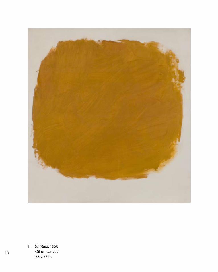
1. Untitled, 1958 Oil on canvas 36 x 33 in.
2. For Denise, 1959 Oil on canvas 69 x 50 in.
3. Love Denise, Glad you like it, 1960 Oil on canvas 81 x 79 in.
4. Untitled, 1961 Oil on canvas 69 x 64 in.
5. Untitled, n.d. ca 1962 Oil on canvas 69 x 64 in.
6. Untitled, 1962 Oil on canvas 49 x 46 in.
7. For Kate / Kate for your Birthday, 1963 Oil on canvas 71 x 87 in. 8. Untitled, 1965 Oil on canvas 69 x 68 in.
9. Untitled, 1968 Oil on canvas 90 x 110 in. 10. Untitled, 1968 Oil on canvas 94 x 108 in.
11. Untitled, 1968 Oil on canvas 108 x 95 in.
12. Untitled, 1969 Oil on canvas 84 x 60 in. Courtesy of Norma and Marvin S. Rappaport
13. Untitled, 1968 Oil on canvas 94 x 108 in.
14. Untitled, 1970 Oil on canvas 91 x 115 in.
15. Untitled, 1970 Oil on canvas 89 x 60 in.
16. Untitled, 1970 Oil on canvas 70 x 90 in.
17. Untitled, 1971 Oil on canvas 60 x 84 in.
DRAWINGS
18. Student Notebook Page, c. 1945 Graphite on paper 11 x 8 ½ in. 19. Untitled, c. 1955 Ink on paper 8 ½ x 11 in. 20. Untitled, c. 1955 Graphite on paper 11 x 8 ½ in. 21. Untitled, c. 1955 Graphite on paper 8 ½ x 11 in. 22. Untitled, c. 1955 Graphite on paper 11 x 8 ½ in. 23. Untitled, c. 1955 Graphite on paper 11 x 8 ½ in. 24. Untitled, c. 1968 Graphite on paper 8 x 9 in. 25. Untitled, c. 1968 Graphite on paper 8 x 9 in.
WORKS IN THE EXHIBITION
1. Untitled, 1958 Oil on canvas 36 x 33 in.
10 11

2. For Denise, 1959 Oil on canvas 69 x 50 in.

3. Love Denise, Glad you like it, 1960 Oil on canvas 81 x 79 in.12 13

4. Untitled, 1961 Oil on canvas 69 x 64 in.
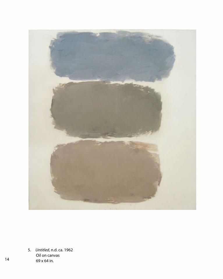
5. Untitled, n.d. ca. 1962 Oil on canvas 69 x 64 in.14 15
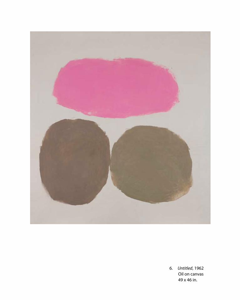
6. Untitled, 1962 Oil on canvas 49 x 46 in.
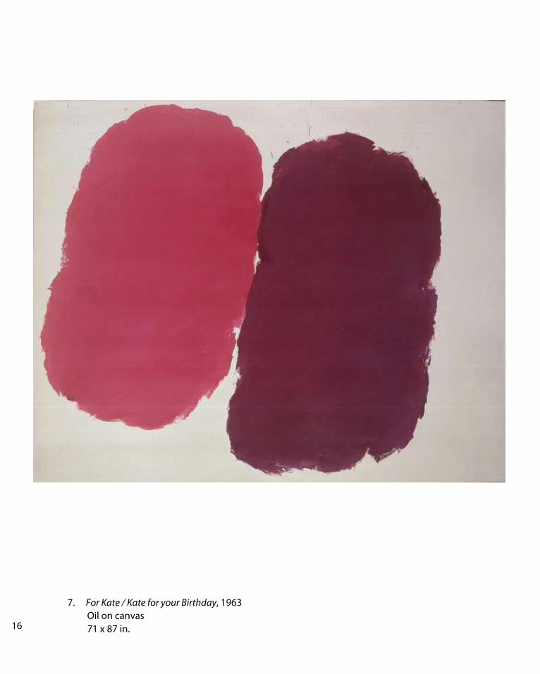
7. For Kate / Kate for your Birthday, 1963 Oil on canvas 71 x 87 in.16 17

8. Untitled, 1965 Oil on canvas 69 x 68 in.

9. Untitled, 1968 Oil on canvas 90 x 110 in.18 19

10. Untitled, 1968 Oil on canvas 94 x 108 in.

11. Untitled, 1968 Oil on canvas 108 x 95 in.
20 21

12. Untitled, 1969 Oil on canvas 84 x 60 in. Courtesy of Norma and Marvin S. Rappaport

13. Untitled, 1968 Oil on canvas 94 x 108 in.
22 23
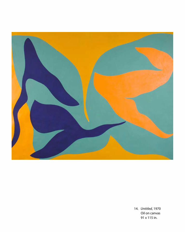
14. Untitled, 1970 Oil on canvas 91 x 115 in.

15. Untitled, 1970 Oil on canvas 89 x 60 in.24 25

16. Untitled, 1970 Oil on canvas 70 x 90 in.

17. Untitled, 1971 Oil on canvas 60 x 84 in.26 27

18. Student Notebook Page, c. 1945 Graphite on paper 11 x 8 1/2 in.

19. Untitled, c. 1955 Ink on paper 8 1/2 x 11 in.
20. Untitled, c. 1955 Graphite on paper 11 x 8 1/2 in.
28 29

21. Untitled, c. 1955 Ink on paper 8 1/2 x 11 in.
22. Untitled, c. 1955 Graphite on paper 11 x 8 1/2 in.
23. Untitled, c. 1955 Graphite on paper 11 x 8 1/2 in.

24. Untitled, c. 1968 Graphite on paper 8 x 9 in.
25. Untitled, c. 1968 Graphite on paper 8 x 9 in.
30 31

RAY PARKER
Born August 22, 1922, Beresford, South Dakota
Died April 14, 1990, New York, New York
Education BA, 1946 University of Iowa; MFA, 1948, University of Iowa
SOLO EXHIBITIONS
1949 Rochester Art Center, Rochester
1950 Walker Art Center, Minneapolis
1953 Paul Kantor Gallery, Los Angeles
Memphis Academy of Art, Memphis
1954 Louisville Art Center, Louisville, KY
1955 Union College Gallery, Schenectady, NY
1956 Paul Kantor Gallery, Los Angeles
1957 Martin Widdifield Gallery, New York
1959 University of Southern California, Los Angeles
1960 Galerie Lawrence, Paris
Galerie Neufville, Paris
Kootz Gallery, New York, also: 1961,1962,1963, 1966
1961 Galleria dell’Arte, Milan
Bennington College, Bennington, VT
Dwan Gallery, Los Angeles, also: 1962
The Solomon R. Guggenheim Museum, New York
1965 Dayton Art Institute, Dayton, OH
1966 Gertrude Kasle Gallery, Detroit, also: 1970
Washington Gallery of Modern Art, Washington, DC
1967 San Francisco Museum of Art, San Francisco
University Art Museum, University of New Mexico, Albuquerque
1970 Molly Barnes Gallery, Los Angeles
Fischbach Gallery, New York, also: 1973
Quay Gallery, San Francisco, also: 1972, 1974
1971 School of Visual Arts, New York
1974 Berenson Gallery, Miami
Elaine Benson Gallery, Bridgehampton, NY, also: 1980
David Berger Gallery, Pittsburgh
Portland Center for the Visual Arts, Portland, OR
1975 American University, Washington, DC
1976 Susan Caldwell Gallery, New York, also: 1977, 1980
1977 University of Maryland, College Park, MD University of Texas, Austin1978 The Billiard Room Gallery, Cambridge
1979 Betty Cunningham, New York, also: 1980
Phillips Collection, Washington, DC
1980 Gloria Luria Gallery, Bay Harbor Islands, FL, also: 1986
Joe Grippi Gallery, New York
1981 College of Cortland, State University of New York, Fine Arts Center, Cortland, NY
1983 Carl Soloway Gallery, Cincinnati
1986 The Butler Institute of American Art, Youngstown, OH
1990 The Bertha and Karl Leubsdorf Art Gallery, Hunter College, New York
1993 Galleria Peccolo, “Works on Paper”, 1978-82 Livorno, Italy
1994 Galleria Milano, Milan
1997 Joan T. Washburn Gallery, New York, also: 1999, 2000, 2004
2006 Haggerty Museum of Art, Marquette University, “Ray Parker Paintings 1958-1971: Color into Drawing” Milwaukee, Wisconsin
GROUP EXHIBITIONS
1949 “Second Biennial Exhibition,” Walker Art Center, Minneapolis, MN
1950 “New Talent Exhibition,” The Museum of Modern Art, New York
“Annual Exhibition of Contemporary Painting,” The Whitney Museum of American Art, New York
“American Painting Today,” The Metropolitan Museum of Art, New York

1951 Allen Memorial Art Museum, Oberlin College, Oberlin, OH
1952 “Annual Exhibition of Contemporary Painting,” The Whitney Museum of American Art, New York
1954-56 “Stable Annual,” Stable Gallery, New York
1956 “Vanguard 1956,” Walker Art Center, Minneapolis, MN Poindexter Gallery, New York
1957 “American Painting Exhibition,” Minneapolis Institute of Art, Minneapolis, MN
1957-58 “International Exhibition of Painting,” traveled throughout Japan (U.S. representatives selected by The Museum of Modern Art)
1958 “Annual Exhibition of Contemporary Painting,” The Whitney Museum of American Art, New York
1960 “60 American Painters,” Walker Art Center, Minneapolis, MN
1961 “Abstract Expressionists and Imagists,” The Solomon R. Guggenheim Museum, New York “Recent Painting and Sculpture,” The Museum of Modern Art, New York (Traveled in the United States October 1961 to June 1963)
1962 “Art Since 1950,” Seattle World’s Fair, Seattle, WA
The Gifford and Joann Phillips Collection, UCLA Art Galleries, Los Angeles, CA
1962-63 Biennial, Corcoran Gallery of Art, Washington, D.C.
“Three Former Iowans,” Des Moines Arts Center, Des Moines, IA
“Biennial,” University of Illinois, Urbana, IL
1963 “Toward a New Abstraction,” The Jewish Museum, New York
Corcoran Gallery of Art Biennial, Washington, D.C. “Black and White,” The Jewish Museum, New York “Annual Exhibition of Contemporary Painting,” The Whitney Museum of American Art, New York
1963 “New Directions in American Painting,” Rose Art Museum, Brandeis University, Waltham, MA
1964 “Carnegie International,” Carnegie Institute, Pittsburgh, PA
“Post Painterly Abstraction,” Los Angeles County Museum of Art, Los Angeles, CA Other venues: Walker Art Center, Minneapolis, MN Art Gallery of Toronto, Toronto, Canada “67th Annual Exhibition of American Painting,” Art Institute of Chicago, Chicago, IL “American Art Since 1950,” Brandeis University, Waltham, MA “Painting of a Decade 1956-64,” The Tate Gallery, London, England “Black, White and Gray,” Wadsworth Athenaeum, Hartford, CT “Selections from the Guggenheim Museum,” Italian Pavilion, Venice Biennial
1965 “Carnegie International,” Carnegie Institute, Pittsburgh, PA “Annual Exhibition of Contemporary Painting,” The Whitney Museum of American Art, New York
1968 “The Art of the Real: USA 1948-1968,” The Museum of Modern Art, New York Other venues: Grand Palais, Paris, France; Kunsthaller, Zurich, Switzerland; The Tate Gallery, London, England
1969-70 “Annual Exhibition of Contemporary Painting,” The Whitney Museum of American Art, New York
1971 “Young Artists of the ‘50s,” The Museum of Modern Art, New York
1972 “Color Forum,” University of Texas, Austin, TX
“Annual Exhibition of Contemporary Painting,” The Whitney Museum of American Art, New York
1973 “The Biennial Exhibition of American Art,” The Whitney Museum of American Art, New York
1975-77 “American Art Since 1945,” from the collection of The Museum of Modern Art Other venues: Worcester Art Museum, Worcester, MA; Toledo Museum of Art, Toledo, OH; Denver Art Museum, Denver, CO; Fine Arts Gallery of San Diego, San Diego, CA; Dallas Museum of Fine Arts, Dallas, TX; Joslyn Art Museum, Omaha, NE; Greenville County Museum, Greenville, SC; Virginia Museum of Fine Arts, Richmond, VA “Three Former Iowans,” Museum of Art, University of Iowa, Iowa City, IA “Color as Language,” sponsored by the International Council of The Museum of Modern Art Other venues: Museo de Arte Moderna, Bogota,
32 33

Colombia; Museo de Arte de Sao Paulo, Brazil; Museo de Arte Moderna, Rio de Janeiro, Brazil; Museo de Bellas Artes, Caracas, Venezuela; Museo de Arte Moderno, Mexico City, Mexico
1976 “Abstract Expressionists and Imagists: A Retrospective View,” The University of Texas, Austin, TX “Drawing Today in New York,” sponsored by Rice University, Houston, TX “Artists and East Hampton, A 100-Year Perspective,” Guild Hall, East Hampton 1977 “New in the ‘70s,” University Art Museum, Austin, TX “A Miscellany of the 1960s,” Susan Caldwell Gallery, New York
1978 “New York, The State of Art, The New York School,” State Museum, Albany
1979 “Art in America After World War II, ” The Solomon R. Guggenheim Museum, New York
1984 “Artists at Hunter 1950-1965,” Hunter College Art Galleries, New York “Then and Now,” Elaine Benson Gallery, Bridgehampton
1986 “After Matisse,” The Queens Museum, Flushing Other venues: Chrysler Museum, Norfolk, VA; Portland Museum of Art, Portland, OR; Bass Museum of Art, Miami Beach, FL; The Phillips Collection, Washington, D.C.; Dayton Art Institute, Dayton, OH; Worcester Art Museum, Worcester, MA
1987 “39th Annual Purchase Exhibition,” American Academy and Institute of Arts and Letters, New York
1989 “Abstract Expressions: Painting and Sculpture of the 1950s and 1960s,” Vanderwoude Tananbaum Gallery, New York “Three-Man Exhibition with Dan Christensen and Robert Goodnough,” Gloria Luria Gallery, Bay Harbor Islands, FL “Before the Field - Paintings from the Sixties,” Daniel Newburg Gallery, New York
PUBLIC COLLECTIONS
Addison Gallery of American Art, Andover, MA
Akron Art Institute, Akron, OH
Albany Institute of History and Art, Albany, NY
Albright-Knox Art Gallery, Buffalo, NY
The Aldrich Museum of Contemporary Art, Ridgefield, CT
Allentown Museum of Art, Allentown, PA
American Academy of Arts and Letters, New York
American University, Watkins Gallery, Washington, D.C.
Art Institute of Chicago, Chicago, IL
Bell Art Gallery, Brown University, Providence, RI
Childe Hassam Foundation, New York
Cleveland Museum of Art, Cleveland, OH
Dayton Art Institute, Dayton, OH
Des Moines Art Center, Des Moines, IA
Ft. Lauderdale Museum, Ft. Lauderdale, FL
The Fort Worth Art Museum, Fort Worth, TX
The Solomon R. Guggenheim Museum, New York
Houston Museum of Fine Art, Houston, TX
Hudson River Museum, Yonkers, NY
University of Kentucky Arts Museum, Lexington, KY
Los Angeles County Museum of Art, Los Angeles, CA
Massachusetts Institute of Technology, Hayden Gallery, Cambridge, MA
The Metropolitan Museum of Art, New York
Miami-Dade Junior College Art Gallery, Miami, FL
Milwaukee Art Center, Milwaukee, WI
Minneapolis Institute of Arts, Minneapolis, MN
Minnesota Historical Society, St. Paul, MN
Museum of Fine Arts, Houston, TX

The Museum of Modern Art, New York
National Gallery of Art, Washington D.C.
New Orleans Museum of Art, New Orleans, LA
The Parrish Art Museum, Southhampton, N.Y.
Philadelphia Museum of Art, Philadelphia, PA
Princeton University, The Art Museum , Princeton, NJ
Portland Museum of Art, Portland, ME
Rice University, Rice Museum, Houston, TX
Rose Art Museum, Brandeis University, Waltham, MA
San Francisco Museum of Modern Art, San Francisco, CA
Snite Museum of Art, Notre Dame University, South Bend, IN
The Tate Gallery, London, England
University of Iowa Museum of Art, Iowa City, IA
University of New Mexico, University Art Museum, Albuquerque, NM
The University of Texas Art Museum, Austin, TX
Vassar College Art Gallery, Poughkeepsie, NY
Wadsworth Athenaeum, Hartford, CT
Walker Art Center, Minneapolis, MN
The Weatherspoon Art Gallery, The University of North CarolinaGreensboro, NC
The Whitney Museum of American Art, New York
The Zimmerli Art Museum, Rutgers University, New Brunswick, NJ
SELECTED BIBLIOGRAPHY
Statements by the Artist
“Student, Teacher, Artist,” College Art Journal, Vol. 8, Fall, 1953, p. 27
“Direct Painting,” It Is, Spring, 1958, p. 20
“Intent Painting,” It Is, Autumn, 1958, pp. 8-9
“Is there a New Academy?” Art News, Vol. 58/6, September 1959, p. 38
Catalogue of American Collection, The Tate Gallery, London, England, 1978
Books
“American Abstract Artists,” editors. The World of Abstract Art, George Wittenborn, New York, 1957.
Bernard Friedman, editor. School of New York. Grove Press, New York, 1959.
Mary Fuller McChesney. A Period of Exploration: San Francisco 1945-1950. Oakland Museum, Oakland, California, 1973.
Robert Motherwell and Ad Reinhardt. Modern Artists in America, No. 1. Wittenborn & Schultz, New York, 1950.
Barbara Rose. American Art Since 1900, A Critical History. Praeger, New York, 1967.
Irving Sandler. The Triumph of American Painting: A History of Abstract Expressionism. Praeger, New York, 1970.
Irving Sandler. The New York School. Harper & Row, New York, 1978.
Irving Sandler. A Sweeper-Up After Artist’s, Thames and Hudson Inc., 2003.
Periodicals
“Exhibition at Widdifield Gallery,” Art News, Vol. 56, November, 1957, p. 56.
J. Schuyler, “New Untitled Oils at Widdifield,” Art News, Vol. 58, March, 1959, p. 10.
H. H. Arnason and Herbert Read, “Dialogue on Modern U.S. Painting,” Art News, Vol. 59/3, May, 1960, pp. 32-36.
William Rubin, “Younger American Painters,” Art International, Vol. 4, January, 1960, p. 30.
Irving Sandler, “New York Letter,” Art International, Vol. 4, January, 1960, p. 30.
“Ray Parker,” Art News, Vol. 60, April, 1961, p. 46.
G. Schoenenberger, “Expositions A Milan: Raymond Parker,” Art International, Vol. 5, August, 1961, pp. 77-78.
“Solomon R. Guggenheim Museum: American Abstract Expressionists and Imagists,” Kunstwerk, Vol. 15, November, 1961, p. 59.
Lawrence Campbell, “Parker Paints a Picture,” Art News, Vol. 61, November, 1962, p. 40.
34 35
of retrospective exhibition at the Bertha and Karl Leubsdorf ArtGallery, Hunter College, New York City. The New York Times, September 28, 1990.
William C. Agee , “Ray Parker, Color and Modern Painting in America,” The Journal of Art, Vol. 3, no. 1, October 1990.
Ken Johnson, “Ray Parker: Painterly Sensualist,” Art inAmerica, March 1991, p. 124.
Michael Klein, “Ray Parker at Joan T. Washburn, “ Art in America, 1997.
Holland Cotter, “Paintings 1958-1965” Joan T. Washburn Gallery, The New York Times, 1997.
Vincent Katz, “Ray Parker on West 57th Street,” The East Hampton Star, 1997.
Grace Glueck, “Ray Parker, Joan T. Washburn,” The New York Times, April 30, 1999.
Mario Naves, “Artistic Freedom,” review. Joan T. Washburn Gallery,The New York Observer, April 5, 2004.
Robert Long, “Ray Parker’s Paintings Have Staying Power,” East Hampton Star, April 15, 2004.
Grace Glueck, “Ray Parker and George Sugarman,” Washburn Gallery, The New York Times, April 2, 2004.
Jim Long, “Ray Parker, Washburn Gallery,” The Brooklyn Rail, May 2004.
Gerald Nordland, “Show at the Dwan Gallery,” Kunstwerk, Vol. 6, November, 1962, p. 67.
Thomas B. Hess, “Phony Crisis in American Art,” Art News, Vol. 62, Summer, 1963, p. 59.
Max Kozloff, “Exhibition at Kootz,” Arts Magazine, Vol. 39, January, 1965, p. 48.
“Neue Abstraktions” Kunstwerk, Vol. 18, April, 1965, p. 121.
L. Picard, “Interview mit Raymond Parker,” Kunstwerk, Vol. 18/7, January, 1965.
Barbara Rose, “The Second Generation: Academy and Breakthrough,” Artforum, Vol. 4, September 1965, pp. 58-63.
Bruce Glaser, “The New Abstraction” Art International, Vol. 10, February, 1966, p. 41.
Hilton Kramer, “Art: 2 Men’s Dazzling Abstractions,” The New York Times, January 31, 1970.
“Ray Parker, Fischbach Gallery,” Artforum, April, 1970, p. 72.
L’Arte Moderna, No. 111, Vol. XIII, pp. 28, 99, 118.
Hilton Kramer, Review, The New York Times, January 16, 1971.
Mary Fuller, “Was There a San Francisco School?” Artforum, January, 1971, pp. 46-53.
Alfred Frankenstein, “Praise Where it Is Due,” San Francisco Chronicle, February 17, 1972.
Barbara Rose, Review, New York Magazine, Vol. 6, No. 11, March 12, 1973.
Benjamin Forgey, “Parker’s Power,” The Washington Star, November 4, 1979.
John Russell, Review, The New York Times, November 9, 1979.
“The Virtue of Solitary Action, de Kooning, Parker, Francis, McNeil” ART\WORLD, October 20, 1979.
Michael Findley, “Ray Parker,” Arts Magazine, Vol. 55, No. 2, October, 1980, p. 3.
“Dialogue: Conversations with Ray Parker and Doug Ohlson,” Arts Magazine, Vol. 56, No. 8, April, 1982.
Gloria Luria Gallery review of one-man exhibition, The Miami News, May 23, 1986.
Louis A. Zona, review of one-man show (works on paper), The Butler Institute of American Art. Youngstown, Ohio, Dialog Magazine, 1986.
Michael Brenson, “Ray Parker’s Piece of the Abstract Puzzle” review
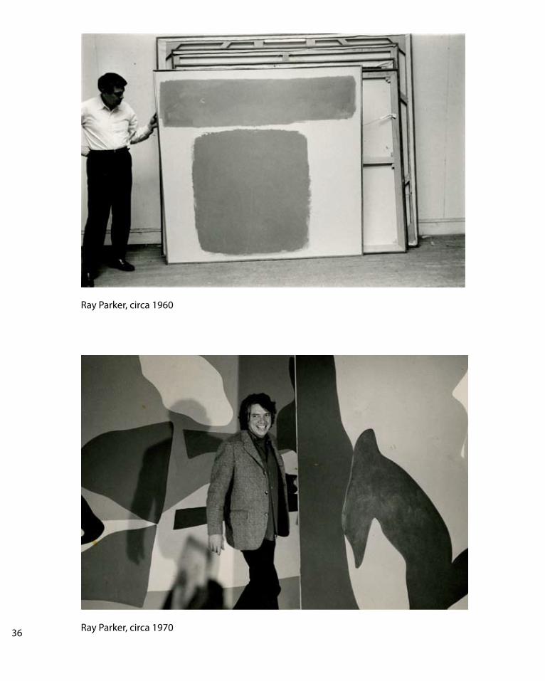
Ray Parker, circa 1960
36 Ray Parker, circa 1970