red w sheets
TRANSCRIPT

8/20/2019 Red w Sheets
http://slidepdf.com/reader/full/red-w-sheets 1/116
INTRODUCTION TO STATISTICAL
MODELLING IN R
P.M.E.Altham, Statistical Laboratory, University of Cambridge.
January 7, 2015

8/20/2019 Red w Sheets
http://slidepdf.com/reader/full/red-w-sheets 2/116
Contents
1 Getting started: books and 2 tiny examples 5
2 Ways of reading in data, tables, text, matrices. Linear regressionand basic plotting 8
3 A Fun example showing you some plotting and regression facilities 19
4 A one-way anova, and a qqnorm plot 255 A 2-way anova, how to set up factor levels, and boxplots 28
6 A 2-way layout with missing data, ie an unbalanced design 32
7 Logistic regression for the binomial distribution 35
8 The space shuttle temperature data: a cautionary tale 38
9 Binomial and Poisson regression 41
10 Analysis of a 2-way contingency table 45
11 Poisson regression: some examples 49
12 Fisher’s exact test, 3-way contingency tables, and Simpson’s para-dox 58
13 Defining a function in R, to plot the contours of a log-likelihoodfunction 62
14 Regression diagnostics continued, and the hat matrix 65
15 Football arrests, Poisson and the negative binomial regressions 69
16 An interesting data set on Election turnout and poll leads 75
17 glm() with the gamma distribution 79
18 Crime and unemployment: a case-control study 82
1

8/20/2019 Red w Sheets
http://slidepdf.com/reader/full/red-w-sheets 3/116
P.M.E.Altham, University of Cambridge 2
19 Maximising a multi-parameter log-likelihood: an example from ge-nomics 86
20 Miscellaneous datasets gathered in 2006 93
21 An application of the Bradley-Terry model to the Corus chess tour-nament, and to World Cup football 99
22 Brief introduction to Survival Data Analysis 106
23 The London 2012 Olympics Men’s 200 metres, and reading dataoff the web 110

8/20/2019 Red w Sheets
http://slidepdf.com/reader/full/red-w-sheets 4/116
Preface
R is available as Free Software under the terms of the Free Software Foundation’sGNU General Public License in source code form.R is powerful and highly developed (and very similar in syntax to S-Plus).The originators of R are R.Gentleman and R.Ihaca from New Zealand, and the Rhome page is at http://www.r-project.org/
R runs on several different platforms: I always use the Linux version.
These worksheets may be used for any educational purpose provided theirauthorship (P.M.E.Altham) is acknowledged.Most of the corresponding datasets may be found athttp://www.statslab.cam.ac.uk/ ~pat/R.bigdata.txt
Note that throughout these notes, which were constructed for Part IIC of the Math-ematical Tripos in Lent 2005, we will be using R as a free, ‘look-alike’ version of S-plus. You may find references to ‘S-plus’, which you can usually take to be refer-ences to ‘R’.
There are subtle and important differences between the languages R and S-plus;these differences will not be explained in the following notes, except where they arestrictly relevant to our worksheets. http://www.stats.ox.ac.uk/pub/R gives acareful description of the differences between R and S-Plus, in ‘R’ Complementsto the text-book Modern Applied Statistics with S-plus, by W.N.Venables andB.D.Ripley, pub Springer.http://www.statslab.cam.ac.uk/ ~pat/notes.pdf gives you the correspondinglecture notes for this course, with a fuller version of these notes at http://www.
statslab.cam.ac.uk/~pat/All.pdf My R/Splus worksheets for multivariate statis-tics, and other examples, may be seen at http://www.statslab.cam.ac.uk/~pat/
misc.pdf A word of reassurance about the Tripos questions for this course: I would
not expect you to be able to remember a lot of R commands and R syntax. ButI do think it’s important that you are able to interpret R output for linear modelsand glm’s, and that you can show that you understand the underlying theory. Of course you may find it convenient to use R for your Computational Projects.Since I retired at the end of September 2005, I have added extra datasets (andgraphs) from time to time, as you will see in the Table of Contents. I probably onlyused the first 8-10 Chapters when I was giving this course as one of 16 lectures and8 practical classes.
3

8/20/2019 Red w Sheets
http://slidepdf.com/reader/full/red-w-sheets 5/116
P.M.E.Altham, University of Cambridge 4
AcknowledgementsSpecial thanks must go to Professor Jim Lindsey for launching me into R, toDr R.J.Gibbens for his help in introducing me to S-plus, and also to ProfessorB.D.Ripley for access to his S-plus lecture notes. Several generations of keen andcritical students for the Cambridge University Diploma in Mathematical Statistics(a 1-year graduate course, which from October 1998 was replaced by the MPhil
in Statistical Science) have made helpful suggestions which have improved theseworksheets. Readers are warmly encouraged to tell me
of any further corrections or suggestions for improvements.

8/20/2019 Red w Sheets
http://slidepdf.com/reader/full/red-w-sheets 6/116
Chapter 1
Getting started: books and 2 tinyexamples
ReferencesFor R/S-plus material
Maindonald, J. and Braun, J. (2007) Data Analysis and Graphics using R - anExample-Based Approach. Cambridge University Press.Venables, W.N. and Ripley, B.D.(2002) Modern Applied Statistics with S-plus. NewYork: Springer-Verlag.For statistics text booksAgresti, A.(2002) Categorical Data Analysis. New York: Wiley.Collett, D.(1991) Modelling Binary Data. London: Chapman and Hall.Dobson, A.J.(1990) An introduction to Generalized Linear Models. London: Chap-man and Hall.Pawitan, Y. (2001) In all likelihood: statistical modelling and inference using like-lihood. Oxford Science Publications. (see also http://www.meb.ki.se/~yudpaw/
likelihood for a really helpful suite of R programs and datasets related to hisbook.)The main purpose of the small index is to give a page reference for the first occur-rence of each of the R commands used in the worksheets. Of course, this is onlya small fraction of the total of R commands available, but it is hoped that theseworksheets can be used to get you started in R.Note that R has an excellent help system : try, for example
?lm
You can always inspect the CONTENTS of a given function by, eg
lm
A problem with the help system for inexperienced users is the sheer volume of in-formation it gives you, in answer to what appears to be a quite modest request, eg
?scan
5
8/20/2019 Red w Sheets
http://slidepdf.com/reader/full/red-w-sheets 7/116
P.M.E.Altham, University of Cambridge 6
But you quickly get used to skimming through and/or ignoring much of what ‘help’is telling you.At the present time the help system still does not QUITE make the universityteacher redundant, largely because (apart from the obvious drawbacks such as lack-ing the personal touch of the university teacher) the help system LOVES words, tothe general exclusion of mathematical formulae and diagrams. But the day will pre-
sumably come when the help system becomes a bit more friendly. Thank goodnessit does not yet replace a good statistical textbook, although it contains a wealth of scholarly information.Many many useful features of S-plus/R may NOT been prominently illustrated inthe worksheets that follow. The keen user of lm() and glm() in particular should beaware of the followingi) use of ‘subset’ for regression on a subset of the data, possibly defined by a logicalvariable (eg sex==“male”)ii) use of ‘update’ as a quick way of modifying a regressioniii) ‘predict’ for predicting for (new) data from a fitted modeliv) poly(x,2) (for example) for setting up orthogonal polynomials
v) summary(glm.example,correlation=T)which is useful if we want to display the parameter estimates and se’s, and also theircorrelation matrix.vi)summary(glm.example,dispersion=0)which is useful for a glm model (eg Poisson or Binomial) where we want to ESTI-MATE the scale parameter φ, rather than force it to be 1. (Hence this is useful fordata exhibiting overdispersion.)
Here is a tiny example of using R as a calculator to check Stirling’s formula, whichas you will know is
n! ∼ √ 2πnn+1/2
exp−n .We take logs, and use the lgamma function in R.
n <- 1:100 ; y <- lgamma(n+1)
x <- (1/2) * log(2 * pi) + (n+ .5)* log(n) - n
plot(x,y)
q()
For the record, here are 2 little examples of loops in R.
x <- .3 # starting value> for (i in 1:4){
+ x <- x+1
+ cat("iteration = ", i,"x=",x,"\n")
+ }
x <- .4 #starting value
while (x^2 <90)
{
+ cat("x=",x,"\n")

8/20/2019 Red w Sheets
http://slidepdf.com/reader/full/red-w-sheets 8/116
P.M.E.Altham, University of Cambridge 7
+ x <- x+.9
+ }
But, one of the beauties of R/S-Plus is that you very rarely need to write explicitloops, as shown above. Because most straightforward statistical calculations can bevectorised , we can just use a built-in function instead of a loop, eg
sum(a*x)
for Σaixi as you will see in the worksheets that follow.Note: R/S-plus is case-sensitive.Note: to abandon any command, press ‘Control C’ simultaneously.

8/20/2019 Red w Sheets
http://slidepdf.com/reader/full/red-w-sheets 9/116
Chapter 2
Ways of reading in data, tables,text, matrices. Linear regressionand basic plotting
R and S-plus have very sophisticated reading-in methods and graphical output.Here we simply read in some data, and follow this with linear regression andquadratic regression, demonstrating various special features of R as we go.Note: S-Plus, and old versions of R, allowed the symbol < − to be replaced by theunderscore sign in all the commands. Note that < − should be read as an arrowpointing from right to left; similarly − > is understood by R as an arrow pointingfrom left to right.R and S-plus differ from other statistical languages in being ‘OBJECT-ORIENTED’.This takes a bit of getting used to, but there are advantages in being Object-Oriented.
Catam users:
mkdir practice
cd practice
dir
copy X:\catam\stats\bigdata bigdata
copy bigdata weld
This will make the directory ‘practice’ and put in it the data-file ‘bigdata’, whichyou then copy to ‘weld’.
Now use notepad to edit ‘weld’ to be exactly the numbers needed for the firstworksheet. (Feel free to do this operation by another means, if you want to.)To start R:Open a Command Prompt window from the start button.type
X:\catam\r
Statslab users: just type
8

8/20/2019 Red w Sheets
http://slidepdf.com/reader/full/red-w-sheets 10/116
P.M.E.Altham, University of Cambridge 9
R
warning: the Catam version of R is not necessarily exactly the same as the theStatslab version.Note that in the sequences of R commands that follow, anything following a # is acomment only, so need not be typed by you.Note also that within most implementations of R you can use the ARROW KEYS
to retrieve, and perhaps edit, your previous commands.
# reading data from the keyboard
x <- c(7.82,8.00,7.95) #"c" means "combine"
x
# a slightly quicker way is to use scan( try help(scan))
x <- scan()
7.82 8.00 7.95
# NB blank line shows end of data
x
# To read a character vector
x <- scan(,"")
A B C
A C B
x
demo(graphics) # for fun
But mostly, for proper data analysis, we’ll need to read data from a separate datafile. Here are 3 methods, all doing things a bit differently from one another.
# scan() is the simplest reading-in functiondata1 <- scan("weld", list(x=0,y=0))
data1 # an object, with components data1$x, data1$y
names(data1)
x<- data1$x ; y <- data1$y
# these data came from The Welding Institute, Abington, near Cambridge
x;y # x=current(in amps) for weld,y= min.diam.of resulting weld
summary(x)
# catam Windows automatically sets up the R graphics window for you
# but if you lose it, just type windows()
hist(x)X <- matrix(scan("weld"),ncol=2,byrow=T) # T means "true"
X
Here is the nicest way to read a table of data.
weldtable <- read.table("weld",header=F) # F means "false"
weldtable
x <- weldtable[,1] ; y <- weldtable[,2]

8/20/2019 Red w Sheets
http://slidepdf.com/reader/full/red-w-sheets 11/116
P.M.E.Altham, University of Cambridge 10
For the present we make use only of x, y and do the linear regression of y on x,followed by that of y on x and x2.
plot(x,y)
teeny <- lm(y~x) # the choice of name ‘teeny’ is mine!
This fits yi = α + βxi + i, 1
≤i
≤n, with the usual assumption that i, 1
≤i
≤n
is assumed to be a random sample from N (0, σ2
).
teeny # This is an "object" in R terminology.
summary(teeny)
anova(teeny)
names(teeny)
fv1 <- teeny$fitted.values
fv1
par(mfrow=c(2,1)) # to have the plots in 2 rows, 1 column
plot(x,fv1)
plot(x,y)
abline(teeny)par(mfrow=c(1,1)) # to restore to 1 plot per screen
Y <- cbind(y,fv1) # "cbind"is "columnbind"
# Y is now a matrix with 2 columns
matplot(x,Y,type="pl") # "matplot" is matrix-plot
res <- teeny$residuals
plot(x,res)
The plot shows a marked quadratic trend. So now we fit a quadratic, ie we fityi = α + βxi + γxi
2 + i, 1 ≤ i ≤ n
xx<- x*xteeny2 <- lm(y~x +xx ) # there’s bound to be a slicker way to do this
summary(teeny2)
This shows us that the quadratic term is indeed significant.We may want more information, so the next step is
summary(teeny2, cor=T)
This gives us the correlation matrix of the parameter estimates.
vcov(teeny2) # for comparison, the corresponding covariance matrix.
fv2 <- teeny2$fitted.valuesplot(x,y)
lines(x,fv2,lty=2) # adds ‘lines’ to the current plot
Now let us work out the ‘confidence’ interval for y at a new value of x, say x = 9thus x2 = 81. We will also find the corresponding ‘prediction’ interval. Why arethey different? What happens to the width of the prediction interval if you replacex = 9 by a value of x further from the original data set, say x = 20, x2 = 400? (andwhy is this rather a silly thing to do?)
8/20/2019 Red w Sheets
http://slidepdf.com/reader/full/red-w-sheets 12/116
P.M.E.Altham, University of Cambridge 11
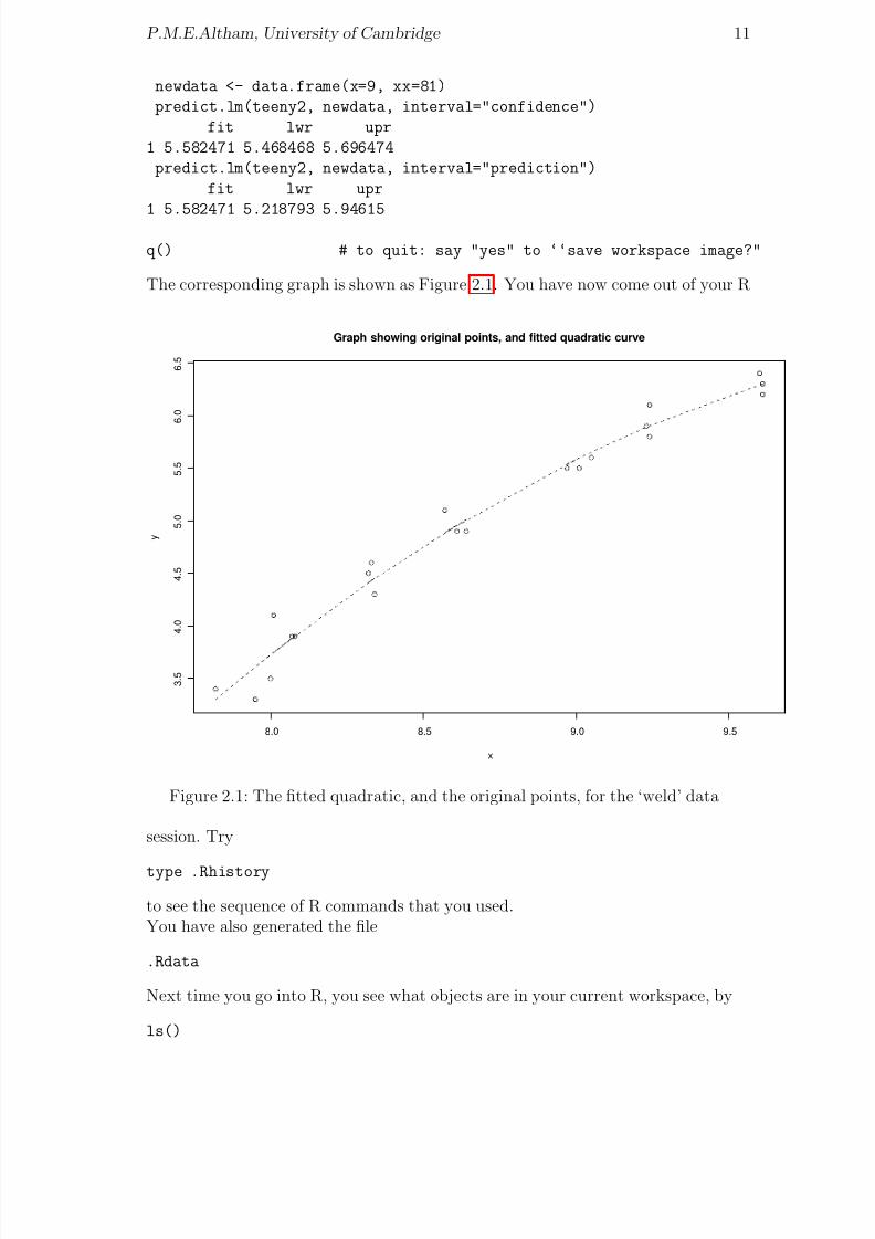
newdata <- data.frame(x=9, xx=81)
predict.lm(teeny2, newdata, interval="confidence")
fit lwr upr
1 5.582471 5.468468 5.696474
predict.lm(teeny2, newdata, interval="prediction")
fit lwr upr
1 5.582471 5.218793 5.94615
q() # to quit: say "yes" to ‘‘save workspace image?"
The corresponding graph is shown as Figure 2.1. You have now come out of your R
8.0 8.5 9.0 9.5
3 .
5
4 .
0
4 .
5
5 .
0
5 .
5
6 .
0
6 .
5
x
y
Graph showing original points, and fitted quadratic curve
Figure 2.1: The fitted quadratic, and the original points, for the ‘weld’ data
session. Try
type .Rhistory
to see the sequence of R commands that you used.You have also generated the file
.Rdata
Next time you go into R, you see what objects are in your current workspace, by
ls()

8/20/2019 Red w Sheets
http://slidepdf.com/reader/full/red-w-sheets 13/116
P.M.E.Altham, University of Cambridge 12
Here is the data-set “weld”, with x, y as first, second column respectively.
7.82 3.4
8.00 3.5
7.95 3.3
8.07 3.9
8.08 3.9
8.01 4.18.33 4.6
8.34 4.3
8.32 4.5
8.64 4.9
8.61 4.9
8.57 5.1
9.01 5.5
8.97 5.5
9.05 5.6
9.23 5.99.24 5.8
9.24 6.1
9.61 6.3
9.60 6.4
9.61 6.2
Remember to END your R data-set with a BLANK line.There is a substantial library of data-sets available on R, including the ‘cherry-trees’data-set (see Examples sheet 2) and the ‘Anscombe quartet’ (see worksheet 13). Try
data()
And, lastly, how about the following datasets as examples for linear regression.The Independent, November 28, 2003 gives the following data on UK Student fund-ing, at 2001-2 prices (in pounds), under the headline ‘Amid the furore, one thingis agreed: university funding is in a severe crisis’.
Funding per student Students (000’s)
1989-90 7916 567
1990-91 7209 622
1991-2 6850 695
1992-3 6340 7861993-4 5992 876
1994-5 5829 944
1995-6 5570 989
1996-7 5204 1007
1997-8 5049 1019
1998-9 5050 1023
1999-00 5039 1041
2000-01 4984 1064

8/20/2019 Red w Sheets
http://slidepdf.com/reader/full/red-w-sheets 14/116
P.M.E.Altham, University of Cambridge 13
2001-02 5017 1087
2002-03* 5022 1101
* = provisional figures
Sometimes you may want to plot one variable (here Funding per student) against an-other (here year, from 1989 to 2002) with point size proportional to a third variable,here Students. An example is shown in Figure 2.2. It is achieved by
year <- 1989:2002
size <- Students/600 # some trial & error here, to see what works well
plot(Funding~ year, cex=size)
1990 1992 1994 1996 1998 2000 2002
5 0 0 0
5 5 0 0
6 0 0 0
6 5 0 0
7 0 0 0
7 5
0 0
8 0 0 0
year
F u n d i n g
funding per student: point−size proportional to the number of students
Figure 2.2: How funding per student has declined over time.
The Independent, October 11, 2004 gives the following CO2 record (data collectedby Dr Charles Keeling at Mauna Loa, an 11000 ft extinct volcano on the Big Islandof Hawaii).
Year Level (in ppm, ie parts per million by volume)
1958 315
1959 315.98
1960 316.91
1961 317.65
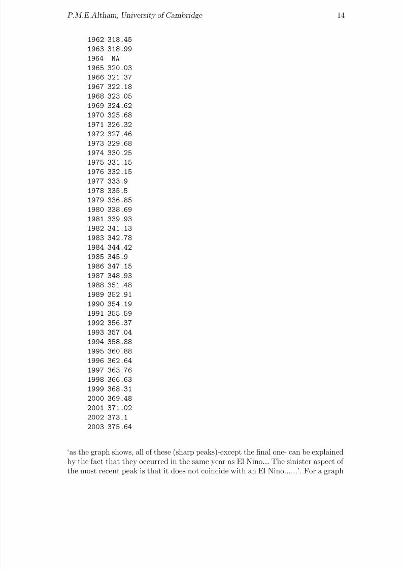
8/20/2019 Red w Sheets
http://slidepdf.com/reader/full/red-w-sheets 15/116
P.M.E.Altham, University of Cambridge 14
1962 318.45
1963 318.99
1964 NA
1965 320.03
1966 321.37
1967 322.18
1968 323.051969 324.62
1970 325.68
1971 326.32
1972 327.46
1973 329.68
1974 330.25
1975 331.15
1976 332.15
1977 333.9
1978 335.5
1979 336.851980 338.69
1981 339.93
1982 341.13
1983 342.78
1984 344.42
1985 345.9
1986 347.15
1987 348.93
1988 351.48
1989 352.91
1990 354.19
1991 355.59
1992 356.37
1993 357.04
1994 358.88
1995 360.88
1996 362.64
1997 363.76
1998 366.63
1999 368.31
2000 369.482001 371.02
2002 373.1
2003 375.64
‘as the graph shows, all of these (sharp peaks)-except the final one- can be explainedby the fact that they occurred in the same year as El Nino... The sinister aspect of the most recent peak is that it does not coincide with an El Nino......’. For a graph

8/20/2019 Red w Sheets
http://slidepdf.com/reader/full/red-w-sheets 16/116
P.M.E.Altham, University of Cambridge 15
of the increase, see Figure 2.3.The Independent, July 4, 2008 has the following headline
1960 1970 1980 1990 2000
3 2 0
3 3 0
3 4 0
3 5 0
3 6 0
3 7 0
Year
c a r b o n d i o x i d e ,
i n p a r t s p e r m i l l i o n
The Mauna Loa carbon dioxide series
Figure 2.3: Global warming? The Mauna Loa carbon dioxide series
‘Inflation worries prompt ECB to hike rates’ (the ECB is the European CentralBank). This is accompanied by a graph showing the GDP annual growth, as apercentage, together with Inflation, also as a percentage, for each of 15 ‘Europeansingle currency member states’. These are given in the Table below.
GDPgrowth Inflation
Ireland 3.8 3.3
UK 2.3 3.0
Bel 2.1 4.1
Neth 3.4 1.7
Lux 3.4 4.3
Ger 2.6 2.6Slovenia 4.6 6.2
Austria 2.9 3.4
Portugal 2.0 2.5
Spain 2.7 4.2
France 2.2 3.4
Malta 3.7 4.1
Italy 0.2 3.6
Greece 3.6 4.4

8/20/2019 Red w Sheets
http://slidepdf.com/reader/full/red-w-sheets 17/116
P.M.E.Altham, University of Cambridge 16
Cyprus 4.3 4.3
Note: the GDPgrowth figures are for the annual growth to the end of the first quarterof 2008, except for Ireland, Luxembourg, Slovenia, Portugal, Malta and Cyprus, inwhich case they are for the annual growth to the end of the fourth quarter of 2007.The inflation figures are for April 2008. Here is a suggestion for plotting a graph,
shown here as Figure 2.4.
ED <- read.table("Europes.dilemma.data", header=T) ; attach(ED)
country = row.names(ED)
attach(ED)
plot(GDPgrowth, Inflation, type="n")
text(GDPgrowth, Inflation,country)
points(GDPgrowth, Inflation, cex = 4, pch = 5)
# cex controls the SIZE of the plotting character
# pch determines the CHOICE of the plotting character, here diamonds
1 2 3 4
2
3
4
5
6
GDPgrowth
I n f l a t i o n
Ireland
UK
Bel
Neth
Lux
Ger
Slovenia
Austria
Portugal
Spain
France
Malta
Italy
GreeceCyprus
Figure 2.4: Annual Inflation against Annual GDP growth for 15 Eurozone countries,July 2008
The Independent, June 13, 2005, says ‘So who really pays and who really benefits?A guide through the war of words over the EU rebate and the Common Agricultural

8/20/2019 Red w Sheets
http://slidepdf.com/reader/full/red-w-sheets 18/116
P.M.E.Altham, University of Cambridge 17
Policy’ and‘The annual income of a European dairy cow exceeds that of half the world’s humanpopulation’ to quote Andreas Whittam Smith.The EU member countries areLuxembourg, Belgium, Denmark, Netherlands, Ireland, Sweden, Finland, France,Austria, Germany, Italy, Spain, UK, Greece, Portugal, Cyprus, Slovenia, Malta,
Czech Republic, Hungary, Estonia, Slovakia, Lithuania, Poland, Latvia.In the same order of countries, we havethe per capita contribution to the EU, in £
466 362 358 314 301 289 273 266 256 249 228 187 186 154 128 110 88 83 54 54 4541 35 32 28and, the total contribution, in £m218 3734 1933 5120 1205 2604 1420 15941 2098 20477 13208 8077 11133 1689 132684 176 33 554 548 58 223 125 1239 64and, ‘how the UK’s rebate is paid, in £m20 259 177 56 108 34 135 1478 27 302 1224 719 -5097 151 121 7 16 3 50 47 5 20 11116 6
and, Receipts from Common Agricultural Policy, in £m29 686 818 934 1314 580 586 6996 754 3930 3606 4336 2612 1847 572 NA NA NANA NA NA NA NA NA NAIt’s easiest to read the data set via read.table() from the table below
per_cap_cont total_cont howUKrebate_pd Rec_from_CAP
Luxembourg 466 218 20 29
Belgium 362 3734 259 686
Denmark 358 1933 177 818
Netherlands 314 5120 56 934
Ireland 301 1205 108 1314
Sweden 289 2604 34 580Finland 273 1420 135 586
France 266 15941 1478 6996
Austria 256 2098 27 754
Germany 249 20477 302 3930
Italy 228 13208 1224 3606
Spain 187 8077 719 4336
UK 186 11133 -5097 2612
Greece 154 1689 151 1847
Portugal 128 1326 121 57
Cyprus 110 84 7 NASlovenia 88 176 16 NA
Malta 83 33 3 NA
Czech_Republic 54 554 50 NA
Hungary 54 548 47 NA
Estonia 45 58 5 NA
Slovakia 41 223 20 NA
Lithuania 35 125 11 NA
Poland 32 1239 116 NA

8/20/2019 Red w Sheets
http://slidepdf.com/reader/full/red-w-sheets 19/116
P.M.E.Altham, University of Cambridge 18
Latvia 28 64 6 NA
8/20/2019 Red w Sheets
http://slidepdf.com/reader/full/red-w-sheets 20/116
Chapter 3
A Fun example showing you someplotting and regression facilities
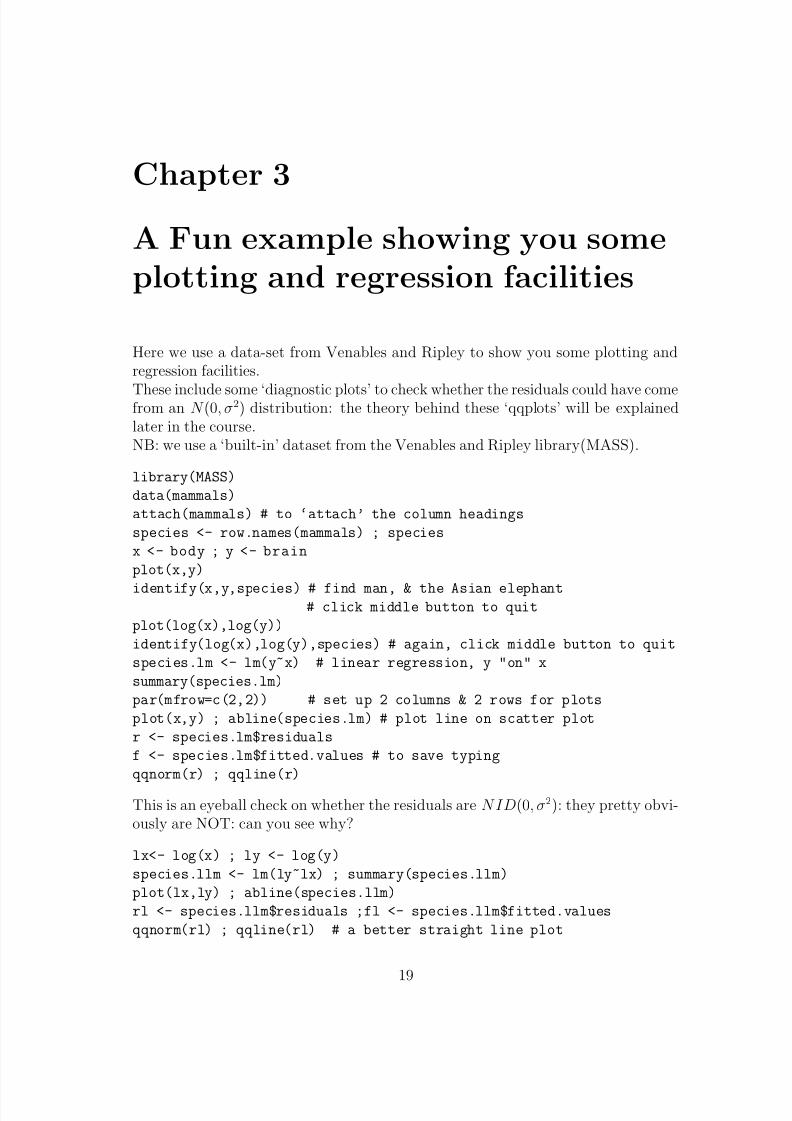
Here we use a data-set from Venables and Ripley to show you some plotting andregression facilities.
These include some ‘diagnostic plots’ to check whether the residuals could have comefrom an N (0, σ2) distribution: the theory behind these ‘qqplots’ will be explainedlater in the course.NB: we use a ‘built-in’ dataset from the Venables and Ripley library(MASS).
library(MASS)
data(mammals)
attach(mammals) # to ‘attach’ the column headings
species <- row.names(mammals) ; species
x <- body ; y <- brain
plot(x,y)
identify(x,y,species) # find man, & the Asian elephant# click middle button to quit
plot(log(x),log(y))
identify(log(x),log(y),species) # again, click middle button to quit
species.lm <- lm(y~x) # linear regression, y "on" x
summary(species.lm)
par(mfrow=c(2,2)) # set up 2 columns & 2 rows for plots
plot(x,y) ; abline(species.lm) # plot line on scatter plot
r <- species.lm$residuals
f <- species.lm$fitted.values # to save typing
qqnorm(r) ; qqline(r)
This is an eyeball check on whether the residuals are N ID(0, σ2): they pretty obvi-ously are NOT: can you see why?
lx<- log(x) ; ly <- log(y)
species.llm <- lm(ly~lx) ; summary(species.llm)
plot(lx,ly) ; abline(species.llm)
rl <- species.llm$residuals ;fl <- species.llm$fitted.values
qqnorm(rl) ; qqline(rl) # a better straight line plot
19

8/20/2019 Red w Sheets
http://slidepdf.com/reader/full/red-w-sheets 21/116
P.M.E.Altham, University of Cambridge 20
x
0 1000 2000 3000 4000 5000 −2 0 2 4 6 8
0
2 0 0 0
4 0 0 0
6 0 0 0
0
1 0 0 0
3 0 0 0
5 0 0 0
y
lx
− 4
0
2
4
6
8
0 1000 3000 5000
− 2
0
2
4
6
8
−4 −2 0 2 4 6 8
ly
Figure 3.1: A pairs plot of bodyweight=x, brainweight=y, and their logs
plot(f,r) ; hist(r)
plot(fl,rl); hist(rl) # further diagnostic checks
# Which of the 2 regressions do you think is appropriate ? mam.mat <- cbind(x,y,lx,ly) # columnbind to form matrix
cor(mam.mat) # correlation matrix
round(cor(mam.mat),3) # easier to read
par(mfrow=c(1,1)) # back to 1 graph per plot
pairs(mam.mat)
Suppose we want a hard copy of this final graph. Here’s how to proceed.
postscript("file.ps", height=4)
This will send the graph to the postscript file called ‘file.ps’. It will contain the
PostScript code for a figure 4 inches high, perhaps for inclusion by you in a laterdocument. Warning: if ‘file.ps’ already exists in your files, it will be overwritten.
pairs(mam.mat) # will now put the graph into file.ps
dev.off() # will turn off the ‘current device’, so that
plot(x,y) # will now appear on the screen
q()
unix users:ls

8/20/2019 Red w Sheets
http://slidepdf.com/reader/full/red-w-sheets 22/116
P.M.E.Altham, University of Cambridge 21
should show you that you have created file.psghostview file.psenables you to look at this file on the screenlp file.psenables you to print out the corresponding graph.
catam users:
You can also see file.ps via ghostviewPlease await instructions in the practical class if you want to obtain a hard copyof this graph, via Postscript printer (But you may be able to work out this printing-out step for yourself. Use title(main=”Posh Spice”) for example, to put your nameon the graph before you click on ‘print’.) R-graphs can also be put into a Worddocument.Here is the data-set ‘mammals’, from Weisberg (1985, pp144-5). It is in the Venablesand Ripley (1994) library of data-sets.
body brain
Arctic fox 3.385 44.50
Owl monkey 0.480 15.50Mountain beaver 1.350 8.10
Cow 465.000 423.00
Grey wolf 36.330 119.50
Goat 27.660 115.00
Roe deer 14.830 98.20
Guinea pig 1.040 5.50
Verbet 4.190 58.00
Chinchilla 0.425 6.40
Ground squirrel 0.101 4.00
Arctic ground squirrel 0.920 5.70
African giant pouched rat 1.000 6.60Lesser short-tailed shrew 0.005 0.14
Star-nosed mole 0.060 1.00
Nine-banded armadillo 3.500 10.80
Tree hyrax 2.000 12.30
N.A. opossum 1.700 6.30
Asian elephant 2547.000 4603.00
Big brown bat 0.023 0.30
Donkey 187.100 419.00
Horse 521.000 655.00
European hedgehog 0.785 3.50Patas monkey 10.000 115.00
Cat 3.300 25.60
Galago 0.200 5.00
Genet 1.410 17.50
Giraffe 529.000 680.00
Gorilla 207.000 406.00
Grey seal 85.000 325.00
Rock hyrax-a 0.750 12.30

8/20/2019 Red w Sheets
http://slidepdf.com/reader/full/red-w-sheets 23/116
P.M.E.Altham, University of Cambridge 22
Human 62.000 1320.00
African elephant 6654.000 5712.00
Water opossum 3.500 3.90
Rhesus monkey 6.800 179.00
Kangaroo 35.000 56.00
Yellow-bellied marmot 4.050 17.00
Golden hamster 0.120 1.00Mouse 0.023 0.40
Little brown bat 0.010 0.25
Slow loris 1.400 12.50
Okapi 250.000 490.00
Rabbit 2.500 12.10
Sheep 55.500 175.00
Jaguar 100.000 157.00
Chimpanzee 52.160 440.00
Baboon 10.550 179.50
Desert hedgehog 0.550 2.40
Giant armadillo 60.000 81.00Rock hyrax-b 3.600 21.00
Raccoon 4.288 39.20
Rat 0.280 1.90
E. American mole 0.075 1.20
Mole rat 0.122 3.00
Musk shrew 0.048 0.33
Pig 192.000 180.00
Echidna 3.000 25.00
Brazilian tapir 160.000 169.00
Tenrec 0.900 2.60
Phalanger 1.620 11.40
Tree shrew 0.104 2.50
Red fox 4.235 50.40
Here is the data-set ‘Japanese set the pace for Europe’s car makers’, from The Inde-pendent, August 18, 1999. The 3 columns of numbers are Vehicles produced in 1998,and the Productivity, in terms of vehicle per employee, in 1997, 1998 respectively.Can you construct any helpful graphs?
veh1998 prod97 prod98
Nissan(UK) 288838 98 105
Volkswagen(Spain) 311136 70 76GM(Germany) 174807 77 76
Fiat(Italy) 383000 70 73
Toyota(UK) 172342 58 72
SEAT(Spain) 498463 69 69
Renault(France) 385118 61 68
GM(Spain) 445750 67 67
Renault(Spain) 213590 59 64
Honda(UK) 112313 62 64
8/20/2019 Red w Sheets
http://slidepdf.com/reader/full/red-w-sheets 24/116
P.M.E.Altham, University of Cambridge 23
Ford(UK) 250351 62 61
Fiat(2Italy) 416000 54 61
Ford(Germany) 290444 59 59
Ford(Spain) 296173 57 58
Vauxhall(UK) 154846 39 43
Skoda(CzechR) 287529 33 35
Rover(UK) 281855 33 30An interesting modern example of multiple regression, complete with the full dataset,is given in‘Distance from Africa, not climate, explains within-population phenotypic diversityin humans’by Betti, Balloux, Amos, Hanihara and Manica, Proc. R.Soc. B (2009) 276, 809–814.
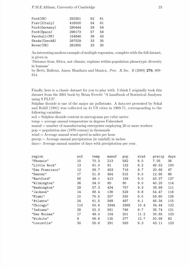
Finally, here is a classic dataset for you to play with. I think I originally took this
dataset from the 2001 book by Brian Everitt “A handbook of Statistical Analysesusing S PLUS”.Sulphur dioxide is one of the major air pollutants. A data-set presented by Sokaland Rohlf (1981) was collected on 41 US cities in 1969-71, corresponding to thefollowing variables:so2 = Sulphur dioxide content in micrograms per cubic metretemp = average annual temperature in degrees Fahrenheitmanuf = number of manufacturing enterprises employing 20 or more workerspop = population size (1970 census) in thousandswind = Average annual wind speed in miles per hour
precip = Average annual precipitation (ie rainfall) in inchesdays= Average annual number of days with precipitation per year.
region so2 temp manuf pop wind precip days
"Phoenix" 10 70.3 213 582 6.0 7.05 36
"Little Rock" 13 61.0 91 132 8.2 48.52 100
"San Francisco" 12 56.7 453 716 8.7 20.66 67
"Denver" 17 51.9 454 515 9.0 12.95 86
"Hartford" 56 49.1 412 158 9.0 43.37 127
"Wilmington" 36 54.0 80 80 9.0 40.25 114
"Washington" 29 57.3 434 757 9.3 38.89 111"Jackson" 14 68.4 136 529 8.8 54.47 116
"Miami" 10 75.5 207 335 9.0 59.80 128
"Atlanta" 24 61.5 368 497 9.1 48.34 115
"Chicago" 110 50.6 3344 3369 10.4 34.44 122
"Indiana" 28 52.3 361 746 9.7 38.74 121
"Des Moines" 17 49.0 104 201 11.2 30.85 103
"Wichita" 8 56.6 125 277 12.7 30.58 82
"Louisvlle" 30 55.6 291 593 8.3 43.11 123

8/20/2019 Red w Sheets
http://slidepdf.com/reader/full/red-w-sheets 25/116
P.M.E.Altham, University of Cambridge 24
"New Orleans" 9 68.3 204 361 8.4 56.77 113
"Baltimore" 47 55.0 625 905 9.6 41.31 111
"Detroit" 35 49.9 1064 1513 10.1 30.96 129
"Minnesota" 29 43.5 699 744 10.6 25.94 137
"Kansas" 14 54.5 381 507 10.0 37.00 99
"St. Louis" 56 55.9 775 622 9.5 35.89 105
"Omaha" 14 51.5 181 347 10.9 30.18 98"Albuquerque" 11 56.8 46 244 8.9 7.77 58
"Albany" 46 47.6 44 116 8.8 33.36 135
"Buffalo" 11 47.1 391 463 12.4 36.11 166
"Cincinnati" 23 54.0 462 453 7.1 39.04 132
"Cleveland" 65 49.7 1007 751 10.9 34.99 155
"Columbia" 26 51.5 266 540 8.6 37.01 134
"Philadelphia" 69 54.6 1692 1950 9.6 39.93 115
"Pittsburgh" 61 50.4 347 520 9.4 36.22 147
"Providence" 94 50.0 343 179 10.6 42.75 125
"Memphis" 10 61.6 337 624 9.2 49.10 105
"Nashville" 18 59.4 275 448 7.9 46.00 119"Dallas" 9 66.2 641 844 10.9 35.94 78
"Houston" 10 68.9 721 1233 10.8 48.19 103
"Salt Lake City" 28 51.0 137 176 8.7 15.17 89
"Norfolk" 31 59.3 96 308 10.6 44.68 116
"Richmond" 26 57.8 197 299 7.6 42.59 115
"Seattle" 29 51.1 379 531 9.4 38.79 164
"Charleston" 31 55.2 35 71 6.5 40.75 148
"Milwaukee" 16 45.7 569 717 11.8 29.07 123

8/20/2019 Red w Sheets
http://slidepdf.com/reader/full/red-w-sheets 26/116
Chapter 4
A one-way anova, and a qqnormplot
This chapter shows you how to construct a one-way analysis of variance and how todo a qqnorm-plot to assess normality of the residuals.
Here is the data in the file ‘potash’: nb, you may need to do some work to get thedatafile in place before you go into R.
7.62 8.00 7.93
8.14 8.15 7.87
7.76 7.73 7.74
7.17 7.57 7.80
7.46 7.68 7.21
The origin of these data is lost in the mists of time; they show the strength of bun-dles of cotton, for cotton grown under 5 different ‘treatments’, the treatments in
question being amounts of potash, a fertiliser. The design of this simple agriculturalexperiment gives 3 ‘replicates’ for each treatment level, making a total of 15 obser-vations in all. We model the dependence of the strength on the level of potash.This is what you should do.
y <- scan("potash") ; y
Now we read in the experimental design.
x <- scan() # a slicker way is to use the "rep" function.
36 36 36
54 54 54
72 72 72
108 108 108
144 144 144 #here x is treatment(in lbs per acre) & y is strength
# blank line to show the end of the data
tapply(y,x,mean) # gives mean(y) for each level of x
plot(x,y)
regr <- lm(y~x) ; summary(regr)
This fits yij = a + bxij + ij, with i = 1, . . . , 5, j = 1, . . . , 3
25

8/20/2019 Red w Sheets
http://slidepdf.com/reader/full/red-w-sheets 27/116
P.M.E.Altham, University of Cambridge 26
potash <- factor(x) ; potash
plot(potash,y) # This results in a ‘boxplot’
teeny <- lm(y~potash)
This fits yij = µ + θi + ij with θ1 = 0 (the default setting in R)
anova(teeny)
names(teeny)coefficients(teeny) # can you understand these ?
help(qqnorm)
qqnorm(resid(teeny))
qqline(resid(teeny))
plot(fitted(teeny),resid(teeny))
plot(teeny,ask=T) # for more of the diagnostic plots
The original data, and the fitted regression line, are given in Figure 4.1. Figure 4.2gives boxplot for this dataset.
40 60 80 100 120 140
7 .
2
7 .
4
7 .
6
7 .
8
8 .
0
x
y
Strength of cotton bundles (y) against amount of potash fertiliser (x)
Figure 4.1: Strengths of cotton bundles against level of potash
Brief explanation of some of the diagnostic plots for the general linearmodel
With Y = Xβ +
and ∼ N (0, σ2I ), we see that β = (X T X )−1X T Y, and Y = H Y and = Y − Y =(I − H ), where H is the usual ‘hat’ matrix.From this we can see that , Y , the residuals and fitted values, are independent, soa plot of against Y should show no particular trend.If we do see a trend in the plot of against Y , for example if the residuals appearto be ‘fanning out’ as Y increases, then this may be a warning that the varianceof Y i is actually a function of E (Y i), and so the assumption var(Y i) = σ2 for all i

8/20/2019 Red w Sheets
http://slidepdf.com/reader/full/red-w-sheets 28/116
P.M.E.Altham, University of Cambridge 27
36 54 72 108 144
7 . 2
7 . 4
7 . 6
7 .
8
8 .
0
The potash data, as a boxplot (potash being a factor)
Figure 4.2: Boxplot for cotton bundles dataset
may fail: we may be able to remedy this by replacing Y i by log Y i, or some othertransformation of Y , in the original linear model.Further, should be N (0, (I − H )σ2).In order to check whether this is plausible, we find F n(u) say, the sample distributionfunction of the residuals. We would like to see whether
F n(u) Φ(u/σ)
for some σ (where Φ is as usual, the distribution function of N (0, 1)). This is hard
to assess visually, so instead we try to see if
Φ−1F n(u) u/σ.
This is what lies behind the qqplot. We are just doing a quick check of the linearityof the function Φ−1F n(u).It’s fun to generate a random sample of size 100 from the t-distribution with 5 df,and find its qqnorm, qqline plots, to assess the systematic departure from a normaldistribution. To do this, try
y <- rt(100,5) ; hist(y) ; qqnorm(y); qqline(y)

8/20/2019 Red w Sheets
http://slidepdf.com/reader/full/red-w-sheets 29/116

8/20/2019 Red w Sheets
http://slidepdf.com/reader/full/red-w-sheets 30/116
P.M.E.Altham, University of Cambridge 29
# remember blank line
OCC <- gl(4,1,48,labels=occ) # gl() is the ‘generate level’ command
COUNTRY <- gl(12,4,48,labels= country)
OCC ; COUNTRY
OCC <- factor(OCC) ; COUNTRY<- factor(COUNTRY) # factor declaration(redundant
Now we try several different models. Study the output carefully and comment onthe differences and similarities.
ex2 <- lm(p~COUNTRY+OCC) ; anova(ex2)
This fits pij = µ + αi + β j + ij for i = 1, . . . , 12 and j = 1, . . . , 4 and the usualassumption about the distribution of (ij).
ex2 ; summary(ex2)
names(ex2)
ex2$coefficients
lex2 <- lm(p~OCC +COUNTRY) ; anova(lex2)
lex3 <- lm(p~ OCC) ; lex3 ; summary(lex3)
lex4 <- lm(p~ COUNTRY); lex4 ; summary(lex4)
lex5 <- lm(p~ COUNTRY + OCC); lex5; anova(lex5)
summary(lex5,cor=T) # cor=T gives the matrix
# of correlation coefficients of parameter estimates
tapply(p,OCC,mean)
tapply(p,COUNTRY,mean)
The default parametrisation for factor effects in R is different from the (ratherawkward) default parametrisation used in S-Plus. If our model is
E (Y ij) = µ + αi + β j
then R takes α1 = 0, β 1 = 0, so that effectively each of the 2nd, 3rd, ... etc factorlevel is being compared with the 1st such.Now we’ll demonstrate some nice graphics, starting with a multiple-comparisons testof the differences between the 4 occupations (hence 4 × 3/2 pairwise comparisons).The corresponding multiple-comparisons plot is given as Figure 5.1.
first.aov = aov(p~ COUNTRY + OCC) ; summary(first.aov)
TukeyHSD(first.aov, "OCC")
plot(TukeyHSD(first.aov, "OCC"))
boxplot(split(p,OCC)) # in fact same effect as plot(OCC,p)
boxplot(split(p,COUNTRY))
res <- ex2$residuals ; fv<- ex2$fitted.values
plot(fv,res)
hist(resid(ex2))
qqnorm(resid(ex2)) # should be approx straight line if errors normal
ls() # opportunity to tidy up here,eg by
rm(ex2)
8/20/2019 Red w Sheets
http://slidepdf.com/reader/full/red-w-sheets 31/116
P.M.E.Altham, University of Cambridge 30
−5 0 5 10 M P − b a r r i s t e r
M P − s u r g e o n
M P − b u s / t r a i n
s u r g e o n − b u s / t r a i n
95% family−wise confidence level
Differences in mean levels of OCC
Figure 5.1: Multiple comparisons between occupations.
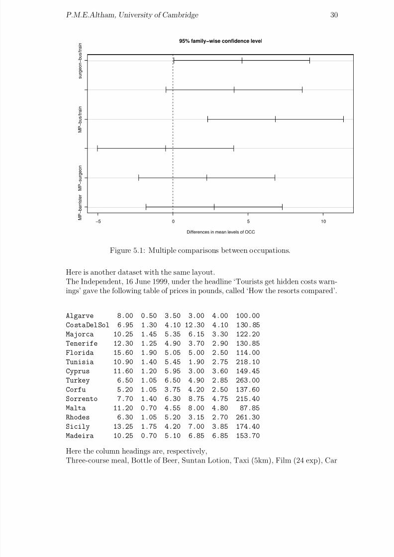
Here is another dataset with the same layout.The Independent, 16 June 1999, under the headline ‘Tourists get hidden costs warn-
ings’ gave the following table of prices in pounds, called ‘How the resorts compared’.
Algarve 8.00 0.50 3.50 3.00 4.00 100.00
CostaDelSol 6.95 1.30 4.10 12.30 4.10 130.85
Majorca 10.25 1.45 5.35 6.15 3.30 122.20
Tenerife 12.30 1.25 4.90 3.70 2.90 130.85
Florida 15.60 1.90 5.05 5.00 2.50 114.00
Tunisia 10.90 1.40 5.45 1.90 2.75 218.10
Cyprus 11.60 1.20 5.95 3.00 3.60 149.45
Turkey 6.50 1.05 6.50 4.90 2.85 263.00
Corfu 5.20 1.05 3.75 4.20 2.50 137.60Sorrento 7.70 1.40 6.30 8.75 4.75 215.40
Malta 11.20 0.70 4.55 8.00 4.80 87.85
Rhodes 6.30 1.05 5.20 3.15 2.70 261.30
Sicily 13.25 1.75 4.20 7.00 3.85 174.40
Madeira 10.25 0.70 5.10 6.85 6.85 153.70
Here the column headings are, respectively,Three-course meal, Bottle of Beer, Suntan Lotion, Taxi (5km), Film (24 exp), Car
8/20/2019 Red w Sheets
http://slidepdf.com/reader/full/red-w-sheets 32/116
P.M.E.Altham, University of Cambridge 31
Hire (per week).Fit the model
log(price) ~ place + item
and interpret the results. Note that this model is more appropriate than
price ~ place + item
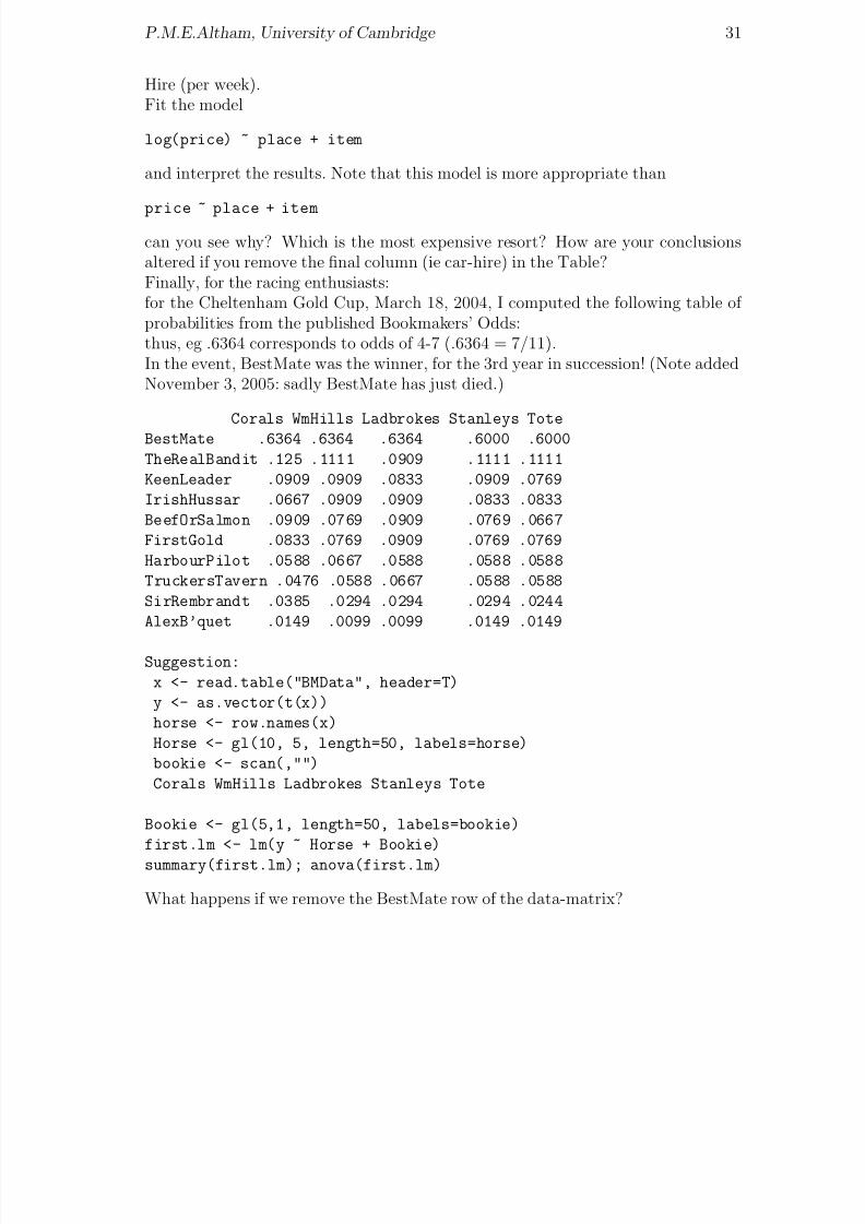
can you see why? Which is the most expensive resort? How are your conclusionsaltered if you remove the final column (ie car-hire) in the Table?Finally, for the racing enthusiasts:for the Cheltenham Gold Cup, March 18, 2004, I computed the following table of probabilities from the published Bookmakers’ Odds:thus, eg .6364 corresponds to odds of 4-7 (.6364 = 7/11).In the event, BestMate was the winner, for the 3rd year in succession! (Note addedNovember 3, 2005: sadly BestMate has just died.)
Corals WmHills Ladbrokes Stanleys Tote
BestMate .6364 .6364 .6364 .6000 .6000
TheRealBandit .125 .1111 .0909 .1111 .1111
KeenLeader .0909 .0909 .0833 .0909 .0769
IrishHussar .0667 .0909 .0909 .0833 .0833
BeefOrSalmon .0909 .0769 .0909 .0769 .0667
FirstGold .0833 .0769 .0909 .0769 .0769
HarbourPilot .0588 .0667 .0588 .0588 .0588
TruckersTavern .0476 .0588 .0667 .0588 .0588
SirRembrandt .0385 .0294 .0294 .0294 .0244
AlexB’quet .0149 .0099 .0099 .0149 .0149
Suggestion:
x <- read.table("BMData", header=T)
y <- as.vector(t(x))
horse <- row.names(x)
Horse <- gl(10, 5, length=50, labels=horse)
bookie <- scan(,"")
Corals WmHills Ladbrokes Stanleys Tote
Bookie <- gl(5,1, length=50, labels=bookie)
first.lm <- lm(y ~ Horse + Bookie)
summary(first.lm); anova(first.lm)
What happens if we remove the BestMate row of the data-matrix?

8/20/2019 Red w Sheets
http://slidepdf.com/reader/full/red-w-sheets 33/116
Chapter 6
A 2-way layout with missing data,ie an unbalanced design
This shows an example of an unbalanced two-way design.These data are taken from The Independent on Sunday for October 6,1991. They
show the prices of certain best-selling books in 5 countries in pounds sterling. Thecolumns correspond to UK, Germany, France, US, Austria respectively. The newfeature of this data-set is that there are some MISSING values (missing for reasonsunknown). Thus in the 10 by 5 table below, we useNA to represent ‘not available’ for these missing entries.We then use ‘na.action...’ to omit the missing data in our fitting, so that we willhave an UNbalanced design. You will see that this fact has profound consequences:certain sets of parameters are NON-orthogonal as a result. Here is the data from
bookpr
14.99 12.68 9.00 11.00 15.95 S.Hawking,"A brief history of time"14.95 17.53 13.60 13.35 15.95 U.Eco,"Foucault’s Pendulum"
12.95 14.01 11.60 11.60 13.60 J.Le Carre,"The Russia House"
14.95 12.00 8.45 NA NA J.Archer,"Kane & Abel"
12.95 15.90 15.10 NA 16.00 S.Rushdie,"The Satanic Verses"
12.95 13.40 12.10 11.00 13.60 J.Barnes"History of the world in ..."
17.95 30.01 NA 14.50 22.80 R.Ellman,"Oscar Wilde"
13.99 NA NA 12.50 13.60 J.Updike,"Rabbit at Rest"
9.95 1 0.50 NA 9.85 NA P.Suskind,"Perfume"
7.95 9.85 5.65 6.95 NA M.Duras,"The Lover"
‘Do books cost more abroad?’ was the question raised by The Independent onSunday.
p <- scan("bookpr") ; p
cou <- scan(,"")
UK Ger Fra US Austria
# blank line
country <- gl(5,1,50,labels=cou)
author <- gl(10,5,50)
32
8/20/2019 Red w Sheets
http://slidepdf.com/reader/full/red-w-sheets 34/116
P.M.E.Altham, University of Cambridge 33
8
1 0
1 2
1 4
1 6
1
8
2 0
Factors
m e a n o f p
UK
Ger
Fra
US
Austria
1
2
3
4
5
6
7
8
9
10
country author
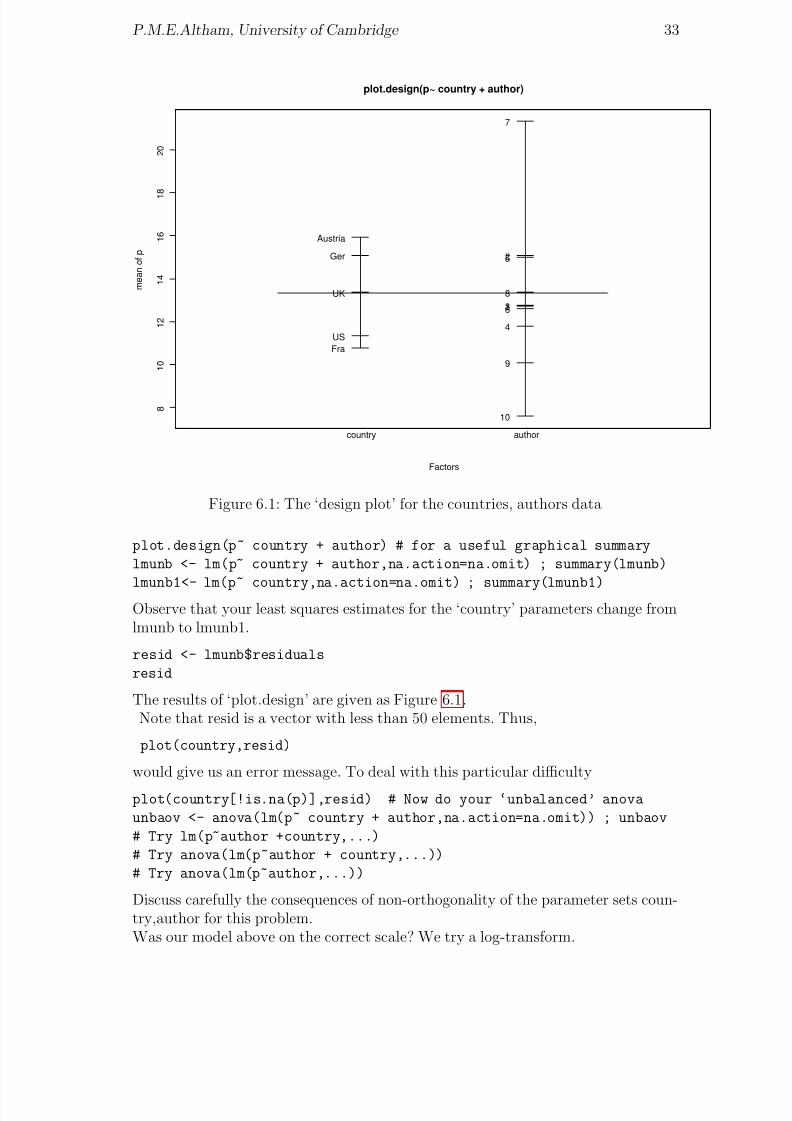
plot.design(p~ country + author)
Figure 6.1: The ‘design plot’ for the countries, authors data
plot.design(p~ country + author) # for a useful graphical summary
lmunb <- lm(p~ country + author,na.action=na.omit) ; summary(lmunb)
lmunb1<- lm(p~ country,na.action=na.omit) ; summary(lmunb1)Observe that your least squares estimates for the ‘country’ parameters change fromlmunb to lmunb1.
resid <- lmunb$residuals
resid
The results of ‘plot.design’ are given as Figure 6.1.Note that resid is a vector with less than 50 elements. Thus,
plot(country,resid)
would give us an error message. To deal with this particular difficulty
plot(country[!is.na(p)],resid) # Now do your ‘unbalanced’ anova
unbaov <- anova(lm(p~ country + author,na.action=na.omit)) ; unbaov
# Try lm(p~author +country,...)
# Try anova(lm(p~author + country,...))
# Try anova(lm(p~author,...))
Discuss carefully the consequences of non-orthogonality of the parameter sets coun-try,author for this problem.Was our model above on the correct scale? We try a log-transform.
8/20/2019 Red w Sheets
http://slidepdf.com/reader/full/red-w-sheets 35/116
P.M.E.Altham, University of Cambridge 34
lp <- log(p)
lmunblp <- lm(lp~ country+author,na.action=na.omit) ; summary(lmunblp)
qqnorm(resid(lmunb))
qqnorm(resid(lmunblp)) # which is best ?
q()
Problems involving MONEY should be attacked with multiplicative rather than
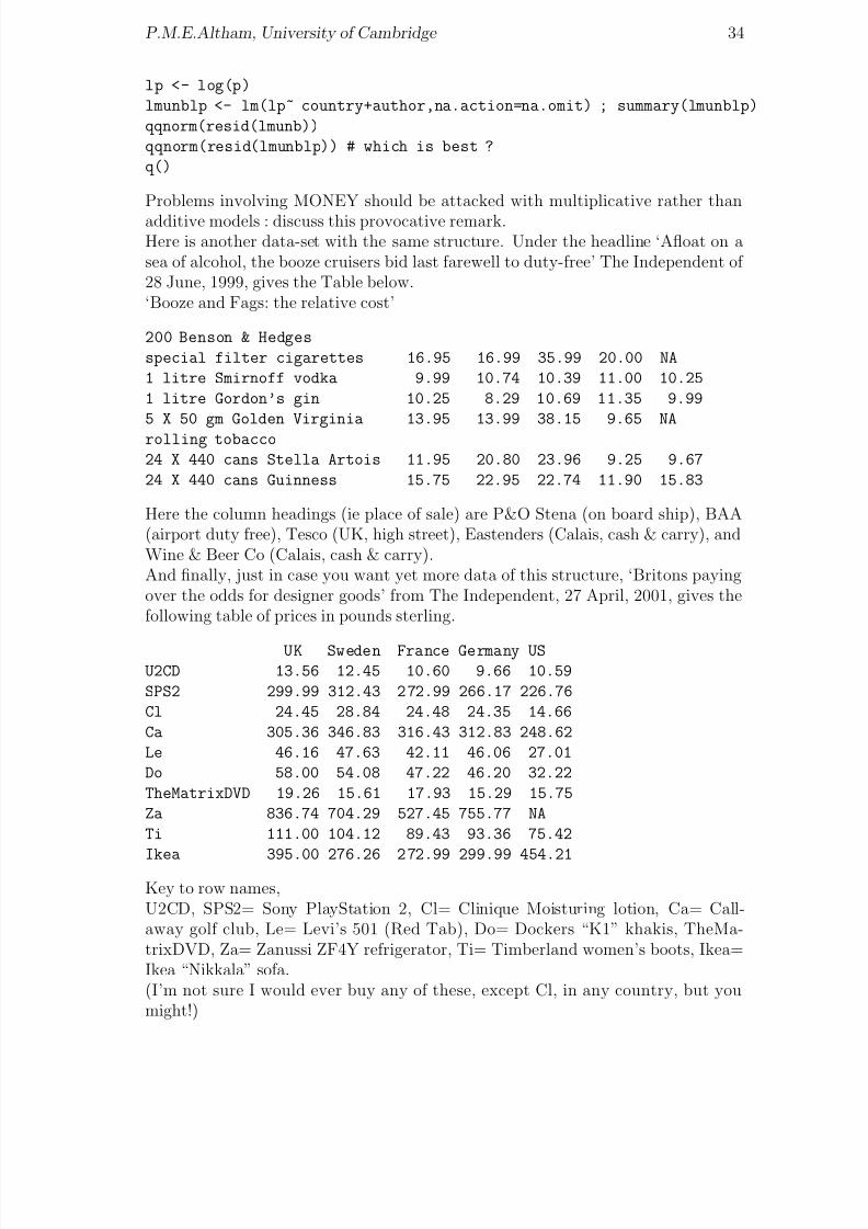
additive models : discuss this provocative remark.Here is another data-set with the same structure. Under the headline ‘Afloat on asea of alcohol, the booze cruisers bid last farewell to duty-free’ The Independent of 28 June, 1999, gives the Table below.‘Booze and Fags: the relative cost’
200 Benson & Hedges
special filter cigarettes 16.95 16.99 35.99 20.00 NA
1 litre Smirnoff vodka 9.99 10.74 10.39 11.00 10.25
1 litre Gordon’s gin 10.25 8.29 10.69 11.35 9.99
5 X 50 gm Golden Virginia 13.95 13.99 38.15 9.65 NA
rolling tobacco
24 X 440 cans Stella Artois 11.95 20.80 23.96 9.25 9.67
24 X 440 cans Guinness 15.75 22.95 22.74 11.90 15.83
Here the column headings (ie place of sale) are P&O Stena (on board ship), BAA(airport duty free), Tesco (UK, high street), Eastenders (Calais, cash & carry), andWine & Beer Co (Calais, cash & carry).And finally, just in case you want yet more data of this structure, ‘Britons payingover the odds for designer goods’ from The Independent, 27 April, 2001, gives thefollowing table of prices in pounds sterling.
UK Sweden France Germany USU2CD 13.56 12.45 10.60 9.66 10.59
SPS2 299.99 312.43 2 72.99 266.17 226.76
Cl 24.45 28.84 24.48 24.35 14.66
Ca 305.36 346.83 316.43 312.83 248.62
Le 46.16 47.63 42.11 46.06 27.01
Do 58.00 54.08 47.22 46.20 32.22
TheMatrixDVD 19.26 15.61 17.93 15.29 15.75
Za 836.74 704.29 527.45 755.77 NA
Ti 111.00 104.12 89.43 93.36 75.42
Ikea 395.00 276.26 2 72.99 299.99 454.21
Key to row names,U2CD, SPS2= Sony PlayStation 2, Cl= Clinique Moisturing lotion, Ca= Call-away golf club, Le= Levi’s 501 (Red Tab), Do= Dockers “K1” khakis, TheMa-trixDVD, Za= Zanussi ZF4Y refrigerator, Ti= Timberland women’s boots, Ikea=Ikea “Nikkala” sofa.(I’m not sure I would ever buy any of these, except Cl, in any country, but youmight!)

8/20/2019 Red w Sheets
http://slidepdf.com/reader/full/red-w-sheets 36/116
Chapter 7
Logistic regression for thebinomial distribution
Here is our first use of a distribution other than the normal. We do a very simpleexample with binomial logistic regression.
The dataset comes from ‘Modelling Binary Data’, by D.Collett(1991). The com-pressive strength of an alloy fastener used in aircraft construction is studied. Tenpressure loads, increasing in units of 200psi from 2500 psi to 4300 psi, were used.Heren= number of fasteners tested at each loadr= number of these which FAIL.We assume that ri is Binomial(ni, πi) for i = 1, . . . , 10 and that these 10 randomvariables are independent. We model the dependence of πi on Loadi, using graphswhere appropriate.The model assumed below is
log(πi/(1 − πi)) = a + b × Loadi.
[This is the LOGIT link in the glm, here the default link.] Note that we do theregression here with p = r/n as the ‘y-variable’ , and n as ‘weights’. See
help(glm)
for general syntax.The corresponding data, given at the end of this sheet, is in the file calledalloyf So, first set up the file ‘alloyf’.
data6 <- read.table("alloyf",header=T)
attach(data6) # BEWARE, this will not over-write variables already present.
p <- r/n
plot(Load,p)
ex6 <- glm(p~ Load,weights=n,family=binomial) #‘weights’ for sample sizes
Observe, we could put the above sequence of commands into a separate file, called,eg “littleprog”which we could then access, and execute, from within R, via the command
35

8/20/2019 Red w Sheets
http://slidepdf.com/reader/full/red-w-sheets 37/116
P.M.E.Altham, University of Cambridge 36
source("littleprog")
data6 ; names(data6); summary(data6)
plot(Load,p,type="l") # note, l for ‘line’
ex6 ; summary(ex6)
names(ex6)
plot(ex6,ask=T) # for diagnostic plots
Now we’ll see how to vary the link function. Previously we were using the defaultlink, ie the logit(this is canonical for the binomial distribution)
ex6.l <- glm(p~Load,family=binomial(link=logit),weights=n)
ex6.p <- glm(p~Load,family=binomial(link=probit),weights=n)
ex6.cll <- glm(p~Load,binomial(link=cloglog),weights=n)
summary(ex6.l)
summary(ex6.p) # the probit link
summary(ex6.cll) # the complementary loglog link
As you will see, all these three models fit very well (ex6.cll being slightly less good).The AI C is the Akaike information criterion; it is defined here asAIC = −2×maximized log likelihood +2× number of parameters fitted.(The log-likelihood is of course defined only up to a constant depending on the data,so the same will be true of the AIC.) In all of the linear models (irrespective of theparticular link function used) the number of parameters fitted is of course 2. Incomparing different models, we look for the one with the smallest AI C .Observe that for the fitted parameter estimates, the ratio a/b is about the same forthe 3 link functions: this is a special case of a general phenomenon.Which link function gives the best fit, ie the smallest deviance ? In practice the
logit and probit will fit almost equally well.We conclude by plotting a graph to show the fitted probability of failure under thelogistic model: the 2 vertical lines are drawn to show the actual range of our datafor Load. (Within this range, the link function is pretty well linear, as it happens.)
x <- 15:55 ; alpha = ex6.l$coefficients[1]; beta= ex6.l$coefficients[2]
y <- alpha + beta*x; Y= 1/(1+ exp(-y))
plot(x, Y, type="l",xlab="Load",ylab="Fitted Probability of failure")
abline(v=25); abline(v=43)
points(Load,p) # to put the original data-points on the graph
title("Fitting a logistic model")
The corresponding graph is shown in Figure 7.1. Here is the dataset “alloyf”. (Warn-ing: ‘load’ is a function in R, so we call the first column ‘Load’ rather than ‘load’.)
Load n r
25 50 10
27 70 17
29 100 30
31 60 21
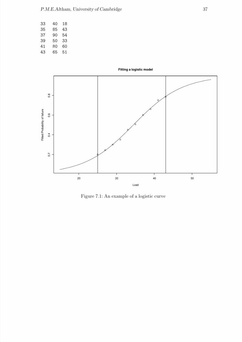
8/20/2019 Red w Sheets
http://slidepdf.com/reader/full/red-w-sheets 38/116
P.M.E.Altham, University of Cambridge 37
33 40 18
35 85 43
37 90 54
39 50 33
41 80 60
43 65 51
20 30 40 50
0 . 2
0 . 4
0 . 6
0 . 8
Load
F i t t e d
P r o b a b i l i t y o f f a i l u r e
Fitting a logistic model
Figure 7.1: An example of a logistic curve

8/20/2019 Red w Sheets
http://slidepdf.com/reader/full/red-w-sheets 39/116
Chapter 8
The space shuttle temperaturedata: a cautionary tale
This is an example on logistic regression and safety in space.Swan and Rigby (GLIM Newsletter no 24,1995) discuss the data below, using bino-
mial logistic regression. To quote from Swan and Rigby‘In 1986 the NASA space shuttle Challenger exploded shortly after it was launched.After an investigation it was concluded that this had occurred as a result of an ‘O’ring failure. ‘O’ rings are toroidal seals and in the shuttles six are used to preventhot gases escaping and coming into contact with fuel supply lines.Data had been collected from 23 previous shuttle flights on the ambient temperatureat the launch and the number of ‘O’ rings, out of the six, that were damaged duringthe launch. NASA staff analysed the data to assess whether the risk of ‘O’ ringfailure damage was related to temperature, but it is reported that they excludedthe zero responses (ie, none of the rings damaged) because they believed them to beuninformative. The resulting analysis led them to believe that the risk of damage
was independent of the ambient temperature at the launch. The temperatures forthe 23 previous launches ranged from 53 to 81 degreees Fahrenheit while the Chal-lenger launch temperature was 31 degrees Fahrenheit (ie, -0.6 degrees Centigrade).’Calculate pfail = nfail/six, where
six <- rep(6,times=23),
for the data below, so that pfail is the proportion that fail at each of the 23 previousshuttle flights. Let temp be the corresponding temperature.Comment on the results of
glm(pfail~ temp,binomial,weights=six)
and plot suitable graphs to illustrate your results.Are any points particularly ‘influential’ in the logistic regression ?How is your model affected if you omit all points for which nfail = 0 ?Suggestion:
glm(pfail~ temp,binomial,weights=six, subset=(nfail>0))
#note that here we are picking out a subset by using the ‘logical condition’
#(nfail>0). Alternatively, for this example we could have used the condition
38

8/20/2019 Red w Sheets
http://slidepdf.com/reader/full/red-w-sheets 40/116
P.M.E.Altham, University of Cambridge 39
# subset=(nfail!=0).
# ‘!=’ means ‘not equal to’ and is the negation of ‘==’
?"&" # for full information on the logical symbols
Do you have any comments on the design of this experiment?The data (read this by read.table(“...”,header=T)) follow.
nfail temp
2 53
1 57
1 58
1 63
0 66
0 67
0 67
0 67
0 68
0 690 70
0 70
1 70
1 70
0 72
0 73
0 75
2 75
0 76
0 760 78
0 79
0 81
first.glm = glm(pfail~ temp, binomial, weights=six)
fv = first.glm$fitted.values
plot(temp, fv, type="l", xlim=c(30,85), ylim=c(0,1), xlab="temperature",
ylab="probability of failure")
points(temp, pfail)
title("The space shuttle failure data, with the fitted curve")
The corresponding logistic graph is shown in Figure 8.1. I took the temperaturevalues from 30 degrees to 85 degrees (the x-axis) to emphasize the fact that we haveno data in the range 30 degrees to 50 degrees.
Note added June 2012.A very interesting use of a complex logistic regression on a large dataset is given byWesthoff, Koepsell and Littell, Brit Med Journal, 2012, ‘Effects of experience and

8/20/2019 Red w Sheets
http://slidepdf.com/reader/full/red-w-sheets 41/116
P.M.E.Altham, University of Cambridge 40
30 40 50 60 70 80
0 .
0
0 .
2
0 .
4
0 .
6
0 .
8
1 .
0
temperature
p r o b a b i l i t y
o f f a i l u r e
The space shuttle failure data, with the fitted curve
Figure 8.1: The logistic graph for the space shuttle data
commercialisation on survival in Himalayan mountaineering: retrospective cohortstudy’, which you can see at http://www.bmj.com/content/344/bmj.e3782. This
uses the ‘Himalayan Database’ compiled by Elizabeth Hawley and Richard Salisbury,and uses logistic modelling of the odds of death against survival.

8/20/2019 Red w Sheets
http://slidepdf.com/reader/full/red-w-sheets 42/116
Chapter 9
Binomial and Poisson regression
Firstly we give an example where both Binomial and Poisson regressions are appro-priate: this is for the Missing Persons dataset.Some rather gruesome data published on March 8, 1994 in The Independent underthe headline
“ Thousands of people who disappear without trace ”are analysed below,
s<- scan()
33 63 157
38 108 159
# nb, blank line
r<- scan()
3271 7256 5065
2486 8877 3520
# nb, blank line
Here,r = number reported missing during the year ending March 1993, ands = number still missing by the end of that year. These figures are from theMetropolitan police.
sex <- scan(,"")
m m m f f f
age <- c(1,2,3,1,2,3)
# sex =m,f for males,females
# age=1,2,3 for 13 years & under, 14-18 years, 19 years & over.sex <- factor(sex) ; age <- factor(age)
bin.add <- glm(s/r ~ sex+age,family=binomial,weights=r)
summary(bin.add)
round(bin.add$fitted.values,3) # to ease interpretation
What is this telling us ?The Binomial with large n, small p, is nearly the Poisson with mean (np). So wealso try Poisson regression, using the appropriate “offset”.
41
8/20/2019 Red w Sheets
http://slidepdf.com/reader/full/red-w-sheets 43/116
P.M.E.Altham, University of Cambridge 42
0 . 0
1
0 . 0
2
0 . 0
3
0 . 0
4
Age
m e a n o f s / r
13&under 14−18 19&over
sex
fm
Proportion of people still missing at the end of a year, by age & sex
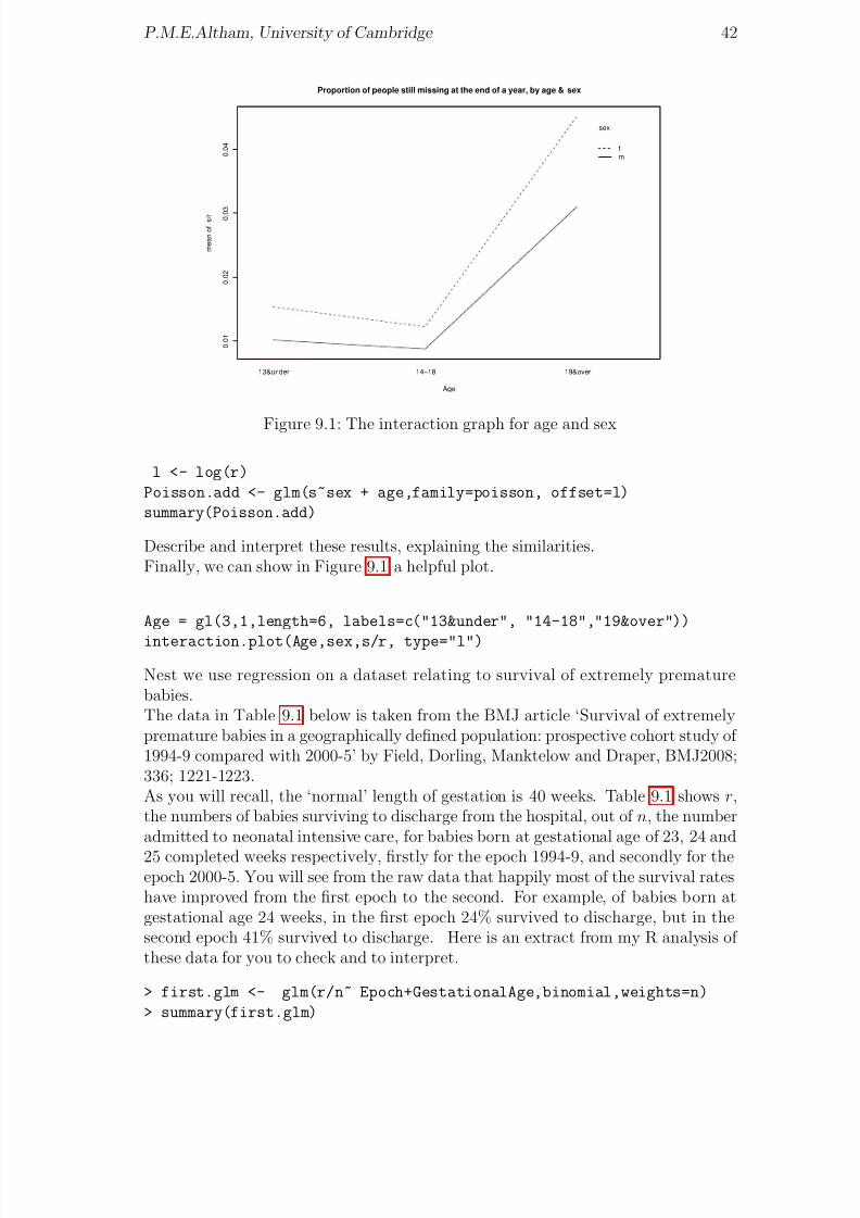
Figure 9.1: The interaction graph for age and sex
l <- log(r)
Poisson.add <- glm(s~sex + age,family=poisson, offset=l)
summary(Poisson.add)
Describe and interpret these results, explaining the similarities.Finally, we can show in Figure 9.1 a helpful plot.
Age = gl(3,1,length=6, labels=c("13&under", "14-18","19&over"))
interaction.plot(Age,sex,s/r, type="l")
Nest we use regression on a dataset relating to survival of extremely prematurebabies.The data in Table 9.1 below is taken from the BMJ article ‘Survival of extremelypremature babies in a geographically defined population: prospective cohort study of 1994-9 compared with 2000-5’ by Field, Dorling, Manktelow and Draper, BMJ2008;336; 1221-1223.As you will recall, the ‘normal’ length of gestation is 40 weeks. Table 9.1 shows r,the numbers of babies surviving to discharge from the hospital, out of n, the numberadmitted to neonatal intensive care, for babies born at gestational age of 23, 24 and
25 completed weeks respectively, firstly for the epoch 1994-9, and secondly for theepoch 2000-5. You will see from the raw data that happily most of the survival rateshave improved from the first epoch to the second. For example, of babies born atgestational age 24 weeks, in the first epoch 24% survived to discharge, but in thesecond epoch 41% survived to discharge. Here is an extract from my R analysis of these data for you to check and to interpret.
> first.glm <- glm(r/n~ Epoch+GestationalAge,binomial,weights=n)
> summary(first.glm)

8/20/2019 Red w Sheets
http://slidepdf.com/reader/full/red-w-sheets 44/116
P.M.E.Altham, University of Cambridge 43
Gestational Age, in completed weeks 23 23 24 24 25 25r n r n r n
Epoch= 1994-9 15 81 40 165 119 229Epoch= 2000-5 12 65 82 198 142 225
Table 9.1: Survival of extremely premature babies
..........
Deviance Residuals:
1 2 3 4 5 6
0.8862 -0.8741 0.2657 -0.8856 0.7172 -0.2786
Coefficients:
Estimate Std. Error z value Pr(>|z|)
(Intercept) -1.7422 0.2265 -7.692 1.45e-14
Epoch2000-5 0.5320 0.1388 3.834 0.000126
GestationalAge24 0.7595 0.2420 3.139 0.001695
GestationalAge25 1.7857 0.2348 7.604 2.88e-14
---(Dispersion parameter for binomial family taken to be 1)
Null deviance: 109.1191 on 5 degrees of freedom
Residual deviance: 2.9963 on 2 degrees of freedom
AIC: 42.133
Number of Fisher Scoring iterations: 4
Although the above analysis shows a remarkably good fit to the model
log( pij/(1 − pij)) = µ + αi + β j , i = 1, 2, j = 1, 2, 3
(using an obvious notation) we have so far taken no account of another possibly‘explanatory’ variable, given in the BMJ paper. This is the mean number of days of care, per baby admitted, and this mean noticeably increases from Epoch 1 to Epoch2. What happens if you include the data from Table 9.2 into your analysis?
Gestational Age, in completed weeks 23 24 25mean days mean days mean days
Epoch= 1994-9 22.9 45.0 52.6Epoch= 2000-5 34.5 58.5 82.1
Table 9.2: Mean number of days of care, per admitted baby
Finally, we analyse a dataset from the UK team in the 2007 International Mathe-matical Olympiad.There were 6 team members (whom I present anonymously as UK1, ..., UK6) and6 questions, and the possible marks for each question ranged from 0 to 7. Here isthe dataset

8/20/2019 Red w Sheets
http://slidepdf.com/reader/full/red-w-sheets 45/116
P.M.E.Altham, University of Cambridge 44
person q1 q2 q3 q4 q5 q6
UK1 7 0 0 7 0 0
UK2 7 2 0 7 0 0
UK3 0 0 0 7 0 0
UK4 7 7 2 7 7 1
UK5 4 1 0 7 0 1
UK6 7 0 0 7 0 0
Setting up all the variables in the appropriate way, try
n <- rep(7, times=36)
first.glm <- glm(r/n ~ person + question, binomial, weights=n)
How is your analysis affected by the removal of question 4?I took this dataset from the UK Mathematics Trust Yearbook, 2006-2007.
8/20/2019 Red w Sheets
http://slidepdf.com/reader/full/red-w-sheets 46/116
Chapter 10
Analysis of a 2-way contingencytable
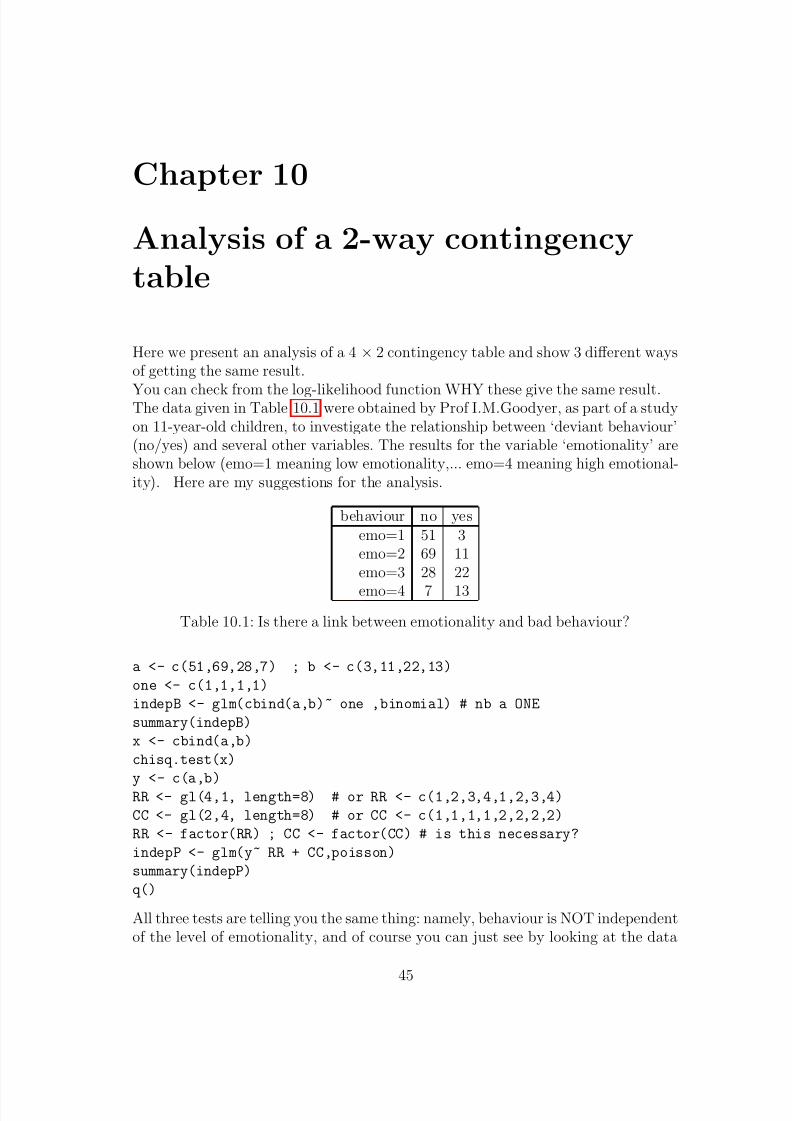
Here we present an analysis of a 4 × 2 contingency table and show 3 different waysof getting the same result.
You can check from the log-likelihood function WHY these give the same result.The data given in Table 10.1 were obtained by Prof I.M.Goodyer, as part of a studyon 11-year-old children, to investigate the relationship between ‘deviant behaviour’(no/yes) and several other variables. The results for the variable ‘emotionality’ areshown below (emo=1 meaning low emotionality,... emo=4 meaning high emotional-ity). Here are my suggestions for the analysis.
behaviour no yesemo=1 51 3emo=2 69 11emo=3 28 22
emo=4 7 13
Table 10.1: Is there a link between emotionality and bad behaviour?
a <- c(51,69,28,7) ; b <- c(3,11,22,13)
one <- c(1,1,1,1)
indepB <- glm(cbind(a,b)~ one ,binomial) # nb a ONE
summary(indepB)
x <- cbind(a,b)
chisq.test(x)
y <- c(a,b)RR <- gl(4,1, length=8) # or RR <- c(1,2,3,4,1,2,3,4)
CC <- gl(2,4, length=8) # or CC <- c(1,1,1,1,2,2,2,2)
RR <- factor(RR) ; CC <- factor(CC) # is this necessary?
indepP <- glm(y~ RR + CC,poisson)
summary(indepP)
q()
All three tests are telling you the same thing: namely, behaviour is NOT independentof the level of emotionality, and of course you can just see by looking at the data
45
8/20/2019 Red w Sheets
http://slidepdf.com/reader/full/red-w-sheets 47/116
P.M.E.Altham, University of Cambridge 46
that this is the case.Other useful functions for contingency tables are
xtabs(), mosaicplot(), fisher.test()
The last of these 3 functions relates to Fisher’s ‘exact’ test, and makes use of thehypergeometric distribution. It is most often applied to 2 × 2 tables, but R has a
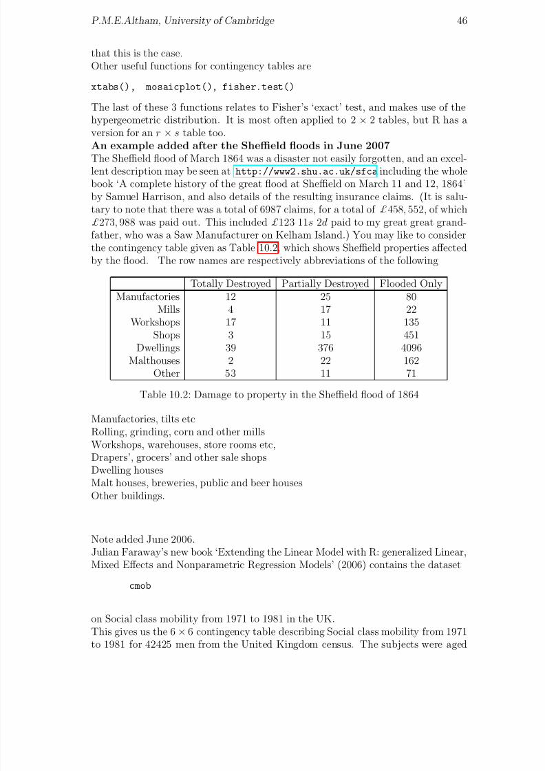
version for an r × s table too.An example added after the Sheffield floods in June 2007The Sheffield flood of March 1864 was a disaster not easily forgotten, and an excel-lent description may be seen at http://www2.shu.ac.uk/sfca including the wholebook ‘A complete history of the great flood at Sheffield on March 11 and 12, 1864’by Samuel Harrison, and also details of the resulting insurance claims. (It is salu-tary to note that there was a total of 6987 claims, for a total of £458, 552, of which£273, 988 was paid out. This included £123 11s 2d paid to my great great grand-father, who was a Saw Manufacturer on Kelham Island.) You may like to considerthe contingency table given as Table 10.2, which shows Sheffield properties affectedby the flood. The row names are respectively abbreviations of the following
Totally Destroyed Partially Destroyed Flooded OnlyManufactories 12 25 80
Mills 4 17 22Workshops 17 11 135
Shops 3 15 451Dwellings 39 376 4096
Malthouses 2 22 162Other 53 11 71
Table 10.2: Damage to property in the Sheffield flood of 1864
Manufactories, tilts etcRolling, grinding, corn and other millsWorkshops, warehouses, store rooms etc,Drapers’, grocers’ and other sale shopsDwelling housesMalt houses, breweries, public and beer housesOther buildings.
Note added June 2006.Julian Faraway’s new book ‘Extending the Linear Model with R: generalized Linear,Mixed Effects and Nonparametric Regression Models’ (2006) contains the dataset
cmob
on Social class mobility from 1971 to 1981 in the UK.This gives us the 6× 6 contingency table describing Social class mobility from 1971to 1981 for 42425 men from the United Kingdom census. The subjects were aged

8/20/2019 Red w Sheets
http://slidepdf.com/reader/full/red-w-sheets 48/116
P.M.E.Altham, University of Cambridge 47
45-64.Key to data framey= Frequency of observationclass71= social class in 1971; this is a factor with levels ‘I’, professionals, ‘II’ semi-professionals, ‘IIIN’ skilled non-manual, ‘IIIM’ skilled manual, ‘IV’ semi-skilled, ‘V’unskilled
class81= social class in 1981; also a factor, same levels as for 1971.The source for these data was D. Blane and S. Harding and M. Rosato (1999) “Doessocial mobility affect the size of the socioeconomic mortality differential?: Evidencefrom the Office for National Statistics Longitudinal Study” JRSS-A, 162 59-70.
Here is the dataframe ‘cmob’.
y class71 class81
1 1759 I I
2 553 I II
3 141 I IIIN
4 130 I IIIM
5 22 I IV6 2 I V
7 541 II I
8 6901 II II
9 861 II IIIN
10 824 II IIIM
11 367 II IV
12 60 II V
13 248 IIIN I
14 1238 IIIN II
15 2562 IIIN IIIN
16 346 IIIN IIIM17 308 IIIN IV
18 56 IIIN V
19 293 IIIM I
20 1409 IIIM II
21 527 IIIM IIIN
22 12054 IIIM IIIM
23 1678 IIIM IV
24 586 IIIM V
25 132 IV I
26 419 IV II27 461 IV IIIN
28 1779 IV IIIM
29 3565 IV IV
30 461 IV V
31 37 V I
32 53 V II
33 88 V IIIN
34 582 V IIIM

8/20/2019 Red w Sheets
http://slidepdf.com/reader/full/red-w-sheets 49/116
P.M.E.Altham, University of Cambridge 48
35 569 V IV
36 813 V V
And here are some suggestions for the analysis. First construct the 6 by 6 contin-gency table
(x = xtabs(y ~ class71 + class81, data=cmob))p = prop.table(x,1)
round(p,2) # to show the transition matrix, 1971- 1981
(p2 = p %*% p)
# this shows what happens after 2 jumps in the Markov chain.
p3 = p %*% p2 # and so on
Using repeated matrix multiplication, find the equilibrium probabilities of this as-sumed Markov chain.

8/20/2019 Red w Sheets
http://slidepdf.com/reader/full/red-w-sheets 50/116
Chapter 11
Poisson regression: some examples
This exercise shows you use of the Poisson ‘family’ or distribution function forloglinear modelling.Also it shows you use of the ‘sink()’ directive in R.
As usual, typing the commands below is a trivial exercise: what YOU must do is tomake sure you understand the purpose of the commands, and that you can interpretthe output.
First. The total number of reported new cases per month of AIDS in the UK up toNovember 1985 are listed below(data from A.Sykes 1986).We model the way in which y, the number of cases depends on i, the month number.
y <- scan()0 0 3 0 1 1 1 2 2 4 2 8 0 3 4 5 2 2 2 5
4 3 1 5 1 2 7 1 4 6 1 0 1 4 8 1 9 1 0 7 2 0 1 0 1 9
# nb, blank line
i<- 1:36
plot(i,y)
aids.reg <- glm(y~i,family=poisson) # NB IT HAS TO BE lower case p,
# even though Poisson was a famous French mathematician.
aids.reg # The default link is in use here, ie the log-link
summary(aids.reg) # thus model is log E(y(i))=a + b*i
fv <- aids.reg$fitted.values
points(i,fv,pch="*") # to add to existing plotlines(i,fv) # to add curve to existing plot
sink("temp") # to store all results from now on
# in the file called "temp". The use of
# sink(), will then switch the output back to the screen.
aids.reg # no output to screen here
summary(aids.reg) # no output to screen here
sink() # to return output to screen
names(aids.reg)
49

8/20/2019 Red w Sheets
http://slidepdf.com/reader/full/red-w-sheets 51/116
P.M.E.Altham, University of Cambridge 50
Table 11.1: vCJD data1994 1995 1996 1997 1998 1999 2000
3,5 5,5 4,7 7,7 8,9 20,9 12,11
Table 11.2: GM tree releases
1988 1989 1990 1991 1992 1993 1994 1995 1996 1997 19981 1 0 2 2 2 1 1 6 3 5
q() # to QUIT R
type temp # to read results of "sink"
(The deviance, 2Σyi log(yi/ei), in the above example is large in comparison with theexpected value of χ2
34, but since we have so many cells with ei < 5, the approximationto the χ2
34 distribution will be poor. We could improve matters here, say by pooling
adjacent cells to give larger values of ei for the combined cells, then recomputingthe deviance, and reducing the degrees of freedom of χ2 accordingly.)Table 11.1 gives the Confirmed and probable vCJD patients reported to the end of December 2001, sorted into males (the first number given in each pair) and females(the second number of the pair), according to their Year of onset of the illness.Can we use a Poisson model for these data?
Here is another data-set of similar structure for you to investigate (once again, agloomy subject I’m afraid).The Independent, November 10, 1999, published an article headed“GM trees pose risk of ‘superweed’ calamity”.This article gave a table, headed ‘Released into the environment’, that showed the
following figures for GM tree species released into the environment through fieldtrials. This is summarised in Table 11.2. Thus, for example, in 1988 there was justone GM species (European aspen) released into the environment, and in 1998 fivenew GM species were released. (In total, 24 different GM tree species were released.These figures are taken from ‘at least 116 GM tree trials in 17 countries, involving24 species’.) You could try a Poisson regression for 1, 1, 0, ...., 5.
Table 11.3 is yet another example of newspaper data for which we might try Poissonregression. On October 18, 1995, ‘The Independent’ gave the following Table 11.3
of the numbers of ministerial resignations because of one or more of the following:Sex scandal, Financial scandal, Failure, Political principle, or Public criticism, whichwe abbreviate to Sex, Fin, Fai, Pol, Pub, respectively as the rows of Table 11.4. Theyears start in 1945, with a Labour government, and 7 Resignations.
Is there any difference between Labour and Conservative in the rate of resigna-tions?To answer this question, we will need to include log(t) as an offset in the Poissonregression, where t is the length of time of that Government, which we only knowfrom these data to the nearest year.

8/20/2019 Red w Sheets
http://slidepdf.com/reader/full/red-w-sheets 52/116
P.M.E.Altham, University of Cambridge 51
Table 11.3: Ministerial resignations, and type of Government.
Date 45-51 51-55 55-57 57-63 63-64 64-70 70-74 74-76 76-79 79-90 90-95Gov’t lab con con con con lab con lab lab con conRes’s 7 1 2 7 1 5 6 5 4 14 11
Table 11.4: Breakdown of resignations dataSex 0 0 0 2 1 0 2 0 0 1 4Fin 1 0 0 0 0 0 2 0 0 0 3Fai 2 1 0 0 0 0 0 0 0 3 0Pol 3 0 2 4 0 5 2 5 4 7 3Pub 1 0 0 1 0 0 0 0 0 3 1
The Independent also gave the breakdown of the totals in Table 11.3, which of course
results in a very sparse table. This is Table 11.4. The 11 columns correspond to thesame sequence of 45 − 51, 51 − 55, . . . , 90 − 95 as before.(The resignation which precipitated the newspaper article in October 1995 may in
fact have been counted under two of the above headings.)Extra data added November 3, 2005, following the resignation of DavidBlunkettAbstracting the new data from today’s Independent ‘Those that have fallen: minis-terial exits 1997-2005’I decided not to attempt to give the ‘reasons’ for resignation (too controversial).D.Foster May 1997R.Davies Oct 1998
P.Mandelson Dec 1998P.Mandelson Jan 2001S.Byers May 2002E.Morris Oct 2002R.Cook March 2003C.Short May 2003A.Milburn June 2003B.Hughes April 2004D.Blunkett Dec 2004D.Blunkett Nov 2005.
I still lack data for the period Oct 1995- April 1997, but here is an R program foryou to try
Term Gov Res years
45-51 lab 7 6
51-55 con 1 4
55-57 con 2 2
57-63 con 7 6
63-64 con 1 1
64-70 lab 5 6

8/20/2019 Red w Sheets
http://slidepdf.com/reader/full/red-w-sheets 53/116
P.M.E.Altham, University of Cambridge 52
70-74 con 6 4
74-76 lab 5 2
76-79 lab 4 3
79-90 con 14 11
90-95 con 11 5
97-05 lab 12 8
Having put this dataset in as the file “Resignations” given above, here’s how we willanalyse it. Note that this program also enables us to plot, in Figure 11.1Res against log(years)using different coloured points for the 2 levels of the factor Gov (blue for conservative,and red for labour, unsurprisingingly).
Resignations <- read.table("Resignations", header=T)
attach(Resignations)
plot(Res ~ log(years), pch=19, col=c(4,2)[Gov])
# Use palette() to find out which colour corresponds
# to which number
title("Ministerial Resignations against log(years)")
legend("topleft", legend= c("conservative", "labour"), col=c(4,2), pch=19)
# for onscreen location of legend box, you can replace
# "topleft" by locator(1)
# and use the mouse for positioning
first.glm <- glm(Res ~ Gov + log(years), poisson); summary(first.glm)
next.glm<- glm(Res ~ Gov + offset(log(years)), poisson); summary(next.glm)
last.glm <- glm(Res ~log(years),poisson); summary(last.glm)
l <- (0:25)/10
fv <- exp(0.3168 + 0.9654*l)# to plot fitted curve under last.glm
lines(l,fv)
And here’s another dataset for Poisson regression. This is taken from the BritishMedical Journal, 2001;322:p460-463. The authors J.Kaye et al wrote ‘Mumps,measles, and rubella vaccine and the incidence of autism recorded by general prac-titioners: a time trend analysis’ and produced the following table, for which thecolumn headings areYear of diagnosis, Number of cases, Number of person-years at risk, Estimated in-cidence per 10,000 person-years, median age (in years) of cases.
Diag Cases Pyears Inc Age
1988 7 255771 0.3 6.0
1989 8 276644 0.3 5.6
1990 16 295901 0.5 5.0
1991 14 309682 0.5 4.4
1992 20 316457 0.6 4.0
1993 35 316802 1.1 5.8
1994 29 318305 0.9 4.6

8/20/2019 Red w Sheets
http://slidepdf.com/reader/full/red-w-sheets 54/116
P.M.E.Altham, University of Cambridge 53
0.0 0.5 1.0 1.5 2.0
2
4
6
8
1 0
1 2
1 4
log(years)
R e s i g n a t i o n s
Ministerial Resignations: fitting a model with no difference between the 2 parties
conservativelabour
Figure 11.1: Ministerial resignations
1995 46 303544 1.5 4.3
1996 36 260644 1.4 4.7
1997 47 216826 2.2 4.3
1998 34 161664 2.1 5.4
1999 13 60502 2.1 5.9
These data are obtained from UK general practices.
Accidents for traffic into Cambridge, 1978-1981.How does the number of accidents depend on traffic volume, Road and Time of day?We have data on the number of accidents y in this 3-year period, for TrumpingtonRd, Mill Road, respectively, at 3 different times of day, 7-9.30 am,9.30am-3pm,3-6.30 pm, respectively, with v as the corresponding estimate of traffic density.Naturally we expect the accident rate to depend on the traffic density, but we wantto know whether Mill Rd is more dangerous than Trumpington Rd (it probably stillis, but Trumpington Rd now has a cycle way) and whether one time of day is moredangerous than another. Our model is yij ∼ P o(µij) with log(µij) = α + β i + γ j +λlog(vij) for i = 1, 2 corresponding to Trumpington Rd, Mill Rd, respectively, and
j = 1, 2, 3 corresponding to 7-9.30 am, 9.30am-3pm, 3-6.30 pm respectively. (Asusual, β 1 = 0 and γ 1 = 0.)
y <- scan()
11 9 4 4 20 4

8/20/2019 Red w Sheets
http://slidepdf.com/reader/full/red-w-sheets 55/116
P.M.E.Altham, University of Cambridge 54
v <- scan()
2206 3276 1999 1399 2276 1417
rd <- c(1,1,1,2,2,2)#rd=1 for Trumpington Rd,rd=2 for Mill Rd
ToD <- c(1,2,3,1,2,3)#ToD =1,2,3 for 7-9.30 am,9.30am-3pm,3-6.30 pm resp’ly
#but more elegantly,rd <- gl(2,3, length=6, labels=c("TrumpingtonRd","MillRd"))
ToD <- gl(3,1,length=6, labels=c("7-9.30am", "9.30am-3pm","3-6.30pm"))
plot.design(y/v ~ rd + ToD) # for quick eye-ball check
accidents<- glm(y~RD +ToD + log(v),family=poisson)
summary(accidents)
The resulting ‘design plot’ is given in Figure 11.2. The residual deviance of 1.88 on 1df shows that the model fits well. We can see that Mill Rd is indeed more dangerousthan Trumpington Rd, and the 9.30am-3pm time of day is less dangerous than theother two, which are about the same as each other.
drop.road <- update(accidents,.~. -RD) ; summary(drop.road)
drop.ToD <- update(accidents,.~.-ToD) ;summary(drop.ToD)
new <- c(1,2,1, 1,2,1);NEW <- factor(new)
# or, more elegantly, as follows
NEW <- ToD; levels(NEW) <- c(1,2,1)
acc.new <- glm(y~RD+NEW+lv,poisson); summary(acc.new)
Can you see the point of the factor “NEW”?
0 . 0
0 2 5
0 . 0
0 3 0
0 . 0
0 3 5
0 . 0
0 4 0
0 . 0
0 4 5
0 . 0
0 5 0
0 . 0
0 5 5
Factors
m e a n o f y / v
TrumpingtonRd
MillRd
7−9.30am
9.30am−3pm
3−6.30pm
rd ToD
Accidents per unit volume against Road, Time of Day
Figure 11.2: Mill Road and Trumpington Road, and Time of Day
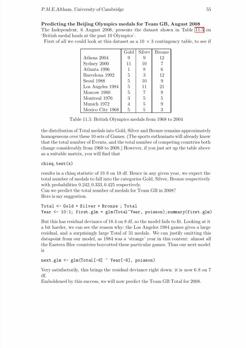
8/20/2019 Red w Sheets
http://slidepdf.com/reader/full/red-w-sheets 56/116
P.M.E.Altham, University of Cambridge 55
Predicting the Beijing Olympics medals for Team GB, August 2008The Independent, 6 August 2008, presents the dataset shown in Table 11.5 on‘British medal hauls at the past 10 Olympics’.
First of all we could look at this dataset as a 10 × 3 contingency table, to see if
Gold Silver BronzeAthens 2004 9 9 12Sydney 2000 11 10 7Atlanta 1996 1 8 6Barcelona 1992 5 3 12Seoul 1988 5 10 9Los Angeles 1984 5 11 21Moscow 1980 5 7 9Montreal 1976 3 5 5Munich 1972 4 5 9Mexico City 1968 5 5 3
Table 11.5: British Olympics medals from 1968 to 2004
the distribution of Total medals into Gold, Silver and Bronze remains approximatelyhomogeneous over these 10 sets of Games. (The sports enthusiasts will already knowthat the total number of Events, and the total number of competing countries bothchange considerably from 1968 to 2008.) However, if you just set up the table aboveas a suitable matrix, you will find that
chisq.test(x)
results in a chisq statistic of 19.8 on 18 df. Hence in any given year, we expect thetotal number of medals to fall into the categories Gold, Silver, Bronze respectively
with probabilities 0.242, 0.333, 0.425 respectively.Can we predict the total number of medals for Team GB in 2008?Here is my suggestion.
Total <- Gold + Silver + Bronze ; Total
Year <- 10:1; first.glm = glm(Total~Year, poisson);summary(first.glm)
But this has residual deviance of 18.4 on 8 df, so the model fails to fit. Looking at ita bit harder, we can see the reason why: the Los Angeles 1984 games gives a largeresidual, and a surprisingly large Total of 31 medals. We can justify omitting thisdatapoint from our model, as 1984 was a ‘strange’ year in this context: almost all
the Eastern Bloc countries boycotted these particular games. Thus our next modelis
next.glm <- glm(Total[-6] ~ Year[-6], poisson)
Very satisfactorily, this brings the residual deviance right down: it is now 6.8 on 7df.Emboldened by this success, we will now predict the Team GB Total for 2008.

8/20/2019 Red w Sheets
http://slidepdf.com/reader/full/red-w-sheets 57/116
P.M.E.Altham, University of Cambridge 56
> library(MASS)
> new.data <- data.frame(Year= 11)
> predict.glm(next.glm,newdata= new.data, type="response",se.fit=T)
$fit
1
29.15959
$se.fit
1
4.122133
> 29.15959- 2*4.122133 ; 29.15959 + 2*4.122133
[1] 20.91532
[1] 37.40386
So the predicted Total number of medals is 29.2, for which the confidence band isabout (20.9, 37.4), which I trust is wide enough for me to be proved correct in duecourse
August 25, 2008: Team GB has a Total of 47 medals, consisting of 19Gold, 13 Silver and 15 Bronze. So the Team GB performance was muchbetter than our past records led us to expect.
Note added March 2008: fitting a non-linear quasi-Poisson model to ac-tuarial dataWe may want to move outside the rather restricted framework of the GeneralizedLinear Model, and now R users may avail themselves of the powerful and flexibleGeneralized Nonlinear Model package, written by David Firth and Heather Turnerof Warwick University.
For example, actuaries use the Lee-Carter model to describe the dependence of mor-tality on age and calendar year. Suppose we have data on the deaths Day, at agea which we will assume in our example takes values 20, 21, . . . , 99, 100 and duringcalendar year y. We will assume y takes values 1947, 1948, . . . , 2003. Let eay rep-resent the ‘exposure’ corresponding to Day (for example this might be the numberof person-years at risk in that particular category). Assume further that Day hasexpectation µay, and variance φµay, for some unknown µay, φ. We model the de-pendence of µay on the age and the year. A Poisson model would have φ = 1, butit makes sense to allow φ to be different from 1 (because we expect over-dispersionrelative to the Poisson, in which case φ > 1). The Lee-Carter model states that
log(µay/eay) = αa + (exp β a)γ y
for a = 20, 21, . . . , 99, 100 and y = 1947, 1948, . . . , 2003. (We have written the modelin this form since it makes sense to have the multiplier exp β a > 0 always.)For parameter identifiability, we will take
α20 = 0, β 20 = 0, γ 1947 = 0.
Then, assuming we have read the data into R, and set up Age and Year as factors,the commands needed to fit the Lee-Carter model are

8/20/2019 Red w Sheets
http://slidepdf.com/reader/full/red-w-sheets 58/116
P.M.E.Altham, University of Cambridge 57
library(gnm)
first.gnm = gnm(Deaths ~ Age + Mult(Exp(Age),Year), constrain=c(82,163),
family="quasipoisson", offset=log(Exposure))
summary(first.gnm)
The ‘constrain=c(82,163)’ looks odd, but you’ll find it’s simply a matter of countingthe number of parameters in the model. You can omit ‘constrain=c(82,163)’, and
you will fitting an equivalent model, but I found the output harder to interpret aswe no longer have the β 20 = 0, γ 1947 = 0 constraint.Helpful plots are obtained, for example, by
library(relimp) ; library(qvcalc)
AgeContrasts = getContrasts(first.gnm, 82:162)
plot(AgeContrasts)

8/20/2019 Red w Sheets
http://slidepdf.com/reader/full/red-w-sheets 59/116
Chapter 12
Fisher’s exact test, 3-waycontingency tables, and Simpson’sparadox
Here we use the Poisson distribution for log-linear modelling of a two-way contin-gency table, and compare the results with the corresponding binomial formulation.We construct a fictitious 3-way table to illustrate Simpson’s paradox.The Daily Telegraph (28/10/88) under the headline ‘Executives seen as DrinkDrivethreat’ presented the following data from breath-test operations at Royal Ascot andat Henley Regatta (these being UK sporting functions renowned for alcohol intakeas well as racehorses and rowing respectively).Are you more likely to be arrested, if tested, at R.A. than at H.R.?You see below that a total of (24 + 2210) persons were breathalysed at R.A., andsimilarly a total of (5 + 680) were tested at H.R. Of these, 24 were arrested atR.A., and 5 at H.R. Hence the proportions arrested at R.A., H.R. respectively are
0.0107, 0.0073. We wish to test whether these are significantly different. In otherwords, we wish to test whether the breath-test result (arrested or not arrested) isindependent of the location (R.A. or H.R.).
r <- scan()
24 2210 # Royal Ascot
5 680 # Henley Regatta
Row <- c(1,1,2,2) ; Col <- c(1,2,1,2);ROW <- factor(Row);COL <- factor(Col)
# Col= 1 for ARRESTED,Col= 2 for NOT arrested
saturated <- glm(r~ ROW*COL,family=poisson)# for a perfect fit
independence <- glm(r~ ROW+COL,family=poisson)
summary(saturated)
This shows us that the ROW.COL term can be dropped: refer .39/.49 to N (0, 1).
summary(independence)
This shows us that the independence model fits well: refer the residual deviance of 0.67733 to χ2 with 1 df.Here is another way of answering the same question.
58

8/20/2019 Red w Sheets
http://slidepdf.com/reader/full/red-w-sheets 60/116
P.M.E.Altham, University of Cambridge 59
a <- c(24,2210) ; b<- c(5,680) ; tot <- a+b; p <- a/tot
Row <- c(1,2) ; ROW<- factor(Row)
indep <- glm(p~ 1 ,family=binomial,weights=tot)
and you will see that this last model also has residual deviance of 0 .67733 with 1 df.Recall that two independent Poisson random variables conditioned on their sumgives a binomial.
Telling the same story are
chisq.test(rbind(a,b)) # for an asymptotically equivalent result.
fisher.test(rbind(a,b)) # for Fisher’s ‘Exact’ test
Now a little piece of fantasy, with a serious educational purpose (of course).It can be very misleading to “collapse” a 3-way table, say Ascot/Henley × Ar-rest/NonArrest × Men/Women over one of the dimensions, say Men/Women. Forexample (pure invention) suppose the above 2 × 2 table was in fact
24=23,1 2210=2,2208
5 =3,2 680=340,340
the first number of each pair being the number of men, the second being the numberof women. We analyse this 3-way table, again using a loglinear model, and thePoisson distribution.
r <- scan()
23 2 1 2208
3 340 2 340
Row <- c(1,1,1,1,2,2,2,2);Col <- c(1,2,1,2,1,2,1,2)
gender <- c(1,1,2,2,1,1,2,2)ROW<- factor(Row) ; COL <- factor(Col) ; GENDER<- factor(gender)
sat <- glm(r~ROW*COL*GENDER ,poisson) ; summary(sat)
Of course we have invented an example with a strong 3-way interaction. This meansthat the relation between any two of the factors, say rows and columns, depends onthe level of the third factor, here the Gender. You should consider the following twoquestions.How does the arrest rate for men vary between Ascot and Henley?How does the arrest rate for women vary between Ascot and Henley?This is an example of ‘Yule’s paradox’. (An historical note: G.U.Yule was a Fellow
of St John’s college, Cambridge at the start of the last century.) It must be admittedthat most people outside Cambridge call it Simpson’s paradox (Simpson wrote about‘his’ paradox in 1951, whereas Yule had written about it about 50 years earlier.)Here is another example of a 3-way table, with data collected by M.Raza (2003) on50 recent famous movies. We look at the interdependence of the following 3 factors:whether or not the movie gets a BAFTA award (1 if successful, 0 otherwise)whether or not the movie gets a Golden Globe (1 if successful, 0 otherwise)whether or not the movie gets an Academy Award (1 if successful, 0 otherwise).This gives us Table12.1.
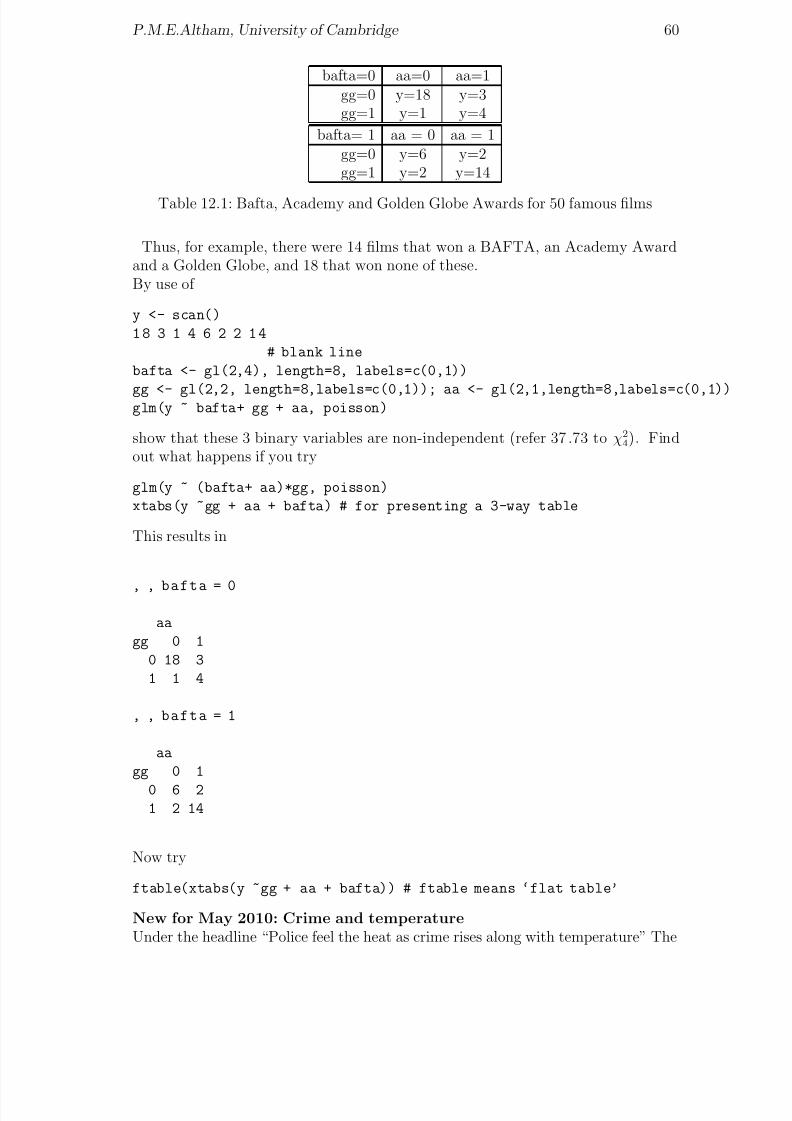
8/20/2019 Red w Sheets
http://slidepdf.com/reader/full/red-w-sheets 61/116
P.M.E.Altham, University of Cambridge 60
bafta=0 aa=0 aa=1gg=0 y=18 y=3gg=1 y=1 y=4
bafta= 1 aa = 0 aa = 1gg=0 y=6 y=2gg=1 y=2 y=14
Table 12.1: Bafta, Academy and Golden Globe Awards for 50 famous films
Thus, for example, there were 14 films that won a BAFTA, an Academy Awardand a Golden Globe, and 18 that won none of these.By use of
y <- scan()
1 8 3 1 4 6 2 2 1 4
# blank line
bafta <- gl(2,4), length=8, labels=c(0,1))
gg <- gl(2,2, length=8,labels=c(0,1)); aa <- gl(2,1,length=8,labels=c(0,1))glm(y ~ bafta+ gg + aa, poisson)
show that these 3 binary variables are non-independent (refer 37.73 to χ24). Find
out what happens if you try
glm(y ~ (bafta+ aa)*gg, poisson)
xtabs(y ~gg + aa + bafta) # for presenting a 3-way table
This results in
, , bafta = 0
aa
gg 0 1
0 18 3
1 1 4
, , bafta = 1
aa
gg 0 1
0 6 21 2 14
Now try
ftable(xtabs(y ~gg + aa + bafta)) # ftable means ‘flat table’
New for May 2010: Crime and temperatureUnder the headline “Police feel the heat as crime rises along with temperature” The

8/20/2019 Red w Sheets
http://slidepdf.com/reader/full/red-w-sheets 62/116
P.M.E.Altham, University of Cambridge 61
Independent of May 26, 2010, gives the following data on ‘Calls to Greater Manch-ester Police: what a difference 12 deg C makes’:For the weekend of May 21-23, when the Manchester temperature had a highof 27deg C , the number of calls to the GMP on Friday, Saturday, Sunday were3702, 4193, 3825 respectively. The corresponding figure for the weekend of May 14-17, when the Manchester temperature had a high of 15 deg C , were 3200, 3414, 3484
respectively. Try the following program, and interpret the results.n <- c(3702,3200,4193,3414,3825,3484)
Heat <- gl(2,1, length=6, labels = c("hot", "cool"))
Day <- gl(3,2, length=6, labels = c("Fri", "Sat","Sun"))
first.glm <- glm( n ~ Heat + Day, poisson)
summary(first.glm)
summary(glm(n ~ Heat + Day, family =quasipoisson))

8/20/2019 Red w Sheets
http://slidepdf.com/reader/full/red-w-sheets 63/116
Chapter 13
Defining a function in R, to plotthe contours of a log-likelihoodfunction
Here we plot the contours for the Poisson regression log-likelihood surface corre-sponding to the ‘Aids’ dataset used in Worksheet 10.
You will see how to define and use a function in R.
y <- scan("aids") # same data as before.
i <- 1:36 ; ii<- i-mean(i) # to make the surface a better shape
aids.reg <- glm(y~ii,poisson)
summary(aids.reg, cor=T)
Our model is yi ∼ P o(µi), independent, with log(µi) = a + b ∗ ii. We see that ourmaximum likelihood estimates are a = 1.51 + / − .09 and b = .08 + / − .008. We
now compute the loglikelihood function, in terms of the parameters a, b.loglik <- function(a,b){
loglik <- - sum(exp(a+b*ii)) + a*t1 +b*t2
loglik
}
Here t1 and t2 are the sufficient statistics, thus
t1 <- sum(y) ; t2 <- sum(ii*y)
We plot the loglikelihood surface for 1.3 ≤ a ≤ 1.7 and .05 ≤ b ≤ .09.
a <- 0:20 ; a <- a*(.02) + 1.3b <- 0:20 ; b <- b*(.002) + 0.05
zz <- 1: (21*21) ; z <- matrix(zz,21,21) # to set up z as a matrix
for (x in 1:21){
for (y in 1:21){
z[x,y] <- loglik(a[x],b[y])
}
}
z[1,] # to see the first row of the matrix
62

8/20/2019 Red w Sheets
http://slidepdf.com/reader/full/red-w-sheets 64/116
P.M.E.Altham, University of Cambridge 63
a
b
1.3 1.4 1.5 1.6 1.7
0 .
0 5
0 . 0
6
0 .
0 7
0 .
0 8
0 . 0
9
The elliptical contours of the log−likelihood function
Figure 13.1: The contours of the log-likelihood function
contour(a,b,z, xlab="a", ylab="b")
points(1.51, 0.08) # to put the mle on the graph
The elliptical contours are shown in Figure 13.1. Note that the elliptical contoursshow the negative correlation between the estimates of a and b.
image(a,b,z, col=terrain.colors(30))
persp(a,b,z,theta = 30, phi = 30, expand = 0.5, col = "lightblue")
also give nice plots, as shown in Figures 13.2, 13.3 respectively.

8/20/2019 Red w Sheets
http://slidepdf.com/reader/full/red-w-sheets 65/116
P.M.E.Altham, University of Cambridge 64
1.3 1.4 1.5 1.6 1.7
0
. 0 5
0 . 0
6
0 .
0 7
0 . 0
8
0 .
0 9
a
b
image(a,b,z, col=terrain.colors(30))
Figure 13.2: An image plot of the log-likelihood function
a
b
z
Figure 13.3: A perspective plot of the log-likelihood function (in Cambridge blue)

8/20/2019 Red w Sheets
http://slidepdf.com/reader/full/red-w-sheets 66/116

8/20/2019 Red w Sheets
http://slidepdf.com/reader/full/red-w-sheets 67/116
P.M.E.Altham, University of Cambridge 66
0 5 10 15 20 25
− 2
0
2
4
6
x
y
all points
all but the point of high leverage
Figure 14.1: An example of a single point of high leverage
x1 y1 x2 y2 x3 y3 x4 y410.0 8.04 10.0 9.14 10.0 7.46 8.0 6.588.0 6.95 8.0 8.14 8.0 6.77 8.0 5.76
13.0 7.58 13.0 8.74 13.0 12.74 8.0 7.719.0 8.81 9.0 8.77 9.0 7.11 8.0 8.84
11.0 8.33 11.0 9.26 11.0 7.81 8.0 8.4714.0 9.96 14.0 8.10 14.0 8.84 8.0 7.04
6.0 7.24 6.0 6.13 6.0 6.08 8.0 5.254.0 4.26 4.0 3.10 4.0 5.39 19.0 12.50
12.0 10.84 12.0 9.13 12.0 8.15 8.0 5.567.0 4.82 7.0 7.26 7.0 6.42 8.0 7.915.0 5.68 5.0 4.74 5.0 5.73 8.0 6.89
Table 14.1: Anscombe’s cunning quartet
data(anscombe) # as it is already an R dataset
attach(anscombe) # to put the column headings on
par(mfrow=c(2,2))
plot(y1~x1, xlim=c(3,20), ylim=c(3,15))
abline(lm(y1~x1))
plot(y2~x2, xlim=c(3,20), ylim=c(3,15))
abline(lm(y2~x2))
plot(y3~x3, xlim=c(3,20), ylim=c(3,15))
abline(lm(y3~x3))
plot(y4~x4,xlim=c(3,20), ylim=c(3,15))
abline(lm(y4~x4))

8/20/2019 Red w Sheets
http://slidepdf.com/reader/full/red-w-sheets 68/116
P.M.E.Altham, University of Cambridge 67
5 10 15 20
4
6
8
1 0
1 2
1 4
x1
y 1
5 10 15 20
4
6
8
1 0
1 2
1 4
x2
y 2
5 10 15 20
4
6
8
1 0
1 2
1 4
x3
y 3
5 10 15 20
4
6
8
1 0
1 2
1 4
x4
y 4
Figure 14.2: Four identical regression lines: which one do you trust?
summary(lm(y1 ~x1)) # .... and so on
The resulting 4 graphs are given as Figure 14.2.
We will now look at the Hat matrix, H . This will involve using R for some linearalgebra.Reminder, in the general linear model
Y i = β T xi + i, 1 ≤ i ≤ n
equivalentlyY = Xβ + ,
where X is an n× p matrix, assumed to be of rank p, the Least Squares Estimatorβ of β is β = (X T X )−1X T Y , and so the fitted values Y may be written
Y = Xβ = HY,
thus defining the matrix H as H = X (X T X )−1X T . (You may check that H = H T ,and HH = H , further tr(H ) = p.) Note that
Y i = ΣhijY j :
this shows you the special role of (hii), the diagonal elements of H , called theleverages. You could now try some influence or leverage plots: for example

8/20/2019 Red w Sheets
http://slidepdf.com/reader/full/red-w-sheets 69/116

8/20/2019 Red w Sheets
http://slidepdf.com/reader/full/red-w-sheets 70/116
Chapter 15
Football arrests, Poisson and thenegative binomial regressions
This dataset comes from the National Criminal Intelligence Service, and representFootball- related arrest figures for 2000/2001, classified by ‘Team Supported’, for
each of the four UK divisions. We use this dataset as an illustration of over-dispersion relative to the Poisson distribution, and how to fit an appropriate model.Premiership, 1stDivision, 2ndDivision, 3rdDivision are the 4 columns of total arrestsbelow, which you can read via
read.table(" ", header=T)
54 38 16 3
60 38 6 15
80 61 52 25
17 44 33 40
74 83 0 1735 7 5 5
28 11 6 18
108 17 13 26
18 27 93 15
119 19 13 9
69 26 7 12
78 14 19 59
148 51 13 3
150 31 47 20
105 41 13 10
191 29 25 015 90 13 11
166 83 49 9
54 14 72 5
54 12 41 12
NA 20 10 20
NA 24 27 10
NA 11 24 1
NA 25 4 6
69
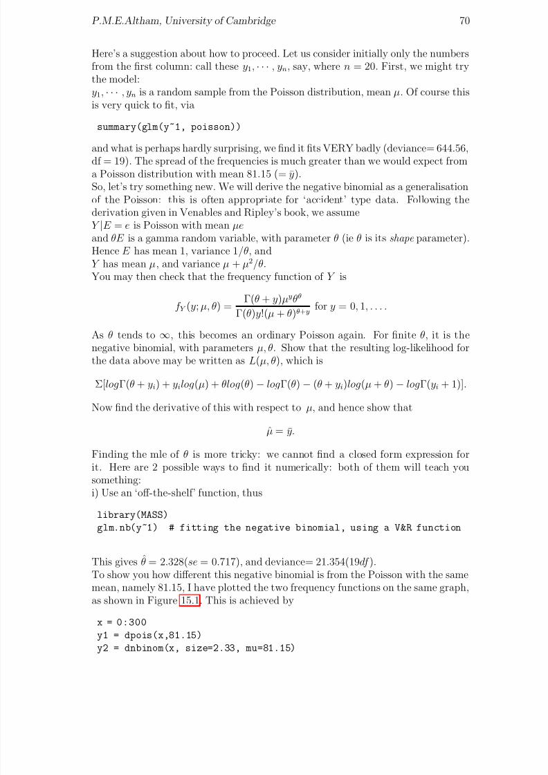
8/20/2019 Red w Sheets
http://slidepdf.com/reader/full/red-w-sheets 71/116
P.M.E.Altham, University of Cambridge 70
Here’s a suggestion about how to proceed. Let us consider initially only the numbersfrom the first column: call these y1, · · · , yn, say, where n = 20. First, we might trythe model:y1, · · · , yn is a random sample from the Poisson distribution, mean µ. Of course thisis very quick to fit, via
summary(glm(y~1, poisson))
and what is perhaps hardly surprising, we find it fits VERY badly (deviance= 644.56,df = 19). The spread of the frequencies is much greater than we would expect froma Poisson distribution with mean 81.15 (= y).So, let’s try something new. We will derive the negative binomial as a generalisationof the Poisson: this is often appropriate for ‘accident’ type data. Following thederivation given in Venables and Ripley’s book, we assumeY |E = e is Poisson with mean µeand θE is a gamma random variable, with parameter θ (ie θ is its shape parameter).Hence E has mean 1, variance 1/θ, andY has mean µ, and variance µ + µ2/θ.You may then check that the frequency function of Y is
f Y (y; µ, θ) = Γ(θ + y)µyθθ
Γ(θ)y!(µ + θ)θ+y for y = 0, 1, . . . .
As θ tends to ∞, this becomes an ordinary Poisson again. For finite θ, it is thenegative binomial, with parameters µ, θ. Show that the resulting log-likelihood forthe data above may be written as L(µ, θ), which is
Σ[logΓ(θ + yi) + yilog(µ) + θlog(θ) − logΓ(θ) − (θ + yi)log(µ + θ) − logΓ(yi + 1)].
Now find the derivative of this with respect to µ, and hence show that
µ = y.
Finding the mle of θ is more tricky: we cannot find a closed form expression forit. Here are 2 possible ways to find it numerically: both of them will teach yousomething:i) Use an ‘off-the-shelf’ function, thus
library(MASS)
glm.nb(y~1) # fitting the negative binomial, using a V&R function
This gives θ = 2.328(se = 0.717), and deviance= 21.354(19df ).To show you how different this negative binomial is from the Poisson with the samemean, namely 81.15, I have plotted the two frequency functions on the same graph,as shown in Figure 15.1. This is achieved by
x = 0:300
y1 = dpois(x,81.15)
y2 = dnbinom(x, size=2.33, mu=81.15)

8/20/2019 Red w Sheets
http://slidepdf.com/reader/full/red-w-sheets 72/116
P.M.E.Altham, University of Cambridge 71
0 50 100 150 200 250 300
0 . 0
0
0 .
0 1
0 .
0 2
0
. 0 3
0 .
0 4
x
f r e q u e n c y
f u n c t i o n
Poisson with mean 81.15
negative binomial with mean 81.15, size=2.33
Figure 15.1: Comparing the Poisson and the negative binomial
matplot(x, cbind(y1,y2), type="l", ylab = "frequency function")
legend("topright", lty=c(1,2),
legend=c("Poisson with mean 81.15",
"negative binomial with mean 81.15, size=2.33"))
ii) Set up the function −L(µ, θ) in R, (see below) and minimise this 2-parameterfunction in R, finding also the matrix of 2nd derivatives at the same time, in orderthat you can then invert this to derive the asymptotic covariance matrix of the mle’s,(µ, θ).
loglik <- function(p){
#actually this is minus log-lik, since nlm() MINIMISES
th <- p[1] ; mu <- p[2]
-(sum(lgamma(th+y)+y*log(mu/(mu+th))
+th*log(th/(mu+th))-lgamma(th)-lgamma(y+1)))
}
nlm(loglik,p=c(2,80), hessian=T)
When I repeated these calculations for the other 3 divisions, I found that myestimates of θ for each of the 4 divisions were, respectively
2.328(0.717), 2.525(0.745), 1.275(0.371), 1.51(0.48)
and I have to say that I am unable to interpret the fact that θ is around 2: perhapsYOU can offer an explanation for this? (Unfortunately total match attendancefigures, which must surely be relevant, seem to be unavailable.) One thing you willnotice is that while the Poisson distribution with mean 81.15 looks very symmetric

8/20/2019 Red w Sheets
http://slidepdf.com/reader/full/red-w-sheets 73/116
P.M.E.Altham, University of Cambridge 72
(and Gaussian), the negative binomial with parameters 81.15, 2.33 is highly skew,with a long tail to the right.Go back to your expression for ∂L/∂µ: of course we know that this has expectedvalue equal to zero. Take the derivative of this expression with respect to θ, andthen take the expectation. Hence show that, asymptotically, µ, θ are uncorrelated.Yudi Pawitan points out that although the deviance for the negative binomial cannot
be interpreted as a goodness of fit test (the chi-sq distribution theory does not apply)we can do an ‘eyeball’ test of the goodness of fit as follows
yran <- rnbinom(20,mu=81.15, size=2.32)
# to generate a sample from this distribution
qqplot(y,yran) ; abline(0,1)
Note that for θ unknown, the negative binomial does NOT lie within the glm frame-work. But consider the following special case. Suppose θ is known, and y1, . . . , yn areindependent negative binomial, with parameters µ1, . . . , µn and common parameterθ. Consider the following link function
µi/(µi + θ) = exp β T xi
for given covariates x1, . . . , xn. Show that this gives a glm with the canonical link,and obtain the equations for β .
Finally, here’s a recent set of data on soccer arrests, for the 4 divisions in Englandand Wales. Under the headline ‘High-tech hooligans lure youths to football ‘firms”,The Times, on August 19, 2003, gives the following data for the 2002-2003 season.The column headings aretotarr = total arrests, and viol= arrests for violent disorder.
Premiership
totarr viol
ManchesterUtd 186 13
Sunderland 185 6
NewcastleUtd 139 2
BirminghamCity 138 27
Liverpool 133 8
Chelsea 122 5
Everton 119 3
ManchesterCity 110 6
LeedsUtd 104 5AstonVilla 101 23
T’hamHotspur 88 9
Middlesborough 67 0
W,Brom.Albion 63 2
W.HamUtd 57 3
Arsenal 53 2
BlackburnRovers 51 0
BoltonWanderers 45 1
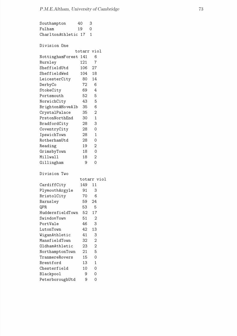
8/20/2019 Red w Sheets
http://slidepdf.com/reader/full/red-w-sheets 74/116
P.M.E.Altham, University of Cambridge 73
Southampton 40 3
Fulham 19 0
CharltonAthletic 17 1
Division One
totarr viol
NottinghamForest 141 6Burnley 121 7
SheffieldUtd 106 27
SheffieldWed 104 18
LeicesterCity 80 14
DerbyCo 72 6
StokeCity 69 4
Portsmouth 52 5
NorwichCity 43 5
Brighton&HoveAlb 35 6
CrystalPalace 35 2
PrstonNorthEnd 30 1BradfordCity 28 3
CoventryCity 28 0
IpswichTown 28 1
RotherhamUtd 28 0
Reading 19 2
GrimsbyTown 18 0
Millwall 18 2
Gillingham 9 0
Division Two
totarr viol
CardiffCity 149 11
PlymouthArgyle 91 3
BristolCity 70 6
Barnsley 59 24
QPR 53 5
HuddersfieldTown 52 17
SwindonTown 51 2
PortVale 46 3
LutonTown 42 13
WiganAthletic 41 3MansfieldTown 32 2
OldhamAthletic 23 2
NorthamptonTown 21 5
TranmereRovers 15 0
Brentford 13 1
Chesterfield 10 0
Blackpool 9 0
PeterboroughUtd 9 0

8/20/2019 Red w Sheets
http://slidepdf.com/reader/full/red-w-sheets 75/116
P.M.E.Altham, University of Cambridge 74
CheltenhamTown 8 1
ColchesterUtd 8 0
NottsCounty 8 0
CreweAlexandra 7 0
StockportCounty 6 1
WycombeWanderers 3 1
Division Three
totarr viol
LincolnCity 52 17
CarlisleUtd 42 9
SwanseaCity 32 2
ScunthorpeUtd 29 1
HartlepoolUtd 25 0
Wrexham 24 1
ShrewsburyTn 21 1
BristolRovers 18 3
CambridgeUtd 16 0BostonUtd 15 3
Bournemouth 15 1
Darlington 14 0
ExeterCity 13 0
YorkCity 13 2
HullCity 12 0
OxfordUtd 10 0
Rochdale 10 0
Bury 8 2
LeytonOrient 7 1
SouthendUtd 7 0
Rushden&Diamonds 1 0
KidderminsterH’s 0 0
Macclesfield 0 0
TorquayUtd 0 0
Note that you can very quickly fit negative binomials, in R, thus
library(MASS)
fitdistr(totarr,"Negative Binomial")
You might like to consider how the parameters θ change between the 4 divisions,and to see whether you can offer any interpretation.

8/20/2019 Red w Sheets
http://slidepdf.com/reader/full/red-w-sheets 76/116
Chapter 16
An interesting data set onElection turnout and poll leads
What happens when we model the data given by Prof Pippa Norris (Harvard Uni-versity) in the Financial Times of April 20, 2005?
See ‘Stirring up apathy?’Here is her dataset, with my analysis in R.
>PN.data
Year UKTurnout Poll_Lead
1 1945 72.8 6.0
2 1950 83.9 0.6
3 1951 82.6 4.5
4 1955 76.8 3.7
5 1959 78.7 2.8
6 1964 77.1 1.97 1966 75.8 10.4
8 1970 72.0 3.1
9 1974 78.8 3.6
10 1974 72.8 8.9
11 1979 76.0 5.3
12 1983 72.7 19.8
13 1987 75.3 8.0
14 1992 77.7 0.4
15 1997 71.4 16.0
16 2001 59.4 14.2
The linear regression of UKTurnout on Poll Lead has rather a poor fit, as shownbelow
> summary(lm(UKTurnout ~ Poll_Lead))
Call:
lm(formula = UKTurnout ~ Poll_Lead)
75
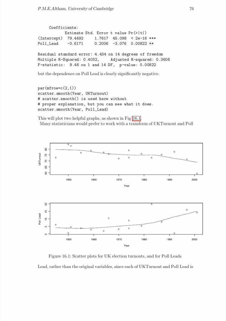
8/20/2019 Red w Sheets
http://slidepdf.com/reader/full/red-w-sheets 77/116
P.M.E.Altham, University of Cambridge 76
Coefficients:
Estimate Std. Error t value Pr(>|t|)
(Intercept) 79.4492 1.7617 45.098 < 2e-16 ***
Poll_Lead -0.6171 0.2006 -3.076 0.00822 **
Residual standard error: 4.434 on 14 degrees of freedomMultiple R-Squared: 0.4032, Adjusted R-squared: 0.3606
F-statistic: 9.46 on 1 and 14 DF, p-value: 0.00822
but the dependence on Poll Lead is clearly significantly negative.
par(mfrow=c(2,1))
scatter.smooth(Year, UKTurnout)
# scatter.smooth() is used here without
# proper explanation, but you can see what it does.
scatter.smooth(Year, Poll_Lead)
This will plot two helpful graphs, as shown in Fig 16.1.Many statisticians would prefer to work with a transform of UKTurnout and Poll
1950 1960 1970 1980 1990 2000
6 0
6 5
7 0
7 5
8 0
Year
U K T u r n o u t
1950 1960 1970 1980 1990 2000
0
5
1 0
1 5
2 0
Year
P o l l_ L e a d
Figure 16.1: Scatter plots for UK election turnouts, and for Poll Leads
Lead, rather than the original variables, since each of UKTurnout and Poll Lead is

8/20/2019 Red w Sheets
http://slidepdf.com/reader/full/red-w-sheets 78/116
P.M.E.Altham, University of Cambridge 77
constrained to be between 0 and 100. In this context it is natural to use the logittransform, and so we define the transformed variables x and y below, and repeatthe linear regression, also including ‘Year’ as one of the independent variables. Thisgreatly improves the fit, and shows that each of the terms x, Year in the regressionequation is significant, with a negative coefficient.
>y <- log(UKTurnout/(100-UKTurnout))
>x <- log(Poll_Lead/(100-Poll_Lead))>first.lm <- lm(y ~ x + Year)
Call:
lm(formula = y ~ x + Year)
Coefficients:
Estimate Std. Error t value Pr(>|t|)
(Intercept) 15.963014 6.282647 2.541 0.0246 *
x -0.120186 0.047713 -2.519 0.0257 *
Year -0.007708 0.003161 -2.439 0.0298 *
Residual standard error: 0.199 on 13 degrees of freedom
Multiple R-Squared: 0.5891,Adjusted R-squared: 0.5259
F-statistic: 9.32 on 2 and 13 DF, p-value: 0.003083
library(lattice)
?cloud # to find out about a 3-d scatter plot
We see that both x and Year have coefficients that are negative and significant.But, study of standard regression ‘diagnostics’ shows that the 2001 row is highly‘influential’ in the regression, so we repeat the linear model omitting that point: the
results are then less dramatic.
>summary(lm(y ~ x + Year, subset = (Year != 2001)))
Call:
lm(formula = y ~ x + Year, subset = (Year != 2001))
Residuals:
Min 1Q Median 3Q Max
-0.27468 -0.07640 0.03179 0.06444 0.29538
Coefficients:
Estimate Std. Error t value Pr(>|t|)(Intercept) 10.153553 5.597677 1.814 0.0948 .
x -0.103097 0.039732 -2.595 0.0235 *
Year -0.004719 0.002826 -1.670 0.1208
Residual standard error: 0.1636 on 12 degrees of freedom
Multiple R-Squared: 0.5084,Adjusted R-squared: 0.4265
F-statistic: 6.205 on 2 and 12 DF, p-value: 0.01412

8/20/2019 Red w Sheets
http://slidepdf.com/reader/full/red-w-sheets 79/116
P.M.E.Altham, University of Cambridge 78
These analyses are a bit simple minded, since they make the the standard assump-tion that residuals are independent and identically normal: I have done a quickcheck for serial correlation, and it appears to be non-significant.You could repeat this analysis including an extra row for 2005, for which UK-Turnout=61.3 % and Poll Lead =6 % (??)

8/20/2019 Red w Sheets
http://slidepdf.com/reader/full/red-w-sheets 80/116
Chapter 17
glm() with the gamma distribution
I first constructed this for the Part IIC course ‘Statistical Modelling’ in 2005.
We follow the notation of McCullagh and Nelder (1970), who define the densityfunction of the gamma distribution with mean µ and shape parameter ν as
f (y|µ, ν ) = 1
Γ(ν )(νy/µ)ν e−νy/µ 1
y
for y > 0.You may check that this gives
E (Y ) = µ, var(Y ) = (µ2)/ν,
and the density is of standard glm form with φ = 1/ν , and canonical link η = 1/µ.
We simulate from two gamma distributions below, and use the glm fitting procedure,with canonical link (ie the inverse). See if you can work out what’s going on.
library(MASS)
x <- (0:1000)/10
Y1 <- dgamma(x, shape=5, rate=0.1) # so true mean is 50
Y2 <- dgamma(x, shape=5, rate= 1) # so true mean is 5
matplot(x, cbind(Y1,Y2), type = "l", xlab="x",
ylab= "probability density function")
legend("topright", lty=c(1,2),
legend=c("first gamma density", "second gamma density"))
Figure 17.1 shows us these two densities. Now we will generate 2 random sam-ples, of sizes 100, 50 respectively, from these two densities, and use glm() to fit theappropriate model.
y1 = rgamma(100, shape=5, rate=0.1)
y2 = rgamma(50, shape=5, rate= 1.0)
In this notation, µ =shape/rate, and ν = shape. (So shape = 1 will give us anegative exponential distribution.)
79

8/20/2019 Red w Sheets
http://slidepdf.com/reader/full/red-w-sheets 81/116
P.M.E.Altham, University of Cambridge 80
0 20 40 60 80 100
0 .
0 0
0 .
0 5
0 .
1 0
0 .
1 5
0 .
2 0
x
p r o b a b i l i t y
d e n s i t y
f u n c t i o
n
first gamma density
second gamma density
Figure 17.1: Two very different gamma densities
par(mfrow=c(2,1))
truehist(y1) ; truehist(y2) # graphs not shown here
summary(y1); summary(y2)
Min. 1st Qu. Median Mean 3rd Qu. Max.
4.817 30.770 43.770 48.360 59.730 114.300
Min. 1st Qu. Median Mean 3rd Qu. Max.
1.173 3.000 4.716 4.694 6.083 10.410
x =c(rep("a", times=100), rep("b", times=50))
is.factor(x) ; x = factor(x)
y = c(y1,y2)
plot(x,y) # graphs not shown here
first.glm = glm(y~x, Gamma) # nb, do not use "gamma"
summary(first.glm)
Call:
glm(formula = y ~ x, family = Gamma)
Deviance Residuals:Min 1Q Median 3Q Max
-1.21730 -0.33643 -0.09652 0.25573 1.10905
Coefficients:
Estimate Std. Error t value Pr(>|t|)
(Intercept) 0.0209790 0.0009124 22.99 <2e-16 ***
xb 0.1720752 0.0119088 14.45 <2e-16 ***
---

8/20/2019 Red w Sheets
http://slidepdf.com/reader/full/red-w-sheets 82/116
P.M.E.Altham, University of Cambridge 81
Signif. codes: 0 ‘***’ 0.001 ‘**’ 0.01 ‘*’ 0.05 ‘.’ 0.1 ‘ ’ 1
(Dispersion parameter for Gamma family taken to be 0.1891440)
Null deviance: 144.609 on 149 degrees of freedom
Residual deviance: 28.430 on 148 degrees of freedom
AIC: 1095.8dev = residuals(first.glm, type="deviance")
summary(dev) ; sum(dev^2)
This fits 1/µi = α for the first 100 observations, and 1/µi = α + β for the remaining50 observations. What is 1/α?What is 1/(α + β )?Note that the estimate given for ν is the reciprocal of the dispersion parameter φ,and this dispersion parameter is estimated by
X 2/(n − p)
where n is the number of observations, and p is the number of parameters in thelinear model (here p = 2) and
X 2 = Σ[(yi − µi)/µi]2
Thus we find for this example that ν = 5.287. This is actually a ‘moments’ estimatorrather than the mle: as an exercise you can write down the equation for the max-imum likelihood extimator. You will find that this gives an equation involving thefunction Γ(ν )/Γ(ν ) (the digamma function), and there is no closed-form solution tothis equation.I must admit, I had difficulty working out where the AIC came from. It is, I believe,minus twice the maximised log-likelihood +2×3, since we were fitting 3 parameters.Try
> nu <- 5.287 # your simulation may mean you have a different estimator here
> fv <- first.glm$fitted.value
> term= -lgamma(nu) + nu*log(nu * y/fv) - (nu*y/fv) - log(y)
> sum(term)
-544.9114
and I trust you will see what I mean.
ReferenceP.McCullagh and J.A.Nelder Generalized Linear Models Chapman and Hall (1990).

8/20/2019 Red w Sheets
http://slidepdf.com/reader/full/red-w-sheets 83/116
Chapter 18
Crime and unemployment: acase-control study
This represents work done with the criminologist Prof D.P.Farrington. The rele-vant ‘matched-pairs’ dataset is reproduced below. I first analysed it in the GLIM
Newsletter in 1987: the GLIM commands are easily translated into equivalent Rcommands.As part of a study on unemployment and crime, Farrington et al use the followingdata on 36 boys:
Boy YearsinEmploy OffE YearsinUnemploy OffU
1 1.21 3 0.68 1
2 1.47 0 1.28 1
3 1.02 0 0.89 8
4 2.97 2 0.36 0
5 3.37 2 0.30 0
6 2.65 8 0.60 07 3.16 1 0.67 1
8 3.07 1 0.27 0
9 2.51 2 0.40 0
10 1.58 2 1.08 0
11 2.21 1 1.37 4
12 2.45 1 0.47 0
13 1.52 2 0.64 2
14 2.64 1 0.70 0
15 2.46 2 0.57 0
16 1.54 1 0.85 017 2.83 1 0.37 0
18 1.50 2 1.25 0
19 2.37 1 0.55 0
20 2.25 0 0.75 1
21 2.84 1 0.75 0
22 1.66 4 0.61 1
23 2.39 2 0.44 1
24 2.42 3 0.78 0
82

8/20/2019 Red w Sheets
http://slidepdf.com/reader/full/red-w-sheets 84/116
P.M.E.Altham, University of Cambridge 83
25 1.17 0 2.50 2
26 3.15 2 0.43 0
27 1.75 1 0.25 0
28 0.83 1 0.88 3
29 2.22 0 0.28 1
30 1.25 4 0.96 2
31 1.31 2 0.69 132 2.91 2 0.67 0
33 2.67 1 0.67 0
34 3.28 4 0.45 0
35 3.00 1 0.34 0
36 2.14 0 0.46 1
We explain this dataset, using almost the same notation as in the 1987 paper. Letn1i, n2i be the numbers of offences committed by the ith boy in Employment, Un-
employment respectively, in times t1i, t2i years. We assume n1i, n2i are independentPoisson, with
logE (n1i) = logλi + αlogt1i
logE (n2i) = logθ + logλi + αlogt2i
for i = 1, . . . , 36. Here λi corresponds to the inherent ‘criminality’ of the ith boy, andθ to the extra (or reduced) propensity to commit offences while in Unemploymentrather than Employment.An important feature of this data set is that each boy is his own ‘control’: we mustuse the information on the pairing of n1i, n2i in our analysis.We want to test the hypothesis θ = 1 against the alternative θ > 1, with λ1, . . . , λ36
and α as nuisance parameters. (As usual, we take log(λ1) = 0.) If the underlyingoffence process were exactly Poisson with constant rate over time, then we wouldhave α = 1. We can use glm() with a Poisson distribution and the log link toestimate the parameters in this model, as follows
>crimedata <- read.table("Fdata", header=T)
>attach(crimedata)
>N <- c(OffE,OffU) ; T <- c(YearsinEmploy,YearsinUnemploy)
>emp <- gl(2,36, length=72, labels= c("employed", "unemployed"))
>boy <- gl(36,1, length=72)
>first.glm <- glm(N ~ boy + emp + log(T), poisson)
>summary(first.glm)Call:
glm(formula = N ~ boy + emp + log(T), family = poisson)
Deviance Residuals:
Min 1Q Median 3Q Max
-2.35751 -0.58849 -0.02662 0.20096 2.03317
Coefficients:
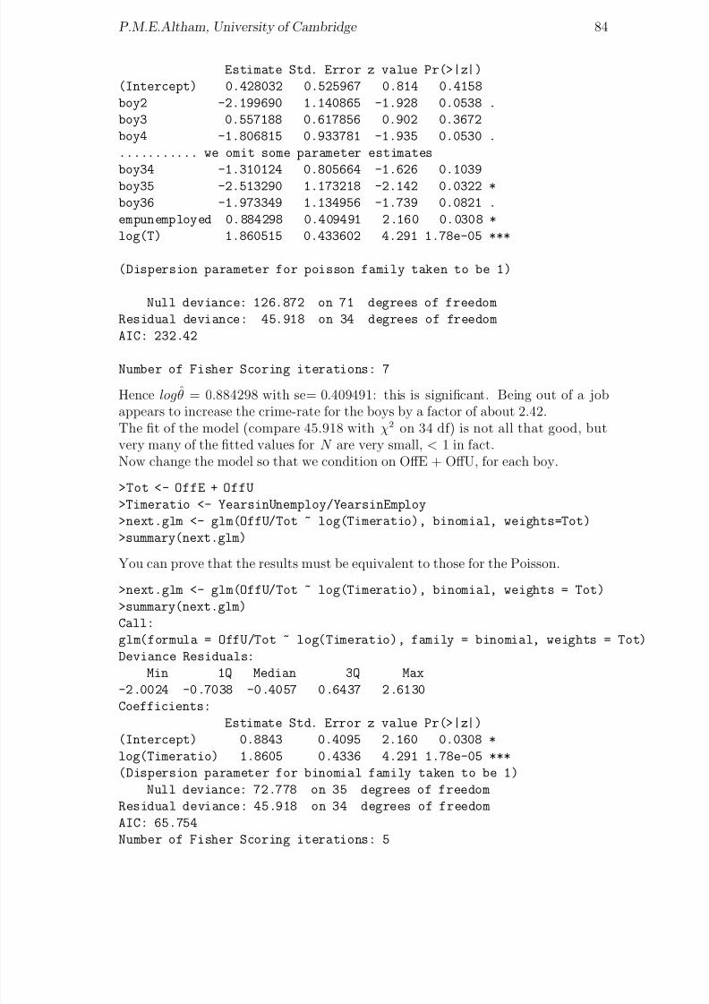
8/20/2019 Red w Sheets
http://slidepdf.com/reader/full/red-w-sheets 85/116
P.M.E.Altham, University of Cambridge 84
Estimate Std. Error z value Pr(>|z|)
(Intercept) 0.428032 0.525967 0.814 0.4158
boy2 -2.199690 1.140865 -1.928 0.0538 .
boy3 0.557188 0.617856 0.902 0.3672
boy4 -1.806815 0.933781 -1.935 0.0530 .
........... we omit some parameter estimates
boy34 -1.310124 0.805664 -1.626 0.1039boy35 -2.513290 1.173218 -2.142 0.0322 *
boy36 -1.973349 1.134956 -1.739 0.0821 .
empunemployed 0.884298 0.409491 2.160 0.0308 *
log(T) 1.860515 0.433602 4.291 1.78e-05 ***
(Dispersion parameter for poisson family taken to be 1)
Null deviance: 126.872 on 71 degrees of freedom
Residual deviance: 45.918 on 34 degrees of freedom
AIC: 232.42
Number of Fisher Scoring iterations: 7
Hence logθ = 0.884298 with se= 0.409491: this is significant. Being out of a jobappears to increase the crime-rate for the boys by a factor of about 2.42.The fit of the model (compare 45.918 with χ2 on 34 df) is not all that good, butvery many of the fitted values for N are very small, < 1 in fact.Now change the model so that we condition on OffE + OffU, for each boy.
>Tot <- OffE + OffU
>Timeratio <- YearsinUnemploy/YearsinEmploy
>next.glm <- glm(OffU/Tot ~ log(Timeratio), binomial, weights=Tot)>summary(next.glm)
You can prove that the results must be equivalent to those for the Poisson.
>next.glm <- glm(OffU/Tot ~ log(Timeratio), binomial, weights = Tot)
>summary(next.glm)
Call:
glm(formula = OffU/Tot ~ log(Timeratio), family = binomial, weights = Tot)
Deviance Residuals:
Min 1Q Median 3Q Max
-2.0024 -0.7038 -0.4057 0.6437 2.6130
Coefficients:Estimate Std. Error z value Pr(>|z|)
(Intercept) 0.8843 0.4095 2.160 0.0308 *
log(Timeratio) 1.8605 0.4336 4.291 1.78e-05 ***
(Dispersion parameter for binomial family taken to be 1)
Null deviance: 72.778 on 35 degrees of freedom
Residual deviance: 45.918 on 34 degrees of freedom
AIC: 65.754
Number of Fisher Scoring iterations: 5

8/20/2019 Red w Sheets
http://slidepdf.com/reader/full/red-w-sheets 86/116
P.M.E.Altham, University of Cambridge 85
Here the intercept corresponds to log(θ), having an estimate identical to that ob-tained in the Poisson regression.You could consideri) how to allow for the over-dispersionii) is there a way of doing an exact test of H 0 : log(θ) = 0?iii) how to allow for the fact that we could not expect n1i, n2i to be truly Poisson:
these 36 boys have been selected from the total of nearly 400 boys in the study asthose who have committed at least 1 offence while in Employment or in Unemploy-ment, and have had at least .25 years in each of Employment and Unemployment.References1. Altham, P.M.E. and Farrington, D.P. ‘A Matched Pairs problem with discretedata: a comparison of offending rates under employment and unemployment’ GLIM
Newsletter , 14, pp. 11-14, 1987.2. Farrington, D.P. et al ‘Unemployment, School Leaving and Crime’ British Journal
of Criminology 26, pp. 335-356, 1986.

8/20/2019 Red w Sheets
http://slidepdf.com/reader/full/red-w-sheets 87/116
Chapter 19
Maximising a multi-parameterlog-likelihood: an example fromgenomics
Here we are essentially estimating the parameters in a model of quasi-independencein a square contingency table. Mary-Rose Wilkinson of Trinity College wrote herdissertation for the MPhil in Statistical Science, University of Cambridge, 2005 on‘Analysing the Frequencies of Loop Lengths of Genomic G-Quadruplex Structures’in which she analysed data (particularly square contingency tables) kindly providedby Dr Julian Huppert of the Sanger Centre.Here is an extract from her dissertation.‘In this project I analyse data collected by Dr Julian Huppert on the loop lengthsof putative G-quadruplex structures identified in the human genome. This analysisshows that there are statistical structures present in the data which indicate that atleast some proportion of these putative G-quadruplex structures actually do form
G-quadruplex structures under certain physiological conditions.’DNA is a long polymer made up of a series of units called nucleotides. Each nu-cleotide consists of a sugar, a phosphate group and an organic molecule (a heterocy-cle) called a base which is one of adenine (A), cytosine (C), guanine (G) or thymine(T). It is well known that the usual structure of DNA is the double-helix (like a spi-ral staircase, with the sugar-phosphate backbone forming the ‘railing’ and the basesof the nucleotides being the ‘steps’). However, sequences of bases of certain patternscan form other structures, and one structure which can be formed by guanine richsequences is the G-quadruplex.The G-quadruplex structure has a core of stacked tetrads linked by three loops.
These loops are sequences of between one and seven bases, and the combination of lengths of the three loops affects the stability and shape of the G-quadruplex. Theseloops are the focus of this dissertation.Dr Huppert developed a ‘quadruplex folding rule’ which says that sequences of basesof a particular form will form a G-quadruplex structure under certain physiologi-cal conditions. Dr Huppert also developed an algorithm called ‘Quadparser’ whichhe used to search the whole of the human genome for sequences which satisfy thisrule. Although Dr Huppert had identified that sequences of this form could form G-quadruplexes, it was not known how many of them actually do form G-quadruplex
86

8/20/2019 Red w Sheets
http://slidepdf.com/reader/full/red-w-sheets 88/116
P.M.E.Altham, University of Cambridge 87
structures physiologically in the genome.For each putative G-quadruplex structure identified by Quadparser, the three lengthsof the loops that would be formed if the sequence formed a G-quadruplex physiolog-ically were recorded. As these loops are of between one and seven bases in length,this gave a 7 × 7 × 7 contingency table, each dimension of the contingency tablegiving the length of one of the loops.
The aim of this project was to analyse the contingency table, investigating whetherthere were statistical structures present. Presence of statistical structures wouldindicate that the sequences identified show evidence of evolutionary selection, andhence that they may actually form G-quadruplexes physiologically in the genome.’The three loop-lengths are very definitely non-independent: there is a predominanceof frequencies in the diagonal cells.‘Further analysis of the three-way contingency table did not initially lead in a partic-ular direction for further work, so I collapsed the table by summing over the lengthsof loop two to give a 7 × 7 contingency table showing the lengths of loops one andthree. It was natural to consider loops one and three together as they have a similarposition in the G-quadruplex structure.
This two-way contingency table had three interesting features. Firstly it was almostexactly symmetric, secondly there were a large number of counts where one or bothof loops one or three were only one base long, and thirdly, there were a large numberof counts on the diagonal, where the lengths of the two loops are the same. As thefirst row and column of this table had such a dominating effect I excluded themfrom the next section of the analysis, and fitted a quasi-independence model to theremaining 6× 6 table, which would model the excess of counts on the diagonal andthe symmetry.’ The quasi-independence model is a probability mixture model, givenby
pij =αθi + (1
−α)β 2i for i = j ;
(1 − α)β iβ j for i = j
where all parameters α, (θi), (β i) are between 0 and 1, and Σθi = 1 = Σβ i.Here the parameter of interest is the probability α, and we wish to estimate α and inaddition to give Dr Huppert an idea of how precise this estimate is: in other wordswe seek α, the mle, together with its standard error.In her project, Mary-Rose uses 3 distinct methods to tackle this problem:i) approximating α to Cohen’s Kappa statistic,ii) by numerically maximising the profile log-likelihood, andiii) by Markov Chain Monte Carlo.
The three estimates that were obtained agree very closely, the latter two methodsagreeing to give α = 0.098 to three decimal places, with a very tight confidenceinterval of (0.096, 0.010).She also modified her programs to run on the 7 x 7 contingency table, to includethe counts where one or both of the loops were just one base long; this gave slightlyhigher estimates. Those obtained through the profile log-likelihood and MarkovChain Monte Carlo methods were both 0.129 with confidence interval (0 .128, 0.131).The 7 × 7 table of frequencies (which is obtained by summing over the Loop 2positions) is given below:
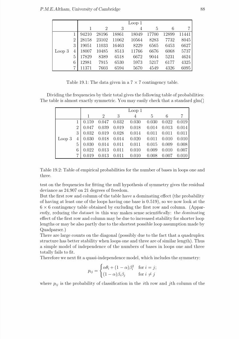
8/20/2019 Red w Sheets
http://slidepdf.com/reader/full/red-w-sheets 89/116
P.M.E.Altham, University of Cambridge 88
Loop 11 2 3 4 5 6 7
1 94210 28196 18861 18049 17700 12899 114412 28158 23102 11062 10564 8283 7732 80453 19051 11033 16463 8229 6565 6453 6627
Loop 3 4 18007 10485 8513 11766 6676 6068 57375 17829 8389 6518 6672 9044 5231 46246 12981 7915 6530 5973 5217 6177 43257 11371 7603 6594 5670 4549 4326 6095
Table 19.1: The data given in a 7 × 7 contingency table.
Dividing the frequencies by their total gives the following table of probabilities:The table is almost exactly symmetric. You may easily check that a standard glm()
Loop 11 2 3 4 5 6 7
1 0.159 0.047 0.032 0.030 0.030 0.022 0.0192 0.047 0.039 0.019 0.018 0.014 0.013 0.0143 0.032 0.019 0.028 0.014 0.011 0.011 0.011
Loop 3 4 0.030 0.018 0.014 0.020 0.011 0.010 0.0105 0.030 0.014 0.011 0.011 0.015 0.009 0.0086 0.022 0.013 0.011 0.010 0.009 0.010 0.0077 0.019 0.013 0.011 0.010 0.008 0.007 0.010
Table 19.2: Table of empirical probabilities for the number of bases in loops one andthree.
test on the frequencies for fitting the null hypothesis of symmetry gives the residualdeviance as 24.907 on 21 degrees of freedom.But the first row and column of the table have a dominating effect (the probabilityof having at least one of the loops having one base is 0.519), so we now look at the6 × 6 contingency table obtained by excluding the first row and column. (Appar-ently, reducing the dataset in this way makes sense scientifically: the dominatingeffect of the first row and column may be due to increased stability for shorter looplengths or may be also partly due to the shortest possible loop assumption made byQuadparser.)
There are large counts on the diagonal (possibly due to the fact that a quadruplexstructure has better stability when loops one and three are of similar length). Thusa simple model of independence of the numbers of bases in loops one and threetotally fails to fit.Therefore we next fit a quasi-independence model, which includes the symmetry:
pij =
αθi + (1 − α)β 2i for i = j ;
(1 − α)β iβ j for i = j
where pij is the probability of classification in the ith row and jth column of the

8/20/2019 Red w Sheets
http://slidepdf.com/reader/full/red-w-sheets 90/116
P.M.E.Altham, University of Cambridge 89
table, that is the probability of having i bases on loop three and j bases on loopone.This is a probability mixture model: with probability α the row and column classi-fications must be the same, and with probability (1−α) the row and column classesare independent, but each with the same distribution.We are interested in estimating the probability α, as we believe that selective pres-
sures may favour the first and third loops being of similar length.Estimation of αMary-Rose estimated α using three different methods: by approximating α to Co-hen’s Kappa statistic, by numerically maximising the profile log-likelihood for α andby using Markov Chain Monte Carlo techniques.i) Estimation of α through Cohen’s Kappa (see Agresti, 2002, p453, ex 10.39.)Make the simplifying assumption (which turns out to be not quite true, as it hap-pens) that
θi = β i
for each i. Then we have
pij =
αθi + (1 − α)θ2i for i = j ;(1 − α)θiθ j for i = j
so pi+ = p+i = αθi + (1 − α)θi
j
θ j
which simplifies to give θi = pi+ = p+i. Alsoi
pii = . . . = α + (1 − α)i
pi+ p+i
giving α = (P o−
P e)/(1−
P e) where P o = pii and P e = pi+ p+i.(P o − P e)/(1 − P e) is Cohen’s Kappa. This was introduced by Cohen in 1960 tomeasure the agreement between ratings by two observers. Note that P o is the prob-ability the two observers agree and that P e is the probability of agreement if the twoobservers’ ratings are statistically independent, so P o − P e is the excess of observeragreement over that expected purely by chance. Dividing this numerator by (1−P e)means that Kappa equals 0 when the agreement equals that expected by chance andequals 1 when there is perfect agreement. The stronger the agreement, the higherthe value.For multinomial sampling, the sample estimate of Kappa is approximately normal,with variance given by
σ2(κ) = 1
n
P o(1 − P o)
(1 − P e)2 +
2(1 − P o)
2P oP e −
ˆ pii(ˆ pi+ + ˆ p+i
(1 − P e)3
+ (1 − P o)2
ˆ pij(ˆ p j+ + ˆ p+i)
2 − 4P 2e
(1 − P e)4
Mary-Rose found by using this method of calculating Cohen’s Kappa , α = 0.0947(to 4 d.p.) with standard error 0.0010 (to 4 d.p.).

8/20/2019 Red w Sheets
http://slidepdf.com/reader/full/red-w-sheets 91/116
P.M.E.Altham, University of Cambridge 90
Estimation of α through Classical Likelihood TheoryThe above method makes the assumption β i = θi ∀i, which may not be correct. Sowe now consider other methods of estimating α which do not require this assump-tion. One method is to work with the profile log-likelihood.The likelihood up to a constant is
i,j
pnij
ij =i
αθi + (1 − α)β 2i
niii= j
(1 − α)β iβ j
nij
=i
αθi + (1 − α)β 2i
(1 − α)β 2i
niii,j
(1 − α)β iβ j
nij
where nij is the number of counts in the (i, j) cell.This gives the log-likelihood as
l(α,θ,β ) =
iniilog
αθi + (1 − α)β 2i
(1 − α)β 2i
+
i,jnij log
(1 − α)β iβ j
=i
niilog
αθi + (1 − α)β 2i
(1 − α)β 2i
+i
(n+i + ni+)logβ i + nlog(1 − α)
where ni+ =
j nij, n+i =
j n ji and n = n++.Mary-Rose maximised this log-likelihood with respect to θ and β for specified valuesof α between 0.045 and 0.145 subject to
θi,
β i = 1 and θi, β i ≥ 0, using theR-function constrOptim. Thus she obtained l p(α), the profile log-likelihood for α,for 0 < α < 1. She chose the range of α to be 0.045 to 0.145 because of the estimate0.0947 obtained for α from Cohen’s Kappa.The maximum of the profile log-likelihood is at α = 0.0979 (to 4 d.p.) with a
confidence interval of (0.0960, 0.0998) obtained from the asymptotic chi-squareddistribution on one degree of freedom of the Wilk’s Statistic. (We require the region{α : l p(α) ≥ l p(α) − 1
2χ20.95,1} where χ2
0.95,1 is the 0.95 point of the χ21 distribution.)
This estimate agrees fairly closely with the estimate obtained using Cohen’s Kappa:subtracting twice the Cohen’s Kappa standard error estimate from the Cohen’sKappa estimate gives 0.0967 (to 4 d.p.), which lies just inside the confidence intervalobtained for α above. Also, the standard error is 0.00095, which agrees very closelywith the estimate obtained using Cohen’s Kappa, which was 0.00098.Modifying her Program slightly to run for the 7 by 7 table so as to use the datafrom the first row and column gives an estimate of α = 0.1291 (to 4 d.p.) witha confidence interval of (0.1276, 0.1307), higher than the estimate obtained before
when using the 6 by 6 table.The corresponding calculations for Cohen’s Kappa give α = 0.1093 (to 4 d.p.) withstandard error 0.0007 (to 4 d.p.). The estimate is higher due to the comparativelyvery large number of counts in cell (1,1).
The second two methods of the three considered agree to give α = 0.098 (to 3d.p.) for the 6 × 6 table, with 95% confidence interval (0.096, 0.100) (to 3 d.p.).The estimates obtained through Cohen’s Kappa do not agree so closely, but for thiscalculation we assumed β i = θi ∀i, which is only approximately true.While the methods used by Mary-Rose were interesting and certainly helped our

8/20/2019 Red w Sheets
http://slidepdf.com/reader/full/red-w-sheets 92/116
P.M.E.Altham, University of Cambridge 91
Method 6 by 6 data 7 by 7 dataCohen’s Kappa 0.0947 (0.0937,0.0957) 0.1093 (0.1086, 0.1100)
Profile log-likelihood 0.0979 (0.0960, 0.0998) 0.1291 (0.1276, 0.1307)MCMC 0.0978 (0.0959, 0.0998) 0.1291 (0.1276, 0.1306)
Table 19.3: Estimates obtained for α.
understanding, a more straightforward method, shown below, is simply to maximisethe log-likelihood function, and then to pick out var(α) from the appropriate termin the inverse of minus the matrix of second derivatives.The worksheet that follows shows firstly the 6×6 table of frequencies, followed by arather simple method for estimating α, the parameter of interest, by straightforwardmaximisation of the log-likelihood function, using
optim().
Here is the datafile “RJdata”.
23102 11062 10564 8283 7732 8045
11033 16463 8229 6565 6453 6627
10485 8513 11766 6676 6068 5737
8389 6518 6672 9044 5231 4624
7915 6530 5973 5217 6177 4325
7603 6594 5670 4549 4326 6095
And here is the corresponding R program. It is designed to make use of the elegantmatrix functions available in R.
original = scan("RJdata")k=6 # here we fit the model for a 6 by 6 table
original = matrix(original, nrow=k, byrow=T)
one = rep(1, times=k)
one = matrix(one, nrow=k, byrow=T)
rn = original %*% one ; cn = t(original)%*% one
# Thus we have computed the row-sums and the column-sums
D = diag(original)
N = sum(original)
od = N -sum(D)#sum of off-diagonal terms
j = k-1# we fit (2*j + 1) parameters
th= rep(.1, times=k) ; beta = rep(.1, times=k)# this sets up th & beta as vectors of the right length
# Now set up f as minus log-likelihood
f = function(x){
th[1:j] = x[1:j] ; th[k] = 1-sum(x[1:j])
beta[1:j] = x[k: (2*j)] ; beta[k] = 1- sum(x[k:(2*j)])
a=x[2*j +1]
-sum(D*log(a*th+(1-a)* beta^2))-sum((rn + cn-2*D)*log(beta))-od*log(1-a)
}

8/20/2019 Red w Sheets
http://slidepdf.com/reader/full/red-w-sheets 93/116
P.M.E.Altham, University of Cambridge 92
x = rep(.1,times=2*j+1)
f(x) # as a trial
x0 = rep(0.1, times=2*j +1) # starting value
first.opt = optim(x0, f, method="BFGS", hessian=T)
# we get a lot of error messages, but the method seems to be working ok
first.eigen = eigen(first.opt$hessian)
first.eigen$values # to check that hessian matrix is positive definite
x= first.opt$par
a = x[2*k -1] # this is our est of alpha
# I got alpha=0.09787283.
V = solve(first.opt$hessian)# to invert the Hessian matrix
se= sqrt(V[2*k -1,2*k -1]) # this is our se of the est of alpha
# I got se = 0.000999305.
# Now we compute the expected frequencies
th[1:j] = x[1:j] ; th[k] = 1-sum(x[1:j])
beta[1:j] = x[k: (2*j)] ; beta[k] = 1- sum(x[k:(2*j)])
Beta = matrix(beta,nrow=k, byrow=T)p = a*diag(th) + (1-a)* Beta %*% t(Beta)
sum(p) # to check these sum to 1
expected = p*N # fitted frequencies
dis = (original- expected)^2
(dis/expected) # to see contribution to chisq statistic
Chisq = sum(dis/expected) # here with 35-11=24 df
(i) You could experiment with other Optimization functions: see for example Ven-ables and Ripley (2002) Chapter 16.(ii) You could also readily adapt the program given above to estimate the mixing
probability α when we don’t assume that the table is symmetric, so that the modelnow becomes
pij =
αθi + (1 − α)β iγ i for i = j ;
(1 − α)β iγ j for i = j
where all parameters α, (θi), (β i), (γ i) are between 0 and 1, and Σθi = 1 = Σβ i = Σγ i.(iii) It should be possible, without much extra effort, to implement a version of theprogram given here in Splus. (You will need to replace
optim()
by
nlminb()
for example.) However, I had problems, so far unsolved, in getting the definition of the function
f()
to work in Splus.

8/20/2019 Red w Sheets
http://slidepdf.com/reader/full/red-w-sheets 94/116
Chapter 20
Miscellaneous datasets gathered in2006
In this chapter three examples are discussed: cannabis use and psychosis, the ‘HarryPotter’ effect, and life is a risky business if you are in a TV soap opera.
i) The BMJ, December 1, 2004, published ‘Prospective cohort study of cannabis,predisposition for psychosis, and Psychotic symptoms in young people’ by C.Henquetand others. This included the following table of data (slghtly simplified here).
cannabis use Number with Number without
at baseline psychosis outcome psychosis outcome
p.no none 294 1642
p.no some 59 216
p.yes none 47 133
p.yes some 23 22
____________________________________________________________
Here the first 2 rows of the table, ‘p.no’, correspond to those with no predispositionfor psychosis at baseline, and the second 2 rows of the table, ‘p.yes’, correspondto those with predisposition for psychosis at baseline. Thus for example, therewere 23 + 22 persons who had both cannabis use at baseline, and predisposition forpsychosis at baseline: of these 45, a total of 23 had a psychosis outcome. Note thatof those without a predisposition for psychosis, 15% of those with no cannabis usehad a psychosis outcome, compared with 21% of those with cannabis use. For thosewith a predisposition for psychosis, the difference was much more striking: 26% of those with no cannabis use had a psychosis outcome, compared with 51% of thosewith cannabis use. This suggests that there is a 3-way interaction between therows, columns and layers of the given 2× 2× 2 table, and we show how to test thisformally, in the following R analysis.
> cannabis <- read.table("cannabis", header=T); cannabis
cannabis.use with without predisposition
none 294 1642 no
93

8/20/2019 Red w Sheets
http://slidepdf.com/reader/full/red-w-sheets 95/116
P.M.E.Altham, University of Cambridge 94
some 59 216 no
none 47 133 yes
some 23 22 yes
> attach(cannabis) ; tot <- with + without
> summary(glm(with/tot~cannabis.use*predisposition,binomial,weights=tot))
> interaction.plot(predisposition,cannabis.use, with/tot)
> title("Proportion with a psychosis outcome")You can see that there is a significant interaction between cannabis.use and thebaseline predisposition for psychosis in terms of their effect on whether or not theyoung person develops psychotic symptoms: refer .66230/.37857 = 1.749 to N (0, 1).It’s usually much easier to interpret an interaction by a graph: see the interactionplot Figure 20.1 given here.What we have done above is to test the null hypothesis of no 3-way interaction in theoriginal 2×2×2 table. We can of course do this test in a much more straightforwardway, which will be exactly equivalent, by considering log crossratios, as follows.The first table is
cannabis use Number with Number withoutat baseline psychosis outcome psychosis outcome
p.no none 294 1642
p.no some 59 216
The log-crossratio for this table is say m1 = log(294 ∗ 216)/(1642 ∗ 59), with cor-responding estimated variance say v1 = (1/294) + (1/1642) + (1/59) + (1/216).Likewise, the second table is
cannabis use Number with Number without
at baseline psychosis outcome psychosis outcome
p.yes none 47 133
p.yes some 23 22
and the corresponding log-crossratio is say m2 = log(47 ∗ 22)/(133 ∗ 23), with esti-mated variance say v2 = (1/47) + (1/133) + (1/23) + (1/22).We assume the 2 tables are independent, and thus compute (m1−m2)/(v1 + v2)1/2.You will find this is 1.749, as above.
ii) ‘Harry Potter casts a spell on accident-prone children’ was published by Gwilym,Howard, Davies and Willett in the BMJ on 23 December 2005. The data givenbelow show the numbers of children aged 7-15 with musculoskeletal injuries who at-tended the emergency department of the John Radcliffe Hospital Oxford as weekend
admissions (ie between 8am Saturday and 8am Monday) over the summer monthsof a 3-year period.The launch dates of the two most recent Harry Potter books- The Order of the
Phoenix and The Half-Blood Prince were Saturday 21 June 2003 and Saturday 16July 2005: these weekends are marked * in the 26 rows of data given below. (NB Ihad to read the data from the graph given on p1506 so my numbers may very slightlydisagree with those actually used by Gwilym and his colleagues in the significancetest they carried out.) Here is the dataset I used, which you may read via

8/20/2019 Red w Sheets
http://slidepdf.com/reader/full/red-w-sheets 96/116
P.M.E.Altham, University of Cambridge 95
0 . 1
5
0 . 2
0
0 . 2
5
0 . 3
0
0 . 3
5
0 . 4
0
0 . 4
5
0 . 5
0
predisposition
m e a n o f w i t h / t o t
no yes
cannabis.use
some
none
Proportion with a psychosis outcome
Figure 20.1: Cannabis use and predisposition to psychosis
read.table(" ", header=T)
Date Year N
7-8June 2003 62
15-15June 2003 78
21-22June 2003 36 *
28-29June 2003 625-6July 2003 77
12-13July 2003 70
19-20July 2003 60
26-27July 2003 51
5-6June 2004 80
12-13June 2004 82
19-20June 2004 70
26-30June 2004 78
3-4July 2004 81
10-11July 2004 59
17-18July 2004 6424-25July 2004 61
4-5June 2005 50
11-12June 2005 81
18-19June 2005 61
25-26June 2005 66
2-3July 2005 75
9-10July 2005 77
16-17July 2005 37 *

8/20/2019 Red w Sheets
http://slidepdf.com/reader/full/red-w-sheets 97/116
P.M.E.Altham, University of Cambridge 96
23-24July 2005 43
30-31July 2005 67
6-7August 2005 60
The graph of the number of injuries against the weekend number is shown in Figure20.2. Note that there appears to be a seasonal pattern to the number of injuries.
1 2 3 4 5 6 7 8
4 0
5 0
6 0
7 0
8 0
Weekend
N
Harry Potter casts a spell on accident−prone children?
Figure 20.2: Harry Potter and the John Radcliffe hospital
For this reason we will use only the first 24 observations of the total of 26.
Year = Year[1:24] ; N= N[1:24] ; year<- factor(Year)
weekend <- gl(8,1, length=24) ; Weekend<- as.numeric(weekend)
plot(Weekend,N )
points(3,36, pch=4) ; points(7,37, pch=4)
# to mark the ‘Harry Potter’ weekends as special points on the graph
first.glm <- glm(N~ weekend + year, poisson)
# this has deviance 26.7 on 14 df, with large residuals for the HP weekends
i <- 1:24 # so we see what happens if we omit those two special points
next.glm <- glm(N~ weekend + year, poisson, subset=(i!=3)&(i!= 23))# this has deviance 11.7 on 12 df, & you can see that
last.glm <- glm(N~ weekend, poisson, subset=(i!=3)&(i!= 23))
# should fit well: indeed,it has deviance 15.7 on 14 df.
iii) ‘Death rates of characters in soap operas on British television: is a governmenthealth warning required?’ BMJ Dec 20, 1997, by Crayford, Hooper (a former Cam-bridge Diploma student) and Evans, gave Table 3, of which an extract is printed

8/20/2019 Red w Sheets
http://slidepdf.com/reader/full/red-w-sheets 98/116
P.M.E.Altham, University of Cambridge 97
below. These authors studied mortality in 4 well-known UK soap operas, Corona-tion Street, Eastenders, Brookside and Emmerdale (for which my brother was onceProducer) from 1985 (the start of Eastenders, the newest of the 4 operas) to mid-1997. The Table showsthe name of the soap operathe total number of deaths
the total number of deaths from ‘external causes’, eg murder, car crash, etcEpmf, the expected proportional mortality fraction from ‘external causes’ in anage-matched population (ie age-matched for the particular soap opera)
soap totaldeaths extdeaths Epmf
CorSt 14 6 .17
EastE 17 11 .22
Brooks 26 20 .28
Emmerd 28 17 .24
The authors comment that ‘characters in soap operas lead very dangerous lives’,and ‘their lives are more dangerous even than those of Formula One racing driversor bomb disposal experts’.Consider the following analysis in R. What is it telling you? Figure 20.3 shows you
0.0 0.2 0.4 0.6 0.8 1.0
0 . 0
0 . 2
0 . 4
0
. 6
0 . 8
1 . 0
Expected proportion
O b s e r v e d p r o p o r t i o n
CorSt
EastE
Brooks
Emmerd
Proportions dying from ‘external causes’ in soap operas
Figure 20.3: Warning: acting in a soap opera could damage your health
the plot of the observed proportion of ‘external causes’ deaths, against Epmf, theexpected proportion.
soap.data <- read.table("soap.data", header=T)
attach(soap.data)
p<- extdeaths/totaldeaths

8/20/2019 Red w Sheets
http://slidepdf.com/reader/full/red-w-sheets 99/116
P.M.E.Altham, University of Cambridge 98
plot(Epmf,p,type="n",xlim=c(0,1),ylim=c(0,1),xlab="Expected proportion",
+ ylab="Observed proportion")
text(Epmf, p, labels=soap)
abline(0,1)
title("Proportions dying from ‘external causes’ in soap operas")
first.glm <- glm(extdeaths/totaldeaths ~ 1, binomial, weights=totaldeaths)
summary(first.glm)cbind(extdeaths/totaldeaths, Epmf)
x <- log(Epmf/(1-Epmf))
next.glm<- glm(extdeaths/totaldeaths ~ x, binomial, weights=totaldeaths)
You will see that the coefficient of x in the second glm is 2.173(se = 1.079).If you check the original article on http://bmj/bmjjournals.com, you can see a pho-tograph from Brookside , captioned ‘Gladys meets her controversial end with the helpof her family’.

8/20/2019 Red w Sheets
http://slidepdf.com/reader/full/red-w-sheets 100/116
Chapter 21
An application of theBradley-Terry model to the Coruschess tournament, and to WorldCup football
Firstly I present the results from a Corus chess tournament, and analyse this datasetusing the Bradley-Terry model.The Times, February 1, 2006, gave the results of ‘The top group at the Corustournament at Wijk aan Zee in Holland’. The Times presented the results as theoff-diagonal elements of a 14 × 14 matrix, with 1, 1/2, 0 corresponding to a Win,Draw or Loss, respectively. In fact the key part of the data consists of just the14× 13/2 elements of the matrix which are above the diagonal, but here I choose toread in these as 91 rows of data, indicating which players, P1, ..., P14 beat, drew orlost against which other player. Thus, for example, the first row of the data matrixgiven below shows that when P1 played P2, the result was a Draw; the third row of the data matrix shows that when P1 played P4, the result was a Win for P1.Scoring 1, 1/2, 0 for a Win, Draw or Loss respectively, the total scores for the 14players were P1 (Anand)= 9, P2 (Topalev)= 9, P3 (Adams, the British player)=7.5, P4 (Ivanchuk)=7.5, P5 (Gelfand)= 7, P6 (Karjakin)= 7, P7 (Tiviakov)= 6.5,P8 (Leko) = 6.5, P9 (Aronian)= 6.5,P10 (VanWely) = 6, P11 (Bacrot)= 5.5, P12 (Mamedyarov)= 4.5, P13 (Kam-sky)=4.5, P14 (Sokolov)=4.The dataset is given below: can you think of a more economical way to read it in,getting R to do the work of setting up the patterned ‘design’ variables P1, ..., P14?
W Dr L P1 P2 P3 P4 P5 P6 P7 P8 P9 P10 P11 P12 P13 P14
0 1 0 1 -1 0 0 0 0 0 0 0 0 0 0 0 0
0 1 0 1 0 -1 0 0 0 0 0 0 0 0 0 0 0
1 0 0 1 0 0 -1 0 0 0 0 0 0 0 0 0 0
1 0 0 1 0 0 0 -1 0 0 0 0 0 0 0 0 0
1 0 0 1 0 0 0 0 -1 0 0 0 0 0 0 0 0
0 1 0 1 0 0 0 0 0 -1 0 0 0 0 0 0 0
1 0 0 1 0 0 0 0 0 0 -1 0 0 0 0 0 0
99

8/20/2019 Red w Sheets
http://slidepdf.com/reader/full/red-w-sheets 101/116
P.M.E.Altham, University of Cambridge 100
0 1 0 1 0 0 0 0 0 0 0 -1 0 0 0 0 0
1 0 0 1 0 0 0 0 0 0 0 0 -1 0 0 0 0
1 0 0 1 0 0 0 0 0 0 0 0 0 -1 0 0 0
0 1 0 1 0 0 0 0 0 0 0 0 0 0 -1 0 0
0 0 1 1 0 0 0 0 0 0 0 0 0 0 0 -1 0
0 1 0 1 0 0 0 0 0 0 0 0 0 0 0 0 -1
0 0 1 0 1 -1 0 0 0 0 0 0 0 0 0 0 00 1 0 0 1 0 -1 0 0 0 0 0 0 0 0 0 0
0 1 0 0 1 0 0 -1 0 0 0 0 0 0 0 0 0
1 0 0 0 1 0 0 0 -1 0 0 0 0 0 0 0 0
0 1 0 0 1 0 0 0 0 -1 0 0 0 0 0 0 0
0 1 0 0 1 0 0 0 0 0 -1 0 0 0 0 0 0
1 0 0 0 1 0 0 0 0 0 0 -1 0 0 0 0 0
1 0 0 0 1 0 0 0 0 0 0 0 -1 0 0 0 0
1 0 0 0 1 0 0 0 0 0 0 0 0 -1 0 0 0
0 1 0 0 1 0 0 0 0 0 0 0 0 0 -1 0 0
1 0 0 0 1 0 0 0 0 0 0 0 0 0 0 -1 0
1 0 0 0 1 0 0 0 0 0 0 0 0 0 0 0 -11 0 0 0 0 1 -1 0 0 0 0 0 0 0 0 0 0
0 0 1 0 0 1 0 -1 0 0 0 0 0 0 0 0 0
0 1 0 0 0 1 0 0 -1 0 0 0 0 0 0 0 0
0 1 0 0 0 1 0 0 0 -1 0 0 0 0 0 0 0
0 1 0 0 0 1 0 0 0 0 -1 0 0 0 0 0 0
0 1 0 0 0 1 0 0 0 0 0 -1 0 0 0 0 0
0 1 0 0 0 1 0 0 0 0 0 0 -1 0 0 0 0
0 1 0 0 0 1 0 0 0 0 0 0 0 -1 0 0 0
0 1 0 0 0 1 0 0 0 0 0 0 0 0 -1 0 0
1 0 0 0 0 1 0 0 0 0 0 0 0 0 0 -1 0
0 1 0 0 0 1 0 0 0 0 0 0 0 0 0 0 -1
0 1 0 0 0 0 1 -1 0 0 0 0 0 0 0 0 0
1 0 0 0 0 0 1 0 -1 0 0 0 0 0 0 0 0
0 1 0 0 0 0 1 0 0 -1 0 0 0 0 0 0 0
0 1 0 0 0 0 1 0 0 0 -1 0 0 0 0 0 0
1 0 0 0 0 0 1 0 0 0 0 -1 0 0 0 0 0
0 1 0 0 0 0 1 0 0 0 0 0 -1 0 0 0 0
0 1 0 0 0 0 1 0 0 0 0 0 0 -1 0 0 0
0 1 0 0 0 0 1 0 0 0 0 0 0 0 -1 0 0
1 0 0 0 0 0 1 0 0 0 0 0 0 0 0 -1 0
1 0 0 0 0 0 1 0 0 0 0 0 0 0 0 0 -10 1 0 0 0 0 0 1 -1 0 0 0 0 0 0 0 0
0 1 0 0 0 0 0 1 0 -1 0 0 0 0 0 0 0
0 1 0 0 0 0 0 1 0 0 -1 0 0 0 0 0 0
0 1 0 0 0 0 0 1 0 0 0 -1 0 0 0 0 0
0 1 0 0 0 0 0 1 0 0 0 0 -1 0 0 0 0
1 0 0 0 0 0 0 1 0 0 0 0 0 -1 0 0 0
0 1 0 0 0 0 0 1 0 0 0 0 0 0 -1 0 0
0 0 1 0 0 0 0 1 0 0 0 0 0 0 0 -1 0

8/20/2019 Red w Sheets
http://slidepdf.com/reader/full/red-w-sheets 102/116
P.M.E.Altham, University of Cambridge 101
1 0 0 0 0 0 0 1 0 0 0 0 0 0 0 0 -1
0 1 0 0 0 0 0 0 1 -1 0 0 0 0 0 0 0
0 1 0 0 0 0 0 0 1 0 -1 0 0 0 0 0 0
0 1 0 0 0 0 0 0 1 0 0 -1 0 0 0 0 0
0 1 0 0 0 0 0 0 1 0 0 0 -1 0 0 0 0
1 0 0 0 0 0 0 0 1 0 0 0 0 -1 0 0 0
1 0 0 0 0 0 0 0 1 0 0 0 0 0 -1 0 01 0 0 0 0 0 0 0 1 0 0 0 0 0 0 -1 0
1 0 0 0 0 0 0 0 1 0 0 0 0 0 0 0 -1
0 1 0 0 0 0 0 0 0 1 -1 0 0 0 0 0 0
0 1 0 0 0 0 0 0 0 1 0 -1 0 0 0 0 0
0 1 0 0 0 0 0 0 0 1 0 0 -1 0 0 0 0
0 0 1 0 0 0 0 0 0 1 0 0 0 -1 0 0 0
0 1 0 0 0 0 0 0 0 1 0 0 0 0 -1 0 0
1 0 0 0 0 0 0 0 0 1 0 0 0 0 0 -1 0
0 1 0 0 0 0 0 0 0 1 0 0 0 0 0 0 -1
0 1 0 0 0 0 0 0 0 0 1 -1 0 0 0 0 0
0 0 1 0 0 0 0 0 0 0 1 0 -1 0 0 0 00 1 0 0 0 0 0 0 0 0 1 0 0 -1 0 0 0
1 0 0 0 0 0 0 0 0 0 1 0 0 0 -1 0 0
1 0 0 0 0 0 0 0 0 0 1 0 0 0 0 -1 0
0 1 0 0 0 0 0 0 0 0 1 0 0 0 0 0 -1
0 0 1 0 0 0 0 0 0 0 0 1 -1 0 0 0 0
0 1 0 0 0 0 0 0 0 0 0 1 0 -1 0 0 0
1 0 0 0 0 0 0 0 0 0 0 1 0 0 -1 0 0
1 0 0 0 0 0 0 0 0 0 0 1 0 0 0 -1 0
1 0 0 0 0 0 0 0 0 0 0 1 0 0 0 0 -1
0 1 0 0 0 0 0 0 0 0 0 0 1 -1 0 0 0
0 1 0 0 0 0 0 0 0 0 0 0 1 0 -1 0 0
0 0 1 0 0 0 0 0 0 0 0 0 1 0 0 -1 0
0 1 0 0 0 0 0 0 0 0 0 0 1 0 0 0 -1
0 1 0 0 0 0 0 0 0 0 0 0 0 1 -1 0 0
1 0 0 0 0 0 0 0 0 0 0 0 0 1 0 -1 0
0 1 0 0 0 0 0 0 0 0 0 0 0 1 0 0 -1
0 0 1 0 0 0 0 0 0 0 0 0 0 0 1 -1 0
0 1 0 0 0 0 0 0 0 0 0 0 0 0 1 0 -1
0 1 0 0 0 0 0 0 0 0 0 0 0 0 0 1 -1
Suggestion for analysis.Let W ij = 1 if Player i beats Player j , let W ij = 0 otherwise.Let Drij = 1 if Player i draws with Player j , let Drij = 0 otherwise.Define Y ij = 2 ∗ W ij + Drij : thus 0 ≤ Y ij ≤ 2.Assume Y ij are independent binomial, with Y ij ∼ Bi(2, pij). (This will be an over-simplification, but as we will see, it actually works quite well.) We fit the modellog( pij/(1 − pij)) = αi − α j, for 1 ≤ i < j ≤ 14, with the parameter α14 = 0 foridentifiability. (Thus each of the first 13 players is being compared with Player 14.)
Y = 2*W + Dr ; tot = rep(2, times=91)

8/20/2019 Red w Sheets
http://slidepdf.com/reader/full/red-w-sheets 103/116
P.M.E.Altham, University of Cambridge 102
first.glm = glm(Y/tot ~ P1 + P2 + P3 + P4 + P5 + P6 + P7 + P8 +
+ P9 + P10 + P11 + P12 + P13 + P14 - 1, family = binomial, weights=tot)
summary(first.glm)
.....................
Deviance Residuals:
Min 1Q Median 3Q Max
-2.5465 -0.4442 -0.1074 1.1513 1.6651
Coefficients: (1 not defined because of singularities)
Estimate Std. Error z value Pr(>|z|)
P1 1.5676 0.5967 2.627 0.0086 **
P2 1.5676 0.5967 2.627 0.0086 **
P3 1.0861 0.5757 1.886 0.0592 .
P4 1.0861 0.5757 1.886 0.0592 .
P5 0.9342 0.5723 1.632 0.1026
P6 0.9342 0.5723 1.632 0.1026
P7 0.7838 0.5704 1.374 0.1694
P8 0.7838 0.5704 1.374 0.1694P9 0.7838 0.5704 1.374 0.1694
P10 0.6334 0.5699 1.111 0.2664
P11 0.4815 0.5709 0.843 0.3990
P12 0.1668 0.5781 0.288 0.7730
P13 0.1668 0.5781 0.288 0.7730
P14 NA NA NA NA
---
(Dispersion parameter for binomial family taken to be 1)
Null deviance: 110.904 on 91 degrees of freedom
Residual deviance: 92.739 on 78 degrees of freedom
AIC: 189.44
Number of Fisher Scoring iterations: 4
Exercise: show that cor(α1, α2) = 0.52.Note that the dataset shows that P1 actually lost to P13: this corresponds to adeviance residual which is large and negative (−2.5465). According to our model,this is an unexpected result.You could consider a more sophisticated model, which does not assume probabilities
p2, 2 pq, q 2 for the outcomes W,Dr,L of any given match. For example, try
polr()
from the MASS library. This is then a ‘proportional odds’ model, for the ‘responsevariable’ Y . It gets harder then to interpret the results!Although in this case, we see that α1, α2, . . . , α14 = 0 are almost exactly a linearfunction of the original ‘scores’ 9, 9, 7.5, . . . , 4, for a different dataset this may not bethe case. Consider the (somewhat crazy, but not impossible) data set given below,for a ‘tournament’ between 4 players, with Y = 2W + Dr, as before.
Y P1 P2 P3 P4

8/20/2019 Red w Sheets
http://slidepdf.com/reader/full/red-w-sheets 104/116
P.M.E.Altham, University of Cambridge 103
[1,] 2 1 -1 0 0
[2,] 0 1 0 -1 0
[3,] 1 1 0 0 -1
[4,] 0 0 1 -1 0
[5,] 0 0 1 0 -1
[6,] 0 0 0 1 -1
Hence although P1 beats P2, he loses to P3, draws with P4, and P2 loses to bothP3 and P4, and P3 loses to P4.
On June 21, 2006, I found a dataset of similar format from the world of football.Of course I could not resist trying out the same technique as above for the resultsof the World Cup, Group B. Here is the dataset.Key to column headings W=win, Dr = Draw, L= Lose, P1=England, P2= Sweden,P3= Trinidad and Tobago, P4= Paraguay.
W Dr L P1 P2 P3 P4
1 0 1 0 1 -1 0 02 1 0 0 1 0 -1 0
3 1 0 0 1 0 0 -1
4 0 1 0 0 1 -1 0
5 1 0 0 0 1 0 -1
6 0 0 1 0 0 1 -1
> Y = 2*W + Dr ; tot = rep(2, times=6)
> first.glm = glm(Y/tot ~ P1 + P2 + P3 - 1,family =binomial,weights=tot)
> summary(first.glm)
Call:
glm(formula = Y/tot ~ P1 + P2 + P3 - 1, family=binomial,weights=tot)Coefficients:
Estimate Std. Error z value Pr(>|z|)
P1 2.0426 1.4166 1.442 0.149
P2 1.3169 1.2675 1.039 0.299
P3 -0.7257 1.2522 -0.580 0.562
(Dispersion parameter for binomial family taken to be 1)
Null deviance: 11.090 on 6 degrees of freedom
Residual deviance: 5.318 on 3 degrees of freedom
AIC: 14.091
Number of Fisher Scoring iterations: 5
and now, to take account of the overdispersion.
>summary(first.glm, dispersion=5.318/3)
Call:
glm(formula = Y/tot ~ P1 + P2 + P3 - 1, family = binomial, weights = tot)
Coefficients:
Estimate Std. Error z value Pr(>|z|)
P1 2.0426 1.8861 1.083 0.279

8/20/2019 Red w Sheets
http://slidepdf.com/reader/full/red-w-sheets 105/116
P.M.E.Altham, University of Cambridge 104
P2 1.3169 1.6875 0.780 0.435
P3 -0.7257 1.6672 -0.435 0.663
(Dispersion parameter for binomial family taken to be 1.772667)
Null deviance: 11.090 on 6 degrees of freedom
Residual deviance: 5.318 on 3 degrees of freedom
AIC: 14.091
Number of Fisher Scoring iterations: 5On this scale, the final ‘scores’ for the 4 teams are2.0426, 1.3169,−0.7257, 0 which (you check) are very closely correlated with the finalPoints for the 4 teams of 7, 5, 1, 3 respectively.I was quite surprised how well the above worked, considering that we have only 6independent observations from which to estimate 3 parameters, and of course themodel is very simple.Football pundits among you can construct more sophisticated models, eg makinguse of the actual match scores (2 − 2, 2 − 0, 1 − 0, 0 − 0, 1 − 0, 0 − 2).Footnote: If the last row of the dataset had been
6 1 0 0 0 0 1 -1
ie if in fact Trinidad and Tobago had beaten Paraguay, you can check that the 3parameter estimates have HUGE se’s: presumably the log-likehood function is insome way degenerate, and is no longer a nice convex function.
New for 2008: the Group A results (taken from The Independent, June 16, 2008)
# P1= Switzerland, P2 = Portugal, P3 = Turkey, P4 = CzechR
goal totgoal P1 P2 P3 P42 2 1 -1 0 0
1 3 1 0 -1 0
0 1 1 0 0 -1
2 2 0 1 -1 0
3 4 0 1 0 -1
3 5 0 0 1 -1
Here I have rather boldly (since I’m pretty ignorant about football) changed the for-mat. Thus the first row of the data indicates that in the match between Switzerlandand Portugal, there were a total of 2 goals, of which 2 were scored by Switzerland.
You might like to try
first.glm <-glm(goal/totgoal~P1+P2+P3-1,binomial,weights=totgoal)
You will find that this doesn’t work very well, perhaps because the first row of thedata was a rather surprising result. The model would fit much better if the first rowhad been
0 2 1 -1 0 0
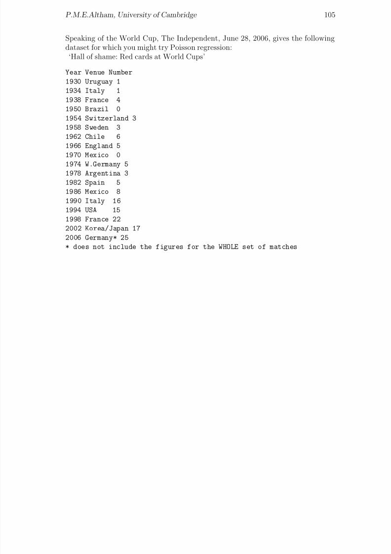
8/20/2019 Red w Sheets
http://slidepdf.com/reader/full/red-w-sheets 106/116
P.M.E.Altham, University of Cambridge 105
Speaking of the World Cup, The Independent, June 28, 2006, gives the followingdataset for which you might try Poisson regression:
‘Hall of shame: Red cards at World Cups’
Year Venue Number
1930 Uruguay 1
1934 Italy 1
1938 France 41950 Brazil 0
1954 Switzerland 3
1958 Sweden 3
1962 Chile 6
1966 England 5
1970 Mexico 0
1974 W.Germany 5
1978 Argentina 3
1982 Spain 5
1986 Mexico 81990 Italy 16
1994 USA 15
1998 France 22
2002 Korea/Japan 17
2006 Germany* 25
* does not include the figures for the WHOLE set of matches

8/20/2019 Red w Sheets
http://slidepdf.com/reader/full/red-w-sheets 107/116
Chapter 22
Brief introduction to SurvivalData Analysis
“What is the median lifetime of a President of the Royal Statistical Society?”This chapter gives you a very small-scale introduction to the important topic of
Survival Data Analysis.‘Long live the president’ is the title of the Editor’s comment in the June 2007Newsletter of the Royal Statistical Society. Here is the dataset giving the lifetime,in years, of all 34 Presidents of the Royal Statistical Society. This is a nice littleexample of ‘censored’ data: the ‘status’ variable listed below takes the value 1 foran observed death (eg the first person listed was known to die at age 94 years) butstatus is 0 if the actual lifetime is unknown. For example the last person listed isonly known to have lifetime 55 years or more (in other words, happily this person isstill alive). In this case the observation is said to be ‘censored’ (strictly speaking, itwas a right-censored observation). Actuaries work out ways of constructing ‘survivalcurves’ from such data, and here we will use the appropriate R-library to do the
work for us. The ‘proper’ mathematical explanation is not given here. Suffice it tosay that we are working out the survival curve, say S (t), which is the estimator of
S (t) = P r(T > t)
where T is the lifetime. Our estimator S (t) is known as the Kaplan-Meier estimate.Remarkably, it is a ‘distribution-free’ or ‘non-parametric’ estimator. The formulafor the estimate of the variance of S (t) was derived by M.Greenwood in 1926. Usingthis formula enables us to plot confidence bands for the unknown S (t).Here is the dataset on the lifetimes of the 34 RSS Presidents: happily many of themare still alive.
years status
94 1
94 1
93 1
92 1
92 1
91 1
90 0
106

8/20/2019 Red w Sheets
http://slidepdf.com/reader/full/red-w-sheets 108/116
P.M.E.Altham, University of Cambridge 107
90 0
87 1
85 0
85 1
84 1
84 0
83 083 0
83 0
83 1
79 0
79 1
77 1
77 1
77 1
76 1
76 0
74 073 0
71 0
68 0
64 0
62 0
61 0
57 0
57 0
55 0
> library(survival) # to let the expert do the work for us!
> Surv(years, status) # this creates a ‘survival object
# + indicates a censored observation (ie that person is still alive)
[1] 94 94 93 92 92 91 90+ 90+ 87 85+ 85 84 84+
[14] 83+ 83+ 83+ 83 79+ 79
[20] 77 77 77 76 76+ 74+ 73+ 71+ 68+ 64+ 62+ 61+ 57+ 57+ 55+
> fit<- survfit(Surv(years, status)~1) #this does the Kaplan-Meier estimation
> fit
Call: survfit(formula = Surv(years, status) ~ 1)
n events median 0.95LCL 0.95UCL
34 15 91 85 Inf
So we see that for the 34 Presidents, there were 15 known deaths, and the estimateof the median lifetime is 91 years.Now we get detailed information on our survivor function. Note that this is com-puted in terms of the ordered observed death times. The first of these is 76 years,at which 24 individuals were known to be ‘at risk’, and exactly 1 died, leaving
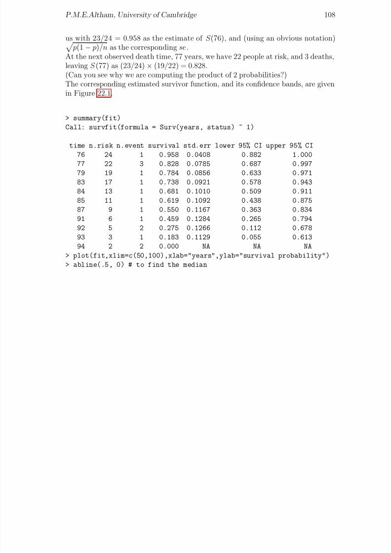
8/20/2019 Red w Sheets
http://slidepdf.com/reader/full/red-w-sheets 109/116
P.M.E.Altham, University of Cambridge 108
us with 23/24 = 0.958 as the estimate of S (76), and (using an obvious notation) p(1 − p)/n as the corresponding se.
At the next observed death time, 77 years, we have 22 people at risk, and 3 deaths,leaving S (77) as (23/24) × (19/22) = 0.828.(Can you see why we are computing the product of 2 probabilities?)The corresponding estimated survivor function, and its confidence bands, are given
in Figure 22.1.
> summary(fit)
Call: survfit(formula = Surv(years, status) ~ 1)
time n.risk n.event survival std.err lower 95% CI upper 95% CI
76 24 1 0.958 0.0408 0.882 1.000
77 22 3 0.828 0.0785 0.687 0.997
79 19 1 0.784 0.0856 0.633 0.971
83 17 1 0.738 0.0921 0.578 0.943
84 13 1 0.681 0.1010 0.509 0.91185 11 1 0.619 0.1092 0.438 0.875
87 9 1 0.550 0.1167 0.363 0.834
91 6 1 0.459 0.1284 0.265 0.794
92 5 2 0.275 0.1266 0.112 0.678
93 3 1 0.183 0.1129 0.055 0.613
94 2 2 0.000 NA NA NA
> plot(fit,xlim=c(50,100),xlab="years",ylab="survival probability")
> abline(.5, 0) # to find the median

8/20/2019 Red w Sheets
http://slidepdf.com/reader/full/red-w-sheets 110/116
P.M.E.Altham, University of Cambridge 109
50 60 70 80 90 100
0 .
0
0 .
2
0 .
4
0 .
6
0 . 8
1 .
0
years
s u r v i v a l p r o b a b i l i t y
Figure 22.1: Survival curve for RSS presidents

8/20/2019 Red w Sheets
http://slidepdf.com/reader/full/red-w-sheets 111/116
Chapter 23
The London 2012 Olympics Men’s200 metres, and reading data off the web
(I added this chapter in November 2012.) Nowadays one can just read in datastraight from the web into R, thanks to the special XML package for ‘scraping’ dataoff the web.Furthermore, the function ‘install.packages’ enables us to download an R packagedirect from the web (you choose your nearest mirror site, when asked)The program below predicts the Olympic Gold Medallist’s time in August 2012 as19.27 secs. In the event, Usain Bolt had a time of 19.32 secs.See if you can work out what the program below is doing. (Don’t worry too muchabout the details of library(drc), which is a general purpose ‘dose-response- -modelfitting program.)
install.packages("XML")install.packages("drc")
library(XML)
library(drc)
url<-
"http://www.databasesports.com/olympics/sport/sportevent.htm?sp=ATH&enum=120"
data <- readHTMLTable(readLines(url), which=3, header=TRUE)
golddata <- subset(data, Medal %in% "GOLD")
golddata$Year <- as.numeric(as.character(golddata$Year))
golddata$Result <- as.numeric(as.character(golddata$Result))
tail(golddata,10)
logistic <- drm(Result~Year, data=subset(golddata, Year>=1900), fct = L.4()log.linear <- lm(log(Result)~Year, data=subset(golddata, Year>=1900))
years <- seq(1896,2012, 4)
predictions <- exp(predict(log.linear, newdata=data.frame(Year=years)))
pdf("Olympics2012.pdf") # to send the graph to a named file
plot(logistic, xlim=c(1896,2012),
ylim=range(golddata$Result) + c(-0.5, 0.5),
xlab="Year", main="Olympic 200 metre",
ylab="Winning time for the 200m men’s final (s)")
110

8/20/2019 Red w Sheets
http://slidepdf.com/reader/full/red-w-sheets 112/116
P.M.E.Altham, University of Cambridge 111
points(golddata$Year, golddata$Result)
lines(years, predictions, col="red")
points(2012, predictions[length(years)], pch=19, col="red")
text(2012 - 0.5, predictions[length(years)] - 0.5,
round(predictions[length(years)],2))
dev.off()
The corresponding graph is shown as Figure 23.1.
Olympic 200 metre
Year
W i n n i n g t i m e f o r t h e 2 0 0 m m e n ' s f i n a l ( s
)
1900 1920 1940 1960 1980 2000
19
20
21
22
23
19.27
Figure 23.1: Predicting the Gold Medallist’s time in the mens’ 200m: LondonOlympics
Source: Rui Barradas contribution to R help, August 9, 2012 ‘Olympics: 200mMen’s finals’ (I corrected the titles of the axes of the graph)Note added May 2014: instead of the 2 commands

8/20/2019 Red w Sheets
http://slidepdf.com/reader/full/red-w-sheets 113/116
P.M.E.Altham, University of Cambridge 112
install.packages("XML")
library(XML)
it is less cumbersome to use
suppressPackageStartupMessages(library(XML))

8/20/2019 Red w Sheets
http://slidepdf.com/reader/full/red-w-sheets 114/116
Index
AIC , 36.Rdata, 10.Rhistory, 10
abline, 9anova, 9, 25, 28aov, 28as.numeric, 96attach, 19
binomial, 36boxplot, 28
c, 9cat, 6cbind, 19chisq.test, 45cloud, 74contour, 62cor, 19
DatasetsAccidents and Harry Potter, 94air quality, 23alloyfasteners, 35Annual CO2 readings, 13annual GM tree releases, 50annual vCJD cases, by gender, 50Anscombe’s quartet, 65autism, annual cases, 52BAFTA, Golden Globe and Academy
Awards, 60
booze and fags, the costs, 34British Olympics medals, 55cannabis and psychosis, 93cars, productivity, 22Challenger and temperature, 39Common Agricultural Policy, 17Corus chess tournament, 99countries and bookprices, 32countries and occupations, 28
crime and heatwave, 61crime and unemployment, 82deviant behaviour, emotionality, 45Election turnout and poll leads, 75Eurozone inflation, GDPgrowth, 15Football-related arrests, 69Genomic Structures, 86Henley Ascot drink-drive, 58mammals, 21Ministerial resignations, 50missing persons, 41monthly AIDS cases, 49Olympics 2012, 110potash, 25Presidents’ lifetimes, 106prices of designer goods, 34Racehorses, betting odds, 31Resorts and prices, 30Sheffield Flood, 1864, 46Soap operas and sudden deaths, 97
Social Mobility, 47Student funding, 12survival of premature babies, 42traffic accidents in Cambridge, 53UK 2007 International Mathematical
Olympiad Team, 43weld, 9World cup, 2006, 103World cup, 2008, 104World Cup: red cards, 105
dev.off, 19
dgamma, 78diag, 65, 91dnbinom, 70dpois, 70
eigen, 91
factor, 25fisher.test, 58
113

8/20/2019 Red w Sheets
http://slidepdf.com/reader/full/red-w-sheets 115/116
P.M.E.Altham, University of Cambridge 114
for, 6ftable, 60function, 62
gamma, 78ghostview, 19gl, 28
glm, 36glm.nb, 70gnm, 56
hat, 65hessian, 91hist, 9
identify, 19image, 62Index, 111
influence, 65install.packages, 110is.na, 32
labels, 32lattice, 74legend, 52levels, 54lgamma, 6library(MASS), 70lines, 9, 52
lm, 9logical symbols, eg &, 39ls, 11
matplot, 9matrix, 9, 62mfrow, 10
NA, 32na.action, 32names, 9, 36
nlm(), 70
offset, 41, 52optim, 91
pairs, 19par, 9pdf, 110persp, 62pi, 6
plot, 9plot,cex, 13plot,pch, 52plot.design, 32points, 16poisson, 41
postscript, 19predict.lm, 10prop.table, 48
qqline, 19qqnorm, 19
read.table, 9readHTMLTable, 110rep, 38residuals, 25rgamma, 78rm, 29rnorm, 65round, 19row.names, 19rt, 27
scan, 9scatter.smooth, 76sink, 49solve, 65, 91source, 36sqrt, 6subset, 39sum, 62summary, 9suppressPackageStartupMessages, 112Surv, 107survfit, 107survival, 107
t, 65
tapply, 25, 28text, 16title, 52TukeyHSD, 28
update, 49
vcov, 9
weights, 36, 39

8/20/2019 Red w Sheets
http://slidepdf.com/reader/full/red-w-sheets 116/116
P.M.E.Altham, University of Cambridge 115
while, 6windows, 9
xtabs, 48, 60