regression for cost analysts
TRANSCRIPT

Regression for Cost Analysts
By Evin J. Stump PE Preface This paper is designed for either 1) self-study by cost analysts who want a better understanding of regression analysis and how they can use it in their work, or 2) the basis of a seminar in regression analysis led by an instructor. The rationale for this paper is that while regression analysis is one of the most powerful and sophisticated tools in the cost analyst’s tool kit, many cost analysts come to their profession with minimal understanding of the subject. This paper has been written with them specifically in mind. Many of the notions of regression analysis are closely related to ideas that are usually encountered by students in a first college course in statistics. In writing this paper, I had to choose between covering that statistical background and assuming the student already has it. I chose the latter course, mainly because statistics is today commonly taught in many college curricula, usually including a smattering of regression analysis. But the coverage of regression analysis in the typical first course is, in the opinion of the author, insufficient for the needs of professional cost analysts. Accordingly, a prerequisite for a decent understanding of the material presented here is a college level first course in statistics, including some work with hypothesis testing. An even better understanding can result if the reader has also had a first course in the calculus, including some analytic geometry. But this is not absolutely necessary. The paper contains several fully worked examples to help drive home the important points. The reader wanting a thorough understanding of the material should work through these examples in detail, preferably using spreadsheet software to assist in the numerous calculations needed. Use of a spreadsheet is advised because regression typically involves dozens if not hundreds of arithmetic calculations and the potential for error is high if hand methods are used. The question that regression methods can potentially answer for the cost analyst can be stated this way: Given a set of historical cost data, what relationships can be discovered that are potentially useful for estimating a future cost?1 The potential product of 1 Regression analysis is indeed used to predict the future. That is its main use in cost analysis. But that doesn’t mean that regression analysis is a true crystal ball, because it can predict the future only to the extent that the future is discernable from past patterns and trends. The biggest obstacle to successful use of regression analysis in cost estimating is that the future may not be like the past. The second biggest obstacle is that the information about the past may be so sparse or so “noisy” that reliable clues about the

regression analysis is a cost estimating relationship (CER). Typically a CER relates cost or a cost connected variable (such as labor hours) to parameters of the project’s product in the form of an algebraic equation. As an example, consider a project whose mission is to write computer software. The following formula was developed in a well-known paper on software development cost, using regression analysis:2
1.052.4MM KSLOC=
In this formula, MM stands for man-months of labor,3 defined as the equivalent of one person working 152 hours. MM can be converted to cost if we know an average labor pay rate. KSLOC stands for thousands (K) of source lines of code (SLOC). KSLOC is the most common (but not the only) measure of the “size” of a software project. The value of an equation such as the above should be obvious. If by some means we can estimate KSLOC we can translate that estimate immediately into an estimate of cost. This is an immensely valuable tool for estimators. Of course, the above “if by some means” is a pretty big one. We do not elaborate further on it in this paper. It is the subject of countless seminars and weighty white papers written by cost analysts connected to the software industry. What we do further explore here, however, is questions such as this: how accurate is our estimate of MM likely to be assuming we know perfectly the value of KSLOC? Superficially, the above formula appears to be all that we need to estimate software development MM. But in most cases it is not. KSLOC is not the only parameter that affects the MM needed to build software, although experience has shown that it is the dominant parameter. To do a really accurate estimate we need additional information. Later we will further explore that issue as it relates to regression analysis.
future cannot be easily found. Cost analysts who use CERs based on regression analysis must always be on guard against these possibilities. 2 “Software Engineering Economics,” by Barry Boehm, 1981. 3 The paper was written before we began the custom of gender neutrality in our writings. Today the appropriate expression would be “person-months.”
Regression of Two Variables Basic ideas. We begin with a simple assumption. We assume that the cost of something, Y , can be accurately estimated from knowledge of one parameter, call it X . A useful mathematical representation of this situation is
Y a bX= +
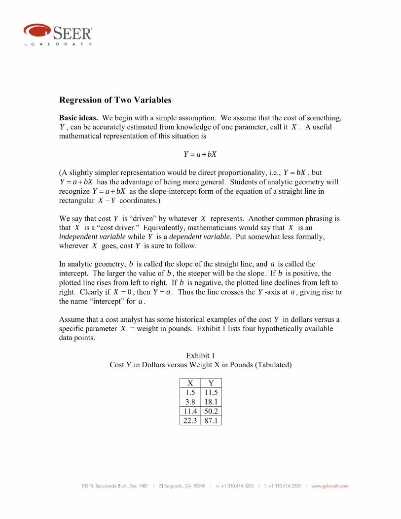
(A slightly simpler representation would be direct proportionality, i.e., Y bX= , but Y a bX= + has the advantage of being more general. Students of analytic geometry will recognize Y a bX= + as the slope-intercept form of the equation of a straight line in rectangular X Y− coordinates.) We say that cost Y is “driven” by whatever X represents. Another common phrasing is that X is a “cost driver.” Equivalently, mathematicians would say that X is an independent variable while Y is a dependent variable. Put somewhat less formally, wherever X goes, cost Y is sure to follow. In analytic geometry, b is called the slope of the straight line, and a is called the intercept. The larger the value of b , the steeper will be the slope. If b is positive, the plotted line rises from left to right. If b is negative, the plotted line declines from left to right. Clearly if 0X = , then Y a= . Thus the line crosses the Y -axis at a , giving rise to the name “intercept” for a . Assume that a cost analyst has some historical examples of the cost Y in dollars versus a specific parameter X = weight in pounds. Exhibit 1 lists four hypothetically available data points.
Exhibit 1 Cost Y in Dollars versus Weight X in Pounds (Tabulated)
X Y
1.5 11.53.8 18.111.4 50.222.3 87.1
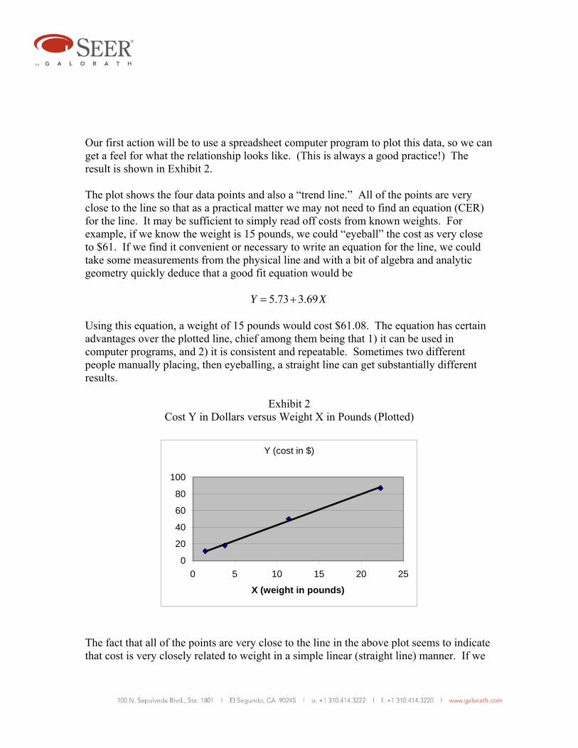
Our first action will be to use a spreadsheet computer program to plot this data, so we can get a feel for what the relationship looks like. (This is always a good practice!) The result is shown in Exhibit 2. The plot shows the four data points and also a “trend line.” All of the points are very close to the line so that as a practical matter we may not need to find an equation (CER) for the line. It may be sufficient to simply read off costs from known weights. For example, if we know the weight is 15 pounds, we could “eyeball” the cost as very close to $61. If we find it convenient or necessary to write an equation for the line, we could take some measurements from the physical line and with a bit of algebra and analytic geometry quickly deduce that a good fit equation would be
5.73 3.69Y X= + Using this equation, a weight of 15 pounds would cost $61.08. The equation has certain advantages over the plotted line, chief among them being that 1) it can be used in computer programs, and 2) it is consistent and repeatable. Sometimes two different people manually placing, then eyeballing, a straight line can get substantially different results.
Exhibit 2 Cost Y in Dollars versus Weight X in Pounds (Plotted)
Y (cost in $)
0
20
40
60
80
100
0 5 10 15 20 25
X (weight in pounds)
The fact that all of the points are very close to the line in the above plot seems to indicate that cost is very closely related to weight in a simple linear (straight line) manner. If we

use the above derived equation for future estimating we must make two additional subjective assumptions: 1) No new parameters will have arisen that would affect cost, and 2) the same simple linear relation will still hold true. Such broad subjective assumptions are unavoidable. Try as we will, we are never able to make cost estimating (or anything else!) totally objective. There will always be subjective influences in everything we attempt. Good judgment by the cost analyst is always important. But having an equation based on real data is far better than an unsupported opinion, is it not? As a further example, suppose we have some other data about the cost of a different product where cost is compared to horsepower. Let the data be as shown in Exhibit 3.
Exhibit 3 Cost Y in Dollars versus Horsepower X (Tabulated)
X Y
120 3500 180 4295 225 6180 350 10450
Again, our first action is to plot the data. See Exhibit 4. In Exhibit 4 we have “eyeballed” the placement of what seems to be a pretty good straight line in terms of “fitting” the data. But in this case there is no straight line that gets “very close” to all of the points, as there was in the previous example. From this fact we can reasonably infer one of three things: 1) factors other than horsepower influence the cost, or 2) we were unable to get accurate measurements of either cost or horsepower or perhaps both, resulting in data errors, or 3) both of these things are true.
Exhibit 4 Cost Y in Dollars versus Horsepower X (Plotted)
In any case, we have a choice. We can either try to understand what factors other than horsepower influence cost, and/or we can try to get more accurate data, or we can live with the data we have. With data as good as that in Exhibit 4, many analysts
Y (Cost in Dollars)
0
5000
10000
15000
0 100 200 300 400
Horsepower

would opt to go with the data they have. Gathering data is usually the most time consuming and expensive aspect of cost analysis in general, and of regression analysis in particular. It can also be frustrating, because the data needed simply may not exist, or may be of dubious quality. We do of course have an interest in how accurate the results probably will be if we use the fitted line. If the accuracy is too low, we might want to attempt extended data searches.
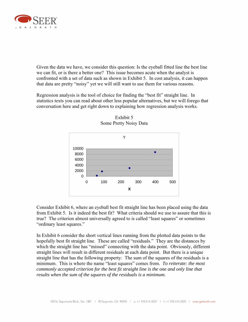
Given the data we have, we consider this question: Is the eyeball fitted line the best line we can fit, or is there a better one? This issue becomes acute when the analyst is confronted with a set of data such as shown in Exhibit 5. In cost analysis, it can happen that data are pretty “noisy” yet we will still want to use them for various reasons. Regression analysis is the tool of choice for finding the “best fit” straight line. In statistics texts you can read about other less popular alternatives, but we will forego that conversation here and get right down to explaining how regression analysis works.
Exhibit 5 Some Pretty Noisy Data
Consider Exhibit 6, where an eyeball best fit straight line has been placed using the data from Exhibit 5. Is it indeed the best fit? What criteria should we use to assure that this is true? The criterion almost universally agreed to is called “least squares” or sometimes “ordinary least squares.”
In Exhibit 6 consider the short vertical lines running from the plotted data points to the hopefully best fit straight line. These are called “residuals.” They are the distances by which the straight line has “missed” connecting with the data point. Obviously, different straight lines will result in different residuals at each data point. But there is a unique straight line that has the following property: The sum of the squares of the residuals is a minimum. This is where the name “least squares” comes from. To reiterate: the most commonly accepted criterion for the best fit straight line is the one and only line that results when the sum of the squares of the residuals is a minimum.
Y
02000400060008000
10000
0 100 200 300 400 500
X
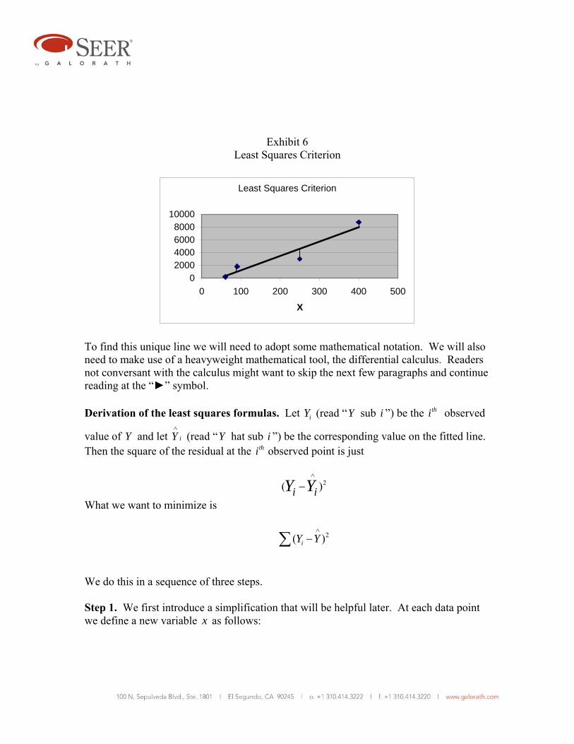
Exhibit 6 Least Squares Criterion
Least Squares Criterion
02000400060008000
10000
0 100 200 300 400 500
X
To find this unique line we will need to adopt some mathematical notation. We will also need to make use of a heavyweight mathematical tool, the differential calculus. Readers not conversant with the calculus might want to skip the next few paragraphs and continue reading at the “►” symbol. Derivation of the least squares formulas. Let iY (read “Y sub i ”) be the thi observed
value of Y and let iY∧
(read “Y hat sub i ”) be the corresponding value on the fitted line. Then the square of the residual at the thi observed point is just
2( )i iY Y∧
−
What we want to minimize is
2( )iY Y∧
−∑
We do this in a sequence of three steps. Step 1. We first introduce a simplification that will be helpful later. At each data point we define a new variable x as follows:
i ix X X= − Here X (“ X bar”) is the mean (arithmetic average) of all of the X values. Instead of fitting the line Y a bX= + , we will fit a slightly different line *Y a bx= + . This will result in a different value of a than we actually want (namely *a ), but as will be seen, we can easily find our way back to the correct value of a , with the advantage that the math will be simpler. .The value of b we find will be the correct value because we have changed the intercept but not the slope.4 As we shall see, the substitution of x for X results in a mathematical simplification because the sum of the x values is zero: 0ix =∑ This is easily demonstrated: ( ) 0i i ix X X X nX nX nX= − = − = − =∑ ∑ ∑
where n is the number of data points. (Note that X
Xn
= ∑ by definition and that
therefore x nX=∑ .) Step 2. We now want to find *a and b such that we minimize
2( )iY Y∧
−∑
We know that each fitted value iY∧
is on the estimated line and that therefore
*i iY a bx
∧
= + We substitute this expression into the expression to be minimized and obtain:
4 To avoid any possible misunderstanding, what we mean by “fitting” the straight line is finding particular values of the coefficients a and b that satisfy the least squares criterion.

minimize * * 2( , ) ( )i iF a b Y a bx= − −∑ Here *( , )F a b simply emphasizes that the summation is a function of *a and b . The differential calculus is used to solve the minimization problem. We first take the partial derivative with respect to *a and set it equal to zero:
* 2 ** ( ) 0i i i iY a bx Y na b x
a∂
− − = − − =∂ ∑ ∑ ∑
Since 0ix =∑ we can simplify this expression and solve for *a to obtain the simple
result *a Y= . The least squares estimate of *a is simply the average of the Y values.5 Next, take the partial derivative with respect to b and set it equal to zero:
* 2 *( ) ( ) 0i i i i iY a bx x Y a bxb∂
− − = − − =∂ ∑ ∑
Rearranging and solving for b :
2i i
i
x Yb
x= ∑
∑
Step 3. We can translate the result back to the original coordinates as follows: * * *( ) ( )Y a bx a b X X a bX bX= + = + − = − + Thus, *a a bX Y bX= − = −
5 As an exercise, satisfy yourself that the fitted least squares line always passes through the point ( , )X Y .

►We recommend that you memorize the following relationships. Even though you may have a spreadsheet that will do simple regression, or even a pocket calculator that can do it, there may come a time when you need to do a quick regression and you don’t have any sophisticated tools available. a Y bX= −
2i i
i
x Yb
x= ∑
∑
Studying these relationships, clearly it is advantageous to first find b , then X and Y will quickly lead to a . To make the process clear we will apply it to a concrete example.
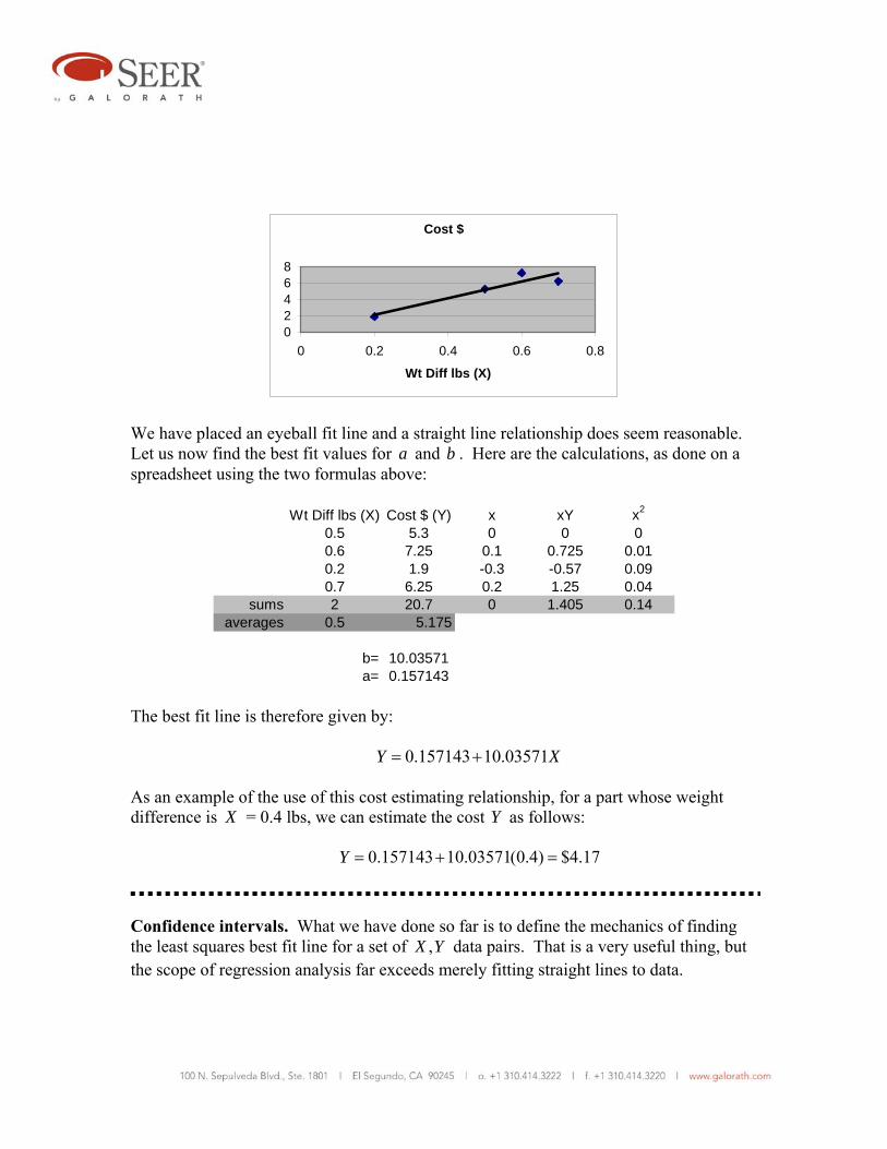
Example 1. We suspect that the cost of a certain class of parts machined from aircraft grade aluminum is closely related to the difference between the weight of the raw stock billet from which the part was machined and the weight of the finished part. This seems reasonable because the difference in weight reflects the amount of metal that must be machined away. We have collected the following historical data on four such parts:
Raw Stock Weight lbs
Part Weight lbs
Weight Difference lbs (X)
Cost $ (Y)
3.2 2.7 0.5 5.30 4.7 4.1 0.6 7.25 1.8 1.6 0.2 1.90 6.2 5.5 0.7 6.25
First we plot X versus Y to see if a simple linear relationship makes sense:
Cost $
02468
0 0.2 0.4 0.6 0.8
Wt Diff lbs (X)
We have placed an eyeball fit line and a straight line relationship does seem reasonable. Let us now find the best fit values for a and b . Here are the calculations, as done on a spreadsheet using the two formulas above:
Wt Diff lbs (X) Cost $ (Y) x xY x2
0.5 5.3 0 0 00.6 7.25 0.1 0.725 0.010.2 1.9 -0.3 -0.57 0.090.7 6.25 0.2 1.25 0.04
sums 2 20.7 0 1.405 0.14averages 0.5 5.175
b= 10.03571a= 0.157143
The best fit line is therefore given by: 0.157143 10.03571Y X= + As an example of the use of this cost estimating relationship, for a part whose weight difference is X = 0.4 lbs, we can estimate the cost Y as follows: 0.157143 10.03571(0.4) $4.17Y = + =
Confidence intervals. What we have done so far is to define the mechanics of finding the least squares best fit line for a set of ,X Y data pairs. That is a very useful thing, but the scope of regression analysis far exceeds merely fitting straight lines to data.
For instance, we noted in previous examples that often (usually!) the data points do not lie on or even very near the best fit line. There is “scatter” about the best fit line. This is generally the case, and it is reasonable to attribute it at least in part to the iY being random variables, each having a probability distribution. It is even possible that each iY
has a different probability distribution. The possibilities are endless, so to make reasoned analysis possible it is customary to make certain assumptions. These are the assumptions usually made: 1. The probability distribution for each iY has the same variance (σ2). 2. The means (expected values) ( )iE Y lie on a straight line, namely the true line
representing the entire population from which our data sample was drawn. The (unknown) population parameters α and β specify this line.
( )i i iE Y x= µ = α + β 3. The random variables iY are statistically independent, that is, 2Y is unaffected by 1Y ,
6Y is unaffected by 3Y , etc. We can summarize these assumptions in the following useful manner: i i iY x e= α + β + where the ie are independent random variables (error terms) with mean = 0 and variance = σ2. We have so far made no assumptions about the shape of the distribution of the error terms. Shortly we will, but for the moment let’s look more closely at the error terms. It appears that each is the sum of two components. The first is measurement error. Whenever anything is measured, however carefully, there is virtually always a measurement error. The second component is called random or stochastic error. Even if there is no measurement error there is likely to be some variability in the iY due to influence of variables that have not been explicitly included in the regression analysis. In cost analysis, both kinds of error are likely to occur and they can seldom be untangled. For example, historical costs of projects often contain accounting errors. And variables other than the ones selected for regression often affect the cost. Including them in the
regression analysis using a technique called multivariate regression can reduce the effect of additional variables. At least In principle, by identifying and using in regression all relevant variables, errors can be reduced to just the measurement errors. We take this up later. We have defined α and β as the coefficients of the best fit line associated with the entire population of objects for which we want a fitted straight line. What we generally have to work with is not the entire population but a sample drawn from it. Unfortunately, we most likely will never know the true values of α and β in any real world situation. We must be content to make the best possible estimates of them, giving us:6
Y x∧ ∧ ∧
= α+ β At issue is how closely the estimated line comes to the true line. Said another way, how are the estimators distributed around α and β? We do not give the proofs here (they are given in many college level introductory statistics texts), but the following can be shown to be true:
( )E∧
α = α 2var( ) / n
∧
α = σ
( )E∧
β = β
2 2var( ) / ix∧
β = σ ∑ We focus first on β. Above we have expressions for the mean and the variance of its estimator. Let’s now add the assumption that the estimator is normally distributed. While this assumption is not necessarily true, the results from using it usually correspond closely to reality. In cost analysis, we are usually constrained to use the readily available, often quite limited historical data. Nevertheless, it is worth pointing out that our estimate of β is improved if our ix values are spread out as much as possible. If they are bunched closely together, our ability to estimate β accurately is impaired.
6 Note that
∧
α and ∧
β are the same as what we have been calling a and b . The new notation is meant to emphasize that these are estimates of unknown true population parameters.

It is often useful to establish a confidence interval for ∧
β . To do this we first convert the estimator to the form of a standard normal distribution by subtracting its mean and dividing by its standard deviation:
2/ i
Zx
∧
β−β=
σ ∑
By definition, because Z has the standard normal distribution, it has a mean of zero and a standard deviation of unity. However, we don’t know the value of σ2, the variance of Y about the true regression line. A natural estimator for σ2 is
2 21 ( )2
iis Y Yn
∧
= −− ∑
The divisor 2n − is used rather than n to make 2s an “unbiased” estimator of σ2. 7 When s is substituted for σ, the standardized estimator is no longer normally distributed, but instead now has what is called the t distribution. The t distribution resembles the normal distribution but has “fatter” tails. We can now write:
2/ i
ts x
∧
β−β=
∑
The denominator in this expression is commonly called the standard error of ∧
β , denoted by sβ . Thus we can write:
ts
∧
β
β−β=
7 We do not discuss unbiasedness in this paper. But intuitively, we need more than two data points to get
any information about the variance of ∧
β , because two data points can only define the line itself. Thus we
say that 2s has 2n − degrees of freedom.
We will consider a t value that leaves 2 ½% of the distribution in the upper tail, and also 2 ½% in the lower tail. This is known as a 95% confidence interval. Although any desired confidence level can be used, the 95% confidence interval is fairly conventional. This interval is conveniently expressed as
.025t s∧
ββ = β ± where the degrees of freedom are those of sβ , namely 2n − . Using a parallel argument, we can derive to 95% confidence interval for the intercept (we do not show this derivation):
2
.025 2
1( )i
XY X t sn x
∧ ∧
0α = −β ± +∑
Note: α0 indicates the value of the intercept corresponding to the form Y X0= α + β as opposed to the form Y x= α + β . Recall that x X X= − at any data point. An example should help clarify what we have discussed.
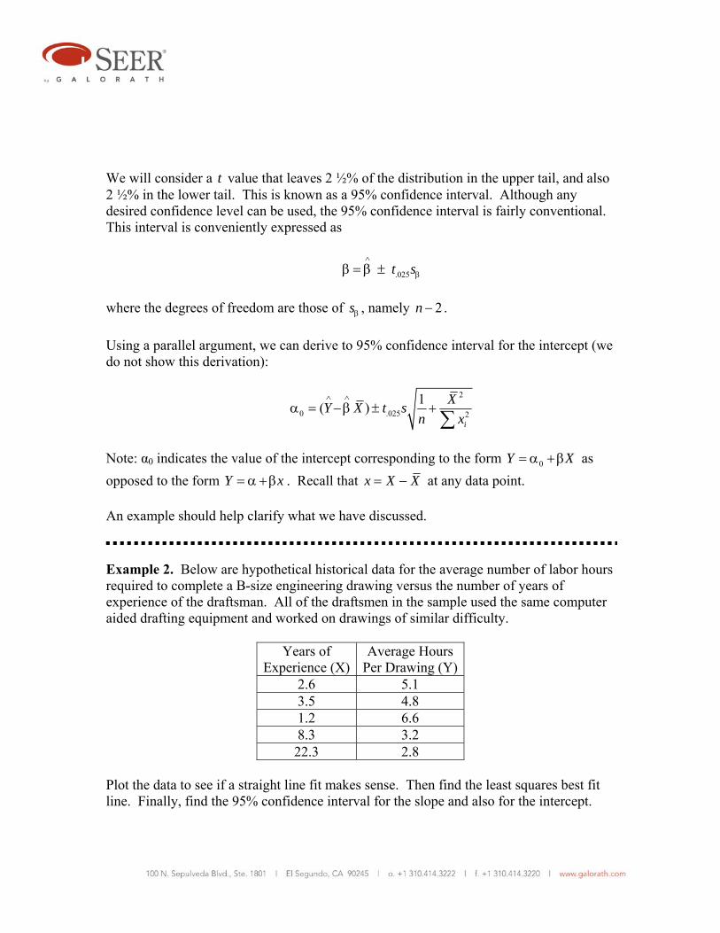
Example 2. Below are hypothetical historical data for the average number of labor hours required to complete a B-size engineering drawing versus the number of years of experience of the draftsman. All of the draftsmen in the sample used the same computer aided drafting equipment and worked on drawings of similar difficulty.
Years of Experience (X)
Average Hours Per Drawing (Y)
2.6 5.1 3.5 4.8 1.2 6.6 8.3 3.2 22.3 2.8
Plot the data to see if a straight line fit makes sense. Then find the least squares best fit line. Finally, find the 95% confidence interval for the slope and also for the intercept.
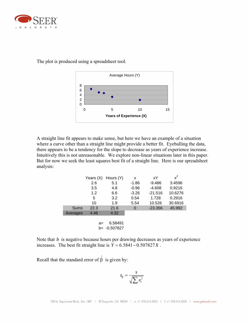
The plot is produced using a spreadsheet tool.
Average Hours (Y)
02468
0 5 10 15
Years of Experience (X)
A straight line fit appears to make sense, but here we have an example of a situation where a curve other than a straight line might provide a better fit. Eyeballing the data, there appears to be a tendency for the slope to decrease as years of experience increase. Intuitively this is not unreasonable. We explore non-linear situations later in this paper. But for now we seek the least squares best fit of a straight line. Here is our spreadsheet analysis:
Years (X) Hours (Y) x xY x2
2.6 5.1 -1.86 -9.486 3.45963.5 4.8 -0.96 -4.608 0.92161.2 6.6 -3.26 -21.516 10.62765 3.2 0.54 1.728 0.2916
10 1.9 5.54 10.526 30.6916Sums 22.3 21.6 0 -23.356 45.992
Averages 4.46 4.32
a= 6.58491b= -0.507827
Note that b is negative because hours per drawing decreases as years of experience increases. The best fit straight line is 6.5841 0.507827Y X= − .
Recall that the standard error of ∧
β is given by:
2i
ssx
β =∑
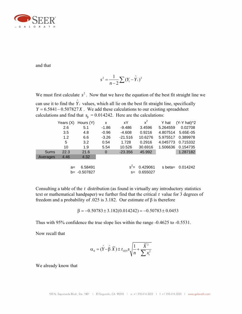
and that
2 21 ( )2
iis Y Yn
∧
= −− ∑
We must first calculate 2s . Now that we have the equation of the best fit straight line we
can use it to find the iY∧
values, which all lie on the best fit straight line, specifically 6.5841 0.507827Y X= − . We add these calculations to our existing spreadsheet
calculations and find that sβ = 0.014242. Here are the calculations: Years (X) Hours (Y) x xY x2 Y hat (Y-Y hat)^2
2.6 5.1 -1.86 -9.486 3.4596 5.264559 0.027083.5 4.8 -0.96 -4.608 0.9216 4.807514 5.65E-051.2 6.6 -3.26 -21.516 10.6276 5.975517 0.3899785 3.2 0.54 1.728 0.2916 4.045773 0.71533210 1.9 5.54 10.526 30.6916 1.506636 0.154735
Sums 22.3 21.6 0 -23.356 45.992 1.287182Averages 4.46 4.32
a= 6.58491 s2= 0.429061 s beta= 0.014242b= -0.507827 s= 0.655027
Consulting a table of the t distribution (as found in virtually any introductory statistics text or mathematical handpaper) we further find that the critical t value for 3 degrees of freedom and a probability of .025 is 3.182. Our estimate of β is therefore 0.50783 3.182(0.014242) 0.50783 0.0453β = − ± = − ± Thus with 95% confidence the true slope lies within the range -0.4625 to -0.5531. Now recall that
2
.025 2
1( )i
XY X t sn x
∧ ∧
0α = −β ± +∑
We already know that

6.58491a Y X∧
= −β = .025 3.182t = 0.655027s = 2 45.992ix =∑ We can readily calculate
1 0.2n
=
2 19.8916X = Plugging these values into the above formula for α0 yields: 0 6.58491 1.6576α = ± Therefore with 95% confidence α0 has the range 4.9273 to 8.2425.
Interpolation and extrapolation. Within the range of the available X data, we can “interpolate” to estimate costs. Shortly we will address the issue of how accurate those estimates might be. But can we safely extrapolate outside the range of our X data? The short answer is “only with great care and caution.” In fact, our accuracy of estimation decreases as we move away from the mean X in either direction. The most accurate estimates are obtained when our X value is near the mean of X for the data we have. There is no sharp dividing line between safe interpolation and risky extrapolation. The possibility of error is least at X and increases gradually and symmetrically in either direction. There is also the risk that a reasonably valid linear model will become grossly invalid outside the range of our data, Outside of that range, the relationship between X and Y
might become highly non-linear. Of course, if we have non-linear data we might consider a non-linear regression model. More on that later. The least squares process rather mechanically yields a line we can use for estimation. Confidence intervals give us a clue as to where that line might possibly lie if only we had more data. To the cost analyst unable to get more data, this is can be highly unsatisfactory. He or she might need to make a representation to management something like this: “Given the data we have, the error in my cost estimate will not exceed 20%.”8 This kind of statement requires knowing more than the possible locations of the true regression line. It requires an analysis that is focused specifically on the accuracy of the particular estimate that has been derived. A precise statement of the issue would be, given a specific 0X , how accurate is the value 0Y given by the regression line we have derived from our data? This is a complex question, and before we answer it, we will first address a slightly easier question. The answer to that question will, as it happens, lead us to the answer we want. The question is, if we had a certain cost driver value 0X and it occurred in many projects, what would be the average cost result? (Admittedly this question is purely hypothetical. The same value of a cost driver is most unlikely to occur in multiple projects.)
We begin by designating our estimate of the average cost result as 0
∧
µ . We want to construct an interval estimate around it. Clearly:
0 0x∧ ∧ ∧
µ = α+ β
Due to errors in ∧
α and ∧
β this point estimate will have errors. Because 0
∧
µ is a linear
combination of ∧
α and ∧
β we can write:
0 0( ) ( ) ( )E E x E∧ ∧ ∧
µ = α + β
8 In reality, a wise cost analyst might further qualify his statement something like this: “Given the data we have, and given the truth of our assumption that the current project is closely similar to the historical data we used, the error in my cost estimate will not exceed 20%. The imaginative reader can probably think of additional qualifications that might be added.

And because ∧
α and ∧
β are independent we can write:
20 0var( ) var var( )x
∧ ∧ ∧
µ = α+ β But from previous results we can also write:
20 0 2var( )
i
xn x
2 2∧ σ σµ = +
∑
or
2
2 00 2
1var( ) ( )i
xn x
∧
µ = σ +∑
Note carefully when computing using this formula that 0x represents a particular value of the cost driver, while the ix represent data points used in the regression.
We can write the 95% prediction interval for 0
∧
µ as follows:
20
0 .025 2
1
i
xt sn x
∧
0µ = µ ± +∑
where 0
∧
µ is the result of the regression at 0x , t has n-2 degrees of freedom, and s has been substituted for the unknown σ.
Also note carefully that the variance of 0
∧
µ has two components, one due to uncertainties
in ∧
α and one due to uncertainties in ∧
β . The uncertainty due to ∧
β increases as 20x
increases. This verifies what we said earlier. Accuracy degrades continuously as we
move away from X . More precisely, disregarding the error in ∧
α , it degrades as the square of the distance from X . Therefore if you have a choice in the matter, use data for your regression that are in the vicinity of the cost you want to estimate.

We now turn to the more interesting question for cost analysts, namely how accurate is a particular estimate 0Y ? We already know that the best point estimate for 0Y is
0 00Y x∧ ∧ ∧ ∧
= α+ β = µ
To obtain an interval estimate for 0Y we have all of the same errors we had for 0
∧
µ plus the added problem that we are trying to estimate for one project rather than the average of many projects. To our previous variance estimate
22 0
0 2
1var( ) ( )i
xn x
∧
µ = σ +∑
we must add the inherent variance of an individual Y observation, with the result that
20
00 .025 2
1 1i
xY t sn x
∧
= µ ± + +∑
Example 3. Assume that you have noticed that the cost of product development in your organization seems to be strongly related to a particular component of that cost, namely the systems engineering component. You surmise that if you can make a very good estimate for systems engineering, you can use it to make a good estimate for the whole product development cycle. This would save time and money. In looking for a good way to estimate systems engineering cost, you notice that it seems to be related to the number of requirements listed in the project top level specification document. You can quickly estimate the number of requirements by parsing the specification document and counting the number of occurrences of the words “shall,” “will,” and “must.” You presume that you can use the combined occurrences of these words as a proxy for the number of requirements. You examine 10 specifications for completed projects and obtain the following data set. The X values are the requirements counts; the Y values are the labor hours expended for systems engineering.
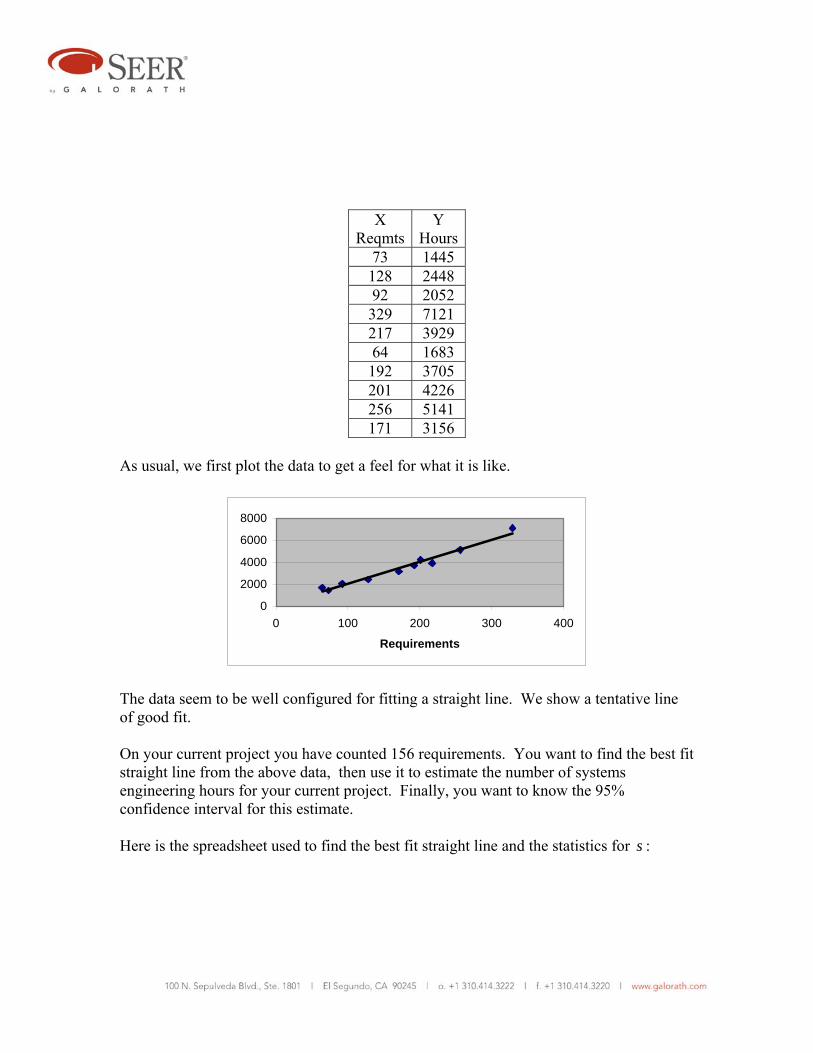
X
ReqmtsY
Hours73 1445 128 2448 92 2052 329 7121 217 3929 64 1683 192 3705 201 4226 256 5141 171 3156
As usual, we first plot the data to get a feel for what it is like.
0
2000
4000
6000
8000
0 100 200 300 400
Requirements
The data seem to be well configured for fitting a straight line. We show a tentative line of good fit. On your current project you have counted 156 requirements. You want to find the best fit straight line from the above data, then use it to estimate the number of systems engineering hours for your current project. Finally, you want to know the 95% confidence interval for this estimate. Here is the spreadsheet used to find the best fit straight line and the statistics for s :

Reqmts (X) Hours (Y) x xY x2 Yhat (Y-Y hat)^273 1445 -99.3 -143488.5 9860.49 1477.711 1070.024128 2448 -44.3 -108446.4 1962.49 2592.604 20910.492 2052 -80.3 -164775.6 6448.09 1862.856 35775.41329 7121 156.7 1115861 24554.89 6667.032 206087.2217 3929 44.7 175626.3 1998.09 4396.704 21874764 1683 -108.3 -182268.9 11728.89 1295.274 150331.3192 3705 19.7 72988.5 388.09 3889.934 34200.74201 4226 28.7 121286.2 823.69 4072.371 23601.72256 5141 83.7 430301.7 7005.69 5187.265 2140.409171 3156 -1.3 -4102.8 1.69 3464.248 95016.82
sums 1723 34906 0 1312981 64772.1 787881.1averages 172.3 3490.6
a= -2.055955 s2= 98485.13 s beta= 1.23308b= 20.27078 s= 313.8234
For the current project with 156 requirements, we estimate the systems engineering hours as -2.055955 + 20.27078(156) = 3,160.2. We use the following formula to estimate the 95% confidence interval for 0Y :
20
00 .025 2
1 1i
xY t sn x
∧
= µ ± + +∑
Here t has eight degrees of freedom. From a table of the t distribution we find that the critical value of t with eight degrees of freedom is 2.306. The calculation is left as an exercise. The result is: 0 3160.2 879.12Y = ± This potential error is equivalent to plus or minus 27.8%, approximately.
The question often arises, how can we get the best possible accuracy from a regression analysis of two variables? This question has many facets, but here are some suggestions. Collect as many valid data points as you can. The larger the value of n , the smaller
the error all else being equal.
If possible, collect historical data that are in the vicinity of the X value you want to estimate. At the same time, try to get data that are spread out as much as possible as opposed to tightly clustered.
Be sure (by plotting the data) that a straight line makes sense as a cost model for your data. For much cost data a non-linear form is better.
Try other cost drivers that you may have data for. Another cost driver may have better accuracy than the one you contemplate using.
Consider multivariate regression, using more than two variables. More on that later. What if X is also random? In all of the situations considered so far, X has been deterministic. We have assumed that we know each X value without error. Sometimes this is not the case. We will not give a proof, but it turns out that we can use all of the processes we have discussed as long as the error term ie in i i iY a bX e= + + is independent of X . Non-linear situations with two variables. In analysis in general and in cost analysis in particular, non-linearity is a frequent occurrence. Straight lines simply do not fit every situation. In fact, in cost analysis non-linearity is probably more commonplace than linearity. Probably the non-linear function most commonly used in cost analysis is the so-called power law function. Its mathematical form is bY aX= If the exponent 1b = this equation represents a straight line of slope a passing though the origin of the X Y− coordinate system. If 1b > it takes the form of an upwardly curving line of increasing slope that passes through the origin. If 0 1b< < it takes the form of an upwardly curving line of decreasing slope that passes through the origin. If
0b < , the curve cannot pass through the origin because that would require division by zero, which is undefined. It resembles a hyperbola. The power law is a popular choice among cost analysts for fitting empirical data that exhibit curvature. This probably is due in part to its simplicity and to its flexibility. It may also be due to the fact that it is easily fitted using regression analysis methods, even though it is non-linear.

The key is to make what is called a logarithmic transformation. But before we do, we need to consider the nature of the fitting error. We hypothesize the following form:
dP cT u= For reasons of notational convenience and clarity we have used P and T as the relevant variables rather than the more conventional Y and X . Also, we have assumed a multiplicative rather than an additive error term (u ). This is not unreasonable if we consider that large errors are likely to be associated with large values of P . Also, the multiplicative form has distinct advantages mathematically, as we shall see. Taking the logarithm to any base of both sides of the power law equation: log( ) log( ) log( ) log( )P c d T u= + + We now define: log( )Y P= log( )a c= b d= log( )X T= log( )e u= We can now write: Y a bX e= + + This is precisely the form of linear equation for which the ordinary least squares process was designed. The almost obvious strategy is to first transform the data logarithmically, then do the regression, then take anti-logarithms to convert back to the original variables for a best fit equation. This is best illustrated by example.

Example 4. A certain manufacturing company has found that as the quantity produced of a certain product increases, the average unit cost of production decreases.9 It has collected the following data over a large production run.
9 This is a manifestation of the well-known “learning effect.”
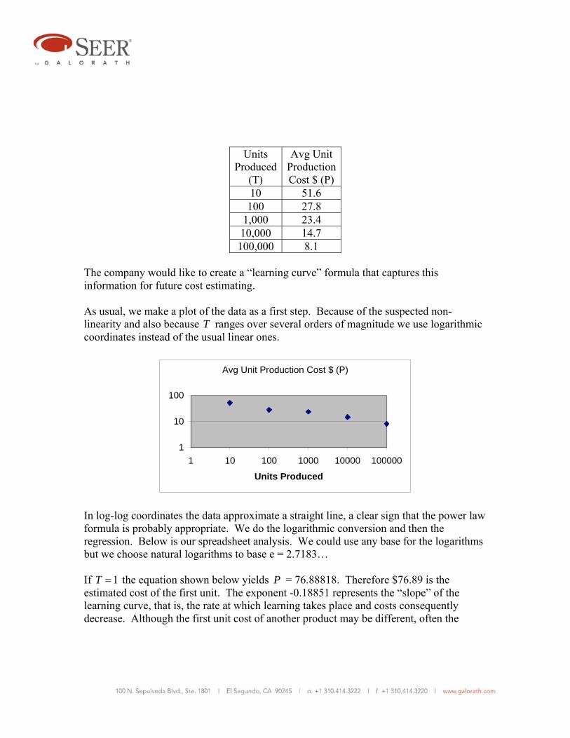
Units
Produced(T)
Avg Unit ProductionCost $ (P)
10 51.6 100 27.8
1,000 23.4 10,000 14.7 100,000 8.1
The company would like to create a “learning curve” formula that captures this information for future cost estimating. As usual, we make a plot of the data as a first step. Because of the suspected non-linearity and also because T ranges over several orders of magnitude we use logarithmic coordinates instead of the usual linear ones.
Avg Unit Production Cost $ (P)
1
10
100
1 10 100 1000 10000 100000
Units Produced
In log-log coordinates the data approximate a straight line, a clear sign that the power law formula is probably appropriate. We do the logarithmic conversion and then the regression. Below is our spreadsheet analysis. We could use any base for the logarithms but we choose natural logarithms to base e = 2.7183… If 1T = the equation shown below yields P = 76.88818. Therefore $76.89 is the estimated cost of the first unit. The exponent -0.18851 represents the “slope” of the learning curve, that is, the rate at which learning takes place and costs consequently decrease. Although the first unit cost of another product may be different, often the
learning slope will be about the same. Therefore the equation could be valuable for future estimating.
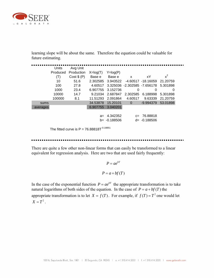
Units Produced
(T)
Avg Unit Production Cost $ (P)
X=log(T) Base e
Y=log(P) Base e x xY x2
10 51.6 2.302585 3.943522 -4.60517 -18.16059 21.20759100 27.8 4.60517 3.325036 -2.302585 -7.656178 5.301898
1000 23.4 6.907755 3.152736 0 0 010000 14.7 9.21034 2.687847 2.302585 6.188998 5.301898
100000 8.1 11.51293 2.091864 4.60517 9.63339 21.20759sums 34.53878 15.20101 0 -9.994379 53.01898
averages 6.907755 3.040201
a= 4.342352 c= 76.88818b= -0.188506 d= -0.188506
The fitted curve is P = 76.88818T-0.18851
There are quite a few other non-linear forms that can easily be transformed to a linear equivalent for regression analysis. Here are two that are used fairly frequently: bTP ae= ( )P a bf T= + In the case of the exponential function bTP ae= the appropriate transformation is to take natural logarithms of both sides of the equation. In the case of ( )P a bf T= + the appropriate transformation is to let ( )X f T= . For example, if 2( )f T T= one would let
2X T= .
Multiple Regression Why do multiple regression? Multiple regression, also called multivariate regression, is the regression of more than one independent variable (regressor) against a single dependent variable. The best argument for doing multiple regression is to reduce the stochastic error that can occur when we use only one independent variable. In many, perhaps most, real life situations, a dependent variable is significantly affected by more than one independent variable. Another reason to use multiple regression to reduce the analytical bias that can occur when important drivers are ignored. Illustrating the process. The simplest form of multiple regression equation is: Y x z e= α + β + γ + The assumptions about e are the same as previously stated. This equation represents a plane in x Y z− − coordinate space. The term α represent the value on the Y axis when x and z are set equal to zero. It can correctly be called an intercept. The coefficient β represents the slope of the plane in the x direction, keeping z constant. The coefficient γ represents the slope of the plane in the z direction, keeping x constant. Another equally valid view is that β represents the increase in Y if x is increased one unit while z is held constant, and γ represents the increase in Y if z is increased one unit while x is held constant. The least squares best fit is obtained by solving the problem
minimize 2( )i i iY x z∧ ∧ ∧
− α− β − γ∑ As before, this is accomplished with the calculus. We do not show the details. The result is as follows.
Y∧
α =
2i i i i ix Y x x z
∧ ∧
= β + γ∑ ∑ ∑
2i i i i iz Y x z z
∧ ∧
= β + γ∑ ∑ ∑
Although ∧
α is rather easily found, finding ∧
β and ∧
γ requires solving two simultaneous linear equations. While this is not very difficult, the number of equations to be solved increases by one for each variable added to the regression equation. That’s one of several reasons why computer programs designed specifically for the purpose are generally used for multiple regression. Multiple regression by hand becomes very tedious when there are more than two independent variables. We present here an example problem to illustrate a spreadsheet solution to a multiple regression problem with two independent variables.
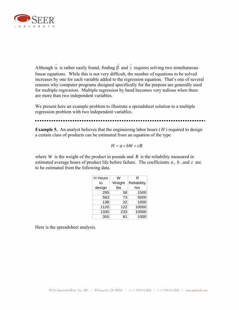
Example 5. An analyst believes that the engineering labor hours ( H ) required to design a certain class of products can be estimated from an equation of the type H a bW cR= + + where W is the weight of the product in pounds and R is the reliability measured in estimated average hours of product life before failure. The coefficients a , b , and c are to be estimated from the following data. Here is the spreadsheet analysis.
H Hours to
design
W Weight
lbs
R Reliability
hrs295 58 1500563 73 5000138 22 1000
1120 122 100001330 233 10000355 81 1000

H Hours to design
W Weight
lbs
R Reliability
hrsw = W - W bar
r = R - R bar wH rH w2 r2 wr
295 58 1500 -40.167 -3250 -11849.2 -958750 1613.36 10562500 130542563 73 5000 -25.167 250 -14168.8 140750 633.361 62500 -6291.7138 22 1000 -76.167 -3750 -10511 -517500 5801.36 14062500 285625
1120 122 10000 23.8333 5250 26693.33 5880000 568.028 27562500 1251251330 233 10000 134.833 5250 179328.3 6982500 18180 27562500 707875
355 81 1000 -17.167 -3750 -6094.17 -1331250 294.694 14062500 64375Sums 3801 589 28500 -3E-14 0 163398.5 10195750 27090.8 93875000 1307250
Averages 633.5 98.1667 4750
a* = 633.5 163399 = 27090.83 b+ 1307250 c1E+07 = 1307250 b+ 9.4E+07 c
The solution of the above simultaneous equation is b = 2.4101, c = 0.07505. Writing
633.5 2.4101( ) 0.07505( )H W W R R⎯ ⎯
= + − + − We find on combining constants that a = 40.15. The complete best fit equation is therefore 40.15 2.4101 0.07505H W R= + + For example, if we want to design a component with weight 45 pounds and life 3,000 hours we can estimate design labor hours of 40.15 2.4101(45) 0.07505(3000) 373H = + + =
Multicollinearity. We mentioned earlier that if the X values are not spread out in simple least squares with two variables, the accuracy of the estimate suffers. An analogous phenomenon can occur in multiple regression. It has been given the name “multicollinearity.” Roughly speaking, in two variable regression, if the X values are closely bunched up, our estimate tends to become a point rather than a line. We lose one dimension. Analogously, in three variable regression, if the X and Z values tend to lie along a line

in three dimensions (because they are closely related), our estimate tends to become a line and not a plane. Again, we lose one dimension. When X and Y are approximately collinear we have multicollinearity. This poses no problems if we want to estimate along the line fitting X to Z , but if we move off that line, the situation may become very unstable and the results invalid. One excellent way of telling that two regressors are highly correlated and therefore likely to produce multicollinearity problems is to calculate their correlation. We take up correlation later in this paper. When regressing three or more regressors multicollinearity can become a critical issue. When two variables are highly correlated, the usual remedy is to remove one of them from the regression. This is reasonable since they both contain essentially the same information. Confidence intervals and hypothesis tests. In discussing simple regression, we defined
the standard error of ∧
β as:
2i
ssx
β =∑
In multiple regression with two regressors X and Z the standard error is found to be:
2 2( ) /i i i i
ssx x z z
β =−∑ ∑ ∑
As the number of regressors increases, the formula for sβ gets extremely complex, so it is customary to rely on computer programs to compute it, and other quantities of interest. Typically, these computer programs will produce tables such as this:
Exhibit 7
Typical Regression Output
Variable Coefficient Standard Errorconstant 31.265 3.5126
X1 7.212 1.0501 X2 3.011 0.0702
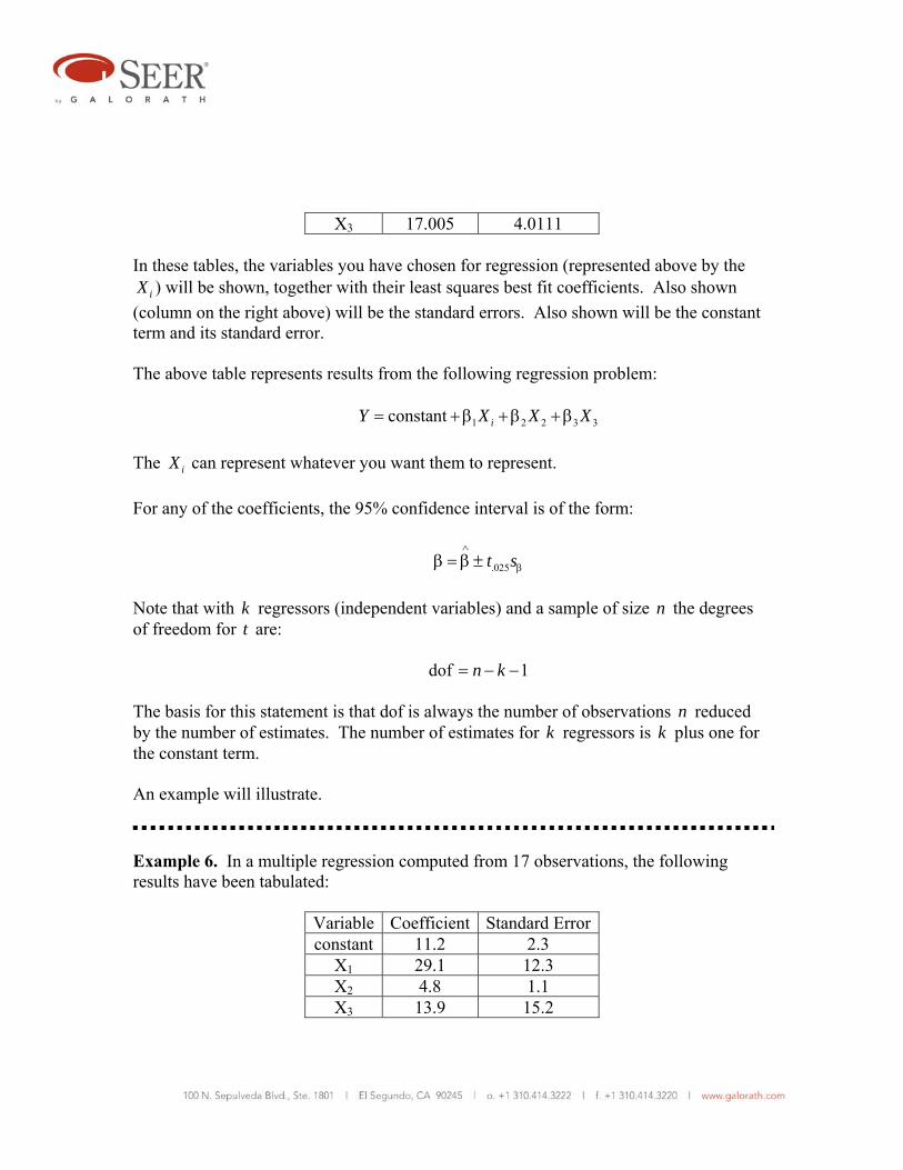
X3 17.005 4.0111
In these tables, the variables you have chosen for regression (represented above by the iX ) will be shown, together with their least squares best fit coefficients. Also shown
(column on the right above) will be the standard errors. Also shown will be the constant term and its standard error. The above table represents results from the following regression problem: 1 2 2 3 3constant iY X X X= + β + β + β The iX can represent whatever you want them to represent. For any of the coefficients, the 95% confidence interval is of the form:
.025t s∧
ββ = β ± Note that with k regressors (independent variables) and a sample of size n the degrees of freedom for t are: dof 1n k= − − The basis for this statement is that dof is always the number of observations n reduced by the number of estimates. The number of estimates for k regressors is k plus one for the constant term. An example will illustrate.
Example 6. In a multiple regression computed from 17 observations, the following results have been tabulated:
Variable Coefficient Standard Errorconstant 11.2 2.3
X1 29.1 12.3 X2 4.8 1.1 X3 13.9 15.2

X4 0.88 0.81 Construct a 95% confidence interval for β1, and also show by means of a hypothesis test that Y is related to β1 at the 5% level. We note that dof = n – k – 1 = 17 – 4 – 1 = 12, and from a table of the t distribution we find that .025t = 2.179. Thus: 1 29.1β = ±12.3(2.179) = 29.1± 26.8 Sometimes, especially when there are several regressors and we are not sure one of them “belongs,” it is of interest to test the hypothesis that Y may not be related to the suspect regressor. If Y is unrelated to, say, 1X , we would expect β1 = 0. In the present problem, zero is outside the interval we have found for β1. So we can say that we reject the hypothesis β1 = 0 in favor of β1 ≠ 0 at the 5% level. Retention of regressors. Usually a cost analyst includes a regressor because theory or intuition says it is likely to have a significant driving effect on cost. The question of which regressors to include and which to drop occurs frequently. This is a complex issue requiring astute judgment on the part of the analyst. The reason is that (mostly because of small sample sizes) statistical theory does not always offer solid grounds for making the decision to drop or keep a regressor. The usual approach to the problem is to test 0 : 0iH β = against
1 : 0iH β >
if βi is expected (on intuitive or theoretical grounds) to be positive. If we expect βi to be negative we would test against:
1 : 0iH β < A natural assumption is that the ratio
ii
ts
∧
ιβ=
should not exceed the critical value .05t . If it does, we say that 0H is rejected in favor of
1H at the 5% level, and then generally the regressor is removed. A judgmental exception probably should be made if the rejection is marginal and there are strong reasons to believe that the regressor “belongs.” Bear in mind that when we are working with a small sample,10 as cost analysts often do, it can be a mistake to reject a regressor if we have strong theoretical grounds for including it. We should not reverse a strong prior belief when the statistical evidence against it is weak. On the other hand, if the prior belief is weak, accepting 0H and removing the regressor may have the beneficial effect of conserving degrees of freedom and strengthening hypothesis tests on the remaining regressors. Cost analysts should guard against the tendency to try out every regressor they can think of just to see what happens. This practice greatly increases the possibility of a serious error. The analyst should have a theoretical or at least a strong intuitional reason for every regressor selected. Otherwise, the result is likely to be “garbage in, garbage out.” An issue that sometimes arises is whether a hypothesis test of a regressor should be one-sided or two sided. The usual statement of a two-sided test is 0 1: 0 versus : 0H Hβ = β ≠ The usual statement of a one-sided test is either
0 1: 0 versus : 0H Hβ = β >
or
10 What is a “small” sample? The rule of thumb most commonly used in statistical analysis is that any sample size less than 30 is small. But if the data are noisy and not particularly homogeneous, the analyst should exercise care even with a sample of 100. Often in cost analysis there is a problem with determining whether or not all members of a “sample” are truly members of the same population. When that assumption is made, it is often an act of personal judgment on the part of the analyst.
0 1: 0 versus : 0H Hβ = β <
The one-sided test is more appropriate if the regressor has been included for prior theoretical or strong intuitional reasons. The two-sided test might be more appropriate if there is no strong basis for retaining the regressor and the analyst simply wants to see if the data says it makes sense to include it. The prob value. Suppose that in testing an hypothesis about a particular iX the critical t value is 1.725 (5% level, 20 dof). If the observed t value is 1.726 we reject 0H , but if it is 1.724 we accept it. Recall that the critical t value depends on our choice of confidence level (e.g., 1%, 5%, etc.), and that this choice is usually arbitrary. We can see that the method of using hypothesis tests to select regressors has a potential weakness. How can we overcome this weakness? A commonly used approach is to note the observed t value and solve for the level of test that would allow us to “just barely” reject 0H . This value is called the prob-value and is often tabulated on reports generated by regression analysis computer programs. Other names for it are “p-value” and “observed level of significance.” The larger the observed t ratio and the smaller the prob-value the less credible is 0H . The prob-value is an excellent measure of what the data say about 0H . We give an example to clarify.
Example 7. We can determine the prob-value approximately using a table of the t distribution. Suppose that a certain variable in a regression analysis has a coefficient of 12.7 and a standard error of 14.1. The t ratio is
12.7 0.914.1
t = =
Also suppose that dof = 20. In a table of the t distribution at 20 dof we find that at the 25% level t = 0.687 and that at the 10% level t = 1.325. The value 0.9 lies between these values. By interpolation we find that the level corresponding to t = 0.9 is approximately 20%. Thus the 20% level is the level of test which would just barely
reject 0H and give us good reason to consider retaining this variable. Some conservative cost analysts might be reluctant to accept any regressor at the 20% level unless they had good empirical reasons for leaving it in.
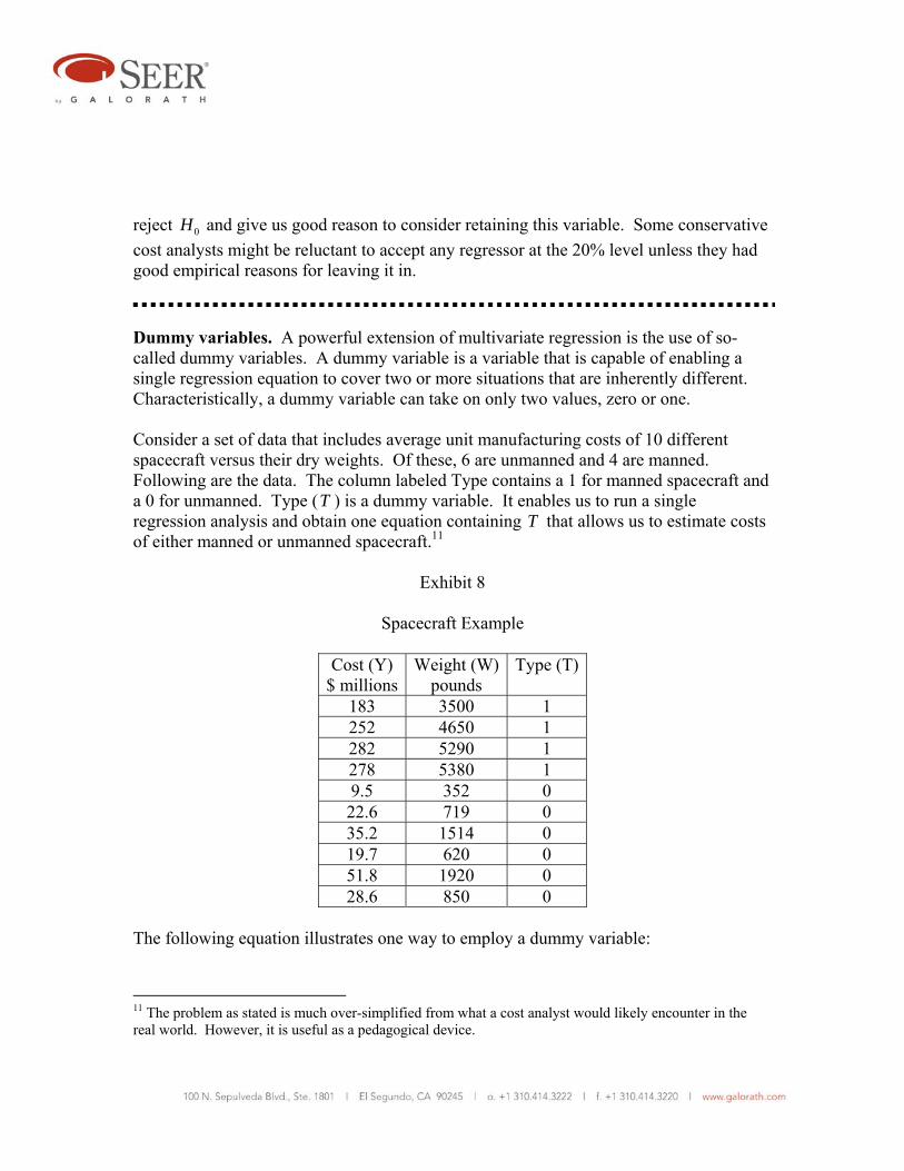
Dummy variables. A powerful extension of multivariate regression is the use of so-called dummy variables. A dummy variable is a variable that is capable of enabling a single regression equation to cover two or more situations that are inherently different. Characteristically, a dummy variable can take on only two values, zero or one. Consider a set of data that includes average unit manufacturing costs of 10 different spacecraft versus their dry weights. Of these, 6 are unmanned and 4 are manned. Following are the data. The column labeled Type contains a 1 for manned spacecraft and a 0 for unmanned. Type (T ) is a dummy variable. It enables us to run a single regression analysis and obtain one equation containing T that allows us to estimate costs of either manned or unmanned spacecraft.11
Exhibit 8
Spacecraft Example
Cost (Y) $ millions
Weight (W)pounds
Type (T)
183 3500 1 252 4650 1 282 5290 1 278 5380 1 9.5 352 0 22.6 719 0 35.2 1514 0 19.7 620 0 51.8 1920 0 28.6 850 0
The following equation illustrates one way to employ a dummy variable:
11 The problem as stated is much over-simplified from what a cost analyst would likely encounter in the real world. However, it is useful as a pedagogical device.
Y a bW cT= + + where Y is the cost, W is the weight, and T is the dummy variable, equal to 1 for manned spacecraft and 0 for unmanned spacecraft. This approach will produce one regression line for manned spacecraft and another for unmanned. The lines will be parallel, having a common slope b . The intercept for unmanned spacecraft will be a . The intercept for manned spacecraft will be a c+ . If the analyst suspects that the slope b may be different for manned and unmanned spacecraft, a slightly different equation can be used: Y a bW cT dWT= + + + If T = 0 (unmanned) the regression will produce a result of this type: Y a bW= + with intercept a and slope b . If T = 1 (manned) the regression will produce a result of this type: ( ) ( )Y a bW c dW a c b d W= + + + = + + + with intercept a c+ and slope b d+ . Dummy variables are a powerful tool for sorting out regression results for various somewhat dissimilar objects that may have found their way into a common database. Here is an example of their use.
Example 8. Based on the spacecraft data provided in Exhibit 8, a spreadsheet for the regression analysis is shown below. The resultant equation is 11.746 0.03981 73.181Y W T= − + + For unmanned spacecraft, with T = 0, the equation reduces to 11.746 0.03981Y W= − +

For manned spacecraft, with T =1, the equation becomes 61.435 0.03981Y W= +
Y W Tw = W - W bar
t = T - T bar wY tY w2 t2 wt
183 3500 1 1020.5 0.6 186752 109.8 1E+06 0.36 612.3252 4650 1 2170.5 0.6 546966 151.2 5E+06 0.36 1302.3282 5290 1 2810.5 0.6 792561 169.2 8E+06 0.36 1686.3278 5380 1 2900.5 0.6 806339 166.8 8E+06 0.36 1740.39.5 352 0 -2127.5 -0.4 -20211 -3.8 5E+06 0.16 851
22.6 719 0 -1760.5 -0.4 -39787 -9.04 3E+06 0.16 704.235.2 1514 0 -965.5 -0.4 -33986 -14.08 932190 0.16 386.219.7 620 0 -1859.5 -0.4 -36632 -7.88 3E+06 0.16 743.851.8 1920 0 -559.5 -0.4 -28982 -20.72 313040 0.16 223.828.6 850 0 -1629.5 -0.4 -46604 -11.44 3E+06 0.16 651.8
Sample size 10Sums 1162.4 24795 4 0 0 2126415 530 4E+07 2.4 8902
Averages 116.24 2479.5 0.4Results a* = 116.24 Equations: 2E+06 = 4E+07 b 8902 c
530.04 = 8902 b 2.4 cSolution: 5E+06 = 9E+07 b 21365 c
5E+06 = 8E+07 b 21365 c384981 = 1E+07 b 0 c
a = -11.746 b = 0.03981 c = 73.181 Extension of multiple regression to non-linear situations. Multiple regression can be extended to non-linear situations in much the same manner that simple regression. The key is to find a transformation that makes the non-linear equation linear. Some examples will be helpful. Consider the multi-dimensional power law equation b cY aX Z= This can be made linear by taking the logarithm to any base of both sides of the equation. The multi-dimensional exponential equation

bX cZ bX cZY ae e ae += = can be made linear by taking the natural logarithm of both sides of the equation. The equation 2 3Y a bS cT= + + can be made linear by letting X = 2S and Z = 3T . Once an equation is made linear the methods of regression analysis can be applied directly. Many equations cannot be made linear by convenient mathematical transformations. There are numerical methods for applying regression to many of these equations but they are beyond the scope of this paper.
Correlation Sample correlation. Regression analysis shows us the linear relationship between cost and cost drivers. As we have seen, it can be extended to certain non-linear situations. Correlation analysis is a less powerful tool that shows us merely the “degree” to which variables are linearly related. Still, it has important uses. A common use is as a rough “goodness of fit” measure in regression analysis. Another important use is testing the degree to which variables are linearly related as a means of avoiding multicollinearity in multiple regression. A simple example will introduce the concept.
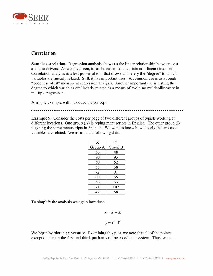
Example 9. Consider the costs per page of two different groups of typists working at different locations. One group (A) is typing manuscripts in English. The other group (B) is typing the same manuscripts in Spanish. We want to know how closely the two cost variables are related. We assume the following data:
X Group A
Y Group B
36 48 80 93 50 52 58 68 72 91 60 65 56 63 71 102 42 58
To simplify the analysis we again introduce x X X= − y Y Y= − We begin by plotting x versus y. Examining this plot, we note that all of the points except one are in the first and third quadrants of the coordinate system. Thus, we can

logically infer that a correlation, to the extent that it exists, is a “positive” correlation. That is, as x increases, y also tends to increase. The opposite tendency is called a negative correlation. When two negatively correlated variables are plotted, most of the points will lie in the second and fourth quadrants. Next we examine what happens when we form the sum xy∑ . This sum reflects how Group A and Group B tend to move together. For points in the first and third quadrants, x and y will agree in sign, so their products will be positive. Conversely, for points in the second and fourth quadrants, x and y will differ in sign and their products will be negative. The summation xy∑ reflects whether signs tend to agree more than disagree, hence reflecting positive versus negative correlation. As a measure of correlation, xy∑ has the right sign. But it has two serious flaws. One is that it is responsive to sample size. The other is that it also is responsive to the units used to measure X and Y. If the sample size above were doubled and the scatter pattern remained similar, then
xy∑ would roughly double in size. We would prefer a measure where this is not true. The “sample covariance” is such a measure. It is defined as:
1XY
xys
n≡
−∑
or equivalently as:
y
-40-20
02040
-30 -20 -10 0 10 20 30
x

1 ( )( )
1XY i is X X Y Yn
= − −− ∑
Note the use of n-1 instead of n. It has to do with avoiding bias in estimating. To eliminate dependence on units of measurement, both factors in the above summation are divided by the sample standard deviation. This results in a quantity r, called the “sample correlation.” It can be expressed as:
1
1( )( )i i
x Y
X X Y Yrn s s
− −=
− ∑
More compactly, we can write:
XY
X Y
srs s
=
The form most convenient for computation is:
2 2
xyr
x y= ∑
∑ ∑
It is left as an exercise to show that this computational form is equivalent to the definition above. Now we are able to compute r for the data above comparing Group A to Group B. Here is a spreadsheet table that does that:
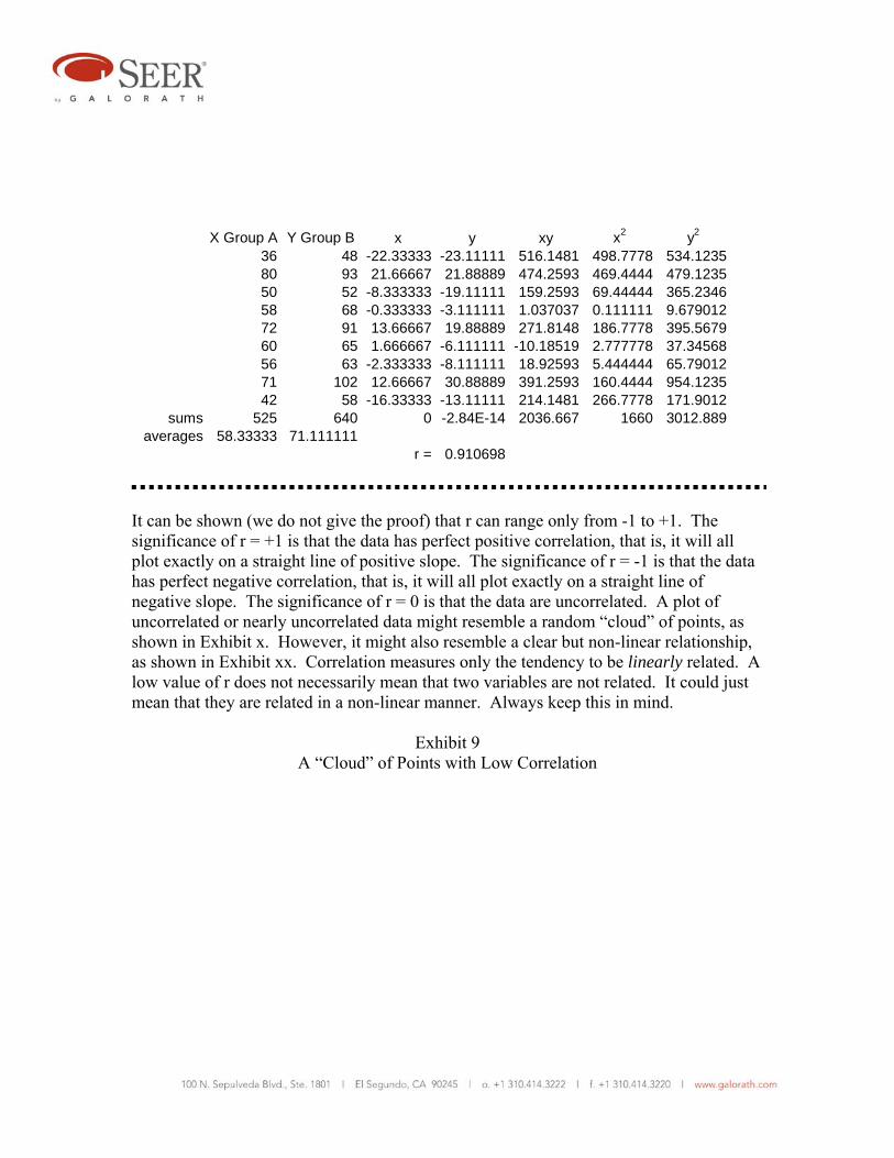
X Group A Y Group B x y xy x2 y2
36 48 -22.33333 -23.11111 516.1481 498.7778 534.123580 93 21.66667 21.88889 474.2593 469.4444 479.123550 52 -8.333333 -19.11111 159.2593 69.44444 365.234658 68 -0.333333 -3.111111 1.037037 0.111111 9.67901272 91 13.66667 19.88889 271.8148 186.7778 395.567960 65 1.666667 -6.111111 -10.18519 2.777778 37.3456856 63 -2.333333 -8.111111 18.92593 5.444444 65.7901271 102 12.66667 30.88889 391.2593 160.4444 954.123542 58 -16.33333 -13.11111 214.1481 266.7778 171.9012
sums 525 640 0 -2.84E-14 2036.667 1660 3012.889averages 58.33333 71.111111
r = 0.910698 It can be shown (we do not give the proof) that r can range only from -1 to +1. The significance of r = +1 is that the data has perfect positive correlation, that is, it will all plot exactly on a straight line of positive slope. The significance of r = -1 is that the data has perfect negative correlation, that is, it will all plot exactly on a straight line of negative slope. The significance of r = 0 is that the data are uncorrelated. A plot of uncorrelated or nearly uncorrelated data might resemble a random “cloud” of points, as shown in Exhibit x. However, it might also resemble a clear but non-linear relationship, as shown in Exhibit xx. Correlation measures only the tendency to be linearly related. A low value of r does not necessarily mean that two variables are not related. It could just mean that they are related in a non-linear manner. Always keep this in mind.
Exhibit 9 A “Cloud” of Points with Low Correlation

Low Correlation "Cloud"
0
50
100
150
200
0 50 100 150
X
Y
The calculated value of r in the above plot is only -0.35.
Exhibit 10 A Clearly Non-linear Relationship
A Non-linear Relationship
0
5000
10000
15000
0 20 40 60 80 100
X
Y Y
Relationship of correlation and regression. The alert reader has probably noticed that the mathematics of correlation bears more than a passing resemblance to the mathematics of regression. Recall that:
2
xyb
x
∧
β = = ∑∑

and that
2 2
xyr
x y= ∑
∑ ∑
Clearly
2
2
yr x
∧
β=
Dividing both numerator and denominator by n-1 under the square root sign yields:
2
2
/( 1)
/( 1)y
X
sy nr sx n
∧−β
= =−
Therefore
Y
X
srs
∧
β =
Clearly ∧
β and r are closely related. If either is zero, the other is zero. This means that if the correlation is zero, the regression line is flat. Explained and unexplained variation. Assume that we have regressed Y on X and have obtained the equation
Y a bX∧
= + If we wanted to predict Y without knowing a specific value for X , our best guess would be simply Y . Our error in doing this would be Y Y− . But if we knew a specific value for X we would predict
Y a bX∧
= +

This would reduce our error by giving us a point on the regression line. A part of the error is said to be “explained” by regression. For any data point we can write
( ) ( ) ( )i i i iY Y Y Y Y Y∧ ∧
− = − + − In words, we can say that the “total deviation” equals the “explained deviation” plus the “unexplained deviation.” Taking sums on both sides across the entire sample:
( ) ( ) ( )ii i iY Y Y Y Y Y∧ ∧
− = − + −∑ ∑ ∑ Interestingly, the same relationship holds when each of the terms in the summations is squared. To show this is left as an exercise. We have:
2 2 2( ) ( ) ( )ii i iY Y Y Y Y Y∧ ∧
− = − + −∑ ∑ ∑ In words, we say that the “total variation” equals the “explained variation” plus the “unexplained variation.” Since
( )i iiY Y y x∧ ∧ ∧
− = = β we can also write
2 2 2( ) ( )i i iY Y x Y Y∧ ∧2− = β + −∑ ∑ ∑
This makes clear that unexplained variation is that variation accounted for by ∧
β . Recall that we showed that
Y
X
srs
∧
β =

After a bit of algebra we can arrive at
22
22i
i
yr
x
∧
β = ∑∑
We can further reduce this to
2
22
( ) Explained variation of Y( ) Total variation of Y
i
i
Y Yr
Y Y
∧
−= =
−∑∑
The quantity 2r is called the coefficient of determination. A clear and intuitively reasonable interpretation of it is that it is the fraction of total variation of Y explained by regression. It is a measure of the “goodness” of the regression. Since the range of r is -1 to +1, it follows that the range of 2r is 0 to +1. Cost analysts and others who frequently use regression methods like to use 2r as a handy measure of goodness of fit of the regression equation. There is a lot to recommend this practice, but it is technically invalid unless X is a random variable, which frequently it is not. Analysts often use some value of 2r as a threshold for acceptable versus unacceptable regression. For example, any 2r > 0.8 might be regarded as acceptable, while any lesser value is regarded as unacceptable. Adopt such a practice only with great care and be prepared to make exceptions. There can be situations where an 2r of 0.4 can be just fine, while an 2r of 0.98 can indicate problems with the data. Always use your judgment, and do “sanity checks” routinely. In particular, statistical evidence based on small data samples should never replace sound judgment. Another danger lurks in the use of either r or 2r . It is called spurious correlation. It is neither all bad nor all good. But it is important to recognize its existence and deal with it accordingly. Just because two variables move together does not mean that one drives the other in the sense of cause and effect. Both might be caused by one or more other variables. It has been said that the number of PhDs granted in a year correlates closely with liquor sales. This does not prove (or disprove) that PhDs are drunkards. What it suggests is that at least one other variable, such as national income level, is driving both grants of PhDs and liquor consumption.
On the other hand, many cost models use product weight as the primary cost driver. Yet weight is seldom a direct driver of cost. Indeed, there is a known counterexample: Attempts to decrease product weight often increase cost. In most cases the correlation between weight and cost is at least somewhat spurious. Yet even a spurious correlation can often get the cost analyst somewhere in the vicinity of the correct cost. But it is almost always necessary to gather additional information to create “adjusting” CERs to get a reasonably accurate estimate. Correlation and regression cannot prove cause and effect. But they can do the following: Quantify a known cause and effect relationship Suggest unsuspected cause and effect relationships for further investigation
Multiple correlation. Simple correlation between two variables is generally denoted r . When multiple variables are considered, the usual notation is R . 2R is commonly used as an aid to multiple regression. For example, if the fitted equation is
Y X Z∧ ∧ ∧ ∧
= α+ β + γ
then R is the simple correlation between the fitted Y∧
and the observed Y :
Y YR r∧=
Thus R has all of the properties of a simple correlation. In particular:
2
22
( ) Variation of Y explained by ALL regressors( ) Total variation of Y
i
i
Y YR
Y Y
∧
−= =
−∑∑
2R measures how well overall Y can be explained by the regressors, that is, how well
multiple regression fits the data. Also, as more regressors are added, the change in 2R shows how helpful they are. Unfortunately, the addition of even an irrelevant regressor will often increase 2R somewhat. To correct for this gratuitous and unwanted effect, statisticians have developed a statistic called corrected 2R . It is defined as:
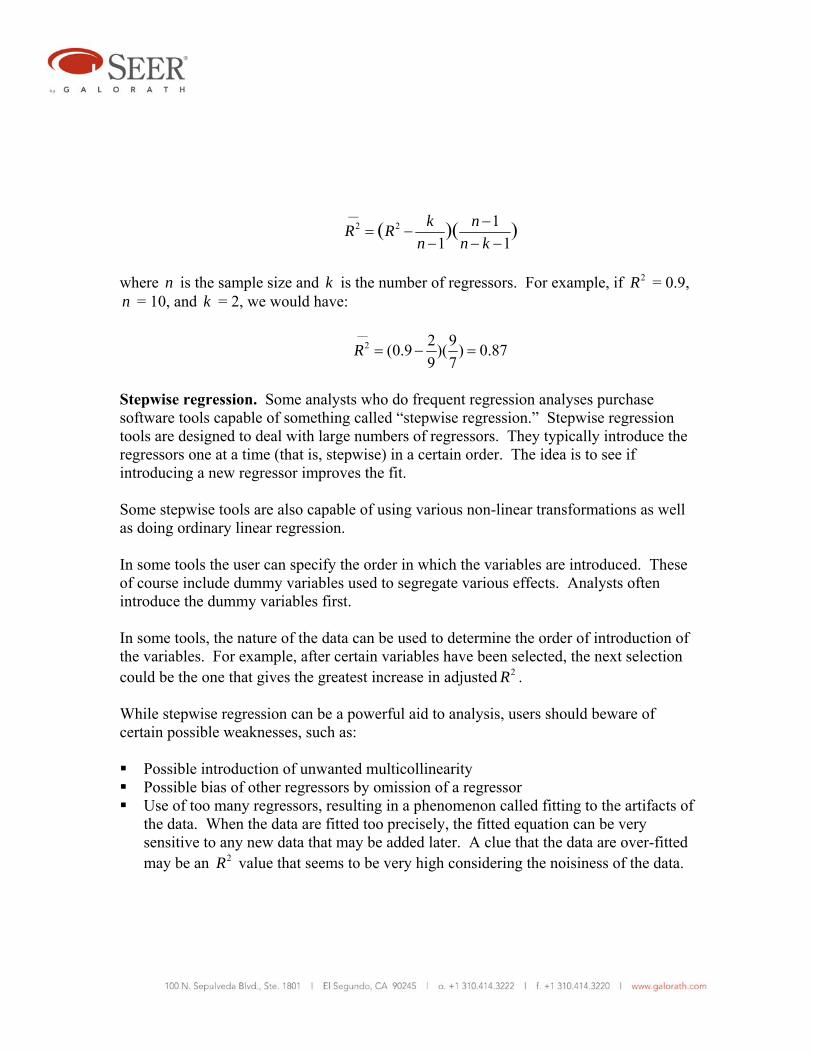
2 2 11 1
( )( )k nR Rn n k
⎯ −= −
− − −
where n is the sample size and k is the number of regressors. For example, if 2R = 0.9, n = 10, and k = 2, we would have:
2 2 9(0.9 )( ) 0.879 7
R⎯
= − =
Stepwise regression. Some analysts who do frequent regression analyses purchase software tools capable of something called “stepwise regression.” Stepwise regression tools are designed to deal with large numbers of regressors. They typically introduce the regressors one at a time (that is, stepwise) in a certain order. The idea is to see if introducing a new regressor improves the fit. Some stepwise tools are also capable of using various non-linear transformations as well as doing ordinary linear regression. In some tools the user can specify the order in which the variables are introduced. These of course include dummy variables used to segregate various effects. Analysts often introduce the dummy variables first. In some tools, the nature of the data can be used to determine the order of introduction of the variables. For example, after certain variables have been selected, the next selection could be the one that gives the greatest increase in adjusted 2R . While stepwise regression can be a powerful aid to analysis, users should beware of certain possible weaknesses, such as: Possible introduction of unwanted multicollinearity Possible bias of other regressors by omission of a regressor Use of too many regressors, resulting in a phenomenon called fitting to the artifacts of
the data. When the data are fitted too precisely, the fitted equation can be very sensitive to any new data that may be added later. A clue that the data are over-fitted may be an 2R value that seems to be very high considering the noisiness of the data.

When the nature of the data is allowed to determine the order of introduction of regressors, a commonly used rule is to add regressors until the following expression reaches a minimum:
2
2
(1 )( 1)
Rn k
−− −
The numerator in this expression is known as the coefficient of indetermination. As before, n is the sample size and k is the number of regressors.