r_mhw
TRANSCRIPT

Tutorial: Using the R Environment for Statistical ComputingAn example with the Mercer & Hall wheat yield dataset
D G RossiterUniversity of Twente, Faculty of Geo-Information Science & Earth
Observation (ITC)Enschede (NL)
October 1, 2012
Contents
1 Introduction 1
2 R basics 12.1 Leaving R . . . . . . . . . . . . . . . . . . . . . . . . . . . . . . 62.2 Answers . . . . . . . . . . . . . . . . . . . . . . . . . . . . . . . . 6
3 Loading and examining a data set 73.1 Reading a CSV file into an R object . . . . . . . . . . . . . . . 73.2 Examining a dataset . . . . . . . . . . . . . . . . . . . . . . . . 83.3 Saving a dataset in R format . . . . . . . . . . . . . . . . . . . 133.4 Answers . . . . . . . . . . . . . . . . . . . . . . . . . . . . . . . . 14
4 Exploratory graphics 144.1 Univariate exploratory graphics . . . . . . . . . . . . . . . . . . 15
4.1.1 Enhancing the histogram* . . . . . . . . . . . . . . . . . 164.1.2 Kernel density* . . . . . . . . . . . . . . . . . . . . . . . 174.1.3 Another histogram enhancement: colour-coding rela-
tive frequency* . . . . . . . . . . . . . . . . . . . . . . . 194.2 Bivariate exploratory graphics . . . . . . . . . . . . . . . . . . . 204.3 Answers . . . . . . . . . . . . . . . . . . . . . . . . . . . . . . . . 23
5 Descriptive statistics 24
Version 2.6. Copyright © 2006–2012 D G Rossiter. All rights reserved.Reproduction and dissemination of the work as a whole (not parts) freelypermitted if this original copyright notice is included. Sale or placementon a web site where payment must be made to access this document isstrictly prohibited. To adapt or translate please contact the author (http://www.itc.nl/personal/rossiter).

5.1 Other descriptive statistics* . . . . . . . . . . . . . . . . . . . . 255.2 Attaching a dataframe to the search path . . . . . . . . . . . . 265.3 A closer look at the distribution . . . . . . . . . . . . . . . . . . 275.4 Answers . . . . . . . . . . . . . . . . . . . . . . . . . . . . . . . . 28
6 Editing a data frame 296.1 Answers . . . . . . . . . . . . . . . . . . . . . . . . . . . . . . . . 31
7 Univariate modelling 317.1 Answers . . . . . . . . . . . . . . . . . . . . . . . . . . . . . . . . 38
8 Bivariate modelling: two continuous variables 388.1 Correlation . . . . . . . . . . . . . . . . . . . . . . . . . . . . . . 40
8.1.1 Parametric correlation . . . . . . . . . . . . . . . . . . . 408.2 Univariate linear regression . . . . . . . . . . . . . . . . . . . . 44
8.2.1 Fitting a regression line . . . . . . . . . . . . . . . . . . 458.2.2 Regression diagnostics . . . . . . . . . . . . . . . . . . . 488.2.3 Prediction . . . . . . . . . . . . . . . . . . . . . . . . . . 53
8.3 Structural Analysis* . . . . . . . . . . . . . . . . . . . . . . . . 568.3.1 A user-defined function . . . . . . . . . . . . . . . . . . 60
8.4 No-intercept model* . . . . . . . . . . . . . . . . . . . . . . . . 638.4.1 Fitting a no-intercept model . . . . . . . . . . . . . . . . 648.4.2 Goodness-of-fit of the no-intercept model . . . . . . . . 66
8.5 Answers . . . . . . . . . . . . . . . . . . . . . . . . . . . . . . . . 68
9 Bivariate modelling: continuous response, classified predictor 709.1 Exploratory data analysis . . . . . . . . . . . . . . . . . . . . . 729.2 Two-sample t-test . . . . . . . . . . . . . . . . . . . . . . . . . . 749.3 One-way ANOVA . . . . . . . . . . . . . . . . . . . . . . . . . . 759.4 Answers . . . . . . . . . . . . . . . . . . . . . . . . . . . . . . . . 76
10 Bootstrapping* 7710.1 Example: 1% quantile of grain yield . . . . . . . . . . . . . . . 7910.2 Example: structural relation between grain and straw . . . . . 8210.3 Answers . . . . . . . . . . . . . . . . . . . . . . . . . . . . . . . . 86
11 Robust methods* 8711.1 A contaminated dataset . . . . . . . . . . . . . . . . . . . . . . 8711.2 Robust univariate modelling . . . . . . . . . . . . . . . . . . . . 9011.3 Robust bivariate modelling . . . . . . . . . . . . . . . . . . . . . 9111.4 Robust regression . . . . . . . . . . . . . . . . . . . . . . . . . . 9411.5 Answers . . . . . . . . . . . . . . . . . . . . . . . . . . . . . . . . 98
12 Multivariate modelling 10012.1 Additive model: parallel regression . . . . . . . . . . . . . . . . 10212.2 Comparing models . . . . . . . . . . . . . . . . . . . . . . . . . 10312.3 Interaction model . . . . . . . . . . . . . . . . . . . . . . . . . . 10512.4 Regression diagnostics . . . . . . . . . . . . . . . . . . . . . . . 10712.5 Analysis of covariance: a nested model* . . . . . . . . . . . . . 11212.6 Answers . . . . . . . . . . . . . . . . . . . . . . . . . . . . . . . . 113
ii

13 Principal Components Analysis 11513.1 Answers . . . . . . . . . . . . . . . . . . . . . . . . . . . . . . . . 118
14 Model validation 11914.1 Splitting the dataset . . . . . . . . . . . . . . . . . . . . . . . . 12014.2 Developing the model . . . . . . . . . . . . . . . . . . . . . . . . 12214.3 Predicting at the validation observations . . . . . . . . . . . . . 12314.4 Measures of model quality* . . . . . . . . . . . . . . . . . . . . 124
14.4.1 MSD . . . . . . . . . . . . . . . . . . . . . . . . . . . . . 12614.4.2 SB . . . . . . . . . . . . . . . . . . . . . . . . . . . . . . 12714.4.3 NU . . . . . . . . . . . . . . . . . . . . . . . . . . . . . . 12714.4.4 LC . . . . . . . . . . . . . . . . . . . . . . . . . . . . . . 131
14.5 An inappropriate model form* . . . . . . . . . . . . . . . . . . . 13214.6 Answers . . . . . . . . . . . . . . . . . . . . . . . . . . . . . . . . 135
15 Cross-validation* 13715.1 Answers . . . . . . . . . . . . . . . . . . . . . . . . . . . . . . . . 142
16 Spatial analysis 14216.1 Geographic visualisation . . . . . . . . . . . . . . . . . . . . . . 14316.2 Setting up a coordinate system . . . . . . . . . . . . . . . . . . 14616.3 Loading add-in packages . . . . . . . . . . . . . . . . . . . . . . 14816.4 Creating a spatially-explicit object . . . . . . . . . . . . . . . . 14816.5 More geographic visualisation . . . . . . . . . . . . . . . . . . . 14916.6 Answers . . . . . . . . . . . . . . . . . . . . . . . . . . . . . . . . 151
17 Spatial structure 15117.1 Spatial structure: trend . . . . . . . . . . . . . . . . . . . . . . . 15117.2 Spatial structure: local . . . . . . . . . . . . . . . . . . . . . . . 15417.3 Absence of spatial structure* . . . . . . . . . . . . . . . . . . . 15617.4 Spatial structure of field halves* . . . . . . . . . . . . . . . . . 15917.5 Answers . . . . . . . . . . . . . . . . . . . . . . . . . . . . . . . . 162
18 Generalized least squares regression* 16318.1 Answers . . . . . . . . . . . . . . . . . . . . . . . . . . . . . . . . 169
19 Geographically-weighted regression* 17019.1 Answers . . . . . . . . . . . . . . . . . . . . . . . . . . . . . . . . 175
References 175
Index of R concepts 179
A Example Data Set 182
B Colours 183
iii

1 Introduction
This tutorial introduces the R environment for statistical computing andvisualisation [20, 37] and its dialect of the S language. It is organized asa systematic analysis of a simple dataset: the Mercer & Hall wheat yielduniformity trial (Appendix A). After completing the tutorial you should:
� know the basics of the R environment;
� be able to use R at a beginning to intermediate level;
� follow a systematic approach to analyze a simple dataset.
The tutorial is organized as a set of tasks followed by questions to checkyour understanding; answers are at the end of each section. If you are am-bitious, there are also some challenges: tasks and questions with no solutionprovided, that require the integration of skills learned in the section.
Not every section is of equal importance; you should pick and choose those ofinterest to you. Sections marked with an asterisk ‘*’ are interesting“detours”or perhaps “scenic byways” developed to satisfy the author’s curiosity or toanswer a reader’s question.
Note: For an explanation of the R project, including how to obtain andinstall the software and documentation, see Rossiter [39]. This also containsan extensive discussion of the S language, R graphics, and many statisticalmethods, as well as a bibliography of texts and references that use R.
2 R basics
Before entering into the sample data analysis (§3), we first explain how tointeract with R, and the basics of the S language.
Task 1 : Start R. •
How you do this is system-specific. Under Microsoft Windows, open the exe-cutable program RGui.exe; under Mac OS/X, open the application programR.app. Rossiter [39, §3] explains how to run the ITC network installation ofR.
Note: There are also some integrated development environments (IDE) forR, along with a source-code editor, object browser, help text, and graphicsdisplay. One that runs on Microsoft Windows, OS/X and Linux is RStudio1.
After starting R, you will be looking at a console where you interact withR: giving commands and seeing numerical results; graphs are displayed intheir own windows. You perform most actions in R by typing commands inresponse to a command prompt, which usually looks like this:
>
1 http://rstudio.org/; there is a complete list of code editors and IDE’s at http://
www.sciviews.org/_rgui/projects/Editors.html
1
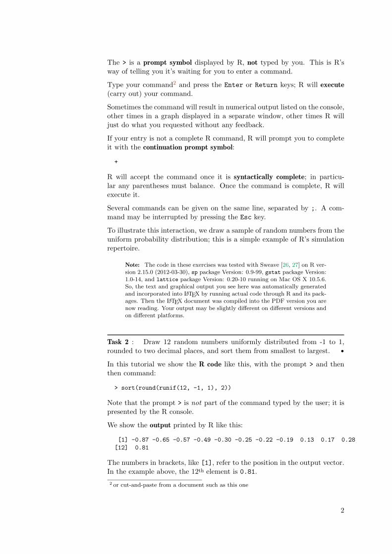
The > is a prompt symbol displayed by R, not typed by you. This is R’sway of telling you it’s waiting for you to enter a command.
Type your command2 and press the Enter or Return keys; R will execute(carry out) your command.
Sometimes the command will result in numerical output listed on the console,other times in a graph displayed in a separate window, other times R willjust do what you requested without any feedback.
If your entry is not a complete R command, R will prompt you to completeit with the continuation prompt symbol:
+
R will accept the command once it is syntactically complete; in particu-lar any parentheses must balance. Once the command is complete, R willexecute it.
Several commands can be given on the same line, separated by ;. A com-mand may be interrupted by pressing the Esc key.
To illustrate this interaction, we draw a sample of random numbers from theuniform probability distribution; this is a simple example of R’s simulationrepertoire.
Note: The code in these exercises was tested with Sweave [26, 27] on R ver-sion 2.15.0 (2012-03-30), sp package Version: 0.9-99, gstat package Version:1.0-14, and lattice package Version: 0.20-10 running on Mac OS X 10.5.6.So, the text and graphical output you see here was automatically generatedand incorporated into LATEX by running actual code through R and its pack-ages. Then the LATEX document was compiled into the PDF version you arenow reading. Your output may be slightly different on different versions andon different platforms.
Task 2 : Draw 12 random numbers uniformly distributed from -1 to 1,rounded to two decimal places, and sort them from smallest to largest. •
In this tutorial we show the R code like this, with the prompt > and thenthen command:
> sort(round(runif(12, -1, 1), 2))
Note that the prompt > is not part of the command typed by the user; it ispresented by the R console.
We show the output printed by R like this:
[1] -0.87 -0.65 -0.57 -0.49 -0.30 -0.25 -0.22 -0.19 0.13 0.17 0.28
[12] 0.81
The numbers in brackets, like [1], refer to the position in the output vector.In the example above, the 12th element is 0.81.
2 or cut-and-paste from a document such as this one
2

This first example already illustrates several features of R:
1. It includes a large number of functions (here, runif to generate randomnumbers from the uniform distribution; round to round them to aspecified precision; and sort to sort them);
2. These functions have arguments that specify the exact behaviour ofthe function. For example, round has two arguments: the first is theobject to be rounded (here, the vector returned by the runif function)and the second is the number of decimal places (here, 2);
3. Many functions are vectorized: they can work on vectors (and usuallymatrices) as well as scalars. Here the round function is modifying theresults of the runif function, which is a 12-element vector;
4. Values returned by a function can be immediately used as an argumentto another function. Here the results of runif is the vector to berounded by the round function; and these are then used by the sort
function. To understand a complex expression, read it from the insideout.
5. R has a rich set of functions for simulation of random processes.
Q1 : Your results will be different from the ones printed in this note; why?Jump to A1 •
To see how this works, we can do the same operation step-by-step.
1. Draw the random sample, and save it in a local variable in the workspaceusing the <- (assignment) operator; we also list it on the console withthe print function:
> sample <- runif(12, -1, 1)
> print(sample)
[1] 0.25644 -0.42512 -0.25248 0.54182 -0.18068 -0.50500 -0.97578
[8] 0.13229 -0.61466 -0.64337 -0.24299 -0.19569
2. Round it to two decimal places, storing it in the same variable (i.e.replacing the original sample):
> sample <- round(sample, 2)
> sample
[1] 0.26 -0.43 -0.25 0.54 -0.18 -0.50 -0.98 0.13 -0.61 -0.64 -0.24
[12] -0.20
3. Sort it and print the results:
> (sample <- sort(sample))
[1] -0.98 -0.64 -0.61 -0.50 -0.43 -0.25 -0.24 -0.20 -0.18 0.13 0.26
[12] 0.54
This example also shows three ways of printing R output on the console:
3

� By using the print function with the object name as argument;
� By simply typing the object name; this calls the print function;
� By enclosing any expression in parenthesis ( ... ); this forces anotherevaluation, which prints its results.
R has an immense repertoire of statistical methods; let’s see two of the mostbasic.
Task 3 : Compute the theoretical and empirical mean and variance of asample of 20 observations from a uniformly-distributed random variable inthe range (0 . . .10), and compare them. •
The theoretical mean and variance of a uniformly-distributed random vari-able are [6, §3.3]:
µ = (b + a)/2σ2 = (b − a)2/12
where a and b are the lower and upper endpoints, respectively, of the uniforminterval.
First the theoretical values for the mean and variance. Although we couldcompute these by hand, it’s instructive to see how R can be used as aninteractive calculator with the usual operators such as +, -, *, /, and ^ (forexponentiation):
> (10 + 0)/2
[1] 5
> (10 - 0)^2/12
[1] 8.3333
Now draw a 20-element sample and compute the sample mean and variance,using the mean and var functions:
> sample <- runif(20, min = 0, max = 10)
> mean(sample)
[1] 5.1767
> var(sample)
[1] 5.9375
Q2 : How close did your sample come to the theoretical value? Jump toA2 •
We are done with the local variable sample, so we remove it from theworkspace with the rm (“remove”) function; we can check the contents ofthe workspace with the ls (“list”) function:
4

> ls()
[1] "sample"
> rm(sample)
> ls()
character(0)
On-line help If you know a function or function’s name, you can get helpon it with the help function:
> help(round)
This can also be written more simply as ?round.
Q3 : Use the help function to find out the three arguments to the runif
function. What are these? Are they all required? Does the order matter?Jump to A3 •
Arguments to functions We can experiment a bit to see the effect of chang-ing the arguments:
> runif(1)
[1] 0.68842
> sort(runif(12))
[1] 0.056824 0.155549 0.330679 0.332763 0.348012 0.367465 0.497712
[8] 0.692830 0.765264 0.768196 0.802825 0.939375
> sort(runif(12, 0, 5))
[1] 0.020834 0.866171 1.514368 1.700327 2.586933 3.001469 3.007611
[8] 3.402821 4.411772 4.610753 4.622963 4.711845
> sort(runif(12, min = 0, max = 5))
[1] 0.20958 0.66706 1.30825 1.64050 2.24625 2.58794 2.71440 3.09623
[9] 3.51202 3.54978 3.67748 4.29115
> sort(runif(max = 5, n = 12, min = 0))
[1] 0.43866 1.09526 1.72724 1.82152 2.60138 2.74913 3.05271 3.39843
[9] 4.09550 4.35773 4.44373 4.95513
Searching for a function If you don’t know a function name, but you knowwhat you want to accomplish, you can search for an appropriate functionwith the help.search function:
> help.search("principal component")
This will show packages and functions relevant to the topic:
5

stats::biplot.princomp Biplot for Principal Components
stats::prcomp Principal Components Analysis
stats::princomp Principal Components Analysis
stats::summary.princomp Summary method for Principal Components Analysis
Then you can ask for more information on one of these, e.g.:
> help(prcomp)
prcomp package:stats R Documentation
Principal Components Analysis
Description:
Performs a principal components analysis on the given data matrix
and returns the results as an object of class 'prcomp'.
Usage: ...
2.1 Leaving R
At this point you should leave R and re-start it, to see how that’s done.
Before leaving R, you may want to save your console log as a text file todocument what you did, and the results, or for later re-use. You can editthis file in any plain-text editor. In the Windows GUI you can use theFile| Save to file... menu command.
To leave R, use the q (“quit”) function (in any OS). On Windows you canquit the program in the conventional ways: select the File | Exit menuitem in the Windows GUI, or click the “Close” icon at the top of the mainwindow.
> q()
You will be asked if you want to save your workspace in the current directory;generally you will want to do this3. The next time you start R in the samedirectory, the saved workspace will be automatically loaded.
In this case we haven’t created anything useful for data analysis, so youshould quit without saving the workspace.
2.2 Answers
A1 : Random number generation gives a different result each time.4. Return toQ1 •
A2 : This depends on your sample; see the results in the text for an example.
3 By default this file is named .RData4 To start a simulation at the same point (e.g. for testing) use the set.seed function
6

Return to Q2 •
A3 : There are three possible arguments: the number of samples n, the minimumvalue min and the maximum max. The last two are not required and default to 0and 1, respectively. If arguments are named directly, they can be put in any order.If not, they have to follow the default order. Return to Q3 •
3 Loading and examining a data set
The remainder of this tutorial uses the Mercer & Hall wheat yield data set,which is described in Appendix A. Please read this now.
There are many ways to get data into R [39, §6]; one of the simplest is tocreate a comma-separated values (“CSV”) file in a text editor5. For thisexample we have prepared file mhw.csv which is supplied with this note.
Task 4 : From the operating system, open the text file mhw.csv with aplain-text editor such as WordPad and examine its structure.
Note: do not examine it in Excel; this automatically splits the file intospreadsheet columns, obscuring its structure as a text file. •
The first four lines of the file should look like this:
"r","c","grain","straw"
1,1,3.63,6.37
2,1,4.07,6.24
3,1,4.51,7.05
Q4 : What does the first line represent? What do the other lines represent,and what is their structure? Jump to A4 •
3.1 Reading a CSV file into an R object
Now we read the dataset into R.
Task 5 : Start R. •
Task 6 : If necessary, make sure R is pointed to the same working direc-tory where you have stored mhw.csv. You can use the getwd function tocheck this, and setwd to change it; in the Windows GUI you can use theFile|Change directory... menu command. •
> getwd()
5 A CSV file can also be prepared as a spreadsheet and exported to CSV format.
7
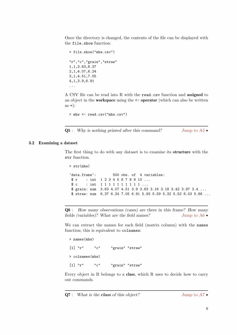
Once the directory is changed, the contents of the file can be displayed withthe file.show function:
> file.show("mhw.csv")
"r","c","grain","straw"
1,1,3.63,6.37
2,1,4.07,6.24
3,1,4.51,7.05
4,1,3.9,6.91
...
A CSV file can be read into R with the read.csv function and assigned toan object in the workspace using the <- operator (which can also be writtenas =):
> mhw <- read.csv("mhw.csv")
Q5 : Why is nothing printed after this command? Jump to A5 •
3.2 Examining a dataset
The first thing to do with any dataset is to examine its structure with thestr function.
> str(mhw)
'data.frame': 500 obs. of 4 variables:
$ r : int 1 2 3 4 5 6 7 8 9 10 ...
$ c : int 1 1 1 1 1 1 1 1 1 1 ...
$ grain: num 3.63 4.07 4.51 3.9 3.63 3.16 3.18 3.42 3.97 3.4 ...
$ straw: num 6.37 6.24 7.05 6.91 5.93 5.59 5.32 5.52 6.03 5.66 ...
Q6 : How many observations (cases) are there in this frame? How manyfields (variables)? What are the field names? Jump to A6 •
We can extract the names for each field (matrix column) with the names
function; this is equivalent to colnames:
> names(mhw)
[1] "r" "c" "grain" "straw"
> colnames(mhw)
[1] "r" "c" "grain" "straw"
Every object in R belongs to a class, which R uses to decide how to carryout commands.
Q7 : What is the class of this object? Jump to A7 •
8

We can examine the class with the class function:
> class(mhw)
[1] "data.frame"
A data frame is used to hold most data sets. The matrix rows are theobservations or cases; the matrix columns are the named fields or variables.Both matrix rows and columns have names.
Fields in the data frame are commonly referred to by their matrix columnname, using the syntax frame$variable, which can be read as “extract thefield named variable from the data frame named frame.
Task 7 : Summarize the grain and straw yields. •
> summary(mhw$grain)
Min. 1st Qu. Median Mean 3rd Qu. Max.
2.73 3.64 3.94 3.95 4.27 5.16
> summary(mhw$straw)
Min. 1st Qu. Median Mean 3rd Qu. Max.
4.10 5.88 6.36 6.51 7.17 8.85
A data frame is also a matrix; we can see this by examining its dimensionswith the dim function and extracting elements.
The two dimensions are the numbers of matrix rows and columns:
> dim(mhw)
[1] 500 4
Q8 : Which matrix dimension corresponds to the observations and whichto the fields? Jump to A8 •
Matrix rows, columns, and individual cells in the matrix can be extractedwith the [] operator; this is just like standard matrix notation in mathe-matics:
> mhw[1, ]
r c grain straw
1 1 1 3.63 6.37
> length(mhw[, 3])
[1] 500
> summary(mhw[, 3])
Min. 1st Qu. Median Mean 3rd Qu. Max.
2.73 3.64 3.94 3.95 4.27 5.16
9

> mhw[1, 3]
[1] 3.63
Matrix rows and columns can also be accessed by their names; here is thegrain yield of the first plot:
> mhw[1, "grain"]
[1] 3.63
Q9 : What is the grain yield of plot 64? Where is this located in the(experimental) field? Jump to A9 •
> mhw[64, "grain"]
[1] 4.04
> mhw[64, c("r", "c")]
r c
64 4 4
Note the use of the c (“catenate”, Latin for ‘build a chain’) function to builda list of two names.
Several adjacent rows or columns can be specified with the : “sequence”operator. For example, to show the row and column in the wheat field forthe first three records:
> mhw[1:3, 1:2]
r c
1 1 1
2 2 1
3 3 1
Rows or columns can be omitted with the - “minus” operator; this is short-hand for “leave these out, show the rest”. For example to summarize thegrain yields for all except the first field column6:
> summary(mhw[-(1:20), "grain"])
Min. 1st Qu. Median Mean 3rd Qu. Max.
2.73 3.64 3.94 3.95 4.27 5.16
> summary(mhw$grain[-(1:20)])
Min. 1st Qu. Median Mean 3rd Qu. Max.
2.73 3.64 3.94 3.95 4.27 5.16
6 recall, the dataset is presented in field column-major order, and there are 20 field rowsper field column
10

An entire field (variable) can be accessed either by matrix column number orname (considering the object to be a matrix) or variable name (consideringthe object to be a data frame); the output can be limited to the first and lastlines only by using the head and tail functions. By default they show thesix first or last values; this can be over-ridden with the optional n argument.
> head(mhw[, 3])
[1] 3.63 4.07 4.51 3.90 3.63 3.16
> tail(mhw[, "grain"], n = 10)
[1] 3.29 3.83 4.33 3.93 3.38 3.63 4.06 3.67 4.19 3.36
> head(mhw$grain)
[1] 3.63 4.07 4.51 3.90 3.63 3.16
The order function is somewhat like the sort function shown above, butrather than return the actual values, it returns their position in the ar-ray. This position can then be used to extract other information from thedataframe.
Task 8 : Display the information for the plots with the five lowest strawyields. •
To restrict the results to only five, we again use the head function.
> head(sort(mhw$straw), n = 5)
[1] 4.10 4.28 4.53 4.56 4.57
> head(order(mhw$straw), n = 5)
[1] 470 467 441 447 427
> head(mhw[order(mhw$straw), ], n = 5)
r c grain straw
470 10 24 2.84 4.10
467 7 24 2.78 4.28
441 1 23 2.97 4.53
447 7 23 3.44 4.56
427 7 22 3.05 4.57
Q10 : What are the values shown in the first command, using sort? In thesecond, using order? Why must we use the results of order to extract therecords in the data frame? Jump to A10 •
Task 9 : Display the information for the plots with the highest straw yields.•
11

One way is to use the rev command to reverse the results of the sort ororder function:
> head(rev(sort(mhw$straw)), n = 5)
[1] 8.85 8.85 8.78 8.75 8.74
Another way is to use the optional decreasing argument to sort or order;by default this has the value FALSE (so the sort is ascending); by setting itto TRUE the sort will be descending:
> head(sort(mhw$straw, decreasing = T), n = 5)
[1] 8.85 8.85 8.78 8.75 8.74
And a final way is to display the end of the ascending order vector, instead ofthe beginning, with the tail function; however, this shows the last recordsbut still in ascending order:
> tail(sort(mhw$straw), n = 5)
[1] 8.74 8.75 8.78 8.85 8.85
Records can also be selected with logical criteria, for example with numericcomparison operators.
Task 10 : Identify the plots with the highest and lowest grain yields andshow their location in the field and both yields. •
There are two ways to do this. First, apply the max and min functions to thegrain yield field, and use their values (i.e., the highest and lowest yields) asa row selector, along with the == “numerical equality” comparison operator.
We save the returned value (i.e., the row number where the maximum orminimum is found), and then use this as the row subscript selector:
> (ix <- which(mhw$grain == max(mhw$grain)))
[1] 79
> mhw[ix, ]
r c grain straw
79 19 4 5.16 8.78
> (ix <- which(mhw$grain == min(mhw$grain)))
[1] 338
> mhw[ix, ]
r c grain straw
338 18 17 2.73 4.77
12

The easier way, in the case of the minimum or maximum, is to use thewhich.max (index of the maximum value in a vector) and which.min (indexof the minimum value in a vector) function
> (ix <- which.max(mhw$grain))
[1] 79
> mhw[ix, ]
r c grain straw
79 19 4 5.16 8.78
> (ix <- which.min(mhw$grain))
[1] 338
> mhw[ix, ]
r c grain straw
338 18 17 2.73 4.77
Q11 : Why is there nothing between the comma ‘,’ and right bracket ‘]’in the expressions mhw[ix, ] above? Jump to A11 •
The advantage of the first method is that == or other numeric comparisonoperators can be used to select; operators include != (not equal), <, >, <=(≤), and >= (≥). For example:
Task 11 : Display the records for the plots with straw yield > 8.8 lb. perplot. •
> mhw[which(mhw$straw > 8.8), ]
r c grain straw
15 15 1 3.46 8.85
98 18 5 4.84 8.85
Challenge: Extract all the grain yields from the most easterly (highest-numbered) column of field plots, along with the straw yields and field plotrow number. Sort them from highest to lowest yields, also displaying therow numbers and straw yields. Does there seem to be any trend by field plotrow? How closely are the decreasing grain yields matched by straw yields?
3.3 Saving a dataset in R format
Once a dataset has been read into R and possibly modified (for example, byassigning field names, changing the class of some fields, or computing newfields) it can be saved in R’s internal format, using the save function. Thedataset can then be read into the workspace in a future session with theload function.
13
Task 12 : Save the mhw object in R format. •
It is conventional to give files with R objects the .RData extension.
> save(mhw, file = "mhw.RData")
3.4 Answers
A4 : The first line is a header with the variable names, in this case r, c, grainand straw. The following lines each represent one plot; there are four variablesrecorded for each plot, i.e. its row and column number in the field, and its grainand straw yield. Return to Q4 •
A5 : Commands that store their results in an object (using the = or <- operators) dotheir work silently; if you want to see the results enclose the command in parentheses( ... ) or just type the object name at the command prompt. Return to Q5 •
A6 : There are 500 observations (cases), and for each 4 variables: r, c, grain andstraw. Return to Q6 •
A7 : It is in class data.frame. Return to Q7 •
A8 : Matrix rows are observations, matrix columns are fields. Return to Q8 •
A9 : Grain yield 4.04; this is located at field row 4, field column 4 Return to Q9•
A10 : The sort function shows the actual values of straw yield; order shows inwhich records in the data frame these are found. The record numbers are the keyinto the dataframe. Return to Q10 •
A11 : So that all fields (matrix columns) are selected. Return to Q11 •
4 Exploratory graphics
Before beginning a data analysis, it is helpful to visualise the dataset. Thisis generally the first phase of exploratory data analysis (EDA) [42].
R is an excellent environment for visualisation; it can produce simple plotsbut also plots of great sophistication, information and beauty. We look firstat single variables and then at the relation between two variables.
14

4.1 Univariate exploratory graphics
Task 13 : Visualise the frequency distribution of grain yield with a stemplot. •
A stem-and-leaf plot, displayed by the stem function, shows the numericalvalues themselves, to some precision:
> stem(mhw$grain)
The decimal point is 1 digit(s) to the left of the |
27 | 38
28 | 45
29 | 279
30 | 144555557899
31 | 4446678999
32 | 2345589999
33 | 002455666677789999
34 | 00112233444444566777777888999
35 | 01112334444555666677789999
36 | 0001111133333444445666666777778889999
37 | 00011111122222233344444555556666667777899999
38 | 0011222223334444455566667777999999
39 | 0111111112222233333444444555666666777777777999
40 | 011122333344555666666677777778888899999999
41 | 0001111122333445555777779999
42 | 00001111111222333344444466677777788999999
43 | 0111223333566666777778888999999
44 | 0011111222234445566667777899
45 | 0112222234445667888899
46 | 1344446678899
47 | 3356677
48 | 466
49 | 12349
50 | 279
51 | 3336
Q12 : According to the stem-and-leaf plot, what are the approximate valuesof the minimum and maximum grain yields? Jump to A12 •
Q13 : What is the advantage of the stem plot over the histogram? Jumpto A13 •
Task 14 : Visualise the frequency distribution of grain yield with a frequencyhistogram. •
A histogram, displayed by the hist function, shows the distribution:
> hist(mhw$grain)
15

Histogram of mhw$grain
mhw$grain
Fre
quen
cy
2.5 3.0 3.5 4.0 4.5 5.0
020
4060
80
You can save the graphics window to any common graphics format. In theSaving graphicoutput Windows GUI, bring the graphics window to the front (e.g. click on its
title bar), select menu command File | Save as ... and then one of theformats.
Q14 : What are the two axes of the default histogram? Jump to A14 •
Q15 : By examining the histogram, how many observations had grain yieldbelow 3 lb. per plot? Jump to A15 •
4.1.1 Enhancing the histogram*
R graphics, including histograms, can be enhanced from their quite plaindefault appearance. Here we change the break points with the breaks argu-ment, the colour of the bars with the col graphics argument, the colour ofthe border with the border graphics argument, and supply a title with themain graphics argument.
We then use the rug function to add a “rug” plot along the x-axis to showthe actual observations. This is an example of a graphics function that addsto an existing plot; whereas hist creates a new plot. Which does which?Consult the help.
> hist(mhw$grain, breaks = seq(2.6, 5.2, by = 0.1), col = "lightblue",
+ border = "red", main = "Mercer-Hall uniformity trial",
+ xlab = "Grain yield, lb. per plot")
> rug(mhw$grain)
16

Mercer−Hall uniformity trial
Grain yield, lb. per plot
Fre
quen
cy
2.5 3.0 3.5 4.0 4.5 5.0
010
2030
40
Note the use of the seq (“sequence”) function to make a list of break points:
> seq(2.6, 5.2, by = 0.1)
[1] 2.6 2.7 2.8 2.9 3.0 3.1 3.2 3.3 3.4 3.5 3.6 3.7 3.8 3.9 4.0 4.1
[17] 4.2 4.3 4.4 4.5 4.6 4.7 4.8 4.9 5.0 5.1 5.2
In this example, the colours are from a list of known names. For moreinformation on these names, and other ways to specify colours, see AppendixB.
4.1.2 Kernel density*
A kernel density, computed with density function, fits an empirical curveto a sample supposed to be drawn from a univariate probability distribution[44, §5.6]. It can be used to give a visual impression of the distribution orto smooth an empirical distribution.
In the context of EDA, the kernel density can suggest:
� whether the empirical distribution is unimodal or multimodal;
� in the case of a unimodal distribution, the theoretical probability den-sity function from which it may have been drawn.
The kernel density is controlled by the kernel and adjust optional argu-ments to the density function; see ?density for details. The default valuesof "gaussian" and 1 select a smoothing bandwidth based on the number ofobservations and a theoretical normal density.
A special case of the density is a histogram expressed as densities rather thanfrequencies; this is selected with the optional freq (“frequency”) argumentto the hist function set to FALSE. The total area under the histogram isthen by definition 1.
17

The lines function can be used to add the empirical density computed bydensity to a density histogram plotted with hist. Another interesting viewis the kernel density with a rug plot to show the actual values of the sample.
Task 15 : Display a histogram of the grain yields as a density (proportionof the total), with the default kernel density superimposed, along with adouble and half bandwidth kernel density. •
> hist(mhw$grain, breaks = seq(2.6, 5.2, by = 0.1), col = "lavender",
+ border = "darkblue", main = "Mercer-Hall uniformity trial",
+ freq = F, xlab = "Grain yield, lb. per plot")
> lines(density(mhw$grain), lwd = 1.5)
> lines(density(mhw$grain, adj = 2), lwd = 1.5, col = "brown")
> lines(density(mhw$grain, adj = 0.5), lwd = 1.5, col = "red")
> text(2.5, 0.95, "Default bandwidth", col = "darkblue",
+ pos = 4)
> text(2.5, 0.9, "Double bandwidth", col = "brown", pos = 4)
> text(2.5, 0.85, "Half bandwidth", col = "red", pos = 4)
Mercer−Hall uniformity trial
Grain yield, lb. per plot
Den
sity
2.5 3.0 3.5 4.0 4.5 5.0
0.0
0.2
0.4
0.6
0.8
Default bandwidthDouble bandwidthHalf bandwidth
Task 16 : Repeat, but show just the kernel density with a rug plot (i.e. nohistogram). •
Here the first plot must be of the density, because rug only adds to anexisting plot.
> plot(density(mhw$grain) ,xlab="Grain yield, lb.\ per plot",
+ lwd=1.5, ylim=c(0,1), col="darkblue",
+ main="Mercer-Hall uniformity trial")
> rug(mhw$grain)
> lines(density(mhw$grain, adj=2), lwd=1.5, col="brown")
> lines(density(mhw$grain, adj=.5), lwd=1.5, col="red")
> text(2.5,0.85,"Default bandwidth", col="darkblue", pos=4)
18

> text(2.5,0.80,"Double bandwidth", col="brown", pos=4)
> text(2.5,0.75,"Half bandwidth", col="red", pos=4)
2.5 3.0 3.5 4.0 4.5 5.0 5.5
0.0
0.2
0.4
0.6
0.8
1.0
Mercer−Hall uniformity trial
Grain yield, lb. per plot
Den
sity
Default bandwidthDouble bandwidthHalf bandwidth
Q16 : Which bandwidths give rougher or smoother curves? What does thecurve for the default bandwidth suggest about the underlying distribution?
Jump to A16 •
4.1.3 Another histogram enhancement: colour-coding relative frequency*
Task 17 : Display a histogram of the grain yield with break points every0.2 lb., with the count in each histogram bin printed on the appropriate bar.Shade the bars according to their count, in a colour ramp with low countswhiter and high counts redder. •
The solution to this task depends on the fact that the hist function notonly plots a histogram graph, it can also return an object which can beassigned to an object in the workspace; we can then examine the object tofind the counts, breakpoints etc. We first compute the histogram but don’tplot it (plot=F argument), then draw it with the plot command, specifyinga colour ramp, which uses the computed counts, and a title. Then the text
command adds text to the plot at (x, y) positions computed from the classmid-points and counts; the pos=3 argument puts the text on top of the bar.
> h <- hist(mhw$grain, breaks = seq(2.6, 5.2, by = 0.2),
+ plot = F)
> str(h)
List of 7
$ breaks : num [1:14] 2.6 2.8 3 3.2 3.4 3.6 3.8 4 4.2 4.4 ...
$ counts : int [1:13] 2 5 22 30 56 80 79 73 70 48 ...
19

$ intensities: num [1:13] 0.02 0.05 0.22 0.3 0.56 ...
$ density : num [1:13] 0.02 0.05 0.22 0.3 0.56 ...
$ mids : num [1:13] 2.7 2.9 3.1 3.3 3.5 3.7 3.9 4.1 4.3 4.5 ...
$ xname : chr "mhw$grain"
$ equidist : logi TRUE
- attr(*, "class")= chr "histogram"
> plot(h, col = heat.colors(length(h$mids))[length(h$count) -
+ rank(h$count) + 1], ylim = c(0, max(h$count) + 5),
+ main = "Frequency histogram, Mercer & Hall grain yield",
+ sub = "Counts shown above bar, actual values shown with rug plot",
+ xlab = "Grain yield, lb. per plot")
> rug(mhw$grain)
> text(h$mids, h$count, h$count, pos = 3)
> rm(h)
Frequency histogram, Mercer & Hall grain yield
Counts shown above bar, actual values shown with rug plotGrain yield, lb. per plot
Fre
quen
cy
2.5 3.0 3.5 4.0 4.5 5.0
020
4060
80
25
22
30
56
80 79
7370
48
20
8 7
4.2 Bivariate exploratory graphics
When several variables have been collected, it is natural to compare them.
Task 18 : Display a scatterplot of straw vs. grain yield. •
We again use plot, but in this case there are two variables, so a scatterplotis produced. That is, plot is an example of a generic function: its behaviourchanges according to the class of object it is asked to work on.
> plot(mhw$grain, mhw$straw)
20

●●
●●
●
●
●
●
●
●●
● ●●
●
●
●
●●
●
●
●
●
●
●
●
●
●
●
●●●
●
●
●
●
●
●
●
●
●
● ●
●
●
● ●●
●
●
●
●
●
●
●
●●
●
●
●
●
●
●
●
●●
●
●
●●
●
●
●
●
●
●
●
●
●●
●
●
●
●
●
●
●
●
●
●●
●
● ●
●
●
●
●
●
●
●
●
●
●
●
●● ●
● ●
●
●
●
●
●
●
●●
●
●
●
●
●
●
●
●
●
●
●
●
●
●
●
●
●
●
●●
●
●
●
●
●
●●
●
●
●
●
●
● ●
●●
●
●
●
●●
●
●●
●●
●
●
●
●
●●
●
●●
●
●
●
●
●
●●
●
●
●
●
●
●
● ●
●
●● ● ●
●
●
●
●
●
●
●
●
●●
●
●
●
●●
●
●
●
●
●
●
●
●
●
●
●
●
●
●●
●
●
●
●
●
●
●
●
●
●
●
●
●
●
●
●●
●
●
●
●●●
●
●
●
●
●●
●
●●
●
●
●
●●
●
●
●
●
●
●●
●
●
●●
●
● ●
●
●
●
●
●
●
●
●
●
●
●
●
●●
●
●
● ●
●
●
●
●
●
●
●
● ●
●
●
●
●●
●
●
●
●
●
●
●
●
●
●
●
●
●●
●●
●
●
●
●
●
●
●
●
●
●
●
●
●
●
●
●
●
●
●
●
●
●
●
●●
●
●●●
●
●●
●
●
●
●
●
●
●
●
●
●
●
●
●
●
●
●
●
●
●●
● ●
● ●
●
●
●
●
●
●
●●
●
●
●●
●
●
●
●
● ●●
●●
●
●
●
●●
● ●
●
●●
●
●
●
●
● ●
●
●●
●
●
●●
●
●
●
●
●
●●
●
●●
●●
●
●
●
● ●●
●
●
●
●
●
●
●
●
●●
●
●
●
●
●
●
●●
●
●
●
●
●
●
●●
●
●
●
●
●
●
●●●
●
●
●
●
●
●
●
●
● ●
●
●
●
●
●
●
●
●
●
●
●
●
●
●
●
3.0 3.5 4.0 4.5 5.0
45
67
89
mhw$grain
mhw
$str
aw
Q17 : What is the relation between grain and straw yield? Jump to A17 •
This plot can be enhanced with much more information. For example:
� We add a grid at the axis ticks with the grid function;
� We specify the plotting character with the pch graphics argument,
� its colours with the col (outline) and bg (fill) graphics arguments,
� its size with the cex “character expansion” graphics argument,
� the axis labels with the xlab and ylab graphics arguments;
� We add a title with the title function, and
� mark the centroid (centre of gravity) with two calls to abline, onespecifying a vertical line (argument v=) and one horizontal (argumentvh=) at the means of the two variables, computed with the mean func-tion;
� The two lines are dashed, using the lty “line type” graphics argument,
� and coloured red using col;
� The centroid is shown as large diamond, using the points functionand the cex graphics argument;
� Finally, the actual mean yields are displayed with the text function,using the pos and adj graphic argument to position the text withrespect to the plotting position.
> plot(mhw$grain, mhw$straw, cex=0.8, pch=21, col="blue",
+ bg="red", xlab="Grain yield, lb.\ plot-1",
+ ylab="Straw yield, lb.\ per plot-1")
> grid()
21

> title(main="Mercer-Hall wheat uniformity trial")
> abline(v=mean(mhw$grain), lty=2, col="blue")
> abline(h=mean(mhw$straw), lty=2, col="blue")
> points(mean(mhw$grain), mean(mhw$straw), pch=23, col="black",
+ bg="brown", cex=2)
> text(mean(mhw$grain), min(mhw$straw),
+ paste("Mean:",round(mean(mhw$grain),2)), pos=4)
> text(min(mhw$grain), mean(mhw$straw),
+ paste("Mean:",round(mean(mhw$straw),2)), adj=c(0,-1))
●
●
●
●
●
●
●
●
●
●●
● ●●
●
●
●
●
●
●
●
●
●
●
●
●
●
●
●
●●
●
●
●
●
●
●
●
●
●
●
●●
●
●
● ●●
●
●
●
●
●
●
●
●
●
●
●
●
●
●
●
●
●●
●
●
●●
●
●
●
●
●
●
●
●
●●
●
●
●
●
●
●
●
●
●
●
●
●
● ●
●
●
●
●
●
●
●
●
●
●
●
●● ●
● ●
●
●
●
●
●
●
●●
●
●
●
●
●
●
●
●
●
●
●
●
●
●
●
●
●
●
●●
●
●
●
●
●
●●
●
●
●
●
●
●●
●●
●
●
●
●
●
●
●●
●
●
●
●
●
●
●●
●
●●
●
●
●
●
●
●●
●
●
●
●
●
●
●●
●
●● ●●
●
●
●
●
●
●
●
●
●●
●
●
●
●●
●
●
●
●
●
●
●
●
●
●
●
●
●
●●
●
●
●
●
●
●
●
●
●
●
●
●
●
●
●
●
●
●
●
●
●●
●
●
●
●
●
●
●
●
●
●
●
●
●
●
●
●
●
●
●
●
●●
●
●
●●
●
● ●
●
●
●
●
●
●
●
●
●
●
●
●
●
●
●
●
●●
●
●
●
●
●
●
●
● ●
●
●
●
●
●
●
●
●
●
●
●
●
●
●
●
●
●
●●
●●
●
●
●
●
●
●
●
●
●
●
●
●
●
●
●
●
●
●
●
●
●
●
●
●
●
●
●●●
●
●●
●
●
●
●
●
●
●
●
●
●
●
●
●
●
●
●
●
●
●
●
●●
● ●
●
●
●
●
●
●
●
●
●
●
●●
●
●
●
●
● ●●
●
●
●
●
●
●●
● ●
●
●●
●
●
●
●
● ●
●
●●
●
●
●
●
●
●
●
●
●
●
●●
●●
●
●
●
●
●
● ●●
●
●
●
●
●
●
●
●
●●
●
●
●
●
●
●
●●
●
●
●
●
●
●
●●
●
●
●
●
●
●
●●●
●
●
●
●
●
●
●
●
● ●
●
●
●
●
●
●
●
●
●
●
●
●
●
●
●
3.0 3.5 4.0 4.5 5.0
45
67
89
Grain yield, lb. plot−1
Str
aw y
ield
, lb.
per
plo
t−1
Mercer−Hall wheat uniformity trial
Mean: 3.95
Mean: 6.51
The advantage of this programmed enhancement is that we can store thecommands as a script and reproduce the graph by running the script.
Some R graphics allow interaction.
Task 19 : Identify the plots which do not fit the general pattern. (In anyanalysis these can be the most interesting cases, requiring explanation.) •
For this we use the identify function, specifying the same plot coordinatesas the previous plot command (i.e. from the plot that is currently displayed):
> plot(mhw$grain, mhw$straw)
> pts <- identify(mhw$grain, mhw$straw)
After identify is called, switch to the graphics window, left-click with themouse on points to identify them, and right-click to exit. The plot shouldnow show the row names of the selected points:
22

●●
●
●
●
●
●
●
●
●●
● ●●
●
●
●
●●
●
●
●
●
●
●
●
●
●
●
●●●
●
●
●
●
●
●
●
●
●
●●
●
●
● ●●
●
●
●
●
●
●
●
●
●
●
●
●
●
●
●
●
●●
●
●
●●
●
●
●
●
●
●
●
●
●●
●
●
●
●
●
●
●
●
●
●●
●
● ●
●
●
●
●
●
●
●
●
●
●
●
●● ●
● ●
●
●
●
●
●
●
●●
●
●
●
●
●
●
●
●
●
●
●
●
●
●
●
●
●
●
●●
●
●
●
●
●
●●
●
●
●
●
●
●●
●●
●
●
●
●●
●
●●
●●
●
●
●
●
●●
●
●●
●
●
●
●
●
●●
●
●
●
●
●
●
●●
●
●● ●●
●
●
●
●
●
●
●
●
●●
●
●
●
●●
●
●
●
●
●
●
●
●
●
●
●
●
●
●●
●
●
●
●
●
●
●
●
●
●
●
●
●
●
●
●
●
●
●
●
●●
●
●
●
●
●
●
●
●
●
●
●
●
●
●●
●
●
●
●
●
●●
●
●
●●
●
● ●
●
●
●
●
●
●
●
●
●
●
●
●
●●
●
●
● ●
●
●
●
●
●
●
●
● ●
●
●
●
●
●
●
●
●
●
●
●
●
●
●
●
●
●
●●
●●
●
●
●
●
●
●
●
●
●
●
●
●
●
●
●
●
●
●
●
●
●
●
●
●
●
●
●●●
●
●●
●
●
●
●
●
●
●
●
●
●
●
●
●
●
●
●
●
●
●
●
● ●
● ●
●
●
●
●
●
●
●
●
●
●
●●
●
●
●
●
● ●●
●●
●
●
●
●●
● ●
●
●●
●
●
●
●
● ●
●
●●
●
●
●
●
●
●
●
●
●
●
●●
●●
●
●
●
●
●
● ●●
●
●
●
●
●
●
●
●
●●
●
●
●
●
●
●
●●
●
●
●
●
●
●
●●
●
●
●
●
●
●
●●●
●
●
●
●
●
●
●
●
● ●
●
●
●
●
●
●
●
●
●
●
●
●
●
●
●
3.0 3.5 4.0 4.5 5.0
45
67
89
mhw$grain
mhw
$str
aw
15
35184
284
292
295311
337
Q18 : Which observations have grain yield that is much lower than expected(considering the straw) and which higher? Jump to A18 •
> tmp <- mhw[pts, ]
> tmp[order(tmp$grain), ]
r c grain straw
337 17 17 3.05 7.64
15 15 1 3.46 8.85
295 15 15 3.73 8.58
311 11 16 3.74 8.63
284 4 15 3.75 4.62
35 15 2 4.42 5.20
184 4 10 4.59 5.41
292 12 15 4.86 6.39
> rm(pts, tmp)
4.3 Answers
A12 : 2.73 and 5.16 lb. per plot, respectively. Note the placement of the decimalpoint, as explained in the plot header. Here it is one digit to the left of the |, sothe entry 27 | 38 is to be read as 2.73,2.78. Return to Q12 •
A13 : The stem plot shows the actual values (to some number of significant digits).This allows us to see if there is any pattern to the digits. Return to Q13 •
A14 : The horizontal axis is the value of the variable being summarized (in thiscase, grain yield). It is divided into sections (“histogram bins”) whose limits are
23

shown by the vertical vars. The vertical axis is the count (frequency) of observationsin each bin. Return to Q14 •
A15 : The two left-most histogram bins represent the values below 3 lb. per plot(horizontal axis); these appear to have 2 and 5 observations, respectively, for atotal of 7; although it’s difficult to estimate exactly. The stem plot, which showsthe values to some precision, can show this exactly. Return to Q15 •
A16 : The higher value of the adj argument to the density function gives asmoother curve. In this case with adj=2 the curve is indistinguishable from a uni-variate normal distribution. The default curve is quite similar but with a slightasymmetry (peak is a bit towards the smaller values) and shorter tails. But, con-sidering the sample size, it still strongly suggests a normal distribution. Returnto Q16 •
A17 : They are positively associated: higher grain yields are generally associatedwith higher straw yields. The relation appears to be linear across the entire rangeof the two measured variables. But the relation is diffuse and there are some clearexceptions. Return to Q17 •
A18 : Plots 15, 337, 311 and 295 have grain yields that are lower than the generalpattern; plots 308, 292, 184 and 35 the opposite. Return to Q18 •
5 Descriptive statistics
After visualizing the dataset, the next step is to compute some numericalsummaries, also known as descriptive statistics. We can summarize all thevariables in the dataset at the same time or individually with the summary
function:
> summary(mhw)
r c grain straw
Min. : 1.00 Min. : 1 Min. :2.73 Min. :4.10
1st Qu.: 5.75 1st Qu.: 7 1st Qu.:3.64 1st Qu.:5.88
Median :10.50 Median :13 Median :3.94 Median :6.36
Mean :10.50 Mean :13 Mean :3.95 Mean :6.51
3rd Qu.:15.25 3rd Qu.:19 3rd Qu.:4.27 3rd Qu.:7.17
Max. :20.00 Max. :25 Max. :5.16 Max. :8.85
> summary(mhw$grain)
Min. 1st Qu. Median Mean 3rd Qu. Max.
2.73 3.64 3.94 3.95 4.27 5.16
Q19 : What are the summary statistics for grain yield? Jump to A19 •
24

5.1 Other descriptive statistics*
The descriptive statistics in the summary all have their individual functions:max, median, mean, max, and quantile. Note this latter has a second argu-ment, probs, with a single value or list (formed with the c function) of theprobabilities for which the quantile is requested:
> max(mhw$grain)
[1] 5.16
> min(mhw$grain)
[1] 2.73
> median(mhw$grain)
[1] 3.94
> mean(mhw$grain)
[1] 3.9486
> quantile(mhw$grain, probs = c(0.25, 0.75))
25% 75%
3.6375 4.2700
Other statistics that are often reported are the variance, standard deviation(square root of the variance) and inter-quartile range (IQR).
Task 20 : Compute these for grain yield. •
The var, sd and IQR functions compute these.
> var(mhw$grain)
[1] 0.21002
> sd(mhw$grain)
[1] 0.45828
> IQR(mhw$grain)
[1] 0.6325
Other measures applied to distributions are the skewness (deviation fromsymmetry; symmetric distributions have no skewness) and kurtosis (con-centration around central value; a normal distribution has kurtosis of 3).Functions for these are not part of base R but are provided as the skewness
and kurtosis functions of the curiously-named e1071 package from the De-partment of Statistics, Technical University of Vienna7.
7 This may have been the Department’s amdinistrative code.
25

Task 21 : Load the e1071 package and compute the skewness and kurtosis.Note that if e1071 is not already installed on your system, you have to installit first. •
Optional packages are best loaded with the require function; this ensuresthat the package is not already loaded before loading it (to avoid duplica-tion).
Note: Since this is the only use we make of this package, we can unload itwith the detach function. This is generally not necessary.
> require(e1071)
> skewness(mhw$grain)
[1] 0.035363
> kurtosis(mhw$grain)
[1] -0.27461
> detach(package:e1071)
Note that kurtosis computes the so-called “excess” kurtosis, i.e., the dif-ference from the normal distribution’s value (3). So a normally-distributedvariable would have no excess kurtosis.
Q20 : How do the skew and kurtosis of this distribution compare to theexpected values for a normally-distributed variable, i.e., 0 (skew) and 0 (ex-cess kurtosis)? Jump to A20•
5.2 Attaching a dataframe to the search path
We can avoid the construction frame$variable by attaching the frame tothe search path with the attach function.
> search()
[1] ".GlobalEnv" "package:spgwr" "package:maptools"
[4] "package:foreign" "package:nlme" "package:lattice"
[7] "package:gstat" "package:spacetime" "package:xts"
[10] "package:zoo" "package:sp" "package:MASS"
[13] "package:class" "package:stats" "package:graphics"
[16] "package:grDevices" "package:utils" "package:datasets"
[19] "package:methods" "Autoloads" "package:base"
> summary(grain)
Error in summary(grain) : object "grain" not found
> attach(mhw)
26

> search()
[1] ".GlobalEnv" "mhw" "package:spgwr"
[4] "package:maptools" "package:foreign" "package:nlme"
[7] "package:lattice" "package:gstat" "package:spacetime"
[10] "package:xts" "package:zoo" "package:sp"
[13] "package:MASS" "package:class" "package:stats"
[16] "package:graphics" "package:grDevices" "package:utils"
[19] "package:datasets" "package:methods" "Autoloads"
[22] "package:base"
> summary(grain)
Min. 1st Qu. Median Mean 3rd Qu. Max.
2.73 3.64 3.94 3.95 4.27 5.16
Notice how the mhw object was not on the search path prior to the attach
command.
5.3 A closer look at the distribution
Q21 : What is the range in grain yields? What proportion of the medianyield is this? Does this seem high or low, considering that all plots weretreated the same? Jump to A21 •
To answer this we can use the diff (“difference”) and median functions:
> diff(range(grain))
[1] 2.43
> diff(range(grain))/median(grain)
[1] 0.61675
Q22 : Which is the lowest-yielding plot? Does it also have low straw yield?Jump to A22 •
To answer this, use the which.min function to identify the record numberwith the lowest yield:
> ix <- which.min(grain)
> mhw[ix, "straw"]
[1] 4.77
We can select cases based on logical criteria, for example, to find the lowest-yielding plots.
Task 22 : Find all observations with grain yield less than 3 lb. per plot, andalso those with grain yield in the lowest (first) percentile. •
27

We can use either the subset function or direct matrix selection. Thequantile function returns a list with quantiles; here we illustrate the de-fault, the case where we use the seq function to ask for the ten deciles, andfinally just the 1% quantile:
> row.names(subset(mhw, grain < 3))
[1] "149" "336" "338" "339" "441" "467" "470"
> quantile(grain)
0% 25% 50% 75% 100%
2.7300 3.6375 3.9400 4.2700 5.1600
> quantile(grain, seq(0, 1, 0.1))
0% 10% 20% 30% 40% 50% 60% 70% 80% 90% 100%
2.730 3.370 3.558 3.700 3.820 3.940 4.070 4.210 4.362 4.520 5.160
> mhw[grain < quantile(grain, 0.01), ]
r c grain straw
336 16 17 2.92 4.95
338 18 17 2.73 4.77
339 19 17 2.85 4.96
467 7 24 2.78 4.28
470 10 24 2.84 4.10
Q23 : Which plots have grain yield less than 3 lb.? Which are the lowest-yielding 1%? Are those close to each other? Jump to A23•
5.4 Answers
A19 : Minimum 2.73, maximum 5.16, arithmetic mean 3.95, first quartile 3.64,third quartile 4.27, median 3.94. Return to Q19 •
A20 : Both skew and excess kurtosis are quite close to the expected values (0).This strengthens the evidence of a normal distribution. Return to Q20 •
A21 : The range in grain yields is 2.43, which is about 62% of the median. Thisseems quite high considering the “equal” treatment. Return to Q21 •
A22 : The lowest-yielding plot is 338, with a grain yield of 4.77 lb. Return toQ22 •
A23 : Plots with yield less than 3 lb. are 149, 336, 338, 339, 441, 467, and 470.The lowest percent are plots 336, 338, 339, 467, and 470. The first three are all in
28

field column 17 and almost adjacent field rows (16, 18, 19); this seems definitely tobe a ‘low-yield “hot spot” in the experimental field. The last two are both in fieldcolumn 24 but a few rows apart (7 and 10). Return to Q23 •
6 Editing a data frame
If you need to fix up a few data entry errors, the data frame can be editedinteractively with the fix function:
> fix(mhw)
In this case there is nothing to change, so just close the editor.
New variables are calculated in the local variable space. For example, thegrain-to-straw ratio is an important indicator of how well the wheat planthas formed grain, relative to its size.
Task 23 : Compute the grain/straw ratio and summarize it. •
Note that arithmetic operations are performed on entire vectors; these arecalled vectorized operations:
> gsr <- grain/straw
> summary(gsr)
Min. 1st Qu. Median Mean 3rd Qu. Max.
0.391 0.574 0.604 0.611 0.642 0.850
Q24 : What is the range in grain/straw ratio? Is it relatively larger orsmaller than the range in grain? Jump to A24 •
> range(gsr)
[1] 0.39096 0.85000
> diff(range(gsr))/median(gsr)
[1] 0.75944
> diff(range(grain))/median(grain)
[1] 0.61675
For further analysis we would like to include this in the data frame itself, asan additional variable.
Task 24 : Add grain-straw ratio to the mhw data frame and remove it fromthe local workspace. •
For this we use the cbind (“column bind”) function to add a new matrixcolumn (data frame field):
29
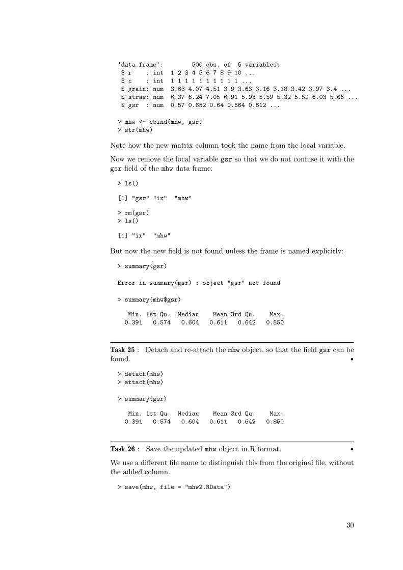
'data.frame': 500 obs. of 5 variables:
$ r : int 1 2 3 4 5 6 7 8 9 10 ...
$ c : int 1 1 1 1 1 1 1 1 1 1 ...
$ grain: num 3.63 4.07 4.51 3.9 3.63 3.16 3.18 3.42 3.97 3.4 ...
$ straw: num 6.37 6.24 7.05 6.91 5.93 5.59 5.32 5.52 6.03 5.66 ...
$ gsr : num 0.57 0.652 0.64 0.564 0.612 ...
> mhw <- cbind(mhw, gsr)
> str(mhw)
Note how the new matrix column took the name from the local variable.
Now we remove the local variable gsr so that we do not confuse it with thegsr field of the mhw data frame:
> ls()
[1] "gsr" "ix" "mhw"
> rm(gsr)
> ls()
[1] "ix" "mhw"
But now the new field is not found unless the frame is named explicitly:
> summary(gsr)
Error in summary(gsr) : object "gsr" not found
> summary(mhw$gsr)
Min. 1st Qu. Median Mean 3rd Qu. Max.
0.391 0.574 0.604 0.611 0.642 0.850
Task 25 : Detach and re-attach the mhw object, so that the field gsr can befound. •
> detach(mhw)
> attach(mhw)
> summary(gsr)
Min. 1st Qu. Median Mean 3rd Qu. Max.
0.391 0.574 0.604 0.611 0.642 0.850
Task 26 : Save the updated mhw object in R format. •
We use a different file name to distinguish this from the original file, withoutthe added column.
> save(mhw, file = "mhw2.RData")
30

6.1 Answers
A24 : The range is from 0.39 to 0.85, i.e. the ratio of grain to straw doubles. Thisis about 76% of the median ratio, which is considerably higher than the comparablefigure for grain yield (about 62%). Return to Q24 •
7 Univariate modelling
After descriptive statistics and visualisation comes the attempt to build sta-tistical models of the underlying processes. These are empirical mathemat-ical relations that describe one variable in terms of some hypothetical un-derlying distribution of which it is a realisation, or describe several variableseither as equals (“correlation”) or where one is described in terms of others(“regression”). We explore these, from simple to complex.
The simplest kind of model is about the distribution of a single variable, i.e,univariate modelling.
We suppose that the observed sample distribution is from an underlyingprobability distribution. This raises two questions: (1) what is the form ofthat distribution, and (2) what are its parameters?
To decide what theoretical distribution might fit, we first visualise the em-pirical distribution. This continues the ideas from §4.1.2.
Task 27 : Visualise an empirical continuous frequency distribution on therug plot. •
We again use the density function, with default arguments:
> plot(density(mhw$grain), col="darkblue",
+ main="Grain yield, lb. per plot", lwd=1.5)
> rug(mhw$grain, col="darkgreen")
> grid()
31

2.5 3.0 3.5 4.0 4.5 5.0 5.5
0.0
0.2
0.4
0.6
0.8
Grain yield, lb. per plot
N = 500 Bandwidth = 0.119
Den
sity
We can also view the distribution as a cumulative rather than density dis-tribution.
Task 28 : Visualise the empirical cumulative distribution of grain yield. •
We use the ecdf (“empirical cumulative distribution function”) function tocompute the distribution, then plot it with the plot function. Vertical linesare added to the plot with the abline (“add a straight line”) function, atthe median, extremes, and specified quantiles.
> plot(ecdf(grain), pch=1,
+ xlab="Mercer & Hall, Grain yield, lb. per plot",
+ ylab="Cumulative proportion of plots",
+ main="Empirical CDF",
+ sub="Quantiles shown with vertical lines")
> q <- quantile(grain, c(.05, .1, .25, .75, .9, .95))
> abline(v=q, lty=2)
> abline(v=median(grain), col="blue")
> abline(v=max(grain), col="green")
> abline(v=min(grain), col="green")
> text(q, 0.5, names(q))
> rm(q)
32

2.5 3.0 3.5 4.0 4.5 5.0
0.0
0.2
0.4
0.6
0.8
1.0
Empirical CDF
Quantiles shown with vertical linesMercer & Hall, Grain yield, lb. per plot
Cum
ulat
ive
prop
ortio
n of
plo
ts
●●●● ●●●●●●●●●●●●●
●●●●●●●●●●●
●●●●●●●
●●●●●●●●●●●
●●●●●●●●●●●●●●●●●●●●●●●●●●●●●●●●●●●●●●●●●●●●
●●●●●●●●●●●●●●●●●●●●●●●●●●●●●●●●
●●●●●●●●●●●●●●●
●●●●●●●●●●●
●●●●●●●● ●●●●●●●●●●●●
5%10% 25% 75% 90%95%
Q25 : From the histogram, stem-and-leaf plot, empirical cumulative distri-bution, and theory, what probability distribution is indicated for the grainyield? Jump to A25 •
We can also visualise the distribution against the theoretical normal distri-bution computed with the sample mean and variance. There are (at least)two useful ways to visualise this.
First, compare the actual and theoretical normal distribution is with theqqnorm function to plot these against each other and then superimpose thetheoretical line with the qqline function:
> qqnorm(grain, main = "Normal probability plot, grain yields (lb. plot-1)")
> qqline(grain)
> grid()
33

●
●
●
●
●
●●
●
●
●●
●
●●
●
●
●
●
●
●
●●
●
●
●
●●
●
●
●●
●
●
●
●
●●
●
●●
●
●
●
●
●
●
●
●
●
●
●●
●●
●●●
●
●
●
●
●●
●
●
●
●
●
●●
●●
●
●
●
●
●
●
●●
●
●
●
●
●
●
●
●●
●
●
●
●
●
●
●
●
●
●
●
●
●
●
●
●
●
●
●
●
●●
●
●●
●
●●
●
●
●
●
●
●
●
●●
●
●
●●
●
●●●
●
●
●
●
●
●●
●
●
●
●
●
●
●
●
●
●
●
●
●
●●
●
●
●
●
●
●
●
●
●
●●
●
●
●
●
●
●●
●
●
●
●
●
●
●
●
●
●
●
●
●●
●
●●
●
●
●
●
●
●
●
●
●
●
●●●
●●
●●
●
●
●●
●
●
●
●
●
●
●
●
●
●
●
●
●
●
●
●
●
●
●
●
●
●●
●
●
●
●
●●
●
●
●
●●
●
●
●
●
●
●
●
●●
●
●
●
●
●
●●
●
●
●
●●
●●
●
●
●
●
●
●●
●
●
●
●
●●●
●●
●
●●●
●
●
●
●
●
●
●
●
●●
●
●
●
●
●
●
●
●
●●
●
●
●
●●
●●●
●
●
●
●
●●
●
●
●
●
●
●
●
●
●
●
●
●
●
●
●
●
●●
●
●
●
●●●
●
●
●
●
●
●
●
●
●
●
●
●
●
●●●
●
●●
●
●
●
●
●
●
●●
●
●
●
●
●
●●
●●
●
●
●
●
●
●
●
●●
●
●
●
●●
●
●
●●
●
●
●
●
●
●
●
●
●
●
●●
●
●
●
●
●
●
●
●
●
●
●
●
●
●
●
●
●●
●
●
●
●
●
●
●
●
●
●
●
●
●
●
●
●
●
●
●
●
●●
●
●
●
●
●
●
●
●
●
●
●
●
●
●
●●
●
●
●
●
●●
●
●
●
●
●
●
●
●
●
●●
●
●
●
●
●
●
●
●
●
●
●
●
●
●
−3 −2 −1 0 1 2 3
3.0
3.5
4.0
4.5
5.0
Normal probability plot, grain yields (lb. plot−1)
Theoretical Quantiles
Sam
ple
Qua
ntile
s
Q26 : Does this change your opinion of normality? Jump to A26 •
The second way to visually compare an empirical and theoretical distributionis to display the empirical density plot, superimposing the normal distribu-tion that would be expected with the sample mean and standard deviation.
Task 29 : Fit a normal probability distribution to the empirical distributionof grain yield. •
Q27 : What are the best estimates of the parameters of a normal distribu-tion for the grain yield? Jump to A27•
These are computed with the mean and sd functions:
> mean(grain)
[1] 3.9486
> sd(grain)
[1] 0.45828
With these in hand, we can plot the theoretical distribution against theempirical distribution:
Task 30 : Graphically compare the theoretical and empirical distributions.•
34

> res <- 0.1
> hist(grain, breaks=seq(round(min(grain),1)-res,
+ round(max(grain),1)+res, by=res),
+ col="lightblue", border="red", freq=F,
+ xlab="Wheat grain yield, lb. per plot",
+ main="Mercer & Hall uniformity trial",
+ sub="Theoretical distribution (solid), empirical density (dashed)")
> grid()
> rug(grain)
> x <- seq(min(grain)-res, max(grain)+res, by=.01)
> lines(x, dnorm(x, mean(grain), sd(grain)), col="blue", lty=1, lwd=1.8)
> lines(density(grain), lty=2, lwd=1.8, col="black")
> rm(res, x)
Mercer & Hall uniformity trial
Theoretical distribution (solid), empirical density (dashed)Wheat grain yield, lb. per plot
Den
sity
2.5 3.0 3.5 4.0 4.5 5.0
0.0
0.2
0.4
0.6
0.8
We can also see this on the empirical density. This version also uses thecurve method to draw the theoretical curve.
> plot(density(mhw$grain), col="darkblue",
+ main="Grain yield, lb. per plot", lwd=1.5, ylim=c(0,1),
+ xlab=paste("Sample mean:",round(mean(mhw$grain), 3),
+ "; s.d:", round(sd(mhw$grain),3)))
> grid()
> rug(mhw$grain)
> curve(dnorm(x, mean(mhw$grain), sd(mhw$grain)), 2.5, 6, add=T,
+ col="darkred", lwd=1.5)
> text(2.5, 0.85, "Empirical", col="darkblue", pos=4)
> text(2.5, 0.8, "Theoretical normal", col="darkred", pos=4)
35

2.5 3.0 3.5 4.0 4.5 5.0 5.5
0.0
0.2
0.4
0.6
0.8
1.0
Grain yield, lb. per plot
Sample mean: 3.949 ; s.d: 0.458
Den
sity
EmpiricalTheoretical normal
There are several tests of normality; here we use the Shapiro-Wilk test,implemented by the shapiro.test function. This compares the empiricaldistribution (from the sample) with the theoretical distribution, and com-putes a statistic (“W”) for which is known the probability that it could occurby change, assuming the sample is really from a normally-distributed popu-lation. The reported probability value is the chance that rejecting the nullhypothesis H0 that the sample is from a normal population is an incorrectdecision (i.e. the probability of committing a Type I error).
> shapiro.test(grain)
Shapiro-Wilk normality test
data: grain
W = 0.997, p-value = 0.486
Q28 : According to the Shapiro-Wilk test, what is the probability if wereject the null hypothesis that this empirical distribution is a realisationof a normal distribution with the sample mean and standard deviation asparameters, we would be wrong (i.e. commit a Type I error)? So, should wereject the null hypothesis of normality? Should we consider grain yield tobe a normally-distributed variable? Jump to A28 •
Once we’ve established that the yields can be reasonably modelled by anormal distribution, we can compute confidence limits on the mean yield.Mercer and Hall used the 50% confidence level, which they called the prob-able error: there is equal chance for the true yield to be inside as outsidethis interval.
Task 31 : Compute the probable error for grain yield in a 1/500 acre plot.
36

•
Although we’ve fitted a normal distribution, both the mean and standarddeviation were estimated from the sample. So, we should use Student’s t-distribution (although with so many plots the difference with the normalz-distribution will be very small).
The probable error is computed from the limits of the interquartile rangeof the distribution; we get the quantiles of the t distribution with the qt
function, specifying the degrees of freedom:
> (t.q13 <- qt(c(0.25, 0.75), length(mhw$grain) - 1))
[1] -0.67498 0.67498
This is for µ = 0, σ = 1. We then scale this to the data:
> (pe <- mean(mhw$grain) + t.q13 * sd(mhw$grain))
[1] 3.6393 4.2580
And we can express it as a relative error; conventionally this is expressed aserror ± relative to the mean:
> rel.error <- (diff(pe)/2)/mean(mhw$grain)
> round(100 * rel.error, 2)
[1] 7.83
Q29 : If the true yield over the entire field is the observed mean yield, whatyields can be expected in any one 1/500 acre plot, with 50% confidence thatthe mean is in this range? Jump to A29 •
Q30 : What is the probable error expressed as a percentage of mean yield?Jump to A30 •
To put this in practical terms, since this was Mercer and Hall’s main concern,we calculate the probable error in absolute kg ha-1.
We saw above that the mean grain yield in this experiment was 3.95 lb. plot-1.Scaling this up to a hectare basis (which is how yields are normally ex-pressed):
> (yield.ha <- mean(mhw$grain) * 500/(0.40469)/(2.2046226))
[1] 2212.9
The two constants in this formula are 0.40469 ha acre-1 and 2.2046226
lb. kg-1, and there are 500 plots per acre.
Q31 : If we try to estimate the yield in kg ha-1 from a single 1/500 acreplot in a variety trial, how much error (in absolute terms) can we expect,
37

with 50% probability? What are the practical implications of this? Jumpto A31 •
> round(yield.ha * rel.error, 2)
[1] 173.35
Clean up:
> rm(t.q13, pe, rel.error, yield.ha)
7.1 Answers
A25 : The Normal distribution. From theory: the addition of multiple indepen-dent sources of noise. From the plots: visual fit to simulated normal distributions.
Return to Q25 •
A26 : The distribution still looks normal, except at both tails: the highest yieldsare not as high, and the lowest not as low, as expected if the yields were normallydistributed. Return to Q26 •
A27 : Parameters µ = 3.95, σ = 0.458. Return to Q27 •
A28 : According to the Shapiro-Wilk test of normality, the probability that re-jecting the null hypothesis of normality would be an incorrect decision (i.e. aType I error is 0.49; this is quite high, so we do not reject the null hypothesis.So, we consider the grain yield to be a realisation of a normal distribution. Returnto Q28 •
A29 : From 3.64 to 4.36 lb. plot-1; the observed mean yield is 3.95 lb. plot-1.Return to Q29 •
A30 : ± 7.83%. Return to Q30 •
A31 : From a true yield (estimated here from our mean) of 2213 kg wheat grain, theprobable error is 173 kg, a substantial amount. There is a 50% chance of observingthis much deviation if we estimate the per-hectare yield from any single 1/500 acreplot. Clearly, this is where the idea of replicated plots originated. Return toQ31 •
8 Bivariate modelling: two continuous variables
After modelling the distribution of a single variable, we now model the jointdistribution of two variables, i.e., bivariate modelling.
In §4.2 we displayed a scatterplot of straw vs. grain yield, repeated here withsome additional graphical elements:
38

> plot(mhw$straw ~ mhw$grain,
+ xlab="Grain yield (lb. plot-1)",
+ ylab="Straw yield (lb. plot-1)",
+ pch=20, col="darkblue", cex=1.2,
+ sub="Medians shown with red dashed lines")
> title(main="Straw vs. grain yields, Mercer-Hall experiment")
> grid()
> abline(v=median(mhw$grain), lty=2, col="red")
> abline(h=median(mhw$straw), lty=2, col="red")
●
●
●
●
●
●
●
●
●
●●
● ●●
●
●
●
●
●
●
●
●
●
●
●
●
●
●
●
●●
●
●
●
●
●
●
●
●
●
●
●●
●
●
● ●●
●
●
●
●
●
●
●
●
●
●
●
●
●
●
●
●
●●
●
●
●●
●
●
●
●
●
●
●
●
●●
●
●
●
●
●
●
●
●
●
●
●
●
● ●
●
●
●
●
●
●
●
●
●
●
●
●● ●
● ●
●
●
●
●
●
●
●●
●
●
●
●
●
●
●
●
●
●
●
●
●
●
●
●
●
●
●●
●
●
●
●
●
●●
●
●
●
●
●
●●
●●
●
●
●
●
●
●
●●
●
●
●
●
●
●
●●
●
●●
●
●
●
●
●
●●
●
●
●
●
●
●
●●
●
●● ●●
●
●
●
●
●
●
●
●
●●
●
●
●
●●
●
●
●
●
●
●
●
●
●
●
●
●
●
●●
●
●
●
●
●
●
●
●
●
●
●
●
●
●
●
●
●
●
●
●
●●
●
●
●
●
●
●
●
●
●
●
●
●
●
●
●
●
●
●
●
●
●●
●
●
●●
●
● ●
●
●
●
●
●
●
●
●
●
●
●
●
●
●
●
●
●●
●
●
●
●
●
●
●
● ●
●
●
●
●
●
●
●
●
●
●
●
●
●
●
●
●
●
●●
●●
●
●
●
●
●
●
●
●
●
●
●
●
●
●
●
●
●
●
●
●
●
●
●
●
●
●
●●●
●
●●
●
●
●
●
●
●
●
●
●
●
●
●
●
●
●
●
●
●
●
●
●●
● ●
●
●
●
●
●
●
●
●
●
●
●●
●
●
●
●
● ●●
●
●
●
●
●
●●
● ●
●
●●
●
●
●
●
● ●
●
●●
●
●
●
●
●
●
●
●
●
●
●●
●●
●
●
●
●
●
● ●●
●
●
●
●
●
●
●
●
●●
●
●
●
●
●
●
●●
●
●
●
●
●
●
●●
●
●
●
●
●
●
●●●
●
●
●
●
●
●
●
●
● ●
●
●
●
●
●
●
●
●
●
●
●
●
●
●
●
3.0 3.5 4.0 4.5 5.0
45
67
89
Medians shown with red dashed linesGrain yield (lb. plot−1)
Str
aw y
ield
(lb
. plo
t−1)
Straw vs. grain yields, Mercer−Hall experiment
Note the use of the ~ formula operator to indicate statistical dependence,here of straw on grain; we will explore this further just below. The centroidis shown by intersecting horizontal and vertical lines, added with the ablinefunction.
Q32 : From the scatterplot of straw vs. grain yield, what functional relationis suggested? Jump to A32 •
For a bivariate linear relation, as hypothesised here, we can view this fourways:
1. A bivariate linear correlation between the two variables (straw andgrain yields) (§8.1);
2. A univariate linear regression of straw (dependent) on grain (indepen-dent) yield (§8.2);
3. A univariate linear regression of grain (dependent) on straw (indepen-dent) yield (§8.3).
4. A linear structural relation between the two yields (§8.3).
These will each be explored below.
39

Bivariate correlation, bivariate structural relations and univariate regressionall compare two variables that refer to the same observations, that is, theyare paired. This is the natural order in a data frame: each row representsone observation on which several variables were measured; in the presentcase, the row and column numbers of the plots, and the grain and strawyields.
Correlation and various kinds of regression are often misused. There areseveral good journal articles that explain the situation, with examples fromearth science applications [29, 45]. A particularly understandable introduc-tion to the proper use of regression is by Webster [46].
Note that in this case there is no evidence to suggest a non-linear or piecewiserelation; but in many cases these are possibilities that must be comparedwith a linear model.
8.1 Correlation
Correlation measures the strength of the association between two variablesmeasured on the same object, from−1 (perfect negative correlation), through0 (no correlation), to +1 (perfect positive correlation). The two variableshave logically equal status, so there is no concept of causation; in addition,there is no functional relation, so there is no way to predict.
There are several numerical measures of correlation; we will see two:
1. Parametric: Pearson’s product moment correlation coefficient (PMCC)r (§8.1.1);
2. Non-parametric: Spearman’s ρ (§11.3).
8.1.1 Parametric correlation
The PMCC should only be used if the two variables are distributed approx-imately bivariate normally. This is two normal distributions, but with somedegree of correlation. So we first check whether the relation between grainand straw yield has this distribution.
Task 32 : Visualise a bivariate normal distribution with the parametersof the grain and straw yields; visually compare with the actual bivariatedistribution. •
R has a rnorm function to simulate a random sample of a given size fromthe normal distribution, by analogy to the runif function presented above.However, to simulate a correlated sample of several variables, we turn to themvrnorm function in the MASS (“Modern Applied Statistics with S”) packagewhich corresponds to the very useful advanced text of Venables and Ripley[44]. This function uses a vector of the variable means, along with thevariance-covariance matrix of two or more variables.
The variable means are computed with the vectorized colMeans function,which finds the by-column mean all or some of the columns in a data frame:
40

> colMeans(mhw[, c("grain", "straw")])
grain straw
3.9486 6.5148
The variance-covariance matrix is computed with the vectorized var func-tion:
> var(mhw[, c("grain", "straw")])
grain straw
grain 0.21002 0.30043
straw 0.30043 0.80696
Q33 : What do the diagonals and off-diagonals of this matrix represent?What are their units of measure? Jump to A33 •
From these the mvrnorm can draw a simulated random sample. We first loadthe optional MASS package with the require function; the mvrnorm functionis then available.
> require(MASS)
> sim.sample <- mvrnorm(length(mhw$grain), mu = colMeans(mhw[,
+ c("grain", "straw")]), Sigma = var(mhw[, c("grain",
+ "straw")]))
> head(sim.sample)
grain straw
[1,] 4.6106 7.9681
[2,] 4.0567 6.6977
[3,] 4.1793 5.8034
[4,] 3.8720 7.5326
[5,] 3.8677 6.7296
[6,] 3.2242 6.3163
> summary(sim.sample)
grain straw
Min. :2.56 Min. :4.12
1st Qu.:3.67 1st Qu.:5.91
Median :3.95 Median :6.53
Mean :3.93 Mean :6.51
3rd Qu.:4.21 3rd Qu.:7.13
Max. :5.01 Max. :8.72
> summary(mhw[, c("grain", "straw")])
grain straw
Min. :2.73 Min. :4.10
1st Qu.:3.64 1st Qu.:5.88
Median :3.94 Median :6.36
Mean :3.95 Mean :6.51
3rd Qu.:4.27 3rd Qu.:7.17
Max. :5.16 Max. :8.85
41

We can also visualise these distributions with histograms. To ensure that thevisualisation is comparable, we compute the overall minimum and maximumof both variables and use these to explicitly set the axis limits.
> par(mfrow = c(2, 2))
> grain.lim = c(min(sim.sample[, "grain"], mhw$grain),
+ max(sim.sample[, "grain"], mhw$grain))
> straw.lim = c(min(sim.sample[, "straw"], mhw$straw),
+ max(sim.sample[, "straw"], mhw$straw))
> hist(mhw$grain, xlim = grain.lim, main = "Grain (actual)",
+ col = "lightyellow", breaks = seq(grain.lim[1], grain.lim[2],
+ length = 17))
> hist(sim.sample[, "grain"], xlim = grain.lim, main = "Grain (simulated)",
+ col = "cornsilk", breaks = seq(grain.lim[1], grain.lim[2],
+ length = 17))
> hist(mhw$straw, xlim = straw.lim, main = "Straw (actual)",
+ col = "lightblue", breaks = seq(straw.lim[1], straw.lim[2],
+ length = 17))
> hist(sim.sample[, "straw"], xlim = straw.lim, main = "Straw (simulated)",
+ col = "lavender", breaks = seq(straw.lim[1], straw.lim[2],
+ length = 17))
> par(mfrow = c(1, 1))
Grain (actual)
mhw$grain
Fre
quen
cy
2.5 3.0 3.5 4.0 4.5 5.0
010
2030
4050
6070
Grain (simulated)
sim.sample[, "grain"]
Fre
quen
cy
2.5 3.0 3.5 4.0 4.5 5.0
020
4060
80
Straw (actual)
mhw$straw
Fre
quen
cy
4 5 6 7 8 9
020
4060
80
Straw (simulated)
sim.sample[, "straw"]
Fre
quen
cy
4 5 6 7 8 9
010
2030
4050
60
42

Q34 : How well do the two univariate simulations match the actual data?Jump to A34 •
So we can simulate a sample with the same mean and standard deviation asthe grain and straw yields, and plot them against each other in a scatterplot.We display this side-by-side with the actual scatterplot.
> par(mfrow = c(1, 2))
> plot(sim.sample, main = "Simulated straw vs. grain yields",
+ xlab = "Grain (lb. plot-1)", ylab = "Straw (lb. plot-1)",
+ xlim = grain.lim, ylim = straw.lim, pch = 20, col = "blue")
> abline(v = median(sim.sample[, 1]), lty = 2, col = "red")
> abline(h = median(sim.sample[, 2]), lty = 2, col = "red")
> plot(mhw$grain, mhw$straw, main = "Actual straw vs. grain yields",
+ xlab = "Grain (lb. plot-1)", ylab = "Straw (lb. plot-1)",
+ xlim = grain.lim, ylim = straw.lim, pch = 20, col = "black")
> abline(v = median(mhw$grain), lty = 2, col = "red")
> abline(h = median(mhw$straw), lty = 2, col = "red")
> par(mfrow = c(1, 1))
●
●
●
●
●
●
●
●
●
●
●
●
●
●
●
●
●
●
●
●
●
●
●
●
●
●
●
●
●
●
●
●
●
●
●
●
●●
●●
●
●●
●
●
●
●
●
●
●
●
●
●
●
●
●
●
● ●
●●
●
●
●●
●
●
● ●
●●
●
●
●
●
●
●
●
●
●
●
●
●
●
●
●
●
●
●
●
●
●
●
●
●
●
●
●
●
●
●
●
●
●
●
●
●
●●
●
●
● ●
●
●
●
●
●
●
●
●
●
●
●
●
●
●
●
●
●
●
●
●
●
●
●
●
●
●
●●
●●
●
●
●
●
●
●
●
●
●
●●
●
●
●
●
●
●
●
●
●
●
● ●
●
●
●
●
●
●
●
●
●
●
●
●
●
●
●
●
●
●
●
●
●●
●
●
●
●
●
●
●
●
●
●
●
●●
●●
●
●
●
●
●
●
●
●
●
●
●
●
●
●
●
●
●
●
● ●
●
●●
●
●
●
●
●
●
●
●
●
●
●
●
●
●
●
●
●
●
● ●
●●
●
●
●
●
●
●
●
●
●
●
●
●
●
●
●
●
●
●
●
●
●●
●
●
●
●●
●
●
●
●
●
●
●
●
●
●
●
●
●●
●●
●
●
●
●
●
●
●
●
● ●
●
●
●
●
●
●
●
●
●
●
●
●
●
●
●
●
●
●
●
●
●
●
●
●
●
●
●
●
●
●
●
● ●
●
●
●
●
●
●
●
●
●
●
● ●
●
●
●
●
●
●
●
●
●
●
●
●
●
●
●
●
●
●● ●
●
●
●
●
●
●
●
●
●
●
●
●
●
●●
●
●
●
●
●
●
●
●
●
●
●
●
●
●
●
●
●
●
●
●
●
●
●
●
●
●
●●
●
●
●
●
●
●
●
●
●
●
●●
●
●
●
●
●
●
●
●
●
●
●
●
●
●
●
●
●
●
●
●
●
●
●
●
●
●
●
●●
●
●
●
●
●
●●
●
●
●
●●
●
●
●
●
●
●
●
●
●
●
●
●●
●
●
●
●
●
●
●
●
●
●
●
●
●
●
●
●
●
●
●
●
●
●
●
●
●
2.5 3.0 3.5 4.0 4.5 5.0
45
67
89
Simulated straw vs. grain yields
Grain (lb. plot−1)
Str
aw (
lb. p
lot−
1)
●
●
●
●
●
●
●
●
●
●●
● ●●
●
●
●
●
●
●
●
●
●
●
●
●
●
●
●
●●
●
●
●
●
●
●
●
●
●
●
●●
●
●
● ●●
●
●
●
●
●
●
●
●
●
●
●
●
●
●
●
●
●
●
●
●
●●
●
●
●
●
●
●
●
●
●●
●
●
●
●
●
●
●
●
●
●
●
●
● ●
●
●
●
●
●
●
●
●
●
●
●
●● ●
● ●
●
●
●
●
●
●
●
●
●
●
●
●
●
●
●
●
●
●
●
●
●
●
●
●
●
●
●●
●
●
●
●
●
●●
●
●
●
●
●
●●
●●
●
●
●
●
●
●
●●
●
●
●
●
●
●
●●
●
●●
●
●
●
●
●
●
●
●
●
●
●
●
●
●●
●
●● ●●
●
●
●
●
●
●
●
●
●●
●
●
●
●●
●
●
●
●
●
●
●
●
●
●
●
●
●
●●
●
●
●
●
●
●
●
●
●
●
●
●
●
●
●
●
●
●
●
●
●●
●
●
●
●
●
●
●
●
●
●
●
●
●
●
●
●
●
●
●
●
●●
●
●
●●
●
● ●
●
●
●
●
●
●
●
●
●
●
●
●
●
●
●
●
●●
●
●
●
●
●
●
●
● ●
●
●
●
●
●
●
●
●
●
●
●
●
●
●
●
●
●
●●
●
●
●
●
●
●
●
●
●
●
●
●
●
●
●
●
●
●
●
●
●
●
●
●
●
●
●
●
●
●●
●
●●
●
●
●
●
●
●
●
●
●
●
●
●
●
●
●
●
●
●
●
●
●●
● ●
●
●
●
●
●
●
●
●
●
●
●●
●
●
●
●
● ●●
●
●
●
●
●
●●
● ●
●
●
●
●
●
●
●
● ●
●
●●
●
●
●
●
●
●
●
●
●
●
●●
●●
●
●
●
●
●
● ●
●
●
●
●
●
●
●
●
●
●●
●
●
●
●
●
●
●●
●
●
●
●
●
●
●●
●
●
●
●
●
●
●●●
●
●
●
●
●
●
●
●
● ●
●
●
●
●
●
●
●
●
●
●
●
●
●
●
●
2.5 3.0 3.5 4.0 4.5 5.0
45
67
89
Actual straw vs. grain yields
Grain (lb. plot−1)
Str
aw (
lb. p
lot−
1)
Q35 : Do the two relations (simulated vs. actual) look similar? Do theysupport the hypothesis of a bivariate linear relation? Jump to A35 •
We delete the temporary variables used in this visualisation:
> rm(sim.sample, grain.lim, straw.lim)
Challenge: The single simulation is only one realisation of the hypotheticalprocess. Repeat the simulation several times and compare (1) the simula-tions with each other; (2) the simulations with the actual data.
With this evidence of bivariate normality, we are justified in computing theparametric correlation.
43

Task 33 : Compute the PMCC between grain and straw yield, and its 95%confidence limit. •
The cor function computes the correlation; the cor.test function also com-putes the confidence interval:
> cor(mhw$grain, mhw$straw)
[1] 0.72978
> cor.test(mhw$grain, mhw$straw)
Pearson's product-moment correlation
data: mhw$grain and mhw$straw
t = 23.821, df = 498, p-value < 2.2e-16
alternative hypothesis: true correlation is not equal to 0
95 percent confidence interval:
0.68599 0.76830
sample estimates:
cor
0.72978
Q36 : What are the lowest possible, most probable, and highest possiblevalues of the correlation coefficient r , with 95% confidence? Do you con-sider this a very strong, strong, moderately strong, weak, or no correlation?Positive or negative? Jump to A36 •
8.2 Univariate linear regression
Univariate linear regression differs from bivariate correlation in that one ofthe two variables is considered mathematically dependent on the other.
An important distinction is made between predictors which are known with-out error, whether fixed by the experimenter or measured, and those thatare not.
Fixed effects model Webster [46] calls the first type a“Gauss linear model”8
because only the predictand has Gaussian or “normal” error, whereas thepredictor is known without error. The regression goes in one direction only,from the mathematical predictor to the random response, and is modelledby a linear model with error in the response:
yi = BXi + εi (8.1)
of which the simplest case is a line with intercept:
yi = β0 + β1xi + εi (8.2)
8 referring to the developer of least-squares regression
44

In this model there is no error associated with the predictors xi, only withthe predictand yi. The predictors are known without error, or at least theerror is quite small in comparison to the error in the model. An exampleis a designed agricultural experiment where the quantity of fertiliser added(the predictor) is specified by the design and the crop yield is measured (thepredictand); there is random error εi in this response.
Further, the errors εi are considered to be identically and independentlydistributed (IID):
� no relation between the magnitude of the error and that of the predictor(homoscedascity);
� no serial correlation between errors (e.g., small errors systematicallyfollowed by another small errors) in the sequence of predictors.
These assumptions can be verified after the regression parameters are esti-mated, using feature-space regression diagnostics (§8.2.2) and spatial anal-ysis (§18). In the present case we will see (§18) that the residuals are notindependent and a more sophisticated model is needed to get a proper re-gression equation.
Random effects model In the present example both variables (grain andstraw yields) were measured with error; they were not imposed by the exper-imenter. Both variables should have Gaussian error, with some correlation.This is modelled as a bivariate normal distribution of two random variables,X and Y with (unknown) population means µX and µY , (unknown) pop-ulation variances σX and σY , and an (unknown) correlation ρXY which iscomputed as the standardised (unknown) covariance Cov(X, Y):
X ∼ N (µX , σX)Y ∼ N (µY , σY )
ρXY = Cov(X, Y)/σXσY
This is exactly what was modelled in the previous section.
Note: In practice, the distinction between the two models is not always clear.The predictor, even if specified by the experimenter, can also have somemeasurement error. In the fertiliser experiment, even though we specify theamount per plot, there is error in measuring, transporting, and spreading it.In that sense it can be considered a random variable. But, since we have somecontrol over it, the experimental error can be limited by careful procedures.We can not limit the error in the response by the same techniques.
8.2.1 Fitting a regression line
When we decide to consider one of the variables as as a response and theother as a predictor, we attempt to fit a line that best describes this relation.There are three types of lines we can fit, usually in this order:
1. Exploratory, non-parametric
2. Parametric
45

3. Robust
The first kind just gives a “smooth” impression of the relation. The secondfits according to some optimality criterion; the classic least-squares estimateis in this class. The third is also parametric but optimises some criterionthat protects against a few unusual data values in favour of the majority ofthe data.
In the present case, our analysis above provides evidence that the relation isindeed well-modelled by a bivariate normal distribution, so that a parametricapproach can be taken. We will then examine regression diagnostics to seeif a robust regression is needed; these methods are discussed below in §11.
Q37 : Is there any reason to choose grain or straw as the dependent variable(predictand), and other as the independent (predictor)? Jump to A37 •
Task 34 : Fit a least-squares prediction line of straw as predicted by grain;display the model summary. •
Q38 : What is the purpose of fitting this relation? Jump to A38 •
For this we use the linear models function lm; this is the workhorse of mod-elling in R. The generic summary function now produces a model summary;the coefficients access function extracts the regression line coefficientsfrom the model object:
> model.straw.grain <- lm(straw ~ grain)
> summary(model.straw.grain)
Call:
lm(formula = straw ~ grain)
Residuals:
Min 1Q Median 3Q Max
-2.0223 -0.3529 0.0104 0.3734 3.0342
Coefficients:
Estimate Std. Error t value Pr(>|t|)
(Intercept) 0.8663 0.2387 3.63 0.00031 ***
grain 1.4305 0.0601 23.82 < 2e-16 ***
---
Signif. codes: 0 '***' 0.001 '**' 0.01 '*' 0.05 '.' 0.1 ' ' 1
Residual standard error: 0.615 on 498 degrees of freedom
Multiple R-squared: 0.533, Adjusted R-squared: 0.532
F-statistic: 567 on 1 and 498 DF, p-value: <2e-16
> coefficients(model.straw.grain)
(Intercept) grain
0.86628 1.43050
46

This example illustrates the simplest S model formula, here straw ~ grain,which is signalled by the ~ operator, which can be read “is modelled by”. Sohere the formula straw ~ grain can be read “straw yield is modelled bygrain yield”.
Q39 : What is the linear least-squares relation between straw and grainyields? Jump to A39 •
Q40 : How much straw yield is expected if there is no grain yield? Doesthis seem realistic? Jump to A40 •
Q41 : How much does the straw yield increase for each extra lb. of grainyield? Jump to A41 •
Q42 : How much of the variability in straw yield is explained by thisrelation? Jump to A42 •
Task 35 : Display the scatterplot with the best-fit line superimposed. •
> plot(straw ~ grain)
> title("Straw yield predicted by grain yield")
> abline(model.straw.grain)
> grid()
> text(4.5, 4.5, paste("slope:",
+ round(coefficients(model.straw.grain)[2], 2)))
●●
●●
●
●
●
●
●
●●
● ●●
●
●
●
●●
●
●
●
●
●
●
●
●
●
●
●●●
●
●
●
●
●
●
●
●
●
● ●
●
●
● ●●
●
●
●
●
●
●
●
●●
●
●
●
●
●
●
●
●●
●
●
●●
●
●
●
●
●
●
●
●
●●
●
●
●
●
●
●
●
●
●
●●
●
● ●
●
●
●
●
●
●
●
●
●
●
●
●● ●
● ●
●
●
●
●
●
●
●●
●
●
●
●
●
●
●
●
●
●
●
●
●
●
●
●
●
●
●●
●
●
●
●
●
●●
●
●
●
●
●
● ●
●●
●
●
●
●●
●
●●
●●
●
●
●
●
●●
●
●●
●
●
●
●
●
●●
●
●
●
●
●
●
● ●
●
●● ● ●
●
●
●
●
●
●
●
●
●●
●
●
●
●●
●
●
●
●
●
●
●
●
●
●
●
●
●
●●
●
●
●
●
●
●
●
●
●
●
●
●
●
●
●
●●
●
●
●
●●●
●
●
●
●
●●
●
●●
●
●
●
●●
●
●
●
●
●
●●
●
●
●●
●
● ●
●
●
●
●
●
●
●
●
●
●
●
●
●●
●
●
● ●
●
●
●
●
●
●
●
● ●
●
●
●
●●
●
●
●
●
●
●
●
●
●
●
●
●
●●
●●
●
●
●
●
●
●
●
●
●
●
●
●
●
●
●
●
●
●
●
●
●
●
●
●●
●
●●●
●
●●
●
●
●
●
●
●
●
●
●
●
●
●
●
●
●
●
●
●
●●
● ●
● ●
●
●
●
●
●
●
●●
●
●
●●
●
●
●
●
● ●●
●●
●
●
●
●●
● ●
●
●●
●
●
●
●
● ●
●
●●
●
●
●●
●
●
●
●
●
●●
●
●●
●●
●
●
●
● ●●
●
●
●
●
●
●
●
●
●●
●
●
●
●
●
●
●●
●
●
●
●
●
●
●●
●
●
●
●
●
●
●●●
●
●
●
●
●
●
●
●
● ●
●
●
●
●
●
●
●
●
●
●
●
●
●
●
●
3.0 3.5 4.0 4.5 5.0
45
67
89
grain
stra
w
Straw yield predicted by grain yield
slope: 1.43
47

Note the use of the abline function to add a line to the plot, the text
function to place text on it, and the title function to add a title. Alsonote the use of the model formula syntax straw ~ grain. This is to be read“straw depends on grain”.
8.2.2 Regression diagnostics
Of course, we have to treat any model with suspicion; for linear modelsthere are some standard diagnostics. In particular, the hypothesis for thelinear model is that the response is some deterministic linear function of thepredictor, plus a normally-distributed random error:
y = β0 + β1x + ε
We will investigate whether the model we have just fit satisfies this criterion.
Task 36 : Display a histogram and quantile-quantile plot of the regressionresiduals; summarise these numerically. •
> hist(residuals(model.straw.grain),
+ main="Residuals from straw vs.\ grain linear model")
Residuals from straw vs. grain linear model
residuals(model.straw.grain)
Fre
quen
cy
−2 −1 0 1 2 3
050
100
150
> qqnorm(residuals(model.straw.grain),
+ main="Residuals from straw vs.\ grain linear model")
> qqline(residuals(model.straw.grain))
> summary(residuals(model.straw.grain))
Min. 1st Qu. Median Mean 3rd Qu. Max.
-2.0200 -0.3530 0.0104 0.0000 0.3730 3.0300
48

●
●
●
●
●
●
●●
●
●●●●
●
●
●
●
●
●●●
●
●●●
●
●●●
●●
●●
●
●
●
●
●
●
●
●●
●
●
●
●
●
●
●●●
●
●
●●
●
●
●●
●
●
●
●●
●●
●●
●●
●
●
●
●
●●
●●
●●
●
●
●●●●
●
●●
●●●●
●●
●
●
●
●
●
●
●
●
●●●●
●
●●
●
●
●
●
●●
●
●
●●
●
●●
●
●
●●
●●
●
●
●
●
●●
●●
●
●
●
●●
●
●
●
●
●●
●
●
●●
●
●●
●
●●
●
●
●●
●
●
●
●
●●
●
●●
●
●●●
●●●●
●
●●
●
●
●
●
●●
●
● ●
●
●
●● ●
●●
●
●●●
●
●
●
●
●●●●
●
●
●
●●●●
●●
●
●●
●
●
●
●
●
●
●
●
●
●●
●
●
●
●●
●
●
●●
●
●
●●
●●
●
●●●
●
●●
●
●
●
●
●
●
●
●
●
●●●
●
●●
●
●
●
●
●
●
●
●
●
●
●
●
●
●
●
●
●●
●
●
●
●
●●
●
●●
●
●
●
●
●
●
●●
●
●
●
●
●
●
●●
●
●
●●
●
●
●
●●
●
●
●●
●
●
●●
●
●●
●
●
●
●
●●
●
●
●
●
●
●
●●
●
●●
●
●
●●●
●●
●
●
●
●
●
●
●
●
●
●●
●
●
●●
●●
●
●
●
●●
●
●
●
●
●
●●●
●
●
●
●
●
●
●●
●●
●
●
●
●
●
●
●●
●
●
●
●
●●●
●
●
●
●
●
●
●●
●
●
●
●●●●●
●
●
●●
●
●
●
●
●
●
●
●
●
●
●
●
●
●●
●
●
●
●
●
●
●●
●
●
●
●
●
●●
●●
●
●
●
●
●●
●
●
●
●●
●●●
●●
●
●
●●
●
●
●
●
●
●
●●
●
●
●●
●●●
●
−3 −2 −1 0 1 2 3
−2
−1
01
23
Residuals from straw vs. grain linear model
Theoretical Quantiles
Sam
ple
Qua
ntile
s
Q43 : Do the residuals appear to be normally-distributed? Are they atleast symmetrically-distributed? Jump to A43 •
We can test the normality of the residuals with a Shapiro-Wilks test:
> shapiro.test(residuals(model.straw.grain))
Shapiro-Wilk normality test
data: residuals(model.straw.grain)
W = 0.9767, p-value = 3.631e-07
Q44 : According to the Shapiro-Wilk test, should we reject the null hy-pothesis of normality for the residuals? Jump to A44•
Task 37 : Compare the fitted to actual values along a 1:1 line; highlightthose that are more than 1 lb. plot-1in error. •
To colour points we use the col optional argument to the plot function,and the ifelse function to select a colour based on a logical condition:
> lim <- c(min(fitted(model.straw.grain), mhw$straw),
+ max(fitted(model.straw.grain), mhw$straw))
> plot(fitted(model.straw.grain), mhw$straw,
+ xlab="Modelled", ylab="Actual", asp=1,
+ xlim=lim, ylim=lim, pch=20,
+ col=ifelse(
+ (abs(fitted(model.straw.grain) - mhw$straw) < 1),
+ "gray",
49

+ ifelse(fitted(model.straw.grain) < mhw$straw, "blue","red")),
+ cex=ifelse(
+ (abs(fitted(model.straw.grain) - mhw$straw) < 1),1,1.3)
+ )
> title("Actual vs. modelled straw yields")
> grid()
> abline(0,1)
> rm(lim)
●
●
●
●
●
●
●
●
●
●●
● ●●
●
●
●
●
●
●
●
●
●
●
●
●
●
●
●
●●
●
●
●
●
●
●
●
●
●
●
●●
●
●
● ●●
●
●
●
●
●
●
●
●
●
●
●
●
●
●
●
●
●
●
●
●
●●
●
●
●
●
●
●
●
●
●●
●
●
●
●
●
●
●
●
●
●
●
●
● ●
●
●
●
●
●
●
●
●
●
●
●
●● ●
● ●
●
●
●
●
●
●
●
●
●
●
●
●
●
●
●
●
●
●
●
●
●
●
●
●
●
●
●●
●
●
●
●
●
●●
●
●
●
●
●
●●
●●
●
●
●
●
●
●
●●
●
●
●
●
●
●
●●
●
●●
●
●
●
●
●
●
●
●
●
●
●
●
●
●●
●
●● ●●
●
●
●
●
●
●
●
●
●●
●
●
●
●●
●
●
●
●
●
●
●
●
●
●
●
●
●
●●
●
●
●
●
●
●
●
●
●
●
●
●
●
●
●
●
●
●
●
●
●●
●
●
●
●
●
●
●
●
●
●
●
●
●
●
●
●
●
●
●
●
●●
●
●
●●
●
● ●
●
●
●
●
●
●
●
●
●
●
●
●
●
●
●
●
●●
●
●
●
●
●
●
●
● ●
●
●
●
●
●
●
●
●
●
●
●
●
●
●
●
●
●
●●
●
●
●
●
●
●
●
●
●
●
●
●
●
●
●
●
●
●
●
●
●
●
●
●
●
●
●
●
●
●●
●
●●
●
●
●
●
●
●
●
●
●
●
●
●
●
●
●
●
●
●
●
●
●●
● ●
●
●
●
●
●
●
●
●
●
●
●●
●
●
●
●
● ●●
●
●
●
●
●
●●
● ●
●
●
●
●
●
●
●
● ●
●
●●
●
●
●
●
●
●
●
●
●
●
●●
●●
●
●
●
●
●
● ●
●
●
●
●
●
●
●
●
●
●●
●
●
●
●
●
●
●●
●
●
●
●
●
●
●●
●
●
●
●
●
●
●●●
●
●
●
●
●
●
●
●
● ●
●
●
●
●
●
●
●
●
●
●
●
●
●
●
●
4 5 6 7 8 9
45
67
89
Modelled
Act
ual
Actual vs. modelled straw yields
Task 38 : Some of the plots are poorly-fit by this relation; identify thosewith an absolute residual > 1.8 lb. straw and display their records, sortedby grain/straw ratio. •
This example illustrates the abs (“absolute value”), which (“which recordnumbers?”), sort (“sort values”) and order (“order records”) functions.
We first identify the records with the high absolute residuals, and show them:
> which.high.res <- which(abs(residuals(model.straw.grain)) >
+ 1.8)
> sort(residuals(model.straw.grain)[which.high.res])
184 35 295 337 311 15
-2.0223 -1.9891 2.3780 2.4107 2.4137 3.0342
Now we show these records in the data frame:
> high.res <- mhw[which.high.res, ]
> high.res[order(high.res$gsr), ]
r c grain straw gsr
15 15 1 3.46 8.85 0.39096
337 17 17 3.05 7.64 0.39921
311 11 16 3.74 8.63 0.43337
50

295 15 15 3.73 8.58 0.43473
184 4 10 4.59 5.41 0.84843
35 15 2 4.42 5.20 0.85000
> rm(which.high.res, high.res)
Q45 : Which plots have absolute residuals > 1.8 lb. straw? Which are toohigh and which too low, according to the relation? Jump to A45 •
Challenge: Repeat the analysis, but reversing the variables: model grainyield as a function of straw yield. Are the slopes inverses of each other?Why or why not?
Further diagnostics The normality of residuals is one requirement for linearmodelling; however there are other issues.
The generic plot function applied to a model result (i.e. object returnedfrom a call to lm) gives a standard set of diagnostic plots, selectable withthe which argument.
Plot type 1 is a plot of residuals vs. fitted values; there should be no relationbetween these. That is, whether a residual is high or low, positive or negativeshould not depend on the value fitted by the model. There should not beany trend; the smooth curve (fit by the lowess function) gives a visualimpression of this – it should ideally be a horizontal line at 0.
This plot type also helps evaluate whether the variance of the residuals isconstant across the range of the predictor, i.e., are they homoscedastic asrequired for fitting simple linear regresssion by OLS (Equation 8.1): lookingvertically at any fitted value, the spread should be identical.
> plot(model.straw.grain, which = 1)
5.0 5.5 6.0 6.5 7.0 7.5 8.0
−2
−1
01
23
Fitted values
Res
idua
ls
●
●●
●
●
●
●●
●
●● ●●
●
●
●
●
●
●●●
●
● ●●
●
●● ●●
●
● ●
●
●
●
●
●
●
●
●●
●
●
●
●
●
●
●●●
●
●
●●
●
●●
●
●
●
●
●●
● ●
●●
●●
●
●
●
●
●●
●●
●●
●
●
●● ●●
●●●
●●● ●
●●
●●
●
●
●
●
●
●
● ●●●
●
●●
●
●
●
●
●●
●
●
●●
●
● ●
●
●
●●
●●
●
●
●
●
●●
●●
●
●
●
● ●
●
●
●
●
●●
●
●
●●
●
● ●
●
●●
●
●
●●
●
●
●
●
●●●
● ●
●
●●●
● ●●●
●
●●
●
●
●
●
● ●
●
●●
●
●
●● ●
●●
●
●●●
●
●
●
●
●●● ●
●
●
●
●●● ●
●●
●●
●●
●
●
●
●
●
●
●
●
● ●
●
●
●
●●
●
●
●●
●
●
●●●●
●
● ●●
●
●●
●
●
●
●
●
●
●
●
●
●●●
●
●●
●
●
●
●
●
●
●
●
●
●
●
●
●
●
●
●●●
●
●
●
●
●●
●
● ●
●
●
●
●
●
●
●●
●
●
●
●
●
●
●●
●
●
●●
●
●
●
●●
●
●
●●
●
●
●●
●●
●
●
●
●
●
● ●
●
●
●
●
●
●
●●
●
●●
●
●
●●●
●●
●
●
●
●
●
●
●
●
●
●●
●
●
●●
●●●
●
●
● ●
●
●
●
●●
●● ●
●
●
●
●
●
●
●●
●●
●
●
●
●
●
●
●●
●
●
●
●
● ●●
●
●
●●
●
●
●●
●
●
●
●● ●● ●
●
●
●●
●
●
●
●
●
●
●
●
●
●
●
●
●
●●
●
●
●
●
●
●
●●
●
●
●
●
●
●●
●●
●
●●
●
●●
●
●
●
●●
●●●
●●
●
●
●●
●
●
●
●
●
●
●●
●
●
● ●
●●●
●
lm(straw ~ grain)
Residuals vs Fitted
15
311337
51

Plot type 2 is the Q-Q plot as we studied in the previous section.
Plot type 5 shows the leverage of each observation and its correspondingresidual.
Observations that are far from the centroid of the regression line can havea large effect on the estimated slope; they are said to have high leverage, byanalogy with a physical lever. They are not necessarily in error, but theyshould be identified and verified; in particular, it is instructive to compare theestimated regression line with and without the high-leverage observations.
The leverage is measured by the hat value, which measures the overall influ-ence of a single observation on the predictions. In diagnostic plot type 5 theabscissa (‘x-axis’) is the hat value. Two things are of interest:
� No extreme leverage, compared to other observations;
� Residuals at high-leverage observations should not be too much smallerthan for other observations. Note that high-leverage observation “pull”the regression towards better fits, so their residuals are expected to besomewhat below average.
> plot(model.straw.grain, which = 5)
0.000 0.005 0.010 0.015
−4
−2
02
4
Leverage
Sta
ndar
dize
d re
sidu
als
●
●●
●
●
●
●●
●
●●●●
●
●
●
●
●
● ●●
●
● ●●
●
● ●●●
●
●●
●
●
●
●
●
●
●
●●
●
●
●
●
●
●
●●●
●
●
●●
●
●●
●
●
●
●
●●
● ●
●●
●●
●
●
●
●
●●
●●
●●
●
●
● ●● ●
●●
●
●● ●●
●●
●●
●
●
●
●
●
●
●● ● ●
●
●●
●
●
●
●
● ●
●
●
●●
●
● ●
●
●
●●
●●
●
●
●
●
●●
●●
●
●
●
● ●
●
●
●
●
●●
●
●
●●
●
●●
●
●●
●
●
●●
●
●
●
●
●●●
● ●
●
●●●
●●●●
●
●●
●
●
●
●
● ●
●
●●
●
●
●● ●
●●
●
●●●●
●
●
●
●●●●
●
●
●
●●●●
●●
●●
●●
●
●
●
●
●
●
●
●
●●
●
●
●
●●
●
●
●●
●
●
●●●●
●
●●●
●
●●
●
●
●
●
●
●
●
●
●
●●●
●
●●
●
●
●
●
●
●
●
●
●
●
●
●
●
●
●
●●●
●
●
●
●
●●
●
●●
●
●
●
●
●
●
●●
●
●
●
●
●
●
●●
●
●
●●
●
●
●
● ●
●
●
●●
●
●
●●
●●
●
●
●
●
●
●●
●
●
●
●
●
●
●●
●
●●
●
●
●●●
●●
●
●
●
●
●
●
●
●
●
●●
●
●
●●
●●●
●
●
●●
●
●
●
●●
●●●
●
●
●
●
●
●
● ●
●●
●
●
●
●
●
●
●●
●
●
●
●
● ●●
●
●
●●
●
●
●●
●
●
●
●●● ●●
●
●
●●
●
●
●
●
●
●
●
●
●
●
●
●
●
●●
●
●
●
●
●
●
●●
●
●
●
●
●
●●
●●
●
●●
●
●●
●
●
●
●●
● ●●
●●
●
●
●●
●
●
●
●
●
●
●●
●
●
●●
● ●●
●
lm(straw ~ grain)
Cook's distance
Residuals vs Leverage
337
15
184
Plot type 6 is Cook’s distance vs. leverage. Cook’s distance measures howmuch the estimated parameter vector β shifts if a single observation is omit-ted. A high Cook’s distance means that the observation has a large influenceon the fitted model.
We also specify the number of extreme points to label with the id.n optionalargument.
> plot(model.straw.grain, which = 6, id.n = 10)
52

0.00
0.02
0.04
0.06
0.08
Leverage hii
Coo
k's
dist
ance
●● ●● ● ●●●● ●●● ●●
●
●● ●● ●●●●
●●
●● ●●● ●●●●
●
●●●●
●●● ●
●
●
● ●● ●●●● ●●●
●● ●●
●
●● ●●● ●
● ●●●●
●●
●● ● ●●
●●
●
●● ●● ●
●●●●● ●● ●●●
●
●
●
●
●
● ●●● ● ●●●●
●
●
●
●
● ●●
●
●
●●●●
●●
● ●●●
●
●
●
●●
●●●
● ●●●●
● ●●●● ● ●●●●●
●●● ●● ●
●●● ●
●●
●●● ●
● ●●
●●●●●● ●●●
●
●
●
●
●
● ●●
●● ● ●●●
●●● ●●●●●●●
●●● ●● ●● ●●● ●● ●
●●● ●● ●●●
● ●●● ●
●
●●
● ●● ● ●
●
●●●●●● ●●●●
●●● ●● ●● ●●●
●● ●
●
●●●●● ● ● ●
●
●●●●● ●●
●
●●
●●
●●●
●
●
●
●
●●
●
●●● ●●
●●● ●●● ●
●
●
●
●
●●●
●
●● ●
●
●
● ●
●●●●
●● ●● ●●●●
● ●
●
●●●
●●
●
●
●
●●
●●●● ●●● ● ●● ●
●●●
●
●
●
●●
●●
●
●
●● ●● ●●●●●●●
●
●●● ●● ●
●
● ●●
●● ●●●●●
●
●
●●
● ●
●
●●●
● ●●●
●
● ●● ●● ●●
●
●● ●●
●
●●
●●●
●
●
●
●
●
●● ●
●
●●
●
●●
●
●●
●●●●
●●
●
●
●
●
●
●●● ●● ●
●
●
●
●
●●●● ●● ●● ●●
●●●●●
●
●●
●
● ●● ●● ●●● ●●
●
0 0.005 0.01 0.015
lm(straw ~ grain)
0
1
2
345
Cook's dist vs Leverage hii (1 − hii)
337
15
184
292
35311295
308 98132
This plot also shows contours of absolute standardised residuals, as labelledstraight lines through the origin.
Q46 : Which observations are flagged by their Cook’s distance as havingthe most influence on the fit? Are these high-leverage observations? Jumpto A46 •
We will compare this model to more complex ones in §12, below.
8.2.3 Prediction
Once the regression model is built, it can be used to predict: in this case,given a grain yield, what is the expected straw yield? And, how large orsmall could it be?
The predict generic method specialized to predict.lm for objects of classlm, such as the model we’ve just built. In addition to the model name, itrequires a dataframe in which predict will look for variables with which topredict (in this case, a field named grain). In addition, predict.lm canreturn the confidence interval of the prediction, either of the fit itself or ofvalues predicted from the equation.
There are two sources of prediction error:
1. The uncertainty of fitting the best regression line from the availabledata;
2. The uncertainty in the prediction, even with a perfect regression line,because of uncertainty in the process which is revealed by the regres-sion (i.e. the inherent noise in the process) These correspond to theconfidence interval and the prediction interval, respectively, both at
53

some level of risk of a Type I error, i.e., that the true value is not inthe given range. Clearly, the second must be wider than the first.
The interpretation of these two intervals is as follows:
confidence : We are confident, with only a specified probability of being wrong, thatthe expected value of the response at the given value of the predictandis within this interval. In this case, if we sampled many plots with thesame grain yield, this is the interval where the true mean value lies.
prediction : We are confident, with only a specified probability of being wrong, thatany single value of the response at the given value of the predictandis within this interval. In this case, any one plot with the given grainyield should have a straw yield in this interval.
The estimation variance depends on (1) the variance of the regression s2Y .x
and (2) the distance (x0−x) of the predictand at value x0 from the centroidof the regression, x. The further from the centroid, the more any error inestimating the slope of the line will affect the prediction:
s2Y0
= s2Y .x
[1+ 1
n+ (x0 − x)2∑n
i=1(xi − x)2]
(8.3)
This shows that if we try to predict “too far” from the centroid, the uncer-tainty will be so large that any prediction is meaningless.
Note: The variance of the regression s2Y .x is computed from the deviations
of actual and estimated values at all the known points:
s2Y .x = 1
n− 2
n∑i=1
(yi − yi)2 (8.4)
Task 39 : Compute the most likely value, and the 95% confidence andprediction intervals, of straw yields predicted by a grain yield of the mean,and the mean ± one and two standard deviations of the predictor. •
We first build a (very) small dataframe with the data.frame function, witha variable of the same name, and then use it as the newdata argument topredict.lm; the other arguments are the model name, the type of interval,and the risk of Type I error.
> t1 <- mean(mhw$grain); t2 <- sd(mhw$grain);
> p.frame <- data.frame(grain=seq(t1-2*t2, t1+2*t2, t2))
> predict(model.straw.grain, newdata=p.frame,
+ interval="confidence", level=0.95)
fit lwr upr
1 5.2037 5.0828 5.3245
2 5.8592 5.7828 5.9357
3 6.5148 6.4608 6.5688
4 7.1704 7.0939 7.2468
5 7.8259 7.7051 7.9468
> predict(model.straw.grain, newdata=p.frame,
+ interval="prediction", level=0.95)
54

fit lwr upr
1 5.2037 3.9898 6.4176
2 5.8592 4.6490 7.0695
3 6.5148 5.3057 7.7239
4 7.1704 5.9601 8.3806
5 7.8259 6.6120 9.0398
Q47 : Which interval is wider? What happens to the width of the intervalas the predictand is further from its centroid (mean)? Jump to A47 •
Task 40 : Display the scatterplot of straw vs. grain yields, with the best-fitline and the two confidence intervals, for grain yields from 2 to 6 lb. acre-1,at 0.1 lb. resolution. •
The seq function builds the required sequence, and data.frame is againused to build a prediction frame. The plot function initiates the plot, andthen the title, grid, lines, points, and abline functions add graphic ortext elements.
> p.frame <- data.frame(grain = seq(from = 2, to = 6, by = 0.1))
> pred.c <- predict(model.straw.grain, newdata = p.frame,
+ interval = "confidence", level = 0.95)
> pred.p <- predict(model.straw.grain, newdata = p.frame,
+ interval = "prediction", level = 0.95)
> plot(straw ~ grain, data = mhw, pch = 20)
> title(main = "Straw yield predicted by grain yield",
+ sub = "Prediction (blue) and confidence (red) intervals")
> abline(model.straw.grain)
> grid()
> lines(p.frame$grain, pred.c[, "lwr"], col = 2, lwd = 1.5)
> lines(p.frame$grain, pred.c[, "upr"], col = 2, lwd = 1.5)
> lines(p.frame$grain, pred.p[, "lwr"], col = 4, lwd = 1.5)
> lines(p.frame$grain, pred.p[, "upr"], col = 4, lwd = 1.5)
> points(mean(grain), mean(straw), pch = 23, cex = 2, bg = "red")
> abline(h = mean(straw), lty = 2)
> abline(v = mean(grain), lty = 2)
55

●
●
●
●
●
●
●
●
●
●●
● ●●
●
●
●
●
●
●
●
●
●
●
●
●
●
●
●
●●
●
●
●
●
●
●
●
●
●
●
●●
●
●
● ●●
●
●
●
●
●
●
●
●
●
●
●
●
●
●
●
●
●
●
●
●
●●
●
●
●
●
●
●
●
●
●●
●
●
●
●
●
●
●
●
●
●
●
●
● ●
●
●
●
●
●
●
●
●
●
●
●
●● ●
● ●
●
●
●
●
●
●
●
●
●
●
●
●
●
●
●
●
●
●
●
●
●
●
●
●
●
●
●●
●
●
●
●
●
●●
●
●
●
●
●
●●
●●
●
●
●
●
●
●
●●
●
●
●
●
●
●
●●
●
●●
●
●
●
●
●
●
●
●
●
●
●
●
●
●●
●
●● ●●
●
●
●
●
●
●
●
●
●●
●
●
●
●●
●
●
●
●
●
●
●
●
●
●
●
●
●
●●
●
●
●
●
●
●
●
●
●
●
●
●
●
●
●
●
●
●
●
●
●●
●
●
●
●
●
●
●
●
●
●
●
●
●
●
●
●
●
●
●
●
●●
●
●
●●
●
● ●
●
●
●
●
●
●
●
●
●
●
●
●
●
●
●
●
●●
●
●
●
●
●
●
●
● ●
●
●
●
●
●
●
●
●
●
●
●
●
●
●
●
●
●
●●
●
●
●
●
●
●
●
●
●
●
●
●
●
●
●
●
●
●
●
●
●
●
●
●
●
●
●
●
●
●●
●
●●
●
●
●
●
●
●
●
●
●
●
●
●
●
●
●
●
●
●
●
●
●●
● ●
●
●
●
●
●
●
●
●
●
●
●●
●
●
●
●
● ●●
●
●
●
●
●
●●
● ●
●
●
●
●
●
●
●
● ●
●
●●
●
●
●
●
●
●
●
●
●
●
●●
●●
●
●
●
●
●
● ●
●
●
●
●
●
●
●
●
●
●●
●
●
●
●
●
●
●●
●
●
●
●
●
●
●●
●
●
●
●
●
●
●●●
●
●
●
●
●
●
●
●
● ●
●
●
●
●
●
●
●
●
●
●
●
●
●
●
●
3.0 3.5 4.0 4.5 5.0
45
67
89
grain
stra
w
Straw yield predicted by grain yield
Prediction (blue) and confidence (red) intervals
Q48 : Why is the confidence interval so narrow and the prediction intervalso wide, for this relation? Jump to A48 •
Task 41 : Clean up from this subsection. •
> rm(t1, t2, p.frame, pred.c, pred.p)
8.3 Structural Analysis*
In §8.2.1 we modelled one of the two variables as as a response and the otheras a predictor, and fit a line that best describes this relation. If we reversethe relation, what happens?
Task 42 : Compare the regression of strain yield on grain yield, with theregression of grain yield on straw yield. •
> model.grain.straw <- lm(grain ~ straw, data = mhw)
> summary(model.grain.straw)
Call:
lm(formula = grain ~ straw, data = mhw)
Residuals:
Min 1Q Median 3Q Max
-1.3580 -0.2011 0.0004 0.1918 1.0527
Coefficients:
56

Estimate Std. Error t value Pr(>|t|)
(Intercept) 1.5231 0.1028 14.8 <2e-16 ***
straw 0.3723 0.0156 23.8 <2e-16 ***
---
Signif. codes: 0 '***' 0.001 '**' 0.01 '*' 0.05 '.' 0.1 ' ' 1
Residual standard error: 0.314 on 498 degrees of freedom
Multiple R-squared: 0.533, Adjusted R-squared: 0.532
F-statistic: 567 on 1 and 498 DF, p-value: <2e-16
> summary(model.straw.grain)
Call:
lm(formula = straw ~ grain)
Residuals:
Min 1Q Median 3Q Max
-2.0223 -0.3529 0.0104 0.3734 3.0342
Coefficients:
Estimate Std. Error t value Pr(>|t|)
(Intercept) 0.8663 0.2387 3.63 0.00031 ***
grain 1.4305 0.0601 23.82 < 2e-16 ***
---
Signif. codes: 0 '***' 0.001 '**' 0.01 '*' 0.05 '.' 0.1 ' ' 1
Residual standard error: 0.615 on 498 degrees of freedom
Multiple R-squared: 0.533, Adjusted R-squared: 0.532
F-statistic: 567 on 1 and 498 DF, p-value: <2e-16
Q49 : Is the amount of variability explained by the two models the same?That is, does knowing straw yield give the same amount of information ongrain yield as the reverse? Jump to A49 •
Intuitively it might seem that the slope of grain vs. straw would be theinverse of the slope of straw vs. grain. Is this the case?
Task 43 : Compute the slope of straw vs. grain as the inverse of the modelledslope of grain vs. straw, and compare with the modelled slope of straw vs.grain. •
> coefficients(model.straw.grain)["grain"]
grain
1.4305
> 1/coefficients(model.grain.straw)["straw"]
straw
2.686
We can visualise these on the scatterplot of straw vs. grain. The regressionline of straw on grain can be directly plotted with abline on the model
57

object; the reverse regression must be inverted from coefficients extractedfrom its model object. The slope is just the inverse; the intercept is thestraw yield corresponding to zero grain yield:
grain = b0 + b1 · straw
0 = grain
⇓0 = b0 + b1 · straw
⇓straw = −b0/b1
> plot(straw ~ grain, pch = 1, main = "Mercer-Hall wheat yields",
+ xlab = "grain (lb. plot-1)", ylab = "straw (lb. plot-1)")
> title(sub = "straw vs. grain: solid; grain vs. straw: dashed")
> abline(model.straw.grain)
> beta <- coefficients(model.grain.straw)
> abline(-beta["(Intercept)"]/beta["straw"], 1/beta["straw"],
+ lty = 2)
> grid()
> rm(beta)
●●
●●
●
●
●
●
●
●●
● ●●
●
●
●
●●
●
●
●
●
●
●
●
●
●
●
●●●
●
●
●
●
●
●
●
●
●
● ●
●
●
● ●●
●
●
●
●
●
●
●
●●
●
●
●
●
●
●
●
●●
●
●
●●
●
●
●
●
●
●
●
●
●●
●
●
●
●
●
●
●
●
●
●●
●
● ●
●
●
●
●
●
●
●
●
●
●
●
●● ●
● ●
●
●
●
●
●
●
●●
●
●
●
●
●
●
●
●
●
●
●
●
●
●
●
●
●
●
●●
●
●
●
●
●
●●
●
●
●
●
●
● ●
●●
●
●
●
●●
●
●●
●●
●
●
●
●
●●
●
●●
●
●
●
●
●
●●
●
●
●
●
●
●
● ●
●
●● ● ●
●
●
●
●
●
●
●
●
●●
●
●
●
●●
●
●
●
●
●
●
●
●
●
●
●
●
●
●●
●
●
●
●
●
●
●
●
●
●
●
●
●
●
●
●●
●
●
●
●●●
●
●
●
●
●●
●
●●
●
●
●
●●
●
●
●
●
●
●●
●
●
●●
●
● ●
●
●
●
●
●
●
●
●
●
●
●
●
●●
●
●
● ●
●
●
●
●
●
●
●
● ●
●
●
●
●●
●
●
●
●
●
●
●
●
●
●
●
●
●●
●●
●
●
●
●
●
●
●
●
●
●
●
●
●
●
●
●
●
●
●
●
●
●
●
●●
●
●●●
●
●●
●
●
●
●
●
●
●
●
●
●
●
●
●
●
●
●
●
●
●●
● ●
● ●
●
●
●
●
●
●
●●
●
●
●●
●
●
●
●
● ●●
●●
●
●
●
●●
● ●
●
●●
●
●
●
●
● ●
●
●●
●
●
●●
●
●
●
●
●
●●
●
●●
●●
●
●
●
● ●●
●
●
●
●
●
●
●
●
●●
●
●
●
●
●
●
●●
●
●
●
●
●
●
●●
●
●
●
●
●
●
●●●
●
●
●
●
●
●
●
●
● ●
●
●
●
●
●
●
●
●
●
●
●
●
●
●
●
3.0 3.5 4.0 4.5 5.0
45
67
89
Mercer−Hall wheat yields
grain (lb. plot−1)
stra
w (
lb. p
lot−
1)
straw vs. grain: solid; grain vs. straw: dashed
Q50 : Do these two models give the same straw vs. grain relation? Whynot? Jump to A50 •
So, the regression of two variables on each other depends on which variablesis considered the predictor and which the predictand. If we are predicting,
58

this makes sense: we get the best possible prediction. But sometimes weare interested not in prediction, but in understanding a relation betweentwo variables. In the present example, we may ask what is the true relationbetween straw and grain in this wheat variety? Here we assume that thisrelation has a common cause, i.e. plant growth processes affect the grain andstraw in some systematic way, so that there is a consistent relation betweenthem. This so-called structural analysis is explained in detail by Sprent [41]and more briefly by Webster [46] and Davis [8, pp. 218–219].
In structural analysis we are trying to establish the best estimate for a struc-tural or law-like relation, i.e. where we hypothesise that y = α+βx, whereboth x and y are mathematical variables. This is appropriate when thereis no need to predict, but rather to understand. This depends on the priorassumption of a true linear relation, of which we have a noisy sample.
X = x + ξ (8.5)
Y = y + η (8.6)
That is, we want to observe X and Y , but instead we observe x with randomerror ξ and y with random error η. These errors have (unknown) variancesσ2ξ and σ2
η , respectively; the ratio of these is crucial to the analysis, and issymbolised as λ:
λ = σ2η/σ
2ξ (8.7)
Then the maximum-likelihood estimator of the slope βY .X , taking Y as thepredictand for convention, is:
βY .X = 12sXY
{(s2Y − λs2
X)+√(s2Y − λs2
X)2 + 4λs2XY
}(8.8)
Equation 8.8 is only valid if we can assume that the errors in the two vari-ables are uncorrelated. In the present example, it means that a large randomdeviation for a particular sample of the observed straw yield from its “true”value does not imply anything about the random deviation of the observedgrain yield from its “true” value.
The problem is that we don’t have any way of knowing the true error varianceratio λ (Equation 8.7), just as we have no way of knowing the true populationvariances, covariance, or parameters of the structural relation. We estimatethe population variances σ2
X , σ2Y and covariance σXY from the sample vari-
ances s2x, s2
y and covariance sxy , but there is nothing we’ve measured fromwhich we can estimate the error variances or their ratio. However, there areseveral plausible methods to estimate the ratio:
� If we can assume that the two error variances are equal, λ = 1. Thismay be a reasonable assumption if the variables measure the sameproperty (e.g. both measure clay content in different soil layers), usethe same method for sampling and analysis, and there is an a priorireason to expect them to have similar variability (heterogeneity amongsamples). However in this case there is no reason to expect equalvariances.
59

� The two error variances may be estimated by the ratio of the samplevariances: λ ≈ s2
y/s2z . That is, we assume that the ratio of variability
in the measured variable is also the ratio of variability in their errors.For example, if the set of straw yields in a sample is twice as variableas the set of grain yields in the same sample, we would infer that theerror variance of straw yields is also twice as much that for grain yields,so that λ = 2. But, these are two completely different concepts! Oneis a sample variance and the other the variance of the error in somerandom process. However, this ratio at least normalizes for differentunits of measure and for different process intensities. Using this valueof λ computes the Reduced Major Axis (RMA), which is popular inbiometrics.
� The variance ratio may be known from previous studies.
Task 44 : Compute the variance ratio of straw and grain yields. •
> var(straw)/var(grain)
[1] 3.8423
Q51 : Is straw or grain yield more variable across the 500 plots? What isthe ratio? Jump to A51 •
8.3.1 A user-defined function
Task 45 : Write an R function to compute βY .X , given the two structuralvariables in the order predictand, predictor and the ratio of the error vari-ances λ. •
This gives us an opportunity to see how to write a user-defined function inthe S language. A function has:
1. a name, like any R object; this is written at the left of the <- assignmentoperator;
2. the command function;
3. a list of named arguments immediately following the function name,written within matched parentheses ( ); if there are more than oneargument, these are separated by commas (,);
4. the function body between matched braces { and }; this is R codewhich can refer to the named arguments and any other object definedin the workspace at the time the function is called;
5. an optional return command, whose argument is evaluated and re-turned as the value of the function; if no return command is given the
60

value at the end of the function is returned.
The function command creates a function, and we know it must have threearguments: the two structural variables and the ratio of the error variances.We can name the arguments as we wish. Here we choose y and x for thevariables, and lambda for the ratio, and refer to these names in the body ofthe function. We also have to choose a name for the function object; herewe choose a meaningful name, struct.beta.
> struct.beta <- function(y, x, lambda) {
+ a <- var(y)-lambda*var(x);
+ c <- var(x,y);
+ return((a + sqrt(a^2 + 4 * lambda * c^2))/(2*c))
+ }
This function is now defined in the workspace and available to be called withthe required three arguments.
Task 46 : Apply this function to the straw vs. grain yields:
1. with λ = 1; this is the orthogonal estimate;
2. with λ as the variance ratio of straw and grain yields (assuming theerror variance ratio equals the variables’ variance ratio); this is theproportional estimate.
Compare with the slopes of the forward and reverse regressions. •
> print(paste("Forward:", round(coefficients(model.straw.grain)["grain"],
+ 4)))
[1] "Forward: 1.4305"
> print(paste("Proportional:", round(struct.beta(straw,
+ grain, var(straw)/var(grain)), 4)))
[1] "Proportional: 1.9602"
> print(paste("Inverse proportional:", round(1/struct.beta(grain,
+ straw, var(grain)/var(straw)), 4)))
[1] "Inverse proportional: 1.9602"
> print(paste("Orthogonal:", round(struct.beta(straw, grain,
+ 1), 4)))
[1] "Orthogonal: 2.4031"
> print(paste("Inverse orthogonal:", round(1/struct.beta(grain,
+ straw, 1), 4)))
[1] "Inverse orthogonal: 2.4031"
> print(paste("Reverse:", round(1/coefficients(model.grain.straw)["straw"],
+ 4)))
[1] "Reverse: 2.686"
61

Note that all the estimates made with the struct.beta function are numer-ically between the slopes of the forward and inverse regressions, which canbe considered the extremes (where all error is attributed to one or the othervariable).
Task 47 : Plot the forward, reverse, orthogonal and proportional regressionlines on one scatterplot of straw vs. grain yield. •
For the models fit with lm we can extract the coefficients; for the structuralmodels we compute the slopes with our user-written function struct.beta
and then their intercepts with the relation:
β0 = µy − βy.xµx (8.9)
> plot(straw ~ grain, main="Mercer-Hall wheat yields",
+ sub="Regression slopes", xlab="grain (lb. plot-1)",
+ ylab="straw (lb. plot-1)")
> abline(model.straw.grain, col="blue")
> beta <- coefficients(model.grain.straw)
> abline(-beta["(Intercept)"]/beta["straw"] , 1/beta["straw"],
+ lty=2, col="green")
> beta <- struct.beta(straw,grain,1)
> abline(mean(straw)-beta*mean(grain), beta, lty=3, col="red")
> beta <- struct.beta(straw,grain,var(straw)/var(grain))
> abline(mean(straw)-beta*mean(grain), beta, lty=4, col="brown")
> lines(c(4,4.5),c(5,5), lty=1, col="blue")
> lines(c(4,4.5),c(4.4,4.4), lty=4, col="brown")
> lines(c(4,4.5),c(4.6,4.6), lty=3, col="red")
> lines(c(4,4.5),c(4.8,4.8), lty=2, col="green")
> grid()
> text(4.5,5,paste("Forward:",
+ round(coefficients(model.straw.grain)["grain"],4)),
+ col="blue", pos=4)
> text(4.5,4.4,paste("Proportional:",
+ round(struct.beta(straw,grain,var(straw)/var(grain)),4)),
+ col="brown", pos=4)
> text(4.5,4.6, paste("Orthogonal:",
+ round(struct.beta(straw,grain,1),4)),
+ col="red", pos=4)
> text(4.5,4.8,paste("Reverse:",
+ round(1/coefficients(model.grain.straw)["straw"],4)),
+ col="green", pos=4)
62

●
●
●
●
●
●
●
●
●
●●
● ●●
●
●
●
●
●
●
●
●
●
●
●
●
●
●
●
●●
●
●
●
●
●
●
●
●
●
●
●●
●
●
● ●●
●
●
●
●
●
●
●
●
●
●
●
●
●
●
●
●
●●
●
●
●●
●
●
●
●
●
●
●
●
●●
●
●
●
●
●
●
●
●
●
●
●
●
● ●
●
●
●
●
●
●
●
●
●
●
●
●● ●
● ●
●
●
●
●
●
●
●●
●
●
●
●
●
●
●
●
●
●
●
●
●
●
●
●
●
●
●●
●
●
●
●
●
●●
●
●
●
●
●
●●
●●
●
●
●
●
●
●
●●
●
●
●
●
●
●
●●
●
●●
●
●
●
●
●
●●
●
●
●
●
●
●
●●
●
●● ●●
●
●
●
●
●
●
●
●
●●
●
●
●
●●
●
●
●
●
●
●
●
●
●
●
●
●
●
●●
●
●
●
●
●
●
●
●
●
●
●
●
●
●
●
●
●
●
●
●
●●
●
●
●
●
●
●
●
●
●
●
●
●
●
●
●
●
●
●
●
●
●●
●
●
●●
●
● ●
●
●
●
●
●
●
●
●
●
●
●
●
●
●
●
●
●●
●
●
●
●
●
●
●
● ●
●
●
●
●
●
●
●
●
●
●
●
●
●
●
●
●
●
●●
●●
●
●
●
●
●
●
●
●
●
●
●
●
●
●
●
●
●
●
●
●
●
●
●
●
●
●
●●●
●
●●
●
●
●
●
●
●
●
●
●
●
●
●
●
●
●
●
●
●
●
●
●●
● ●
●
●
●
●
●
●
●
●
●
●
●●
●
●
●
●
● ●●
●
●
●
●
●
●●
● ●
●
●●
●
●
●
●
● ●
●
●●
●
●
●
●
●
●
●
●
●
●
●●
●●
●
●
●
●
●
● ●●
●
●
●
●
●
●
●
●
●●
●
●
●
●
●
●
●●
●
●
●
●
●
●
●●
●
●
●
●
●
●
●●●
●
●
●
●
●
●
●
●
● ●
●
●
●
●
●
●
●
●
●
●
●
●
●
●
●
3.0 3.5 4.0 4.5 5.0
45
67
89
Mercer−Hall wheat yields
Regression slopesgrain (lb. plot−1)
stra
w (
lb. p
lot−
1)
Forward: 1.4305
Proportional: 1.9602Orthogonal: 2.4031Reverse: 2.686
Q52 : What do you conclude is the best numerical expression of the struc-tural relation between straw and grain yields in this variety of wheat, grownin this field? Jump to A52 •
Challenge: Modify function struct.beta to return both the intercept andslope of the structural line9, and use this to simplify the display of lines onthe scatterplot.
8.4 No-intercept model*
In the simple linear regression of §8.2 the model is:
yi = β0 + β1xi + εi (8.10)
This has two parameters: the slope β1 and the intercept (value of the predic-tand when the predictor is 0) β0. It is also possible to fit the model withoutan intercept, i.e., the linear relation is forced through the origin (0,0). Theequation becomes:
yi = βxi + εi (8.11)
There is then only a slope to be estimated, since the intercept is fixed at 0.These are termed no-intercept models.
Q53 : Why might this have some logic in the case of predicting straw yieldfrom grain yield? Jump to A53 •9 Hint: use the c “make a list” function
63
There are some mathematical implications of a no-intercept model.
� The mean residual is (in general) not zero;
� The residual sum-of-squares is (in general) larger than for a model withintercept;
� The usual formula for goodness-of-fit is not appropriate (§8.4.2).
Even if we know from nature that the relation must include (0,0), this takesaway a degree of freedom from the fit, and gives a poorer fit in the range ofobserved responses, if this does not include y = 0.
A no-intercept model may be appropriate when:
1. There are physical reasons why the relation must include (0,0); e.g.,no straw → no grain is possible (but not vice-versa!);
2. If a negative prediction should be avoided; e.g., it is impossible to havenegative straw or grain in a plot10;
3. If the range of the observations covers or approaches (0,0); otherwisewe are assuming a linear form from the origin to the range of our data,when it may have some other form, e.g., exponential, power . . . ; thereis no evidence for choosing a linear form near the origin;
4. If, after fitting a with-intercept model, the null hypothesis H0 : β0 = 0in a linear regression with intercept can not be disproven (t-test of thecoefficient), and we want to simplify the relation, we may then chooseto re-fit with a no-intercept model.
8.4.1 Fitting a no-intercept model
In a no-intercept model, the slope βY .x can not be estimated from the samplecovariance sXY and variance of the predictand s2
x, because the (co)variancesare relative to means, which we can not compute; this is because the fixedintercept removes this degree of freedom.
Instead, the slope is computed by minimizes the RSS, again by orthogonalprojection: b = [x′x]−1[x′y], where the design matrix x here does not havean initial column of 1’s, just a column of xi. In the univariate case thisreduces to
∑xiyi/
∑x2i .
Task 48 : Fit a no-intercept model of straw yield predicted by grain yieldand summarize it. •
In the R model formulas, absence of the intercept is symbolized by the term-1 in the formula supplied to the lm function:
> model.straw.grain.0 <- lm(straw ~ grain - 1)
> summary(model.straw.grain.0)
10 But this can also be avoided by setting any negative predictions to zero.
64
Call:
lm(formula = straw ~ grain - 1)
Residuals:
Min 1Q Median 3Q Max
-2.1496 -0.3660 0.0292 0.3657 3.1515
Coefficients:
Estimate Std. Error t value Pr(>|t|)
grain 1.647 0.007 235 <2e-16 ***
---
Signif. codes: 0 '***' 0.001 '**' 0.01 '*' 0.05 '.' 0.1 ' ' 1
Residual standard error: 0.622 on 499 degrees of freedom
Multiple R-squared: 0.991, Adjusted R-squared: 0.991
F-statistic: 5.54e+04 on 1 and 499 DF, p-value: <2e-16
Q54 : What is the slope of the relation? Does this differ from the β1
coefficient of the with-intercept model? Why? Jump to A54 •
Task 49 : Display a scatterplot of the straw vs. grain yields, with the with-and no-intercept lines superimposed. Show the origin (0,0). Also show thecentroid of the points. •
> plot(straw ~ grain, main="Mercer-Hall wheat yields",
+ xlab="grain (lb. plot-1)", ylab="straw (lb. plot-1)",
+ xlim=c(0,ceiling(max(grain))),
+ ylim=c(0, ceiling(max(straw))), cex=0.8)
> abline(model.straw.grain, col="blue")
> abline(model.straw.grain.0, col="red")
> grid()
> text(4.5,4, paste(" With:",
+ round(coefficients(model.straw.grain)["grain"],2)),
+ col="blue", pos=4)
> text(4.5,3.4,paste("Without:",
+ round(coefficients(model.straw.grain.0)["grain"],2)),
+ col="red", pos=4)
> abline(v=mean(grain), col="darkgray", lty=2)
> abline(h=mean(straw), col="darkgray", lty=2)
> points(mean(grain), mean(straw), cex=2, pch=23, bg="red")
> abline(h=coefficients(model.straw.grain)["(Intercept)"],
+ col="darkgray", lty=2)
> text(1,1,paste("Intercept:",
+ round(coefficients(model.straw.grain)["(Intercept)"],2)),
+ col="blue", pos=4)
65

●●
●●
●
●
●
●
●
●●
● ●●
●
●
●●
●
●
●
●
●
●
●
●
●●
●
●●●
●
●
●
●
●
●
●
●
●
● ●
●
●
● ●●
●
●
●
●●
●
●
●●
●
●
●
●
●
●
●
●●
●
●
●●
●
●
●
●
●
●
●
●
●●
●
●●
●
●●
●
●●
●●
●
● ●
●●
●
●
●
●
●
●
●
●
●
●● ●
● ●
●
●
●
●
●
●●
●
●
●
●
●
●
●
●
●
●
●
●
●
●
●
●
●
●
●
●●
●
●
●
●
●
●●
●
●
●
●
●
● ●
●●
●
●
●
●●
●
●●
●●
●
●
●
●
●●
●
●●
●●
●●
●
●●
●
●
●
●
●
●
●●
●
●● ● ●
●
●
●
●
●
●
●●
●●
●
●
●
●●
●
●
●
●
●
●
●
●
●
●
●
●
●
●●
●
●
●
●
●
●
●
●
●
●
●
●
●
●
●
●●
●
●
●●●
●
●
●
●
●
●●
●
●●
●
●
●
●●
●
●
●
●
●
●●
●
●
●●
●
● ●
●
●
●●
●
●
●
●
●
●
●
●
●●
●
●
● ●
●
●
●
●
●
●
●
● ●●
●
●
●●
●
●
●
●
●
●
●
●
●
●
●
●
●●
●●
●
●
●
●
●
●●
●
●
●
●
●
●
●
●
●
●
●
●
●
●
●
●
●●
●
●●●
●
●●
●
●
●
●
●
●
●
●
●
●
●
●
●
●
●
●
●
●
●●
● ●
● ●
●
●
●
●
●
●
●●
●
●
●●
●
●
●
●
● ●●
●●
●
●
●
●●
● ●
●
●●
●
●
●
●
● ●
●
●●
●
●
●●
●
●
●
●
●
●●
●
●●
●●
●
●
●
● ●●
●
●
●
●
●
●
●
●
●●
●●
●
●
●
●
●●
●
●
●●
●
●
●●
●
●
●
●
●
●
●●●
●
●
●
●
●
●
●
●
● ●
●
●
●
●
●
●
●
●
●
●
●
●
●
●
●
0 1 2 3 4 5 6
02
46
8
Mercer−Hall wheat yields
grain (lb. plot−1)
stra
w (
lb. p
lot−
1)
With: 1.43
Without: 1.65
Intercept: 0.87
Task 50 : Confirm that the mean residual of the no-intercept model is notzero, whereas that for the with-intercept model is. •
> mean(residuals(model.straw.grain.0))
[1] 0.011491
> mean(residuals(model.straw.grain))
[1] 1.7643e-16
Q55 : Is the no-intercept model appropriate in this case? Jump to A55 •
8.4.2 Goodness-of-fit of the no-intercept model
The coefficient of determination R2 for no-intercept model is in general nota good measure of fit, and is usually massively inflated, for the followingreason.
Since there is no intercept in the design matrix, the total sum of squares(TSS) must be computed relative to zero: TSS =
∑ni=1(yi − 0)2, rather
than relative to the sample mean y : TSS =∑ni=1(yi − y)2. We still define
R2 as:
R2 = 1− RSSTSS
66

But since the TSS is computed relative to zero, it tends to be quite high(no compensation for the sample mean), so even though the residual sum ofsquares (RSS) is larger than if an intercept is included, the R2 tends to bevery high.
Task 51 : Compute the coefficient of determination R2 and the root meansquared error for the no- and with-intercept models. •
First, we compute R2 directly from the definitions:
> (TSS <- sum((straw - mean(straw))^2))
[1] 402.67
> (TSS0 <- sum(straw^2))
[1] 21624
> (RSS <- sum(residuals(model.straw.grain)^2))
[1] 188.22
> (RSS0 <- sum(residuals(model.straw.grain.0)^2))
[1] 193.19
> (R2 <- 1 - (RSS/TSS))
[1] 0.53258
> (R20 <- 1 - (RSS0/TSS0))
[1] 0.99107
> rm(TSS, TSS0, RSS, RSS0, R2, R20)
Notice how the total sums of squares is much higher for the no-interceptmodel, because it is relative to 0 rather than the sample mean. The residualsum of squares is a bit higher, because the fit through the points is not soclose when an intercept is not allowed; however, in this case (and in general)the RSS is only a bit higher.
Second, we show the R2 computed with the model; note that this is adjustedfor the number of model parameters and sample size. We also compute theRMSE from the RSS and the degrees of freedom:
> summary(model.straw.grain.0)$adj.r.squared
[1] 0.99105
> summary(model.straw.grain)$adj.r.squared
[1] 0.53164
> sqrt(sum(residuals(model.straw.grain)^2)/(length(straw) -
+ 2))
67

[1] 0.61477
> sqrt(sum(residuals(model.straw.grain.0)^2)/(length(straw) -
+ 2))
[1] 0.62285
Note how the adjusted R2 are slightly lower than the raw R2.
Q56 : What happens to the R2 in this case when the intercept is removedfrom the model? Is this a realistic view of the success of the model?
What happens to the RMSE? How can this be explained? Jump to A56 •
8.5 Answers
A32 : Linear. Return to Q32 •
A33 : The diagonals are the variances of the two variables, both in (lb. plot-1)squared; the off-diagonals are the covariances between the two variables, in this casealso in (lb. -1) squared, because the two variables have the same units of measure.
Return to Q33 •
A34 : The summary statistics are quite similar, for both variables; the simulationreproduces the statistics of the actual data. Return to Q34 •
A35 : The relations look quite similar; this supports the hypothesis. However,the bivariate simulation seems to have a slightly steeper slope than the actual data.
Return to Q35 •
A36 : The most probable value is 0.73 lb. plot-1; the lower and upper confidencelimits are 0.686 and 0.768 lb. plot-1, respectively.
Assessment of the strength is subjective and depends on the application field; theauthor would call this a moderate positive correlation. Return to Q36 •
A37 : No; both are caused by the same underlying process (plant growth inresponse to the environment), and neither is more under control of the experimenter.However, see the next question. Return to Q37 •
A38 : It can be used to understand plant physiology: is grain yield a directresult of straw yield, or at least do large plants (lots of straw) tend to have highyield (lots of grain)? Practically, we could use this relation to predict straw yieldon other plots where only grain was weighed; it is much easier to collect and weigh
68

grain than straw. Return to Q38 •
A39 : straw = 0.866+ 1.43 · grain Return to Q39 •
A40 : 0.866 lb.; maybe wheat this small would indeed have no grain, because theplants would be too weak to form grain. Return to Q40 •
A41 : 1.43 lb. of straw increase for each lb. of grain increase. Return to Q41 •
A42 : 53.2% (the value of the adjusted R2). Return to Q42 •
A43 : It’s clear that the highest residuals are too low and vice-versa; the histogramis somewhat peaked. The median residual is slightly biased (−0.01). The range isquite high, from −2 to +3 lb. plot-1. Return to Q43 •
A44 : The p-value (probability that rejecting the null hypothesis would be anerror) is almost zero, so we should reject the null hypothesis: these residuals arenot normally-distributed. This is due to the deviations at both tails. Return toQ44 •
A45 : Plots 15, 337, 311 and 295 have very low grain/straw ratios, so the linearrelation predicts too much grain; for plots 35 and 184 it’s the reverse. Return toQ45 •
A46 : Observations 292, 184, 15, and especially 337. Plots 337 and 292 also havehigh leverage. In the previous answer we saw that plots 15 and 337 have very lowgrain/straw ratios, so the linear relation predicts too much grain; for plot 184 it’sthe reverse. Plot 292 has high leverage and fairly high Cook’s distance, but itsstandardised residual is not so high (< 2). Return to Q46 •
A47 : The prediction intervals are much wider at all values of the predictand.Intervals further away from the centroid are increasingly wide. Return to Q47 •
A48 : The confidence interval is narrow because the average linear relation is veryconsistent across its range (although, see §18 for some exceptions at the extremevalues), so the estimate of the best-fit line is quite good. The prediction interval iswide because there is poor correlation in the sample set, i.e., a wide spread in strawyields for any observed grain yield. So this same uncertainty must appear in theprediction. Return to Q48 •
A49 : The models explain the same proportion of the total variability, 0.532.
69

Return to Q49 •
A50 : The slopes are very different. The forward model gives a slope of 1.43 ofstraw vs. grain, whereas the inverse model gives a slope of 2.686. The reason is thatthe two regressions minimise different error sums-of-squares: in the forward model,residual straw yield, in the inverse model, residual grain yield. Each is the bestpredictive relation for its target variable. Return to Q50 •
A51 : The variance ratio is 3.842, that is, straw yields are almost four times asvariable as grain yields. This is partly explained by the higher absolute values ofall the yields: the medians are 6.36 for straw vs. 3.94 for grain. Return to Q51 •
A52 : The best estimate of the error variance ratio is the variable variance ratio,so the structural relation is 1.96 lb. straw for each lb. grain; or equivalently 0.51 lb.grain for each lb. straw. This is the best estimate of the plant morphology. Returnto Q52 •
A53 : Physically, if there is no grain, there is no straw. Thus the point (0,0) isby definition part of the straw vs. grain response relation. Return to Q53 •
A54 : The slope is 1.65, considerably steeper than the slope of the with-interceptmodel, 1.43. This compensates for the intercept (here, forced to 0) being smallerthan the fitted intercept of the full model, 0.87, which allows the line to have ashallower slope while passing through the centroid. Return to Q54 •
A55 : No, for three reasons. (1) The intercept from the full model is highlyunlikely to be zero, so the no-intercept model is not appropriate; (2) the range ofthe observations is far from (0,0) so there is no reason to guard from negativepredictions; (3) we have no evidence for the model form near the origin; the closestpoints are around (2.8,4). Return to Q55 •
A56 : The adjusted R2 increases massively, from 0.53 to 0.99.
However, the RMSE increases from 0.615 (with-intercept) to 0.623 (no-intercept) lb.acre-1; this shows that the with-intercept line does not come as close, on average, tothe points in the scatterplot. This is because there is one less degree of freedom: theslope is not free to float (find the optimum intercept); instead it is forced through(0,0). Return to Q56 •
9 Bivariate modelling: continuous response, classified predictor
A continuous variable can also be modelled based on some classified (dis-crete) predictor. In the present example we will consider the field half (North& South) to be such a predictor.
It has been suggested [43] that the North and South halves of the field hadbeen treated differently prior to Mercer & Hall’s experiment. To test this
70

suggestion, we first have to code each plot according to its location in thefield (N or S half); this is a logical variable (True or False, written in S asTRUE or FALSE, abbreviated T and F). Then we use this variable to split thefield statistically and compare the yields for each half. Each plot is thus inone or the other class, in this case field half.
Task 52 : Add a logical field to the data frame to codes whether each plotfalls in the north half or not. •
We first use a logical expression that evaluates to either T or F to create alogical variable, here named in.north, as a field in the data frame. Thisfield codes whether teach plot falls in the north half or not. We then detachand re-attach the data frame to make the name in.north visible.
Recall from the description of the dataset in Appendix A that the rows ranW to E, with 25 plots in each row, beginning at 1 on the W and running to25 at the E, and the columns run N to S with 20 plots in each, beginning at1 on the N and running to to 20 at the S. So the N half of the field consistsof the plots with row numbers from 1 to 10, inclusive.
> mhw <- cbind(mhw, in.north = (r < 11))
> str(mhw)
'data.frame': 500 obs. of 6 variables:
$ r : int 1 2 3 4 5 6 7 8 9 10 ...
$ c : int 1 1 1 1 1 1 1 1 1 1 ...
$ grain : num 3.63 4.07 4.51 3.9 3.63 3.16 3.18 3.42 3.97 3.4 ...
$ straw : num 6.37 6.24 7.05 6.91 5.93 5.59 5.32 5.52 6.03 5.66 ...
$ gsr : num 0.57 0.652 0.64 0.564 0.612 ...
$ in.north: logi TRUE TRUE TRUE TRUE TRUE TRUE ...
To make the new field in.north visible without having to specify the dataframe name, we detach the frame, and then re-attach it:
> detach(mhw)
> attach(mhw)
> summary(in.north)
Mode FALSE TRUE NA's
logical 250 250 0
Task 53 : Display a post-plot of grain yields with the plots in the Northhalf coloured blue, those in the South coloured grey11. •
> plot(c, r, col = ifelse(in.north, "blue", "darkslategrey"),
+ cex = 1.3 * straw/max(straw), pch = 1, xlab = "Column",
+ ylab = "Row", ylim = c(20, 1), sub = "North: blue; South: gray")
> title(main = "Postplot of straw yields, coded by field half")
> abline(h = 10.5, lty = 2)
11 An obvious historical reference.
71

●
●
●
●
●
●
●
●
●
●
●
●
●
●
●
●
●
●
●
●
●
●
●
●
●
●
●
●
●
●
●
●
●
●
●
●
●
●
●
●
●
●
●
●
●
●
●
●
●
●
●
●
●
●
●
●
●
●
●
●
●
●
●
●
●
●
●
●
●
●
●
●
●
●
●
●
●
●
●
●
●
●
●
●
●
●
●
●
●
●
●
●
●
●
●
●
●
●
●
●
●
●
●
●
●
●
●
●
●
●
●
●
●
●
●
●
●
●
●
●
●
●
●
●
●
●
●
●
●
●
●
●
●
●
●
●
●
●
●
●
●
●
●
●
●
●
●
●
●
●
●
●
●
●
●
●
●
●
●
●
●
●
●
●
●
●
●
●
●
●
●
●
●
●
●
●
●
●
●
●
●
●
●
●
●
●
●
●
●
●
●
●
●
●
●
●
●
●
●
●
●
●
●
●
●
●
●
●
●
●
●
●
●
●
●
●
●
●
●
●
●
●
●
●
●
●
●
●
●
●
●
●
●
●
●
●
●
●
●
●
●
●
●
●
●
●
●
●
●
●
●
●
●
●
●
●
●
●
●
●
●
●
●
●
●
●
●
●
●
●
●
●
●
●
●
●
●
●
●
●
●
●
●
●
●
●
●
●
●
●
●
●
●
●
●
●
●
●
●
●
●
●
●
●
●
●
●
●
●
●
●
●
●
●
●
●
●
●
●
●
●
●
●
●
●
●
●
●
●
●
●
●
●
●
●
●
●
●
●
●
●
●
●
●
●
●
●
●
●
●
●
●
●
●
●
●
●
●
●
●
●
●
●
●
●
●
●
●
●
●
●
●
●
●
●
●
●
●
●
●
●
●
●
●
●
●
●
●
●
●
●
●
●
●
●
●
●
●
●
●
●
●
●
●
●
●
●
●
●
●
●
●
●
●
●
●
●
●
●
●
●
●
●
●
●
●
●
●
●
●
●
●
●
●
●
●
●
●
●
●
●
●
●
●
●
●
●
●
●
●
●
●
●
●
●
●
●
●
●
●
●
●
●
●
●
●
●
●
●
●
●
●
●
●
●
●
●
●
●
●
●
●
●
●
●
●
●
●
●
●
●
●
●
●
●
●
●
●
●
●
5 10 15 20 25
2015
105
North: blue; South: grayColumn
Row
Postplot of straw yields, coded by field half
Note: Note the use of the ylim graphics argument, to specify that the labelsof the y-axis run from 20 (lower left corner) to 1 (upper left corner); by defaultscatterplots drawn by the plot function assume the lowest-numbered row isthe lower left. This is the usual case for scatterplots, but here we know thelowest-numbered row is at the N side.
9.1 Exploratory data analysis
We first compare the two halves with exploratory graphics; a suitable graphis the boxplot, created with the boxplot function.
Task 54 : Compare the two field halves with box plots. •
To compare these on one graph, we split the graphics frame by specifying thenumber of rows and columns with the mfrow argument to the par (“graphicsparameters”) command. These plots look better if they are displayed hori-zontally, using the optional horizontal argument with the value TRUE. Notethe use of the optional names argument to label the plots; these are S and N
to represent the internal values FALSE and TRUE of the in.north classifier.
> par(mfrow=c(3,1))
> boxplot(grain ~ in.north, names=c("S", "N"),
+ main="Grain yield", horizontal=T)
> boxplot(straw ~ in.north, names=c("S", "N"),
+ main="Straw yield", horizontal=T)
> boxplot(gsr ~ in.north, names=c("S", "N"),
+ main="Grain/straw ratio", horizontal=T)
> par(mfrow=c(1,1))
72

SN
3.0 3.5 4.0 4.5 5.0
Grain yield
● ●●
SN
4 5 6 7 8 9
Straw yield
● ●●●●● ● ●● ●● ●●
●●● ●●
SN
0.4 0.5 0.6 0.7 0.8
Grain/straw ratio
Q57 : Do the two halves appear to have different ranges? medians? spreads?Comment for all three variables. Jump to A57 •
We then compare the two halves numerically:
Task 55 : Compare the summary statistics of the two halves for all thevariables. Also compare their variances. •
Any function can be applied to subsets of a data frame with the by function.The first argument is the argument to the function, the second is the subsetclassifier, and the third the function to be applied:
> by(grain, in.north, summary)
in.north: FALSE
Min. 1st Qu. Median Mean 3rd Qu. Max.
2.73 3.59 3.91 3.93 4.29 5.16
----------------------------------------------------
in.north: TRUE
Min. 1st Qu. Median Mean 3rd Qu. Max.
2.78 3.66 3.97 3.96 4.27 5.13
> by(straw, in.north, summary)
in.north: FALSE
Min. 1st Qu. Median Mean 3rd Qu. Max.
4.66 6.11 6.76 6.75 7.32 8.85
----------------------------------------------------
in.north: TRUE
Min. 1st Qu. Median Mean 3rd Qu. Max.
4.10 5.73 6.14 6.28 6.86 8.64
> by(gsr, in.north, summary)
73

in.north: FALSE
Min. 1st Qu. Median Mean 3rd Qu. Max.
0.391 0.558 0.585 0.586 0.609 0.850
----------------------------------------------------
in.north: TRUE
Min. 1st Qu. Median Mean 3rd Qu. Max.
0.482 0.596 0.635 0.636 0.669 0.848
> by(grain, in.north, var)
in.north: FALSE
[1] 0.22162
----------------------------------------------------
in.north: TRUE
[1] 0.19876
> by(straw, in.north, var)
in.north: FALSE
[1] 0.74777
----------------------------------------------------
in.north: TRUE
[1] 0.75985
> by(gsr, in.north, var)
in.north: FALSE
[1] 0.0026123
----------------------------------------------------
in.north: TRUE
[1] 0.0030585
Q58 : Do the two halves have different summary statistics? Is one halfmore variable than the other? Jump to A58 •
From the boxplots, it appears that the straw yield is, on average, higher inthe S half; can we confirm this with a statistical test?
Task 56 : Test whether the straw yield is higher in the N half. •
There are two approaches that give the same answer for a binomial classifiedpredictor: a two-sample t-test, and a one-way ANOVA.
9.2 Two-sample t-test
The simplest way to do this is with a two-sample unpaired t test of thedifference between means, with the default null hypothesis that they areidentical. This only works when the classified variable is binary.
> t.test(straw[in.north], straw[!in.north])
Welch Two Sample t-test
74

data: straw[in.north] and straw[!in.north]
t = -6.0152, df = 497.97, p-value = 3.481e-09
alternative hypothesis: true difference in means is not equal to 0
95 percent confidence interval:
-0.61969 -0.31455
sample estimates:
mean of x mean of y
6.2812 6.7484
Q59 : Is there a significant difference in the means? What is the probabilitythat this apparent difference is only by chance (i.e. a Type I error would becommitted if we reject the null hypothesis)? What is the 95% confidenceinterval of the difference? Jump to A59 •
9.3 One-way ANOVA
Another way to analyse this is with a one-way Analysis of Variance (ANOVA).This can also deal with multivalued classified predictors, although in this casewe only have a binary predictor.
Task 57 : Compute a one-way ANOVA for straw yield between field halves.•
This illustrates another use of the lm function, i.e. modelling a continuousresponse variable from a categorical (here, binary) predictor:
> model.straw.ns <- lm(straw ~ in.north, data = mhw)
> summary(model.straw.ns)
Call:
lm(formula = straw ~ in.north, data = mhw)
Residuals:
Min 1Q Median 3Q Max
-2.181 -0.608 -0.108 0.572 2.359
Coefficients:
Estimate Std. Error t value Pr(>|t|)
(Intercept) 6.7484 0.0549 122.90 < 2e-16 ***
in.northTRUE -0.4671 0.0777 -6.02 3.5e-09 ***
---
Signif. codes: 0 '***' 0.001 '**' 0.01 '*' 0.05 '.' 0.1 ' ' 1
Residual standard error: 0.868 on 498 degrees of freedom
Multiple R-squared: 0.0677, Adjusted R-squared: 0.0659
F-statistic: 36.2 on 1 and 498 DF, p-value: 3.48e-09
Q60 : How much of the total variability in straw yield is explained by fieldhalf? Jump to A60 •
75

We can also see the results with a traditional ANOVA table:
> anova(model.straw.ns)
Analysis of Variance Table
Response: straw
Df Sum Sq Mean Sq F value Pr(>F)
in.north 1 27 27.28 36.2 3.5e-09 ***
Residuals 498 375 0.75
---
Signif. codes: 0 '***' 0.001 '**' 0.01 '*' 0.05 '.' 0.1 ' ' 1
And of course we must check the regression diagnostics:
> qqnorm(residuals(model.straw.ns),
+ main="Residuals from one-way ANOVA",
+ sub="Straw yield vs. field half")
> qqline(residuals(model.straw.ns))
●●
●●
●
●
●
●
●
●
●
●●●
●
●
●
●●
●
●
●
●
●
●
●
●
●
●
●
●●
●
●
●
●
●
●
●
●●
●●
●
●
●●●
●
●
●
●
●
●
●
●
●
●
●
●●
●
●
●
●●
●
●
●●
●
●
●
●
●
●
●
●
●●
●
●
●
●
●
●
●
●
●
●
●
●
●●
●
●
●
●
●
●
●
●
●
●
●
●●●
●●
●
●
●
●
●
●
●●
●
●●
●
●
●
●
●
●
●
●
●
●
●
●
●
●
●
●●●
●
●
●
●
●●
●
●
●
●
●
●●
●●
●
●
●
●●
●●
●
●●
●
●
●
●
●●
●
●●
●
●
●
●
●
●●
●
●
●
●
●
●
●●
●
●
●●●
●
●
●
●
●
●
●
●
●●
●
●
●
●●
●
●
●
●
●
●
●
●
●
●
●
●
●
●●
●
●
●
●
●
●
●
●
●
●
●
●
●
●
●
●●
●
●
●
●●
●
●
●
●
●
●
●
●
●●
●
●
●
●●●
●
●
●
●
●●
●
●
●
●
●
●●
●
●
●
●
●
●
●
●
●
●
●
●
●●
●
●
●●
●
●
●
●
●
●
●
●
●
●
●
●
●
●
●
●
●
●
●
●
●
●
●
●
●
●
●●●
●
●
●
●
●
●
●
●
●
●
●
●
●
●
●
●
●
●
●●
●
●
●
●
●
●
●
●●
●
●
●●
●
●
●
●
●
●
●
●
●
●
●
●
●
●
●
●
●
●
●●
●●
●●
●
●
●
●
●
●
●
●
●
●
●●
●
●
●
●
●●●
●●
●
●
●
●●
●●
●
●●
●
●
●
●
●●
●
●●
●
●
●●
●
●
●
●
●
●
●●
●●
●
●
●
●
●
●●●
●
●
●
●
●
●
●
●
●●
●
●
●
●
●
●
●●
●
●
●
●
●
●
●●
●
●
●
●
●
●
●●●
●
●
●
●
●
●
●
●
●●
●
●
●
●
●
●
●
●
●
●
●
●
●
●
●
−3 −2 −1 0 1 2 3
−2
−1
01
2
Residuals from one−way ANOVA
Straw yield vs. field halfTheoretical Quantiles
Sam
ple
Qua
ntile
s
Q61 : Are the model residuals normally-distributed? What does this implyabout the process in the field? Jump to A61 •
We will compare this model to more complex ones in §12, below.
9.4 Answers
A57 : Grain yields appear to be almost identically distributed, although the Shalf is slightly more variable. Straw yields appear slightly higher in the S. Thegrain/straw ratio appears higher in the N. Variability between field halves seems
76

similar for grain and straw, but the grain/straw ratio in the S half appears to havemore total spread and boxplot outliers. Return to Q57 •
A58 : Grain: Almost identical summary statistics; Straw: The S is somewhathigher in all summary statistics, but the variability is almost the same; Grain/strawratio: the N is higher in all summary statistics except the maximum, which is almostthe same; the N is also somewhat more variable. Return to Q58 •
A59 : Yes, very highly significant; the N has a higher ratio than the S. theprobability of a Type I error is almost 0. The 95% confidence interval is -0.62,-0.315, i.e. there is only a 2.5% chance that the difference in yields is not at least0.315. Return to Q59 •
A60 : In the summary, the Adjusted R^2 gives this proportion; here it is 0.066,a very low proportion. This shows that a model can be highly significant – thedifference between class means is almost surely not zero – but numerically notimportant. Return to Q60 •
A61 : For the most part yes, but the tails (highest and lowest ratios) are notwell-modelled: the absolute residuals are too high at both tails, especially the lowertail. This suggests that the extreme values are caused by some process that isbeyond what is causing most of the “random” variability. This is sometimes calleda “contaminated” process. Return to Q61 •
10 Bootstrapping*
Most of the estimates of population statistics based on sample estimates, ascomputed in the previous sections, rely on assumptions that are difficult toverify.
For example, we saw in §8.1.1 that the parametric correlation coefficientis only justified for the case of a bivariate normal distribution. Althoughin this case the simulation based on the sample variance-covariance matrixseemed to support this assumption, we did notice several observations welloutside the “envelope” expected if the distribution of the two variables is infact bivariate normal. Also in the univariate modelling of §7 we could seethat the distribution of grain yield was not completely normal: the highestyields are not as high, and the lowest not as low, as expected if the yieldswere normally distributed.
Further, any confidence intervals for both parametric and non-parametricstatistics rely on a major assumption: that the sample estimate approachesthe true population value asymptotically; that is, as the sample gets larger,the estimate gets more precise in a smooth manner. All the classical confi-dence intervals depend on this assumption, which by its nature can not beproven. Further, the smaller the sample (typical of many studies), the lessthe asymptotic assumption is justified.
Another approach has been made possible by the advent of fast computers.
77

This is bootstrapping, first proposed by Efron in the late 1970’s [12]. Supposewe could repeat whatever experiment gave rise to the one dataset we have– in this case, it would be another uniformity trial with the same designas Mercer and Hall’s original trial and under the same conditions (wheatvariety, weather, soil, cultural practices . . . ). If we repeated the trial a largenumber of times, we’d have a direct estimate of the confidence interval: “Outof 1 024 trials, 95% of the correlation coefficients between grain and strawwere above 0.67.” This is another way of saying that we have 95% confidencethat any future trial would show a correlation that high or higher.
But of course, we can’t repeat most trials many times – either it is tooexpensive, would take too long, or is logistically impractical – in the presentexample we couldn’t reproduce the same weather as in summer 1910 andeven in the same field the soil properties could have changed due to theprevious trial.
Efron’s idea was to simulate many trials by resampling the existing trial.This is a subtle idea which at first seems like a trick. But, recall that theactual sample in hand is in fact the best non-parametric information aboutthe true distribution in a larger population. In the present case we have 500valid observations of grain and straw yield.
As a simple example, suppose we want to know the worst-case grain yield ofa small plot (as in the experiment), say the yield with only 1% chance thata given yield would be smaller. With our current sample we can simply takethe 1% quantile, symbolised as q0.01; in this case with 500 observations, thisis the mean of the 5th and 6th-smallest values:
> quantile(mhw$grain, p = 0.01, type = 5)
1%
2.945
> mean(sort(mhw$grain)[5:6])
[1] 2.945
Note: The type=5 specifies a piecewise linear function through the values;the default type=7 uses a slightly different computation; see Hyndman andFan [19] for an extensive discussion of different ways to compute quantiles ofa continuous distribution from an empirical distribution.
But of course this is based on a single experiment with 500 observations.What if we could repeat this experiment many times?
Efron proposed a non-parametric bootstrap which uses the sample in handas the population, and simulates a new sample from this “population” bypicking a number of observations with equal probability, with replacement.That is, a given observation can be picked multiple times12. Then thissimulated sample is used to estimate the statistic of interest. We can do this100’s or 1000’s of times and then summarise the statistic.
12 otherwise we’d just get the original sample
78
Bootstrapping is nicely introduced, without formulas, by Shalizi [40] andexplained in more detail in the texts of Efron [11] and Davison and Hinkley[9]. The boot R package provides functions related to bootstrapping.
The basic function of the boot package is also named boot. The default isfor a non-parametric bootstrap, specified with the optional sim argument assim="ordinary" (the default).
Setting up the bootstrap can be quite complicated. The user must write afunction that computes the statistic of interest for each bootstrap replicate.This function has a different form depending on the boot optional arguments;in this simplest case it has two arguments:
1. the data, typically a data frame;
2. a list of the indices of the rows (observations) selected for the boot-strap. Note that these may be repeated; the bootstrap samples withreplacement.
10.1 Example: 1% quantile of grain yield
We begin with a simple example: the 1% quantile (i.e., estimate of thelowest grain yield, with 99% being greater). We estimated this from thesingle sample as:
> quantile(mhw$grain, p = 0.01, type = 5)
1%
2.945
The bootstrapped estimate will compute this many times, each with a dif-ferent simulated sample.
Task 58 : Write a function to return the statistic “1% quantile”. •
We already wrote a user-defined function in §8.3.1. Again, we use thefunction command to create a function in the workspace. In this caseit must have two arguments: the data frame and the selected indices. Wechoose meaningful names data and indices, and refer to these names in thebody of the function. We choose a meaningful name for the function object:boot.q01.
> boot.q01 <- function(data, indices) {
+ obs <- data[indices, ]
+ return(quantile(obs$grain, p = 0.01, type = 5))
+ }
In the function body, the line obs <- data[indices,] makes a data framewith rows corresponding to the bootstrap sample, with the same structure asthe original frame. So then the function call to quantile refers to field grain
in the resampled dataframe, which has the same structure as the originalframe mhw but a different set of 500 observations from the resampling.
79

A function typically ends with the return command, which specifies thevalue to return to the caller; here it’s the statistic of interest, computed onthe replicate.
Task 59 : Estimate the population statistic “1% quantile” with a non-parametric bootstrap. •
We call boot with three arguments: the data, the function to compute thestatistic on the replicate (i.e., the function we just wrote), and the number ofreplicates (argument R). Before calling boot, we must first load the optionalboot package, by using the require function.
> require(boot)
> b.q01 <- boot(mhw, boot.q01, R = 1024)
> print(b.q01)
ORDINARY NONPARAMETRIC BOOTSTRAP
Call:
boot(data = mhw, statistic = boot.q01, R = 1024)
Bootstrap Statistics :
original bias std. error
t1* 2.945 -0.0071045 0.07302
The output of boot shows:
original : the statistic (here,the 1% quantile) applied to the original dataset; inthis example, this is the same as the result of the (non-bootstrapped)R command quantile(mhw$grain, p=0.01, type=5);
bias : the average difference of the bootstrapped estimates from the originalvalue; this should be zero;
standard error : of the replicated statistic; the lower this is, the more consistent is theestimate.
Note that each time that boot is called, a random set of replicates is gener-ated, so the statistics will vary.
The bootstrapped estimates can be summarised graphically with the plot
method; this recognises the object of class boot and produces two plots: ahistogram of the estimate (with the non-bootstrapped estimate shown as adashed vertical line) and its normal Q-Q plot.
> plot(b.q01)
80

Histogram of t
t*
Den
sity
2.7 2.8 2.9 3.0
02
46
810
1214
●
●●●●●
●●●●●●●●●●●●●●●●●●
●●●●●●●●●●●●●●●●●●●●●●●●●●●●●●●●●●
●●●●●●●●●●●●●●●●●●●●●●●●●●●●●●●●●●●●●●●●●●●●●●●●●●●●●●●●●●●●●●●●●●●●●●●●●●●●●●●●●●●●●●●●●●●●●●●●●●●●●●●●●●●●●●●●●●●●●●●●●●●●●●●●●●●●●●●●●●●●●●●●●●●●●●●●●●●●●●●●●●●●●●●●●●●●●●●●●●●●●●●
●●●●●●●●●●●●●●●●●●●●●●●●●●●●●●●●●●●●●●●●●●●●●●●●●●●●●●●●●●●●●●●●●●●●●●●●●●●●●●●●●●●●
●●●●●●●●●●●●●●●●●●●●●●●●●●●●●●●●●●●●●●●●●●●●●●●●●●●●●●●●●●●●●●●●●●●●●●●●●●●●●●●●●●●●●●●●●●●●●●●●●●●●●●●●●●●●●●●●●●
●●●●●●●●●●●●●●●●●●●●●●●●●●●●●●●●●●●●●●●●●●●●●●●●●●●●●●●●●●●●●●●●●●●●●●●●●●●●●●●●●●●
●●●●●●●●●●●●●●●●●●●●●●●●●●●●●●●●●●●●●●●●●●●●●●●●●●●●●●●●●●●●●●●●●●●●●●●●●●●●●●●●●●●●●●●●●●●●●●●●●●●●●●●●●●●●●●●●
●●●●●●●●●●●●●●●●●●●●●●●●●●●●●●●●●●●●●●●●●●●●●●●●●●●●●●●●●●●●●●●●●●●●●●●●●●●●●●●●●●●●●●●●●●●●●●●●●●●●●●●●●●●●●●●●●●●●●●●●●●●●●●●●●●●●
●●●●●●●●●●●●●●●●●●●●●●●●●●●●●●●●●●●●●●●●●●●●●●●●●●●●●●●●●●●●●●●●●●●●●●●●●●●●●●●●●●●●●●●●●●●●●●●●●●●●●●●●●●●●●●●●●●
●●●●●●●●●●●●●●●●●●●●●●●●●●●●●●●●●●●●●●●●●●●●●●●●●●●●●●●●●●●●●●●●●●●●●●●●●●●●●●●●●●●●●●●●●●●●●●●●●●●●●●●●●●●●●●●●●●
●●●●●●●●●●●●●●●●●●●●●●●●●●●●●●
−3 −2 −1 0 1 2 3
2.75
2.85
2.95
3.05
Quantiles of Standard Normal
t*
Q62 : Describe the histogram of the 1 024 bootstrapped estimates of q0.01,also with respect to the single (non-bootstrapped) estimate. Jump to A62•
Q63 : Explain the “discontinuous” form of the histogram and Q-Q plot.Jump to A63 •
Bootstrapped confidence intervals With these in hand we can compute theconfidence intervals of the statistic. This is one of the main applications ofbootstrapping.
There are various ways to compute bootstrapped confidence intervals; thetwo most used are the normal approximation and the basic bootstrappedestimate; see Davison and Hinkley [9, Ch. 5] for a lengthy discussion.
Normal : Assumes that the empirical distribution of the statistic is asymptoticto a normal distribution, so the bias b and standard error s computedfrom the empirical bootstrap estimates can be used to compute a nor-mal confidence interval for the population statistic T :
t − b − s · z1−α, t − b − s · zα (10.1)
where t is the statistic of interest and α specifies the (1−2α) interval;e.g., α = 0.025 specifies the 0.95 (95%) interval.
Basic : When there is evidence that the empirical distribution of the statisticnot asymptotic to normal (e.g., as revealed by the Q-Q normal prob-ability plot of the estimates t∗1 , t
∗2 , . . . t∗n), the normal approximation
is not justified. Instead, the value of the quantile is extracted directlyfrom the empirical distribution of the statistic.
Task 60 : Compute bootstrap estimates of the of the 1% quantile of grain
81

yield and the bootstrap estimate of the normal approximation and basic 95%confidence intervals. •
The original estimate of any bootstrap statistic is found in the t0 field ofthe object returned by boot; the bootstrap estimates are in field t. So toget the best estimate we average the bootstrap estimates in field t:
> mean(b.q01$t)
[1] 2.9379
> b.q01$t0
1%
2.945
Q64 : How does the average bootstrapped estimate of the 1% quantilecompare to the estimate from the original sample? Jump to A64 •
The boot.ci function computes confidence intervals; the conf argumentgives the probability 2α and the type argument specifies the type of com-putation.
> (b.q01.ci <- boot.ci(b.q01, conf = 0.95, type = c("norm",
+ "basic")))
BOOTSTRAP CONFIDENCE INTERVAL CALCULATIONS
Based on 1024 bootstrap replicates
CALL :
boot.ci(boot.out = b.q01, conf = 0.95, type = c("norm", "basic"))
Intervals :
Level Normal Basic
95% ( 2.809, 3.095 ) ( 2.840, 3.080 )
Calculations and Intervals on Original Scale
Q65 : What are the bootstrapped estimates of the 95% confidence intervalfor the 1% quantile? Jump to A65 •
Q66 : State the basic interval in terms of probability. Jump to A66 •
10.2 Example: structural relation between grain and straw
In §8.3 we investigated the structural relation between grain and straw; thisshould be an inherent property of the wheat variety.
Recall that the function to compute a structural relation is:
> struct.beta <- function(y, x, lambda) {
+ a <- var(y)-lambda*var(x);
82

+ c <- var(x,y);
+ return((a + sqrt(a^2 + 4 * lambda * c^2))/(2*c))
+ }
where the variance ratio lambda partitions the error between the two vari-ables. For the reduced major axis (RMA) structural relation, the ratio oferror variances is estimated as the ratio of sample variances; then the struc-tural relation is estimated as a slope and intercept of:
> beta <- struct.beta(straw, grain, var(straw)/var(grain))
> alpha <- mean(straw) - beta * mean(grain)
Task 61 : Determine the most likely value and 95% confidence intervalfor the slope and intercept of the structural relation, with a non-parametricbootstrap. •
We first write the function to compute the statistics; note that the functionstruct.beta to compute the slope of the structural relation must be alreadydefined. This function returns a list of two values; the boot function willthen record both of these in field t of the boot object.
> boot.sr <- function (data, indices) {
+ obs <- data[indices,]
+ beta <- struct.beta(obs$straw,obs$grain,
+ var(obs$straw)/var(obs$grain))
+ alpha <- mean(obs$straw)-beta*mean(obs$grain)
+ return(c(beta, alpha))
+ }
Then the bootstrap:
> b.sr <- boot(mhw, boot.sr, R = 1024)
> print(b.sr)
ORDINARY NONPARAMETRIC BOOTSTRAP
Call:
boot(data = mhw, statistic = boot.sr, R = 1024)
Bootstrap Statistics :
original bias std. error
t1* 1.9602 0.0018576 0.054312
t2* -1.2252 -0.0081326 0.213627
Visualise the bootstrap; first the slope:
> plot(b.sr, index = 1)
83

Histogram of t
t*
Den
sity
1.8 1.9 2.0 2.1
02
46
8
●●●●●●●●●
●●●●●●●●
●●●●●●●●●●●●●
●●●●●●●●●●●●●●●●●●●●●●●●●●●●
●●●●●●●●●●●●●●●●●●●●●●●●●●●●●●●●●●●●●●●
●●●●●●●●●●●●●●●●●●●●●●●●●●●●●●●●●●●●●●●●●●●●●●●●●●●●●●●
●●●●●●●●●●●●●●●●●●●●●●●●●●●●●●●●●●●●●●●●●●●●●●●●●●●●●●●●●●●●●●●
●●●●●●●●●●●●●●●●●●●●●●●●●●●●●●●●●●●●●●●●●●●●●●●●●●●●●●●●●●●●●●●●●●●●●●●●●●●●●
●●●●●●●●●●●●●●●●●●●●●●●●●●●●●●●●●●●●●●●●●●●●●●●●●●●●●●●●●●●●●●●●●●●●●●●●●●●●●●●●●●●●●●●●●●●●●●●●●●●●●●●●●●●●●●●●●●●●●●●●●●●●●●●●●●●●●●●●●●●●●●●●●●●●●●●●●●●●●●●●●●●●●●
●●●●●●●●●●●●●●●●●●●●●●●●●●●●●●●●●●●●●●●●●●●●●●●●●●●●●●●●●●●●●●●●●●●●●●●●●●●●●●●●●●●●●●●●●●●●●●●●●●●●●●●●●●●●●●●●●
●●●●●●●●●●●●●●●●●●●●●●●●●●●●●●●●●●●●●●●●●●●●●●●●●●●●●●●●●●●●●●●●●●●●●●●●●●●●●●●●●●●●●●●●●
●●●●●●●●●●●●●●●●●●●●●●●●●●●●●●●●●●●●●●●●●●●●●●●●●●●●●●●●●●●●●●●●●●●●●●●●●●●●●●●●●●●●●●●
●●●●●●●●●●●●●●●●●●●●●●●●●●●●●●●●●●●●●●●●●●●●●●●●●●●●●●●●●●●●●●●●●●●●●●
●●●●●●●●●●●●●●●●●●●●●●●●●●●●●●●●●●●●●●●●●●●●●●●●●●●●●●
●●●●●●●●●●●●●●●●●●●●●●●●●●●●●●●●●●●●●●●●●●●●●●●●●●●●
●●●●●●●●●●●●●●●●●●●●●●●●●●●●●
●●●●●●●●●●●●●●●●●●●●●●●●●●●●
●●●●●●●●●●●●●●●●●●●●●●●●●●
●●●●●●●●●●
●●●●●
●
●●
−3 −2 −1 0 1 2 3
1.80
1.90
2.00
2.10
Quantiles of Standard Normal
t*
and then the intercept:
> plot(b.sr, index = 2)
Histogram of t
t*
Den
sity
−2.0 −1.5 −1.0 −0.5
0.0
0.5
1.0
1.5
2.0
● ●
●●●●●
●●●●
●●●●●●●●●●
●●●●●●●●●●●●●●●●●
●●●●●●●●●●●●●●●●●●●●●●●●●●●●●●●
●●●●●●●●●●●●●●●●●●●●●●●●●●●●●●●
●●●●●●●●●●●●●●●●●●●●●●●●●●●●●●●●●●●●●●●●●●●●●●●●●●●●●●●●●●●●●●●●●●●●●●●●
●●●●●●●●●●●●●●●●●●●●●●●●●●●●●●●●●●●●●●●●●●●●●●●●●●●●●●●●●●●
●●●●●●●●●●●●●●●●●●●●●●●●●●●●●●●●●●●●●●●●●●●●●●●●●●●●●●●●●●●●●●●●●●●●●
●●●●●●●●●●●●●●●●●●●●●●●●●●●●●●●●●●●●●●●●●●●●●●●●●●●●●●●●●●●●●●●●●●●●●●●●●●●●●●●●
●●●●●●●●●●●●●●●●●●●●●●●●●●●●●●●●●●●●●●●●●●●●●●●●●●●●●●●●●●●●●●●●●●●●●●●●●●●●●●●●●●●●●●●●●●●
●●●●●●●●●●●●●●●●●●●●●●●●●●●●●●●●●●●●●●●●●●●●●●●●●●●●●●●●●●●●●●●●●●●●●●●●●●●●●●●●●●●●●●●●●●●●●●●●●●●●●●●
●●●●●●●●●●●●●●●●●●●●●●●●●●●●●●●●●●●●●●●●●●●●●●●●●●●●●●●●●●●●●●●●●●●●●●●●●●●●●●●●●●●●●●●●
●●●●●●●●●●●●●●●●●●●●●●●●●●●●●●●●●●●●●●●●●●●●●●●●●●●●●●●●●●●●●●●●●●●●●●●
●●●●●●●●●●●●●●●●●●●●●●●●●●●●●●●●●●●●●●●●●●●●●●●●●●●●●●●●●●●●●●●●●●●●●●●●●●●●●●●●●●●●●●●●●●●●●●●●●●●●●●●●●●●●●●●●●●●●●●●●●●●●●●●●●●●●●●●
●●●●●●●●●●●●●●●●●●●●●●●●●●●●●●●●●●●●●●●●●●●●●●●●●●●●●
●●●●●●●●●●●●●●●●●●●●●●●●●●●●●●●●●●●●●●●●●●●●●●●●●●●●●●●●●●●●●●●●●●●●●●
●●●●●●●●●●●●●●●
●●●●●●●●●
●●●●●●●● ●
−3 −2 −1 0 1 2 3
−2.
0−
1.6
−1.
2−
0.8
Quantiles of Standard Normal
t*
Note the use of the optional index argument to select each of the two pa-rameters in the boot object created by boot.
Q67 : Do the bootstrap estimates of the two parameters of the structuralrelation appear to be normally-distributed? Jump to A67 •
Finally, from this the normal and basic confidence intervals, along with themean (best estimate):
> mean(b.sr$t[, 1])
[1] 1.962
> (b.sr.ci <- boot.ci(b.sr, conf = 0.95, type = c("norm",
+ "basic"), index = 1))
84

BOOTSTRAP CONFIDENCE INTERVAL CALCULATIONS
Based on 1024 bootstrap replicates
CALL :
boot.ci(boot.out = b.sr, conf = 0.95, type = c("norm", "basic"),
index = 1)
Intervals :
Level Normal Basic
95% ( 1.852, 2.065 ) ( 1.850, 2.067 )
Calculations and Intervals on Original Scale
> mean(b.sr$t[, 2])
[1] -1.2333
> (b.sr.ci <- boot.ci(b.sr, conf = 0.95, type = c("norm",
+ "basic"), index = 2))
BOOTSTRAP CONFIDENCE INTERVAL CALCULATIONS
Based on 1024 bootstrap replicates
CALL :
boot.ci(boot.out = b.sr, conf = 0.95, type = c("norm", "basic"),
index = 2)
Intervals :
Level Normal Basic
95% (-1.636, -0.798 ) (-1.642, -0.789 )
Calculations and Intervals on Original Scale
Q68 : How well do the two types of confidence intervals agree? Jump toA68 •
Challenge: Use non-parametric bootstrapping to estimate the 95% confi-dence interval and best estimate of the correlation coefficient between grainand straw yields for this wheat variety grown in the conditions of Mercer &Hall’s experiment.
You should obtain the following plot of the bootstrap:
85

Histogram of t
t*
Den
sity
0.60 0.65 0.70 0.75 0.80
05
1015
●
●●
●●●●
●●●●●●●●
●●●●●●●●●●●●●●●●●●
●●●●●●●●●●●●●●●●●●●●●●●●●●●●●●●●
●●●●●●●●●●●●●●●●●●●●●●●●●
●●●●●●●●●●●●●●●●●●●●●●●●●●●●●●●●●●●●●●●●●
●●●●●●●●●●●●●●●●●●●●●●●●●●●●●●●●●●●●●●●●●●●●●●●●●●●●●●●●●●●●●●●●●●●●●●●
●●●●●●●●●●●●●●●●●●●●●●●●●●●●●●●●●●●●●●●●●●●●●●●●●●●●●●●●●●●●●●●●●●●●●●●●●●●●●●●●●●●●●●●
●●●●●●●●●●●●●●●●●●●●●●●●●●●●●●●●●●●●●●●●●●●●●●●●●●●●●●●●●●●●●●●●●●●●●●●●●●●●●●●●●●●●●●●●●●●●●●●●●●●●●●●●●●●●●●●●●●●●●●●●●●●●●●●●●●●●●●●●●●●●●●●
●●●●●●●●●●●●●●●●●●●●●●●●●●●●●●●●●●●●●●●●●●●●●●●●●●●●●●●●●●●●●●●●●●●●●●●●●●●●●●●●●●●●●●●●●●●●●●●●●●●●●●●●●●●●●●●●●●●●●●●●●●●
●●●●●●●●●●●●●●●●●●●●●●●●●●●●●●●●●●●●●●●●●●●●●●●●●●●●●●●●●●●●●●●●●●●●●●●●●●●●●●●●●●●●●●●●●●●●●●●●●●●●●●●●●●●●●●●●●●●●●●●●●
●●●●●●●●●●●●●●●●●●●●●●●●●●●●●●●●●●●●●●●●●●●●●●●●●●●●●●●●●●●●●●●●●●●●●●●●●●●●●●●●●●●●●●●●●●●●●●●●●●●●●
●●●●●●●●●●●●●●●●●●●●●●●●●●●●●●●●●●●●●●●●●●●●●●●●●●●●●●●●●●●●●●●●●●●●●●●●●●●●●●●●●●●●●●●●●
●●●●●●●●●●●●●●●●●●●●●●●●●●●●●●●●●●●●●●●●●●●●●●●●●●●●●●●●●●●●●●●●●●●●●●●●●●●●●●●●●●
●●●●●●●●●●●●●●●●●●●●●●●●●●●●●●●●●●●●●●●●●●●●●
●●●●●●●●●●●●●●●●●●●●●●
●●●●●
●●●
●
−3 −2 −1 0 1 2 3
0.60
0.65
0.70
0.75
0.80
Quantiles of Standard Normal
t*
You should obtain these results for the basic confidence interval and bestestimate of the population correlation coefficient ρ: ρ = 0.7312, ρ ∈(0.6818,0.7817). Compare this to the parametric (Pearson’s) estimate:ρ = 0.7298, ρ ∈ (0.686,0.7683). What can you conclude about the ap-propriateness of the parametric test and its confidence interval computed onthe basis of a theoretical bivariate normal distribution, in this experiment?
10.3 Answers
A62 : The single (non-bootstrapped) estimate is 2.945, shown by the dashed verti-cal line, is close to the middle of the histogram. The histogram of the bootstrappedestimates of q0.01 is quite irregular. At low values there is a high frequency ofsome values and none of others; at high values a fairly uniform distribution. Thisis because of the few low values in the sample. Return to Q62 •
A63 : The resampling only uses the known values; there are only 500 of these andso are not continuous. Return to Q63 •
A64 : The bootstrapped estimate is 2.938, while the one-sample estimate is 2.945.They are quite close, although the bootstrap estimate is a bit lower (i.e., moreconservative, predicting a lower value for the 1%-lowest grain yields). Return toQ64 •
A65 : The normal approximation is 2.809 . . . 3.095; the basic bootstrap estimateis 2.84 . . . 3.08. In this case the basic estimate is a bit narrower than the normalapproximation, probably because the very low values are not as likely as predictedby the normal distribution see the Q-Q normal probability plot of §7 where thelower tail is above the Q-Q line. Return to Q65 •
A66 : There is only a 5% chance that in the population of all possible smallplots grown according to the Mercer & Hall experimental protocol, under the same
86

conditions (weather, soil . . . ), the lowest 1% of grain yields would be lower than2.84 or higher than 3.08. Return to Q66 •
A67 : Yes, the parameters do seem normally-distributed. Thus the basic andnormal confidence intervals should be almost the same. Return to Q67 •
A68 : The two types of confidence intervals agree very closely; this is because thethe bootstrap estimates are almost normally-distributed. Return to Q68 •
We are done with these models, some variables, and the boot package, soclean up the workspace:
> rm(model.grain.straw)
> rm(boot.q01, b.q01, b.q01.ci, boot.sr, b.sr, b.sr.ci)
> detach(package:boot)
11 Robust methods*
A robust inference is one that is not greatly disturbed by:
� a few unusual observations in the dataset, so-called outliers; or
� a “small” violation of model assumptions.
An example of the first case is a contaminated dataset, where some obser-vations result from a different process then that which produced the others.In the present example this could be small areas of the wheat field withextreme stoniness, where a large amount of animal manure was stored, orwhere pests attacked. The issue here is that the observations do not all comefrom the same population, i.e., result of a single process. But of course thatis not known prior to the experiment.
The second case (violation of model assumptions) can be the result of thefirst case (outliers) but also because an incorrect model form was selected torepresent the underlying process.
Recall that in estimating linear regression parameters by least-squares, theassumed model is:
yi = BXi + εiwhere the errors are identically and independently distributed (IID). If theregression diagnostic plots suggest that this assumption is violated, robustmethods should be used.
11.1 A contaminated dataset
To illustrate the application of robust methods, we purposely add somecontamination to our dataset. That is, we simulate the case where thewheat plants in some of the 500 plots were subject to some process otherthan “normal” growth as affected by soil, weather, management, and smallattacks by a variety of pests. The contamination is that plots in one corner
87

of the field were attacked by deer, who ate most of the grain but did notaffect the straw13.
Q69 : What could be some analysis options for the experimenter whoobserves different processes in the field? Jump to A69 •
In the present example, we suppose that we receive the dataset withouthaving any opportunity to determine a priori whether several processes wereactive; we need to deal with the dataset as-is. Recall, the purpose of thisexperiment is to investigate the distribution of many replications of grainand straw yields when grown under identical conditions.
� Can we determine whether the conditions were “identical” except foridentical random “noise”?
� How can we estimate true values for the “typical” situation when thereis unknown contamination from another process?
Task 62 : Make a “contaminated” version of the dataset by setting the16 northwest-most plots’ grain yields (3.2%) to one-quarter of their actualyields. •
First, make a copy the “true” dataset:
> mhw.c <- mhw
Second, modify the NW corner. The dataset description (§A) states that therows ran W to E, with 25 plots in each row, beginning at 1 on the W andrunning to 25 at the E, so that columns run S to N with 20 plots in each,running from 1 at the N to 20 at the S. We can find the 4 x 4 NW-mostplots by selecting on row and column number:
> ix <- (mhw.c$r < 5) & (mhw.c$c < 5)
> rownames(mhw.c[ix, ])
[1] "1" "2" "3" "4" "21" "22" "23" "24" "41" "42" "43" "44" "61"
[14] "62" "63" "64"
> subset(mhw.c, ix)
r c grain straw gsr in.north
1 1 1 3.63 6.37 0.56986 TRUE
2 2 1 4.07 6.24 0.65224 TRUE
3 3 1 4.51 7.05 0.63972 TRUE
4 4 1 3.90 6.91 0.56440 TRUE
21 1 2 4.15 6.85 0.60584 TRUE
22 2 2 4.21 7.29 0.57750 TRUE
23 3 2 4.29 7.71 0.55642 TRUE
24 4 2 4.64 8.23 0.56379 TRUE
41 1 3 4.06 7.19 0.56467 TRUE
13 This happened to the one of author’s field experiments during his MSc research at thePennsylvania State University in the mid 1970’s.
88

42 2 3 4.15 7.41 0.56005 TRUE
43 3 3 4.40 7.35 0.59864 TRUE
44 4 3 4.05 7.89 0.51331 TRUE
61 1 4 5.13 7.99 0.64205 TRUE
62 2 4 4.64 7.80 0.59487 TRUE
63 3 4 4.69 7.50 0.62533 TRUE
64 4 4 4.04 6.66 0.60661 TRUE
Note how the logical vector ix is a list of TRUE and FALSE, stating whethera given case (row, observation) in the dataframe is in the NW corner or not.
Now adjust the grain yields:
> mhw.c[ix, "grain"] <- mhw.c[ix, "grain"]/4
Task 63 : Summarize the effect of the contamination both numerically andgraphically. •
First the numeric summary, also the standard deviation:
> summary(mhw$grain)
Min. 1st Qu. Median Mean 3rd Qu. Max.
2.73 3.64 3.94 3.95 4.27 5.16
> sd(mhw$grain)
[1] 0.45828
> summary(mhw.c$grain)
Min. 1st Qu. Median Mean 3rd Qu. Max.
0.908 3.590 3.920 3.850 4.260 5.160
> sd(mhw.c$grain)
[1] 0.67636
Second, side-by-side histograms “before” and “after”:
> par(mfrow=c(1,2))
> hist(mhw$grain, xlab="Grain yield, lbs / plot",
+ main="Actual", breaks=seq(0,6, by=.25))
> rug(mhw$grain)
> hist(mhw.c$grain, xlab="Grain yield, lbs / plot",
+ main="Contaminated", breaks=seq(0,6, by=.25))
> rug(mhw.c$grain)
> par(mfrow=c(1,1))
89

Actual
Grain yield, lbs / plot
Fre
quen
cy
0 1 2 3 4 5 6
020
4060
8010
0
Contaminated
Grain yield, lbs / plot
Fre
quen
cy
0 1 2 3 4 5 6
020
4060
80
11.2 Robust univariate modelling
Typical parameters estimated for a single variable are some measure of thecenter and spread. For a normally-distributed variable the appropriate mea-sures are the mean and variance (or standard deviation). But these are notrobust. The robust measures include the median for central tendency andthe inter-quartile range (IQR) for spread.
Task 64 : Compute the mean and standard deviation of the actual andcontaminated grain yields. Also compute the robust measures. For all,compute the percent change due to contamination. •
The mean, sd, median, and IQR functions compute these:
> mean(mhw$grain)
[1] 3.9486
> mean(mhw.c$grain)
[1] 3.8458
> (mean(mhw.c$grain) - mean(mhw$grain))/mean(mhw$grain) *
+ 100
[1] -2.6044
> sd(mhw$grain)
[1] 0.45828
> sd(mhw.c$grain)
[1] 0.67636
> (sd(mhw.c$grain) - sd(mhw$grain))/sd(mhw$grain) * 100
[1] 47.586
90

> median(mhw$grain)
[1] 3.94
> median(mhw.c$grain)
[1] 3.915
> (median(mhw.c$grain) - median(mhw$grain))/median(mhw$grain) *
+ 100
[1] -0.63452
> IQR(mhw$grain)
[1] 0.6325
> IQR(mhw.c$grain)
[1] 0.67
> (IQR(mhw.c$grain) - IQR(mhw$grain))/IQR(mhw$grain) *
+ 100
[1] 5.9289
Q70 : How do the changes in the robust measures compare to those in thenon-robust measures? Jump to A70 •
11.3 Robust bivariate modelling
In §8.1.1 we estimated the correlation between grain and straw yield. Recallthat the parametric correlation (Pearson’s) should only be used if the twovariables are distributed approximately bivariate normally. In the originaldataset this seemed to be a reasonable assumption.
In case the relation can not be assumed to be bivariate normal, methodsmust be used that do not depend on this assumption. These are called non-parametric; for correlation a widely-used metric is Spearman’s ρ, which isthe PPMC between the ranks of the observations.
Task 65 : Compare the ranks of the grain and straw yields for the first eightplots in the original data frame. •
The rank function returns the ranks of the values in a vector, from low tohigh. Ties can be handled in several ways; the default is to average theranks. We display the data values and their ranks in a table:
> head(cbind(mhw[, c("grain", "straw")], rank(mhw$grain),
+ rank(mhw$straw)), n = 8)
grain straw rank(mhw$grain) rank(mhw$straw)
1 3.63 6.37 123.0 254.5
2 4.07 6.24 299.0 219.5
91

3 4.51 7.05 445.5 356.5
4 3.90 6.91 228.0 329.0
5 3.63 5.93 123.0 136.0
6 3.16 5.59 23.5 70.5
7 3.18 5.32 26.0 36.0
8 3.42 5.52 62.5 59.0
Q71 : What are the data values and ranks of the first plot? Do the ranksof the two variables generally match? Jump to A71 •
Task 66 : Display a scatterplot of the ranks, alongside a scatterplot of thevalues of the original dataset, and below this, the same for the contaminateddataset •
> par(mfrow = c(2, 2))
> plot(rank(mhw$grain), rank(mhw$straw), xlab = "Grain rank",
+ ylab = "Straw rank", pch = 1, main = "Original")
> plot(mhw$grain, mhw$straw, xlab = "Grain (lbs / plot)",
+ ylab = "Straw (lbs / plot)", pch = 20, main = "Original")
> plot(rank(mhw.c$grain), rank(mhw.c$straw), xlab = "Grain rank",
+ ylab = "Straw rank", pch = 1, main = "Contaminated")
> plot(mhw.c$grain, mhw.c$straw, xlab = "Grain (lbs / plot)",
+ ylab = "Straw (lbs / plot)", pch = 20, main = "Contaminated")
> par(mfrow = c(1, 1))
92

●
●
●
●
●
●
●
●
●
●●
● ●●
●●
●
●●
●
●
●
●
●
●
●
●
●
●
●●
●
●
●
●
●
●
●
●
●
●
● ●
●
●
● ●●
●
●
●
●
●
●
●
●
●
●
●●
●●
●
●
●●
●
●
●●
●
●
●
●
●
●
●
●
●●
●
●
●
●
●
●
●
●
●
●
●
●
● ●
●
●
●
●
●
●
●
●
●
●
●
●
●●
● ●
●●
●●
●
●
●●
●
●
●
●●
●
●
●
●
●
●
●
●●
●
●
●
●
●●
●
●
●
●
●
●●
●
●
●
●
●
● ●
●●
●
●
●
●
●
●
●●
●
●
●
●
●
●
●●
●
●●
●
●
●
●
●
●●
●
●
●
●
●
●
●●
●
●● ●●
●
●
●
●
●
●
●
●
●
●
●
●
●
●
●
●
●
●
●
●
●
●
●
●
●
●
●
●
●●
●
●
●
●
●
●
●
●
●
●
●
●
●
●
●
●●
●
●
●
●
●
●
●
●
●
●
●
●
●
●●
●
●
●
●
●
●
●
●
●
●
●●
●
●
●●
●
● ●
●
●
●
●
●
●
●
●
●
●
●
●
●
●
●
●
● ●
●
●
●
●
●
●
●
● ●
●
●
●
●
●
●
●
●
●
●
●
●
●
●
●
●
●
●●
●●
●
●
●
●
●
●
●
●
●
●
●
●
●
●
●
●●
●
●
●
●
●
●
●
●
●
●
●●
●
●
●
●
●
●
●
●
●
●
●
●
●
●
●
●
●
●
●
●
●
●
●
● ●
● ●
●
●
●
●
●
●
●
●
●
●
●●
●
●
●
●
● ●●
●
●
●
●
●
●●
● ●
●
●
●
●
●
●
●
● ●
●
●●
●
●
●●
●
●
●
●
●
●
●●
●●
●
●
●
●
●
● ●
●
●
●●
●
●
●
●
●
●●
●
●
●
●
●
●
●●
●
●
●
●
●
●
●●
●
●
●●
●
●
●●
●
●
●
●
●
●
●
●
●
● ●
●
●
●
●
●
●
●
●
●
●
●
●
●
●
●
0 100 200 300 400 500
010
020
030
040
050
0
Original
Grain rank
Str
aw r
ank
●
●
●
●
●
●
●
●
●
●●
● ●●
●
●
●
●
●
●
●
●
●
●
●
●
●
●
●
●●
●
●
●
●
●
●
●
●
●
●
●●
●
●
● ●●
●
●
●
●
●
●
●
●
●
●
●
●
●
●
●
●
●
●
●
●
●●
●
●
●
●
●
●
●
●
●●
●
●
●
●
●
●
●
●
●
●
●
●
● ●
●
●
●
●
●
●
●
●
●
●
●
●● ●
● ●
●
●
●
●
●
●
●
●
●
●
●
●
●
●
●
●
●
●
●
●
●
●
●
●
●
●
●●
●
●
●
●
●
●●
●
●
●
●
●
●●
●●
●
●
●
●
●
●
●●
●
●
●
●
●
●
●●
●
●●
●
●
●
●
●
●●
●
●
●
●
●
●
●●
●
●● ●●
●
●
●
●
●
●
●
●
●●
●
●
●
●●
●
●
●
●
●
●
●
●
●
●
●
●
●
●●
●
●
●
●
●
●
●
●
●
●
●
●
●
●
●
●
●
●
●
●
●●
●
●
●
●
●
●
●
●
●
●
●
●
●
●
●
●
●
●
●
●
●●
●
●
●●
●
● ●
●
●
●
●
●
●
●
●
●
●
●
●
●
●
●
●
●●
●
●
●
●
●
●
●
● ●
●
●
●
●
●
●
●
●
●
●
●
●
●
●
●
●
●
●●
●
●
●
●
●
●
●
●
●
●
●
●
●
●
●
●
●
●
●
●
●
●
●
●
●
●
●
●
●●●
●
●●
●
●
●
●
●
●
●
●
●
●
●
●
●
●
●
●
●
●
●
●
●●
● ●
●
●
●
●
●
●
●
●
●
●
●●
●
●
●
●
● ●●
●
●
●
●
●
●●
● ●
●
●
●
●
●
●
●
● ●
●
●●
●
●
●
●
●
●
●
●
●
●
●●
●●
●
●
●
●
●
● ●
●
●
●
●
●
●
●
●
●
●●
●
●
●
●
●
●
●●
●
●
●
●
●
●
●●
●
●
●
●
●
●
●●●
●
●
●
●
●
●
●
●
● ●
●
●
●
●
●
●
●
●
●
●
●
●
●
●
●
3.0 3.5 4.0 4.5 5.0
45
67
89
Original
Grain (lbs / plot)
Str
aw (
lbs
/ plo
t)●
●
●
●
●
●
●
●
●
●●
● ●●
●●
●
●●
●
●
●
●
●
●
●
●
●
●
●●
●
●
●
●
●
●
●
●
●
●
●●
●
●
● ●●
●
●
●
●
●
●
●
●
●
●
●●
●●
●
●
●●
●
●
●●
●
●
●
●
●
●
●
●
●●
●
●
●
●
●
●
●
●
●
●
●
●
● ●
●
●
●
●
●
●
●
●
●
●
●
●
●●
● ●
●●
●●
●
●
●●
●
●
●
●●
●
●
●
●
●
●
●
●●
●
●
●
●
●●
●
●
●
●
●
●●
●
●
●
●
●
● ●
●●
●
●
●
●
●
●
●●
●
●
●
●
●
●
●●
●
●●
●
●
●
●
●
●●
●
●
●
●
●
●
●●
●
●● ●●
●
●
●
●
●
●
●
●
●
●
●
●
●
●
●
●
●
●
●
●
●
●
●
●
●
●
●
●
●●
●
●
●
●
●
●
●
●
●
●
●
●
●
●
●
●●
●
●
●
●
●
●
●
●
●
●
●
●
●
●●
●
●
●
●
●
●
●
●
●
●
●●
●
●
●●
●
● ●
●
●
●
●
●
●
●
●
●
●
●
●
●
●
●
●
● ●
●
●
●
●
●
●
●
● ●
●
●
●
●
●
●
●
●
●
●
●
●
●
●
●
●
●
●●
●●
●
●
●
●
●
●
●
●
●
●
●
●
●
●
●
●●
●
●
●
●
●
●
●
●
●
●
●●
●
●
●
●
●
●
●
●
●
●
●
●
●
●
●
●
●
●
●
●
●
●
●
● ●
● ●
●
●
●
●
●
●
●
●
●
●
●●
●
●
●
●
● ●●
●
●
●
●
●
●●
● ●
●
●
●
●
●
●
●
● ●
●
●●
●
●
●●
●
●
●
●
●
●
●●
●●
●
●
●
●
●
● ●
●
●
●●
●
●
●
●
●
●●
●
●
●
●
●
●
●●
●
●
●
●
●
●
●●
●
●
●●
●
●
●●
●
●
●
●
●
●
●
●
●
● ●
●
●
●
●
●
●
●
●
●
●
●
●
●
●
●
0 100 200 300 400 500
010
020
030
040
050
0
Contaminated
Grain rank
Str
aw r
ank
●
●
●
●
●
●
●
●
●
●●
● ●●
●
●
●
●
●
●
●
●
●
●
●
●
●
●
●
●●
●
●
●
●
●
●
●
●
●
●
●●
●
●
● ●●
●
●
●
●
●
●
●
●
●
●
●
●
●
●
●
●
●
●
●
●
●●
●
●
●
●
●
●
●
●
●●
●
●
●
●
●
●
●
●
●
●
●
●
● ●
●
●
●
●
●
●
●
●
●
●
●
●● ●
● ●
●
●
●
●
●
●
●
●
●
●
●
●
●
●
●
●
●
●
●
●
●
●
●
●
●
●
●●
●
●
●
●
●
●●
●
●
●
●
●
●●
●●
●
●
●
●
●
●
●●
●
●
●
●
●
●
●●
●
●●
●
●
●
●
●
●●
●
●
●
●
●
●
●●
●
●● ●●
●
●
●
●
●
●
●
●
●●
●
●
●
●●
●
●
●
●
●
●
●
●
●
●
●
●
●
●●
●
●
●
●
●
●
●
●
●
●
●
●
●
●
●
●
●
●
●
●
●●●
●
●
●
●
●
●
●
●
●
●
●
●
●
●
●
●
●
●
●
●●
●
●
●●
●
● ●
●
●
●
●
●
●
●
●
●
●
●
●
●
●
●
●
●●
●
●
●
●
●
●
●
● ●
●
●
●
●
●
●
●
●
●
●
●
●
●
●
●
●
●
●●
●
●
●
●
●
●
●
●
●
●
●
●
●
●
●
●
●
●
●
●
●
●
●
●
●
●
●
●
●●●
●
●●
●
●
●
●
●
●
●
●
●
●
●
●
●
●
●
●
●
●
●
●
●●
● ●
●
●
●
●
●
●
●
●
●
●
●●
●
●
●
●
● ●●
●
●
●
●
●
●●
● ●
●
●
●
●
●
●
●
● ●
●
●●
●
●
●
●
●
●
●
●
●
●
●●
●●
●
●
●
●
●
● ●
●
●
●
●
●
●
●
●
●
●●
●
●
●
●
●
●
●●
●
●
●
●
●
●
●●
●
●
●
●
●
●
●●●
●
●
●
●
●
●
●
●
● ●
●
●
●
●
●
●
●
●
●
●
●
●
●
●
●
1 2 3 4 5
45
67
89
Contaminated
Grain (lbs / plot)
Str
aw (
lbs
/ plo
t)
Q72 : How similar are the rank and value scatterplots in both cases? Whichscatterplot type (rank or value) is more affected by contamination? Jumpto A72 •
Q73 : Does the scatterplot of values (straw vs. grain yields) of the contam-inated dataset appear to be bivariate normal? Jump to A73•
Task 67 : Compute the numerical value of the Spearman’s correlationbetween grain and straw yield, and compare it to the PPMC. Do this forboth the original and contaminated datasets. •
The cor and cor.test functions have an optional method argument; thisdefaults to pearson but can be set explicitly:
> (c.p <- cor(mhw$grain, mhw.c$straw, method = "pearson"))
[1] 0.72978
93

> (cc.p <- cor(mhw.c$grain, mhw.c$straw, method = "pearson"))
[1] 0.35968
> (c.s <- cor(mhw$grain, mhw.c$straw, method = "spearman"))
[1] 0.71962
> (cc.s <- cor(mhw.c$grain, mhw.c$straw, method = "spearman"))
[1] 0.61684
Q74 : Which method is most affected by the contamination? Jump toA74 •
11.4 Robust regression
In §8.2.1 we computed the linear regression of straw yield as modelled bygrain yield.
Task 68 : Repeat the regression fit for the contaminated dataset, andcompare it with the original estimates of the regression model parameters.
•
> print(model.straw.grain)
Call:
lm(formula = straw ~ grain)
Coefficients:
(Intercept) grain
0.866 1.430
> (model.straw.grain.c <- lm(straw ~ grain, data = mhw.c))
Call:
lm(formula = straw ~ grain, data = mhw.c)
Coefficients:
(Intercept) grain
4.678 0.478
Q75 : How much did the regression parameters change? Jump to A75 •
Task 69 : Display the regression diagnostic plots for the regression fit forthe contaminated dataset. Compare these with the plots from §8.2.2. •
> par(mfrow = c(2, 2))
> plot(model.straw.grain.c)
> par(mfrow = c(1, 1))
94

5.5 6.0 6.5 7.0
−2
−1
01
23
Fitted values
Res
idua
ls ●●
●●
●●
● ●●●●
●●●
●
●
●●
●
●
●
●
●
●
●
●
●●●
●●●
●
●
●
●●
●
●
●
●●●
●
●
● ●●
●
●
●
●●
●●
●●
●
●
●
●●
●
●
●●
●●
●●
●
●
●
●
●●
●
●
●●
●
●●
●●●
●
●●
●●
●
●●
●
●
●
●
●●
●
● ●●
●
●● ●
●●
●
●
●
●
●
●● ●
●
●
●
●●
●
●
●
●
●
●
●
●
●
●
●
●
●
●● ●
●
●●
●
●●
●
●
●
●
●
● ●
●●
●
● ●●
●
●
●●
●●
● ●
●
●●
●●●
●●
●●
●●
●●
●
●●
●
●
●
●●
●●● ●
●
●
●
●
●
●
●
●●
●●●
●
●
●●●
●
●
●
●●
●
●
●
●
●
●
●●●
●
●
●
●
●
● ●
●
●
●
●
●
● ●●
●●
●
●
● ●●●
●
●
●●
●●
●
●●
●●
●
●●
●
●
●●
●
●●
●
●
●●
●
●●
●
●●
●●
●
●
●
●
●
●
●
●●
●
●
●
●●
●
●
●●
●
●
●●
●
●●
●●
●
●
●
●
●
●
●
●
●
●●
●
●●
●●
●●
●●
●
● ●●●
●
●
●
●
●
●
●●
●
●
●
●
●
●
●●●
●●●●●●
●●
●●
●
●
●
●
●
●●
●●
●
●
●
●
●
●●
● ●
● ●●
●
●
●
●
●●●
●
● ●●
●
●
●●● ●●
●
●
●
●
●
●●
●
●●● ●
●●
●
●●●
●
●●
●●
● ●
●
●
●
●
●
●●
●
●● ●●●
●
●
● ●
●
●
● ●
●
●
●
●
●●
●
●
●
●
●
●
●
●●
●
●
●●
●
● ●●
●
●
●
●
●
●
●
●●●
●
●
●
● ●
●
●
●
●
●●
●
●●●
●
●
●●
●
●
●
●●
Residuals vs Fitted
244461
●●
●●
●●
●●
●●●
●●●
●
●
●●●
●
●
●
●
●
●
●
●●●
●●●
●
●
●
●●
●
●
●
●●●
●
●
●●●
●
●
●
●●
●●
●●
●
●
●
●●
●
●
●●
●●
●●
●
●
●
●
●●
●
●
●●
●
●●
●●●
●
●●
●●
●
●●
●
●
●
●
●●
●
●●
●●
●●●
●●
●
●
●
●
●
●●●
●
●
●
●●
●
●
●
●
●
●
●
●
●
●
●
●
●
●●●
●
●●
●
●●
●
●
●
●
●
●●
●●
●
●●●
●
●
●●
●●
●●
●
●●
●●●
●●
●●
●
●
●●
●
●●
●
●
●
●●
●●●●
●
●
●
●
●
●
●
●●
●●
●
●
●
●●●
●
●
●
●●
●
●
●
●
●
●
●
●●
●
●
●
●
●
●●
●
●
●
●
●
●●●
●●
●
●
●●●●
●
●
●
●
●●
●
●●
●●
●
●●
●
●
●●
●
●●
●
●
●●
●
●●
●
●●
●●
●
●
●
●
●
●
●
●●
●
●
●
●●
●
●
●●
●
●
●●
●
●●
●●
●
●
●
●
●
●
●
●
●
●●
●
●●
●●
●●
●●
●
●●●●
●
●
●
●
●
●
●●
●
●
●
●
●
●
●●●
●●●●●●
●●
●●
●
●
●
●
●
●●
●●
●
●
●
●
●
●●
●●
●●●
●
●
●
●
●●●
●
●●●
●
●
●●●●●
●
●
●
●
●
●●
●
●●
●●
●●
●
●●●
●
●●
●●
●●
●
●
●
●
●
●
●
●
●●●●●
●
●
●●
●
●
●●
●
●
●
●
●●
●
●
●
●
●
●
●
●●
●
●
●●
●
●●●
●
●
●
●
●
●
●
●●●
●
●
●
●●
●
●
●
●
●●
●
●●●
●
●
●●
●
●
●
●●
−3 −2 −1 0 1 2 3
−2
−1
01
23
4
Theoretical Quantiles
Sta
ndar
dize
d re
sidu
als
Normal Q−Q
244461
5.5 6.0 6.5 7.0
0.0
0.5
1.0
1.5
Fitted values
Sta
ndar
dize
d re
sidu
als
●
●
●●
●●
●●
●●●
●●
●
●
●
●
●●
●
●
●
●
●
●
●
●●
●
●●
●
●
●
●
●
●
●
●
●
●●●
●
●
●●
●
●
●
●
●
●
●
●
●
●
●
●
●
●●
●
●
●●
●
●
●●
●
●
●
●
●
●
●
●
●●●
●●
●
●●
●
●
●
●●
●
●
●
●
●
●
●
●●
●
● ●
●●
●●
●
●●
●
●
●
●
●
●
●
●
●
●
●
●
●
●
●
●
●
●
●
●
●
●
●
●
●
●
●●
●
●●
●
●●
●
●●
●
●
●
● ●
●
●
●
●●
●
●
●
●●●●
● ●
●
●
●
●
●●
●
●
●
●
●
●
●●●
●
●
●
●
●
●●
●
●●●
●
●
●
●
●
●
●
●
●
●
●
●
●
●
●●
●
●
●
●
●●
●●
●
●
●
●
●
●●
●
●
●
●
●
●●
●
●
●
●
●
●●
●
●●
●
●
● ●●●
●
●
●
●
●●
●
●
●
●
●
●
●
●
●
●
●●
●
●●
●
●
●●
●
●●
●
●
●
●
●
●
●
●
●
●
●●
●●
●
●
●
●
●
●
●
●
●
●
●
●
●
●
●
●
●
●
●●
●
●
●
●
●
●
●
●
●
●
●
●
●●
●
●
●
●
●
●●
●●
● ●
●
●
●
●
●●
●
●
●
●
●
●
●
●●
●●
●●
●●
●●
●●
●
●
●
●
●
●
●
●●
●
●
●
●
●
●
●
● ●
●●
●●
●
●
●
●●●
●
● ●
●
●
●
●●
●●●
●
●●
●
●
●
●
●
●●
● ●
●
●
●
●●
●
●
●
●
●
●
● ●
●
●
●
●
●
●
●
●
●●●
●
●
●
●
●●
●
●
●●
●
●
●
●
●●
●
●
●
●
●
●
●
●
●
●
●
●●
●
● ●●
●
●
●
●
●
●
●
●●
●
●
●
●
●
●
●
●
●●
●●
● ●●●
●
●
●
●
●
●
●
●
●
Scale−Location24
4461
0.00 0.01 0.02 0.03 0.04
−3
−2
−1
01
23
4
Leverage
Sta
ndar
dize
d re
sidu
als
●●
● ●
●●
●●●●●
●●●
●
●
●●
●
●
●
●
●
●
●
●
●●●●●●●
●
●
●●
●
●
●
●●●
●
●
●●●
●
●
●
●●
●●
●●
●
●
●
●●
●
●
●●
●●
●●
●
●
●
●
●●
●
●
●●
●
●●
●●●
●
●●
●●
●
●●
●
●
●
●
●●
●
● ●●●
●●●
●●
●
●
●
●
●
●●●
●
●
●
●●
●
●
●
●
●
●
●
●
●
●
●
●
●
●● ●
●
●●
●
●●
●
●
●
●
●
●●
●●
●
●●●●
●
●●
● ●
●●
●●
●●●●
●●●●●
●
●●
●
●●
●
●
●
●●
●●●●
●
●
●
●
●
●
●
●●
●●●
●
●
●●●
●
●
●
●●
●
●
●
●
●
●
●●●
●
●
●
●
●
●●
●
●
●
●
●
●●●
●●
●
●
●●●●
●
●
●●
●●
●
●●
●●
●
●●
●
●
●●
●
●●
●
●
●●
●
●●
●
●●●
●●
●
●
●
●
●
●
●●
●
●
●
●●
●
●
●●
●
●
●●●
●●
●●
●
●
●
●
●
●
●
●
●
●●
●●
●
●●
●●
●●
●
●●●●
●
●
●
●
●
●
●●
●
●
●
●
●
●
●●●
●●●●●●
●●
●●
●
●
●
●
●
●●
●●
●
●
●
●
●
●●
●●
●●●
●
●
●
●
●●●
●
● ●●
●
●
●●●●●
●
●
●
●
●
●●●
●●●●
●●
●
●●●
●
●●
●●
●●
●
●
●
●
●
●●
●
●● ●●●
●
●
●●
●
●
●●
●
●●
●
●●
●
●
●
●
●
●
●
●●
●
●
●●
●
●●●
●
●
●
●
●
●
●
●●●●
●
●
● ●
●
●
●
●
●●
●
●● ●
●
●
●●
●
●
●
●●
Cook's distance
Residuals vs Leverage
2444
23
Q76 : Are the assumptions for a least-squares linear fit justified? Whatassumptions are violated? Jump to A76 •
Task 70 : Visualize the poor quality of the linear fit on a scatterplot ofstraw vs. grain yield of the contaminated dataset. Also show the linear fitto the original dataset. •
We use the generic plot method with a formula to specify the scatterplot,the abline function to add lines extracted from the linear models, and thelegend function to place a legend on the graph. Note the use of the with
function to specify an environment for the plot method.
> with(mhw.c, plot(straw ~ grain))
> abline(model.straw.grain.c)
> abline(model.straw.grain, lty=2, col="blue")
> legend(1.5, 8.5, legend=c("fit", "fit to uncontaminated"),
+ lty=1:2, col=c("black","blue"))
95

●
●
●
●
●
●
●
●
●
●●
● ●●
●
●
●
●
●
●
●
●
●
●
●
●
●
●
●
●●
●
●
●
●
●
●
●
●
●
●
●●
●
●
● ●●
●
●
●
●
●
●
●
●
●
●
●
●
●
●
●
●
●●
●
●
●●
●
●
●
●
●
●
●
●
●●
●
●
●
●
●
●
●
●
●
●
●
●
● ●
●
●
●
●
●
●
●
●
●
●
●
●● ●
● ●
●
●
●
●
●
●
●●
●
●
●
●
●
●
●
●
●
●
●
●
●
●
●
●
●
●
●●
●
●
●
●
●
●●
●
●
●
●
●
●●
●●
●
●
●
●
●
●
●●
●
●
●
●
●
●
●●
●
●●
●
●
●
●
●
●●
●
●
●
●
●
●
●●
●
●● ●●
●
●
●
●
●
●
●
●
●●
●
●
●
●●
●
●
●
●
●
●
●
●
●
●
●
●
●
●●
●
●
●
●
●
●
●
●
●
●
●
●
●
●
●
●
●
●
●
●
●●●
●
●
●
●
●
●
●
●
●
●
●
●
●
●
●
●
●
●
●
●●
●
●
●●
●
● ●
●
●
●
●
●
●
●
●
●
●
●
●
●
●
●
●
●●
●
●
●
●
●
●
●
● ●
●
●
●
●
●
●
●
●
●
●
●
●
●
●
●
●
●
●●
●●
●
●
●
●
●
●
●
●
●
●
●
●
●
●
●
●
●
●
●
●
●
●
●
●
●
●
●●●
●
●●
●
●
●
●
●
●
●
●
●
●
●
●
●
●
●
●
●
●
●
●
●●
● ●
●
●
●
●
●
●
●
●
●
●
●●
●
●
●
●
● ●●
●
●
●
●
●
●●
● ●
●
●●
●
●
●
●
● ●
●
●●
●
●
●
●
●
●
●
●
●
●
●●
●●
●
●
●
●
●
● ●●
●
●
●
●
●
●
●
●
●●
●
●
●
●
●
●
●●
●
●
●
●
●
●
●●
●
●
●
●
●
●
●●●
●
●
●
●
●
●
●
●
● ●
●
●
●
●
●
●
●
●
●
●
●
●
●
●
●
1 2 3 4 5
45
67
89
grain
stra
w
fitfit to uncontaminated
Q77 : Looking at this scatterplot and the two lines, explain how the con-tamination affects the linear model fit. Jump to A77•
Many of the problems with parametric regression can be avoided by fittinga so-called “robust” regression line. There are many variants of this, well-explained by Birkes and Dodge [4] and illustrated with S code by Venablesand Ripley [44]. Fox and Weisberg [16] is a good introduction to the con-cepts, illustrated by R code.
Here we just explore one method: lqs in the MASS package; this fits a regres-sion to the “good” points in the dataset (as defined by some criterion), toproduce a regression estimator with a high “breakdown” point. This methodhas several tuneable parameters; we will just use the default.
This is the so-called “least trimmed squares” (LTS) estimate of the slopevector β, by the criterion of minimizing:
q∑i=1
|yi − xiβ|2(i)
that is, the squared absolute deviations over some subset of the residuals,indicated by the subscript (i) and the summand q in the above formula.The smallest q residuals are chosen as some proportion, by default:
q = b(n+ p + 1)/2c
where p is the number of predictors and n the number of observations(cases). In this case these are 2 and 500, so q = 251. There is no an-alytical solution, the method iterates: first fitting a regular linear model,then examining the residuals and selecting the q smallest, then refitting
96

(thus obtaining a new set of residuals), selecting the smallest q of these,refitting, and so on until the fit converges.
Task 71 : Load the MASS package and compute a robust regression of strawon grain yield. Compare the fitted lines and the coefficient of determination(R2) of this with those from the least-squares fit. •
> require(MASS)
> (model.straw.grain.c.r <- lqs(straw ~ grain, data = mhw.c))
Call:
lqs.formula(formula = straw ~ grain, data = mhw.c)
Coefficients:
(Intercept) grain
-0.0465 1.6815
Scale estimates 0.548 0.531
> sqrt(mean(residuals(model.straw.grain)^2))
[1] 0.61354
The scale estimates are the scale of the error, similar to the residual meansquare in a least-squares fit (shown above for comparison). There are twoscale estimates, the first is based on the fit and is more conservative (larger).
Task 72 : Visualize the robust fit on a scatterplot of straw vs. grain yieldof the contaminated dataset. Also show the linear fit to the contaminatedand original datasets. •
> with(mhw.c, plot(straw ~ grain))
> abline(model.straw.grain.c.r)
> abline(model.straw.grain.c, lty = 3, col = "red")
> abline(model.straw.grain, lty = 2, col = "blue")
> legend(1.5, 8.5, legend = c("robust fit", "linear fit",
+ "fit to uncontaminated"), lty = c(1, 3, 2), col = c("black",
+ "red", "blue"))
97

●
●
●
●
●
●
●
●
●
●●
● ●●
●
●
●
●
●
●
●
●
●
●
●
●
●
●
●
●●
●
●
●
●
●
●
●
●
●
●
●●
●
●
● ●●
●
●
●
●
●
●
●
●
●
●
●
●
●
●
●
●
●●
●
●
●●
●
●
●
●
●
●
●
●
●●
●
●
●
●
●
●
●
●
●
●
●
●
● ●
●
●
●
●
●
●
●
●
●
●
●
●● ●
● ●
●
●
●
●
●
●
●●
●
●
●
●
●
●
●
●
●
●
●
●
●
●
●
●
●
●
●●
●
●
●
●
●
●●
●
●
●
●
●
●●
●●
●
●
●
●
●
●
●●
●
●
●
●
●
●
●●
●
●●
●
●
●
●
●
●●
●
●
●
●
●
●
●●
●
●● ●●
●
●
●
●
●
●
●
●
●●
●
●
●
●●
●
●
●
●
●
●
●
●
●
●
●
●
●
●●
●
●
●
●
●
●
●
●
●
●
●
●
●
●
●
●
●
●
●
●
●●●
●
●
●
●
●
●
●
●
●
●
●
●
●
●
●
●
●
●
●
●●
●
●
●●
●
● ●
●
●
●
●
●
●
●
●
●
●
●
●
●
●
●
●
●●
●
●
●
●
●
●
●
● ●
●
●
●
●
●
●
●
●
●
●
●
●
●
●
●
●
●
●●
●●
●
●
●
●
●
●
●
●
●
●
●
●
●
●
●
●
●
●
●
●
●
●
●
●
●
●
●●●
●
●●
●
●
●
●
●
●
●
●
●
●
●
●
●
●
●
●
●
●
●
●
●●
● ●
●
●
●
●
●
●
●
●
●
●
●●
●
●
●
●
● ●●
●
●
●
●
●
●●
● ●
●
●●
●
●
●
●
● ●
●
●●
●
●
●
●
●
●
●
●
●
●
●●
●●
●
●
●
●
●
● ●●
●
●
●
●
●
●
●
●
●●
●
●
●
●
●
●
●●
●
●
●
●
●
●
●●
●
●
●
●
●
●
●●●
●
●
●
●
●
●
●
●
● ●
●
●
●
●
●
●
●
●
●
●
●
●
●
●
●
1 2 3 4 5
45
67
89
grain
stra
w
robust fitlinear fitfit to uncontaminated
Q78 : Describe the effect of the robust fit. Jump to A78 •
Challenge: Compute the robust regression for the original (uncontami-nated) dataset. How much does the fit change? What does this imply aboutthe “outliers” identified in §4.2? Are they contamination (i.e., from anotherprocess) or just unusual (extreme) observations?
Challenge: Repeat the analysis of this section with a larger contaminatedportion of the observations. At what point do the robust estimates alsobecome unreliable?
11.5 Answers
A69 : Some possibilities:
(1) Remove the known contamination and analyze the “typical” case; state that theresults only apply to these.
(2) Mark observations as “typical” or “contaminated” and use this factor in mod-elling. Return to Q69•
A70 : Since the contaminated observations are smaller than the original, thecentral tendency will be lower. The contaminated mean is lower by -2.6% whereasthe contaminated median is hardly affected, only -0.6% lower.
The measure of spread is much more affected by contamination: the standard devia-tion increases dramatically, by 48%, whereas the IQR only increases by 6%. Returnto Q70 •
98

A71 : The first plot has grain and straw yields of 3.63 and 6.37, respectively;these are ranked 123 and 254.5 in their respective vectors. The grain yield is thusjust under the first quartile (123 out of 500) whereas the straw yield is higher, justunder the median (254 out of 500). For this plot, the straw yield ranks considerablyhigher than the grain yield.
Overall, in the eight displayed ranks, there is a clear correspondence, but not veryclose. Return to Q71 •
A72 : In both datasets the scatterplot of ranks is more diffuse; this is becausethe ranks throw away much information (the actual numeric values). In the case ofbivariate normal distributions, the tails (extreme values) contribute disproportion-ately to the correlation.
The rank plots are much less affected by contamination than the value plots; thuswe expect a non-parametric correlation (based on ranks) to be less affected. Returnto Q72 •
A73 : The relation of straw and grain yields is definitely not bivariate normal. Thegroup of observations at low grain yields (around 1 lb plot-1) has very little relationwith straw yield, and also is far from the scatter of the “normal” plots. Return toQ73 •
A74 : The parametric estimate of correlation (Pearson’s) is greatly affected, by-51%; whereas the non-parametric estimate (Spearman’s) is only changed by -14%.
Return to Q74 •
A75 : The regression parameters (slope and intercept) both change drastically.The slope decreased from 1.43 to 0.48, i.e., from well above unity (straw yieldincreases more than grain yield) to well below (the reverse). The intercept thenis adjusted to maintain the centroid of the regression; for the original dataset thisis 0.87 lb plot-1 straw, i.e., a grain yield of zero corresponds to a straw yield of abit under 1 lb plot-1 straw, but to compensate for the greatly reduced slope in themodel of the contaminated dataset this increases to 4.68 lb plot-1 straw. Returnto Q75 •
A76 : The assumptions are clearly violated in several ways:
(1) The residuals have a clear relation with the fits: low fits have very high positiveresiduals (these are the plots where the deer ate most of the grain); to compensatethere is then a linear relation between residuals and fits from about 6 to 7.5 lbs plot-1
straw, i.e, the unaffected plots.
(2) The distribution of the residuals is not normal; this is especially clear at highresiduals where the actual residuals are too high, i.e., large over-predictions (be-cause the model is fitting mostly the ordinary relation, the low-grain plots areover-predicted).
(3) The high residuals are also associated with high leverage, i.e., the low-grainplots disproportionately affect the regression parameters (which is why the slope is
99

so low). Return to Q76 •
A77 : This scatterplot clearly shows what we mean by “leverage”: the 16 contam-inated points “pull” the original line (shown as a dashed line on the plot) towardsthem. The further from the original centroid, the more the leverage, exactly as witha physical lever. Return to Q77 •
A78 : The robust fit models the uncontaminated portion of the dataset andcompletely ignores the contaminated observations. Thus it gives a true model ofthe dominant process of wheat growth. Note that the robust fit is a bit differentfrom the fit to the uncontaminated dataset, because it also ignores the outliers inthe original dataset. Return to Q78 •
12 Multivariate modelling
In §8.2 we determined that the regression of straw yield on grain yields, overthe whole field, was significant: i.e. straw yield does vary with grain yield. In§9 we determined that straw yields of the two field halves differ significantly.This raises the question whether it is possible and useful to combine thesetwo findings, i.e. whether straw yield can be modelled as a function of bothfield half and grain yield.
There are four possibilities, from simplest to most complex:
1. Straw yields can be modelled by field half only;
2. Straw yields can be modelled by grain yield only;
3. Straw yields can be modelled by field half and grain yield, additively(i.e. with these as independent predictors);
4. Straw yields must be modelled by field half and grain yield, consideringalso the interaction between them (i.e. the relation between straw andgrain yield differs in the two field halves).
These are tested with increasingly-complex linear models:
1. One-way ANOVA (or, two-sample t-test) of straw yield; following theevidence in the boxplot of §9.1 that seemed to show slightly higheryields in the north half; this was computed in §9.3 above;
2. Linear model of straw yield predicted by grain yield only, following theevidence of the scatterplot, ignoring field halves; this was computed in§8.2 above;
3. Linear model of straw yield predicted by field half (a categorical vari-able) and grain yield (a continuous variable), with an additive model(§12.1, below);
4. Linear model of straw yield predicted by field half (a categorical vari-able) and grain yield (a continuous variable), with an interaction model(§12.3, below);
100

We now compute all of these and compare the proportion of the total vari-ation in straw yield that each explains.
Task 73 : Display the results of the field-half and bivariate regressionmodels. •
Straw yield vs. field half was already computed in §9.3 above and saved asmodel object model.straw.ns:
> summary(model.straw.ns)
Call:
lm(formula = straw ~ in.north, data = mhw)
Residuals:
Min 1Q Median 3Q Max
-2.181 -0.608 -0.108 0.572 2.359
Coefficients:
Estimate Std. Error t value Pr(>|t|)
(Intercept) 6.7484 0.0549 122.90 < 2e-16 ***
in.northTRUE -0.4671 0.0777 -6.02 3.5e-09 ***
---
Signif. codes: 0 '***' 0.001 '**' 0.01 '*' 0.05 '.' 0.1 ' ' 1
Residual standard error: 0.868 on 498 degrees of freedom
Multiple R-squared: 0.0677, Adjusted R-squared: 0.0659
F-statistic: 36.2 on 1 and 498 DF, p-value: 3.48e-09
Q79 : Is there evidence that average straw yield differs in the two fieldhalves? What proportion of the total variation in straw yield is explainedby field half? Jump to A79 •
Straw yield vs. grain yield was computed in §8.2 above and saved as modelobject model.straw.grain:
> summary(model.straw.grain)
Call:
lm(formula = straw ~ grain)
Residuals:
Min 1Q Median 3Q Max
-2.0223 -0.3529 0.0104 0.3734 3.0342
Coefficients:
Estimate Std. Error t value Pr(>|t|)
(Intercept) 0.8663 0.2387 3.63 0.00031 ***
grain 1.4305 0.0601 23.82 < 2e-16 ***
---
Signif. codes: 0 '***' 0.001 '**' 0.01 '*' 0.05 '.' 0.1 ' ' 1
Residual standard error: 0.615 on 498 degrees of freedom
101

Multiple R-squared: 0.533, Adjusted R-squared: 0.532
F-statistic: 567 on 1 and 498 DF, p-value: <2e-16
Q80 : Is there evidence that straw yield varies with grain yield? Whatproportion of the total variation in straw yield is explained by grain yield?
Jump to A80 •
Since both of these predictors (field half and grain yield) do explain someof the straw yield, it seems logical that a combination of the two, i.e. amultivariate model, might explain more than either separately. So, we nowmodel straw yield vs. grain yield, also accounting for the overall differencebetween field halves.
12.1 Additive model: parallel regression
The simplest multivariate model is an additive model, also called parallel re-gression because it fits one regression line, but with the intercept at differentlevels, one for each field half.
Task 74 : Model straw yield as the combined effect of two independentpredictors: field half and grain yield. •
We use the lm function, naming both predictors on the right-hand side ofthe model formula, combined with the + “additive effects” formula operator.Note this is not an arithmetic + (addition).
> model.straw.ns.grain <- lm(straw ~ in.north + grain,
+ data = mhw)
> summary(model.straw.ns.grain)
Call:
lm(formula = straw ~ in.north + grain, data = mhw)
Residuals:
Min 1Q Median 3Q Max
-2.2548 -0.3189 -0.0276 0.3042 2.7871
Coefficients:
Estimate Std. Error t value Pr(>|t|)
(Intercept) 1.0461 0.2178 4.8 2.1e-06 ***
in.northTRUE -0.5132 0.0500 -10.3 < 2e-16 ***
grain 1.4499 0.0546 26.5 < 2e-16 ***
---
Signif. codes: 0 '***' 0.001 '**' 0.01 '*' 0.05 '.' 0.1 ' ' 1
Residual standard error: 0.559 on 497 degrees of freedom
Multiple R-squared: 0.614, Adjusted R-squared: 0.613
F-statistic: 396 on 2 and 497 DF, p-value: <2e-16
Q81 : Is there evidence that both field half and grain yield are needed to
102

predict straw yield? What proportion of the total variation in straw yield isexplained by this model? Jump to A81 •
Q82 : According to the model summary, what is the difference in overallyields between the S and N halves? What is the slope of the regression linefor straw vs. grain yield? Is this the same as the slope for the model thatdoes not include field half? Jump to A82 •
In parallel regression (additive effects of a continuous and discrete predictor)there is only one regression line, which is displaced up or down for each classof the discrete predictor. Even though there are two predictors, we canvisualize this in a 2D plot by showing the displaced lines.
> plot(straw ~ grain, col = ifelse(in.north, "blue", "slategray"),
+ pch = 20, xlab = "grain (lbs plot-1)", ylab = "straw (lbs plot-1)")
> title(main = "Straw vs. grain yield")
> title(sub = "N half: blue, S half: grey; whole-field line: red")
> abline(coefficients(model.straw.ns.grain)["(Intercept)"],
+ coefficients(model.straw.ns.grain)["grain"], col = "slategray")
> abline(coefficients(model.straw.ns.grain)["(Intercept)"] +
+ coefficients(model.straw.ns.grain)["in.northTRUE"],
+ coefficients(model.straw.ns.grain)["grain"], col = "blue")
> abline(model.straw.grain, lty = 2, col = "red")
> grid()
●
●
●
●
●
●
●
●
●
●●
● ●●
●
●
●
●
●
●
●
●
●
●
●
●
●
●
●
●●
●
●
●
●
●
●
●
●
●
●
●●
●
●
● ●●
●
●
●
●
●
●
●
●
●
●
●
●
●
●
●
●
●
●
●
●
●●
●
●
●
●
●
●
●
●
●●
●
●
●
●
●
●
●
●
●
●
●
●
● ●
●
●
●
●
●
●
●
●
●
●
●
●● ●
● ●
●
●
●
●
●
●
●
●
●
●
●
●
●
●
●
●
●
●
●
●
●
●
●
●
●
●
●●
●
●
●
●
●
●●
●
●
●
●
●
●●
●●
●
●
●
●
●
●
●●
●
●
●
●
●
●
●●
●
●●
●
●
●
●
●
●
●
●
●
●
●
●
●
●●
●
●● ●●
●
●
●
●
●
●
●
●
●●
●
●
●
●●
●
●
●
●
●
●
●
●
●
●
●
●
●
●●
●
●
●
●
●
●
●
●
●
●
●
●
●
●
●
●
●
●
●
●
●●
●
●
●
●
●
●
●
●
●
●
●
●
●
●
●
●
●
●
●
●
●●
●
●
●●
●
● ●
●
●
●
●
●
●
●
●
●
●
●
●
●
●
●
●
●●
●
●
●
●
●
●
●
● ●
●
●
●
●
●
●
●
●
●
●
●
●
●
●
●
●
●
●●
●
●
●
●
●
●
●
●
●
●
●
●
●
●
●
●
●
●
●
●
●
●
●
●
●
●
●
●
●
●●
●
●●
●
●
●
●
●
●
●
●
●
●
●
●
●
●
●
●
●
●
●
●
●●
● ●
●
●
●
●
●
●
●
●
●
●
●●
●
●
●
●
● ●●
●
●
●
●
●
●●
● ●
●
●
●
●
●
●
●
● ●
●
●●
●
●
●
●
●
●
●
●
●
●
●●
●●
●
●
●
●
●
● ●
●
●
●
●
●
●
●
●
●
●●
●
●
●
●
●
●
●●
●
●
●
●
●
●
●●
●
●
●
●
●
●
●●●
●
●
●
●
●
●
●
●
● ●
●
●
●
●
●
●
●
●
●
●
●
●
●
●
●
3.0 3.5 4.0 4.5 5.0
45
67
89
grain (lbs plot−1)
stra
w (
lbs
plot
−1)
Straw vs. grain yield
N half: blue, S half: grey; whole−field line: red
In the code for this plot, note the use of the coefficients function toextract the model coefficients.
12.2 Comparing models
Is a more complex model better than a simpler one? There are several waysto answer this, among which are:
103

� Compare the adjusted R2 of the two models: this is the proportion ofthe variance explained;
� Directly compare hierarchical models with an Analysis of Variance.
Task 75 : Compare the adjusted R2 of the three models. •
We’ve already seen these in the model summaries; they can be accesseddirectly as field adj.r.squared of the model summary:
> summary(model.straw.ns)$adj.r.squared
[1] 0.065864
> summary(model.straw.grain)$adj.r.squared
[1] 0.53164
> summary(model.straw.ns.grain)$adj.r.squared
[1] 0.61268
Q83 : Which model explains the most variability? Jump to A83 •
Another way to compare two hierarchical models (i.e. where the more com-plex model has all the predictors of the simpler one) is with an analysisof variance: comparing variance explained vs. degrees of freedom. This isa statistical test, so we can determine whether the more complex model isprovably better.
Task 76 : Compare the additive multivariate model to the two univariatemodels. •
The anova function can be used to compare the models:
> anova(model.straw.ns.grain, model.straw.ns)
Analysis of Variance Table
Model 1: straw ~ in.north + grain
Model 2: straw ~ in.north
Res.Df RSS Df Sum of Sq F Pr(>F)
1 497 155
2 498 375 -1 -220 704 <2e-16 ***
---
Signif. codes: 0 '***' 0.001 '**' 0.01 '*' 0.05 '.' 0.1 ' ' 1
> anova(model.straw.ns.grain, model.straw.grain)
Analysis of Variance Table
Model 1: straw ~ in.north + grain
Model 2: straw ~ grain
104
Res.Df RSS Df Sum of Sq F Pr(>F)
1 497 155
2 498 188 -1 -32.9 105 <2e-16 ***
---
Signif. codes: 0 '***' 0.001 '**' 0.01 '*' 0.05 '.' 0.1 ' ' 1
The anova function compares the residual sum of squares (RSS) of the twomodels; this is the amount of variability not explained by the model, so alower RSS is better. It then computed the F-ratio between the two vari-ances, and the probability that this large an F-value, with the degrees offreedom (d.f.) could occur by chance, if the null hypothesis of no modelimprovement is true. The probability of a Type I error (falsely rejecting atrue null hypothesis) is reported as field Pr(>F); lower is better.
Q84 : Is the multivariate additive model provably better than either uni-variate model? Jump to A84•
12.3 Interaction model
We saw that the additive model is superior to either single-predictor model.However, there is also the possibility that both field half and grain yield helppredict straw yield, but that the relation between straw and grain is differentin the two halves; this is known as an interaction. This allows a differentlinear regression in each field half, rather than a parallel regression.
Q85 : What is the difference between an additive and interaction model,with respect to processes in the field? Jump to A85 •
Task 77 : Model straw yield as the combined effect of two interactingpredictors: field half and grain yield. •
We use the lm function, naming both predictors on the right-hand side of themodel formula, combined with the * “interactive effects” formula operator.This is not an arithmetic * (multiplication).
> model.straw.ns.grain.i <- lm(straw ~ in.north * grain,
+ data = mhw)
> summary(model.straw.ns.grain.i)
Call:
lm(formula = straw ~ in.north * grain, data = mhw)
Residuals:
Min 1Q Median 3Q Max
-2.2242 -0.3169 -0.0398 0.3136 2.7574
Coefficients:
Estimate Std. Error t value Pr(>|t|)
105

(Intercept) 1.2930 0.2979 4.34 1.7e-05 ***
in.northTRUE -1.0375 0.4350 -2.39 0.017 *
grain 1.3872 0.0752 18.44 < 2e-16 ***
in.northTRUE:grain 0.1328 0.1094 1.21 0.225
---
Signif. codes: 0 '***' 0.001 '**' 0.01 '*' 0.05 '.' 0.1 ' ' 1
Residual standard error: 0.559 on 496 degrees of freedom
Multiple R-squared: 0.615, Adjusted R-squared: 0.613
F-statistic: 265 on 3 and 496 DF, p-value: <2e-16
Q86 : What do the four coefficients in the regression equation represent?Jump to A86 •
Q87 : Are the two slopes (one for each field half) significantly different? Isan interaction model indicated? What does that imply about the processesin the field? Jump to A87 •
Even though the slopes are not significantly different, we show them graph-ically, to visualize how different they are.
Task 78 : Plot the two regressions (one for each field half). •
To do this, we use the subset= optional argument to the lm method to selectjust some observations, in this case, those in a zone. We plot each regressionline (using the abline function on the model object returned by lm) andits associated points in different colours, using the col graphics argument.Dashed lines (using the lty graphics argument) show the parallel regressionfor the two field halves.
> plot(straw ~ grain, col = ifelse(in.north, "blue", "slategray"),
+ pch = 20, xlab = "grain (lbs plot-1)", ylab = "straw (lbs plot-1)")
> title(main = "Straw vs. grain, by field half")
> title(sub = "Interaction: solid lines; additive: dashed lines")
> abline(lm(straw ~ grain, subset = in.north), col = "blue")
> abline(lm(straw ~ grain, subset = !in.north), col = "slategray")
> abline(coefficients(model.straw.ns.grain)["(Intercept)"],
+ coefficients(model.straw.ns.grain)["grain"], col = "slategray",
+ lty = 2)
> abline(coefficients(model.straw.ns.grain)["(Intercept)"] +
+ coefficients(model.straw.ns.grain)["in.northTRUE"],
+ coefficients(model.straw.ns.grain)["grain"], col = "blue",
+ lty = 2)
106
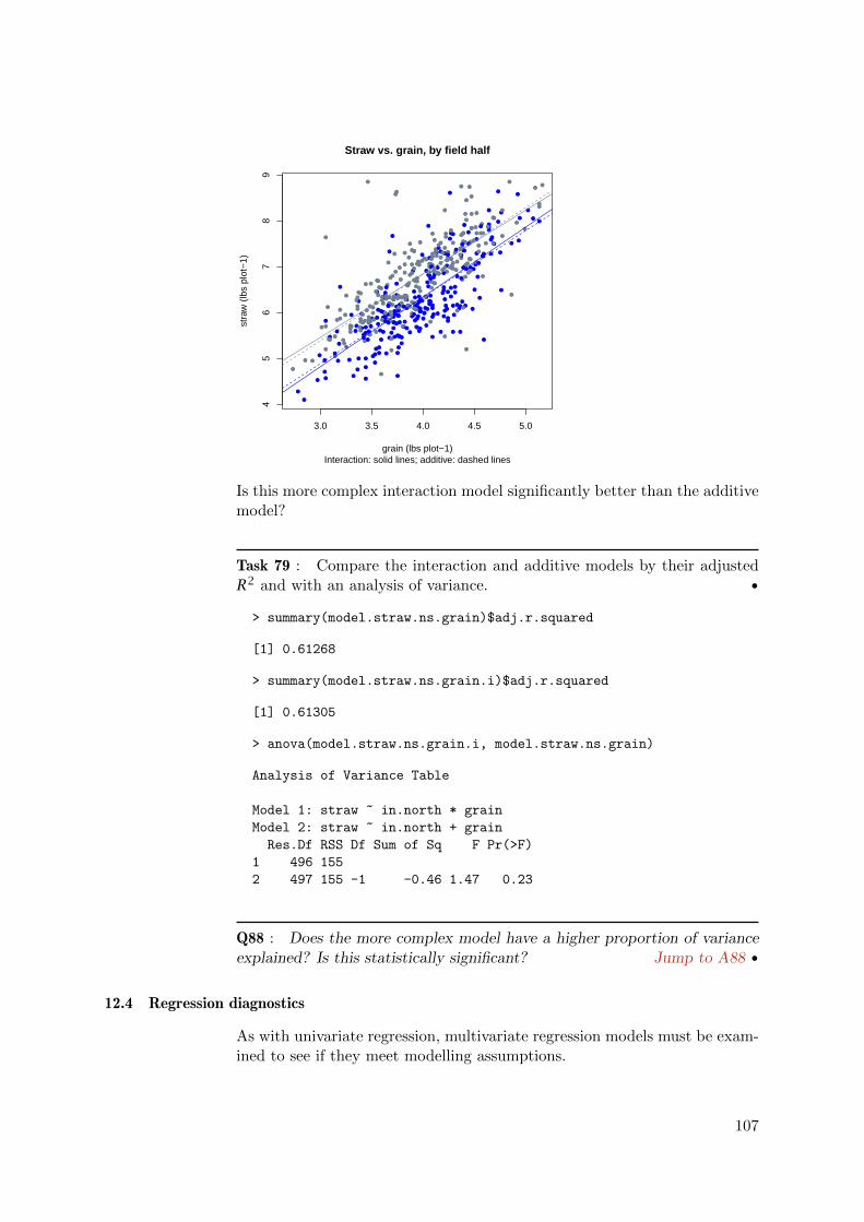
●
●
●
●
●
●
●
●
●
●●
● ●●
●
●
●
●
●
●
●
●
●
●
●
●
●
●
●
●●
●
●
●
●
●
●
●
●
●
●
●●
●
●
● ●●
●
●
●
●
●
●
●
●
●
●
●
●
●
●
●
●
●
●
●
●
●●
●
●
●
●
●
●
●
●
●●
●
●
●
●
●
●
●
●
●
●
●
●
● ●
●
●
●
●
●
●
●
●
●
●
●
●● ●
● ●
●
●
●
●
●
●
●
●
●
●
●
●
●
●
●
●
●
●
●
●
●
●
●
●
●
●
●●
●
●
●
●
●
●●
●
●
●
●
●
●●
●●
●
●
●
●
●
●
●●
●
●
●
●
●
●
●●
●
●●
●
●
●
●
●
●
●
●
●
●
●
●
●
●●
●
●● ●●
●
●
●
●
●
●
●
●
●●
●
●
●
●●
●
●
●
●
●
●
●
●
●
●
●
●
●
●●
●
●
●
●
●
●
●
●
●
●
●
●
●
●
●
●
●
●
●
●
●●
●
●
●
●
●
●
●
●
●
●
●
●
●
●
●
●
●
●
●
●
●●
●
●
●●
●
● ●
●
●
●
●
●
●
●
●
●
●
●
●
●
●
●
●
●●
●
●
●
●
●
●
●
● ●
●
●
●
●
●
●
●
●
●
●
●
●
●
●
●
●
●
●●
●
●
●
●
●
●
●
●
●
●
●
●
●
●
●
●
●
●
●
●
●
●
●
●
●
●
●
●
●
●●
●
●●
●
●
●
●
●
●
●
●
●
●
●
●
●
●
●
●
●
●
●
●
●●
● ●
●
●
●
●
●
●
●
●
●
●
●●
●
●
●
●
● ●●
●
●
●
●
●
●●
● ●
●
●
●
●
●
●
●
● ●
●
●●
●
●
●
●
●
●
●
●
●
●
●●
●●
●
●
●
●
●
● ●
●
●
●
●
●
●
●
●
●
●●
●
●
●
●
●
●
●●
●
●
●
●
●
●
●●
●
●
●
●
●
●
●●●
●
●
●
●
●
●
●
●
● ●
●
●
●
●
●
●
●
●
●
●
●
●
●
●
●
3.0 3.5 4.0 4.5 5.0
45
67
89
grain (lbs plot−1)
stra
w (
lbs
plot
−1)
Straw vs. grain, by field half
Interaction: solid lines; additive: dashed lines
Is this more complex interaction model significantly better than the additivemodel?
Task 79 : Compare the interaction and additive models by their adjustedR2 and with an analysis of variance. •
> summary(model.straw.ns.grain)$adj.r.squared
[1] 0.61268
> summary(model.straw.ns.grain.i)$adj.r.squared
[1] 0.61305
> anova(model.straw.ns.grain.i, model.straw.ns.grain)
Analysis of Variance Table
Model 1: straw ~ in.north * grain
Model 2: straw ~ in.north + grain
Res.Df RSS Df Sum of Sq F Pr(>F)
1 496 155
2 497 155 -1 -0.46 1.47 0.23
Q88 : Does the more complex model have a higher proportion of varianceexplained? Is this statistically significant? Jump to A88 •
12.4 Regression diagnostics
As with univariate regression, multivariate regression models must be exam-ined to see if they meet modelling assumptions.
107

Task 80 : Display the diagnostic plots for the additive model: (1) residualsvs. fits; (2) normal Q-Q plot of the residuals; (3) residuals vs. leverage; (4)Cook’s distance vs. leverage. •
These are plot types 1, 2, 5, and 6, respectively, selected with the which
optional argument to the plot.lm function. We also specify the number ofextreme points to label with the id.n optional argument.
> par(mfrow = c(2, 2))
> plot.lm(model.straw.ns.grain, which = c(1, 2, 5, 6),
+ id.n = 10)
> par(mfrow = c(1, 1))
5 6 7 8
−2
−1
01
23
Fitted values
Res
idua
ls ●
●
●
●
●
●
●
●
●
●
● ●●
●
●
●
●
●
●●
●
●
● ●●
●
●●●
●
●
● ●
●
●
●
●
●
●
●
●●
●
●
●
●
●
●
●●
●
●
●
●●
●
●
●●
●
●
●
●●
● ●
●●
●●
●
●
●
●
●●
●●
●●
●
●
●● ●●
●
●●
●
●● ●
●●
●
●
●
●
●
●
●
●
● ●●●
●
●●
●
●
●
●
●●
●
●
●
●
●
● ●
●
●
●●
●●
● ●
●
●
●●
●●
●
●
●
●●
●
●
●
●
●●
●
●
●●
●
● ●
●
●●
●
●
●●
●
●
●
●
●●
●
●
●
●
●●●
● ●●
●
●
●●
●
●
●
●
● ●
●
●
●
●
●
●
● ●
●●
●
●
●●
●
●
●
●
●●
● ●●
●
●
●●● ●
●●
●
●●
●
●
●
●
●
●
●
● ●
● ●
●
●
●
●●
●
●
●●
●
●
●●
●●
●
●
●●
●
●
●●
●
●
●
●
●
●
●
●
●●●
●
●●
●
●
●
●
●
●
●
●
●
●
●
●
●
●
●
●
●●
●
● ●
●
●●
●
● ●
●
●
●●
●
●
●●
●
●
●
●
●
●
●●
●
●
●
●●
●
●
●●
●
●
●●
●
●
●●
●
●●
●
●
●
●
● ●
●●
●
●
●
●
●●
●
●●
●
●
●●
●
●
●
●
●
●●
●
●
●
●
●
●●
●
●
●●
●●
●
●
●
● ●
●
●
●
●
●
●● ●
●
●
● ●
●
●
●●
● ●
●
●
●
●
●
●
●●
●
●
●
●
●
●●
●
●
●
●
●
●
●●
●
●
●
●
● ●● ●
●
●
●●
●
●
●
●
●
●
●
●
●
●
●
●
●
●●
●
●
●●
●
●
●●
●
●
●
●
●
●●
●●
●
●
●
●
●
●
●
●
●
●●
●●●
●●
●
●
●●
●
●
●
●
●
●●
●●
●
● ●
●●
●
●
Residuals vs Fitted
15
35
337 311295
362
184
285
292457
●
●
●
●
●
●
●
●
●
●
●●●
●
●
●
●
●
●●
●
●
●● ●
●
●●
●●
●
●●
●
●
●
●
●
●
●
●●
●
●
●
●
●
●
●●
●
●
●
●●
●
●
●●
●
●
●
●●
●●
●●
●●
●
●
●
●
●●
●●
●●
●
●
●●●●
●
●●
●
●●●
●●
●
●
●
●
●
●
●
●
●●●●
●
●●
●
●
●
●
●●
●
●
●
●
●
●●
●
●
●●
●●
●●
●
●
●●
●●
●
●
●
●●
●
●
●
●
●●
●
●
●●
●
●●
●
●●
●
●
●●
●
●
●
●
●●
●
●
●
●
●●●
● ●●
●
●
●●
●
●
●
●
●●
●
●
●
●
●
●
● ●
●●
●
●
●●
●
●
●
●
●●
●●●
●
●
●●●●
●●
●
●●
●
●
●
●
●
●
●
●●
●●
●
●
●
●●
●
●
●●
●
●
●●
●●
●
●
●●
●
●
●●
●
●
●
●
●
●
●
●
●●●
●
●
●
●
●
●
●
●
●
●
●
●
●
●
●
●
●
●
●
●●
●
●●
●
●
●
●
●●
●
●
●●
●
●
●●
●
●
●
●
●
●
●●
●
●
●
●●
●
●
●●
●
●
●●
●
●
●●
●
●
●
●
●
●
●
●●
●●
●
●
●
●
●●
●
●●
●
●
●●
●
●
●
●
●
●●
●
●
●
●
●
●●
●
●
●●
●●
●
●
●
●●
●
●
●
●
●
●●
●●
●
●●
●
●
●●
●●
●
●
●
●
●
●
●
●
●
●
●
●
●
●●
●
●
●
●
●
●
●●
●
●
●
●
●●●●
●
●
●●
●
●
●
●
●
●
●
●
●
●
●
●
●
●●
●
●
●●
●
●
●●
●
●
●
●
●
● ●
●●
●
●
●
●
●
●
●
●
●
●●
●●●
●●
●
●
●●
●
●
●
●
●
●●
●●
●
●●
●●
●
●
−3 −2 −1 0 1 2 3
−4
−2
02
46
Theoretical Quantiles
Sta
ndar
dize
d re
sidu
als
Normal Q−Q
15
35
337311295
362
184
285
292457
0.000 0.005 0.010 0.015
−4
−2
02
46
Leverage
Sta
ndar
dize
d re
sidu
als
●
●
●
●
●
●
●
●
●
●
●●●
●
●
●
●
●
● ●
●
●
● ●●
●
● ●●
●
●
●●
●
●
●
●
●
●
●
●●
●
●
●
●
●
●
●●
●
●
●
●●
●
●
●●
●
●
●
●●
● ●
●●
●●
●
●
●
●
●●
●●
●●
●
●
●●● ●
●
●●
●
● ●●
●●
●
●
●
●
●
●
●
●
●● ● ●
●
●●
●
●
●
●
● ●
●
●
●
●
●
● ●
●
●
●●
●●
● ●
●
●
●●
●●
●
●
●
●●
●
●
●
●
●●
●
●
●●
●
●●
●
●●
●
●
●●
●
●
●
●
●●
●
●
●
●
●●●
● ●●
●
●
●●
●
●
●
●
● ●
●
●
●
●
●
●
● ●
●●
●
●
●●●
●
●
●
●●
●●●
●
●
●●●●
●●
●
●●
●
●
●
●
●
●
●
● ●
●●
●
●
●
●●
●
●
●●
●
●
●●
●●
●
●
●●
●
●
●●
●
●
●
●
●
●
●
●
●●●
●
●●
●
●
●
●
●
●
●
●
●
●
●
●
●
●
●
●
●●
●
●●
●
●●
●
●●
●
●
●●
●
●
●●
●
●
●
●
●
●
●●
●
●
●
●●
●
●
●●
●
●
●●
●
●
●●
●
●●
●
●
●
●
●●
●●
●
●
●
●
●●
●
●●
●
●
●●
●
●
●
●
●
●●
●
●
●
●
●
●●
●
●
●●
●●
●
●
●
●●
●
●
●
●
●
●●●
●
●
● ●
●
●
● ●
●●
●
●
●
●
●
●
●●
●
●
●
●
●
●●
●
●
●
●
●
●
●●
●
●
●
●
●● ●●
●
●
●●
●
●
●
●
●
●
●
●
●
●
●
●
●
●●
●
●
●●
●
●
●●
●
●
●
●
●
●●
●●
●
●
●
●
●
●
●
●
●
●●
● ●●
●●
●
●
●●
●
●
●
●
●
●●
●●
●
●●
● ●
●
●
Cook's distance
Residuals vs Leverage
337
15
292
35
184
311295
264
362
309
0.00
0.01
0.02
0.03
0.04
0.05
0.06
Leverage hii
Coo
k's
dist
ance
●
● ●
●
●
●
●●● ●●●
●●
●
●●
●
● ●●
●
●
●
●
●
● ●●●●●●●
●
●●● ●●
●●
●
●
●
●●
● ●●●●
●●●●● ● ●
●
●
●
●●
● ●
● ●●● ●● ●●● ●●●
●●●
●● ●● ●●
●●
●
● ●● ●●●●
●
●
●
●
●
●●● ● ●●● ●
●
●
●
●
● ●●
●
●
●●
●
●
●
●
● ●●
●
● ●
●
●
●●
●●
●●
●●●
● ●
●
●●●
●●
●●●
●●● ●● ●
●●●
●
●
●
●
●● ●
●
●
●
●●●● ●● ●
●●
●
●
●
●
●
● ●
●●
●●
●●● ● ●● ●
●
●●●●●●
●● ●● ●●
●
●● ●● ● ●
●
● ●● ●
●
● ●●●● ●
●
●●
●●
● ● ●
●
●● ●● ●● ●●●
●
●●
●●● ●● ●●●●● ●
●
●●●●● ● ●
●
●●
●
●●●
●
●
●
●●
●
●
●●●
●●
●
●
●●
●
●●●
●
●●●● ●●● ●
●
●
●
●
●●● ●
●● ●●●
● ●
●●
●●●● ●● ●●● ● ●
●
●
●●●●
●
●
●
●
●●
●●●●
●●●
● ●●●●●●
●
●
●
●
●
●●
●
●
●● ●●●
●
●●● ●●
●
●●● ●● ●
●
● ●● ●● ●●●●
● ●
●
●
●
● ●
●
●●●●
●●●●
●●●
●● ● ●
●●● ●●
●●
●
●●●
●
●
●
●
●
●●
●●
●●
●
●
●
●
●
●
●●
●
●
●
●
●
●
●
●
●
●●● ●
●● ●
●
●
●
●●
●
● ●● ●● ●●●●
●●
●
●
●
●
●
● ●● ●
●●●● ●●
●
0 0.005 0.01 0.015
0
1
23456
Cook's dist vs Leverage hii (1 − hii)
337
15
292
35
184
311295 264362
309
Q89 : Which observations (plots) are marked on the plots as being potentialproblems? Jump to A89 •
We can identify these numerically. First, we examine plots that were notwell-modelled. We use the criterion of model residuals more than threestandard deviations from zero; we want to see if there is any pattern tothese.
108

We identify the plots with the large residuals, using the rstandard “stan-dardized residuals” function, and show just these records in the data frame,using the which function to identify their row (record) numbers:
> (selected <- which(abs(rstandard(model.straw.ns.grain)) >
+ 3))
15 35 184 285 292 295 311 337 362
15 35 184 285 292 295 311 337 362
> rstandard(model.straw.ns.grain)[selected]
15 35 184 285 292 295 311 337
5.0007 -4.0459 -3.1930 3.1776 -3.0646 3.8105 3.8741 3.9068
362
3.4074
Second, build a data frame with all the information for these plots, alongwith the residuals, using the cbind function to add a column:
> mhw.hires <- cbind(mhw[selected,],
+ sres = rstandard(model.straw.ns.grain)[selected])
> rm(selected)
> str(mhw.hires)
'data.frame': 9 obs. of 7 variables:
$ r : int 15 15 4 5 12 15 11 17 2
$ c : int 1 2 10 15 15 15 16 17 19
$ grain : num 3.46 4.42 4.59 3.7 4.86 3.73 3.74 3.05 4.26
$ straw : num 8.85 5.2 5.41 7.67 6.39 8.58 8.63 7.64 8.61
$ gsr : num 0.391 0.85 0.848 0.482 0.761 ...
$ in.north: logi FALSE FALSE TRUE TRUE FALSE FALSE ...
$ sres : num 5 -4.05 -3.19 3.18 -3.06 ...
Finally, order the selected plots by the residual, using the order function:
> mhw.hires[order(mhw.hires$sres), ]
r c grain straw gsr in.north sres
35 15 2 4.42 5.20 0.85000 FALSE -4.0459
184 4 10 4.59 5.41 0.84843 TRUE -3.1930
292 12 15 4.86 6.39 0.76056 FALSE -3.0646
285 5 15 3.70 7.67 0.48240 TRUE 3.1776
362 2 19 4.26 8.61 0.49477 TRUE 3.4074
295 15 15 3.73 8.58 0.43473 FALSE 3.8105
311 11 16 3.74 8.63 0.43337 FALSE 3.8741
337 17 17 3.05 7.64 0.39921 FALSE 3.9068
15 15 1 3.46 8.85 0.39096 FALSE 5.0007
We can also visualize the locations of these in the field: high positive resid-uals green, high negative residuals red, symbol size proportional to thegrain/straw ratio:
> plot(c, r, ylim = c(20, 1), cex = 3 * gsr/max(gsr), pch = 20,
+ col = ifelse(rstandard(model.straw.ns.grain) > 3,
+ "brown", ifelse(rstandard(model.straw.ns.grain) <
+ (-3), "red", ifelse(in.north, "lightblue",
109

+ "gray"))), xlab = "column", ylab = "row")
> abline(h = 10.5)
> title(main = "Large residuals, straw yield vs. field half and grain yield")
> title(sub = "Positive: brown; negative: red")
●
●
●
●
●
●
●
●
●
●
●
●
●
●●
●
●
●
●
●
●
●
●
●
●
●
●
●
●
●
●
●
●
●
●●
●
●
●
●
●
●
●
●
●
●
●
●
●
●
●
●
●
●
●
●
●
●
●
●
●
●
●
●
●
●
●
●
●
●
●
●
●
●
●
●
●
●
●
●
●
●
●
●
●
●
●
●
●
●
●
●
●
●
●
●
●
●
●
●
●●
●
●
●
●
●
●
●
●
●
●
●
●
●
●
●
●
●
●
●
●
●
●
●
●
●
●
●
●
●
●
●
●
●
●
●
●
●
●
●
●
●
●
●
●
●
●
●
●
●
●
●
●
●
●
●
●
●
●
●
●
●
●
●
●
●
●
●
●
●
●
●
●
●
●
●
●
●
●
●
●●
●●
●●
●
●
●
●
●
●
●
●
●
●
●
●
●
●
●
●
●
●
●●
●
●
●
●
●
●
●
●
●
●
●
●
●
●
●
●
●
●
●●
●
●
●
●
●
●
●
●
●
●
●
●
●
●
●
●
●
●
●
●
●
●
●
●
●
●
●
●
●
●
●
●
●
●
●
●
●
●●
●●
●
●
●
●
●
●
●
●
●
●
●
●
●●
●
●●
●
●
●
●●
●
●●
●
●
●
●
●
●
●
●
●
●
●
●
●
●
●●
●●
●
●
●
●
●
●
●
●
●
●●●
●
●●●
●
●
●
●
●
●
●
●
●
●
●
●
●
●●
●●
●●●●
●
●
●
●
●
●
●
●
●
●
●
●
●●
●
●●
●●
●●
●●
●
●
●
●
●
●
●
●
●
●
●●
●●
●
●
●
●●
●
●
●
●
●
●
●
●
●
●
●●
●●
●
●●
●
●●
●
●
●
●
●
●
●
●
●
●
●
●●
●
●
●
●
●●
●●
●
●●
●
●
●
●
●
●
●
●
●
●●
●●●●●●
●●
●●●
●●
●●
●●●
●
●●●
●
●●●
●
●●
●
●
●
●
●
●
●
●●
●
●
●●
●
●●
●
●
●
●
●
●
●
●
●
●
5 10 15 20 25
2015
105
column
row
Large residuals, straw yield vs. field half and grain yield
Positive: brown; negative: red
Note: Note the use of the nested ifelse functions to select the four colours.
Q90 : Are the high positive or negative residuals concentrated in one partof the field? Is there anything else unusual about these? Hint: look at themost negative and positive residuals. Jump to A90 •
The plot of leverage vs. Cook’s distance shows which plots most affect thefit: high leverage and high distance means that removing that plot wouldhave a large effect on the fit.
Q91 : Do the two highest-residual plots identified in the previous ques-tion have high leverage? Which high-residual plots also have high leverage?
Jump to A91 •
We can examine the effect of these on the fit by re-fitting the model, leavingout one or more of the suspect plots.
Task 81 : Fit the model without the two adjacent plots where we hypothe-size sloppy field procedures and compare the goodness-of-fit and regressionequations to the original model. •
To exclude some observations, we use the - operator on a list of dataframerow numbers created with the c function:
110

> model.straw.ns.grain.adj <- lm(straw ~ in.north + grain,
+ data = mhw[-c(15, 35), ])
> summary(model.straw.ns.grain.adj)
Call:
lm(formula = straw ~ in.north + grain, data = mhw[-c(15, 35),
])
Residuals:
Min 1Q Median 3Q Max
-1.7926 -0.3106 -0.0274 0.3017 2.1942
Coefficients:
Estimate Std. Error t value Pr(>|t|)
(Intercept) 0.9528 0.2094 4.55 6.8e-06 ***
in.northTRUE -0.5118 0.0481 -10.64 < 2e-16 ***
grain 1.4731 0.0525 28.04 < 2e-16 ***
---
Signif. codes: 0 '***' 0.001 '**' 0.01 '*' 0.05 '.' 0.1 ' ' 1
Residual standard error: 0.536 on 495 degrees of freedom
Multiple R-squared: 0.64, Adjusted R-squared: 0.638
F-statistic: 440 on 2 and 495 DF, p-value: <2e-16
> summary(model.straw.ns.grain)
Call:
lm(formula = straw ~ in.north + grain, data = mhw)
Residuals:
Min 1Q Median 3Q Max
-2.2548 -0.3189 -0.0276 0.3042 2.7871
Coefficients:
Estimate Std. Error t value Pr(>|t|)
(Intercept) 1.0461 0.2178 4.8 2.1e-06 ***
in.northTRUE -0.5132 0.0500 -10.3 < 2e-16 ***
grain 1.4499 0.0546 26.5 < 2e-16 ***
---
Signif. codes: 0 '***' 0.001 '**' 0.01 '*' 0.05 '.' 0.1 ' ' 1
Residual standard error: 0.559 on 497 degrees of freedom
Multiple R-squared: 0.614, Adjusted R-squared: 0.613
F-statistic: 396 on 2 and 497 DF, p-value: <2e-16
Q92 : Does the model without the two plots fit the remaining plots betterthan the original model? How different are the model coefficients? Jumpto A92 •
Challenge: Compare the diagnostic plots for the adjusted regression. What,if anything, has improved? Does the model now meet the assumptions oflinear regression?
111

12.5 Analysis of covariance: a nested model*
In the parallel-lines model there is only one regression line between the con-tinuous predictor and predictand, which can be moved up and down accord-ing to different class means; this is an additive model. In the interactionmodel there is both an overall line and deviations from it according to class,allowing different slopes, as well as differences in class means.
Another way to look at this is to abandon the idea of a single regressionaltogether, and fit a separate line for each class. This is a nested model:the continuous predictor is measured only within each level of the classifiedpredictor. There is no interest in the difference between classes (here, thefield halves), only an interest in making the best fit in each half.
A nested model is specified with the / formula operator (this is not mathe-matical division). This is to be read as “fit the relation after the / separatelyfor the two values of the classified variable”.
> model.straw.ns.grain.nest <- lm(straw ~ in.north/grain,
+ data = mhw)
> summary(model.straw.ns.grain.nest)
Call:
lm(formula = straw ~ in.north/grain, data = mhw)
Residuals:
Min 1Q Median 3Q Max
-2.2242 -0.3169 -0.0398 0.3136 2.7574
Coefficients:
Estimate Std. Error t value Pr(>|t|)
(Intercept) 1.2930 0.2979 4.34 1.7e-05 ***
in.northTRUE -1.0375 0.4350 -2.39 0.017 *
in.northFALSE:grain 1.3872 0.0752 18.44 < 2e-16 ***
in.northTRUE:grain 1.5199 0.0794 19.14 < 2e-16 ***
---
Signif. codes: 0 '***' 0.001 '**' 0.01 '*' 0.05 '.' 0.1 ' ' 1
Residual standard error: 0.559 on 496 degrees of freedom
Multiple R-squared: 0.615, Adjusted R-squared: 0.613
F-statistic: 265 on 3 and 496 DF, p-value: <2e-16
Note that the nested model does not give a difference between field halves;instead each half has its own regression line (intercept and slope).
Q93 : What are the two slopes of straw vs. grain? Are they different?Do they differ from the single slope found in the parallel regression model?
Jump to A93 •
Q94 : This model has the same adjusted R-squared as the interactionmodel. Why? Jump to A94 •
112
Challenge: Compare the regression lines of this nested model with theregression lines implied by the interaction model. Are they the same? Whyor why not?
12.6 Answers
A79 : Yes, straw yield most likely (p ≈ 0) is higher in the South half; but thisexplains very little (0.066) of the total variance. Return to Q79 •
A80 : Yes, straw yield almost surely (p ≈ 0) varies with grain yield; this explainsabout half (0.532) of the total variance. Return to Q80 •
A81 : Both coefficients are highly significant (probability that they are reallyzero almost nil). Coefficient in.northTRUE represents the difference between fieldhalves, and grain the regression between straw and grain.
This explains over 60% (0.613) of the total variance. Return to Q81 •
A82 : Coefficient in.northTRUE represents the difference between field halves; thefitted value is -0.5132 lb. plot-1. Coefficient grain is the regression between strawand grain; the fitted value is 1.4499 lb. straw increase per plot for each lb grainincrease per plot. This is not the same as the best-fit univariate line (ignoring fieldhalf), which is 1.4305 Return to Q82 •
A83 : The multivariate additive model is clearly best; it explains about two-thirds(66%) of the variability, whereas the whole-field straw vs. grain model only explainsjust more than half (53%) and the field-half model very little (6%). Return toQ83 •
A84 : Yes, in both cases the probability that we’d be wrong by rejecting the nullhypothesis of no difference is practically zero. The RSS decreases from 375.4 for thefield-half model, and 188.2 for the whole-field straw vs. grain model, to 155.3 for thecombined model. That is, much less variability in straw yield remains unexplainedafter the combined model. Return to Q84 •
A85 : The parallel regression models the case where one half of the field is moreproductive, on average, than the other, but the relation between grain and straw isthe same in both cases (i.e. the grain/straw ratio is the same in both field halves).There is no difference in plant morphology, just overall size.
By contrast, the interaction model allows that the two field halves may also differin the grain/straw ratio, i.e. the relation between grain and straw yield – differentplant morphology. Return to Q85 •
A86 : The coefficients are:
113

1. (Intercept): estimated straw yield at zero grain yield and in the S fieldhalf;
2. in.northTRUE: difference in average yield in the N vs. the S;
3. grain: increase in straw yield for each unit increase in grain yield, in the Sfield half;
4. in.northTRUE:grain: difference in slope (increase in straw yield for eachunit increase in grain yield) in the N vs. the S.
Return to Q86 •
A87 : The coefficient in.northTRUE:grain is not significant; the probability offalsely rejecting the null hypothesis is quite high, 0.2255, so we should accept thehypothesis that this difference is really 0.
According to this test, the interaction is not significant. Plants grow with the samemorphology in the two field halves. Return to Q87 •
A88 : The interaction model has slightly higher adjusted R2: 0.61305 vs. 0.61268.However, the ANOVA table shows that this increase has a p=0.225 probability ofoccurring by chance, so we conclude the interaction model is not justified. This isthe same conclusion we reached from the model summary, where the interactionterm (coefficient) was not significant. Return to Q88 •
A89 : Plots labelled on the diagnostic graphs are 15, 337, 311, 295, 362, 285(positive residuals) and 35, 184, 292, 457 (negative residuals). These have residualsmore extreme than expected by theory (normal Q-Q plot of residuals). Plots 292,337, 264, 184 and 309 are large residuals with high leverage. Return to Q89 •
A90 : The highest four positive residuals are all in the S half, but otherwise donot seem clustered. The most negative residual is from plot 35 (r=15, c=2) and themost positive from the immediately adjacent plot 15 (r=15, c=1). Could some ofthe grain from plot 15 have been accidentally measured as part of the yield of plot35? If these two are combined, the grain/straw ratio is 0.56085, close to the meangrain/straw ratio of the whole field, 0.61054. Return to Q90 •
A91 : Plots 15 and 35 do not have high leverage, i.e. their removal would not changethe equation very much. The high-leverage plots that also have high residuals are292 and 184 (negative residuals) and 337, 264 and 309 (positive residuals). Returnto Q91 •
A92 : The fit is considerably better without these badly-modelled plots: 0.63841without the two plots vs. 0.61268 with them. Another 2.5% of the variation isexplained.
The coefficient for field half hardly changes, but the regression line changes substan-tially: higher intercept: (0.9528 vs. 1.0461) and shallower slope (1.4731 vs. 1.4499
114

. As predicted by the high leverage, removing these points changes the functionalrelation. Return to Q92 •
A93 : The slope in the S half is 1.3872, in the N half 1.5199. These differconsiderably from each other, and from the parallel regression slope: 1.4499. Theslope in the S half is less steep, in the N half steeper, than the parallel regressionslope. Return to Q93 •
A94 : Both models have four parameters to fit the same dataset. Both modeldifference between levels (either means or intercepts) and slopes. Return to Q94 •
We are done with these models and some other variables, so clean up theworkspace:
> rm(model.straw.ns, model.straw.grain, model.straw.ns.grain,
+ model.straw.ns.grain.adj, model.straw.ns.grain.i,
+ model.straw.ns.grain.nest)
> rm(struct.beta, beta, mhw.hires)
13 Principal Components Analysis
In §8.1.1 and §11.3 we computed the correlation between the grain and strawyields from each plot, i.e., the strength of their association. This showed thatthey are highly-correlated. Thus there is redundancy: the two variables arenot fully independent.
Principal components analysis (PCA) is a data reduction technique. It findsa new set of variables, equal in number to the original set, where these so-called synthetic variables are uncorrelated. In addition, the first syntheticvariable represents as much of the common variation of the original variablesas possible, the second variable represents as much of the residual variationas possible, and so forth. This technique thus reveals the structure of thedata. The transformation itself and the synthetic variables produced by itcan be interpreted by the analyst to understand the underlying processes.
In the present example, Mercer & Hall measured two variables: grain andstraw yield. However, these measured quantities are the outcomes of pro-cesses which we can not directly observe: (1) plant growth; (2) partition ofplant growth between grain and straw. PCA can be used to gain insight intothese.
PCA is often used for data reduction in datasets with many variables; agood example is in image processing. It is explained and illustrated in thiscontext by many textbooks on remote sensing [e.g. 1, 28]
Note: In terms of mathematics, the vector space made up of the originalvariables is projected onto another space such that the projected variables areorthogonal, with descending variances. The mathematics are well-explainedin many texts, e.g., [8, 25].
PCA can be standardized or not. In the first case the variables are scaledto zero mean and unit variance, thus giving them equal importance math-
115

ematically. In the second, the original units are used; thus variables withmore variance are more important. In the present case, although the twovariables are computed in the same units of measure (lb. plot-1), they are ofintrinsically different magnitude (there is much more straw than grain). Toreveal the relation between the variables they should be standardised beforecomputing the components.
Task 82 : Compute the standardized PCA of grain and straw yields. •
The prcomp function computes the PCA; with the optional scale argumentthe variables are first scaled, resulting in standardized PCA. The output isan object of class prcomp.
> pc <- prcomp(mhw[, c("grain", "straw")], scale = T)
> summary(pc)
Importance of components:
PC1 PC2
Standard deviation 1.315 0.520
Proportion of Variance 0.865 0.135
Cumulative Proportion 0.865 1.000
Q95 : How much of the variance is explained by each component? Howmuch data redundancy is in the original two variables? Jump to A95 •
Sometimes PCA is used just for data reduction, but here our interest is inthe interpretation. One way to interpret is to examine the loadings: theseshow how the synthetic variables are created from the original ones.
Note: Mathematically, these are the eigenvectors (in the columns) whichmultiply the original variables to produce the synthetic variables (principalcomponents).
Task 83 : Examine the loadings of the two PC’s. •
These are in the rotation field of the PCA object.
> pc$rotation
PC1 PC2
grain 0.70711 -0.70711
straw 0.70711 0.70711
These can be visualized on a so-called biplot, which shows the loadings asvectors in the space spanned by two PC’s. It also shows the location of the500 observations in this space, i.e., the values of the synthetic variables (theprincipal component scores).
Task 84 : Show the biplot. •
116

This is displayed with the biplot method, which when presented with anobject of class prcomp specializes to biplot.prcomp:
> biplot(pc)
> grid()
−0.1 0.0 0.1 0.2
−0.
10.
00.
10.
2
PC1
PC
2
1
2 3
4
5
6
7
8
9
1011
121314
15
16
17
18
1920
21
22
2324
2526
2728
2930
31
3233
34
35
3637 38
39
404142
43
44
4546
47
48
49
50
51
52
53
5455
56
5758 59
60
61
62
63
64 6566
67
686970
71
72
7374
75
76
77
78
798081
82
838485
86
87 8889
9091
9293
9495
96
97
98
99
100
101
102
103
104 105
106107
108109
110
111
112
113
114115116
117
118
119120
121
122123
124
125
126
127
128 129
130
131
132
133
134135
136
137
138
139
140
141142
143144
145
146147
148149 150
151152
153
154
155
156
157158
159
160
161162
163
164
165
166
167168
169
170171
172
173174175
176177178 179
180
181
182
183
184
185
186
187188
189
190191
192
193
194
195196
197198
199200201
202203
204
205
206
207208
209210
211212
213
214215
216
217 218 219
220221 222223
224
225
226
227228 229
230
231
232
233
234
235236
237238
239
240
241
242243
244
245246
247
248249
250
251252
253254255
256
257258259
260
261
262 263
264
265
266267
268
269
270
271
272
273
274
275
276
277
278
279
280
281
282
283
284
285
286 287288
289
290
291
292
293 294
295
296297
298
299
300
301
302
303
304
305
306307
308
309
310
311
312
313
314
315
316317318
319
320
321322
323
324
325326
327
328
329330
331332
333
334
335336
337
338339
340
341 342343
344
345
346347
348
349350
351
352
353354355
356
357
358359
360
361
362
363
364
365
366
367368
369
370
371372373374
375
376 377
378 379
380
381
382
383384
385386
387
388
389
390391
392
393
394395
396397
398
399
400
401402
403
404
405
406
407
408
409
410411412
413
414
415416
417
418
419
420
421
422
423
424425426
427
428
429
430
431432
433
434
435
436
437
438
439
440
441
442
443
444445
446
447 448
449
450
451
452
453
454
455
456
457
458
459460461
462
463464
465
466
467 468
469
470
471
472
473
474475
476477 478479
480
481482
483
484
485
486
487 488
489
490
491
492493
494
495496 497
498
499
500
−20 −10 0 10 20 30
−20
−10
010
2030
grain
straw
The biplot can be interpreted in three ways:
1. The orientation (direction) of the vector, with respect to the PC space.The more a vector, which represents an original variable, is parallel toa PC axis, the more it contributes to that PC.
2. The length in the space defined by the displayed PCs; the longer thevector, the more variability of this variable is represented by the twodisplayed PCs.
3. The angles between vectors of different variables show their correlationin the space spanned by the two displayed PC’s: small angles repre-sent high positive correlation, right angles represent lack of correlation,opposite angles represent high negative correlation.
Q96 : Considering the biplot and loadings matrix, what does the first PCrepresent? Jump to A96 •
To help answer this question, we can examine the plots with the highest andlowest scores of PC1. The scores (synthetic variables) are returned in the x
field of the prcomp object; this is a matrix whose columns are the PC scores.
117

The which.max and which.min functions find the positions of the maximumand minimum values in a vector. We then extract the record from thedataframe:
> str(pc$x)
num [1:500, 1:2] -0.6056 -0.0291 1.2874 0.236 -0.952 ...
- attr(*, "dimnames")=List of 2
..$ : NULL
..$ : chr [1:2] "PC1" "PC2"
> mhw[which.max(pc$x[, "PC1"]), ]
r c grain straw gsr in.north
79 19 4 5.16 8.78 0.5877 FALSE
> mhw[which.min(pc$x[, "PC1"]), ]
r c grain straw gsr in.north
470 10 24 2.84 4.1 0.69268 TRUE
Q97 : Which are the plots with the largest positive and negative scores forPC1? How is this explained? Jump to A97 •
Q98 : What does the biplot reveal about the correlation between grain andstraw yield? Jump to A98 •
Q99 : What is the interpretation of the second PC? Jump to A99 •
To help answer this question we can again look at high– and low–scoringobservations, but this time for PC2.
> mhw[which.max(pc$x[, "PC2"]), ]
r c grain straw gsr in.north
15 15 1 3.46 8.85 0.39096 FALSE
> mhw[which.min(pc$x[, "PC2"]), ]
r c grain straw gsr in.north
184 4 10 4.59 5.41 0.84843 TRUE
Q100 : Interpret the two PCs and the proportion of variance explained byeach in terms of this experiment. Jump to A100 •
13.1 Answers
A95 : PC1 explains 86.5% and PC2 13.5% of the total variance. That is, about
118

85% of the information is in the first component; this is a measure of the redundancy.Return to Q95 •
A96 : The first PC is made up of large contributions from the standardizedvariables representing grain yield and straw yield. This is interpreted as generalplant size: high yielding-plants score higher on PC1. Return to Q96 •
A97 : The maximum score is from plot 79, the minimum from plot 470. Thefirst has both very high grain and straw yield, the second both very low. Theinterpretation that PC1 represents overall yield is confirmed. Return to Q97 •
A98 : The angle between the vectors representing the two yields is small, showingthat the yields are highly-correlated. Return to Q98 •
A99 : The second PC represents a contrast between grain and straw yield, inde-pendent of the overall yield level. Positive values have higher-than-average strawyields, at a given level of grain yield. In other words, the grain-to-straw ratio (GSR)is low. The highest– and lowest– scoring plots for PC2 confirm this: plot 15 has avery low GSR: 0.391, whereas plot 184 has a very high GSR: 0.848. Return toQ99 •
A100 : In summary, the first PC, accounting for about 85% of the variance inboth grain and straw yield, represents the overall yield level, whereas the secondPC, accounting for about 15% of the variance, represents the grain/straw ratio, i.e.,plant morphology independent of yield. The great majority of the overall variabilityin this field is due to variable yield. However, there is still a fair amount of variationin plant morphology that does not depend on overall plant size. Since this is onevariety of wheat (i.e., no genetic variation) and one management, we conclude thatlocal environmental factors affect not only yield but also plant morphology. Returnto Q100 •
14 Model validation
In §8, §9 and §12 models were evaluated by the goodness-of-fit (coefficientof determination, expressed as the adjusted R2) and compared by ANOVA.These are internal measures of model quality: the data used to evaluate themodel is also used to build it.
Of course, the main use of a model is to predict; and what we really wouldlike is some measure of the predictive success of a model, i.e., an externalmeasures of model quality, using independent data to evaluate the model,not the data that was used to build it. The modelling steps so far weredesigned to best calibrate the model; now we want to validate it.
A common approach is to split the dataset into a calibration and a validationset.
1. The model is developed using only the observations in the calibrationset;
119

2. This model is used to predict at the the observations in the validationset, using the actual (measured) values of the predictor (independent)variable(s);
3. These predicted values are compared to the actual (measured) valuesof the response (dependent) variable in the validation set.
14.1 Splitting the dataset
Splitting the dataset has two constraints:
1. The calibration set must be large enough reliable modelling;
2. The validation set must be large enough for reliable validation statis-tics.
A common split in a medium-size dataset such as this one is 3 to 1, i.e., 3/4for calibration and 1/4 for validation.
The next issue is how to select observations for each set. This can be:
� random: select at random (without replacement); this requires no as-sumptions about the sequence of items in the dataset;
� systematic: select in sequence; this requires absence of serial correla-tion, i.e., that observations listed in sequence be independent;
� stratified: first divide the observations by some factor and then applyeither a random or systematic sampling within each stratum, generallyproportional to stratum size.
To decide which strategy to use, we need to know how the dataset is ordered,and if there are any useful stratifying factors.
The sequence of observations is given by the row.names function; to seejust the first few we use the head function with the optional n argument tospecify the number of items to view:
> head(row.names(mhw), n = 10)
[1] "1" "2" "3" "4" "5" "6" "7" "8" "9" "10"
The observations correspond to these are:
> head(mhw, n = 10)
r c grain straw gsr in.north
1 1 1 3.63 6.37 0.56986 TRUE
2 2 1 4.07 6.24 0.65224 TRUE
3 3 1 4.51 7.05 0.63972 TRUE
4 4 1 3.90 6.91 0.56440 TRUE
5 5 1 3.63 5.93 0.61214 TRUE
6 6 1 3.16 5.59 0.56530 TRUE
7 7 1 3.18 5.32 0.59774 TRUE
8 8 1 3.42 5.52 0.61957 TRUE
9 9 1 3.97 6.03 0.65837 TRUE
10 10 1 3.40 5.66 0.60071 TRUE
120

Q101 : What is the sequence of observations? Could there be serial corre-lation? Jump to A101•
Q102 : What are possible stratifying factors? Jump to A102 •
Q103 : Which of these strategies is best to apply to the Mercer-Hall dataset,and why? Jump to A103 •
Task 85 : Select a random sample of 3/4 of the 500 observations as thecalibration set, and the rest as the validation set. •
The sample function selects a sample from a vector (here, the row numbersof the dataframe); the size argument gives the size of the sample and thereplace argument is logical: should sampling be with replacement?
Although we know there are 500 observations, it’s more elegant to extractthe number programatically with the dim “dimensions of a matrix” function.
Finally, we use set.seed so your results will be the same as ours; in practiceyou would not use this, instead accept the random seed.
> dim(mhw)
[1] 500 6
> (n <- dim(mhw)[1])
[1] 500
> set.seed(621)
> head(index.calib <- sort(sample(1:n, size = floor(n *
+ 3/4), replace = F)), n = 12)
[1] 1 2 3 4 6 7 8 10 12 13 14 15
> length(index.calib)
[1] 375
Task 86 : Assign the remaining observations to the validation set. •
The very useful setdiff function selects the subset of a set that is not inanother subset:
> head(index.valid <- setdiff(1:n, index.calib), n = 12)
[1] 5 9 11 17 18 21 29 31 34 37 39 41
> length(index.valid)
121

[1] 125
Check that the two subsets together equal the original set; this gives a chanceto introduce the union function and the setequal “are the sets equal?”logical function.
> setequal(union(index.calib, index.valid), 1:n)
[1] TRUE
14.2 Developing the model
From §12.2 we know that the multivariate additive model (straw yield ex-plained by the additive effect of grain yield and field half) is clearly best inthis particular experiment. However, in any other situation the field wouldbe different and so would any effect of field half. We’d like a measure of howgood is a model to predict straw yield from grain yield in general. So wework with the single-predictor model.
Task 87 : Re-fit this model on the calibration set. •
> cal.straw.grain <- lm(straw ~ grain, data = mhw, subset = index.calib)
> summary(cal.straw.grain)
Call:
lm(formula = straw ~ grain, data = mhw, subset = index.calib)
Residuals:
Min 1Q Median 3Q Max
-2.0145 -0.3451 0.0244 0.3561 3.0500
Coefficients:
Estimate Std. Error t value Pr(>|t|)
(Intercept) 0.8258 0.2657 3.11 0.002 **
grain 1.4376 0.0672 21.38 <2e-16 ***
---
Signif. codes: 0 '***' 0.001 '**' 0.01 '*' 0.05 '.' 0.1 ' ' 1
Residual standard error: 0.607 on 373 degrees of freedom
Multiple R-squared: 0.551, Adjusted R-squared: 0.55
F-statistic: 457 on 1 and 373 DF, p-value: <2e-16
Q104 : How well do the model coefficients agree with the model based onall observations? Jump to A104 •
To answer this, fit the model based on all observations, then compare theabsolute and relative differences of the coefficients, extracted from the modelwith the coef (or, coefficients function:
> model.straw.grain <- lm(straw ~ grain, data=mhw)
> (coef(cal.straw.grain) - coef(model.straw.grain))
122

(Intercept) grain
-0.0404513 0.0071276
> ((coef(cal.straw.grain) - coef(model.straw.grain))
+ /coef(model.straw.grain))*100
(Intercept) grain
-4.66954 0.49826
14.3 Predicting at the validation observations
Now we have a model, it can be used to predict at the observations held outfrom calibration, i.e., the validation set.
Task 88 : Predict the straw yield for the observation set. •
The predict.lm function, which can also be called as predict, uses anobject returned by lm to predict from a dataframe specified by the newdata
argument. Here the data should be the rows (cases) of the mhw dataframethat are part of the validation set; these row numbers are in the index.validvector.
> pred <- predict.lm(cal.straw.grain, newdata = mhw[index.valid,
+ ])
Task 89 : Compare them with the actual yields in this set, both numericallyand graphically. •
For convenience, we first extract the vector of actual yields from the valida-tion data frame:
> actual <- mhw[index.valid, "straw"]
Now compare the numeric summaries and side-by-side histograms; note thecommon scales.
> summary(pred); summary(actual)
Min. 1st Qu. Median Mean 3rd Qu. Max.
4.75 6.17 6.66 6.60 7.02 7.93
Min. 1st Qu. Median Mean 3rd Qu. Max.
4.77 6.03 6.53 6.65 7.28 8.75
> par(mfrow=c(1,2))
> hist(pred, main="", xlab="Predicted straw yields, lb / plot",
+ breaks=seq(4.5,9,by=0.4), freq=F, ylim=c(0,.65))
> hist(mhw[index.valid,"straw"], main="",
+ xlab="Actual straw yields, lb / plot",
+ breaks=seq(4.5,9,by=0.4), freq=F, ylim=c(0,.65))
> par(mfrow=c(1,1))
123
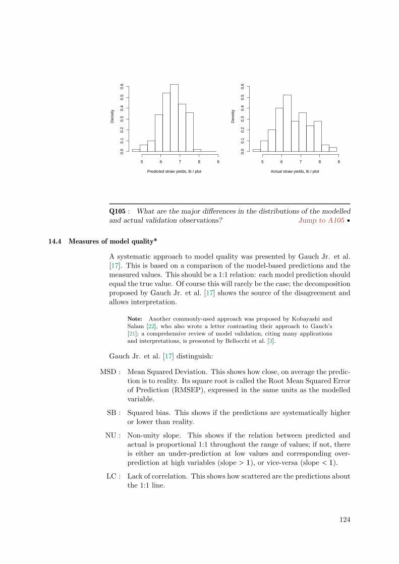
Predicted straw yields, lb / plot
Den
sity
5 6 7 8 9
0.0
0.1
0.2
0.3
0.4
0.5
0.6
Actual straw yields, lb / plot
Den
sity
5 6 7 8 9
0.0
0.1
0.2
0.3
0.4
0.5
0.6
Q105 : What are the major differences in the distributions of the modelledand actual validation observations? Jump to A105 •
14.4 Measures of model quality*
A systematic approach to model quality was presented by Gauch Jr. et al.[17]. This is based on a comparison of the model-based predictions and themeasured values. This should be a 1:1 relation: each model prediction shouldequal the true value. Of course this will rarely be the case; the decompositionproposed by Gauch Jr. et al. [17] shows the source of the disagreement andallows interpretation.
Note: Another commonly-used approach was proposed by Kobayashi andSalam [22], who also wrote a letter contrasting their approach to Gauch’s[21]; a comprehensive review of model validation, citing many applicationsand interpretations, is presented by Bellocchi et al. [3].
Gauch Jr. et al. [17] distinguish:
MSD : Mean Squared Deviation. This shows how close, on average the predic-tion is to reality. Its square root is called the Root Mean Squared Errorof Prediction (RMSEP), expressed in the same units as the modelledvariable.
SB : Squared bias. This shows if the predictions are systematically higheror lower than reality.
NU : Non-unity slope. This shows if the relation between predicted andactual is proportional 1:1 throughout the range of values; if not, thereis either an under-prediction at low values and corresponding over-prediction at high variables (slope > 1), or vice-versa (slope < 1).
LC : Lack of correlation. This shows how scattered are the predictions aboutthe 1:1 line.
124

It is quite common to report the RMSEP; this indeed is the single numberthat tells how closely, on average, the model predicted the validation points;however the decomposition shows the reason(s) for lack of agreement.
Some notation:
– there are n total validation observations;
– yi is the true (measured) value of validation observation i;
– yi is the predicted value of validation observation i;
– the overbar y indicates the arithmetic mean of the yi, etc.
Then MSD, SB, NU, and LC are computed as:
MSD = 1n
n∑i=1
(yi − yi
)2(14.1)
SB =(y −y
)2(14.2)
NU = (1− b2)1n
n∑i=i
(yi − y
)2(14.3)
LC = (1− r2)1n
n∑i=i
(yi −y
)2(14.4)
where:
– b is the slope of the least-squares regression of actual values on thepredicted values, i.e.,
∑yiyi/
∑y2i ; this is also called the gain.
– r2 is the square of the correlation coefficient r1:1 between actual and
predicted, i.e.,(∑yiyi
)2/(∑yi)2(∑ yi)2
.
Thus NU is the non-unity slope in the regression of actual on predicted,scaled by the sums of squares of the predicted values of the validation ob-servations, and LC is the lack of correlation in the regression of actual onpredicted, scaled by the sums of squares of the actual values of the validationobservations.
These have the relation:
MSD = SB+NU+ LC (14.5)
That is, the total validation error consists of bias, gain, and lack of correla-tion. These are distinct aspects of model quality and can be interpreted astranslation (SB), rotation (NU), and scatter (LC), respectively:
Translation : The model systematically over- or under-predicts;
Rotation : The relation between actual and predicted value is non-linear, that is,not a constant relation throughout the range of values;
Scatter : The model is not precise.
125

If there is significant translation or rotation, this indicates the model form isnot correct; we show an example of this below in §14.5. If there is significantscatter, this indicates that the model does not well-describe the system;perhaps there are missing factors (predictors) or perhaps the system has a lotof noise that can not be modelled. Thus by examining the model validationdecomposition the analyst can decide on how to improve the model.
We begin by visualizing the predictive success of the model on a 1:1 plot.Note that by convention this plot has the actual (measured) value on they-axis (dependent) and the predicted (modelled) value on the x-axis (inde-pendent). That is, it shows how the prediction predicts the actual.
Task 90 : Plot the actual vs. predicted grain yields of the validation set,with a 1:1 line. •
The plot:
> plot(actual ~ pred, ylab="Actual", xlab="Predicted", asp=1,
+ main="Mercer-Hall trial, straw yield, lbs/plot",
+ xlim=c(4.5,9), ylim=c(4.5,9));
> abline(0,1); grid()
●●
●
●
●●
●
●
●
●
●
●●
●
●
●
●
●
●
●
●
●
●
●
●
●
●
● ●
●
●●
●
●
●
●●
●
●
●
●●
●
●
●
●
●
●
●
●
●●
●
●
●
●●
●
●●●
●
●
●●
●
●
●
●
●
●
●
●
●
●
●
●●
●
●
●
●
●
●
●
●
●
●
●●●
●
●
●
●
●
●
●
●
●
●●
●
●
● ●
●
●
● ●●
●
●
●
●
●
●
●●
●
●
●
●
●
●
4 5 6 7 8 9
56
78
9
Mercer−Hall trial, straw yield, lbs/plot
Predicted
Act
ual
Q106 : How well does the calibrated model predict the validation observa-tions? Jump to A106•
14.4.1 MSD
Task 91 : Compute the MSD and RMSEP. •
126

> (valid.msd <- sum((actual - pred)^2)/length(index.valid))
[1] 0.40712
> (valid.msd <- mean((actual - pred)^2))
[1] 0.40712
> (valid.rmsep <- sqrt(valid.msd))
[1] 0.63806
Q107 : How does the RMSEP compare to the RMSE (root mean squarederror) in the calibration linear model? What is the practical interpretationof the RMSE? Jump to A107 •
The RMSE of the linear model is the mean of the squared residuals, extractedfrom the linear model with the residuals function:
> (rmse <- sqrt(mean(residuals(cal.straw.grain)^2)))
[1] 0.60532
14.4.2 SB
Task 92 : Compute the bias and its square (SB). •
> (valid.bias <- (mean(pred) - mean(actual)))
[1] -0.049228
> (valid.sb <- valid.bias^2)
[1] 0.0024234
> valid.sb/valid.msd * 100
[1] 0.59525
Q108 : What is the bias? Is it positive or negative? What does this implyabout the model? What proportion of the MSD is attributed to the SB?
Jump to A108 •
14.4.3 NU
The next component of the error the non-unity slope (NU) factor. To com-pute this we first need to compute b, the slope of the least-squares regressionof actual values on the predicted values. This is an interesting number inits own right, the gain, which we hope will be 1. The gain can be directlywith the least-squares formula
∑yiyi/
∑y2i , but in practice it’s easier to
127

use the lm function to fit the slope and then extract that coefficient with thecoef function:
Task 93 : Compute the regression of actual straw yield on predicted grainyield in the validation set, and display, along with the 1:1 line, on a scatter-plot of actual vs. predicted. •
As usual, we fit the model with the lm function, summarize it with thesummary function (to see the coefficients and scatter), and produce the scat-terplot with plot. We add text to the plot with text, and (this is new)produce a legend with legend, also specifying the legend symbols (here,lines using the lty “line type” argument) and colours (here, matching theline colours, both specified with the col “colour” argument):
Now compute, summarize and plot the regression:
> regr.actual.pred <- lm(actual ~ pred)
> summary(regr.actual.pred)
Call:
lm(formula = actual ~ pred)
Residuals:
Min 1Q Median 3Q Max
-1.5452 -0.3758 0.0049 0.3833 2.3635
Coefficients:
Estimate Std. Error t value Pr(>|t|)
(Intercept) 0.2917 0.6240 0.47 0.64
pred 0.9633 0.0941 10.24 <2e-16 ***
---
Signif. codes: 0 '***' 0.001 '**' 0.01 '*' 0.05 '.' 0.1 ' ' 1
Residual standard error: 0.641 on 123 degrees of freedom
Multiple R-squared: 0.46, Adjusted R-squared: 0.456
F-statistic: 105 on 1 and 123 DF, p-value: <2e-16
> plot(actual ~ pred, ylab="Actual", xlab="Predicted", asp=1,
+ main="Mercer-Hall trial, straw yield, lbs/plot",
+ xlim=c(4.5,9), ylim=c(4.5,9));
> abline(regr.actual.pred, col="red")
> abline(0,1); grid()
> text(4.5, 8.5, paste("Gain:", round(coef(regr.actual.pred)[2], 2)),
+ pos=4, col="red")
> legend(7.5, 5, c("1:1","regression"), lty=1, col=c("black","red"))
128

●●
●
●
●●
●
●
●
●
●
●●
●
●
●
●
●
●
●
●
●
●
●
●
●
●
● ●
●
●●
●
●
●
●●
●
●
●
●●
●
●
●
●
●
●
●
●
●●
●
●
●
●●
●
●●●
●
●
●●
●
●
●
●
●
●
●
●
●
●
●
●●
●
●
●
●
●
●
●
●
●
●
●●●
●
●
●
●
●
●
●
●
●
●●
●
●
● ●
●
●
● ●●
●
●
●
●
●
●
●●
●
●
●
●
●
●
4 5 6 7 8 9
56
78
9
Mercer−Hall trial, straw yield, lbs/plot
Predicted
Act
ual
Gain: 0.96
1:1regression
Q109 : What is the gain? Is it greater than or less than 1? What does thissay about the model? Jump to A109 •
The model summary shows that the gain is significantly different from zero,which is no surprise. To assess it against a null hypothesis of β = 1, onemethod is to remove the 1:1 line from the regression and then compare theregression slope to zero. The 1:1 line is simply the line where actual yieldequals predicted yield, so first we subtract the predicted from the actual;this would reduce an exact 1:1 slope to 0. Then we re-fit and summarize themodel. We also visualize the hypothesized 0 slope and the actual negativegain.
> regr.actual.pred.0 <- lm(I(actual - pred) ~ pred)
> summary(regr.actual.pred.0)
Call:
lm(formula = I(actual - pred) ~ pred)
Residuals:
Min 1Q Median 3Q Max
-1.5452 -0.3758 0.0049 0.3833 2.3635
Coefficients:
Estimate Std. Error t value Pr(>|t|)
(Intercept) 0.2917 0.6240 0.47 0.64
pred -0.0367 0.0941 -0.39 0.70
Residual standard error: 0.641 on 123 degrees of freedom
Multiple R-squared: 0.00124, Adjusted R-squared: -0.00688
F-statistic: 0.152 on 1 and 123 DF, p-value: 0.697
> plot(I(actual - pred) ~ pred, ylab="Actual - Predicted",
+ xlab="Predicted",
129

+ main="Mercer-Hall trial, straw yield, lbs/plot")
> grid(); abline(regr.actual.pred.0, col="red"); abline(h=0)
> text(5, 1.6, paste("Slope:",
+ round(coef(regr.actual.pred.0)[2], 2)),
+ pos=4, col="red")
> legend(5, -1, c("1:1","regression"), lty=1, col=c("black","red"))
●
●
●●
●
●●
●
●●
●
●
●
●
●
●
●
●
●
●●
●
●
●●
●● ●
●
●●
●●
●
●
●
●
● ●
●
●
●
●
●
●
●
●
●●
●
●
●
●
●
●
● ●
●
●
●●
●●
●
●
●
●
●
●
●
●
●
●
●●
●
●
●
●
●
●
●
●
●
●
●
● ●
●●
●
●
●
●●
●●
●
●
●
●
●
●
●
●
●
●
●
●
●●
●
● ●
●
●
●●
●●
●●
●
●
●
5.0 5.5 6.0 6.5 7.0 7.5 8.0
−1
01
2Mercer−Hall trial, straw yield, lbs/plot
Predicted
Act
ual −
Pre
dict
ed
Slope: −0.04
1:1regression
Note here the use of the I “as-is” function to specify that the expression(actual-pred) is an arithmetic operation, not a model formula. This isnecessary because - is a formula operator, meaning to remove a term froma model.
The slope coefficient here is exactly 1 less than the slope coefficient from theoriginal regression of actual vs. predicted, as expected:
> coef(regr.actual.pred)[2] - coef(regr.actual.pred.0)[2]
pred
1
Q110 : Is the gain of the regression of actual vs. predicted significantlydifferent from 1? Jump to A110 •
Task 94 : Compute the non-unity slope (NU) factor. •
First, extract the slope from the fitted linear model:
> b <- coef(regr.actual.pred)[2]
> names(b) <- NULL
> print(b)
[1] 0.96329
130

Note: The names function retrieves the name attribute; here it was assignedthe coefficient name pred (from the independent variable’s name) by the lm
function. We don’t need the name, so we assign it NULL.
Then we use equation (14.3). Note that the factor 1/n ·∑ni=i(xi − x)2 is
the mean squared deviation of the predicted values from their mean:
> (valid.msd.pred <- mean((pred - mean(pred))^2))
[1] 0.37132
and this is multiplied by the squared deviation of the slope of the regressionof actual on predicted from 1:1:
> (valid.nu <- (1 - b)^2 * valid.msd.pred)
[1] 0.0005003
> valid.nu/valid.msd * 100
[1] 0.12289
Q111 : What is the magnitude of the non-unity factor NU? What proportionof the MSD is attributed to the NU? Jump to A111 •
14.4.4 LC
The final aspect of model quality is the lack of correlation, LC.
Task 95 : Compute LC. •
We use equation (14.4). Note that the factor 1/n ·∑ni=i(yi − y)2 is the
mean squared deviation of the measured values from their mean:
> (valid.msd.actual <- mean((actual - mean(actual))^2))
[1] 0.74876
and then this is multiplied by the lack of fit in the regression of actual onpredicted, (1− r2). The fit is a field in the model summary; it can also becomputed directly with cor function for this bivariate model:
> (r2 <- summary(regr.actual.pred)$r.squared)
[1] 0.46018
> (r2 <- cor(actual, pred)^2)
[1] 0.46018
> (valid.lc <- (1 - r2) * valid.msd.actual)
[1] 0.4042
> valid.lc/valid.msd * 100
131
[1] 99.282
Q112 : What proportion of the MSD is attributed to LC? Jump to A112 •
Check that the three components add up to the MSD:
> print(valid.msd - (valid.sb + valid.nu + valid.lc))
[1] -1.1102e-16
Yes, within rounding error.
Q113 : What is the weak point of the model? Is the linear form justified?Jump to A113 •
Challenge: Repeat the above analysis for another (or several more) randomselections of subsets; how much do MSD and its components change?
Challenge: Repeat the above analysis for another (or several more) splitsizes, e.g., 1/20, 1/10, 1/5, 1/3, 1/2 validation sets. At what split are theresults least variable?
14.5 An inappropriate model form*
The main use of the validation analysis is to discover an inappropriate modelform. We can see how this works by fitting such a model. The example wechoose is a linear model without an intercept. That is, we force a zero grainyield to also have a zero straw yield. This was discussed above in §8.4,where its deficiencies in this case were revealed; here we analyze these withthe model validation components of the previous section.
Q114 : Would a plot with no grain yield necessarily have no straw yield?Jump to A114 •
Task 96 : Fit a linear model of straw predicted by grain, without anintercept, to the validation subset, and summarize it. •
By default models fit with lm include an intercept; to remove it use the -
formula operator to remove the intercept, symbolized by the term 1.
> cal.straw.grain.00 <- lm(straw ~ grain - 1, data = mhw,
+ subset = index.calib)
> summary(cal.straw.grain.00)
Call:
lm(formula = straw ~ grain - 1, data = mhw, subset = index.calib)
Residuals:
Min 1Q Median 3Q Max
132

-2.1410 -0.3580 0.0541 0.3755 3.1579
Coefficients:
Estimate Std. Error t value Pr(>|t|)
grain 1.64511 0.00802 205 <2e-16 ***
---
Signif. codes: 0 '***' 0.001 '**' 0.01 '*' 0.05 '.' 0.1 ' ' 1
Residual standard error: 0.614 on 374 degrees of freedom
Multiple R-squared: 0.991, Adjusted R-squared: 0.991
F-statistic: 4.21e+04 on 1 and 374 DF, p-value: <2e-16
Task 97 : Plot the straw vs. grain yield of the validation set, with the with-intercept and no-intercept models shown as lines; include the (0,0) point.
•
The graphing limits are specified with the xlim and ylim arguments to plot:
> plot(straw ~ grain, data = mhw, subset = index.calib,
+ xlim = c(0, 6), ylim = c(0, 9))
> title("Mercer-Hall trial, calibration dataset")
> abline(cal.straw.grain, lty = 2)
> abline(cal.straw.grain.00, col = "red")
> grid()
> legend(4, 1, c("with intercept", "no intercept"), lty = c(2,
+ 1), col = c("black", "red"))
> text(0, 2.5, paste("Slope:", round(coef(cal.straw.grain)[2],
+ 2)), pos = 4)
> text(1, 0.5, paste("Slope:", round(coef(cal.straw.grain.00)[1],
+ 2)), col = "red")
●●
●●
●●
●●
●●●
●
●
●
●
●
●
●
●
●
●●
●●
●
●
●
●●
● ●
●
●
● ●●
●
●●
●●
●
●●
●
●
●
●●●
●
●●
●
●
●●
●
●
●
●
●
●●
●
●●
●
●
●
●
●
●
● ●
●●
●
●
●
●
●
●
●●
●● ●
●
●
●
●
●
● ●
●
●●
●●
●
●
●
●
●
●
●●
●●
●
●
●●
●●
●●●●●●
●●
●●
●
●
●
●
●
●●
●
●● ●●
●
●
●
●●
●
●
●
●●
●
●
●
●
●
●
●
●
●
●
●
●
●●
●
●
●
●
●
●
●
●
●
●●
●
●
●●
●
●
●
●
●
●●
●
●
●
●
●
●
●
●●
●●
●●
●
● ●
●
●
●●
●●
●
●●
●
●
●
●
●
● ●●
●
●●
●
●
● ●
●
●
●
●
●
●
●
●
●
●
●●
●● ●
●●
● ●
●●
●●
●
●
●
● ●
●
●
●
●●
●●
●●
●
●
●●
●
●
●
●
●
●
●●
●
●
●
●●
● ●
● ●
●
●
●
●
●
●●
●
● ●●
●
● ●
●
●
●
●●
●
●●
●
●
●●
●
●●
●
●
●
●● ●
●●●
●
●
●
●●
●
●
●
●●
●
●●
●●
●
●
●●●
●
●
●
●
●●
●
●
●
●
●
●
●●●
●●
●
●
●
●
●
● ●
●
●
●
●
●
●
●
●
●
●
●
0 1 2 3 4 5 6
02
46
8
grain
stra
w
Mercer−Hall trial, calibration dataset
with interceptno intercept
Slope: 1.44
Slope: 1.65
Q115 : What is the effect of forcing the regression through (0,0)? Can you
133
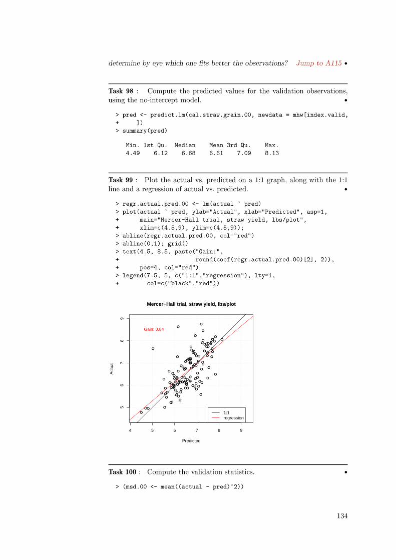
determine by eye which one fits better the observations? Jump to A115 •
Task 98 : Compute the predicted values for the validation observations,using the no-intercept model. •
> pred <- predict.lm(cal.straw.grain.00, newdata = mhw[index.valid,
+ ])
> summary(pred)
Min. 1st Qu. Median Mean 3rd Qu. Max.
4.49 6.12 6.68 6.61 7.09 8.13
Task 99 : Plot the actual vs. predicted on a 1:1 graph, along with the 1:1line and a regression of actual vs. predicted. •
> regr.actual.pred.00 <- lm(actual ~ pred)
> plot(actual ~ pred, ylab="Actual", xlab="Predicted", asp=1,
+ main="Mercer-Hall trial, straw yield, lbs/plot",
+ xlim=c(4.5,9), ylim=c(4.5,9));
> abline(regr.actual.pred.00, col="red")
> abline(0,1); grid()
> text(4.5, 8.5, paste("Gain:",
+ round(coef(regr.actual.pred.00)[2], 2)),
+ pos=4, col="red")
> legend(7.5, 5, c("1:1","regression"), lty=1,
+ col=c("black","red"))
●●
●
●
●●
●
●
●
●
●
●●
●
●
●
●
●
●
●
●
●
●
●
●
●
●
● ●
●
●●
●
●
●
●●
●
●
●
●●
●
●
●
●
●
●
●
●
●●
●
●
●
●●
●
●●●
●
●
●●
●
●
●
●
●
●
●
●
●
●
●
●●
●
●
●
●
●
●
●
●
●
●
●●●
●
●
●
●
●
●
●
●
●
●●
●
●
● ●
●
●
● ●●
●
●
●
●
●
●
●●
●
●
●
●
●
●
4 5 6 7 8 9
56
78
9
Mercer−Hall trial, straw yield, lbs/plot
Predicted
Act
ual
Gain: 0.84
1:1regression
Task 100 : Compute the validation statistics. •
> (msd.00 <- mean((actual - pred)^2))
134

[1] 0.41805
> (rmsep.00 <- sqrt(msd.00))
[1] 0.64657
> (sb.00 <- (mean(pred) - mean(actual))^2)
[1] 0.0016826
> (nu.00 <- (1 - coef(regr.actual.pred.00)[2])^2 * mean((pred -
+ mean(pred))^2))
pred
0.012169
> (lc.00 <- (1 - cor(actual, pred)^2) * mean((actual -
+ mean(actual))^2))
[1] 0.4042
Task 101 : Compute the relative contribution of the model validation ele-ments to the overall quality. •
> sb.00/msd.00 * 100
[1] 0.40249
> nu.00/msd.00 * 100
pred
2.9108
> lc.00/msd.00 * 100
[1] 96.687
> msd.00 - (sb.00 + nu.00 + lc.00)
pred
1.1102e-16
Q116 : How do these statistics compare with those for the with-interceptmodel? Interpret them geometrically – what could be wrong with thismodel? Jump to A116 •
14.6 Answers
A101 : By row, within each column in the field. Adjacent plots, i.e., adjacentobservations in the data frame, may not be independent. Thus there could be serialcorrelation. Return to Q101 •
A102 : Possible stratifying factors are field half (in.north), row, and column.
135

But we saw in §9.3 that field half only explains a small amount of the variance, wellunder 10%; below in §17 we will see the same result for row and column. Returnto Q102 •
A103 : A random sampling is indicated: (1) there is no useful stratifying factor;(2) there may be serial autocorrelation. Return to Q103 •
A104 : The coefficients agree fairly well; the percentage change from the full modelto the calibration model is -4.7% for the intercept, 0.8% for the grain yield, Returnto Q104 •
A105 : The actual yields are spread over a wider range, especially the maximum,and less concentrated at the central value (about 6.5 lbs plot-1). Return to Q105 •
A106 : For the most part fairly well (points are bunched around the 1:1 line)but several points are very badly predicted. There does not appear to be any gain.
Return to Q106 •
A107 : The RMSEP of validation is 0.638 lbs plot-1; the residual mean squareerror of the model is 0.605 lbs plot-1. These are similar but in this validation theRMSEP is a somewhat higher. The RMSEP is the mean prediction error of strawyield that we expect for the “same” experimental structure where we measure grainyield and use it to predict straw yield. Return to Q107 •
A108 : The bias is very small: -0.0492. This negative bias shows that the actual isa bit greater than the predicted, i.e., on average the model slightly under-predicts.But the squared bias SB is a very small proportion of the total error, 0.595%, i.e.,less than 1%. This is not a weak point of the model. Return to Q108 •
A109 : The gain is slightly less than 1: 0.96. Thus high straw yields are (veryslightly) under-predicted, and low straw yields are (very slightly) over-predicted.
Return to Q109 •
A110 : No, the probability that it would be a Type I error to reject the nullhypothesis that the coefficient of the 1:1 model is in fact 1 (i.e., the coefficient ofthe 0:1 model is in fact 0) is 0.7, i.e., about 70% chance of an incorrect statement!So the hypothesis of 1:1 model fit stands. Return to Q110 •
A111 : The non-unity factor NU is 0.0005003. This is again a very small partof the MSD, namely 0.123%, much less than 1%. This is not a weak point of themodel. Return to Q111 •
A112 : The lack of correlation LC is 0.4042; this is almost all of MSD, namely
136

99.282% of it. Return to Q112 •
A113 : The only problem with the model is lack of correlation (LC), i.e., theprediction precision. There is almost no bias or gain. Thus the linear model formis well-justified. Return to Q113 •
A114 : No, a plant could grow vegetatively but never flower or produce grain.Return to Q114 •
A115 : The line through (0,0) has a steeper slope to reach the “cloud” of points,whereas the line with intercept has a positive intercept and so can have a gentlerslope. It seems difficult to tell by eye which better fits the point cloud. Return toQ115 •
A116 : The no-intercept model has higher overall error: its RMSEP is 0.647compared to 0.638 for the full model. But, this is not due to lack of correlation(LC): these are 0.404 and 0.404 respectively, i.e., identical! This shows nicely thevalue of the decomposition – the problem with the no-intercept model is not its lackof precision, this is exactly the same as for the with-intercept model.
Both squared biases (SB): are quite small: 0.001683 (no-intercept) and 0.002423(intercept). Thus neither systematically over- or under-predicts.
This means the problem with the no-intercept model is in the non-unity slope (NU):0.012169 (no-intercept) vs. 0.0005003. In the no-intercept model this is now arecognizable proportion (2.9%) of the total error. This is interpreted as a rotation;this is in fact what happens when we forced the regression through the origin.
Return to Q116 •
We are done with these models and some other variables, except for the mainmodel of straw yield and its RMSEP (see §15), so clean up the workspace:
> rm(n, index.valid, index.calib, actual)
> rm(cal.straw.grain, pred)
> rm(valid.msd, rmse)
> rm(regr.actual.pred, regr.actual.pred.0, valid.bias,
+ valid.sb, valid.lc, b, valid.nu, valid.msd.pred,
+ valid.msd.actual, r2)
> rm(cal.straw.grain.00, regr.actual.pred.00, msd.00, rmsep.00,
+ sb.00, nu.00, lc.00)
15 Cross-validation*
In §14 the predictive success of a model was evaluated by validation againstan independent dataset. Since we only had one dataset (the 500 plots),we were forced to create this set by a random split into calibration andvalidation sets. There are several problems here:
1. We lose precision in the model, because it’s based on fewer observa-tions;
137
2. The split is random, so that a different split (with the same propor-tions) would give different results.
An approach to validation that uses the insight of point (2) but retainsprecision is leave-one-out cross validation, abbreviated LOOCV. This is alsoknown as leave-one-out jackknifing [10, 12], where our main interest is in theaccuracy of the prediction.
The concept is simple:
1. For each observation:
(a) remove it from the dataset, i.e., “leave one out”;
(b) compute the model parameters (e.g., slope and intercept of a sim-ple linear regression);
(c) use this model to predict at the left-out point;
(d) calculate the prediction error for this one point.
2. Compute the validation statistics for the set of prediction errors (onefor each observation), as in §14.4.
These validation statistics are assumed to apply to the single equation (pa-rameterization) computed from all observations.
Task 102 : Write a function to compute the LOOCV fits for the linearmodel of straw yield predicted by grain yield. This function should take asarguments: (1) a model to cross-validate and (2) the dataset on which tocross-validate it. It should return (1) the LOOCV predictions and (2) thecoefficients for each LOOCV model fit. •
We use the function command to define a function; this was explained in§8.3.1. We define two arguments: (1) the model form to be cross-validated,named model within the function; (2) the dataset where the model shouldbe applied, named dset.
This is the most complex function we’ve defined; here are some points ofinterest:
� The function is defined with the function command and stored in aworkspace object with a name of our choosing; this name is then usedto call the function;
� At the end of the function we use the return function to return alist, build with the list function, of (1) the LOOCV predictions asa vector named pred, (2) the coefficients of each of the models builtomitting one observation as a matrix with one column per model co-efficient, named coef. The former is used for the cross-validation, thelatter to evaluate the robustness of the model to any unusual singleobservations.
138

� Both of the returned variables must be initialized before the for loop,which will fill in the rows one-by-one as each observation is omitted.
� The colnames function is used to assign names to the columns ofthe coefficients vector, using the paste function to create a list ofcoefficient names of the correct length, depending on the number ofmodel parameters.
� Also note the use of the type conversion function as.character toconvert a sequence of numbers into a character vector, suitable to beused in paste.
� The for command defines a for-loop: the first expression after the foris the list of indices which are used inside the loop. Here we specifythe sequence 1: nrow(dset); this uses the : operator, shorthand fora continuous integer sequence which could also be specified with theseq command, i.e., seq(1, nrow(dset), by=1).
� The value from this sequence is assigned to variable which we namei. This is only defined in the loop, and is used to specify observationnumbers, both for omitting a row from the dataframe, i.e., [-i,], andselecting just the one row, i.e., [i,]; both use the [] matrix selectionoperator.
� The results of each model fit (prediction and coefficients) are stored inthe initialized vectors, at the correct slot, again using the loop indexi.
Here is the function:
> Xval <- function(model, dset) {
+ pred <- rep(0, nrow(dset))
+ n <- length(coefficients(model))
+ coef <- matrix(0, nrow = nrow(dset), ncol = n)
+ colnames(coef) <- paste("b", as.character(0:(n -
+ 1)), sep = "")
+ for (i in 1:nrow(dset)) {
+ m <- lm(formula(model), data = dset[-i, ])
+ pred[i] <- predict(m, newdata = dset[i, ])
+ coef[i, ] <- coefficients(m)
+ }
+ return(list(pred = pred, coef = coef))
+ }
Task 103 : Apply this function to the model of straw yield predicted bygrain yield, and display the structure of the returned object. •
> xval.fit <- Xval(model.straw.grain, mhw)
> str(xval.fit)
List of 2
$ pred: num [1:500] 6.06 6.69 7.32 6.44 6.06 ...
$ coef: num [1:500, 1:2] 0.862 0.865 0.861 0.864 0.868 ...
139

..- attr(*, "dimnames")=List of 2
.. ..$ : NULL
.. ..$ : chr [1:2] "b0" "b1"
Task 104 : Display the actual observations of straw yield against theLOOCV fits, on a 1:1 line. •
> lim <- range(xval.fit$pred, mhw$straw)
> plot(mhw$straw ~ xval.fit$pred, asp = 1, xlim = lim,
+ ylim = lim, xlab = "LOOCV prediction", ylab = "Actual")
> abline(0, 1)
> grid()
●●
●●
●
●
●
●
●
●●
● ●●
●
●
●
●●
●
●
●
●
●
●
●
●
●
●
●●●
●
●
●
●
●
●
●
●
●
● ●
●
●
● ●●
●
●
●
●
●
●
●
●●
●
●
●
●
●
●
●
●●
●
●
●●
●
●
●
●
●
●
●
●
●●
●
●
●
●
●
●
●
●
●
●●
●
● ●
●
●
●
●
●
●
●
●
●
●
●
●● ●
● ●
●
●
●
●
●
●
●●
●
●
●
●
●
●
●
●
●
●
●
●
●
●
●
●
●
●
●●
●
●
●
●
●
●●
●
●
●
●
●
● ●
●●
●
●
●
●●
●
●●
●●
●
●
●
●
●●
●
●●
●
●
●
●
●
●●
●
●
●
●
●
●
●●
●
●● ● ●
●
●
●
●
●
●
●
●
●●
●
●
●
●●
●
●
●
●
●
●
●
●
●
●
●
●
●
●●
●
●
●
●
●
●
●
●
●
●
●
●
●
●
●
●●
●
●
●
●●●
●
●
●
●
●●
●
●●
●
●
●
●●
●
●
●
●
●
●●
●
●
●●
●
● ●
●
●
●
●
●
●
●
●
●
●
●
●
●●
●
●
● ●
●
●
●
●
●
●
●
● ●
●
●
●
●●
●
●
●
●
●
●
●
●
●
●
●
●
●●
●●
●
●
●
●
●
●
●
●
●
●
●
●
●
●
●
●
●
●
●
●
●
●
●
●●
●
●●●
●
●●
●
●
●
●
●
●
●
●
●
●
●
●
●
●
●
●
●
●
●●
● ●
● ●
●
●
●
●
●
●
●●
●
●
●●
●
●
●
●
● ●●
●●
●
●
●
●●
● ●
●
●●
●
●
●
●
● ●
●
●●
●
●
●●
●
●
●
●
●
●●
●
●●
●●
●
●
●
● ●●
●
●
●
●
●
●
●
●
●●
●
●
●
●
●
●
●●
●
●
●
●
●
●
●●
●
●
●
●
●
●
●●●
●
●
●
●
●
●
●
●
● ●
●
●
●
●
●
●
●
●
●
●
●
●
●
●
●
4 5 6 7 8 9
45
67
89
LOOCV prediction
Act
ual
Task 105 : Compute the cross-validation residuals, i.e., the actual strawyields less the LOOCV fits; summarize them and display as a histogram. •
> xval.res <- xval.fit$pred - mhw$straw
> summary(xval.res)
Min. 1st Qu. Median Mean 3rd Qu. Max.
-3.05000 -0.37500 -0.01040 -0.00009 0.35500 2.03000
> hist(xval.res, main = "LOOCV residuals")
140

LOOCV residuals
xval.res
Fre
quen
cy
−3 −2 −1 0 1 2
050
100
150
Recall, the RMSEP is the square root of the sum of squared residuals dividedby the number of observations.
Q117 : What is the LOOCV RMSEP? How does this compare to the RMSEof the fit (the internal measure) and the independent validation RMSE?
Jump to A117 •
Recall, the single estimate of independent validation RMSE was computedin §14.4.
Here are (1) RMSEP from cross-validation; (2) RMSE from the internal fit;(3) RMSEP from the single validation:
> sqrt(sum(xval.res^2)/nrow(mhw))
[1] 0.61597
> sqrt(sum(residuals(model.straw.grain)^2)/(model.straw.grain$df.residual))
[1] 0.61477
> print(valid.rmsep)
[1] 0.63806
Challenge: Compute and interpret the measures of model quality developin §14.4, i.e., the RMSEP broken down into bias, gain and scatter.
The function also returned the LOOCV model coefficients.
Task 106 : Summarize the LOOCV model coefficients, and compare withthe best-fit coefficients (using all observations). •
141
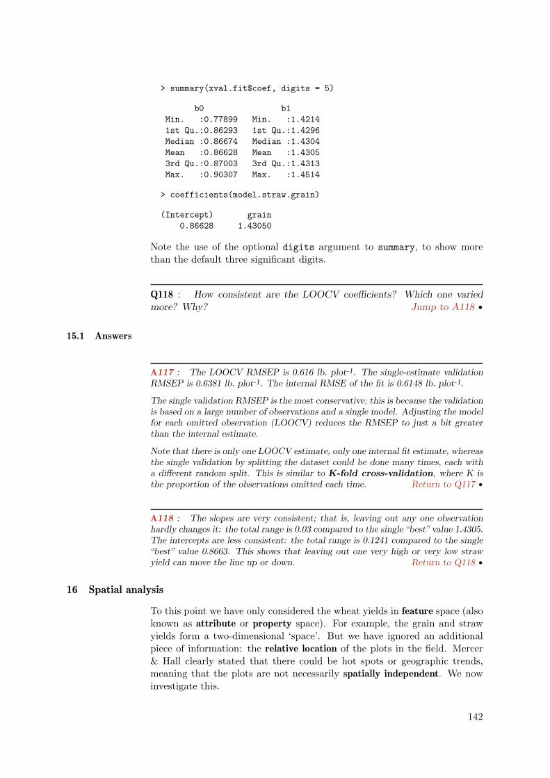
> summary(xval.fit$coef, digits = 5)
b0 b1
Min. :0.77899 Min. :1.4214
1st Qu.:0.86293 1st Qu.:1.4296
Median :0.86674 Median :1.4304
Mean :0.86628 Mean :1.4305
3rd Qu.:0.87003 3rd Qu.:1.4313
Max. :0.90307 Max. :1.4514
> coefficients(model.straw.grain)
(Intercept) grain
0.86628 1.43050
Note the use of the optional digits argument to summary, to show morethan the default three significant digits.
Q118 : How consistent are the LOOCV coefficients? Which one variedmore? Why? Jump to A118 •
15.1 Answers
A117 : The LOOCV RMSEP is 0.616 lb. plot-1. The single-estimate validationRMSEP is 0.6381 lb. plot-1. The internal RMSE of the fit is 0.6148 lb. plot-1.
The single validation RMSEP is the most conservative; this is because the validationis based on a large number of observations and a single model. Adjusting the modelfor each omitted observation (LOOCV) reduces the RMSEP to just a bit greaterthan the internal estimate.
Note that there is only one LOOCV estimate, only one internal fit estimate, whereasthe single validation by splitting the dataset could be done many times, each witha different random split. This is similar to K-fold cross-validation, where K isthe proportion of the observations omitted each time. Return to Q117 •
A118 : The slopes are very consistent; that is, leaving out any one observationhardly changes it: the total range is 0.03 compared to the single “best” value 1.4305.The intercepts are less consistent: the total range is 0.1241 compared to the single“best” value 0.8663. This shows that leaving out one very high or very low strawyield can move the line up or down. Return to Q118 •
16 Spatial analysis
To this point we have only considered the wheat yields in feature space (alsoknown as attribute or property space). For example, the grain and strawyields form a two-dimensional ‘space’. But we have ignored an additionalpiece of information: the relative location of the plots in the field. Mercer& Hall clearly stated that there could be hot spots or geographic trends,meaning that the plots are not necessarily spatially independent. We nowinvestigate this.
142

16.1 Geographic visualisation
We begin by visualisaing the agricultural field:
Task 107 : Make a correctly-scaled map of the plot locations in the field,showing the plot numbers. •
The plots are rectangular (longer N-S than wide E-W), so that by plottingthe 25 columns and 20 rows in a square (the shape of the field, and thedefault for a bivariate plot), we get a geometrically-correct map. However,the default plotting function is from low to high indices, so that row 1 wouldbe plotted at the bottom, when in fact it is at the top. We can specify theaxis with the ylim argument, reversing the row order:
> plot(c, r, type = "n", xlab = "column", ylab = "row",
+ ylim = c(20, 1), main = "Layout of the Mercer-Hall uniformity trial")
> abline(v = 1:25, lty = 1, col = "darkgray")
> abline(h = 1:20, lty = 1, col = "darkgray")
> text(c, r, rownames(mhw), cex = 0.5)
5 10 15 20 25
2015
105
Layout of the Mercer−Hall uniformity trial
column
row
1
2
3
4
5
6
7
8
9
10
11
12
13
14
15
16
17
18
19
20
21
22
23
24
25
26
27
28
29
30
31
32
33
34
35
36
37
38
39
40
41
42
43
44
45
46
47
48
49
50
51
52
53
54
55
56
57
58
59
60
61
62
63
64
65
66
67
68
69
70
71
72
73
74
75
76
77
78
79
80
81
82
83
84
85
86
87
88
89
90
91
92
93
94
95
96
97
98
99
100
101
102
103
104
105
106
107
108
109
110
111
112
113
114
115
116
117
118
119
120
121
122
123
124
125
126
127
128
129
130
131
132
133
134
135
136
137
138
139
140
141
142
143
144
145
146
147
148
149
150
151
152
153
154
155
156
157
158
159
160
161
162
163
164
165
166
167
168
169
170
171
172
173
174
175
176
177
178
179
180
181
182
183
184
185
186
187
188
189
190
191
192
193
194
195
196
197
198
199
200
201
202
203
204
205
206
207
208
209
210
211
212
213
214
215
216
217
218
219
220
221
222
223
224
225
226
227
228
229
230
231
232
233
234
235
236
237
238
239
240
241
242
243
244
245
246
247
248
249
250
251
252
253
254
255
256
257
258
259
260
261
262
263
264
265
266
267
268
269
270
271
272
273
274
275
276
277
278
279
280
281
282
283
284
285
286
287
288
289
290
291
292
293
294
295
296
297
298
299
300
301
302
303
304
305
306
307
308
309
310
311
312
313
314
315
316
317
318
319
320
321
322
323
324
325
326
327
328
329
330
331
332
333
334
335
336
337
338
339
340
341
342
343
344
345
346
347
348
349
350
351
352
353
354
355
356
357
358
359
360
361
362
363
364
365
366
367
368
369
370
371
372
373
374
375
376
377
378
379
380
381
382
383
384
385
386
387
388
389
390
391
392
393
394
395
396
397
398
399
400
401
402
403
404
405
406
407
408
409
410
411
412
413
414
415
416
417
418
419
420
421
422
423
424
425
426
427
428
429
430
431
432
433
434
435
436
437
438
439
440
441
442
443
444
445
446
447
448
449
450
451
452
453
454
455
456
457
458
459
460
461
462
463
464
465
466
467
468
469
470
471
472
473
474
475
476
477
478
479
480
481
482
483
484
485
486
487
488
489
490
491
492
493
494
495
496
497
498
499
500
Note the use of the xlab and ylab graphics parameter to specify the axisnames. Also, the type of plot is specified with the type graphics argument,here set to "n", meaning “no plot” (yet) – this just sets up the plot area andaxes. The actual plotting is then done with the text function, using therownames function to extract the plot number from the dataframe.
Task 108 : Make a post-plot of the grain yield, i.e. a map of the plotlocations with symbol size proportional to the data value. •
> plot(c, r, pch=21, col="black", bg="lightblue", ylim=c(20,1),
+ xlab="column", ylab="row",
+ main="Mercer-Hall uniformity trial",
143

+ sub="Area of circles proportional to grain yield",
+ cex=2*grain/max(grain))
●
●
●●
●
●
●
●
●
●
●
●●●●
●●●●
●
●
●●●●●
●
●
●
●
●
●
●
●
●●
●
●
●●
●
●
●●
●●
●●
●●●
●
●●●●●
●●●
●●●●
●●●●●●●●●●●
●●●
●●
●
●
●
●
●
●
●
●
●
●
●
●
●
●●
●
●
●●●
●●
●●
●●
●
●
●
●●
●●●●
●
●
●
●●
●●●●●●●●●●●●●●●
●●
●●●
●
●●
●●●
●●
●
●
●
●
●
●
●
●
●●●●
●
●●
●
●
●●●
●●
●●
●
●
●
●
●●
●●
●
●●
●●●●●●●●●●●●
●●●
●●
●●
●
●
●
●
●
●
●
●
●●
●●●●
●●●●
●
●●●
●
●●
●
●
●
●●
●
●
●
●
●
●
●●
●●
●
●
●
●
●●
●●
●
●
●●
●
●
●
●●●
●
●
●●
●●
●
●
●
●
●
●
●
●
●
●
●
●
●●
●
●
●
●
●
●
●
●
●
●
●
●●
●
●
●
●
●
●
●
●
●
●
●●
●
●●●●●
●●
●
●
●
●
●
●
●
●
●
●
●
●
●
●
●
●●●
●
●●
●
●
●
●
●
●
●
●
●
●
●●●●
●●
●
●
●
●
●
●
●
●
●
●
●●●
●●●●
●
●
●
●●
●
●
●
●
●
●
●
●
●
●●●●
●
●
●
●●
●●●●
●
●
●
●
●●
●
●
●●
●
●●
●
●●
●●
●●
●
●
●
●
●
●
●
●
●
●
●
●●
●
●
●
●
●
●●●
●
●
●
●
●
●
●
●
●
●
●●
●
●●
●
●
●
●●
●
●●
●●
●●
●
●
●
●
●
●
●
●
●
●
●
●
●
●
●
●
●●
●●
●●
●●●
●
●●
●
●
●●
●
●
●
●
●●
5 10 15 20 25
2015
105
Mercer−Hall uniformity trial
Area of circles proportional to grain yieldcolumn
row
We can visualise this better by displaying each point in a colour ramp. Firstwe classify the observations into octiles (eight groups) with the cut function,using the quantile function to compute the octiles.
> (q8 <- quantile(grain, seq(0, 1, length = 9)))
0% 12.5% 25% 37.5% 50% 62.5% 75% 87.5% 100%
2.7300 3.4238 3.6375 3.7812 3.9400 4.0900 4.2700 4.4700 5.1600
> grain.c <- cut(grain, q8, include.lowest = T, labels = F)
> sort(unique(grain.c))
[1] 1 2 3 4 5 6 7 8
So the 500 yields have been grouped into eight classes.
A colour ramp is a list of colours in some visually-meaningful sequence. Oneexample is produced by the terrain.colors function; the colours are givenas hexidecimal numbers from 00 (absence of colour) to FF (saturation withthe colour), for the three primary colours Red, Green and Blue:
> terrain.colors(8)
[1] "#00A600FF" "#3EBB00FF" "#8BD000FF" "#E6E600FF" "#E9BD3AFF"
[6] "#ECB176FF" "#EFC2B3FF" "#F2F2F2FF"
For example, the final colour in this ramp is #F2F2F2, which is a dark gray:equal saturations of the three primaries, and each of these has #F2/#FF, i.e.95% saturation:
> 0xf2/0xff
[1] 0.94902
144

This example shows that hexidecimal numbers may be used in R; they areindicated with the prefix 0x.
Now we use this colour ramp, selecting the appropriate colour for each quan-tile: dark green is lowest, white is highest.
> plot(c, r, pch=20, cex=2, bg="lightblue", ylim=c(20,1),
+ xlab="column", ylab="row",
+ main="Mercer-Hall uniformity trial",
+ sub="Colour of circles from low yield (green) to high (gray)",
+ col=terrain.colors(8)[grain.c])
●
●
●
●
●
●
●
●
●
●
●
●
●
●
●
●
●
●
●
●
●
●
●
●
●
●
●
●
●
●
●
●
●
●
●
●
●
●
●
●
●
●
●
●
●
●
●
●
●
●
●
●
●
●
●
●
●
●
●
●
●
●
●
●
●
●
●
●
●
●
●
●
●
●
●
●
●
●
●
●
●
●
●
●
●
●
●
●
●
●
●
●
●
●
●
●
●
●
●
●
●
●
●
●
●
●
●
●
●
●
●
●
●
●
●
●
●
●
●
●
●
●
●
●
●
●
●
●
●
●
●
●
●
●
●
●
●
●
●
●
●
●
●
●
●
●
●
●
●
●
●
●
●
●
●
●
●
●
●
●
●
●
●
●
●
●
●
●
●
●
●
●
●
●
●
●
●
●
●
●
●
●
●
●
●
●
●
●
●
●
●
●
●
●
●
●
●
●
●
●
●
●
●
●
●
●
●
●
●
●
●
●
●
●
●
●
●
●
●
●
●
●
●
●
●
●
●
●
●
●
●
●
●
●
●
●
●
●
●
●
●
●
●
●
●
●
●
●
●
●
●
●
●
●
●
●
●
●
●
●
●
●
●
●
●
●
●
●
●
●
●
●
●
●
●
●
●
●
●
●
●
●
●
●
●
●
●
●
●
●
●
●
●
●
●
●
●
●
●
●
●
●
●
●
●
●
●
●
●
●
●
●
●
●
●
●
●
●
●
●
●
●
●
●
●
●
●
●
●
●
●
●
●
●
●
●
●
●
●
●
●
●
●
●
●
●
●
●
●
●
●
●
●
●
●
●
●
●
●
●
●
●
●
●
●
●
●
●
●
●
●
●
●
●
●
●
●
●
●
●
●
●
●
●
●
●
●
●
●
●
●
●
●
●
●
●
●
●
●
●
●
●
●
●
●
●
●
●
●
●
●
●
●
●
●
●
●
●
●
●
●
●
●
●
●
●
●
●
●
●
●
●
●
●
●
●
●
●
●
●
●
●
●
●
●
●
●
●
●
●
●
●
●
●
●
●
●
●
●
●
●
●
●
●
●
●
●
●
●
●
●
●
●
●
●
●
●
●
●
●
●
●
●
●
●
●
●
●
●
●
●
●
●
●
●
●
●
●
●
●
5 10 15 20 25
2015
105
Mercer−Hall uniformity trial
Colour of circles from low yield (green) to high (gray)column
row
Another way to visualize the field is with a 3D plot using the wireframe
graphics function of the lattice package. The optional aspect argumentcontrols the vertical exaggeration:
> plot(wireframe(grain ~ r + c, data=mhw, drape=T,
+ aspect=c(1,.2), col.regions=terrain.colors(128),
+ main="Grain yields, lb. per plot",
+ sub="Looking SE from NW corner of field"))
145

Grain yields, lb. per plot
Looking SE from NW corner of field
rc
grain
3.0
3.5
4.0
4.5
5.0
Q119 : Does there appear to be local spatial dependence, i.e. similarvalues near each other? Does this appear to vary over the field? Jump toA119 •
16.2 Setting up a coordinate system
Analysis of the spatial structure requires metric coordinates, rather thanrow and column numbers, since the plots are not square.
Task 109 : Determine the field size and the plot dimensions. •
The original experiment was in English units, but we will use metres. So,we start with some conversions to get the dimensions of each plot:
First, some conversion factors; note that 1 ha = 10 000 m2:
> ha2ac <- 2.471054
> ft2m <- 0.3048
> (field.area <- 10000/ha2ac)
[1] 4046.9
Then we divide the side of the 1-acre field evenly into 20 rows and 25 columnsto obtain the dimensions in meters and the area in m2:
> (plot.area <- field.area/500)
[1] 8.0937
> (plot.len <- sqrt(field.area)/20)
[1] 3.1807
146

> (plot.wid <- sqrt(field.area)/25)
[1] 2.5446
> rm(ha2ac, ft2m, field.area)
Task 110 : Compute the total length and width in metres, confirm they areequal (because the field is a square, and confirm that they multiply to 1 ha(4 045.9 m2). •
> (tot.len <- plot.len * 20)
[1] 63.615
> (tot.wid <- plot.wid * 25)
[1] 63.615
> tot.len * tot.wid
[1] 4046.9
> rm(tot.len, tot.wid)
Task 111 : Compute coordinates for the centre of each plot. •
Coordinates are assigned from an arbitrary origin of (0,0) at the SW cornerof the field, so that the coordinates of the centre of plot [1,1] are half theplot size in both directions:
> plot.wid/2
[1] 1.2723
> plot.len/2
[1] 1.5904
Now we build a data frame of coordinates; first with the seq function tomake vectors of the midpoints of the E and N directions, respectively; andthen with the expand.grid function to make a dataframe with one row percombination:
> nrow <- length(unique(r))
> ncol <- length(unique(c))
> sx <- seq(plot.wid/2, plot.wid/2 + (ncol - 1) * plot.wid,
+ length = ncol)
> sy <- seq(plot.len/2 + (nrow - 1) * plot.len, plot.len/2,
+ length = nrow)
> xy <- expand.grid(x = sx, y = sy)
> rm(nrow, ncol, sx, sy)
Note the order of the y sequence: starting with the highest coordinate forrow 1 (which is at the top of the plot).
We keep plot.wid, plot.len, and plot.area to be used later.
147

16.3 Loading add-in packages
For most of the spatial analysis we will use two add-in packages; these arerepresentative of the hundreds which have been implemented by practisingstatisticians. Here we will use sp package [34], which is a foundation forspatially-explicit analysis in R, and the gstat package [33], which is an Rimplementation of the gstat geostatistics program [35]. Both of these areextensively discussion and illustrated in the textbook “Applied Spatial DataAnalysis with R” by Bivand et al. [5].
When R starts, a number of basic packages are loaded; we can see these withthe search function. Additional packages may be loaded with the library
function; however it is better to use the require function, which ensuresthat the package isn’t already loaded.
Task 112 : Load the sp and gstat packages, and also the lattice graphicspackage. •
> require(sp); require(gstat); require(lattice)
16.4 Creating a spatially-explicit object
The sp package adds a number of spatial data types, i.e. new object classes.
Task 113 : Copy the mhw dataframe to a new object and convert the copyto class SpatialPointsDataFrame. •
By making a copy we have the data in two forms, spatial and non-spatial,so we don’t have to keep converting between them.
We do this by adding the computed coordinates to the data frame with thecoordinates function; this automatically converts to the spatial data typedefined by the sp package:
> mhw.sp <- mhw
> coordinates(mhw.sp) <- xy
> summary(mhw.sp)
Object of class SpatialPointsDataFrame
Coordinates:
min max
x 1.2723 62.343
y 1.5904 62.025
Is projected: NA
proj4string : [NA]
Number of points: 500
Data attributes:
r c grain straw
Min. : 1.00 Min. : 1 Min. :2.73 Min. :4.10
1st Qu.: 5.75 1st Qu.: 7 1st Qu.:3.64 1st Qu.:5.88
Median :10.50 Median :13 Median :3.94 Median :6.36
Mean :10.50 Mean :13 Mean :3.95 Mean :6.51
148

3rd Qu.:15.25 3rd Qu.:19 3rd Qu.:4.27 3rd Qu.:7.17
Max. :20.00 Max. :25 Max. :5.16 Max. :8.85
gsr in.north
Min. :0.391 Mode :logical
1st Qu.:0.574 FALSE:250
Median :0.604 TRUE :250
Mean :0.611 NA's :0
3rd Qu.:0.642
Max. :0.850
Q120 : What is the data type of the mhw.sp object? What is the boundingbox, i.e. limits of the the coordinates? Jump to A120 •
Now that we’ve built the spatial object, we can save it for later use in anothersession:
> save(mhw.sp, file = "mhw_spatial.RData")
16.5 More geographic visualisation
Once an object is in a spatial class, the spplot function can be used to makea nicely-coloured post plot:
Task 114 : Plot the grain, straw, and their ratio, coloured by their octile. •
We take this chance to illustrate some more colour ramps, produced by thebpy.colors and heat.colors functions, as well as the terrain.colors
function we saw before. To put several plots on the same page, we createeach plots with spplot and save it in a local variable; we then use the genericprint function, with the optional more argument. Further, to give the im-pression of plots rather than points, we use the as generic method to convertthe mhw.sp object to a spatial object of class SpatialPixelsDataFrame.
> mhw.sp.pix <- as(mhw.sp,"SpatialPixelsDataFrame")
> f1 <- spplot(mhw.sp.pix, zcol="grain", cuts=8,
+ col.regions=bpy.colors(64),
+ main="Grain yield", key.space="right")
> f2 <- spplot(mhw.sp.pix, zcol="straw", cuts=8,
+ col.regions=heat.colors(64),
+ main="Straw yield", key.space="right")
> f3 <- spplot(mhw.sp.pix, zcol="gsr", cuts=8,
+ col.regions=terrain.colors(64),
+ main="Grain/Straw ratio", key.space="right")
> print(f1, split=c(1,1,2,2), more=T)
> print(f2, split=c(2,1,2,2), more=T)
> print(f3, split=c(1,2,2,2), more=F)
> rm(f1, f2, f3)
149

Grain yield
3.0
3.5
4.0
4.5
5.0
Straw yield
4
5
6
7
8
9
Grain/Straw ratio
0.4
0.5
0.6
0.7
0.8
And we can make a postplot with both colour and size, although its valuefor visualization is questionable:
> print(spplot(mhw.sp, zcol="grain", cuts=8, cex=1.6*grain/max(grain),
+ col.regions=bpy.colors(64), main="Grain yield",
+ sub="Symbol size proportional to yield",
+ key.space="right"))
150
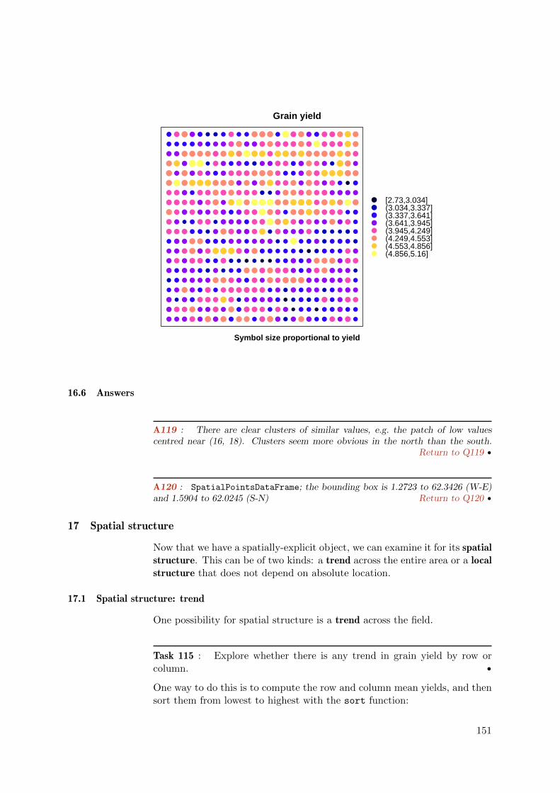
Grain yield
Symbol size proportional to yield
● ● ● ● ● ● ● ● ● ● ● ● ● ● ● ● ● ● ● ● ● ● ● ● ●
● ● ● ● ● ● ● ● ● ● ● ● ● ● ● ● ● ● ● ● ● ● ● ● ●
● ● ● ● ● ● ● ● ● ● ●● ● ● ● ● ● ● ● ● ● ● ● ● ●
● ● ● ●● ● ● ● ● ● ● ● ● ● ● ● ● ● ● ● ● ● ● ● ●
● ● ● ● ● ● ● ● ● ● ● ● ● ● ● ● ● ● ● ● ● ● ● ● ●
● ● ● ● ● ● ● ● ● ● ● ● ● ● ● ● ● ● ● ● ● ● ● ● ●
● ● ● ● ● ● ● ● ● ● ● ● ● ● ● ● ● ● ● ● ● ● ● ● ●
● ● ● ● ● ● ● ● ● ● ● ●●● ● ● ● ● ● ● ● ● ● ● ●
● ● ● ● ● ● ● ● ● ● ● ● ● ● ● ● ● ● ● ● ● ● ● ● ●
● ● ● ● ● ● ● ● ● ● ● ● ● ● ● ● ● ● ● ● ● ● ● ● ●
● ● ● ● ● ● ● ● ● ● ● ● ● ● ● ● ● ● ● ● ● ● ● ● ●
● ● ● ● ● ● ● ● ● ● ● ● ● ● ● ● ● ● ● ● ● ● ● ● ●
● ● ● ● ● ● ● ● ● ● ● ● ● ● ● ● ● ● ● ● ● ● ● ● ●
● ● ● ● ● ● ● ● ● ● ● ● ● ● ● ● ● ● ● ● ● ● ● ● ●
● ● ● ● ● ● ● ● ● ● ● ● ● ● ● ● ● ● ● ● ● ● ● ● ●
● ● ● ● ● ● ● ● ● ● ● ● ● ● ● ● ● ● ● ● ● ● ● ● ●
● ● ● ● ● ● ● ● ● ● ● ● ● ● ● ● ● ● ● ● ● ● ● ● ●
● ● ● ● ● ● ● ● ● ● ● ● ● ● ● ● ● ● ● ● ● ● ● ● ●
● ● ● ● ● ● ● ● ● ● ● ● ● ● ● ● ● ● ● ● ● ● ● ● ●
● ● ● ● ● ● ● ● ● ● ● ● ● ● ● ● ● ● ● ● ● ● ● ● ●
●●●●●●●●
[2.73,3.034](3.034,3.337](3.337,3.641](3.641,3.945](3.945,4.249](4.249,4.553](4.553,4.856](4.856,5.16]
16.6 Answers
A119 : There are clear clusters of similar values, e.g. the patch of low valuescentred near (16, 18). Clusters seem more obvious in the north than the south.
Return to Q119 •
A120 : SpatialPointsDataFrame; the bounding box is 1.2723 to 62.3426 (W-E)and 1.5904 to 62.0245 (S-N) Return to Q120 •
17 Spatial structure
Now that we have a spatially-explicit object, we can examine it for its spatialstructure. This can be of two kinds: a trend across the entire area or a localstructure that does not depend on absolute location.
17.1 Spatial structure: trend
One possibility for spatial structure is a trend across the field.
Task 115 : Explore whether there is any trend in grain yield by row orcolumn. •
One way to do this is to compute the row and column mean yields, and thensort them from lowest to highest with the sort function:
151

> sort(by(grain, r, mean), decreasing = FALSE)
r
15 16 7 8 20 17 10 4 18 14
3.7072 3.7432 3.8708 3.8796 3.8816 3.9012 3.9136 3.9144 3.9164 3.9352
6 11 1 12 2 5 3 9 13 19
3.9536 3.9540 3.9576 3.9848 4.0072 4.0276 4.0420 4.0788 4.1160 4.1880
> sort(by(grain, c, mean), d = F)
c
17 15 24 14 18 22 23 5 21 16
3.5280 3.6075 3.6565 3.7390 3.7545 3.7585 3.7925 3.8150 3.8165 3.8635
19 12 13 1 9 25 8 2 20 6
3.8740 3.8955 3.8970 3.9165 3.9420 3.9450 3.9635 3.9650 4.0025 4.0570
11 3 7 10 4
4.1125 4.2820 4.4630 4.5280 4.5410
Q121 : Does there appear to be any trend or pattern in the sequence ofrow or column numbers? Jump to A121 •
We can see both the means and variability with a grouped boxplot, first byrow and then by column. Note the use of the xlim argument to display therow boxplots in correct geographical order.
> boxplot(grain ~ r, horizontal = T, data = mhw, xlim = c(20,
+ 1), ylab = "Row number", xlab = "Grain yield, lb. per plot")
●
●● ●
●
●
●●
2018
1614
1210
86
42
3.0 3.5 4.0 4.5 5.0
Grain yield, lb. per plot
Row
num
ber
> boxplot(grain ~ c, data = mhw, xlab = "Column number",
+ ylab = "Grain yield, lb. per plot")
152

●
●
●
●●
●●
●
●
●
●
1 3 5 7 9 11 13 15 17 19 21 23 25
3.0
3.5
4.0
4.5
5.0
Column number
Gra
in y
ield
, lb.
per
plo
t
Q122 : Does there appear to be any pattern by row or column, either inthe median yield or the variability with each row or column? Jump toA122 •
Although only the columns show a slight trend, there could be a trend notoriented with these.
Task 116 : Compute a first-order trend surface of grain yield. •
> ts1 <- lm(grain ~ coordinates(mhw.sp))
> summary(ts1)
Call:
lm(formula = grain ~ coordinates(mhw.sp))
Residuals:
Min 1Q Median 3Q Max
-1.1352 -0.2936 0.0069 0.3140 1.1711
Coefficients:
Estimate Std. Error t value Pr(>|t|)
(Intercept) 3.731260 0.051850 71.96 < 2e-16 ***
coordinates(mhw.sp)x -0.000664 0.001067 -0.62 0.53
coordinates(mhw.sp)y 0.007498 0.001068 7.02 7.2e-12 ***
---
Signif. codes: 0 '***' 0.001 '**' 0.01 '*' 0.05 '.' 0.1 ' ' 1
Residual standard error: 0.438 on 497 degrees of freedom
Multiple R-squared: 0.0909, Adjusted R-squared: 0.0873
F-statistic: 24.9 on 2 and 497 DF, p-value: 5.14e-11
153
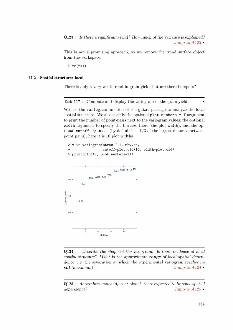
Q123 : Is there a significant trend? How much of the variance is explained?Jump to A123 •
This is not a promising approach, so we remove the trend surface objectfrom the workspace:
> rm(ts1)
17.2 Spatial structure: local
There is only a very weak trend in grain yield; but are there hotspots?
Task 117 : Compute and display the variogram of the grain yield. •
We use the variogram function of the gstat package to analyze the localspatial structure. We also specify the optional plot.numbers = T argumentto print the number of point-pairs next to the variogram values; the optionalwidth argument to specify the bin size (here, the plot width), and the op-tional cutoff argument (by default it is 1/3 of the largest distance betweenpoint pairs); here it is 10 plot widths.
> v <- variogram(straw ~ 1, mhw.sp,
+ cutoff=plot.wid*10, width=plot.wid)
> print(plot(v, plot.numbers=T))
distance
sem
ivar
ianc
e
0.2
0.4
0.6
5 10 15 20
●
●
●●
●
●
●● ●
●
160
1927
2748 4097 39194887
54036534 6713 5597
Q124 : Describe the shape of the variogram. Is there evidence of localspatial structure? What is the approximate range of local spatial depen-dence, i.e. the separation at which the experimental variogram reaches itssill (maximum)? Jump to A124 •
Q125 : Across how many adjacent plots is there expected to be some spatialdependence? Jump to A125 •
154

We now try to fit a theoretical variogram model to this empirical variogram.There appear to be two structures: a short-range to about 5 m with rapidincrease in semivariance with separation, and then a gradual increase to asill. So we use the the vgm (specify a variogram) function twice, with theadd.to argument the second time to combine variogram models:
> (vm <- vgm(0.15, "Sph", 5, 0.02))
model psill range
1 Nug 0.02 0
2 Sph 0.15 5
> (vm <- vgm(0.03, "Sph", 20, add.to = vm))
model psill range
1 Nug 0.02 0
2 Sph 0.15 5
3 Sph 0.03 20
> print(plot(v, model = vm, main = "Estimated variogram model"))
Estimated variogram model
distance
sem
ivar
ianc
e
0.2
0.4
0.6
5 10 15 20
●
●
●● ●
●
●● ●
●
We then adjust the variogram with the fit.variogram function:
> (vmf <- fit.variogram(v, vm))
Warning: singular model in variogram fit
Warning: singular model in variogram fit
model psill range
1 Nug 0.00000 0.0000
2 Sph 0.59606 5.2724
3 Sph 2.58509 678.4131
> print(plot(v, model = vmf, main = "Fitted variogram model"))
155

Fitted variogram model
distance
sem
ivar
ianc
e
0.2
0.4
0.6
5 10 15 20
●
●
●● ●
●
●● ●
●
The fit has reduced the nugget to zero; so at each point (inside a plot) thereshould be, as theory predicts, no spatial dependence. The nested structureclearly suggests that most of the spatial variability is within the first 5 m,so grouping a few plots should greatly reduce the between-plot variability ofan experiment (Mercer & Hall’s objective).
17.3 Absence of spatial structure*
In this section we show that spatial data does not necessarily have spa-tial structure. This also is a chance to investigate some of R’s facilities forsimulation. We can see how this field might look if there were no spatialdependence, i.e. if the variation in yields analyzed in §7 were randomly dis-tributed across the field. We do this by applying the sample function tothe vector of yields, to take a sample of the size as the original vector (ex-tracted with the length function) without replacement. This ensures thateach recorded yield appears once in the new vector.
Task 118 : Permute the vector of grain yields into a random order, compareto the original vector. •
We do this several times to see the effect of randomization. The head func-tion displays the first few elements of a vector; the sort method sorts them.The set.seed function ensures that your results match those presented here;of course you can experiment with other randomizations. We show the firstfew records of the samples, both unsorted and sorted, with the head function.
> set.seed(4502)
> head(mhw$grain)
[1] 3.63 4.07 4.51 3.90 3.63 3.16
> head(s1 <- sample(mhw$grain, length(mhw$grain), replace = FALSE))
[1] 4.06 2.97 4.47 4.06 4.20 4.29
> head(s2 <- sample(mhw$grain, length(mhw$grain), replace = FALSE))
156

[1] 3.05 4.27 3.92 4.46 3.55 4.49
> head(s3 <- sample(mhw$grain, length(mhw$grain), replace = FALSE))
[1] 3.42 3.46 5.07 3.67 4.10 4.46
> head(s1)
[1] 4.06 2.97 4.47 4.06 4.20 4.29
> head(s2)
[1] 3.05 4.27 3.92 4.46 3.55 4.49
> head(s3)
[1] 3.42 3.46 5.07 3.67 4.10 4.46
Q126 : Do the permutations have the same elements as the original vector?What is different? Jump to A126 •
Task 119 : Display the spatial pattern of the randomized yields. •
> par(mfrow=c(2,2))
> plot(mhw$c, mhw$r, pch=20, cex=2, bg="lightblue", ylim=c(20,1),
+ xlab="column", ylab="row", main="Randomization 1",
+ col=terrain.colors(8)[cut(s1, q8, include.lowest=T, labels=F)])
> plot(mhw$c, mhw$r, pch=20, cex=2, bg="lightblue", ylim=c(20,1),
+ xlab="column", ylab="row", main="Randomization 2",
+ col=terrain.colors(8)[cut(s2, q8, include.lowest=T, labels=F)])
> plot(mhw$c, mhw$r, pch=20, cex=2, bg="lightblue", ylim=c(20,1),
+ xlab="column", ylab="row", main="Randomization 3",
+ col=terrain.colors(8)[cut(s3, q8, include.lowest=T, labels=F)])
> plot(mhw$c, mhw$r, pch=20, cex=2, bg="lightblue", ylim=c(20,1),
+ xlab="column", ylab="row", main="Actual spatial distribution",
+ col=terrain.colors(8)[grain.c])
> par(mfrow=c(1,1))
157

●●●●●●●●●●●●●●●●●●●●
●●●●●●●●●●●●●●●●●●●●
●●●●●●●●●●●●●●●●●●●●
●●●●●●●●●●●●●●●●●●●●
●●●●●●●●●●●●●●●●●●●●
●●●●●●●●●●●●●●●●●●●●
●●●●●●●●●●●●●●●●●●●●
●●●●●●●●●●●●●●●●●●●●
●●●●●●●●●●●●●●●●●●●●
●●●●●●●●●●●●●●●●●●●●
●●●●●●●●●●●●●●●●●●●●
●●●●●●●●●●●●●●●●●●●●
●●●●●●●●●●●●●●●●●●●●
●●●●●●●●●●●●●●●●●●●●
●●●●●●●●●●●●●●●●●●●●
●●●●●●●●●●●●●●●●●●●●
●●●●●●●●●●●●●●●●●●●●
●●●●●●●●●●●●●●●●●●●●
●●●●●●●●●●●●●●●●●●●●
●●●●●●●●●●●●●●●●●●●●
●●●●●●●●●●●●●●●●●●●●
●●●●●●●●●●●●●●●●●●●●
●●●●●●●●●●●●●●●●●●●●
●●●●●●●●●●●●●●●●●●●●
●●●●●●●●●●●●●●●●●●●●
5 10 15 20 25
2015
105
Randomization 1
column
row
●●●●●●●●●●●●●●●●●●●●
●●●●●●●●●●●●●●●●●●●●
●●●●●●●●●●●●●●●●●●●●
●●●●●●●●●●●●●●●●●●●●
●●●●●●●●●●●●●●●●●●●●
●●●●●●●●●●●●●●●●●●●●
●●●●●●●●●●●●●●●●●●●●
●●●●●●●●●●●●●●●●●●●●
●●●●●●●●●●●●●●●●●●●●
●●●●●●●●●●●●●●●●●●●●
●●●●●●●●●●●●●●●●●●●●
●●●●●●●●●●●●●●●●●●●●
●●●●●●●●●●●●●●●●●●●●
●●●●●●●●●●●●●●●●●●●●
●●●●●●●●●●●●●●●●●●●●
●●●●●●●●●●●●●●●●●●●●
●●●●●●●●●●●●●●●●●●●●
●●●●●●●●●●●●●●●●●●●●
●●●●●●●●●●●●●●●●●●●●
●●●●●●●●●●●●●●●●●●●●
●●●●●●●●●●●●●●●●●●●●
●●●●●●●●●●●●●●●●●●●●
●●●●●●●●●●●●●●●●●●●●
●●●●●●●●●●●●●●●●●●●●
●●●●●●●●●●●●●●●●●●●●
5 10 15 20 25
2015
105
Randomization 2
column
row
●●●●●●●●●●●●●●●●●●●●
●●●●●●●●●●●●●●●●●●●●
●●●●●●●●●●●●●●●●●●●●
●●●●●●●●●●●●●●●●●●●●
●●●●●●●●●●●●●●●●●●●●
●●●●●●●●●●●●●●●●●●●●
●●●●●●●●●●●●●●●●●●●●
●●●●●●●●●●●●●●●●●●●●
●●●●●●●●●●●●●●●●●●●●
●●●●●●●●●●●●●●●●●●●●
●●●●●●●●●●●●●●●●●●●●
●●●●●●●●●●●●●●●●●●●●
●●●●●●●●●●●●●●●●●●●●
●●●●●●●●●●●●●●●●●●●●
●●●●●●●●●●●●●●●●●●●●
●●●●●●●●●●●●●●●●●●●●
●●●●●●●●●●●●●●●●●●●●
●●●●●●●●●●●●●●●●●●●●
●●●●●●●●●●●●●●●●●●●●
●●●●●●●●●●●●●●●●●●●●
●●●●●●●●●●●●●●●●●●●●
●●●●●●●●●●●●●●●●●●●●
●●●●●●●●●●●●●●●●●●●●
●●●●●●●●●●●●●●●●●●●●
●●●●●●●●●●●●●●●●●●●●
5 10 15 20 25
2015
105
Randomization 3
column
row
●●●●●●●●●●●●●●●●●●●●
●●●●●●●●●●●●●●●●●●●●
●●●●●●●●●●●●●●●●●●●●
●●●●●●●●●●●●●●●●●●●●
●●●●●●●●●●●●●●●●●●●●
●●●●●●●●●●●●●●●●●●●●
●●●●●●●●●●●●●●●●●●●●
●●●●●●●●●●●●●●●●●●●●
●●●●●●●●●●●●●●●●●●●●
●●●●●●●●●●●●●●●●●●●●
●●●●●●●●●●●●●●●●●●●●
●●●●●●●●●●●●●●●●●●●●
●●●●●●●●●●●●●●●●●●●●
●●●●●●●●●●●●●●●●●●●●
●●●●●●●●●●●●●●●●●●●●
●●●●●●●●●●●●●●●●●●●●
●●●●●●●●●●●●●●●●●●●●
●●●●●●●●●●●●●●●●●●●●
●●●●●●●●●●●●●●●●●●●●
●●●●●●●●●●●●●●●●●●●●
●●●●●●●●●●●●●●●●●●●●
●●●●●●●●●●●●●●●●●●●●
●●●●●●●●●●●●●●●●●●●●
●●●●●●●●●●●●●●●●●●●●
●●●●●●●●●●●●●●●●●●●●
5 10 15 20 25
2015
105
Actual spatial distribution
column
row
Q127 : How do the randomizations differ from each other and the originalspatial pattern? Jump to A127 •
It may be difficult to see that the randomizations have no spatial struc-ture. So, we examine this with variograms, as in §17.2, after converting thesimulated objects to spatial object.
> s1 <- data.frame(s1); coordinates(s1) <- xy
> s2 <- data.frame(s2); coordinates(s2) <- xy
> s3 <- data.frame(s3); coordinates(s3) <- xy
> pv <- plot(variogram(grain ~ 1, mhw.sp, cutoff=plot.wid*10,
+ width=plot.wid), main="Real")
> p1 <- plot(variogram(s1 ~ 1, s1, cutoff=plot.wid*10,
+ width=plot.wid), main="Simulation 1")
> p2 <- plot(variogram(s2 ~ 1, s2, cutoff=plot.wid*10,
+ width=plot.wid), main="Simulation 2")
> p3 <- plot(variogram(s3 ~ 1, s3, cutoff=plot.wid*10,
+ width=plot.wid), main="Simulation 3")
> print(p1, split = c(1, 1, 2, 2), more = T)
> print(p2, split = c(2, 1, 2, 2), more = T)
158

> print(p3, split = c(1, 2, 2, 2), more = T)
> print(pv, split = c(2, 2, 2, 2), more = F)
Simulation 1
distance
sem
ivar
ianc
e
0.05
0.10
0.15
0.20
5 10 15 20
● ●
● ●●
● ● ●●
●
Simulation 2
distance
sem
ivar
ianc
e
0.05
0.10
0.15
0.20
5 10 15 20
● ●●
●●
● ● ●●
●
Simulation 3
distance
sem
ivar
ianc
e
0.05
0.10
0.15
0.20
5 10 15 20
●
●
●●
●●
●● ●
●
Real
distance
sem
ivar
ianc
e
0.05
0.10
0.15
0.20
5 10 15 20
●
●
●
● ●
●●
● ● ●
Q128 : Are the variograms of simulated fields similar to each other? To thevariogram of the actual spatial arrangement of plots? What is the evidencethat the simulated fields (actual yields randomly assigned to plots) has nospatial dependence? Jump to A128 •
The conclusion from this section must be that spatial dependence is notalways present! It must be verified by variogram analysis or similar (e.g.spatial autocorrelograms) or trend surface analysis.
Remove the temporary variables from the simulation displays:
> rm(xy, q8, grain.c, s1, s2, s3, pv, p1, p2, p3)
17.4 Spatial structure of field halves*
In §9 we computed an indicator variable to show which half of the field eachplot is in. In a spatial analysis we may now ask whether these two halveshave different spatial structures.
Task 120 : Separate the dataset into two halves, one for each field half. •
To get a suitable data structure we use the split function to create oneobject with a list of two data frames, one for each half. We then assign theircoordinates.
159

> mhw.sp.ns <- split(as.data.frame(mhw.sp), in.north)
> coordinates(mhw.sp.ns$T) <- ~x + y
> coordinates(mhw.sp.ns$F) <- ~x + y
> summary(mhw.sp.ns)
Length Class Mode
FALSE 8 data.frame list
TRUE 8 data.frame list
T 250 SpatialPointsDataFrame S4
F 250 SpatialPointsDataFrame S4
> summary(mhw.sp.ns$T)
Object of class SpatialPointsDataFrame
Coordinates:
min max
x 1.2723 62.343
y 1.5904 62.025
Is projected: NA
proj4string : [NA]
Number of points: 250
Data attributes:
r c grain straw
Min. : 1.0 Min. : 1 Min. :2.78 Min. :4.10
1st Qu.: 3.0 1st Qu.: 7 1st Qu.:3.66 1st Qu.:5.73
Median : 5.5 Median :13 Median :3.97 Median :6.14
Mean : 5.5 Mean :13 Mean :3.96 Mean :6.28
3rd Qu.: 8.0 3rd Qu.:19 3rd Qu.:4.27 3rd Qu.:6.86
Max. :10.0 Max. :25 Max. :5.13 Max. :8.64
gsr in.north
Min. :0.482 Mode:logical
1st Qu.:0.596 TRUE:250
Median :0.635 NA's:0
Mean :0.636
3rd Qu.:0.669
Max. :0.848
Task 121 : Compute the variograms for each half, and plot these along withthe combined variogram. •
We first compute the variograms for the two field halves; we already havethe variogram for the entire field.
> v.n <- variogram(grain ~ 1, mhw.sp.ns$T, cutoff = 30)
> v.s <- variogram(grain ~ 1, mhw.sp.ns$F, cutoff = 30)
We now compute the figures, but do not print them right away; instead westore them as plotting objects:
> g.max = max(v$gamma, v.n$gamma, v.s$gamma)*1.2
> plot.vgm.all <- plot(v, plot.numbers=T,
+ main="All", ylim=c(0,g.max))
> plot.vgm.N <- plot(v.n, plot.numbers=T,
+ main="N half", ylim=c(0,g.max))
160

> plot.vgm.S <- plot(v.s, plot.numbers=T,
+ main="S half", ylim=c(0,g.max))
Note how we compute a common vertical axis from the maximum value ofall three variograms, so we can compare them side-by-side.
Now we print these on one screen, specifying their positions in the plot:
> print(plot.vgm.all, split = c(1, 1, 3, 1), more = T)
> print(plot.vgm.N, split = c(2, 1, 3, 1), more = T)
> print(plot.vgm.S, split = c(3, 1, 3, 1), more = F)
All
distance
sem
ivar
ianc
e
0.2
0.4
0.6
0.8
5 10 15 20
●
●
●● ●
●
●● ●
●
160
1927
2748 4097 39194887
5403 6534 6713 5597
N half
distance
sem
ivar
ianc
e
0.2
0.4
0.6
0.8
5 10 15 20 25
●
● ●●
●
● ●●
● ●● ● ●
●
340420 416 697524
1654 961114891810301508153013821470
S half
distancese
miv
aria
nce
0.2
0.4
0.6
0.8
5 10 15 20 25
●●
●
●
●
● ●
●● ●
●●
● ●
340420
416
697
5241654 961
114891810301508153013821470
We now try to model the half-field variograms, as we did for the whole fieldin the previous section. The half-field variograms do not seem to show thenested structure of the whole-field variogram.
> (vmS <- vgm(0.14, "Sph", 20, 0.09))
model psill range
1 Nug 0.09 0
2 Sph 0.14 20
> (vmN <- vgm(0.08, "Sph", 13, 0.11))
model psill range
1 Nug 0.11 0
2 Sph 0.08 13
> (vmSf <- fit.variogram(v.s, vmN))
model psill range
1 Nug 0.076024 0.000
2 Sph 0.141284 13.787
> (vmNf <- fit.variogram(v.n, vmS))
model psill range
1 Nug 0.112956 0.000
2 Sph 0.081287 14.747
161

> plot.vgm.all <- plot(v, plot.numbers = T, main = "All",
+ model = vmf, ylim = c(0, g.max))
> plot.vgm.N <- plot(v.n, plot.numbers = T, main = "N half",
+ model = vmNf, ylim = c(0, g.max))
> plot.vgm.S <- plot(v.s, plot.numbers = T, main = "S half",
+ model = vmSf, ylim = c(0, g.max))
> print(plot.vgm.all, split = c(1, 1, 3, 1), more = T)
> print(plot.vgm.N, split = c(2, 1, 3, 1), more = T)
> print(plot.vgm.S, split = c(3, 1, 3, 1), more = F)
All
distance
sem
ivar
ianc
e
0.2
0.4
0.6
0.8
5 10 15 20
●
●
●● ●
●
●● ●
●
160
1927
2748 4097 39194887
5403 6534 6713 5597
N half
distance
sem
ivar
ianc
e
0.2
0.4
0.6
0.8
5 10 15 20 25
●
● ●●
●
● ●●
● ●● ● ●
●
340420 416 697524
1654 961114891810301508153013821470
S half
distancese
miv
aria
nce
0.2
0.4
0.6
0.8
5 10 15 20 25
●●
●
●
●
● ●
●● ●
●●
● ●
340420
416
697
5241654 961
114891810301508153013821470
Remove the plotting objects and scale:
> rm(g.max, plot.vgm.all, plot.vgm.N, plot.vgm.S)
Q129 : Do the two halves appear to have different local spatial structure?
Jump to A129 •
Remove the variograms and models from the workspace:
> rm(v, v.n, v.s, vm, vmf, vmN, vmNf, vmS, vmSf)
We are also done with the field halves:
> rm(mhw.sp.ns)
17.5 Answers
A121 : The row and column numbers don’t seem to show any pattern or trend.Return to Q121 •
A122 : Although there are differences among rows and columns, there does notappear to be a trend. The higher-numbered columns (East half of the field) appearto be slightly lower (as a group) than the lower-numbered columns. There appears
162

to be some short-range periodicity at a one-plot range (high followed by low) inboth dimensions, although this is not regular. Return to Q122 •
A123 : Only about 9% of the variance is explained; only the x-coordinate (E-W,across the columns from low- to high-numbered) is significant; it shows a slighttrend towards the East; this agrees with the by-column boxplot. This trend wasalso noted by Patankar [32]. Return to Q123 •
A124 : There is evidence of spatial structure: the semivariance increases up toabout 13 m separation; the semivariance then fluctuates around a total sill of aboutγ = 0.21lb2 There appears to be a “nugget” effect (semivariance at zero separation)
of about γ = 0.05lb2. Return to Q124 •
A125 : Plot size is (3.18 m long x 2.55 m wide) (§A), so the range of about13 m corresponds to about four adjacent plots column-wise and five adjacent plotsrow-wise. Return to Q125 •
A126 : The elements of the permuted and original vectors are the same, all thatchanges is their sequence. Return to Q126 •
A127 : The randomizations have a similar pattern but different locations of highand low values; there is no apparent spatial pattern. The actual spatial distributionshows clear concentrations of high and low values (“hot” and “cold” spots) with aspatial dependence of about 4 plots. Return to Q127 •
A128 : The three simulations have very similar variograms: they all fluctuatearound the sill (representing the total variability in the field), which is the same asfor the variogram of actual data. This latter is quite different from the simulations,and shows clear spatial structure up to 15 m.
The lack of spatial dependence in the “random assignment” fields is proven by thevariograms: a pure nugget effect, where the nugget variance is the same as the sill.
Return to Q128 •
A129 : There is a big difference between the structures in the two halves. The Shalf is more variable overall (higher total sill, about γ = 0.22lb22), with a longer
range around 20 m; the N half reaches a lower total sill (about γ = 0.19lb2) at a
shorter range, about 12 m. Both have a nugget effect, about γ = 0.075lb2 in the Sand γ = 0.011lb2 in the N. Return to Q129 •
18 Generalized least squares regression*
In §8.2 we computed a relation of straw yield modelled from grain yield,which could then be applied to predict the straw yield of any plot, undersimilar conditions, with a measured grain yield:
> coef(model.straw.grain <- lm(straw ~ grain, data = mhw.sp))
163

(Intercept) grain
0.86628 1.43050
Clearly, however, this relation is not the same at each plot: that’s whythere are non-zero residuals from the linear regression. But is there a spa-tial relation here? That is, are the residuals from the regression spatiallycorrelated? If they are, they violate one of the assumptions of ordinaryleast-squares (OLS) linear regression, namely, the independence of residuals.
Task 122 : Add the OLS model residuals to the spatial points data frameand show as a post-plot. •
Again, as in §16.5, we also make a pixel version for easier visualization.
> mhw.sp$msg.res <- residuals(model.straw.grain)
> mhw.sp.pix <- as(mhw.sp,"SpatialPixelsDataFrame")
> spplot(mhw.sp.pix, zcol="msg.res", col.regions=bpy.colors(64),
+ main="Linear model residuals",
+ sub="straw ~ grain, lb. per plot")
Linear model residuals
straw ~ grain, lb. per plot
−2
−1
0
1
2
3
Q130 : Does there appear to be spatial correlation among the residuals?At what scale? Jump to A130 •
The post-plot suggests that the residuals are spatially-correlated. In §17.2we saw how to reveal spatial structure of a variable; here we want to applythat method to the residuals, to see if they are spatially-correlated.
Task 123 : Compute and display their empirical variogram. •
As in §17.2 we compute the variogram to a radius of 10 plot widths, withbins of plot width size:
164
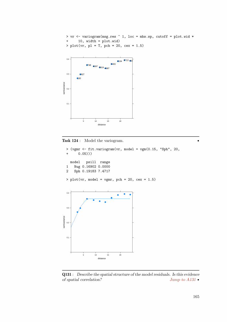
> vr <- variogram(msg.res ~ 1, loc = mhw.sp, cutoff = plot.wid *
+ 10, width = plot.wid)
> plot(vr, pl = T, pch = 20, cex = 1.5)
distance
sem
ivar
ianc
e
0.1
0.2
0.3
0.4
5 10 15 20
●
●
●●
●●
●
●● ●
160
1927
27484097 3919 4887
54036534 6713 5597
Task 124 : Model the variogram. •
> (vgmr <- fit.variogram(vr, model = vgm(0.15, "Sph", 20,
+ 0.05)))
model psill range
1 Nug 0.16902 0.0000
2 Sph 0.19183 7.4717
> plot(vr, model = vgmr, pch = 20, cex = 1.5)
distance
sem
ivar
ianc
e
0.1
0.2
0.3
0.4
5 10 15 20
●
●
●●
●●
●
●● ●
Q131 : Describe the spatial structure of the model residuals. Is this evidenceof spatial correlation? Jump to A131 •
165

We conclude that the model residuals are not independent – they are spa-tially correlated. Although the regression coefficients computed in §8.2 areunbiased, the standard errors are too small and so the significance is over-estimated, since there are effectively fewer degrees of freedom (plots partiallyduplicate each other’s information). Further, the coefficients may not be op-timal.
The key difference here is that in the linear model, the residuals ε are inde-pendently and identically distributed with the same variance σ2:
y = Xβ+ ε, ε ∼N (0, σ2I) (18.1)
Whereas, now the residuals are considered themselves a random variable ηthat has a covariance structure:
y = Xβ+ η, η ∼N (0,V) (18.2)
where V is a positive-definite variance-covariance matrix of the model resid-uals. In the case of spatial correlation, we ensure positive-definiteness byusing an authorized covariance function C and assuming that the entries arecompletely determined by the distance between points xi − xj :
Vi,j = C(xi − xj) (18.3)
Further constraints on these equations and the solution are presented clearlyby Lark and Cullis [23]. These are called mixed models: some effects arefixed (here, the known grain yield) and others are random (here, the errorvariances) but follow a known structure.
In this formulation C has a three-parameter vector θ, as does the correspond-ing variogram model: the range a, the total sill σ2, and the proportion oftotal sill due to spatial correlation s. Thus the random effect η representsboth the spatial structure of the residuals from the fixed-effects model, andthe unexplainable (short-range) noise. This latter corresponds to the noiseσ2 of the linear model of Equation 18.1.
The solution of equation 18.2 is found by least-squares:
β = (XTV−1X)−1XTV−1y (18.4)
To solve this equation (18.4) we first need to compute V, i.e., estimate thevariance parameters θ = [σ2, s, a], use these to compute C with equation18.3 and only then use equation 18.4 to estimate the fixed effects β. But θis estimated from the residuals of the fixed-effects regression, which has notyet been computed. How can this “chicken-and-egg” computation be solved?
The answer is to use residual (sometimes called “restricted”) maximum like-lihood (REML) to maximize the likelihood of both sets of parameters (fixedβ and random θ) at the same time. The only pre-requisite is to select thefunctional form of the covariance model. REML maximizes a likelihood func-tion of the variance parameter vector θ as variables to be estimated by ML;however this likelihood is conditional (“restricted”) on the parameters in β.
166

Once the covariance parameters θ are known, V can be directly computed,and then β. See Lark and Cullis [23] for details.
In the R environment REML can be implemented with the gls “GeneralizedLeast Squares” function of the nlme “Linear and Nonlinear Mixed EffectsModels” package, based on the text by Pinheiro and Bates [36]. See Bates[2] for a simple introduction to the concepts, and how to use them in the Renvironment.
Task 125 : Load the nlme package and examine the help for the gls function.•
> require(nlme)
> help(gls)
As with the lm function, this requires a formula (here called a ‘model’)and a dataframe in which to find variables. In addition, it requires eithera correlation structure or a weights matrix. In our case we have a knownspatial correlation, so we need to specify how the residuals may be correlated.
The nlme package provides a number of constructors of correlation structuresfor both time and spatial correlation. The spatial correlation models aresimilar to familiar variogram models: exponential, Gaussian, and Spherical(the structure we used to model the residuals, above). All that is required isa starting value for the range and nugget, which we extract from the fittedvariogram model and put together in a list, and the formula for spatialcoordinates. A small complication is that nlme does not depend on the sp
structures, so we need to convert to a dataframe with the as.data.frame
function, so that the coordinate names x and y become visible.
Task 126 : Fit the regression model by GLS, using a spherical correlationstructure based on the variogram analysis. •
The model fitting takes a bit of time; the generalized least squares fit is byrestricted maximum likelihood (REML) to fit both the covariance structureand the linear model at the same time; see Lark and Cullis [23].
> model.gls.straw.grain <-
+ gls(model=straw ~ grain,
+ data=as.data.frame(mhw.sp),
+ correlation=corSpher(
+ value=c(vgmr[2,"range"],vgmr[1,"psill"]),
+ form=~x+y, nugget=T))
Task 127 : Summarize the model. •
> summary(model.gls.straw.grain)
Generalized least squares fit by REML
Model: straw ~ grain
167

Data: as.data.frame(mhw.sp)
AIC BIC logLik
853.54 874.59 -421.77
Correlation Structure: Spherical spatial correlation
Formula: ~x + y
Parameter estimate(s):
range nugget
8.02312 0.37426
Coefficients:
Value Std.Error t-value p-value
(Intercept) 1.5605 0.240165 6.4977 0
grain 1.2557 0.059545 21.0879 0
Correlation:
(Intr)
grain -0.978
Standardized residuals:
Min Q1 Med Q3 Max
-3.114035 -0.637046 -0.010328 0.619166 4.790892
Residual standard error: 0.61467
Degrees of freedom: 500 total; 498 residual
There is quite a bit of information in the model summary:
1. the fixed-effects model form;
2. the fitting information: Akaike’s Information Criterion (AIC), Bayes’Information Criterion (BIC) and the log-likelihood of the final REMLfit;
3. the random-effects model form, i.e., the correlation structure, withestimates of its parameters (here, range and proportional nugget);
4. the fitted model coefficients for the fixed effects, their standard errorsand significance;
5. the correlation between parameters;
6. the residuals and residual standard error (i.e., lack of fit).
Q132 :
(1) How do the GLS linear regression coefficients compare with those esti-mated by OLS?;
(2) What parameters for the specified spatial correlation structure were fitby REML?
(3) How do these spatial structure parameters compare with the fitted vari-ogram model? Jump to A132•
168

> coefficients(model.gls.straw.grain)
(Intercept) grain
1.5605 1.2557
> coefficients(model.straw.grain)
(Intercept) grain
0.86628 1.43050
Task 128 : Plot the straw vs. grain yield, with the OLS and GLS regressionlines. •
> plot(straw ~ grain, data=mhw, pch=20,
+ sub="black: OLS; red: GLS")
> grid()
> abline(model.straw.grain)
> abline(model.gls.straw.grain, col="red")
●
●
●
●
●
●
●
●
●
●●
● ●●
●
●
●
●
●
●
●
●
●
●
●
●
●
●
●
●●
●
●
●
●
●
●
●
●
●
●
●●
●
●
● ●●
●
●
●
●
●
●
●
●
●
●
●
●
●
●
●
●
●
●
●
●
●●
●
●
●
●
●
●
●
●
●●
●
●
●
●
●
●
●
●
●
●
●
●
● ●
●
●
●
●
●
●
●
●
●
●
●
●● ●
● ●
●
●
●
●
●
●
●
●
●
●
●
●
●
●
●
●
●
●
●
●
●
●
●
●
●
●
●●
●
●
●
●
●
●●
●
●
●
●
●
●●
●●
●
●
●
●
●
●
●●
●
●
●
●
●
●
●●
●
●●
●
●
●
●
●
●
●
●
●
●
●
●
●
●●
●
●● ●●
●
●
●
●
●
●
●
●
●●
●
●
●
●●
●
●
●
●
●
●
●
●
●
●
●
●
●
●●
●
●
●
●
●
●
●
●
●
●
●
●
●
●
●
●
●
●
●
●
●●
●
●
●
●
●
●
●
●
●
●
●
●
●
●
●
●
●
●
●
●
●●
●
●
●●
●
● ●
●
●
●
●
●
●
●
●
●
●
●
●
●
●
●
●
●●
●
●
●
●
●
●
●
● ●
●
●
●
●
●
●
●
●
●
●
●
●
●
●
●
●
●
●●
●
●
●
●
●
●
●
●
●
●
●
●
●
●
●
●
●
●
●
●
●
●
●
●
●
●
●
●
●
●●
●
●●
●
●
●
●
●
●
●
●
●
●
●
●
●
●
●
●
●
●
●
●
●●
● ●
●
●
●
●
●
●
●
●
●
●
●●
●
●
●
●
● ●●
●
●
●
●
●
●●
● ●
●
●
●
●
●
●
●
● ●
●
●●
●
●
●
●
●
●
●
●
●
●
●●
●●
●
●
●
●
●
● ●
●
●
●
●
●
●
●
●
●
●●
●
●
●
●
●
●
●●
●
●
●
●
●
●
●●
●
●
●
●
●
●
●●●
●
●
●
●
●
●
●
●
● ●
●
●
●
●
●
●
●
●
●
●
●
●
●
●
●
3.0 3.5 4.0 4.5 5.0
45
67
89
black: OLS; red: GLSgrain
stra
w
Q133 : What may account for the shallower slope of the GLS line? Jumpto A133 •
18.1 Answers
A130 : Yes, there are definitely many high (orange to yellow) and low (blue)patches of a few adjacent plots. Return to Q130 •
A131 : There is a fairly high nugget (theoretically, the same as for the residuals
169

of straw yield) but clear spatial structure to about 6 meters (a bit more than twoplot widths) and then some fluctuation around a sill. Return to Q131 •
A132 :
(1) The intercept is higher (1.56 vs. 0.87) and the slope is shallower (1.26 vs. 1.43).
(2) A range of just over 8 m and a nugget of about 0.37.
(3) The range is quite comparable to the variogram model fit, just a little longer;but the nugget has a different meaning. Here it is the proportion of the total sill,which for the variogram fit is 0.4684; the REML fit decreases this a bit.
Return to Q132 •
A133 : If the very high- and very low-yielding plots, with the highest leverage onthe regression line, are spatially-correlated (which seems likely), the clusters in thescatterplot at extreme upper-right (above the average line) and extreme lower-left(below) will have less effect; because of spatial correlation they will be effectivelyclustered by the GLS fit, to some degree sharing their weights. So the line will notbe pulled so much by these high-leverage plots. Return to Q133 •
19 Geographically-weighted regression*
Another approach to spatial correlation in regression is to use it to reveal anunderlying process. In §8.2 and §18 we implicitly assumed that the processby which straw and grain yields are related (i.e., the plant physiology in re-sponse to environmental factors) is the same everywhere. The environmentalfactors could result in higher or lower yields (linear model intercept), butthe relation of straw to grain is constant (linear model slope). But is thistrue?
A recently-developed technique for investigating this is“geographically weight-ed regression” (GWR). This computes the coefficients of the regression equa-tion for each plot, in a local window which moves across a spatial field. Fur-ther, it weights plots near to the target plot more than those further away,using a density kernel. Thus the equation reported at each point can bethought of as the local linear relation between the response and predictor,which is now allowed to vary across the field. The main interpretive interestin GWR is the spatial pattern of the coefficients, which is taken as evidenceof a spatially-varying process.
GWR is comprehensively described by Fotheringham et al. [15] and briefly byFotheringham et al. [14, §5.4.3]; these same authors maintain a web page14
with tutorial material.
One implementation of GWR in the R environment is the spgwr package15,which builds on the sp package loaded in §16.3.
14 http://ncg.nuim.ie/ncg/GWR/whatis.htm15 Although the package loads with the somewhat of-putting disclaimer“NOTE: This pack-
age does not constitute approval of GWR as a method of spatial analysis”!
170

Task 129 : Load the spgwr package. •
> library(spgwr)
A key issue in GWR is the size and shape of the window to be moved overthe field, and centred on each point in turn. This is closely related to kerneldensity estimation of a single variable (not a regression relation). The mostcommon kernel shape is Gaussian (bivariate normal, the familiar bell-curve),and the bandwidth is often chosen to minimize the average cross-validationerror of all the points predicted by their own local regression.
Task 130 : Compute the optimal bandwidth for GWR of the straw vs. grainrelation. •
The gwr.sel function does this:
> (bw <- gwr.sel(straw ~ grain, data = mhw.sp, adapt = F,
+ verbose = F))
[1] 7.7937
Q134 : To the range of the variogram of which variable should this band-width correspond? Jump to A134•
Task 131 : Compute and model the empirical variogram of the grain/strawratio. •
> (vmf.gsr <- fit.variogram(v.gsr <- variogram(gsr ~ 1, loc=mhw.sp),
+ model=vgm(0.004, "Sph", 10, 0.002)))
model psill range
1 Nug 0.0018000 0.0000
2 Sph 0.0016304 8.4351
Q135 : Does the effective range of the fitted variogram model of thegrain/straw ratio match the fitted bandwidth for GWR? Jump to A135 •
Task 132 : Compute the GWR for the straw vs. grain regression. •
The gwr.sg function computes this:
> (gwr.sg <- gwr(straw ~ grain, data = mhw.sp, bandwidth = bw))
Call:
gwr(formula = straw ~ grain, data = mhw.sp, bandwidth = bw)
Kernel function: gwr.Gauss
Fixed bandwidth: 7.7937
171

Summary of GWR coefficient estimates:
Min. 1st Qu. Median 3rd Qu. Max. Global
X.Intercept. -0.0923 1.1600 1.6200 2.0600 3.4400 0.87
grain 0.8950 1.1000 1.2500 1.4000 1.7100 1.43
Q136 : How much do the local slopes vary? How do they compare with theslope computed for the relation over the whole field? Jump to A136 •
Task 133 : Plot the GWR slopes (coefficient of straw vs. grain) across thefield. •
The SDF field of the fitted object contains the fitted coefficients, the predic-tion from the local model, the residuals, and the local goodness-of-fit. Thegrain field within the SDF field is the slope coefficient.
For easier visualization, we convert the points representing plots into pixels.
> gwr.coef <- as(gwr.sg$SDF,"SpatialPixelsDataFrame")
> print(spplot(gwr.coef, zcol="grain",
+ col.regions=bpy.colors(64),
+ key.space="right", cuts=8,
+ main="Slope: straw ~ grain"))
Slope: straw ~ grain
0.9
1.0
1.1
1.2
1.3
1.4
1.5
1.6
1.7
Q137 : Does the relation of straw vs. grain appear to vary across the field?What is the interpretation? Jump to A137 •
172

Task 134 : Plot the GWR residuals and investigate if they have any spatialstructure. •
The gwr.e field within the SDF field contains the residuals.
> print(spplot(gwr.coef, zcol="gwr.e",
+ col.regions=bpy.colors(64),
+ key.space="right", cuts=8,
+ main="Slope: straw ~ grain"))
Slope: straw ~ grain
−2
−1
0
1
2
To check for spatial structure, we compute the empirical variogram of theseGWR residuals, and model it. A technical point: the variogram methodcan not handle non-square grid cells, so we have to convert to spatial points.
> vr.gwr <- variogram(gwr.e ~ 1,
+ loc=as(gwr.coef, "SpatialPointsDataFrame"))
> (vmf.r.gwr <- fit.variogram(vr.gwr,
+ model=vgm(0.1, "Sph", 5, 0.2)))
model psill range
1 Nug 0.20118 0.0000
2 Sph 0.11740 8.5787
Q138 : Is there any spatial structure in the GWR residuals? Jump toA138 •
Task 135 : Plot the empirical variogram and fitted variogram model forthese residuals, along with those from the OLS global fit (§8.2.1) and theREML fit (§18) to the entire dataset. •
We first must compute and model the variogram for the REML fit:
173

> mhw.sp$gls.res <- residuals(model.gls.straw.grain)
> vr.gls <- variogram(gls.res ~ 1, loc = mhw.sp, cutoff = plot.wid *
+ 10, width = plot.wid)
> (vmf.r.gls <- fit.variogram(vr.gls, model = vgm(0.1,
+ "Sph", 5, 0.2)))
model psill range
1 Nug 0.14959 0.0000
2 Sph 0.20438 7.2492
To put these on one plot it’s easiest to use the base graphics plot methodto establish the plotting axes and show one of the point sets; we then usethe lines and points functions to add more point sets and lines. The linesare computed from the fitted variogram models with the variogramLine
function.
> ylim.plot=c(0, max(vr.gwr$gamma, vr.gls$gamma, vr$gamma))
> plot(gamma ~ dist, data=vr.gwr, ylim=ylim.plot,
+ type="b", lty=2, col="red", xlab="separation, m",
+ ylab="semivariance, (lbs plot-1)^2",
+ main="Regression model residuals")
> lines(variogramLine(vmf.r.gwr, maxdist=max(vr.gwr$dist)),
+ col="red")
> points(gamma ~ dist, data=vr, type="b", lty=2, col="blue")
> lines(variogramLine(vgmr, maxdist=max(vr.gwr$dist)),
+ col="blue")
> points(gamma ~ dist, data=vr.gls, type="b", lty=2, col="green")
> lines(variogramLine(vmf.r.gls, maxdist=max(vr.gwr$dist)),
+ col="green")
> legend(20,0.15,c("OLS", "GLS", "GWR"), lty=1,
+ col=c("blue","green","red"))
●●
●●
●● ●
● ●
●
● ●
●
●
5 10 15 20 25
0.0
0.1
0.2
0.3
0.4
Regression model residuals
separation, m
sem
ivar
ianc
e, (
lbs
plot
−1)
^2
●
●
●●
●●
●
●● ●
●
●
●●
●●
●
●● ●
OLSGLSGWR
Q139 : Explain the change in spatial structure from (1) OLS residuals, (2)
174
GLS residuals, (3) GWR residuals. Jump to A139 •
19.1 Answers
A134 : In this case of a bivariate relation, the bandwidth might be expected tocorrespond to the variogram range for the grain/straw ratio, which also representsthe same process as the straw vs. grain regression. Return to Q134 •
A135 : The bandwidth 7.8 m is a bit less than the range for grain/straw with aspherical model, 8.4; but they are comparable. Return to Q135 •
A136 : There is quite a wide range of both coefficients; the IQR is also wide. Theglobal coefficients are nowhere near the medians of the GWR coefficient distribu-tions. Return to Q136•
A137 : Most definitely. There is a very high straw yield per unit grain yieldin the NW and SE, very low in the SW. The process by which carbohydratesare partitioned between grain and straw appears to be systematically different inpatches of about 1/5 field size, not just random noise plot-to-plot. Return toQ137 •
A138 : Yes, the fitted variogam model shows a range of 8.6 m and a structuralsill to total sill ratio of 37%. Return to Q138 •
A139 : The OLS fit has the highest residuals; these are slightly lowered by theREML fit, presumably because it better accounted for very high and low valuesclose to each other. The GWR residuals are considerably lower and are fit with aslightly longer range. The lower residuals are because the GWR fit is local and socan better adjust to local relations between straw and grain. Return to Q139 •
References
[1] E C Barrett and L F Curtis. Introduction to environmental remote sens-ing. Stanley Thornes Publishers, Cheltenham, Glos., UK, 4th edition,1999. 115
[2] D Bates. Fitting linear mixed models in R. R News, 5(1):27–30, 2005.167
[3] G Bellocchi, M Rivington, M Donatelli, and K Matthews. Validationof biophysical models: issues and methodologies. a review. Agronomyfor Sustainable Development, 30(1):109–130, 2010. doi: 10.1051/agro/2009001. 124
[4] D Birkes and Y Dodge. Alternative methods of regression. Wiley
175
series in probability and mathematical statistics. Wiley, 1993. ISBN0471568813. 96
[5] R S Bivand, E J Pebesma, and V GAsmez-Rubio. Applied Spatial DataAnalysis with R. UseR! Springer, 2008. URL http://www.asdar-book.
org/. 148
[6] G Casella and R L Berger. Statistical inference. Duxbury, Pacific Grove,CA, 2nd edition, 2002. 4
[7] W G Cochran. A catalogue of uniformity trial data. Supplement to theJournal of the Royal Statistical Society, 4(2):233–253, 1937. 182
[8] J C Davis. Statistics and data analysis in geology. John Wiley & Sons,New York, 3rd edition, 2002. 59, 115
[9] A C Davison and D V Hinkley. Bootstrap methods and their application.Cambridge University Press, 1997. ISBN 0521573912. 79, 81
[10] B Efron. The jackknife, the bootstrap, & other resampling plans. Societyfor Industrial & Applied Mathematics, 1982. 138
[11] B Efron. An introduction to the bootstrap. Chapman & Hall, 1993. 79
[12] B Efron and G Gong. A leisurely look at the bootstrap, the jackknife& cross-validation. American Statistician, 37:36–48, 1983. 78, 138
[13] H Fairfield Smith. An empirical law describing heterogeneity in theyields of agricultural crops. The Journal of Agricultural Science (Cam-bridge), 28:1–3, 1938. 182
[14] A S Fotheringham, C Brunsdon, and M Charlton. Quantitative geog-raphy: perspectives on spatial data analysis. Sage Publications, 2000.170
[15] A S Fotheringham, C Brunsdon, and M Charlton. Geographicallyweighted regression: the analysis of spatially varying relationships. Wi-ley, 2002. ISBN 0471496162. 170
[16] J Fox and S Weisberg. Robust regression in R: An appendixto “An R companion to applied regression, second edition”. Dec2010. URL http://socserv.mcmaster.ca/jfox/Books/Companion/
appendix/Appendix-Robust-Regression.pdf. 96
[17] H G Gauch Jr., J T G Hwang, and G W Fick. Model evaluation bycomparison of model-based predictions and measured values. AgronomyJournal, 95(6):1442–1446, 2003. 124
[18] J C Gower. Statistics and agriculture. Journal of the Royal StatisticalSociety. Series A (Statistics in Society), 151(1):179–200, 1988. 182
[19] R J Hyndman and Y N Fan. Sample quantiles in statistical packages.American Statistician, 50(4):361–365, Nov 1996. 78
[20] R Ihaka and R Gentleman. R: A language for data analysis and graphics.Journal of Computational and Graphical Statistics, 5(3):299–314, 1996.1
176

[21] K Kobayashi. Comments on another way of partitioning mean squareddeviation proposed by Gauch et al. (2003). Agronomy Journal, 96(4):1206–1207, Aug 2004. 124
[22] K Kobayashi and M U Salam. Comparing simulated and measuredvalues using mean squared deviation and its components. AgronomyJournal, 92(2):345–352, Apr 2000. 124
[23] R M Lark and B R Cullis. Model based analysis using REML forinference from systematically sampled data on soil. European Journalof Soil Science, 55(4):799–813, 2004. 166, 167
[24] R M Lark and J V Stafford. Information on within-field variabilityfrom sequences of yield maps: multivariate classification as a first stepof interpretation. Nutrient Cycling in Agroecosystems, 50(1 - 3):277–281, 1998. 182
[25] P Legendre and L Legendre. Numerical ecology. Elsevier Science, 1998.115
[26] F Leisch. Sweave, part I: Mixing R and LATEX. R News, 2(3):28–31,December 2002. URL http://CRAN.R-project.org/doc/Rnews/. 2
[27] F Leisch. Sweave User’s Manual. TU Wein, Vienna (A), 2.1 edition,2006. URL http://www.ci.tuwien.ac.at/~leisch/Sweave. 2
[28] T M Lillesand, R W. Kiefer, and J W Chipman. Remote sensing andimage interpretation. John Wiley & Sons, Hoboken, NJ, 6th edition,2007. 115
[29] D M Mark and M Church. On the misuse of regression in earth science.Mathematical Geology, 9(1):63–77, 1977. 40
[30] A B McBratney and R Webster. Detection of ridge and furrow patternsby spectral analysis of crop yield. International Statistical Review, 49:45–52, 1981. 182, 183
[31] W B Mercer and A D Hall. The experimental error of field trials. TheJournal of Agricultural Science (Cambridge), 4:107–132, 1911. 182
[32] V N Patankar. The goodness of fit of frequency distributions obtainedfrom stochastic processes. Biometrika, 41:450–462, 1954. 163, 182
[33] E J Pebesma. Multivariable geostatistics in S: the gstat package. Com-puters & Geosciences, 30(7):683–691, 2004. 148
[34] E J Pebesma and R S Bivand. Classes and methods for spatial data inR. R News, 5(2):9–13, November 2005. URL http://CRAN.R-project.
org/doc/Rnews/. 148
[35] E J Pebesma and C G Wesseling. Gstat: a program for geostatisticalmodelling, prediction and simulation. Computers & Geosciences, 24(1):17–31, 1998. URL http://www.gstat.org/. 148
[36] J C Pinheiro and D M Bates. Mixed-effects models in S and S-PLUS.Springer, 2000. ISBN 0387989579. 167
177

[37] R Development Core Team. R: A language and environment for sta-tistical computing. R Foundation for Statistical Computing, Vienna,Austria, 2004. URL http://www.R-project.org. ISBN 3-900051-07-0. 1
[38] B D Ripley. Spatial statistics. John Wiley and Sons, New York, 1981.182, 183
[39] D G Rossiter. Introduction to the R Project for Statistical Computingfor use at ITC. International Institute for Geo-information Science &Earth Observation (ITC), Enschede (NL), 3.6 edition, 2009. URL http:
//www.itc.nl/personal/rossiter/teach/R/RIntro_ITC.pdf. 1, 7
[40] C Shalizi. The bootstrap. American Scientist, 98(3):186–190, 2010. 79
[41] P Sprent. Models in regression and related topics. Methuen’s mono-graphs on applied probability and statistics. Methuen, London
”1969.
59
[42] J W Tukey. Exploratory data analysis. Addison-Wesley, New York,1977. 14
[43] H M van Es and C L van Es. Spatial nature of randomization andits effects on the outcome of field experiments. Agronomy Journal, 85:420–428, 1993. 70, 182, 183
[44] W N Venables and B D Ripley. Modern applied statistics with S.Springer-Verlag, New York, fourth edition, 2002. 17, 40, 96
[45] R Webster. Is regression what you really want? Soil Use & Manage-ment, 5(2):47–53, 1989. 40
[46] R Webster. Regression and functional relations. European Journal ofSoil Science, 48(3):557–566, 1997. 40, 44, 59
[47] P Whittle. On stationary processes in the plane. Biometrika, 41:434–449, 1954. 182
[48] P Whittle. On the variation of yield variance with plot size. Biometrika,43:337–343, 1956. 182
178

Index of R Concepts
* formula operator, 105* operator, 4+ formula operator, 102+ operator, 4- formula operator, 130, 132- operator, 4, 10/ formula operator, 112/ operator, 4: operator, 10, 139< operator, 13<- operator, 3, 8, 60<= operator, 13= operator, 8== operator, 12, 13> operator, 13>= operator, 13[] operator, 9, 139^ operator, 4~ formula operator, 39, 47
abline, 21, 32, 39, 48, 55, 57, 95, 106abs, 50adj graphics argument, 21anova, 104, 105as, 149as.character, 139as.data.frame, 167attach, 26, 27, 71
bg graphics argument, 21, 187biplot, 117biplot.prcomp, 117boot (package:boot), 79, 80, 82–84boot, 79boot package, 79, 80boot.ci (package:boot), 82border graphics argument, 16boxplot, 72bpy.colors, 149breaks graphics argument, 16by, 73
c, 10, 25, 63, 110cbind, 29, 109cex graphics argument, 21class, 9coef, 122, 128coefficients, 46, 103, 122
col function argument, 128col graphics argument, 16, 21, 49, 106colMeans, 40colnames, 8, 139colors, 184colours, 184conf argument (boot.ci function), 82coordinates (package:sp), 148cor, 44, 93, 131cor.test, 44, 93curve, 35cut, 144
data.frame, 54, 55decreasing argument (sort function), 12density, 17, 18, 24, 31detach, 26, 71diff, 27digits argument (summary function), 142dim, 9, 121
e1071 package, 25, 26ecdf, 32expand.grid, 147
fg graphics argument, 187file.show, 8fit.variogram (package:gstat), 155fix, 29for, 139function, 60, 61, 79, 138
getwd, 7gls (package:nlme), 167gray, 187grid, 21, 55gstat package, 2, 148, 154gwr.sel (package:spgwr), 171gwr.sg (package:spgwr), 171
head, 11, 120, 156heat.colors, 149, 187help, 5help.search, 5hist, 15–19horizontal argument (boxplot function),
72hsv, 187
179

I, 130id.n graphics argument, 52, 108identify, 22, 185ifelse, 49, 110index argument (plot.boot function), 84IQR, 25, 90
kurtosis (package:e1071), 25, 26
lattice package, 2, 145, 148legend, 95, 128length, 156library, 148lines, 18, 55, 174list, 138lm, 46, 51, 62, 64, 75, 102, 105, 106, 123,
128, 131, 132, 167lm class, 53load, 13lowess, 51lqs, 96ls, 4lty argument (plot function), 128lty graphics argument, 21, 106
main graphics argument, 16MASS package, 40, 41, 96, 97max, 12, 25mean, 4, 21, 25, 34, 90median, 25, 27, 90method argument (cor function), 93mfrow argument (par function), 72min, 12mvrnorm (package:MASS), 40, 41
n argument (head function), 120names, 8, 131names argument (boxplot function), 72newdata argument (predict.lm function),
123nlme package, 167
order, 11, 12, 14, 50, 109
palette, 185, 186par, 72paste, 139pch graphics argument, 21, 187plot, 19, 20, 22, 32, 49, 51, 55, 72, 80, 95,
128, 133, 143, 174
plot.lm, 108points, 21, 55, 174pos graphics argument, 21prcomp, 116prcomp class, 116, 117predict, 53, 123predict.lm, 53, 54, 123print, 3, 4, 149probs argument (quantile function), 25
q, 6qqline, 33qqnorm, 33qt, 37quantile, 25, 28, 79, 144
R argument (boot function), 80rainbow, 187rank, 91read.csv, 8replace argument (sample function), 121require, 26, 41, 80, 148residuals, 127return, 60, 80, 138rev, 12rgb, 187rm, 4rnorm, 40round, 3row.names, 120rownames, 143rstandard, 109rug, 16, 18runif, 3, 5, 40
sample, 121, 156save, 13scale argument (prcomp function), 116sd, 25, 34, 90search, 148seq, 17, 28, 55, 139, 147set.seed, 6, 121, 156setdiff, 121setequal, 122setwd, 7shapiro.test, 36sim argument (boot function), 79size argument (sample function), 121skewness (package:e1071), 25sort, 3, 11, 12, 14, 50, 151, 156
180

sp package, 2, 148, 167, 170SpatialPixelsDataFrame (sp class), 149spgwr package, 170, 171split, 159spplot (package:sp), 149stem, 15str, 8subset, 28summary, 24, 46, 128, 142
tail, 11, 12terrain.colors, 144, 149text, 19, 21, 48, 128, 143title, 21, 48, 55type argument (boot.ci function), 82type graphics argument, 143
union, 122
var, 4, 25, 41variogram (package:gstat), 154, 173variogramLine (package:gstat), 174vgm (package:gstat), 155
which, 50, 109which argument (plot.lm function), 51which graphics argument, 108which.max, 13, 118which.min, 13, 27, 118wireframe, 145with, 95
xlab graphics argument, 21, 143xlim graphics argument, 133, 152
ylab graphics argument, 21, 143ylim graphics argument, 72, 133, 143
181

A Example Data Set
In the early days of scientific agriculture, Mercer and Hall [31] were tryingto determine the optimum plot size for agricultural yield trials:
� Plots that are too small will be too variable;
� Plots that are too large waste resources (land, labour, seed); if the landarea is limited, the number of treatments will be unnecessarily small.
So, they performed a very simple experiment: an apparently homogeneousfield was selected, prepared as uniformly as possible and planted to the samevariety of wheat. They attempted to treat all parts of the field field exactlythe same in all respects during subsequent farm operations. When the wheathad matured, the field was divided into 500 equally-size plots. Each plotwas harvested separately. Both grain and straw were air-dried, then hand-threshed and weighed to a precision of 0.01 lb (4.54 g = 0.00454 kg). Thereported values are thus air-dry weight in pounds per plot.
The field was a square of 1 acre16, which is 0.40469 ha or 4,046.9 m2,which was divided into a 20 rows by 25 columns, giving 500 plots, eachof 1/500 acre, which is about 8.09 m2 (3.30 m long x 2.45 m wide). We donot have records of the original orientation of the field, so we assume thatthe rows ran W to E, with 25 plots in each row, beginning at 1 on the Wand running to 25 at the E, so that columns run N to S with 20 plots ineach, running from 1 at the N to 20 at the S. Thus the NW corner (1,1) isplot 1, the NE corner (1, 25) is plot 481, the SE corner (25, 20) is plot 500,and the SW corner (1, 20) is plot 20.
Research questions This experiment was one of a series of so-called unifor-mity trials which were conducted early in the 20th century [7, 13], mainlyto determine optimum plot sizes [48], field layouts and numbers of replica-tions17.
This data set has attracted many statisticians since 1911 [13, 24, 30, 32, 38,43, 47] because of a simple fact: although the yields should be identical, theyare not; in fact they vary considerably. How is this to be explained?
Mercer and Hall distinguished two possible causes:
“If we consider the causes of variation in the yield of a crop itseems that broadly speaking they are divisible into two kinds.The first are random, occurring at haphazard all over the field.Such would be attacks by birds, the incidence of weeds or thepresence of lumps of manure. The second occur with more reg-ularity, increasing from point to point or having centres fromwhich they spread outwards; we may take as instances of thiskind changes of soil, moist patches over springs or the presenceof rabbit holes along a hedge.”
16 2.471054 acres = 1 ha = 10 000 m217 The intimate relation between the development of applied statistics and scientific agri-
culture is given in fascinating detail by Gower [18]
182

The first we recognize as multiple small random errors, with no spatial pat-tern, which should typify normally-distributed (Gaussian) errors.
The second, however, may have a spatial pattern, so that this dataset is thusa testbed for geo-statistical analysis.
Others [30, 38, 43] have suggested that the field was not as uniform asassumed, so that there are both random effect as mentioned by Mercer andHall but also systematic effects from previous management.
The CSV file The data has been prepared as the comma-separated values(“CSV”) file mhw.csv in a plain-text editor. The first line gives the four fieldnames:
"r","c","grain","straw"
These represent:
r : Row number in the field
c : Column number in the field
grain : Grain yield, lbs plot-1
straw : Straw yield, lbs plot-1
The following 500 lines each represent a plot; the four fields are separatedby commas. For example, the first line is:
1,1,3.63,6.37
B Colours
Colours may be specified in several ways; the most intuitive is by predefinedname; these can be listed with the colours or colors methods.
> colours()
[1] "white" "aliceblue" "antiquewhite" "antiquewhite1"
[5] "antiquewhite2" "antiquewhite3" "antiquewhite4" "aquamarine"
...
Note: These colours are shown various ways on the PDF colour chart http://research.stowers-institute.org/efg/R/Color/Chart/ColorChart.pdf.
These colours can be visualised as a bar graph:
> plot(seq(1:length(colors())), rep(2, length(colours())), type="h",
+ lwd=2, col=colors(), ylim=c(0,1), xlab="Colour number",
+ ylab="", yaxt="n",
+ main="Colours available with the colour() function")
183

0 100 200 300 400 500 600
Colours available with the colour() function
Colour number
An individual colour number can be identified interactively with the identifyfunction; left-click on the vertical colour bar at its midpoint; right-click any-where in the graph when done.
> abline(h=0.5, lwd=3)
> (selected <- identify(seq(1:length(colors())),
+ rep(0.5, length(colors()))))
> colors()[selected]; rm(selected)
For example, clicking on the light blue bar near colour 430, and then right-clicking to end the interaction, shows the colour number and name:
[1] 432
[1] "lightskyblue2"
Colours can also be referred by number; this is their position in the activepalette. These names are displayed or extracted with the palette function:
> palette()
[1] "black" "red" "green3" "blue" "cyan" "magenta"
[7] "yellow" "gray"
> palette()[2]
[1] "red"
Numbered colours are often used when the graphical element matches anumbered element in some data structure:
> boxplot(mhw$straw ~ mhw$r, col=mhw$r, xlab="row",
+ ylab="Straw yield, lbs plot-1")
184

●
●
●
●
●
●
●
●
●●●
1 3 5 7 9 11 13 15 17 19
45
67
89
row
Str
aw y
ield
, lbs
plo
t−1
Here the row number is directly used as the colour: row 1 black, row 2 red,row 3 green etc. Note that the colours are recycled if there are more plotelements than colours in the palette.
The palette function can also be used to set the palette. For example tomake a 20-element grey-scale to match the 20 rows of wheat plots:
> palette(gray(seq(0,.9,len=20))); palette()
[1] "black" "#0C0C0C" "#181818" "gray14" "gray19" "#3C3C3C"
[7] "#484848" "#555555" "gray38" "#6D6D6D" "#797979" "gray52"
[13] "gray57" "#9D9D9D" "darkgray" "gray71" "#C1C1C1" "#CDCDCD"
[19] "gray85" "#E6E6E6"
> boxplot(mhw$straw ~ mhw$r, col=mhw$r,
+ xlab="row", ylab="Straw yield, lbs plot-1")
> palette("default"); palette()
[1] "black" "red" "green3" "blue" "cyan" "magenta"
[7] "yellow" "gray"
185
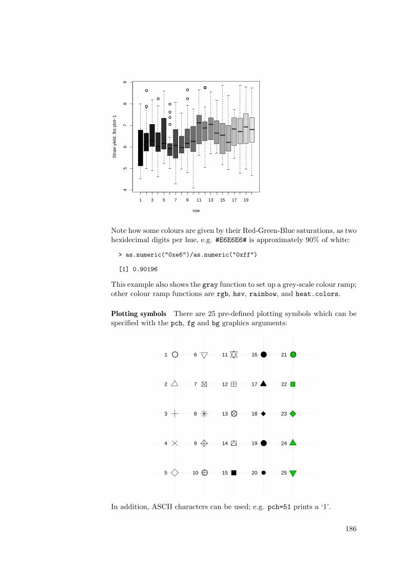
●
●
●
●
●
●
●
●
●●●
1 3 5 7 9 11 13 15 17 19
45
67
89
row
Str
aw y
ield
, lbs
plo
t−1
Note how some colours are given by their Red-Green-Blue saturations, as twohexidecimal digits per hue, e.g. #E6E6E6# is approximately 90% of white:
> as.numeric("0xe6")/as.numeric("0xff")
[1] 0.90196
This example also shows the gray function to set up a grey-scale colour ramp;other colour ramp functions are rgb, hsv, rainbow, and heat.colors.
Plotting symbols There are 25 pre-defined plotting symbols which can bespecified with the pch, fg and bg graphics arguments:
●1
2
3
4
5
6
7
8
9
●10
11
12
●13
14
15
●16
17
18
●19
●20
●21
22
23
24
25
In addition, ASCII characters can be used; e.g. pch=51 prints a ‘1’.
186