sas1683-2015 sas visual analytics for fun and profit: a
TRANSCRIPT

1
SAS1683-2015
SAS® Visual Analytics for Fun and Profit:
A College Football Case Study
John Davis, SAS Institute Inc., Cary, NC
ABSTRACT
SAS® Visual Analytics is a powerful tool for exploring, analyzing, and reporting on your data. Whether you
understand your data well or are in need of additional insights, SAS Visual Analytics has the capabilities you need to discover trends, see relationships, and share the results with your information consumers. This paper presents a case study applying the capabilities of SAS Visual Analytics to NCAA Division I college football data from 2005 through 2014. It follows the process from reading raw comma-separated values (CSV) files through processing that data into SAS data sets, doing data enrichment, and finally loading the data into in-memory SAS
® LASR™ tables. The case study then demonstrates using SAS
Visual Analytics to explore detailed play-by-play data to discover trends and relationships, as well as to analyze team tendencies to develop game-time strategies. Reports on player, team, conference, and game statistics can be used for fun (by fans) and for profit (by coaches, agents and sportscasters). Finally, the paper illustrates how all of these capabilities can be delivered via the web or to a mobile device—anywhere—even in the stands at the stadium. Whether you are using SAS Visual Analytics to study college football data or to tackle a complex problem in the financial, insurance, or manufacturing industry, SAS Visual Analytics provides the power and flexibility to score a big win in your organization.
INTRODUCTION
Implementing a solution to solve an analysis and reporting problem involves much more than just understanding how to use the software tools that are available to you. The solution requires a clear definition of the problem, access to data that is pertinent to the problem, and a detailed plan for how the software tools can manage and present the data to give users the desired insight.
This project to analyze college football data was conceived as a part of my work as a member of the Customer Experience Testing (CET) team at SAS Institute. The charter of the CET team is to perform “Act Like a Customer” (ALAC) testing. This testing methodology supplements a stringent functional testing program by the SAS Research and Development testing organization. Figure 1 illustrates the theory behind ALAC testing: testing software the same way a customer uses the software will lead to the discovery and elimination of defects that cause the most negative impact on your customer.
Figure 1: Act Like a Customer Testing

2
The CET team works to create customer-like scenarios using real-world data to find these types of defects before the software is shipped to the user.
When beginning to test a new release of SAS Visual Analytics, I was looking for some new, real-world data and analysis requirements that would exercise the product in a customer-like way. At the same time, I was enjoying the fall college football season. While looking at all of the information and analysis available on websites like ESPN and Yahoo Sports, I started to wonder how much of the analysis and presentation on these websites could be produced using SAS Visual Analytics. At this point the project was born. The project needed clear definition, data that would support the analysis and reporting requirements, and proper execution to deliver the desired results using the SAS Visual Analytics components.
DEFINING THE PROBLEM
College football fans frequent websites like ESPN.com and Yahoo.sports.com for up-to-the-play information on their favorite team’s games. These websites present schedule and game results as well as detailed team and individual player statistics. The information is presented in a compelling and entertaining format. (See Figure 2.)
Figure 2: Popular College Football Websites
The first problem we must solve is acquiring access to the data we need in order to produce the reports and analysis we wish to duplicate. We also have to move that data from its source and complete any cleansing and transformations required to get the data into an analysis-ready format. Next, we design the reports, determining how the capabilities of SAS Visual Analytics map to the output that we want to reproduce. In addition, we will design some new features that go beyond the capabilities of these public websites. Our reports will have their own unique look and feel to distinguish them from our more well-known competitors (ESPN and Yahoo). Finally, we will build our reports and test their delivery via a web interface, as well as to mobile devices. This will be an iterative process, which means that as we move through each step in the project, we may find reasons to modify work from the previous step to meet some new requirement we have discovered. It is important that our design and tools are flexible enough to accommodate such changes

3
ACQUIRING THE DATA
The most logical place to look for detailed data on college football is the National Intercollegiate Athletic Association (NCAA) website www.ncaa.com/sports/football. While this website has a plethora of information on NCAA football games for the last 15 years, it only provides summary statistics, not the detailed play-by-play data that we need for the level of detail that we wish to surface in our reporting.
A manual search of the web using popular search engines led to a College Football Statistics website (www.cfbstats.com), which provided detailed data on each NCAA Division I game played from 2005 through 2013. This data was updated weekly during the current fall football season. The data was provided in CSV files, which could be manually downloaded from the website. This data was provided free through the 2013 season. In 2014, access to the data became a paid service of SportsSource Analytics (www.sportsourceanalytics.com).
GETTING THE DATA ANALYSIS-READY
In order to prepare the data for analysis, we have to understand what the data looks like when we receive it from the source. Then we must define what transformations are needed to cleanse and enrich the data as we prepare it for use in our reports. SAS Visual Analytics has several components which assisted with understanding the data that was received from the website.
SAS® VISUAL ANALYTICS EXPLORER
SAS® Visual Analytics Explorer (the explorer) can import CSV files directly, and can be used to study the
raw data as we received it. Later we will also use it later to do more complex analysis of the enriched data. Here we are using the explorer to see what the raw data looks like, the cardinality of the variables in the data, and how the data is distributed. This information will help us decide what we need to do to transform the data from its raw form into a form that can be used to produce our desired reports.
Figure 3: SAS Visual Analytics Explorer

4
In Figure 3, the explorer enables us to look at the CSV file containing the individual play data for each game. Our exploration of the data gives us insight as to the values of individual columns, how the values are distributed, and how analysis-ready the data is. This helps us know what information is already available in the raw data, and what we may need to derive from the raw data, to transform it into a presentation-ready state. SAS
® VISUAL DATA BUILDER
SAS
® Visual Data Builder (the data builder) can also be used to investigate our raw data, and to begin to
design the transformations necessary to enrich the raw data by combining tables and deriving new data elements from what we received in the raw content. Using the data builder, we can directly import the CSV files we downloaded and then create new output tables via SQL table joins. The resulting output can be directly loaded into in-memory LASR tables for use by the other SAS Visual Analytics components. These transformation jobs can be saved and scheduled for batch execution as well. We are using the data builder for initial work on our data, but it has many more capabilities.
Figure 4: SAS Visual Data Builder Query Designer
In Figure 4, we can see that our tables are de-normalized, as raw data is typically stored. We must use information from our 2013_Game joined with a 2013_Team and 2013_Conference in order to enrich the games table with team and conference names for each game. This is typical extract/transform/load (ETL) processing done to construct data marts.
5
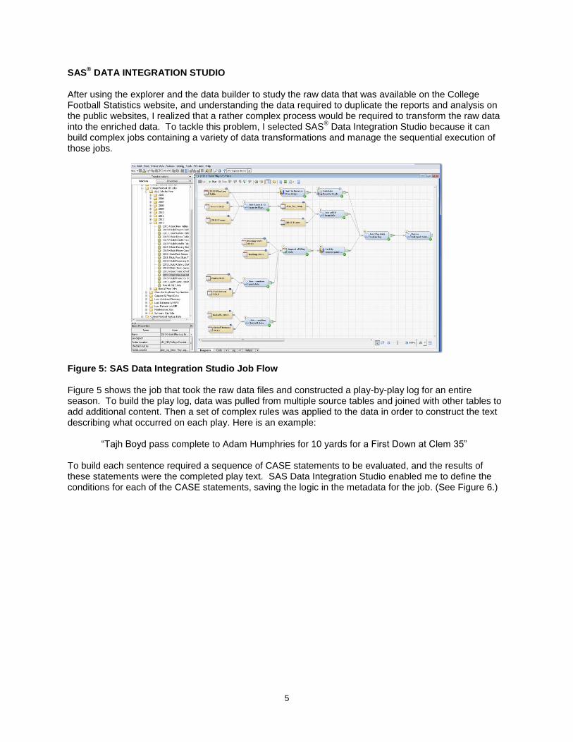
SAS® DATA INTEGRATION STUDIO
After using the explorer and the data builder to study the raw data that was available on the College Football Statistics website, and understanding the data required to duplicate the reports and analysis on the public websites, I realized that a rather complex process would be required to transform the raw data into the enriched data. To tackle this problem, I selected SAS
® Data Integration Studio because it can
build complex jobs containing a variety of data transformations and manage the sequential execution of those jobs.
Figure 5: SAS Data Integration Studio Job Flow Figure 5 shows the job that took the raw data files and constructed a play-by-play log for an entire season. To build the play log, data was pulled from multiple source tables and joined with other tables to add additional content. Then a set of complex rules was applied to the data in order to construct the text describing what occurred on each play. Here is an example:
“Tajh Boyd pass complete to Adam Humphries for 10 yards for a First Down at Clem 35” To build each sentence required a sequence of CASE statements to be evaluated, and the results of these statements were the completed play text. SAS Data Integration Studio enabled me to define the conditions for each of the CASE statements, saving the logic in the metadata for the job. (See Figure 6.)

6
Figure 6: SAS Data Integration Expression Builder
Using SAS Data Integration Studio, we can build out a data mart for each season, and then combine the data from all seasons into a single mart, which is then loaded into our SAS LASR Analytic Server, for consumption by the SAS Visual Analytics software.
DESIGNING THE REPORTS
The next phase of the project is to design the reports that we want to deliver to our users. We want to duplicate the most popular displays from the sports websites, but also to come up with some new ways of representing the data. Figures 7 through 9 show some examples we will need to reproduce from ESPN.com:
Figure 7: Schedule and Results

7
Figure 8: Play-by-Play report
Figure 9: Drive Chart
SAS Visual Analytics has a wide range of objects we can use to construct these visualizations. Table 1 lists some of the objects we have available to us:
List Table Cross Tab Bar Chart Waterfall Chart
Line Chart Pie Chart Scatter Plot Time Series Plot
Bubble Plot Treemap Geo Bubble Map
Geo Coordinate
Map
Geo Region Map
Network Diagram
Sankey Diagram
Histogram
Box Plot Heat Map Word Cloud Correlation Matrix
Linear Regression
Logistic Regression
Cluster GLM
Table 1: Partial Listing of SAS Visual Analytics Reporting Objects

8
In addition to these pre-defined objects, SAS® Visual Analytics Graph Builder (the graph builder), enables
us to combine and extend these default objects to create our own custom visualizations. (See Figure 10.)
FIGURE 10: SAS VISUAL ANALYTICS GRAPH BUILDER
CREATING THE SCHEDULE RESULTS REPORT OBJECT
To build the Schedule Results report, we will use the List Report object in SAS® Visual Analytics Designer
(the designer). The designer enables us to lay out the data from our Team Schedule Results table in the data mart. We can lay the information out similarly to the way it is displayed on the public website, adding color-coded fields to highlight the winners and losers. We added additional data to our table: the attendance and capacity figures, along with a percent-of-capacity statistic.
Figure 11: SAS Visual Analytics Schedule Results Table

9
The color coding is configured using the Display Rules feature within the designer. This gives the user extensive control to conditionally set background and foreground colors and fonts for rows or individual columns of data. (See Figure 12.)
Figure 12: Display Rules Dialog Box
PLAY-BY-PLAY REPORT OBJECT
This report object, while appearing very simple required the most amount of data preparation work, as well as developing a custom graph object to give the SAS Visual Analytics Play-by-Play report an additional element not found on the public sites.
Figure 13: SAS Visual Analytics Play-by-Play Report Object
The play log in Figure 13 shows each play in a drive, where it began (Down-Distance), and the result of the play (Play Text). These descriptions were built by combining information from as many as seven initial data sources: play log, rushing, passing, kick return, punt return, punt, and kickoff tables. This was accomplished by evaluating a very complex set of conditions that evaluated data collected from these tables, applying conditional logic to evaluate the possible outcomes of each play. The code generated by SAS Data Integration Studio looked like this:

10
WHEN (play_log_w_end_spot.Play_Type ='PASS') THEN
CASE
WHEN (play_log_w_end_spot.Completion =1) THEN
CASE
WHEN (play_log_w_end_spot.Yards > 0) THEN
CASE WHEN (play_log_w_end_spot.Touchdown =1) THEN
STRIP
(play_log_w_end_spot.Passer_Player_Name) || ' pass complete to ‘||
STRIP
(play_log_w_end_spot.Receiver_Player_Name) || ' for '||
PUT (play_log_w_end_spot.Yards,? best2.) ||
' yards for a TOUCHDOWN'
Using the Display Rules in SAS Visual Analytics, we assigned colors to the rows of the table based on whether the play was a gain, a loss, or a scoring play. This gives additional visual cues that are not shown on the public website. The Drive Play graph in Figure 13 was created using the graph builder, based on the Schedule Chart (Gantt chart). The challenge here is that spotting the play on a football field uses the 0-50 yards on the offensive or defensive team’s side of the field. The spotting data in the data mart is based on a 0-100 scale, and required special formatting and logic to display the play data on the graph in the way users are accustomed to seeing it.
UNIQUE SAS VISUAL ANALYTICS FEATURES
Once we had reproduced the principal report objects that were available on the public websites, it was time to see what additional insight could be provided using the unique features of the SAS product. A number of additional report objects in the designer are available to us. SAS Visual Analytics includes a number of geographic mapping report objects. Any data that contains geographic content can be displayed in these objects. Geographic content can include standard state names/abbreviations and ZIP codes. Also, custom IDs can be defined using a location’s latitude and longitude. We used this feature to analyze attendance and performance by stadium and team. (See Figure 14.)
Figure 14: Geographical Mapping of Attendance versus Stadium Capacity

11
Another unique report object that we are using in the SAS Visual Analytics reports is the Treemap object. This enables us to graphically represent information in a way that the public website does not. In Figure 15 a treemap shows all the opponents of a team. The treemap boxes are sized based on the number of games played against each opponent, while the coloring represents the win-loss percentage against that opponent. At a glance, we can see who this team plays most often and which opposing team they are more successful against. This report object is linked to another report showing the details of each series so that a user can drill from this treemap to see the results of each game played against any opponent.
Figure 15: Team Performance Treemap

12
INTERACTIVE REPORTS
SAS Visual Analytics enables the users to interact with the data and to ask and answer their own questions. This is accomplished by defining interactions between elements in a report, and even between reports. In Figure 16 is a report that summarizes the performance of each conference. By defining interactions, we can select a specific conference in the table and filter all the other report objects by the selected conference. Using the Interactions Viewer (shown in Figure 17), filters and links can be defined between other report objects in this section and also links to other sections of this report, or to a separate report.
Figure 16: Report with Multiple Objects
Figure 17: Interactions Diagram for Report

13
GAINING INSIGHT (EXPLORING THE DATA)
The capabilities of SAS Visual Analytics extend well beyond what we need to reproduce the reporting surfaced on the public websites. The explorer enables us to study the rich data collected from the College Football Statistics website. Also, the explorer enables us to analyze the tendencies of a team in certain game situations, look for correlations and clustering in the team’s statistics, and even create a model to predict team win percentage based on the available statistics.
DECISION TREE
For coaches, understanding a team’s tendencies is critical to knowing how to attack a defense or defend an offense. Using the Decision Tree exploration in SAS Visual Analytics, we can study a team’s pass/run/kick tendencies based in the down and distance to see if a team tends to run, pass, or kick in certain situations. (See Figure 18.)
Figure 18: Play Tendency Decision Tree

14
CLUSTER ANALYSIS AND CORRELATION MATRIX
SAS Visual Analytics Explorer is aptly named, as it is a tool for exploring relationships in data by presenting compelling visualizations the results from statistical analysis. We used two of these visualization tools (as shown in Figure 19), to look for groups of data (clusters) that exhibit common characteristics and strong statistical correlation. As with the decision tree, we are looking for keys to predicting the performance of our team or our opponent in order to gain an advantage.
Figure 19: Cluster Analysis (left) and Correlation Matrix (right)
SOCIAL MEDIA AND TEXT ANALYSIS
SAS Visual Analytics can import content directly from a Twitter feed and from Facebook Fan Pages. This enables us to see what fans are tweeting and posting about their teams, players, and coaches (among other things). We can create a word cloud (Figure 20) to see trends in what is being posted, and using the text analytics capabilities of SAS through the SAS Visual Analytics user interface, we can do sentiment analysis on the postings. This extends the capabilities of our solution far beyond what is surfaced on the public sites.
Figure 20: Text Analytics for Facebook and Twitter data

15
MODELING BEHAVIORS
The most sophisticated techniques available to us in SAS Visual Analytics are the modeling tools in the explorer. A number of models enable us to predict a desired behavior. In Figure 21 we have constructed a model to predict a team’s conference win percentage based on factors that most strongly influence that outcome. SAS Visual Analytics analyzes the data, builds a suggested model, and then allows us to adjust the model to optimize it.
Figure 21: Linear Regression Model
The modeling tools in SAS Visual Analytics build a model by analyzing the relationships between variables, ranking the variables by the importance of their contribution to the model. In the preceding display, the user can see which variables contribute the most to the model and how well the model fits the data. The user can then fine tune the model by making changes to the variables used and to the model parameters, until they are satisfied with the ability of the model to predict an outcome. The model can then be applied to other data in order to predict outcomes from the new data.

16
SPIT AND POLISH
Now that we have all of our reports and analyses, we need to think about what we want user interface to look like. SAS Visual Analytics comes with a standard theme that ships for all SAS Flex web applications. SAS supplies a theme editor, SAS
® Theme Designer for Flex (shown in Figure 22), which enables us to
create a custom look and feel for our College Football environment. We selected our own color palette and logos. Then using the editor, we assigned colors, fonts, and images to particular roles for the SAS Visual Analytics applications. After saving and deploying our theme, we can make it the default for all users or allow individual users to choose it or any other deployed theme.
Figure 22: SAS Theme Designer for Flex

17
DELIVERING CONTENT TO THE CONSUMER
WEB ACCESS
SAS Visual Analytics provides several options for users to consume the results of all our hard work. For web access, we have the SAS
® Visual Analytics Viewer, which comes in two flavors: Flex or HTML5.
Users can open and view their reports via this interface using all popular web browsers. Figure 23 shows both the Flex and HTML5 interfaces.
Figure 23: SAS Visual Analytics Viewer (left: Flex version, right: HTML5 version)
You can choose between the Flex and HTML5 viewers at a per-user level or set a default for all users. While either interface works equally well, the HTML5 version represents the future direction for SAS user interfaces.
MOBILE ACCESS
A major feature of SAS Visual Analytics is that all of its output can be delivered to mobile devices. Currently SAS supports the Apple’s iPad and a variety of Android tablets. The same reports and analyses that are available on the web can be downloaded and viewed with the SAS
® BI Mobile app.
(See Figure 24.) This app is available free from the Apple app store and from the Google Play app store.
Figure 24: SAS Mobile BI (Apple Version)

18
CONCLUSION
We have used this project, which began as an exercise to test SAS Visual Analytics, to study the features and capabilities of the product. This also provided a vehicle to do a case study of one approach to designing and implementing a solution that involves several additional SAS offerings. We have seen some of the capabilities provided by SAS Visual Analytics, but there are many more available. For more information, see the Recommended Reading section.
ACKNOWLEDGMENTS
I would like to acknowledge my fellow team members of the Customer Experience Testing team at SAS. We work as a team, and I would not have been able to complete this project and write this paper without their assistance.
RECOMMENDED READING
SAS Office Analytics 6.1 with SAS Visual Analytics 6.4: Video Library – This is a set of free videos illustrating how to use the various components of the product. https://support.sas.com/edu/schedules.html?id=1825&ctry=US
CONTACT INFORMATION
Your comments and questions are valued and encouraged. Contact the author at:
John Davis SAS Institute Inc. [email protected] http://www.sas.com
SAS and all other SAS Institute Inc. product or service names are registered trademarks or trademarks of SAS Institute Inc. in the USA and other countries. ® indicates USA registration.
Other brand and product names are trademarks of their respective companies.