seattle audubon - western washington university
TRANSCRIPT

Seattle Audubon
Crystal TamDsgn 360 Winter 2020
Website Redesign Case Study
01. BackgroundSeattle Audubon Redesign 03. Process02. Solution 04. Outcome

Background01

The Client The ProblemSeattle Audubon is an organization leading the community of Seattle in appreciating, understanding, and protecting birds and their natural habitats. The Seattle Audubon website is meant for people who want to get to know their surroundings better and become involved in the outdoors through neighboorhood walks/field trips with others who share the same interest in birding. It is a tool to learn more about nature, conservation, science, and advocacy that goes behind protecting the native bird species in Washington.
The current Seattle Audubon website lacks a visual consistency to its webpages, has confusing navigational bars to the left and top of the pages, and a lack of visual engagement or interactivity. Furthermore, the heavy amount of text and lack of content organization on each page made finding information difficult and stressful for users.
01. BackgroundSeattle Audubon Redesign 03. Process02. Solution 04. Outcome

Current Website
Home Page
Donation Page
Get Involved Page
01. BackgroundSeattle Audubon Redesign 03. Process02. Solution 04. Outcome
Solution02

01. BackgroundSeattle Audubon Redesign 03. Process02. Solution 04. Outcome
Identifying GoalsBy identifying the primary goals for the organization, user, and brand I was able to develop a solution to address what the current website lacks.
Organization Goals
User Goals
Brand Goals
• Increase overall awareness of the Seattle Audubon Society and interest in volunteering/recruitment for NextGen Advisory Council
• Increase donor support to protect and sustain the environment and support educational programs
• Create an accessible experience for people of all ages and abilities to engage with Seattle Audubon
• Access information about how to volunteer or participate in the birding community • Sign up for educational classes and field trips • Donate money to the organization
• Create a cohesive visual aesthetic • Inspire users to engage with Seattle Audubon • Develop a user-friendly interface for all ages
01
02
03

01. BackgroundSeattle Audubon Redesign 03. Process02. Solution 04. Outcome
Strategy StatementSeattle Audubon depends on community engagement as well as the generous donations from its members to continue to fund the conservation work, educational classes and walks they provide the community.
The current website is not representing an interactive or inspiring environment for engagement or learning. Furthermore, user accessibility for navigating the website information is tenuous at best. The website redesign seeks to develop a refreshing cohesive visual identity for the organization, provide an engaging visually-driven interface that keeps users interested, and pages that are accessible for users of all backgrounds.
This will require an overhaul of the navigational organization, designing an involvement page that contains a clear calendar of events, and streamlining the membership donation page to encourage the user to a call to action.

Process03

Arctic Wild National AudubonEastside Audubon
This website utilizes an image collage grid approach to navigating various pages that direct users to different events or trips. Mouse-over interactivity for the bubbles add interest and act as a visual cue for users to interact with. Sticky navigation bar as you scroll further down the page.
Clean typography. Bright orange buttons at the top clearly indicate actionable ways the user can actively support the organization. Nav bar and search bar is directly located below. There are interactive cards that play the calls of various birds when they are clicked on. User is prompted again at very bottom of page with ways to take action with orange buttons.
Each page features a banner image of a different bird with the title of the page centered at the top. The calendar is minimal and shows images of birds on the days where events are occuring. When scrolled over there is a window that shows the event details. Drop down menu at the top helps split and organize everything between birding, education, getting involved, about, blog, and how to donate. There are distinct blue buttons that direct the user to sign up or access a calendar page.
01. BackgroundSeattle Audubon Redesign 03. Process02. Solution 04. Outcome
Competitive ResearchI explored the approaches that similar websites and organizations used to gain inspiration and understand the standards of what my competitors were doing successfully and how I could apply this to reaching my goals for the Seattle Audubon website redesign.
01. BackgroundSeattle Audubon Redesign 03. Process02. Solution 04. Outcome
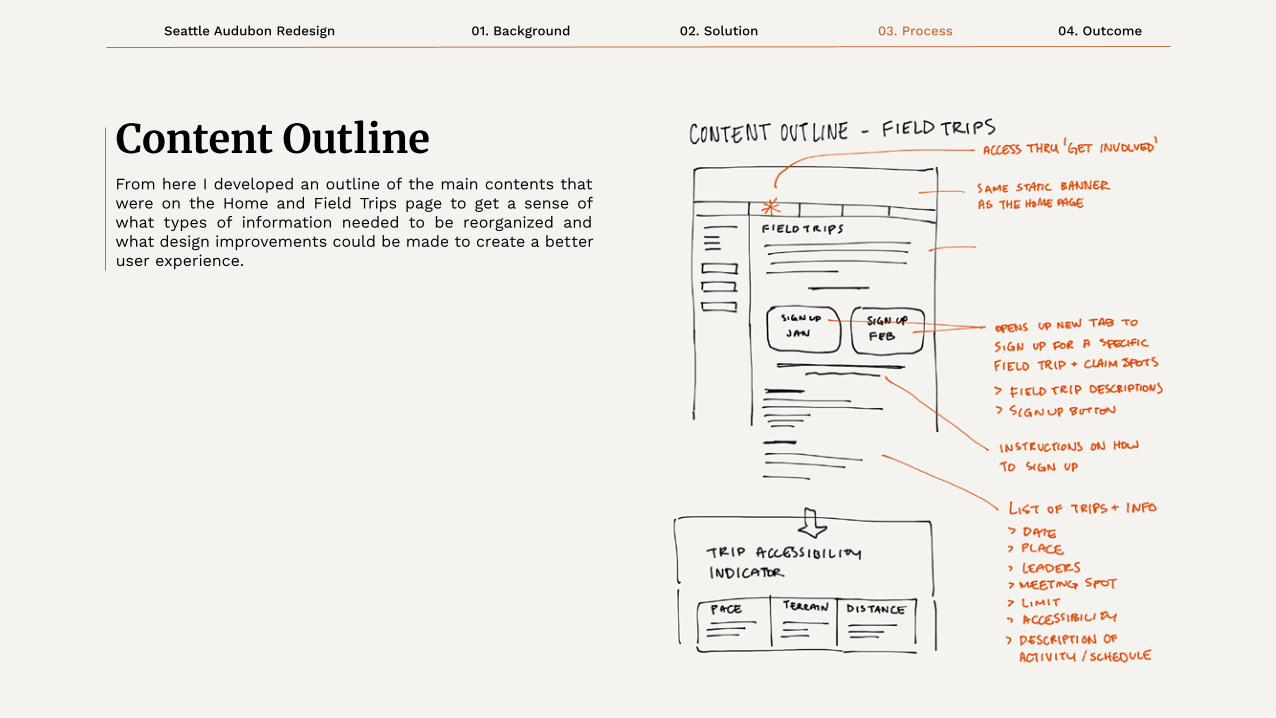
Content OutlineFrom here I developed an outline of the main contents that were on the Home and Field Trips page to get a sense of what types of information needed to be reorganized and what design improvements could be made to create a better user experience.

01. BackgroundSeattle Audubon Redesign 03. Process02. Solution 04. Outcome

ABOUT ALAN
GOALS
DEMANDS OF SERVICE
POTENTIAL PAINPOINTS
Alan is a 25 year old graduate student studying environmental policy at the University of Washington. He is an advocate for social and climate justice and works for the City of Seattle as a Climate Data Analyst to monitor carbon emissions. When he is not busy studying hard or working, you will find him either working out at the gym, volunteering with his community, or birding in the wilderness.
• Expand breadth of knowlege of regional birds, abilityto distinguish bird calls)
• Become a state legislator to implement systemic policies to protect the land and animals for future generations to come
Alan would like to conveniently be able to view and sign up for any upcoming birding excursions because he plans to invite his friends along to participate in one of his favorite hobbies.
• Being overwhelmed by the amount of information when attempting to sign up for a birding field trip with his friends
• He wishes that the website didn’t feel so dated with how un-userfriendly it is to navigate and engage with.
01. BackgroundSeattle Audubon Redesign 03. Process02. Solution 04. Outcome
Target Personas

01. BackgroundSeattle Audubon Redesign 03. Process02. Solution 04. Outcome
Target Personas
ABOUT MOHAMMED
GOALS
DEMANDS OF SERVICE
POTENTIAL PAINPOINTS
Mohammed is 65 year old retiree residing in Seattle. He immigrated to the United States and settled in Washington State when he discovered the beauty of the evergreen trees. He worked as the photographer for The Sierra Club for nearly a decade. He loves his grandchildren and wants to keep them curious about nature and its’ wonders.
• Climb Mt. Everest
• Publish his photographs in a magazine
• Build his own sustainable mini house with built-in solar panels
Mohammed would love to use the website to donate his money to invest in wildlife conservation. He also wants to get his grandchildren signed up for educational classes that are offered.
• Difficulty understanding with the overwhelming donation options available to him.
• Getting confused about the visually different pages

Usability Testing03

01. BackgroundSeattle Audubon Redesign 03. Process02. Solution 04. Outcome
Usability Testing

Font size/spacing is easy to read
Clear path to important information
Navigation is clear and consistent
Style and colors are consistent
URLs and page titles are explanatory
Overall website was easy to understand
CURRENT WEBSITE
develop a consistent visual language
streamline user navigation of the website
remove redundant pathways
MAIN ISSUES TO RESOLVE
01
02
03
01. BackgroundSeattle Audubon Redesign 03. Process02. Solution 04. Outcome
Usability ResearchI conducted usability testing on the original website to see what the main concerns were when it came to executing 3 tasks: registering for online classes, becoming a member, and accessing the online shop.
After conducting the usability testing it became apparent that there was a lack of consistency between the websites visual appearance. This brought confusion to users who were trying to navigate to the online shop and were presented with a completely different looking external website.
This led to frustration when the user would attempt to access the drop down menus in the navigation bar. The arrows had to be directly clicked on in order to view the drop down. Finally, the vertical navigation bar on the left along with the horizontal navigation bar further added to the redundancy and confusion.
01. BackgroundSeattle Audubon Redesign 03. Process02. Solution 04. Outcome
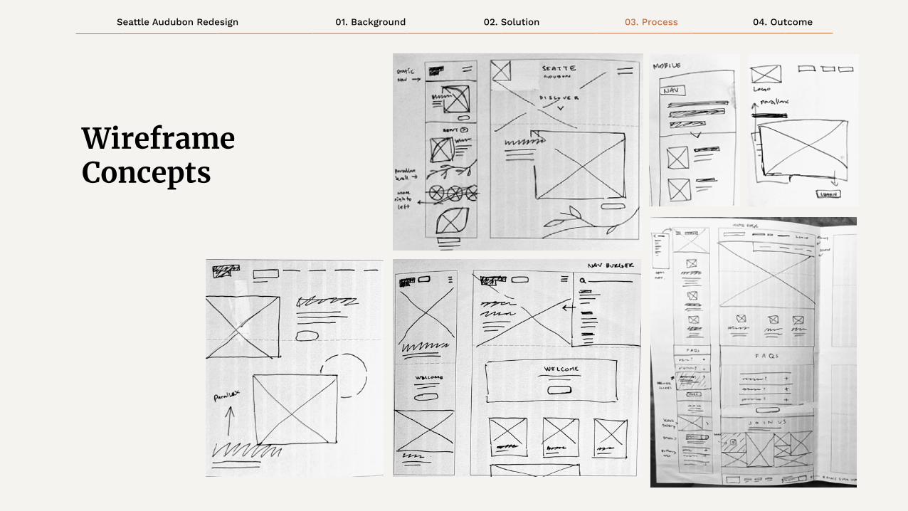
Wireframe Concepts

Logo Redesign03
01. BackgroundSeattle Audubon Redesign 03. Process02. Solution 04. Outcome
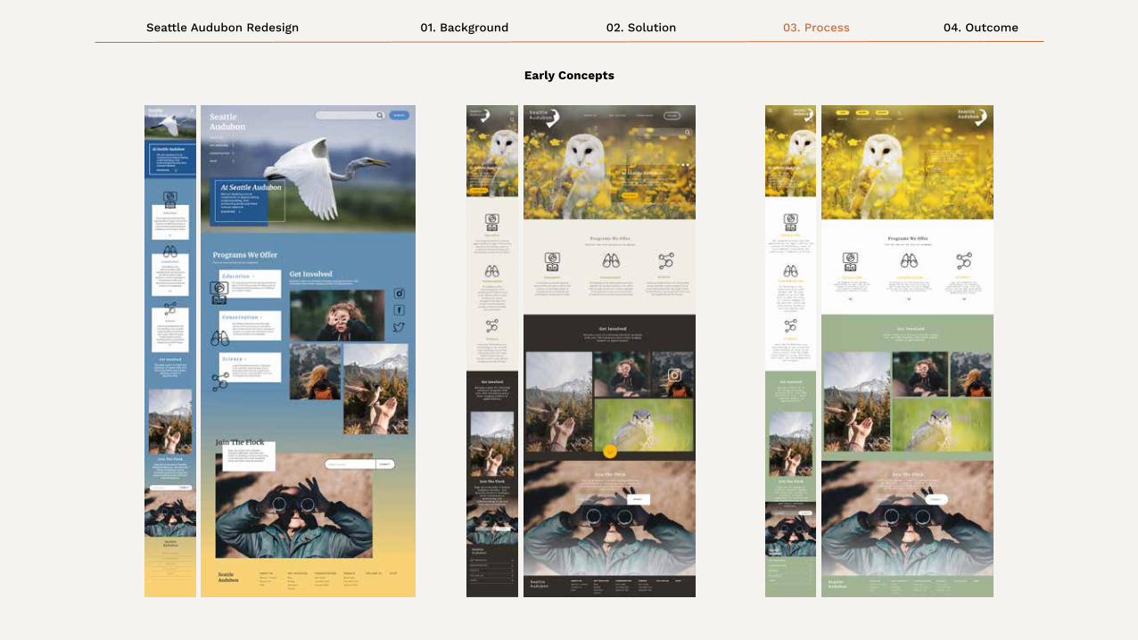
Early Concepts

01. BackgroundSeattle Audubon Redesign 03. Process02. Solution 04. Outcome
Concept Feedback

Final Outcome04

01. BackgroundSeattle Audubon Redesign 03. Process02. Solution 04. Outcome
Final Usability Feedback
01. BackgroundSeattle Audubon Redesign 03. Process02. Solution 04. Outcome
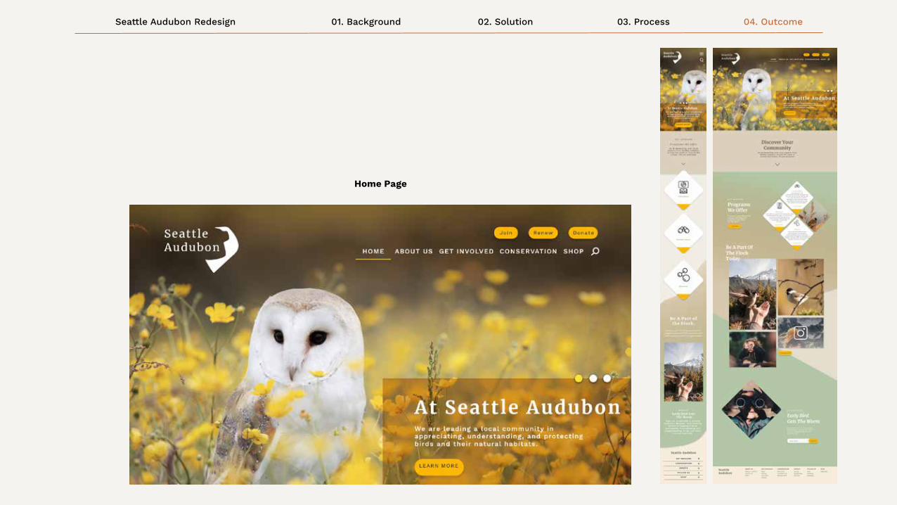
Home Page

01. BackgroundSeattle Audubon Redesign 03. Process02. Solution 04. Outcome
Secondary Membership Page

01. BackgroundSeattle Audubon Redesign 03. Process02. Solution 04. Outcome
Tertiary Involvement Page

Reflections04

01. BackgroundSeattle Audubon Redesign 03. Process02. Solution 04. Outcome
Thoughts + ChallengesOne of my biggest challenges in tackling the Seattle Audubon Website redesign was in developing a cohesive and mature brand identity to suit the needs of an older audience age range. Given that the original website was so text heavy, it took time to divvy up the sections of information that went into each page.
Furthermore, I had some trouble with making a visually engaging website without creating too much business. I was able to recieve helpful feedback among my peers to help break up sections of information to provide breathing room. I learned that sometimes just the smallest changes can make all the difference in the overall experience!
This was also my very first time using the Adobe XD program to create mockups of web designs, but once I got the hang of it I grew in my confidence and got quicker at making my pages. I am proud of myself for going out of my comfort zone to use an unfamiliar program because it turned out to be a breeze to use and made my processes much more streamlined.

Thanks :)