social groups
TRANSCRIPT

How Does Your Media Product Represent Particular
Social Groups?

Mise-En-Scene
• I decided to represent different social groups in my magazine through the way I have set out my front cover, contents page and double page spread through Mise-en-Scene.
• To represent typical teenage groups I had to include a lot of information on the front cover as teenagers cant stay focused very well so including a list of bands which may get their attention would help persuade them to read my magazine.

Props and Costume• I used costumes to portray the indie genre and
teenage audiences throughout. On my Front Cover my main model is wearing a summer dress with a denim jacket which represents a bohemian look and indie genre.
• I used costumes to portray the indie genre and teenage audiences throughout. On my Front Cover my main model is wearing a summer dress with a denim jacket which represents a bohemian look and indie genre.
• On my Contents Page I used a variation of different models, my new model represented the indie teenage social group by wearing non branded clothes stereotypical for this niche social group.

Lighting• For images on my
Front Cover and Double Page Spread I used studio lighting from a ParCan theatre light and a variation of coloured photography light boxes. The colours from the light box represent the indie social group because I chose a yellow colour which is stereotypically a positive colour and it matched the colour of my model’s dress.
• From this image you can see the edge of the box light and how it reflects off of my model’s face which looks like natural sunlight on my front cover.
• The ParCan lights provided white light around the edge of my model and this created the intense light on the photography vinyl again which provided a light scene to represent indie as being bright, optimistic and positive.
• I used these lighting effects because when in the studio I could choose from a variety of different colours which allowed me to experiment with representations. After deciding I wanted the image to be bright and slightly colourful I believed yellow would represent the indie social group well.
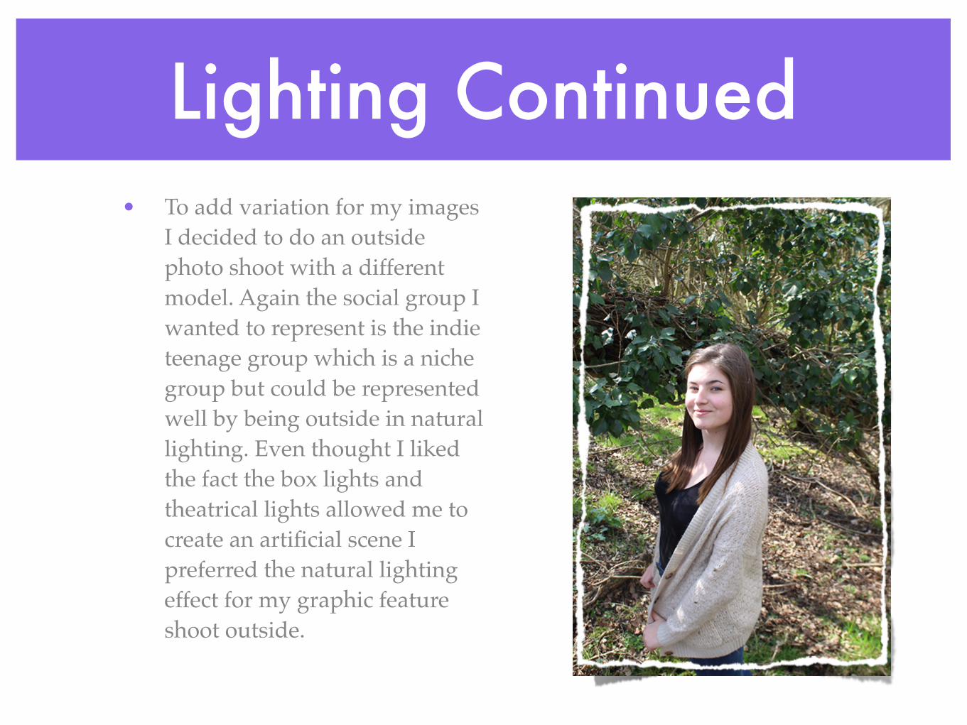
Lighting Continued• To add variation for my images
I decided to do an outside photo shoot with a different model. Again the social group I wanted to represent is the indie teenage group which is a niche group but could be represented well by being outside in natural lighting. Even thought I liked the fact the box lights and theatrical lights allowed me to create an artificial scene I preferred the natural lighting effect for my graphic feature shoot outside.

Location• For my magazine I used
two different locations. I used the photography studio set up in school and the local forest in natural sunlight during the day.
• I used the studio for my front cover image so that it was of the highest quality and it could be easily manipulated in photoshop. However to represent the social group of indie teens I would have preferred to use an outdoor shot like the one on the right.
• I would have preferred to use this image on my Front cover as I believe it represents my intended social group well but I decided against it as the background would be difficult to place text on and difficult to manipulate in photoshop.
• My outdoor shot which I took in a forest I decided to use for a graphic feature on the contents page because it was well lit and it was simple yet effective. This image represented the social group well as it was a teenager in an indie location and this fitted well with other themes I had on the contents page of my magazine.

Use of Language• The use of language in my magazine throughout represents the
social group well as I have used fairly informal language throughout the magazine on all of the pages.
• “Well playing Reading was the best experience of my life!” I used the exclamation at the end of this quote to show that the artist is excited and this represents the social group of indie teenagers as being easily excitable as this was intended to downwardly converge with them.
• The phrase “We believe that the best things come in small packages” again downwardly converges with the intended audience and represents the social group of indie teens as informal and colloquial and again easily excitable.
• “…enjoy!” I used the ellipses and then an exclamation at the end of this feature description for a colloquial, laid back and informal effect. This fits in well with the other language which I have used throughout my other pages of my magazine.

Camera Angles• I used a variety of different camera angles in my music magazine, some of them
are shown below with and explanation of their effect.
• I used this shot to display my model and the surroundings to show that my model is outdoors in a forest.
High Angle Long Shot
• I used this shot to show my model’s costume to the audience as I felt that this would attract the intended social group in my audience.
Mid Shot
• I used a mid shot on my front cover as this would allow the audience to see elements of my model’s costume and facial expressions. This would therefore attract an audience and represent a social group.

Poses• In my magazine I had my models do a variation of different poses. Each
pose would have a different affect and represent the social group differently. Some of my poses were simple and neutral and others were a bit more demonstrative for effect. Some of the images below I didn't include in my final magazine but are here to show a variation of poses.

Mode of Address• A mode of address is whether or not my model is looking directly at the
camera. In the majority of images in my magazine the model is directly addressing the camera and therefore the reader. I think that it is good to have a mode of address because if the model is having eye contact with the reader then this creates a synthetic relationship.

What Attitudes Come Across In My Magazine?
• I think that on my front cover there is an attitude of innocence and determination. I think this because my model is using mode of address and a relaxed, serious yet innocent facial expression. The slight smile on her face could represent an attitude of achievement as this issue of the magazine if focusing on her in particular as an artist.
• This real magazine is an example of how mode of address and facial expression can represent an attitude and this is what I was attempting to achieve in my music magazine front cover.

Stereotypes Portrayed in My Magazine
• On my front cover I wanted to represent the stereotype of an achieving, innocent indie artist. I achieved this by choosing the costume to represent the indie genre, the pose and address of the model to show innocence and the facial expression to show achievement. This adhered to the stereotype of most teenage girls as they are perceived as harder working than boys of their age. Furthermore, the stereotype of a person who likes indie is usually shown from what they wear and the stereotypes of a bohemian would be someone who loves to be outdoors in summer so getting my model to wear a summer dress and denim jacket this stereotype is also adhered to.

Magazines That Are Like “Bohemian”
• I used a variety of different conventions from different magazines such as Q and Q&R. They don’t follow the target audience but they do follow the the magazine layout.

Conventions Used From QI used a logo at the top left
of my contents page to create a strong house style along with the house colour which follows through the
magazine.
I took inspiration from Q to use graphic features
throughout my contents page as this makes it look more
professional overall.
I used the house colour throughout my magazine
contents page for all coloured blocks. I did this to develop the house theme.
Furthermore I used the house colour for text which was sub text or important
information on the page. A convention which Q uses
frequently.